Embed Size (px)
Citation preview

Kentico (Content Management System)
Widget Documentation

TableofContentsINTRODUCTION ....................................................................................................................................................................... 3
GENERAL WIDGETS ................................................................................................................................................................. 4
General Module – Contact .............................................................................................................................................. 4
General Module – Static HTML ....................................................................................................................................... 5
CAROUSEL WIDGET ................................................................................................................................................................. 6
Carousel Module – Images with Captions....................................................................................................................... 6
IMAGE WIDGET ....................................................................................................................................................................... 9
Image Module – 470px x 260px, with Caption ............................................................................................................... 9
FAQ WIDGETS........................................................................................................................................................................ 10
FAQ Module .................................................................................................................................................................. 10
NAVIGATION WIDGETS ......................................................................................................................................................... 12
Navigation Module – Breadcrumbs .............................................................................................................................. 12
Navigation Module – Drop Down Menu ....................................................................................................................... 12
Navigation Module – Left column Tree view ................................................................................................................ 15
Navigation Module – Left column Tree view – Child Items .......................................................................................... 16
PROGRAM WIDGET ............................................................................................................................................................... 17
Program Module ........................................................................................................................................................... 17
RIGHT COLUMN WIDGETS .................................................................................................................................................... 18
Right Column – Event .................................................................................................................................................... 18
Right Column – News .................................................................................................................................................... 19
Right Column – File Download List ............................................................................................................................... 19
Right Column – Message ............................................................................................................................................... 20
Right Column – Highlighted Link ................................................................................................................................... 21
ACCORDION WIDGETS .......................................................................................................................................................... 22
ACCORDION SECTIONS ...................................................................................................................................................... 24
PUTTING IT ALL TOGETHER ............................................................................................................................................... 25
Other Widgets ....................................................................................................................................................................... 27
Forms & Surveys ............................................................................................................................................................... 27
Bizform (on‐line form)................................................................................................................................................... 27
Media & Services............................................................................................................................................................... 27
Youtube ......................................................................................................................................................................... 27
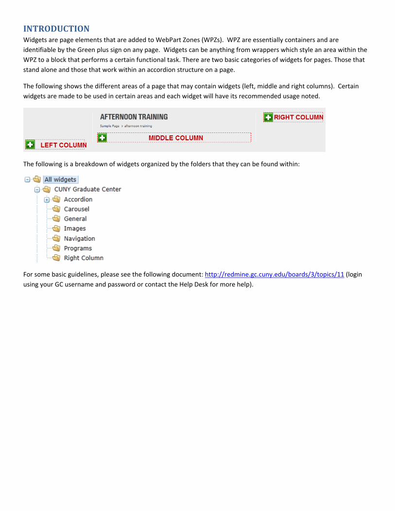
INTRODUCTIONWidgets are page elements that are added to WebPart Zones (WPZs). WPZ are essentially containers and are
identifiable by the Green plus sign on any page. Widgets can be anything from wrappers which style an area within the
WPZ to a block that performs a certain functional task. There are two basic categories of widgets for pages. Those that
stand alone and those that work within an accordion structure on a page.
The following shows the different areas of a page that may contain widgets (left, middle and right columns). Certain
widgets are made to be used in certain areas and each widget will have its recommended usage noted.
The following is a breakdown of widgets organized by the folders that they can be found within:
For some basic guidelines, please see the following document: http://redmine.gc.cuny.edu/boards/3/topics/11 (login
using your GC username and password or contact the Help Desk for more help).
GENERALWIDGETS
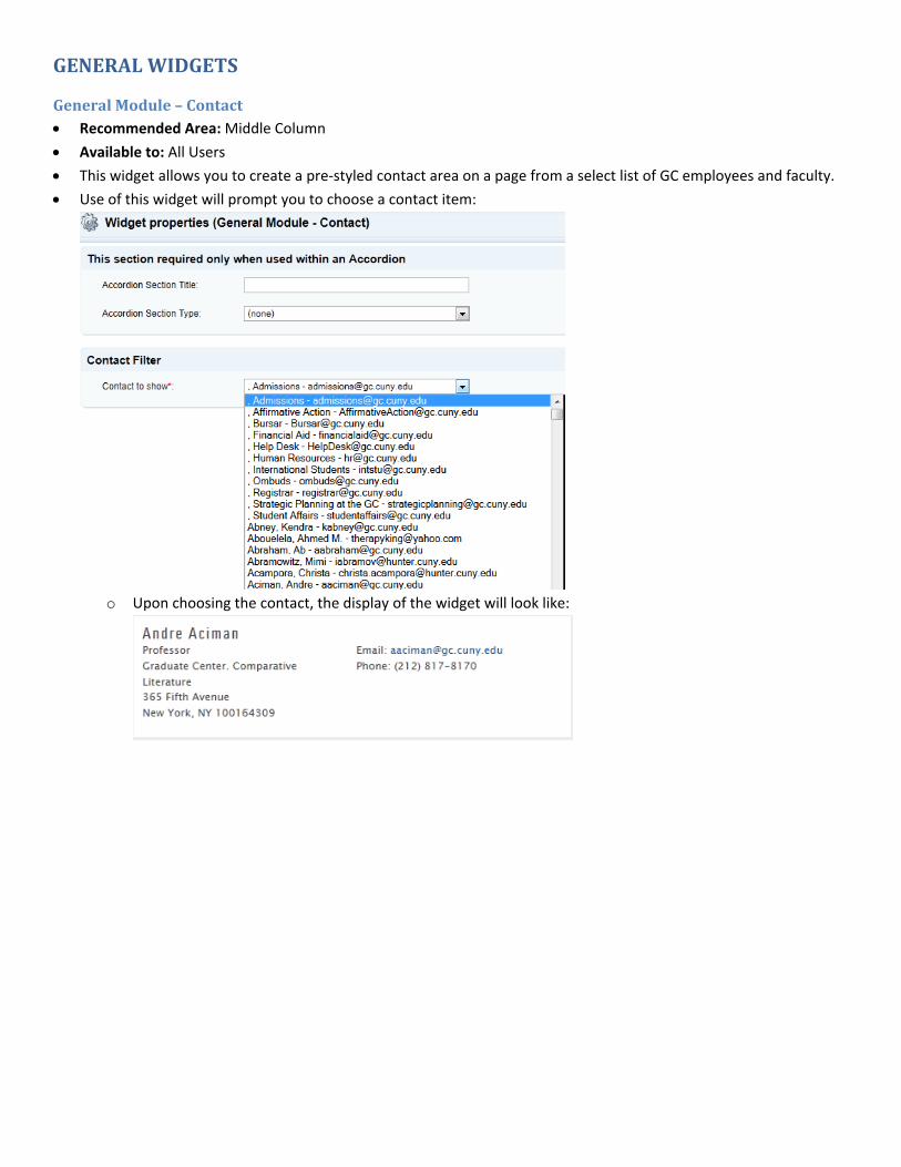
GeneralModule–Contact Recommended Area: Middle Column
Available to: All Users
This widget allows you to create a pre‐styled contact area on a page from a select list of GC employees and faculty.
Use of this widget will prompt you to choose a contact item:
o Upon choosing the contact, the display of the widget will look like:
GeneralModule–StaticHTML Recommended Area: Middle or Left Column
Available to: All Users
Static HTML widget allows for the placement of any text, links, images, flash, video, etc… This text is visible on
immediate page visit. The widget allows you some basic formatting capabilities.
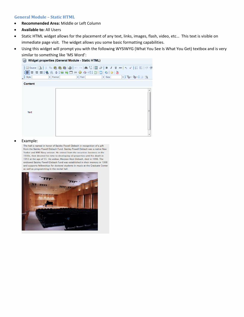
Using this widget will prompt you with the following WYSIWYG (What You See Is What You Get) textbox and is very
similar to something like ‘MS Word’:
Example:

CAROUSELWIDGET
CarouselModule–ImageswithCaptions Recommended Area: Middle Column or Right Column
Available to: All Users
It allows presentation of multiple images with or without captions that the user can browse through. This can be used
to feature event photos, faculty/alumni/student book covers, and a variety of other items.
In order to use this widget, users must first crop/resize their images so all images used in the same carousel have the
same dimensions.
For the middle column, max width is 460px; for the right column, max width is 190px.
Create a folder (i.e. named ‘History Faculty Book Covers’) under ‘Carousels’ (located under each dept/center/other or
the general page elements dependent upon your permission levels):
Within your folder, create a Carousel Item for each image.
Each Carousel Item requires:
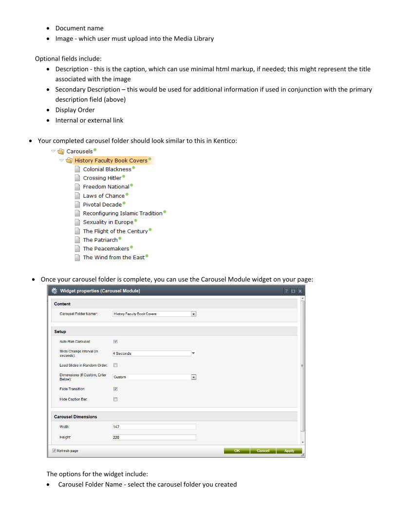
Document name
Image ‐ which user must upload into the Media Library
Optional fields include:
Description ‐ this is the caption, which can use minimal html markup, if needed; this might represent the title
associated with the image
Secondary Description – this would be used for additional information if used in conjunction with the primary
description field (above)
Display Order
Internal or external link
Your completed carousel folder should look similar to this in Kentico:
Once your carousel folder is complete, you can use the Carousel Module widget on your page:
The options for the widget include:
Carousel Folder Name ‐ select the carousel folder you created
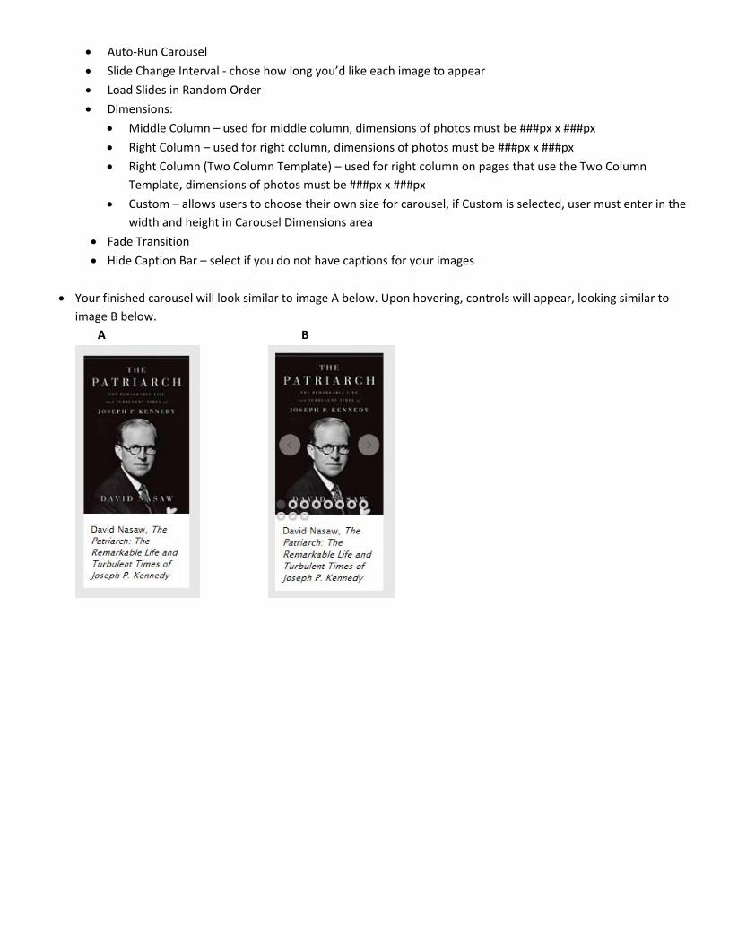
Auto‐Run Carousel
Slide Change Interval ‐ chose how long you’d like each image to appear
Load Slides in Random Order
Dimensions:
Middle Column – used for middle column, dimensions of photos must be ###px x ###px
Right Column – used for right column, dimensions of photos must be ###px x ###px
Right Column (Two Column Template) – used for right column on pages that use the Two Column
Template, dimensions of photos must be ###px x ###px
Custom – allows users to choose their own size for carousel, if Custom is selected, user must enter in the
width and height in Carousel Dimensions area
Fade Transition
Hide Caption Bar – select if you do not have captions for your images
Your finished carousel will look similar to image A below. Upon hovering, controls will appear, looking similar to
image B below.
A B

IMAGEWIDGET
ImageModule–470pxx260px,withCaption Recommended Area: Middle or Left Column
Available to: All Users
Allows placement of an image with the maximum dimensions of 470 pixels wide by 260 pixels tall (standard middle
column space) with a (optional) caption.
Using this widget presents you with the following options which allow you to choose an image from the media
library to use. You can also add some text captioning that will display under the image.
Results of this look like:
FAQWIDGETS
FAQModule Recommended Area: Middle Column
Available to: All Users
FAQ Content Creation
o Allows the placement of a FAQ (Frequently Asked Questions) listing on a page
o In order to use this widget, a user must either make a request of the Help Desk to create a new FAQ
category OR they may see if an existing FAQ category meets their needs.
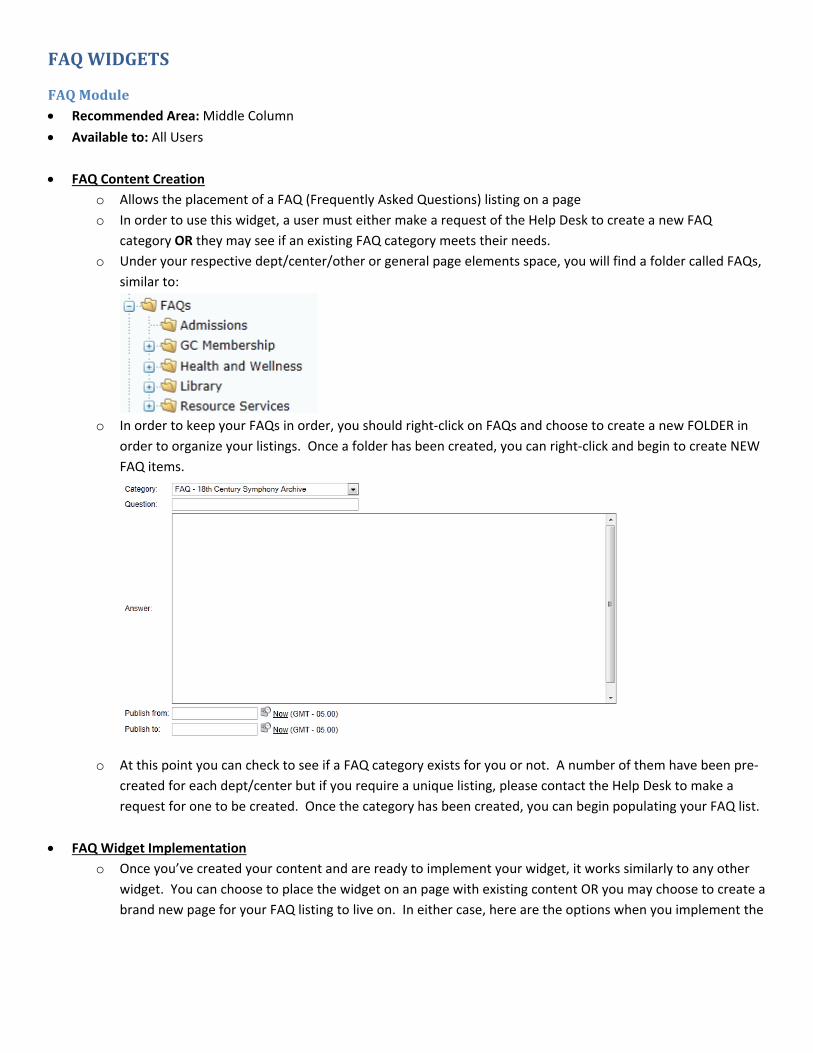
o Under your respective dept/center/other or general page elements space, you will find a folder called FAQs,
similar to:
o In order to keep your FAQs in order, you should right‐click on FAQs and choose to create a new FOLDER in
order to organize your listings. Once a folder has been created, you can right‐click and begin to create NEW
FAQ items.
o At this point you can check to see if a FAQ category exists for you or not. A number of them have been pre‐
created for each dept/center but if you require a unique listing, please contact the Help Desk to make a
request for one to be created. Once the category has been created, you can begin populating your FAQ list.
FAQ Widget Implementation
o Once you’ve created your content and are ready to implement your widget, it works similarly to any other
widget. You can choose to place the widget on an page with existing content OR you may choose to create a
brand new page for your FAQ listing to live on. In either case, here are the options when you implement the
FAQ widget.
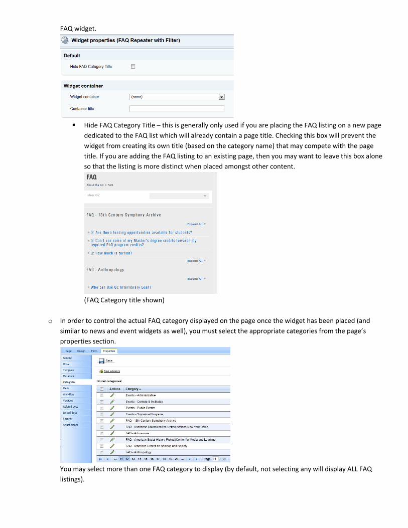
Hide FAQ Category Title – this is generally only used if you are placing the FAQ listing on a new page
dedicated to the FAQ list which will already contain a page title. Checking this box will prevent the
widget from creating its own title (based on the category name) that may compete with the page
title. If you are adding the FAQ listing to an existing page, then you may want to leave this box alone
so that the listing is more distinct when placed amongst other content.
(FAQ Category title shown)
o In order to control the actual FAQ category displayed on the page once the widget has been placed (and
similar to news and event widgets as well), you must select the appropriate categories from the page’s
properties section.
You may select more than one FAQ category to display (by default, not selecting any will display ALL FAQ
listings).
NAVIGATIONWIDGETS
NavigationModule–Breadcrumbs Recommended Area: N/A
Available to: Administrators ONLY
This widget places the bread crumb trail on pages which show where the user is in the page structure for the site.
This element is a basic item on all pages and does not need to be added.
NavigationModule–DropDownMenu Recommended Area: Right Column.
Available to: This widget is only available to authorized users. If you do not have access and would like to utilize this
widget, please email the help desk at [email protected] or call 212‐817‐7300.
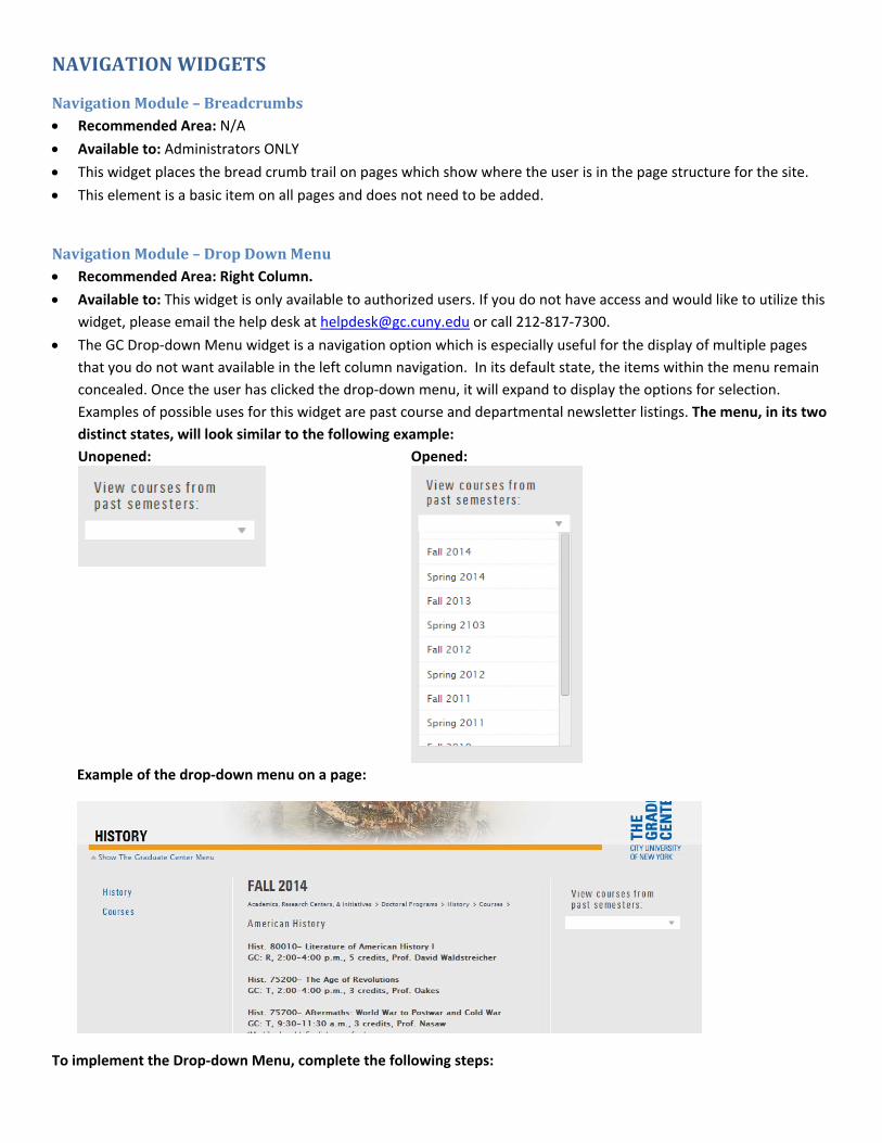
The GC Drop‐down Menu widget is a navigation option which is especially useful for the display of multiple pages
that you do not want available in the left column navigation. In its default state, the items within the menu remain
concealed. Once the user has clicked the drop‐down menu, it will expand to display the options for selection.
Examples of possible uses for this widget are past course and departmental newsletter listings. The menu, in its two
distinct states, will look similar to the following example:
Unopened: Opened:
Example of the drop‐down menu on a page:
To implement the Drop‐down Menu, complete the following steps:

1. Organize the pages that will be visible in the drop down.
2. Apply the proper navigation properties to each page.
3. Add the drop‐down menu to each page where you would like it to display and set its properties.
4. Optional: Set up a redirect for the parent item of your drop‐down.
Step 1: Organize the pages that you would like visible in the drop‐down menu.
Pages that you would like to appear in the drop‐down menu must all be located on the same level of the content tree. For example, on the left, all past course pages have been gathered as sub‐pages of Courses. Each published page on that level will appear in the drop‐down in the same order in which they are listed. To organize/move your subpages, simply drag and drop the titles of the pages. You can also use the arrows at the top of the content tree to move pages up/down within the same level:
Step 2: Apply the proper navigation properties to each page.
On each page you wish to include in the drop‐down menu, go to the Properties tab and then the Navigation section (see
below). In that window, deselect “Show in navigation.” This will remove the pages from the main left‐hand navigation.
Step 3: Add the drop‐down menu to each page where you would like it to display and set its properties.
On each page the drop‐down menu should appear, click on the large green plus icon in the column where it
will display. Once you are on the widget selection screen, browse to the Graduate Center folder and then within
the navigation section find and select the widget “GC Drop‐down Menu.” Click “OK.”
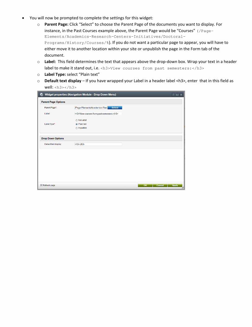
You will now be prompted to complete the settings for this widget:
o Parent Page: Click “Select” to choose the Parent Page of the documents you want to display. For
instance, in the Past Courses example above, the Parent Page would be “Courses” (/Page-Elements/Academics-Research-Centers-Initiatives/Doctoral-
Programs/History/Courses/%). If you do not want a particular page to appear, you will have to
either move it to another location within your site or unpublish the page in the Form tab of the
document.
o Label: This field determines the text that appears above the drop‐down box. Wrap your text in a header
label to make it stand out, i.e. <h3>View courses from past semesters:</h3>
o Label Type: select “Plain text”
o Default text display – If you have wrapped your Label in a header label <h3>, enter that in this field as
well: <h3></h3>
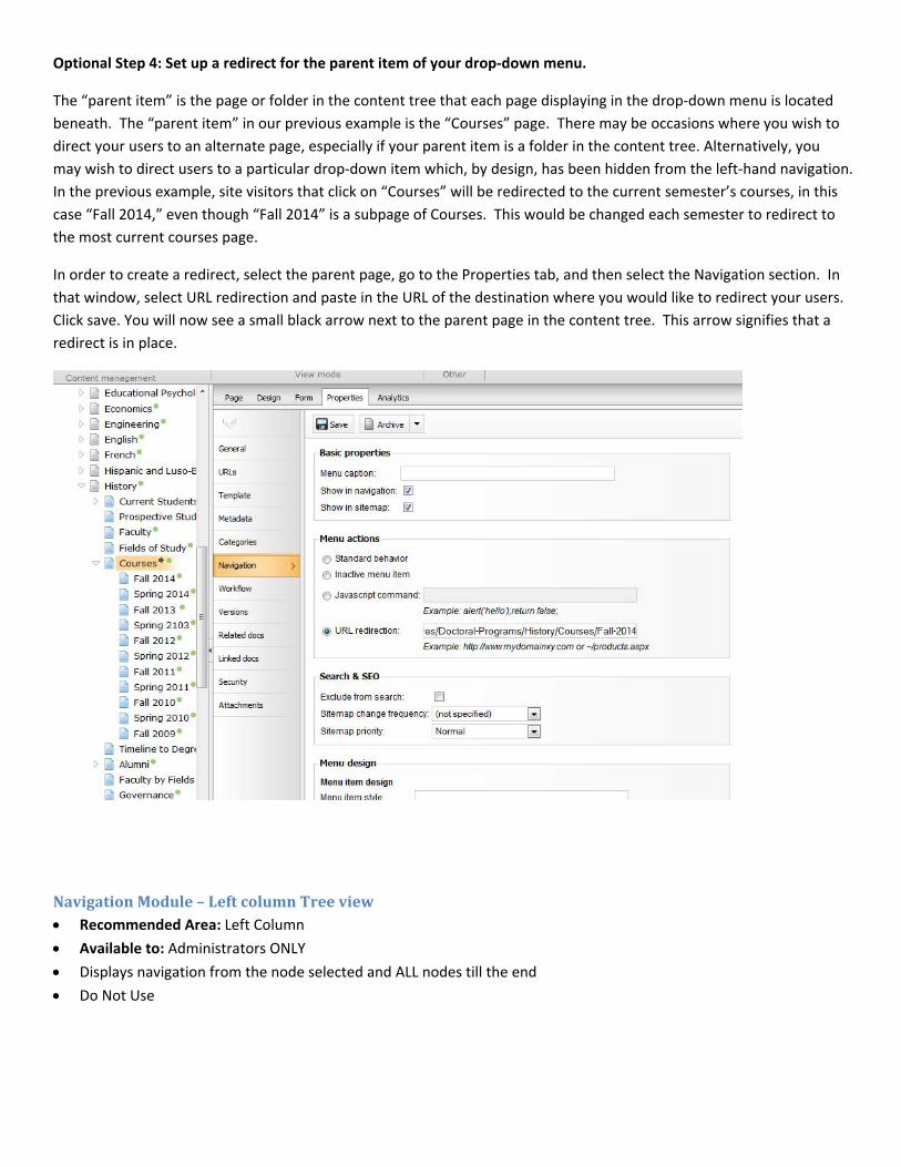
Optional Step 4: Set up a redirect for the parent item of your drop‐down menu.
The “parent item” is the page or folder in the content tree that each page displaying in the drop‐down menu is located
beneath. The “parent item” in our previous example is the “Courses” page. There may be occasions where you wish to
direct your users to an alternate page, especially if your parent item is a folder in the content tree. Alternatively, you
may wish to direct users to a particular drop‐down item which, by design, has been hidden from the left‐hand navigation.
In the previous example, site visitors that click on “Courses” will be redirected to the current semester’s courses, in this
case “Fall 2014,” even though “Fall 2014” is a subpage of Courses. This would be changed each semester to redirect to
the most current courses page.
In order to create a redirect, select the parent page, go to the Properties tab, and then select the Navigation section. In
that window, select URL redirection and paste in the URL of the destination where you would like to redirect your users.
Click save. You will now see a small black arrow next to the parent page in the content tree. This arrow signifies that a
redirect is in place.
NavigationModule–LeftcolumnTreeview Recommended Area: Left Column
Available to: Administrators ONLY
Displays navigation from the node selected and ALL nodes till the end
Do Not Use
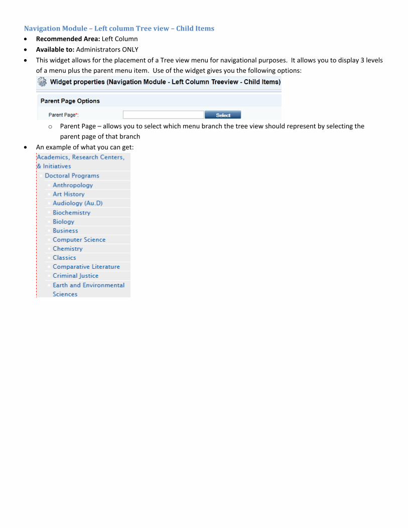
NavigationModule–LeftcolumnTreeview–ChildItems Recommended Area: Left Column
Available to: Administrators ONLY
This widget allows for the placement of a Tree view menu for navigational purposes. It allows you to display 3 levels
of a menu plus the parent menu item. Use of the widget gives you the following options:
o Parent Page – allows you to select which menu branch the tree view should represent by selecting the
parent page of that branch
An example of what you can get:
PROGRAMWIDGET
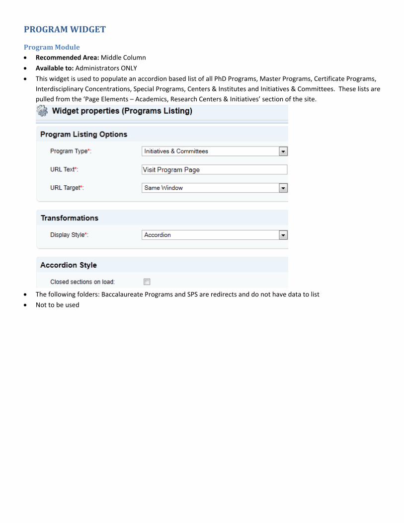
ProgramModule Recommended Area: Middle Column
Available to: Administrators ONLY
This widget is used to populate an accordion based list of all PhD Programs, Master Programs, Certificate Programs,
Interdisciplinary Concentrations, Special Programs, Centers & Institutes and Initiatives & Committees. These lists are
pulled from the ‘Page Elements – Academics, Research Centers & Initiatives’ section of the site.
The following folders: Baccalaureate Programs and SPS are redirects and do not have data to list
Not to be used
RIGHTCOLUMNWIDGETS
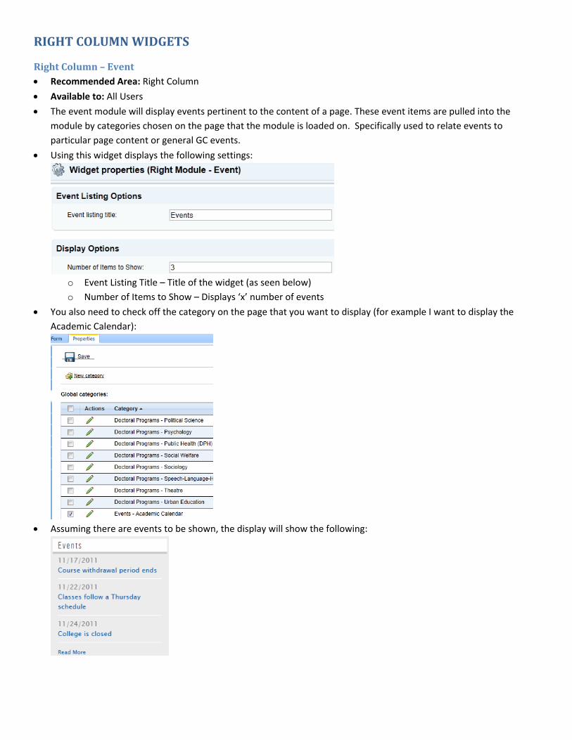
RightColumn–Event Recommended Area: Right Column
Available to: All Users
The event module will display events pertinent to the content of a page. These event items are pulled into the
module by categories chosen on the page that the module is loaded on. Specifically used to relate events to
particular page content or general GC events.
Using this widget displays the following settings:
o Event Listing Title – Title of the widget (as seen below)
o Number of Items to Show – Displays ‘x’ number of events
You also need to check off the category on the page that you want to display (for example I want to display the
Academic Calendar):
Assuming there are events to be shown, the display will show the following:
RightColumn–News Recommended Area: Right Column
Available to: All Users
News module is similar to the event module in that it can pull items related to a specific page (e.g. news about the
history program on the history page). These news items are pulled into the module by categories chosen on the
page that the module is loaded on.
The setup process is similar to the Right Columns – Events widget and the same steps needed to be followed. The
categories selected, like Events, will determine what News categories will be displayed.
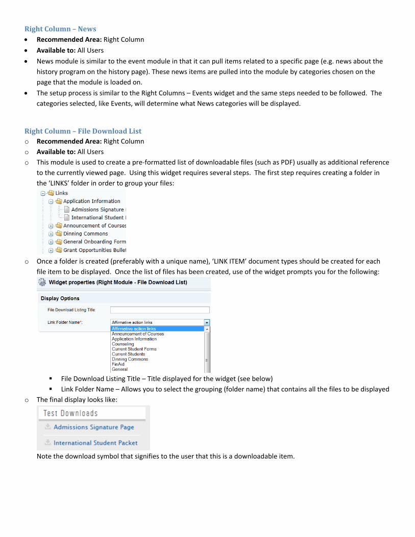
RightColumn–FileDownloadListo Recommended Area: Right Column
o Available to: All Users
o This module is used to create a pre‐formatted list of downloadable files (such as PDF) usually as additional reference
to the currently viewed page. Using this widget requires several steps. The first step requires creating a folder in
the ‘LINKS’ folder in order to group your files:
o Once a folder is created (preferably with a unique name), ‘LINK ITEM’ document types should be created for each
file item to be displayed. Once the list of files has been created, use of the widget prompts you for the following:
File Download Listing Title – Title displayed for the widget (see below)
Link Folder Name – Allows you to select the grouping (folder name) that contains all the files to be displayed
o The final display looks like:
Note the download symbol that signifies to the user that this is a downloadable item.

RightColumn–Message Recommended Area: Right Column
Available to: All Users
Allows the creation of a pre‐formatted space on the right column generally used to provide addendum or referential
information to the page. Use of the widget displays the following options:
o Heading Title – Title used for the display (see example)
o Header Image – Header image to be used right under the title and prior to any text
o Text – Any text you wish
o Read More Link Options – Provides the use of a ‘Read More’ style to link for more information either via an
internal link (GC Website page) or an external URL (non‐GC).
The display of the widget with use of all the above fields could result in:

RightColumn–HighlightedLink Recommended Area: Right Column
Available to: All Users
This widget allows you to create a highly visible URL link (with rollover effect) that should primarily be used to
highlight a critical link. This widget should not be used in excess which would only serve to detract from its
importance. Use of the widget would display the following properties:
o Text to link – Text to be used for the link
o Link Rollover Text – rollover text
o Image/PDF Selection – link to a PDF or other downloadable file
o Internal Link – Link to another page on the GC site
o External URL – Link to an external site (non‐GC)
This is the display of the widget. When a mouse is rolled over, the link reverses colors.
ACCORDIONWIDGETSAn accordion is an expandable/collapsible region on a page. An accordion can have one or many different components within its framework. These components are called widgets and are currently broken up into 2 categories: Wrappers and Content Display. In order for any accordion to function properly it must have the basic open and close tag widget with the various widgets (the content you wish to have collapsible/expandable) placed within those tags. Available to: All UsersHere is the basic structure <Open Tag> <content display widgets> < Close Tag>
Accordion Wrappers Start (Open Tag) Options
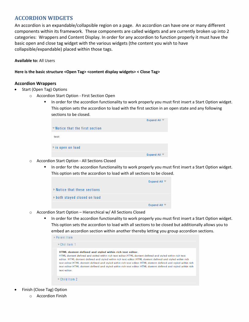
o Accordion Start Option ‐ First Section Open
In order for the accordion functionality to work properly you must first insert a Start Option widget.
This option sets the accordion to load with the first section in an open state and any following
sections to be closed.
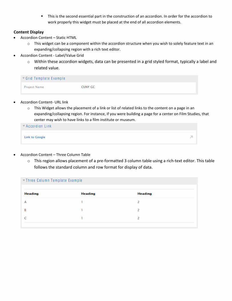
o Accordion Start Option ‐ All Sections Closed
In order for the accordion functionality to work properly you must first insert a Start Option widget.
This option sets the accordion to load with all sections to be closed.
o Accordion Start Option – Hierarchical w/ All Sections Closed
In order for the accordion functionality to work properly you must first insert a Start Option widget.
This option sets the accordion to load with all sections to be closed but additionally allows you to
embed an accordion section within another thereby letting you group accordion sections.
Finish (Close Tag) Option
o Accordion Finish
This is the second essential part in the construction of an accordion. In order for the accordion to
work properly this widget must be placed at the end of all accordion elements.
Content Display Accordion Content – Static HTML
o This widget can be a component within the accordion structure when you wish to solely feature text in an
expanding/collapsing region with a rich text editor.
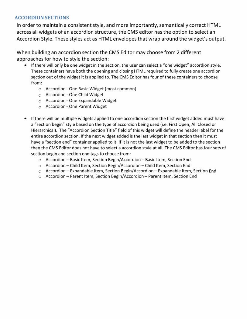
Accordion Content ‐ Label/Value Grid
o Within these accordion widgets, data can be presented in a grid styled format, typically a label and
related value.
Accordion Content‐ URL link
o This Widget allows the placement of a link or list of related links to the content on a page in an
expanding/collapsing region. For instance, if you were building a page for a center on Film Studies, that
center may wish to have links to a film institute or museum.
Accordion Content – Three Column Table
o This region allows placement of a pre‐‐‐formatted 3 column table using a rich‐‐‐text editor. This table
follows the standard column and row format for display of data.
ACCORDIONSECTIONSIn order to maintain a consistent style, and more importantly, semantically correct HTML across all widgets of an accordion structure, the CMS editor has the option to select an Accordion Style. These styles act as HTML envelopes that wrap around the widget’s output.
When building an accordion section the CMS Editor may choose from 2 different approaches for how to style the section:
• If there will only be one widget in the section, the user can select a “one widget” accordion style. These containers have both the opening and closing HTML required to fully create one accordion section out of the widget it is applied to. The CMS Editor has four of these containers to choose from:
o Accordion ‐‐‐ One Basic Widget (most common)
o Accordion ‐‐‐ One Child Widget o Accordion ‐‐‐ One Expandable Widget o Accordion ‐‐‐ One Parent Widget
• If there will be multiple widgets applied to one accordion section the first widget added must have
a “section begin” style based on the type of accordion being used (i.e. First Open, All Closed or Hierarchical). The “Accordion Section Title” field of this widget will define the header label for the entire accordion section. If the next widget added is the last widget in that section then it must have a “section end” container applied to it. If it is not the last widget to be added to the section then the CMS Editor does not have to select a accordion style at all. The CMS Editor has four sets of section begin and section end tags to choose from:
o Accordion – Basic Item, Section Begin/Accordion – Basic Item, Section End o Accordion – Child Item, Section Begin/Accordion – Child Item, Section End o Accordion – Expandable Item, Section Begin/Accordion – Expandable Item, Section End o Accordion – Parent Item, Section Begin/Accordion – Parent Item, Section End
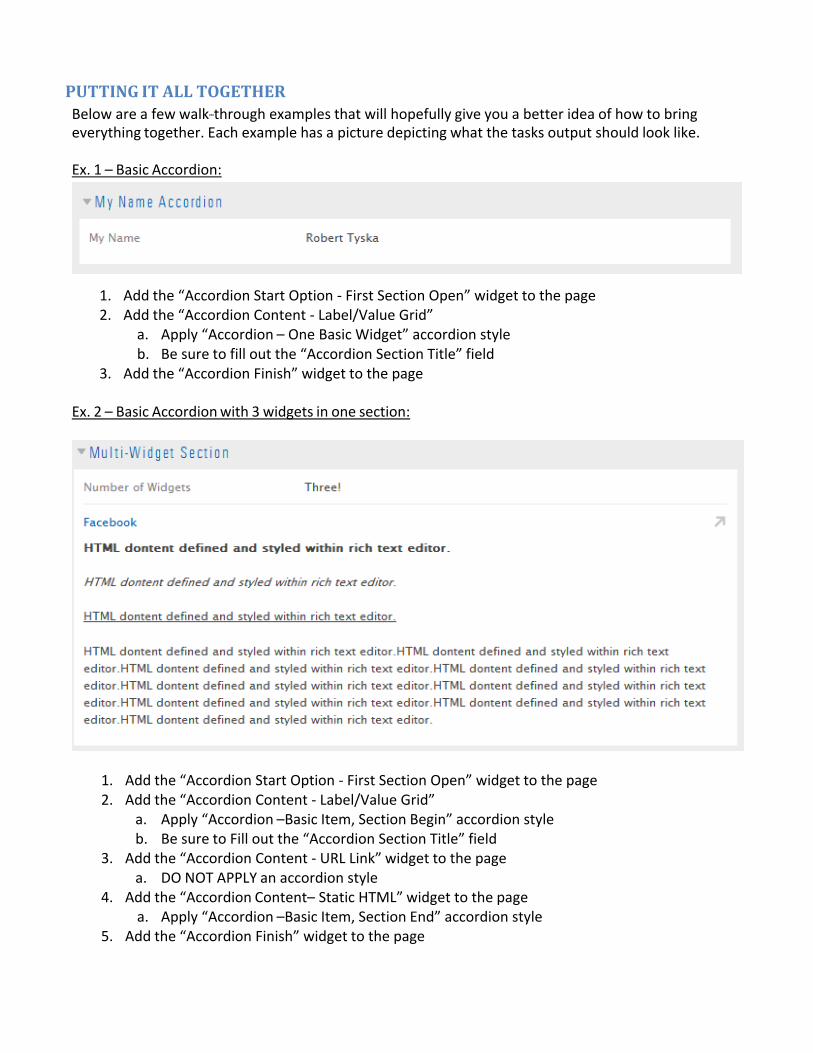
PUTTINGITALLTOGETHERBelow are a few walk‐‐‐through examples that will hopefully give you a better idea of how to bring everything together. Each example has a picture depicting what the tasks output should look like. Ex. 1 – Basic Accordion:
1. Add the “Accordion Start Option ‐ First Section Open” widget to the page 2. Add the “Accordion Content ‐ Label/Value Grid”
a. Apply “Accordion – One Basic Widget” accordion style b. Be sure to fill out the “Accordion Section Title” field
3. Add the “Accordion Finish” widget to the page Ex. 2 – Basic Accordion with 3 widgets in one section:
1. Add the “Accordion Start Option ‐ First Section Open” widget to the page 2. Add the “Accordion Content ‐ Label/Value Grid”
a. Apply “Accordion –Basic Item, Section Begin” accordion style b. Be sure to Fill out the “Accordion Section Title” field
3. Add the “Accordion Content ‐ URL Link” widget to the page a. DO NOT APPLY an accordion style
4. Add the “Accordion Content– Static HTML” widget to the page a. Apply “Accordion –Basic Item, Section End” accordion style
5. Add the “Accordion Finish” widget to the page

Ex. 3 – Hierarchical Accordion:
1. Add the “Accordion Start Option – Hierarchical w/ All Sections Closed” widget to the page 2. Add the “Accordion Content ‐ Static HTML” widget to the page
a. Apply “Accordion – One Parent Item Widget” accordion style b. Be sure to Fill out the “Accordion Section Title” field
3. Add the “Accordion Content ‐ Static HTML” widget to the page a. Apply “Accordion – One Child Item Widget” accordion style b. Be sure to Fill out the “Accordion Section Title” field
4. Add the “Accordion Content ‐ Static HTML” widget to the page a. Apply “Accordion – One Child Item Widget” accordion style b. Be sure to Fill out the “Accordion Section Title” field
5. Repeat step #2 two more times 6. Add the “Accordion Wrapper ‐‐‐ Generic Close Tags” widget to the page

OtherWidgetsThere are a number of other widgets available that are provided through the system by default. In this
section, we will briefly cover the use of these other widgets. You can find these widgets under
respective folder names as matches the headings.
Forms&Surveys
Bizform(on‐lineform) Recommended Area: Middle Column
Available to: All Users
This widget allows you to place a Bizform (online form) that has been created via the Bizform toolset.
Document for this feature can be found here
(http://redmine.gc.cuny.edu/attachments/download/429/Training_Documentation_Bizforms.pdf).
Using this widget, it will prompt you to choose a Bizform:
Select the one that matches the form that you’d like to make available. Doing so will bring that form
onto your page.
As a general rule, you should never have more than ONE Bizform on a page. However you may
incorporate additional widgets such as a ‘Static HTML’ widget in order to provide additional
information or descriptive text.
Media&Services
Youtube Recommended Area: Middle or Right Column
Available to: All Users
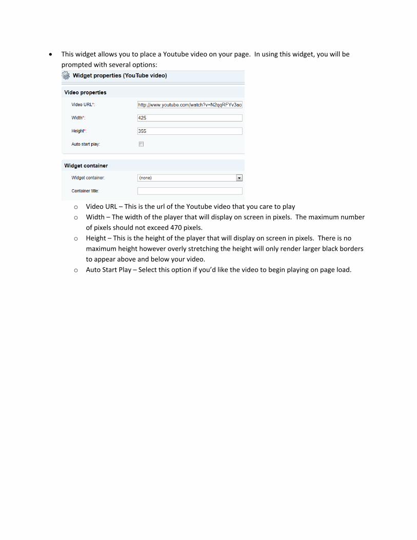
This widget allows you to place a Youtube video on your page. In using this widget, you will be
prompted with several options:
o Video URL – This is the url of the Youtube video that you care to play
o Width – The width of the player that will display on screen in pixels. The maximum number
of pixels should not exceed 470 pixels.
o Height – This is the height of the player that will display on screen in pixels. There is no
maximum height however overly stretching the height will only render larger black borders
to appear above and below your video.
o Auto Start Play – Select this option if you’d like the video to begin playing on page load.

