Embed Size (px)
DESCRIPTION
kelly
Citation preview
ACOMPREHENSIVE PROJECT
ON
“FUNDAMENTAL AND TECHNICAL ANALYSIS OF EQUITY SHARE OF SELECTED COMPANIES IN INDIA”
Submitted To:GLS Institute of Computer Technology (GLSICT-MBA)
IN PARTIAL FULFILLMENT OF THEREQUIREMENT OF THE AWARD FOR THE DEGREE OF
MASTER IN BUSINESS ADMINISTRATION
In
Gujarat Technological University
Faculty Guide:Prof. Darshana Khakhar
Submitted By:Kelly Gandhi (127140592010)Chintesh Patel (127140592031)
Batch 2012-14MBA SEMESTER III/IV
GLS Institute of Computer Technology (GLSICT-MBA)Affiliated to Gujarat Technological University
Ahmedabad

PREFACE
The MBA programme is a well-structured and integrated course of business studies at GLS
Institute of Computer Technology. The main objective of preparing projects at MBA level is to
develop skills in students by supplement to the theoretical study of business management in
general.
In a second year of our MBA programme, we received the opportunity to prepare a
comprehensive project report on “Fundamental and Technical Analysis of Equity scripts of
selected companies.” From this project, we learnt two important aspects of equity scripts
analysis i.e. fundamental analysis and technical analysis.
Our aim of this project is to find out companies from major three sectors of Indian economy,
which are best performing companies and are profitable for short-term as well as long-term
investment. As we have used both fundamental and technical methods for analysis, the result is
more accurate. We have also grabbed a lot of theoretical knowledge related to fundamental and
technical analysis as a part of our subject. This project is very much useful in our real life for
investment decisions.
G.L.S Institute of Computer Technology (GLS ICT-MBA) i

ACKNOWLEDGEMENT
Comprehensive project report provided us with an opportunity to gain information of various
Indian companies from different sectors and their positions in a stock market. We also
experienced of applying the concepts as well as the knowledge learned during classrooms in real
life practical situations.
Every Project Report is a culmination of a student’s endeavor to gain optimum experience during
a short valuable tenure. This Project is dedicated to all the people to whom we met, talked, took
guidance and learnt many things from them.
We take immense pleasure in taking this as an opportunity to express our deepest gratitude to all
those people whose guidance and support has made it possible for us to complete this project
successfully.
First and foremost, we would like to convey our heartiest thanks to GLS Institute of Computer
Technology for providing us with the huge platform for doing a project.
We are thankful to our director Mr. Hitesh Ruparel for providing us a constant support from
institute. Our deepest gratitude to our project guide Prof. Darshana Khakhar, faculty members
who in spite of their busy schedules have provided us with their invaluable support, suggestions
and directions, which facilitated us during all stages of this project.
Finally we would like to convey our deepest regard to everyone who has directly or indirectly
helped us in accomplishing this project.
Place: Ahmedabad With sincere regards,
Kelly Gandhi (127140592010)
Chintesh Patel (127140592031)
G.L.S Institute of Computer Technology (GLS ICT-MBA) ii

GLS INSTITUTE OF COMPUTER TECHNOLOGY(GLSICT-MBA)
CERTIFICATE
“Certified that this Comprehensive Project Report Titled “Fundamental and Technical Analysis
of Equity Shares of Selected Companies in India” is the bonafide work of Ms. Kelly Gandhi
(Enrollment No- 127140592010) and Mr. Chintesh Patel (Enrollment No- 127140592031), who
carried out the research under my supervision.
I also certify further, that to the best of my knowledge the work reported here in does not form
part of any other project report or dissertation on the basis of which a degree or award was
conferred on an earlier occasion on this or any other candidate.
_______________ ________________
Dr. Hitesh Ruparel Prof. Darshana Khakhar
(Director) (Project Guide)
Date: ___________
Place: Ahmedabad
G.L.S Institute of Computer Technology (GLS ICT-MBA) iii

TABLE OF CONTENT
Sr. No. Particulars Page No.
Preface I
Acknowledgement II
Certificate III
CH-1 Research Proposal 1-5
1.1 Introduction 1
1.2 Problem Statement 2
1.3 Objective 2
1.4 Scope of Study 2
1.5 Research Design 2
1.6 Research Question 3
1.7 Data Source 3
1.8 Budget 3
1.9 Tentative Chapter Plan 4
1.10 Benefits of Study 4
1.11 Beneficiaries 4
1.12 Limitation of Study 5
CH-2 Literature Review 6-9
CH-3 Industry Overview 10-26
3.1 Introduction of Power Sector In India 10
3.2 Company Profile of Power Sector 12
3.3 Automotive Sector In India 15
3.4 Company Profile of Automotive Sector 18
3.5 Petroleum Industry In India 22
3.6 Company Profile of Petroleum Sector 24
G.L.S Institute of Computer Technology (GLS ICT-MBA) iv
CH-4 Conceptual Framework 27-85
4.1 Fundamental Analysis 27
4.2 Importance of Fundamental Analysis 29
4.3 Parties Interested 30
4.4 Ratios 31
4.4.1 Liquidity Ratios 32
4.4.2 Activity Ratios 33
4.4.3 Profitability Ratios 35
4.4.4 Leverage Ratios 37
4.5 Pros and Cons of Fundamental Analysis 40
4.6 Technical Analysis 43
4.7 Basic Assumption of Technical Analysis 44
4.8 The Use of Trend in Technical Analysis 46
4.9 Trend Length 48
4.10 Trend Lines 49
4.11 Channels 50
4.12 Support And Resistance 51
4.13 Price Patterns 54
4.14 Charts and its Types 59
4.15 Moving Average and its Types 62
4.16 Indicators and Oscillators 68
4.17 Moving Average Convergence 69
G.L.S Institute of Computer Technology (GLS ICT-MBA) v

4.18 Stoch Astic Chart 70
4.19 Pros and Cons of Technical Analysis 71
4.20 Fundamental vs. Technical 74
CH-5 Fundamental Analysis 75-105
5.1 Automobile Industry 75
5.2 Power Industry 85
5.3 Petroleum Industry 96
CH-6 Technical Analysis 106-165
6.1 Automobile Industry 106
6.2 Power Industry 126
6.3 Petroleum Industry 146
CH-7 Recommendation 166-167
CH-8 Conclusion 168-170
CH-9 Bibliography 171
G.L.S Institute of Computer Technology (GLS ICT-MBA) vi

CHAPTER 1:
RESEARCH PROPOSAL

RESEARCH PROPOSAL
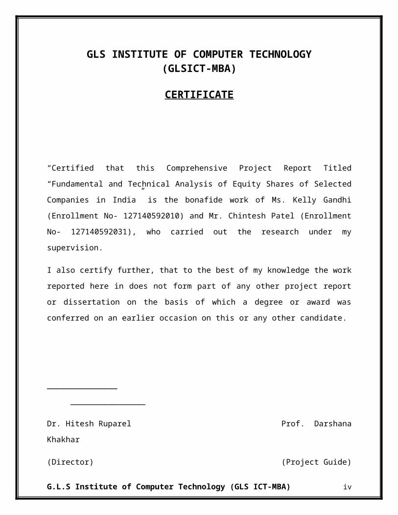
1.1 INTRODUCTION:-
A financial statement provides an insight into the business of any organisation. The information
is processed in the organisation and then to the management which further uses the information
for the decision making in the organization. The main task associated with this is to consider all
the factors affecting and their sources to help the analyst analyze the organization. According to
Accounting Standards, the term “financial statements” covers balance sheets, income statements
or profit and loss accounts, notes and other statements and explanatory material which are
identified as being part of the financial statements”
The methods used to analyze securities and make investment decisions fall into two very broad
categories: fundamental analysis and technical analysis.
Fundamental analysis involves analyzing the characteristics of a company in order to estimate its
value. Fundamental analysis is the cornerstone of investing. In fact, it is said that one is not really
investing if one is not performing fundamental analysis. There are an endless number of
investment strategies that are very different from each other, yet almost all use the fundamentals.
The biggest part of fundamental analysis involves intensive research into the financial
statements. Also known as quantitative analysis, this involves looking at revenue, expenses,
assets, liabilities and all the other financial aspects of a company. Fundamental analysts look at
this information to gain insight on a company's future performance.
But there is more than just number crunching when it comes to analyzing a company. This is
where qualitative analysis comes in - the breakdown of all the intangible, difficult-to-measure
aspects of a company.
Technical analysis takes a completely different approach; it doesn't care one bit about the "value"
of a company or a commodity. Technicians (sometimes called chartists) are only interested in the
price movements in the market.
Despite all the fancy and exotic tools it employs, technical analysis, it studies supply and demand
in a market in an attempt to determine what direction, or trend, will continue in the future. In
G.L.S Institute of Computer Technology (GLS ICT-MBA) 1

other words, technical analysis attempts to understand the emotions in the market by studying the
market itself, as opposed to its components. If one understands the benefits and limitations of
technical analysis, it can give one a new set of tools or skills that will enable one to be a better
trader or investor.
1.2 PROBLEM STATEMENT:-
A Study of Fundamental and Technical Analysis of Equity Share of selected Companies in India.
1.3 OBJECTIVES:-
PRIMARY OBJECTIVES:-
To do the fundamental and Technical Analysis of shares of Selected Companies.
SECONDARY OBJECTIVES:-
To determine whether equity share of a company is worth buying selling or holding,
using Fundamental and Technical Analysis.
To understand the movement and performance of the equity scripts to take decision
regarding investment.
To find trends in stock price using charts of Technical Analysis.
1.4 SCOPE OF STUDY:-
The study is based on information of last five years data.
There are three sectors which are taken for study and analysis Viz., Automobile, Oil and
Gas and Power.
The analysis is done using tools such as Fundamental Analysis and Technical Analysis.
1.5 RESEARCH DESIGN:-
The research mainly uses secondary data for analysis purpose. The research design used
is mainly “Descriptive Research Design”.
G.L.S Institute of Computer Technology (GLS ICT-MBA) 2

1.6 RESEARCH QUESTIONS:-
In current market, there are various securities available for investment to the investor, investor
has to decide on following questions:-
Which stock to invest in?
Which type of securities to buy?
Where to invest?
How much to invest?
Whether to hold, sell or buy securities?
All these questions are needed to be answer prior to make the investment. One also has to know
and forecast future benefits and risks associated with them.
1.7 DATA SOURCE:-
Mainly Secondary source are used to conduct the research. The Secondary Data Source
contributing to the research is:-
Annual Reports
Financial Statements
Journals
Reference Books
Internet
1.8 BUDGET:-
Telephone expense
Web Surfing expense
Travelling expense
Stationery expenses
Printing expense
G.L.S Institute of Computer Technology (GLS ICT-MBA) 3
1.9 TENTATIVE CHAPTER PLAN:-
Preface
Acknowledgement
Executive Summary
Table of Content
Research Methodology
Introduction to Industry(macro)
Introduction to Industry
Detailed discussion on the scope of the project
Key finding and analysis
Conclusion
Recommendations
1.10 BENEFITS OF STUDY:-
The study will help to know Stock market in a better way which is a growing field for
investment.
It would help to know the company for investment in selected industry.
With the help of Fundamental and Technical analysis, one will get idea regarding the
performance of selected companies in selected industry.
It will help to conclude whether to buy, hold or sell shares of companies.
1.11 BENEFICIARIES:-
The research taken up would be useful to the following:-
The Companies studied:-
The study conducted will be useful to the company on which it is been carried out. It will
help them to know the performance of the industry and their competitors.
G.L.S Institute of Computer Technology (GLS ICT-MBA) 4

To Other Researchers:-
The report will provide other researchers with better understanding and knowledge
especially for them who analyze the equity shares of a company.
To Students:-
With help of this research, other students will get a good knowledge about how to conduct
a research and carry out a project.
To public:-
The report will be useful to public to know about the performance of selected equity shares.
It will help them to know in which company they would be getting a better return.
1.12 LIMITATION OF STUDY:-
Following are the limitations of the study:-
Two parameters i.e., Fundamental and Technical Analysis are used to conduct research,
which may not be enough to make conclusions.
Error due to some oversight or misinterpretation.
Few sectors and details of limited number of companies in the sector are used to conduct
research.
G.L.S Institute of Computer Technology (GLS ICT-MBA) 5

CHAPTER 2:
LITERATURE REVIEW

Literature Review
Stock Market Analysis in Practice: Is It Technical or Fundamental?
(Cohen, Kudryaytsey, Andrey, Hon-Sin, & Shlomit, 2011)
For many years investors used various tools to support their buying and selling stocks
decisions. Two sets of tools are commonly used by investors: fundamental and technical
analysis. The first uses the firm's economics data such as profits, dividends and growth
projection, and the second method is based on historic price movements, and mathematical
formulas to predict future returns.
The article is about the investor’s use of fundamental and technical analysis while investing
in stocks. The main aim was to study the difference of use of fundamental and technical tools
in buying versus selling stocks.
The results of survey showed that the investors use more frequently fundamental tools than
technical tools when the go for buying or selling stocks. It was found that non-professional
investors use more of fundamental analysis for buying shares and more technical tools for
selling the shares.
G.L.S Institute of Computer Technology (GLS ICT-MBA) 6
Blending Technical And Fundamental Analysis
(Curtis, 2009)
In the above article, the combination of fundamental analysis and technical analysis has been
done. It is stated that forecasts of share prices can be done with both the methods by the
investors, as both have their own advantages of giving successful returns. One can also use
both of the methods to get the benefits of fundamental and technical analysis together.
The article also states the advantage that an investor gets by using the combo of both tools
and mentions the downside of this blend. The article concludes that Technical analysis can be
a very valuable tool, but it is important to realize the benefits as well as the limitations before
using the same. There is no definite answer about whether technical analysis should be used
as a substitute to fundamental analysis, but many agree that it has its merits when used as a
compliment to other investing strategies.
G.L.S Institute of Computer Technology (GLS ICT-MBA) 7

Relevance Of Fundamental Analysis On The Baltic Equity Market
(Bistrova & Lace, 2009)
The main target of the research was to discover the importance of fundamental analysis on
the Baltic equity markets. The hypothesis that fundamental analysis is not able to generate
substantial additional value to the performance of the portfolio comprised of Baltic
enterprises stocks was proved. The relevance and need of fundamental analysis was checked
by analyzing the performances of portfolios, which were created on the basis of key
fundamental ratios: ROE, equity ratio, ROIC, net debt to assets as well as PE and PB.
Naturally, the companies with better than average ratios were selected to form stock
portfolios.
The findings of the conducted study demonstrate that neither of the mentioned ratios helped
in the creating portfolio, performance of which would beat market’s performance. The only
exception was price to earnings ratio, which proved that cheap companies seem to be
attractive to the investors. In the research it was decided to look closer at the major
performers and to find out whether there are any common patterns among the winners and
the losers of the Baltic equity markets. Basically, equity investors ignored financial situation
of the companies (profitability, stability of balance sheets) and focused mainly on assessing
their growth opportunities and attractiveness of business model. So, investors were mainly
forward-looking when making company selection. As a result, major sufferers performance-
wise were the companies with limited growth potential or total business model erosion.
G.L.S Institute of Computer Technology (GLS ICT-MBA) 8

Fundamental Analysis Of Indian Automobile Industry
(PANDYA & PANDYA, 2013)
Fundamental analysis is an approach to arrive at the ‘correct price’ of the security. Its
objective is to identify the underpriced and overpriced securities in the market place so that
the investment decision-buying and selling of securities can be made. From financial
condition of economy fundamental analysis finds out the intrinsic value of securities. The
intrinsic value is the function of the underling economical value. The intrinsic value is useful
to compare the current market price to determine whether the stock is underpriced or
overpriced. Another assumption of the fundamental analysis is that discrepancies between the
intrinsic value and current market value occurs from time to time explores fundamental
analysis to determine its application as an Austrian approach to common stock selection. The
Thymologic method and the category of understanding are applied as frameworks for an
Austrian approach and to evaluate fundamental analysis as a process for common stock
selection. The analysis supports the conclusion that fundamental security analysis can be
practiced in a manner consistent with traditional Austrian views and is suitable as a common
stock selection method by those
Rajiv Kumar Bhatt (2011) has attempted to analyze the impact of recent global financial
crisis on Indian Economy. The paper is divided into three sections. In the first introductory
section, he has discussed the features of recent global financial meltdown. Section two deals
with the impact of this crisis on Indian economy and discusses how India came back to high
growth. Conclusion and suggestions have been given in the third section.
G.L.S Institute of Computer Technology (GLS ICT-MBA) 9
CHAPTER 3:
INDUSTRY OVERVIEW
3.1 INTRODUCTION OF POWER SECTOR IN INDIA
The power sector in India has undergone significant progress after Independence. When India
became independent in 1947, the country had a power generating capacity of 1,362 MW. Hydro
power and coal based thermal power have been the main sources of generating electricity.
Generation and distribution of electrical power was carried out primarily by private utility
companies. Notable amongst them and still in existence is Calcutta Electric. Power was available
only in a few urban centers; rural areas and villages did not have electricity. After 1947, all new
power generation, transmission and distribution in the rural sector and the urban centers (which
was not served by private utilities) came under the purview of State and Central government
agencies. State Electricity Boards (SEBs) were formed in all the states. Nuclear power
development is at slower pace, which was introduced, in late sixties. The concept of operating
power systems on a regional basis crossing the political boundaries of states was introduced in
the early sixties. In spite of the overall development that has taken place, the power supply
industry has been under constant pressure to bridge the gap between supply and demand.
Growth Scenario Indian Power Sector
Development of Power Sector is the key to the economic development. The power Sector has
been receiving adequate priority ever since the process of planned development began in 1950.
The Power Sector has been getting 18-20% of the total Public Sector outlay in initial plan
periods. Remarkable growth and progress have led to extensive use of electricity in all the
sectors of economy in the successive five years plans. Over the years (since 1950) the installed
capacity of Power Plants (Utilities) has increased to 89090 MW (31.3.98) from meagre 1713
MW in 1950, registering a 52d fold increase in 48 years. Similarly, the electricity generation
increased from about 5.1 billion units to 420 Billion units – 82 fold increase. The per capita
consumption of electricity in the country also increased from 15 kWh in 1950 to about 338 kWh
in 1997-98, which is about 23 times. In the field of Rural Electrification and pump set
energisation, country has made a tremendous progress. About 85% of the villages have been
electrified except far-flung areas in North Eastern states, where it is difficult to extend the grid
supply.
G.L.S Institute of Computer Technology (GLS ICT-MBA) 10

Structural Development of Power Sector
Till December 1950 about 37% of the installed capacity in the Utilities was in the public sector
and about 63% was in the private sector. The Industrial Policy Resolution of 1956 envisaged the
generation, transmission and distribution of power almost exclusively in the public sector. As a
result of this Resolution and facilitated by the Electricity (Supply) Act, 1948, the electricity
industry developed rapidly in the State Sector.
In the Constitution of India “Electricity” is a subject that falls within the concurrent jurisdiction
of the Centre and the States. The Electricity (Supply) Act, 1948, provides an elaborate
institutional frame work and financing norms of the performance of the electricity industry in the
country. The Act envisaged creation of State Electricity Boards (SEBs) for planning and
implementing the power development programmes in their respective States. The Act also
provided for creation of central generation companies for setting up and operating generating
facilities in the Central Sector. The Central Electricity Authority constituted under the Act is
responsible for power planning at the national level. In addition the Electricity (Supply) Act also
allowed from the beginning the private licensees to distribute and/or generate electricity in the
specified areas designated by the concerned State Government/SEB.
From, the Fifth Plan onwards i.e. 1974-79, the Government of India got itself involved in a big
way in the generation and bulk transmission of power to supplement the efforts at the State level
and took upon itself the responsibility of setting up large power projects to develop the coal and
hydroelectric resources in the country as a supplementary effort in meeting the country’s power
requirements. The National thermal Power Corporation (NTPC) and National Hydro-
electric Power Corporation (NHPC) were set up for these purposes in 1975. North-Eastern
Electric Power Corporation (NEEPCO) was set up in 1976 to implement the regional power
projects in the North-East. Subsequently two more power generation corporations were set up in
1988 viz. Tehri Hydro Development Corporation (THDC) and Nathpa Jhakri Power
Corporation (NJPC). To construct, operate and maintain the inter-State and interregional
transmission systems the National Power Transmission Corporation (NPTC) was set up in
1989. The corporation was renamed as POWER GRID in 1992.
G.L.S Institute of Computer Technology (GLS ICT-MBA) 11

3.2 COMPANY PROFILE OF POWER SECTOR:
Power Grid Corporation of India Limited ( POWERGRID ),
Power Grid Corporation of India Limited is an Indian state-owned electric utilities company
headquartered in Gurgaon, India. Power Grid transmits about 50% of the total power generated
in India on its transmission network. Power Grid has a pan-India presence with around 101,886
Circuit Kilometers of Transmission network and 170 EHVAC & HVDC sub-stations with a total
transformation capacity of 168,063 MVA. The Inter-regional capacity is enhanced to 32,000
MW. Power Grid has also diversified into a Telecom business and established a telecom network
of 29,279 Kilometers and points of presence in 210 locations across the country. Power Grid has
consistently maintained the transmission system availability over 99.00% which is at par with the
International Utilities.
Torrent Power Limited
Torrent Power Limited is an India-based company engaged in the electricity generation,
transmission and distribution. Its current operations are in the states of Gujarat and Maharashtra.
It is expanding into Uttar Pradesh starting 15 August 2009. The company is the sole distributor
of electricity to consumers in the cities of Ahmedabad, Gandhinagar and Surat.
In 1997, the company received clearance from the Foreign Investment Promotion Board to issue
preferential shares to US based MNC Investment Corporation for Rs. 400 Crore to help fund its
acquisition of the Ahemdabad Electricity Company by purchasing the entire 28.89% stake held
by the Gujarat government .This acquisition formed what was then known as Torrent Power
AEC Limited. Similarly, after acquiring the Surat Electricity Company in the same deal, Torrent
Power SEC Limited was formed .In 2005, the parent company; Torrent Group floated the
company Torrent Power Generation to further expand into the power business. In 2006, the three
power-related companies of Torrent Group, Torrent Power AEC Ltd, Torrent Power SEC Ltd,
and Torrent Power Generation Ltd were merged to form Torrent Power. More recently, in 2009,
Torrent Power inked a deal with Uttar Pradesh Power Corporation Limited to franchisee to
supply power to parts of Kanpur and Agra then handled by The Kanpur Electricity Supply
G.L.S Institute of Computer Technology (GLS ICT-MBA) 12
Company Ltd. and the Agra Circle of Dakshinanchal Vidyut Vitran Nigam Limited for 20 years.
The handover has been marred by bad frequent power-cuts by the currently operating electricity
boards and threats of state wide strikes by power engineers.
Adani Power Limited
Adani Power Limited is the power business arm of Indian business conglomerate Adani Group
with head office at Ahmedabad, Gujarat. The company is India's largest thermal private power
producer with capacity of 5280 MW and also it is the largest solar power producer of India with
capacity 40MW. Adani Power Limited is ranked 334 in top companies in India in Fortune India
500 list of 2011.The company currently operates five supercritical boilers of 660MW each (as
per March 2012) at Mundra Gujarat & One 660MW out of 05 units at Tirora, Maharashtra. It
also operates a mega solar plant of 40MW at Surendranagar; Gujarat It is India's first company to
achieve the supercritical technology. The plant is the only thermal power plant in India to be
certified by UN under CDM.
The company is currently implementing 16500 MW at different stages of construction. Its
mission is to achieve 20000 MW by 2020. The company currently produces electricity using
only coal. 100MW of solar power station is also under advanced stage of implementation at
Surendranagar in Gujarat out of which 40MW is already commissioned. The company has gone
to long term PPAs of about 7200MW of its 9280MW with government of Gujarat, Maharashtra,
Haryana and Rajasthan.
Coal India Limited
Coal India Limited is an Indian state-controlled coal mining company headquartered in Kolkata,
West Bengal, India and the world's largest coal miner with revenue exceeding 624.15 billion
(FY 2012). It was formerly owned entirely by the Union Government of India, under the
administrative control of the Ministry of Coal. It is involved in coal mining and production
industry. In April 2011, CIL was conferred the Maharatna status by the Union Government of
India and ranked as one of India's most valuable companies by market value.
G.L.S Institute of Computer Technology (GLS ICT-MBA) 13

In 2010, CIL's initial public offering (IPO) got subscribed 15.28 times, collecting a record over
2.4 trillion—the highest IPO subscription so far. On the first day of its listing on the Sensex, its
stock closed 40% higher than IPO price. It is India's largest ever public offer from Coal India
Ltd. to raise up to 150 billion (US$2.3 billion). It is currently 90% owned by the Government of
India with the remaining 10% owned by the public.
National Hydroelectric Power Corporation (NHPC)
NHPC Company was incorporated on November 7, 1975 under the Companies Act as a private
limited company under the name National Hydro Electric Power Corporation Private Limited.
The company was converted to a public limited company with effect from April 2, 1986. The
promoter of the company is the President of India acting through the MoP, GoI and currently
holds 100% of the paid-up share capital of the company.
The company is a hydroelectric power generating company dedicated to the planning,
development and implementation of an integrated and efficient network of hydroelectric projects
in India. It executes all aspects of the development of hydroelectric projects, from concept to
commissioning. It has developed and constructed 13 hydroelectric power stations and its total
installed capacity is currently 5,175 MW. This includes two power stations with a combined
capacity of 1,520 MW, constructed and operated through the Subsidiary, NHDC. Its power
stations and hydroelectric projects are located predominantly in the North and North East of
India, in the states of Jammu & Kashmir, Himachal Pradesh, Uttarakhand, Arunachal Pradesh,
Assam, Manipur, Sikkim and West Bengal.
G.L.S Institute of Computer Technology (GLS ICT-MBA) 14

3.3 AUTOMOTIVE INDUSTRY IN INDIA
The automotive industry in India is one of the larger markets in the world and had previously
been one of the fastest growing globally, but is now seeing flat or negative growth rates. India’s
passenger car and commercial vehicle manufacturing industry is the sixth largest in the world,
with an annual production of more than 3.9 million units in 201. According to recent reports,
India overtook Brazil and became the sixth largest passenger vehicle producer in the world
(beating such old and new auto makers as Belgium, United Kingdom, Italy, Canada, Mexico,
Russia, Spain, France, and Brazil), grew 16 to 18 per cent to sell around three million units in the
course of 2011-12. In 2009, India emerged as Asia's fourth largest exporter of passenger cars,
behind Japan, South Korea, and Thailand. In 2010, India beat Thailand to become Asia's third
largest exporter of passenger cars.
As of 2010, India is home to 40 million passenger vehicles. More than 3.7 million automotive
vehicles were produced in India in 2010 (an increase of 33.9%), making the country the second
(after China) fastest growing automobile market in the world in that year. According to the
Society of Indian Automobile Manufacturers, annual vehicle sales are projected to increase to 4
million by 2015, no longer 5 million as previously projected.
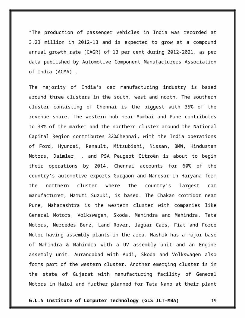
“The production of passenger vehicles in India was recorded at 3.23 million in 2012-13 and is
expected to grow at a compound annual growth rate (CAGR) of 13 per cent during 2012-2021,
as per data published by Automotive Component Manufacturers Association of India (ACMA)”.
The majority of India's car manufacturing industry is based around three clusters in the south,
west and north. The southern cluster consisting of Chennai is the biggest with 35% of the
revenue share. The western hub near Mumbai and Pune contributes to 33% of the market and the
northern cluster around the National Capital Region contributes 32%Chennai, with the India
operations of Ford, Hyundai, Renault, Mitsubishi, Nissan, BMW, Hindustan Motors, Daimler, ,
and PSA Peugeot Citroën is about to begin their operations by 2014. Chennai accounts for 60%
of the country's automotive exports Gurgaon and Manesar in Haryana form the northern cluster
where the country's largest car manufacturer, Maruti Suzuki, is based. The Chakan corridor near
Pune, Maharashtra is the western cluster with companies like General Motors, Volkswagen,
G.L.S Institute of Computer Technology (GLS ICT-MBA) 15

Skoda, Mahindra and Mahindra, Tata Motors, Mercedes Benz, Land Rover, Jaguar Cars, Fiat
and Force Motor having assembly plants in the area. Nashik has a major base of Mahindra &
Mahindra with a UV assembly unit and an Engine assembly unit. Aurangabad with Audi, Skoda
and Volkswagen also forms part of the western cluster. Another emerging cluster is in the state
of Gujarat with manufacturing facility of General Motors in Halol and further planned for Tata
Nano at their plant in Sanand. Ford, Maruti Suzuki and Peugeot-Citroen plants are also set to
come up in Gujarat. Kolkata with Hindustan Motors, Noida with Honda and Bangalore with
Toyota are some of the other automotive manufacturing regions around the country.
MAJOR DEVELOPMENTS & INVESTMENTS
Hero MotoCorp plans to establish 20 manufacturing and assembly facilities to expand its
presence across 50 countries by 2020
Nissan Motor India, the Indian unit of Japanese auto maker Nissan Motor Co Ltd, has
entered into an agreement with Ennore Port Ltd (EPL), to export at least 60,000 cars a
year through the port for the next 10 years
TVS Motor Co plans to launch two new motorcycle models in the Kenyan market. These
motorcycles will be specific to the Kenyan markets in terms of usability, reliability and
durability. Moreover, the firm also plans to set up a two-wheeler assembly line in Uganda
and will also launch two motorcycle models in the African nation
HMIL has invested US$ 2 billion in two state-of-the-art passenger car manufacturing
facilities in India. Moreso, India contributes 25 per cent of the firm’s global sales
Mahindra & Mahindra (M&M) plans capital expenditure and investments worth Rs
10,000 crore (US$ 1.63 billion) over the next two years
Maruti Suzuki India Ltd (MSIL) is setting up an operational integrated research &
development (R&D) centre in Rohtak, Haryana. The test tracks at the new facility would
be longer and considerably enhanced in technical capabilities than the ones at the Suzuki
Motor Corp (SMC) facility in Japan
Tech Mahindra has signed an agreement with Volvo Car Corporation. The IT company
will provide Volvo with a service to maintain and develop a range of applications that
can increase efficiency and reduce costs
G.L.S Institute of Computer Technology (GLS ICT-MBA) 16
Isuzu Motors India plans to start contract manufacturing of its sports utility vehicles
(SUV) and pick-up trucks at Hindustan Motors' (HM) Chennai plant from December
2013
Daimler India Commercial Vehicles (DICV) has expanded its network across the
country. The company plans to establish dealership facilities in over 100 identified
locations across India by 2014
G.L.S Institute of Computer Technology (GLS ICT-MBA) 17

3.4 COMPANY PROFILE OF AUTOMOTIVE SECTOR:
TATA Motors Ltd:
Tata Motors Limited is an Indian multinational automotive manufacturing company
headquartered in Mumbai, Maharashtra, India and a subsidiary of the Tata Group. . Its products
include passenger cars, trucks, vans, coaches, buses and military vehicles. It is the world's
eighteenth-largest motor vehicle manufacturing company, fourth-largest truck manufacturer and
second-largest bus manufacturer by volume. Tata Motors has auto manufacturing and assembly
plants in Jamshedpur, Pantnagar, Lucknow, Sanand, Dharwad and Pune in India, as well as in
Argentina, South Africa, Thailand and the United Kingdom. It has research and development
centers in Pune, Jamshedpur, Lucknow and Dharwad, India, and in South Korea, Spain, and the
United Kingdom. It has a bus manufacturing joint venture with Marcopolo S.A., a construction
equipment manufacturing joint venture with Hitachi and a joint venture with Fiat in India.
Founded in 1945 as a manufacturer of locomotives, the company manufactured its first
commercial vehicle in 1954 in collaboration with Daimler-Benz AG, which ended in 1969. Tata
Motors entered the passenger vehicle market in 1991 with the launch of the Tata Sierra,
becoming the first Indian manufacturer to achieve the capability of developing a competitive
indigenous automobile. In 1998 launched the first fully indigenous Indian passenger car, the
Indica. Tata Motors acquired the South Korean truck manufacturer Daewoo Commercial
Vehicles Company in 2004 and the British premium car maker Jaguar Land Rover in 2008.
Mahindra & Mahindra
Mahindra & Mahindra was established on October 2, 1945 when K.C. Mahindra visited the
United States of America as Chairman of the India Supply Mission. He met Barney Roos,
inventor of the rugged 'general purpose vehicle' or Jeep and had a flash of inspiration: wouldn't a
vehicle that had proved its invincibility on the battlefields of World War II be ideal for India's
rugged terrain and its kutcha rural roads. Swift action followed thought. The Mahindra brothers
joined hands with a distinguished gentleman called Ghulam Mohammed. And, Mahindra &
Mohammed was set up as a franchise for assembling jeeps from Willys, USA. Two years later,
India became an independent nation and Mahindra & Mohammed changed its name to Mahindra
G.L.S Institute of Computer Technology (GLS ICT-MBA) 18

& Mahindra. Ghulam Mohammed migrated to Pakistan post-partition and became the first
Finance Minister of Pakistan.
Mahindra & Mahindra is the only Indian company among the top three tractor manufacturers in
the world. The Group has a leading presence in key sectors of the Indian economy. The Group
employs over 50,000 people and has several state-of-the-art facilities in India and overseas.
Mahindra & Mahindra has comprehensive manufacturing facilities with high level of vertical
integration. Catering to the Sector's diverse customer base spanning rural and semi urban
customers, defence requirements and luxurious urban utility vehicles or SUVs. These
manufacturing plants keep abreast with the latest technology to meet the growing market
expectations.
Maruti Suzuki India Ltd:
Maruti Suzuki India Ltd. is a leading manufacturer of four-wheeler in India. Born in 1983 with
the mission to motorise India, Maruti was a joint venture between Government of India and
Suzuki Motor Corporation, Japan. It quickly grew into the largest compact car making company
of India and remained so till 2004. The company started with Suzuki holding the minor stakes of
the company while GoI holding the major stakes. As of present, GoI has disinvested its stakes in
the company completely, and handed over the management of company to Suzuki Motor
Corporation. Today, Maruti and its partners employ more than 75000 employees. Its
manufacturing facilities are located at two locations, Gurgaon and Manesar, both south of New
Delhi.
Maruti in recent years, owing to several innovative measures like investing in green equipments,
its employee-driven campaigns and Kaizens (shop floor improvements), has drastically reduced
the consumption of power and water and the waste generation in its facilities. Company also
credits this decrease in utility consumption to its adoption of “just-in-time” approach towards
operations.
G.L.S Institute of Computer Technology (GLS ICT-MBA) 19
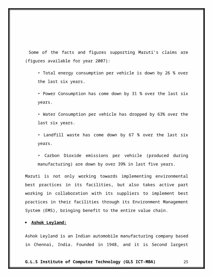
Some of the facts and figures supporting Maruti’s claims are (figures available for year 2007):
• Total energy consumption per vehicle is down by 26 % over the last six years.
• Power Consumption has come down by 31 % over the last six years.
• Water Consumption per vehicle has dropped by 63% over the last six years.
• Landfill waste has come down by 67 % over the last six years.
• Carbon Dioxide emissions per vehicle (produced during manufacturing) are down by
over 39% in last five years.
Maruti is not only working towards implementing environmental best practices in its facilities,
but also takes active part working in collaboration with its suppliers to implement best practices
in their facilities through its Environment Management System (EMS), bringing benefit to the
entire value chain.
Ashok Leyland:
Ashok Leyland is an Indian automobile manufacturing company based in Chennai, India.
Founded in 1948, and it is Second largest commercial vehicle manufacturers of commercial
vehicles, such as trucks and buses, as well as emergency and military vehicles. Operating six
plants, Ashok Leyland also makes spare parts and engines for industrial and marine applications.
It sells about 60,000 vehicles and about 7,000 engines annually. It is the second largest
commercial vehicle company in India in the medium and heavy commercial vehicle (M&HCV)
segment with a market share of 28% (2007–08). With passenger transportation options ranging
from 19 seaters to 80 seaters, Ashok Leyland is a market leader in the bus segment. The
company claims to carry over 60 million passengers a day, more people than the entire Indian
rail network. In the trucks segment Ashok Leyland primarily concentrates on the 16 ton to 25 ton
range of trucks. However Ashok Leyland has presence in the entire truck range starting from 7.5
tons to 49 tons. The joint venture announced with Nissan Motors of Japan would improve its
presence in the Light Commercial Vehicle (LCV) segment (<7.5 tons).
G.L.S Institute of Computer Technology (GLS ICT-MBA) 20

Ashok Leyland's UK subsidiary Optare has shut down its bus factory in Blackburn, Lancashire.
This subsidiary's traditional home in Leeds has also been vacated in favour of a purpose built
plant at Sherburn-in-Elmet.
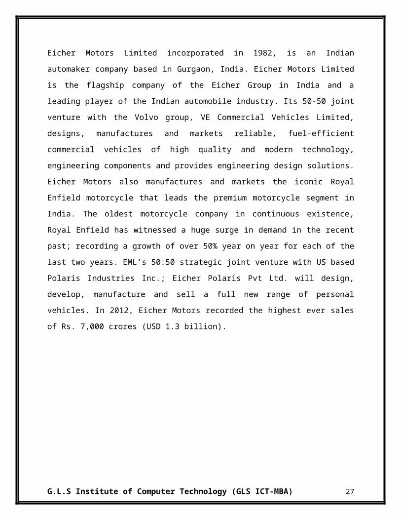
Eicher Motors Limited (EML)
Eicher Motors Limited incorporated in 1982, is an Indian automaker company based in Gurgaon,
India. Eicher Motors Limited is the flagship company of the Eicher Group in India and a leading
player of the Indian automobile industry. Its 50-50 joint venture with the Volvo group, VE
Commercial Vehicles Limited, designs, manufactures and markets reliable, fuel-efficient
commercial vehicles of high quality and modern technology, engineering components and
provides engineering design solutions. Eicher Motors also manufactures and markets the iconic
Royal Enfield motorcycle that leads the premium motorcycle segment in India. The oldest
motorcycle company in continuous existence, Royal Enfield has witnessed a huge surge in
demand in the recent past; recording a growth of over 50% year on year for each of the last two
years. EML’s 50:50 strategic joint venture with US based Polaris Industries Inc.; Eicher Polaris
Pvt Ltd. will design, develop, manufacture and sell a full new range of personal vehicles. In
2012, Eicher Motors recorded the highest ever sales of Rs. 7,000 crores (USD 1.3 billion).
G.L.S Institute of Computer Technology (GLS ICT-MBA) 21
3.5 PETROLEUM INDUSTRY IN INDIA
Oil can be both refined and unrefined. Refined oil is transformed into familiar products such as
gasoline, kerosene, diesel fuel, motor oil, etc. Unrefined oil is known simply as crude oil due to
the presence of various amounts of impurities that have mixed with the oil deep down in the
earth.
Crude oil is the term for "unprocessed" oil, the stuff that comes out of the ground. It is also
known as petroleum. Crude oil is a fossil fuel, meaning that it was made naturally from decaying
plants and animals living in ancient seas millions of years ago -- most places one can find crude
oil were once sea beds.
Indian oil and gas (O&G) sector marked its emergence way back in the late 19th century, when
the oil was first struck at Digboi in Assam in 1889. Refining, transportation, followed with the
discovery at Digboi.
After independence, India didn't lose much time in initiating geological and seismic surveys in
search of oil in the Indian basins. After discoveries in the western sector in Gujarat, the
prevailing attitude of non-cooperation by multinationals necessitated the establishment of Koyali
refinery in the 60s. One after the other major refineries was set up and infrastructure for
distribution of the products expanded at a great pace.
In response to the underdevelopment of domestic hydrocarbon reserves in the face of a growing
dependence on petroleum imports, the Government of India is encouraging both domestic and
international private investors to increase exploration and production efforts in the country with
the implementation of a new exploration licensing policy (NELP).
With demand for 100 million tonne, India is the fourth largest oil consumption zone in Asia,
even though on a per capita basis the consumption is a mere 0.1 tonne, the lowest in the region-
This makes the prospects of the Indian Oil industry even more energizing.
G.L.S Institute of Computer Technology (GLS ICT-MBA) 22

Key Statistics:-
India stood out as one of the top contributors to growth in the refining sector in 2012,
according to the International Energy Agency (IEA). The latest report released by the
international entity shows that the country processed 4.5 million barrels per day (mbpd)
of crude oil in October 2012, (680, 000 bpd higher than a year earlier)
Total refining capacity in India increased from 187.4 MMT (as on 1 Apr 2011) to 215.1
MMT (as on 1 April 2013) and is projected to reach 239.6 MMT in 2013-14 with
capacity augmentation of existing refineries and commissioning of the Paradip Refinery.
India is not only self-sufficient but also substantially exports petroleum products.
Furthermore, Indian exports of refined petroleum products marked a record growth in
October 2012; wherein they stood at over 1.5 mbpd, according to the Petroleum Planning
& Analysis Cell (PPAC). Of this, 39 per cent was diesel, 25 per cent gasoline, 15 per cent
naphtha and 8 per cent jet fuel
Future of Indian Petroleum Industry:-
The future of Indian petroleum industry has good potential but it needs developmental activities
in this sector to strengthen itself. The Petroleum Industry in India is one of the forerunners of
huge economic growth.
The arena for business has now gone global since trade boundaries are fast dissolving. These
developments present India with tremendous opportunities in the future to be one of the major
players in the export of petrochemical intermediaries.
Today, India imports more than 76% of its petroleum requirements. India has to compete for
conventional energy sources and for becoming efficient there must be developmental activities
for energy efficient buildings and vehicles.
G.L.S Institute of Computer Technology (GLS ICT-MBA) 23
The main problems with the Petroleum Industry in India are related to infrastructural
developments. The lack of proper storage facilities, enhancements in refining capacities, and
fluctuating import prices plays important role in the development of the sector.
3.6 COMPANY PROFILE OF PETROLEUM SECTOR:
Indian Oil Corporation Ltd.
IndianOil is India's flagship national oil company with business interests straddling the entire
hydrocarbon value chain – from refining, pipeline transportation and marketing of petroleum
products to exploration & production of crude oil & gas, marketing of natural gas and
petrochemicals. It is the leading Indian corporate in the Fortune 'Global 500' listing, ranked at the
88rd position in the year 2013.
Beginning in 1959 as IndianOil Company Ltd., IndianOil Corporation Ltd. was formed in 1964
with the merger of Indian Refineries Ltd. (established 1958). IndianOil and its subsidiary
(CPCL) account for over 49% petroleum products market share, 31% national refining capacity
and 71% downstream sector pipelines capacity in India. The IndianOil Group of companies owns
and operates 10 of India's 22 refineries with a combined refining capacity of 65.7 million metric
tonnes per annum. With a corporate vision to be the Energy of India, IndianOil closed the year
2011-12 with a sales turnover of Rs. 4,09,957 crore ($ 85,550 million) and profits of Rs. 3,955
crore ($ 825 million).
Hindustan Petroleum Corporation Ltd. (HPCL)
HPCL is a Government of India Enterprise with a Navratna Status, and a Fortune 500 and
Forbes 2000 company, with an annual turnover of Rs. Rs 1, 88,131 Crores during year 2011-12,
having about 20% Marketing share in India among PSUs and a strong market infrastructure.
HPCL's Crude Thruput and Market Sales (including exports) are 15.78 Million Metric Tonnes
(MMT) and 30.32 MMT respectively in the same period.
G.L.S Institute of Computer Technology (GLS ICT-MBA) 24

HPCL operates 2 major refineries producing a wide variety of petroleum fuels & specialties, one
in Mumbai (West Coast) of 6.5 Million Metric Tonnes Per Annum(MMTPA) capacity and the
other in Vishakapatnam, (East Coast) with a capacity of8.3 MMTPA. HPCL holds an equity
stake of 16.95% in Mangalore Refinery & Petrochemicals Limited, a state-of-the-art refinery at
Mangalore with a capacity of 15 MMTPA. In addition, HPCL has constructed a 9 MMTPA
refinery at Bathinda, in Punjab.
HPCL's vast marketing network consists of 13 Zonal offices in major cities and 101 Regional
Offices facilitated by a Supply & Distribution infrastructure comprising Terminals, Pipeline
networks, Aviation Service Stations, LPG Bottling Plants, Inland Relay Depots & Retail Outlets,
Lube and LPG Distributorships. HPCL, over the years, has moved from strength to strength on
all fronts. The refining capacity steadily increased from 5.5 MMTPA in 1984/85 to 14.8
MMTPA presently.
Bharat Petroleum Corporation Ltd. (BPCL)
BPCL was incorporated in 1952 when the Government entered into a joint venture with Burma
Oil and Shell Petroleum. Subsequently, the company was nationalized by way of acquiring a
100% equity stake in 1976, but subsequently the Government has let go a part of its holding to
financial institutions, mutual funds, etc. As the name suggests, its interests are in downstream
petroleum sector. It is involved in the refining and retailing of petroleum products. Bharat
Petroleum is considered to be a pioneer in Indian petroleum industry with various path-breaking
initiatives such as Pure for Sure campaign, Petro card, Fleet card etc.
BPCL was also one of the foremost organizations to implement ERP successfully across its
business domain. It helped to centralize data and subsequent analysis to meet the challenging
market scenario and is still termed as a landmark in the sector. BPCL is a member of the elite
group, which SAP consults for further improvements in its Oil & Gas related products.
Reliance Industries Ltd. (RIL)
G.L.S Institute of Computer Technology (GLS ICT-MBA) 25

Reliance Petroleum was incorporated in 1991as Reliance Refineries, but changed its name to the
former in 1993, and has since merged with its parent company RIL. Its refinery is a standalone,
and is at Jamnagar, on the country’s western coast. The refinery was commissioned in July 1999,
and it commenced its operations in 2000-01. It is India’s largest standalone refinery.
The Jamnagar refinery is also the world’s fifth largest refinery at a single place. RIL also owns
23% of the product pipelines in the country. RIL achieved a turnover of ` 339,792 Crore ($ 66.8
Billion) and net profit of ` 20,040 Crore ($ 3.9 Billion). It achieved their highest ever crude
processing of 67.6 Million tonnes, surpassing their previous record by over a Million tonnes.
ONGC
ONGC was set up under the visionary leadership of Pandit Jawahar Lal Nehru. Pandit Nehru
reposed faith in ShriKeshavDevMalviya who laid the foundation of ONGC in the form of Oil
and Gas division, under Geological Survey of India, in 1955. A few months later, it was
converted into an Oil and Natural Gas Directorate. The Directorate was converted into
Commission and christened Oil & Natural Gas Commission on 14th August 1956. In 1994, Oil
and Natural Gas Commission was converted in to a Corporation, and in 1997 it was recognized
as one of the Navratnas by the Government of India. Subsequently, it has been conferred with
Maharatna status in the year 2010.
Over 56 years of its existence ONGC has crossed many a milestone to realize the energy dreams
of India. The journey of ONGC, over these years, has been a tale of conviction, courage and
commitment. Today, Oil and Natural Gas Corporation Ltd. (ONGC) is, the leader in Exploration
& Production (E&P) activities in India having 72% contribution to India’s total production of
crude oil and 48% of natural gas. ONGC has established more than 7 Billion Tonnes of in-place
hydrocarbon reserves in the country. In fact, six out of seven producing basins in India have been
discovered by ONGC. ONGC produces more than 1.27 million Barrels of Oil Equivalent (BOE)
per day.
G.L.S Institute of Computer Technology (GLS ICT-MBA) 26

CHAPTER 4:
CONCEPTUAL
FRAMEWORK
4.1 FUNDAMENTAL ANALYSIS
The goal of this section is to provide a foundation for understanding "Fundamental Analysis". It's
geared primarily at new investors who don't know a balance sheet from an income statement.
While you may not be a "stock-picker extraordinaire" by the end of this section, you will have a
much more solid grasp of the language and concepts behind security analysis and be able to use
this to further your knowledge in other areas without feeling totally lost.
The biggest part of "Fundamental Analysis" involves delving into the financial statements. Also
known as quantitative analysis, this involves looking at revenue, expenses, assets, liabilities and
all the other financial aspects of a company. Fundamental analysts look at this information to gain
insight on a company's future performance. A good part of this tutorial will be spent learning
about the balance sheet, income statement, cash flow statement and how they all fit together.
The dilemma faced by the market participants in the secondary market as to predict the movement
of stock prices is well managed with two approaches, Fundamental and Technical analysis. Due to
high volatility in the stock markets it is considered as a very rigorous job to predict the future
movement of the stock prices. Secondary market participants often use two forecasting
techniques, Fundamental and Technical analysis. According to this distinction fundamentalists are
market participants who predict movements of stock prices by analyzing the underlying economic
conditions upon which they assume changes in the stock prices.
Fundamental analysis believes that analyzing the economy, strategy, management, product,
financial status and other related information will help choose shares that will outperform the
market and provide consistent gains to the investor. Fundamental analysis is the examination of
the underlying forces that affect the interest of the economy, industrial sectors, and companies. It
tries to forecast the future movement of the capital market using signals from the economy,
industry and company.
Fundamental analysis requires an examination of the market from a broader perspective. The
presumption behind fundamental analysis is that a thriving economy fosters industrial growth
which leads to development of companies. Fundamental analysis is method of finding out the
G.L.S Institute of Computer Technology (GLS ICT-MBA) 27

future price of a stock which an investor wishes to buy. It relates to the examination of the
intrinsic worth of a company to find out whether the current market price is fair or not, whether it
is overpriced or underpriced, in the back ground of the company’s performance and in the
background of the performance of the industry to which the company belongs and also the general
socio-political scenario of the country.
The fundamental approach suggest that every stock has an intrinsic value which should be equal
to the present value of the future stream of income from the stock discounted at an appropriate
risk related rate of interest. Estimate of real worth of a stock is made by considering the earning
potential of the company. It depends on investment environment and factors relating to specific
industry, competitiveness, quality of management, operational efficiency, profitability, and capital
structure and dividend policy.
Chartists, in contrast, study only the stock price movements themselves and believe that the
history of previous data provides indicators for future stock price movements. Chartists employ
Technical analysis, the analysis of past stock price movements to guide forecasts and trading
decisions in the secondary market. Chartism includes the visual search for repeated patterns of
data across time.
Fundamental analysis is the cornerstone of Investing. In fact, some would say that you aren't
really investing if you aren't performing Fundamental Analysis. Because the subject is so broad,
however, it's tough to know where to start. There are an endless number of investment strategies
that are very different from each other, yet almost all use the fundamentals.
G.L.S Institute of Computer Technology (GLS ICT-MBA) 28

4.2 IMPORTANCE OF FUNDAMENTAL ANALYSIS:-
Holding of Share: Shareholders are the owners of the company. Time and again, they
may have to take decisions whether they have to continue with the holdings of the
company's share or sell them out. The fundamental analysis is important as it provides
meaningful information to the shareholders in taking such decisions.
Decisions and Plans: The management of the company is responsible for taking
decisions and formulating plans and policies for the future. They, therefore, always need
to evaluate its performance and effectiveness of their action to realize the company's goal
in the past. For that purpose, fundamental analysis is important to the company's
management.
Extension of Credit: The creditors are the providers of loan capital to the company.
Therefore they may have to take decisions as to whether they have to extend their loans
to the company and demand for higher interest rates. The fundamental analysis provides
important information to them for their purpose.
Investment Decision: The prospective investors are those who have surplus capital to
invest in some profitable opportunities. Therefore, they often have to decide whether to
invest their capital in the company's share. The fundamental analysis is important to them
because they can obtain useful information for their investment decision making purpose.
G.L.S Institute of Computer Technology (GLS ICT-MBA) 29

4.3 Parties Interested:-
Fundamental Analysis has become very significant due to widespread interest of various parties
in the financial results of a business unit. The various parties interested in Fundamental analysis
are:
Investors: Shareholders or proprietors of the business are interested in the well being of
the business. They like to know the earning capacity of the business and its prospects of
future growth.
Management: The management is interested in the financial position and performance of
the enterprise as a whole and of its various divisions. It helps them in preparing budgets
and assessing the performance of various departmental heads.
Lenders: Lenders to the business like debenture holders, suppliers of loans and lease are
interested to know short term as well as long term solvency position of the entity.
Suppliers and trade creditors: The suppliers and other creditors are interested to know
about the solvency of the business i.e. the ability of the company to meet the debts as and
when they fall due.
Employees: They are interested to know the growth of profit. As a result of which they
can demand better remuneration and congenial working environment.
Government and their agencies: Government and their agencies need financial
information to regulate the activities of the enterprises/ industries and determine taxation
policy. They suggest measures to formulate policies and regulations.
G.L.S Institute of Computer Technology (GLS ICT-MBA) 30
4.4 RATIOS:-
A financial ratio (or accounting ratio) is a relative magnitude of two selected numerical
values taken from an enterprise's financial statements. Often used in accounting, there are
many standard ratios used to try to evaluate the overall financial condition of a
corporation or other organization. Financial ratios may be used by managers within a
firm, by current and potential shareholders (owners) of a firm, and by a firm's creditors.
Security analysts use financial ratios to compare the strengths and weaknesses in various
companies. If shares in a company are traded in a financial market, the market price of
the shares is used in certain financial ratios.
The ratio analysis is a useful way of gaining a snapshot picture of a company. These
ratios can be analyzed to identify the company’s strengths and weaknesses. Besides that,
through the process, one can gain the useful insights. There are four most commonly used
groups of ratios such as liquidity, debt or leverage, activity or turnover and profitability.
The effect of ratio analysis improves when the ratios derived are compared to the
historical years and certain pattern is observed according to the operations in the financial
year. The main ratio dealing with the short term time frame solvency is a current ratio
and quick ratio (or acid test). While, when dealing with the larger picture, ratios of
greater concern are gearing ratio, shareholders equity to assets ratio, non-equity claims to
assets ratio and interest coverage ratio. Ratios are basically used to simplify the
accounting information available to be used so as to analyze whether the company is
heading in coherence with its aims or objectives. It is also sometimes helpful to forecast
the trend of the business by reviewing the pattern of the ratios.
G.L.S Institute of Computer Technology (GLS ICT-MBA) 31

4.4.1 Liquidity Ratios:-
The liquidity refers to the maintenance of cash, bank balance and those assets which are easily
convertible into cash in order to meet the liabilities as and when arising. The liquidity ratios
study the firm’s short term solvency and its ability to pay off the liabilities. The liquidity ratios
provide a quick measure of liquidity of the firm by establishing relationship between current
assets and current liabilities. If the firm does not have enough liquidity it may not be in a position
to meet its commitments and thereby loose creditworthiness. The liquidity ratios may be called
Balance Sheet ratios because the information required for the calculation of liquidity ratios is
available in the Balance Sheet only. It Includes following ratios:-
Current Ratio:-
Current ratio is equal to current assets divided by current liabilities. If the current assets
of a company are more than twice the current liabilities, then that company is generally
considered to have good short-term financial strength. If current liabilities exceed current
assets, then the company may have problems meeting its short-term obligations.
CURRENT RATIO = CURRENT ASSETS / CURRENT LIABILITY
Quick/Liquid Ratio:-
Liquid ratio is also known as ‘quick’ or ‘Acid test ‘ratio. Liquid assets refer to assets
which are quickly convertible into cash. Current Assets other than stock and prepaid
expenses are considered as quick assets. The ideal liquid ratio accepted ‘norm’ for liquid
ratio ‘1’.
QUICK RATIO = TOTAL QUICK ASSETS/ TOTAL CURRENT LIABILITIES
QUICK ASSETS = TOTAL CURRENT ASSETS (MINUS) INVENTORY
Cash Ratio:-
Cash Ratio is ratio of a company's total cash and cash equivalents to its current liabilities.
The cash ratio is most commonly used as a measure of company liquidity. It can therefore
determine if, and how quickly, the company can repay its short-term debt. A strong cash
G.L.S Institute of Computer Technology (GLS ICT-MBA) 32
ratio is useful to creditors when deciding how much debt, if any, they would be willing to
extend to the asking party. But businesses usually do not plan to keep their cash and cash
equivalent at level with their current liabilities because they can use a portion of idle cash
to generate profits.
CASH RATIO =
(CASH + MARKETABLE SECURITIES) / TOTAL CURRENT LIABILITIES
4.4.2 Activity Ratios:-
The turnover ratio is also known as activity or efficiency ratios. They indicates the efficiency
with which the capital employed is rotated in the business (i.e.) the speed at which capital
employed in the business rotates. Higher the rate of rotation, the greater will be the profitability.
Turnover ratios indicate the number of times the capital has been rotated in the process of doing
business.
Inventory Turnover Ratio:-
It is also known as Stock Turnover Ratio. It establishes relationship between the cost of
goods sold during the year and average inventory held during the year. It measures the
efficiency of inventory management. Hence, higher the ratio, the better it is for the firm.
The Inventory turnover ratio signifies the liquidity of the Inventory.
INVENTORY TURNOVER RATIO =
COST OF GOODS SOLD / AVERAGE INVENTORY
AVERAGE INVENTORY =
(OPENING BALANCE OF INVENTORY + CLOSING BALANCE OF
INVENTORY) / 2
Days of Inventory Holding:-
This ratio calculates the average time that inventory is held. Individual inventories should
be looked at to find areas where the inventory, and inventory holding period, can be
G.L.S Institute of Computer Technology (GLS ICT-MBA) 33

reduced. A high number of days inventory indicates that there is a lack of demand for the
product being sold. A low days inventory holding period may indicate that the company
is efficient in management of Inventories.
DAYS OF INVENTORY HOLDING = 360/ INVENTORY TURNOVER RATIO
Debtors Turnover Ratio:-
Debtor’s turnover ratio measures the efficiency with which the debtors are converted into
cash. This ratio indicates both the quality of debtors and the collection efforts of the
business enterprise. This ratio is calculated as follows:
DEBTORS TURNOVER RATIO = NET SALES / AVERAGE DEBTORS
AVERAGE DEBTORS =
(OPENING BALANCE OF DEBTORS + CLOSING BALANCE OF DEBTORS) / 2
Average Collection Period:-
The ratio indicates the extent to which the debt has been collected in time. It gives the
average debt collection period. The ratio is very helpful to lenders because it explains to
them whether their borrowers are collecting money within a reasonable time. An increase
in the period will result in greater blockage of funds in debtors.
DEBT COLLECTION PERIOD = 360/ DEBTOR’S TURNOVER RATIO
Net Assets Turnover Ratio:-
Net asset turnover is the ratio of sales (on your Profit and loss account) to the value of
your fixed assets (on your balance sheet). It indicates how well your business is using its
fixed assets to generate sales.
NET ASSETS TURNOVER RATIO = NET SALES / NET FIXED ASSETS
G.L.S Institute of Computer Technology (GLS ICT-MBA) 34
Generally speaking, the higher the ratio, the better, because a high ratio indicates your
business has less money tied up in fixed assets for each Rupee of sales revenue. A
declining ratio may indicate that you've over-invested in plant, equipment, or other fixed
assets.
Working Capital Turnover Ratio:-
Working capital refers to investment in current assets. This is also known as gross
concept of working capital. There is another concept of working capital known as net
working capital. Net working capital is the difference between current assets and current
liabilities. Analysts intend to establish a relationship between working capital and salsas
the two are closely related. Through this ratio we are attempting to see that one rupee
blocked by the organization in net working capital is generating how much sales. Higher
the ratio better it is.
WORKING CAPITAL TURNOVER RATIO = NET SALES / NET WORKING
CAPITAL
NET WORKING CAPITAL =
CURRENT ASSETS (MINUS) CURRENT LIABILITIES
4.4.3 Profitability Ratios:-
Profitability is an indication of the efficiency with which the operation of the business is carried
on. Poor operational performance may indicate poor sales and hence poor profits. A lower
profitability may arise due to lack of control over the expenses. Bankers, financial institutions
and other creditors look at the profitability ratios as an indicator whether or not the firm earns
substantially more than it pays interest for the use of borrowed funds.
Operating Profit Ratio:-
Operating profit margin measures what proportion of a company's revenue is left over,
after deducting direct costs and overhead and before taxes and other indirect costs such as
interest. Operating margin formula is:
G.L.S Institute of Computer Technology (GLS ICT-MBA) 35

OPERATING PROFIT RATIO = (OPERATING PROFIT / NET SALES) * 100
It gives an idea of how much a company makes (before interest and taxes) on each Rupee
of sales. Operating Profit ratio shows whether the fixed costs are too high for the
production or sales volume Operating profit ratio shows the profitability of sales resulting
from regular business. Operating income results from ordinary business operations and
excludes other revenue or losses, extraordinary items, interest on long term liabilities and
income taxes.
Net Profit Ratio:-
Net profit is a key financial indicator used to assess the profitability of a company. The
Net Profit ratio or Net Profit Margin Ratio establishes the relationship between the net
profit of the firm and the net sales. Net profit margin formula is:
NET PROFIT RATIO = (NET PROFIT (AFTER TAX) / NET SALES) * 100
Net profit ratio measures how much of each ruppe earned by the company is translated
into profits. A low profit margin indicates a low margin of safety: higher risk that a
decline in sales will erase profits and result in a net loss.Net profit ratio provides clues to
the company's pricing policies, cost structure and production efficiency. Net profit ratio is
an indicator of how efficient a company is and how well it controls its costs. The higher
the ratio is, the more effective the company is in converting revenue into actual profit.
Return on Investment (ROCE):-
It is also called as “Return on Capital Employed”. It indicates the percentage of return on
the total capital employed in the business.
RETURN ON CAPITAL EMPLOYED (ROCE) = (PBIT / CAPITAL EMPLOYED)
* 100
PBIT = PROFIT BEFORE INTEREST AND TAXES
G.L.S Institute of Computer Technology (GLS ICT-MBA) 36

CAPITAL EMPLOYED = NET WORTH + TOTAL DEBT
Return on Equity (ROE):-
Return on Equity (ROE) is an indicator of company's profitability by measuring how
much profit the company generates with the money invested by common stock owners. It
represents how much rupees earnings has resulted from each rupee of equity. It is
computed as follows:
RETURN ON EQUITY (ROE) = (PROFIT AFTER TAX / NET WORTH) * 100
Earnings Per Share:-
Earnings per Share are that portion of a company's profit allocated to each outstanding
share of common stock. Earnings per share serve as an indicator of a company's
profitability. The earnings per share is a good measure of profitability and when
compared with EPS of similar companies, it gives a view of the comparative earnings or
earnings power of the firm. EPS ratio calculated for a number of years indicates whether
or not the earning power of the company has increased. It is calculated as follows:-
EARNINGS PER SHARE =
(PROFIT AFTER TAX (-) PREFERANCE DIVIDEND) / EQUITY SHARES
4.4.4 Leverage Ratios:-
Leverage ratios are also called long-term solvency ratios or capital structure ratios. The term
'solvency' implies the ability of a company to meet the payments associated with its long-term
debts. Thus solvency ratios are the measure of the company's ability to meet its long-term
obligations. Leverage means to use various financial instruments or borrowed capital; to increase
the shareholders wealth. A firm with significantly more debt than equity is considered to be
highly leveraged. Leverage helps both the investor and the firm to invest or operate. However, it
comes with greater risk. If an investor uses leverage to make an investment and the investment
moves against the investor, his or her loss is much greater than it would've been if the investment
G.L.S Institute of Computer Technology (GLS ICT-MBA) 37

had not been leveraged - leverage magnifies both gains and losses. In the business world, a
company can use leverage to try to generate shareholder wealth, but if it fails to do so, the
interest expense and credit risk of default destroys shareholder value.
Debt Ratio:-
Debt ratio indicates what proportion of debt a company has relative to its assets. The
measure gives an idea to the leverage of the company along with the potential risks the
company faces in terms of its debt-load. The lower the company's reliance on debt for
asset formation, the less risky the company is since excessive debt can lead to a very
heavy interest and principal repayment burden However, when a company chooses to
forgo debt and rely largely on equity, they are also giving up the tax reduction effect of
interest payments. Thus, a company will have to consider both risk and tax issues when
deciding on an optimal debt ratio. It is calculated as:-
DEBT RATIO = TOTAL DEBT / TOTAL LIABILITIES
Debt-Equity Ratio:-
This ratio indicates the relationship between debt funds and net worth of the company,
which is known as ‘gearing’. The DE Ratio is the basic and most common measure of
studying the indebtedness of the firm. The long term debt include the long term loans,
borrowings and debentures while Net worth includes Shareholder’s funds consists of
equity share capital, the preference share capital and all accumulated reserves and
surplus. If the proportion of debt to equity is low, a company is said to be low-geared,
and vice-versa. A debt-equity ratio of 2:1 is the norm accepted by financial institutions
for financing a project. A debt-equity ratio gives us idea for every single rupee of fund in
firm, how much does the company borrow from outside. It is calculated as follows:-
DEBT EQUITY RATIO = TOTAL DEBT / NET WORTH
G.L.S Institute of Computer Technology (GLS ICT-MBA) 38

Interest Coverage Ratio:-
A ratio used to determine how easily a company can pay interest on outstanding debt.
The interest coverage ratio is calculated by dividing a company's earnings before interest
and taxes (EBIT) of one period by the company's interest expenses of the same period.
The lower the ratio, the more the company is burdened by debt expense. When a
company's interest coverage ratio is 1.5 or lower, its ability to meet interest expenses may
be questionable. An interest coverage ratio below 1 indicates the company is not
generating sufficient revenues to satisfy interest expenses.
INTEREST COVERAGE RATIO =
PROFIT BEFORE INTEREST TAXES / INTEREST ON LONG TERM DEBT
G.L.S Institute of Computer Technology (GLS ICT-MBA) 39

4.5 PROS AND CONS OF FUNDAMENTAL ANALYSIS:
Pros of Fundamental Analysis
Finding Value of the Company
One of the most important benefits of Fundamental Analysis is finding the value of the company.
Determining what the company is worth at today’s price will enable you to make a decision to
either buy or sell the company. If the company’s share is way above the value, it is a clear sign
that it is overpriced and it would be wise to take some money off the table.
Enables to read pulse:
Fundamental Analysis enables you to read the pulse of the company. You can understand the
financial dynamics within the company and determine whether is it in a good state or are there
some problems.
Identify potential companies before the general market:
Fundamental Analysis also helps to identify potential companies before the general market. If
you have found a company that is in a market or sector that is poised to grow for the next few
years, then it would present a good investing opportunity if the company is still priced way
below the potential value.
Intuitive Appeal:
Most of us accept the precept that one thing causes another. Using fundamental analysis to
predict futures prices has that precept as its foundation, and attempts to identify the "causing"
factors. In this sense, the approach is intuitively appealing.
G.L.S Institute of Computer Technology (GLS ICT-MBA) 40

Cons:
Tedious and Time Consuming:
It is quite a long list of items to look at when using fundamental analysis. This makes
fundamental analysis a tedious process. There are stock screeners that can help to narrow down
based on PE Ratio, Dividend Yield and so on but still you would need to spend a lot of time to
pore through the financial reports to extract out the financial information. You would need to
look at the financial reports for a few years and a few quarters to determine the trend in the
fundamentals of the company.
Drawbacks of Extrapolation:
Once you have established a trend in the fundamentals of the company, normally, the future
growth will be extrapolated using the trend. The extrapolation is a subjective exercise as you
need to ask yourself is the extrapolated numbers realistic? For example, the trend may still be up
but the market may already be saturated. In that case, there is a higher chance of the trend
flattening rather than continue on its upward path. Extrapolation may not work all the time and
when it does not work, it may result in a wrong call.
Time Delay:
There is a time delay when doing fundamental analysis as the financial data that you are looking
at is the one for the previous year or previous quarter. The market could have changed in the
mean time. Interest rate changes could have impacted the company but the data of the actual
impact would only be known once the next financial results are published. Due to this time
delay, the fundamental analysis is a laggard to the real situation.
May Need to Be Invested for Long Time:
Even if you have found a fundamentally strong company at the right price, it does not mean that
the company shares are going to move anytime soon. You may have to hold the company shares
for years and it still won’t move. The reason for this is because the share price of a company is
G.L.S Institute of Computer Technology (GLS ICT-MBA) 41
influenced by the investor sentiment. A good company can remain well below the radar of
investors and share market participants for long periods of time. This may not be a bad thing if
the company has a generous dividend policy. If indeed that is the case, then you have found
yourself a cash cow.
Does Not Provide Trade Signals:
Fundamental analysis will tell whether the company is worth the price that is trading at. But it
would not tell when the share price is going to move. In that sense, Fundamental Analysis does
not provide a trade signal. It just tells you whether the company is worth it at that price.
May Exit Too Early:
The share market is driven by investor sentiment and it swings from extreme bullishness to
extreme bearishness. Due to this, stock price of companies can get to extremely overvalued
levels as well as extremely undervalued levels. When the share price gets overvalued,
fundamental analyst will stay out or they will exit too early. As the share price can get to
extremely overvalued levels, the fundamental analyst might miss out the biggest gain in the share
price. The fundamental analyst may also buy when the price drops within a value range. But, the
stock price could head lower still well into oversold regions before recovering.
Manipulated Numbers:
Enron case is good example of manipulated financial reports. It does happen and it can be very
difficult to detect. This is another problem with fundamental analysis as you are limited by the
information that is published by the management.
Accounting Methods:
There are specific accounting methods to represent items such as depreciation, inventory, stock,
and so on in the financial reports. Sometimes the management can value those items at a higher
price which will then impact the financial ratios. That is why some fundamental analyst will omit
these items from their analysis or re-value those items at a lower percentage.
G.L.S Institute of Computer Technology (GLS ICT-MBA) 42
4.6 TECHNICAL ANALYSIS
The methods used to analyze securities and make investment decisions fall into two very broad
categories: fundamental analysis and technical analysis. Fundamental analysis involves analyzing
the characteristics of a company in order to estimate its value. Technical analysis takes a
completely different approach; it doesn't care one bit about the "value" of a company or a
commodity. Technicians (sometimes called chartists) are only interested in the price movements in
the market.
Despite all the tools it employs, technical analysis really just studies supply and demand in a
market in an attempt to determine what direction, or trend, will continue in the future. In other
words, technical analysis attempts to understand the emotions in the market by studying the market
itself, as opposed to its components. If you understand the benefits and limitations of technical
analysis, it can give you a new set of tools or skills that will enable you to be a better trader or
investor. It's a broad topic, so we'll just cover the basics, providing you with the foundation you'll
need to understand more advanced concepts down the road.
Technical analysts have developed tools and techniques to study past patterns and predict future
price. Technical analysis is basically the study of markets only. Technical analysts study the
technical characteristics which may be expected it may or market turning points and their objective
assessment. The previous turning points are studied with a view to develop some characteristics
that would help in identification of major market tops and bottoms. Human reactions are, by and
large consistent in similar though not identical reaction; with the help of various tools, the
technician attempts to correctly catch changes in trend and take advantage of them. “Technical
analysis is directed towards predicting the price of a security. The price at which a buyer and seller
settle a deal is considered to be the one precise figure which synthesizes, weighs and finally
expresses all factors, rational and irrational quantifiable and non-quantifiable and is the only figure
that counts”.
G.L.S Institute of Computer Technology (GLS ICT-MBA) 43

4.7 BASIC ASSUMPTION OF TECHNICAL ANALYSIS:-
Technical analysis is a method of evaluating securities by analyzing the statistics generated by
market activity, such as past prices and volume. Technical analysts do not attempt to measure a
security's intrinsic value, but instead use charts and other tools to identify patterns that can
suggest future activity.
Just as there are many investment styles on the fundamental side, there are also many different
types of technical traders. Some rely on chart patterns; others use technical indicators and
oscillators, and most use some combination of the two. In any case, technical analysts' exclusive
use of historical price and volume data is what separates them from their fundamental
counterparts. Unlike fundamental analysts, technical analysts don't care whether a stock is
undervalued - the only thing that matters is a security's past trading data and what information
this data can provide about where the security might move in the future.
The field of technical analysis is based on three assumptions:-
1. The Market Discounts Everything.
2. Price Moves in Trends.
3. History tends to repeat itself.
The Market Discounts Everything:-
A major criticism of technical analysis is that it only considers price movement, ignoring the
fundamental factors of the company. However, technical analysis assumes that, at any given
time, a stock's price reflects everything that has or could affect the company - including
fundamental factors. Technical analysts believe that the company's fundamentals, along with
broader economic factors and market psychology, are all priced into the stock, removing the
need to actually consider these factors separately. This only leaves the analysis of price
movement, which technical theory views as product of the supply and demand for a particular
stock in the market.
G.L.S Institute of Computer Technology (GLS ICT-MBA) 44

Price Moves in Trends:-
In technical analysis, price movements are believed to follow trends. This means that after a
trend has been established, the future price movement is more likely to be in the same direction
as the trend than to be against it. Most technical trading strategies are based on this assumption.
History tends to repeat itself:-
Another important idea in technical analysis is that history tends to repeat itself, mainly in terms
of price movement. The repetitive nature of price movements is attributed to market psychology;
in other words, market participants tend to provide a consistent reaction to similar market stimuli
over time. Technical analysis uses chart patterns to analyze market movements and understand
trends. Although many of these charts have been used for more than 100 years, they are still
believed to be relevant because they illustrate patterns in price movements that often repeat
themselves.
Not Just For Stocks:-
Technical analysis can be used on any security with historical trading data. This includes stocks,
futures and commodities, fixed-income securities, forex, etc. In this tutorial, we'll usually analyze
stocks in our examples, but keep in mind that these concepts can be applied to any type of
security. In fact, technical analysis is more frequently associated with commodities and forex,
where the participants are predominantly traders.
G.L.S Institute of Computer Technology (GLS ICT-MBA) 45

4.8 THE USE OF TREND IN TECHNICAL ANALYSIS:-
One of the most important concepts in technical analysis is that of trend. The meaning in finance
isn't all that different from the general definition of the term - a trend is really nothing more than
the general direction in which a security or market is headed. Take a look at the chart below:
It isn't hard to see that the trend in Figure is up. However, it's not always this easy to see a trend:
There are lots of ups and downs in this chart, but there isn't a clear indication of which direction
this security is headed.
Trends are not always easy to see. In other words, defining a trend goes well beyond the obvious.
In any given chart, you will probably notice that prices do not tend to move in a straight line in
G.L.S Institute of Computer Technology (GLS ICT-MBA) 46

any direction, but rather in a series of highs and lows. In technical analysis, it is the movement of
the highs and lows that constitutes a trend. For example, an uptrend is classified as a series of
higher highs and higher lows, while a downtrend is one of lower lows and lower highs.
Point 2 in the chart is the first high, which is determined after the price falls from this point.
Point 3 is the low that is established as the price falls from the high. For this to remain an uptrend
each successive low must not fall below the previous lowest point or the trend is deemed a
reversal.
Types of Trends:-
There are mainly three types of trends. They are as follows:-
Up Trends
As the names imply, when each successive peak and trough is higher, it's referred to as an
upward trend.
Down Trends
If the peaks and troughs are getting lower, it's a downtrend.
Sideway or Horizontal Trends
When there is little movement up or down in the peaks and troughs, it's a sideways or horizontal
trend. If you want to get really technical, you might even say that a sideways trend is actually not
a trend on its own, but a lack of a well-defined trend in either direction. In any case, the market
can really only trend in these three ways: up, down or nowhere.
G.L.S Institute of Computer Technology (GLS ICT-MBA) 47

4.9 TREND LENGTH:-
Along with these three trend directions, there are three trend classifications. A trend of any
direction can be classified as a long-term trend, intermediate trend or a short-term trend. In terms
of the stock market, a major trend is generally categorized as one lasting longer than a year. An
intermediate trend is considered to last between one and three months and a near-term trend is
anything less than a month. A long-term trend is composed of several intermediate trends, which
often move against the direction of the major trend. If the major trend is upward and there is a
downward correction in price movement followed by a continuation of the uptrend, the
correction is considered to be an intermediate trend. The short-term trends are components of
both major and intermediate trends. Take a look a Figure to get a sense of how these three trend
lengths might look.
When analyzing trends, it is important that the chart is constructed to best reflect the type of
trend being analyzed. To help identify long-term trends, weekly charts or daily charts spanning a
five-year period are used by chartists to get a better idea of the long-term trend. Daily data charts
are best used when analyzing both intermediate and short-term trends. It is also important to
remember that the longer the trend, the more important it is; for example, a one-month trend is
not as significant as a five-year trend.
4.10 TREND LINES:-
G.L.S Institute of Computer Technology (GLS ICT-MBA) 48

A trend line is a simple charting technique that adds a line to a chart to represent the trend in the
market or a stock. Drawing a trend line is as simple as drawing a straight line that follows a
general trend. These lines are used to clearly show the trend and are also used in the
identification of trend reversals.
As you can see in Figure, an upward trend line is drawn at the lows of an upward trend. This line
represents the support the stock has every time it moves from a high to a low. Notice how the
price is propped up by this support. This type of trend line helps traders to anticipate the point at
which a stock's price will begin moving upwards again. Similarly, a downward trend line is
drawn at the highs of the downward trend. This line represents the resistance level that a stock
faces every time the price moves from a low to a high.
G.L.S Institute of Computer Technology (GLS ICT-MBA) 49
4.11 CHANNELS:-
A channel, or channel lines, is the addition of two parallel trend lines that act as strong areas of
support and resistance. The upper trend line connects a series of highs, while the lower trend line
connects a series of lows. A channel can slope upward, downward or sideways but, regardless of
the direction, the interpretation remains the same. Traders will expect a given security to trade
between the two levels of support and resistance until it breaks beyond one of the levels, in
which case traders can expect a sharp move in the direction of the break. Along with clearly
displaying the trend, channels are mainly used to illustrate important areas of support and
resistance.
Figure illustrates a descending channel on a stock chart; the upper trend line has been placed on
the highs and the lower trend line is on the lows. The price has bounced off of these lines several
times, and has remained range-bound for several months. As long as the price does not fall below
the lower line or move beyond the upper resistance, the range-bound downtrend is expected to
continue.
It is important to be able to understand and identify trends so that you can trade with rather than
against them. Two important sayings in technical analysis are "the trend is your friend" and
"don't buck the trend," illustrating how important trend analysis is for technical traders.
G.L.S Institute of Computer Technology (GLS ICT-MBA) 50

4.12 SUPPORT AND RESISTANCE:-
You'll often hear technical analysts talk about the ongoing battle between the bulls and the bears,
or the struggle between buyers (demand) and sellers (supply). This is revealed by the prices a
security seldom moves above (resistance) or below (support).
As you can see in Figure, support is the price level through which a stock or market seldom falls
(illustrated by the blue arrows). Resistance, on the other hand, is the price level that a stock or
market seldom surpasses (illustrated by the red arrows).
REASON:-
These support and resistance levels are seen as important in terms of market psychology and
supply and demand. Support and resistance levels are the levels at which a lot of traders are
willing to buy the stock (in the case of a support) or sell it (in the case of resistance). When these
trend lines are broken, the supply and demand and the psychology behind the stock's movements
is thought to have shifted, in which case new levels of support and resistance will likely be
established.
Round Numbers & Support and Resistance:-
One type of universal support and resistance that tends to be seen across a large number of
securities is round numbers. Round numbers like 10, 20, 35, 50, 100 and 1,000 tend be important
G.L.S Institute of Computer Technology (GLS ICT-MBA) 51

in support and resistance levels because they often represent the major psychological turning
points at which many traders will make buy or sell decisions.
Buyers will often purchase large amounts of stock once the price starts to fall toward a major
round number such as $50, which makes it more difficult for shares to fall below the level. On
the other hand, sellers start to sell off a stock as it moves toward a round number peak, making it
difficult to move past this upper level as well. It is the increased buying and selling pressure at
these levels that makes them important points of support and resistance and, in many cases,
major psychological points as well.
Role Reversal:-
Once a resistance or support level is broken, its role is reversed. If the price falls below a support
level, that level will become resistance. If the price rises above a resistance level, it will often
become support. As the price moves past a level of support or resistance, it is thought that supply
and demand has shifted, causing the breached level to reverse its role. For a true reversal to
occur, however, it is important that the price make a strong move through either the support or
resistance.
For example, as you can see in Figure, the dotted line is shown as a level of resistance that has
prevented the price from heading higher on two previous occasions (Points 1 and 2). However,
once the resistance is broken, it becomes a level of support (shown by Points 3 and 4) by
propping up the price and preventing it from heading lower again.
Many traders who begin using technical analysis find this concept hard to believe and don't
realize that this phenomenon occurs rather frequently, even with some of the most well-known
companies. For example, as you can see in Figure, this phenomenon is evident on the Wal-Mart
G.L.S Institute of Computer Technology (GLS ICT-MBA) 52
Stores Inc. (WMT) chart between 2003 and 2006. Notice how the role of the $51 level changes
from a strong level of support to a level of resistance.
In almost every case, a stock will have both a level of support and a level of resistance and will
trade in this range as it bounces between these levels. This is most often seen when a stock is
trading in a generally sideways manner as the price moves through successive peaks and troughs,
testing resistance and support.
Importance of Support and Resistance:
Support and resistance analysis is an important part of trends because it can be used to make
trading decisions and identify when a trend is reversing. For example, if a trader identifies an
important level of resistance that has been tested several times but never broken, he or she may
decide to take profits as the security moves toward this point because it is unlikely that it will
move past this level.
Support and resistance levels both test and confirm trends and need to be monitored by anyone
who uses technical analysis. As long as the price of the share remains between these levels of
support and resistance, the trend is likely to continue. It is important to note, however, that a
break beyond a level of support or resistance does not always have to be a reversal. For example,
if prices move above the resistance levels of an upward trending channel, the trend has
accelerated and not reversed. This means that the price appreciation is expected to be faster than
it was in the channel.
G.L.S Institute of Computer Technology (GLS ICT-MBA) 53
Traders should avoid placing orders at these major points, as the area around them is usually
marked by a lot of volatility. If you feel confident about making a trade near a support or
resistance level, it is important that you follow this simple rule: do not place orders directly at the
support or resistance level. This is because in many cases, the price never actually reaches the
whole number, but flirts with it instead. So if you're bullish on a stock that is moving toward an
important support level, do not place the trade at the support level. Instead, place it above the
support level, but within a few points. On the other hand, if you are placing stops or short selling,
set up your trade price at or below the level of support.
4.13 PRICE PATTERNS
In technical analysis, the distinctive formation created by the movement of security prices on a
chart. It is identified by a line connecting common price points (closing prices, highs, lows) over
a period of time. Chartists try to identify patterns to try to anticipate the future price direction.
Also known as "trading pattern"
Patterns in security prices occur daily. However, although the various kinds of price patterns may
in hindsight be easy to understand and see on paper, it is much harder to spot, and trade these
formations in real time. There are many different kinds of patterns in technical analysis: the cup
and handle, ascending/descending channels and, among others, the head-and-shoulders pattern.
Double Tops and Bottoms:-
This chart pattern is another well-known pattern that signals a trend reversal - it is considered to
be one of the most reliable and is commonly used. These patterns are formed after a sustained
trend and signal to chartists that the trend is about to reverse. The pattern is created when a price
movement tests support or resistance levels twice and is unable to break through. This pattern is
often used to signal intermediate and long-term trend reversals.
G.L.S Institute of Computer Technology (GLS ICT-MBA) 54

In the case of the double top pattern in Figure 3, the price movement has twice tried to move
above a certain price level. After two unsuccessful attempts at pushing the price higher, the trend
reverses and the price heads lower. In the case of a double bottom (shown on the right), the price
movement has tried to go lower twice, but has found support each time. After the second bounce
off of the support, the security enters a new trend and heads upward.
Pennant and Flag:-
These two short-term chart patterns are continuation patterns that are formed when there is a
sharp price movement followed by a generally sideways price movement. This pattern is then
completed upon another sharp price movement in the same direction as the move that started the
trend. The patterns are generally thought to last from one to three weeks.
G.L.S Institute of Computer Technology (GLS ICT-MBA) 55

As you can see in Figure, there is little difference between a pennant and a flag. The main
difference between these price movements can be seen in the middle section of the chart pattern.
In a pennant, the middle section is characterized by converging trend lines, much like what is
seen in a symmetrical triangle. The middle section on the flag pattern, on the other hand, shows a
channel pattern, with no convergence between the trend lines. In both cases, the trend is expected
to continue when the price moves above the upper trend line.
Cup and Handle:-
A pattern on bar charts resembling a cup with a handle & is in the shape of a "U" and the handle
has a slight downward drift. The right-hand side of the pattern has low trading volume. It can be
as short as seven weeks and as long as 65 weeks. As the stock comes up to test the old highs, the
stock will incur selling pressure by the people who bought at or near the old high. This selling
pressure will make the stock price trade sideways with a tendency towards a downtrend for four
days to four weeks... then it takes off. Below is an example of a cup and handle chart pattern:
G.L.S Institute of Computer Technology (GLS ICT-MBA) 56
A couple points on trying to detect cup and handles: Length - Generally, cups with longer and
more "U" shaped bottoms, the stronger the signal. Avoid cups with a sharp "V" bottoms.
Depth - Ideally, the cup should not be too deep. Also, avoid handles which are too deep since the
handles should form in the top half of the cup pattern. Volume - Volume should dry up on the
decline and remain lower than average in the base of the bowl. It should then increase when the
stock finally starts to make its move back up to test the old high. Retest (of old high) - doesn't
have touch or come within a few ticks of old high. However, the further the top of the handle is
away from the highs, the more significant the breakout needs to be.
Ascending Tops:-
This refers to a series of peaks, each peak higher than the previous one on the stock's chart
pattern. The chart below illustrates a series of four ascending tops. This is considered a very
bullish indicator.
Descending Channel:-
A descending channel or downtrend is the price action contained between two downward sloping
parallel lines. Lower pivot highs and lower pivot lows are a bearish signal. In a downtrend, a
trade might be entered at the trend line and exited at the channel line. A lower low below a
descending channel can signal continuation. A higher high above the low of an ascending
channel can signal trend change. Price channels show trend direction. The slope of the channel
G.L.S Institute of Computer Technology (GLS ICT-MBA) 57

shows momentum. Here is a simple technical edge: start the down trend line using two lower
pivot highs and stay short below the trend line.
Head and Shoulders Pattern:-
This is one of the most popular and reliable chart patterns in technical analysis. Head and
shoulders is a reversal chart pattern that when formed, signals that the security is likely to move
against the previous trend. As you can see in Figure 1, there are two versions of the head and
shoulders chart pattern. Head and shoulders top (shown on the left) is a chart pattern that is
formed at the high of an upward movement and signals that the upward trend is about to end.
Head and shoulders bottom, also known as inverse head and shoulders (shown on the right) is the
lesser known of the two, but is used to signal a reversal in a downtrend.
Both of these head and shoulders patterns are similar in that there are four main parts: two
shoulders, a head and a neckline. Also, each individual head and shoulder is comprised of a high
and a low. For example, in the head and shoulders top image shown on the left side in Figure 1,
the left shoulder is made up of a high followed by a low. In this pattern, the neckline is a level of
support or resistance. Remember that an upward trend is a period of successive rising highs and
rising lows. The head and shoulders chart pattern, therefore, illustrates a weakening in a trend by
showing the deterioration in the successive movements of the highs and lows.
4.14 CHARTS AND ITS TYPES
G.L.S Institute of Computer Technology (GLS ICT-MBA) 58

In technical analysis, charts are similar to the charts that you see in any business setting. A chart
is simply a graphical representation of a series of prices over a set time frame. For example, a
chart may show a stock's price movement over a one-year period, where each point on the graph
represents the closing price for each day the stock is traded:
Figure provides an example of a basic chart. It is a representation of the price movements of a
stock over a 1.5 year period. The bottom of the graph, running horizontally (x-axis), is the date
or time scale. On the right hand side, running vertically (y-axis), the price of the security is
shown. By looking at the graph we see that in October 2004 (Point 1), the price of this stock was
around $245, whereas in June 2005 (Point 2), the stock's price is around $265. This tells us that
the stock has risen between October 2004 and June 2005.
There are four main types of charts that are used by investors and traders depending on the
information that they are seeking and their individual skill levels. The chart types are: the line
chart, the bar chart, the candlestick chart and the point and figure chart. In the following sections,
we will focus on the S&P Index 500 during the period of January 2006 through May 2006.
Notice how the data used to create the charts is the same, but the way the data is plotted and
shown in the charts is different.
LINE CHART:-
G.L.S Institute of Computer Technology (GLS ICT-MBA) 59
The most basic of the four charts is the line chart because it represents only the closing prices
over a set period of time. The line is formed by connecting the closing prices over the time
frame. Line charts do not provide visual information of the trading range for the individual points
such as the high, low and opening prices. However, the closing price is often considered to be the
most important price in stock data compared to the high and low for the day and this is why it is
the only value used in line charts.
BAR CHART:
The bar chart expands on the line chart by adding several more key pieces of information to each
data point. The chart is made up of a series of vertical lines that represent each data point. This
vertical line represents the high and low for the trading period, along with the closing price. The
close and open are represented on the vertical line by a horizontal dash. The opening price on a
bar chart is illustrated by the dash that is located on the left side of the vertical bar. Conversely,
the close is represented by the dash on the right. Generally, if the left dash (open) is lower than
the right dash (close) then the bar will be shaded black, representing an up period for the stock,
which means it has gained value. A bar that is colored red signals that the stock has gone down
in value over that period. When this is the case, the dash on the right (close) is lower than the
dash on the left (open).
G.L.S Institute of Computer Technology (GLS ICT-MBA) 60

CANDLESTICK CHART:
The candlestick chart is similar to a bar chart, but it differs in the way that it is visually
constructed. Similar to the bar chart, the candlestick also has a thin vertical line showing the
period's trading range. The difference comes in the formation of a wide bar on the vertical line,
which illustrates the difference between the open and close. And, like bar charts, candlesticks
also rely heavily on the use of colors to explain what has happened during the trading period. A
major problem with the candlestick color configuration, however, is that different sites use
different standards; therefore, it is important to understand the candlestick configuration used at
the chart site you are working with. There are two color constructs for days up and one for days
that the price falls. When the price of the stock is up and closes above the opening trade, the
candlestick will usually be white or clear. If the stock has traded down for the period, then the
candlestick will usually be red or black, depending on the site. If the stock's price has closed
above the previous day’s close but below the day's open, the candlestick will be black or filled
with the color that is used to indicate an up day.
G.L.S Institute of Computer Technology (GLS ICT-MBA) 61
4.15 MOVING AVERAGE AND ITS TYPES
Most chart patterns show a lot of variation in price movement. This can make it difficult for
traders to get an idea of a security's overall trend. One simple method traders use to combat this
is to apply moving averages. A moving average is the average price of a security over a set
amount of time. By plotting a security's average price, the price movement is smoothed out.
Once the day-to-day fluctuations are removed, traders are better able to identify the true trend
and increase the probability that it will work in their favor.
There are a number of different types of moving averages that vary in the way they are
calculated, but how each average is interpreted remains the same. The calculations only differ in
regards to the weighting that they place on the price data, shifting from equal weighting of each
price point to more weight being placed on recent data. The three most common types of moving
averages are simple, linear and exponential.
Simple Moving Average:-
This is the most common method used to calculate the moving average of prices. It simply takes
the sum of all of the past closing prices over the time period and divides the result by the number
of prices used in the calculation. For example, in a 10-day moving average, the last 10 closing
prices are added together and then divided by 10. As you can see in Figure 1, a trader is able to
make the average less responsive to changing prices by increasing the number of periods used in
G.L.S Institute of Computer Technology (GLS ICT-MBA) 62
the calculation. Increasing the number of time periods in the calculation is one of the best ways
to gauge the strength of the long-term trend and the likelihood that it will reverse.
Many individuals argue that the usefulness of this type of average is limited because each point
in the data series has the same impact on the result regardless of where it occurs in the sequence.
The critics argue that the most recent data is more important and, therefore, it should also have a
higher weighting. This type of criticism has been one of the main factors leading to the invention
of other forms of moving averages.
Exponential Moving Average:
This moving average calculation uses a smoothing factor to place a higher weight on recent data
points and is regarded as much more efficient than the linear weighted average. Having an
understanding of the calculation is not generally required for most traders because most charting
packages do the calculation for you. The most important thing to remember about the
exponential moving average is that it is more responsive to new information relative to the
simple moving average. This responsiveness is one of the key factors of why this is the moving
average of choice among many technical traders. As you can see in Figure, a 15-period EMA
raises and falls faster than a 15-period SMA. This slight difference doesn’t seem like much, but it
is an important factor to be aware of since it can affect returns.
G.L.S Institute of Computer Technology (GLS ICT-MBA) 63
Uses of Averages:
Moving averages are used to identify current trends and trend reversals as well as to set
up support and resistance levels.
Moving averages can be used to quickly identify whether a security is moving in an
uptrend or a downtrend depending on the direction of the moving average. As you can
see in Figure 3, when a moving average is heading upward and the price is above it, the
security is in an uptrend. Conversely, a downward sloping moving average with the price
below can be used to signal a downtrend
G.L.S Institute of Computer Technology (GLS ICT-MBA) 64
Another method of determining momentum is to look at the order of a pair of moving
averages. When a short-term average is above a longer-term average, the trend is up. On
the other hand, a long-term average above a shorter-term average signals a downward
movement in the trend.
Moving average trend reversals are formed in two main ways: when the price moves
through a moving average and when it moves through moving average crossovers. The
first common signal is when the price moves through an important moving average. For
example, when the price of a security that was in an uptrend falls below a 50-period
moving average, like in Figure, it is a sign that the uptrend may be reversing.
The other signal of a trend reversal is when one moving average crosses through another.
For example, as you can see in Figure, if the 15-day moving average crosses above the
50-day moving average, it is a positive sign that the price will start to increase.
G.L.S Institute of Computer Technology (GLS ICT-MBA) 65
If the periods used in the calculation are relatively short, for example 15 and 35, this
could signal a short-term trend reversal. On the other hand, when two averages with
relatively long time frames cross over (50 and 200, for example), this is used to suggest a
long-term shift in trend.
Another major way moving averages are used is to identify support and resistance levels.
It is not uncommon to see a stock that has been falling stop its decline and reverse
direction once it hits the support of a major moving average. A move through a major
moving average is often used as a signal by technical traders that the trend is reversing.
For example, if the price breaks through the 200-day moving average in a downward
direction, it is a signal that the uptrend is reversing.
G.L.S Institute of Computer Technology (GLS ICT-MBA) 66

Moving averages are a powerful tool for analyzing the trend in a security. They provide
useful support and resistance points and are very easy to use. The most common time
frames that are used when creating moving averages are the 200-day, 100-day, 50-day,
20-day and 10-day. The 200-day average is thought to be a good measure of a trading
year, a 100-day average of a half a year, a 50-day average of a quarter of a year, a 20-day
average of a month and 10-day average of two weeks.
Moving averages help technical traders smooth out some of the noise that is found in
day-to-day price movements, giving traders a clearer view of the price trend. So far we
have been focused on price movement, through charts and averages. In the next section,
we'll look at some other techniques used to confirm price movement and patterns.
G.L.S Institute of Computer Technology (GLS ICT-MBA) 67

4.16 INDICATORS AND OSCILLATORS
Indicators are calculations based on the price and the volume of a security that measure such
things as money flow, trends, volatility and momentum. Indicators are used as a secondary
measure to the actual price movements and add additional information to the analysis of
securities. Indicators are used in two main ways: to confirm price movement and the quality of
chart patterns, and to form buy and sell signals.
There are two main types of indicators: leading and lagging. A leading indicator precedes price
movements, giving them a predictive quality, while a lagging indicator is a confirmation tool
because it follows price movement. A leading indicator is thought to be the strongest during
periods of sideways or non-trending trading ranges, while the lagging indicators are still useful
during trending periods.
There are also two types of indicator constructions: those that fall in a bounded range and those
that do not. The ones that are bound within a range are called oscillators - these are the most
common type of indicators. Oscillator indicators have a range, for example between zero and
100, and signal periods where the security is overbought (near 100) or oversold (near zero). Non-
bounded indicators still form buy and sell signals along with displaying strength or weakness,
but they vary in the way they do this.
The two main ways that indicators are used to form buy and sell signals in technical analysis is
through crossovers and divergence. Crossovers are the most popular and are reflected when
either the price moves through the moving average, or when two different moving averages cross
over each other. The second way indicators are used is through divergence, which happens when
the direction of the price trend and the direction of the indicator trend are moving in the opposite
direction. This signals to indicator users that the direction of the price trend is weakening.
Indicators that are used in technical analysis provide an extremely useful source of additional
information. These indicators help identify momentum, trends, volatility and various other
aspects in a security to aid in the technical analysis of trends. It is important to note that while
some traders use a single indicator solely for buy and sell signals, they are best used in
conjunction with price movement, chart patterns and other indicators.
G.L.S Institute of Computer Technology (GLS ICT-MBA) 68

4.17 MOVING AVERAGE CONVERGENCE :
This indicator is comprised of two exponential moving averages, which help to measure
momentum in the security. The MACD is simply the difference between these two moving
averages plotted against a centerline. The centerline is the point at which the two moving
averages are equal. Along with the MACD and the centerline, an exponential moving average of
the MACD itself is plotted on the chart. The idea behind this momentum indicator is to measure
short-term momentum compared to longer term momentum to help signal the current direction of
momentum.
MACD= shorter term moving average - longer term moving average
When the MACD is positive, it signals that the shorter term moving average is above the longer
term moving average and suggests upward momentum. The opposite holds true when the MACD
is negative - this signals that the shorter term is below the longer and suggest downward
momentum. When the MACD line crosses over the centerline, it signals a crossing in the moving
averages. The most common moving average values used in the calculation are the 26-day and
12-day exponential moving averages. The signal line is commonly created by using a nine-day
exponential moving average of the MACD values. These values can be adjusted to meet the
needs of the technician and the security. For more volatile securities, shorter term averages are
used while less volatile securities should have longer averages.
Another aspect to the MACD indicator that is often found on charts is the MACD histogram. The
histogram is plotted on the centerline and represented by bars. Each bar is the difference between
the MACD and the signal line or, in most cases, the nine-day exponential moving average. The
higher the bars are in either direction, the more momentum behind the direction in which the bars
point.
As you can see in Figure, one of the most common buy signals is generated when the MACD
crosses above the signal line (blue dotted line), while sell signals often occur when the MACD
crosses below the signal.
G.L.S Institute of Computer Technology (GLS ICT-MBA) 69

4.18 STOCH ASTIC CHART:
There are two components to the stochastic oscillator: the %K and the %D. The %K is the main
line indicating the number of time periods, and the %D is the moving average of the %K.
Understanding how the stochastic is formed is one thing, but knowing how it will react in
different situations is more important. For instance:
Common triggers occur when the %K line drops below 20 - the stock is considered
oversold, and it is a buying signal.
If the %K peaks just below 100, then heads downward, the stock should be sold before
that value drops below 80.
Generally, if the %K value rises above the %D, then a buy signal is indicated by this
crossover, provided the values are fewer than 80. If they are above this value, the security
is considered overbought.
G.L.S Institute of Computer Technology (GLS ICT-MBA) 70

4.19 PROS AND CONS OF TECHNICAL ANALYSIS
PROS OF TECHNICAL ANALYSIS:
1. Entry point and exit point:
Technical analysis actually shows a more specific way of when we can go into the game, and
purchase some stock. If we are educated enough, we will have the ability to interpret the entry
and exit point of the stock. It will allow us to maximize our gain on the stock.
2. Volume trend:
It tell us about the traders sentimental, and what is going through the mind of most of the traders,
because the market is govern by supply and demand, we will be able to know roughly what other
investors are thinking. High demand will push up the prices, and high supply will inverse push
down the prices, therefore from there; we can judge how the overall market is working. It also
suggests distribution, and accumulation. Together with price, we will be able to identify
correction, in which its a more advance way of looking at the prices and volume. It can also help
us see a sudden increase of volume, in the intraday chart, to enable us to know if there is a
community of buyers having the same sentimental, or institutional ownership, or just simply a
damn rich guy.
3. Short term market indication:
It provide a short term market indication, for example we want to earn a 10% profit of the stock,
we can time our entry, and minimize the time usage, (because by buying one security, we are
locking in our asset, and not being able to buy others) and getting the goal we want. its more
specific.
4. Visual indication:
There are some chart patterns which are proven that if it happens, a very high chance of a certain
pattern will follow after that. As human, we are more visual centered, we like to see more than
G.L.S Institute of Computer Technology (GLS ICT-MBA) 71

hear, therefore by looking at diagram, we can actually track down pattern, and aid in our decision
making faster. Price pattern also repeat overtime, so if we are going by technical analysis, most
likely, we will not be lured to make other decision by the noise made by other investors and
expert.
CONS OF TECHNICAL ANALYSIS :
1. Historical prices:
The suggestive trend is based on historical price, which means there is a psychological error
here, Representativeness, which is people, will tend to evaluate the next move, based on what
happened recently. Therefore it might not be accurate; any sudden news can distort the price
predicted, or the trend predicted. Based on the previous price, it might suggest to us a move the
next day; it’s a short term indication, because it’s hard to use it as a long term judgment.
2. How much it predict?
Like what i said before that, it makes use of price movement and volume movement to give us
suggestion of the next move. Therefore that is the limitation, we will not know the outlook of the
company, it’s even harder to predict the particular sector. Therefore being useful for tracking
stocks, there is still limitation at a bigger picture.
3. The human touch:
Part of technical analysis deal with Volume changes, therefore, if the crowd is being affected by
certain news, or event, they might overreact, or under react. Overreact will cause the price to
move above or below the fundamental value of the stock price. Under react will cause the price
to stay stagnant, and not move up or down to the fundamental value of the stock. Example the
2000 tech bubble, valuation of stocks is well over 3000 like yahoo. Why? No real reason to
explain this, but crowd movement does make a big a difference.
G.L.S Institute of Computer Technology (GLS ICT-MBA) 72

4. Too vague:
Technical analysis look at price consolidation and also price break out point, if a trader do not
have adequate education, will the price consolidation to what others think it is will one interpret
the same as the others
5. Volatile:
In an uncertain market like the period where we are all affected by the subprime crisis, prices
move a lot more volatile, and based on technical analysis; we might not be able to get into trade.
G.L.S Institute of Computer Technology (GLS ICT-MBA) 73

4.20 FUNDAMENTAL VS. TECHNICAL:
Analyzing fundamentals such as earnings, cash flow, and assets, is useful in determining buyout
and liquidation value of a company. Growth models can be made to gauge potential accumulation
in the worth of the company. The difficulty is in trying to bridge this information to the market
price of the shares, whereas the technical analyst often interprets the data by studying a chart. He
may look for price patterns, trends, conflicting signals, or slight changes in buying momentum.
Determining the success of technical analysis is very difficult due to the subjective nature of this
practice. Ten technical analysts can examine the same chart and have differing opinions of how
and when the price will move. Many famous technical analysts, such as George C. Lane, have little
written about their personal successes using such techniques.
Technical analysis says nothing of a company’s finances; it attempts to get inside the head of the
investor. Fundamental analysts will try to figure out what a stock is really worth, versus what it is
being traded at. Technical analysts will attempt to gauge the current emotional state of the buyers
to forecast if further buying or selling is likely. This article discusses elaborately some of the
investor’s opinion about fundamental and technical analysis. The aim of this article is not to
determine which art is better. Instead, should endeavor to find out which method is commonly
used on a particular stock.
G.L.S Institute of Computer Technology (GLS ICT-MBA) 74

CHAPTER 5:
FUNDAMENTAL
ANALYSIS
5.1 AUTOMOBILE INDUSTRY:-
1. ASHOK LEYLAND LTD. :-
RatiosMarch 2013
March 2012
March 2011
March 2010
March 2009
Liquidity RatioCurrent Ratio 0.93 0.90 1.09 1.22 1.29Quick Ratio 0.56 0.48 0.54 0.63 0.75Cash Ratio 0.0027 0.0061 0.0449 0.0560 0.0351Activity RatioInventory Turnover Ratio 4.94 4.92 4.96 4.24 -Debtors Turnover Ratio 9.43 11.02 10.34 7.51 -Net Assets Turnover Ratio 1.57 2.01 1.72 1.25 1.13Working Capital Turnover Ratio -35.83 -24.72 31.23 10.10 8.56Days of Inventory Holding 72.84 73.19 72.65 84.86 -Average Collection Period (in Days) 38.19 32.67 34.83 47.93 -Leverage RatioDebt Ratio 0.44 0.36 0.40 0.38 0.36Debt - Equity Ratio 0.79 0.57 0.67 0.62 0.56Interest Coverage Ratio 2.25 3.70 5.24 6.35 2.33Profitability RatioNet Profit Ratio 3.47% 4.25% 5.53% 5.70% 3.08%Operating Profit Ratio 7.02% 9.44% 10.67% 10.24% 7.67%Return on Investment 10.65% 14.31% 14.96% 10.89% 6.73%Return On Equity (ROE) 9.74% 13.44% 15.93% 11.59% 5.47%Earnings Per Share 1.63 2.13 4.75 3.18 1.43
G.L.S Institute of Computer Technology (GLS ICT-MBA) 75

INTERPRETATION:
From 2009 to 2010 the current ratio of Ashok Leyland is increasing from 1.29 to 1.22, after that from 2011 to 2013 it has decreasing to 0.93. The Quick ratio is in fluctuating form 2009 to 2013 i.e. in 2011 it is in decreasing form and then it is increase in 2013 ie.0.56. Cash ratio is in increasing form from 2009 to 2011 which is 0.0351 to 0.0449 and after that it has been decreased to 0.0027 in year 2013. This means company would not be able to meet short term obligation.
Higher the Inventory Turnover Ratio Better for the company as it directly add up to the productivity. The inventory turnover ratio of Ashok Leyland is in stable at 4 to 5.and From 2009 to 2013 the overall days of inventory holding is been reduced from 47 to 38 days which means they are incurring less storage cost and are able to convert inventory into sales easily. Debtor turnover ratio is fluctuating the highest debtor turnover ratio is in 2011 i.e. 11.02 and then it is decreased to 9.43 in 2013. This shows that company is not able to handle its debtors properly. The net asset turnover ratio is in decreasing form from 2009 to 2013 which is 1.13 to 1.57 which means that company is not using its assets efficiently. Working capital turnover ratio is going negative from 2009 to 2013 which shows company is generating sells from negative working capital.
Operating profit ratio of Ashok Leyland is showing fluctuating trend which is from 2009 to 2011 it is increasing from 7.67% to 10.67% and then it is decreased to 7.02% in 2013. The overall net profit ratio is showing a fluctuating trend which is from 2009 to 2010 it is increasing from 3.08% to 5.70% and it is reduced from 2011 to 2013 to 3.47%. The Return on investment is also fluctuating. It is increasing from 2009 to 2012 and is reduced in 2013. The return on equity of the company is increasing from 2009 to 2011 to 15.93% and is then reduced to 9.74% in year 2013. EPS is having a fluctuating form; it is maximum in year 2011 which is 4.75 and then it is reduced to 1.63 in year 2013.
Debt ratio is constantly increasing of Ashok Leyland from 0.36 to 0.44 which means that company is using more debt compared to that of equity. Debt equity ratio is also increasing from 0.56 in year 2009 to 0.79 in year 2013 which means that company is using more borrowed fund. Interest coverage ratio is in fluctuating form i.e.it is increase in 2010 and it is then decreased to 2.
G.L.S Institute of Computer Technology (GLS ICT-MBA) 76

2. EICHER MOTORS LTD. :-
RatiosMarch 2013
March 2012
March 2011
March 2010
March 2009
Liquidity RatioCurrent Ratio 0.47 0.61 0.61 1.34 4.48Quick Ratio 0.27 0.39 0.39 0.42 0.52Cash Ratio 0.0093 0.0130 0.0220 0.0263 0.2810Activity RatioInventory Turnover Ratio 13.52 14.49 13.84 13.76 -Debtors Turnover Ratio 203.74 173.05 100.11 73.71 -Net Assets Turnover Ratio 1.62 1.20 0.93 0.92 1.43Working Capital Turnover Ratio -5.29 -7.57 -6.84 7.84 1.69Days of Inventory Holding 26.62 24.85 26.01 26.16 -Average Collection Period (in Days) 1.77 2.08 3.60 4.88 -Leverage RatioDebt Ratio 0.03 0.03 0.04 0.03 0.01Debt - Equity Ratio 0.03 0.03 0.04 0.03 0.01Interest Coverage Ratio 669.46 71.32 34.65 112.14 10.41Profitability RatioNet Profit Ratio 13.80% 18.60% 17.07% 9.92% 5.60%Operating Profit Ratio 13.86% 12.05% 10.18% 7.33% 2.06%Return on Investment 26.82% 25.86% 18.78% 11.40% 7.67%Return On Equity (ROE) 23.01% 23.06% 16.52% 9.32% 8.11%Earnings Per Share 53.61 46.14 28.01 29.64 13.88
G.L.S Institute of Computer Technology (GLS ICT-MBA) 77

INTERPRETATION:
From 2009 to 2013 the current ratio of Eicher Motors is continuously decreasing i.e. in 2009 the current ratio is 4.48 and then it decreased to 0.47 in 2013. Quick ratio is stable from 2009 to 2013 there is only minor difference i.e. in 2009 the ratio is 0.52 in 2011 the ratio 0.39 and in 2013 the quick ratio is decreased to 0.27. Cash ratio is continuously decreasing i.e. 2009 the cash ratio is 0.2810 and in 2013 it is 0.0093 this means company would not be able to meet short term obligation.
The inventory turnover ratio of Eicher Motors is highest in 2012 i.e. 14.49 and after that it decreased to 13.52 in 2013 and overall days of inventory is stable from 2009 to 2013 i.e.26 days but only in 2012 it decreased to 24 days which means they are incurring less storage cost and are able to convert inventory into sales easily. Debtor turnover ratio is in increasing from 2009 to 2013 which is 73.71 to 203.74 This shows that company is efficiently handle their debtors. The net assets turnover ratio is decreasing in year 2009 to 2011 which is 1.43 to 0.93 and after that the ratio is increasing to 1.62 in which means that company is using its assets efficiently. Working capital turnover ratio is going negative from 20011 to 2013 which shows company is generating sells from negative working capital.
Operating profit ratio of Eicher Motors is in increasing form i.e. from 2009 to 2013 the ratio is 2.06 % to 13.86. The overall net profit ratio is also in increasing form i.e. 5.60 to 13.80 from 2009 to 2013. The Return on investment is also increasing from year 2009 to 2013 i.e.7.67% to 26.82%.The return on equity of the company is increasing from 2009 to 2013 which is 8.11% to 23.01%. EPS is also increasing which shows that company performs well over 5 years.
Debt ratio of Eicher Motors is highest in 2011 which is 0.04 and then it is constant from 2012 to 2013 which is 0.03 which means company is having less risky financial operation Debt equity ratio is same as debt ratio which means that company is using less borrowed fund. Interest coverage ratio is in fluctuating form the highest interest coverage ratio is in year 2013 which is 669.46 which shows that company can easily pay interest on outstanding debt.
G.L.S Institute of Computer Technology (GLS ICT-MBA) 78

3. MAHINDRA & MAHINDRA LTD. :-
RatiosMarch 2013
March 2012
March 2011
March 2010
March 2009
Liquidity RatioCurrent Ratio 1.02 0.99 0.97 1.11 1.06Quick Ratio 0.77 0.72 0.73 0.67 0.64Cash Ratio 0.1862 0.1387 0.0890 0.0846 0.1325Activity RatioInventory Turnover Ratio 13.71 12.90 12.61 12.34 -Debtors Turnover Ratio 19.27 19.61 18.63 16.09 -Net Assets Turnover Ratio 2.26 2.08 1.86 1.73 1.41Working Capital Turnover Ratio 174.93 -693.98 -118.65 30.58 46.15Days of Inventory Holding 26.26 27.91 28.54 29.17 -Average Collection Period (in Days) 18.68 18.36 19.32 22.38 -Leverage RatioDebt Ratio 0.18 0.21 0.18 0.27 0.44Debt - Equity Ratio 0.22 0.26 0.23 0.37 0.77Interest Coverage Ratio 24.26 23.16 49.55 18.69 8.39Profitability RatioNet Profit Ratio 8.29% 9.04% 11.35% 11.28% 6.40%Operating Profit Ratio 11.64% 11.84% 14.72% 16.29% 9.82%Return on Investment 25.93% 24.56% 28.43% 27.37% 12.11%Return On Equity (ROE) 22.87% 23.65% 25.81% 26.66% 15.96%Earnings Per Share 54.61 46.89 43.36 36.89 30.69
G.L.S Institute of Computer Technology (GLS ICT-MBA) 79

INTERPRETATION:
From 2009 to 2010 the current ratio of Mahindra is increasing i.e. 1.06 to 1.11 and after that
it decreased to 1.02 in year 2013. Quick ratio is increasing from 2009 to 2013 which is 0.64 to 0.77. Cash ratio is highest in year 2012 which is 0.1387 and then it decreased to 0.1862 this means company would not be able to meet short term obligation.
The inventory turnover ratio of Mahindra is been constant for three years i.e. 2010 to 2012 and in 2013 the inventory turnover ratio is highest i.e. 13.71 and overall days of inventory is decreasing from 2009 to 2013 which is 29 to 26 days which means they are incurring more storage cost and are not able to convert inventory into sales easily. Debtor turnover ratio is in increasing from 2010 to 2013 which is 16.09 to 19.27 This shows that company is efficiently handle their debtors. The net assets turnover ratio is increasing from year 2009 to 2013 which is 1.41 to 2.26 which means that company is using its assets efficiently. Working capital turnover ratio is going negative from 20011 to 2012 which shows company is generating sells from negative working capital.
Operating profit ratio of Mahindra is showing fluctuating trend which is from 2009 to 2011 it is increasing from 9.28% to 14.72% and then it is constant for 2 years 2012 to 2013 which is 11% The overall net profit ratio is showing a fluctuating trend which is from 2009 to 2011 it is increasing from 6.40% to 11.35% and it is reduced from 2012 to 2013 to 8.29%. The Return on investment is also fluctuating. It is increasing from 2009 to 2011 and is reduced in 2013. The return on equity of the company is fluctuating it is highest in 2010 which is 26.66 % and then it reduced to 22.87% in year. EPS is increasing from year 2009 to 2013 which is 30.69 to 54.61which Shows Company is growing.
Debt ratio of Mahindra is highest in 2009 which is 0.44 and then it is fluctuating from 2010 to 2013 which is 0.27 to 0.18 which means company is having less stable financial operation Debt equity ratio is decreasing from 2009 to 2013 which is 0.77 to 0.22 which means that company is using more borrowed fund. Interest coverage ratio is in fluctuating form the highest interest coverage ratio is in year 2011 which is 49.55 and it is constant in year 2012 to 2013 which is 24 which shows that company can easily pay interest on outstanding debt.
G.L.S Institute of Computer Technology (GLS ICT-MBA) 80

4. MARUTI SUZUKI LTD.:-
RatiosMarch 2013
March 2012
March 2011
March 2010
March 2009
Liquidity RatioCurrent Ratio 1.17 1.33 1.58 1.02 1.53Quick Ratio 0.90 1.03 1.26 0.70 0.82Cash Ratio 0.1153 0.4036 0.5718 0.0259 0.0658Activity RatioInventory Turnover Ratio 18.85 18.31 22.41 23.17 -Debtors Turnover Ratio 36.92 40.39 44.81 33.92 -Net Assets Turnover Ratio 2.18 2.19 2.61 2.32 2.06Working Capital Turnover Ratio 37.96 17.92 14.42 433.69 10.69Days of Inventory Holding 19.10 19.66 16.06 15.54 -Average Collection Period (in Days) 9.75 8.91 8.03 10.61 -Leverage RatioDebt Ratio 0.07 0.07 0.01 0.06 0.07Debt - Equity Ratio 0.07 0.07 0.01 0.07 0.07Interest Coverage Ratio 16.76 39.88 125.35 109.30 34.55Profitability RatioNet Profit Ratio 5.49% 4.59% 6.25% 8.52% 5.88%Operating Profit Ratio 9.70% 7.06% 9.94% 13.05% 9.54%Return on Investment 15.93% 13.53% 22.32% 28.93% 17.54%Return On Equity (ROE) 12.88% 10.77% 16.50% 21.10% 13.04%Earnings Per Share 79.19 56.60 79.21 86.45 42.18
G.L.S Institute of Computer Technology (GLS ICT-MBA) 81

INTERPRETATION:
From 2009 to 2013 the current ratio of Maruti Suzuki is stable which is 1.53 to 1.17. quick ratio is highest in 2011 which is 1.26 and then it decreased to 0.90 in year 2013.Cash ratio is in fluctuating form the highest cash ratio is in year 2011which is 0.5718 and then it decreased to 0.1153 in year 2013.
The inventory turnover ratio of Maruti Suzuki is decreasing from 2010 to 2013 which is 23.17 to 18.85 and overall days of inventory is increasing from 2010 to 2013 which is 15 days to 19 days which means they are incurring less storage cost and are able to convert inventory into sales easily. Debtor turnover ratio is highest in 2011 which is 44.81 and then it decreased to 36.92 this shows that company is not efficiently handle their debtors. The net assets turnover ratio is constant from 2009 to 2013 which is 2.06 to 2.18 which mean that company is using its assets efficiently. Working capital turnover ratio is highest in 2010 which is 433.69, then it is reduced to 37.96 in 2013, which shows company working capital is able to generate sale and is utilized properly.
Operating profit ratio of Maruti is showing fluctuating trend which is from 2009 to 2010 it is increasing from 9.54% to 13.05% and then it is constant to 9.70% in 2013. The overall net profit ratio is showing a fluctuating trend which is from 2009 to 2010 it is increasing from 5.88% to 6.25% and it is reduced from 2011 to 2013 to 5.49%. The Return on investment is also fluctuating. It is increasing from 2009 to 2011 and is reduced in 2013. The return on equity of the company is increasing from 2009 to 2011 to 16.50% and is then reduced to 12.88% in year 2013. EPS is having a fluctuating form; it is maximum in year 2010 which is 79.21 and then it is reduced to 56.60 in year 2012 and then again it became stable to 79.19 in year 2013.
Debt ratio of Maruti Suzuki is constant from 2009 to 2013 i.e. 0.07 but only in year 2011 it decreased to which is 0.03 which means company is having less risky financial operation Debt equity ratio is same as debt ratio which means that company is using less borrowed fund. Interest coverage ratio is in fluctuating form the highest interest coverage ratio is in year 2011 which is 125.35 which shows that company can easily pay interest on outstanding debt.
G.L.S Institute of Computer Technology (GLS ICT-MBA) 82

5. TATA MOTORS LTD.:-
RatiosMarch 2013
March 2012
March 2011
March 2010
March 2009
Liquidity RatioCurrent Ratio 0.64 0.63 0.73 0.63 0.84Quick Ratio 0.40 0.43 0.54 0.42 0.63Cash Ratio 0.0246 0.0771 0.1243 0.0311 0.0497Activity RatioInventory Turnover Ratio 8.20 10.45 11.08 11.17 -Debtors Turnover Ratio 19.78 20.45 18.85 17.92 -Net Assets Turnover Ratio 1.34 1.77 1.36 1.13 1.00Working Capital Turnover Ratio -6.64 -6.09 -9.07 -4.82 -12.77Days of Inventory Holding 43.89 34.44 32.50 32.22 -Average Collection Period (in Days) 18.20 17.60 19.09 20.09 -Leverage RatioDebt Ratio 0.43 0.36 0.42 0.53 0.52Debt - Equity Ratio 0.75 0.56 0.73 1.12 1.06Interest Coverage Ratio 1.13 2.10 2.59 3.27 2.44Profitability RatioNet Profit Ratio 0.67% 2.29% 3.85% 6.33% 3.90%Operating Profit Ratio 3.84% 7.69% 9.91% 11.40% 6.71%Return on Investment 4.68% 8.35% 10.33% 12.97% 6.72%Return On Equity (ROE) 1.58% 6.33% 9.05% 15.13% 8.08%Earnings Per Share 0.95 3.91 28.55 39.26 19.48
G.L.S Institute of Computer Technology (GLS ICT-MBA) 83

INTERPRETATION:
The highest current ratio is in year 2009 which is 0.84 after that current ratio is stable to 0.63 over 4 years. Quick ratio is showing same trend as current ratio the highest quick ration is 0.63 in 2009 and then it decreased to 0.40 in 2013. Cash ratio is in fluctuating form the highest cash ratio is in year 2011which is 0.1243 and then it decreased to 0.0246 year 2013.
The inventory turnover ratio of Tata Motors is constantly decreasing from 2010 to 2013 which is 11.17 to 8.20 and overall days of inventory is increasing from 2010 to 2013 i.e. 32.22 to 43.89 days which means they are incurring less storage cost and are able to convert inventory into sales easily. Debtor turnover ratio is having fluctuating trend i.e. from 2009 to 2012 it is increasing which is 17.92 to 20.45 and in 2013 it is decreased to 19.78 This shows that company is not efficiently handle their debtors. The net assets turnover ratio is highest in 2012 which is 1.77 and then it decreased in year 2013 to 1.34 which means that company is not using its assets efficiently. Working capital turnover ratio is going negative from 20011 to 2013 which shows company is generating sells from negative working capital.
Operating profit ratio of Tata Motors is showing fluctuating trend which is from 2009 to 2010 it is increasing from 6.71% to 11.40% and then it is decreased to 3.84% in 2013. The overall net profit ratio is decreasing from 2009 to 2013 only in 2010 it increased to 6.33% and it is reduced from to 0.67% in 2013. The Return on investment is fluctuating It is increasing from 2009 to 2010 which is 6.72% to 12.97% and then it is reduced in 2013 to 4.68%. The return on equity of the company is increasing from 2009 to 2010 i.e. 8.08% to 15.13% and is then reduced to 1.58% in year 2013. EPS is having a fluctuating form; it is maximum in year 2010 which is 39.26 and then it is reduced to 0.95 in year 2013.
Debt ratio of Tata Motors is fluctuating from year 2009 to 2013 the highest debt ratio is 0.53 in year 2010 and then in 2013 the ratio is 0.43 which means company is having less risky financial operation Debt equity ratio is in decreasing from year 2009 to 2013 which is 1.06 to 0.75 which means that company is using more borrowed fund. Interest coverage ratio is in fluctuating form the highest interest coverage ratio is in year 2010 which is 3.27 which shows that company can easily pay interest on outstanding debt.
G.L.S Institute of Computer Technology (GLS ICT-MBA) 84
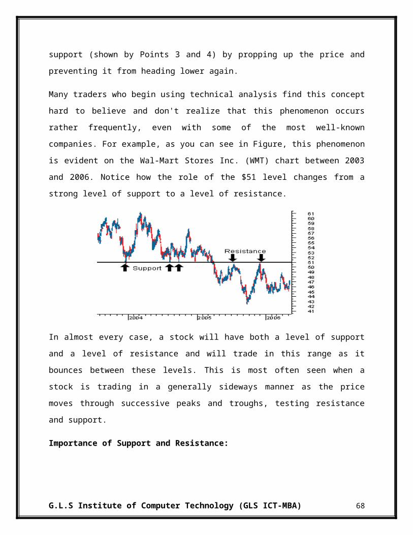
5.2 POWER INDUSTRY:
1. ADANI POWER LTD.:-
RatiosMarch 2013
March 2012
March 2011
March 2010
March 2009
Liquidity RatioCurrent Ratio 0.96 1.82 1.69 2.06 1.78Quick Ratio 0.82 1.66 1.33 1.40 1.34Cash Ratio 0.1668 0.5744 0.1528 0.1441 0.4742Activity RatioInventory Turnover Ratio 4.74 4.45 5.46 37.75 -Debtors Turnover Ratio 11.27 9.12 6.26 3.39 -Net Assets Turnover Ratio 0.22 0.13 0.09 0.03 0.00Working Capital Turnover Ratio -18.15 0.91 1.37 0.32 0.00Days of Inventory Holding 76.01 80.87 65.94 9.54 -Average Collection Period (in Days) 31.94 39.46 57.49 106.09 -Leverage RatioDebt Ratio 0.84 0.80 0.73 0.63 0.69Debt - Equity Ratio 5.31 4.11 2.74 1.68 2.18Interest Coverage Ratio 0.14 1.00 3.60 6.40 -Profitability RatioNet Profit Ratio -30.82% -7.44% 24.86% 39.28% -Operating Profit Ratio 12.59% 31.39% 57.72% 56.25% -Return on Investment 0.84% 2.54% 4.82% 1.55% -0.04%Return On Equity (ROE) -41.98% -4.88% 8.28% 2.95% -0.12%Earnings Per Share -8.16 -1.35 2.40 0.78 -0.02
G.L.S Institute of Computer Technology (GLS ICT-MBA) 85

INTERPRETATION:
From 2009 to 2013 the current ratio of Adani Power is showing fluctuating trend the highest current ratio is in year 2010 which is 2.06 and after that the ratio is decreased to 0.96 in year 2013. Which shows that they not in good position to meet the current obligation. Quick Ratio is an indicator of company's short-term liquidity. The Quick ratio of company is in fluctuating form 2009 to 2013 i.e. in 2011 it is in decreasing form and then it is increase in 2012 ie.1.66 and then it again decreased to 0.82 in year 2013.which shows that the company relies too much on inventory or other assets to pay its short-term liabilities. Cash ratio measures the ability to use its cash and cash equivalents to pay its current financial obligations. Cash ratio of Adani Power is showing Fluctuating trend from 2009 to 2013 which is 0.4742 to 0.1668 and highest cash ratio is in year 2012 0.5744. This means company would be able to meet short term obligation.
Inventory Turnover Ratio measures company's efficiency in turning its inventory into sales. Its purpose is to measure the liquidity of the inventory. The inventory turnover ratio of Adani Power is constantly decreasing from 2010 to 2013 which is 37.75 to 4.74 this means company is less efficient in turning inventory in sales and overall days of inventory is increasing from 2010 to 2013 i.e. 9 to76 days and highest day of inventory is 80 in year 2012 which means they are incurring more storage cost and are not able to convert inventory into sales easily. Debtor turnover ratio is constantly increasing from year 2010 to 2013 which is 3.39 to 11.27 This shows that company is efficiently handle their debtors. The net assets turnover ratio is also constantly increasing from year 2010 to 2013 which is 0.03 to 0.22 which means that company is using its assets efficiently.
Operating profit ratio of Adani Power is constantly decreasing from 2010 to 2011 i.e. 56.25% to 12.59% this shows the company The overall net profit ratio is constantly decreasing, for 2010 to 2011 i.e. 39.24% to 24.86% and then for 2 years the ratio has going in negative i.e. from year 2011 to 2012, -7.44 % to -30.82% which means company is going negative and investors should not invest in the company The Return on investment is showing fluctuating trend. It is increasing from 2009 to 2011 and is reduced in 2013. The return on equity of the company is constantly decreasing in 2009 the ratio is in negative i.e. -0.12% and then it increased for 2 years from 2010 to 2011 and then again it has going in negative i.e. from year 2012 to 2013 this shows that the company is not in good position. EPS is decreasing from year 2009 to 2013 i.e.-0.02 to -8.16 that means company’s share price is decreasing and investors should not invest in to the company.
G.L.S Institute of Computer Technology (GLS ICT-MBA) 86
Debt ratio is the ratio of total liabilities of a business to its total assets. Debt ratio of Adani Power is increasing from year 2009 to 2013, from 0.69 to 0.84 which means company is having less risky financial operation. Debt to equity ratio is a long term solvency ratio that indicates the soundness of long-term financial policies of the company. Debt equity ratio is decreasing from year 2009 to 2010 which is 2.18 to 1.68 and then increased to 5.31 in year 2013 which means that company is using less borrowed fund. The interest coverage ratio is a measure of a company's ability to meet its interest payments. Interest coverage ratio is decreasing 2010 to 2013 i.e. 6.40 to 0.14 which shows that company cannot easily pay interest on outstanding debt.
G.L.S Institute of Computer Technology (GLS ICT-MBA) 87

2. COAL INDIA LTD.:-
RatiosMarch 2013
March 2012
March 2011
March 2010
March 2009
Liquidity RatioCurrent Ratio 1.97 2.41 2.44 3.22 3.03Quick Ratio 1.97 2.40 2.44 1.58 1.82Cash Ratio 1.4361 1.5343 1.3445 0.0399 0.0266Activity RatioInventory Turnover Ratio 30.29 15.01 12.22 12.26 -Debtors Turnover Ratio 472.82 83172.00 - 44814.00 -Net Assets Turnover Ratio 0.02 0.02 0.02 0.02 0.02Working Capital Turnover Ratio 0.03 0.03 0.03 0.04 0.03Days of Inventory Holding 11.88 23.98 29.45 29.37 -Average Collection Period (in Days) 0.76 0.00 - 0.01 -Leverage RatioDebt Ratio 0.04 0.06 0.06 0.08 0.10Debt - Equity Ratio 0.04 0.06 0.07 0.09 0.12Interest Coverage Ratio 28.52 23.71 24.19 11.00 8.68Profitability RatioNet Profit Ratio 2780.50% 1939.38% 1146.90% 843.47% 1036.12%Operating Profit Ratio -104.86% -28.02% -34.00% -10.04% -47.37%Return on Investment 49.99% 43.29% 25.93% 22.95% 24.24%Return On Equity (ROE) 47.74% 41.22% 26.36% 22.16% 21.63%Earnings Per Share 15.51 12.77 7.43 5.98 5.22
G.L.S Institute of Computer Technology (GLS ICT-MBA) 88

INTERPRETATION:
Current Ratio is a liquidity ratio that measures company's ability to pay its debt over the next 12 months or its business cycle. The current ratio of Coal India Ltd is decreasing from 2009 to 2013; from 3.03 to 1.97.the low current ratio shows company may have problems paying its bills on time. The Quick ratio of company is highest in year 2011 i.e. 2.44 then it decreased to 1.97 in year in 2013 which shows that the company relies too much on inventory or other assets to pay its short-term liabilities. Cash ratio of Coal India Ltd is increasing from 2009 to 2013 which is 0.0266 to 1.4361. This means company would be able to meet short term obligation.
The inventory turnover ratio of Coal India is constantly increasing from 2010 to 2013 which is 12.26 to 30.29 this means company is more efficient in turning inventory in sales and overall days of inventory is decreased from 2010 to 2013 i.e. 29 to11 days which means they are incurring less storage cost and are able to convert inventory into sales easily. Debtor turnover ratio is constantly decreasing from year 2010 to 2013 which is 44814 to 472.82 This shows that company is less efficiently handle their debtors. The net assets turnover ratio is constant for 5 year which is 0.02 these shows company is having stable operations.
Operating margin is used to measure company's pricing strategy and operating efficiency. Operating profit ratio of Coal India Ltd is decreasing from year 2009 to 2013, -47.37% to -104.86% this shows that company is less efficient in to earn more profit per share. The overall net profit ratio is increasing from 2009 to 2013 i.e. 1036.12% to 2780.50% which. The Return on investment is increasing from 2009 to 2013 which is 2.24% to 49.99% The return on equity of the company is also increasing from 2009 to 2013 i.e. 21.63% to 7.74% .EPS is also increasing from 2009 to 2013 i.e. 5.22 to 15.51 this means in 5 years company’s share price has been increased and shareholders who hold the share of coal India are in profit.
Debt ratio of Coal India Ltd is decreasing from year 2009 to 2013, 0.10 to 0.04 which means company is having more risky financial operation. Debt to equity ratio is same as debt ratio which means that company is using more borrowed fund. The interest coverage ratio is a measure of a company's ability to meet its interest payments. Interest coverage ratio is increasing 2009 to 2013 i.e. 8.26 to 28.52 which means in 5 years is the ratio increased 20 times more which shows that company is more capable to meet its interest obligations from operating earnings.
G.L.S Institute of Computer Technology (GLS ICT-MBA) 89

3. NHPC LTD.:-
RatiosMarch 2013
March 2012
March 2011
March 2010
March 2009
Liquidity RatioCurrent Ratio 1.37 1.44 0.94 1.39 0.86Quick Ratio 1.37 1.43 0.56 0.58 0.53Cash Ratio 0.6392 0.6032 0.0186 0.0572 0.0468Activity RatioInventory Turnover Ratio 29.87 20.68 13.87 10.15 -Debtors Turnover Ratio 5.17 2.86 2.77 6.04 -Net Assets Turnover Ratio 0.12 0.13 0.11 0.12 0.09Working Capital Turnover Ratio 1.62 1.30 -9.00 1.86 -3.76Days of Inventory Holding 12.05 17.41 25.95 35.47 -Average Collection Period (in Days) 69.61 126.08 129.88 59.62 -Leverage RatioDebt Ratio 0.38 0.38 0.37 0.37 0.40Debt - Equity Ratio 0.63 0.62 0.59 0.60 0.68Interest Coverage Ratio 9.31 11.45 5.34 5.69 3.23Profitability RatioNet Profit Ratio 44.25% 49.02% 51.28% 48.26% 39.52%Operating Profit Ratio 62.64% 65.09% 65.49% 71.75% 65.36%Return on Investment 8.21% 9.15% 6.73% 7.11% 5.43%Return On Equity (ROE) 8.43% 10.52% 8.81% 8.98% 5.98%Earnings Per Share 1.91 2.25 1.76 1.70 0.96
G.L.S Institute of Computer Technology (GLS ICT-MBA) 90
INTERPRETATION:
The current ratio of NHPC is showing fluctuating trend from 2009 to 2013; from 0.86 to 1.37.the highest current ratio is in year 2012 i.e. 1.44. This shows that the company is able to pay its obligation. The Quick ratio is increasing from 2009 to 2013, which is 0.53 to 1.37. It is positive sign for company it shows that company is able to meet any kind of short term obligation which shows that the company relies too much on inventory or other assets to pay its short-term liabilities. Cash ratio of NHPC is decreasing from 2009 to 2011 which is 0.0468 to 0.0186.and then it increased to 0.6392. This means company would be able to meet short term obligation.
Inventory Turnover Ratio measures company's efficiency in turning its inventory into sales. The inventory turnover ratio of NHPC is constantly increasing from 2010 to 2013 which is 10.15 to 29.87 this means company is more efficient in turning inventory in sales and overall days of inventory is decreasing from 2010 to 2013 i.e. 35 to12 days which means they are incurring less storage cost and are able to convert inventory into sales easily. Debtor turnover ratio is constantly decreasing from year 2010 to 2013 which is 6.04 to 5.17 This shows that company is not efficiently handle their debtors. The net assets turnover ratio is constantly increasing from year 2010 to 2013 which is 0.09 to 0.12 which means that company is using its assets efficiently.
Operating profit ratio of NHPC is showing fluctuating trend which is from 2009 to 2010 it is increasing from 65.36% to 71.75% and then it decreased to 62.6% that means in 5 years company’s profit per share is decreased. The overall net profit ratio of company is increasing for 3 years i.e. from 2009 to 2011, 39.52% to 51.28% and then from 2012 to 2013 net profit has been decreased which is 9.02% to 44.25% which means company is earning less profit then earlier. The Return on investment is from 2009 to 2013 i.e. 5.3% to 8.21%.The return on equity of the company is increasing from 2009 to 2013, 5.98% to 8.43%. EPS is increasing from 2009 to 2013 i.e. 0.96 to 1.91 which means company has strong financial position therefore it is reliable company to invest.
Debt ratio of Coal India Ltd is decreasing from year 2009 to 2011, 0.40 to 0.37 and then it is constant for 2 years 2012 to 2013 which is 0.38 Debt to equity ratio is showing fluctuating trend the highest debt to equity ratio is in year 2009 i.e. 0.68 and in 2013 the ratio is 0.63.The interest coverage ratio is a measure of a company's ability to meet its interest payments. Interest coverage ratio is highest in year in 2012 which is 11.45 and then it is decreased to 9.31 which shows that company is less capable to meet its interest obligations from operating earnings.
G.L.S Institute of Computer Technology (GLS ICT-MBA) 91

4. POWER GRID CORPORATION LTD.:-
RatiosMarch 2013
March 2012
March 2011
March 2010
March 2009
Liquidity RatioCurrent Ratio 1.83 0.99 0.85 0.71 0.64Quick Ratio 1.80 0.96 0.83 0.69 0.39Cash Ratio 0.1032 0.1774 0.2346 0.2509 0.0048Activity RatioInventory Turnover Ratio 2.13 2.26 2.26 3.71 -Debtors Turnover Ratio 8.70 7.78 0.29 3.97 -Net Assets Turnover Ratio 0.13 0.13 0.01 0.14 0.16Working Capital Turnover Ratio 0.95 -104.73 -0.21 -1.91 -1.64Days of Inventory Holding 169.07 159.40 159.16 97.00 -Average Collection Period (in Days) 41.36 46.25 1231.52 90.62 -Leverage RatioDebt Ratio 0.72 0.70 0.64 0.69 0.68Debt - Equity Ratio 2.62 2.28 1.81 2.18 2.10Interest Coverage Ratio 3.22 3.38 -1.51 2.72 1.72Profitability RatioNet Profit Ratio 33.19% 32.02% -1069.83% 28.63% 25.69%Operating Profit Ratio 85.72% 83.74% -196.95% 81.42% 92.73%Return on Investment 8.58% 8.52% -4.08% 8.59% 13.10%Return On Equity (ROE) 16.14% 13.86% -24.36% 12.92% 12.49%Earnings Per Share 9.15 7.03 -11.24 4.85 4.02
G.L.S Institute of Computer Technology (GLS ICT-MBA) 92

INTERPRETATION:
From 2009 to 2013 the current ratio of Powergrid is Increasing from 2009to 2013, 0.64 to 1.83 which means company’s current assets is more than current liabilities and they can easily pay their current obligation. Quick Ratio is an indicator of company's short-term liquidity. The Quick ratio is also showing increasing trend from 2009 to 2013, 0.39 to 1.80. Cash ratio measures the ability to use its cash and cash equivalents to pay its current financial obligations. Cash ratio of Powergrid is showing Fluctuating trend from 2009 to 2013 which is 0.0048 to 0.1032 and highest cash ratio is in year 2010, 0.2509. This means company would be able to meet short term obligation.
The inventory turnover ratio of Powergrid is highest in year 2010 i.e.3.71 and then it has remain constant for 2 years 2011 to 2012 i.e. 2.26 and it has decreased to 2.13 in year 2013 this and overall days of inventory has constantly increasing from year 2010 to 2013 i.e. 97 to 169 days decreasing from 2010 to 2013 i.e. 35 to12 days which means they are incurring more storage cost and are not able to convert inventory into sales easily. Debtor turnover ratio is constantly increasing from year 2010 to 2013 which is 3.97 to 8.70 This shows that company is efficiently handle their debtors. The net assets turnover ratio is showing fluctuating trend for 3 years it has showing decreasing trend i.e. for year 2009 to 2011 and then it increase and remain constant for 2 years i.e. 2012 to 2013 at 0.13.
Operating profit ratio of Powergrid is decreasing from 2009 to 2013, in 2011 it has going in negative i.e.-196.95% but after that it has increased to 85.72% but as compare to 2009 it has decreased that means overall operating profit of company is decreased in 5 years. The overall net profit ratio is increasing from 2009 to 2013 i.e. 25.69% to 33.19% The Return on investment is decreased from 2009 to 2013 i.e. 13.10% to 8.58%. The return on equity of the company is increased from 2009 to 2013. EPS is increasing from year 2009 to 2013 which is 4.02to 9.15 which Shows Company is growing.
Debt ratio of Powergrid is showing fluctuating trend i.e. from 2009 to 2010 it is increasing 0.68 to 0.69 then it decreased to 0.64 in year 2011 then it increased to 0.72 in 2013 that means in 5 years the overall debt ratio is showing upward trend. Debt equity ratio measures leverage by comparing long-term debt directly to shareholder’s equity. Debt to equity ratio of company is increasing from year 2009 to 2013 which is 2.10 to 2.62. This shows that company is aggressive in financing its growth with debt. The interest coverage ratio, also called times interest earned, measures a company’s ability to pay interest on its outstanding debt. Interest coverage ratio is highest in year in 2012 which is 3.38 but it is going in negative in year 2011, which is -1.51 it is negative sign for company and in 2013 the ratio is 3.22 that means company is growing and company is able to pay their creditor.
G.L.S Institute of Computer Technology (GLS ICT-MBA) 93

5. TORRENT POWER LTD.:-
RatiosMarch 2013
March 2012
March 2011
March 2010
March 2009
Liquidity RatioCurrent Ratio 0.71 0.88 1.04 0.91 0.66Quick Ratio 0.44 0.40 0.54 0.51 0.48Cash Ratio 0.0351 0.0344 0.0252 0.0205 0.0133Activity RatioInventory Turnover Ratio 19.57 22.59 25.24 21.77 -Debtors Turnover Ratio 12.57 11.43 11.39 9.69 -Net Assets Turnover Ratio 0.88 0.84 0.82 0.67 0.68Working Capital Turnover Ratio -9.15 -24.43 64.42 -24.60 -5.77Days of Inventory Holding 18.39 15.94 14.26 16.54 -Average Collection Period (in Days) 28.65 31.51 31.62 37.14 -Leverage RatioDebt Ratio 0.36 0.39 0.45 0.50 0.47Debt - Equity Ratio 0.55 0.64 0.81 1.01 0.88Interest Coverage Ratio 6.29 4.64 4.77 4.11 7.29Profitability RatioNet Profit Ratio 15.69% 16.19% 14.26% 9.35% 5.77%Operating Profit Ratio 28.61% 27.76% 29.98% 17.05% 14.84%Return on Investment 21.89% 20.04% 20.98% 9.86% 8.03%Return On Equity (ROE) 21.53% 22.26% 21.12% 12.61% 7.31%Earnings Per Share 26.19 22.56 17.71 8.63 4.47
G.L.S Institute of Computer Technology (GLS ICT-MBA) 94

INTERPRETATION:
Current Ratio is a liquidity ratio that measures company's ability to pay its debt over the next 12 months or its business cycle. current ratio of Torrent Power is highest in year 2011 i.e.1.04 and then it decreased to 0.71 which means company’s current assets is more than current liabilities and they can easily pay their current obligation. The Quick ratio is also showing fluctuating trend from 2009 to 2013, 0.48 to 0.44. Cash ratio measures the ability to use its cash and cash equivalents to pay its current financial obligations. Cash ratio of Torrent Power is increasing from 2009 to 2013 which is 0.0133 to 0.0351.
Inventory Turnover Ratio measures company's efficiency in turning its inventory into sales. The inventory turnover ratio of Torrent Power is showing fluctuating trend from year 2010 to 2011 it has showing increasing trend i.e. 21.77 to 25.24 and then it has showing decreasing trend for 2 years which from 2012 to 2013 i.e. 22.59 to 19.57 this means company is less efficient in turning inventory in sales and overall days of inventory has increasing from 2010 to 2013 i.e. 16 to18 days which means they are incurring more storage cost and are not able to convert inventory into sales easily. Debtor turnover ratio is constantly increasing from year 2010 to 2013 which is 9.69 to 12.57 This shows that company is efficiently handle their debtors.
Operating profit ratio of Torrent Power is increasing from 2009 to 2013 i.e. 14.84% to 28.61% which means company is earning more per share. The overall net profit ratio is increasing from 2009 to 2013 i.e. 5.77% to 15.69% this shows that company’s net profit ration is almost double in 5 years and company is in good position. The Return on investment is increasing from 2009 to 2013 i.e.8.03% to 21.89% that means company is earning good profit The return on equity of the company is increasing from 2009 to 2013 i.e. 7.31% to 21.53%. EPS is increasing from year 2009 to 2013 which is 4.47 to 26.19 which Shows Company is growing .The net assets turnover ratio is also constantly increasing from year 2010 to 2013 which is 0.68 to 0.88 which means that company is using its assets efficiently.
Debt ratio is the ratio of total liabilities of a business to its total assets. Debt ratio of Torrent Power is decreasing from year 2009 to 2013, from 0.47 to 0.36 which means company is having more risky financial operation. Debt to equity ratio is a long term solvency ratio that indicates the soundness of long-term financial policies of the company. Debt equity ratio is decreasing from year 2009 to 2013 which is 7.29 to 0.55 and which means that company is using more borrowed fund. The interest coverage ratio is a measure of a company's ability to meet its interest payments. Interest coverage ratio is decreasing 2009 to 2013 i.e. 7.29 to 6.29 which shows that company cannot easily pay interest on outstanding debt.
G.L.S Institute of Computer Technology (GLS ICT-MBA) 95

5.3 PETROLEUM INDUSTRY
1. BHARAT PETROLEUM CORPORATION LTD.:-
RatiosMarch 2013
March 2012
March 2011
March 2010
March 2009
Liquidity RatioCurrent Ratio 1.34 1.26 1.06 1.36 1.18Quick Ratio 0.71 0.71 0.45 0.73 0.71Cash Ratio 0.0869 0.0332 0.0149 0.0179 0.0300Activity RatioInventory Turnover Ratio 13.92 12.83 10.53 12.37 -Debtors Turnover Ratio 46.16 47.58 58.38 58.81 -Net Assets Turnover Ratio 5.97 5.86 4.97 3.41 4.03Working Capital Turnover Ratio 26.72 28.22 100.63 17.44 51.95Days of Inventory Holding 25.86 28.06 34.19 29.09 -Average Collection Period (in Days) 7.80 7.57 6.17 6.12 -Leverage RatioDebt Ratio 0.59 0.59 0.54 0.63 0.64Debt - Equity Ratio 1.42 1.42 1.17 1.70 1.75Interest Coverage Ratio 2.40 2.05 3.14 3.40 1.46Profitability RatioNet Profit Ratio 1.10% 0.62% 1.02% 1.28% 0.55%Operating Profit Ratio 1.93% 1.82% 2.34% 2.90% 3.39%Return on Investment 10.92% 10.19% 11.51% 9.73% 9.51%Return On Equity (ROE) 15.89% 8.79% 11.00% 11.75% 6.07%Earnings Per Share 36.55 36.27 42.78 42.53 20.35
G.L.S Institute of Computer Technology (GLS ICT-MBA) 96

INTERPRETATION:
Liquidity ratios determine a company’s ability to pay off its short-term debts. From 2009 to 2011 the current ratio of BPCL is decreasing from 1.18 to 1.06, after that from 2011 to 2013 it has increased to 1.34. The Quick ratio is highest in 2010 which 0.73 and after that it is same in year 2012 and 2013 which is 0.71. Cash ratio is in decreasing form from 2009 to 2011 which is 0.030 to 0.015 and after that it has been increased to 0.87 in year 2013. This means company is in good position to meet its short term obligation.
Higher the Inventory Turnover Ratio Better for the company as it directly add up to the productivity. The inventory turnover ratio of BPCL is decreasing from 2010 to 2011 and then it has been increased in year 2013. This is a positive sign for BPCL. From 2010 to 2013 the overall days of inventory holding is been reduced from 29 to 25 days which means they are incurring less storage cost and are able to convert inventory into sales easily. Debtor turnover ratio is decreasing from 2010 to 2013 i.e., 58 to 46 times, this is leading to increase in average collection period from 6 days to 7 days. This shows that company is not able to handle its debtors properly. The net asset turnover ratio is in increasing form from 2009 to 2013 which is 4.03 to 5.97 which means that company is using its assets efficiently. Working capital turnover ratio is highest in 2011 which is 100.63 and it’s reduced to 26.72 in year 2013 which shows that money invested in working capital is not able to generated sales properly.
Profitability ratios include different types of measures of corporate profitability and financial performance. Operating profit ratio of BPCL is been continuously decreasing from 2009 to 2013 which is 3.39% to 1.93%. This means that operating cost is been increased. The overall net profit ratio is showing a fluctuating trend which is from 2009 to 2010 it is increasing from 0.55% to 1.28% and it is reduced from 2011 to 2012 to 0.62% and increased in 2013 to 1.10%. The Return on investment is also fluctuating. It is increasing from 2009 to 2011 and is reduced in 2012 and then it is increased in 2013. The overall return on equity of the company is increasing and is maximum in year 2013 which is 15.89%. EPS is having a fluctuating form; it is increasing from year 2009 to 2011 from 20.35 to 42.78 and is reduced to 36.27 in 2012 and in year 2013 it is increased to 36.55.
Leverage ratios are used to calculate financial leverage of a company. Debt ratio is constantly decreasing of BPCL from 0.64 to 0.59 which means that company is using less debt compared to that of equity. Debt equity ratio is also decreasing from 1.75 in year 2009 to 1.42 in year 2013 which means that company is using less borrowed fund. Interest coverage ratio is in increasing form from 2009 to 2011 i.e., from 1.46 to 3.14 and after that it is reduced to 2.40 in year 2013. This means companies profit is capable to pay twice the current interest.
G.L.S Institute of Computer Technology (GLS ICT-MBA) 97
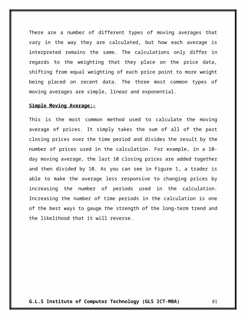
2. HINDUSTAN PETROLEUM CORPORATION LTD.:-
RatiosMarch 2013
March 2012
March 2011
March 2010
March 2009
Liquidity RatioCurrent Ratio 1.26 1.16 1.17 1.12 1.19Quick Ratio 0.71 0.52 0.44 0.45 0.55Cash Ratio 0.0049 0.0074 0.0033 0.0127 0.0443Activity RatioInventory Turnover Ratio 10.89 9.41 8.83 9.66 -Debtors Turnover Ratio 48.70 57.48 52.33 45.87 -Net Assets Turnover Ratio 4.48 4.40 3.55 3.27 3.73Working Capital Turnover Ratio 26.41 36.20 35.16 47.09 47.44Days of Inventory Holding 33.05 38.26 40.75 37.26 -Average Collection Period (in Days) 7.39 6.26 6.88 7.85 -Leverage RatioDebt Ratio 0.70 0.68 0.67 0.65 0.68Debt - Equity Ratio 2.36 2.09 1.99 1.84 2.12Interest Coverage Ratio 1.67 1.57 3.66 3.33 1.35Profitability RatioNet Profit Ratio 0.44% 0.51% 1.16% 1.21% 0.46%Operating Profit Ratio 2.06% 2.26% 2.49% 3.09% 2.64%Return on Investment 7.32% 8.27% 8.65% 9.23% 8.38%Return On Equity (ROE) 6.59% 6.95% 12.27% 11.26% 5.36%Earnings Per Share 26.72 26.92 45.45 38.43 16.98
G.L.S Institute of Computer Technology (GLS ICT-MBA) 98
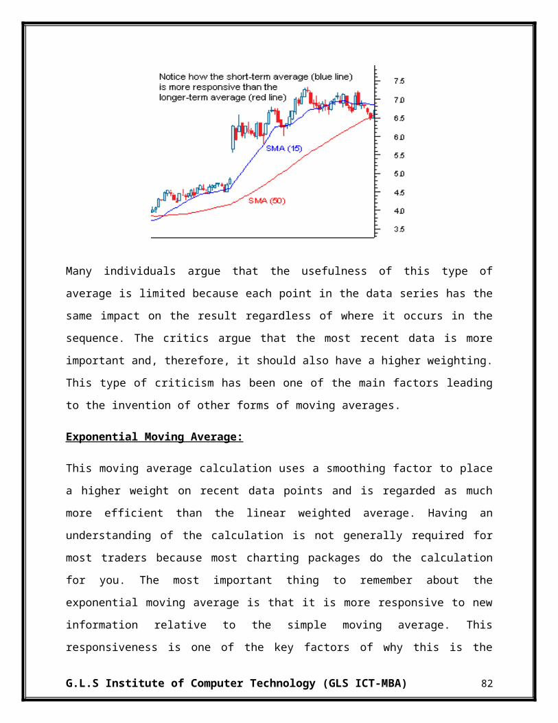
INTERPRETATION:
From 2009 to 2013 the current ratio of HPCL is increased from 1.19 to 1.26. The Quick ratio is highest in 2013 which 0.71, overall it is showing increasing trend. Cash ratio is in decreasing form from 2009 to 2013 which is 0.0443 to 0.0049. This means company is in good position to meet its short term obligation and cash is properly managed.
The inventory turnover ratio of HPCL is increasing from year 2010 to 2013 from 9.66 to 10.89. This is a positive sign for HPCL. From 2010 to 2013 the overall days of inventory holding is been reduced from 37 to 33 days which means they are incurring less storage cost and are able to convert inventory into sales easily. Debtor turnover ratio is increasing from 2010 to 2013 from 45.87 to 48.70 times; this is not leading to decrease in average collection period and it is at 7 days. The net asset turnover ratio is in increasing form from 2009 to 2013 which is 3.73 to 4.48 which means that company is using its assets efficiently. Working capital turnover ratio is decreasing from year 2009 to 2013 which is from 47 times to 26 times, this shows that money invested in working capital is not able to generated sales properly.
Operating profit ratio of HPCL is been reduced from 2009 to 2013 which is 2.64% to 2.06%. This means that operating cost of company is been increased. The overall net profit ratio is showing a fluctuating trend which is from 2009 to 2010 it is increasing and it is reduced from 2011 to 2013 to 0.44%. The Return on investment is also fluctuating. It is increasing from 2009 to 2010 and is reduced from 2011 to 2013. The overall return on equity of the company is increasing from year 2009 to 2011 and it is reduce from 2012 to 2013. EPS is having a fluctuating form; it is increasing from year 2009 to 2011 to 45.45 and is reduced to 26.72 in 2013.
Debt ratio is constantly increasing of HPCL from 0.68 to 0.70 which means that company is using more debt compared to that of equity. Debt equity ratio is also increasing from 2.12 in year 2009 to 2.36 in year 2013 which means that company is using more borrowed fund. Interest coverage ratio is in increasing form from 2009 to 2011 i.e., from 1.35 to 3.66 and after that it is reduced to 1.67 in year 2013. This means companies profit is capable to pay approximately twice the current interest.
G.L.S Institute of Computer Technology (GLS ICT-MBA) 99

3. INDIAN OIL CORPORATION LTD.:-
RatiosMarch 2013
March 2012
March 2011
March 2010
March 2009
Liquidity RatioCurrent Ratio 1.44 1.26 1.19 1.09 1.32Quick Ratio 0.74 0.52 0.47 0.48 0.56Cash Ratio 0.0038 0.0096 0.0179 0.0192 0.0201Activity RatioInventory Turnover Ratio 7.63 7.23 8.06 10.02 -Debtors Turnover Ratio 36.01 45.15 45.91 48.15 -Net Assets Turnover Ratio 3.42 3.06 2.83 3.45 3.23Working Capital Turnover Ratio 12.20 18.71 27.27 82.10 19.02Days of Inventory Holding 47.20 49.79 44.64 35.94 -Average Collection Period (in Days) 10.00 7.97 7.84 7.48 -Leverage RatioDebt Ratio 0.55 0.49 0.47 0.51 0.46Debt - Equity Ratio 1.22 0.95 0.88 1.02 0.86Interest Coverage Ratio 1.62 4.27 9.62 1.86 7.24Profitability RatioNet Profit Ratio 0.90% 2.25% 3.79% 0.96% 2.81%Operating Profit Ratio 4.20% 3.83% 5.68% 4.42% 4.58%Return on Investment 7.07% 10.68% 15.90% 8.40% 15.02%Return On Equity (ROE) 6.83% 13.46% 20.22% 6.70% 16.95%Earnings Per Share 16.29 30.67 42.10 24.74 58.39
G.L.S Institute of Computer Technology (GLS ICT-MBA) 100
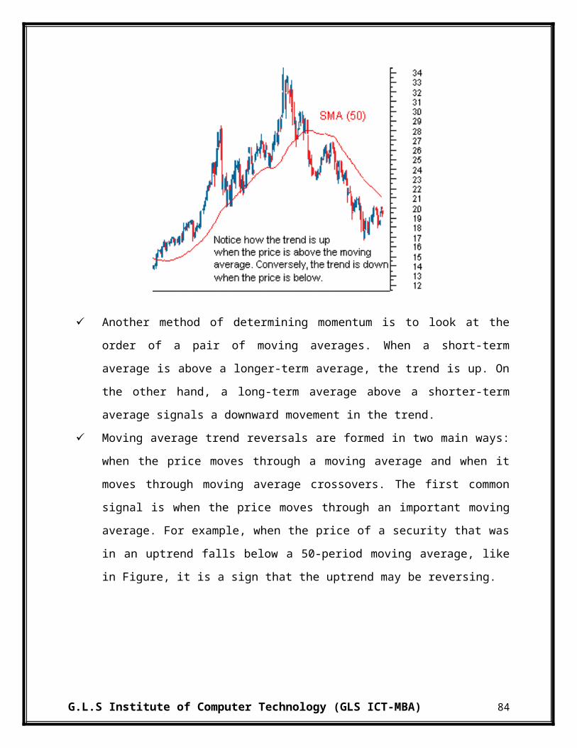
INTERPRETATION:
In 2010, the current ratio of IOCL has drastically reduced from 1.32 to 1.09 after that it has been increased to 1.44 in year 2013. The Quick ratio is reducing from 2009 to 2011 and then it has increased to 0.74 in 2013. Cash ratio is in decreasing form from 2009 to 2013 which is 0.0201 to 0.0038. This means company has managed its short term obligation and cash in properly manner.
The inventory turnover ratio of IOCL is reduced from year 2010 to 2013 from 10.02 to 7.63. This means IOCL is not able to manage its inventories properly. From 2010 to 2013 the overall days of inventory holding is been increased from 36 to 47 days which means they are incurring high storage cost and are not able to convert inventory into sales easily. Debtor turnover ratio is decreasing from 2010 to 2013 from 48.15 to 36.01 times; this is leading to increase in average collection period from 7 days to 10 days. The net asset turnover ratio is stable from 2009 to 2013 which is 3.23 to 3.42. Working capital turnover ratio is decreasing from year 2009 to 2013 which is from 19 times to 12 times and was highest in 2010 which is 82 times, this shows that money in working capital is not leading to increase in sales.
Operating profit ratio of IOCL has reduced from 2009 to 2013 by 0.38% leading to increase in operating cost. The net profit ratio is showing a fluctuating trend but it is finally decreased to 0.90% which is decrease of approximately 2%. The Return on investment is also reduced from 15.02% to 7.07% which almost half reduction. The return on equity of the company is showing a reducing trend from year 2009 to 2013 and is reduced from 16.95% to 6.83% leading to reduction of around 10%. EPS of company has reduced from 58.39 to 16.29 which means profits of company has reduced drastically.
Debt ratio of IOCL has increased from 0.46 to 0.55 which means that company is using more debt compared to that of equity. Debt equity ratio is also increasing from 0.86 in year 2009 to 1.22 in year 2013 which means that company is using more borrowed fund. Interest coverage ratio is reduced from 2009 to 2011 i.e., from 7.24 to 1.62. This means companies profit has been reducing drastically.
G.L.S Institute of Computer Technology (GLS ICT-MBA) 101

4. OIL & NATURAL GAS CORPORATON LTD.:-
RatiosMarch 2013
March 2012
March 2011
March 2010
March 2009
Liquidity RatioCurrent Ratio 2.37 1.32 1.17 1.39 1.45Quick Ratio 2.26 1.22 1.08 1.04 1.05Cash Ratio 0.2463 0.3708 0.2867 0.0044 0.0028Activity RatioInventory Turnover Ratio 4.58 4.70 4.44 8.00 -Debtors Turnover Ratio 12.71 15.02 19.38 16.87 -Net Assets Turnover Ratio 0.67 0.65 0.70 0.58 0.68Working Capital Turnover Ratio 1.13 4.42 8.15 2.38 2.49Days of Inventory Holding 78.55 76.60 81.06 44.99 -Average Collection Period (in Days) 28.32 23.97 18.58 21.34 -Leverage RatioDebt Ratio 0.00 0.04 0.00 0.16 0.17Debt - Equity Ratio 0.00 0.04 0.00 0.19 0.20Interest Coverage Ratio 1107.17 1053.31 1102.15 3.20 3.77Profitability RatioNet Profit Ratio 25.21% 32.83% 27.69% 27.83% 25.20%Operating Profit Ratio 40.41% 60.02% 58.82% 62.58% 50.39%Return on Investment 24.59% 31.23% 28.38% 34.79% 33.75%Return On Equity (ROE) 16.81% 22.24% 19.41% 19.21% 20.48%Earnings Per Share 24.46 29.36 22.12 78.39 75.40
G.L.S Institute of Computer Technology (GLS ICT-MBA) 102

INTERPRETATION:
In 2010, the current ratio of ONGC has increased from 1.45 to 2.37. The Quick ratio is also increasing from 2009 to 2013 which is from 1.05 to 2.26. Cash ratio has increased from 2009 to 2013 which is 0.0028 to 0.2463. This means company has sufficient current assets and cash to meet current and short term obligations.
The inventory turnover ratio of ONGC is reduced from year 2010 to 2013 from 8.00 to 4.58. This means ONGC is not able to convert its inventories in to sales quickly. From 2010 to 2013 the overall days of inventory holding is been increased from 45 to 79 days which means they are incurring high storage cost and carrying cost. Debtor turnover ratio is decreasing from 2010 to 2013 from 16.87 to 12.71 times; this is leading to increase in average collection period from 21 days to 28 days, which means company lacks proper receivables management. The net asset turnover ratio is stable from 2009 to 2013 which is 0.68 to 0.67. Working capital turnover ratio is decreasing from year 2009 to 2013 which is from 2.49 times to 1.13 times and was highest in 2011 which is 8.15 times, this means company’s working capital in not able to generate sales properly.
Operating profit ratio of ONGC has reduced from 2009 to 2013 by approximately 10% which is from 50.39% to 40.41%, which means there is an increase in operating cost. The net profit ratio is increasing from 2009 to 2012 from 25.2% to 32.83% and in 2013 it has been reduced to 25.21%. The Return on investment is also reduced from 33.75% to 24.59% which means assets are not properly been used. The return on equity of the company is reduced from 20.48% to 16.81% this shows that profits for owners has decreased. EPS of company is reduced from 75.40 per share to 24.46 which means per share profit has been reduced.
ONGC has become zero debt company in year 2013 thus debt ratio is reduced from 0.17 to 0 which means that company is purely using equity to finance its projects. Debt equity ratio has also been reduced to 0. Interest coverage ratio is showing a high figure of 1107 times as interest factor is almost nil in the company
G.L.S Institute of Computer Technology (GLS ICT-MBA) 103
5. RELIANCE INDUSTREIS LTD.:-
RatiosMarch 2013
March 2012
March 2011
March 2010
March 2009
Liquidity RatioCurrent Ratio 1.63 1.68 1.39 1.21 1.20Quick Ratio 1.12 0.62 0.54 0.44 0.40Cash Ratio 0.5901 0.0126 0.0092 0.0070 0.0109Activity RatioInventory Turnover Ratio 8.22 8.79 7.25 7.69 -Debtors Turnover Ratio 23.78 18.40 17.05 23.67 -Net Assets Turnover Ratio 1.54 1.47 1.13 0.96 0.71Working Capital Turnover Ratio 6.78 6.87 9.63 17.40 15.29Days of Inventory Holding 43.82 40.94 49.67 46.79 -Average Collection Period (in Days) 15.14 19.57 21.11 15.21 -Leverage RatioDebt Ratio 0.23 0.26 0.31 0.31 0.37Debt - Equity Ratio 0.30 0.35 0.44 0.46 0.58Interest Coverage Ratio 9.66 10.65 11.85 11.28 11.40Profitability RatioNet Profit Ratio 5.83% 6.07% 8.18% 8.45% 10.78%Operating Profit Ratio 8.54% 10.25% 15.25% 15.60% 17.01%Return on Investment 12.50% 12.65% 12.60% 11.30% 10.10%Return On Equity (ROE) 11.67% 12.07% 13.39% 11.84% 12.11%Earnings Per Share 65.05 61.26 61.97 49.64 97.28
G.L.S Institute of Computer Technology (GLS ICT-MBA) 104

INTERPRETATION:
The current ratio of RIL is increased from 1.20 to 1.63. The Quick ratio is also increasing from 2009 to 2013 from 0.40 to 1.12. Cash ratio is increased from 2009 to 2013 which is 0.0109 to 0.5901. This means company sufficient current asset and cash to meet current obligation.
The inventory turnover ratio of RIL is increased from year 2010 to 2013 from 7.69 to 8.22. This means RIL is able to manage its inventories properly this leads to reduction in days of inventory holding from 46 to 43 days which means they are able to convert inventory into sale easily and are having proper inventory management. Debtor turnover ratio is reduced in 2010 from 23.67 to 17.05 times and it is increased to 23.78; this is not leading to any change in average collection period which is at 15 days. The net asset turnover ratio has increased from 2009 to 2013 which is from 0.71 to 1.54 which means company is using its assets in efficient manner. Working capital turnover ratio is decreasing from year 2009 to 2013 which is from 15.29 times to 6.78 times, this shows that less money in working capital is leading to increase in sales.
Operating profit ratio of RIL has reduced from 2009 to 2013 by 8.47% which means operating cost is increased. The net profit ratio is also decreasing from 2009 to 2013 from 10.78% to 5.83%. The Return on investment has increased from 10.10% to 12.50% which means funds invested in assets are able to generate increase in return. The return on equity of the company is showing a reduced from year 2009 to 2013 and is reduced from 12.11% to 11.67% which means equity owners are getting less return compared to previous years. The earnings per share are also reducing from 97.28 to 65.05 which mean profit per share has reduced.
Debt ratio of RIL has decreased from 0.37 to 0.23 which means that company is using less debt compared to that of equity in financing their projects. Debt equity ratio is also decreasing from 0.58 in year 2009 to 0.30 in year 2013 which means that company is using more borrowed fund. Interest coverage ratio is reduced from 2009 to 2011 i.e., from 11.40 to 9.66. This means companies profit has been reducing drastically, but still it is capable to pay 9 times of current interest.
G.L.S Institute of Computer Technology (GLS ICT-MBA) 105

CHAPTER 6
TECHNICAL
ANALYSIS

6.1 AUTOMOBILE INDUSTRY:-
1. ASHOK LEYLAND LTD. :-
Candlestick Chart:-
G.L.S Institute of Computer Technology (GLS ICT-MBA) 106

Exponential Moving Average ( EMA) Chart:
In Ashok Leyland we can see there is upward trend in EMA chart till around 2011but then it goes down in 2012 after that between 2012 to 2013 it goes up and then again it goes down in 2014 and reaches its lowest level. Due to downtrend n the EMA chart it is not advisable to invest in the company.
Moving Average Convergence Divergence (MACD) Chart:
As per the MACD chart, we can say that investment in Ashok Leyland was profitable during 2009-2011.because between 2009 to 2011 the MACD chart showing upward trend but after 2011 it goes down till 2014 expected is -0.445 but actual is -0.173 this shows that stock price is decreased beyond the expectations.
Relative Strength Index (RSI) Chart:
In RSI chart, In RSI chart, we can see that the Upper Control Line (UCL) is above 70 points and Lower Control Line (LCL) is below 30 points. During 2009 to 2011 chart is showing upward trend but after that between 2011 to 2012 company has shown sharp fall but after that again in 2013 it goes up and then it goes down below lower control line.
G.L.S Institute of Computer Technology (GLS ICT-MBA) 107

Line Chart:-
As we can see from the chart above, a line chart can give the reader a comparatively good idea of where the price of an asset has traveled over a given time frame. Since the closing prices are often seen as the most important ones to keep track of. Here with the help of the above chart we are able to see that the closing prices of the shares are goes up during 2010 to 2011 but after that time period the closing price for the shares show the downward trend in stock market due to downward trend in the above line chart it will better not to invest in the market. Currently the closing price is 16.45.
G.L.S Institute of Computer Technology (GLS ICT-MBA) 108

Opening High Closing Low (OHLC) Chart:-
On Incredible Charts OHLC bars are colored red and green:
If today's close is higher than yesterday's close - the bar is colored green.
If today's close is lower than yesterday's close - the bar is colored red.
If today's close is equal to yesterday's close - the bar is colored the same as yesterday.
Here with the help of the above chart it can be seen that the closing prices of the shares have gone up at the end of the year 2010-2011.
Here with the help of the above chart it can be seen that the closing prices of the shares have sharply gone down at the end of the year 2009-2010. And then chart shows down ward trend till 2013 and then between 2013-2014 the OHLC chart is showing down ward trend. The opening price is 16 and it closed at 16.45 with increase of 0.45 Rs.
G.L.S Institute of Computer Technology (GLS ICT-MBA) 109

2. EICHER MOTORS LTD. :-
Candlestick Chart:-
G.L.S Institute of Computer Technology (GLS ICT-MBA) 110
Exponential Moving Average (EMA) Chart:
In the Eicher motors we can see constant upward trend from 2009 to 2013. From 2009-2010 it is below the 200 point but after that the EMA chart reaches its highest level i.e. 4467 which is good for the company and it is advisable to invest in Eicher Motors as it is showing constant growth.
Moving Average Convergence Divergence (MACD) Chart:
As per the MACD chart we give preference to invest in this company. Main reason is that it reaches at its low and now shown upward as well as matches with the expectation. But we can see that between 2010-2011 it goes down than the expectation but at the starting of 2013 it goes up and now it shows the upward trend. It’s expected is 391.9 and MACD shown 389.2 which is lower than expectation but difference is minor.
Relative Strength Index (RSI) Chart:
In RSI chart we have shown the Upward Control Line (UCL) at 70 points and Lower Control Line (LCL) at 30 points. During 2008-2009 company have shown upward trend and it goes beyond upward control line, and this trend remain continue in year 2011-2012 and it remain constant till 2014 that it can be preferable to invest in this company. It is currently shows RSI 61.32
G.L.S Institute of Computer Technology (GLS ICT-MBA) 111
Line Chart:-
As we can see from the chart above, a line chart can give the reader a comparatively good idea of
where the price of an asset has traveled over a given time frame. Since the closing prices are
often seen as the most important ones to keep track of. Here with the help of the above chart we
can see that the closing prices of the shares have sharply increased after 2009 till 2014. Very few
companies have shown such an improvement in last few years. Due to upward trend in the above
line chart it will be in good health to invest in the market. Currently the closing for the same is
4646.
G.L.S Institute of Computer Technology (GLS ICT-MBA) 112

Opening High Closing Low (OHLC) Chart:-
On Incredible Charts OHLC bars are colored red and green:
If today's close is higher than yesterday's close - the bar is colored green.
If today's close is lower than yesterday's close - the bar is colored red.
If today's close is equal to yesterday's close - the bar is colored the same as yesterday.
Here from the above chart it can be seen that the closing prices of the shares have drastically 0increased after 2009 till 2013. Open price is 4903 and High price is 4940 during 2008-2013. It closed at 4646.1.
G.L.S Institute of Computer Technology (GLS ICT-MBA) 113

3. MAHINDRA & MAHINDRA LTD. :-
Candlestick Chart:-
G.L.S Institute of Computer Technology (GLS ICT-MBA) 114

Exponential Moving Average (EMA) Chart:
The above EMA chart of Mahindra depicts that there had been a continuous increase in the stock price from 2009 to 2014, at the end of 2008 there is down follow but from 2009, the stock price has shown a drastic improvement with minor fluctuations. So, it shows that company has gained a very strong position during last four years. Investors have also gained very much profit by investing in this company.
Moving Average Convergence Divergence (MACD) Chart:
From MACD chart we can see that from 2009 to 2012 the share price is constantly increasing so in these duration it is preferable to invest in the company but from 2013-2014 it shows downward trend at the starting of 2013 the share price is at the highest level but in end of 2013 it shows down fall so it is not preferable to invest.
Relative Strength Index (RSI) Chart:
In RSI chart we have shown the Upward Control Line (UCL) at 70 points and Lower Control Line (LCL) at 30 points. At the beginning of 2009 it shows upward trend, in 2009 the line goes up from upward control line and after that from 2010-2014 it is showing upward trend but as compare to 2009 it is lower. It is currently shown RSI 48.07.
G.L.S Institute of Computer Technology (GLS ICT-MBA) 115

Line Chart:-
As we can see from the chart above, a line chart can give the reader a fairly good idea of where
the price of an asset has traveled over a given time frame. Since the closing prices are often seen
as the most important ones to keep track of. Here with the help of the above chart we can able to
see that the closing price of the shares are sharply goes down at the beginning of the year 2009.
But after that time period the closing price for the shares shows the upward trend in the stock
market. Due to upward trend in the above line chart it will better to invest in the market. The
opening price is 861, the highest price is 849.95 and currently the closing for the same is 890.2.
G.L.S Institute of Computer Technology (GLS ICT-MBA) 116

Opening High Closing Low (OHLC) Chart:-
On Incredible Charts OHLC bars are colored red and green:
If today's close is higher than yesterday's close - the bar is colored green.
If today's close is lower than yesterday's close - the bar is colored red.
If today's close is equal to yesterday's close - the bar is colored the same as yesterday.
Here with the help of the above chart we can able to see that the closing price of the shares are sharply goes down at the beginning of the year 2008. But after that time period the closing price for the shares shows the upward trend in the stock market from year 2010-2014 only in the beginning of 2012 it shows downward trend but after that the share price is increasing. And Due to upward trend in the above OHLC chart it will better to invest in the market.
G.L.S Institute of Computer Technology (GLS ICT-MBA) 117

4. MARUTI SUZUKI LTD.:-
Candlestick Chart:-
G.L.S Institute of Computer Technology (GLS ICT-MBA) 118
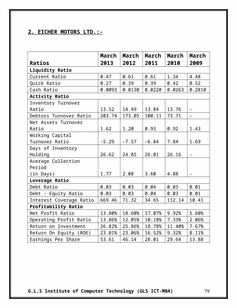
Exponential Moving Average (EMA) Chart:
In the Maruti Suzuki we can see there is upward trend in the EMA chart till around end of the year 2011 but then it goes down in 2012-2013 but after that we can see upward trend in the beginning of 2013 which means share price is going up and reaches 160 points which is good sign for company.
Moving Average Convergence Divergence (MACD) Chart
From MACD chart we can see that in year 2009-2010 it shows upward trend and it reach at its highest level but after 2009 in the end of 2010 it goes beyond the line that means at that time the company’s share price has gone very low but after 2011 in 2012 it show upward trend till end of 2013 which means investor can invest into the company.
Relative Strength Index (RSI) Chart:
In RSI chart we have shown the Upward Control Line (UCL) at 70 points and Lower Control Line (LCL) at 30 points. During 2009-2010 it shows upward trend and the line goes beyond the upward control line but after that there is sharp fall in year 2011-2012 and after that it has maintain stable line, we can prefer to invest in this company now. It is currently shown RSI 51.37 which is near the UCL.
G.L.S Institute of Computer Technology (GLS ICT-MBA) 119

Line Chart:-
As we can see from the chart above, a line chart can give the reader a comparatively good idea of
where the price of an asset has traveled over a given time frame. Since the closing prices are
often seen as the most important ones to keep track of. Here with the help of the above chart we
are able to see that the closing prices of the shares are sharply goes up during 2009-2010. But
after that time period the closing price for the shares shows the downward trend till the end of
2011 but after that till the end of 2013 it shows upward trend in the stock market. Due to upward
trend in the above line chart it will better to invest in the market. Currently the closing for the
same is 1636.25.
G.L.S Institute of Computer Technology (GLS ICT-MBA) 120
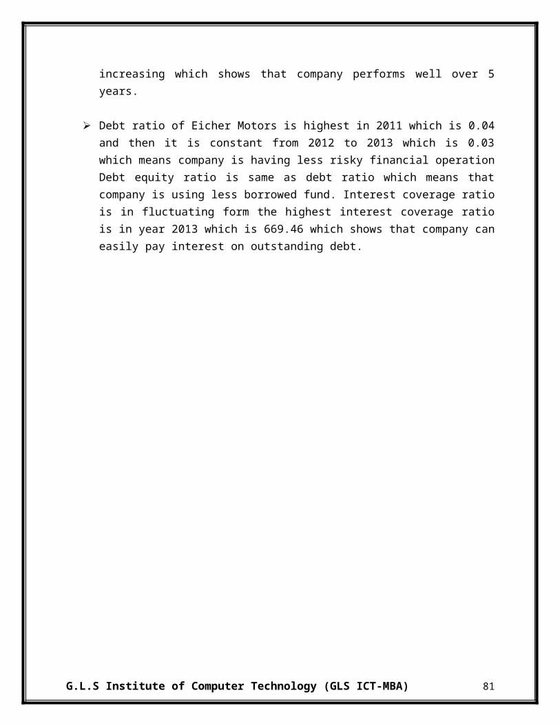
Opening High Closing Low (OHLC) Chart:-
On Incredible Charts OHLC bars are colored red and green:
If today's close is higher than yesterday's close - the bar is colored green.
If today's close is lower than yesterday's close - the bar is colored red.
If today's close is equal to yesterday's close - the bar is colored the same as yesterday.
Here with the help of the above chart it can be seen that the closing prices of the shares are s goes up the end of the year 2009. Open and High prices during 2009-2014 are the same, 1755. It closed at 1636.25 with decrease of around 119.
G.L.S Institute of Computer Technology (GLS ICT-MBA) 121

5. TATA MOTORS LTD.:-
Candlestick Chart:-
G.L.S Institute of Computer Technology (GLS ICT-MBA) 122
Exponential Moving Average (EMA) Chart:
In the TATA MOTORS we can see there is upward trend in the EMA chart from the end of 2009 and it remain constant till 2014 only at the end of 2011 chart fell down but after that it remain upward so it is preferable to invest in the Tata Motors.
Moving Average Convergence Divergence (MACD) Chart:
As per the MACD chart we give preference to invest in this company. Main reason is that it reaches at its low and now shown upward as well as matches with the expectation. But we can see that at the end of the year 2011 it goes down than the expectation but at the starting of 2009 it goes up than expectation and now it shows the upward trend. It’s expected is 16.84 and MACD shown 11.52 which is below expectation.
Relative Strength Index (RSI) Chart:
In RSI chart we have shown the Upward Control Line (UCL) at 70 points and Lower Control Line (LCL) at 30 points. During 2009-2010 it shows upward trend and then at the end of 2011 it shows sharp fall but after 2011 it shows upward trend. So, we can prefer to invest in this company now. It is currently shown RSI 48.11...
G.L.S Institute of Computer Technology (GLS ICT-MBA) 123
Line Chart:-
As we can see from the chart above, a line chart can give the reader a fairly good idea of where the price of an asset has traveled over a given time frame. Since the closing prices are often seen as the most important ones to keep track of. Here with the help of the above chart we can able to see that the closing price of the shares are sharply goes down up to the starting of the year 2009. But after that time period the closing price for the shares shows the upward trend in the stock market although it not arrive at the highest price which was there during the starting of the year 2008. Due to upward trend in the above line chart it will better to invest in the market. Currently the closing price for the same is 349.55.
G.L.S Institute of Computer Technology (GLS ICT-MBA) 124

Opening High Closing Low (OHLC) Chart:-
On Incredible Charts OHLC bars are colored red and green:
If today's close is higher than yesterday's close - the bar is colored green.
If today's close is lower than yesterday's close - the bar is colored red.
If today's close is equal to yesterday's close - the bar is colored the same as yesterday.
Here with the help of the above chart we can able to see that the closing price of the shares are sharply goes down at the beginning of the year 2009. But after that time period the closing price for the shares shows the upward trend in the stock market. Due to upward trend in the above OHLC chart it will better to invest in the market.
G.L.S Institute of Computer Technology (GLS ICT-MBA) 125

6.2 POWER INDUSTRY:-
1. ADANI POWER LTD.:-
Candlestick Chart:-
G.L.S Institute of Computer Technology (GLS ICT-MBA) 126
Exponential Moving Average (EMA) Chart:-
In ADANI POWER LTD, it can be seen that EMA is showing an increasing trend from 2010 to 2011, then after 2011 there is declining trend till 2014. During 2012-2014 there is fluctuating trend which is seen but the price of stock is continuously decreasing. Overall EMA is showing a declining trend. Due to downward trend in the EMA it will be better not to invest in the stock of the ADANI POWER LTD as the price have sharply decreased from Rs 120 to Rs 32.
Moving Average Convergence Divergence (MACD) Chart:-
At starting of 2010, MACD matches expectations, afterwards in mid 2010; it is increasing and is above expectation. A declining patter is seen after 2011 to 2013. In 2013, MACD is above expectation and is positive, thereafter it has reached it is decreasing and is also below expectation.
Relative Strength Index (RSI) Chart;-
In RSI Chart, the Upward Control Line (UCL) is at 70 points and Lower Control Line (LCL) is at 30 points. From 2010 to mid 2010 it is showing an upward trend, after mid 2010 till 2012, there is a decline in RSI and it has reached its LCL. In beginning of 2013, there is an increase and there is a decline afterwards and in 2014 it shows a reducing trend. Thus one should not invest in the stocks of the company.
G.L.S Institute of Computer Technology (GLS ICT-MBA) 127

Line Chart:-
From the above chart, it can be seen that the price are showing a sharp declining trend. From 2009 to end of 2010 there is an increasing trend, after there is a downfall till 2014. Prices have reduced from Rs.140 to Rs 32. Thus line chart is showing a decreasing trend which is a sign not to invest in the stocks of the company.
G.L.S Institute of Computer Technology (GLS ICT-MBA) 128
Opening High Closing Low (OHLC) Chart:-
From 2009 to end of 2010 there is an increasing trend there is an increase in price of Rs 40, after
that till 2014 there is a decreasing trend and a reduction in price of Rs 108 is there. Due to this
reduction trend in the above OHLC chart it will be better not to invest in this stock as price may
go further down.
G.L.S Institute of Computer Technology (GLS ICT-MBA) 129

2. COAL INDIA LTD.:-
Candlestick Chart:-
G.L.S Institute of Computer Technology (GLS ICT-MBA) 130
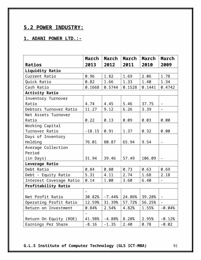
Exponential Moving Average (EMA) Chart:-
In Coal India Ltd, it can be seen that EMA is showing a decreasing trend till 2011, then there is an increase and a decrease in the same year. After that there is an increasing trend from 2012 to 2013. From 2013 to 2014 there is a decline in price. Overall EMA is showing a fluctuating trend. Due to this trend in the EMA it will be better to hold or invest in the stock of the Coal India.
Moving Average Convergence Divergence (MACD) Chart:-
As per MACD it is preferable to invest shares of the company as it shows an increasing trend. Main reason is that it reaches at its low and now shows upward trend. At starting it is below expectations, but in mid 2011, it is increasing and is above expectation. There is a decline during year 2012 and there is increase in year 2013. Afterwards there is a declining trend till 2014, but in end 2014 it is tending to increasing. Thus one should invest in the security as it is possible that the price would increase.
Relative Strength Index (RSI) Chart;-
In RSI Chart, the Upward Control Line (UCL) is at 70 points and Lower Control Line (LCL) is at 30 points. Overall RSI is showing a fluctuating pattern. From 2011 to 2012 it is showing an increase as well as a declining pattern. But after 2012 till 2013 there is an increase, but after that there is a fluctuation till 2014, and it is at same point as in 2013, afterwards there is a decreasing trend. Thus one should invest in the stocks of the company as price is reduced and it is expected to increase.
G.L.S Institute of Computer Technology (GLS ICT-MBA) 131

Line Chart:-
During 2011 there is a decline in the price, thereafter there is an increase in price and it has reached it high of Rs 410. After reaching the high point there is a decrease in price during 2012. After 2012 price is increasing and in starting of year 2013 the price closed at Rs 360. Afterwards there is a sharp decrease in price and price closed at Rs. 247 during 2014. Thus line chart is showing a fluctuating trend which is a sign to invest in the stocks as price may tend to increase.
G.L.S Institute of Computer Technology (GLS ICT-MBA) 132

Opening High Closing Low (OHLC) Chart:-
From above chart it can be seen that green bar are more, this indicate that closing price of that
day is higher than that of previous day. In 2011 there is an decreasing trend from Rs 360 to Rs
300, after that price has reached it all time high of Rs. 420, afterwards there is decrease in price
till 2012 to Rs 300 and after 2012 till 2013 there is a increasing trend and price roused to Rs 365,
but during year 2013 to 2014 there is an decreasing trend and price are closed to Rs 247. Due to
fluctuation trend in the above OHLC chart it will be better to invest in this stock as price may
increase in future.
G.L.S Institute of Computer Technology (GLS ICT-MBA) 133

3. NHPC LTD.:-
Candlestick Chart:-
G.L.S Institute of Computer Technology (GLS ICT-MBA) 134

Exponential Moving Average (EMA) Chart:-
It can be seen that EMA is showing a decreasing trend from 2009 to 2012, and then from 2012 to 2013, there is an increasing trend. After that point there is reduction in price of share till 2014 Overall EMA is showing a decreasing trend. Due to decreasing trend in the EMA it will be better to sell or not invest in the stock of the NHPC Ltd.
Moving Average Convergence Divergence (MACD) Chart:-
Looking at MACD chart it is having a fluctuating trend and has remain below expectation. From 2009 till 2013, it has remained negative. After 2013 there is a positive MACD and is above expectations, but in end of 2013, it is decreasing and is below expectation and then in later stage it is raising and is above expectation. Thus one should invest in the security as it is possible that the price would increase.
Relative Strength Index (RSI) Chart;-
In RSI Chart, the Upward Control Line (UCL) is at 70 points and Lower Control Line (LCL) is at 30 points. From 2010 to 2012, it is showing a fluctuating trend where it has reached LCL twice. But after 2012 to starting of 2013, there is an increase in RSI and it reached at 85 points but after that there is a decreasing trend and it felled to 20 points. Afterwards there is an increase in 2014 and it reached 45 points.
G.L.S Institute of Computer Technology (GLS ICT-MBA) 135

Line Chart:-
From the above chart, it can be seen that the price are showing a decreasing trend from 2010 to 2012 which is from Rs. 35 to Rs. 18 and after 2012 there is an increase in price and price reached to Rs 29 and after the price closed to Rs. 18 in 2014. Thus line chart is showing a decreasing trend which is a sign not to invest in the stocks.
G.L.S Institute of Computer Technology (GLS ICT-MBA) 136

Opening High Closing Low (OHLC) Chart:-
From 2010 to 2012 there is a decreasing trend in share price has decreased from Rs 40 to Rs18,
after that till 2013 there is increase in price and it reached to Rs 30 afterwards there is sharp
decline trend in 2013-14 and price reduced to Rs 15. In end of 2013 there is an upward trend and
price is closed at Rs 18. Due to declining trend in the above OHLC chart it will be better to not
invest in this stock.
G.L.S Institute of Computer Technology (GLS ICT-MBA) 137
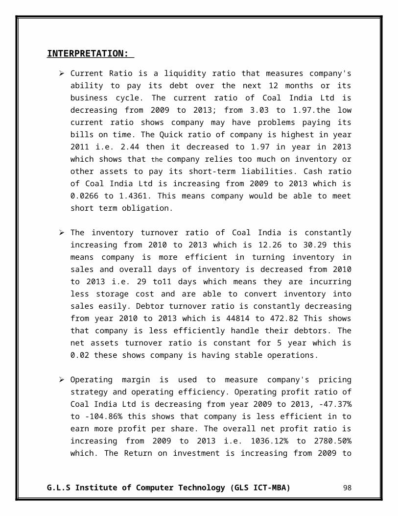
4. POWER GRID CORPORATION LTD.:-
Candlestick Chart:-
G.L.S Institute of Computer Technology (GLS ICT-MBA) 138
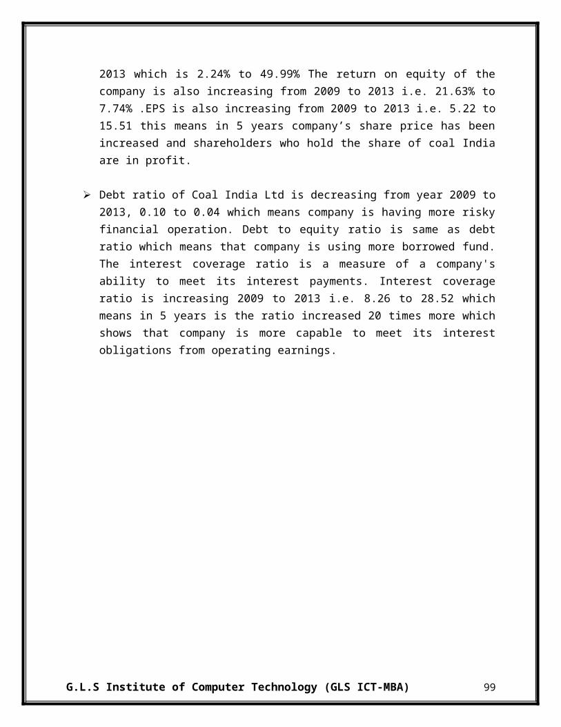
Exponential Moving Average (EMA) Chart:-
In Power Grid Corporation Ltd, it can be seen that EMA is showing an increasing trend in year 2009, then till mid 2012, it is showing fluctuating trend. After that there is an increasing trend from 2012 to 2013 after that there is a declining trend in till 2014, during 2014 price raised and closed at 95 Rs. Overall EMA is showing a fluctuating trend. From EMA it will be better to hold or to invest in the stock of the company.
Moving Average Convergence Divergence (MACD) Chart:-
As per MACD it is preferable to invest shares of the company as it shows an increasing trend. Main reason is that it reaches at its low and now shown upward as well as same as the expectation. At starting of 2009, it above the expectations and is at its peak, but in 2010, it is decreasing and is below expectation. There is a fluctuating trend from 2010 to 2011, in year 2012 there is an increase in MACD and is above expectation but in 2013 beginning it is below expectation and is declining, thereafter mid 2013 it is showing an upward trend and in 2014 it is at -1.5 and is above expectation. Thus one should invest in the security as it is possible that the price would increase and MACD is increasing and is above expectation.
Relative Strength Index (RSI) Chart;-
In RSI Chart, the Upward Control Line (UCL) is at 70 points and Lower Control Line (LCL) is at 30 points. From 2009 to 2011 it is showing a declining trend. But after 2011 till end of 2012 there is an increase in RSI. Afterwards there is a decline in RSI and in mid 2013 it touches LCL. Thereafter it is increasing and is at 41 points in 2014. Thus one should invest in the stocks of the company as overall the companies price are upward moving.
G.L.S Institute of Computer Technology (GLS ICT-MBA) 139
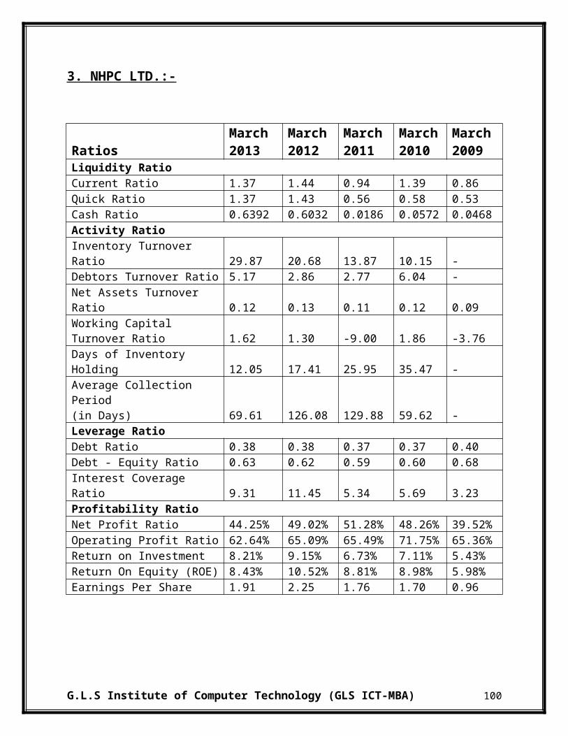
Line Chart:-
In 2009, there is an increase in price of share and it increased to Rs 125 and thereafter it started declining and it declined to Rs. 98 in 2011. After 2011 there us an increase in price and in end of 2012 it reached to Rs. 120 and after that it closed at Rs 95 in 2014. The line chart shows a fluctuating trend and price are at low, so one should invest in the share at this point as price may tend to increase in future.
G.L.S Institute of Computer Technology (GLS ICT-MBA) 140

Opening High Closing Low (OHLC) Chart:-
In 2009 there is a sharp increase in OHLC, and it reached to its high of Rs 130. After that there is
a declining trend till 2012 where price fall to Rs 100. Then in 2013 there is a price rise and it
reached to Rs 120 and finally in 2014 it closed at Rs 95 showing a declining trend. Due to
fluctuating trend in the above OHLC chart it is better to invest in this stock as stock is available
at low price.
G.L.S Institute of Computer Technology (GLS ICT-MBA) 141

5. TORRENT POWER LTD.:-
Candlestick Chart:-
G.L.S Institute of Computer Technology (GLS ICT-MBA) 142

Exponential Moving Average (EMA) Chart:-
From EMA of Torrent Power it is seen that there is an increasing trend year from 2009 to 2011 and then there is a decline trend from 2011 to mid 2013. After mid 2013, there is a raise in price and it closed at Rs. 94. Overall EMA is showing a decreasing trend, but it is increasing afterwards. Due to increase seen in 2014 in the EMA it will be better to hold or invest in the stock of the Torrent as price are expected to rise.
Moving Average Convergence Divergence (MACD) Chart:-
As per MACD it is preferable to hold shares of the company as it shows an increasing trend and is above expectation. In 2009, it increasing and is above expectations and in 2010 it is declining and below expectation. Then afterwards there is further declining trend till 2011, after that there is an increasing trend from mid 2011 to 2013 and is same as expectation. In year 2013 it declined and then it raised in the ending of the year in 2014 it is at 0.9 and is above expectation. Thus one should hold in the security as it is possible that the price would increase.
Relative Strength Index (RSI) Chart;-
In RSI Chart, the Upward Control Line (UCL) is at 70 points and Lower Control Line (LCL) is at 30 points. In 2009 the stock has crossed its UCL. But from 2010 to 2011 there is a declining trend and it has reached its LCL. After that till 2012, there is a fluctuating trend. In 2013 it decrease to 15 points and then after it is increasing and in 2014 it is at 44 point. Thus one should invest in the stocks of the company as RSI is having an increase trend and it has reached it low.
G.L.S Institute of Computer Technology (GLS ICT-MBA) 143

Line Chart:-
From the above chart, it can be seen that the price are showing a decreasing trend. In year 2009 the share price showing an increasing trend and in mid 2010 it reaches its peak which is Rs 360, but after that the price are decreasing till end of 2012. Afterwards the price is rising in 2013, but it further started reducing in the year and reduced to Rs 75. After that price started to increase and in 2014 it declined and closed at Rs 95. Thus it is showing an increasing trend in beginning and a declining trend from 2010 to 2013. Then price are tending to increase will is a sign to invest and to hold in the stocks.
G.L.S Institute of Computer Technology (GLS ICT-MBA) 144

Opening High Closing Low (OHLC) Chart:-
In 2009 there is an increase in price is of Rs 415, after that till 2013 there is a declining trend and
price is reduced to Rs 200. Afterwards there is a further decreasing trend till mid 2013 and
afterwards there is an increase in price in 2014 and it closed at Rs 95. Due to upward trend in
2014 in the above OHLC chart it is better to invest or to hold in the stock as price are expected to
rise.
G.L.S Institute of Computer Technology (GLS ICT-MBA) 145
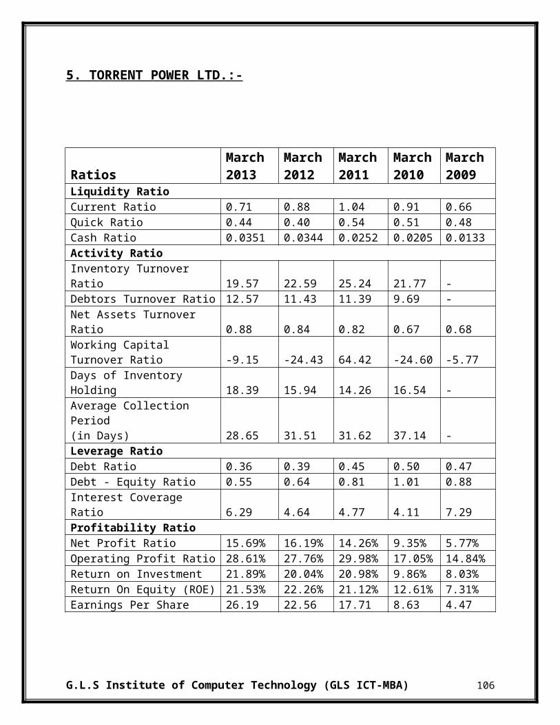
6.3 PERTOLEUM INDUSTRY:-
1. BHARAT PETROLEUM CORPORATION LTD.:-
Candlestick Chart:-
G.L.S Institute of Computer Technology (GLS ICT-MBA) 146

Exponential Moving Average (EMA) Chart:-
In BPCL, it can be seen that EMA is showing an increasing trend from 2009 to end of 2010, then in 2011 it is decreasing and in mid 2011 it rises. From 2011 to 2014, there is no high fluctuation in trend. Overall EMA is showing an increasing trend. Due to upward trend in the EMA it will be better to invest in the stock of the BPCL.
Moving Average Convergence Divergence (MACD) Chart:-
As per MACD it is preferable to invest in the company as it shows an increasing trend. Main reason is that it reaches at its low and now shown upward as well as matches with the expectation. At starting of 2009, it matches expectations, but in 2010, it is decreasing and is below expectation. A fluctuating patter is seen from 2010 to 2014. Since in 2014, it has reached its low it is possible that it will go high as in past and would increase.
Relative Strength Index (RSI) Chart;-
In RSI Chart, the Upward Control Line (UCL) is at 70 points and Lower Control Line (LCL) is at 30 points. From 2009 to 2010 it is showing a stable trend. But after 2010 till 2012 there is a declining trend but after that there is an increasing trend. Thus one should invest in the stocks of the company.
G.L.S Institute of Computer Technology (GLS ICT-MBA) 147

Line Chart:-
A line chart can give the reader a fairly good idea of where the price of an asset has traveled over a given time frame. Since the closing prices are often seen as the most important ones to keep track of. From the above chart, it can be seen that the price are showing an upward trend. From 2009 to 2011 there is an increasing trend, after there is a downfall till 2012 then there is an increase till mid 2013 after that there is a downfall and in beginning of 2014 there is an increase. Thus line chart is showing an increasing trend which is a sign to invest in the stocks.
G.L.S Institute of Computer Technology (GLS ICT-MBA) 148

Opening High Closing Low (OHLC) Chart:-
On Incredible Charts OHLC bars are colored red and green:
If today's close is higher than yesterday's close - the bar is colored green.
If today's close is lower than yesterday's close - the bar is colored red.
If today's close is equal to yesterday's close - the bar is colored the same as yesterday.
From 2009 to mid 2010 there is an increasing trend there is an increase in price of Rs 240, after
that till 2012 there is a fluctuating trend and a reduction in price to Rs 250 is seen, afterwards
there is an increasing trend and price are closed at Rs 362. Due to upward trend in the above
OHLC chart it will be better to invest in this stock.
G.L.S Institute of Computer Technology (GLS ICT-MBA) 149
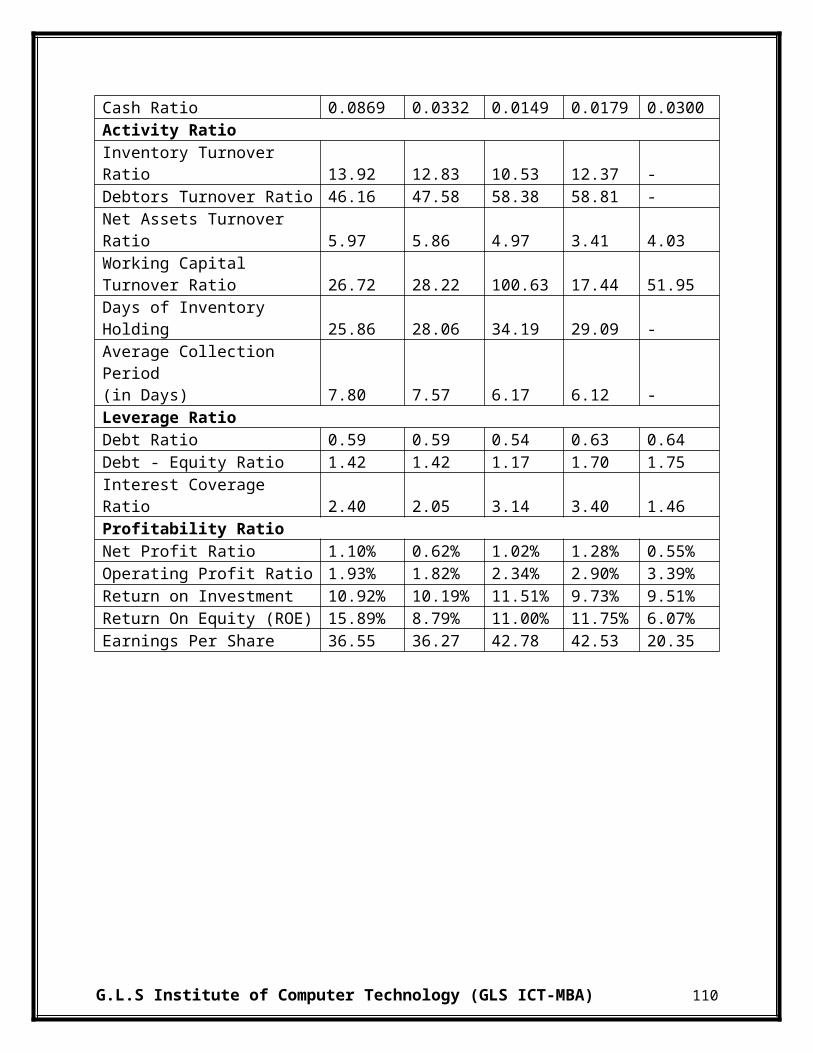
2. HINDUSTAN PETROLEUM CORPORATION LTD.:-
Candlestick Chart:-
G.L.S Institute of Computer Technology (GLS ICT-MBA) 150
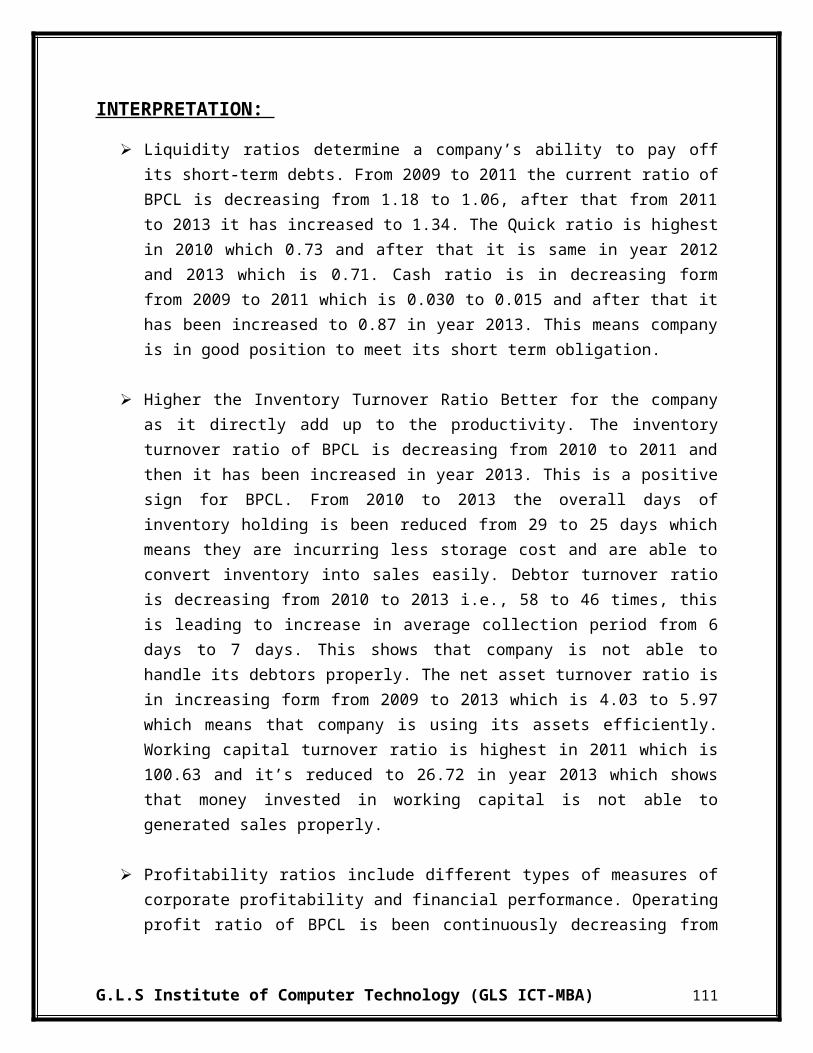
Exponential Moving Average (EMA) Chart:-
In HPCL, it can be seen that EMA is showing an increasing trend from 2009 to end of 2011, then from 2011 to mid 2013, it is showing decreasing trend. After that there is an increasing trend from mid 2013 to 2014. Overall EMA is showing a decreasing trend, but it is increasing afterwards. Due to upward trend seen in after 2013 in the EMA it will be better to hold or invest in the stock of the HPCL.
Moving Average Convergence Divergence (MACD) Chart:-
As per MACD it is preferable to invest shares of the company as it shows an increasing trend. Main reason is that it reaches at its low and now shown upward as well as above the expectation. At starting of 2009, it matches expectations, but in 2010, it is decreasing and is below expectation. There is an increase in year 2010 and there is decrease in 2011. Afterwards there is a fluctuating trend till 2013, but in 2014 it is increasing. Thus one should invest in the security as it is possible that the price would increase.
Relative Strength Index (RSI) Chart;-
In RSI Chart, the Upward Control Line (UCL) is at 70 points and Lower Control Line (LCL) is at 30 points. From 2009 to 2010 it is showing a stable trend. But after 2010 till 2012 there is a declining trend but after that there is an increasing trend till mid 2013, afterwards there is an increasing trend. Thus one should invest in the stocks of the company.
G.L.S Institute of Computer Technology (GLS ICT-MBA) 151

Line Chart:-
From the above chart, it can be seen that the price are showing a fluctuating trend. From 2009 to mid 2010 there is an increasing trend, after there is a downfall till 2012 then there is a stable trend till 2013 after that there is a downfall and in beginning of 2014 there is an increase. Thus line chart is showing an increasing trend which is a sign to invest in the stocks.
G.L.S Institute of Computer Technology (GLS ICT-MBA) 152

Opening High Closing Low (OHLC) Chart:-
On Incredible Charts OHLC bars are colored red and green:
If today's close is higher than yesterday's close - the bar is colored green.
If today's close is lower than yesterday's close - the bar is colored red.
If today's close is equal to yesterday's close - the bar is colored the same as yesterday.
From 2009 to mid 2010 there is an increasing trend from Rs 250 to Rs 550, after that till 2012
there is a fluctuating trend afterwards there is stable trend till 2013 and after 2013 there is a
downfall and price reduced to Rs 165, but in beginning of 2014 there is an increasing trend and
price are closed to Rs 244. Due to upward trend in the above OHLC chart it will be better to
invest in this stock.
G.L.S Institute of Computer Technology (GLS ICT-MBA) 153

3. INDIAN OIL CORPORATION LTD.:-
Candlestick Chart:-
G.L.S Institute of Computer Technology (GLS ICT-MBA) 154

Exponential Moving Average (EMA) Chart:-
In IOCL, it can be seen that EMA is showing an increasing trend from 2009 to end of 2010, then from 2011 to 2013, it is showing decreasing trend. After that there is an increasing trend in 2013. After mid 2013 there is a sharp decrease in share price Overall EMA is showing a decreasing trend. Due to decreasing trend in the EMA it will be better to sell or not invest in the stock of the IOCL.
Moving Average Convergence Divergence (MACD) Chart:-
As per MACD it is preferable to invest shares of the company as it shows an increasing trend. Main reason is that it has reached at its low and now is showing upward trend as well as above the expectation. At starting of 2009, it matches expectations, but in 2010, it is decreasing and is below expectation. There is a decrease in year 2010 and there is a rise in price in 2011 till 2013. Afterwards there is a decrease in price till mid 2013, but in 2014 it is increasing. Thus one should invest in the security as it is possible that the price would increase.
Relative Strength Index (RSI) Chart;-
In RSI Chart, the Upward Control Line (UCL) is at 70 points and Lower Control Line (LCL) is at 30 points. From 2009 to 2010 it is showing an upward trend and has reached UCL twice. But after 2010 till 2011 there is a declining trend at starting but after that there is an increasing trend. Afterwards there is a stable trend till 2013. A decline is seen after beginning of 2013 but after mid 2013 an increasing trend is seen. Thus one should invest in the stocks of the company.
G.L.S Institute of Computer Technology (GLS ICT-MBA) 155

Line Chart:-
From the above chart, it can be seen that the price are showing a increasing trend till 2011 and after there is a decline till 2013 and at end there is an increase in price of share in 2014. Thus line chart is showing an increasing trend which is a sign to invest in the stocks.
G.L.S Institute of Computer Technology (GLS ICT-MBA) 156

Opening High Closing Low (OHLC) Chart:-
From 2009 to 2011 there is an increasing trend price has raised by Rs 250, after that till 2013
there is a decreasing trend and price are reduced to Rs 250 afterwards there is sharp decline trend
till 2014 and price further reduced to Rs 200, after 2014 there is an upward trend and price is
closed at Rs 245. Due to upward trend in the above OHLC chart it will be better to invest in this
stock.
G.L.S Institute of Computer Technology (GLS ICT-MBA) 157

4. OIL & NATURAL GAS CORPORATON LTD.:-
Candlestick Chart:-
G.L.S Institute of Computer Technology (GLS ICT-MBA) 158

Exponential Moving Average (EMA) Chart:-
In ONGC, it can be seen that EMA is showing an increasing trend from 2009 to mid of 2010, then from 2011 to mid 2013, it is showing decreasing trend. After that there is an increasing trend from 2013 to mid 2013 after that there is a declining trend in 2014. Overall EMA is showing a decreasing trend. Due to downward trend seen in the EMA it will be better to sell or not invest in the stock of the ONGC.
Moving Average Convergence Divergence (MACD) Chart:-
As per MACD it is preferable to invest shares of the company as it shows an increasing trend. Main reason is that it reaches at its low and now shown upward as well as same as the expectation. At starting of 2009, it above the expectations, but in 2010, it is decreasing and is below expectation. There is an increase in year 2010 and there is decrease in 2011. Afterwards there is a fluctuating trend till end of 2012, but in 2013 beginning it is above expectation, but it is decreasing after mid 2013 and is also below expectation. In beginning of 2014 it matches with expectation and is expected to go up Thus one should invest in the security as it is possible that the price would increase.
Relative Strength Index (RSI) Chart;-
In RSI Chart, the Upward Control Line (UCL) is at 70 points and Lower Control Line (LCL) is at 30 points. From 2009 to 2010 it is showing a declining trend. But after 2010 till 2011 there is an increase and it is above UPC twice in that year. Afterwards there is a stable trend till 2013. From year 2013 to 2014 there is a declining trend and it is rising at end of year 2013 but in 2014 beginning there is a decline. Thus one should invest in the stocks of the company as overall the companies price are upward moving.
G.L.S Institute of Computer Technology (GLS ICT-MBA) 159

Line Chart:-
From the above chart, it can be seen that the price are showing an increasing trend. From 2009 to mid 2010 there is a sharp increasing trend, after there is a downfall till 2013 then there is increasing trend till mid 2013 after that there is a downfall and in beginning of 2014 there is a decrease. Line chart is showing an increasing trend will is a sign to invest in the stocks.
G.L.S Institute of Computer Technology (GLS ICT-MBA) 160

Opening High Closing Low (OHLC) Chart:-
From 2009 to mid 2010 there is an increasing trend and an increase in price of Rs 200 can be
seen, after that till 2013 there is a decreasing trend and it is reduced to Rs 250 afterwards there is
increase trend till mid 2013 and after mid 2013 there is a decline and a stable trend is seen after
that decline and price closed at Rs. 275. Due to upward trend in the above OHLC chart it will be
better to invest in this stock as stock is available at low price.
G.L.S Institute of Computer Technology (GLS ICT-MBA) 161
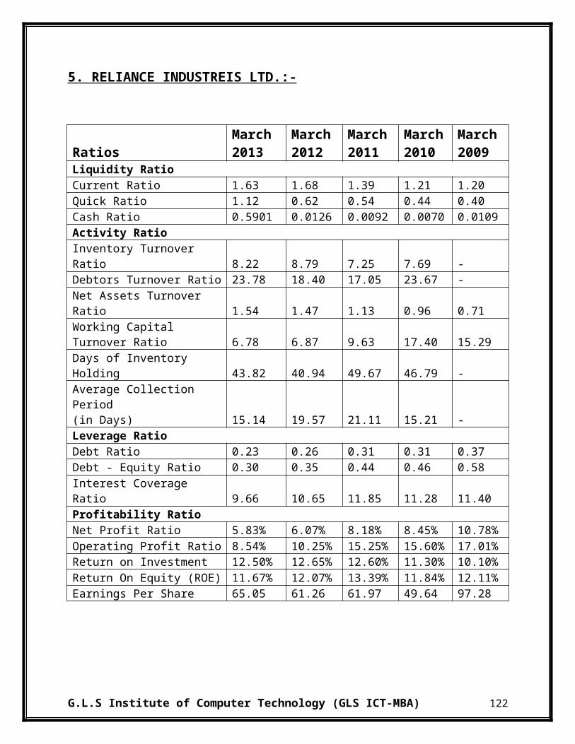
5. RELIANCE INDUSTREIS LTD.:-
Candlestick Chart:-
G.L.S Institute of Computer Technology (GLS ICT-MBA) 162
Exponential Moving Average (EMA) Chart:-
In RIL, it can be seen that EMA is showing an increasing trend year 2009 and then there is a fluctuating trend from 2010 to mid 2011. There is a decline in EMA from 2011 to2012. From 2012 to 2013 there is an increasing trend in EMA. From year 2013 to 2014 there is a stable trend. Overall EMA is showing a fluctuating trend, but it is decreasing afterwards. Due to decline seen in 2014 in the EMA it will be better to hold or invest in the stock of the RIL as price are expected to rise.
Moving Average Convergence Divergence (MACD) Chart:-
As per MACD it is preferable to hold shares of the company as it shows an increasing trend in beginning and a stable trend afterwards. At starting of 2009, it matches expectations and in mid 2009 it is high and above expectation. Then afterwards there is a declining trend till mid 2011, after that there is an increasing trend from 2012 to 2014 and is same as expectation. Thus one should hold in the security as it is possible that the price would increase.
Relative Strength Index (RSI) Chart;-
In RSI Chart, the Upward Control Line (UCL) is at 70 points and Lower Control Line (LCL) is at 30 points. In 2009 the stock has crossed its UCL. But from 2010 to mid 2011 there is a declining trend and it has reached its LCL. After that there is an increasing trend. Thus one should invest in the stocks of the company.
G.L.S Institute of Computer Technology (GLS ICT-MBA) 163
Line Chart:-
From the above chart, it can be seen that the price are showing a fluctuating trend. In year 2009 the share price has reached it all time high, but after that the price are decreasing till 2012. Afterwards the price is rising from 2012 to 2014. Thus it is showing an increasing trend will is a sign to invest and to hold in the stocks.
G.L.S Institute of Computer Technology (GLS ICT-MBA) 164
Opening High Closing Low (OHLC) Chart:-
In 2009 there is an increase in price is of Rs 700, after that till 2012 there is a declining trend and
price is reduced to Rs 700. Afterwards there is increasing trend till mid 2013 and afterwards
there is a stable price. Due to upward trend in the above OHLC chart it will be better to invest or
to hold in the stock as price are expected to rise.
G.L.S Institute of Computer Technology (GLS ICT-MBA) 165

CHAPTER 7
RECOMMENDATIONS

7 RECOMMENDATIONS:-
Before going to invest, an investor should have clear and adequate knowledge of capital
market.
It is better to go for Long term Investment rather than the Short term Investment. Because it
is less risky and also provides sufficient return
Investors can consider combining the two approaches as part of their overall investment
plan.
Although from our research, the technical method such as “RELATIVE STRENGTH
INDEX “ and “PIVOT POINT” proves quite useful in predicting the movement of stock
prices, but sometimes such technical analysis misleads the price movement due to
uncontrollable factors. So while selecting the stock for intraday or long term perspective,
the fundamentals of the company should be studied deeply, also the fundamental research
should also be considered while investing in the capital market. For taking the investment
decisions, both the technical analysis and the fundamental analysis are equally important
for any small or big investor.
Fundamental analysis attempts to determine the value of a share by analyzing a company's
financials from its annual report and using qualitative data about the environment in which
it operates. This value is often called intrinsic value.
Technical analysis offers a different view of a stock. It is based on the belief that all that is
known about a stock is reflected in its price and volume.
The investors should be trained to use the technical analysis tools. Since it will help them in
their day to day investments to get more returns.
G.L.S Institute of Computer Technology (GLS ICT-MBA) 166

Fundamental analysis can also be suggested to the investors together corporate, growth of
earnings and profitability.
The company should orient the investors to mainly watch the business, economic, social
and political factors that affect the supply and demand for securities.
The investors can also use more number of charts which will depict a true picture on the
movement of the securities.
The investors should analyze market data in real time; plan your own market timing
strategy to make money, regardless of upwards and downwards trending markets.
Minute – by – Minute trading volume shows the reversal points of the market, and
therefore when to buy and sell can be identified.
The trend is your Friend‖ is the motto of technical analysis. So the investor has to monitor
the trend of stocks before investment.
The activity of these very large numbers of investors and traders results in different
patterns emerging in the market.
Technical analysts attempt to recognize these patterns and take advantage of them when
making their investment decisions.
In case a trader entering in a new industry first he has to select stock to buy in a new
industry making careful study prospects and charts of the stock.
Even though technical analysis is enough for making decision in stock market,
simultaneous usage of both fundamental and technical analysis will reduce errors in
forecasting future prices.
G.L.S Institute of Computer Technology (GLS ICT-MBA) 167

CHAPTER 8
CONCLUSION
8 CONCLUSION:-
Whenever one thinking of investing in a company it is vital that one understand what it does, its
market and the industry in which it operates. One should never blindly invest in a company.
One of the most important areas for any investor to look at when researching a company is the
financial statements. It is essential to understand the purpose of each part of these statements and
how to interpret them. Sometimes Using Technical and fundamental analysis individually lead to
incorrect results hence both Fundamental and technical analysis should be used at a time to get
the desired result.
Fundamental analysts study everything from the overall economy and industry conditions, to the
financial condition and management of companies before deciding on any particular stock.
Technical analysts look for peaks, bottoms, trends, patterns and other factors affecting a stock's
price movement and then make buy/sell decisions based on those factors
A fundamentally sound company will eventually be discovered. Candlestick signals have
a very viable benefit to the combination of fundamental and technical analysis. If a
universe of stocks is developed with the criteria being that they are fundamentally strong
companies, this greatly reduces the probabilities of being surprised with bad financial
numbers.
Equity capital is a high risk-high reward, permanent source of long term finance for
corporate enterprises and short term earning for shareholders. The investors, who desire
to share the risk, return and control associated with ownership of companies would invest
in equity capital.
So, the stock exchanges must disregards the emotional component of trading by making
investors decisions based upon chart formation, assuming that prices reflect both facts &
emotion also by creating the awareness of fundamental analysis among the investors to
avoid the irregularities while trading.
G.L.S Institute of Computer Technology (GLS ICT-MBA) 168
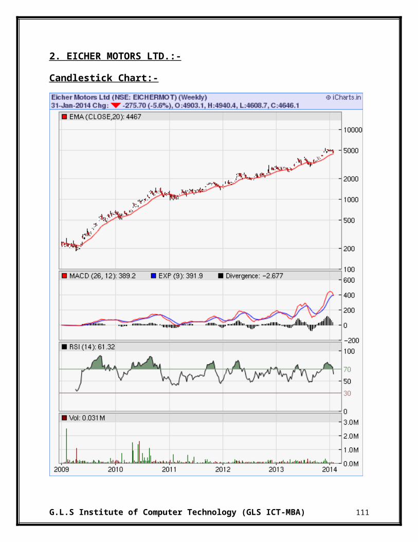
Technical analysis could be use in the short to medium time frame for trading as the stock
price movement is affected by largely by external events that cause swings in trading
moods and sentiments which will dictate prices of stock. Fundamental analysis could not
effectively function in the short and medium term analysis of stock price as it is affected
by external events that are not relevant to the company's business growth and potential.
In the long run, a good company with sound management and business growth will be
able to attract fund manager's attention to invest in the company. This in turn will be
reflected in the price changes and the price trends Technical analysis in the longer time
frame will also be able to conclude the rise of the price of a stock of a good company.
If a person uses the mix analysis, fundamental analysis focuses on the reason why price
will change while technical analysis focus on when will the price change. As a result, it is
the best way to integrate the two approaches.
Although there are some benefits to combine the two approaches, some limitations also
exist. Technical analysis is good for controlling the risk so it is suitable for both short
team and long term analysis. On the other side, fundamental analysis only uses long term
approach so it is not so much useful to control risk.
From the point of data availability, Technical Analysis provides all recent data unlike
Fundamental Analysis which only provides data till last year.
The primary focus of Technical Analysis is on the movement of prices. Charts show how
prices are moving or not moving, when the prices are trending and the strength of those
trends.
The MACD chart of Technical Analysis quickly displays a price that is trending or stuck
in a range. Whether it is up, down or sideways, a chart can quickly display a currency that
is exhibiting a trend.
G.L.S Institute of Computer Technology (GLS ICT-MBA) 169

The OHLC bar charts are very useful in analyzing the variations in the stock and
currency prices over a period of time. They are widely used in Technical Analysis for
recognition of support and resistance levels and trends.
Technical Analysis is less time consuming and less costly than Fundamental Analysis. It
can be performed in less than five minutes and the services are very often offered for free
or at a nominal cost.
In summary, both fundamental analysis and technical analysis are important to analyze
company financial statement. Managers and investors should use the two approaches or
use one of them depend on the market condition to optimize the profit of company.
G.L.S Institute of Computer Technology (GLS ICT-MBA) 170

CHAPTER 9:
BIBLIOGRAPHY
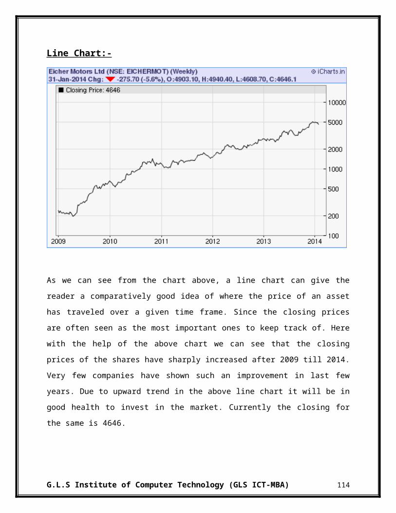
9 BIBLIOGRAPHY
Bistrova, J., & Lace, N. (2009). RELEVANCE OF FUNDAMENTAL ANALYSIS ON
THE BALTIC EQUITY MARKET. Retrieved from www.ktu.lt:
http://www.ktu.lt/lt/mokslas/zurnalai/ekovad/14/1822-6515-2009-132.pdf
Chandra, P. (2009). Investment Analysis and Portfolio Management. Delhi: Tata
McGraw-Hill.
Cohen, Kudryaytsey, Andrey, Hon-Sin, & Shlomit. (2011). Stock Market Analysis in
Practice: Is It Technical or Fundamental? Retrieved from http://search.proquest.com:
http://search.proquest.com/docview/1314906186?accountid=143305
Curtis, G. (2009, Febuary 26). Blending Technical And Fundamental Analysis. Retrieved
from www.Investopedia.com: http://www.investopedia.com/articles/trading/07/technical-
fundamental.asp
Janssen, C., C. L., & C. M. (2009, february 25). Technical Analysis. Retrieved from
www.Investopedia.com: http://www.investopedia.com/university/technical
PANDYA, H., & PANDYA, H. (2013, MAY). FUNDAMENTAL ANALYSIS OF
INDIAN AUTOMOBILE INDUSTRY. Retrieved from http://www.journalcra.com/:
http://www.journalcra.com/sites/default/files/3452.pdf
http://www.ongcindia.com/
http://www.bharatpetroleum.in/
http://www.iocl.com/
http://www.moneycontrol.com/stocksmarketsindia/
http://icharts.in/
http://www.chartpatterns.com
G.L.S Institute of Computer Technology (GLS ICT-MBA) 171