Embed Size (px)
DESCRIPTION
slides
Citation preview
Chapter 11
Designing Forms and Reports
Modern Systems Analysisand Design
Fifth Edition
Jeffrey A. Hoffer Joey F. George
Joseph S. Valacich
© 2008 by Prentice Hall 2Chapter 11
Learning Objectives
Explain the process of designing forms and reports and the deliverables for their creation.
Apply the general guidelines for formatting forms and reports.
Use color and know when color improves the usability of information.
© 2008 by Prentice Hall 3Chapter 11
Learning Objectives (Cont.)
Format text, tables, and lists effectively. Explain how to assess usability and describe
how variations in users, tasks, technology, and environmental characteristics influence the usability of forms and reports.
Discuss guidelines for the design of forms and reports for Internet-based electronic commerce systems.
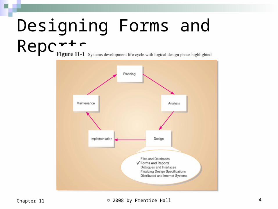
Designing Forms and Reports
© 2008 by Prentice Hall 4Chapter 11
Designing Forms and Reports
Design process for forms and reports is important activity because:
Users often equate the quality of a system with the quality of its input and output methods.
Information can be collected and formatted in many ways, gaining an understanding of design do’s and the trade-offs between various formatting option is useful for system analyst
© 2008 by Prentice Hall 5Chapter 11
Designing Forms and Reports
System inputs and outputs were identified during requirements structuring.
During analysis the concern focus on which forms or reports need to exist and their content. It does not focus on the precise appearance of forms and reports.
© 2008 by Prentice Hall 6Chapter 11
© 2008 by Prentice Hall 7Chapter 11
Designing Forms and Reports Form: a business document that contains some predefined data and
may include some areas where additional data are to be filled in. An instance of a form is typically based on one database record.
Forms are used to collect or present information on a single item (e.g. Customer, product).
They can be used for both input and output.
Most forms have a stylized format and are usually not in a simple row and column format (e.g. Product order forms, employment applications, ATM transactional layout and class registration).
On the internet, form interaction is the standard method of gathering and displaying information when consumers order products or query account status.
© 2008 by Prentice Hall 8Chapter 11
Designing Forms and Reports (Cont.)
Report: A business document that contains only predefined data; It is a passive document used solely for reading
or viewing data (e.g. invoices, weekly sales summaries by region and salesperson or a pie chart of population by age).
A report typically contains data from many unrelated records or transactions.
Report has rows and columns of data but report may be of any format (e.g. mailing labels).
© 2008 by Prentice Hall 9Chapter 11
Designing Forms and Reports (Cont.) Common Types of Reports:
Scheduled: produced at predefined time intervals for routine information needs.
Key-indicator: provide summary of critical information on regular basis.
© 2008 by Prentice Hall 10Chapter 11
Designing Forms and Reports (Cont.)
Exception: highlights data outside of normal operating ranges.
Drill-down: provide details behind summary of key-indicator or exception reports.
Ad-hoc: respond to unplanned requests for non-routine information needs.
© 2008 by Prentice Hall 11Chapter 11
The Process of Designing Forms and Reports Designing forms and report is a user-focused activity
that typically follows a prototyping approach.
First steps are to gain an understanding of the intended user and task objectives by collecting initial requirements during requirements determination.
During this process, several questions must be answered. These questions attempt to answer the “who, what, when, where and how” related to the creation of all forms or reports.
© 2008 by Prentice Hall 12Chapter 11
The Process of Designing Forms and Reports Requirements determination:
Who will use the form or report? Understand who the users are, their skills and abilities.
What is the purpose of the form or report? What task will users be performing and what information
is needed to complete this task? When is the report needed or used? Where does the form or report need to be delivered and
used? Where will the users be when performing this task? Will
users have access to online systems or will be in the field.
How many people need to use or view the form or report?
© 2008 by Prentice Hall 13Chapter 11
The Process of Designing Forms and Reports (Cont.)
Second structure and refine the collected information into initial prototype. Initial prototype is designed from requirements.
Finally Users review prototype design and either accept the design or request changes. If changes are requested, the construction-evaluation-refinement cycle is repeated until the design is accepted.
The Process of Designing Forms and Reports (Cont.) The initial prototype may be constructed in
numerous environments, including Windows, Linux or Macintosh.
Often, initial prototypes are simply mock screens that are not working modules or systems. Mock screens can be produced from a word processor, computer graphics design package, electronic spreadsheet or even on paper.
© 2008 by Prentice Hall 14Chapter 11
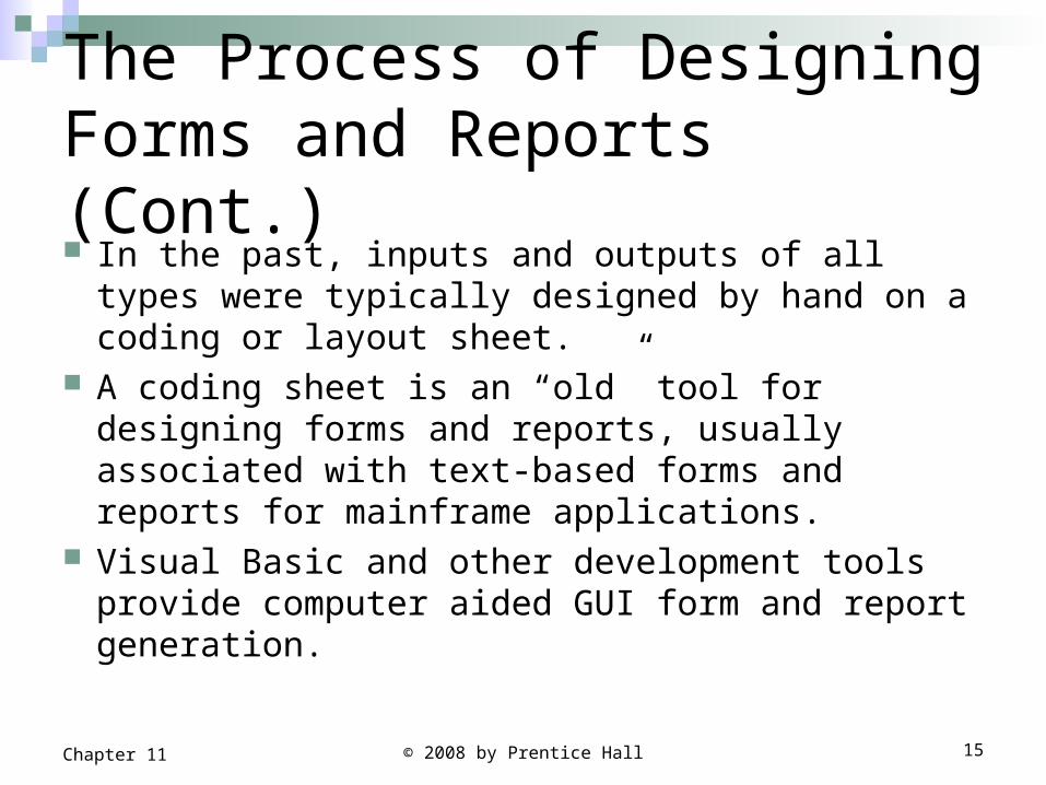
The Process of Designing Forms and Reports (Cont.) In the past, inputs and outputs of all types were
typically designed by hand on a coding or layout sheet.
A coding sheet is an “old” tool for designing forms and reports, usually associated with text-based forms and reports for mainframe applications.
Visual Basic and other development tools provide computer aided GUI form and report generation.
© 2008 by Prentice Hall 15Chapter 11
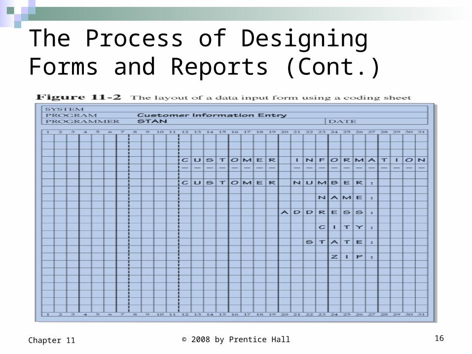
The Process of Designing Forms and Reports (Cont.)
© 2008 by Prentice Hall 16Chapter 11
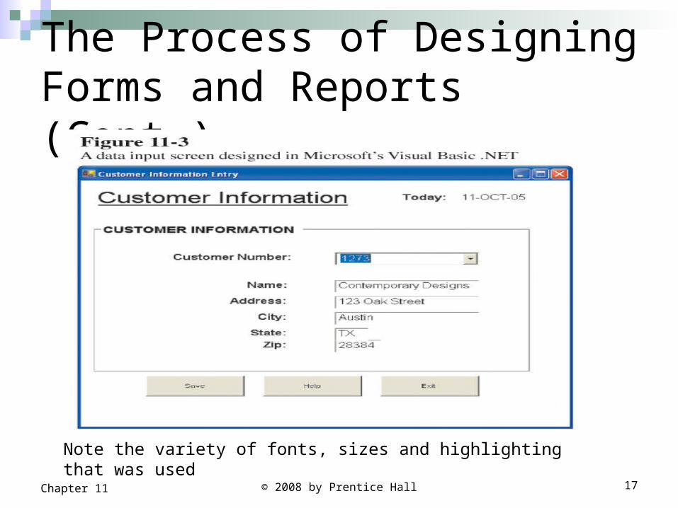
The Process of Designing Forms and Reports (Cont.)
© 2008 by Prentice Hall 17Chapter 11
Note the variety of fonts, sizes and highlighting that was used
Deliverables and Outcomes
Design specifications are the major deliverables and inputs to the system implementation phase.
Design specifications have three sections: Narrative overview: contains a general overview of
the characteristics of the target users, tasks, system, and environmental factors.
The purpose is to explain to those who will actually develop the final form why this form exists and how it will be used so that they can make the appropriate implementation decisions.
© 2008 by Prentice Hall 18Chapter 11
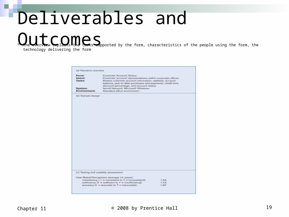
Deliverables and Outcomes The overview explains the tasks supported by the form, characteristics of the people using the form, the technology delivering the form
© 2008 by Prentice Hall 19Chapter 11
Deliverables and Outcomes (Cont.)
Sample design: image of the form (from coding sheet or form building development tool).
Testing and usability assessment: measuring test/usability results (consistency, sufficiency, accuracy, etc.).
© 2008 by Prentice Hall 20Chapter 11
Formatting Forms and Reports
Meaningful titles clear and specific titles describing content and use of form or report Revision date or code to distinguish a form or report from prior versions Current date, which identifies when the form or report was generated Valid date, which identifies on what date (or time) the data in the
form or report were accurate
Meaningful information only needed information should be displayed Information should be provided in a manner that is usable
without modification
© 2008 by Prentice Hall 21Chapter 11
Formatting Forms and Reports (Cont.) Balance the layout
Information should be balanced on the screen or page adequate spacing and margins should be used All data and entry fields should be clearly labeled
Easy navigation system clearly show how to move forward and backward Clearly show where you are currently (e.g. page 1 of 3) Notify user when on the last page of a multi-paged sequence.
© 2008 by Prentice Hall 22Chapter 11
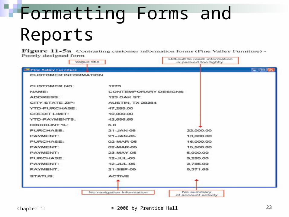
Formatting Forms and Reports
© 2008 by Prentice Hall 23Chapter 11
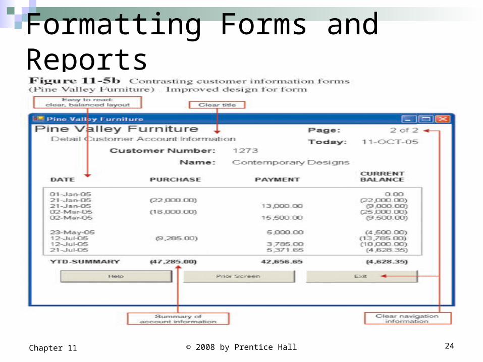
Formatting Forms and Reports
© 2008 by Prentice Hall 24Chapter 11
Formatting Forms and Reports Figure 11-5 a
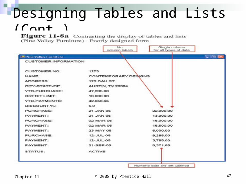
Title is ambiguous View information that is extraneous to the intent of the form Provides information that is not in the most useful format for the user Provides all customer data as well as account transactions and
summery of YTD-purchase. Does not provide the current outstanding balance of the account; a user
who desire this information must make a manual calculation.
Figure 11-5 b Title clearly and specifically describes the content of the form Include the date on which the form was generated so that if printed, it
will be clear to the reader when this occurred.
© 2008 by Prentice Hall 25Chapter 11
© 2008 by Prentice Hall 26Chapter 11
Highlighting Information
Highlighting should be used sparingly to draw the user to or a way from certain information and to group together related information.
There are several situations when highlighting can be a valuable technique for conveying special information: Notify users of errors in data entry or processing. Provide warnings regarding possible problems. Draw attention to keywords, commands, high-priority
messages, unusual data values.
© 2008 by Prentice Hall 27Chapter 11
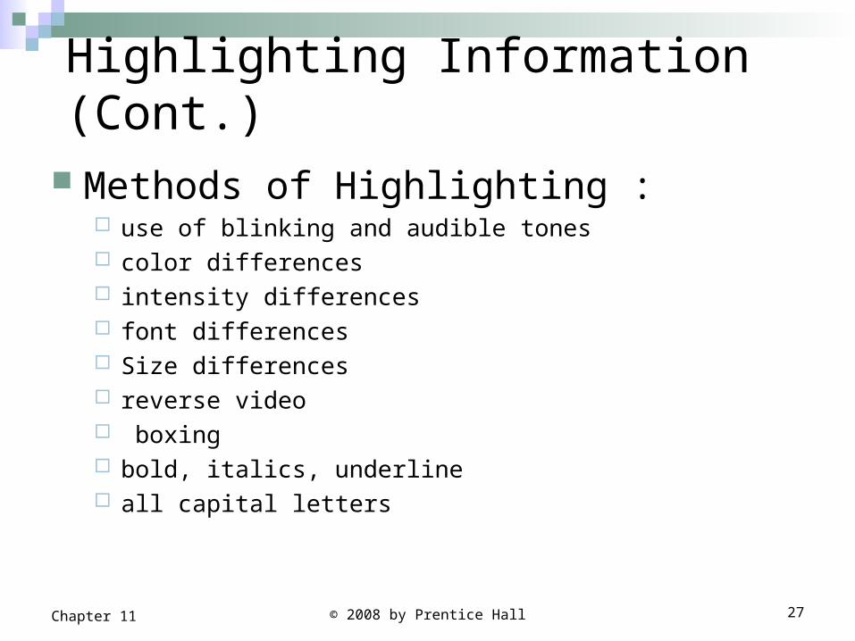
Highlighting Information (Cont.)
Methods of Highlighting : use of blinking and audible tones color differences intensity differences font differences Size differences reverse video boxing bold, italics, underline all capital letters
Highlighting Information
© 2008 by Prentice Hall 28Chapter 11
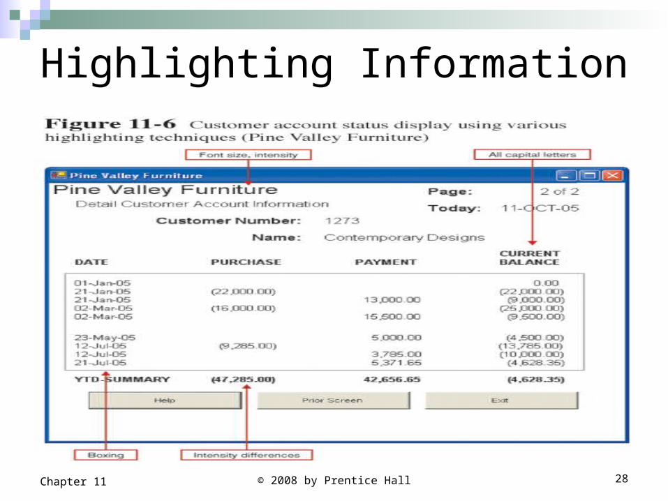
Highlighting Information
In Figure 11-6 several types of highlighting are used:Boxes clarify different categories of dataCapital letters and different fonts distinguish
labels from actual dataBolding is used to draw attention to important
data
© 2008 by Prentice Hall 29Chapter 11
Highlighting Information General guidelines for using highlighting:
Blinking and audible tones should only be used to highlight critical information requiring an immediate response from the user. Once a response is made , these highlights should be turned off.
Highlighting methods should be consistently used and selected based upon the level of importance of the emphasized information.
It is important to examine how a particular highlighting method appears on all possible output devices that could be used with the system (e.g. some color combinations may convey appropriate information on one display configuration but wash out and reduce legibility on another).
© 2008 by Prentice Hall 30Chapter 11
Color vs. No Color Color is powerful tool for the designer in
influencing the usability of a system. Colors provides many potential benefits to
forms and reports when applied appropriately: Soothes or strikes the eye. Accents an uninteresting display. Facilitates subtle discriminations in complex displays. Emphasizes the logical organization of information. Draws attention to warnings. Evokes more emotional reactions. Gaining greater understanding from display or chart.
© 2008 by Prentice Hall 31Chapter 11
Color vs. No Color
The benefits of color only seem to apply if the information is first provided to the user in the most appropriate presentation format. (e.g. if the information is displayed in a bar chart, color can be used to enhance or supplement the display)
If information is displayed in an appropriate format, color has little or no effect on improving understanding or task performance.
© 2008 by Prentice Hall 32Chapter 11
Color vs. No Color (Cont.) Problems from Using Color
Color pairings may wash out or cause problems for some users (color blindness).
Resolution may degrade with different displays. Color fidelity may degrade on different displays. Printing or conversion to other media may not easily
translate.
You need to limit the number of colors and allow color to be a user-activated option.
© 2008 by Prentice Hall 33Chapter 11
© 2008 by Prentice Hall 34Chapter 11
Displaying Text The display and formatting of system help screens, which
often contain lengthy textual descriptions is one example of textual data.
Guidelines for displaying text Case: display text in mixed upper and lower case, use conventional
punctuation. Spacing: double spacing if possible for large blocks of text,
otherwise blank lines between paragraphs. if the text is short, use single spacing and place a blank line between each paragraph.
Justification: left justify text, ragged right margins. Hyphenation: no hyphenated words between lines. Abbreviations: only when widely understood and significantly
shorter than full text.
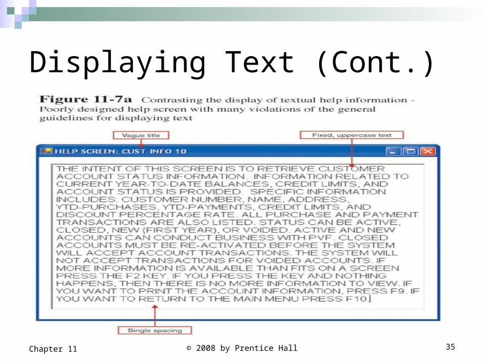
Displaying Text (Cont.)
© 2008 by Prentice Hall 35Chapter 11
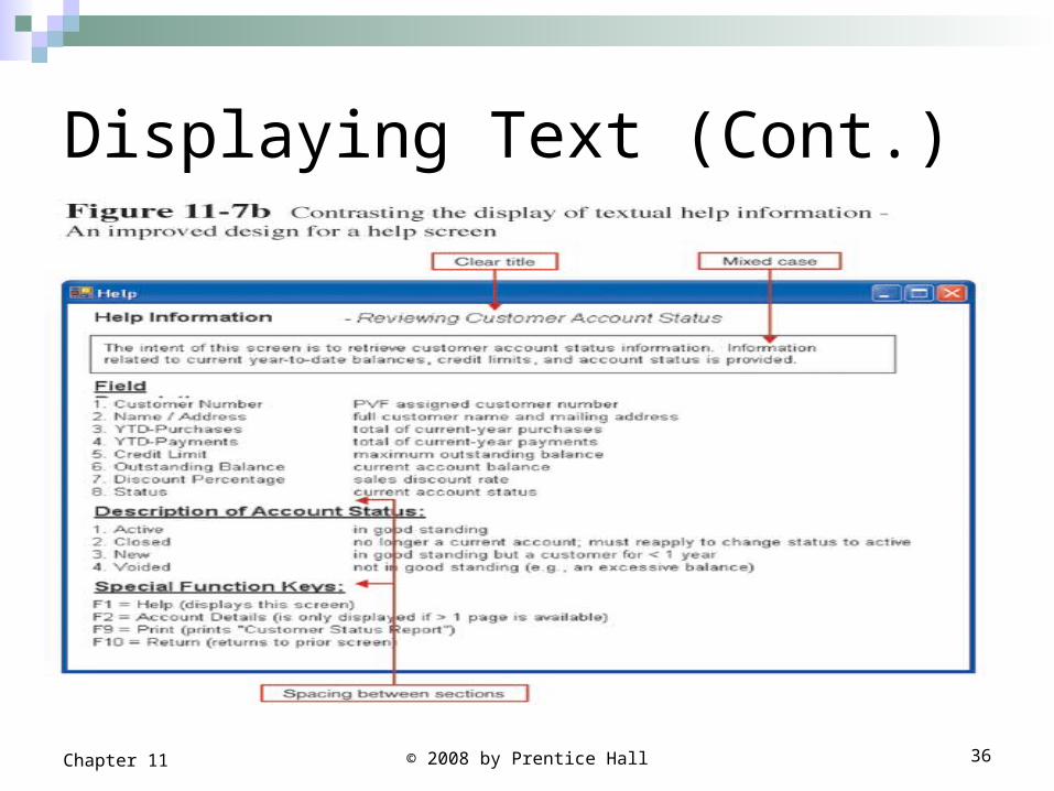
Displaying Text (Cont.)
© 2008 by Prentice Hall 36Chapter 11
Designing Tables and Lists
Unlike textual information, where context and meaning are derived through reading, the context and meaning of tables and lists are derived from the format of the information.
The usability of information displayed in tables and list is likely to be much more heavily influenced by effective layout.
© 2008 by Prentice Hall 37Chapter 11
© 2008 by Prentice Hall 38Chapter 11
Designing Tables and ListsGeneral guidelines for displaying tables and lists: Labels
All columns and rows should have meaningful labels.
Labels should be separated from other information by using highlighting.
Redisplay labels when the data extend beyond a single screen or page.
© 2008 by Prentice Hall 39Chapter 11
Designing Tables and Lists (Cont.)
General guidelines for displaying tables and lists:
Formatting columns, rows and text: Sort in a meaningful order. Place a blank line between every five rows in
long columns. Similar information displayed in multiple
columns should be sorted vertically (that is, read from top to bottom, not from left to right).
© 2008 by Prentice Hall 40Chapter 11
Designing Tables and Lists (Cont.)
General guidelines for displaying tables and lists:
Formatting columns, rows and text: Columns should have at least two spaces
between them. Allow white space on printed reports for user
to write notes. Use a single typeface, except for emphasis. Use same family of typefaces within and
across displays and reports. Avoid overly fancy fonts.
© 2008 by Prentice Hall 41Chapter 11
Designing Tables and Lists (Cont.)General guidelines for displaying tables and lists: Formatting numeric, textual and alphanumeric data:
Right justify numeric data and align columns by
decimal points or other delimiter.
Left justify textual data. Use short line length, usually
30 to 40 characters per line.
Break long sequences of alphanumeric data into
small groups of three to four characters each.
Designing Tables and Lists (Cont.)
© 2008 by Prentice Hall 42Chapter 11
Designing Tables and Lists (Cont.)
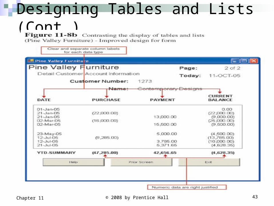
© 2008 by Prentice Hall 43Chapter 11
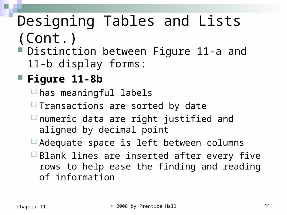
Designing Tables and Lists (Cont.) Distinction between Figure 11-a and 11-b
display forms: Figure 11-8b
has meaningful labels Transactions are sorted by date numeric data are right justified and aligned by decimal
point Adequate space is left between columns Blank lines are inserted after every five rows to help
ease the finding and reading of information
© 2008 by Prentice Hall 44Chapter 11
© 2008 by Prentice Hall 45Chapter 11
Designing Tables and Lists (Cont.)
Use tables for reading individual data values or finding an individual data value from a larger data set.
Use graphs for: Understating of data changes over time Providing quick summary. Displaying trends over time. Comparing points and patterns of variables. Forecasting activity. Simple reporting of vast quantities of information.
Designing Tables and Lists (Cont.)
© 2008 by Prentice Hall 46Chapter 11
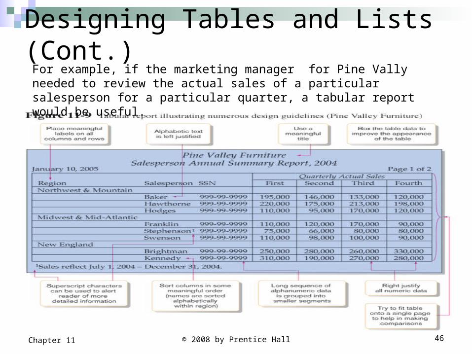
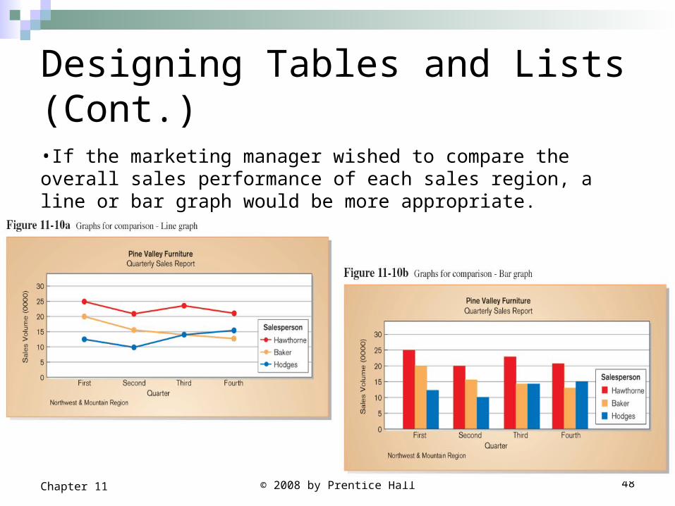
For example, if the marketing manager for Pine Vally needed to review the actual sales of a particular salesperson for a particular quarter, a tabular report would be useful.
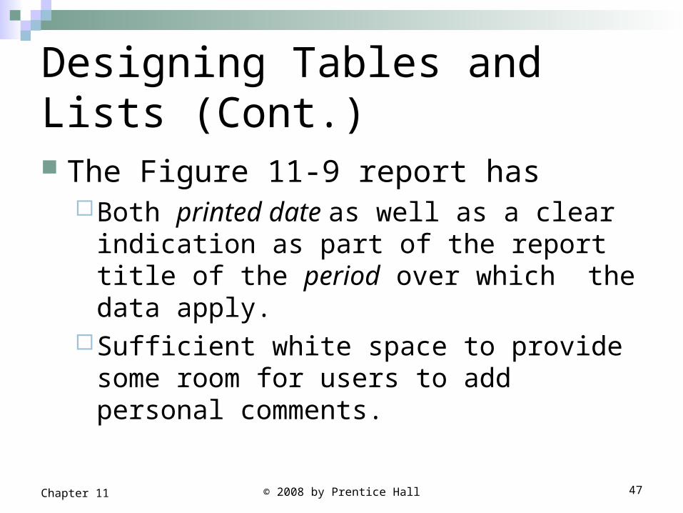
Designing Tables and Lists (Cont.) The Figure 11-9 report has
Both printed date as well as a clear indication as part of the report title of the period over which the data apply.
Sufficient white space to provide some room for users to add personal comments.
© 2008 by Prentice Hall 47Chapter 11
Designing Tables and Lists (Cont.)
© 2008 by Prentice Hall 48Chapter 11
•If the marketing manager wished to compare the overall sales performance of each sales region, a line or bar graph would be more appropriate.
© 2008 by Prentice Hall 49Chapter 11
Assessing Usability
Objective for designing forms, reports and all human-computer interactions is usability.
Usability refers to the following three characteristics : Speed. Can you complete a task efficiently? Accuracy. Does the output provide what you expect? Satisfaction. Do you like using the output?
Usability means that your designs should assist, not hinder user performance
© 2008 by Prentice Hall 50Chapter 11
Assessing Usability (Cont.)
Usability: an overall evaluation of how a system performs in supporting a particular user for a particular task.
© 2008 by Prentice Hall 51Chapter 11
Usability Success FactorsGeneral design guidelines for usability of forms
and reports Consistency: consistent use of terminology, abbreviations, formatting, titles
and navigation within and across outputs. Consistent response time each time a function is performed. For example, titles, menu options appear in the same place and look the
same on all forms and reports. The same form of highlighting has the same meaning each time it is
used. The system will respond in roughly the same amount of time each time a
particular operation is performed.
Efficiency: formatting should be designed with an understanding of the task
being performed and the intended user. Text and data should be aligned and sorted for efficient navigation and entry.
minimize required user actions. Entry of data should be avoided where possible ( e.g. computing rather than entering totals)
© 2008 by Prentice Hall 52Chapter 11
Usability Success Factors
Ease: self-explanatory outputs and labels. Not require users to remember information from prior outputs in
order to complete tasks. Labels should be extensively used and all scales and unit of
measures should be cleary indicated.
Format: appropriate display of data and symbols. Information format should be consistent between entry and display Format should distinguish each piece of data and highlight important data Special symbols such as decimal places, dollar signs and +/- should be used as
appropriate.
Flexibility: information should be viewed and retrieved in a manner most convenient to the user. Maximize user options for data input according to preference. For example, users should be given options for the sequence in which to enter or
view data and for use of shortcut and the system should remember where the user stopped during last use of system.
© 2008 by Prentice Hall 53Chapter 11
Usability Success Factors (Cont.) When designing outputs, you must also consider the
context in which the forms or report will be used.
Characteristics for consideration when designing forms and reports : User: experience, skills, motivation, education and personality
should considered.
Task: tasks differ in amount of information that must be obtained from or provided to the user. Task demands such as time pressure, cost of errors, work durations will influence usability.
© 2008 by Prentice Hall 54Chapter 11
Usability Success Factors (Cont.) Characteristics for consideration when
designing forms and reports :
System: the platform on which system is constructed will influence interaction styles and devices.
Environment: social issues such as the user role should be considered in addition to environmental or physical concerns such as lighting, sound, task interruption and temperature. The creation of usable forms and report may necessitate changes in the users physical work facility
© 2008 by Prentice Hall 55Chapter 11
Measures of Usability Time to learn: Reflects how long it takes the average system users
to become proficient using the system.
Speed of performance. The manner in which the processing steps are sequenced and the selection of one set of keystrokes over others can greatly influence the user’s task performance. For example the most commonly used functions should be
quickly accessed with the fewest number of steps possible such as pressing one key to save the work.
Rate of errors. Retention over time. Subjective satisfaction.
© 2008 by Prentice Hall 56Chapter 11
Measures of Usability (Cont.)
Layout of information should be consistent both within and across applications, whether information is delivered on screen display or on a hard-copy report.
Electronic Commerce Application: Designing Forms and Reports for Pine Valley Furniture WebStore
The rapid deployment of Internet Web sites have resulted in having countless people design sites who arguable have limited ability to do so.
Three possible solutions to the problem: Make it possible to design reasonably usable sites
without having UI experience. Train more people in good Web design. Live with poorly designed sites that are hard to use.
© 2008 by Prentice Hall 57Chapter 11
Electronic Commerce Application: Designing Forms and Reports for Pine Valley Furniture WebStore
Common errors when designing the layout of the web pages
Nonstandard use of GUI weights: make sure that when using standard design items, they behave in accordance with major interface design standards.
Anything that looks like advertising: make sure that you avoid designing any legitimate information in a manner that resembles advertising as many users have learned to stop paying attention to web advertisements.
Bleeding-edge technology: make sure that users do not need the latest browsers or plug-ins to view your site
© 2008 by Prentice Hall 58Chapter 11
Electronic Commerce Application: Designing Forms and Reports for Pine Valley Furniture WebStore
Common errors when designing the layout of the web pages
Scrolling test and looping animations: avoid scrolling text and animations since they are both hard to read and users often equate such content with advertising.
Nonstandard link colors: avoid using nonstandard colors to show links and for showing that users have already used; nonstandard colors will confuse the user and reduce ease of use.
Outdated information: make sure your site is continuously updated so that users feel that the site is regularly maintained and updated
© 2008 by Prentice Hall 59Chapter 11
Electronic Commerce Application: Designing Forms and Reports for Pine Valley Furniture WebStore
Common errors when designing the layout of the web pages
Slow download times: avoid using large images, lots of images, unnecessary animations that will slow the downloading time of a page.
Fixed formatted text: avoid fixed formatted text hat requires users to scroll horizontally to view content or links.
Displaying long lists as long pages: avoid requiring users to scroll down a page to view information. Manage information by showing only N items at a time, using multiple pages or by using scrolling container
within the window.
© 2008 by Prentice Hall 60Chapter 11
Designing Forms and Reports at Pine Valley Furniture PVF established the following design guidelines
for web forms and reports:Easy menu and page navigationUse lightweight graphics.Establish forms and data integrity rules.Use template-based HTML.
© 2008 by Prentice Hall 61Chapter 11
Lightweight Graphics Lightweight Graphics: the use of small,
simple images that allow a Web page to load as quickly as possible.Using lightweight graphics allows pages to
load quickly and help users to reach their final location as quickly as possible.
Quick feedback from the Web site can provide will help to keep customers at the PVF WebStore longer.
© 2008 by Prentice Hall 62Chapter 11
Forms and Data Integrity Rules.
All forms that request information should be clearly labeled and provide adequate room for input.
Specific fields requiring specific information (e.g. date of birth or phone number) must provide a clear example so that data errors can be reduced.
The site must clearly designate which fields are optional, which are required, and which have a range of values.
© 2008 by Prentice Hall 63Chapter 11
Template-Based HTML
Template-based HTML: templates to display and process common attributes of higher-level, more abstract items. Using HTML templates will help to creates an
interface that is very easy to maintain. This way a change requires modifying one page, not 700 pages.
have a “few” templates that could be used for entire product line.
Not every product needs its own page. The development time for that would be far too great.
© 2008 by Prentice Hall 64Chapter 11
© 2008 by Prentice Hall 65Chapter 11
Summary In this chapter you learned how to: Explain the process of designing forms
and reports and the deliverables for their creation.
Apply the general guidelines for formatting forms and reports.
Use color and know when color improves the usability of information.
© 2008 by Prentice Hall 66Chapter 11
Summary (Cont.) Format text, tables, and lists effectively. Explain how to assess usability and
describe how variations in users, tasks, technology, and environmental characteristics influence the usability of forms and reports.
Discuss guidelines for the design of forms and reports for Internet-based electronic commerce systems.