Embed Size (px)
Citation preview
����
IBM Performance Management for Power Systems: Graph Reference Document
A Guide to Help Understand:
The PM for Power Systems Offering and Process
The PM for Power Systems Reports December 2012 Note: Updates to this document are made periodically. Access the on-line version (versus a printed copy) for the most current information.
PM for Power Systems Graph Reference Document
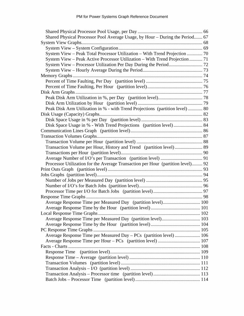
Table of Contents Section 1: Intro to Performance Management for Power Systems ..................................... 1
Daily Updates.................................................................................................................. 2 Trending.......................................................................................................................... 2 Benefits of PM for Power Systems................................................................................. 2 System Management with More Flexibility ................................................................... 2 Explanation of Growth and Performance Issues in Non-Technical Terms .................... 2 Systems Management Process of PM for Power Systems.............................................. 3
The Performance Management Cycle......................................................................... 3 Automated Collection and Reporting ......................................................................... 3 Self Maintained Collection and Reporting ................................................................. 3 Minimal Data Storage Requirement ........................................................................... 4
Transmission Consistency / History ............................................................................... 4 Multiple Operating System Support ............................................................................... 5 Interface to the IBM Systems Workload Estimator........................................................ 6
Minimum Amount of Data Needed for Sizing ........................................................... 7 Levels of Service............................................................................................................. 8
PM for Power Systems Summary Service (No Additional Charge)........................... 8 PM for Power Systems Full Service (Fee Service)..................................................... 8 Functions Available to both ‘No Additional Charge’ and ‘Fee’ Service.................... 9
IBM Hardware and Software Supported......................................................................... 9 Report Calculation Principles and Definitions ............................................................. 10
The Difference Between Average and Peak Average............................................... 10 The Manner in which Trends are Calculated............................................................ 10 Other Definitions ...................................................................................................... 11
Terms and Conditions ................................................................................................... 12 What am I agreeing to upon PM for Power Systems activation? ............................. 12 Data Collection ......................................................................................................... 12 Data Availability to IBM .......................................................................................... 12 Data Availability to Solution Providers and Business Partners................................ 12 Warranty/Liability..................................................................................................... 12 Additional Terms and Conditions............................................................................. 12
Accessing the PM for Power Systems Graphs.............................................................. 13 IBM Web ID and password ...................................................................................... 13 Registering the Partition to a ‘Group’....................................................................... 13 Managing Access to the PM for Power Systems Reports and Graphs ..................... 14 Accessing the PM for Power Systems Website to View Graphs:............................. 15 Using the Server Information Page (SIP) ................................................................. 16 IBM and Business Partner Access to Graphs ........................................................... 17 Selecting the Interactive or .PDF Icon to View Graphs............................................ 17
Authorizing IBM Business Partners to View Graphs ................................................... 18 What to do for Questions .............................................................................................. 20
Section 2: AIX Interactive Graphs.................................................................................... 21 Processor Graphs on AIX ............................................................................................. 22
PM for Power Systems Graph Reference Document
Guidelines for Total Processor Utilization ............................................................... 22 Average Processor Utilization in Percent, per Day (partition level) ...................... 23 Processor Utilization, by the Hour (partition level)................................................. 24 Peak Processor Utilization, Total – with Trend Projections (partition level) ......... 25 Percent of Time RunQ Over the Limit, Per Day (partition level) ........................... 27 Percent of Time RunQ Over the Limit, Per Hour (partition level)......................... 28
Shared Processor Pool Reporting.................................................................................. 29 Shared Physical Processor Pool Peak Utilization – with Trend Projections ............ 30 Shared Physical Processor Pool Usage, per Day ...................................................... 31 Shared Physical Processor Pool Average Usage, by Hour – During the Period....... 32
System View Graphs..................................................................................................... 33 System View – System Configuration...................................................................... 34 System View – Peak Total Processor Utilization – With Trend Projection ............. 35 System View – Peak Active Processor Utilization – With Trend Projection ........... 36 System View – Processor Utilization Per Day During the Period............................ 37 System View – Hourly Average During the Period.................................................. 38
Memory Graphs ............................................................................................................ 39 Memory Usage in Percent, per Day (partition level)............................................... 39 Memory Utilization per Hour (partition level) ........................................................ 40
Disk Arm Graphs .......................................................................................................... 41 Peak Disk Arm Utilization in % - Per Day (partition level) ................................... 41 Disk Arm Utilization by Hour (partition level) ...................................................... 42 Peak Disk Arm Utilization in Percent - with Trend Projections (partition level)..... 43
Disk Graphs .................................................................................................................. 44 Disk Space Usage in %, per Day (partition level) .................................................. 44 Disk Space Usage in MB – with Trend Projections (partition level) ..................... 45 File System Usage in MB – with Trend Projections (partition level)..................... 46 Top Ten Most Heavily Used File Systems (partition level) ................................... 47
I/O Graphs..................................................................................................................... 48 Disk I/O Per Second for User Jobs (partition level) ............................................... 48 Processor Seconds per I/O for User Jobs (partition level)...................................... 49
Facts Table .................................................................................................................... 50 System Resources Summary (partition level)......................................................... 50
Management Summary Graphs (Mgmt Summary)....................................................... 51 Processor (partition level) ....................................................................................... 51 Disk Space (partition level) .................................................................................... 52 File System (partition level).................................................................................... 53
Section 3: IBM i Interactive Graphs ................................................................................ 54 Processor Graphs on IBM i........................................................................................... 55
Guidelines for Processor Utilization......................................................................... 56 Average Processor Utilization in % per Day (partition level) ................................ 58 Processor Utilization, by the Hour (partition level)................................................ 59 Peak Processor Utilization, Total – with Trend Projections (partition level) .......... 60 Peak Interactive Processor – with Trend Projections (partition level) .................... 62
Shared Processor Pool Reporting.................................................................................. 64 Shared Physical Processor Pool Peak Utilization – with Trend Projections ............ 65
PM for Power Systems Graph Reference Document
Shared Physical Processor Pool Usage, per Day ...................................................... 66 Shared Physical Processor Pool Average Usage, by Hour – During the Period....... 67
System View Graphs..................................................................................................... 68 System View – System Configuration...................................................................... 69 System View – Peak Total Processor Utilization – With Trend Projection ............. 70 System View – Peak Active Processor Utilization – With Trend Projection ........... 71 System View – Processor Utilization Per Day During the Period............................ 72 System View – Hourly Average During the Period.................................................. 73
Memory Graphs ............................................................................................................ 74 Percent of Time Faulting, Per Day (partition level) ............................................... 75 Percent of Time Faulting, Per Hour (partition level).............................................. 76
Disk Arm Graphs .......................................................................................................... 77 Peak Disk Arm Utilization in %, per Day (partition level)..................................... 78 Disk Arm Utilization by Hour (partition level) ...................................................... 79 Peak Disk Arm Utilization in % - with Trend Projections (partition level) ............ 80
Disk Usage (Capacity) Graphs...................................................................................... 82 Disk Space Usage in % per Day (partition level) ................................................... 83 Disk Space Usage in % - With Trend Projections (partition level) ........................ 84
Communication Lines Graph (partition level)............................................................ 86 Transaction Volumes Graphs........................................................................................ 87
Transaction Volume per Hour (partition level) ....................................................... 88 Transaction Volume per Hour, History and Trend (partition level) ....................... 89 Transactions per Hour (partition level).................................................................... 90 Average Number of I/O’s per Transaction (partition level) ................................... 91 Processor Utilization for the Average Transaction per Hour (partition level)......... 92
Print Outs Graph (partition level) ............................................................................... 93 Jobs Graphs (partition level)........................................................................................ 94
Number of Jobs per Measured Day (partition level) ............................................... 95 Number of I/O’s for Batch Jobs (partition level)..................................................... 96 Processor Time per I/O for Batch Jobs (partition level) ......................................... 97
Response Time Graphs ................................................................................................. 98 Average Response Time per Measured Day (partition level)............................... 100 Average Response Time by the Hour (partition level) ......................................... 101
Local Response Time Graphs ..................................................................................... 102 Average Response Time per Measured Day (partition level)................................ 103 Average Response Time by the Hour (partition level) ......................................... 104
PC Response Time Graphs ......................................................................................... 105 Average Response Time per Measured Day – PCs (partition level) ..................... 106 Average Response Time per Hour – PCs (partition level) ................................... 107
Facts - Charts .............................................................................................................. 108 Response Time (partition level)........................................................................... 109 Response Time – Average (partition level) ........................................................... 110 Transaction Volumes (partition level) .................................................................. 111 Transaction Analysis – I/O (partition level) .......................................................... 112 Transaction Analysis – Processor time (partition level) ....................................... 113 Batch Jobs – Processor Time (partition level) ...................................................... 114
PM for Power Systems Graph Reference Document
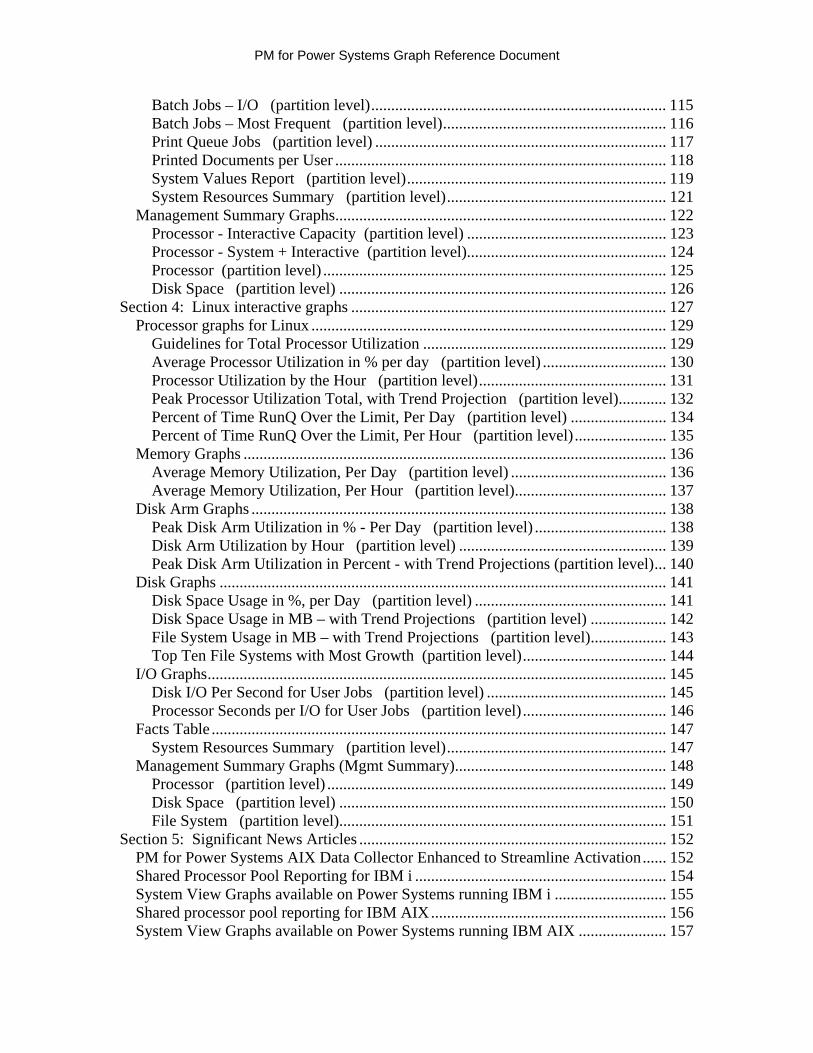
Batch Jobs – I/O (partition level).......................................................................... 115 Batch Jobs – Most Frequent (partition level)........................................................ 116 Print Queue Jobs (partition level) ......................................................................... 117 Printed Documents per User ................................................................................... 118 System Values Report (partition level)................................................................. 119 System Resources Summary (partition level)....................................................... 121
Management Summary Graphs................................................................................... 122 Processor - Interactive Capacity (partition level) .................................................. 123 Processor - System + Interactive (partition level).................................................. 124 Processor (partition level) ...................................................................................... 125 Disk Space (partition level) .................................................................................. 126
Section 4: Linux interactive graphs ............................................................................... 127 Processor graphs for Linux ......................................................................................... 129
Guidelines for Total Processor Utilization ............................................................. 129 Average Processor Utilization in % per day (partition level) ............................... 130 Processor Utilization by the Hour (partition level)............................................... 131 Peak Processor Utilization Total, with Trend Projection (partition level)............ 132 Percent of Time RunQ Over the Limit, Per Day (partition level) ........................ 134 Percent of Time RunQ Over the Limit, Per Hour (partition level)....................... 135
Memory Graphs .......................................................................................................... 136 Average Memory Utilization, Per Day (partition level) ....................................... 136 Average Memory Utilization, Per Hour (partition level)...................................... 137
Disk Arm Graphs ........................................................................................................ 138 Peak Disk Arm Utilization in % - Per Day (partition level) ................................. 138 Disk Arm Utilization by Hour (partition level) .................................................... 139 Peak Disk Arm Utilization in Percent - with Trend Projections (partition level)... 140
Disk Graphs ................................................................................................................ 141 Disk Space Usage in %, per Day (partition level) ................................................ 141 Disk Space Usage in MB – with Trend Projections (partition level) ................... 142 File System Usage in MB – with Trend Projections (partition level)................... 143 Top Ten File Systems with Most Growth (partition level).................................... 144
I/O Graphs................................................................................................................... 145 Disk I/O Per Second for User Jobs (partition level) ............................................. 145 Processor Seconds per I/O for User Jobs (partition level).................................... 146
Facts Table .................................................................................................................. 147 System Resources Summary (partition level)....................................................... 147
Management Summary Graphs (Mgmt Summary)..................................................... 148 Processor (partition level) ..................................................................................... 149 Disk Space (partition level) .................................................................................. 150 File System (partition level).................................................................................. 151
Section 5: Significant News Articles ............................................................................. 152 PM for Power Systems AIX Data Collector Enhanced to Streamline Activation...... 152 Shared Processor Pool Reporting for IBM i ............................................................... 154 System View Graphs available on Power Systems running IBM i ............................ 155 Shared processor pool reporting for IBM AIX........................................................... 156 System View Graphs available on Power Systems running IBM AIX ...................... 157

PM for Power Systems Graph Reference Document
Section 1: Intro to Performance Management for Power Systems
Important notice: The comments contained in this document are for informational purposes only with no implied warranties or guarantees. Interpretation of system performance, utilization and growth data and its use in planning for future system requirements remains a customer responsibility. System and workload management tasks are an important aspect of a system administrator’s role. The administrator has the responsibility to monitor and maintain the system, gather performance data, summarize results, and manage growth. The IBM Performance Management for Power Systems (PM for Power Systems) offerings are designed to help you manage the performance of the IBM i and AIX® Power systems or Power Systems running Redhat or SUSE Linux®. Whether you have a single server with one logical partition (LPAR) or multiple servers with multiple LPARs, PM for Power Systems can save you time. These tools allow you to be proactive in monitoring your system performance, help you identify system problems, and help you plan for future capacity needs. A collection agent specifically for PM for Power Systems is integrated into current releases of IBM i and AIX. The collection agent in support of Linux is shipped as part of the IBM Installation Toolkit version 5.3. This agent automatically gathers non-proprietary performance data from your system and allows you the choice of sending it to IBM®, at your discretion, on a daily or weekly basis. In return, you receive access to reports, tables, and graphs on the Internet that show your specific partition’s (or total system if no partitioning is used) utilization, growth and performance calculations. Web page for more information More information on all facets of PM for Power Systems is available at: http://www.ibm.com/systems/power/support/perfmgmt
1

PM for Power Systems Graph Reference Document
Daily Updates
The performance data can be transmitted daily. Your performance metrics can then be viewed the next day via a traditional browser on a secure Web site. A series of graphs, tables, and reports show the performance of your server or servers at the partition level.
Trending
Trending data lets you plan for additional capacity when needed. Optionally, your performance data can be uploaded into a tool called the IBM Systems Workload Estimator (WLE) to size for additional growth, server consolidations, or new applications. The combination of PM for Power Systems and IBM Systems Workload Estimator give you an automated, maintenance-free systems management strategy to manage performance and plan for future capacity.
Benefits of PM for Power Systems
PM for Power Systems capabilities are automated, self-maintaining tools for single or multiple partition systems. IBM stores the data input collected by PM for Power Systems for you. PM for Power Systems also helps you to:
Identify performance bottlenecks before they affect your performance Identify resource-intensive applications Maximize the return on your current and future hardware investments Plan and manage consistent service levels Forecast data processing growth that is based on trends
System Management with More Flexibility
Data and trends are collected and calculated for the average utilization across the measured time period, as well as for peak average utilization. This means that you have more flexibility to manage your system for peak utilization versus the average. Many of the reports contain text clarification to help make them easy to understand and user friendly. They also enable you to visualize the trends more clearly.
Explanation of Growth and Performance Issues in Non-Technical Terms The Executive Summary report, which is provided as part of the full service, fee report option, provides a quick image that shows whether your processor and disk are within guidelines. Acceptable, marginal, and critical thresholds are shown. Color coded indicators depict if CPU utilization or disk capacity are approaching a threshold.
2
PM for Power Systems Graph Reference Document
Systems Management Process of PM for Power Systems
The Performance Management Cycle You should see performance management as a never-ending cycle consisting of: 1. Setting a baseline 2. Taking regular measurements of performance 3. Regularly interpreting the results 4. Periodically comparing the results with the baseline and adjusting the baseline, as
appropriate 5. Monitoring for trends 6. Planning for upgrade as required PM for Power Systems is designed to simplify all of this for you.
Automated Collection and Reporting The collection of performance data using the PM agent is automated, self-managing and done on a partition boundary. The IBM ‘call home’ function provided through the Electronic Service Agent™, the HMC, FSM or the Service and Support Manager within IBM Systems Director (AIX or IBM i environments only) automatically triggers the collection of non-proprietary performance data and automatically transmits the data to IBM based on the parameters that you have defined. From a performance standpoint, the collection programs use less than one percent of your processor unit. The data is encrypted and sent to a secure IBM site. IBM automatically formats the raw data into reports, tables, and graphs that are easy to understand and interpret. You can review your performance data as often as you choose. Your information is updated daily from the previous collection if you transmit daily. It is updated weekly if you transmit weekly. The automated collection mechanism relieves the system administrator of the time consuming tasks associated with starting and stopping performance collections, and getting raw data into a readable format that can easily be analyzed.
Self Maintained Collection and Reporting Once the ‘call home’ function through the IBM Electronic Service Agent, the HMC, the FSM or the Service and Support Manager within IBM Systems Director is configured and data is transmitted, collection and reporting are self-managing thereafter. Data continues to be collected, transmitted to IBM, and then deleted from your system to minimize storage requirements. Your reports, graphs, and tables are available for analysis on the Web site to view at your convenience. A self-maintained, automated approach allows you to be proactive in the analysis of your system performance. It provides a mechanism to avoid potential resource constraints and to plan for future capacity requirements.
3
PM for Power Systems Graph Reference Document
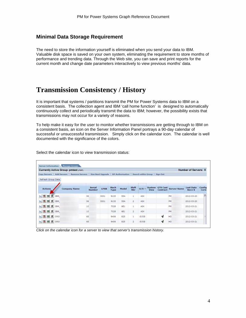
Minimal Data Storage Requirement
The need to store the information yourself is eliminated when you send your data to IBM. Valuable disk space is saved on your own system, eliminating the requirement to store months of performance and trending data. Through the Web site, you can save and print reports for the current month and change date parameters interactively to view previous months’ data.
Transmission Consistency / History
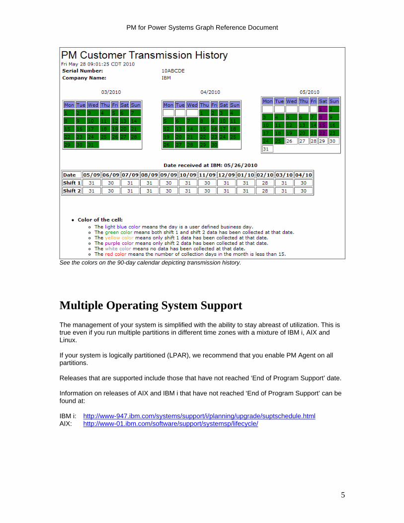
It is important that systems / partitions transmit the PM for Power Systems data to IBM on a consistent basis. The collection agent and IBM ‘call home function’ is designed to automatically continuously collect and periodically transmit the data to IBM; however, the possibility exists that transmissions may not occur for a variety of reasons. To help make it easy for the user to monitor whether transmissions are getting through to IBM on a consistent basis, an icon on the Server Information Panel portrays a 90-day calendar of successful or unsuccessful transmission. Simply click on the calendar icon. The calendar is well documented with the significance of the colors. Select the calendar icon to view transmission status:
Click on the calendar icon for a server to view that server’s transmission history.
4
PM for Power Systems Graph Reference Document
See the colors on the 90-day calendar depicting transmission history.
Multiple Operating System Support
The management of your system is simplified with the ability to stay abreast of utilization. This is true even if you run multiple partitions in different time zones with a mixture of IBM i, AIX and Linux. If your system is logically partitioned (LPAR), we recommend that you enable PM Agent on all partitions. Releases that are supported include those that have not reached ‘End of Program Support’ date. Information on releases of AIX and IBM i that have not reached ‘End of Program Support’ can be found at: IBM i: http://www-947.ibm.com/systems/support/i/planning/upgrade/suptschedule.html AIX: http://www-01.ibm.com/software/support/systemsp/lifecycle/
5
PM for Power Systems Graph Reference Document
Interface to the IBM Systems Workload Estimator
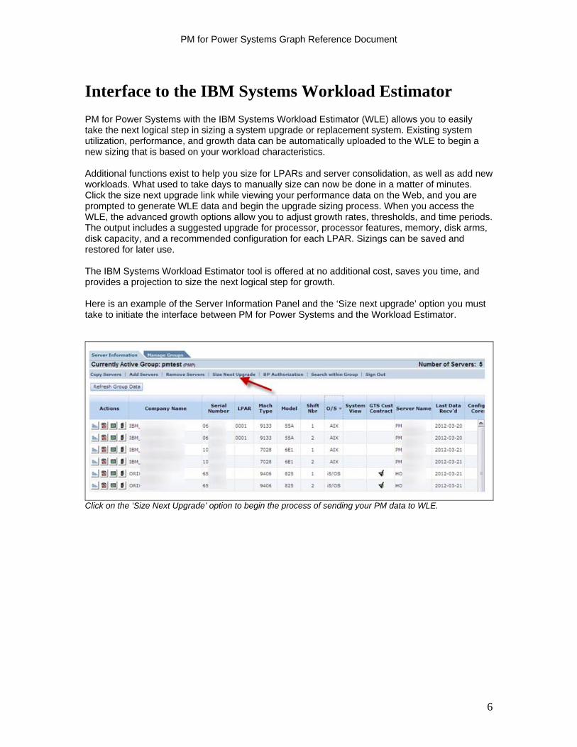
PM for Power Systems with the IBM Systems Workload Estimator (WLE) allows you to easily take the next logical step in sizing a system upgrade or replacement system. Existing system utilization, performance, and growth data can be automatically uploaded to the WLE to begin a new sizing that is based on your workload characteristics. Additional functions exist to help you size for LPARs and server consolidation, as well as add new workloads. What used to take days to manually size can now be done in a matter of minutes. Click the size next upgrade link while viewing your performance data on the Web, and you are prompted to generate WLE data and begin the upgrade sizing process. When you access the WLE, the advanced growth options allow you to adjust growth rates, thresholds, and time periods. The output includes a suggested upgrade for processor, processor features, memory, disk arms, disk capacity, and a recommended configuration for each LPAR. Sizings can be saved and restored for later use. The IBM Systems Workload Estimator tool is offered at no additional cost, saves you time, and provides a projection to size the next logical step for growth. Here is an example of the Server Information Panel and the ‘Size next upgrade’ option you must take to initiate the interface between PM for Power Systems and the Workload Estimator.
Click on the ‘Size Next Upgrade’ option to begin the process of sending your PM data to WLE.
6
PM for Power Systems Graph Reference Document
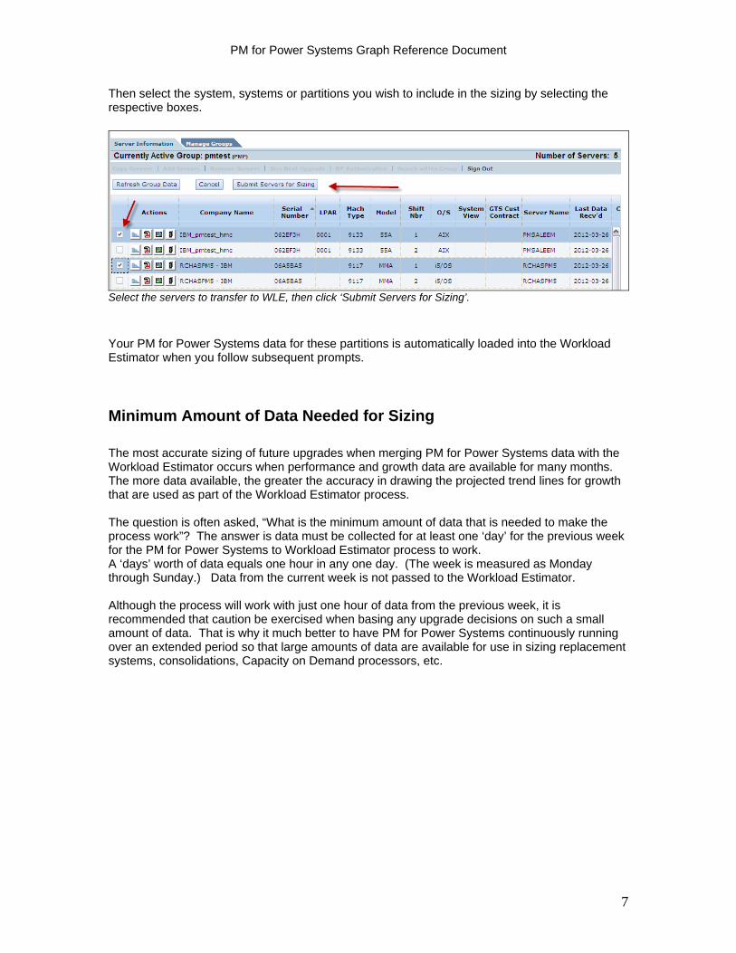
Then select the system, systems or partitions you wish to include in the sizing by selecting the respective boxes.
Select the servers to transfer to WLE, then click ‘Submit Servers for Sizing’.
Your PM for Power Systems data for these partitions is automatically loaded into the Workload Estimator when you follow subsequent prompts.
Minimum Amount of Data Needed for Sizing The most accurate sizing of future upgrades when merging PM for Power Systems data with the Workload Estimator occurs when performance and growth data are available for many months. The more data available, the greater the accuracy in drawing the projected trend lines for growth that are used as part of the Workload Estimator process. The question is often asked, “What is the minimum amount of data that is needed to make the process work”? The answer is data must be collected for at least one ‘day’ for the previous week for the PM for Power Systems to Workload Estimator process to work. A ‘days’ worth of data equals one hour in any one day. (The week is measured as Monday through Sunday.) Data from the current week is not passed to the Workload Estimator. Although the process will work with just one hour of data from the previous week, it is recommended that caution be exercised when basing any upgrade decisions on such a small amount of data. That is why it much better to have PM for Power Systems continuously running over an extended period so that large amounts of data are available for use in sizing replacement systems, consolidations, Capacity on Demand processors, etc.
7
PM for Power Systems Graph Reference Document
Levels of Service
PM for Power Systems offers two levels of service: a no additional charge offering (summary reports) and a full service offering (detailed reports). Brief descriptions follow. More information can be accessed by viewing the PM for Power Systems website: http://www.ibm.com/systems/power/support/perfmgmt
PM for Power Systems Summary Service (No Additional Charge) If your IBM Power System server is using the IBM Electronic Service Agent and / or an IBM management console with the call home function enabled, you receive the benefit of the Management Summary Graph at no additional charge. After you register the partition with the registration key that IBM provides, you can view the Performance Management summary reports via a standard Web browser. These reports are referred to as the Management Summary Graphs (or MSG). (See the Management Summary Graph examples under section 2 for AIX, and section 3 for IBM i, later in this document.) You can monitor the CPU and disk attributes of the partition, measure capacity trends, and anticipate requirements at the partition level. You may also merge the previously collected PM historical data with the IBM Systems Workload Estimator to size needed upgrades, the impact of a Capacity on Demand processor, etc. Flexibility is also provided to arrange the information on specific partitions or systems in groups in the viewing tool, so as to make the information more meaningful to your operation.
PM for Power Systems Full Service (Fee Service) The following functions are provided in the PM for Power Systems full service. These reports services are in addition to the no-charge service features. The specific charges and/or packaging of this service are dependent on your local country. Contact your IBM Representative for more information or visit the contacts page on the PM for Power Systems homepage. Numerous detailed reports and graphs Numerous detailed reports and graphs, available through an IBM Global Technology Services offering, provide the detailed information you need to clearly visualize the growth of your system, and to help diagnose existing performance problems. Examples of the reports for IBM I, AIX and Linux can be found at the bottom of the PM for Power Systems homepage, or in sections 2, 3 and 4 of this reference document.
8
PM for Power Systems Graph Reference Document
Functions Available to both ‘No Additional Charge’ and ‘Fee’ Service
Monthly .pdf of Detailed Reports A .pdf of your entire report package is generated monthly by partition or, if special configuration options are taken, by processor pool or total system view. It is viewable and downloadable from the web site via your personalized secure password.
Customizable Graphs PM for Power Systems provides the user the ability to customize the reports and graphs by changing the time period, e.g. instead of looking at a 30 day view, you can drill down to a 7 day view, or even a daily view of the same information.
Additionally, the user has access to up to 24 months of history to re-draw the same graph from a historical perspective, providing the system or partition has been transmitting PM for Power Systems data consistently.
IBM Hardware and Software Supported
PM for Power Systems is supported on all versions and releases of IBM AIX and IBM i that have not reached the ‘End of Program Support’ date. The End of Program Support dates can be found at: IBM i: http://www-947.ibm.com/systems/support/i/planning/upgrade/suptschedule.html IBM AIX: http://www-01.ibm.com/software/support/systemsp/lifecycle/ Linux: PMLinux is treated differently as it is a ‘non supported’ product in the traditional sense. Questions and answers are provided via a blog. PM data collection, data processing and report generation requires a minimum of RedHat Version 5 and / or SUSE Version 10. Notice will be posted on the PM for Power Systems web site and blog when reports for a respective release are no longer available Access to the PMLinux support blog:
https://www.ibm.com/developerworks/mydeveloperworks/groups/service/forum/topics?communityUuid=fe313521-2e95-46f2-817d-44a4f27eba32
Look for the topic ‘Performance Management Agent for IBM PowerLinux’. To understand what models of IBM Power Systems™, IBM System i®, and IBM System p® hardware that PM for Power Systems runs on, visit the PM for Power Systems home page under the paragraph titled ‘What releases and models are supported?’ at: http://www-03.ibm.com/systems/power/support/perfmgmt/
9
PM for Power Systems Graph Reference Document
Report Calculation Principles and Definitions
The Difference Between Average and Peak Average By default, operating statistics are summarized and averaged every 15 minutes under normal operation. Average and peak average statistics are collected and presented in the PM for Power Systems reports as:
Average The average figures represent the average of all the 15 minute utilization summaries, across each shift of each day included in the reporting period.
Peak Average
The peak average figures represent the averages of the utilization summaries for the highest two hour period for each shift of each day of the reporting period. Usually the performance constraints occur during this time period.
The Manner in which Trends are Calculated The PM for Power Systems trend calculations are made using linear regression analysis and are based on up to twelve months of historical data. Predictions are still produced if less than one year’s worth of data is available; however a minimum of three months data is required. Note: The accuracy of these predictions depends on the information that is available. The use of regression analysis in a rapidly changing environment can tend to disguise sudden changes away from the trend. PM for Power Systems includes trend lines for processor and disk utilization based on the previous three and six months of historical data for this reason, in addition to twelve months. This allows you to more easily see rapid changes in utilization over a short period of time and to evaluate your growth and business needs based on your most recent information. Normalization is the basis on which PM for Power Systems reports are calculated. It takes into account configuration changes, either to the system or to a logical partition (LPAR) during the reporting period. The basis used for all historical and predicted data is the relative commercial processing workload (CPW) in the case of IBM i, and rperfs in the case of AIX. All models of Power Systems have a performance value that represents the relative amount of processing which can be performed by that model. Using this normalized value to plot workload demand allows you to see a more accurate reflection of your workload changes even if a processor upgrade has taken place. It is also important in a logical partitioning environment to see the amount of processing power being used across (dynamic) partitions. For Linux systems, processor seconds is used as the normalized variable.
Note: The percentages shown on the reports are based on the configuration of the system or LPAR at the end of the last 15 minute period of the month of the reporting period. This can lead to reports showing in excess of 100% utilization when the resource assigned at this time is less than during other periods of the reporting period.
10

PM for Power Systems Graph Reference Document
Other Definitions Hourly Peaks: on several of the graphs, the term Hourly Peak Max is used. This should be interpreted the following way: If the graph is an hourly graph of any type, the hourly peak is for the single worst hour If the graph is a memory graph of any type, the hourly peak is always for the single worst
hour If the graph is a daily graph (other than a memory graph), the hourly peak is an average of
the two peak hours If the graph is a weekly or monthly graph, the hourly peak is always an average of the two
peak hours averaged during the shift for the period
Interactive Capacity Utilization on IBM i: This is a comparison of utilization for jobs coded i (interactive) versus the total Interactive capacity of the server or partition (as defined by the Interactive feature card, IBM i Edition or partition allocation). System and Interactive on IBM i: This is a comparison of Interactive plus OS utilization versus total processing capacity for the server or partition. Total Utilization on IBM i: This is a ratio of the sum of utilization for IBM i plus the Interactive utilization plus the Batch utilization versus the total processing capacity of the server or partition. Total utilization on AIX: This is a ratio of the sum of the AIX operating system plus User jobs utilization versus the total processing capacity for the server or partition. Additional clarification Weekly/Monthly Average: Average of all daily averages during the week or month (Note: this includes only Customer Business days) Weekly/Monthly Peak Average: Average of all daily peak averages during the week or month (Note: this includes only Customer Business days) Weekly/Monthly Peak Max: Highest peak average in a single day in a shift (Note: this includes only Customer Business days)
11
PM for Power Systems Graph Reference Document
Terms and Conditions
What am I agreeing to upon PM for Power Systems activation?
Data Collection PM for Power Systems uses performance and capacity information from the Power Systems platform. (This includes both System i and System p.) The data collected is system utilization and performance information as well as hardware configuration information. This data is collected by the collection services functions available with IBM i and AIX operating systems. Once the data is collected, PM Agent processes the data and prepares it for transmission to IBM for future analysis and report generation.
Data Availability to IBM You agree that IBM may use and share the data collected by PM for Power Systems within the IBM enterprise without limitation, including for purposes of problem determination, of assisting you with performance and capacity planning, of maintaining your existing and new business relationships with IBM, of notifying you of existing or projected resource constraints, and to assist us to enhance IBM products. You also agree that your data may be transferred to such entities in any country whether or not a member of the European Union.
Data Availability to Solution Providers and Business Partners You may authorize IBM to share your data with various third parties, including one or more solution providers and Business Partners to make them aware of your performance and capacity demands and to enable them to provide you with a higher level of service. You may complete the authorization process online for your selected Solution Providers and/or Business Partners. See the section below on Authorizing IBM Business Partners to View Graphs for further explanation and examples. You may also learn more at: Business Partner Performance Management Data Release Form Instructions
Warranty/Liability This material is provided "AS IS" without warranty of any kind, either express or implied, including, but not limited to, the implied warranties of merchantability, fitness for a particular purpose, or non-infringement. Some jurisdictions do not allow the exclusion of implied warranties, so the above exclusion may not apply to you. In no event will IBM be liable to any party for any direct, indirect, special or other consequential damages for any use of this material including, without limitation, any lost profits, business interruptions, loss of programs or other data on your information handling system or otherwise, even if we are expressly advised of the possibility of such damages.
Additional Terms and Conditions For additional information on country-specific detail report service offerings refer to the IBM Representative Contact List.
12
PM for Power Systems Graph Reference Document
Accessing the PM for Power Systems Graphs
Accessing the specific LPAR or system graphs after PM for Power Systems has been activated for transmission involves having:
- an IBM Web ID - registering the partition to a ‘group’ - accessing the PM for Power Systems web site - selecting either the Interactive or .pdf icon to view graphs
It is critical that a valid email address and other contact information be provided for each partition that is transmitting PM for Power Systems data. This is necessary so that IBM can send the customer the registration key they will need to assign the partition to a group for subsequent viewing of reports. The email address is entered and maintained by the customer on their respective systems / partitions. Please see the website topic ‘Contact Information / Registration Keys’ for more information on this process. http://www-03.ibm.com/systems/power/support/perfmgmt/getstarted.html
IBM Web ID and password
To access the entitled graphs, both the No Additional Charge (summary level) and Fee Service (detail level) reports, the user is required to have an IBM Web ID with password, and access to a browser.
IBM Web IDs and passwords, if the user does not currently have one, are available for request at: https://www.ibm.com/account/profile/
Registering the Partition to a ‘Group’
Once a respective partition has transmitted data for the first time, the PM for Power Systems process will email the client a registration key for the respective partition. It is the user’s responsibility to log into the PM for Power Systems graph site at:
https://pmeserver.rochester.ibm.com/PMServerInfo/loginPage.jsp
and register the partition to a group. This must be done before any subsequent graphs are viewable.
Instructions for registering a partition are self-documented in the registering process. Simply follow the ‘tabs’ for registering the partition to an existing or new ‘group’.
Additional information on scenarios of needing a registration key resent to you are documented on the website at: (See topic: Contact Information / Registration Keys)
13
PM for Power Systems Graph Reference Document
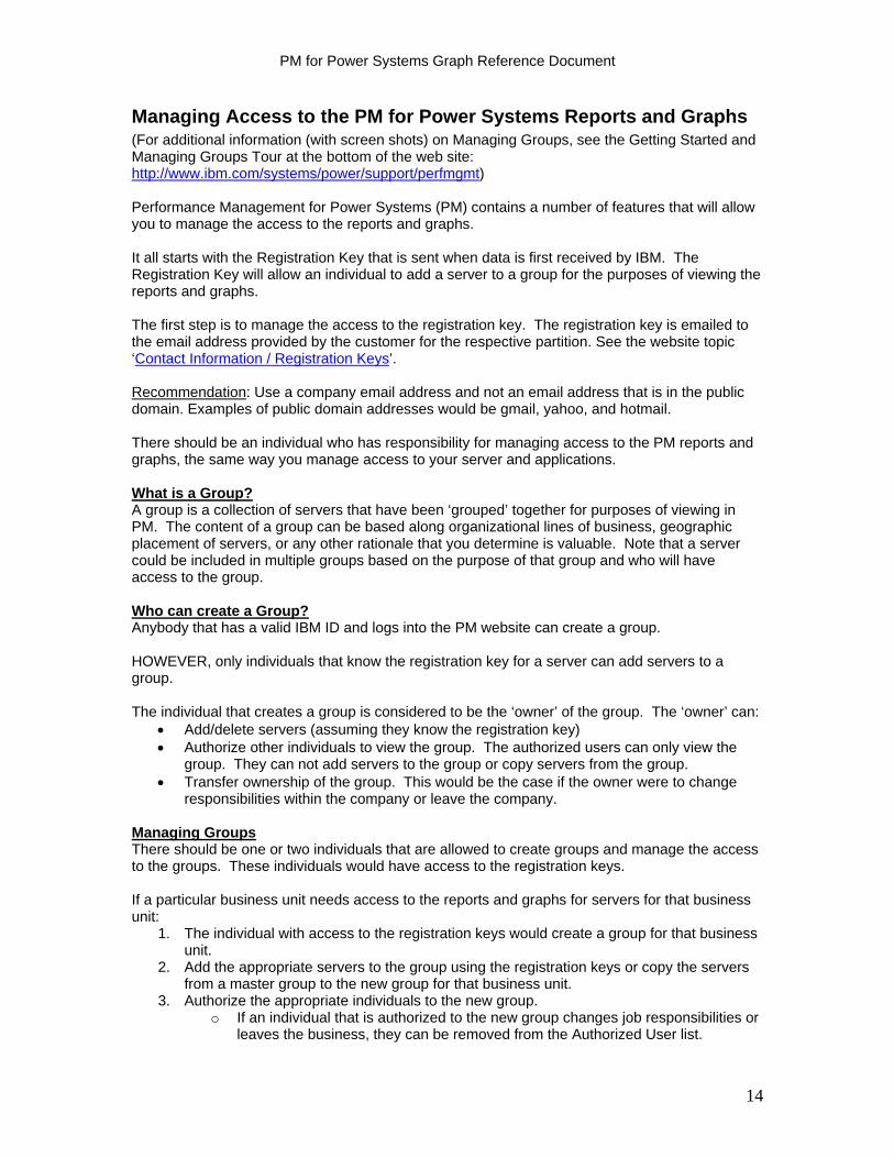
Managing Access to the PM for Power Systems Reports and Graphs (For additional information (with screen shots) on Managing Groups, see the Getting Started and Managing Groups Tour at the bottom of the web site: http://www.ibm.com/systems/power/support/perfmgmt) Performance Management for Power Systems (PM) contains a number of features that will allow you to manage the access to the reports and graphs. It all starts with the Registration Key that is sent when data is first received by IBM. The Registration Key will allow an individual to add a server to a group for the purposes of viewing the reports and graphs. The first step is to manage the access to the registration key. The registration key is emailed to the email address provided by the customer for the respective partition. See the website topic ‘Contact Information / Registration Keys’. Recommendation: Use a company email address and not an email address that is in the public domain. Examples of public domain addresses would be gmail, yahoo, and hotmail. There should be an individual who has responsibility for managing access to the PM reports and graphs, the same way you manage access to your server and applications. What is a Group? A group is a collection of servers that have been ‘grouped’ together for purposes of viewing in PM. The content of a group can be based along organizational lines of business, geographic placement of servers, or any other rationale that you determine is valuable. Note that a server could be included in multiple groups based on the purpose of that group and who will have access to the group. Who can create a Group? Anybody that has a valid IBM ID and logs into the PM website can create a group. HOWEVER, only individuals that know the registration key for a server can add servers to a group. The individual that creates a group is considered to be the ‘owner’ of the group. The ‘owner’ can:
Add/delete servers (assuming they know the registration key) Authorize other individuals to view the group. The authorized users can only view the
group. They can not add servers to the group or copy servers from the group. Transfer ownership of the group. This would be the case if the owner were to change
responsibilities within the company or leave the company. Managing Groups There should be one or two individuals that are allowed to create groups and manage the access to the groups. These individuals would have access to the registration keys. If a particular business unit needs access to the reports and graphs for servers for that business unit:
1. The individual with access to the registration keys would create a group for that business unit.
2. Add the appropriate servers to the group using the registration keys or copy the servers from a master group to the new group for that business unit.
3. Authorize the appropriate individuals to the new group. o If an individual that is authorized to the new group changes job responsibilities or
leaves the business, they can be removed from the Authorized User list.
14
PM for Power Systems Graph Reference Document
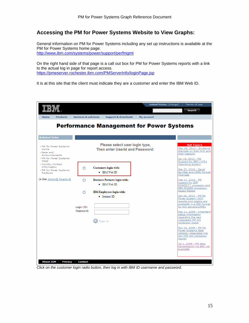
Accessing the PM for Power Systems Website to View Graphs: General information on PM for Power Systems including any set up instructions is available at the PM for Power Systems home page: http://www.ibm.com/systems/power/support/perfmgmt
On the right hand side of that page is a call out box for PM for Power Systems reports with a link to the actual log in page for report access. https://pmeserver.rochester.ibm.com/PMServerInfo/loginPage.jsp
It is at this site that the client must indicate they are a customer and enter the IBM Web ID.
Click on the customer login radio button, then log in with IBM ID username and password.
15
PM for Power Systems Graph Reference Document
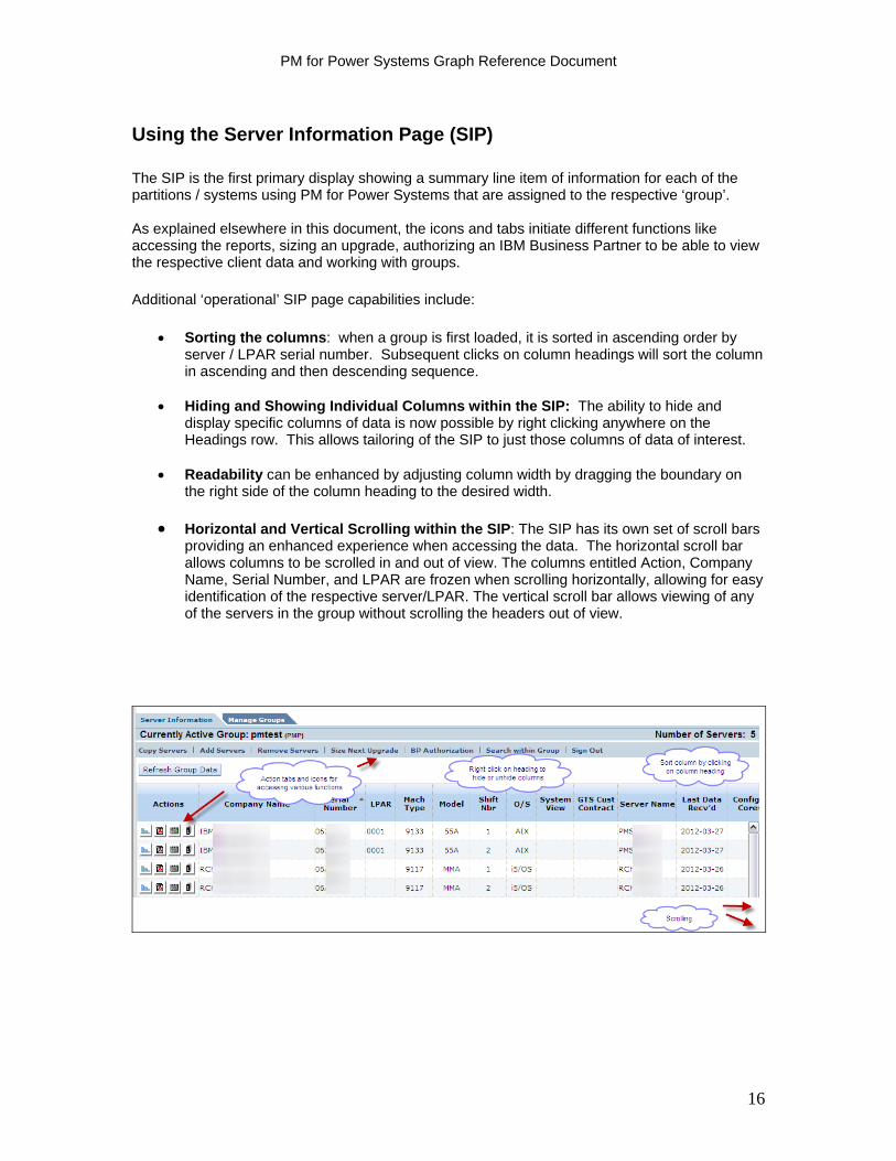
Using the Server Information Page (SIP) The SIP is the first primary display showing a summary line item of information for each of the partitions / systems using PM for Power Systems that are assigned to the respective ‘group’. As explained elsewhere in this document, the icons and tabs initiate different functions like accessing the reports, sizing an upgrade, authorizing an IBM Business Partner to be able to view the respective client data and working with groups. Additional ‘operational’ SIP page capabilities include:
Sorting the columns: when a group is first loaded, it is sorted in ascending order by server / LPAR serial number. Subsequent clicks on column headings will sort the column in ascending and then descending sequence.
Hiding and Showing Individual Columns within the SIP: The ability to hide and
display specific columns of data is now possible by right clicking anywhere on the Headings row. This allows tailoring of the SIP to just those columns of data of interest.
Readability can be enhanced by adjusting column width by dragging the boundary on
the right side of the column heading to the desired width.
Horizontal and Vertical Scrolling within the SIP: The SIP has its own set of scroll bars providing an enhanced experience when accessing the data. The horizontal scroll bar allows columns to be scrolled in and out of view. The columns entitled Action, Company Name, Serial Number, and LPAR are frozen when scrolling horizontally, allowing for easy identification of the respective server/LPAR. The vertical scroll bar allows viewing of any of the servers in the group without scrolling the headers out of view.
16
PM for Power Systems Graph Reference Document
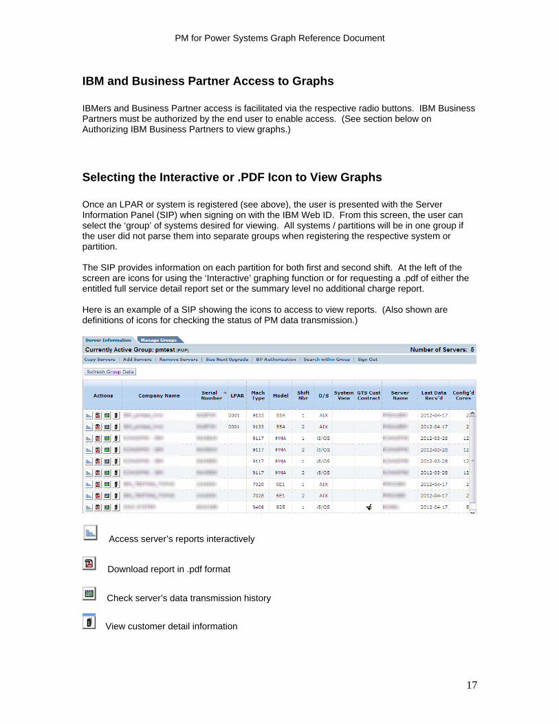
IBM and Business Partner Access to Graphs IBMers and Business Partner access is facilitated via the respective radio buttons. IBM Business Partners must be authorized by the end user to enable access. (See section below on Authorizing IBM Business Partners to view graphs.)
Selecting the Interactive or .PDF Icon to View Graphs Once an LPAR or system is registered (see above), the user is presented with the Server Information Panel (SIP) when signing on with the IBM Web ID. From this screen, the user can select the ‘group’ of systems desired for viewing. All systems / partitions will be in one group if the user did not parse them into separate groups when registering the respective system or partition. The SIP provides information on each partition for both first and second shift. At the left of the screen are icons for using the ‘Interactive’ graphing function or for requesting a .pdf of either the entitled full service detail report set or the summary level no additional charge report. Here is an example of a SIP showing the icons to access to view reports. (Also shown are definitions of icons for checking the status of PM data transmission.)
Access server’s reports interactively
Download report in .pdf format
Check server’s data transmission history
View customer detail information
17
PM for Power Systems Graph Reference Document
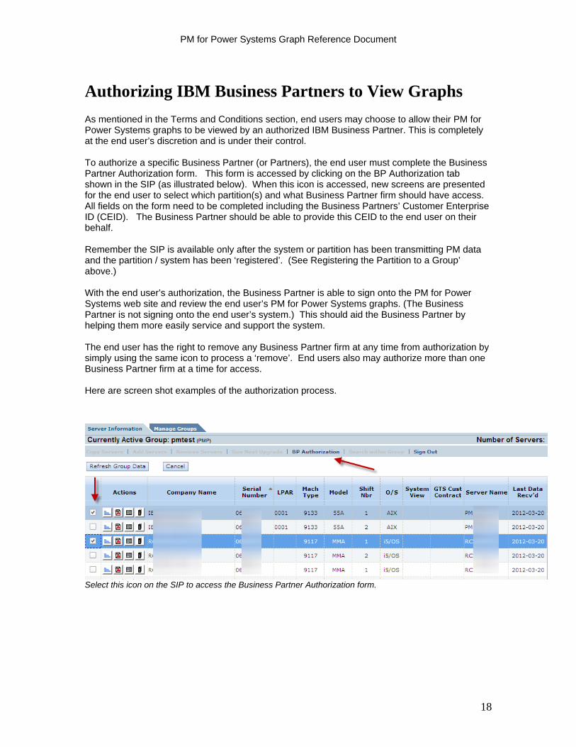
Authorizing IBM Business Partners to View Graphs
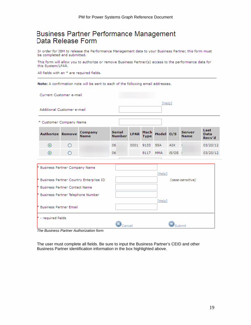
As mentioned in the Terms and Conditions section, end users may choose to allow their PM for Power Systems graphs to be viewed by an authorized IBM Business Partner. This is completely at the end user’s discretion and is under their control. To authorize a specific Business Partner (or Partners), the end user must complete the Business Partner Authorization form. This form is accessed by clicking on the BP Authorization tab shown in the SIP (as illustrated below). When this icon is accessed, new screens are presented for the end user to select which partition(s) and what Business Partner firm should have access. All fields on the form need to be completed including the Business Partners’ Customer Enterprise ID (CEID). The Business Partner should be able to provide this CEID to the end user on their behalf. Remember the SIP is available only after the system or partition has been transmitting PM data and the partition / system has been ‘registered’. (See Registering the Partition to a Group’ above.) With the end user’s authorization, the Business Partner is able to sign onto the PM for Power Systems web site and review the end user’s PM for Power Systems graphs. (The Business Partner is not signing onto the end user’s system.) This should aid the Business Partner by helping them more easily service and support the system. The end user has the right to remove any Business Partner firm at any time from authorization by simply using the same icon to process a ‘remove’. End users also may authorize more than one Business Partner firm at a time for access. Here are screen shot examples of the authorization process.
Select this icon on the SIP to access the Business Partner Authorization form.
18
PM for Power Systems Graph Reference Document
The Business Partner Authorization form The user must complete all fields. Be sure to input the Business Partner’s CEID and other Business Partner identification information in the box highlighted above.
19

PM for Power Systems Graph Reference Document
20
What to do for Questions
Questions of all nature can be directed to your IBM Representative or IBM Business Partner. The PM for Power Systems web site is a good source for additional information on many facets of the offering: When viewing a graph, often times hot links are available that link directly to the respective page in the Graph Reference Document for further explanation. http://www-03.ibm.com/systems/power/support/perfmgmt/
- For questions on the offering description - For questions on the terms and conditions - For questions on setting up PM for Power Systems
The FAQ’s can be particularly helpful. http://www-03.ibm.com/systems/power/support/perfmgmt/faq.html A country contacts page is provided for additional respective country information. http://www-03.ibm.com/systems/power/support/perfmgmt/contact.html
Section 2: AIX Interactive Graphs
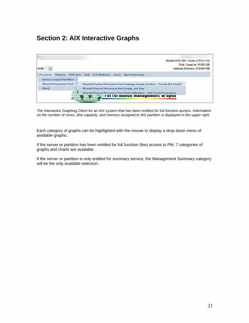
The Interactive Graphing Client for an AIX system that has been entitled for full function access. Information on the number of cores, disk capacity, and memory assigned to this partition is displayed in the upper right.
Each category of graphs can be highlighted with the mouse to display a drop down menu of available graphs. If the server or partition has been entitled for full function (fee) access to PM, 7 categories of graphs and charts are available. If the server or partition is only entitled for summary service, the Management Summary category will be the only available selection.
21
PM for Power Systems Graph Reference Document
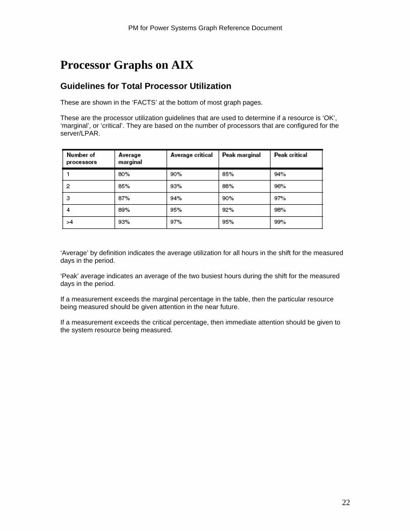
Processor Graphs on AIX
Guidelines for Total Processor Utilization These are shown in the ‘FACTS’ at the bottom of most graph pages. These are the processor utilization guidelines that are used to determine if a resource is ‘OK’, ‘marginal’, or ‘critical’. They are based on the number of processors that are configured for the server/LPAR.
‘Average’ by definition indicates the average utilization for all hours in the shift for the measured days in the period. ‘Peak’ average indicates an average of the two busiest hours during the shift for the measured days in the period. If a measurement exceeds the marginal percentage in the table, then the particular resource being measured should be given attention in the near future. If a measurement exceeds the critical percentage, then immediate attention should be given to the system resource being measured.
22
PM for Power Systems Graph Reference Document
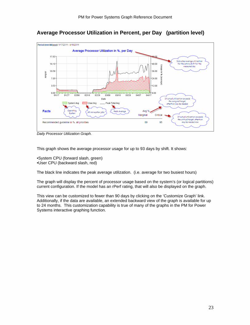
Average Processor Utilization in Percent, per Day (partition level)
Daily Processor Utilization Graph.
This graph shows the average processor usage for up to 93 days by shift. It shows: •System CPU (forward slash, green) •User CPU (backward slash, red) The black line indicates the peak average utilization. (i.e. average for two busiest hours) The graph will display the percent of processor usage based on the system’s (or logical partitions) current configuration. If the model has an rPerf rating, that will also be displayed on the graph. This view can be customized to fewer than 90 days by clicking on the ‘Customize Graph’ link. Additionally, if the data are available, an extended backward view of the graph is available for up to 24 months. This customization capability is true of many of the graphs in the PM for Power Systems interactive graphing function.
23
PM for Power Systems Graph Reference Document
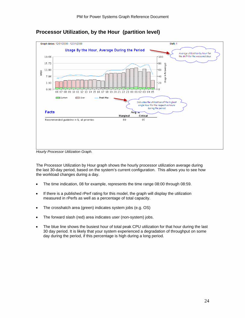
Processor Utilization, by the Hour (partition level)
Hourly Processor Utilization Graph. The Processor Utilization by Hour graph shows the hourly processor utilization average during the last 30-day period, based on the system’s current configuration. This allows you to see how the workload changes during a day. The time indication, 08 for example, represents the time range 08:00 through 08:59. If there is a published rPerf rating for this model, the graph will display the utilization
measured in rPerfs as well as a percentage of total capacity. The crosshatch area (green) indicates system jobs (e.g. OS) The forward slash (red) area indicates user (non-system) jobs. The blue line shows the busiest hour of total peak CPU utilization for that hour during the last
30 day period. It is likely that your system experienced a degradation of throughput on some day during the period, if this percentage is high during a long period.
24
PM for Power Systems Graph Reference Document
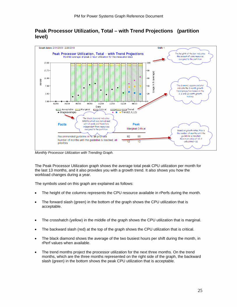
Peak Processor Utilization, Total – with Trend Projections (partition level)
Monthly Processor Utilization with Trending Graph. The Peak Processor Utilization graph shows the average total peak CPU utilization per month for the last 13 months, and it also provides you with a growth trend. It also shows you how the workload changes during a year. The symbols used on this graph are explained as follows: The height of the columns represents the CPU resource available in rPerfs during the month. The forward slash (green) in the bottom of the graph shows the CPU utilization that is
acceptable. The crosshatch (yellow) in the middle of the graph shows the CPU utilization that is marginal. The backward slash (red) at the top of the graph shows the CPU utilization that is critical. The black diamond shows the average of the two busiest hours per shift during the month, in
rPerf values when available. The trend months project the processor utilization for the next three months. On the trend
months, which are the three months represented on the right side of the graph, the backward slash (green) in the bottom shows the peak CPU utilization that is acceptable.
25

PM for Power Systems Graph Reference Document
On the trend months:
The pink diamond shows the calculated peak CPU utilization and projected growth based on the three last months utilization.
The blue square shows the calculated peak CPU utilization and projected growth based
on the last six months utilization. The yellow star shows the calculated peak CPU utilization and projected growth based on
the last 12 months of utilization. The advantage of plotting rPerfs, when available, is that rPerfs are a normalized unit of work independent of the resources allocated to the server/LPAR. This means that the black diamonds on the graph represent the workload trend independent of the resources allocated to the server/LPAR. Under the Facts, the number of months until the guideline is reached is a projection, based on current utilization and growth data, of the number of month’s growth remaining until the respective resource reaches guideline. If greater than or equal to 12 months, it is shown as 12 months.
26
PM for Power Systems Graph Reference Document
Percent of Time RunQ Over the Limit, Per Day (partition level)
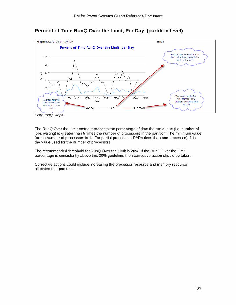
Daily RunQ Graph.
The RunQ Over the Limit metric represents the percentage of time the run queue (i.e. number of jobs waiting) is greater than 5 times the number of processors in the partition. The minimum value for the number of processors is 1. For partial processor LPARs (less than one processor), 1 is the value used for the number of processors. The recommended threshold for RunQ Over the Limit is 20%. If the RunQ Over the Limit percentage is consistently above this 20% guideline, then corrective action should be taken. Corrective actions could include increasing the processor resource and memory resource allocated to a partition.
27
PM for Power Systems Graph Reference Document
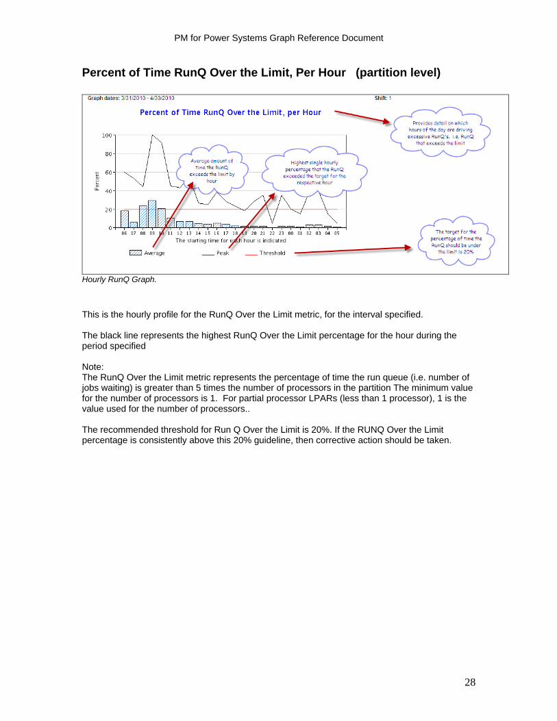
Percent of Time RunQ Over the Limit, Per Hour (partition level)
Hourly RunQ Graph.
This is the hourly profile for the RunQ Over the Limit metric, for the interval specified. The black line represents the highest RunQ Over the Limit percentage for the hour during the period specified Note: The RunQ Over the Limit metric represents the percentage of time the run queue (i.e. number of jobs waiting) is greater than 5 times the number of processors in the partition The minimum value for the number of processors is 1. For partial processor LPARs (less than 1 processor), 1 is the value used for the number of processors.. The recommended threshold for Run Q Over the Limit is 20%. If the RUNQ Over the Limit percentage is consistently above this 20% guideline, then corrective action should be taken.
28

PM for Power Systems Graph Reference Document
Shared Processor Pool Reporting
Customers who are subscribed to the detail IBM Global Services fee report offering and who also have configured their systems to create a shared processor pool, will now receive three different levels of shared processor reports for IBM AIX. Reports are provided showing 'total pool' utilization versus 'total pool' capacity:
1) in a monthly comparison for the last year including a 3, 6 and 12 month projection of future pool utilization
2) in a daily comparison for the last 90 days; and 3) in an hourly comparison for the last 30 days. Set up instructions for Shared Processor Pool Graphs When configuring PM for Power Systems on IBM AIX to support the Shared Processor Pool Graphs, please follow these instructions / requirements: Interim to the integration of this function into AIX, it is necessary to download and install the 'ifix' software that enables the function. This process includes 4 basic steps. Details of the steps can be found under the Getting Started - Activation Steps for AIX instructions on the main PM for Power Systems web site: (Look for the PM_AIX_Pools_ReadMeV6.txt file) http://www-03.ibm.com/systems/power/support/perfmgmt/activation.html The 4 basic steps necessary to enable this function are: 1) Determine the appropriate release of AIX for which the Shared Processor Pool ifix package is needed 2) Visit Developer Works web site to access the ifix package to download 3) Transfer the ifix package to the AIX server 4) Install the ifix package on the AIX server To enable shared pool graphs, customers must also select a new TOPAS option. From the command prompt, type: 'smit topas' ---> Setup Performance Management ---> Change/Show HMC Information and enter HMC name and user name. Please note: If all the processors on the AIX based system are assigned to the shared physical processor pool, then essentially the PM for Power Systems shared physical processor pool graph is a view of the entire system. Such a 'total system view' graph that would not require all processors be assigned to the pool is under consideration for future announcement. Report examples follow.
29
PM for Power Systems Graph Reference Document
Shared Physical Processor Pool Peak Utilization – with Trend Projections
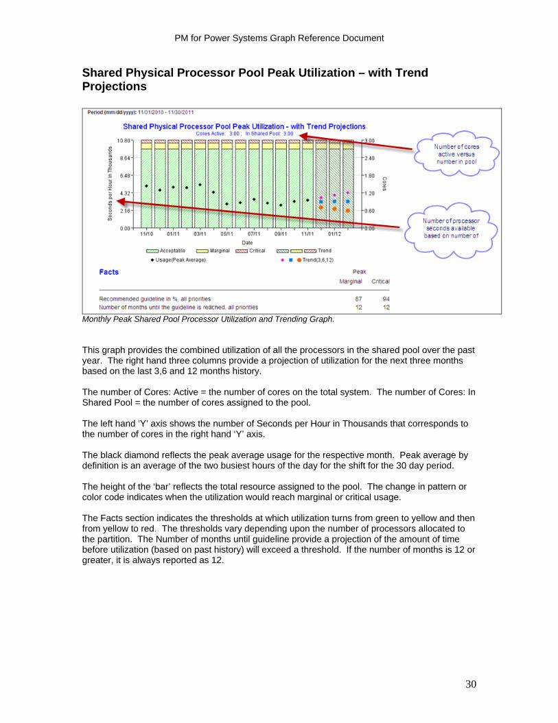
Monthly Peak Shared Pool Processor Utilization and Trending Graph. This graph provides the combined utilization of all the processors in the shared pool over the past year. The right hand three columns provide a projection of utilization for the next three months based on the last 3,6 and 12 months history. The number of Cores: Active = the number of cores on the total system. The number of Cores: In Shared Pool = the number of cores assigned to the pool. The left hand ‘Y’ axis shows the number of Seconds per Hour in Thousands that corresponds to the number of cores in the right hand ‘Y’ axis. The black diamond reflects the peak average usage for the respective month. Peak average by definition is an average of the two busiest hours of the day for the shift for the 30 day period. The height of the ‘bar’ reflects the total resource assigned to the pool. The change in pattern or color code indicates when the utilization would reach marginal or critical usage. The Facts section indicates the thresholds at which utilization turns from green to yellow and then from yellow to red. The thresholds vary depending upon the number of processors allocated to the partition. The Number of months until guideline provide a projection of the amount of time before utilization (based on past history) will exceed a threshold. If the number of months is 12 or greater, it is always reported as 12.
30
PM for Power Systems Graph Reference Document
Shared Physical Processor Pool Usage, per Day
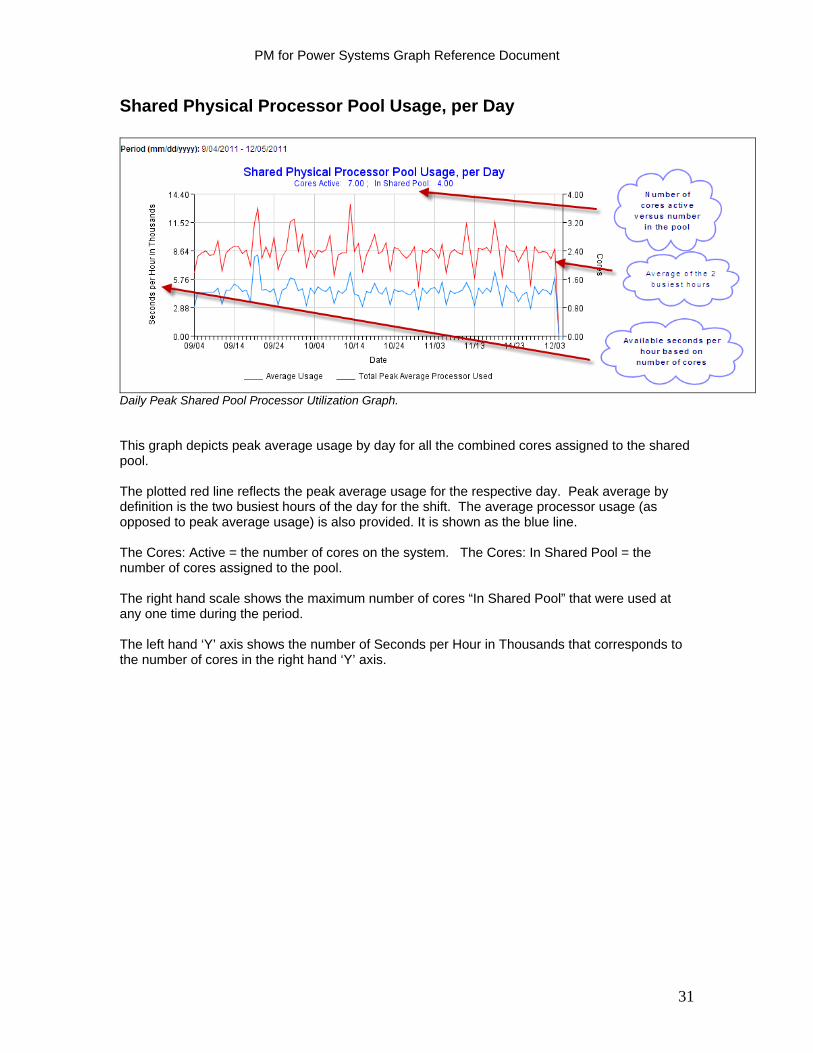
Daily Peak Shared Pool Processor Utilization Graph. This graph depicts peak average usage by day for all the combined cores assigned to the shared pool. The plotted red line reflects the peak average usage for the respective day. Peak average by definition is the two busiest hours of the day for the shift. The average processor usage (as opposed to peak average usage) is also provided. It is shown as the blue line. The Cores: Active = the number of cores on the system. The Cores: In Shared Pool = the number of cores assigned to the pool. The right hand scale shows the maximum number of cores “In Shared Pool” that were used at any one time during the period. The left hand ‘Y’ axis shows the number of Seconds per Hour in Thousands that corresponds to the number of cores in the right hand ‘Y’ axis.
31
PM for Power Systems Graph Reference Document
Shared Physical Processor Pool Average Usage, by Hour – During the Period
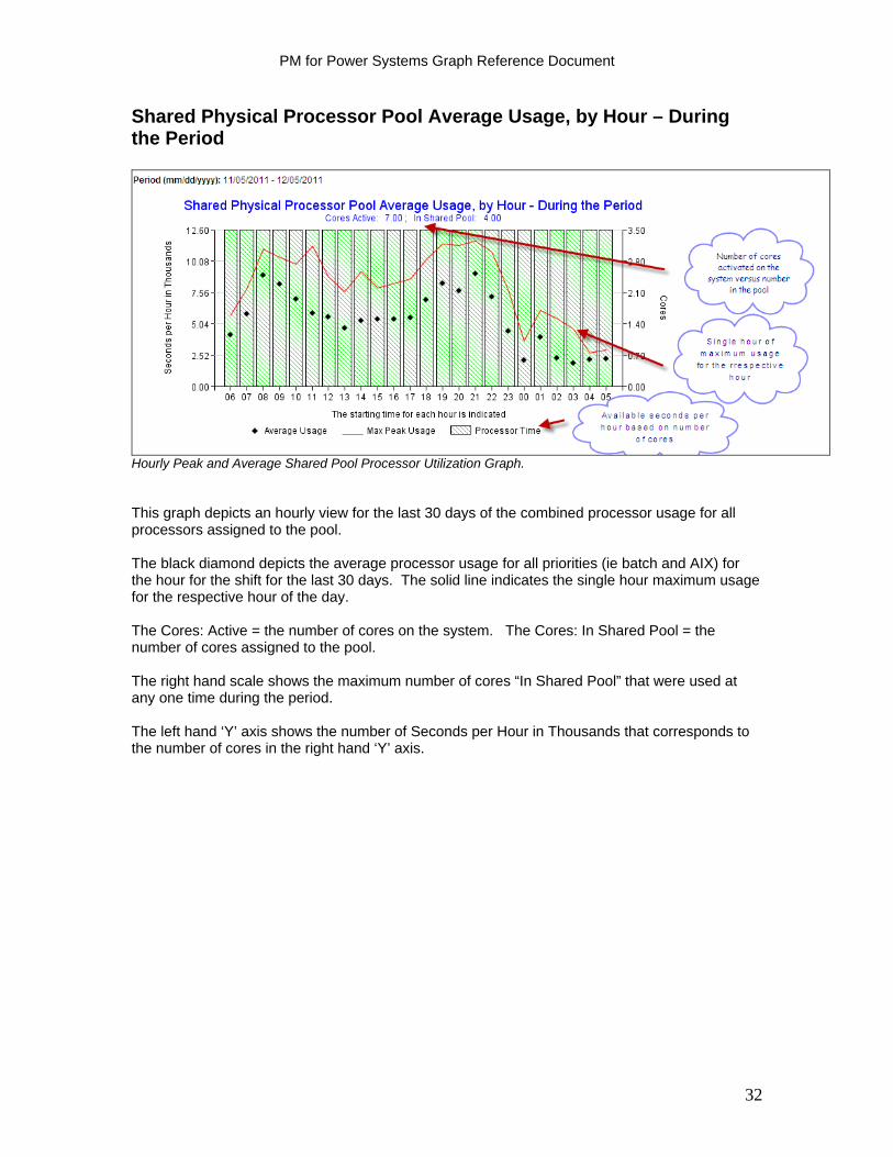
Hourly Peak and Average Shared Pool Processor Utilization Graph. This graph depicts an hourly view for the last 30 days of the combined processor usage for all processors assigned to the pool. The black diamond depicts the average processor usage for all priorities (ie batch and AIX) for the hour for the shift for the last 30 days. The solid line indicates the single hour maximum usage for the respective hour of the day. The Cores: Active = the number of cores on the system. The Cores: In Shared Pool = the number of cores assigned to the pool. The right hand scale shows the maximum number of cores “In Shared Pool” that were used at any one time during the period. The left hand ‘Y’ axis shows the number of Seconds per Hour in Thousands that corresponds to the number of cores in the right hand ‘Y’ axis.
32

PM for Power Systems Graph Reference Document
System View Graphs
This capability provides the end user with a single, consolidated view of processor utilization versus remaining available capacity across all processors and partitions on the system. This capability complements the prior PM for Power Systems reports, which show processor utilization at the partition level only, by providing the user a view of the system in its entirety plus a view of the individual partitions that make up the total system view. Only customers subscribed to the detail PM for Power Systems reports either in a stand alone contract or as part of services premium offering have access to the System View graphs. The System View graph types available are:
Configuration Graph: provides a pictorial of total cores on the system versus how many are activated. Of those cores activated, how they are allocated is shown. Monthly Graphs: provide a 12 month trend view of the entire system's utilization versus activated processor capacity. It also provides a view of the entire system's utilization versus a combination of the activated cores and capacity upgrade on demand cores.
Daily Graph: combines all the partitions on the system. The graph provides a total system view from both a combined CPU seconds perspective (average, peak average and maximum usage) and a combined core perspective.
Hourly Graph: provides a view of utilization by hour for the entire system. Prerequisites IBM Power 6 hardware or above If using HMC must be at Version 7.3.0 or above AIX release 6.1 TL 06 or higher; AIX release 7.1 TL 00 or higher Set up instructions are unique to software release and whether an HMC or FSM is being
used. Please see the System View and Shared Processor Pool instructions in the ReadMe posted on the website under the ‘Activating PM AIX Collection Agent’ twisty.
http://www-03.ibm.com/systems/power/support/perfmgmt/activation.html
Please note: Enabling shared processor pool and system view data collection will enable a specified partition to remotely execute commands on the HMC/FSM using SSH for gathering configuration and performance data of processor pool and other partitions.
33
PM for Power Systems Graph Reference Document
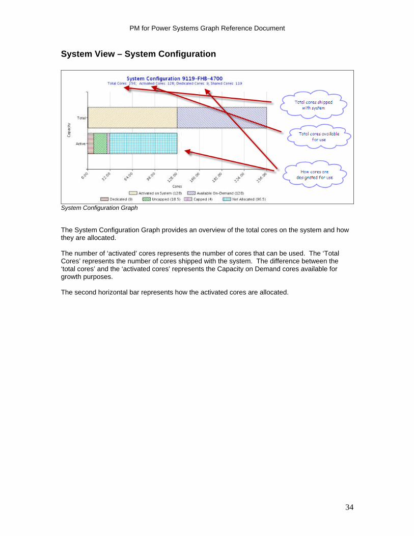
System View – System Configuration
System Configuration Graph The System Configuration Graph provides an overview of the total cores on the system and how they are allocated. The number of ‘activated’ cores represents the number of cores that can be used. The ‘Total Cores’ represents the number of cores shipped with the system. The difference between the ‘total cores’ and the ‘activated cores’ represents the Capacity on Demand cores available for growth purposes. The second horizontal bar represents how the activated cores are allocated.
34

PM for Power Systems Graph Reference Document
System View – Peak Total Processor Utilization – With Trend Projection
Monthly System View Peak Processor Usage Graph for all processors.
The System View – Peak Total Processor Utilization – with Trend Projection graph portrays the entire system’s peak average utilization (black diamond) against available activated (see green shade) processor cores. A perspective of remaining available processors (see purple shade above) on the system is shown through the Capacity on Demand processors. The left hand ‘Y’ axis shows the number of Seconds per Hour in Thousands that corresponds to the number of cores in the right hand ‘Y’ axis. The right hand three columns reflect projected growth or decline in utilization over the next 3 months based on the last 3, 6 and 12 month history. The 13 month trend provides perspective on total system utilization trends against total system capacity.
35

PM for Power Systems Graph Reference Document
System View – Peak Active Processor Utilization – With Trend Projection
Monthly System View Peak Processor Usage Graph for active processors.
The System View – Peak Active Processor Utilization – with Trend Projection graph provides a 13 month view of peak average utilization as shown against total capacity of the activated processors and partitions on the system. The height of the bar reflects the total activated processors for the month. The green, yellow and red color coding reflects performance utilization thresholds for good (green), cautionary (yellow) or needs immediate attention (red). These target thresholds vary based on the total number of processors activated on the system. The black diamond’s position in relation to the ‘green / yellow / red’ threshold colors indicates the status of current performance. The right hand three columns reflect projected growth or decline in utilization over the next 3 months based on the last 3, 6 and 12 month history.
36

PM for Power Systems Graph Reference Document
System View – Processor Utilization Per Day During the Period
Daily System View Peak Processor Usage Graph.
The System View – Processor Utilization Per Day During the Period graph combines all the partitions on the system to show both a combined CPU seconds perspective (left hand legend) and combined core perspective (right hand legend) of overall system utilization at a daily interval. The left hand ‘Y’ axis shows the number of Seconds per Hour in Thousands that corresponds to the number of cores in the right hand ‘Y’ axis. Both the ‘average per day’ (average for the shift) and ‘peak average’ (average for the 2 busiest hours during the shift) are shown. The ‘max usage’ red line indicates the single greatest hourly usage interval for the day.
37

PM for Power Systems Graph Reference Document
System View – Hourly Average During the Period
Hourly System View Average Processor Usage Graph.
The System View – Hourly Average During the Period provides a view of combined CPU utilization for the respective hour across all partitions and cores. The left hand ‘Y’ axis shows the number of Seconds per Hour in Thousands that corresponds to the number of cores in the right hand ‘Y’ axis. The hours on the graph begin at 6:00 a.m. The green shaded area reflects activated cores; the purple shaded area reflects the number of cores remaining on the system for capacity on demand expansion.
38
PM for Power Systems Graph Reference Document
Memory Graphs
Memory Usage in Percent, per Day (partition level)
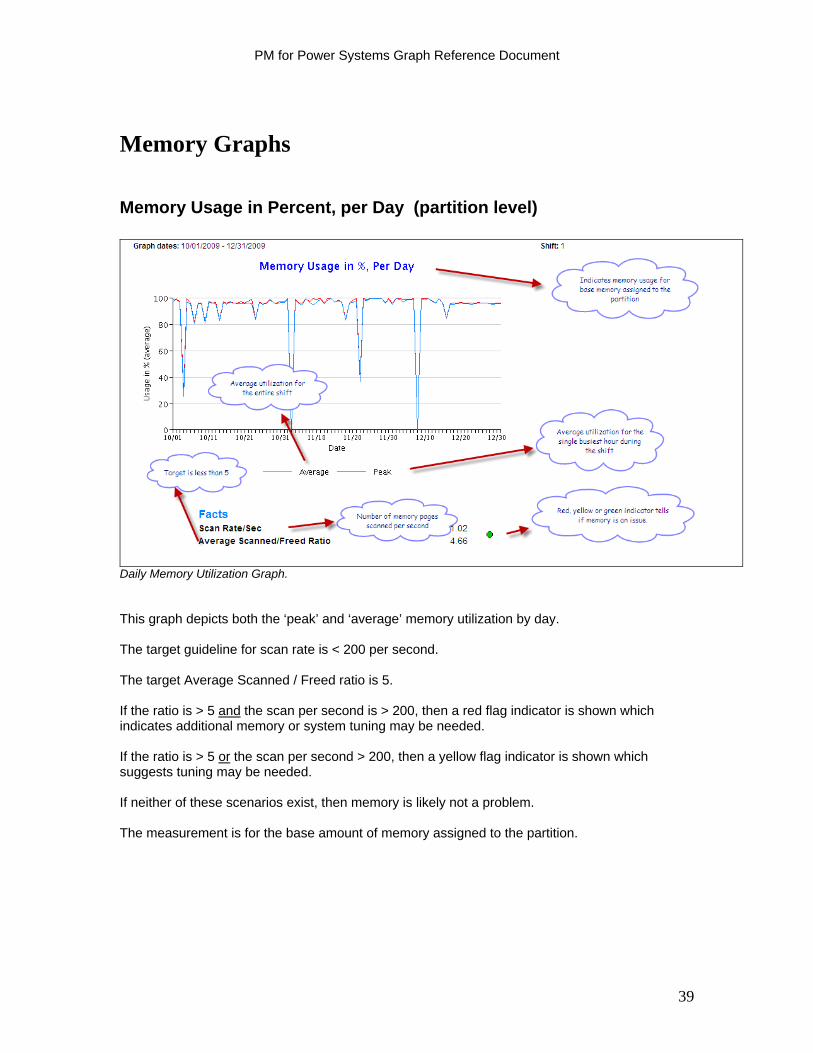
Daily Memory Utilization Graph. This graph depicts both the ‘peak’ and ‘average’ memory utilization by day. The target guideline for scan rate is < 200 per second. The target Average Scanned / Freed ratio is 5. If the ratio is > 5 and the scan per second is > 200, then a red flag indicator is shown which indicates additional memory or system tuning may be needed. If the ratio is > 5 or the scan per second > 200, then a yellow flag indicator is shown which suggests tuning may be needed. If neither of these scenarios exist, then memory is likely not a problem. The measurement is for the base amount of memory assigned to the partition.
39
PM for Power Systems Graph Reference Document
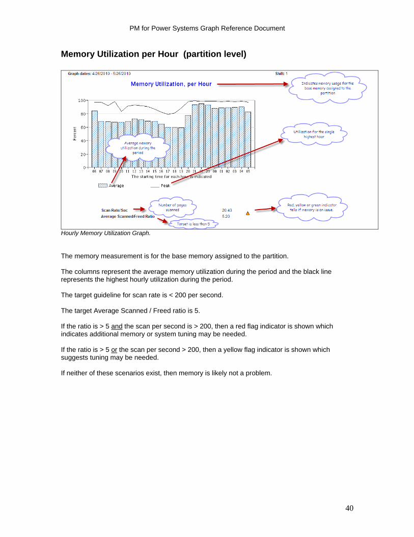
Memory Utilization per Hour (partition level)
Hourly Memory Utilization Graph. The memory measurement is for the base memory assigned to the partition. The columns represent the average memory utilization during the period and the black line represents the highest hourly utilization during the period. The target guideline for scan rate is < 200 per second. The target Average Scanned / Freed ratio is 5. If the ratio is > 5 and the scan per second is > 200, then a red flag indicator is shown which indicates additional memory or system tuning may be needed. If the ratio is > 5 or the scan per second > 200, then a yellow flag indicator is shown which suggests tuning may be needed. If neither of these scenarios exist, then memory is likely not a problem.
40
PM for Power Systems Graph Reference Document
Disk Arm Graphs
Peak Disk Arm Utilization in % - Per Day (partition level)
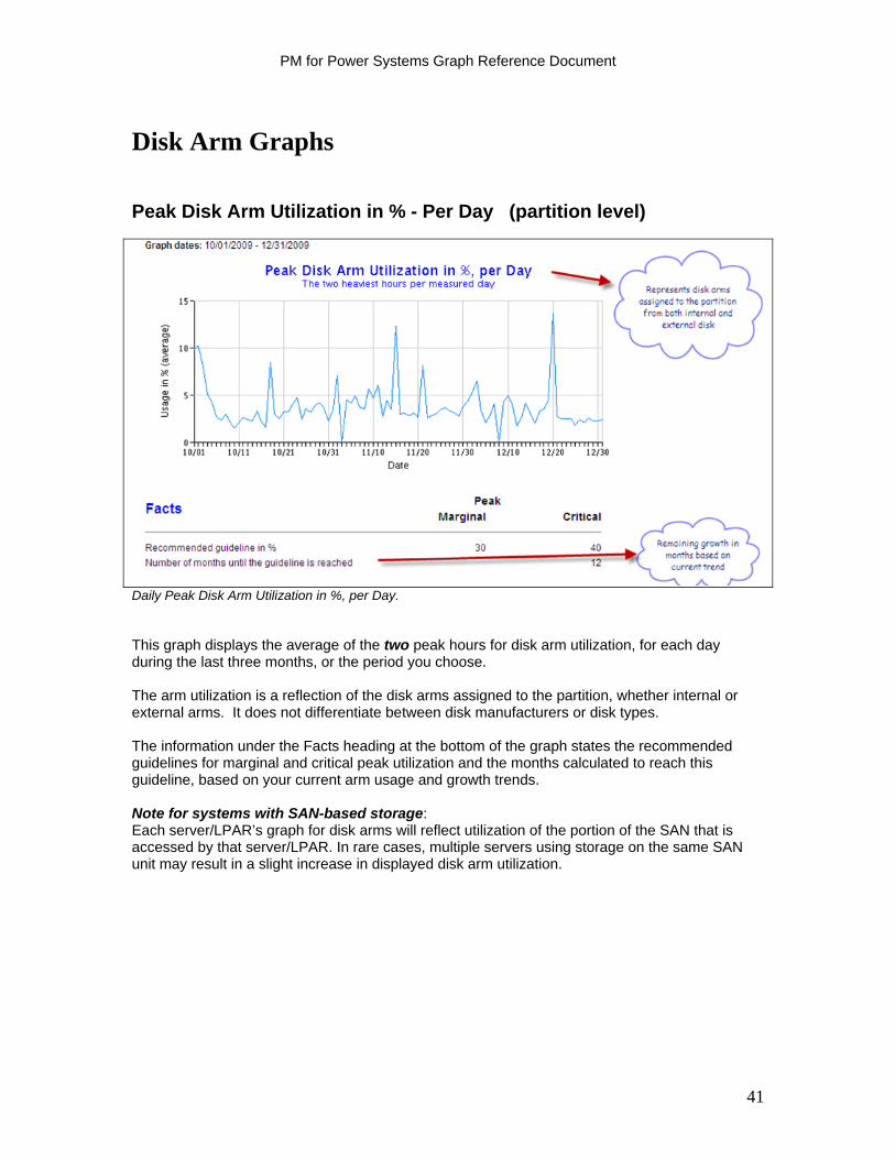
Daily Peak Disk Arm Utilization in %, per Day. This graph displays the average of the two peak hours for disk arm utilization, for each day during the last three months, or the period you choose. The arm utilization is a reflection of the disk arms assigned to the partition, whether internal or external arms. It does not differentiate between disk manufacturers or disk types. The information under the Facts heading at the bottom of the graph states the recommended guidelines for marginal and critical peak utilization and the months calculated to reach this guideline, based on your current arm usage and growth trends. Note for systems with SAN-based storage: Each server/LPAR’s graph for disk arms will reflect utilization of the portion of the SAN that is accessed by that server/LPAR. In rare cases, multiple servers using storage on the same SAN unit may result in a slight increase in displayed disk arm utilization.
41
PM for Power Systems Graph Reference Document
Disk Arm Utilization by Hour (partition level)
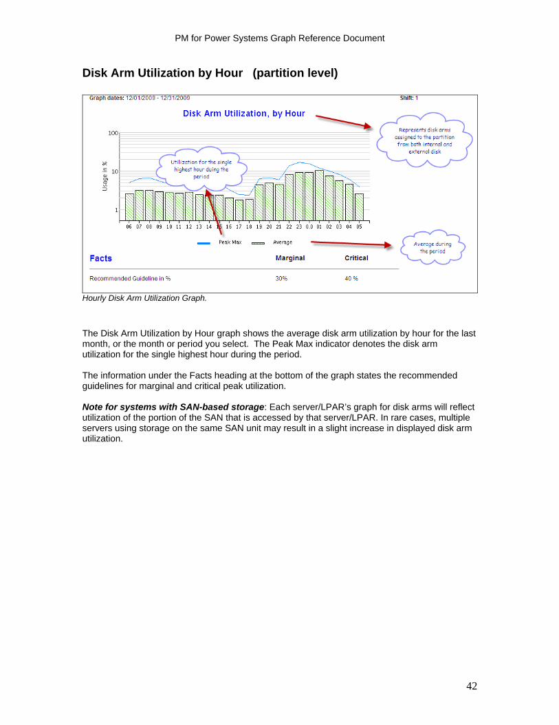
Hourly Disk Arm Utilization Graph.
The Disk Arm Utilization by Hour graph shows the average disk arm utilization by hour for the last month, or the month or period you select. The Peak Max indicator denotes the disk arm utilization for the single highest hour during the period. The information under the Facts heading at the bottom of the graph states the recommended guidelines for marginal and critical peak utilization. Note for systems with SAN-based storage: Each server/LPAR’s graph for disk arms will reflect utilization of the portion of the SAN that is accessed by that server/LPAR. In rare cases, multiple servers using storage on the same SAN unit may result in a slight increase in displayed disk arm utilization.
42

PM for Power Systems Graph Reference Document
Peak Disk Arm Utilization in Percent - with Trend Projections (partition level)
Monthly Peak Disk Arm Utilization with Trending Graph.
This graph shows the average peak disk arm utilization for up to 13 months, and a 3, 6 and 12 month trend projection for the two busiest hours per measured day during the period. The trend months are the three last months shown at the right of the graph. Because each displayed value is an average, the actual values during each month can be higher or lower than what is indicated on the graph. Note for systems with SAN-based storage: Each server/LPAR’s graph for disk arms will reflect utilization of the portion of the SAN which is accessed by that server/LPAR. In rare cases, multiple servers using storage on the same SAN unit may result in a slight increase in displayed disk arm utilization. The Facts section indicates the thresholds at which utilization turns from green to yellow and then from yellow to red. The Number of months until guideline provide a projection of the amount of time before utilization (based on past history) will exceed a threshold. If the number of months is 12 or greater, it is always reported as 12.
43
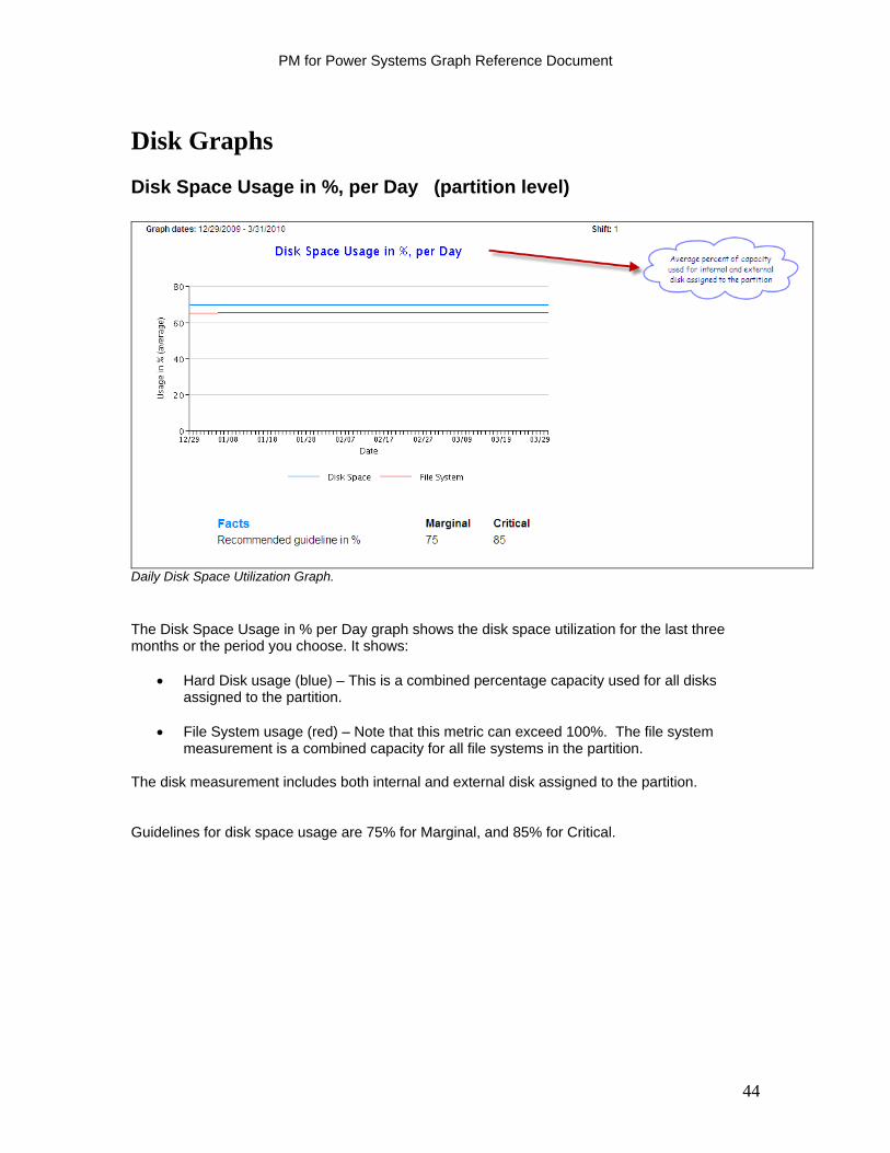
PM for Power Systems Graph Reference Document
Disk Graphs
Disk Space Usage in %, per Day (partition level)
Daily Disk Space Utilization Graph.
The Disk Space Usage in % per Day graph shows the disk space utilization for the last three months or the period you choose. It shows:
Hard Disk usage (blue) – This is a combined percentage capacity used for all disks assigned to the partition.
File System usage (red) – Note that this metric can exceed 100%. The file system
measurement is a combined capacity for all file systems in the partition. The disk measurement includes both internal and external disk assigned to the partition. Guidelines for disk space usage are 75% for Marginal, and 85% for Critical.
44

PM for Power Systems Graph Reference Document
Disk Space Usage in MB – with Trend Projections (partition level)
Monthly Disk Space Utilization with Trending Graph.
This graph shows the monthly disk space utilization for the specified range, up to twelve months. The height of the columns reflects the total internal and external disk assigned to the partition. It also displays the projected usage for the following three months based on usage trends over the last 3, 6, and 12 months. Guidelines for disk space usage are 75% for Marginal, and 85% for Critical. The Facts section indicates the thresholds at which utilization turns from green to yellow and then from yellow to red. The Number of months until guideline provide a projection of the amount of time before utilization (based on past history) will exceed a threshold. If the number of months is 12 or greater, it is always reported as 12.
45

PM for Power Systems Graph Reference Document
File System Usage in MB – with Trend Projections (partition level)
Monthly File System Usage with Trending Graph.
This graph shows the monthly file system utilization for the specified range, up to twelve months. It also displays the projected usage for the following three months based on usage trends over the last 3, 6, and 12 months. The graph depicts a consolidation of all file systems created in the partition. Guidelines for file system usage are 75% for Marginal, and 85% for Critical. The Facts section indicates the thresholds at which utilization turns from green to yellow and then from yellow to red. The Number of months until guideline provide a projection of the amount of time before utilization (based on past history) will exceed a threshold. If the number of months is 12 or greater, it is always reported as 12.
46
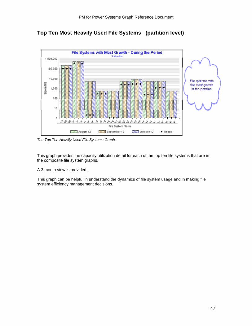
PM for Power Systems Graph Reference Document
Top Ten Most Heavily Used File Systems (partition level)
The Top Ten Heavily Used File Systems Graph.
This graph provides the capacity utilization detail for each of the top ten file systems that are in the composite file system graphs. A 3 month view is provided. This graph can be helpful in understand the dynamics of file system usage and in making file system efficiency management decisions.
47
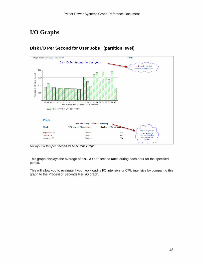
PM for Power Systems Graph Reference Document
I/O Graphs
Disk I/O Per Second for User Jobs (partition level)
Hourly Disk IOs per Second for User Jobs Graph.
This graph displays the average of disk I/O per second rates during each hour for the specified period. This will allow you to evaluate if your workload is I/O intensive or CPU intensive by comparing this graph to the Processor Seconds Per I/O graph.
48
PM for Power Systems Graph Reference Document
Processor Seconds per I/O for User Jobs (partition level)
Hourly Processor Seconds per IO for User Jobs Graph.
This graph displays the processor usage per I/O during each hour for the specified period.
This will allow you to evaluate if your workload is I/O intensive or CPU intensive by comparing this graph to the Disk I/O per Second graph.
49
PM for Power Systems Graph Reference Document
Facts Table
System Resources Summary (partition level)
System Resources Summary Report.
This report displays the average, peak average, and maximum values for Total Processor Utilization, Disk Usage, File System Usage, and Memory Utilization for the specified period. The number of months growth remaining until the respective metric is projected to reach the guideline is also calculated and displayed. If it is calculated as 12 or more months, it is recorded as 12 months.
50
PM for Power Systems Graph Reference Document
Management Summary Graphs (Mgmt Summary)
The Management Summary graphs are available as part of the no additional charge offering of PM for Power Systems. There are three graphs available:
Processor Disk Space File System Space
Processor (partition level)
Processor Management Summary Graph. This graph provides a view of the total processor utilization for the shift for the partition (or system if no partitions exist) for the period. Average percent utilization is a utilization measure of all workloads combined for the entire shift for all measured days for the period. Peak Average percent utilization is an average of the two busiest shift hours of all workloads combined for all measured days in the period. The graph shows the current monthly utilization, the color for the month and then shows a 12-month projection based on up to 13 months prior history, if available. The color of a bar in a certain month is the projected status of that resource for that month. Green means the resource usage will be in the acceptable range. Yellow means the resource usage is marginal and will need attention in the near future. Red means the resource usage is critical and needs immediate attention.
51

PM for Power Systems Graph Reference Document
Disk Space (partition level)
Disk Space Management Summary Graph.
This graph is a measure of the average percent full of available capacity for the hard disk assigned to the partition (or total system if there is no partitioning on the system). Both internal and external disk assigned to the partition are consolidated into one measurement. It does not differentiate between disk manufacturer and disk type. The graph shows the current monthly average utilization, the color for the month and then shows a 12-month projection based on up to 13 months prior history, if available. The color of a bar in a certain month is the projected status of that resource for that month. Color Percentage – Disk Space Usage Green 74% or less used Yellow 75% to 84% used Red 85% or higher used Green means the resource usage will be in the acceptable range. Yellow means the resource usage is marginal and will need attention in the near future. Red means the resource usage is critical and needs immediate attention. These values are used because experience has shown they are the points at which typical installations start to experience performance problems because of disk space constraint. A three-month lead time is allowed to correct the situation.
52
PM for Power Systems Graph Reference Document
File System (partition level)
File System Management Summary Graph.
This graph provides a consolidated average percent full of all file systems assigned to the partition. It includes file systems residing on both internal and external disk. The graph shows the current monthly utilization, the color for the month and then shows a 12 month projection based on up to 13 months prior history, if available. The color of a bar in a certain month is the projected status of that resource for that month. Green means the resource usage will be in the acceptable range. Yellow means the resource usage is marginal and will need attention in the near future. Red means the resource usage is critical and needs immediate attention. Color Percentage – Disk Space Usage Green 74% or less used Yellow 75% to 84% used Red 85% or higher used These values are used since experience has shown they are the points at which typical installations start to experience performance problems because of disk space constraint. A three-month lead time is allowed to correct the situation.
53
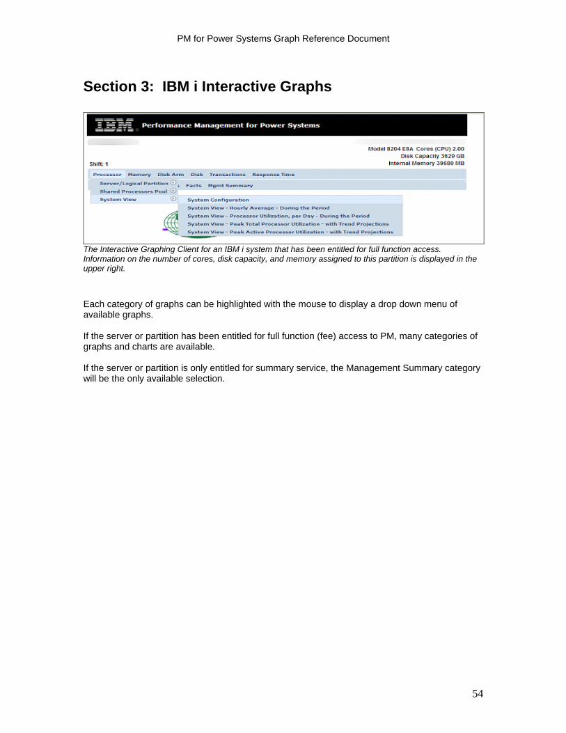
PM for Power Systems Graph Reference Document
Section 3: IBM i Interactive Graphs
The Interactive Graphing Client for an IBM i system that has been entitled for full function access. Information on the number of cores, disk capacity, and memory assigned to this partition is displayed in the upper right.
Each category of graphs can be highlighted with the mouse to display a drop down menu of available graphs. If the server or partition has been entitled for full function (fee) access to PM, many categories of graphs and charts are available. If the server or partition is only entitled for summary service, the Management Summary category will be the only available selection.
54
PM for Power Systems Graph Reference Document
Processor Graphs on IBM i
Processor cycles used are classified into one of three categories based on the job type of the process involved for IBM i partitions:
I = Interactive (Jobtype = I) B = Batch (Jobtype = B) S = System
The total amount of processor cycles used is the total of these three categories and gives you an indication of the amount of processor resource remaining available for additional workload. Batch job throughput might decrease if the total processor utilization approaches 100%. The batch job turn around time becomes longer due to an increase in the time that a job spends on the job queue before becoming active. The guidelines displayed at the bottom of the graph, under the Facts heading, depend on the number of processors that are on the system or are defined to the LPAR. It is possible to have close to 100% processor utilization as long as batch throughput is acceptable. The total of the interactive and system utilization and the utilization of the system’s interactive capacity for interactive workloads are metrics that you need to consider. Interactive is the same as 5250 online transaction processing (OLTP) when referencing interactive CPW or interactive capacity. Interactive Plus System Utilization In general, it is typical to experience long and unpredictable interactive response times when the guidelines shown under Facts on this report are exceeded. Response times become longer because the processor becomes busier, queues build up, and each transaction spends more time waiting for its turn to use the CPU. Interactive users have the best response times when the interactive plus system CPU utilization measurement is maintained below the guidelines. Interactive Capacity The guideline established for interactive work is clearly less than that for interactive plus system utilization. Some systems are limited in their interactive capability by Edition or interactive feature card. The guideline shown for interactive capacity is based on the interactive threshold for that particular Edition or of the interactive feature card. Four graphs are available to show the processor utilization of a partition:
Average Processor Utilization in % per day (the default graph) Usage by Hour/Average during the period Peak Processor Utilization Peak Interactive Utilization
The following sections explain each of these graphs.
55
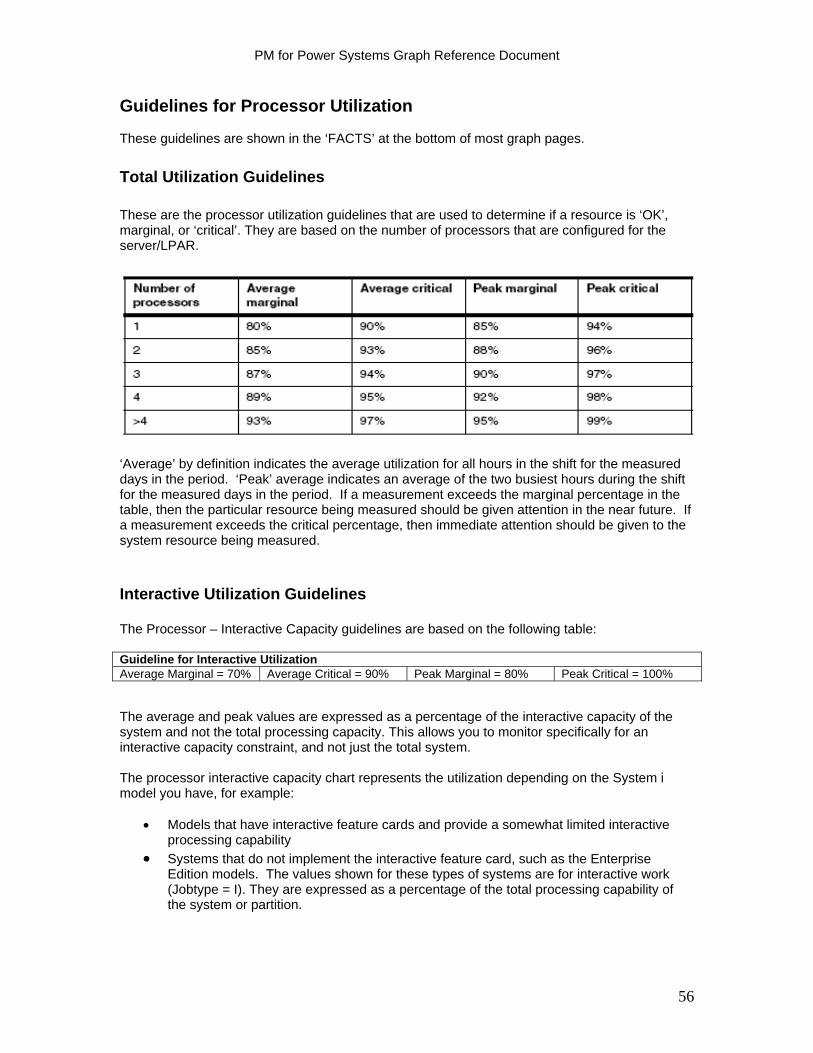
PM for Power Systems Graph Reference Document
Guidelines for Processor Utilization These guidelines are shown in the ‘FACTS’ at the bottom of most graph pages.
Total Utilization Guidelines These are the processor utilization guidelines that are used to determine if a resource is ‘OK’, marginal, or ‘critical’. They are based on the number of processors that are configured for the server/LPAR.
‘Average’ by definition indicates the average utilization for all hours in the shift for the measured days in the period. ‘Peak’ average indicates an average of the two busiest hours during the shift for the measured days in the period. If a measurement exceeds the marginal percentage in the table, then the particular resource being measured should be given attention in the near future. If a measurement exceeds the critical percentage, then immediate attention should be given to the system resource being measured. Interactive Utilization Guidelines The Processor – Interactive Capacity guidelines are based on the following table: Guideline for Interactive Utilization Average Marginal = 70% Average Critical = 90% Peak Marginal = 80% Peak Critical = 100% The average and peak values are expressed as a percentage of the interactive capacity of the system and not the total processing capacity. This allows you to monitor specifically for an interactive capacity constraint, and not just the total system. The processor interactive capacity chart represents the utilization depending on the System i model you have, for example:
Models that have interactive feature cards and provide a somewhat limited interactive processing capability
Systems that do not implement the interactive feature card, such as the Enterprise Edition models. The values shown for these types of systems are for interactive work (Jobtype = I). They are expressed as a percentage of the total processing capability of the system or partition.
56

PM for Power Systems Graph Reference Document
System and Interactive Guidelines This metric shows how much both the system jobs and the interactive jobs are using of the processor cycles. Interactive response time can deteriorate when the total of the system and interactive cycles approaches or exceeds the values identified in the table below: Guidelines for System and Interactive Utilization Number of Processors
Average Marginal % Average Critical % Peak Marginal % Peak Critical %
1 45% 60% 56% 70% 2 60% 75% 72% 83% 3 67% 81% 80% 88% 4 71% 85% 81% 91% > 4 75% 90% 86% 94% What to Look For in Processor Graphs When analyzing the processor graphs, look for the following:
Is the utilization close to the guidelines? Is the trend a rising one? Is the utilization high all the time or are there periods of low utilization?
57
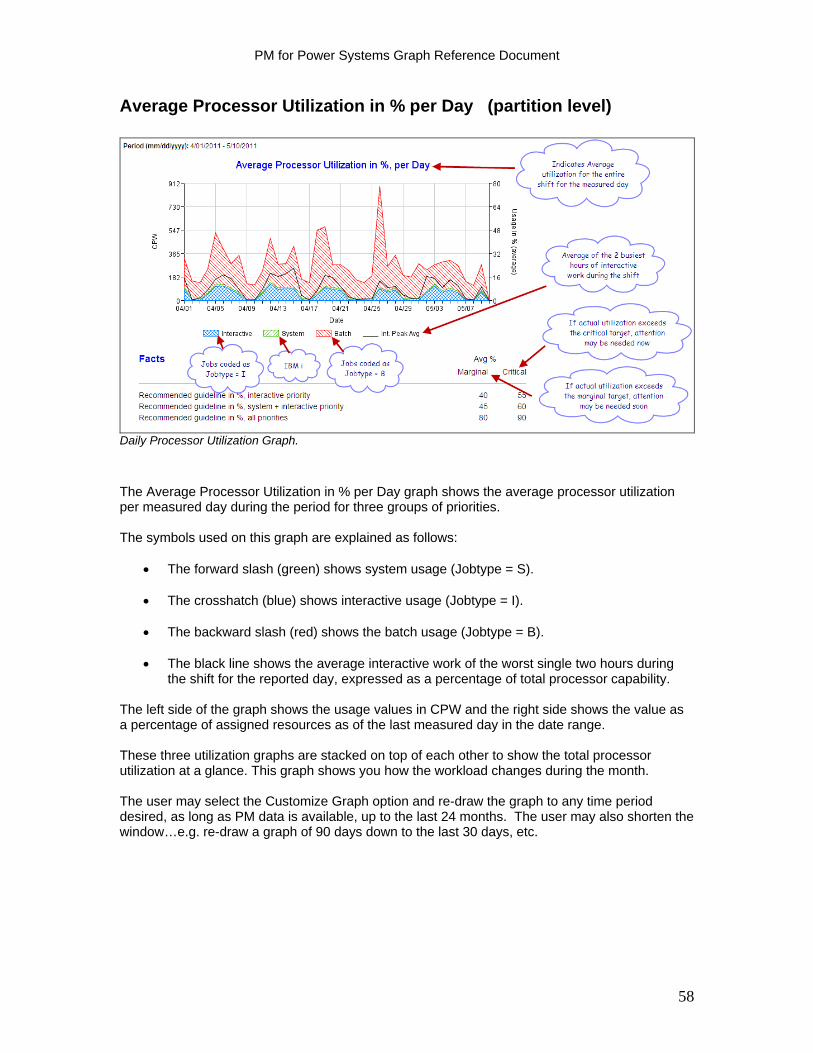
PM for Power Systems Graph Reference Document
Average Processor Utilization in % per Day (partition level)
Daily Processor Utilization Graph.
The Average Processor Utilization in % per Day graph shows the average processor utilization per measured day during the period for three groups of priorities. The symbols used on this graph are explained as follows:
The forward slash (green) shows system usage (Jobtype = S). The crosshatch (blue) shows interactive usage (Jobtype = I). The backward slash (red) shows the batch usage (Jobtype = B). The black line shows the average interactive work of the worst single two hours during
the shift for the reported day, expressed as a percentage of total processor capability. The left side of the graph shows the usage values in CPW and the right side shows the value as a percentage of assigned resources as of the last measured day in the date range. These three utilization graphs are stacked on top of each other to show the total processor utilization at a glance. This graph shows you how the workload changes during the month. The user may select the Customize Graph option and re-draw the graph to any time period desired, as long as PM data is available, up to the last 24 months. The user may also shorten the window…e.g. re-draw a graph of 90 days down to the last 30 days, etc.
58
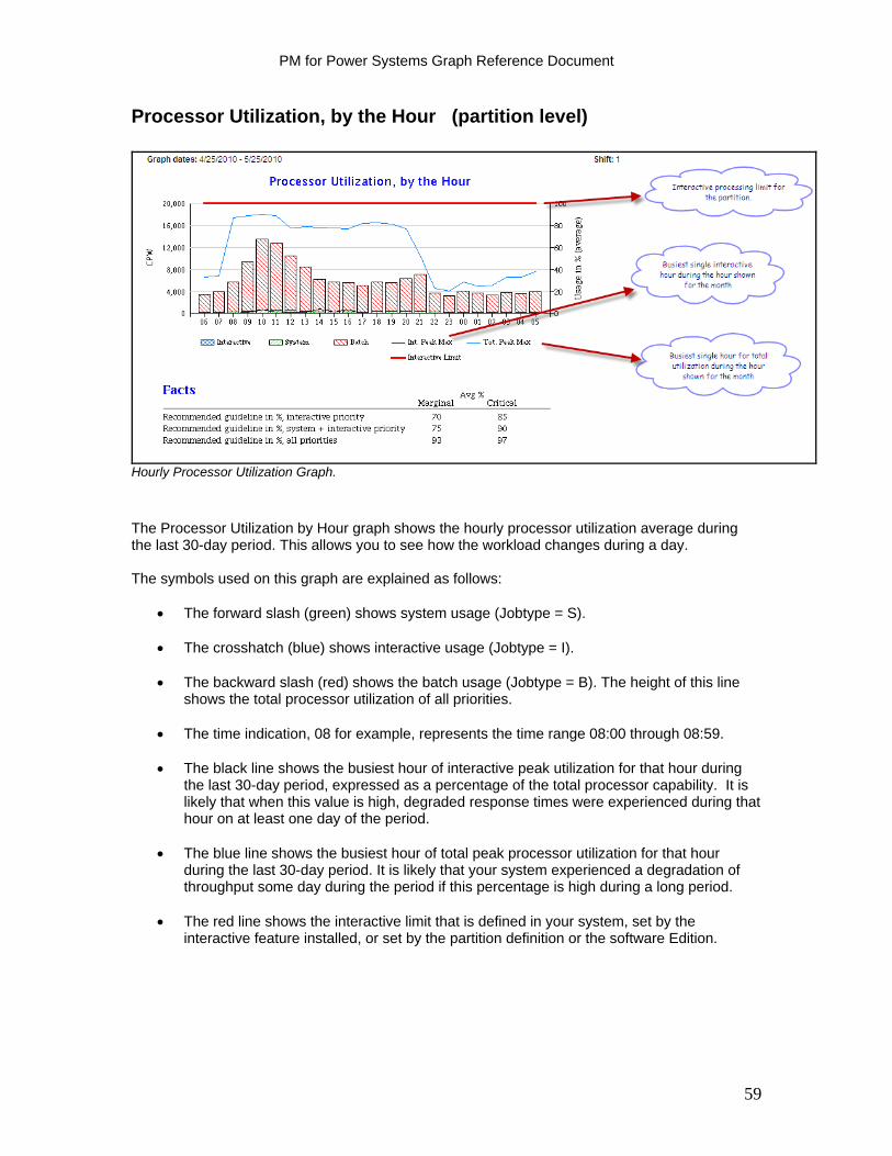
PM for Power Systems Graph Reference Document
Processor Utilization, by the Hour (partition level)
Hourly Processor Utilization Graph.
The Processor Utilization by Hour graph shows the hourly processor utilization average during the last 30-day period. This allows you to see how the workload changes during a day. The symbols used on this graph are explained as follows:
The forward slash (green) shows system usage (Jobtype = S).
The crosshatch (blue) shows interactive usage (Jobtype = I).
The backward slash (red) shows the batch usage (Jobtype = B). The height of this line shows the total processor utilization of all priorities.
The time indication, 08 for example, represents the time range 08:00 through 08:59.
The black line shows the busiest hour of interactive peak utilization for that hour during
the last 30-day period, expressed as a percentage of the total processor capability. It is likely that when this value is high, degraded response times were experienced during that hour on at least one day of the period.
The blue line shows the busiest hour of total peak processor utilization for that hour
during the last 30-day period. It is likely that your system experienced a degradation of throughput some day during the period if this percentage is high during a long period.
The red line shows the interactive limit that is defined in your system, set by the
interactive feature installed, or set by the partition definition or the software Edition.
59
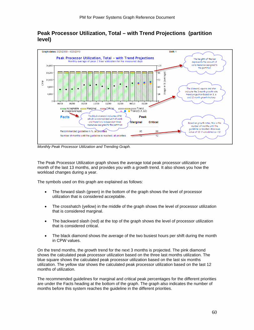
PM for Power Systems Graph Reference Document
Peak Processor Utilization, Total – with Trend Projections (partition level)
Monthly Peak Processor Utilization and Trending Graph.
The Peak Processor Utilization graph shows the average total peak processor utilization per month of the last 13 months, and provides you with a growth trend. It also shows you how the workload changes during a year. The symbols used on this graph are explained as follows:
The forward slash (green) in the bottom of the graph shows the level of processor utilization that is considered acceptable.
The crosshatch (yellow) in the middle of the graph shows the level of processor utilization
that is considered marginal. The backward slash (red) at the top of the graph shows the level of processor utilization
that is considered critical. The black diamond shows the average of the two busiest hours per shift during the month
in CPW values. On the trend months, the growth trend for the next 3 months is projected. The pink diamond shows the calculated peak processor utilization based on the three last months utilization. The blue square shows the calculated peak processor utilization based on the last six months utilization. The yellow star shows the calculated peak processor utilization based on the last 12 months of utilization. The recommended guidelines for marginal and critical peak percentages for the different priorities are under the Facts heading at the bottom of the graph. The graph also indicates the number of months before this system reaches the guideline in the different priorities.
60

PM for Power Systems Graph Reference Document
The Facts section indicates the thresholds at which utilization turns from green to yellow and then from yellow to red. The thresholds vary depending upon the number of processors allocated to the partition. The Number of months until guideline provide a projection of the amount of time before utilization (based on past history) will exceed a threshold. If the number of months is 12 or greater, it is always reported as 12.
61
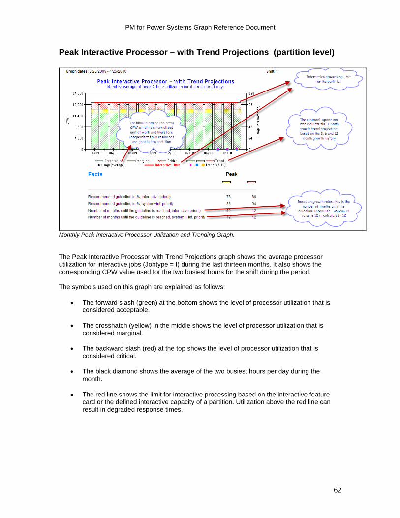
PM for Power Systems Graph Reference Document
Peak Interactive Processor – with Trend Projections (partition level)
Monthly Peak Interactive Processor Utilization and Trending Graph. The Peak Interactive Processor with Trend Projections graph shows the average processor utilization for interactive jobs (Jobtype = I) during the last thirteen months. It also shows the corresponding CPW value used for the two busiest hours for the shift during the period. The symbols used on this graph are explained as follows:
The forward slash (green) at the bottom shows the level of processor utilization that is considered acceptable.
The crosshatch (yellow) in the middle shows the level of processor utilization that is
considered marginal. The backward slash (red) at the top shows the level of processor utilization that is
considered critical.
The black diamond shows the average of the two busiest hours per day during the month.
The red line shows the limit for interactive processing based on the interactive feature
card or the defined interactive capacity of a partition. Utilization above the red line can result in degraded response times.
62
PM for Power Systems Graph Reference Document
The trend projects the processor utilization for the next three months.
The backward slash (green) at the bottom of the three rightmost months (trend months) shows the level of processor utilization that is considered acceptable.
The crosshatch (dark yellow) in the middle shows the level of processor utilization that is
considered marginal.
The forward slash (red) at the top shows the level of processor utilization that is considered critical.
The pink diamond on the trend months shows the calculated peak processor utilization
based on the three last months’ utilization.
The blue square shows the calculated peak processor utilization based on the last six months utilization.
The yellow star shows the calculated peak processor utilization based on the last 12
months utilization. The recommended guidelines for marginal and critical peak percentage for the different priorities are shown in the Facts section at the bottom of the graph. It also indicates how many months to go before this partition reaches the guideline. The trend markers for the next three months show you how the processor utilization is predicted to be if the load on the system is using the last three, six or twelve months of processor utilization as representative of the trend. The trend is still calculated if less than 12 months of data is available. However, the more data there is available, the more accurate the prediction is. The Facts section indicates the thresholds at which utilization turns from green to yellow and then from yellow to red. The thresholds vary depending upon the number of processors allocated to the partition. The Number of months until guideline provide a projection of the amount of time before utilization (based on past history) will exceed a threshold. If the number of months is 12 or greater, it is always reported as 12.
63
PM for Power Systems Graph Reference Document
Shared Processor Pool Reporting
Customers who are subscribed to the detail IBM Global Services fee report offering and who also have configured their systems to create a shared physical processor pool, will now receive three different levels of shared processor reports for IBM i. Reports are provided showing 'total pool' utilization versus 'total pool' capacity:
1) in a monthly comparison for the last year including a 3, 6 and 12 month projection of future pool utilization
2) in a daily comparison for the last 90 days; and 3) in an hourly comparison for the last 30 days.
Set up instructions for Shared Processor Pool Graphs
When configuring PM for Power Systems on IBM i to support the Shared Processor Pool Graphs, please follow these instructions / requirements:
Ensure currency on all IBM i PTF’s IBM Power 5 hardware or above Minimum of one partition running IBM i V5R4 or higher Enable the IBM i partition for the collection of the shared pool and system
o On an HMC: check 'allow performance information collection' on the partition properties / hardware / processors tab
o If using IVM: on the 'lssyscfg' command, specify the 'all_perf_collection' to ‘1’ to allow authority. (Note: the default is ‘0’.)
Report examples follow.
64

PM for Power Systems Graph Reference Document
Shared Physical Processor Pool Peak Utilization – with Trend Projections
Monthly Peak Shared Pool Processor Utilization and Trending Graph. This graph provides the combined utilization of all the processors in the shared pool over the past year. The right hand three columns provide a projection of utilization for the next three months based on the last 3,6 and 12 months history. The number of Cores: Active = the number of cores on the total system. The number of Cores: In Shared Pool = the number of cores assigned to the pool. The left hand ‘Y’ axis shows the number of Seconds per Hour in Thousands that corresponds to the number of cores in the right hand ‘Y’ axis. The black diamond reflects the peak average usage for the respective month. Peak average by definition is an average of the two busiest hours of the day for the shift for the 30 day period. The height of the ‘bar’ reflects the total resource assigned to the pool. The change in pattern or color code indicates when the utilization would reach marginal or critical usage. The Facts section indicates the thresholds at which utilization turns from green to yellow and then from yellow to red. The thresholds vary depending upon the number of processors allocated to the partition. The Number of months until guideline provide a projection of the amount of time before utilization (based on past history) will exceed a threshold. If the number of months is 12 or greater, it is always reported as 12.
65

PM for Power Systems Graph Reference Document
Shared Physical Processor Pool Usage, per Day
Daily Peak Shared Pool Processor Utilization Graph. This graph depicts peak average usage by day for all the combined cores assigned to the shared pool. The plotted red line reflects the peak average usage for the respective day. Peak average by definition is the two busiest hours of the day for the shift. The average processor usage (as opposed to peak average usage) is also provided. It is shown as the blue line. The Cores: Active = the number of cores on the system. The Cores: In Shared Pool = the number of cores assigned to the pool. The right hand scale shows the maximum number of cores “In Shared Pool” that were used at any one time during the period. The left hand ‘Y’ axis shows the number of Seconds per Hour in Thousands that corresponds to the number of cores in the right hand ‘Y’ axis.
66

PM for Power Systems Graph Reference Document
Shared Physical Processor Pool Average Usage, by Hour – During the Period
Hourly Peak and Average Shared Pool Processor Utilization Graph. This graph depicts an hourly view for the last 30 days of the combined processor usage for all processors assigned to the pool. The black diamond depicts the average processor usage for all priorities (ie interactive, batch and System i) for the hour for the shift for the last 30 days. The solid line indicates the single hour maximum usage for the respective hour of the day. The Cores: Active = the number of cores on the system. The Cores: In Shared Pool = the number of cores assigned to the pool. The right hand scale shows the maximum number of cores “In Shared Pool” that were used at any one time during the period. The left hand ‘Y’ axis shows the number of Seconds per Hour in Thousands that corresponds to the number of cores in the right hand ‘Y’ axis.
67
PM for Power Systems Graph Reference Document
System View Graphs
This capability provides the end user with a single, consolidated view of processor utilization versus remaining available capacity across all processors and partitions on the system. This support is currently available for Power Systems running IBM i. (Support for Power Systems running AIX only can be anticipated in the future.) This capability complements the prior PM for Power Systems reports, which show processor utilization at the partition level only, by providing the user a view of the system in its entirety plus a view of the individual partitions that make up the total system view. Only customers subscribed to the detail PM for Power Systems reports either in a stand alone contract or as part of services premium offering have access to the System View graphs. The System View graph types available are:
Configuration Graph: provides a pictorial of total cores on the system versus how many are activated. Of those cores activated, how they are allocated is shown. Monthly Graphs: provide a 12 month trend view of the entire system's utilization versus activated processor capacity. It also provides a view of the entire system's utilization versus a combination of the activated cores and capacity upgrade on demand cores.
Daily Graph: combines all the partitions on the system. The graph provides a total system view from both a combined CPU seconds perspective (average, peak average and maximum usage) and a combined core perspective.
Hourly Graph: provides a view of utilization by hour for the entire system. Prerequisites: IBM Power 6 hardware or above Minimum of one partition running IBM i V6R1M0 or newer Minimum firmware level xx340_061 or higher Designate an IBM i partition for the collection of the system wide processor utilization data
before it is transmitted to IBM. The following settings are required to do this: - On an HMC: check 'allow performance information collection' on the partition properties / hardware / processors tab - If using IVM: on the 'lssyscfg' command, specify the 'all_perf_collection' to '1' to allow authority. (Note: the default is '0')
68

PM for Power Systems Graph Reference Document
System View – System Configuration
System Configuration Graph The System Configuration Graph provides an overview of the total cores on the system and how they are allocated. The number of ‘activated’ cores represents the number of cores that can be used. The ‘Total Cores’ represents the number of cores shipped with the system. The difference between the ‘total cores’ and the ‘activated cores’ represents the Capacity on Demand cores available for growth purposes. The second horizontal bar represents how the activated cores are allocated.
69
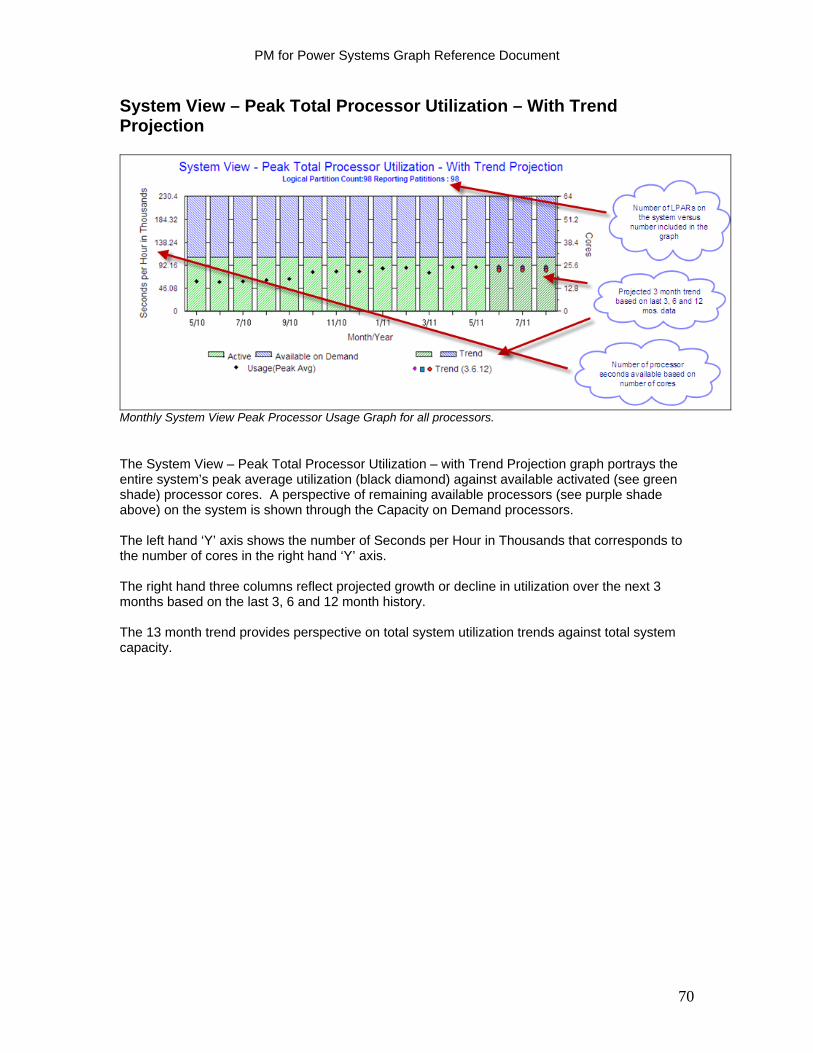
PM for Power Systems Graph Reference Document
System View – Peak Total Processor Utilization – With Trend Projection
Monthly System View Peak Processor Usage Graph for all processors.
The System View – Peak Total Processor Utilization – with Trend Projection graph portrays the entire system’s peak average utilization (black diamond) against available activated (see green shade) processor cores. A perspective of remaining available processors (see purple shade above) on the system is shown through the Capacity on Demand processors. The left hand ‘Y’ axis shows the number of Seconds per Hour in Thousands that corresponds to the number of cores in the right hand ‘Y’ axis. The right hand three columns reflect projected growth or decline in utilization over the next 3 months based on the last 3, 6 and 12 month history. The 13 month trend provides perspective on total system utilization trends against total system capacity.
70
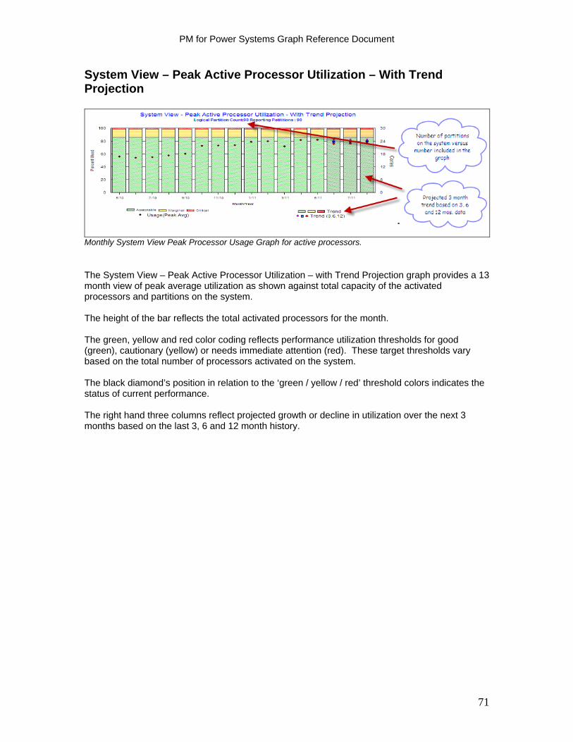
PM for Power Systems Graph Reference Document
System View – Peak Active Processor Utilization – With Trend Projection
Monthly System View Peak Processor Usage Graph for active processors.
The System View – Peak Active Processor Utilization – with Trend Projection graph provides a 13 month view of peak average utilization as shown against total capacity of the activated processors and partitions on the system. The height of the bar reflects the total activated processors for the month. The green, yellow and red color coding reflects performance utilization thresholds for good (green), cautionary (yellow) or needs immediate attention (red). These target thresholds vary based on the total number of processors activated on the system. The black diamond’s position in relation to the ‘green / yellow / red’ threshold colors indicates the status of current performance. The right hand three columns reflect projected growth or decline in utilization over the next 3 months based on the last 3, 6 and 12 month history.
71
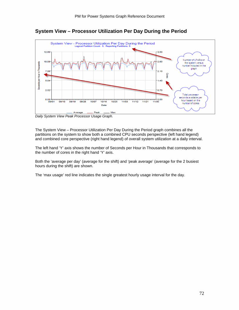
PM for Power Systems Graph Reference Document
System View – Processor Utilization Per Day During the Period
Daily System View Peak Processor Usage Graph.
The System View – Processor Utilization Per Day During the Period graph combines all the partitions on the system to show both a combined CPU seconds perspective (left hand legend) and combined core perspective (right hand legend) of overall system utilization at a daily interval. The left hand ‘Y’ axis shows the number of Seconds per Hour in Thousands that corresponds to the number of cores in the right hand ‘Y’ axis. Both the ‘average per day’ (average for the shift) and ‘peak average’ (average for the 2 busiest hours during the shift) are shown. The ‘max usage’ red line indicates the single greatest hourly usage interval for the day.
72
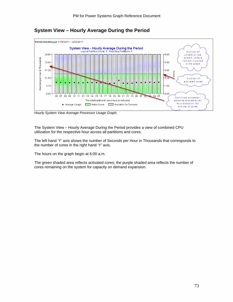
PM for Power Systems Graph Reference Document
System View – Hourly Average During the Period
Hourly System View Average Processor Usage Graph.
The System View – Hourly Average During the Period provides a view of combined CPU utilization for the respective hour across all partitions and cores. The left hand ‘Y’ axis shows the number of Seconds per Hour in Thousands that corresponds to the number of cores in the right hand ‘Y’ axis. The hours on the graph begin at 6:00 a.m. The green shaded area reflects activated cores; the purple shaded area reflects the number of cores remaining on the system for capacity on demand expansion.
73

PM for Power Systems Graph Reference Document
Memory Graphs
Currently, there is no method to directly measure the memory usage within a partition. We can indirectly observe the rate of moving data between disk and main storage. The utilizations shown below are actually the percentages of time spent faulting. They do not depict the amount of memory being used. Memory graphs represent a newer approach to evaluate the effect of page faulting. The graph depicts the impact of the faults as measured by time spent faulting rather than using the number of faults as an indicator. The impact can vary depending on the arm utilization (disk service time) at the time of the fault. The result is expressed as a percentage of the time spent faulting versus the time spent in the application. If the percentage is high, excessive time is spent faulting. This can be caused by:
A high number of faults compared to other synchronous input/output (I/O) The partition does not have enough memory A high service time at the disk operation level The structure of the application
You can choose from the following options to correct this problem:
Add memory to the partition to reduce faulting or to take advantage of expert cache. Add disk arms to the partition to reduce the disk arm utilization. Reschedule the background tasks to reduce disk arm utilization or contention. Review the application structure and re-design as appropriate.
Two graphs are available to show memory utilization:
Percent of Time Faulting, Per Day Percent of Time Faulting, Per Hour
What to Look For in Memory Graphs Consider the following when reviewing memory graphs:
Is the percent of time faulting close to the guidelines? Is the rate of faulting growing? Is the utilization high in all the pools all the time, or are there pools with a low rate of
faulting?
74
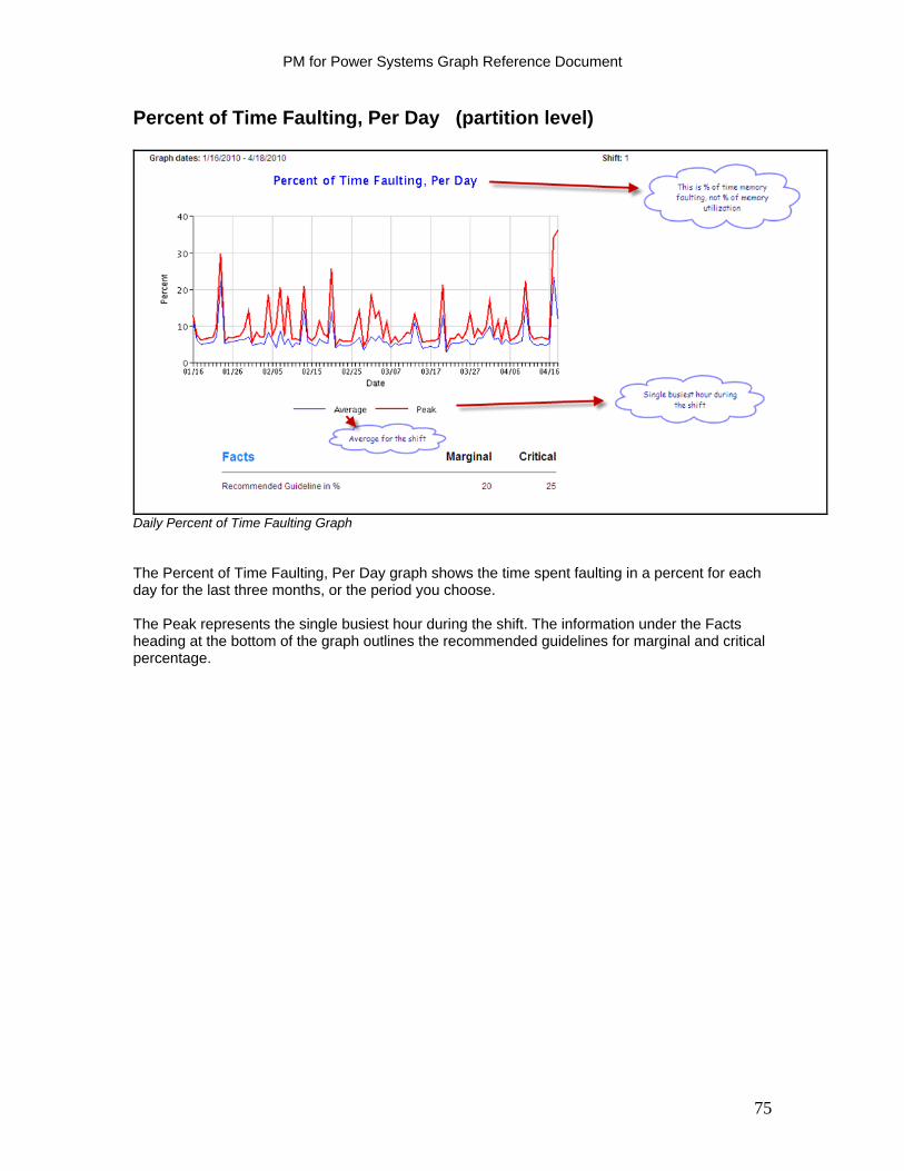
PM for Power Systems Graph Reference Document
Percent of Time Faulting, Per Day (partition level)
Daily Percent of Time Faulting Graph The Percent of Time Faulting, Per Day graph shows the time spent faulting in a percent for each day for the last three months, or the period you choose. The Peak represents the single busiest hour during the shift. The information under the Facts heading at the bottom of the graph outlines the recommended guidelines for marginal and critical percentage.
75
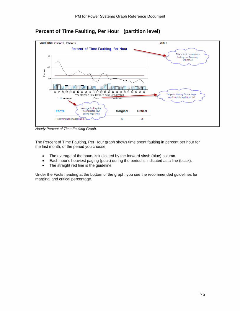
PM for Power Systems Graph Reference Document
Percent of Time Faulting, Per Hour (partition level)
Hourly Percent of Time Faulting Graph. The Percent of Time Faulting, Per Hour graph shows time spent faulting in percent per hour for the last month, or the period you choose.
The average of the hours is indicated by the forward slash (blue) column. Each hour’s heaviest paging (peak) during the period is indicated as a line (black). The straight red line is the guideline.
Under the Facts heading at the bottom of the graph, you see the recommended guidelines for marginal and critical percentage.
76

PM for Power Systems Graph Reference Document
Disk Arm Graphs
Disk arm utilization is described as a percent used of the time. The utilization is calculated as an average over a long period of time, one hour or more. Acceptable utilization is less than 10% for response time critical environments. This utilization is also the recommendation for new installations or upgrades. A value of 30% to 40% is considered marginal and depends on customer expectations. A value above 40% is considered critical utilization. The recommended guideline is for a single arm in a short time period, less than five minutes. An abnormally high disk arm activity leads to an increase in waiting time to access the requested data. This can mean longer response times and longer turnaround time for batch jobs. High disk activity can be a result of one or all of the following conditions:
The amount of disk arms is insufficient for the workload There is insufficient memory, resulting in excessive faulting Disks are fragmented
o Data is placed on disks in smaller and smaller segments as disk fragmentation increases. When disks are fragmented, data is retrieved from several places when a block of records is requested. This takes time and keeps the disk arms busy.
The size of the disk drives o You can have sufficient disk space but an insufficient number of disk arms.
Consider a smaller GB per arm configuration if the data requires high availability (frequent random access).
Lots of logical views with immediate maintenance Consider adding disk arms on your partition if the disk arm utilization approaches or exceeds the acceptable value. Having a partition with not enough memory and a high paging rate usually causes high disk arm utilization. You must examine both memory and disk arm utilization to understand the necessary action to take. Three types of disk arm graphs are available in PM for Power Systems in support of IBM i as explained in the following sections:
Peak Disk Arm Utilization in % graph Disk Arm Utilization Monthly Average by Hour graph Peak Disk Arm Utilization in %, 3 Month Trend graph
What to Look For in Disk Arm Graphs Consider the following when reviewing disk arm graphs:
Is the utilization close to the guidelines? Is the trend a rising one? Is the utilization high all the time?
77
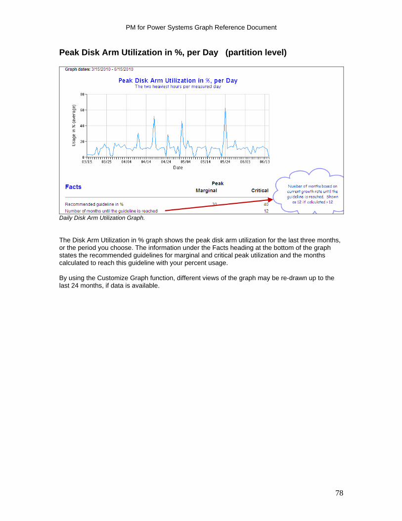
PM for Power Systems Graph Reference Document
Peak Disk Arm Utilization in %, per Day (partition level)
Daily Disk Arm Utilization Graph. The Disk Arm Utilization in % graph shows the peak disk arm utilization for the last three months, or the period you choose. The information under the Facts heading at the bottom of the graph states the recommended guidelines for marginal and critical peak utilization and the months calculated to reach this guideline with your percent usage. By using the Customize Graph function, different views of the graph may be re-drawn up to the last 24 months, if data is available.
78
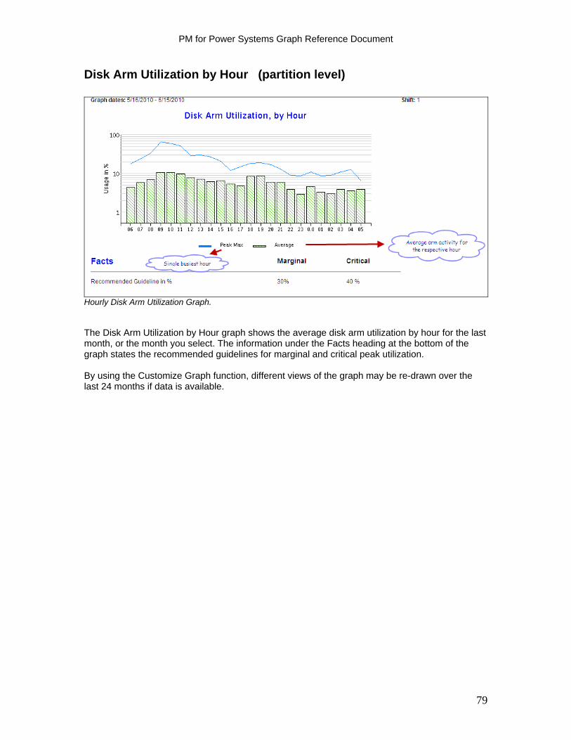
PM for Power Systems Graph Reference Document
Disk Arm Utilization by Hour (partition level)
Hourly Disk Arm Utilization Graph. The Disk Arm Utilization by Hour graph shows the average disk arm utilization by hour for the last month, or the month you select. The information under the Facts heading at the bottom of the graph states the recommended guidelines for marginal and critical peak utilization. By using the Customize Graph function, different views of the graph may be re-drawn over the last 24 months if data is available.
79
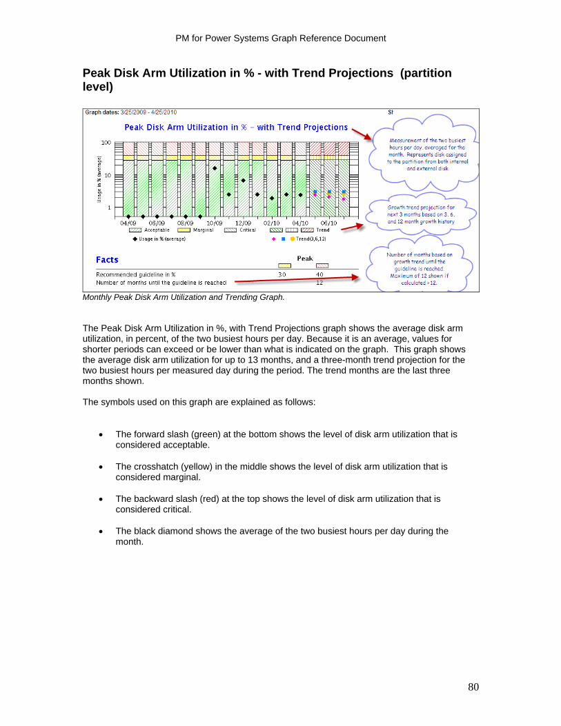
PM for Power Systems Graph Reference Document
Peak Disk Arm Utilization in % - with Trend Projections (partition level)
Monthly Peak Disk Arm Utilization and Trending Graph. The Peak Disk Arm Utilization in %, with Trend Projections graph shows the average disk arm utilization, in percent, of the two busiest hours per day. Because it is an average, values for shorter periods can exceed or be lower than what is indicated on the graph. This graph shows the average disk arm utilization for up to 13 months, and a three-month trend projection for the two busiest hours per measured day during the period. The trend months are the last three months shown. The symbols used on this graph are explained as follows:
The forward slash (green) at the bottom shows the level of disk arm utilization that is considered acceptable.
The crosshatch (yellow) in the middle shows the level of disk arm utilization that is
considered marginal. The backward slash (red) at the top shows the level of disk arm utilization that is
considered critical.
The black diamond shows the average of the two busiest hours per day during the month.
80

PM for Power Systems Graph Reference Document
The trend projects the disk arm utilization for the next three months.
The backward slash (dark green) in the bottom shows the level of peak disk arm utilization that is considered acceptable.
The crosshatch (yellow) in the middle shows the level of peak disk arm utilization that is
considered marginal.
The forward slash (dark red) at the top shows the level of peak disk arm utilization that is considered critical.
The pink diamond on the trend months shows the calculated peak disk arm utilization
based on the utilization of the last three months.
The blue square shows the calculated peak disk arm utilization based on the utilization of the last six months.
The yellow star shows the calculated peak disk arm utilization based on the utilization of
the last 12 months. The information under the Facts heading, at the bottom of the graph, shows the recommended guidelines for marginal and critical peak percentage. It also indicates the number of months before this system reaches the guideline. Through the Customize Graph function, the graph may be re-drawn for up to the last 24 months if data is available.
81

PM for Power Systems Graph Reference Document
Disk Usage (Capacity) Graphs
Disk usage of a partition should not exceed 85% of full capacity. An abnormally high usage can lead to fragmented disks. Data is placed on the disks in smaller segments as disk fragmentation increases. The consequence of a highly fragmented disk is the need to retrieve the data from several places when a block of records is requested. This takes both time and additional disk and processor cycles and increases the load on the disk subsystems, which results in higher utilization and overall lower throughput. The request for data can usually be satisfied by only one read from disk on an unfragmented system. Furthermore, the partition can cease to function until relief is provided as the amount of disk used exceeds 95% and approaches full capacity. The remedy entails either increasing the total disk capacity on the partition or minimizing the unnecessary data. A sudden increase in data usage shows clearly on disk usage graphs. It might not be highlighted on either the Management Summary Graph or the months to guideline calculations because of the averaging effect of the regression calculations. This can tend to mask sudden changes away from the trend in a rapidly changing environment. PM for Power Systems for IBM i includes trend lines for disk utilization based on the previous three and six months of historical data, in addition to thirteen months. This allows you to more easily see rapid changes in usage over a short period of time. This also helps you to evaluate your growth and business needs based on the most recent information. What to Look For in Disk Space Usage Graphs Consider the following when reviewing disk space usage graphs:
Is the utilization close to the guidelines? Is the trend a rising one?
Two graphs are available to understand the usage of disk space on your system or partition:
Disk Space Usage in % per Day Disk Space Usage in %, 3 Month Trend
82
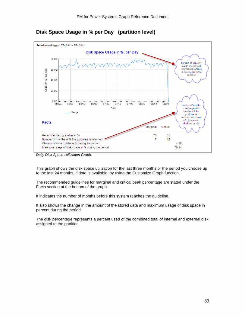
PM for Power Systems Graph Reference Document
Disk Space Usage in % per Day (partition level)
Daily Disk Space Utilization Graph. This graph shows the disk space utilization for the last three months or the period you choose up to the last 24 months, if data is available, by using the Customize Graph function. The recommended guidelines for marginal and critical peak percentage are stated under the Facts section at the bottom of the graph. It indicates the number of months before this system reaches the guideline. It also shows the change in the amount of the stored data and maximum usage of disk space in percent during the period. The disk percentage represents a percent used of the combined total of internal and external disk assigned to the partition.
83
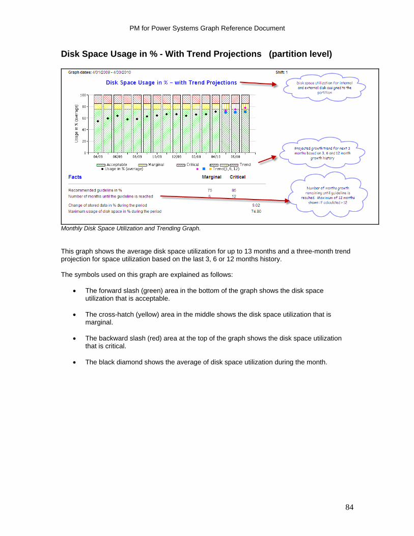
PM for Power Systems Graph Reference Document
Disk Space Usage in % - With Trend Projections (partition level)
Monthly Disk Space Utilization and Trending Graph. This graph shows the average disk space utilization for up to 13 months and a three-month trend projection for space utilization based on the last 3, 6 or 12 months history. The symbols used on this graph are explained as follows:
The forward slash (green) area in the bottom of the graph shows the disk space utilization that is acceptable.
The cross-hatch (yellow) area in the middle shows the disk space utilization that is
marginal.
The backward slash (red) area at the top of the graph shows the disk space utilization that is critical.
The black diamond shows the average of disk space utilization during the month.
84

PM for Power Systems Graph Reference Document
The trend projects the disk space utilization for the next three months.
The backward slash (dark green) area in the bottom of the graph of the last three trend months shows the level of disk space utilization that is considered acceptable.
The crosshatch (yellow) area in the middle of the graph on the trend months shows the
level of disk space utilization that is considered marginal.
The forward slash (dark red) area at the top of the graph on the trend months shows the level of disk space utilization that is considered critical.
The pink diamond on the trend months shows the calculated disk space utilization growth
based on the three last months’ utilization.
The blue square shows the calculated disk space utilization based on the last six months’ utilization.
The yellow star shows the calculated disk space utilization based on the last 12 months’
utilization. The recommended guidelines for the marginal and critical peak percentage are stated at the bottom of the graph. This graph also indicates the number of months before this partition reaches the guideline. If the calculation is greater than 12 months, it is reported as 12 months. You also see the change in stored data and maximum usage of disk space in percent during the period.
85
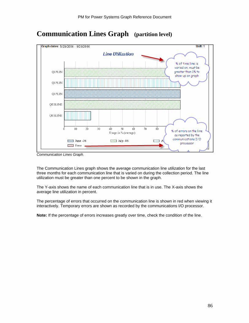
PM for Power Systems Graph Reference Document
Communication Lines Graph (partition level)
Communication Lines Graph. The Communication Lines graph shows the average communication line utilization for the last three months for each communication line that is varied on during the collection period. The line utilization must be greater than one percent to be shown in the graph. The Y-axis shows the name of each communication line that is in use. The X-axis shows the average line utilization in percent. The percentage of errors that occurred on the communication line is shown in red when viewing it interactively. Temporary errors are shown as recorded by the communications I/O processor. Note: If the percentage of errors increases greatly over time, check the condition of the line.
86

PM for Power Systems Graph Reference Document
Transaction Volumes Graphs
A transaction is a basic unit of work done on a system. An interactive transaction begins when a user presses the Enter key or a function key and ends when a reply is displayed. See “Response Time graphs” explanations in this document for a description of transaction boundaries as they relate to response times. Usually, there is a correlation among:
The transaction volume in a System i partition The organization’s business volume The response times of the transactions
PM for Power Systems in support of IBM i gives you the opportunity to monitor both transaction rates and response times to help understand this correlation. You can make predictions that are more accurate in capacity planning when you understand this correlation. For example, you can use this information to help plan for future changes in business volumes if you find that a 20% increase in business volumes leads to a 40% increase in transaction rates. Observe changes in transaction volumes when adding new applications, or when business volumes change significantly. The PM for Power Systems Transaction Volumes graphs for IBM i show the interactive transaction rates. Available Transaction Volume graphs include:
Volume per Hour Volume per Hour History and Three Month Trend Transactions per Hour Average Number of I/Os per Transaction Processor Usage for the Average Transaction per Hour
Note: It might be necessary to do additional research using other performance analysis tools to accurately determine the exact number of transactions being performed. This is more commonly found with client/server workloads where, because of the application structure, PM for Power Systems in support of IBM i cannot accurately define where each transaction starts and ends.
87
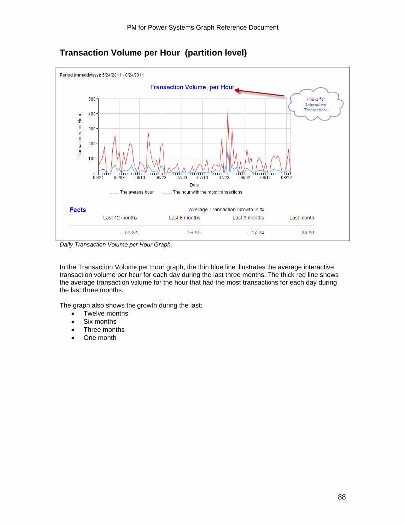
PM for Power Systems Graph Reference Document
Transaction Volume per Hour (partition level)
Daily Transaction Volume per Hour Graph. In the Transaction Volume per Hour graph, the thin blue line illustrates the average interactive transaction volume per hour for each day during the last three months. The thick red line shows the average transaction volume for the hour that had the most transactions for each day during the last three months. The graph also shows the growth during the last:
Twelve months Six months Three months One month
88
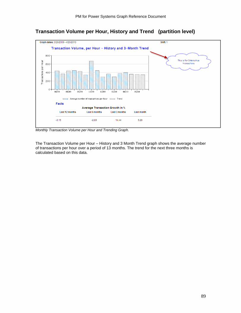
PM for Power Systems Graph Reference Document
Transaction Volume per Hour, History and Trend (partition level)
Monthly Transaction Volume per Hour and Trending Graph. The Transaction Volume per Hour – History and 3 Month Trend graph shows the average number of transactions per hour over a period of 13 months. The trend for the next three months is calculated based on this data.
89
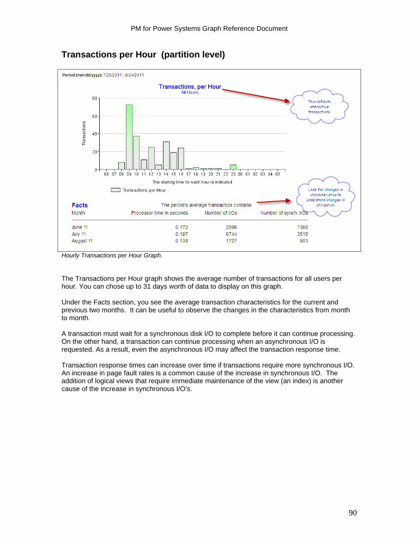
PM for Power Systems Graph Reference Document
Transactions per Hour (partition level)
Hourly Transactions per Hour Graph. The Transactions per Hour graph shows the average number of transactions for all users per hour. You can chose up to 31 days worth of data to display on this graph. Under the Facts section, you see the average transaction characteristics for the current and previous two months. It can be useful to observe the changes in the characteristics from month to month. A transaction must wait for a synchronous disk I/O to complete before it can continue processing. On the other hand, a transaction can continue processing when an asynchronous I/O is requested. As a result, even the asynchronous I/O may affect the transaction response time. Transaction response times can increase over time if transactions require more synchronous I/O. An increase in page fault rates is a common cause of the increase in synchronous I/O. The addition of logical views that require immediate maintenance of the view (an index) is another cause of the increase in synchronous I/O’s.
90
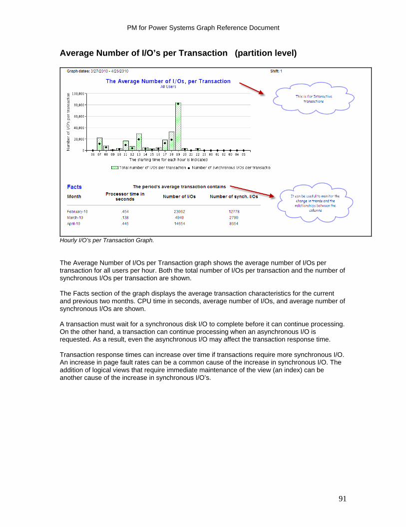
PM for Power Systems Graph Reference Document
Average Number of I/O’s per Transaction (partition level)
Hourly I/O’s per Transaction Graph. The Average Number of I/Os per Transaction graph shows the average number of I/Os per transaction for all users per hour. Both the total number of I/Os per transaction and the number of synchronous I/Os per transaction are shown. The Facts section of the graph displays the average transaction characteristics for the current and previous two months. CPU time in seconds, average number of I/Os, and average number of synchronous I/Os are shown. A transaction must wait for a synchronous disk I/O to complete before it can continue processing. On the other hand, a transaction can continue processing when an asynchronous I/O is requested. As a result, even the asynchronous I/O may affect the transaction response time. Transaction response times can increase over time if transactions require more synchronous I/O. An increase in page fault rates can be a common cause of the increase in synchronous I/O. The addition of logical views that require immediate maintenance of the view (an index) can be another cause of the increase in synchronous I/O’s.
91
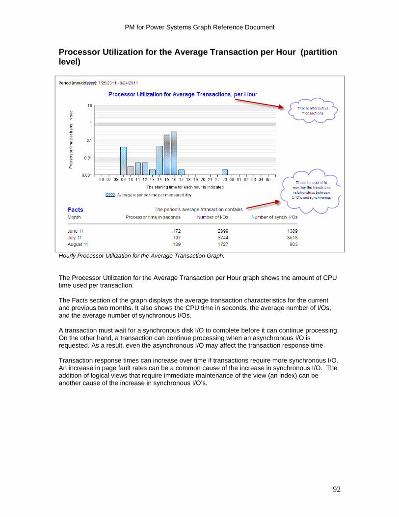
PM for Power Systems Graph Reference Document
Processor Utilization for the Average Transaction per Hour (partition level)
Hourly Processor Utilization for the Average Transaction Graph. The Processor Utilization for the Average Transaction per Hour graph shows the amount of CPU time used per transaction. The Facts section of the graph displays the average transaction characteristics for the current and previous two months. It also shows the CPU time in seconds, the average number of I/Os, and the average number of synchronous I/Os. A transaction must wait for a synchronous disk I/O to complete before it can continue processing. On the other hand, a transaction can continue processing when an asynchronous I/O is requested. As a result, even the asynchronous I/O may affect the transaction response time. Transaction response times can increase over time if transactions require more synchronous I/O. An increase in page fault rates can be a common cause of the increase in synchronous I/O. The addition of logical views that require immediate maintenance of the view (an index) can be another cause of the increase in synchronous I/O’s.
92
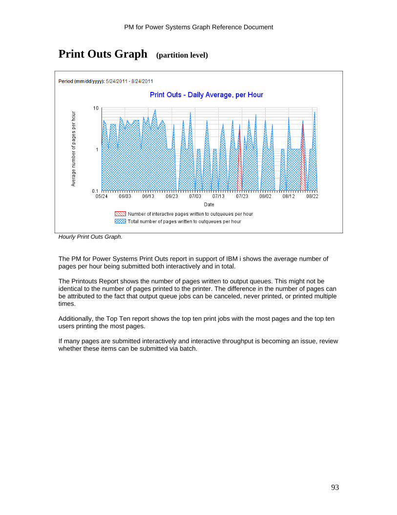
PM for Power Systems Graph Reference Document
Print Outs Graph (partition level)
Hourly Print Outs Graph. The PM for Power Systems Print Outs report in support of IBM i shows the average number of pages per hour being submitted both interactively and in total. The Printouts Report shows the number of pages written to output queues. This might not be identical to the number of pages printed to the printer. The difference in the number of pages can be attributed to the fact that output queue jobs can be canceled, never printed, or printed multiple times. Additionally, the Top Ten report shows the top ten print jobs with the most pages and the top ten users printing the most pages. If many pages are submitted interactively and interactive throughput is becoming an issue, review whether these items can be submitted via batch.
93

PM for Power Systems Graph Reference Document
Jobs Graphs (partition level)
The PM for Power Systems in support of IBM i ‘Jobs’ graphs show the number of interactive and batch jobs that are run each day. The report also shows the I/O and CPU usage for batch jobs. The Facts section at the bottom of each graph shows the current and previous two months. Review this information for trends or significant changes. You can choose from the following graphs:
Number of Jobs per Measured Day I/O Usage for Batch Jobs Processor Usage for Batch Jobs
In the following sections, we describe each graph.
94
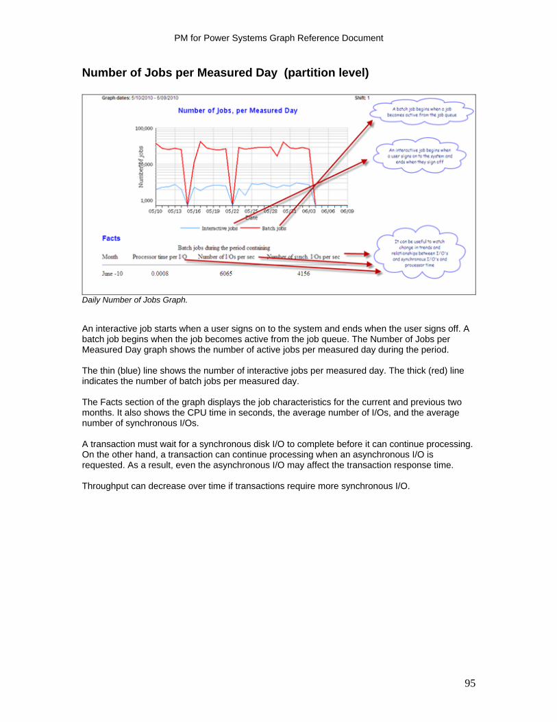
PM for Power Systems Graph Reference Document
Number of Jobs per Measured Day (partition level)
Daily Number of Jobs Graph. An interactive job starts when a user signs on to the system and ends when the user signs off. A batch job begins when the job becomes active from the job queue. The Number of Jobs per Measured Day graph shows the number of active jobs per measured day during the period. The thin (blue) line shows the number of interactive jobs per measured day. The thick (red) line indicates the number of batch jobs per measured day. The Facts section of the graph displays the job characteristics for the current and previous two months. It also shows the CPU time in seconds, the average number of I/Os, and the average number of synchronous I/Os. A transaction must wait for a synchronous disk I/O to complete before it can continue processing. On the other hand, a transaction can continue processing when an asynchronous I/O is requested. As a result, even the asynchronous I/O may affect the transaction response time. Throughput can decrease over time if transactions require more synchronous I/O.
95
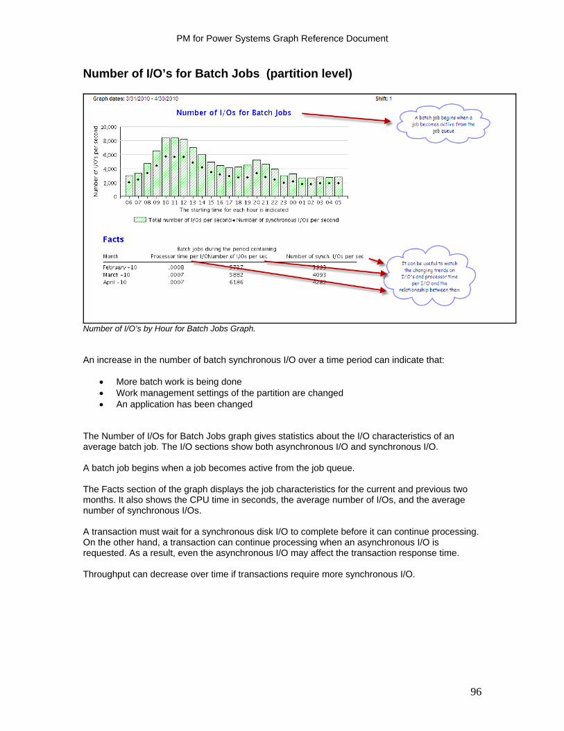
PM for Power Systems Graph Reference Document
Number of I/O’s for Batch Jobs (partition level)
Number of I/O’s by Hour for Batch Jobs Graph. An increase in the number of batch synchronous I/O over a time period can indicate that:
More batch work is being done Work management settings of the partition are changed An application has been changed
The Number of I/Os for Batch Jobs graph gives statistics about the I/O characteristics of an average batch job. The I/O sections show both asynchronous I/O and synchronous I/O. A batch job begins when a job becomes active from the job queue. The Facts section of the graph displays the job characteristics for the current and previous two months. It also shows the CPU time in seconds, the average number of I/Os, and the average number of synchronous I/Os. A transaction must wait for a synchronous disk I/O to complete before it can continue processing. On the other hand, a transaction can continue processing when an asynchronous I/O is requested. As a result, even the asynchronous I/O may affect the transaction response time. Throughput can decrease over time if transactions require more synchronous I/O.
96
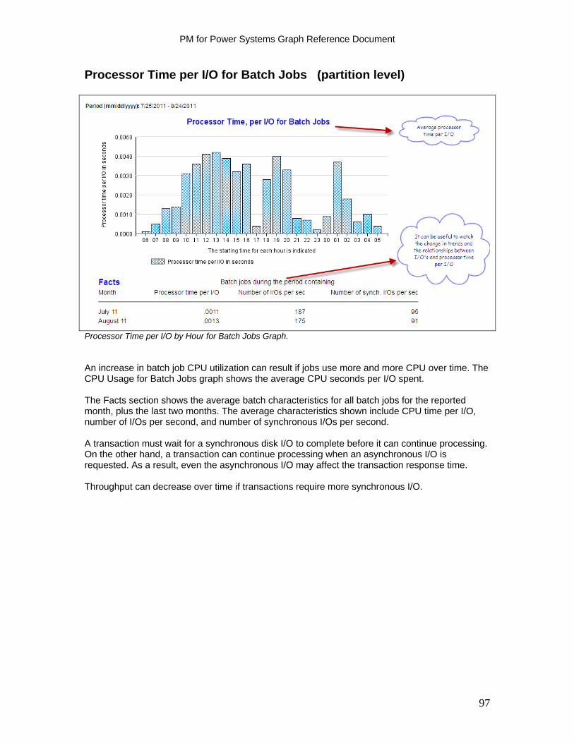
PM for Power Systems Graph Reference Document
Processor Time per I/O for Batch Jobs (partition level)
Processor Time per I/O by Hour for Batch Jobs Graph. An increase in batch job CPU utilization can result if jobs use more and more CPU over time. The CPU Usage for Batch Jobs graph shows the average CPU seconds per I/O spent. The Facts section shows the average batch characteristics for all batch jobs for the reported month, plus the last two months. The average characteristics shown include CPU time per I/O, number of I/Os per second, and number of synchronous I/Os per second. A transaction must wait for a synchronous disk I/O to complete before it can continue processing. On the other hand, a transaction can continue processing when an asynchronous I/O is requested. As a result, even the asynchronous I/O may affect the transaction response time. Throughput can decrease over time if transactions require more synchronous I/O.
97
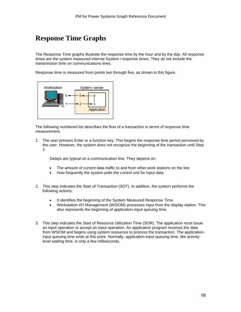
PM for Power Systems Graph Reference Document
Response Time Graphs
The Response Time graphs illustrate the response time by the hour and by the day. All response times are the system measured internal System i response times. They do not include the transmission time on communications lines. Response time is measured from points two through five, as shown in this figure.
The following numbered list describes the flow of a transaction in terms of response time measurement. 1. The user presses Enter or a function key. This begins the response time period perceived by
the user. However, the system does not recognize the beginning of the transaction until Step 2.
Delays are typical on a communication line. They depend on:
The amount of current data traffic to and from other work stations on the line How frequently the system polls the control unit for input data
2. This step indicates the Start of Transaction (SOT). In addition, the system performs the
following actions:
It identifies the beginning of the System Measured Response Time. Workstation I/O Management (WSIOM) processes input from the display station. This
also represents the beginning of application-input queuing time. 3. This step indicates the Start of Resource Utilization Time (SOR). The application must issue
an input operation or accept an input operation. An application program receives the data from WSIOM and begins using system resources to process the transaction. The application-input queuing time ends at this point. Normally, application-input queuing time, like activity-level waiting time, is only a few milliseconds.
98
PM for Power Systems Graph Reference Document
4. This step indicates the End of Resource Utilization Time (EOR). The application program
completes using system resources. This normally coincides with the End of Transaction (EOT). The program has performed an operation that causes workstation I/O to send data to the display station at this point. User program operations that can cause the data to be sent to the display station include:
Read or invite input operation following one or more output operations with the defer
write (DFRWRT) parameter set to *YES in the display file description Output operation with DFRWRT(*NO) in the display file description Output operation with the DDS INVITE keyword Combined output/input operation, for example an Execute Format (EXFMT) operation
in an RPG/400® program and a Send and Receive file (SNDRCVF) command in a control language (CL) program.
End of program 5. This step indicates the EOT. This is the end of the System Measured Response Time. The next transaction can begin. Resource usage by the transaction is measured at this point. 6. A system response is displayed back to the user. The available Response Time graphs include:
Average Response Time per Measured Day Average Response Time per Hour
The following sections describe each response time graph.
99
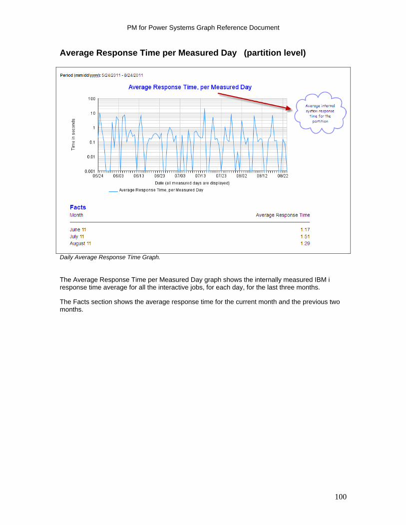
PM for Power Systems Graph Reference Document
Average Response Time per Measured Day (partition level)
Daily Average Response Time Graph. The Average Response Time per Measured Day graph shows the internally measured IBM i response time average for all the interactive jobs, for each day, for the last three months. The Facts section shows the average response time for the current month and the previous two months.
100
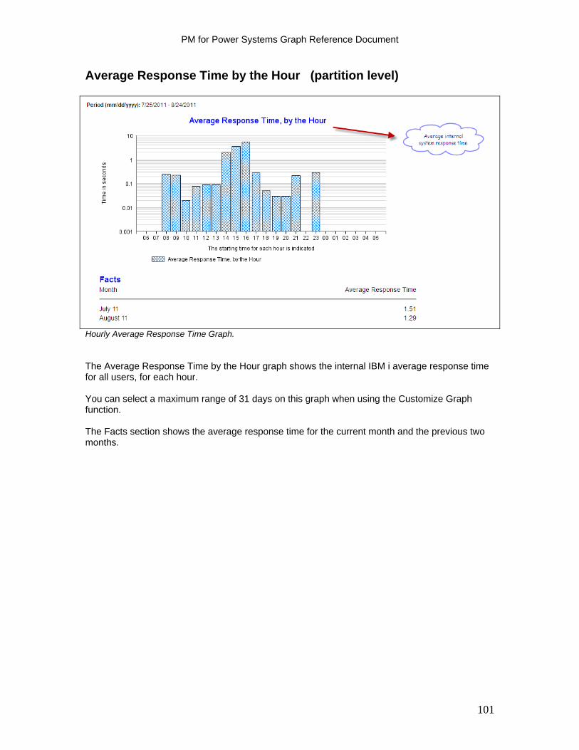
PM for Power Systems Graph Reference Document
Average Response Time by the Hour (partition level)
Hourly Average Response Time Graph. The Average Response Time by the Hour graph shows the internal IBM i average response time for all users, for each hour. You can select a maximum range of 31 days on this graph when using the Customize Graph function. The Facts section shows the average response time for the current month and the previous two months.
101

PM for Power Systems Graph Reference Document
Local Response Time Graphs
Available Local Response Time graphs include:
Average Response Time per Measured Day Average Response Time by the Hour
Note: If you do not have twinax devices, these graphs are empty.
102
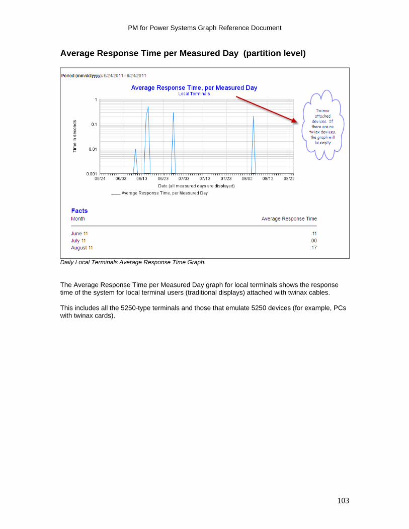
PM for Power Systems Graph Reference Document
Average Response Time per Measured Day (partition level)
Daily Local Terminals Average Response Time Graph. The Average Response Time per Measured Day graph for local terminals shows the response time of the system for local terminal users (traditional displays) attached with twinax cables. This includes all the 5250-type terminals and those that emulate 5250 devices (for example, PCs with twinax cards).
103
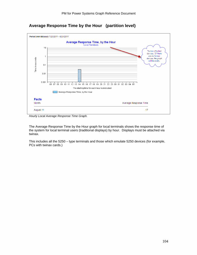
PM for Power Systems Graph Reference Document
Average Response Time by the Hour (partition level)
Hourly Local Average Response Time Graph. The Average Response Time by the Hour graph for local terminals shows the response time of the system for local terminal users (traditional displays) by hour. Displays must be attached via twinax. This includes all the 5250 – type terminals and those which emulate 5250 devices (for example, PCs with twinax cards.)
104
PM for Power Systems Graph Reference Document
PC Response Time Graphs
Available PM for Power Systems Local Response Time reports and graphs include:
Average Response Time per Measured Day Average Response Time per Hour
Attention: If PCs are connected using the TCP/IP protocol, these graphs are empty.
105
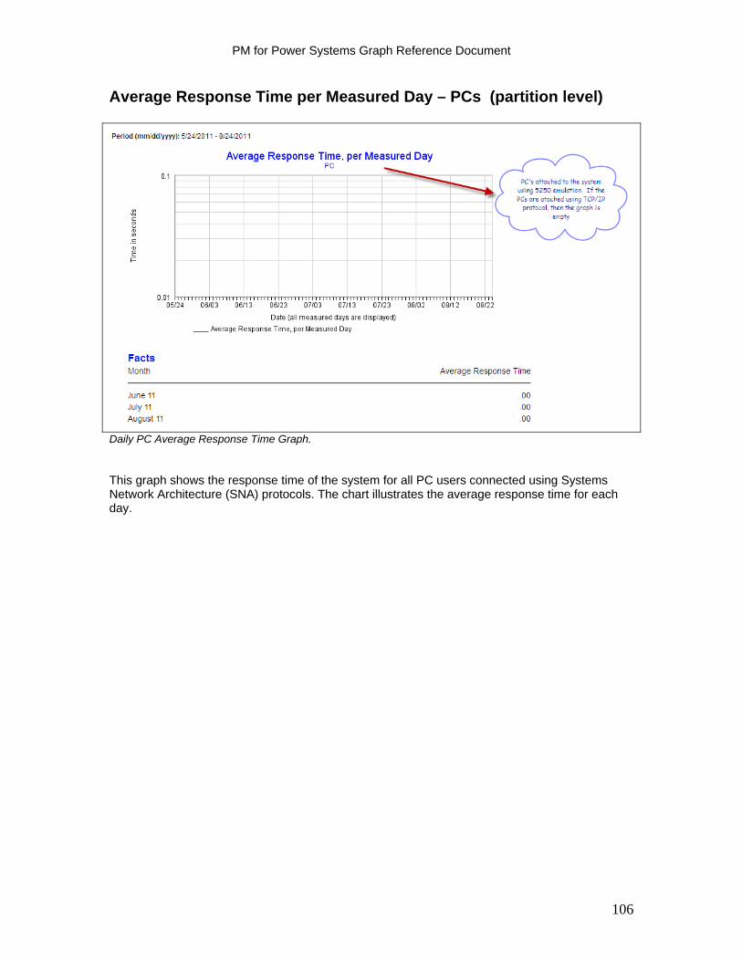
PM for Power Systems Graph Reference Document
Average Response Time per Measured Day – PCs (partition level)
Daily PC Average Response Time Graph. This graph shows the response time of the system for all PC users connected using Systems Network Architecture (SNA) protocols. The chart illustrates the average response time for each day.
106
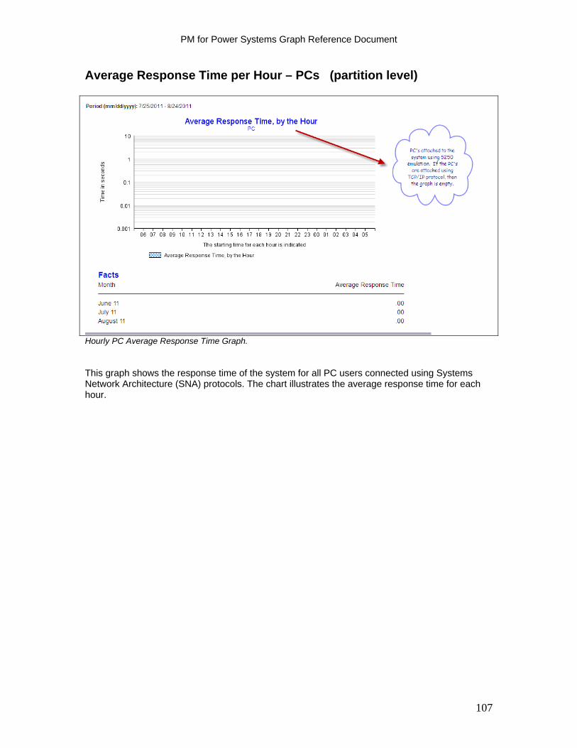
PM for Power Systems Graph Reference Document
Average Response Time per Hour – PCs (partition level)
Hourly PC Average Response Time Graph. This graph shows the response time of the system for all PC users connected using Systems Network Architecture (SNA) protocols. The chart illustrates the average response time for each hour.
107
PM for Power Systems Graph Reference Document
Facts - Charts
The PM for Power Systems Interactive Graphic Client in support of IBM i shows the basic Facts information in graphic format. Available Fact Sheet information includes:
Response Time Response Time - Average Transactions Volumes Transaction Analysis – I/O
Transaction Analysis – Processor Time Batch Jobs – Processor Time Batch Jobs – I/O Batch Jobs – Most Frequent System Values System Resources Summary
Print Queue Jobs
Printed Documents per User
The Customize Graph / calendar function does allow the user to select previous time periods for drawing the charts. In the following sections, we describe each chart.
108
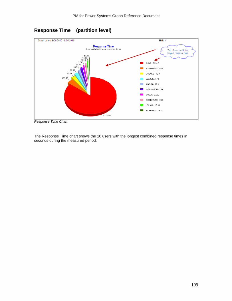
PM for Power Systems Graph Reference Document
Response Time (partition level)
Response Time Chart
The Response Time chart shows the 10 users with the longest combined response times in seconds during the measured period.
109
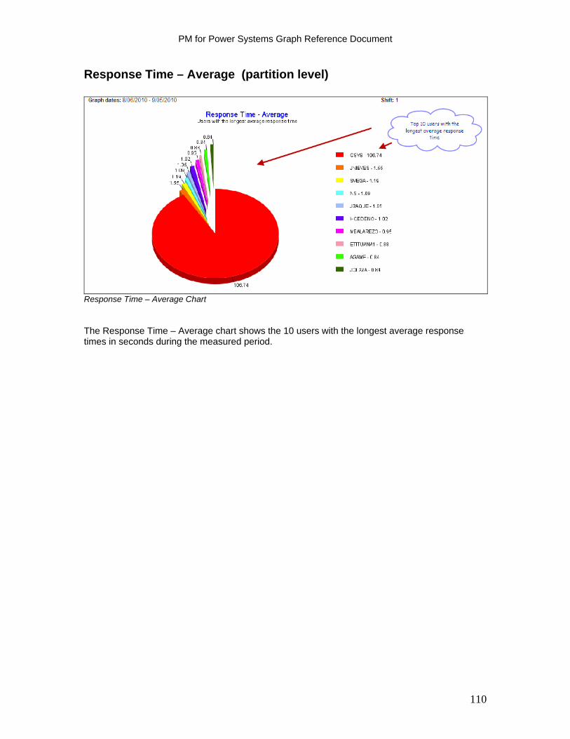
PM for Power Systems Graph Reference Document
Response Time – Average (partition level)
Response Time – Average Chart The Response Time – Average chart shows the 10 users with the longest average response times in seconds during the measured period.
110
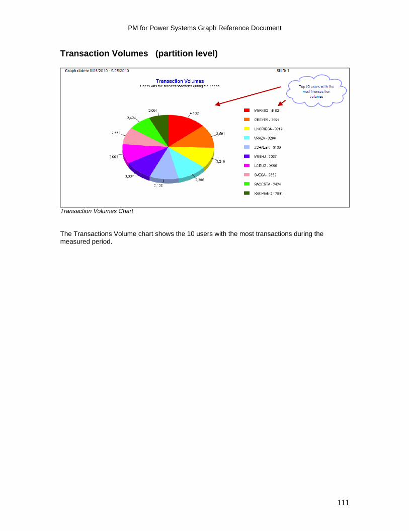
PM for Power Systems Graph Reference Document
Transaction Volumes (partition level)
Transaction Volumes Chart The Transactions Volume chart shows the 10 users with the most transactions during the measured period.
111
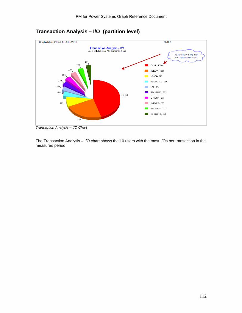
PM for Power Systems Graph Reference Document
Transaction Analysis – I/O (partition level)
Transaction Analysis – I/O Chart The Transaction Analysis – I/O chart shows the 10 users with the most I/Os per transaction in the measured period.
112
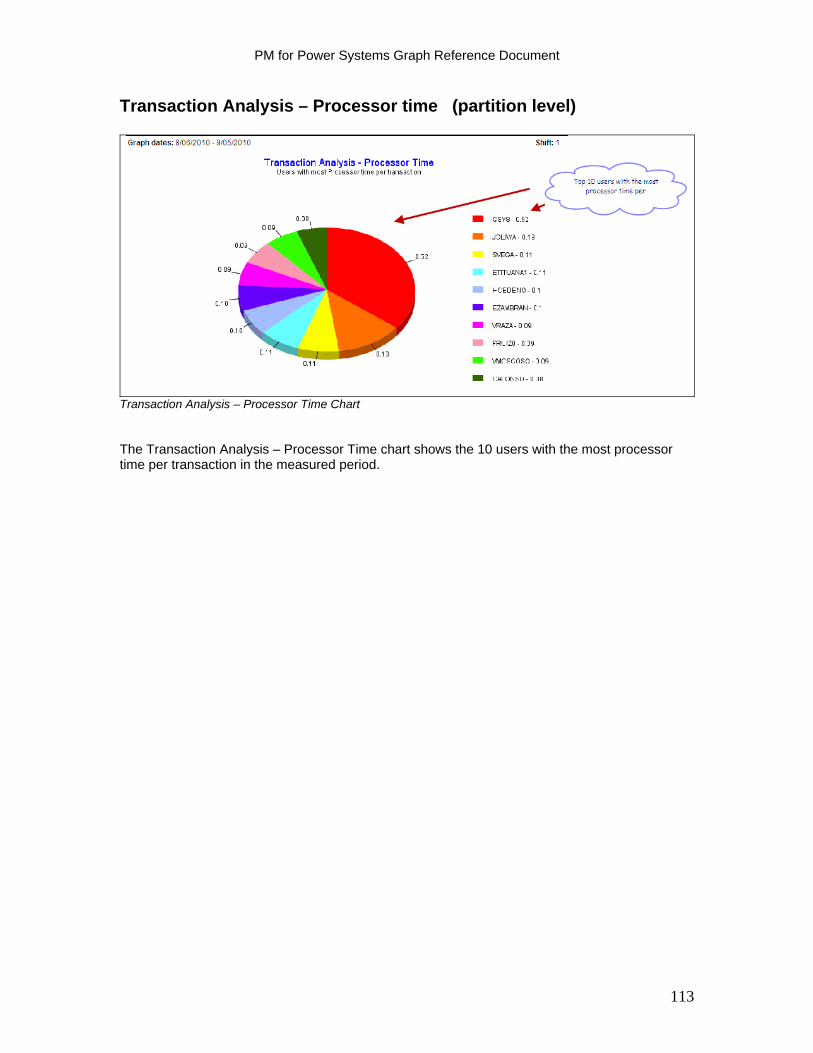
PM for Power Systems Graph Reference Document
Transaction Analysis – Processor time (partition level)
Transaction Analysis – Processor Time Chart The Transaction Analysis – Processor Time chart shows the 10 users with the most processor time per transaction in the measured period.
113
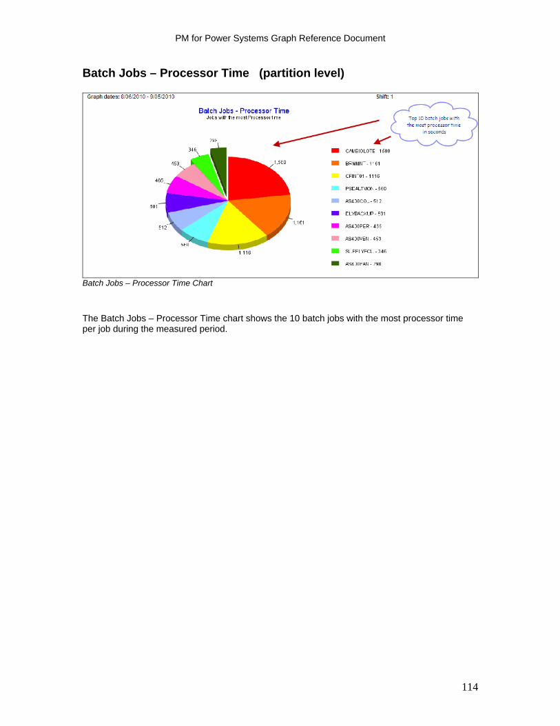
PM for Power Systems Graph Reference Document
Batch Jobs – Processor Time (partition level)
Batch Jobs – Processor Time Chart
The Batch Jobs – Processor Time chart shows the 10 batch jobs with the most processor time per job during the measured period.
114
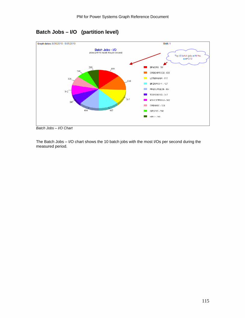
PM for Power Systems Graph Reference Document
Batch Jobs – I/O (partition level)
Batch Jobs – I/O Chart The Batch Jobs – I/O chart shows the 10 batch jobs with the most I/Os per second during the measured period.
115
PM for Power Systems Graph Reference Document
Batch Jobs – Most Frequent (partition level)
Batch Jobs - Most Frequent Chart The Batch Jobs - Most Frequent chart shows the 10 batch jobs that ran most frequently in the measured period.
116
PM for Power Systems Graph Reference Document
Print Queue Jobs (partition level)
Print Queue Jobs
This is a graph of the jobs with the most pages sent to the out queue. This is not necessarily equivalent to pages printed as out queue jobs can be cancelled or saved prior to printing.
117
PM for Power Systems Graph Reference Document
Printed Documents per User (partition level)
Printed Documents per User
This is a graph of the top 10 users with the most documents sent to the print queue.
118
PM for Power Systems Graph Reference Document
System Values Report (partition level)
System Values Report
Note: The IBM i user interface function for adjusting system values is System i Navigator; or as of Version 6.1, IBM Systems Director Navigator for i (a browser based user interface). In the following discussion, these will be collectively referred to as the graphical user interface or GUI. In prior releases, this interface was referred to as iSeries Navigator. The System Values report shows the value set for key performance values. Also shown are the actual average active jobs and maximum active jobs. For best performance, adjust these values based on a regular review of the actual jobs. The values shown are:
Active Jobs Additional Number of Active Jobs Total Jobs Additional Number of Total Jobs Performance Adjustment
The Performance Adjustment system value (QPFRADJ) is a member of the performance category of IBM i system values. Use QPFRADJ to specify when to automatically adjust memory pools and activity levels. Activity level refers to the maximum number of threads that can compete for memory and processor resources (the maximum number of eligible threads at the same time). Total Active Jobs (QACTJOB) and Total jobs (QTOTJOB) are members of the jobs category of IBM i system values. Use these system values to set the amount of storage used at system restart for active and total jobs. The Active Jobs (QACTJOB) system value specifies the initial number of active jobs for which auxiliary storage is allocated when you restart the system. An active job is one that has started running and has not ended. The storage used is in addition to the storage allocated using the total jobs system value. Set QACTJOB to the estimated number of jobs that are active on a typical heavy-use day. To use the GUI to see the number of active jobs on the system, select Work Management and then select Active Jobs.
119

PM for Power Systems Graph Reference Document
The total number of active jobs is shown in the status bar at the bottom of the GUI window. Make sure the include criteria specifies all jobs except system jobs to ensure that this number is accurate. Select to include everything except System in the Type field. System jobs are not considered when assigning a value to the active jobs at restart system value. The Total Jobs (QTOTJOB) system value represents the minimum number of jobs for which storage is allocated when you restart the system. The number of jobs is the number supported by the system at any one time. This number includes the jobs on job queues, active jobs (including system jobs), and jobs with output on output queues. Additional storage is allocated when the QTOTJOB value is set so that the amount of storagerequired exceeds the amount currently allocated. No action is taken when this value is set so that the amount of storage required is less than the amount currently available. Set the QTOTJOB value high enough so it is not normally exceeded by the total number of jobs. In the GUI, right-click your system and select System Status to find the number of total jobs in the system. Keep this number within reason because it is a factor in the time to perform a restart and some internal searches. This can require periodic removal of jobs that have only job logs. The CL Programming manual contains a discussion about the job logs and how to remove them for jobs that complete normally. Knowledge of the job remains in the system and counts toward the DSPSYSSTS value as long as a job has one or more spooled output files attached to the job. Consider changing the Spooled File Action (QSPLFACN) system value to *DETACH such that when a job ends, the spooled files are detached from the job and the job itself is removed from the system. Additional active jobs (QADLACTJ) and additional total jobs (QADLTOTJ) are two system values that specify the additional number of active jobs and total jobs for which auxiliary storage is to be allocated when the initial number of active jobs and total jobs at restart is reached. QADLACTJ specifies the additional number of active jobs for which auxiliary storage is to be allocated when the initial number of active jobs at restart is reached. An active job is one that has started running but has not ended. This auxiliary storage is allocated whenever the number of active jobs exceeds the storage which has already been allocated. . QADLTOTJ specifies the additional number of jobs for which auxiliary storage is to be allocated when the initial number of jobs at restart is reached. This auxiliary storage is allocated whenever the number of jobs exceeds that for which storage has already been allocated. To learn more about system values and performance tuning, search on performance system values in the IBM i Information Center: http://publib.boulder.ibm.com/iseries/
120
PM for Power Systems Graph Reference Document
System Resources Summary (partition level)
System Resources Summary Report Use the PM for Power Systems in support of IBM i interactive graphic client to display the Management Summary Report. It is also part of the Fact Sheet 2 .pdf report, as shown above. The .pdf Management Summary report also includes CPU average and peak graphs in addition to the disk space average. CPU interactive, CPU system and interactive, and CPU total are displayed with the average, peak, and maximum value. The average values represent the average of all the 15-minute utilization summaries across each shift of each day included in the reporting period. The peak average values represent the averages of the utilization summaries for the highest two hours for each shift of each day in the reporting period. The maximum values represent the maximum utilization that occurred during the reporting period. See the previous CPU, disk and memory graphs in this document for additional understanding of the information. The Months column refers to the calculated number of month's growth based on current growth rates until guidelines are reached. The maximum number is 12 (if the calculation results in more than 12 months). This is calculated when the monthly report is run. There can be zeros in this column if you choose to look at this graph at a date that is later than the last report was made.
121

PM for Power Systems Graph Reference Document
Management Summary Graphs
These graphs are an entitlement as part of the no additional charge, PM for Power Systems offering. (See the Levels of Service topic above - refer to Table of Contents.) The drop-down options in the interactive function include:
Processor – Interactive Capacity Processor – System + Interactive Processor Disk space
122
PM for Power Systems Graph Reference Document
Processor - Interactive Capacity (partition level)
Processor – Interactive Capacity Graph The guideline established for interactive work is reflection of the available system or partition assigned to interactive work. Some systems are limited in their interactive capability by IBM i Edition or interactive feature card. The guideline shown for interactive capacity is based on the interactive threshold for that particular Edition or by the interactive feature card. In some instances, there is no interactive limitation. This graphic uses the colors to indicate the current status of the resource and the projected status for the next 12 months.
Green bar – resource utilization is within good performance guidelines Yellow bar – resource utilization is marginal, you may be experiencing intermittent
performance degradation due to the resource constraint Red bar – resource utilization is critical, the resource utilization is beyond the guidelines
for good performance and corrective action should be taken.
Both average utilization and peak average utilization are shown. (See the ‘Report Calculation Principles’ section of this document for the description of average versus peak average utilization calculations.)
123
PM for Power Systems Graph Reference Document
Processor - System + Interactive (partition level)
Processor - System + Interactive Graph This calculation is a combined calculation comparing the system (e.g. IBM i) workload plus the interactive workload to available system (or partition) capacity. This graphic uses the colors to indicate the current status of the resource and the projected status for the next 12 months.
Green bar – resource utilization is within good performance guidelines
Yellow bar – resource utilization is marginal, you may be experiencing intermittent performance degradation due to the resource
Red bar – resource utilization is critical, the resource utilization is beyond the guidelines
for good performance and corrective action should be taken. Both average utilization and peak average utilization are shown. (See the ‘Report Calculation Principles’ section of this document for the description of average versus peak average utilization calculations.)
124
PM for Power Systems Graph Reference Document
Processor (partition level)
Processor Graph This is a utilization calculation based on combining the interactive, batch and system (e.g. IBM i) total workloads as compared to total CPU cycles assigned to the partition. This graphic uses the colors to indicate the current status of the resource and the projected status for the next 12 months.
Green bar – resource utilization is within good performance guidelines
Yellow bar – resource utilization is marginal, you may be experiencing intermittent performance degradation due to the resource constraint
Red bar – resource utilization is critical, the resource utilization is beyond the guidelines
for good performance and corrective action should be taken. Both average utilization and peak average utilization are shown. (See the ‘Report Calculation Principles’ section of this document for the description of average versus peak average utilization calculations.)
125
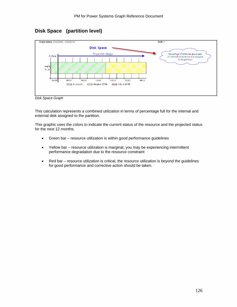
PM for Power Systems Graph Reference Document
126
Disk Space (partition level)
Disk Space Graph This calculation represents a combined utilization in terms of percentage full for the internal and external disk assigned to the partition. This graphic uses the colors to indicate the current status of the resource and the projected status for the next 12 months.
Green bar – resource utilization is within good performance guidelines
Yellow bar – resource utilization is marginal, you may be experiencing intermittent performance degradation due to the resource constraint
Red bar – resource utilization is critical, the resource utilization is beyond the guidelines
for good performance and corrective action should be taken.

Section 4: Linux Interactive Graphs
PM for Power Systems support is provided for Linux in a PowerLinux environment or when Linux is running in the partition of a more traditional system. Support is provided for Linux Red Hat RHEL Version 5 or higher and SUSE SLES Version 10 or higher. (Both are supported as long as their GLIBC version is 2.4 or up.)
(Prior releases of RHEL and SLES may work but are not supported.)
This new capability will allow Linux users on any IBM POWER based processor system to enjoy the partition level (or total system if a non partitioned environment) performance, system management and capacity planning functions that IBM PM for Power Systems provides. Linux support is provided in both a stand alone Linux environment or in a mixed OS (Linux, AIX and / or IBM i) environment.
The PM for Power Systems data collection package for support of Linux can be found as an option on IBM Installation Toolkit version 5.3, which is available for access beginning November 16, 2012. This is a toolkit for IBM Power Linux installation that will provide access to unique software packages for both RHEL and SLES .
Support is provided in the following environments for transmitting the data to IBM: 1) IBM Electronic Service Agent (ESA) running in a stand alone environment; 2) an HMC environment; 3) an FSM environment if ESA is configured for transmission of the data.
Activation Instructions:
The activation instructions for PMLinux Collection Agent can be found in the respective ReadMe under Getting Started - Activation Steps
http://www-03.ibm.com/systems/power/support/perfmgmt/activation.html
127
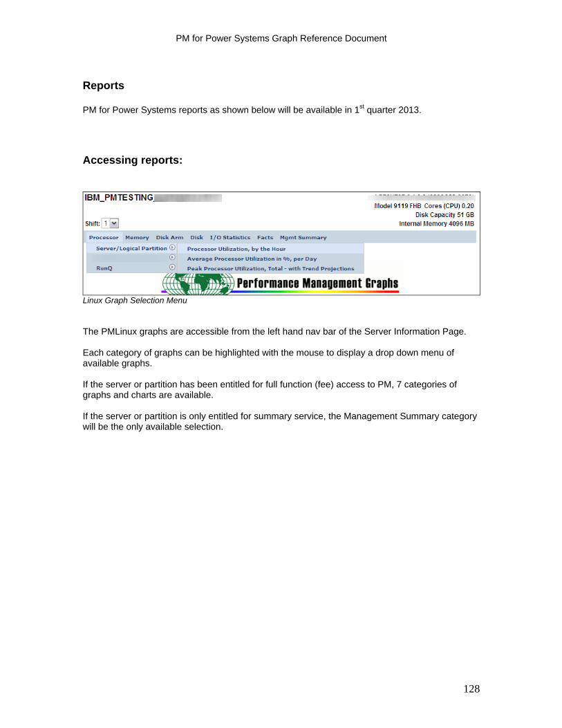
PM for Power Systems Graph Reference Document
Reports
PM for Power Systems reports as shown below will be available in 1st quarter 2013.
Accessing reports:
Linux Graph Selection Menu The PMLinux graphs are accessible from the left hand nav bar of the Server Information Page. Each category of graphs can be highlighted with the mouse to display a drop down menu of available graphs. If the server or partition has been entitled for full function (fee) access to PM, 7 categories of graphs and charts are available. If the server or partition is only entitled for summary service, the Management Summary category will be the only available selection.
128
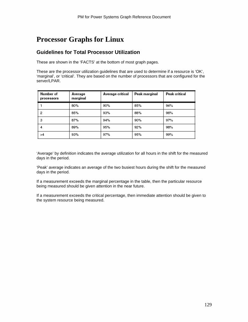
PM for Power Systems Graph Reference Document
Processor Graphs for Linux
Guidelines for Total Processor Utilization These are shown in the ‘FACTS’ at the bottom of most graph pages. These are the processor utilization guidelines that are used to determine if a resource is ‘OK’, ‘marginal’, or ‘critical’. They are based on the number of processors that are configured for the server/LPAR.
‘Average’ by definition indicates the average utilization for all hours in the shift for the measured days in the period. ‘Peak’ average indicates an average of the two busiest hours during the shift for the measured days in the period. If a measurement exceeds the marginal percentage in the table, then the particular resource being measured should be given attention in the near future. If a measurement exceeds the critical percentage, then immediate attention should be given to the system resource being measured.
129
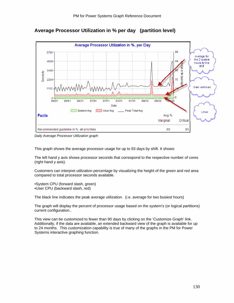
PM for Power Systems Graph Reference Document
Average Processor Utilization in % per day (partition level)
Daily Average Processor Utilization graph This graph shows the average processor usage for up to 93 days by shift. It shows: The left hand y axis shows processor seconds that correspond to the respective number of cores (right hand y axis). Customers can interpret utilization percentage by visualizing the height of the green and red area compared to total processor seconds available. •System CPU (forward slash, green) •User CPU (backward slash, red) The black line indicates the peak average utilization. (i.e. average for two busiest hours) The graph will display the percent of processor usage based on the system’s (or logical partitions) current configuration.. This view can be customized to fewer than 90 days by clicking on the ‘Customize Graph’ link. Additionally, if the data are available, an extended backward view of the graph is available for up to 24 months. This customization capability is true of many of the graphs in the PM for Power Systems interactive graphing function.
130
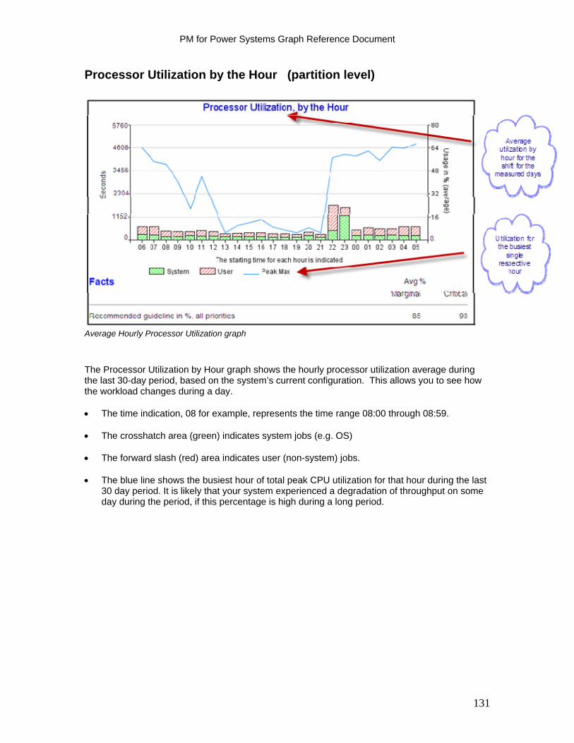
PM for Power Systems Graph Reference Document
Processor Utilization by the Hour (partition level)
Average Hourly Processor Utilization graph
The Processor Utilization by Hour graph shows the hourly processor utilization average during the last 30-day period, based on the system’s current configuration. This allows you to see how the workload changes during a day. The time indication, 08 for example, represents the time range 08:00 through 08:59. The crosshatch area (green) indicates system jobs (e.g. OS) The forward slash (red) area indicates user (non-system) jobs. The blue line shows the busiest hour of total peak CPU utilization for that hour during the last
30 day period. It is likely that your system experienced a degradation of throughput on some day during the period, if this percentage is high during a long period.
131
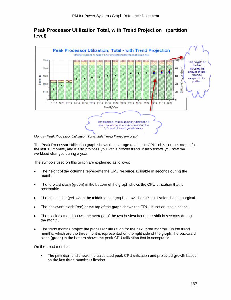
PM for Power Systems Graph Reference Document
Peak Processor Utilization Total, with Trend Projection (partition level)
Monthly Peak Processor Utilization Total, with Trend Projection graph The Peak Processor Utilization graph shows the average total peak CPU utilization per month for the last 13 months, and it also provides you with a growth trend. It also shows you how the workload changes during a year. The symbols used on this graph are explained as follows: The height of the columns represents the CPU resource available in seconds during the
month. The forward slash (green) in the bottom of the graph shows the CPU utilization that is
acceptable. The crosshatch (yellow) in the middle of the graph shows the CPU utilization that is marginal. The backward slash (red) at the top of the graph shows the CPU utilization that is critical. The black diamond shows the average of the two busiest hours per shift in seconds during
the month, The trend months project the processor utilization for the next three months. On the trend
months, which are the three months represented on the right side of the graph, the backward slash (green) in the bottom shows the peak CPU utilization that is acceptable.
On the trend months:
The pink diamond shows the calculated peak CPU utilization and projected growth based on the last three months utilization.
132

PM for Power Systems Graph Reference Document
The blue square shows the calculated peak CPU utilization and projected growth based on the last six months utilization.
The yellow star shows the calculated peak CPU utilization and projected growth based on
the last 12 months of utilization. The advantage of processor seconds is that processor seconds is a normalized unit of work independent of the resources allocated to the server/LPAR. This means that the black diamonds on the graph represent the workload trend independent of the resources allocated to the server/LPAR. Not shown: Under the Facts, the number of months until the guideline is reached is a projection, based on current utilization and growth data, of the number of month’s growth remaining until the respective resource reaches guideline. If greater than or equal to 12 months, it is shown as 12 months.
133
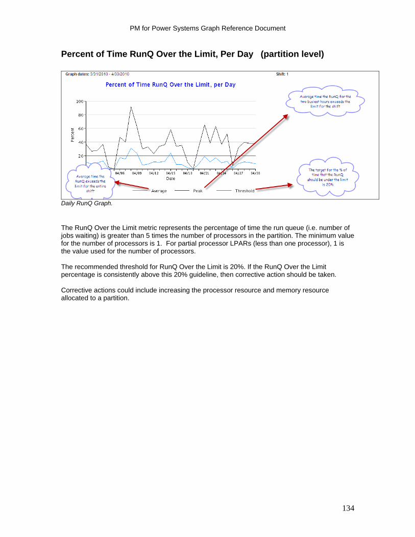
PM for Power Systems Graph Reference Document
Percent of Time RunQ Over the Limit, Per Day (partition level)
Daily RunQ Graph.
The RunQ Over the Limit metric represents the percentage of time the run queue (i.e. number of jobs waiting) is greater than 5 times the number of processors in the partition. The minimum value for the number of processors is 1. For partial processor LPARs (less than one processor), 1 is the value used for the number of processors. The recommended threshold for RunQ Over the Limit is 20%. If the RunQ Over the Limit percentage is consistently above this 20% guideline, then corrective action should be taken. Corrective actions could include increasing the processor resource and memory resource allocated to a partition.
134

PM for Power Systems Graph Reference Document
Percent of Time RunQ Over the Limit, Per Hour (partition level)
Hourly RunQ Graph.
This is the hourly profile for the RunQ Over the Limit metric, for the interval specified. The black line represents the highest RunQ Over the Limit percentage for the hour during the period specified Note: The RunQ Over the Limit metric represents the percentage of time the run queue (i.e. number of jobs waiting) is greater than 5 times the number of processors in the partition The minimum value for the number of processors is 1. For partial processor LPARs (less than 1 processor), 1 is the value used for the number of processors.. The recommended threshold for Run Q Over the Limit is 20%. If the RUNQ Over the Limit percentage is consistently above this 20% guideline, then corrective action should be taken.
135
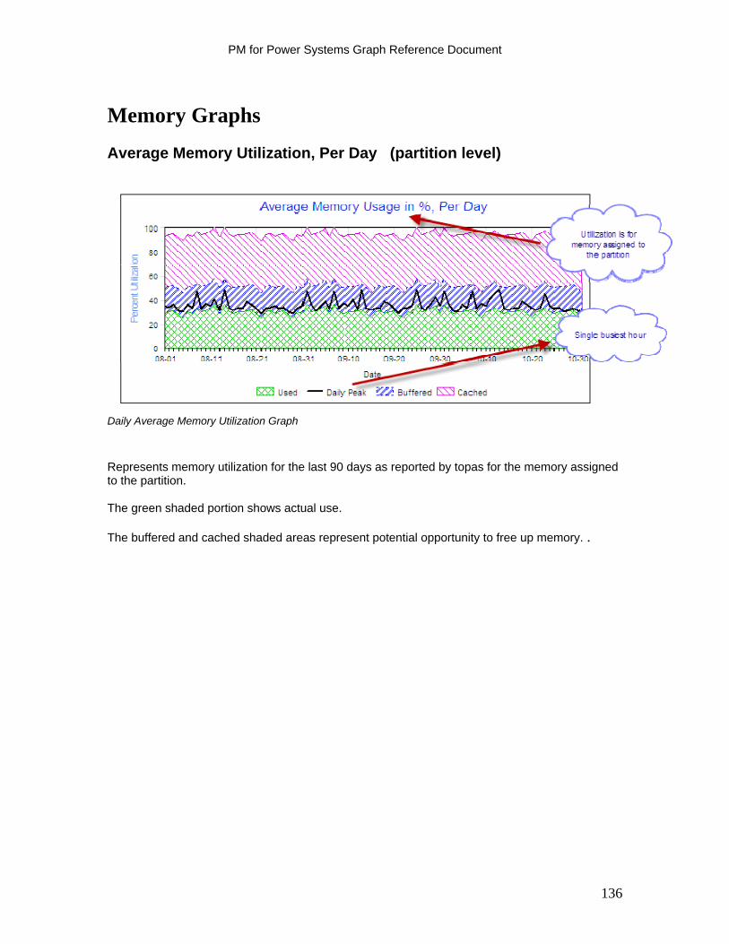
PM for Power Systems Graph Reference Document
Memory Graphs
Average Memory Utilization, Per Day (partition level)
Daily Average Memory Utilization Graph
Represents memory utilization for the last 90 days as reported by topas for the memory assigned to the partition. The green shaded portion shows actual use. The buffered and cached shaded areas represent potential opportunity to free up memory. .
136
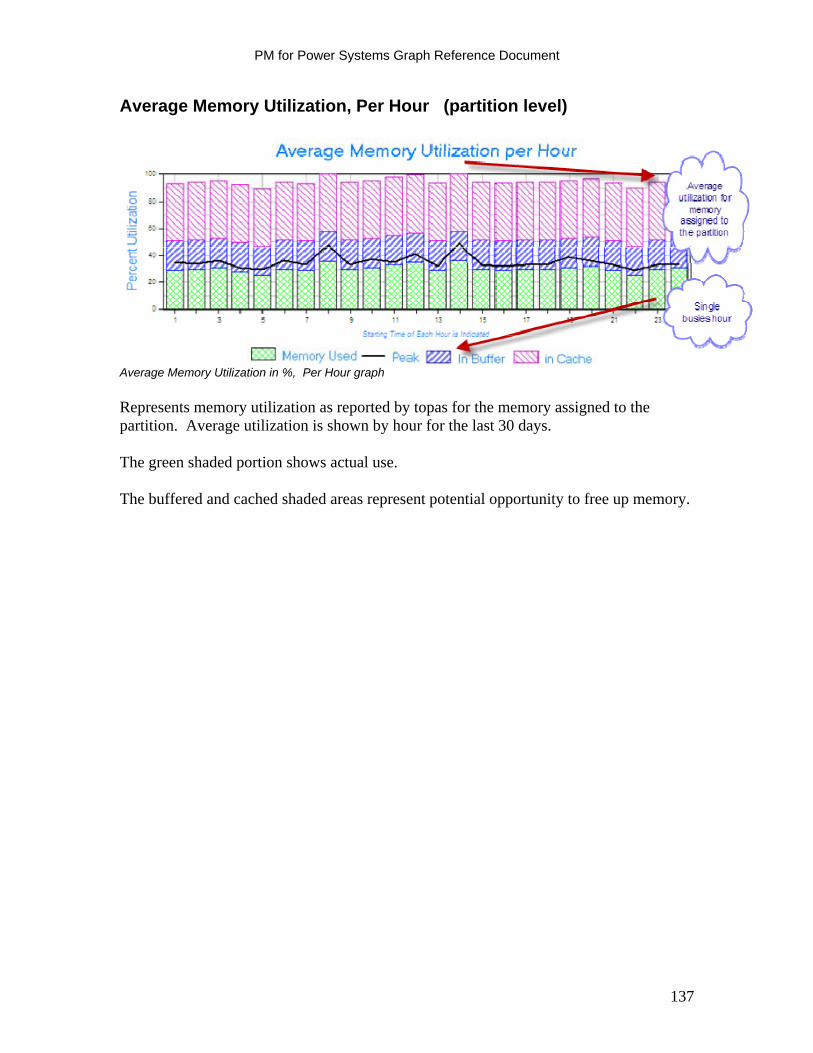
PM for Power Systems Graph Reference Document
Average Memory Utilization, Per Hour (partition level)
Average Memory Utilization in %, Per Hour graph
Represents memory utilization as reported by topas for the memory assigned to the partition. Average utilization is shown by hour for the last 30 days. The green shaded portion shows actual use. The buffered and cached shaded areas represent potential opportunity to free up memory.
137
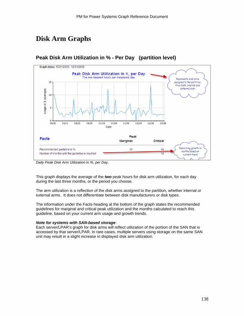
PM for Power Systems Graph Reference Document
Disk Arm Graphs
Peak Disk Arm Utilization in % - Per Day (partition level)
Daily Peak Disk Arm Utilization in %, per Day. This graph displays the average of the two peak hours for disk arm utilization, for each day during the last three months, or the period you choose. The arm utilization is a reflection of the disk arms assigned to the partition, whether internal or external arms. It does not differentiate between disk manufacturers or disk types. The information under the Facts heading at the bottom of the graph states the recommended guidelines for marginal and critical peak utilization and the months calculated to reach this guideline, based on your current arm usage and growth trends. Note for systems with SAN-based storage: Each server/LPAR’s graph for disk arms will reflect utilization of the portion of the SAN that is accessed by that server/LPAR. In rare cases, multiple servers using storage on the same SAN unit may result in a slight increase in displayed disk arm utilization.
138

PM for Power Systems Graph Reference Document
Disk Arm Utilization by Hour (partition level)
Hourly Disk Arm Utilization Graph.
The Disk Arm Utilization by Hour graph shows the average disk arm utilization by hour for the last month, or the month or period you select. The Peak Max indicator denotes the disk arm utilization for the single highest hour during the period. The information under the Facts heading at the bottom of the graph states the recommended guidelines for marginal and critical peak utilization. Note for systems with SAN-based storage: Each server/LPAR’s graph for disk arms will reflect utilization of the portion of the SAN that is accessed by that server/LPAR. In rare cases, multiple servers using storage on the same SAN unit may result in a slight increase in displayed disk arm utilization.
139
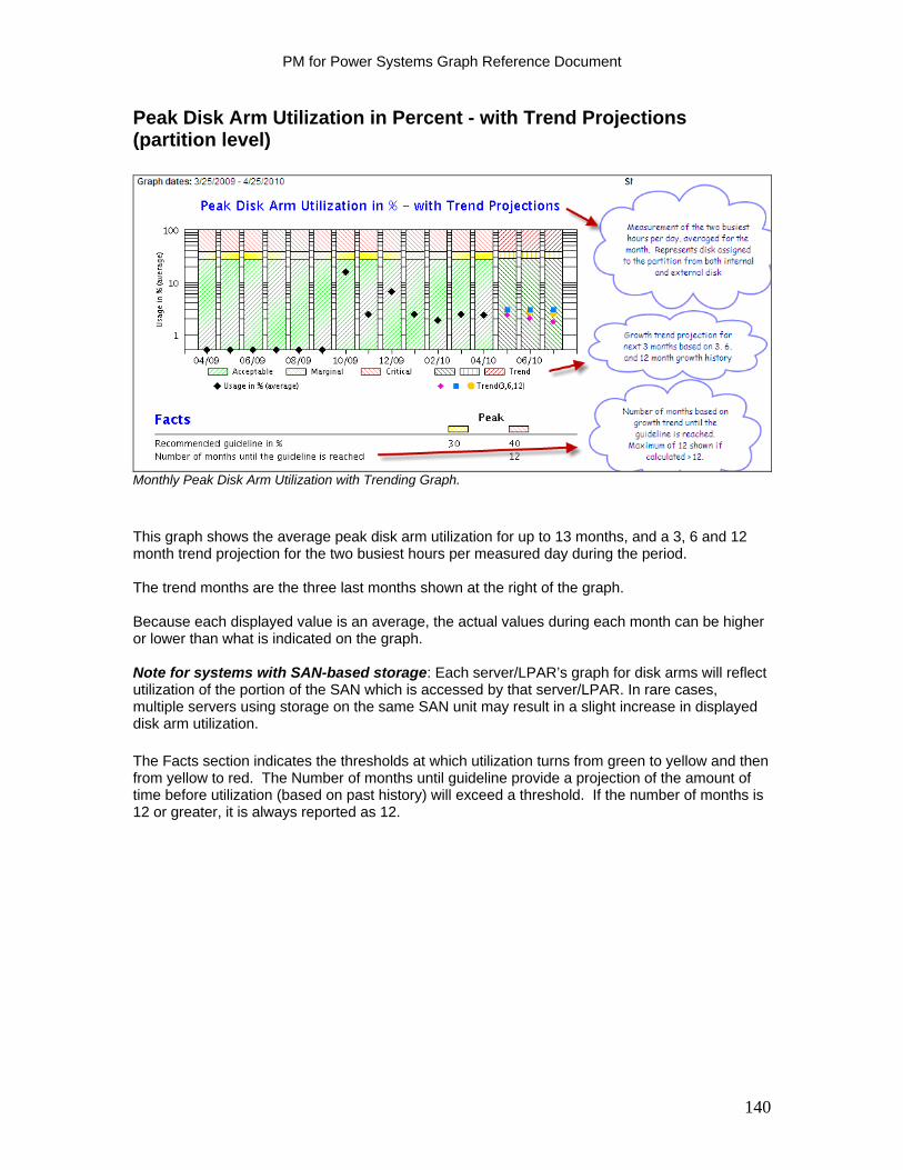
PM for Power Systems Graph Reference Document
Peak Disk Arm Utilization in Percent - with Trend Projections (partition level)
Monthly Peak Disk Arm Utilization with Trending Graph.
This graph shows the average peak disk arm utilization for up to 13 months, and a 3, 6 and 12 month trend projection for the two busiest hours per measured day during the period. The trend months are the three last months shown at the right of the graph. Because each displayed value is an average, the actual values during each month can be higher or lower than what is indicated on the graph. Note for systems with SAN-based storage: Each server/LPAR’s graph for disk arms will reflect utilization of the portion of the SAN which is accessed by that server/LPAR. In rare cases, multiple servers using storage on the same SAN unit may result in a slight increase in displayed disk arm utilization. The Facts section indicates the thresholds at which utilization turns from green to yellow and then from yellow to red. The Number of months until guideline provide a projection of the amount of time before utilization (based on past history) will exceed a threshold. If the number of months is 12 or greater, it is always reported as 12.
140

PM for Power Systems Graph Reference Document
Disk Graphs
Disk Space Usage in %, per Day (partition level)
Daily Disk Space Utilization Graph.
The Disk Space Usage in % per Day graph shows the disk space utilization for the last three months or the period you choose. It shows:
Hard Disk usage (blue) – This is a combined percentage capacity used for all disks assigned to the partition.
File System usage (red) – Note that this metric can exceed 100%. The file system
measurement is a combined capacity for all file systems in the partition. The disk measurement includes both internal and external disk assigned to the partition. Guidelines for disk space usage are 75% for Marginal, and 85% for Critical.
141
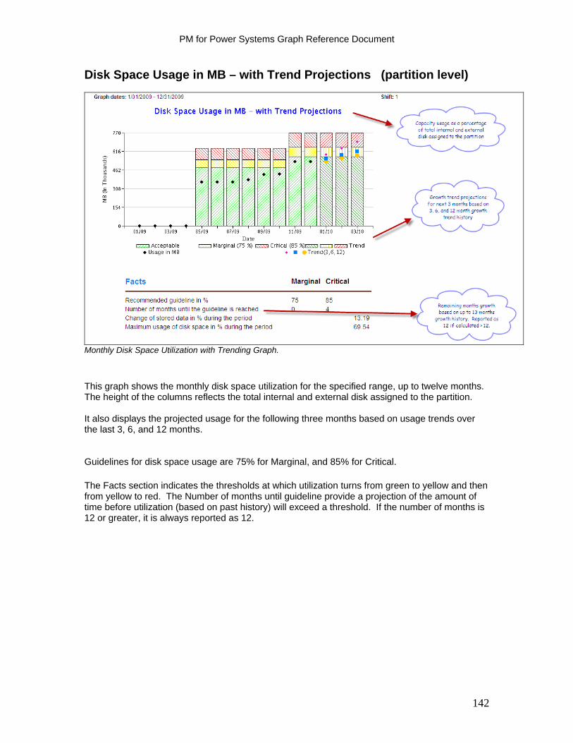
PM for Power Systems Graph Reference Document
Disk Space Usage in MB – with Trend Projections (partition level)
Monthly Disk Space Utilization with Trending Graph.
This graph shows the monthly disk space utilization for the specified range, up to twelve months. The height of the columns reflects the total internal and external disk assigned to the partition. It also displays the projected usage for the following three months based on usage trends over the last 3, 6, and 12 months. Guidelines for disk space usage are 75% for Marginal, and 85% for Critical. The Facts section indicates the thresholds at which utilization turns from green to yellow and then from yellow to red. The Number of months until guideline provide a projection of the amount of time before utilization (based on past history) will exceed a threshold. If the number of months is 12 or greater, it is always reported as 12.
142
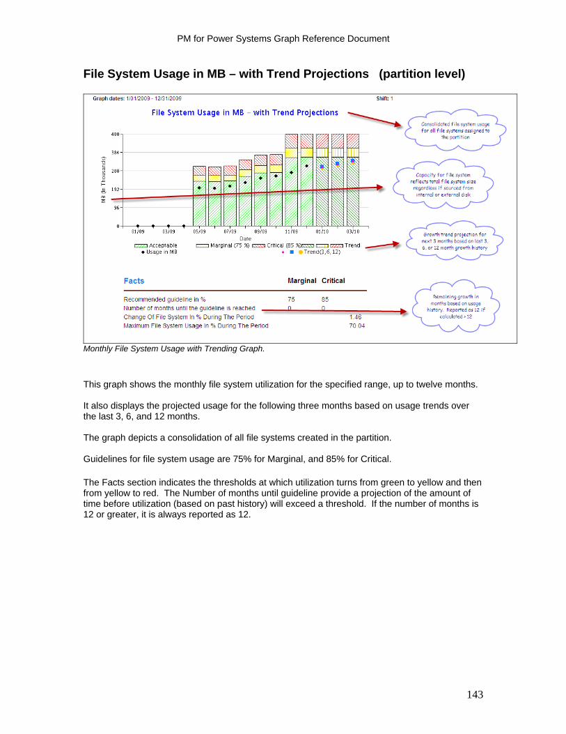
PM for Power Systems Graph Reference Document
File System Usage in MB – with Trend Projections (partition level)
Monthly File System Usage with Trending Graph.
This graph shows the monthly file system utilization for the specified range, up to twelve months. It also displays the projected usage for the following three months based on usage trends over the last 3, 6, and 12 months. The graph depicts a consolidation of all file systems created in the partition. Guidelines for file system usage are 75% for Marginal, and 85% for Critical. The Facts section indicates the thresholds at which utilization turns from green to yellow and then from yellow to red. The Number of months until guideline provide a projection of the amount of time before utilization (based on past history) will exceed a threshold. If the number of months is 12 or greater, it is always reported as 12.
143
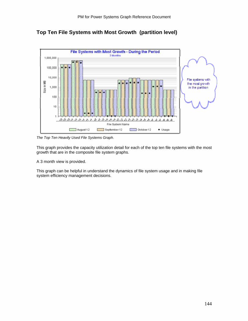
PM for Power Systems Graph Reference Document
Top Ten File Systems with Most Growth (partition level)
The Top Ten Heavily Used File Systems Graph.
This graph provides the capacity utilization detail for each of the top ten file systems with the most growth that are in the composite file system graphs. A 3 month view is provided. This graph can be helpful in understand the dynamics of file system usage and in making file system efficiency management decisions.
144

PM for Power Systems Graph Reference Document
I/O Graphs
Disk I/O Per Second for User Jobs (partition level)
Hourly Disk IOs per Second for User Jobs Graph.
This graph displays the average of disk I/O per second rates during each hour for the specified period. This will allow you to evaluate if your workload is I/O intensive or CPU intensive by comparing this graph to the Processor Seconds Per I/O graph.
145
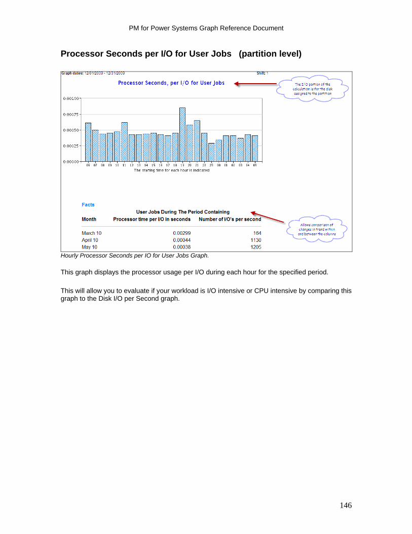
PM for Power Systems Graph Reference Document
Processor Seconds per I/O for User Jobs (partition level)
Hourly Processor Seconds per IO for User Jobs Graph.
This graph displays the processor usage per I/O during each hour for the specified period.
This will allow you to evaluate if your workload is I/O intensive or CPU intensive by comparing this graph to the Disk I/O per Second graph.
146

PM for Power Systems Graph Reference Document
Facts Table
System Resources Summary (partition level)
System Resources Summary Report.
This report displays the average, peak average, and maximum values for Total Processor Utilization, Disk Usage, File System Usage, and Memory Utilization for the specified period. The number of months growth remaining until the respective metric is projected to reach the guideline is also calculated and displayed. If it is calculated as 12 or more months, it is recorded as 12 months.
147

PM for Power Systems Graph Reference Document
Management Summary Graphs (Mgmt Summary)
The Management Summary graphs are available as part of the no additional charge offering of PM for Power Systems. There are three graphs available:
Processor Disk Space File System Space
148
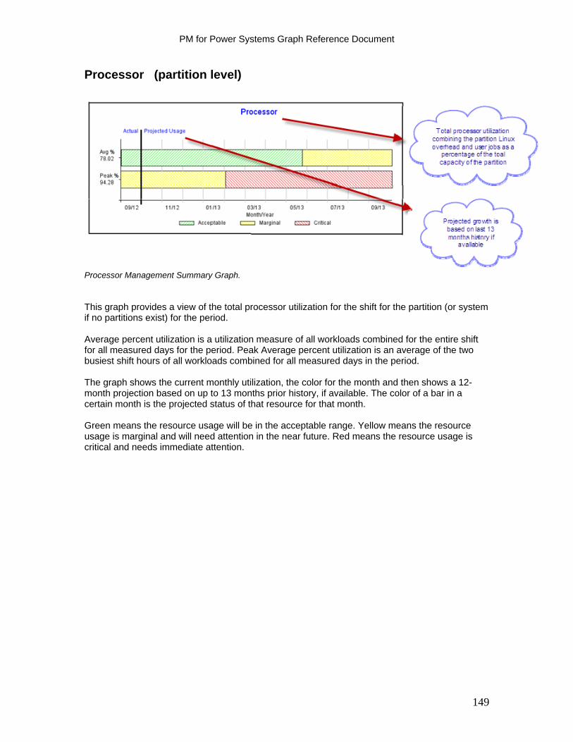
PM for Power Systems Graph Reference Document
Processor (partition level)
Processor Management Summary Graph. This graph provides a view of the total processor utilization for the shift for the partition (or system if no partitions exist) for the period. Average percent utilization is a utilization measure of all workloads combined for the entire shift for all measured days for the period. Peak Average percent utilization is an average of the two busiest shift hours of all workloads combined for all measured days in the period. The graph shows the current monthly utilization, the color for the month and then shows a 12-month projection based on up to 13 months prior history, if available. The color of a bar in a certain month is the projected status of that resource for that month. Green means the resource usage will be in the acceptable range. Yellow means the resource usage is marginal and will need attention in the near future. Red means the resource usage is critical and needs immediate attention.
149
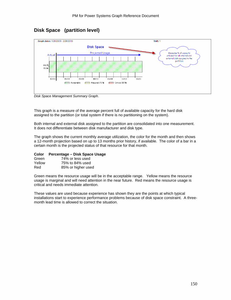
PM for Power Systems Graph Reference Document
Disk Space (partition level)
Disk Space Management Summary Graph.
This graph is a measure of the average percent full of available capacity for the hard disk assigned to the partition (or total system if there is no partitioning on the system). Both internal and external disk assigned to the partition are consolidated into one measurement. It does not differentiate between disk manufacturer and disk type. The graph shows the current monthly average utilization, the color for the month and then shows a 12-month projection based on up to 13 months prior history, if available. The color of a bar in a certain month is the projected status of that resource for that month. Color Percentage – Disk Space Usage Green 74% or less used Yellow 75% to 84% used Red 85% or higher used Green means the resource usage will be in the acceptable range. Yellow means the resource usage is marginal and will need attention in the near future. Red means the resource usage is critical and needs immediate attention. These values are used because experience has shown they are the points at which typical installations start to experience performance problems because of disk space constraint. A three-month lead time is allowed to correct the situation.
150

PM for Power Systems Graph Reference Document
151
File System (partition level)
File System Management Summary Graph.
This graph provides a consolidated average percent full of all file systems assigned to the partition. It includes file systems residing on both internal and external disk. The graph shows the current monthly utilization, the color for the month and then shows a 12 month projection based on up to 13 months prior history, if available. The color of a bar in a certain month is the projected status of that resource for that month. Green means the resource usage will be in the acceptable range. Yellow means the resource usage is marginal and will need attention in the near future. Red means the resource usage is critical and needs immediate attention. Color Percentage – Disk Space Usage Green 74% or less used Yellow 75% to 84% used Red 85% or higher used These values are used since experience has shown they are the points at which typical installations start to experience performance problems because of disk space constraint. A three-month lead time is allowed to correct the situation.
Section 5: Significant News Articles
PM for Power Systems AIX Data Collector Enhanced to Streamline Activation
IBM Performance Management for Power Systems has announced a significant enhancement to the integrated PM AIX Collection Agent that streamlines the activation of PM for Power Systems in the AIX operating system environment. This new capability began shipping in mid December, 2010.
Beginning with the installation of AIX 6.1 TL06 SP3 and AIX 7.1 TL 00 SP2, the PM AIX Collection Agent which collects performance data will automatically create and populate the PM data file needed for subsequent transmission to IBM as part of the PM for Power Systems process. The automated PM performance data file collection is an integrated function within topas, the integrated performance data collector within AIX. The user will no longer need to run the 'smit topas' or 'smit SetUpPM' commands to start creation of the file.
If you have previously configured topas to collect AIX performance data and transmit to IBM, installing the December 2010 Service Pack will not change any of the settings and your server/partition will continue to create and populate the PM data file needed for subsequent transmission to IBM.
Automatic creation of the file does not mean the file will be automatically transmitted to IBM. The user must enable transmission by configuring IBM Electronic Service Agent (ESA) call home function at the standalone server (no HMC), at the HMC, or via enabling ”performance management reporting” on the Service and Support Manager plugin for IBM Systems Director 6.2.1. (See below for how the service pack installation affects the call home function defaults.)
With the installation of the above AIX service packs (and future releases), ESA will automatically transmit the "PM" performance data file that was generated on the system’s behalf, per the following scenarios:
1. ESA for standalone AIX server (unmanaged): by default the file will transmit to IBM. 2. ESA for Power HMC: the user should ensure that “transmit performance data” is
configured at the HMC. Default transmission setting will vary by HMC version. 3. ESA for Service and Support Manager 6.2.1 (IBM Systems Director): By default
performance data reporting is set “Enabled”.
Installation of the AIX service packs affects ESA and PM configurations in the following manner:
ESA for AIX -- unmanaged environment (ie. ESA installed on an AIX server): Installation of the above service packs enables ESA to transmit performance data, and updates any prior configuration options selected within ESA. If ESA was not previously configured, then the default will be set to 'Transmit Performance Data' when the user installs the service pack and subsequently configures ESA.
ESA for Power HMC environment (ie ESA call home functions configured within the Power HMC): For most versions of the HMC, the default ESA configuration is set to ”Transmit Performance Data”. Installation of the AIX service pack at the partition will not change the existing ESA on HMC settings for the transmission of performance data. The user should verify desired settings.
152
PM for Power Systems Graph Reference Document
ESA for IBM Systems Director environment: (ESA resides in the Service & Support Manager plugin) Installation of the AIX service pack at the server will not change existing ESA on Director transmission settings. The user should ensure that the performance data transmission checkbox reflects 'Enabled’ within Service and Support Manager 6.2.1 (Systems Director) to have ESA transmit the performance data.
The 'PM' performance data file created within topas as a result of this change defaults to an average of a 128k file size at the partition level. The file will contain one day of history. The user has the option to increase the number of days of history retained should subsequent re-transmission of the performance data be needed.
The new process on PM for Power Systems on AIX is now more similar to how the PM for Power Systems process works on IBM i.
If you wish to learn more about this new process or how to stop transmission or collection of PM for Power Systems data, visit our website: http://www.ibm.com/systems/power/support/perfmgmt/faq.html
153
PM for Power Systems Graph Reference Document
Shared Processor Pool Reporting for IBM i
The IBM Performance Management Development and Worldwide Operations team is pleased to announce a significant enhancement to the IBM i detailed report offering of Performance Management (PM) for Power Systems that is designed to help customers manage their systems in a dynamic processor allocation environment. Shared physical processor pool reporting is now supported as of the first of April, 2011. Customers who are subscribed to the detail IBM Global Services fee report offering and who also have configured their systems to create a shared processor pool, will now receive three different levels of shared processor reports. Reports are provided showing 'total pool' utilization versus 'total pool' capacity:
1) in a monthly comparison for the last year including a 3, 6 and 12 month projection of future pool utilization
2) in a daily comparison for the last 90 days; and 3) in an hourly comparison for the last 30 days. Initially the only System i environments where shared processor pool reporting is supported is when all of the physical processors on the system are assigned to the shared pool. If all the available processors are not assigned to the shared pool, the graph will not be generated. This restriction will be eliminated in the near future. To enable this capability, customers should be current on IBM i PTF's. Current subscribers to the PM for Power Systems detail IBM Global Services fee report offering do not need to take any additional action to begin receiving the shared processor pool reports. Similar support for AIX is under review.
154
PM for Power Systems Graph Reference Document
System View Graphs available on Power Systems running IBM i
The IBM Performance Management Development and Worldwide Operations team is pleased to announce the availability of System View graphs on Power Systems running IBM i and running Performance Management for Power Systems. This capability provides the end user with a single, consolidated view of processor utilization versus remaining available capacity across all processors and partitions on the system.
This capability complements the prior PM for Power Systems reports, which show processor utilization at the partition level only, by providing the user a view of the system in its entirety plus a view of the individual partitions that make up the total system view.
Only customers subscribed to the detail PM for Power Systems reports either in a stand alone contract or as part of services premium offering (e.g. Enhanced Technical Support in Europe) will have access to the System View graphs.
The System View graph types available are:
Configuration Graph: provides a pictorial of total cores on the system versus how many are activated. Of those cores activated, how they are allocated is shown.
Monthly Graphs: provide a 12 month trend view of the entire system's utilization versus activated processor capacity. They also provide a view of the entire system's utilization versus a combination of the activated cores and capacity upgrade on demand cores.
Daily Graph: combines all the partitions on the system. The graph provides a total system view from both a combined CPU seconds perspective (average, peak average and maximum usage) and a combined core perspective.
Hourly Graph: provides a view of utilization by hour for the entire system.
Prerequisites:
IBM Power 6 hardware or above Minimum of one partition running IBM i V6R1M0 or newer Minimum firmware level xx340_061 or higher Enable the IBM i partition for the collection of the shared pool and system wide processor
utilization data before it is transmitted to IBM. The following settings are required to do this:
o On an HMC: check 'allow performance information collection' on the partition properties / hardware / processors tab
o If using IVM: on the 'lssyscfg' command, specify the 'all_perf_collection' to '1' to allow authority. (Note: the default is '0')
155
PM for Power Systems Graph Reference Document
Shared processor pool reporting for IBM AIX
The IBM Performance Management Development and Worldwide Operations team is pleased to announce a significant enhancement to the IBM AIX detailed report offering of Performance Management (PM) for Power Systems. As of April 23, 2012, shared physical processor pool reporting that is designed to help customers manage their systems in a dynamic processor allocation environment is now supported.
Customers who are subscribed to the detail IBM Global Services fee report offering and who also have configured their systems to create a shared processor pool, will now receive three different levels of shared processor reports. Reports are provided showing 'total pool' utilization versus 'total pool' capacity:
1. in a monthly comparison for the last year including a 3, 6 and 12 month projection of future pool utilization
2. in a daily comparison for the last 90 days; and 3. in an hourly comparison for the last 30 days.
Support is provided for AIX 7.1.0.0 TL 00 and TL 01 and AIX 6.1.0.0 TL 06 and TL 07 via ifix download. (see below). Prior releases and TL's are not supported.
Set up instructions for Shared Processor Pool Graphs
When configuring PM for Power Systems on IBM AIX to support the Shared Processor Pool Graphs, please follow these instructions / requirements:
Interim to the integration of this function into AIX, it is necessary to download and install the 'ifix' software that enables the function. This process includes 4 basic steps. Details of the steps can be found under the Getting Started - Activation Steps for AIX instructions on the main PM for Power Systems web site: (Look for the PM_AIX_Pools_ReadMeV6.txt file)
http://www.ibm.com/systems/power/support/perfmgmt/activation.html
The 4 basic steps necessary to enable this function are:
1. Determine the appropriate release of AIX for which the Shared Processor Pool ifix package is needed
2. Visit Developer Works web site to access the ifix package to download 3. Transfer the ifix package to the AIX server 4. Install the ifix package on the AIX server
To enable shared pool graphs, customers must also select a new TOPAS option. From the command prompt, type: 'smit topas' ---> Setup Performance Management ---> Change/Show HMC Information and enter HMC name and user name.
Please note: If all the processors on the AIX based system are assigned to the shared physical processor pool, then essentially the PM for Power Systems shared physical processor pool graph is a view of the entire system. Such a 'total system view' graph that would not require all processors be assigned to the pool is under consideration for future announcement.
156
PM for Power Systems Graph Reference Document
Current subscribers to the PM for Power Systems detail IBM Global Services fee report offering need not take any additional action to begin receiving the shared processor pool reports beyond the set up instructions identified above.
For additional information on the specific graphs available with shared processor pools, visit the PM for Power Systems Graph Reference Document at: http://www.ibm.com/systems/power/support/perfmgmt
System View Graphs available on Power Systems running IBM AIX
The IBM Performance Management Development and Worldwide Operations team is pleased to announce System View graphs on IBM POWER processor based systems, including IBM PureFlex System, using IBM AIX and running Performance Management for Power Systems. This capability provides the end user with a single, consolidated view of processor utilization versus the remaining available capacity across all processors and partitions on the system. This capability complements the prior PM for Power Systems reports, which show processor utilization at the partition level only, by providing the user a view of the system in its entirety. With this announcement, a complete view is now available....at the partition, processor pool and now total system. Combined with the prior capability to drill down (monthly, daily and hourly level) and backwards (up to the prior 25 months history), the user now has powerful and flexible capability to assist with problem diagnosis or for predicting future capacity requirements. Only customers subscribed to the detail PM for Power Systems reports either in a stand alone contract or as part of services premium offering (e.g. Enhanced Technical Support in Europe) will have access to the System View graphs. The System View graph types available are:
Configuration Graph: provides a pictorial of total cores on the system versus how many are activated. Of those cores activated, how they are allocated is shown. Monthly Graphs: provide a 12 month trend view of the entire system's utilization versus activated processor capacity. They also provide a view of the entire system's utilization versus a combination of the activated cores and capacity upgrade on demand cores.
Daily Graph: combines all the partitions on the system. The graph provides a total system view from both a combined CPU seconds perspective (average, peak average and maximum usage) and a combined core perspective.
Hourly Graph: provides a view of utilization by hour for the entire system.
This new System View support is provided for both the existing AIX release TL's (referred to below as Environment #1) and for the new AIX release TL's announced on October 3, 2012, (Environment #2). The following summarizes how the PM data collection software is obtained.
157
PM for Power Systems Graph Reference Document
158
Environment #1: For existing releases AIX 7.1.0.0 TL 00 or TL 01 and AIX 6.1.0.0 TL 06 or 07 in HMC or FSM configurations
Support is provided via ifix download (see below). Prior releases and TLs are not supported. nor is the VIOS partition supported as the data collection / consolidation partition. Minimum Power 6 hardware or newer. The HMC release must be 7.3.3.5.0 or newer.
Interim to the integration of this function into AIX, it is necessary to download and install the 'ifix' software that enables the function. (Note: the ifix that is downloaded contains support for both System View graphs and Shared Processor Pool graphs. Therefore this ifix supersedes the Shared Processor Pool ifix announced on April 23, 2012).
Environment #2: For new AIX TL's (AIX 7.1 TL 02 and AIX 6.1 TL08) announced on October 3, 2012
In HMC managed systems, the PM collector code to support System View graphs (and Shared Processor Pool graphs) is now embedded in the release in the form of a fileset. It will default install.
In FSM managed systems, an additional ifix supporting both System View and Shared Processor Pool graphs is needed and is available for download. This is in addition to the fileset mentioned above. This ifix will be superseded by a Service Pack in the 1Q'2013.
In both cases, Minimum Power 6 hardware or newer. For the HMC environment, the HMC release must be 7.3.3.5.0 or newer. The VIOS partition is not supported as the data collection / consolidation partition.
Activation Instructions: The activation instructions for both environments can be found in the respective ReadMe under Getting Started - Activation Instructions at: http://www-03.ibm.com/systems/power/support/perfmgmt/activation.html
Current subscribers to the PM for Power Systems detail IBM Global Services fee report offering need not take any additional action to begin receiving the System View reports beyond the set up instructions identified above.
For additional information on the specific graphs available within the System View reports, visit the PM for Power Systems Graph Reference Document at: http://www.ibm.com/systems/power/support/perfmgmt

IBM, the IBM logo, ibm.com, and AIX are trademarks of IBM Corp., registered in many jurisdictions worldwide. Other product and service names might be trademarks of IBM or other companies. A current list of IBM trademarks is available on the Web at “Copyright and trademark information” at www.ibm.com/legal/copytrade.shtml. Adobe and PostScript are either registered trademarks or trademarks of Adobe Systems Incorporated in the United States, and/or other countries. UNIX is a registered trademark of The Open Group in the United States and other countries.