Embed Size (px)
Citation preview
Helvetica Movie Analysis and Summary
Michael Filler | Design Studies | Summer 2014
Helvetica is a documentary film produced by Gary Hustwit about typography in general but also more specifically about Helvetica itself. Many influential typographers and graphic designers provide their opinions on Helvetica and how it functions as a font in our world today. Helvetica also explores the split between modernist and post modernists and why the revolution and evolving of fonts has presented a dispute.
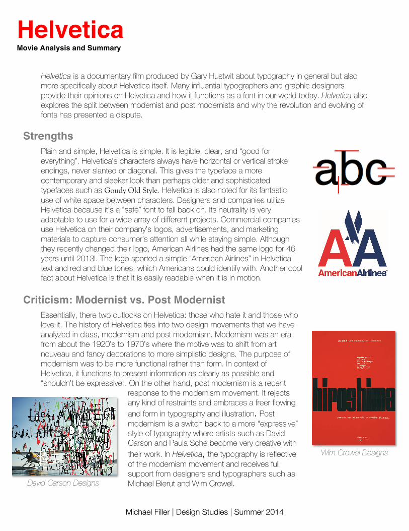
Strengths Plain and simple, Helvetica is simple. It is legible, clear, and “good for everything”. Helvetica’s characters always have horizontal or vertical stroke endings, never slanted or diagonal. This gives the typeface a more contemporary and sleeker look than perhaps older and sophisticated typefaces such as Goudy Old Style. Helvetica is also noted for its fantastic use of white space between characters. Designers and companies utilize Helvetica because it’s a “safe” font to fall back on. Its neutrality is very adaptable to use for a wide array of different projects. Commercial companies use Helvetica on their company’s logos, advertisements, and marketing materials to capture consumer’s attention all while staying simple. Although they recently changed their logo, American Airlines had the same logo for 46 years until 2013l. The logo sported a simple “American Airlines” in Helvetica text and red and blue tones, which Americans could identify with. Another cool fact about Helvetica is that it is easily readable when it is in motion.
Criticism: Modernist vs. Post Modernist Essentially, there two outlooks on Helvetica: those who hate it and those who love it. The history of Helvetica ties into two design movements that we have analyzed in class, modernism and post modernism. Modernism was an era from about the 1920’s to 1970’s where the motive was to shift from art nouveau and fancy decorations to more simplistic designs. The purpose of modernism was to be more functional rather than form. In context of Helvetica, it functions to present information as clearly as possible and “shouldn’t be expressive”. On the other hand, post modernism is a recent
response to the modernism movement. It rejects any kind of restraints and embraces a freer flowing and form in typography and illustration. Post modernism is a switch back to a more “expressive” style of typography where artists such as David Carson and Paula Sche become very creative with their work. In Helvetica, the typography is reflective of the modernism movement and receives full support from designers and typographers such as Michael Bierut and Wim Crowel. David Carson Designs
Wim Crowel Designs
Helvetica Movie Analysis and Summary
Michael Filler | Design Studies | Summer 2014
Michael Bierut
My favorite part of the movie was the commentary and interview of Michael Beirut. The way he explained Helvetica was humorous and awesome at the same time. You can tell that Beirut is a passionate modernist who is an advocate for Helvetica. He claims that Helvetica is “scrapping the crud off of filthy old things” and “restoring them to shining beauty”. The part of his interview that had me laughing out loud was when he vividly put into context what Helvetica was like: “it would feel like your crawling through a desert with your mouth just caked in filthy dust and then someone is giving you a clear, refreshing still icy glass of water that is clearing off a burden”. Watch his whole spiel here: Click Here
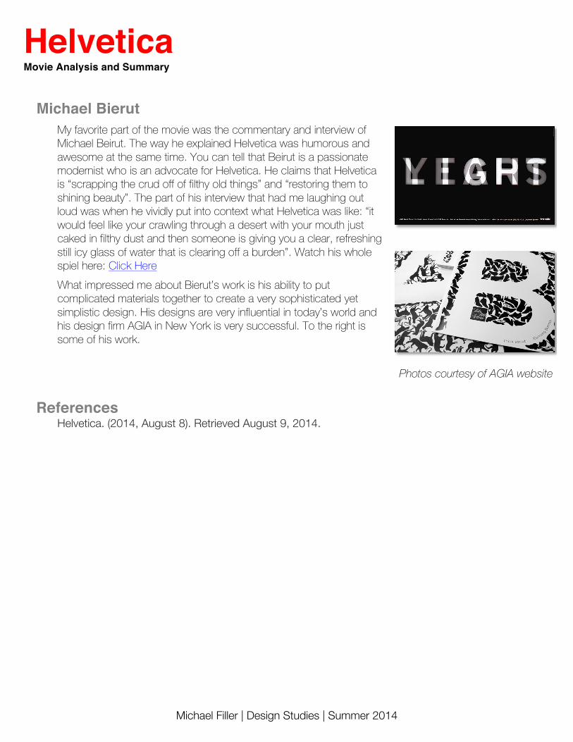
What impressed me about Bierut’s work is his ability to put complicated materials together to create a very sophisticated yet simplistic design. His designs are very influential in today’s world and his design firm AGIA in New York is very successful. To the right is some of his work.
References Helvetica. (2014, August 8). Retrieved August 9, 2014.
Photos courtesy of AGIA website


![The fontspec package FontselectionforX E LT … · FontselectionforX E LAT EXandLuaLATX ... of font weights. For example, ... [BoldFont={Helvetica Neue}] Helvetica Neue UltraLight](https://img.pdfslide.us/doc/110x75/5b781b797f8b9a515a8e83a3/the-fontspec-package-fontselectionforx-e-lt-fontselectionforx-e-lat-exandlualatx.jpg)