Embed Size (px)
Citation preview
HARMONY COLOR CONCEPTS
3
When we began working on the Harmony Furniture Line, we knew the importance the use of color plays in creating a
commercial furniture line that entices customers to stay longer, socialize more, eat more, relax or be more competitive.
We interviewed numerous designers and color experts. During this process we met Mr. Massimo Caiazzo, Designer, Color
Consultant and Vice President of Italy’s IACC (International Association of Color Consultants/Designers) International
Committee, the oldest international association of color designers.
We soon began working with Mr. Caiazzo to create various color palettes for the interior and furnishings of a bowling
or entertainment facility. This was a complex and challenging project. It required analyzing each area of a bowling
facility—the reception, restaurant, concourse, settee and lane areas—and then creating specific color climates based
on the activities that take place in each area.
The impact of color on people who go to a bowling center is total and can dramatically affect the qualitative perception
of the “bowling experience.” In an environment so rich in sensory stimuli (light, sound, movement), as a bowling
facility, it is important to highlight the most prominent features of furniture by virtue of their function. The ultimate
goal is to ensure that people who decide to spend time in a bowling center feel at ease in an environment that at the
same time entertains, helps them to socialize, stimulates competition—but most of all, entices them to come back.
Born in Naples, Italy in 1966, Massimo Caiazzo lives and works in Milan. He worked at Atelier Mendini,
a large graphic, interior and architectural design firm, for over 25 years up until 2006. Mr. Caiazzo is also
a professor at the Department of Fashion Design of the New Academy of Fine Arts (NABA) in Milan,
teaches at the Domus Academy, Polytechnic School of Design and also teaches advanced training courses
organized by IACC, of which he is President and Coordinator.
Harmony in Color
54
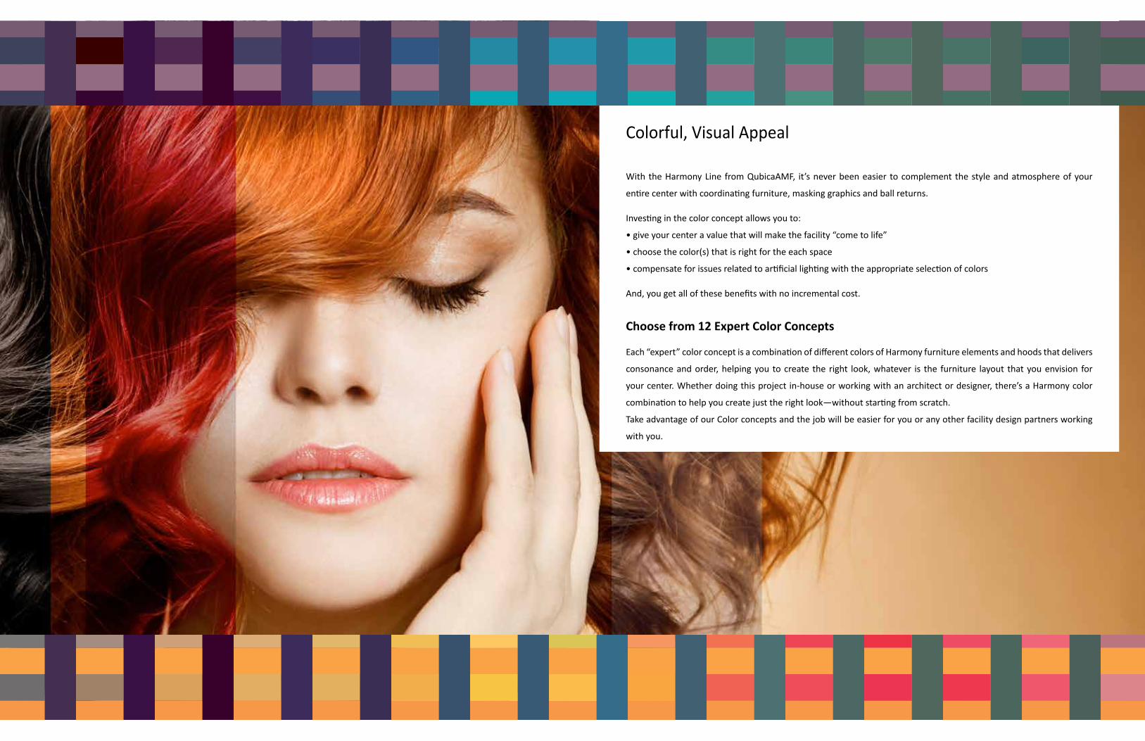
With the Harmony Line from QubicaAMF, it’s never been easier to complement the style and atmosphere of your
entire center with coordinating furniture, masking graphics and ball returns.
Investing in the color concept allows you to:
• give your center a value that will make the facility “come to life”
• choose the color(s) that is right for the each space
• compensate for issues related to artificial lighting with the appropriate selection of colors
And, you get all of these benefits with no incremental cost.
Choose from 12 Expert Color Concepts
Each “expert” color concept is a combination of different colors of Harmony furniture elements and hoods that delivers
consonance and order, helping you to create the right look, whatever is the furniture layout that you envision for
your center. Whether doing this project in-house or working with an architect or designer, there’s a Harmony color
combination to help you create just the right look—without starting from scratch.
Take advantage of our Color concepts and the job will be easier for you or any other facility design partners working
with you.
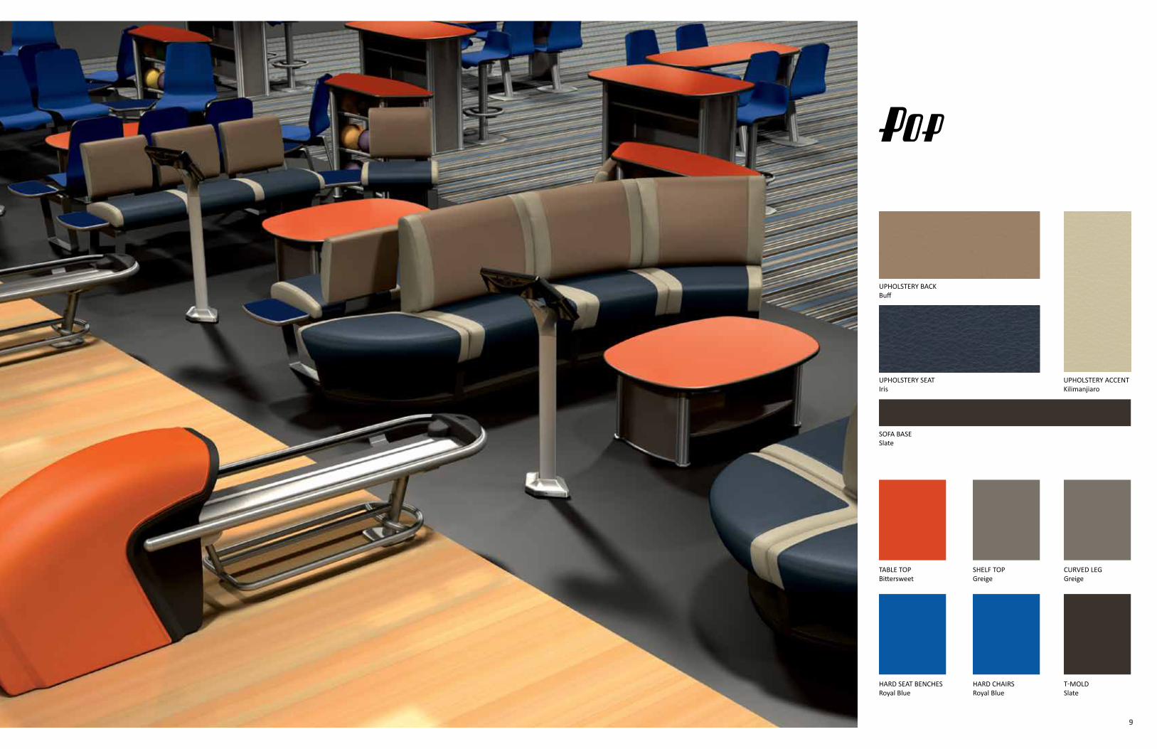
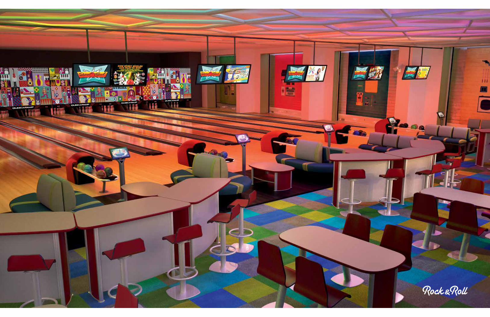
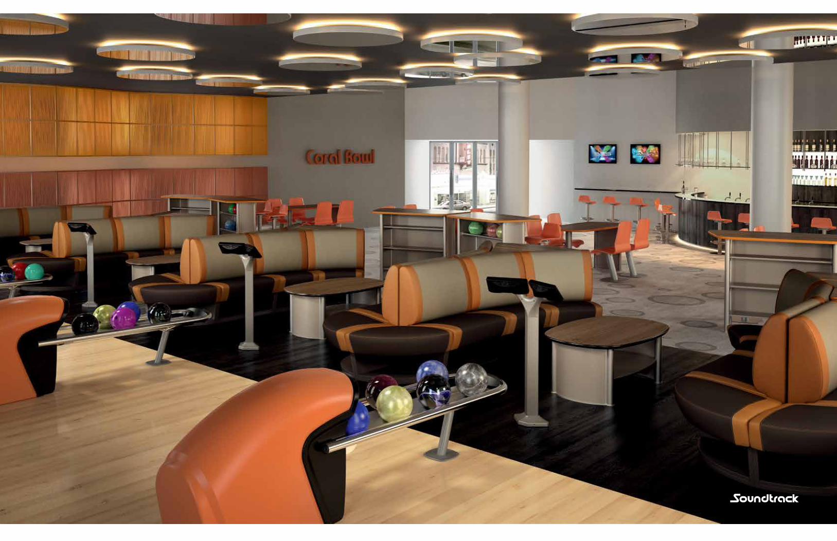
Colorful, Visual Appeal
7
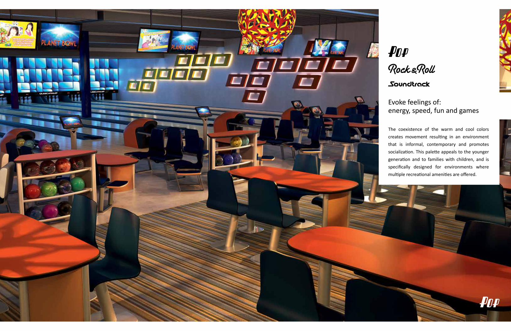
Evoke feelings of:energy, speed, fun and games
The coexistence of the warm and cool colors
creates movement resulting in an environment
that is informal, contemporary and promotes
socialization. This palette appeals to the younger
generation and to families with children, and is
specifically designed for environments where
multiple recreational amenities are offered.
9
UPHOLSTERY ACCENT Kilimanjiaro
UPHOLSTERY SEATIris
SOFA BASESlate
UPHOLSTERY BACKBuff
SHELF TOPGreige
TABLE TOPBittersweet
HARD SEAT BENCHESRoyal Blue
CURVED LEGGreige
HARD CHAIRSRoyal Blue
T-MOLDSlate
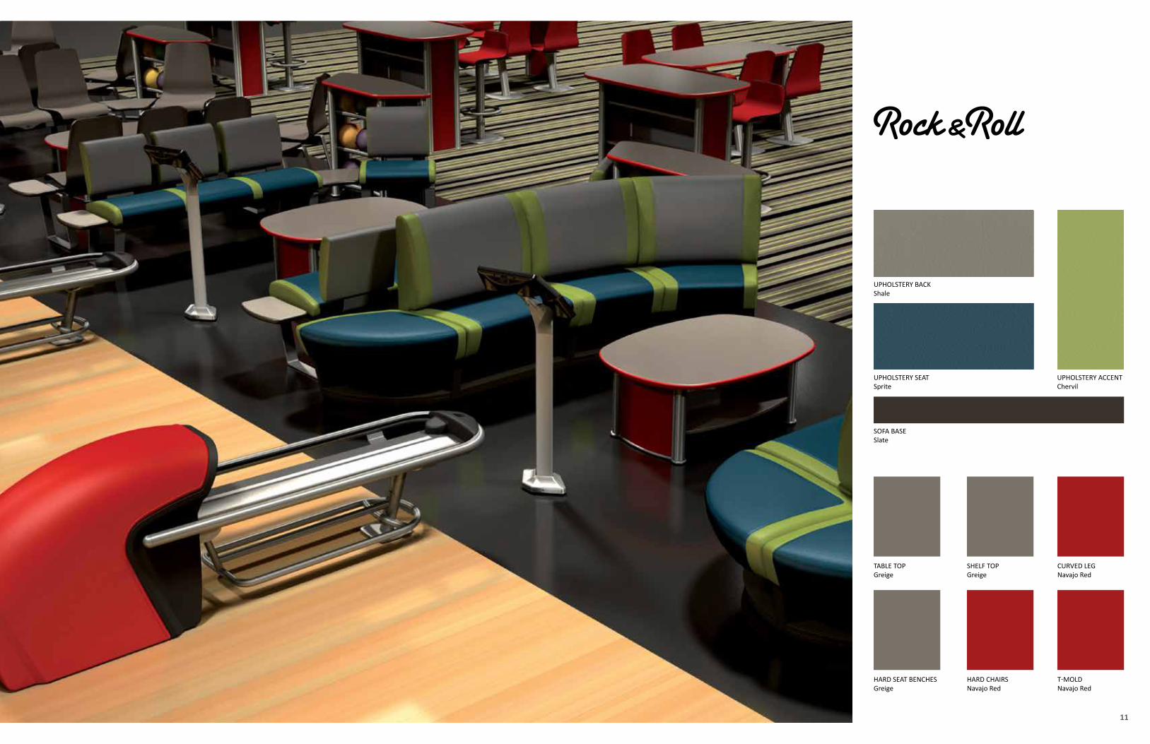
11
UPHOLSTERY ACCENTChervil
UPHOLSTERY SEATSprite
SOFA BASESlate
UPHOLSTERY BACKShale
SHELF TOPGreige
TABLE TOPGreige
HARD SEAT BENCHESGreige
CURVED LEGNavajo Red
HARD CHAIRSNavajo Red
T-MOLDNavajo Red
13
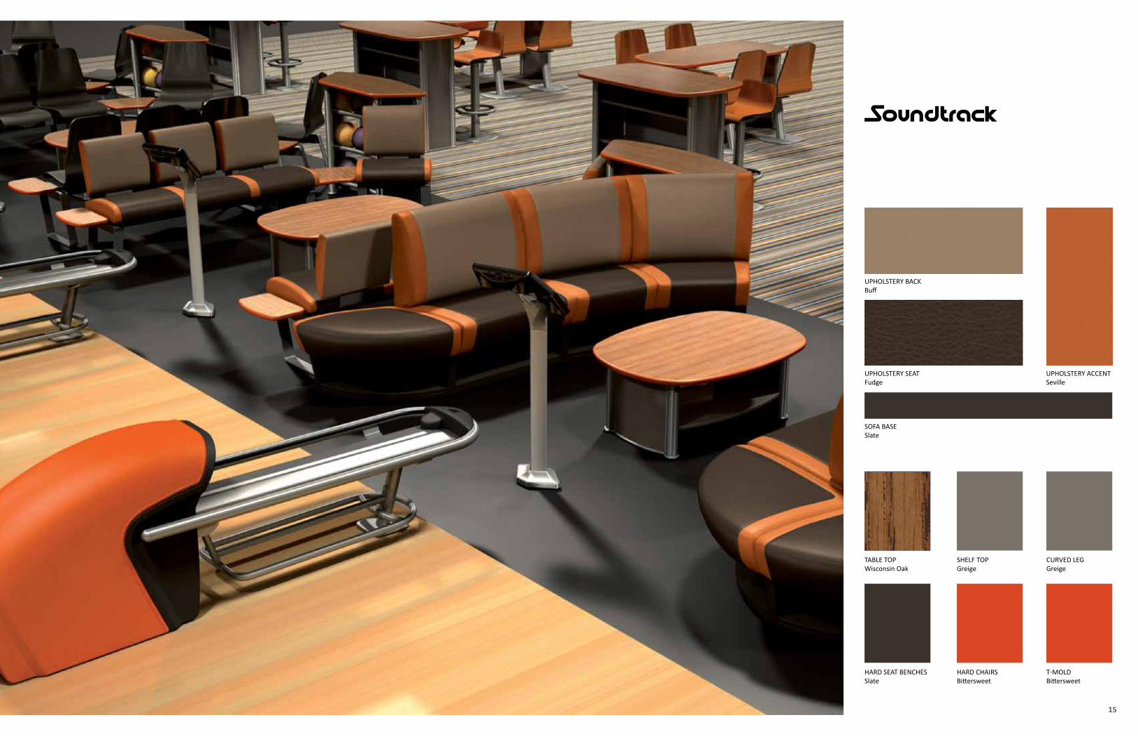
15
UPHOLSTERY ACCENT Seville
UPHOLSTERY SEATFudge
SOFA BASESlate
UPHOLSTERY BACKBuff
SHELF TOPGreige
TABLE TOPWisconsin Oak
HARD SEAT BENCHESSlate
CURVED LEGGreige
HARD CHAIRSBittersweet
T-MOLDBittersweet
17
19
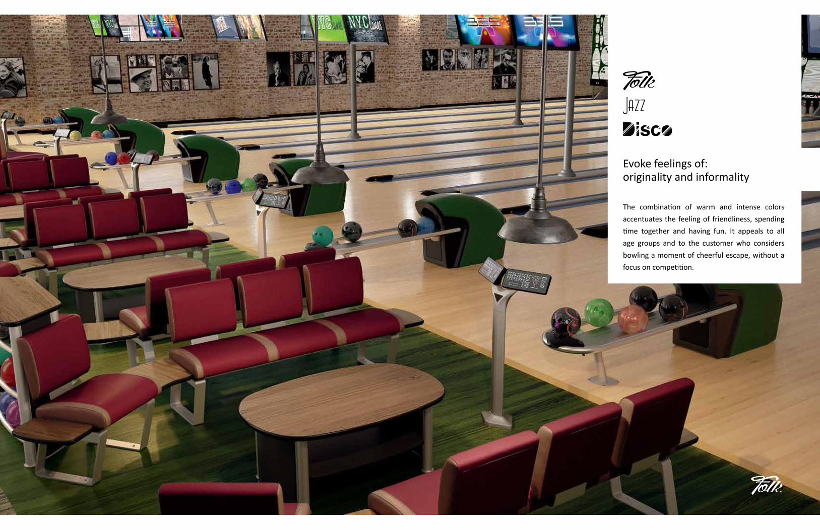
Evoke feelings of:originality and informality
The combination of warm and intense colors
accentuates the feeling of friendliness, spending
time together and having fun. It appeals to all
age groups and to the customer who considers
bowling a moment of cheerful escape, without a
focus on competition.
21
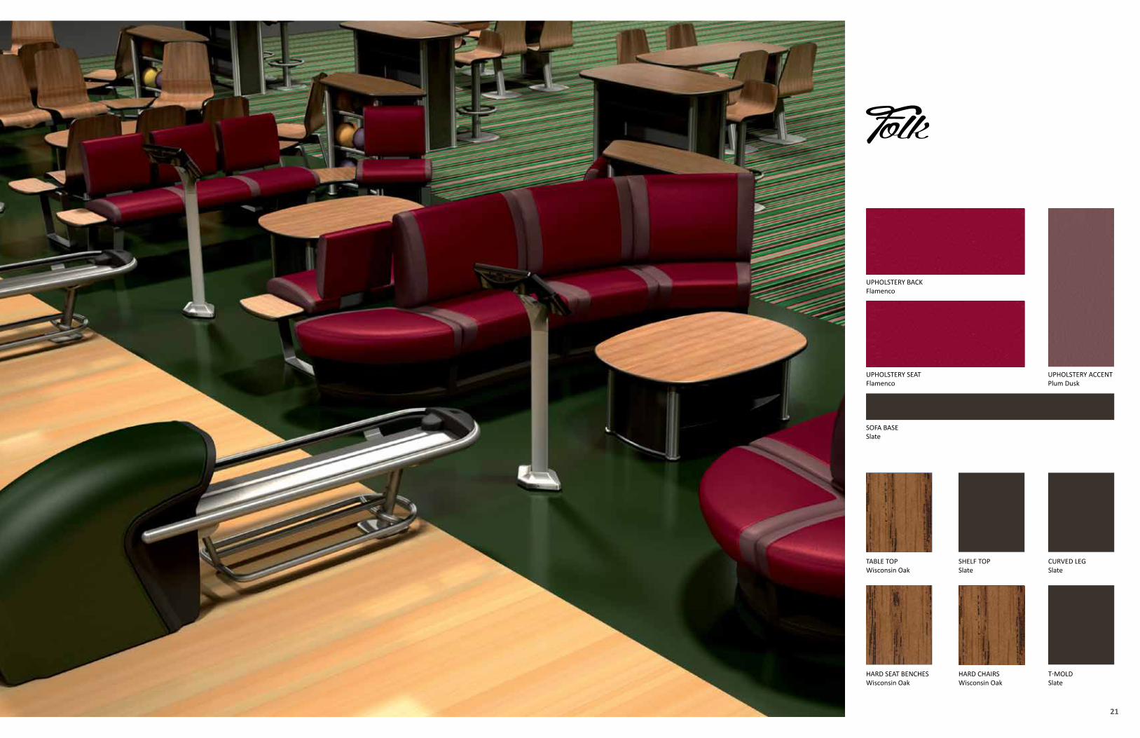
UPHOLSTERY ACCENT Plum Dusk
UPHOLSTERY SEATFlamenco
SOFA BASESlate
UPHOLSTERY BACKFlamenco
SHELF TOPSlate
TABLE TOPWisconsin Oak
HARD SEAT BENCHESWisconsin Oak
CURVED LEGSlate
HARD CHAIRSWisconsin Oak
T-MOLDSlate
23
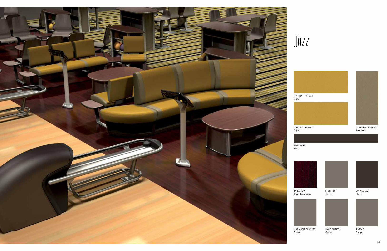
UPHOLSTERY ACCENT Portobello
UPHOLSTERY SEATDijon
SOFA BASESlate
UPHOLSTERY BACKDijon
SHELF TOPGreige
TABLE TOPJewel Mahogany
HARD SEAT BENCHESGreige
CURVED LEGSlate
HARD CHAIRSGreige
T-MOLDGreige
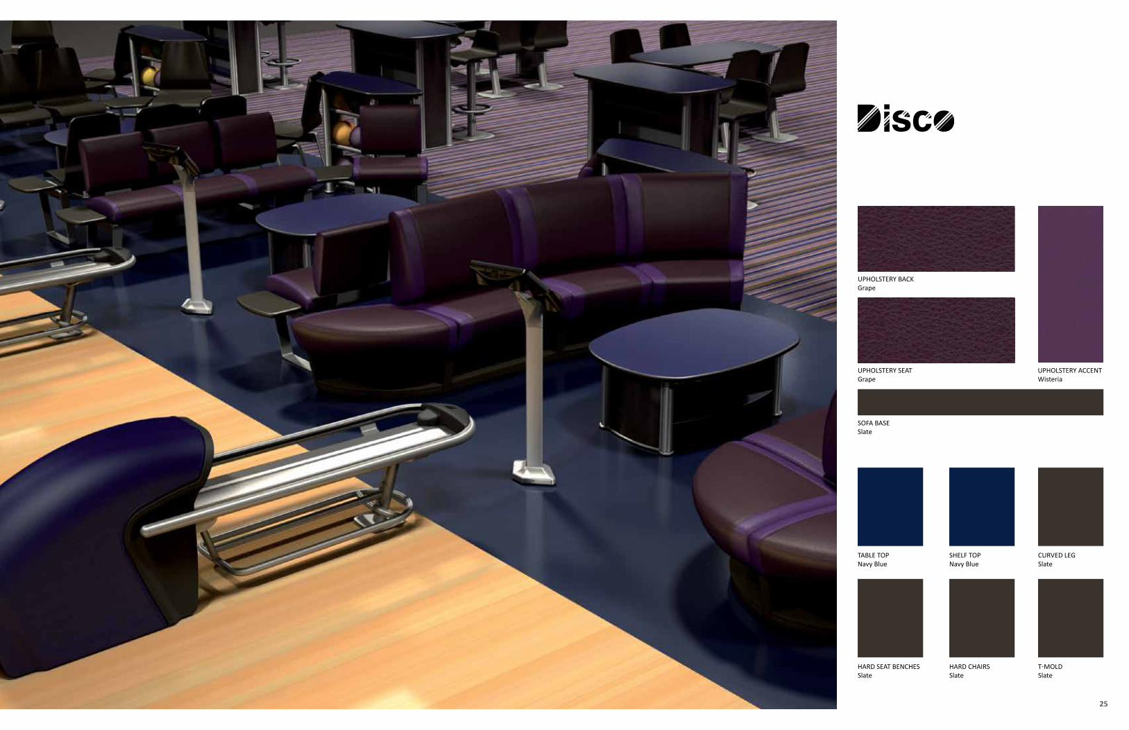
25
UPHOLSTERY ACCENT Wisteria
UPHOLSTERY SEATGrape
SOFA BASESlate
UPHOLSTERY BACKGrape
SHELF TOPNavy Blue
TABLE TOPNavy Blue
HARD SEAT BENCHESSlate
CURVED LEGSlate
HARD CHAIRSSlate
T-MOLDSlate
27
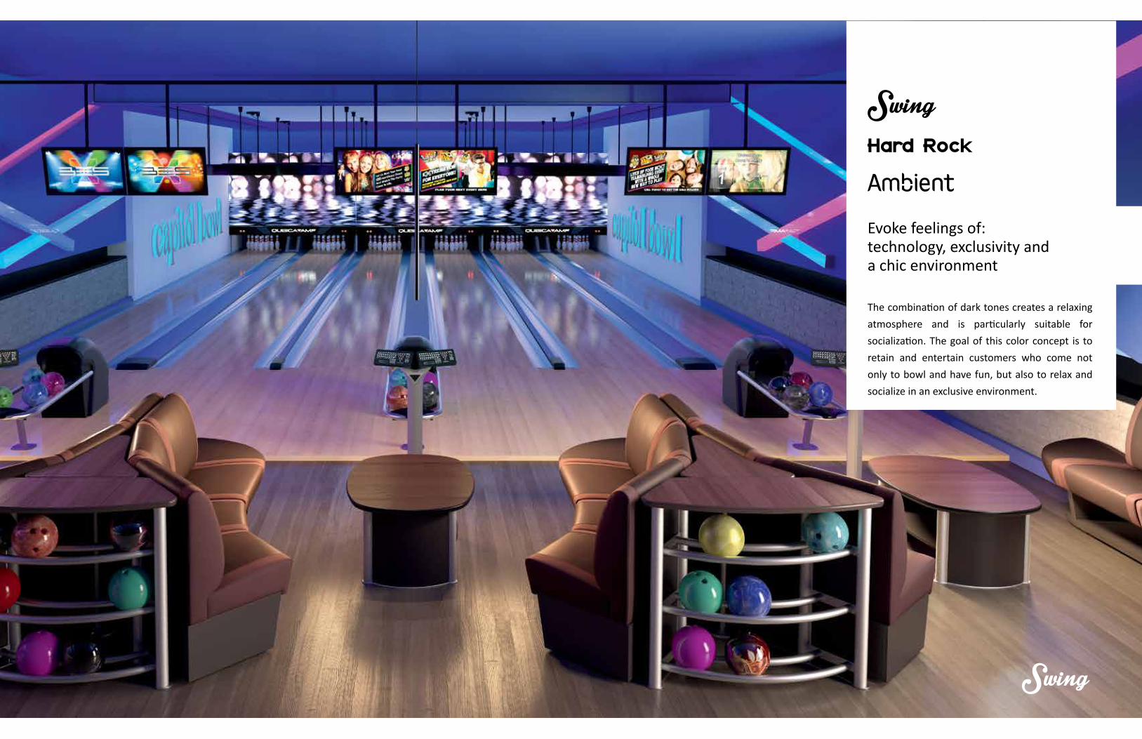
Evoke feelings of:technology, exclusivity anda chic environment
The combination of dark tones creates a relaxing
atmosphere and is particularly suitable for
socialization. The goal of this color concept is to
retain and entertain customers who come not
only to bowl and have fun, but also to relax and
socialize in an exclusive environment.
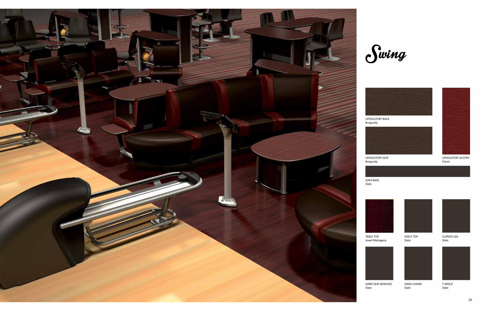
29
UPHOLSTERY ACCENT Claret
UPHOLSTERY SEATBurgundy
SOFA BASESlate
UPHOLSTERY BACKBurgundy
SHELF TOPSlate
TABLE TOPJewel Mahogany
HARD SEAT BENCHESSlate
CURVED LEGSlate
HARD CHAIRSSlate
T-MOLDSlate
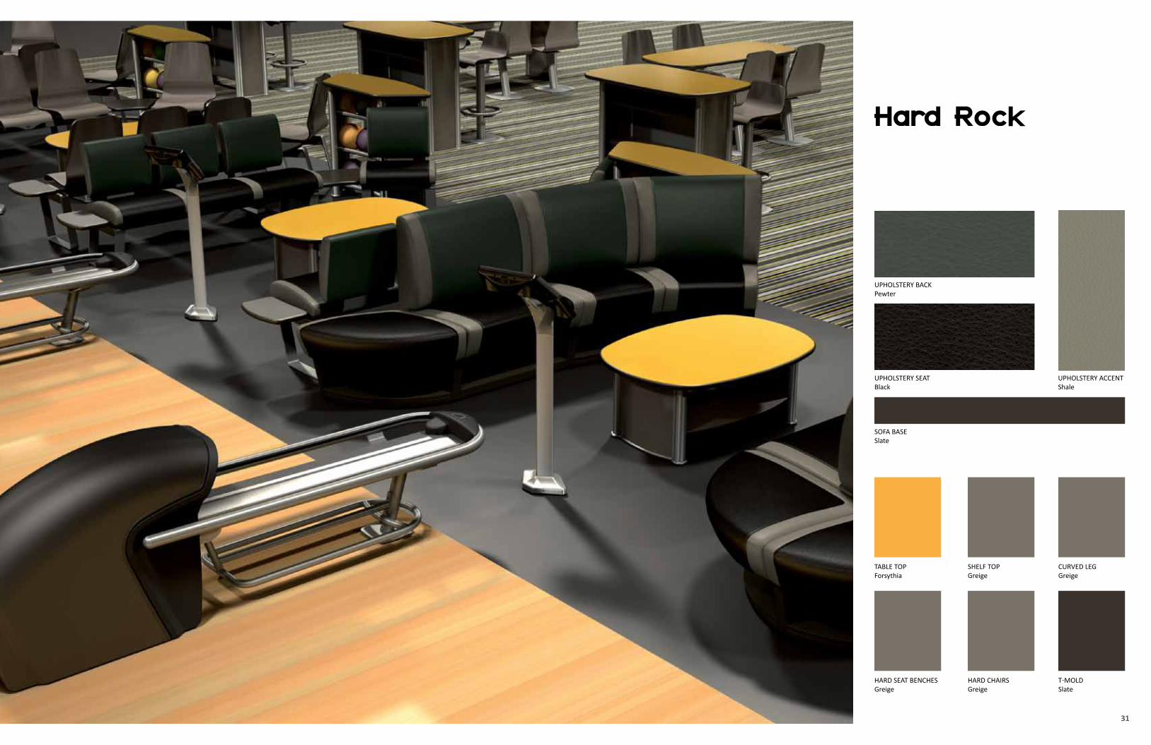
31
UPHOLSTERY ACCENT Shale
UPHOLSTERY SEATBlack
SOFA BASESlate
UPHOLSTERY BACKPewter
SHELF TOPGreige
TABLE TOPForsythia
HARD SEAT BENCHESGreige
CURVED LEGGreige
HARD CHAIRSGreige
T-MOLDSlate
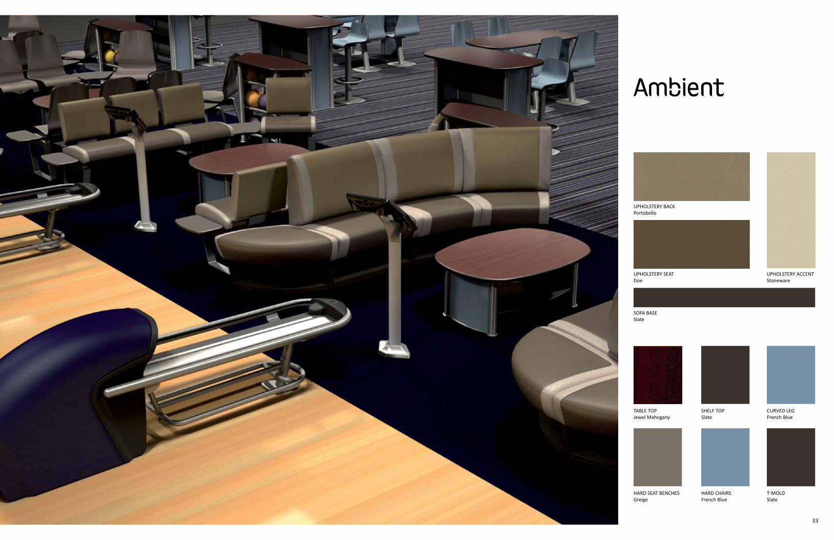
33
UPHOLSTERY ACCENT Stoneware
UPHOLSTERY SEATDoe
SOFA BASESlate
UPHOLSTERY BACKPortobello
SHELF TOPSlate
TABLE TOPJewel Mahogany
HARD SEAT BENCHESGreige
CURVED LEGFrench Blue
HARD CHAIRSFrench Blue
T-MOLDSlate
35
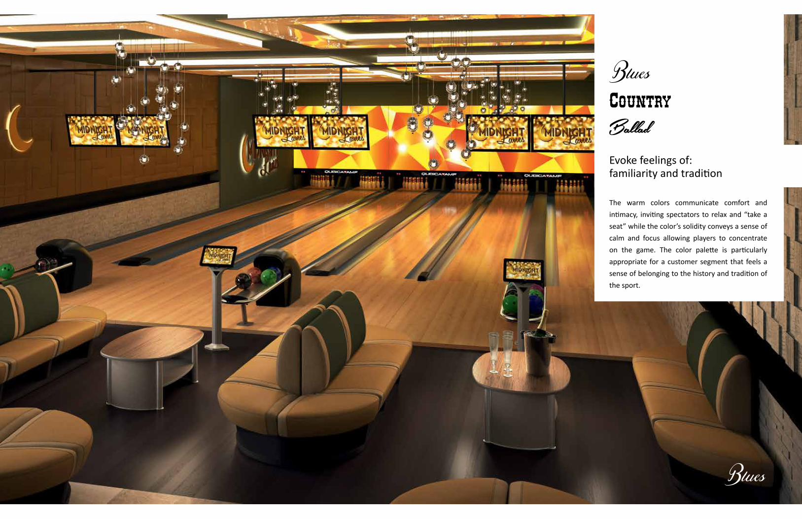
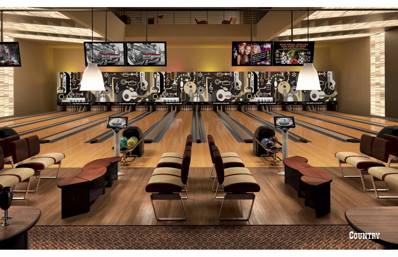
Evoke feelings of:familiarity and tradition
The warm colors communicate comfort and
intimacy, inviting spectators to relax and “take a
seat” while the color’s solidity conveys a sense of
calm and focus allowing players to concentrate
on the game. The color palette is particularly
appropriate for a customer segment that feels a
sense of belonging to the history and tradition of
the sport.
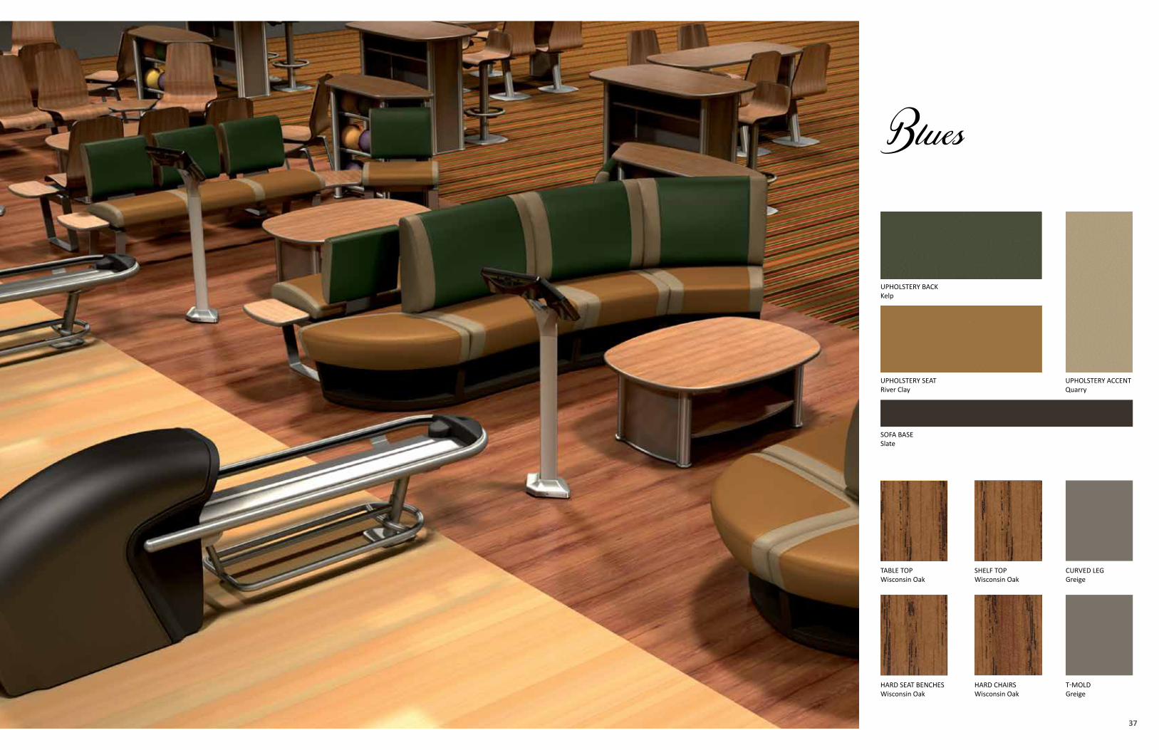
37
UPHOLSTERY ACCENT Quarry
UPHOLSTERY SEATRiver Clay
SOFA BASESlate
UPHOLSTERY BACKKelp
SHELF TOPWisconsin Oak
TABLE TOPWisconsin Oak
HARD SEAT BENCHESWisconsin Oak
CURVED LEGGreige
HARD CHAIRSWisconsin Oak
T-MOLDGreige
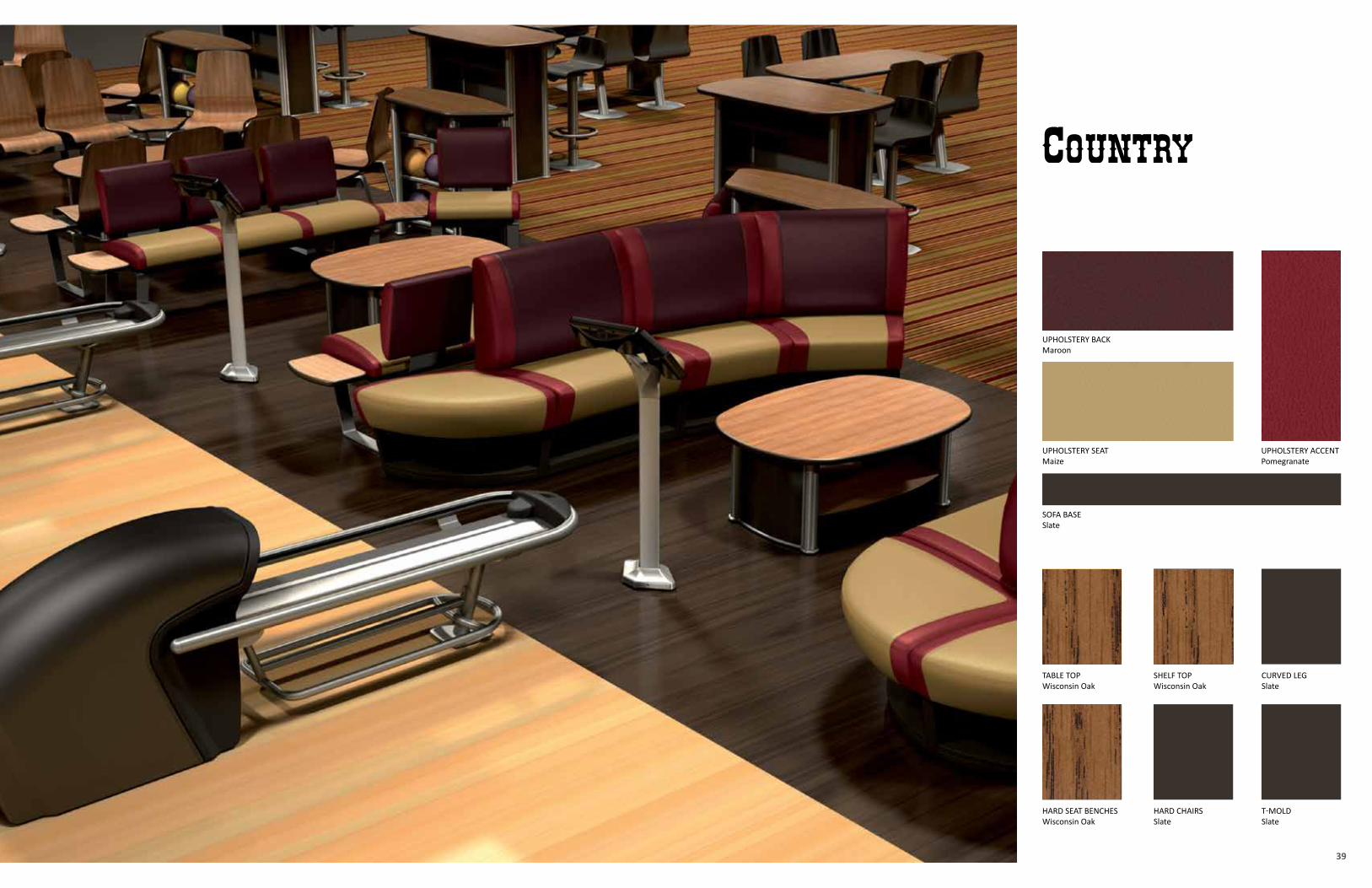
39
UPHOLSTERY ACCENT Pomegranate
UPHOLSTERY SEATMaize
SOFA BASESlate
UPHOLSTERY BACKMaroon
SHELF TOPWisconsin Oak
TABLE TOPWisconsin Oak
HARD SEAT BENCHESWisconsin Oak
CURVED LEGSlate
HARD CHAIRSSlate
T-MOLDSlate
41
43
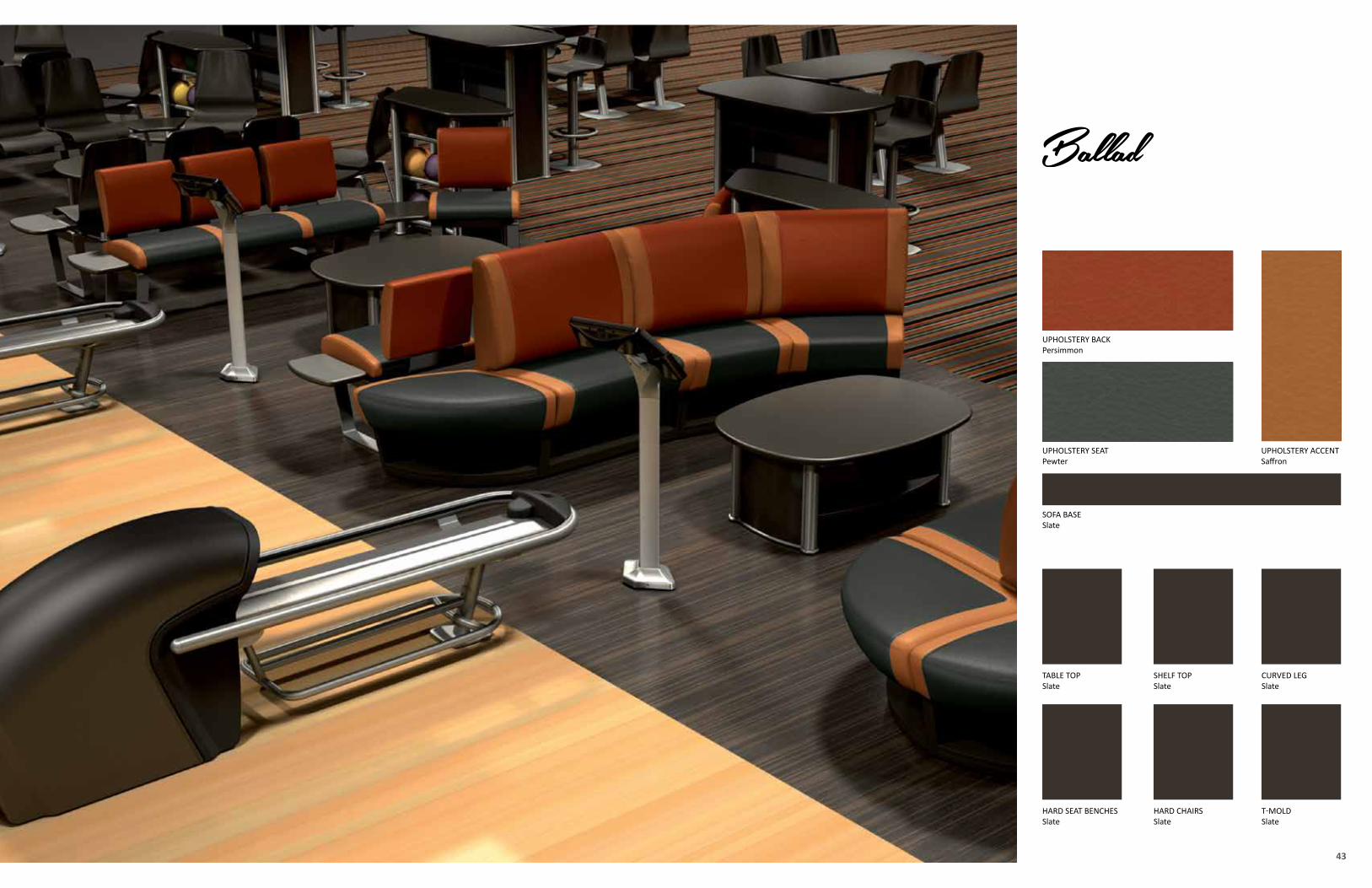
UPHOLSTERY ACCENT Saffron
UPHOLSTERY SEATPewter
SOFA BASESlate
UPHOLSTERY BACKPersimmon
SHELF TOPSlate
TABLE TOPSlate
HARD SEAT BENCHESSlate
CURVED LEGSlate
HARD CHAIRSSlate
T-MOLDSlate
4544
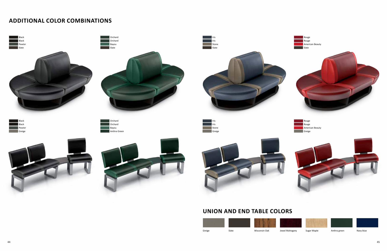
ADDITIONAL COLOR COMBINATIONS
UNION AND END TABLE COLORS
Anthra green Navy blueGreige Slate Sugar MapleJewel MahoganyWisconsin Oak
BlackBlackPewterSlate
OrchardOrchardBayouSlate
IrisIrisStoneSlate
RougeRougeAmerican BeautySlate
BlackBlackPewterGreige
OrchardOrchardBayouAnthra Green
IrisIrisStoneGreige
RougeRougeAmerican BeautyGreige
4746
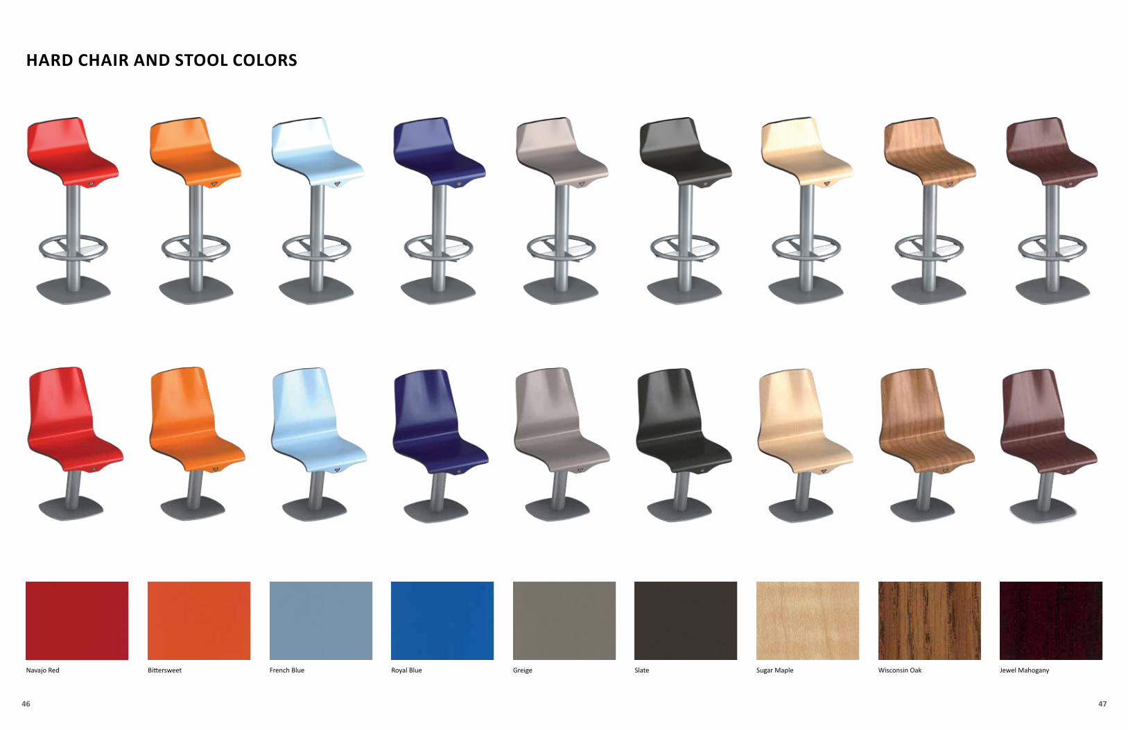
Navajo Red Jewel MahoganySugar MapleBittersweet Wisconsin OakFrench Blue Royal Blue Greige Slate
HARD CHAIR AND STOOL COLORS
4948
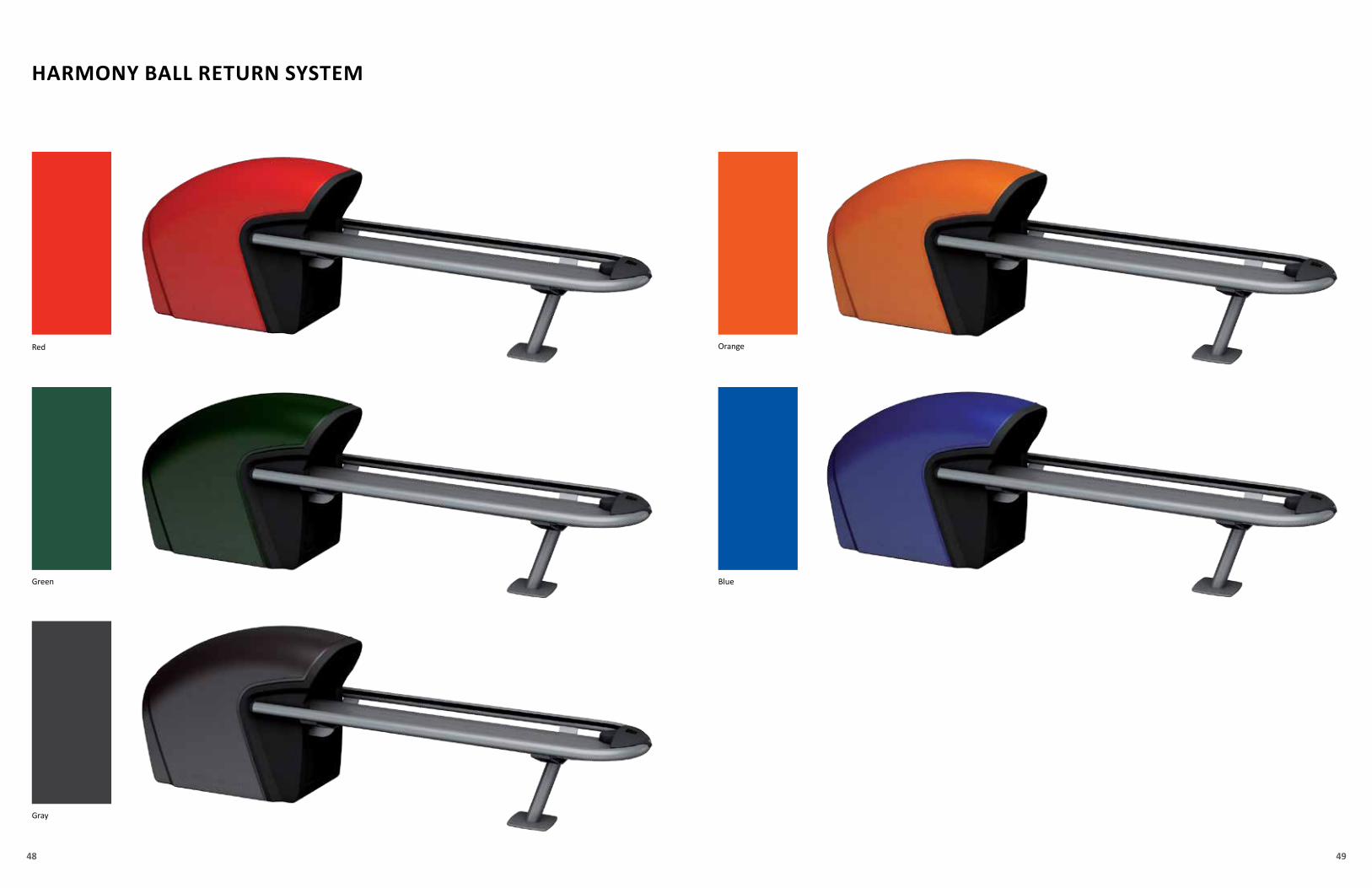
HARMONY BALL RETURN SYSTEM
Red
Gray
Orange
Green Blue
5150
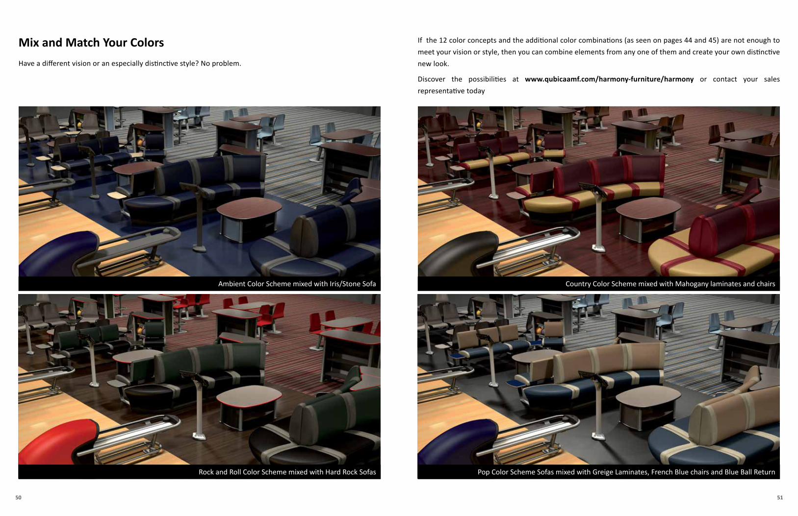
Have a different vision or an especially distinctive style? No problem.
If the 12 color concepts and the additional color combinations (as seen on pages 44 and 45) are not enough to
meet your vision or style, then you can combine elements from any one of them and create your own distinctive
new look.
Discover the possibilities at www.qubicaamf.com/harmony-furniture/harmony or contact your sales
representative today
Ambient Color Scheme mixed with Iris/Stone Sofa
Rock and Roll Color Scheme mixed with Hard Rock Sofas Pop Color Scheme Sofas mixed with Greige Laminates, French Blue chairs and Blue Ball Return
Country Color Scheme mixed with Mahogany laminates and chairs
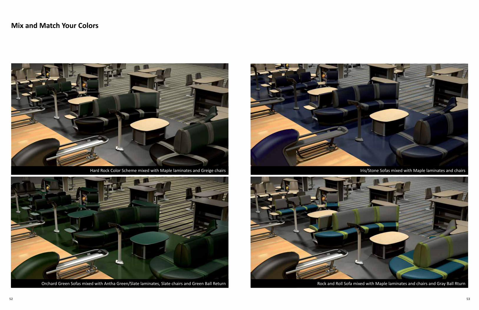
Mix and Match Your Colors
5352
Hard Rock Color Scheme mixed with Maple laminates and Greige chairs
Orchard Green Sofas mixed with Antha Green/Slate laminates, Slate chairs and Green Ball Return Rock and Roll Sofa mixed with Maple laminates and chairs and Gray Ball Rturn
Iris/Stone Sofas mixed with Maple laminates and chairs
Mix and Match Your Colors
5554
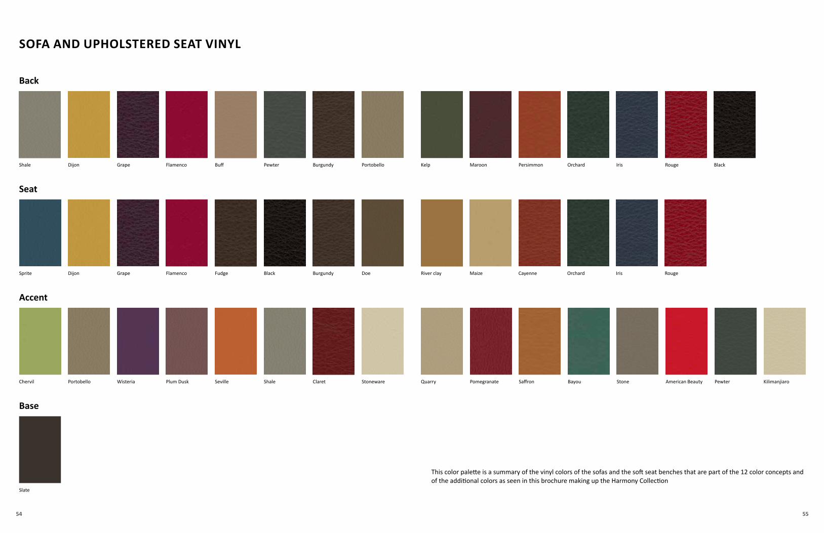
SOFA AND UPHOLSTERED SEAT VINYL
Shale BurgundyDijon PortobelloGrape Flamenco Pewter
Back
Sprite BurgundyDijon DoeGrape Flamenco Black
Kelp Maroon Persimmon BlackOrchard Iris Rouge
River clay Maize Cayenne Orchard Iris Rouge
Seat
Pomegranate Saffron Pewter
Buff
Fudge
Bayou KilimanjiaroStoneChervil QuarryClaretPortobello StonewareWisteria Plum Dusk Seville Shale American Beauty
Accent
Slate
Base
This color palette is a summary of the vinyl colors of the sofas and the soft seat benches that are part of the 12 color concepts and of the additional colors as seen in this brochure making up the Harmony Collection
5756
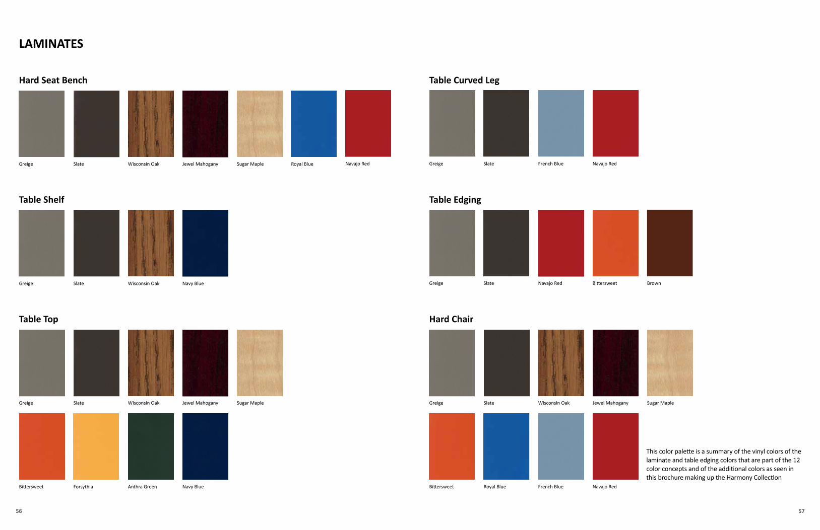
LAMINATES
Hard Seat Bench
Navajo Red
Table Curved Leg
Navajo RedFrench Blue Royal BlueBittersweet
Navajo Red Bittersweet
French Blue Greige Slate
Greige Slate
Table Edging
Greige Slate Sugar Maple
Brown
Jewel MahoganyWisconsin Oak
Hard Chair
Greige Slate Wisconsin Oak
Navy Blue Greige Slate Wisconsin Oak
Table Shelf
Sugar MapleJewel Mahogany
Anthra Green Navy Blue
Greige Slate Sugar MapleJewel MahoganyWisconsin Oak
Table Top
ForsythiaBittersweet
Navajo RedRoyal Blue
This color palette is a summary of the vinyl colors of the laminate and table edging colors that are part of the 12 color concepts and of the additional colors as seen in this brochure making up the Harmony Collection
58
“The synesthetic value of colors, which is the ability to create stimuli related to other senses such as smell and taste,
is vital in a bowling environment. There needs to be a balance to ensure adequate concentration and support for
recreational or competitive activities on the lanes, while providing maximum visual comfort for spectators from the
settee, concourse or restaurant areas.
For owners or investors who are looking to create or renew the image of their facility, I would suggest being open to
the culture of chromatic design and color concepts, focusing specifically on the consumer and functional areas within
the facility.
It’s also important to introduce elements of surprise, curiosity and interaction with the users into the color palette–
to emphasize not only the aesthetic features of the elements, but also the technical and functional elements. It is
important to create a look and image that brings the center to life the whole day—not just in the evenings.
Lastly, it is important to be objective, involving your designer or architect if needed, and choose the right colors for
each space and for the way you want consumers to use these spaces.”
- Massimo Caiazzo
Harmony in Color
We remind you that accurancy of the printed colors can only be as good as the printing process allows.
Discover Harmony today at www.qubicaamf.com/Harmony-Furniture/Harmonyor contact your QubicaAMF representative today!
Tech
nica
l spe
cific
ation
s su
bjec
t to
chan
ge w
ithou
t noti
ce -
Imag
es s
how
n ar
e fo
r illu
stra
tion
purp
ose
only
and
may
diff
er fr
om a
ctua
l pro
duct
sCA
T-CO
L-20
14
WORLDWIDE HEADQUARTERS8100 AMF Drive - Mechanicsville, VA 23111 - USA - Tel. +1 (804) 569-1000 - Fax: +1 (804) 559-8650 - Toll free 1-866-460-QAMF (7263)
EUROPEAN HEADQUARTERSVia della Croce Coperta, 15 - 40128 Bologna - Italy - Tel.+39 (051) 4192-611 - Fax +39 (051) 4192-602
www.qubicaamf.com - [email protected]