Embed Size (px)
Citation preview
ISS, NEWCASTLE UNIVERSITY
Getting Started With IBM SPSS Statistics for
Windows A Training Manual for Beginners
Dr. S. T. Kometa
2
Getting Started with SPSS
A Training Manual for Beginners
Table of Contents
Contents Page
Some Basics ……..…………………………………………………………….……….3-5
Introducing SPSS: A Typical SPSS Session ...…………..…………...………………6-6
The SPSS Help System ...…….…...…………………………………….…….……….6-6
Getting Started with SPSS for Windows .…………………………………….…….7-21
SPSS Menus and Toolbar ……......………………………………………………...22-24
Graphical Presentation of Data (Data Visualisation)……………………………..25-31
Statistical Significance and Inference…………………………………………...…32-41
Correlational Analysis………………………………………………………………41-52
Measures of Association and Analysing Data ……………………………...……..53-53
Introduction to Non-Parametric Statistics…………………………………...……54-54
Hands-on Exercises…………………………………………………………….……55-56
3
1 Aims and Objectives
1.1 Learning outcomes (Aims and Objectives of course)
This course gives a quick overview of the essentials of SPSS. After completing this
course you should:
understand some common statistical terms
be able to create an SPSS data file from scratch (coding a questionnaire)
be able to carry out some simple analyses on the data file
be able to present some of the data graphically
open an Excel file in SPSS
be able to interpret the output from the analyses
be able to use SPSS with a degree of confidence
1.2 Some Basics
1.2.1 Scale of Measurement
Nominal (categorical) e.g. race, colour, sex, job status, etc.
Ordinal (categorical) e.g. the effect of a drug could be none, mild and severe, job
importance (1-5, 1 being not important and 5 very important), etc.
Interval (continuous, covariates, scale, metric) e.g. temperature (in Celsius),
weight (in stones or Kg), height (in inches or cm), etc.
1.2.2 Summarising Data
Frequency Table
o Frequency (counts) number of occurrences of a given value
o Percentages and cumulative percentages
Charts
o Pie charts
o Bar charts
o Histograms
Central measure
o Mean is sum of all values divided by the number of values, written as:
n
xxxxx n
...321
where x1, x2, etc. are the individual values and n the number of
values. (What is the mean of the following values: 22, 13, 10, 4, 13
and 30?)
o Median is the value which lies half-way along a series if a set of values are
arranged in ascending or descending order of size. When there are an even
number of values in the set the median is found by taking the mean of the
middle two values. What is the median of the numbers above?
o Mode is the most frequently occurring data value. Associated to mode we
have unimodal, bimodal, and multimodal.
o Percentile (most common are 25% (Q1), 50% (Q2 same as median), &
75% (Q3)). The 25th
percentile is that value such that 25% of the
4
observations have value less than or equal to it. You can use the quartile
values to regroup values into low and high values.
1.2.3 Measure of Variability
Range is maximum value minus minimum value, i.e. Range = Max - Min
Interquartile range is 75th
percentile minus 25th
percentile, i.e. InterQ = Q3 – Q1
Variance
Standard Deviation ( )
n
xx
2)(
1.2.4 Some Common Statistical Terms
In order to use any statistical package (SPSS, Minitab, SAS, etc.) successfully, there are
some common statistical terms that you should know. These terms serve as a useful
conceptual interface between methodology and any statistical data analysis technique.
Irrespective of the statistical package that you are using, it is important that you
understand the meaning of the following terms.
1.2.5 Variables
Most statistical data analysis involves the investigation of some supposed relationship
among variables. A variable is therefore a feature or characteristic of a person, a place,
an object or a situation that the experimenter wishes to investigate. A variable comprises
different values or categories and there are different types of variables.
1.2.5.1 Quantitative variables
Quantitative variables are possessed in degrees. Some common examples are height,
weight and temperature.
1.2.5.2 Qualitative variables
Qualitative variables are possessed in kind. Some common examples are sex, blood
group, and nationality.
1.2.6 Hypotheses
Often, statistical data analysis wishes to test a hypothesis. A hypothesis is therefore a
provisional supposition among variables. It may be hypothesized, for example, that tall
mothers give birth to tall children. The investigator will have to collect data to test the
hypothesis. The collected data can confirm or disprove the hypothesis.
5
1.2.7 Independent and dependent variables
The independent variable has an effect upon another, the dependent variable. In the
example hypothesized above, the height of mothers is the independent variable while the
height of children is the dependent variable. This is so because a child’s height is
supposed to depend upon the height of their mother.
1.2.8 Kinds of data
There are basically three kinds of data:
1.2.8.1 Interval data
These are data taken from an independent scale with units. Examples include height,
weight and temperature.
1.2.8.2 Ordinal data
These are data collected from ranking variables on a given scale. For example, you may
ask respondents to rank some variable based on their perceived level of importance of the
variables.
1.2.8.3 Nominal data
Merely statements of qualitative category of membership. Examples include sex (male or
female), race (black or white), nationality (British, American, African, etc.).
It should be appreciated that both Interval and Ordinal data relate to quantitative variables
while Nominal data refers to qualitative variables.
1.2.9 Some cautions in using statistical packages
The availability of powerful statistical packages such as SPSS, Minitab, and SAS has
made statistical data analysis very simple. It is easy and straightforward to subject a data
set to all manner of statistical analysis and tests of significance. It is, however, not
advisable to proceed to formal statistical analysis without first exploring your data for
transcription errors and the presence of outliers (extreme values). The importance of
thorough preliminary examination of your data set before formal statistical analysis can
not be overemphasized.
1.2.10 The Golden Rule of Data Analysis
Know exactly how you are going to analyse the data before you even begin to think about
to collect it. Ignoring this advice could lead to difficulties when analyzing your data.
6
1.2.11 Introducing SPSS: A Typical SPSS Session
A typical SPSS session involves starting SPSS, opening an SPSS data file, requesting an
analysis or building a chart and then leaving SPSS.
Starting SPSS
To start SPSS within the Windows operating system follow these instructions:
Choose Start -> Programs -> Statistical Software. The available statistical software
will be displayed, choose IBM SPSS Statistics -> SPSS 19.0 for Windows. Click
Cancel.
Opening An SPSS Data File
Click File -> Open -> Data (or click the open File button). Within the SPSS directory
look for and open the file called Employee.sav.
Running An Analysis
Click Analyze -> Descriptive Statistics -> Frequencies…
Click on Employment Category [ jobcat], then click the arrow (>) to place it on the
variable(s) list. Click Minority Classification [minority] and then click the arrow (>)
button. Click OK to run the frequencies analysis.
Building A Chart
Click Graphs -> Legacy Dialogs -> Interactive -> Line…
Drag and drop Current Salary [salary] to the vertical axis list box.
Drag and drop Beginning Salary [salbegin] to the horizontal axis list box.
Click OK to produce the chart.
Leaving SPSS
Click File -> Exit. Click the No button in the Save Contents alert box
Summary
You have seen a typical SPSS session, been introduced to the primary windows within
SPSS, and used dialogue boxes to produce frequency tables and a chart.
1.2.12 The SPSS Help System SPSS has a comprehensive help system. This is very useful to both experienced and new
users of SPSS. This course covers the following:
Click Help -> Topics. There are fours tabs here: Contents, Index, Search and
Favorites. Briefly explore them. Then close the window.
Click Help -> Tutorial: This is SPSS online tutorial. You are strongly encouraged to go
through this tutorial. It helps you to learn SPSS by yourself. Click on Introduction and
use the arrows at the bottom of the screen to navigate through the tutorial.
Statistics Coach: Helps you to select a suitable analysis for your data by asking you to
answer a series of questions. It is located at Help -> Statistics Coach. Select What do
7
you want to do? from the available choices. You are encouraged to have a look at the
example output by clicking on Show examples output.
Case Studies: Case Studies provide hands-on examples of how to create various types of
statistical analyses and how to interpret the results. These examples assume you are
already familiar with the basic operations of SPSS. If you want to perform any advanced
procedure it is recommended that you go through a case study first via Help -> Case
Studies… Then look for procedure of interest. You can also access a case study through
Analyze menu. For example select Analyze -> Regression -> Linear… -> Help. Then
click on Show Me.
2 Getting Started with SPSS for Windows
2.1 Assumptions
This course assumes that you know the basics of using a computer such as:
1. How to start applications
2. How to use your mouse
3. How to move and close windows.
4. How to save and open a file.
2.2 Essential steps for data analysis in SPSS
SPSS is a powerful computer package that can be used to carry out a wide range of
statistical analysis. Before carrying out any formal statistical analysis, users are
encouraged go through a preparatory first step.
It is important to ensure that the data has been correctly entered into the Data Editor of
SPSS. Errors during data entry will result to misleading conclusions. It is very tempting
to proceed to formal statistical analysis after ensuring that the data has been correctly
entered. Not a good thing to do.
The procedure for data analysis using SPSS and indeed any other statistical package
should be thought of as a two step process:
1. The exploration and description of the data to examine the main characteristics.
2. The formal statistical analysis to confirm some characteristics of the data.
If you embark immediately on formal statistical analysis, you may miss the most
important feature of your data. Also, formal statistical analyses assumed some
characteristics about your data. If these assumptions are wrong, the results of statistical
analysis may be quite misleading.
2.3 Exploratory data analysis in SPSS
Many Exploratory Data Analysis (EDA) techniques are available in SPSS. These
include: Frequencies, Descriptives, Explore, Crosstabs, Case summaries. These are
8
located under Analyze -> Descriptive Statistics on the main menu bar. This document
demonstrates the proper use of these facilities.
2.4 Starting SPSS
Start SPSS and reproduce the results of the typical session.
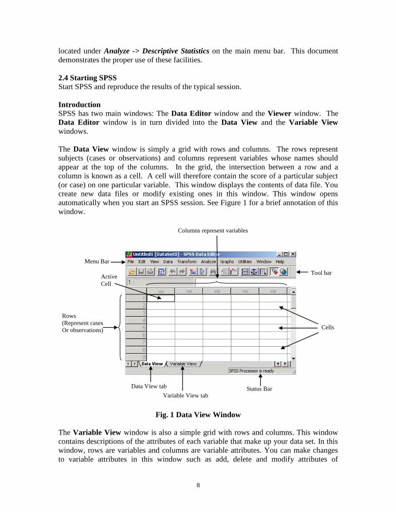
Introduction
SPSS has two main windows: The Data Editor window and the Viewer window. The
Data Editor window is in turn divided into the Data View and the Variable View
windows.
The Data View window is simply a grid with rows and columns. The rows represent
subjects (cases or observations) and columns represent variables whose names should
appear at the top of the columns. In the grid, the intersection between a row and a
column is known as a cell. A cell will therefore contain the score of a particular subject
(or case) on one particular variable. This window displays the contents of data file. You
create new data files or modify existing ones in this window. This window opens
automatically when you start an SPSS session. See Figure 1 for a brief annotation of this
window.
Fig. 1 Data View Window
The Variable View window is also a simple grid with rows and columns. This window
contains descriptions of the attributes of each variable that make up your data set. In this
window, rows are variables and columns are variable attributes. You can make changes
to variable attributes in this window such as add, delete and modify attributes of
Tool bar
Menu Bar
Rows
(Represent cases
Or observations)
Columns represent variables
Data View tab
Variable View tab Status Bar
Cells
Active
Cell
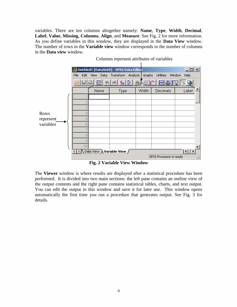
9
variables. There are ten columns altogether namely: Name, Type, Width, Decimal,
Label, Value, Missing, Columns, Align, and Measure. See Fig. 2 for more information.
As you define variables in this window, they are displayed in the Data View window.
The number of rows in the Variable view window corresponds to the number of columns
in the Data view window.
Fig. 2 Variable View Window
The Viewer window is where results are displayed after a statistical procedure has been
performed. It is divided into two main sections: the left pane contains an outline view of
the output contents and the right pane contains statistical tables, charts, and text output.
You can edit the output in this window and save it for later use. This window opens
automatically the first time you run a procedure that generates output. See Fig. 3 for
details.
Rows
represent
variables
Columns represent attributes of variables
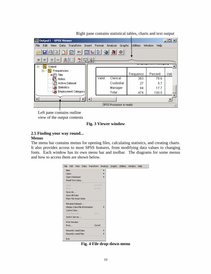
10
Fig. 3 Viewer window
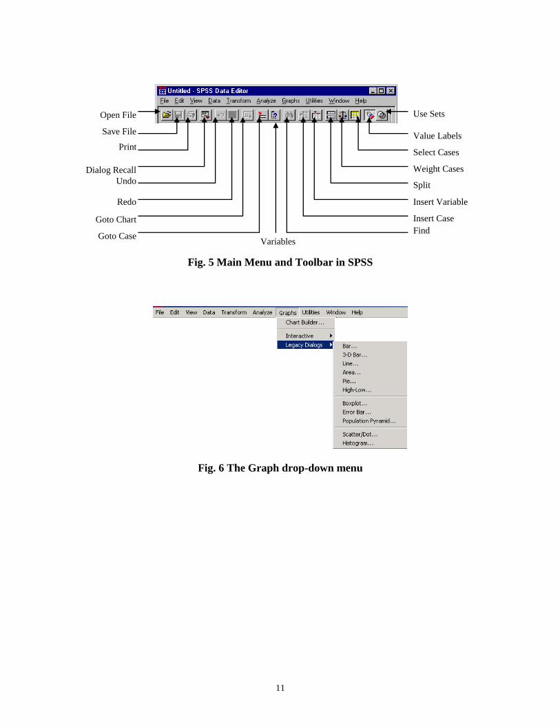
2.5 Finding your way round...
Menus
The menu bar contains menus for opening files, calculating statistics, and creating charts.
It also provides access to most SPSS features, from modifying data values to changing
fonts. Each window has its own menu bar and toolbar. The diagrams for some menus
and how to access them are shown below.
Fig. 4 File drop-down menu
Left pane contains outline
view of the output contents
Right pane contains statistical tables, charts and text output
11
Fig. 5 Main Menu and Toolbar in SPSS
Fig. 6 The Graph drop-down menu
Use Sets
Value Labels
Select Cases
Weight Cases
Split
File Insert Variable
Insert Case
Find
Variables
Open File
Save File
Dialog Recall
Undo
Redo
Goto Chart
Goto Case
12
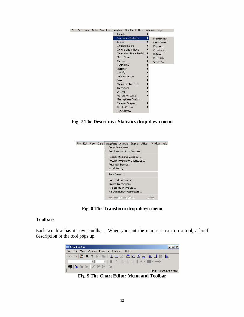
Fig. 7 The Descriptive Statistics drop-down menu
Fig. 8 The Transform drop-down menu
Toolbars
Each window has its own toolbar. When you put the mouse cursor on a tool, a brief
description of the tool pops up.
Fig. 9 The Chart Editor Menu and Toolbar
13
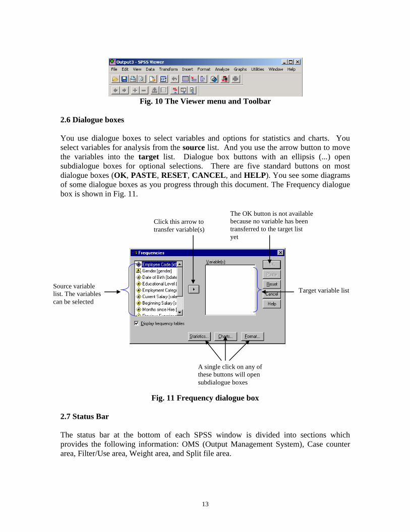
Fig. 10 The Viewer menu and Toolbar
2.6 Dialogue boxes
You use dialogue boxes to select variables and options for statistics and charts. You
select variables for analysis from the source list. And you use the arrow button to move
the variables into the target list. Dialogue box buttons with an ellipsis (...) open
subdialogue boxes for optional selections. There are five standard buttons on most
dialogue boxes (OK, PASTE, RESET, CANCEL, and HELP). You see some diagrams
of some dialogue boxes as you progress through this document. The Frequency dialogue
box is shown in Fig. 11.
Fig. 11 Frequency dialogue box
2.7 Status Bar
The status bar at the bottom of each SPSS window is divided into sections which
provides the following information: OMS (Output Management System), Case counter
area, Filter/Use area, Weight area, and Split file area.
Source variable
list. The variables
can be selected
Target variable list
Click this arrow to
transfer variable(s)
A single click on any of
these buttons will open
subdialogue boxes
The OK button is not available
because no variable has been
transferred to the target list
yet
14
2.8 Opening a Data File
SPSS can open many types of files such as Excel, dBase, Lotus 1-2-3, SYLK, SYSTAT,
SAS, etc. and of course the SPSS files format. SPSS data file has the extension .sav, the
output file .spo (old version), .spv (new version) and the syntax file .sps. To open a data
file follow these instructions:
2.8.1 File -> Open -> Data...
Note you have to tell SPSS the type of file you want to open via Files of types:.
2.8.2 Saving a New Data File or Save Data in a Different Format
To save a file:
1. Make sure the Data Editor is active.
2. File -> Save AS...
3. Select a file type from the drop-down list.
4. Enter a file name for the new data file.
5. Click Save.
2.9 Basic data file structure
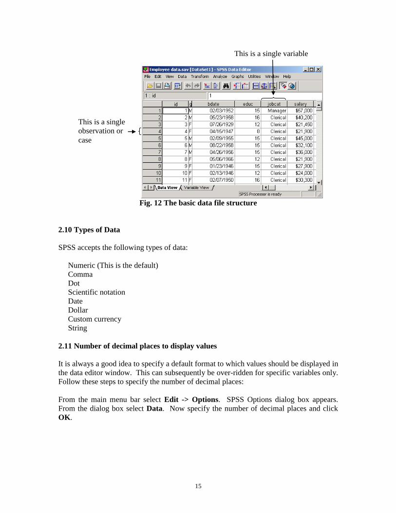
The Data Editor reflects the basic structure of an SPSS data file. Each row is a single
case (observation). For example, each person in a survey is a case. Each column is a
single variable. For example, each question in a survey is a variable. You can enter and
edit data in the Data Editor. You can't perform calculations or enter formulas in the
Data Editor as is common in other spreadsheets, e.g. Microsoft Excel. There are other
ways of doing this in SPSS through the Transform -> Compute menu.
Note that the columns named id, educ, and jobcat contain Numeric data, the one named
gender contains String data, the one named bdate contains Date data, and the one named
salary contains Dollar data.
15
Fig. 12 The basic data file structure
2.10 Types of Data
SPSS accepts the following types of data:
Numeric (This is the default)
Comma
Dot
Scientific notation
Date
Dollar
Custom currency
String
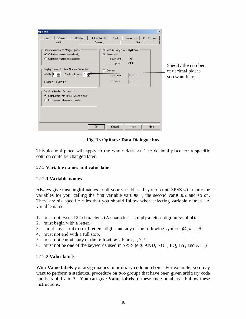
2.11 Number of decimal places to display values
It is always a good idea to specify a default format to which values should be displayed in
the data editor window. This can subsequently be over-ridden for specific variables only.
Follow these steps to specify the number of decimal places:
From the main menu bar select Edit -> Options. SPSS Options dialog box appears.
From the dialog box select Data. Now specify the number of decimal places and click
OK.
This is a single
observation or
case
This is a single variable
16
Fig. 13 Options: Data Dialogue box
This decimal place will apply to the whole data set. The decimal place for a specific
column could be changed later.
2.12 Variable names and value labels
2.12.1 Variable names
Always give meaningful names to all your variables. If you do not, SPSS will name the
variables for you, calling the first variable var00001, the second var00002 and so on.
There are six specific rules that you should follow when selecting variable names. A
variable name:
1. must not exceed 32 characters. (A character is simply a letter, digit or symbol).
2. must begin with a letter.
3. could have a mixture of letters, digits and any of the following symbol: @, #, _, $.
4. must not end with a full stop.
5. must not contain any of the following: a blank, !, ?, *.
6. must not be one of the keywords used in SPSS (e.g. AND, NOT, EQ, BY, and ALL)
2.12.2 Value labels
With Value labels you assign names to arbitrary code numbers. For example, you may
want to perform a statistical procedure on two groups that have been given arbitrary code
numbers of 1 and 2. You can give Value labels to these code numbers. Follow these
instructions:
Specify the number
of decimal places
you want here
17
With the Define Value labels dialogue box on the screen, type the lowest code number 1
into the Value text box. In the Value label text box type the label for the code number
e.g. group 1. The Add button will become active. Click the Add button and the
following will appear in the lowest box: 1="group 1". Repeat the procedure to label
value 2 so that the lowest box will contain the following:
1="group 1"
2="group 2"
After completing the value labels click OK.
2.13 Data entry using the keyboard
When the Data Editor window is accessed for the first time, the top cell of the leftmost
column will be highlighted (i.e. thickened black borders round the cell). This is the
active cell. You can make any cell active by moving your mouse to the required cell and
then clicking the left mouse button. Notice that as you change the active cell, the cell
editor on the left, track the location of the active cell. A value typed in from the keyboard
will appear in the cell editor and can be transferred to the active cell by pressing return
or enter key on the keyboard. You can change position of the active cell in grid by
using the cursor keys (i.e. the up, down, right and left arrows on the keyboard). You can
now enter data into any cell.
2.13.1 Editing data on the grid
The editing functions found in most applications are available in SPSS for Windows.
You can copy, cut, and paste in SPSS. The block-and-paste technique can also be used.
To delete the values in a cell (or block), highlight the required area and press shift delete
or the back space key. To delete the values of an entire row, click on the grey area
containing the row number followed by delete. Similarly, to delete the values of an entire
column, click on the grey area containing the name of the column followed by delete.
2.14 Exercise
Now that the basics of SPSS for Windows have been covered, attempt the following
exercise. To do the exercise you must start SPSS for Windows if you have not already
done so.
2.14.1 Exercise 1a – Sample Questionnaire and Coding, Variable Labels, Value
Labels and Data entry
In this exercise, you will learn how to code a questionnaire, label variable and value, and
enter data into SPSS Data Editor.
18
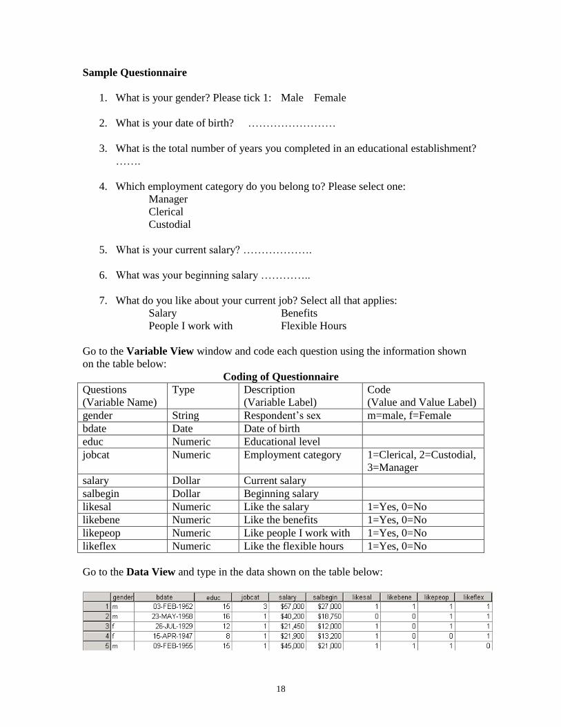
Sample Questionnaire
1. What is your gender? Please tick 1: Male Female
2. What is your date of birth? ……………………
3. What is the total number of years you completed in an educational establishment?
…….
4. Which employment category do you belong to? Please select one:
Manager
Clerical
Custodial
5. What is your current salary? ……………….
6. What was your beginning salary …………..
7. What do you like about your current job? Select all that applies:
Salary Benefits
People I work with Flexible Hours
Go to the Variable View window and code each question using the information shown
on the table below:
Coding of Questionnaire
Questions
(Variable Name)
Type Description
(Variable Label)
Code
(Value and Value Label)
gender String Respondent’s sex m=male, f=Female
bdate Date Date of birth
educ Numeric Educational level
jobcat Numeric Employment category 1=Clerical, 2=Custodial,
3=Manager
salary Dollar Current salary
salbegin Dollar Beginning salary
likesal Numeric Like the salary 1=Yes, 0=No
likebene Numeric Like the benefits 1=Yes, 0=No
likepeop Numeric Like people I work with 1=Yes, 0=No
likeflex Numeric Like the flexible hours 1=Yes, 0=No
Go to the Data View and type in the data shown on the table below:
19
Save the file, give it a suitable name and save it in a folder of your choice (if you like you
can save it under H:\). You have now successfully created and saved your first data set in
SPSS. Congratulations!
2.14.2 Exercise 1b – Read an Excel Data file into SPSS
The file is stored in this location \\campus\software\dept\spss. It is called Gss91Sm.xls.
Before you open the file in SPSS it is a good idea to open it first in Excel, have a look at
it. Close the file in Excel. Now open this file in SPSS following these instructions:
1. File -> Open -> Data…
2. Under Files of type: using the drop-down arrow select Excel (*.xls, *.xlsx,
*.xlsm)
3. Under File name: type \\campus\software\dept\spss and click Open
4. Select GSS91Sm.xls and click Open
5. Make sure Read variable names from first row of data is checked
6. Using the drop down arrow select the worksheet to open
7. Under Range type A6:F506 and click OK
You can now modify and save the file as an SPSS data file.
2.15 Exercise 2 - How to conduct an Exploratory Data Analysis - Quantitative
Variable
Now that we have successfully entered and saved data into SPSS, it is time to perform
some statistical data analysis procedures. However, it is advisable to conduct an
Exploratory Data Analysis (EDA) before carrying out any formal data analysis. Why not
attempt some Exploratory Data Analysis using the following: Explore, Descriptives, and
Frequencies. Follow these instructions:
2.15.1 The Explore Procedure
1. Start SPSS if you have not already done so and open the data set file called employee
data in the usual way. That is File -> Open -> Data. Select the file and click Open.
Study this data file. The file is located at C:\Program Files\SPSS.
2. Select Analyze -> Descriptive Statistics -> Explore.... The Explore dialogue box
will appear on the screen. Highlight the variable Current Salary [salary] by clicking
on it once using your mouse left button and transfer it to the Dependent List box by
clicking the top arrow. Highlight the variable Employment Category [jobcat] and
transfer it to the Factor List box by clicking the middle arrow.
3. Click on Plots… to open the Explore:Plots dialogue box and deselect the Stem-and-
Leaf check box in the Descriptive group. If Stem-and-Leaf is already deselected
click on Continue.
4. Click on OK to run the procedure. The result of this procedure will be displayed on
the Output Viewer window. Examine and try to interpret the result.
20
2.15.2 The Descriptives Procedure
With Descriptives you can quickly generate summary statistical measures such as mean,
standard deviation, variance, maximum and minimum values, range and sum for a given
variable. Follow these instructions:
1. From the menu bar, select Analyze -> Descriptive Statistics -> Descriptives.... The
Descriptives dialogue box will appear on the screen.
2. Transfer the variable Current Salary [salary] into the Variable(s) box.
3. Select the Options pushbutton. The Descriptives: Options dialogue box will appear
on the screen. Notice that Mean, Std. deviation, Minimum and Maximum have
already been selected for you. These are the default statistics.
4. Also select these statistical measures: Variance, Range, Sum, and S.E mean. To
select an item click on the check box once. To deselect it click on it again once.
5. Select Continue to return to the Descriptives dialogue box.
6. Select OK to run the procedure.
Examine and attempt to interpret the output.
What are the main differences between the output from the Descriptives Procedure
compare to the output from the Explore Procedure?
2.15.3 The Frequencies Procedure
With the Frequencies procedure you can also generate summary statistical measures for a
given variable. Frequencies gives frequency distributions for all types of data (nominal,
ordinal and interval). This example concentrates on the quantitative variable Current
Salary [salary]. An example involving qualitative variables will be carried out in
Exercise 3. Follow these instructions:
1. From the menu bar, select Analyze -> Descriptive Statistics -> Frequencies.... The
Frequencies dialog box will appear on the screen. You my need to click on the Reset
button if this dialogue box has been used before.
2. Highlight the variable Current Salary [salary] and then click on the arrow pushbutton
to transfer it into the Variables(s) box.
3. Click on the Charts pushbutton to open the Frequencies: Charts dialogue box.
Click on the Histogram and click on With Normal Curve button in the Chart Type
group and then click on Continue.
4. Click on the Statistics pushbutton to open the Frequencies: Statistics dialogue box.
5. Select these statistics: Quartiles, Mean, Median, Mode, Sum and click on
Continue.
6. Click on Display frequency tables to deselect it. It is not appropriate to produce a
frequency table for interval (continuous) variable.
7. Click on OK to run the procedure.
Examine and interpret the output.
21
2.16 Exercise 3 - How to conduct an Exploratory Data Analysis - Qualitative
Variable
The data file used in this example is stored \\campus\software\dept\spss. Follow these
instructions to open this file:
1. File -> Open -> Data…
2. In the text area for File name: type \\campus\software\dept\spss.
3. Click on Open and select the file called bloodtype.sav.
4. Click Open.
Study this file.
The most commonly used SPSS procedures for describing qualitative data are
Frequencies and Crosstabs. To conduct an exploratory data analysis on the data follow
these instructions:
2.16.1 The Frequencies Procedure
1. From the menu bar, select Analyze -> Descriptive Statistics -> Frequencies.... The
Frequencies dialogue box will appear on the screen.
2. Highlight the variables Blood Type [bloodtyp] and Gender [gender] then click on the
arrow pushbutton to transfer them into the Variables(s) box.
3. Click on the Charts pushbutton to open the Frequencies: Charts dialogue box.
Click on the Histogram and click on With Normal Curve buttons within the Chart
Type group and then click on Continue.
4. Click on OK to run the procedure. Examine and interpret the output.
2.16.2 The Crosstabs Procedure
This procedure is used to generate contingency tables from qualitative data. To carry out
this procedure follow these instructions:
1. From the menu bar, select Analyze -> Descriptive Statistics -> Crosstabs.... The
Crosstabs dialogue box will appear on the screen.
2. Highlight the variable Gender [gender] and click on the arrow pushbutton to transfer
it to the Row(s) text box.
3. Highlight the variable Blood Type [bloodtyp] and click on the arrow pushbutton to
transfer it to the Column(s) text box.
4. Click on OK to run the procedure. Examine and interpret the output.
To use the Chi-Square test and find out if gender is associated with blood type, the
contingency table must satisfy these assumptions:
No cell should have expected value (count) less than 0, and
No more than 20% of the cells have expected values (counts) less than 5
22
In order to perform the test we need to state the null and alternative hypotheses:
Null (Ho): There is no association between gender and blood type.
Alternative (H1): There is an association between gender and blood type.
To perform the test, follow these instructions:
1. Recall the Crosstabs dialogue box via Analyze -> Descriptive Statistics ->
Crosstabs....
2. Click Cells… Under Percentage select Row and click Continue
3. Click Statistics… Select Chi-square and click Continue
4. Click OK to run the procedure.
Examine and interpret the output. Will you accept or reject the null hypothesis? What
will you conclude?
3 Menu and Toolbar in SPSS: Selecting Cases / Variables
Example data set: Employee data.sav
The following tools on the TOOLBAR are used often:
3.1 Select Cases: Helps you to subset your data file and work with specific cases
only. Example, select case if gender=’f’ & jobcat=3. That is, we are interested in only
female managers. To set the conditions, follow these instructions:
1. From the menu bar select Data -> Select Cases….
2. Click on If Condition is Satisfied. Click on If….
3. Click on Gender [gender] and click on the arrow. Type equal sign (=) using your
keyboard or select it from the dialogue box.
4. Type ‘f’. Type & or select it from the dialogue box.
5. Click on Employment Category [jobcat] and click on the arrow. Type equal sign
(=) using your keyboard or select it from the dialogue box.
6. Then type 3 or select it from the dialogue box. The complete expression should
look like this gender=’f’ & jobcat=3.
7. Click on Continue. Click on OK.
Notice that in your Data View window some row numbers are crossed out. These are the
cases that have not satisfied the condition. Also note that a new variable called ‘filter_$’
is added to your data set.
Now do a descriptive procedure on current salary. Use your output to answer this
question.
23
How many female managers work for this company? What is their average current
salary?
3.2 Split File: Helps you divide a file based on a given condition. Example split
the employee data file into (a) the different gender and (b) the different job categories
(jobcat). Follow these instructions:
1. From the menu bar select Data -> Split File….
2. Click on Organize output by groups. This option gives you a different table for
each combination of factor while Compare groups give you a single table.
3. Select Gender [gender] and click on arrow.
4. Select Employment category [jobcat] and click on arrow.
5. Click OK.
Notice the changes that have taken place in the Data View window. First the data is
sorted alphabetically according to gender. Then within gender, it is sorted in ascending
order according to Employment category [jobcat].
Do a descriptive procedure on current salary and see how the output is displayed. Use the
output to answer the following questions.
How many female clerical employees work for this company? What is their average
current salary?
How many male clerical employees work for this company? What is their average current
salary?
How does the average current salary for female clerical employees compares to that of
male clerical employees?
3.3 Dialogue Recall: Helps you to recall the most recently used dialogue boxes.
From the tool bar select the fourth tool from your left ( ). You can now select any of
the dialogue by a single click. It is a fast way to gain access to a previously used dialogue
box.
3.4 Menu and Toolbar in SPSS: Data Manipulation
3.4.1 Data -> Sort: Helps you sort a data set based on a given variable. You can
sort in ascending or descending order. Example, sort the data set using ‘gender’ in
ascending order.
24
3.4.2 Transform: This menu helps you create new variables and as well as many
other tasks. For example: there is an increase of 3% on current salary for all employees.
Create a new variable to represent this. Call this variable salinc.
If we wish to create a new grouping for salary, that is,
Salary less than $20,750=Low Income (1)
Salary between $20,751 and $50,000=Medium Income (2)
Salary greater than $50,001=High Income (3)
To create the new category of salary based on these conditions, follow these steps
carefully:
1. From the menu bar select Transform->Recode Into Different Variables…
2. Select current salary [salary] and click on the arrow
3. In the Output Variable area under Name: type salacate; under Label type
Salary Category
4. Click on Change. Click on Old and New Values…
5. In the Old Value area, select Range, LOWEST through value: and type 20750.
6. In the New Value area, select Value and type 1.
7. In the Old->New: area click on Add.
8. In the Old Value area, select Range: type 20751 and 50000 in the boxes
respectively.
9. In the New Value area, select Value and type 2.
10. In the Old->New: area click on Add.
11. In the Old Value area, select All other values.
12. In the New Value area, select Value and type 3.
13. In the Old->New: area click on Add.
14. Click on Continue. Click on OK.
Notice that the new variable (salacate) has been added to the Data Editor and Variable
View windows. Select the Variable View window and specify these Values and Labels
for the variable: 1=Low Income, 2=Medium Income and 3=High Income.
Find out how many female/male employees fall into this new category of salary by doing
a crosstabs. Also show the percentages.
3.5 Calculating age using Date and Time Wizard
1. From the menu bar select Transform -> Date and Time Wizard….
2. Select Calculate with dates and times and click Next.
3. Select Calculate the number of time units between two dates (e.g. calculate an
age in years from birthdate and another date) and click Next.
4. Select Current date and time [$TIME] and click on the arrow next to it.
5. Select birthdate [bdate] and click on the active arrow. Make sure that under
Units: Years is selected. Click on Next.
6. Under Result Variable: type age. Under Variable Label: type Age of
respondent. Click Finish.
25
Notice that the new variable (age) has been added to the Data Editor and Variable
View windows.
What is the minimum, maximum, average, and modal age? What is the 95% confidence
interval of the average age? What is the 1%, 25%, 75% and the 99% of age? How would
you interpret the 1% of age?
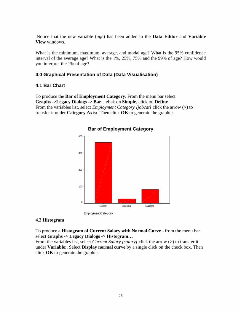
4.0 Graphical Presentation of Data (Data Visualisation) 4.1 Bar Chart To produce the Bar of Employment Category. From the menu bar select
Graphs ->Legacy Dialogs -> Bar…click on Simple, click on Define
From the variables list, select Employment Category [jobcat] click the arrow (>) to
transfer it under Category Axis:. Then click OK to generate the graphic.
Bar of Employment Category
Employment Category
ManagerCustodialClerical
Count
400
300
200
100
0
4.2 Histogram
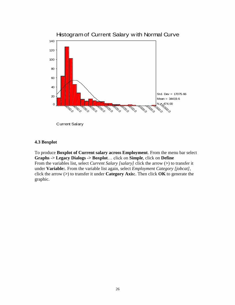
To produce a Histogram of Current Salary with Normal Curve - from the menu bar
select Graphs -> Legacy Dialogs -> Histogram…
From the variables list, select Current Salary [salary] click the arrow (>) to transfer it
under Variable:. Select Display normal curve by a single click on the check box. Then
click OK to generate the graphic.
26
Current Salary
135000.0
125000.0
115000.0
105000.0
95000.0
85000.0
75000.0
65000.0
55000.0
45000.0
35000.0
25000.0
15000.0
Histogram of Current Salary w ith Normal Curve140
120
100
80
60
40
20
0
Std. Dev = 17075.66
Mean = 34419.6
N = 474.00
4.3 Boxplot
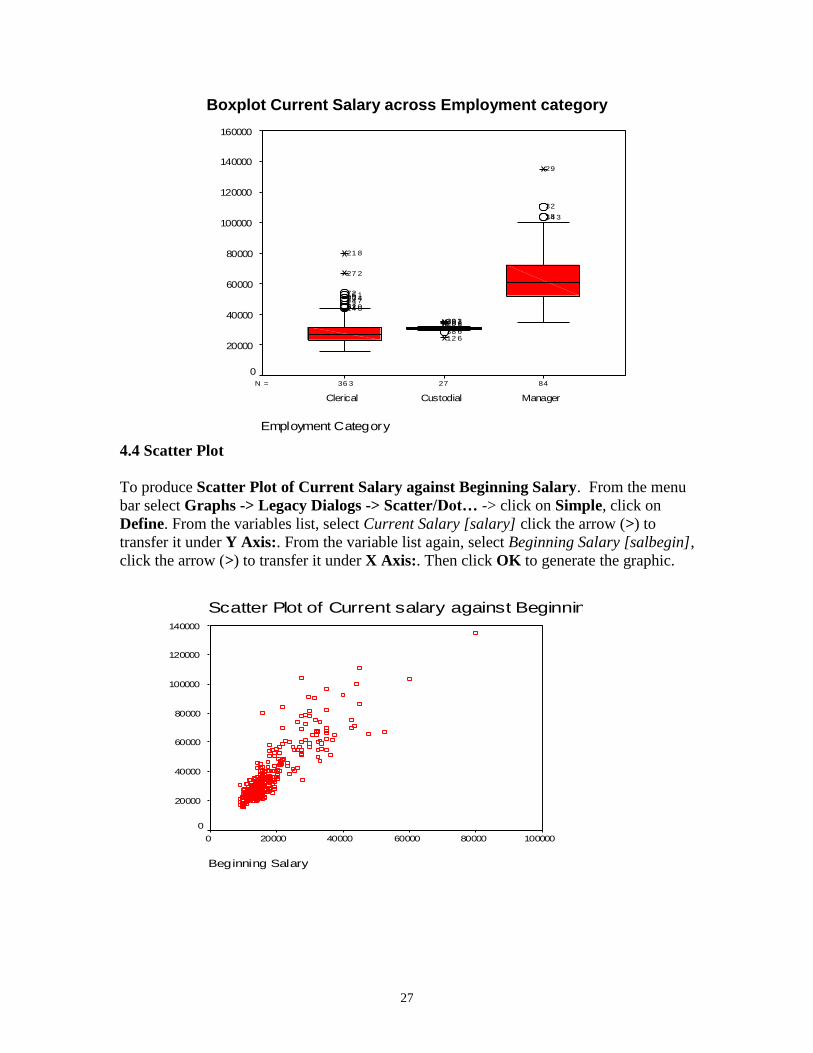
To produce Boxplot of Current salary across Employment. From the menu bar select
Graphs -> Legacy Dialogs -> Boxplot… click on Simple, click on Define
From the variables list, select Current Salary [salary] click the arrow (>) to transfer it
under Variable:. From the variable list again, select Employment Category [jobcat],
click the arrow (>) to transfer it under Category Axis:. Then click OK to generate the
graphic.
27
Boxplot Current Salary across Employment category
842736 3N =
Employment Category
ManagerCustodialClerical
Cur
rent
Sal
ary
160000
140000
120000
100000
80000
60000
40000
20000
0
34 318
32
29
38 612 6
20 628 130 329 1
14 631 05521744 723 48016 172
27 2
21 8
4.4 Scatter Plot
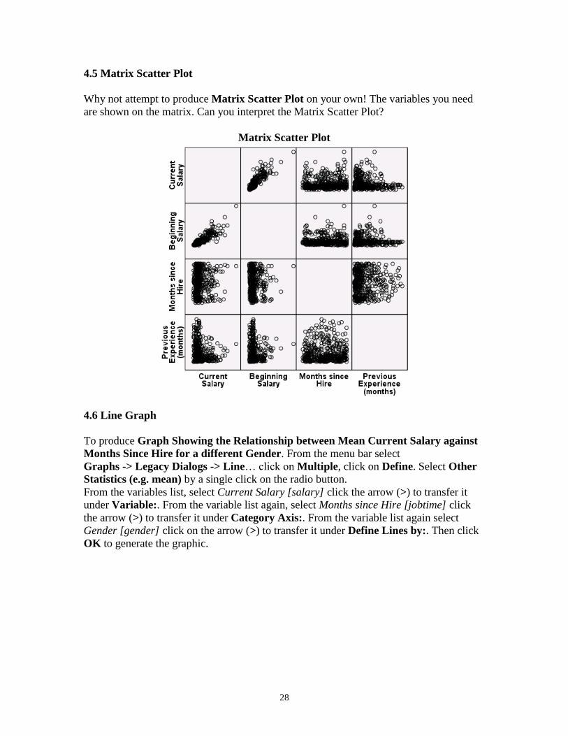
To produce Scatter Plot of Current Salary against Beginning Salary. From the menu
bar select Graphs -> Legacy Dialogs -> Scatter/Dot… -> click on Simple, click on
Define. From the variables list, select Current Salary [salary] click the arrow (>) to
transfer it under Y Axis:. From the variable list again, select Beginning Salary [salbegin],
click the arrow (>) to transfer it under X Axis:. Then click OK to generate the graphic.
Scatter Plot of Current salary against Beginning Salary
Beginning Salary
100000800006000040000200000
Cur
rent
Sal
ary
140000
120000
100000
80000
60000
40000
20000
0
28
4.5 Matrix Scatter Plot
Why not attempt to produce Matrix Scatter Plot on your own! The variables you need
are shown on the matrix. Can you interpret the Matrix Scatter Plot?
Matrix Scatter Plot
4.6 Line Graph
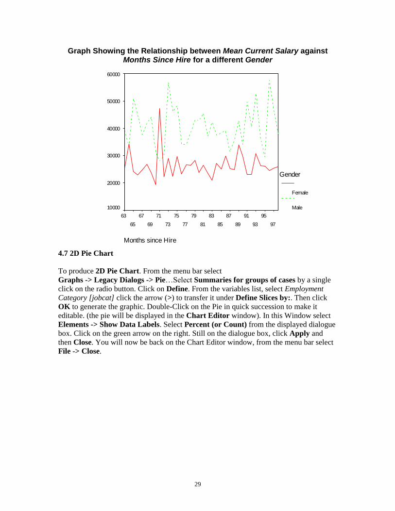
To produce Graph Showing the Relationship between Mean Current Salary against
Months Since Hire for a different Gender. From the menu bar select
Graphs -> Legacy Dialogs -> Line… click on Multiple, click on Define. Select Other
Statistics (e.g. mean) by a single click on the radio button.
From the variables list, select Current Salary [salary] click the arrow (>) to transfer it
under Variable:. From the variable list again, select Months since Hire [jobtime] click
the arrow (>) to transfer it under Category Axis:. From the variable list again select
Gender [gender] click on the arrow (>) to transfer it under Define Lines by:. Then click
OK to generate the graphic.
29
Graph Showing the Relationship between Mean Current Salary against Months Since Hire for a different Gender
Months since Hire
97
95
93
91
89
87
85
83
81
79
77
75
73
71
69
67
65
63
Mean C
urr
ent S
ala
ry
60000
50000
40000
30000
20000
10000
Gender
Female
Male
4.7 2D Pie Chart
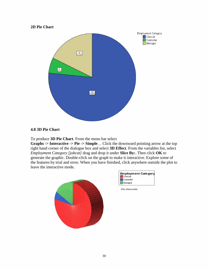
To produce 2D Pie Chart. From the menu bar select
Graphs -> Legacy Dialogs -> Pie…Select Summaries for groups of cases by a single
click on the radio button. Click on Define. From the variables list, select Employment
Category [jobcat] click the arrow (>) to transfer it under Define Slices by:. Then click
OK to generate the graphic. Double-Click on the Pie in quick succession to make it
editable. (the pie will be displayed in the Chart Editor window). In this Window select
Elements -> Show Data Labels. Select Percent (or Count) from the displayed dialogue
box. Click on the green arrow on the right. Still on the dialogue box, click Apply and
then Close. You will now be back on the Chart Editor window, from the menu bar select
File -> Close.
30
2D Pie Chart
4.8 3D Pie Chart
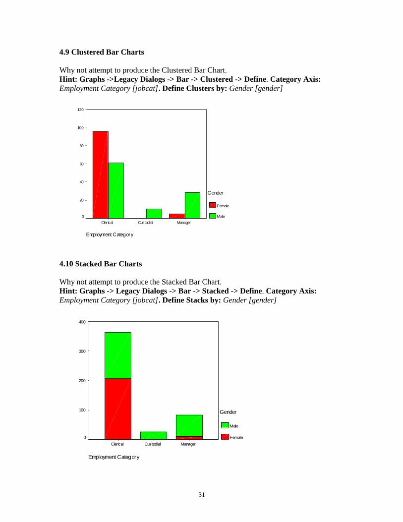
To produce 3D Pie Chart. From the menu bar select
Graphs -> Interactive -> Pie -> Simple… Click the downward pointing arrow at the top
right hand corner of the dialogue box and select 3D Effect. From the variables list, select
Employment Category [jobcat] drag and drop it under Slice By:. Then click OK to
generate the graphic. Double-click on the graph to make it interactive. Explore some of
the features by trial and error. When you have finished, click anywhere outside the plot to
leave the interactive mode.
Clerical
Custodial
Manager
Employment Category
Pies show counts
31
4.9 Clustered Bar Charts
Why not attempt to produce the Clustered Bar Chart.
Hint: Graphs ->Legacy Dialogs -> Bar -> Clustered -> Define. Category Axis:
Employment Category [jobcat]. Define Clusters by: Gender [gender]
Employment Category
ManagerCustodialClerical
Perc
ent
120
100
80
60
40
20
0
Gender
Female
Male
4.10 Stacked Bar Charts
Why not attempt to produce the Stacked Bar Chart.
Hint: Graphs -> Legacy Dialogs -> Bar -> Stacked -> Define. Category Axis:
Employment Category [jobcat]. Define Stacks by: Gender [gender]
Employment Category
ManagerCustodialClerical
Count
400
300
200
100
0
Gender
Male
Female
32
5 Statistical Significance and Inference
5.1 Samples and Random Sampling
The main idea of sampling is to reduce cost and save time. However, you have to make
sure that your sample is a good representation of the population. If resources were not
limited, we would study the whole population. This would give us an accurate estimate of
whatever we are studying. To get a good representation of the population, you would
have to collect a random sample. Usually, the size of a sample does not depend on the
size of the population but on the accuracy you require and the resources you are willing
to allocate to data collection. A large sample will give a more accurate result than a small
sample, but would need more time and resource to collect.
5.2 Populations and Samples
Population refers to the entire number of things you want to study. In other words, the
totality of the potential units for observation. It could be the population of a given
country, the number of houses in a given area, number of insects on a single tree, the
number of companies with turnover of £1b, the number of teachers in a given county, and
so-on. A sample is a selection of individual items or members of the population.
5.3 Units
In case of the population of given country, the sampling unit will be a single individual.
For number of houses in an area, it would be a single house. For insects, it would be a
single insect. Note that a sampling unit can also refer to more than one item, for example,
a classroom in a school could be a sampling unit from which pupils are selected to take
part in a survey.
5.4 Sampling Frames
Sampling frame simply refers to the record from which a sample can be selected. In the
case of teachers, a list with the local councils, register of professional bodies, or a list of
occupation register kept by some agency would be a suitable sampling frame.
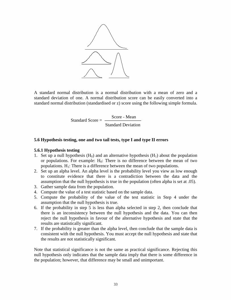
5.5 Normal Distribution
Normal distribution is a theoretical concept that is symbolised by the familiar bell-shaped
curve. It is really a family of distribution. See diagram below. It plays an important role
in statistical inference. Some statistical procedures in SPSS assume that your data is
normally distributed. That is, your data is taken from a normal population.
33
A standard normal distribution is a normal distribution with a mean of zero and a
standard deviation of one. A normal distribution score can be easily converted into a
standard normal distribution (standardised or z) score using the following simple formula.
5.6 Hypothesis testing, one and two tail tests, type I and type II errors
5.6.1 Hypothesis testing
1. Set up a null hypothesis (H0) and an alternative hypothesis (H1) about the population
or populations. For example: H0: There is no difference between the mean of two
populations. H1: There is a difference between the mean of two populations.
2. Set up an alpha level. An alpha level is the probability level you view as low enough
to constitute evidence that there is a contradiction between the data and the
assumption that the null hypothesis is true in the population (often alpha is set at .05).
3. Gather sample data from the population.
4. Compute the value of a test statistic based on the sample data.
5. Compute the probability of the value of the test statistic in Step 4 under the
assumption that the null hypothesis is true.
6. If the probability in step 5 is less than alpha selected in step 2, then conclude that
there is an inconsistency between the null hypothesis and the data. You can then
reject the null hypothesis in favour of the alternative hypothesis and state that the
results are statistically significant.
7. If the probability is greater than the alpha level, then conclude that the sample data is
consistent with the null hypothesis. You must accept the null hypothesis and state that
the results are not statistically significant.
Note that statistical significance is not the same as practical significance. Rejecting this
null hypothesis only indicates that the sample data imply that there is some difference in
the population; however, that difference may be small and unimportant.
Standard Score = Score - Mean
Standard Deviation
34
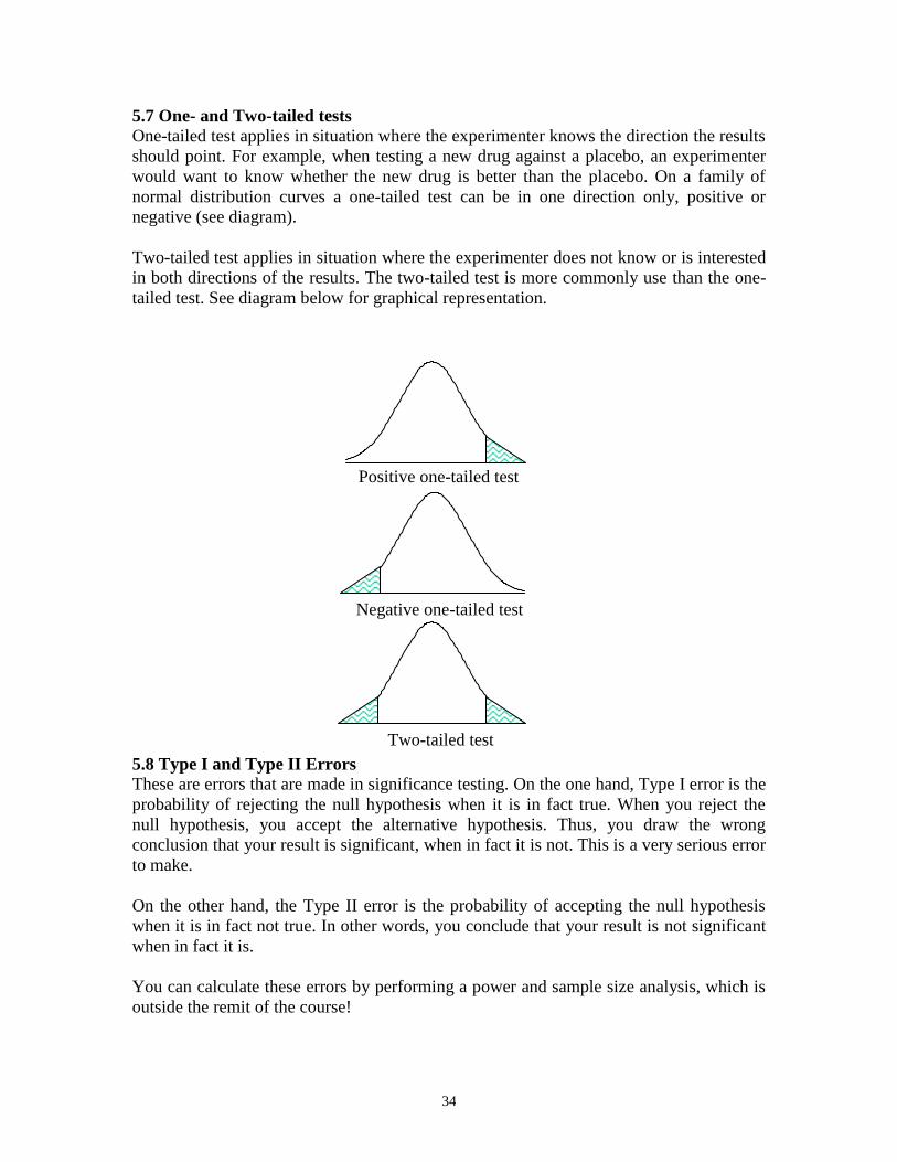
5.7 One- and Two-tailed tests
One-tailed test applies in situation where the experimenter knows the direction the results
should point. For example, when testing a new drug against a placebo, an experimenter
would want to know whether the new drug is better than the placebo. On a family of
normal distribution curves a one-tailed test can be in one direction only, positive or
negative (see diagram).
Two-tailed test applies in situation where the experimenter does not know or is interested
in both directions of the results. The two-tailed test is more commonly use than the one-
tailed test. See diagram below for graphical representation.
5.8 Type I and Type II Errors
These are errors that are made in significance testing. On the one hand, Type I error is the
probability of rejecting the null hypothesis when it is in fact true. When you reject the
null hypothesis, you accept the alternative hypothesis. Thus, you draw the wrong
conclusion that your result is significant, when in fact it is not. This is a very serious error
to make.
On the other hand, the Type II error is the probability of accepting the null hypothesis
when it is in fact not true. In other words, you conclude that your result is not significant
when in fact it is.
You can calculate these errors by performing a power and sample size analysis, which is
outside the remit of the course!
Negative one-tailed test
Positive one-tailed test
Two-tailed test
35
5.9 Student’s t-test for independent samples and for matched samples
There are basically three types of t tests. We are going to look at each one in turn, that is,
how to perform and interpret the output. The three types are:
5.9.1 Independent-samples t test (two-sample t test)
This is used to compare the means of one variable for two groups of cases. As an
example, a practical application would be to find out the effect of a new drug on blood
pressure. Patients with high blood pressure would be randomly assigned into two groups,
a placebo group and a treatment group. The placebo group would receive conventional
treatment while the treatment group would receive a new drug that is expected to lower
blood pressure. After treatment for a couple of months, the two-sample t test is used to
compare the average blood pressure of the two groups. Note that each patient is
measured once and belongs to one group.
5.9.2 Paired-samples t test (dependent t test)
This is used to compare the means of two variables for a single group. The procedure
computes the differences between values of the two variables for each case and tests
whether the average differs from zero. For example, you may be interested to evaluate
the effectiveness of a mnemonic method on memory recall. Subjects are given a passage
from a book to read, a few days later, they are asked to reproduce the passage and the
number of words noted. Subjects are then sent to a mnemonic training session. They are
then asked to read and reproduce the passage again and the number of words noted. Thus
each subject has two measures, often called before and after measures.
An alternative design for which this test is used is a matched-pairs or case-control study.
To illustrate an example in this situation, consider treatment patients. In a blood pressure
study, patients and control might be matched by age, that is, a 64-year-old patient with a
64-year-old control group member. Each record in the data file will contain responses
from the patient and also for his matched control subject.
5.9.3 One-sample t test
This is used to compare the mean of one variable with a known or hypothesised value. In
other words, the One-sample t tests procedure tests whether the mean of a single variable
differs from a specified constant. For instance, you might be interested to test whether
the average IQ of some 50 students differs from 125; or how the average salary in
Newcastle compares to the national average.
5.10 Assumptions underlying the use of t test
Before we look at the details of how to perform and interpret a t test, it is good idea for
you to understand the assumptions underlying the use of t test. The assumptions are:
your data is normally distributed
the variances between the groups are equal
the sample size is adequate (at least 30 cases per group)
36
So, before you carry out any t test, you must check to make sure that your data satisfy all
these assumptions. However, if your data seriously violates any of these assumptions then
Non-parametric tests should be used. Non-parametric tests do not carry specific
assumptions about population distributions, variance and sample size.
5.11 The p-value
In the interpretation of the t statistics, we will be looking at its p-value. Generally, there
are three situations where you will need to interpret the p-value:
1. If the p-value is greater than 0.05, the null hypothesis is accepted and the result is not
significant.
2. If the p-value is less than 0.05 but greater than 0.01, the null hypothesis is rejected
and the result is significant beyond the 5 percent level.
3. If the p-value is smaller than 0.01, the null hypothesis is rejected and the result is
significant beyond the 1 percent level.
5.12 Exercise
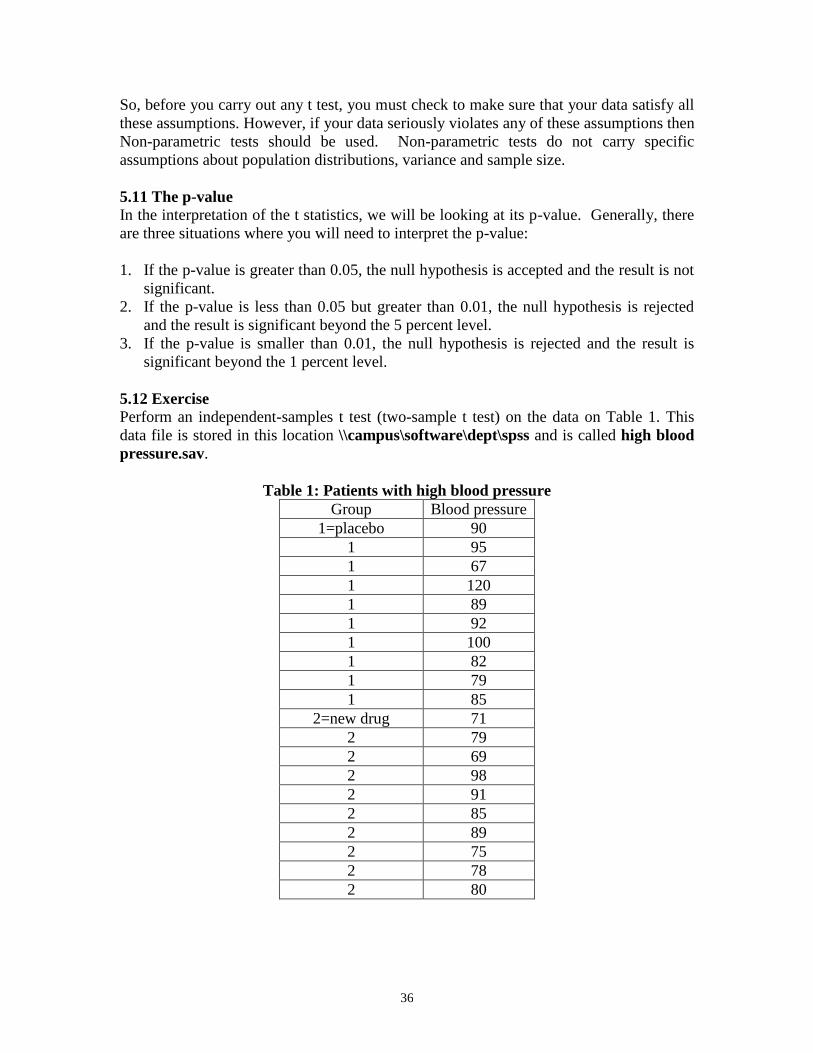
Perform an independent-samples t test (two-sample t test) on the data on Table 1. This
data file is stored in this location \\campus\software\dept\spss and is called high blood
pressure.sav.
Table 1: Patients with high blood pressure
Group Blood pressure
1=placebo 90
1 95
1 67
1 120
1 89
1 92
1 100
1 82
1 79
1 85
2=new drug 71
2 79
2 69
2 98
2 91
2 85
2 89
2 75
2 78
2 80
37
You need to first check the two assumptions: i) whether blood pressure is normally
distributed and ii) whether the variance is equal between the two groups (Homogeneity of
variance test). Write down the null and alternative hypotheses for the normality test:
Null Hypothesis (Ho): Blood pressure is normally distribution.
Alternative Hypothesis (H1): Blood pressure is not normally distribution.
5.12.1 Normality Test
Follow these steps to perform the normality test:
1. From the menu bar select Analyze -> Descriptives Statistics -> Explore….
2. Transfer blood pressure [bloodpres] to Dependent List:.
3. Transfer Group Membership [group] to Factor List:.
4. From Display click on Plots. Then click on Plots….
5. Under Descriptive deselect Stem-and –leaf.
6. Select Normality plots with tests.
7. Click on Continue. Click on OK.
Examine the result on the table Tests of Normality. For a small sample size (n≤50) use
the Shapiro-Wilk statistic. For large sample size (n>50) use the Kolmogorov-Smirnov
statistic.
Is blood pressure from the placebo group normally distributed? Why?
Is blood pressure from the new drug group normally distributed? Why?
Overall, what would you conclude?
Notice that as part of the output some graphs (charts) are also produced. The Normal Q-Q
plots and Detrented Normal Q-Q plots. The Normal Q-Q plots also helps you decide if
the data is normally distributed or not. For a normal distribution, all the dots should be
closed to (or be on) the straight line of the Normal Q-Q plots. Ignore the Detrented
Normal Q-Q plots.
Write down the null and alternative hypotheses for the Homogeneity of variance test:
Null Hypothesis (Ho): The variance is equal between the two groups.
Alternative Hypothesis (H1): The variance is not equal between the two groups.
5.12.1 Homogeneity of variance test
Follow these steps to perform the homogeneity of variance test:
1. Select Analyze -> Compare Means -> One-Way ANOVA….
2. Transfer blood pressure [bloodpres] to Dependent List:.
3. Transfer Group Membership [group] to Factor.
4. Click on Options and select Homogeneity of variance test.
5. Click Continue and click OK.
38
Examine the table Test of Homogeneity of variance. What would you conclude? Ignore
the table ANOVA which is also produced as part of this procedure.
5.12.3 Independent Samples T Tests
Since blood pressure passed the two assumptions, that is, blood pressure was normally
distributed and the variances between the two groups are equal, we have to perform a
parametric t test.
Write down the null and alternative hypotheses for the Independent Samples T Tests:
Null Hypothesis (Ho): The average blood pressure is the same between the placebo group
and new drug group.
Alternative Hypothesis (H1): The average blood pressure is different between the placebo
group and new drug group.
Follow these steps to perform the test:
1. Select Analyze -> Compare Means -> Independent-Samples T Test….
2. Transfer blood pressure [bloodpres] to Test Variable(s):.
3. Transfer Group Membership [group] to Grouping Variable:.
4. Click on Define Groups. Beside Group 1: type 1. Beside Group 2: type 2.
5. Click on Continue and click on OK.
Examine the output. Notice that two tables are produced. Using the table Group
Statistics answer these questions.
What is the average blood pressure for the placebo group?
What is the average blood pressure for the new drug group?
Which of these two averages is more variable and why?
Using the table Independent Sample Test, answer these questions. Notice that in this
table two rows of figures are given, use the first row.
What is the difference in the averages between the two groups?
Is this difference statistically significant and why?
What is the 95% Confidence Interval of the average difference between the two groups?
How is this related to the p-value?
Will you accept or reject the null hypothesis? Why?
39
5.13 Exercise
Perform a Paired-samples t test (dependent t test) on the data on Table 2. This data file is
stored in this location \\campus\software\dept\spss and is called b4_after training
words.sav.
Table 2: Number of words recalled
Before mnemonic training After mnemonic training
204 223
393 412
391 402
265 285
326 353
220 243
423 443
342 340
480 582
464 490
You need to check whether the number of words recalled before training and after
training are normally distributed.
Why do you think in this case it not necessary to perform the homogeneity of variance
test?
Write down the null and alternative hypotheses for the Paired-samples t test (dependent t
test):
Null Hypothesis (Ho): There is no difference in the average number of words recalled
before and after training.
Alternative Hypothesis (H1): There is a difference in the average number of words
recalled before and after training.
5.13.1 Normality Test
Follow these steps to perform the normality test:
1. From the menu bar select Analyze -> Descriptives Statistics -> Explore….
2. Transfer number of words recalled before training [words_b4] to Dependent
List:.
3. Transfer number of words recalled after training [words_af] to Dependent List:.
4. From Display click on Plots. Then click on Plots….
5. Under Descriptive deselect Stem-and –leaf.
6. Select Normality plots with tests.
7. Click on Continue. Click on OK.
40
Examine the output. What would you conclude?
5.13.2 Paired Samples T Test (Dependent T Test)
Since number of words recalled before training [words_b4] was normally distributed and
number of words recalled after training [words_af] was also normally distributed, we
need to perform a parametric paired samples t test. There was not need to homogeneity of
variance test because we are dealing with the same group. To do the actual test, follow
these steps:
1. From the menu bar select Analyze -> Compare Means -> Paired Samples T
Test….
2. Click on number of words recalled before training [words_b4] and click on the
arrow.
3. Click on number of words recalled after training [words_af] and click on the
arrow. Click OK.
Use the output to answer these questions.
Using the table Paired Sample Statistics what is the average value of the number of
words recalled before training [words_b4]? What is the average value of the number of
words recalled after training [words_af]? Which of these two averages is more variable?
Using the table Paired Samples Test, what is the mean difference between the two
averages? Is this difference significant? Why? Will you accept or reject the null
hypothesis? Why?
5.14 Exercise
Perform a One-sample t-test on the data on Table 3. Is the IQ of 10 students shown on the
table different from an IQ of 125? This data file is stored in this location
\\campus\software\dept\spss and is called iqs.sav.
Table 3: IQs of students
IQs
128
134
134
131
134
126
140
133
127
131
41
This test assumes that the data are normally distributed; however, this test is fairly robust
to departures from normality. This probably explains why SPSS does not provide a non-
parametric equivalent of this test. You have no option but to proceed with the parametric
test.
Write down the null and alternative hypotheses for the One-sample t test:
Null Hypothesis (Ho): The IQ from the ten students is not different from an IQ of 125.
Alternative Hypothesis (H1): The IQ from the ten students is different from an IQ of 125.
5.14.1 One-Sample T Test
To do the actual test, follow these steps:
1. From the menu bar select Analyze -> Compare Means -> One-Sample T
Test….
2. Select Intelligence Quotient [iq] and click on the arrow.
3. Type 125 besides Test Value:.
4. Click OK.
Use the output to answer these questions.
What is the average Intelligence Quotient [IQ] from the ten students? Is this average
significantly different from an IQ of 125? Why? Will you accept or reject the null
hypothesis? Why?
5.15 Confidence Intervals
We have discussed hypothesis above; it should be appreciated that it is only one form of
statistical inference. There would be situation that you will not be interested in testing
hypotheses. You may only be interested in obtaining an estimate of a parameter. For
example, we usually use the sample mean as an estimate of the population mean.
However, we are quite certain that the population mean will not be equal to the sample
mean due to sampling and data collection errors. It is therefore important to present our
estimate within a given range to address these errors. This is where confidence interval is
important. A confidence interval is therefore an estimated range of values with a given
high probability of covering the true population value.
Note, you can calculate the confidence interval of other parameters.
6 Correlational Analysis
6.1 Introduction
Correlation analysis is use to measure the association between two variables. A
correlation coefficient (r) is a statistic used for measuring the strength of a supposed
42
linear association between two variables. The most common correlation coefficient is the
Pearson correlation coefficient, use to measure the relationship between two interval
variables. Generally, the correlation coefficient varies from -1 to +1.
After completing this session you should be able to do the following:
Conduct and interpret a correlation analysis using interval data.
Conduct and interpret a correlation analysis using ordinal data.
Conduct and interpret a correlation analysis using categorical data (crosstabs).
6.2 Scatterplot
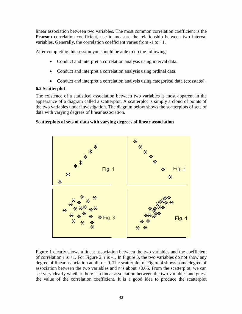
The existence of a statistical association between two variables is most apparent in the
appearance of a diagram called a scatterplot. A scatterplot is simply a cloud of points of
the two variables under investigation. The diagram below shows the scatterplots of sets of
data with varying degrees of linear association.
Scatterplots of sets of data with varying degrees of linear association
Figure 1 clearly shows a linear association between the two variables and the coefficient
of correlation r is +1. For Figure 2, r is -1. In Figure 3, the two variables do not show any
degree of linear association at all, r = 0. The scatterplot of Figure 4 shows some degree of
association between the two variables and r is about +0.65. From the scatterplot, we can
see very clearly whether there is a linear association between the two variables and guess
the value of the correlation coefficient. It is a good idea to produce the scatterplot
43
between two variables before conducting a correlation analysis. From the correlation
coefficient alone, we can not say much about the linear association between the two
variables.
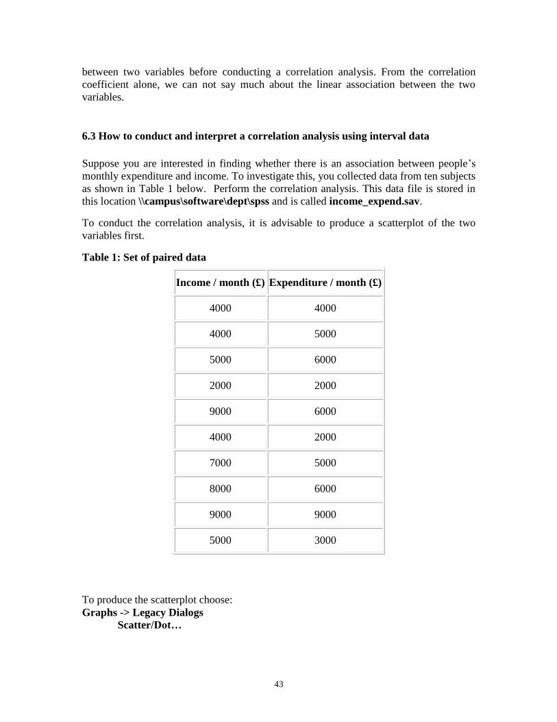
6.3 How to conduct and interpret a correlation analysis using interval data
Suppose you are interested in finding whether there is an association between people’s
monthly expenditure and income. To investigate this, you collected data from ten subjects
as shown in Table 1 below. Perform the correlation analysis. This data file is stored in
this location \\campus\software\dept\spss and is called income_expend.sav.
To conduct the correlation analysis, it is advisable to produce a scatterplot of the two
variables first.
Table 1: Set of paired data
Income / month (£) Expenditure / month (£)
4000 4000
4000 5000
5000 6000
2000 2000
9000 6000
4000 2000
7000 5000
8000 6000
9000 9000
5000 3000
To produce the scatterplot choose:
Graphs -> Legacy Dialogs
Scatter/Dot…
44
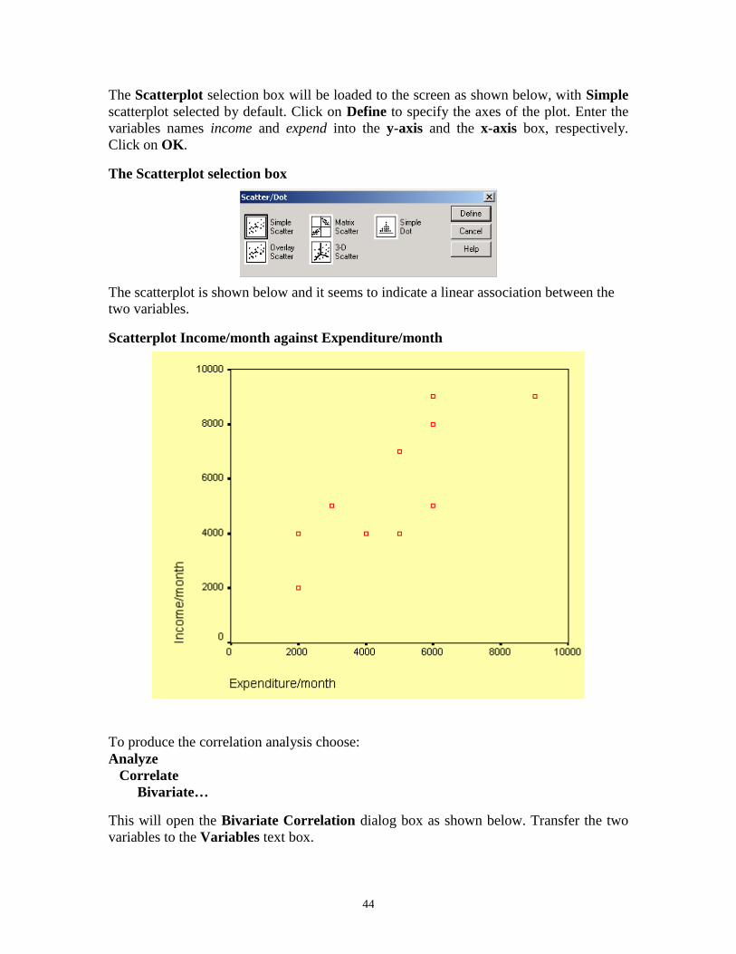
The Scatterplot selection box will be loaded to the screen as shown below, with Simple
scatterplot selected by default. Click on Define to specify the axes of the plot. Enter the
variables names income and expend into the y-axis and the x-axis box, respectively.
Click on OK.
The Scatterplot selection box
The scatterplot is shown below and it seems to indicate a linear association between the
two variables.
Scatterplot Income/month against Expenditure/month
To produce the correlation analysis choose:
Analyze
Correlate
Bivariate…
This will open the Bivariate Correlation dialog box as shown below. Transfer the two
variables to the Variables text box.
45
The Bivariate Correlation dialog box
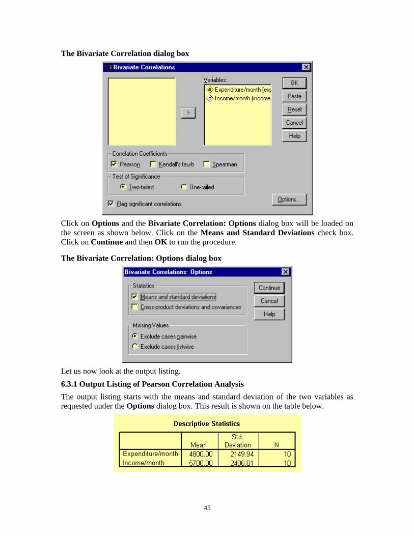
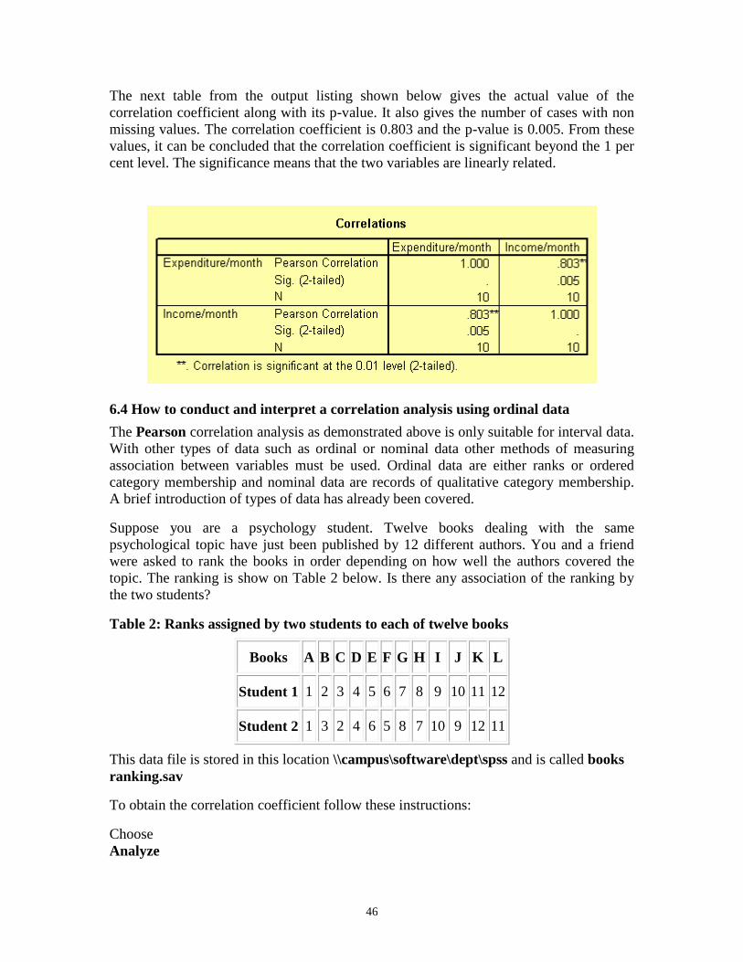
Click on Options and the Bivariate Correlation: Options dialog box will be loaded on
the screen as shown below. Click on the Means and Standard Deviations check box.
Click on Continue and then OK to run the procedure.
The Bivariate Correlation: Options dialog box
Let us now look at the output listing.
6.3.1 Output Listing of Pearson Correlation Analysis
The output listing starts with the means and standard deviation of the two variables as
requested under the Options dialog box. This result is shown on the table below.
46
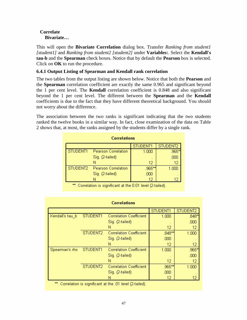
The next table from the output listing shown below gives the actual value of the
correlation coefficient along with its p-value. It also gives the number of cases with non
missing values. The correlation coefficient is 0.803 and the p-value is 0.005. From these
values, it can be concluded that the correlation coefficient is significant beyond the 1 per
cent level. The significance means that the two variables are linearly related.
6.4 How to conduct and interpret a correlation analysis using ordinal data
The Pearson correlation analysis as demonstrated above is only suitable for interval data.
With other types of data such as ordinal or nominal data other methods of measuring
association between variables must be used. Ordinal data are either ranks or ordered
category membership and nominal data are records of qualitative category membership.
A brief introduction of types of data has already been covered.
Suppose you are a psychology student. Twelve books dealing with the same
psychological topic have just been published by 12 different authors. You and a friend
were asked to rank the books in order depending on how well the authors covered the
topic. The ranking is show on Table 2 below. Is there any association of the ranking by
the two students?
Table 2: Ranks assigned by two students to each of twelve books
Books A B C D E F G H I J K L
Student 1 1 2 3 4 5 6 7 8 9 10 11 12
Student 2 1 3 2 4 6 5 8 7 10 9 12 11
This data file is stored in this location \\campus\software\dept\spss and is called books
ranking.sav
To obtain the correlation coefficient follow these instructions:
Choose
Analyze
47
Correlate
Bivariate…
This will open the Bivariate Correlation dialog box. Transfer Ranking from student1
[student1] and Ranking from student2 [student2] under Variables:. Select the Kendall's
tau-b and the Spearman check boxes. Notice that by default the Pearson box is selected.
Click on OK to run the procedure.
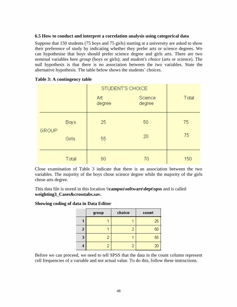
6.4.1 Output Listing of Spearman and Kendall rank correlation
The two tables from the output listing are shown below. Notice that both the Pearson and
the Spearman correlation coefficient are exactly the same 0.965 and significant beyond
the 1 per cent level. The Kendall correlation coefficient is 0.848 and also significant
beyond the 1 per cent level. The different between the Spearman and the Kendall
coefficients is due to the fact that they have different theoretical background. You should
not worry about the difference.
The association between the two ranks is significant indicating that the two students
ranked the twelve books in a similar way. In fact, close examination of the data on Table
2 shows that, at most, the ranks assigned by the students differ by a single rank.
48
6.5 How to conduct and interpret a correlation analysis using categorical data
Suppose that 150 students (75 boys and 75 girls) starting at a university are asked to show
their preference of study by indicating whether they prefer arts or science degrees. We
can hypothesise that boys should prefer science degree and girls arts. There are two
nominal variables here group (boys or girls); and student's choice (arts or science). The
null hypothesis is that there is no association between the two variables. State the
alternative hypothesis. The table below shows the students’ choices.
Table 3: A contingency table
Close examination of Table 3 indicate that there is an association between the two
variables. The majority of the boys chose science degree while the majority of the girls
chose arts degree.
This data file is stored in this location \\campus\software\dept\spss and is called
weighting3_Cases&crosstabs.sav.
Showing coding of data in Data Editor
Before we can proceed, we need to tell SPSS that the data in the count column represent
cell frequencies of a variable and not actual value. To do this, follow these instructions.
49
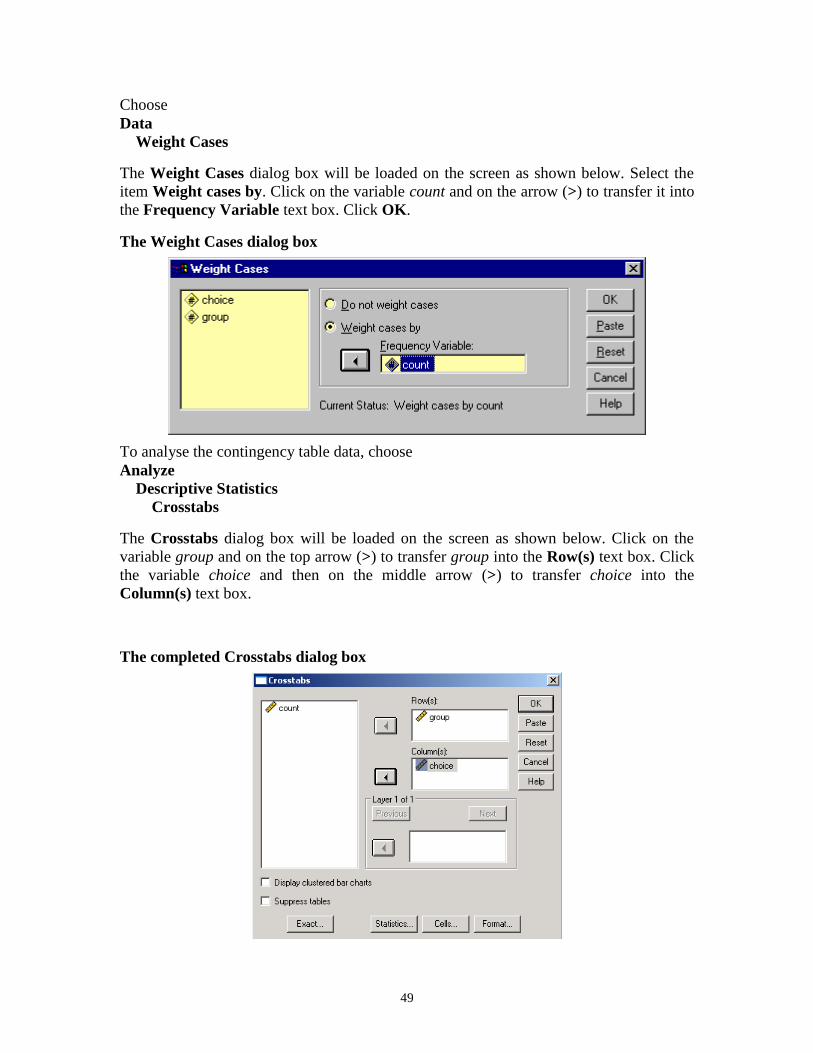
Choose
Data
Weight Cases
The Weight Cases dialog box will be loaded on the screen as shown below. Select the
item Weight cases by. Click on the variable count and on the arrow (>) to transfer it into
the Frequency Variable text box. Click OK.
The Weight Cases dialog box
To analyse the contingency table data, choose
Analyze
Descriptive Statistics
Crosstabs
The Crosstabs dialog box will be loaded on the screen as shown below. Click on the
variable group and on the top arrow (>) to transfer group into the Row(s) text box. Click
the variable choice and then on the middle arrow (>) to transfer choice into the
Column(s) text box.
The completed Crosstabs dialog box
50
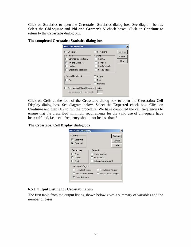
Click on Statistics to open the Crosstabs: Statistics dialog box. See diagram below.
Select the Chi-square and Phi and Cramer's V check boxes. Click on Continue to
return to the Crosstabs dialog box.
The completed Crosstabs: Statistics dialog box
Click on Cells at the foot of the Crosstabs dialog box to open the Crosstabs: Cell
Display dialog box. See diagram below. Select the Expected check box. Click on
Continue and then OK to run the procedure. We have computed the cell frequencies to
ensure that the prescribed minimum requirements for the valid use of chi-square have
been fulfilled, i.e. a cell frequency should not be less than 5.
The Crosstabs: Cell Display dialog box
6.5.1 Output Listing for Crosstabulation
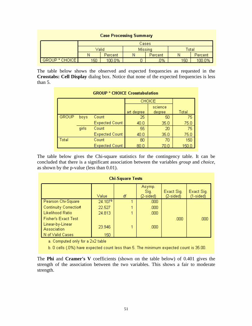
The first table from the output listing shown below gives a summary of variables and the
number of cases.
51
The table below shows the observed and expected frequencies as requested in the
Crosstabs: Cell Display dialog box. Notice that none of the expected frequencies is less
than 5.
The table below gives the Chi-square statistics for the contingency table. It can be
concluded that there is a significant association between the variables group and choice,
as shown by the p-value (less than 0.01).
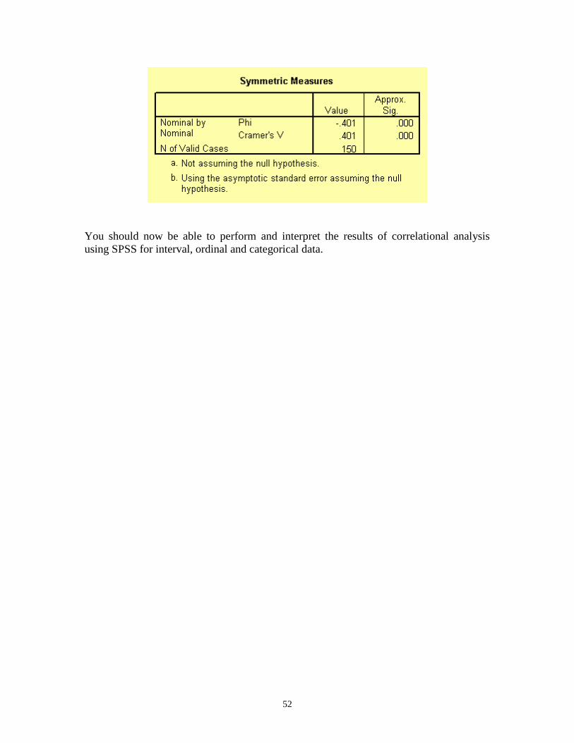
The Phi and Cramer's V coefficients (shown on the table below) of 0.401 gives the
strength of the association between the two variables. This shows a fair to moderate
strength.
52
You should now be able to perform and interpret the results of correlational analysis
using SPSS for interval, ordinal and categorical data.
53
7 Measures of Association and Analysing Data from more than two
groups
7.1 Simple One-Way Analysis of Variance (ANOVA)
ANOVA is concerned with the testing of hypotheses about means. It is very similar to t-
test. In fact, for an experiment involving two groups, output from ANOVA and t-test will
be the same. However, t-test can not be used to test hypothesis on three or more groups.
So, if there are just two groups use t-test. If there are three groups or more use ANOVA.
The assumptions stated earlier that need to be satisfied before proceeding with a t test are
also applicable to ANOVA. Can you remember the three assumptions?
Carry out a simple one-way ANOVA on the employee data set using the variable current
salary as dependent list and employment category as factor. Note you have to test these
assumptions before you proceed. This will help you decide whether you perform a
parametric or nonparametric ANOVA.
To select one-way ANOVA from the menu bar choose Analyze -> Compare Means ->
One-Way ANOVA.
Note that ANOVA can only tell us if there is a difference between the three groups or
not. It does not justify us saying that any particular comparison is significant or not. In
other words, in cases where there is significance, ANOVA does not tell us where the
significance lies.
A planned comparison of means is known as a priori comparisons and unplanned is
known as post-hoc comparisons. Two post-hoc comparisons test in SPSS are Tukey’s
Honestly Significant Difference (HSD) and Scheffe’s test. After performing an
ANOVA, to find where the differences lies between the groups, you need to carry out a
post-hoc test. If the result from the ANOVA is not significant, there will be no need to
perform a post-hoc test.
Look at your output and try to interpret it by answering the following questions. Is the
ANOVA test significant? If so where does the difference lie? That is:
Is the Manager group different from the Clerical group?
Is the Manager group different from the Custodial group?
Is Clerical group different from Custodial group?
7.2 Kruskal-Wallis test (Non-parametric equivalent to ANOVA)
If your data is not normally distributed, you should consider the use of non-parametric
test such as Kruskal-Wallis. Note that with Ordinal data you can’t use parametric
ANOVA.
To open the Tests for Several Independent Samples dialogue box from the main menu
bar choose Analyze -> Nonparametric Tests ->Legacy Dialogs -> K Independent
Samples.
54
8 Introduction to Non-Parametric Statistics
In most statistical packages and in SPSS in particular it is assumed that the data has been
derived from a population with normal distribution. When this is not the case, non-
parametric test should be used instead.
SPSS provides a variety of non-parametric tests in the Non-parametric Tests submenu
within the Analyze menu in the main menu bar. The Sign and Wilcoxon tests are the
equivalent to the paired samples t-test. The Mann-Whitney test is the equivalent to the
independent samples t-test.
Most non-parametric tests use measures that are resistant to outliers and skewness, for
instance median.
8.1 Mann-Whitney U Test
Use this test to compare two independent samples. Choose Analyze -> Nonparametric
Tests -> Legacy Dialogs -> 2 Independent Samples….
Wilcoxon Signed Ranks test for two correlated samples
Use this test to compare two related or paired samples. Choose Analyze ->
Nonparametric Tests -> Legacy Dialogs -> 2 Related Samples….
55
9 Hands-on Exercises
9.1 Exercise 1: Opening an Excel File into SPSS
The file is stored in this location \\campus\software\dept\spss. It is called Gss91Sm.xls.
Open this file in SPSS.
Background Information for Exercises 2, 3 and 4
The data file used for exercises contains demographics, salary and job information of the
employees of a company. We are interested in understanding the employees in terms of
demographics (gender, minority classification, education) and employment measures (job
position, beginning and current salary). We are also interested in the relationship between
demographics and salary. Finally we want to represent our findings graphically. You are
not expected to perform the definitive study on this data, but rather make a start in terms
of describing the employees and take a preliminary look at how the measures interrelate.
The data are stored as an SPSS file. In the course of performing the exercises you will
read this data, perform several statistical analyses, modify the data and create several
charts.
9.2 Exercise 2: Examining Summary Data for Individual Variables
In this exercise we ask you to begin analysing the employee data by producing some
descriptive summaries on both the demographic and salary variables. These will provide
summaries useful in describing the employees and serve as a check on the data values;
for example, are the maximum and minimum values of education, months since hire and
salary reasonable?
1. Open the data file employee data.
2. Run Frequencies on the variables jobcat (employment category), minority
(minority classification), and gender (employee gender), requesting mode, plus
barcharts. Examine the bar charts to better understand the distributions of these
variables. Which job category had the greatest number of employees, and which
had the fewest?
3. Run Frequencies for salbegin (beginning salary) and salary (current salary),
requesting summary statistics, and a histogram for each variable with a
superimposed normal curve. Suppress the display of the frequency table. Do
you think that the salaries are normally distributed? If not, why?
4. Produce a frequency distribution of educ (educational level) showing the table in
descending order of frequency (use the format pushbutton). You may need to
reset the frequency dialogue box.
56
9.3 Exercise 3: Modifying Data Values
In this exercise we will look at salary information in several different ways, which
require some modification of data. First we will group employees into several salary
categories and see how many employees fall into each category. Next we will study the
difference between current and beginning salary across employees.
1. Open the data file employee data if you have not already done so.
2. Use Recode Into Different Variables under the Transform menu to create a new
variable that groups salbegin (beginning salary) into 3 categories (call this new
variable salcate and labelled it salary category). Use these cut off points:
Range Category
Salary up to $13,500 Low salary
$13,501 - $15950 Medium salary
$15,951+ High salary
3. After the recode is complete, check your work by running frequencies of salcate.
4. Use Compute under the Transform menu to create a new variable that contains
the difference between current and beginning salary. Call this new variable saldiff
(salary difference)
5. Run Descriptives on this new variable to see summary information. Can you tell
whether anyone has a current salary lower than their beginning salary? What was
the largest salary change?
6. Save the modified data file under Drive C: in the temporary (temp) folder.
7. Use the variables jobtime (months since hire) and prevexp (previous experience)
to create a new variable that measures the total time (in months) each employee
has been working. Examine summary information (i.e. mean, mode, median,
standard deviation, range, minimum, maximum values) of the new variable.
8. Create a new variable that divides the saldiff (salary difference) by jobtime
(months since hire). This will produce a salary difference adjusted for the number
of months in the current position. Run the Descriptives procedure on this new
variable.
9.4 Exercise 4: T-test
Is there any statistical significance difference between the average salary of male and
female employees on current salary?