Embed Size (px)
Citation preview
Fiscal risks report
July 2017
Office for Budget ResponsibilityFiscal risks report
Presented to Parliament by the Economic Secretary to the Treasury by Command of Her Majesty
July 2017
Cm 9459

© Crown copyright 2017 This publication is licensed under the terms of the Open Government Licence v3.0 except where otherwise stated. To view this licence, visit nationalarchives.gov.uk/doc/open-government-licence/version/3 or write to the Information Policy Team, The National Archives, Kew, London TW9 4DU, or email: [email protected].
Where we have identified any third party copyright information you will need to obtain permission from the copyright holders concerned.
This publication is available at www.gov.uk/government/publications
Any enquiries regarding this publication should be sent to us at [email protected]
Print ISBN 9781474146197Web ISBN 9781474146203
ID 05061711 07/17 59950
Printed on paper containing 75% recycled fibre content minimum
Printed in the UK by the Williams Lea Group on behalf of the Controller of Her Majesty’s Stationery Office

Contents
Foreword ...................................................................................... 1
Executive summary ........................................................................ 3
Chapter 1 Introduction ................................................................................ 17
Chapter 2 The Government’s approach to fiscal risk management ................ 33
Chapter 3 Macroeconomic risks ................................................................... 39
Chapter 4 Risks from the financial sector ...................................................... 75
Chapter 5 Revenue risks .............................................................................. 93
Chapter 6 Primary spending risks ............................................................... 137
Chapter 7 Balance sheet risks .................................................................... 215
Chapter 8 Debt interest risks ...................................................................... 239
Chapter 9 A fiscal stress test....................................................................... 261
Chapter 10 Conclusions .............................................................................. 295
Index of charts and tables .......................................................... 309

Foreword
The Office for Budget Responsibility (OBR) was established in 2010 to provide independent and authoritative analysis of the UK’s public finances. In the October 2015 update to the Charter for Budget Responsibility, Parliament required us to produce a fiscal risks report at least once every two years. The Government has committed to responding formally to each report within a year.
We have always placed considerable emphasis on the risks and uncertainties around any assessment of the outlook for the public finances. In our Economic and fiscal outlook (EFO) publications, we illustrate the risks to our medium-term forecasts by drawing on the pattern of past forecast errors, estimates of their sensitivity to changes in key parameters, and scenario analysis. We also subject the long-term projections in our Fiscal sustainability reports (FSR) to sensitivity analysis, as well as highlighting specific fiscal risks from the Whole of Government Accounts.
In this first Fiscal risks report (FRR) we draw together and expand on these analyses. We hope that it will provide a valuable addition to the material that we produce to help promote an informed public debate about the sustainability of the public finances. Much of that debate focuses on our central medium-term forecasts and long-term projections, despite the wide range of uncertainty that surrounds those central conclusions. By focusing on identifiable risks to the public finances, the FRR builds on the sensitivity and scenario analysis that we already present in our EFOs and FSRs.
The approach that we have taken and the structure of this report benefited from discussion with the International Monetary Fund’s Fiscal Affairs Department, officials at the Treasury, National Audit Office and Government Actuary’s Department, attendees at the 2017 Organisation for Economic Cooperation and Development’s (OECD) annual meeting of independent fiscal institutions and a number of written responses to our discussion paper. Inevitably we have not been able to do justice to every suggestion that we received, but we hope to be able to do so as part of our ongoing reporting on fiscal risks, both in future FRRs and in dedicated reports in the periods between them.
The analysis and conclusions presented in this document represent the collective view of the three independent members of the OBR’s Budget Responsibility Committee. We take full responsibility for the judgements that underpin them. We have been hugely supported in this by the staff of the OBR, to whom we are as usual enormously grateful.
We have also drawn on the help and expertise of officials across numerous departments and agencies for which we are very grateful. This report has involved scrutinising some areas of the public finances that have not in the past been central to our role, so we are particularly grateful to those who assisted us at the Nuclear Decommissioning Authority, NHS Resolution, the Health Foundation and the Nuffield Trust. Finally, we are grateful to staff at the Bank of England for their assistance in understanding the Bank’s stress test scenarios that we have built upon to produce the fiscal stress test presented in Chapter 9. We would also emphasise that despite that assistance, all judgements underpinning our stress test are our own and should not be attributed to the Bank.
1 Fiscal risks report

Foreword
We provided the Chancellor of the Exchequer with a summary of our main conclusions on 6 July. Given the breadth and depth of the report, we provided exceptional pre-release access to a near-final version of the full report to a named list of Treasury officials on 10 July. We then provided a full and final copy 24 hours prior to publication. This is in line with pre-release access arrangements set out in the Memorandum of Understanding between the Office for Budget Responsibility, HM Treasury, Department for Work and Pensions and HM Revenue & Customs that was updated in March 2017. In accordance with this Memorandum, emerging findings and draft material were discussed with officials in the Treasury and other departments under the auspices of a liaison group set up for the purpose. At no point in the process did we come under any pressure from Ministers, special advisers or officials to alter any of our analysis or conclusions.
We hope that this report is of use and interest to readers. As with any new report, we consider it to be a work-in-progress that will be refined and modified over time. We would therefore be pleased to receive feedback on any aspect of the content or presentation of the analysis. This can be sent to [email protected].
Fiscal risks report 2
Robert Chote Sir Charles Bean Graham Parker CBE
The Budget Responsibility Committee

Executive summary
Overview
1 The Office for Budget Responsibility has produced regular medium-term forecasts and long-term projections for the UK public finances since 2010. We have always emphasised the uncertainty that lies around them and have quantified it in various ways. Parliament has now asked us to build on this work by producing a regular report on ‘fiscal risks’. In doing so, we seek to identify specific shocks or pressures that could push the public finances away from our latest medium-term forecast or threaten fiscal sustainability over the longer term.
2 We produce this report at a sensitive time. A decade after the outbreak of the financial crisis and recession, net borrowing is well down from its peak. But the budget is still in deficit by 2 to 3 per cent of GDP – as it was on the eve of the crisis – and net debt is more than double its pre-crisis share of GDP and not yet falling. As a result, the public finances are much more sensitive to interest rate and inflation surprises than they were. In terms of the political backdrop, the previous Government had to abandon a number of measures to increase taxes and cut welfare spending, the new Government has just agreed a ‘confidence and supply’ arrangement that increases public spending significantly in Northern Ireland and the Chancellor of the Exchequer notes of austerity that “people are weary of the long slog”.
3 Nonetheless, the Government says it remains committed to balancing the budget by 2025. Our March forecast showed it on course to reduce the deficit to 0.7 per cent of GDP by 2021-22, but predicated on plans for a further significant cut in real public services spending per person. In making judgements on tax and spending in its first Autumn Budget this year – and in those that follow – the Government will need to bear in mind not just our central forecasts, but also the many risks that surround both them and the longer-term outlook.
4 In this report we have taken a broad view of those risks, not all of which are negative. They range from the economy-wide costs of financial crises and recessions to the specific challenges of taxing modern work practices and cleaning up nuclear reactors. But the main message is clear: governments should expect nasty fiscal surprises from time to time – because policy can only reduce risks, not eliminate them – and plan accordingly. And they have to do so in the context of ongoing pressures that are likely to weigh on receipts and drive up spending and a variety of risks that governments choose to expose themselves to for policy reasons. This is true for any government, but this one also has to manage the uncertainties posed by Brexit, which could influence the likelihood or impact of other risks.
5 History tells us that the biggest peacetime fiscal risks over the medium term relate to the economy. The chance of a recession in any five-year period is around one in two, and in three of the last four the budget deficit topped 6 per cent of GDP. Recessions associated with
3 Fiscal risks report

Executive summary
financial crises are typically the most costly, especially when their economic effects persist. These long-term costs are generally much more significant, if less immediately visible, than any money spent bailing out banks. The chance of a financial crisis in any five-year period is around one in four, but thankfully not all are as big or as costly as the most recent one.
6 With recessions and financial crises almost inevitable over a 50-year horizon, governments need to recognise the very high probability that they will have to deal with their costs at some point in the future. Policy can reduce the likelihood of these risks crystallising and their fiscal impact when they do, but the underlying risks cannot be eliminated. So the public finances need to be managed prudently during more favourable times to ensure that when these shocks do crystallise they do not put the public finances onto an unsustainable path. This is all the more important given the rise in the stock of debt in recent years, and the greater sensitivity of future debt interest costs to changes in interest rates and retail price inflation.
7 The economy could also be a source of slow-building fiscal pressures. Most importantly, our productivity growth assumptions, which underpin current fiscal plans and forecasts, assume that the weakness of recent years will dissipate over the next five years and historical norms will re-assert themselves. But if the past few years prove to be the ‘new normal’, even the current challenging spending plans would require either higher taxes or higher borrowing. By way of illustration, if trend productivity and GDP growth were just 0.3 percentage points a year lower than we assume, half the £26 billion of headroom the Government has against its structural deficit target for 2020-21 would be lost. The remaining £13 billion would disappear if just some of the other risks discussed in this report were to crystallise.
8 Surveying specific risks to receipts and spending points to a wide range of ongoing pressures that governments must deal with, while also preparing for inevitable future shocks:
• The tax system is designed in a way that should increase the tax-to-GDP ratio over time, for example by linking thresholds to inflation so that real earnings growth drags more income into higher tax brackets. But in practice that ratio has fluctuated within a fairly narrow range, partly because of pressures on tax bases and effective tax rates that work in the opposite direction. Some taxpayers will always seek to reduce their liability through legal or illegal means. Some heavily taxed activities are in relative decline (fuel consumption, smoking, North Sea oil production). Some activities become harder to tax (changes in the way people work are weighing on receipts). And policy is a source of risk, for example repeated decisions not to implement fuel duty increases.
• Pressures on public spending abound. By far the biggest relate to health, where an ageing population is raising demand while technological advances raise costs. Ageing also creates pressures on adult social care and the state pension – which each face policy-driven cost pressures in the form of the National Living Wage and the triple lock respectively. To these can be added ongoing pressures from the uncertain costs of cleaning up nuclear power stations, compensating victims of clinical negligence and reimbursing tax that the courts determine should not have been collected. In the near term the Government may also need to finance an extensive programme of fire safety measures in the wake of the Grenfell Tower tragedy. All these have to be considered in
Fiscal risks report 4

Executive summary
the context of medium-term spending plans that imply significant real terms cuts in spending per person over the next three years, on top of those implemented since 2010. Lifting current limits on public sector pay increases would pose a fiscal challenge to the extent that departments had their budgets increased to pay for it, rather than simply giving them greater flexibility over how they manage their pay bills.
9 The new Government must also manage the risks posed by Brexit. These do not supplant the possible shocks and likely pressures that we have already discussed, but they could affect the likelihood and impact of many of them. A lot of attention focuses on the possible ‘divorce bill’, but, while some numbers mooted for it are very large, a one-off hit of this sort would not pose a big threat to fiscal sustainability. More important are the implications of whatever agreements are reached with the EU and other trading partners for the long-term growth of the UK economy, which we do not attempt to predict here. If GDP and receipts grew just 0.1 percentage points more slowly than projected over the next 50 years, but spending growth was unchanged, the debt-to-GDP would end up around 50 percentage points higher.
10 None of this should be taken as a recommendation to refrain from particular spending increases or tax cuts, or to avoid particular fiscal risks – that would lie beyond our remit. And there are those who believe fiscal policy is still too tight, given the pace of economic growth and the looseness of monetary policy. But new unfunded ‘giveaways’ would take the Government further away from its medium-term fiscal objective and would only add to the longer-term challenges. In many recent fiscal events, giveaways today have been financed by the promise of takeaways tomorrow. The risk there, of course, is that tomorrow never comes.
Our approach
11 Chapter 1 sets out our approach in this report. Our goal is to identify some of the major risks to the outlook for the UK public finances over two time horizons: to our March forecast over the next five years and to fiscal sustainability over the next 50. We are interested primarily in ‘downside’ risks that would make things look worse rather than better. They are a bigger challenge to policymakers and history suggests that they crystallise more often.
12 Many fiscal risks take the form of potential increases in spending or losses of revenue – either one-off or persistent – that increase public sector net borrowing and put balance sheet measures like public sector net debt on a less favourable path. Other risks threaten the balance sheet directly: the Government might have to issue debt to buy assets or lend to the private sector; it might need to bring private sector entities onto the public sector’s balance sheet; and existing assets and liabilities might change in value.
13 Within these categories, we consider various characteristics of each risk: is it likely to be a one-off event or something that builds up continuously; is it directly influenced by government action or does it impose itself from elsewhere; is it isolated or likely to be correlated with other risks, for example due to a common underlying cause? As well as looking at individual spending, revenue and balance sheet risks, we look at the multi-dimensional risks posed by adverse developments in the economy or financial sector.
5 Fiscal risks report

Executive summary
14 Where possible, we try to evaluate the probability that particular risks will crystallise over the medium and long term, and the potential impact if they do. For many individual risks there are many possible combinations: from the relatively high probability of a low-impact event to the relatively low probability of a high-impact one. Occasionally probability and impact can be estimated with a degree of precision, but more often broad judgements must suffice.
15 Finally, we consider what governments do in light of these risks, with particular reference to the ‘four Ts’ in the Treasury’s published risk management guidance – namely the choice between ‘tolerating’ a risk, ‘treating’ it, ‘transferring’ it to the private sector or ‘terminating’ the activity that generates it. At the end of each chapter we list some of the issues that the Government may wish to address in its formal response to this report.
The Government’s approach to risk management
16 In Chapter 2 we summarise the Government’s current approach to managing fiscal risks, which has evolved over time and continues to develop:
• Overall responsibility for fiscal risk management lies with the Treasury, which has an objective to keep the public finances on a sustainable footing. It requires departments to manage risks within spending limits that it sets – and to inform it of any emerging pressures where that may not be possible, so that costs can be met or offset centrally.
• The Treasury’s internal processes are built around various risk groups, including a dedicated Fiscal Risks Group, that report to the Executive Management Board each quarter. They are responsible for risk identification and assessment, and for recommending mitigating actions. Their outputs inform advice to Treasury Ministers.
• Recent developments include an enhanced process around the approval of new contingent liabilities and the decision to commission us to produce this report.
Macroeconomic risks
17 In Chapter 3 we consider the various ways in which macroeconomic risks can affect the public finances. History suggests that these are the high-impact fiscal risks most likely to crystallise over the medium term and, more particularly, over the long term:
• Risks to potential output growth are the most important long-term macroeconomic risks. They can stem from any of the different sources of potential growth: population growth (including net migration), the proportion of the population working (reflecting participation rates and the sustainable unemployment rate), the number of hours worked by those in employment and, most important of all, the amount produced per hour worked (i.e. potential productivity growth). Small changes in potential output growth can build up over time to deliver large effects on the size of the economy and therefore the size of the tax base and the affordability of public spending plans. In a world in which thresholds in the tax and benefit system are assumed to rise with living standards over the long term – and most public services spending is assumed broadly
Fiscal risks report 6
Executive summary
constant as a share of GDP – weaker potential output growth leaves everyone poorer (especially if driven by weaker productivity growth), but does not itself pose a threat to fiscal sustainability. It poses more of a fiscal risk over the medium term, when public services spending is fixed in cash terms and when thresholds and benefit levels are more often linked to measures of inflation than living standards.
• The risk of a recession is around one in two over any five-year horizon and well-nigh inevitable over a 50-year one. Since 1970, no decade has passed without a recession. Each was different, but three pushed the budget deficit over 6 per cent of GDP. The impact of recessions on net debt depends importantly on the pace of the recovery that follows them. Those with lasting adverse economic effects – like the most recent one – are associated with the greatest fiscal costs. Recessions are rarely anticipated, and they tend to surprise forecasters more on the downside than booms do on the upside. Recessions are discrete events, but many other risks can be triggered alongside them. Given their near inevitability, but unpredictable timing, there is little policymakers can do in advance beyond recognising that they will need to accept their fiscal costs at some point in the future. This is one reason why academic research and IMF advice says that governments should aim to create fiscal space in normal times.
• Risks associated with the sectoral composition of activity can be important, but generally less so than those affecting the whole economy. Risks emanating from the housing market for example are often correlated with broader cyclical risks and all UK recessions have been associated with periods of falling real house prices. This is more likely to reflect common causes than the housing market being the source of economic downturns. The housing sector is relatively tax-rich, helps drive some parts of welfare spending and has spawned a number of policy initiatives that involve potentially costly guarantees and contingent liabilities. So risks affecting it are fiscally important.
• Risks associated with the expenditure or income composition of GDP are also important, but again less so than whole economy risks. Different components of expenditure and income are taxed at different rates, so changes in composition affect the tax-to-GDP ratio. The labour share of income is the most important source of risk, given the relatively high tax rate on employment income and the relatively low rate on profits. On the expenditure side, consumer spending drives VAT receipts and excise duties, whereas business investment attracts capital allowances that reduce receipts in the short term but has broader effects that may boost them over the longer term.
• Brexit-related uncertainties overlay many of these risks. Will new trading arrangements affect potential productivity growth? Will new migration policies affect working-age population growth? Will there be a period of cyclical weakness around the exit date?
7 Fiscal risks report

Executive summary
Financial sector risks
18 In Chapter 4 we consider the fiscal risks associated with the financial sector. We focus on the potential costs of financial crises, but also look at how the public finances might be affected if this tax-rich sector were to decline over time as a share of the economy:
• Financial crises are among the biggest fiscal risks faced by governments in all countries, and particularly in the UK where the sector remains unusually large relative to the economy, even after the recent crisis. The fiscal costs of financial crises typically include the direct costs of intervening to support particular institutions, so that the system continues to function, and the indirect costs associated with the accompanying economic downturn. The upfront cost of ‘bailing out banks’ is easy to identify and politically unpopular, but the ultimate cost after these interventions are unwound tends to be relatively small. The indirect costs from damage done to the economy is typically much larger, especially if the economy suffers persistent weakness in the post-crisis recovery, as in the UK over the past decade. These costs would be much greater in the absence of direct interventions to restore the financial system to stability.
• The likelihood of financial crises cannot be reduced to zero. Over a five-year horizon, the likelihood appears relatively low, given the steps taken since the crisis by financial institutions and their regulators. But over a 50-year horizon, history suggests that the likelihood of another crisis is high, although that does not mean that the next one would be as big as the last. Financial systems are prone to excess and there is often pressure to ease onerous post-crisis regulation as the years pass and memories fade. So even though regulatory policies have been tightened recently to reduce the likelihood and impact of financial crises, governments need to recognise that over longer horizons they are likely to need to deal with the consequences of another one.
• The financial sector is relatively tax-rich, which means that any decline in the sector relative to the economy as a whole would be likely to weigh on the tax-to-GDP ratio. Tighter regulation may reduce the size and profitability of the sector, while uncertainties surrounding the impact of Brexit pose a particular risk.
Revenue risks
19 In Chapter 5 we consider specific risks to receipts – i.e. those that might affect the tax-to-GDP ratio in any given state of the economy. In terms of potential impact, they are smaller than macroeconomic and financial crisis-related risks. But if several crystallise together then their aggregate effect could be significant:
• There are risks to a number of tax bases, several of which seem likely to grow more slowly than the economy as a whole. These include fuel duty (as engine efficiency continues to improve) and tobacco duty (thanks to the decline in smoking). The risk associated with a declining North Sea oil and gas tax base has largely crystallised, but future repayments associated with decommissioning costs represent a risk.
Fiscal risks report 8

Executive summary
• There are also risks to the amount of tax raised from a given tax base, with HMRC estimating ‘tax gaps’ – the difference between what is and should be collected from individual taxes – ranging from 1 to almost 20 per cent. A related issue that has grown in recent years is the downward pressure on the tax-to-GDP ratio from rising self-employment and incorporations, reflecting people’s choices of employment status (as an employee, unincorporated self-employed or their own company) and the different tax rates applied to the associated income types. Governments can tolerate the consequences of these trends for the tax-to-GDP ratio; treat their underlying causes; or try to offset their effects by raising taxes elsewhere. As the effects of these trends tend to build over time, governments have scope to adjust policies incrementally if they wish.
• Tax policy itself is a source of fiscal risk. In recent years, governments have announced and then abandoned a number of revenue-raising measures. They have also set out default assumptions for the indexation of taxes that have not subsequently been implemented – the most costly of which have been successive freezes to fuel duty since 2010. It has also been striking that the relatively certain costs of recent headline tax cuts (e.g. raising the income tax personal allowance and cutting corporation tax rates) have been funded by the relatively uncertain yield from a large number of measures to tackle avoidance and evasion or to boost HMRC’s operational capacity.
• There are risks from the concentration of tax receipts among a small number of taxpayers. In the case of income tax and stamp duty land tax, these risks have increased in recent years as a result of policy decisions. For capital gains tax, it has always been true. While not necessarily a source of downside risk in its own right, greater concentration is likely to increase the sensitivity of the tax system to downturns and the susceptibility of tax receipts to idiosyncratic shocks affecting the key taxpayers.
Primary spending risks
20 In Chapter 6 we consider risks to primary spending – i.e. on everything other than debt interest. This is spending over which governments have varying degrees of direct control – for example via the amount they choose to spend on a public service or the way they choose to structure the welfare system. Risks to primary spending are particularly varied:
• Welfare spending is an important long-term risk to fiscal sustainability, as the ageing population and triple lock on uprating are expected to raise state pension spending as a share of GDP. In the medium term, there are risks to spending on working-age adults and children, relating to the delivery of major reforms (notably to incapacity and disability benefits, and the rollout of universal credit) and legal challenges that could expand eligibility for different benefits. Our medium-term forecasts also incorporate big cuts to spending on working-age adults and children announced in July 2015 that have yet to be delivered in full. The ‘welfare cap’ has been materially changed twice since it was introduced in 2014 and its contribution to spending control is unclear.
• Health and adult social care spending are subject to significant medium- and long-term pressures. Governments have managed to reduce spending as a share of GDP in
9 Fiscal risks report

Executive summary
recent years, but amid signs of pressure on the system Ministers have topped up initial spending settlements in various ways: the health budget has received extra money from the Treasury’s reserve, from new issue-specific funds and from permission to use capital budgets to meet current needs; and adult social care funding has been boosted by council tax rises and additional grants from central government. The likelihood of further increases in the medium term seems reasonably high. And over the long term both health and adult social care spending will be subject to demographic demand pressures and other cost pressures. While the effects of these would build slowly, if not addressed or offset they would be very large indeed. In our long-term projections, health spending is the biggest risk to fiscal sustainability.
• Nuclear decommissioning costs are the biggest source of provisions in the Whole of Government Accounts (WGA). The key known risks relate to Sellafield, where little thought was given to decommissioning in the early days of nuclear power, and new information has been driving up expected costs. Lessons have been learnt in how to plan for these costs in the second and new generation of nuclear power stations, but governments still face risks if future cost pressures cannot be met by the private sector. The amounts involved are very large – a central estimate of £117 billion in the 2015-16 accounts (on a simple sum of future expected real spending), but within a range from £95 billion to £218 billion. But these costs are spread over more than a century and spending is currently expected to peak at around £3 billion a year in the next five years. So while the numbers are large from the perspective of the department managing them, they are less so from the perspective of the public sector as a whole.
• Clinical negligence costs are the second biggest source of provisions and contingent liabilities in the WGA. For primary care (e.g. GPs and dentists) they are met through practitioners’ own insurance. For secondary care (e.g. hospitals) they are managed centrally by NHS Resolution. Spending on the latter has been rising, driven by higher average claims – especially for maternity incidents, given the high cost of lifetime care after brain injuries at birth. (The average claim in these cases has doubled over the past six years). It also reflects higher legal costs per case. Spending has risen by almost half over the past two years alone – to almost £2 billion – and is expected to rise by around another £1 billion a year after the Government reduced the ‘personal injury discount rate’ used to calculate damages. This could more than double average claims in maternity incidents, putting further pressure on health spending budgets.
• Tax litigation costs could also be significant. HMRC made £1.9 billion of payments in 2015-16 and provisioned for £5.9 billion of future spending. HMRC does not specify a time period over which it expects this to occur, but we assume it will be within our five-year forecast horizon. It also reported a contingent liability of £49.1 billion in respect of ongoing cases. The biggest fiscal risks relate to the loss of cases that would set a precedent for a large number of similar ‘follower’ cases. The most prominent of these is the ongoing Littlewoods case over the way interest is calculated on repaid tax.
• Local authorities and devolved administrations pose fiscal risks in that they could require greater central government funding or run down their reserves more quickly
Fiscal risks report 10

Executive summary
than expected. In extremis, if one got into serious trouble, central government seems likely to step in to offer support. Local authority budgets have suffered relatively sharp cuts since 2010-11, so the likelihood of one or more facing financial difficulty has probably risen. In addition, a number have sought to boost income by investing in commercial property, which may pose specific risks if the assets are not managed well. But overall the controls on local authority finances suggest that the impact of any risk crystallising would be relatively small. Fiscal devolution has added complexity to fiscal management, but again the controls on devolved administrations’ borrowing suggest that if any were to get into financial trouble the fiscal impact would be relatively small.
• The Treasury’s control of departmental spending, via ‘departmental expenditure limits’ or DELs, has been a long-standing strength in the management of UK public spending. Departments almost always underspend the final limits they are set – the Department of Health’s overspend in 2015-16 being unusual. But the limits themselves can be (and often are) adjusted many times, so pressures may still lead to higher spending than originally planned. Given the significant further falls in real spending per person implied by the 2015 Spending Review plans – particularly in 2018-19 and 2019-20 – the likelihood of limits being raised before they are finalised seems reasonably high. The result of the General Election might also be seen to increase the risk of upward revisions to current spending limits, given reports of ‘austerity fatigue’ among voters and the £1 billion cost of the minority Conservative Government’s confidence and supply agreement with Northern Ireland’s Democratic Unionist Party.
Balance sheet risks
21 In Chapter 7 we look at risks that could affect the balance sheet directly via balance sheet transactions (e.g. lending to the private sector or issuing debt to purchase assets, as when ‘bailing out the banks’), balance sheet transfers (when the government assumes the liabilities of a private sector entity, either in the real world or through a statistical reclassification) and valuation effects (e.g. the effect of currency movements on the sterling value of the foreign exchange reserves). We consider the implications for different balance sheet measures that are more or less comprehensive and well-known:
• Recent history provides many examples of balance sheet shocks across all categories – not just the cost of nationalising or recapitalising banks, but also the reclassification of Network Rail and housing associations into the public sector. Each added tens of billions of pounds to measured public sector net debt, often with smaller effects on broader balance sheet measures that factor in a wider range of assets.
• Balance sheet risks come in various forms. Financial asset sales included in our forecasts are subject to uncertainty (e.g. student loan sales have been delayed repeatedly in the past). Other assets could be sold that have not yet been factored in. Explicit guarantees could be called upon (e.g. the exposures to infrastructure projects or the housing market) or implicit backing tested (e.g. if some part of the ‘critical national infrastructure’ were put at risk by financial difficulties at its owner or operator).
11 Fiscal risks report

Executive summary
• Balance sheet measures generate risks of ‘fiscal illusions’. This is an IMF term for any transaction that improves or worsens measured fiscal aggregates without genuinely affecting the health of the fiscal position in the same way. Public sector net debt is particularly susceptible to this, with financial asset sales and off-balance sheet financing looking more attractive in PSND terms than in fiscal sustainability terms. Following the reclassification of housing associations into the public sector, the Government has taken legislative steps to reduce its control so that the ONS might reverse the decision. But, even if it does, an accounting change is unlikely to reduce the risk that a future government would feel the need to step in if an association got into trouble and the provision of social housing services was put at risk.
Debt interest risks
22 In Chapter 8 we consider risks associated with debt interest spending and debt dynamics. These are affected by the composition of public sector debt – its maturity and the balance between inflation-linked and conventional government bonds (‘gilts’). The outlook is complicated by the fact that the Bank of England currently holds around a third of all conventional gilts, so a significant proportion of debt interest payments flow from one part of the public sector (central government) to another (the Bank):
• Medium-term risks to debt interest spending have risen since the crisis as the debt-to-GDP ratio has risen and the de facto maturity of the debt stock has declined. The increase in the Bank’s gilt holdings, financed by creating reserve deposits on which commercial banks only earn Bank Rate, has made net payments to the private sector more sensitive to short-term interest rates, where any changes feed through quickly. The rising amount of index-linked gilts has also increased sensitivity to changes in RPI inflation, which again feed through quickly. Changes in longer-term bond yields feed through more slowly, because only newly issued gilts are affected by changes in market interest rates. The key medium-term risks are from interest rates rising more quickly than expected from their historical lows and upside surprises to inflation.
• The sources of shocks to debt interest spending often affect GDP and receipts too, with the latter often dominating for the public finances as a whole. So the most unhelpful shocks are those that raise debt interest spending without boosting receipts. Most threatening, especially over the long run, are factors that raise the interest rate relative to GDP growth, adding more to spending than to GDP or receipts. Relative to our medium-term forecast, that would merely require some reversion from the current favourable relationship between market interest rates and our GDP growth forecast toward more historical norms. The more interest rates exceed GDP growth, the bigger the primary surpluses governments need to run to keep the debt-to-GDP ratio on a stable path. The average peacetime gap between the effective interest rate on government debt and nominal GDP growth since 1900 has been +¼ percentage points, but it averaged +2½ percentage points across the 1980s, 1990s and 2000s.
Fiscal risks report 12
Executive summary
A fiscal stress test
23 In accordance with the IMF’s best practice recommendations, we have carried out a fiscal ‘stress test’. In it, we quantify the impact on the public finances were the economy to evolve in line with the ‘annual cyclical scenario’ published by the Bank of England in March 2017 (which it will use to stress test the UK banking system). This is similar in some respects to the financial crisis and its aftermath: a deep recession, with asset prices and the pound falling sharply and lasting effects on potential output. But in others it is different, with domestic inflationary pressures rising so the Bank is forced to raise Bank Rate to meet its target.
24 The fiscal effects are severe, with the deficit rising to 8.1 per cent of GDP by 2021-22 (of which 7.4 per cent of GDP is deemed structural) and debt rising to around 114 per cent of GDP. Relative to our March 2017 forecast, the deficit is £66.2 billion higher in 2017-18, rising to £158.5 billion higher by 2021-22. Spending accounts for around two-thirds of the rise in cash borrowing on average over the five years to 2021-22. Factoring in the hit to nominal GDP, the deficit is 3.6 per cent of GDP higher in 2017-18, rising to 7.4 per cent of GDP higher by 2021-22. Spending accounts for virtually all the rise, since the receipts-to-GDP ratio is little changed – up slightly in the near term and down by just 0.2 percentage points by 2021-22. The Government’s fiscal targets would be missed by wide margins.
25 Comparing the stress test with the actual experience of the late 2000s crisis is instructive. The overall fiscal damage is similar, but its composition is very different. Higher spending – especially on debt interest – accounts for more of the deterioration in the stress test than it did in the crisis and the loss of income tax receipts accounts for less. This reflects both the different features of the stress test – notably higher interest rates and stronger earnings growth – but also the fact that the initial stock of debt when the shock hits is much higher.
26 The stress test highlights once more that the most important determinant of fiscal health is the economy’s underlying growth potential. As with the crisis, it is the loss of potential output in the stress test that is ultimately responsible for the fiscal damage. This implies permanently smaller tax bases and lower cash receipts than in the baseline, rendering cash spending plans that appeared affordable in the baseline unaffordable in the stress scenario. Fiscal consolidation would inevitably have to follow at some point.
27 The stress test highlights areas where sensitivity to risks has increased. In particular, debt interest spending is more sensitive to changes in interest rates and inflation, because there is more debt and more of it is either short maturity or linked to the Retail Prices Index (RPI). Relative to the eve of the crisis, debt interest spending as a share of GDP is now four times more sensitive to interest rate changes and two-and-a-half times more sensitive to movements in RPI inflation. The stress test also highlights areas where sensitivity has reduced – welfare spending is less sensitive to inflation changes because most working-age welfare awards are currently frozen. This pain of higher inflation falls more on benefit recipients.
13 Fiscal risks report

Executive summary
Conclusions and next steps
28 In Chapter 10, we bring together our main conclusions. Ideally, we would summarise all the risks we have discussed by ranking them according to a common measure – a probability-weighted net present value of the stock and flow effects. But this would require more information than is currently available and more uncertain judgements than we feel would be reasonable. So rather than give a spurious impression of precision, we have made broad judgements about the likelihood of different risks crystallising over a five- or 50-year horizon, and the potential impact if they did. We have attached some numbers to impacts, but the values assigned should be treated as no more than rough illustrations.
29 Over the medium term, the biggest potential risks we consider are those that would affect the whole economy. These include shocks like recessions (a medium likelihood over five years) and financial crises (low probability) or the building pressure of sustained productivity weakness (medium probability); and risks that would affect large parts of public spending – shocks affecting debt interest (medium probability) or pressures on health (high probability).
30 Since we aim to produce a central forecast – factoring in any event or trend that we consider more likely than not – most forecast risks are considered medium or low probability almost by definition. The exceptions are policy risks, since our forecasts are conditioned on the Government’s current stated policy rather than a judgement about the most likely path for policy. Among them, history suggests future fuel duty rises are highly likely to be cancelled.
31 Some risks might be big enough on their own to imperil the Government’s medium-term ‘fiscal mandate’ for the structural deficit to come below 2 per cent of GDP by 2020-21. A financial crisis would; a recession could if it had wider fiscal effects beyond just cyclical borrowing; and some combinations of debt interest risks could too. Combinations of pressures crystallising together could also be sufficient, among them policy risks. In an environment of ‘austerity fatigue’, there are calls for higher spending in a number of areas, which come on top of outstanding commitments to cut income tax and a track-record of failing to implement fuel duty rises. Some combination of these policy-related risks could consume most, if not all, the Chancellor’s headroom in the absence of offsetting measures.
32 In recent fiscal events, governments have tended to announce near-term giveaways funded by the promise of longer-term takeaways, with the moment of Augustinian virtue remaining tantalisingly out of reach as the forecast horizon rolls forward from one year to the next. This pattern is clear in the policy measures affecting 2017-18. Every fiscal event from December 2012 to December 2014 tightened policy in that year; every subsequent one loosened it.
33 Over the longer term, we see some relatively high probability, high impact risks to fiscal sustainability. Shocks are highly likely to hit in a 50-year window, so one financial crisis and several recessions seem almost inevitable. And the pressures of an ageing population and other sources of cost pressure seem highly likely to push spending on health, social care and state pensions higher as a share of GDP. Downward pressures on the tax-to-GDP ratio are also medium-to-high probability, including improvements in vehicle efficiency, reductions in smoking and the interaction between modern ways of working and the tax system.
Fiscal risks report 14
Executive summary
34 From the perspective of policymakers, three perennial conclusions emerge. Governments need: to manage the risks to which they actively choose to expose themselves, to prepare for shocks and to deal with many sources of slow-building pressure. And for this Government in particular, these ongoing challenges must be faced while negotiating Brexit and in an environment of ‘austerity fatigue’. It also faces them from a starting fiscal position that is more vulnerable than that which prevailed on the eve of the crisis 10 years ago.
35 The deficit is at 2 to 3 per cent of GDP (only just back to its pre-crisis level), but net debt is above 85 per cent (more than twice its pre-crisis level). And while the UK is still somewhat cushioned against interest rate movements by the long average maturity of outstanding gilts, once the APF’s substantial holdings are taken into account the true vulnerability of the public finances to short-term interest rate movements is much greater. And index-linked gilts now amount to nearly 20 per cent of GDP, increasing vulnerability to inflation risk as well.
36 Even in a report of more than 300 pages there are important sources of fiscal risk to which we have not been able to do justice. We have not discussed risks associated with major wars (historically the biggest source of public debt shocks) or climate change (a potentially huge future source of risk). Nor have we explored the fiscal implications of cyber security risks. And we have not gathered together systematically some of the cross-cutting themes affecting the public finances – the overall exposure to different sorts of inflation or to the housing market. These are among the areas that we will focus on in our future work on fiscal risks.
15 Fiscal risks report

1 Introduction
1.1 The OBR has been tasked with producing a report on “the main risks to the public finances, including macroeconomic risks and specific fiscal risks”. A number of countries produce regular fiscal risk assessments, but in most cases these are undertaken by finance ministries or cabinet offices; the UK is unusual in outsourcing it to an independent fiscal institution, thereby boosting transparency around the Government’s management of those risks.
1.2 Fiscal risk assessment is a potentially huge subject. There are few activities in the economy or in the public sector without some implications for the public finances – and each may be subject to risks and uncertainties. In this, our debut report, we look first at fiscal risks related to developments in the macroeconomy and the financial sector, and then at a variety of specific revenue, spending and balance sheet risks, before pulling several of them together in a fiscal ‘stress test’ and then drawing conclusions. This chapter sets out how we have defined fiscal risks for the purposes of this report and our approach to analysing them.
1.3 The choices we have made in part reflect the Government’s welcome commitment to respond formally to this report within a year of publication. This argues for a definition that encompasses most significant potential developments in the public finances that might require a policy response – either before or after the event – and where it would therefore be useful to ask if the government takes them into account in its risk management strategy and what it intends to do about them. That said, it is impossible to cover every risk comprehensively in our first report. We shall return to some in more detail in later reports.
1.4 Confronted with a fiscal risk, governments generally face policy choices that fall into four categories, not all of which may be available in any particular instance:
• to tolerate it (perhaps with an accounting provision to reflect the potential cost);
• to treat it (to reduce the probability or expected impact of crystallisation);
• to transfer it to the private sector (for example by insuring against crystallisation); or
• to terminate the activity creating the risk.
The appropriate choice will depend on the Government’s overall risk appetite and on its assessment of: the benefits that it perceives from the activity that creates a particular risk; the potential cost should that risk crystallise; and the potential cost of any policy response.
17 Fiscal risks report

Introduction
When is a risk a risk?
1.5 The International Monetary Fund (IMF) defines a fiscal risk as “the possibility of deviations of fiscal outcomes from what was expected at the time of the Budget or other forecast”.1 On this basis, we would define a fiscal risk as a potential deviation from the 5-year-ahead central forecasts for public sector spending, receipts, borrowing and debt contained in our Economic and fiscal outlooks (EFO), and from the corresponding 50-year-ahead projections in our Fiscal sustainability reports (FSR). We are required by Parliament to base these forecasts and projections on current stated Government policy, although in most cases current policy is much less clearly defined over the long term than over the medium term.
1.6 On this definition, however, what constitutes a fiscal risk depends crucially on which potential developments in the public finances you choose to incorporate into the central projection and which you regard as potential deviations. This is a matter of judgement on which different forecasters may hold different views and on which any forecaster may take a different view at different times. For example, in our January 2017 FSR we assumed in our central projection that health spending would rise as a share of GDP over time in response to non-demographic cost pressures, having treated this only as a risk in earlier FSRs.
1.7 Given the sensitivity of long-term projections to these sorts of judgements, we focus in this report on risks around our central forecast (and to the Government’s formal fiscal targets) over the medium term, but on risks to fiscal sustainability (rather than to our latest central projection) over the longer term. This ensures that, in asking the Government to respond to the risks we identify, we do not end up ignoring some of the most important – notably pressures on spending from the ageing of the population and non-demographic cost pressures in health – simply because they are already assumed to crystallise in the FSR.
1.8 Our focus on risks to sustainability also implies some asymmetry in our approach – we are more (although not exclusively) interested in potential ‘bad news’ than in potential ‘good news’. Experience across both time and countries suggests that shocks to the public finances (especially big ones) are more likely to be adverse than beneficial.
Fiscal risks and the public finances
1.9 Once we have decided what to treat as a fiscal risk, we need to assess how likely it is to crystallise and how big an impact it would have on the public finances. To do the latter we employ the same fiscal metrics that are reported by the Office for National Statistics (ONS) in the National Accounts, which we use to describe the expected evolution of the public finances in our own forecasts and projections. We are interested both in flows of spending and receipts, and in the stocks of assets and liabilities on the public sector’s balance sheet. We supplement our analysis of ONS data with information from departmental accounts and the consolidated Whole of Government Accounts, which are produced using private sector
1 IMF Fiscal Affairs Department, Fiscal risks – sources, disclosure and management, 2009.
Fiscal risks report 18

Introduction
style accounting principles. These and other broader measures of the public sector balance sheet are discussed in Box 1.1 at the end of this section.
Public finances: the flows
1.10 Starting with the flows, governments spend money every year on things like public services, capital investment, pensions and benefit payments, while they raise money from taxes, charges and the operating surpluses of public enterprises. Governments also have to make interest and dividend payments on their financial liabilities, while they receive interest and dividend income from their financial assets.
1.11 Public sector net borrowing (PSNB) – the headline measure of the budget balance – is the difference between total spending and total receipts.2 The ‘primary’ balance excludes interest and dividend payments and receipts. Table 1.1 shows our latest forecast for 2017-18, with net borrowing of £58.3 billion in that year – equivalent to 2.9 per cent of GDP.
Table 1.1: Public sector spending and receipts in 2017-18
Public services 318.3 Taxes and NICs 690.3Capital spending 82.9 Charges -3.5Pensions and welfare 233.2 Gross operating surplus 49.3Other 121.9 Other 2.0
756.3 minus 738.1 equals Primary deficit 18.2Interest and dividends 46.1 Interest and dividends 6.1Total 802.4 minus Total 744.2 equals Net borrowing 58.3
£ billionReceiptsSpending
Public finances: the stocks
1.12 Turning to the balance sheet, the National Accounts recognise a variety of public sector financial liabilities and assets. The former include currency, deposits, loans and gilts – together referred to as ‘debt liabilities’ – plus the net liabilities of funded public service pension schemes, liabilities to the IMF and accounts payable. The assets include currency and deposits, foreign exchange reserves and the Debt Management Office’s cash balances – all of which are deemed ‘liquid’ assets – plus loans (mostly student loans and the mortgages it owns having nationalised Northern Rock and Bradford & Bingley), equity holdings (mostly in the Royal Bank of Scotland) and accounts receivable.
1.13 Public sector net debt (PSND) – the headline summary measure of the public sector balance sheet – is the difference between the government’s debt liabilities and its liquid assets.3 Public sector net financial liabilities (PSNFL) is a recent, broader measure than PSND,
2 Specifically, ‘public sector net borrowing excluding public sector banks’. 3 Unless otherwise stated, when we refer to PSND in this report we are referring to ‘public sector net debt excluding public sector banks’. We discuss the implications of interventions in the financial sector for the assessment of fiscal risks extensively in Chapter 4.
19 Fiscal risks report

Introduction
including all financial assets and liabilities in the National Accounts. However, it is less well known and understood than PSND and we do not yet have a reliable long-run data series.4
1.14 Table 1.2 shows that the government’s liabilities exceed its assets by a considerable margin on both balance sheet measures. But these measures exclude the government’s fixed assets (such as roads and buildings) and its greatest financial asset – its ability to levy future taxes. As we discuss in Box 1.1, some balance sheet measures take these into account.
Table 1.2: Public sector financial liabilities and assets in 2017-18
£ billionLiabilities Assets
Currency and deposits 607.7 Currency and deposits 84.5Gilts and other securities 1346.2 Debt securities 78.4Loans 91.1 Other 52.6Debt liabilities 2045 minus Liquid assets 215 equals Net debt 1830Pensions 61.6 Loans 267.5Special Drawing Rights 11.1 Equity holdings 50.9Other 84.0 Other 99.4Total financial liabilities 2202 minus Total financial assets 633 equals Net financial liabilities 1569
1.15 When looking at the evolution of both stock and flow measures of the public finances over time, it usually makes sense to look at them relative to the size of the economy (in other words, as a percentage of GDP). As the economy grows over time, so too does the pool of potential tax revenue that governments can draw on to finance public spending.
How fiscal risks can have both stock and flow effects
1.16 Viewed through this stock-and-flow accounting framework, we can think of most fiscal risks as potential events or trends that would result in:
• a one-off or persistent increase in spending (such as the cost of fighting a war or the need to spend a higher proportion of GDP on health because of cost pressures);
• a one-off or persistent loss of revenue (such as the sharp falls in stamp duty when house prices fall or a structural decline in excise duty as a result of reduced smoking);
• a balance sheet transaction, in which the government issues debt to buy an asset or to lend to the private sector (such as the purchase of shares in RBS and Lloyds Banking Group or the Bank of England’s lending to commercial banks through its Term Funding Scheme (which is financed by Bank rather than government liabilities));
• a balance sheet transfer, in which the government directly absorbs the assets and liabilities of a private sector entity (this can be a real-world event, like the transfer of the Royal Mail’s historic pension liabilities and associated assets to the public sector in
4 See Annex C of our November 2016 Economic and fiscal outlook.
Fiscal risks report 20

Introduction
2012, or a statistical one, as in 2015 when the ONS reclassified English housing associations from the private to public sector); or
• a change in the value of existing assets and liabilities, such as the impact of a movement in the exchange rate on the sterling value of the UK’s foreign exchange reserves and debt denominated in foreign currencies.
These last three developments are referred to together as ‘stock-flow adjustments’.
1.17 Most balance sheet transactions or transfers between the public and private sectors have a persistent impact on public sector spending and/or revenue flows, via the income that the assets generate or the interest or other payments that have to be made on the liability.
1.18 When we think about fiscal sustainability, it is ultimately the flows that matter. A risk threatens fiscal sustainability if its crystallisation would move the public finances onto, or closer to, a trajectory in which the government would eventually be unable or unwilling to raise sufficient revenue to deliver core public services and to meet its financial obligations. If a government does find itself stuck on a trajectory of this sort, eventually a fiscal crisis will result – typically with one or more of the following features:
• a ‘credit event’, such as default or the need to reschedule or restructure debt;
• large-scale official financing, for example from the International Monetary Fund;
• implicit default on domestic debt, via very high inflation or accumulation of arrears; or
• loss of access to capital markets (or access only at prohibitively high interest rates).
A recent study published by the IMF estimates that on this definition 15 out of 35 advanced economies experienced at least one fiscal crisis between 1970 and 2015, including the 1976 UK crisis in which the then government borrowed $3.9 billion from the Fund.5
1.19 Typically governments take action to get off – or to avoid getting onto – an unsustainable trajectory before a crisis looms. Indeed it can be prudent to act even if the outlook appears to be sustainable on a central projection, for example if debt reaches a share of GDP where a government feels vulnerable to a shift in market sentiment that would push up its borrowing costs and/or result in a disruptive currency depreciation.
1.20 Most policymakers would certainly feel uncomfortable with net debt persistently exceeding 100 per cent of GDP, but there is no clear consensus in the academic literature or policy world as to exactly what levels of debt are safe or optimal – and there is no reason to believe that these would be constant over time or consistent across countries. Some studies
5 Gerling, Medas, Poghoysan, Farah-Yacoub and Xu, Fiscal crises, IMF Working Paper 17/86, 2017.
21 Fiscal risks report
Introduction
suggest that policymakers should aim to have the debt-to-GDP ratio falling in normal times, even from relatively low levels, to make room for big adverse fiscal shocks.
1.21 The reactive policy measures taken when a government suffers a fiscal crisis typically combine stock and flow adjustments, but those taken pre-emptively to avoid crises are more often flow adjustments – increases in taxes or cuts in public spending. Sales of public sector financial assets may help a government to meet short-term liquidity needs, but if they are undertaken at fair value they do not improve long-term fiscal sustainability as they merely swap one asset (a long-term flow of income) for another (an upfront cash payment).
1.22 Nevertheless, analyses of fiscal risks undertaken in other countries and by international institutions typically use a summary balance sheet measure rather than a flow measure as their main illustrative metric. And flows and the balance sheet are obviously closely linked. If public sector net debt is on course to rise without limit as a share of GDP , then the same will be true of net interest payments unless the real interest rate is negative.
The evolution of public sector debt and interest payments
1.23 Changes in the debt-to-GDP ratio over time reflect the size of the primary budget balance (and therefore any revenue and spending shocks), the impact of any stock-flow adjustments and the relationship between the interest rate on the government’s debt and the growth rate of the economy.6 The last matters because interest payments add to debt, pushing up the debt-to-GDP ratio, while growth adds to GDP, pulling down the debt-to-GDP ratio.
1.24 The interest rate and the growth rate can be measured in real or nominal terms, which has two important implications: first, that inflation can reduce the debt-to-GDP ratio (if it is unanticipated and not therefore offset by a higher nominal interest rate); and second, that changes in the real interest rate relative to the real growth GDP (the ‘growth-adjusted real interest rate’) are a fiscal risk in their own right. We discuss this in more detail in Chapter 8.
1.25 The speed with which a change in the interest rate on new borrowing feeds through to the effective rate on the stock will depend on the maturity of the government’s existing liabilities, in other words how quickly it will need to borrow new money simply to repay old debts.
1.26 The historical importance of these elements to the evolution of the public finances over the past two centuries can be seen in Chart 1.1:7
• The debt-to-GDP ratio reached a peak of 220 per cent following the Napoleonic wars, but then declined by 190 percentage points over the nine decades running up to the outbreak of the First World War. With little sustained inflation over this period, the
6 This decomposition can be expressed formally thus: dt – dt-1 = pt + st + (Rt – πt – gt)dt-1. The change in the debt-to-GDP ratio (dt – dt-1) is equal to the primary deficit (pt) plus any stock-flow adjustments (st) plus the impact of any difference between the effective interest rate on the debt stock and the growth of the economy. The difference can be expressed either in real or nominal terms, so it appears in the equation as the nominal interest rate (Rt) minus whole economy inflation (πt) minus real GDP growth (gt). The effect of any difference on the change in debt is bigger when the initial debt-to-GDP ratio is higher, hence this term being multiplied by (dt-1). See IMF, Analyzing and managing fiscal risks – best practice, June 2016. 7 Compiling very long time series inevitably requires judgements to be made about how to splice together different data sources and how to fill any gaps in the available data. We have used the Bank of England’s ‘three centuries of data’ to produce these charts and analysis.
Fiscal risks report 22
Introduction
decline largely reflected a long run of primary surpluses, generated in part by revenue from the Empire. Debt interest fell as a share of GDP in parallel with the debt stock, with the effective interest rate remaining fairly stable.
• During both the First and Second World Wars, the debt-to-GDP ratio rose by about 100 percentage points as the conflict pushed up spending and the primary deficit. In both cases, the effect was partially offset by nominal GDP growth in excess of the effective nominal interest rate. Rapid nominal GDP growth reflected high government spending and inflation. Low borrowing costs reflected concessional lending from other governments (mainly the United States) and the issuance of low-coupon war bonds.
• In the three decades following the Second World War, the debt-to-GDP ratio fell more than 200 percentage points. Governments tightened policy and ran large primary surpluses, but half the decline came from growth exceeding the effective interest rate. Initially, this reflected ‘financial repression’, with government borrowing costs held down by institutional factors and regulatory constraints on banks and financial markets. Unanticipated inflation played a greater role later – notably after the 1973 oil shock. In contrast to the post-Napoleonic period, interest spending did not fall with the debt stock (except initially), as higher bond yields raised the effective interest rate paid.
• The almost 50 percentage point rise in the debt-to-GDP ratio during and after the late 2000s financial crisis was the largest peacetime fiscal risk to crystallise over the past two centuries. This primarily reflected an unexpected fall in nominal GDP. Receipts fell sharply in cash terms (but less a share of GDP), while public spending was somewhat higher in cash terms (but increased sharply as a share of GDP). The debt ratio also increased as a result of balance sheet transactions and transfers, notably the purchase of shares in Lloyds and RBS, and the nationalisation of Bradford & Bingley and Northern Rock. In contrast to the earlier periods, the effective interest rate exceeded the growth rate (with the latter falling much more sharply than the former), but this increased the debt-to-GDP ratio only very modestly. Meanwhile low interest rates on new borrowing and the impact of quantitative easing have kept debt interest spending low as a share of GDP, despite the debt-to-GDP ratio more than doubling.
1.27 Debt has risen much less after the financial crisis than it did after the Napoleonic and First and Second World Wars. But in some respects the challenge facing governments in reducing it is greater: the population is ageing at a time when public spending has been tilted towards the old; financial repression is harder to achieve when inflation is low and capital flows freely across borders; and expectations for public services and the welfare state – plus resistance to higher taxation – make primary surpluses more difficult to sustain.
23 Fiscal risks report

Introduction
Chart 1.1: Public sector debt dynamics since 1800
Post-Napoleonic depression
WWI WWIIPost-Napoleonic wars Post-war decades
0
50
100
150
200
250
300
Per
cent
of G
DP
Public sector net debt including banks
Public sector net debt
-15
-10
-5
0
5
10
15
20
25
30
35
Per
cent
of G
DP
Primary deficit
Net borrowing
Debt interest spending
-30
-20
-10
0
10
20
30
1800-01 1820-21 1840-41 1860-61 1880-81 1900-01 1920-21 1940-41 1960-61 1980-81 2000-01
Per
cent
Growth-corrected interest rate (r-g)
Y-on-y change in nominal GDP (g)
Effective interest rate (r)
Source: Bank of England, ONS
Note: For 1800 to 1900, nominal GDP growth is shown as a 5 year moving average.
Fiscal risks report 24

Introduction
Box 1.1: Broader measures of the public sector balance sheet
When discussing the potential impact of fiscal risks on the public sector balance sheet, we focus in this report on two summary measures of financial assets and liabilities: the familiar headline measure public sector net debt (PSND) and its more comprehensive – but less well-known and well-developed – counterpart public sector net financial liabilities (PSNFL). But arguments can be made for looking at even wider balance sheet measures, for example:
• Public sector net worth (PSNW) is the broadest National Accounts measure of the public sector balance sheet in the UK. It includes non-financial assets – such as the road network – as well as financial ones. In principle this could be relevant to the assessment of fiscal risks. For example, if the reported value of the road network fell significantly due to poor maintenance this might highlight a risk that the Government would need to carry out an expensive repair programme in the future. Unfortunately, the valuation of most non-financial assets in PSNW is not sufficiently robust to draw such conclusions reliably.
• Comprehensive net worth (CNW) is an even wider measure, currently being developed in New Zealand. In addition to financial and non-financial assets and liabilities, CNW includes ‘fiscal net worth’ – the present value of expected future revenue minus spending flows. The New Zealand Treasury hopes to use estimates of CNW to guide policy through a ‘value-at-risk’ methodology, which would require ministers to identify the maximum loss of CNW that they would be willing to tolerate at a given probability. This has the advantage of incorporating future tax and spending flows in a comprehensive way, as we do when making long-term flow projections. But balance sheet estimates will be highly sensitive to the choice of (and changes in) the discount rate chosen to convert the future flows into asset and liability measures. It will also be interesting to see how easy CNW is to communicate and whether ministers would use it to justify policy changes to the public.
• The UK’s Whole of Government Accounts offer alternative and broader balance sheet and flow measures of the public finances to those in the National Accounts, based on international financial reporting standards adapted for the public sector. These provide useful information on fiscal risks via their reporting on provisions and contingent liabilities. But the flow measures in particular seem less useful as a basis for fiscal policy decisions and analysis than the National Accounts, because of the volatility in them created by the varied treatment of different balance sheet valuation changes.
Identifying the characteristics of specific fiscal risks
1.28 In the following chapters, we identify and assess a range of fiscal risks, beginning with those related to developments in the macroeconomy and the financial sector, and then other specific revenue, spending and balance-sheet risks. We ask a number of questions about each, rather as public and private sector entitites do when compiling a ‘risk register’:
• what is the nature of the risk?
• how likely is it to crystallise?
25 Fiscal risks report

Introduction
• what impact would it have on the public finances if it did?
• how (if at all) is it currently recognised in official forecasts and data?
• what is Government policy towards the management of the risk?
What is the nature of the risk?
1.29 Fiscal risks come in many shapes and sizes. They can be categorised in a number of ways:
• The IMF distinguishes between discrete risks, which “occur irregularly, and may even have yet to occur”, and continuous risks, which are “regular events that cause outturns to differ from forecasts”.8 Another way of putting this would be to distinguish between unexpected events and unexpected trends (including cycles). The former would include a flood or a financial crisis; the latter a rise in government borrowing costs or the impact of a rise in longevity or age-specific morbidity on projected social care costs.
• We are also interested in whether a risk is isolated or is correlated with other risks. Some risks are more likely to crystallise alongside others than alone because they share a common trigger or because the crystallisation of one risk is itself a trigger for another. One important example is when a financial crisis or severe economic downturn not only affects public spending and receipts directly, via its impact on the economy, but also results in explicit and implicit government guarantees being called upon. Potential correlations of this type – ‘it never rains but it pours’ – are an important motivation for the ‘fiscal stress test’ we undertake in Chapter 9.
• The IMF also categorises fiscal risks as either endogenous or exogenous to government action. Endogenous if they are generated by government activities or if the actions of government influence the probability of them crystallising. Exogenous if they fall largely outside the influence of government policy. Distinguishing between the two is not always straightforward. Coastal flooding is an exogenous event, but the fiscal impact is endogenous to the extent policy encourages or discourages building on flood plains.
How likely is the risk to crystallise?
1.30 The likelihood of a particular risk crystallising will depend to a significant degree on the time horizon – many risks are far more likely to crystallise at some point over the 50-year horizon we use to assess sustainability than over the 5-year horizon of our medium-term forecast. Over the near-to-medium term our judgement can more readily reflect an examination of specific potential trigger factors, while over the longer term it may be guided more by the frequency with which such risks have crystallised in the past. (The past frequency of crystallisation cannot of course be used as a guide for new and emerging risks, such as cyber-attacks, where you have to fall back more on expert judgement.)
8 IMF, Analyzing and Managing Fiscal Risks – Best Practices, May 2016.
Fiscal risks report 26

Introduction
1.31 Assessing the probability of a cyclical downturn in the economy or a financial crisis is a good example. Looking over the medium term, one might focus on specific trigger factors, such as the extent to which activity in the economy is operating above the level judged consistent with low and stable inflation (for a cyclical downturn), or at indicators of credit growth and financial sector leverage (for a financial crisis), and conclude that the chances of either crystallising over this horizon are relatively low. But historical experience suggests that we are very likely to suffer several cyclical downturns during a 50-year period and that there is a high chance that at least one of those will be accompanied by a financial crisis. So while policymakers can seek to reduce the chances of such risks crystallising, history suggests they should also prepare for the likelihood that one will, by seeking to reduce the associated cost and ensuring that the public finances are in adequate shape to absorb it.
1.32 The probability of a risk crystallising also depends on how widely or narrowly it is defined. Take, for instance, litigation to challenge HMRC tax decisions. History suggests that a stream of such cases is likely to be brought over time and that in many cases HMRC’s lawyers will judge it to be more likely than not that the challenge will fail. But with a large number of such cases one would expect some proportion to be lost consistently over time. From the perspective of planning the public finances, it is sensible to estimate an expected value of the flow of settlements from these individually unexpected defeats and to treat possible departures from that estimate as the risk – for example, a big defeat setting a precedent for other cases and thereby materially increasing the expected flow of future payouts. Where possible, it is also useful to identify a maximum value.
1.33 The crystallisation of some costs will be certain, with only the amount uncertain. Prominent examples include the decommissioning of nuclear power stations and North Sea oil and gas platforms. These are known to involve future fiscal costs, though the scale and timing is uncertain. As discussed in Chapters 5 and 6, the projected costs of both have been rising.
1.34 Evaluating the probability that any particular risk will crystallise over any particular period can rarely be done precisely. Reflecting the imprecision surrounding such judgements, in most cases we put the probability of a given risk crystallising into one of five broad categories: very high (90 to 100 per cent), high (60 to 90 per cent), medium (40 to 60 per cent), low (10 to 40 per cent) and very low (0 to 10 per cent). It is useful to provide some quantification of the risks we discuss, but we recognise that attaching descriptions such as ‘high’ or ‘low’ is problematic when different probabilities will be acceptable for different risks with different potential impacts – 5 per cent might sound an acceptably low probability for losing a court case, but it would be worryingly high for suffering a nuclear accident.
1.35 In addition to the absolute probability that a particular risk will crystallise, where feasible in this or future reports we are also interested in:
• Whether the probability has risen or fallen over time – which can sometimes be easier to judge. Changes in probability may be the result of changes in policy or in external factors. So, for example, we conclude in Chapter 5 that the risk of a large shortfall in income tax receipts has increased in recent years because of a narrowing in the tax base. In future reports, we will be able to assess changes since previous ones.
27 Fiscal risks report
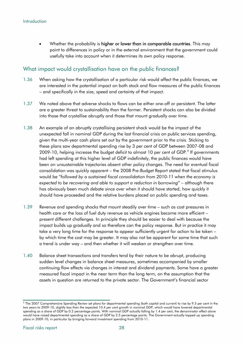
Introduction
• Whether the probability is higher or lower than in comparable countries. This may point to differences in policy or in the external environment that the government could usefully take into account when it determines its own policy response.
What impact would crystallisation have on the public finances?
1.36 When asking how the crystallisation of a particular risk would affect the public finances, we are interested in the potential impact on both stock and flow measures of the public finances – and specifically in the size, speed and certainty of that impact.
1.37 We noted above that adverse shocks to flows can be either one-off or persistent. The latter are a greater threat to sustainability than the former. Persistent shocks can also be divided into those that crystallise abruptly and those that mount gradually over time.
1.38 An example of an abruptly crystallising persistent shock would be the impact of the unexpected fall in nominal GDP during the last financial crisis on public services spending, given the multi-year cash plans set out by the government prior to the crisis. Sticking to these plans saw departmental spending rise by 3 per cent of GDP between 2007-08 and 2009-10, helping increase the budget deficit to almost 10 per cent of GDP.9 If governments had left spending at this higher level of GDP indefinitely, the public finances would have been on unsustainable trajectories absent other policy changes. The need for eventual fiscal consolidation was quickly apparent – the 2008 Pre-Budget Report stated that fiscal stimulus would be “followed by a sustained fiscal consolidation from 2010-11 when the economy is expected to be recovering and able to support a reduction in borrowing” – although there has obviously been much debate since over when it should have started, how quickly it should have proceeded and the relative burdens placed on public spending and taxes.
1.39 Revenue and spending shocks that mount steadily over time – such as cost pressures in health care or the loss of fuel duty revenue as vehicle engines become more efficient – present different challenges. In principle they should be easier to deal with because the impact builds up gradually and so therefore can the policy response. But in practice it may take a very long time for the response to appear sufficiently urgent for action to be taken – by which time the cost may be greater. It may also not be apparent for some time that such a trend is under way – and then whether it will weaken or strengthen over time.
1.40 Balance sheet transactions and transfers tend by their nature to be abrupt, producing sudden level changes in balance sheet measures, sometimes accompanied by smaller continuing flow effects via changes in interest and dividend payments. Some have a greater measured fiscal impact in the near term than the long term, on the assumption that the assets in question are returned to the private sector. The Government’s financial sector
9 The 2007 Comprehensive Spending Review set plans for departmental spending (both capital and current) to rise by 9.5 per cent in the two years to 2009-10, slightly less than the expected 10.4 per cent growth in nominal GDP, which would have lowered departmental spending as a share of GDP by 0.2 percentage points. With nominal GDP actually falling by 1.4 per cent, the denominator effect alone would have raised departmental spending as a share of GDP by 2.5 percentage points. The Government actually topped up spending plans in 2009-10, in particular by bringing forward investment spending from 2010-11.
Fiscal risks report 28
Introduction
interventions in the last crisis are a case in point. In Chapter 4, we estimate the direct financial loss or gain to the Government from these and how it has changed over time.
1.41 These financial sector interventions highlight what is often a politically challenging trade-off. When should the government engage in high-profile, highly concentrated and often unpopular balance sheet transactions (‘bailing out the banks’) to avoid or ameliorate less visible, more widely dispersed and harder-to-quantify fiscal risks (the bigger cost that would have been incurred in the absence of such support, via the damage to economic activity and tax revenues when the functioning of the banking system was severely impaired)?
How is the risk currently recognised in official data and forecasts?
1.42 Some of the potential developments in the public finances that we treat as fiscal risks in this report are regularly discussed and quantified in our Economic and fiscal outlooks and Fiscal sustainability reports, either in the central forecasts and projections or in our analysis of the uncertainty around them. For example, our central forecasts include an estimated flow of tax litigation settlements and estimated losses of tax receipts from greater fuel efficiency and rising numbers of incorporations; our central long-term projections include an assumption that the Government will increase health spending over the long term to accommodate population ageing and non-demographic cost pressures. Our analyses of uncertainty include sensitivity tests for different paths of productivity growth, government borrowing costs and population ageing, plus bespoke scenarios in each EFO.
1.43 In addition to our forecasts, some fiscal risks are recognised in the Treasury’s Whole of Government Accounts. The WGA use a wider definition of financial assets and liabilities than the National Accounts, including an estimate of public service pension liabilities for past employment. It also reports on what it deems ‘uncertain liabilities’, specifically:
• Provisions: These are defined as liabilities of uncertain timing or amount where: the public sector is under a present obligation as a result of a past event; an outflow of resources is likely to be required; and a ‘reliable’ estimate can be made of the amount. Most provisions are potential increases in spending, of which the largest currently on the WGA balance sheet are future clinical negligence claims and the costs of decommissioning nuclear power stations. Provisions are included on the WGA balance sheet because the probability of them crystallising at some point is estimated to be greater than 50 per cent. For that reason, our central forecasts and projections should also include the expected value of this future spending. In most cases their inclusion is implicit as they fall within the overall Departmental Expenditure Limits (DELs) set by the Treasury, for which we forecast spending top-down (by estimating an aggregate over- or under-spend) rather than bottom-up. We use HMRC’s provision for tax litigation costs explicitly when forecasting the associated spending.
• Contingent liabilities: These are defined as possible obligations where the existence of the liability will be confirmed by a future event out of the public sector’s control or present obligations where an outflow of resources is not likely or where the amount cannot be measured with sufficient reliability. As with provisions, most contingent
29 Fiscal risks report
Introduction
liabilities are potential increases in spending. The largest are potential legal challenges to tax decisions and clinical negligence claims where the government thinks it more likely than not to win the case (with the ones it thinks it is more likely to lose than win taken as provisions). Contingent liabilities are not included on the WGA balance sheet, as the probability of crystallisation is thought less than 50 per cent, but are disclosed in notes to the accounts. Some are deemed ‘remote’ and some unquantifiable.
What is the Government doing to manage the risk?
1.44 At a macroeconomic level, the Government’s response to fiscal risk is captured by its overarching fiscal objective – to eliminate the deficit by the mid-2020s – and the fiscal targets it has set as a staging post along the way – to get the structural deficit below 2 per cent of GDP by 2020-21 and to have debt falling as a share of GDP then. While there is no academic or policymaking consensus on the optimal debt-to-GDP ratio, clearly a lower ratio provides more fiscal space to accommodate future shocks.
1.45 In terms of individual risks, the Treasury’s 2004 ‘Orange Book’ guidance notes that “the resources available for managing risk are finite and so the [Government’s] aim is to achieve an optimum response to risk, prioritised in accordance with an evaluation of the risks.” In terms of responses, it frames the choice as among the ‘four Ts’ noted above:
• Tolerating the risk, as it chooses to do when it takes on the risk of a private sector entity failing by guaranteeing its liabilities or as it has no reasonable choice but to do when it comes to meeting the uncertain cost of cleaning up nuclear material at Sellafield. To the extent that cost-benefit analysis is undertaken, one would expect risks to be tolerated when the cost of doing otherwise is deemed to exceed the benefit from reducing the likelihood or impact of it crystallising;
• Treating the risk in an appropriate way to constrain it to an acceptable level. One would expect this to be by far the most common choice for managing specific risks. Once government has deemed the activity generating the risk to be necessary, it is faced with a trade-off between the cost of treatment and the benefit in terms of lower risk. One example is the decisions governments take on how much resource to allocate to HMRC in order for it to reduce the proportion of tax that goes unpaid;
• Transferring the risk to another party. This could involve conventional insurance or passing management of a risk to a third party that is deemed better able to do so. Governments have sought to better manage spending risks from major capital projects by partnering with the private sector – with patchy success; and/or
• Terminating the activity giving rise to the risk. Until recently, governments were eschewing sector-specific industrial policies, deeming that the risk of backing losers when trying to pick winners was too great. But, in general, terminating activities is rarely a choice for government – it cannot realistically stop providing health care just because it might rise as a share of GDP due to cost pressures and ageing.
Fiscal risks report 30

Introduction
1.46 The Orange Book also advises that the risk exposure that remains after any response “should be acceptable and justifiable – it should be within the risk appetite.” Sometimes there may be no choice but to tolerate a risk – even if it is outside the Government’s desired risk appetite, simply because there are no treatment, transfer or termination options.
1.47 In preparing this report, we have asked the Government to explain its overall risk appetite and to describe the institutions and processes it has in place to manage risk, which we discuss in Chapter 2. At the end of each chapter that follows, we list some of the issues that the government might wish to take into account in its risk management strategy and, if it agrees, ask what approach it takes to them. It is not our place to recommend particular policy responses, but this is an opportunity for the Government to explain its choices.
1.48 It is important to recognise that no government can eliminate fiscal risks altogether. Indeed, an almost universally accepted role of government is to act as ‘insurer of last resort’, for example supporting the incomes of those who are unable to work or by standing behind the banking system in times of severe stress. So we frame our conclusions in a way that allows the Government to explain the choices it has made. Hopefully this cycle of challenge and response over successive reports will encourage more effective risk management and greater public understanding of the choices and trade-offs facing successive governments.
Structure of the report
1.49 We use the analytical framework set out above to structure the report as follows:
• Chapter 2: summarises the Government’s current approach to risk management;
• Chapter 3: considers macroeconomic risks;
• Chapter 4: assesses financial sector risks;
• Chapter 5: analyses specific revenue risks;
• Chapter 6: discusses specific non-interest expenditure risks;
• Chapter 7: looks at the balance sheet;
• Chapter 8: discusses debt interest spending and its relationship with economic growth;
• Chapter 9: details the results of an illustrative fiscal stress test; and
• Chapter 10: draws conclusions and sets out next steps.
31 Fiscal risks report
2 The Government’s approach to fiscal risk management
Introduction
2.1 When the International Monetary Fund assessed the UK Government’s performance against its Fiscal Transparency Code in November 2016, it highlighted the potential for improved disclosure of specific fiscal risks and warned that “in many cases, the government’s control of risks falls short of the Code’s standards of good or advanced practice”.1
2.2 Partly to address the first concern, the Government has asked the OBR to produce this regular Fiscal risks report, which builds on the analysis of risks and uncertainty in our existing publications. To address the second concern, it has made a number of organisational and process changes to improve the way it identifies, monitors and manages fiscal risks. This chapter sets out the Government’s current approach. It:
• describes how the Government thinks about fiscal risks;
• sets out how it manages fiscal risks; and
• draws some conclusions.
How does the Government think about fiscal risks?
2.3 The Treasury considers risks in relation to three high-level objectives. From a fiscal perspective, it seeks to place the public finances on a sustainable footing. From a macroeconomic perspective, it aims to ensure the stability of the economy and financial system. And from a microeconomic perspective, it seeks to increase employment, productivity, growth and competitiveness.
2.4 In terms of its appetite for overall fiscal risk, the Government believes that public sector debt and the deficit are both too high. It is committed to eliminating the deficit by the mid-2020s and reducing debt as a share of GDP over the long term. In the previous Parliament, the Government set out its objective and three targets in the Charter for Budget Responsibility.2
1 IMF, United Kingdom Fiscal Transparency Evaluation, 2016. 2 The most recent version of the Charter was passed by Parliament in January 2017. This and all previous versions are available on the ‘Legislation and related material’ page of our website.
33 Fiscal risks report

The Government’s approach to fiscal risk management
2.5 The fiscal objective is to “return the public finances to balance at the earliest possible date in the next Parliament.” At the time, this was expected to run from 2020-21 to 2025-26. The Charter also sets out targets for borrowing, debt and welfare spending that require:
• the structural deficit (cyclically adjusted public sector net borrowing) to be below 2 per cent of GDP by 2020-21 – this is described as the ‘fiscal mandate’;
• public sector net debt to fall as a percentage of GDP in 2020-21 – this is the ‘supplementary target’; and
• welfare spending (excluding the state pension and payments closely linked to the economic cycle) to lie below a ‘welfare cap’ set for 2021-22. The Government has in effect set a cap 3 per cent above our November 2016 forecast for the relevant spending in that year, with the expected level of spending adjusted for changes in our inflation forecast using a specific methodology of its own choosing.
2.6 The Conservative Party’s 2017 manifesto stated that “We will continue with the fiscal rules announced by the chancellor in the autumn statement last year, which will guide us to a balanced budget by the middle of the next decade.” The commitment was repeated in the notes to the Queen’s Speech and the Chancellor’s Mansion House speech in June 2017.
2.7 The Government defines ‘fiscal risk’ as any risk that might affect:
• in the near term: its ability to achieve the OBR’s fiscal forecast;
• in the medium term: its ability to meet its mandate and targets; and
• in the long term: its ability to maintain sustainable public finances.
2.8 We do not cover near-term risks in this report – since these are less relevant to a biennial report and are covered in our monthly commentary on the public finances data. The Government’s definitions of medium- and long-term risk largely accord with those we set out in Chapter 1, the only difference being that the Government’s key concern over the medium term is risks large enough to remove the headroom it has against its fiscal targets.
2.9 The Government considers both upside and downside risks, with more emphasis on the downside risks. In keeping with the issues that it asked us to address in this report, the Government focuses on macroeconomic risks to the fiscal position and various specific risks to tax, spending and the balance sheet.
Fiscal risks report 34
The Government’s approach to fiscal risk management
How does the Government manage fiscal risks?
The current process
Treasury risk groups and reporting
2.10 Within the Treasury there is a Fiscal Risk Group (FRG) that has responsibility for identifying and assessing risks to the sustainability of the public finances. Its tasks include scanning possible sources of fiscal risk, tracking those that are identified, and assessing their likelihood, probable impact and potential mitigation approaches. An Economic Risk Group (ERG) considers risks to the wider economy. ERG’s discussions feed into FRG where they have fiscal consequences. There is also an Operational Risks Group (ORG).
2.11 These groups are sub-committees of the Treasury’s Executive Management Board (EMB), contributing to the Treasury’s risk management framework and helping EMB and senior managers to take action where appropriate. EMB is kept appraised of FRG’s analysis via quarterly reports. These include an assessment of how the Treasury is performing against its goals, the associated risks, and recommended actions on how to mitigate them.
2.12 EMB and Directors are accountable for risk management at the Treasury and Group level respectively.3 Outputs from FRG are disseminated to relevant senior managers and policy forums, including the central Strategy, Planning and Budget Group (SPB).
2.13 FRG brings together the analysis of many separate Treasury risk management forums, which focus on specific types of risk. These include risks to tax, spending, the balance sheet, the economy and long-term fiscal sustainability. Many issues are discussed in these groups and processes, and are escalated to FRG when required. Figure 2.1 below illustrates how the performance and risk management reporting timetables operate within Treasury.
2.14 The Government considers a wide range of factors when making decisions that increase or reduce fiscal risks, including the benefit of any policy change under consideration, the potential impact of any decisions on the deficit and debt, the likelihood of risks crystallising, and the scope for mitigation of the risks. New risks are routinely considered by Ministers when making policy decisions. Existing risks are monitored and discussed at FRG, and escalated to Ministers as necessary.
2.15 FRG contributes to this by:
• Horizon-scanning and tracking a standard set of indicators to scrutinise trends and identify any fiscal risks.
• Analysing relevant data and discussing issues with experts within the department to establish the cause and estimate the likelihood, impact and trend of risks that have
3 The Treasury is structured into 14 director-led groups to which are allocated responsibilities for the department’s various functions.
35 Fiscal risks report

The Government’s approach to fiscal risk management
been identified. It decides whether further engagement, analysis or indicator-monitoring might be necessary in assessing any given risk.
• Discussing deeper analysis of priority risk areas, focusing on key issues or themes. This forms the main part of each FRG meeting.
• Acting as a forum for exchange and challenge through sharing views, challenging analysis, and identifying inter-linkages between fiscal and economic issues.
Figure 2.1: The Treasury’s performance and risk reporting timetable
Strategy, Planning and Budget(SPB) commissions quarterlyPerformance Report delivery
assessments from policy leads
Risk Groups meet to consider quarterlystatus of Treasury outcome objectivesin light of delivery performance and
report back to SPB
SPB collates and synthesisesRisk Groups’ analysis into
quarterly Performance Reportoverview papers
Executive Management Board (EMB)discusses draft quarterly Performance Report
and agrees final draft
Final draft quarterlyPerformance Report isdiscussed by TreasuryBoard Sub-Committee
End of Start of Mid-quarter- 2 weeks +1 week +2 +4
precedingquarter
quarter
The role of spending departments
2.16 A key element of the Treasury’s approach to managing fiscal risks is the use of departmental expenditure limits (DELs) to manage spending risks. As described in Chapter 6, these cover around half of total public spending. Individual departments are responsible for managing risks that could cause them to exceed the DELs that have been set for them by the Treasury. It is each department’s Accounting Officer – typically the permanent secretary – and its board that are responsible for the specific approach taken to risk management. Each must observe the Treasury’s Managing Public Money guidance.4
2.17 Departments are required to provide the Treasury with accurate and timely information about their expenditure, performance against objectives, and the evolution of risk. This includes early indications of spending pressures that could be difficult for the department to absorb and could therefore lead to calls on the Treasury’s central reserves or require an increase in overall public spending. This allows the Treasury to work with the department to mitigate the risk or, where risks materialise, to address any associated funding gaps.
4 HM Treasury, Managing public money, July 2013 (with annexes revised as at August 2015).
Fiscal risks report 36

The Government’s approach to fiscal risk management
The role of the OBR
2.18 Since 2010, the Treasury has been able to draw on our own analysis and reporting in its management of fiscal risks. The legislation underpinning the OBR requires us to carry out our work objectively, transparently and impartially – setting out our main assumptions and the main risks that we consider relevant. In our Economic and fiscal outlooks, we illustrate the risks to our medium-term forecasts by drawing on the pattern of past forecast errors (using them to produce fan charts around our forecasts of GDP growth and the deficit), estimates of their sensitivity to changes in key parameters, and scenario analysis. We also subject the long-term projections in our Fiscal sustainability reports to sensitivity analysis, as well as highlighting specific fiscal risks from the Whole of Government Accounts. And each year we publish a detailed Forecast evaluation report, helping us and the Government to learn lessons from the inevitable differences between our forecasts and subsequent events.
2.19 The Treasury uses our analysis and publications as inputs into its management of fiscal risks. For example, it has a dedicated branch within its Fiscal Group that uses our analysis of long-term fiscal pressures when providing contextual analysis to support policy advice.
Recent developments and future changes to fiscal risk management
2.20 The Treasury states that it continually looks to improve the processes for identifying, assessing, and managing fiscal risk, citing a number of recent actions that were aimed at strengthening their current fiscal risk management processes. These include:
• Improvements in the process of reporting fiscal risks to FRG and EMB. These include greater focus on mitigation strategies at FRG, improving the consistency of reporting across tax and spending risks, more frequent EMB briefings on the top fiscal risks and mitigating actions, and greater use of fiscal scenario planning.
• Improvements in cross-group coordination within the Treasury, such as FRG/ERG secretariat links and coordination between other risk management groups.
• More systematic data monitoring across a comprehensive range of economic and financial indicators by ERG.
• Judgements on the creation of new contingent liabilities are subject to a Treasury approval regime. This provides a framework for judging their affordability and value for money. The Treasury scrutinises these on a case-by-case basis using the following criteria: rationale, exposure, risk and return, risk management and mitigation, and affordability.
• FRG scans economic triggers that may affect several fiscal risks at the same time (including contingent liabilities) through engagement with ERG and other groups.
37 Fiscal risks report

The Government’s approach to fiscal risk management
These are also considered via periodic stress tests presented to FRG. The Treasury also undertakes regular scenario planning, bringing together macroeconomic and specific fiscal risks.
2.21 The Treasury considers that the publication of our Fiscal risks report – and the subsequent Government response to it – will provide further opportunities to review and develop fiscal risk management processes, including their transparency and credibility.
Conclusions
2.22 The Government considers fiscal risk management to be a high priority. Within the Treasury, there is a management architecture to ensure that risks are discussed and issues escalated. Recently it has taken steps to improve risk management, including establishing new processes to manage the creation of contingent liabilities more systematically and commissioning us to produce this report.
2.23 From the material that we have reviewed in preparing this report, the Government’s interests and concerns broadly match those that it covers. The Government’s analysis and management of risks would therefore be subject to the critique that we make of our own analysis in Chapter 10: that consideration of low probability but high impact risks such as major wars, or the wider risks from climate change and other natural disasters, is limited; and that risks tend to be considered one issue at a time, with fewer examples of them being considered holistically across all aspects of the public finances.
2.24 Regular risk monitoring in the Treasury concentrates more on the type of risks that we term ‘endogenous’ – in the sense of Government having some direct influence over them – than the exogenous ones that we judge to be among the most serious. This may reflect a choice to focus on risks that are more amenable to treatment.
Fiscal risks report 38

3 Macroeconomic risks
Introduction
3.1 Macroeconomic developments are one of the largest and most frequent sources of fiscal risk. Economic shocks come in many shapes and sizes and propagate through the public finances in complex ways. As elsewhere in this report, our main focus is the various downside risks to our latest medium-term forecast and to longer-term fiscal sustainability.
3.2 This chapter discusses:
• risks to the economy’s potential output growth;
• the sources and potential consequences of cyclical shocks;
• shocks to the composition of GDP growth – both by expenditure and by income;
• housing sector risks;
• risks associated with sectoral net lending and balance sheets; and
• risks associated with the UK’s forthcoming exit from the EU.
Risks to potential output growth
3.3 The path of potential output determines how much the economy can grow over time, abstracting from the ups and downs of the economic cycle. It is the ultimate driver of living standards and an important determinant of the health of the public finances, given the way tax and spending policies are set. Potential output can be separated into how much labour is available (i.e. labour inputs) and how much output each unit can produce (i.e. labour productivity). Unlike actual output, it can only be estimated rather than observed directly.
Risks to growth in potential labour input
3.4 Potential labour input is defined as the total work hours available when the economy is operating at full capacity. It is driven by the adult population, the fraction participating in the labour market, the fraction of those that can be employed sustainably and the average hours worked by those in employment. There are risks and uncertainties around each.
39 Fiscal risks report

Macroeconomic risks
Adult population growth
3.5 Growth in the adult population increases the potential size of the economy. It is a key driver of tax revenues in cash and real terms, but has a less clear-cut effect on revenues per head or as a share of GDP. The population’s contribution to revenues is greatest in age groups where employment rates are highest – i.e. the ‘working-age’ population, aged between 16 and the state pension age. But population growth more broadly increases the demand for public services. Like many advanced economies, the UK has an ageing population, which is expected to place upward pressure on public spending (see Chapter 6). In recent years, high net migration has boosted the working-age population and potential output.
Chart 3.1: Contributions of adult population growth to potential output growth
-0.2
0.0
0.2
0.4
0.6
0.8
1.0
1977-1981 1987-1991 1997-2001 2007-2011 2017-2021 2027-2031 2037-2041 2047-2051 2057-2061
Net migration
Natural change
Source: ONS
Ave
rage
con
trib
utio
ns to
pot
entia
l out
put g
row
th (p
er c
ent) March
2017forecast
FSR 2017 projection
Fiscal risks report 40
3.6 Our latest medium-term forecasts and long-term projections are based on the ‘principal’ population projection by the Office for National Statistics (ONS). This assumes net inward migration falls to 185,000 by 2021 and remains at that level thereafter. The ONS will publish updated population projections this autumn.
3.7 Risks to our medium-term forecast from working-age population growth are relatively small. Excluding the effects of migration, ‘natural change’ is relatively slow-moving and predictable, with the lower growth in the coming five years reflecting a fall in the number of births in the late 1990s and early 2000s (Chart 3.1). There are bigger risks associated with net migration being higher or lower than expected. This can change relatively quickly.
3.8 The fiscal effects of changes in net migration depend on many factors. Recent net migration to the UK has been concentrated among those of working age, boosting employment and tax revenues more than spending. We assume that migrants are as productive as natives on
Macroeconomic risks
average, although this will not be true of every migrant.1 In our March 2016 Economic and fiscal outlook (EFO), we presented scenarios based on the ONS ‘low migration’ and ‘natural change only’ population variants. Relative to the final year of our central forecast, public sector net borrowing (PSNB) was 0.3 per cent of GDP higher in the low migration scenario and 0.5 per cent higher in the natural change scenario. Over longer horizons, these differences build. In our 2017 Fiscal sustainability report (FSR), debt was 31 per cent of GDP higher in the ‘low migration’ variant than in our central projection by 2066-67.
3.9 The longer the period over which population projections extend, the greater the chance that outcomes will differ from the assumptions underpinning them. The overall effect can be large. For example, the 1955 projections under-estimated the population 25 years ahead by almost 3 million, largely because they did not foresee the baby boom of the early 1960s. Conversely, the 1965 projections over-estimated the population 25 years ahead by 9½ million because they incorrectly assumed that the baby boom would continue. More recently, higher-than-expected net inward migration has prompted upward revisions to expected population growth in the 2012- and 2014-based projections. Chart 3.2 tracks these and other surprises relative to past official population projections.2
3.10 Given these long-run uncertainties, in each FSR we test the sensitivity of our central projections to a range of population variants. Any factor that raises the old-age dependency ratio – including lower fertility, higher longevity or lower net migration (given its concentration among working-age adults) – is detrimental to the public finances over the long term. These factors either reduce potential output growth or raise public spending growth – and in some cases both. These effects are discussed in Chapter 6.
1 We tested the assumptions underpinning how we factor the fiscal effects of net migration into our long-term projections in Annex A of our 2013 Fiscal sustainability report. Further discussion was presented in Box 3.4 of the following year’s report. 2 For more detail, see Box 3.3 in our 2014 Fiscal sustainability report and Shaw, Fifty years of UK national population projections: how accurate have they been?, Population Trends, 2007.
41 Fiscal risks report

Macroeconomic risks
Chart 3.2: The evolution of population projections since 1955
50
55
60
65
70
75
80
85
90
1951 1971 1991 2011 2031 2051 2071
Mill
ions
Successive projections2014-based projectionActual
Total population
-100
-50
0
50
100
150
200
250
300
350
400
1976 1996 2016 2036Th
ousa
nds
Net migration
1.5
1.6
1.7
1.8
1.9
2.0
2.1
2.2
1975 1995 2015 2035
Per
cent
Total fertility rate
Source: ONS
500
550
600
650
700
750
800
1975 1995 2015 2035
Thou
sand
s
Deaths
Potential participation rates and the equilibrium unemployment rate
3.11 Participation rates among older people have been rising, partly due to ongoing rises in the female state pension age. Among all people aged 65 or over, the participation rate has almost doubled over the past 15 years, from 5.4 to 10.5 per cent. But participation remains much lower than among working-age adults (currently 78.5 per cent), so ageing puts downward pressure on the average participation rate across the adult population as a whole. The latter effect is expected to dominate over the medium term.
3.12 Our medium-term assumption for the equilibrium unemployment rate is informed by an assessment of past trends in the actual unemployment rate, as well as other labour market developments. In March 2017, with wage growth still muted, we lowered our estimate from 5.2 to 5.0 per cent of the labour force. In its February 2017 Inflation Report, the Bank of England reduced its own estimate to around 4½ per cent.3
3 See the box ‘Why has wage growth remained subdued?’ starting on page 18 of the February 2017 Inflation Report.
Fiscal risks report 42
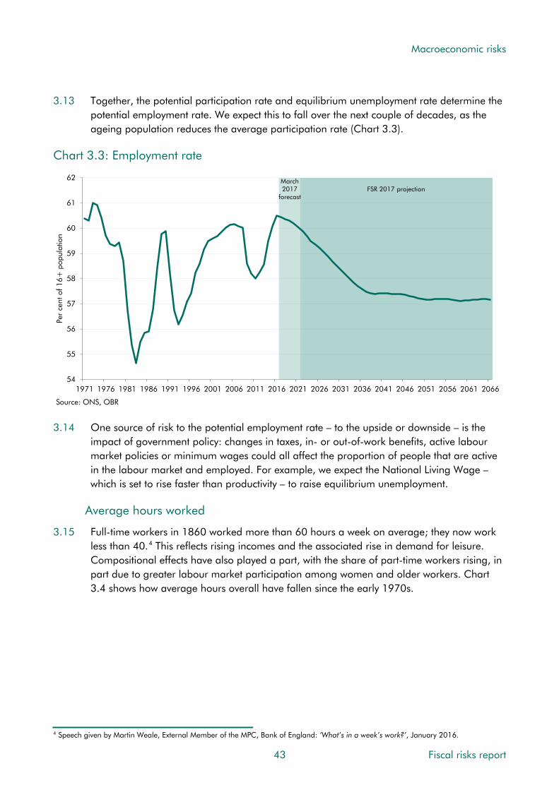
Macroeconomic risks
3.13 Together, the potential participation rate and equilibrium unemployment rate determine the potential employment rate. We expect this to fall over the next couple of decades, as the ageing population reduces the average participation rate (Chart 3.3).
Chart 3.3: Employment rate
54
55
56
57
58
59
60
61
62
1971 1976 1981 1986 1991 1996 2001 2006 2011 2016 2021 2026 2031 2036 2041 2046 2051 2056 2061 2066
Per
cent
of 1
6+ p
opul
atio
n
Source: ONS, OBR
FSR 2017 projectionMarch2017
forecast
3.14 One source of risk to the potential employment rate – to the upside or downside – is the impact of government policy: changes in taxes, in- or out-of-work benefits, active labour market policies or minimum wages could all affect the proportion of people that are active in the labour market and employed. For example, we expect the National Living Wage – which is set to rise faster than productivity – to raise equilibrium unemployment.
Average hours worked
3.15 Full-time workers in 1860 worked more than 60 hours a week on average; they now work less than 40.4 This reflects rising incomes and the associated rise in demand for leisure. Compositional effects have also played a part, with the share of part-time workers rising, in part due to greater labour market participation among women and older workers. Chart 3.4 shows how average hours overall have fallen since the early 1970s.
4 Speech given by Martin Weale, External Member of the MPC, Bank of England: ‘What’s in a week’s work?’, January 2016.
43 Fiscal risks report
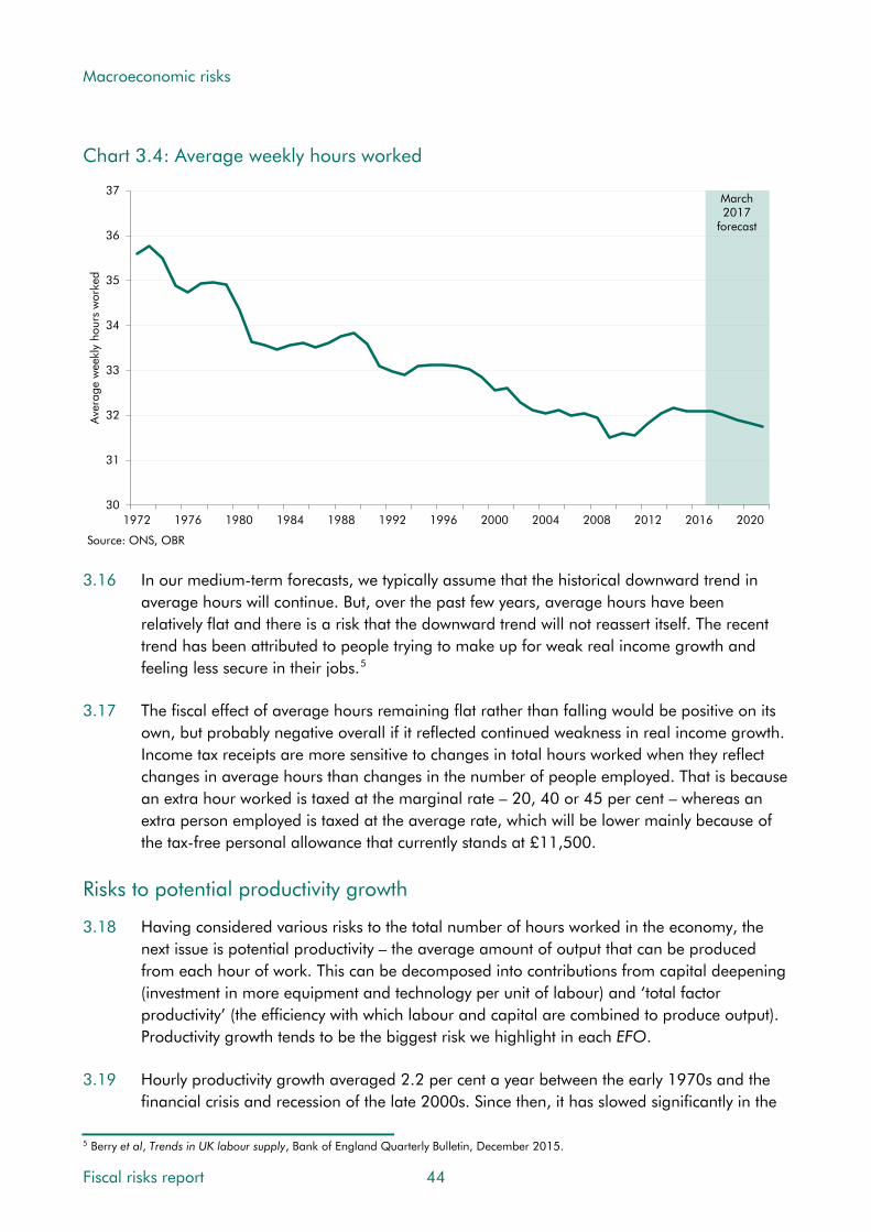
Macroeconomic risks
Chart 3.4: Average weekly hours worked
30
31
32
33
34
35
36
37
1972 1976 1980 1984 1988 1992 1996 2000 2004 2008 2012 2016 2020
Ave
rage
wee
kly
hour
s w
orke
d
Source: ONS, OBR
March2017
forecast
3.16 In our medium-term forecasts, we typically assume that the historical downward trend in average hours will continue. But, over the past few years, average hours have been relatively flat and there is a risk that the downward trend will not reassert itself. The recent trend has been attributed to people trying to make up for weak real income growth and feeling less secure in their jobs.5
3.17 The fiscal effect of average hours remaining flat rather than falling would be positive on its own, but probably negative overall if it reflected continued weakness in real income growth. Income tax receipts are more sensitive to changes in total hours worked when they reflect changes in average hours than changes in the number of people employed. That is because an extra hour worked is taxed at the marginal rate – 20, 40 or 45 per cent – whereas an extra person employed is taxed at the average rate, which will be lower mainly because of the tax-free personal allowance that currently stands at £11,500.
Risks to potential productivity growth
3.18 Having considered various risks to the total number of hours worked in the economy, the next issue is potential productivity – the average amount of output that can be produced from each hour of work. This can be decomposed into contributions from capital deepening (investment in more equipment and technology per unit of labour) and ‘total factor productivity’ (the efficiency with which labour and capital are combined to produce output). Productivity growth tends to be the biggest risk we highlight in each EFO.
3.19 Hourly productivity growth averaged 2.2 per cent a year between the early 1970s and the financial crisis and recession of the late 2000s. Since then, it has slowed significantly in the
5 Berry et al, Trends in UK labour supply, Bank of England Quarterly Bulletin, December 2015.
Fiscal risks report 44

Macroeconomic risks
UK and in many other advanced economies – the ‘productivity puzzle’. To produce our medium-term forecasts, we have to judge whether this is a temporary (if persistent) hangover from the crisis or marks a long-term structural change – to date we have by and large assumed the former. Chart 3.5 shows how actual productivity growth (as opposed to the unobservable growth in potential productivity) has varied over time. There have been other periods of weakness, but the annual productivity growth rate since 2008 has averaged just 0.2 per cent. It picked up to 1.5 per cent in the year to the fourth quarter of 2016, but has now dropped back again to just 0.4 per cent in the year to the first quarter of 2017.
Chart 3.5: Productivity growth
FSR 2017 projection
-2
-1
0
1
2
3
4
5
6
7
8
1972 1976 1980 1984 1988 1992 1996 2000 2004 2008 2012 2016 2020 2024 2028 2032
Per
cent
Output per hour
Average
Source: ONS
March2017
forecast
3.20 There are many possible explanations for the post-crisis weakness in productivity growth and views on its long-term implications. Most commentators assume that it reflects a combination of factors, with views differing on their relative importance:6
• Impaired resource allocation has slowed the speed with which labour and capital move from less to more productive firms. Survival rates have been unusually high while the share of loss-making firms has risen, possibly due to low interest rates or forbearance by lenders. The damaged financial system explains part of this.
• Some firms appeared to hoard labour in the immediate aftermath of the crisis, although the longer the period of weak productivity growth has persisted, the less plausible this seems as an explanation for continuing weakness.
• A slowdown in investment growth is likely to have weighed on productivity growth by reducing the amount of capital available to each worker.
6 For a fuller discussion see Barnett et al, The UK productivity puzzle, Bank of England Quarterly Bulletin, June 2016.
45 Fiscal risks report

Macroeconomic risks
• Some of the slowdown may be attributable to measurement issues, including those associated with fully capturing output of the digital economy.7
3.21 Until November 2015, our medium-term forecasts assumed that potential productivity growth would return to its pre-crisis average rate of 2.2 per cent by the end of the forecast. In March 2016, we put more weight on the post-crisis weakness, taking our medium-term assumption down to 2.0 per cent. And in November 2016, we revised it down to 1.8 per cent in light of the expected effects of the Brexit vote. All these assumptions imply that most of the recent weakness in productivity growth results from ultimately temporary factors.
3.22 The main risk to potential productivity growth is that the post-crisis weakness continues. Robert Gordon has argued that total factor productivity growth has been weak since the 1970s, due to flagging technological advancement and a variety of supply-side headwinds, such as the cessation of improvements in educational outcomes.8 But others – including so-called ‘techno-optimists’ – believe the digital revolution will lead to innovations that will eventually combine to give a huge boost to productivity.9
Implications for the public finances
3.23 The outlook for productivity growth is central to prospects for living standards – as proxied by real GDP per head. Confronted by the unusual period of very weak productivity growth since the financial crisis, which remains hard to explain fully, we like most forecasters assume that it will recover, but take time to return towards its long run historical average. There are risks to both sides of this forecast – we may be able to sustain a period of strong ‘catch-up’ growth, but conversely the recent weakness may be the ‘new normal’. But the renewed weakness of actual productivity growth in the latest data points to the downside.
3.24 The outlook for population growth directly affects the size of the economy in both cash and real terms, but has less impact on GDP per head as it increases the number of heads as well as GDP. That said, net inward migration does tend to boost GDP per head because inward migrants are more likely to be of working age. Participation rates, the sustainable employment rate and average hours all matter for GDP and GDP per head. There are risks around all of these, with those around migration perhaps the biggest in the medium term.
3.25 But does any of this matter for the public finances? That depends on how revenues and public spending respond as GDP and GDP per head rise over time. In our long-term projections we assume – broadly in line with historical experience – that most thresholds in the tax and benefit systems on average rise in line with living standards (earnings or real GDP). Other things being equal, this implies no long-term upward or downward trend in receipts or welfare spending as a share of GDP (although there may be plenty of cyclical, policy-related and other variation). The amount the Government spends on public services
7 Bean, Independent review of UK economic statistics, 2016. 8 Gordon, The Rise and Fall of American Growth: The U.S. Standard of Living since the Civil War, 2016. See also Cowen, The Great Stagnation: How America Ate All the Low-Hanging Fruit of Modern History, Got Sick, and Will (Eventually) Feel Better, 2011. 9 See Brynjolfsson and McAfee, Will Humans Go the Way of Horses? Labor in the Second Machine Age, Foreign Affairs, 2015 and Mokyr, Secular stagnation? Not in your life in Secular Stagnation: Facts, Causes and Cures Edited by Coen Teulings and Richard Baldwin, 2014.
Fiscal risks report 46

Macroeconomic risks
is a political choice, but it is a reasonable assumption that this too will be roughly constant as a share of GDP (adjusted for the changing age structure of the population, and with – we think – the important exception of health spending, as discussed in Chapter 6).
3.26 All this means that if a downside risk to potential GDP per head were to crystallise over the long term – say because of continued weak total factor productivity growth – this would reduce both receipts and spending in cash terms, but would have a smaller effect on them (and on the gap between them) as percentages of GDP. The impact on the quality and quantity of public services would depend on whether the productivity shortfall across the whole economy was mirrored in those services. This explains why the long-term projections in our FSRs are relatively insensitive to different productivity growth assumptions. We are all poorer if the downside risk materialises, in both the private and public goods we consume, but this does not translate into a big threat to fiscal sustainability.
3.27 The impact of weaker-than-expected potential GDP growth is greater over our medium-term forecast, because the Government has set its policy parameters over this horizon and most are not linked to changes in earnings and GDP per head. For example, public services spending totals are planned in cash terms and most tax allowances and thresholds are either determined by the policy parameters or rise with inflation. In this setting weaker GDP growth reduces cash revenues significantly and increases cash spending on debt interest and means-tested benefits somewhat. Receipts fall less as a share of GDP (because both are lower), but spending rises more because the unchanged cash plans for public services spending are higher as a share of that lower GDP.
3.28 The ‘weak productivity’ scenario in our November 2016 EFO assumed potential productivity growth of just 0.8 per cent a year, similar to the actual rate in 2015. This implied average GDP growth of around 1 per cent a year, compared to almost 2 per cent in our central forecast. After five years public sector net borrowing was £41 billion or 1.9 per cent of GDP higher than in the central forecast and net debt was 8.0 per cent of GDP higher.
Risks from cyclical shocks
3.29 In addition to the fiscal risks arising if potential GDP rises more or less strongly than assumed, there are additional risks from the possibility – in fact the high probability – that actual GDP will at times diverge significantly from this potential level.
3.30 Chart 3.6 shows the shape of the economic cycle over the past 40 years, based on our estimates of the ‘output gap’ between actual (non-oil) GDP and its potential level. It suggests there have been three complete economic cycles over this period, each comprising years with activity above potential followed by years with activity below potential.
3.31 Most recently, a large margin of spare capacity opened up during the financial crisis and subsequent recession of 2008-09 and we estimate that activity has only now returned to potential some eight years later. We assume in our latest medium-term forecast that the output gap will remain modest over the next five years and in our long-term projections we assume – because we are focusing on long-term fiscal drivers – that it remains negligible
47 Fiscal risks report

Macroeconomic risks
throughout. In reality, however, activity is likely to continue to fluctuate around potential; we certainly cannot claim to have abolished ‘boom and bust’.
Chart 3.6: The economic cycle and its impact on the budget balance
-6
-4
-2
0
2
4
6
Per
cent
Output gapMarch2017
forecast
-4
-2
0
2
4
6
8
10
1975-76 1979-80 1983-84 1987-88 1991-92 1995-96 1999-00 2003-04 2007-08 2011-12 2015-16 2019-20
Per
cent
of G
DP
Cyclical deficit
Structural deficit
Public sector net borrowing
Source: ONS, OBR
Fiscal risks report 48
3.32 Cyclical fluctuations in GDP matter fiscally because of their impact on spending and revenues. When economic activity weakens, this reduces tax revenues (because tax bases are smaller), increases welfare spending (with higher unemployment and more households on low incomes) and increases plans for public services spending as a share of GDP if nominal GDP is weaker than expected. The opposite happens when activity strengthens.

Macroeconomic risks
3.33 We assume from the average relationship between the cycle and the public finances since the 1970s that for each 1 per cent that activity falls below potential, the cyclical budget deficit worsens by 0.5 per cent of GDP in the same year and by an extra 0.2 per cent in following year.10 Most of the deterioration comes about via spending rising as a share of GDP (because spending remains reasonably stable in cash terms while GDP weakens), with receipts falling slightly as a share of GDP (because they weaken slightly more than GDP).
3.34 Alongside the estimates of the output gap, Chart 3.6 shows the contribution of the corresponding cyclical deficits and surpluses to the overall budget balance. Over this period, output has ranged from 3.3 per cent above potential in 1988-89 to 3.6 per cent below in 2010-11. The cyclical budget balance has ranged from a surplus of 2.1 per cent of GDP in 1988-89 to a deficit of 2.1 per cent in 1981-82. The average cyclical balance is a deficit of 0.3 per cent of GDP – reflecting the fact that cyclical surpluses and deficits tend to balance out over time, essentially by definition. But the average absolute cyclical balance – surplus or deficit – is 1.0 per cent of GDP. This suggests that cyclical movements in the economy pose significant risks to the fiscal position over a medium-term horizon (although not to fiscal targets expressed in cyclically adjusted terms), but that they tend to wash out over longer periods – they do not constitute a significant risk to fiscal sustainability. However, as we discuss below, this ignores the fact that significant deviations from potential may themselves alter the subsequent path of potential through a process of ‘hysteresis’.
3.35 The estimates of cyclical surpluses and deficits shown in Chart 3.6 assume that each upswing and downswing in the economy affects the public finances in proportionately the same way, based on the average response over this entire period. However, experience shows that the impact of upswings and downswings on the fiscal position varies according to their cause, composition and severity – notably in the characteristics of particular recessions. So it is worth looking not only at average relationships, but also at particular historical experiences and scenarios. In Chapter 9 we report on a fiscal stress test scenario.
Cyclical shocks in UK post-war history
3.36 The ONS publishes consistent quarterly real GDP data from 1955. Defining a recession as at least two consecutive quarters of falling output, the latest vintage shows seven recessions in the past 61 years. That implies that the chance of being in recession at some point in any given five-year period – the horizon of our medium-term forecasts – is around one in two.11 The recessions differed in length, depth and the time it took for output to recover its pre-recession peak (Table 3.1). The ONS also reports 20 isolated quarters of falling output.
10 Helgadottir et al, Cyclically adjusting the public finances, OBR Working Paper No. 3, 2012. 11 This is the cumulative probability of a recession occurring in one of the five years. This is based on the probability of a recession in any given year (11 per cent) and a Bernoulli distribution, assuming that probability of a recession is independent in each year. The probability would be sensitive to changes in the average growth rate, since, for a given output variability, lower average growth would increase the probability of it falling below zero.
49 Fiscal risks report

Macroeconomic risks
Table 3.1: UK recessions since 1955
Number of quarters unless otherwise statedMid Early Early Mid Early Early Late
1950s 1960s 1970s 1970s 1980s 1990s 2000s
First quarter of falling output 1956Q2 1961Q3 1973Q3 1975Q2 1980Q1 1990Q3 2008Q2
Consecutive quarters of falling output 2 2 3 2 5 5 5Peak-to-trough fall in output (per cent) 0.3 0.7 4.1 2.0 4.3 2.0 6.3Quarters for output to regain pre-recession peak 1 2 13 2 13 11 22
3.37 Adverse cyclical shocks are not always large enough to generate a recession. A downswing
might instead be confined to a period of weak, but below potential, growth. But that has been relatively rare in the UK, with growth typically falling below 1 per cent on a rolling 4 quarter-on-4 quarter basis only when there is a full-blown recession. We therefore focus on the four major recessions of the past 50 years: in the mid 1970s (with the two periods in the 1970s that meet the ‘two consecutive quarters’ definition considered together), the early 1980s, the early 1990s and the late 2000s (top panel of Chart 3.7).
3.38 Recessions are usually characterised by falling real incomes and consumer spending, cuts in real business investment, higher unemployment and lower asset prices. Tax revenues fall and government spending increases relative to nominal GDP (middle panel of Chart 3.7).
3.39 In three of the four recessions, the consequences for tax revenues and spending were sufficient to push the deficit above 6 per cent of GDP. The exception was in the early 1980s, when fiscal tightening was one factor contributing to the recession. Other than in the most recent recession, the effect on public debt relative to nominal GDP was relatively modest (bottom panel of Chart 3.7). One reason was that higher inflation boosted nominal GDP around the other three recessions, whereas it fell in the late-2000s recession.
Fiscal risks report 50
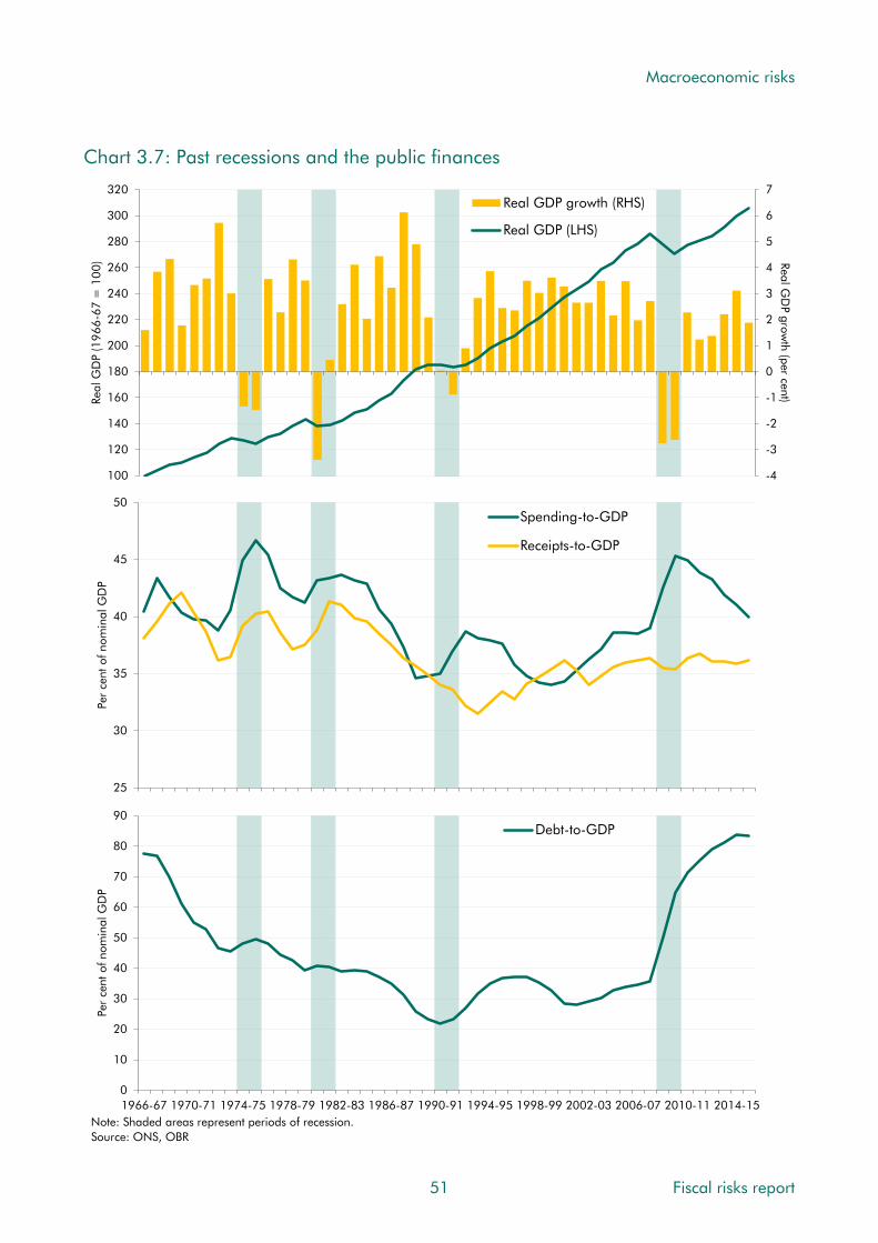
Macroeconomic risks
Chart 3.7: Past recessions and the public finances
-4
-3
-2
-1
0
1
2
3
4
5
6
7
100
120
140
160
180
200
220
240
260
280
300
320
Real GD
P growth (per cent)Re
al G
DP
(196
6-67
= 1
00)
Real GDP growth (RHS)
Real GDP (LHS)
25
30
35
40
45
50
Per
cent
of n
omin
al G
DP
Spending-to-GDP
Receipts-to-GDP
0
10
20
30
40
50
60
70
80
90
1966-67 1970-71 1974-75 1978-79 1982-83 1986-87 1990-91 1994-95 1998-99 2002-03 2006-07 2010-11 2014-15
Per
cent
of n
omin
al G
DP
Debt-to-GDP
Note: Shaded areas represent periods of recession.Source: ONS, OBR
51 Fiscal risks report

Macroeconomic risks
3.40 The different sources and characteristics of these previous recessions help explain the varying impact they had on the public finances. Starting with the most recent:
• Late-2000s recession (common external and domestic shocks): the subprime mortgage crisis in the US revealed widespread problems in the financial sector, which was a catalyst for the global financial crisis and credit crunch. The UK joined many advanced economies in recession as confidence and credit availability evaporated. Domestic policy responded aggressively to try to limit the effect on GDP and employment through lower interest rates, quantitative easing and fiscal stimulus. These policies and large-scale government intervention in the banking sector resulted in sharp increases in net debt. A falling pound pushed up import prices, but domestic inflation and earnings growth remained low. Income tax receipts fell sharply. The tax-rich financial sector was hit disproportionately hard, as were housing and equity markets. Lower interest rates mitigated the impact of higher borrowing on debt interest spending. The deficit increased from 2.6 to 9.9 per cent of GDP between 2007-08 and 2009-10, while net debt doubled between 2007-08 and 2010-11.12
• Early-90s recession (a domestic policy shock): strong economic growth in the late 1980s (the so-called ‘Lawson Boom’) resulted in higher inflation, with RPI inflation peaking at 9.5 per cent in 1990. Controlling inflation motivated the Government to join the European Exchange Rate Mechanism (ERM) in 1990, greatly restricting the variability of the sterling exchange rate against the German deutschmark. But the Bundesbank simultaneously needed to set uncomfortably high interest rates to counteract inflationary pressures stemming from German reunification. To maintain the required exchange rate parity, the Government was forced to maintain undesirably high UK interest rates, hitting the real economy and the housing market. Overall, the resulting recession helped raise the deficit from 0.9 to 6.7 per cent of GDP between 1990-91 and 1993-94, while net debt increased by 13 per cent of GDP by 1994-95.
• Early-80s recession (a domestic policy shock with global elements): inflation increased significantly as a result of the doubling of oil prices in 1979, and major economies around the world experienced synchronised downturns. The UK government pursued a tight fiscal policy to contain budget deficits and focused on monetary targets to lower inflation, which peaked at 18 per cent in 1980 (on the RPI measure). Output fell sharply. The combination of tight fiscal policy and high inflation meant that net debt remained relatively flat at around 40 per cent of GDP.
• Mid-70s recession (an external shock): the oil crisis of 1973-74 pushed oil prices up four-fold, increasing domestic energy prices. This exacerbated the extant inflationary pressures from expansive fiscal policy and high growth (the so-called ‘Barber boom’), with RPI inflation peaking at 24 per cent in 1975. Industrial disputes over pay led to electricity shortages and the three-day week. This resulted in a steep fall in output and a sharp rise in unemployment. The economy had returned to positive growth by the end of 1975, but inflation and unemployment remained high. The high budget deficit
12 For a fuller discussion, see Riley and Chote, Crisis and consolidation in the public finances, OBR Working Paper No. 7, 2014.
Fiscal risks report 52

Macroeconomic risks
and perception that sterling was overvalued undermined investor confidence and the UK Government was eventually forced to apply for IMF support in 1976, which helped stabilise the economy on the condition of spending cuts. During this recession, the budget deficit peaked at 6.4 per cent of GDP, but high inflation meant that net debt did not rise much relative to nominal GDP.
Can cyclical shocks have permanent consequences for the public finances?
3.41 The conventional approach to cyclical adjustment of the public finances assumes that a cyclical downturn is temporary and so too therefore is the accompanying cyclical deficit. But in practice effects on the public finances can and do persist. These include:
• Cyclical deficits during downturns will result in permanent additions to public debt. The effect on the debt-to-GDP ratio will be amplified if cycles are skewed to the downside or if the fiscal benefits of upturns are not as big as the costs of downturns.
• Cyclical shocks can affect potential output and could therefore be associated with any of the risks described in the first section of this chapter.
• Cyclical effects on inflation have persistent effects on the price level. This will lead to permanent effects – some positive, some negative – on those parts of the public finances that are linked to inflation. The net effect will depend on the nature of the underlying shocks and their consequences for different measures of inflation.
Persistent effects on public sector net debt
3.42 Cyclical shocks can be thought of as temporary deviations of output from its trend. Given that most methods of distinguishing the trend from the cycle (including purportedly structural ones) in effect draw a smoothed line through the path of actual output and treat the deviations from it as the cycle, past upswings and downswings tend to look broadly symmetric in size (if not in shape) once viewed with sufficient hindsight. That said, looking forward at any given point in time, unexpected downturns tend to surprise more on the downside than unexpectedly strong upswings surprise on the upside. And once the recession is past, the conclusion implied by most estimation techniques is often that potential was lower (and overheating greater) on the eve of the downturn than it appeared at the time.
3.43 Assuming that economic cycles are broadly symmetric, at least when viewed with sufficient hindsight, they will have permanent fiscal effects if the fiscal consequences of downturns are greater than that of upturns. This could result from an asymmetry in the fiscal policy response to cyclical trends – i.e. deploying deficit financing more aggressively to support the economy in a downturn versus what is saved in an upturn. History suggests that this may be the case, with surpluses becoming rarer and deficits bigger. So the past average relationship between the cycle and the public finances may not be a good guide to the future. One factor that is likely to have contributed to this is the tendency of governments to misinterpret cyclical upturns as structural improvements to growth prospects, thereby setting spending plans on the basis of permanently rather than temporarily higher revenues.
53 Fiscal risks report

Macroeconomic risks
3.44 Non-linearities in the tax and spending systems can also play an important role – for example, the uprating of most benefits is subject to a floor of zero per cent, so if a downturn generates deflation their value will rise in real terms. The triple lock on state pensions puts a much higher floor of 2.5 per cent on uprating, so would have a bigger ratchet effect on spending during downturns (see Chapter 6 for a fuller discussion of the triple lock).
3.45 In our November 2015 EFO, we presented a ‘negative shock’ scenario, where a cyclical shock to the economy results in a peak-to-trough fall in real GDP of 2¾ per cent and a reduction in nominal GDP (as it did in 2009-10, after the financial crisis). By the end of the forecast, net debt was around 14 per cent of GDP higher than in the central forecast.
Effects of temporary downturns on potential output
3.46 Severe downturns or prolonged periods of slow economic growth can affect both the level and growth rate of potential output. These ‘hysteresis’ effects can operate through the labour market, for instance if long spells of unemployment lead to skills atrophying or a lessening in search intensity. Also, weaker investment during a downturn will reduce the amount of productive capital per unit of labour. Weaker investment in research and development could also lower total factor productivity growth. As the first section of this chapter showed, risks to potential output are a significant risk to the public finances.
3.47 The extended post-crisis weakness in productivity has stimulated interest in the potential link between downturns and potential productivity growth.13 One cross-country review by Blanchard and others shows that recessions with persistent effects on output are quite common – across 23 countries and 50 years, almost 70 per cent of recessions were followed by a sustained negative output gap, with the output level still below that implied by the pre-recession trend three to seven years later.14 Furthermore, in half of these cases, output growth was also lower than the pre-recession trend, implying that the growth of potential may also have been lowered, at least temporarily.
3.48 IMF analysis of large and persistent output shocks suggests that a 1 percentage point widening of the cumulative output gap results in a 0.2 per cent fall in potential output.15 A recent study by Ball compares estimates of potential output before and after the last recession and finds that by 2015 there was a 12 per cent reduction in potential output of the UK compared to a continuation of the pre-crisis trend.16 Our own estimate of potential output in 2015 is around 12 per cent below an extrapolation of the Treasury’s pre-crisis assumption from Budget 2008.
3.49 If the hysteresis effect is powerful, it creates a hard-to-quantify trade-off for policymakers. If a government chooses to undertake discretionary stimulus measures to support activity in a downturn it will help determine the fiscal risk it is exposed to over the longer term both from any cyclical borrowing, but also the possible fiscal risks arising from any impact on potential
13 See DeLong and Summers, Fiscal Policy in a Depressed Economy, 2012, or European Commission, Impact of the current economic and financial crisis on potential output, 2009. 14 Blanchard et al, Inflation and activity: two explorations and their monetary policy implications, IMF Working Paper No. 15/230, 2015. 15 IMF, Estimating Hysteresis Effects, Country Report No. 12/190 (Annex 1), July 2012. 16 Ball, Long-term damage from the great recession in OECD countries, NBER Working Paper No. 20185, 2014.
Fiscal risks report 54

Macroeconomic risks
GDP. The more powerful any hysteresis effects, the more they would magnify the fiscal consequences of cyclical downturns.
Persistent effects from price-level shocks
3.50 A ‘pure’ cyclical output shock would see real GDP return to the same potential path once the effects of the shock had dissipated. But it would not necessarily return nominal GDP or the price level to their original paths. This can have long-term implications for the public finances, with the extent influenced by the types of inflation that accompany a shock:
• Direct effects of inflation on the public finances relate to parameters in the tax and spending systems that are linked to inflation. Income tax thresholds are typically linked to CPI inflation, so all else equal higher inflation reduces receipts. Excise duties are typically linked to RPI inflation, so higher inflation increases receipts. Most working-age benefits and tax credits are normally uprated in line with CPI inflation (although at present they are subject to a four-year cash freeze). State pension spending would rise if CPI inflation determined the level of triple lock uprating. And the interest that accrues on index-linked gilts is linked to RPI inflation. So higher inflation typically raises cash spending. The net direct effect on the budget balance will depend on whether a shock has the same effects on CPI and RPI inflation, and whether policy settings dampen any channels (as with the benefit freeze). In the first year, the direct effect of higher inflation is negative because the RPI link to debt interest spending is rapid. Beyond the first year, the positive and negative effectives are more likely to net off.
• Indirect effects of inflation on the public finances depend on the nature of the underlying shocks that push inflation up or down. It is only once these have been considered that the overall effect of inflation on borrowing as a share of GDP – the relevant metric for sustainability analysis – can be discerned. For example, a positive domestic demand shock that boosts wage growth and profit margins will lead to higher inflation on the CPI and RPI measures, with direct effects on the public finances, but will also increase the growth rate of nominal GDP via its effect on whole economy inflation, which affects many nominal tax bases and boosts receipts. A key factor is that wage growth boosts income tax receipts more than the indexation of thresholds reduces them – a process known as ‘fiscal drag’. The overall effect of this type of inflation is likely to reduce the deficit – although, to the extent that it reflects unsustainable patterns in demand, that effect would be temporary. Inflation can also be raised by negative supply shocks that push up costs rather than demand. For example, high global oil prices raise production costs via higher import prices. That boosts the CPI and RPI measures of inflation more than it increases whole economy inflation and the nominal tax base. For income tax, fiscal drag would move into reverse. The overall effect of this type of inflation is likely to increase the deficit.17
17 In our March 2015 Economic and fiscal outlook, we looked at different types of demand- or supply-driven movements in global oil prices. As would be expected, these showed adverse fiscal consequences in the case of a negative shock to oil supply but positive consequences if the underlying shock were stronger global demand. The effects were relatively small.
55 Fiscal risks report

Macroeconomic risks
• Unexpected inflation can reduce the debt-to-GDP ratio. While high inflation directly erodes the real value of debt, if it is anticipated by investors at the time the debt is sold, then the inflation component of debt interest payments will be correspondingly higher, adding to both the deficit and the debt stock. Unexpected inflation, by contrast, does not affect the debt interest payments on fixed-interest debt until new debt is issued, though it will affect the payments made on any index-linked debt. In the UK, around a quarter of government debt is now directly linked to the RPI, so even unexpected inflation raises debt interest spending almost immediately (see Chapter 8).
3.51 The experience during and after the late-2000s recession is instructive. Sterling fell sharply during the crisis, raising import costs. As the global recovery got underway, oil prices increased sharply, further adding to imported inflation. Between the first quarter of 2009, at the depth of the crisis, and the final quarter of 2013, before oil prices fell back, the CPI increased 5.4 percentage points more than would have been the case if inflation had been in line with the Government’s 2 per cent target throughout. That was not matched by growth in average weekly earnings, which fell 5.9 per cent in real terms (relative to the CPI) over that period. This was an example of a fiscally painful upside surprise in inflation. It contributed to higher cash spending on welfare and debt interest, but the offsetting boost to excise duties from higher RPI inflation was limited by successive government decisions not to apply the default RPI indexation to fuel duty rates (see Chapter 5), and, most importantly, because reverse fiscal drag weighed on income tax receipts.
3.52 Our latest forecast factors in some fiscally painful inflation in the short term as sterling’s past depreciation feeds through to import prices and the CPI and RPI. We generally assume that the Monetary Policy Committee will look through what is expected to be a temporary period of above-target inflation, so the effect on the price level is persistent. This can be seen in our November 2016 EFO, where we estimated that the upward revision to inflation, which peaked at around 1 percentage point in 2017 on both measures, had increased our net borrowing forecast by £2.7 billion in 2017-18 (when the effect on index-linked gilts is greatest) and around £2 billion in subsequent years (due to the persistent price level effect on other elements of tax and spending). Despite inflation being assumed to return to target later in the forecast, in line with our March 2016 forecast, the level of the CPI by early 2021 (the end of the March 2016 forecast period) had been revised up by 1.4 per cent.
Risks from the composition of GDP
3.53 The composition of GDP can be as important to the fiscal forecast as the total, because some components generate more tax receipts per pound than others (i.e. they are more ‘tax rich’). Changes to the composition of GDP can therefore have a significant impact on the public finances, even if the path of GDP itself is unchanged. And the composition of cyclical or structural shocks will determine the extent to which the public finances are affected.
3.54 Chart 3.8 illustrates the tax-richness of different income and expenditure components of GDP by assigning various taxes to each: for example, income tax to labour income and VAT and excise duties to consumer spending. Not all taxes relate to income or expenditure components of GDP – in particular those that relate to disposals or transfers of assets
Fiscal risks report 56

Macroeconomic risks
(capital gains tax or inheritance tax) or balance sheets (the bank levy). These have been excluded. We have split onshore corporation tax between a negative capital allowance element assigned to investment and a notional pre-capital allowance element assigned to corporate profits.18 The chart illustrates the particular fiscal importance of labour income and consumer spending, both of which are big components of GDP and relatively tax-rich.19
Chart 3.8: Selected components of GDP and associated effective tax rates
Consumer spending
Business investment
Labour income
Corporate profits
-10
-5
0
5
10
15
20
25
30
0 10 20 30 40 50 60 70
Effe
ctiv
e ta
x ra
te
Share of nominal GDP (per cent)Source: OBR
Risks associated with the expenditure composition of GDP
Household consumption
3.55 In 2016, consumer spending made up 65 per cent of nominal GDP by expenditure, so its sheer size makes it an important source of economic growth. As Chart 3.8 showed, it is also relatively tax-rich. It accounts for around 70 per cent of VAT receipts, for example. Over the five years to 2016, it grew at a similar rate to the economy as a whole, accounting for around two-thirds of GDP growth. We expect it to grow slightly more slowly than GDP over the next five years, but still to account for more than half of GDP growth (Chart 3.9).
18 We have not included use of North Sea capital allowances in this estimate. Almost all North Sea investment is subject to immediate 100 per cent capital allowances, but the effect on tax receipts depends on the proportion of that investment undertaken by firms with tax liabilities that can be offset. This is subject to significant uncertainty. 19 The effective tax rate calculations underpinning this chart reflect static, average effects in one year. They do not attempt to capture interactions between components or longer-term dynamic effects. Most significantly, higher business investment would be expected to boost overall receipts in the longer term via its effect on potential output growth – this would far outweigh the short-term cost of greater use of capital allowances.
57 Fiscal risks report

Macroeconomic risks
Chart 3.9: Contributions to average quarterly GDP growth
-0.4
-0.2
0.0
0.2
0.4
0.6
0.8
1.0
2009-2013 2014 2015 2016 2017 2018 2019 2020 2021
Perc
enta
ge p
oint
s
Private consumption Private investmentTotal government Net tradeStockbuilding OtherGDP
Source: ONS, OBR
March 2017 forecast
3.56 Owing to its high share of GDP, relatively small differences between forecast and actual consumption growth can be fiscally material. Ready reckoners suggest that a 1 per cent fall in consumption relative to forecast would reduce receipts by £¾ billion. A 1 percentage point fall in the consumption share of GDP – offset by a rise in business investment – would lower the tax-to-GDP ratio by 0.2 percentage points.
3.57 There are two key sources of risk to consumption growth: that household income growth diverges from forecast; and that more or less is saved from a given flow of household income. Both could assert themselves in different combinations, depending on the nature of the shocks – for example, the financial crisis involved both a negative shock to real incomes and a spike in the saving ratio as confidence and credit availability fell away.
Investment
3.58 Business investment makes up a much smaller share of GDP than private consumption. Investment projects deliver benefits over a long period of time and often involve large upfront costs that cannot be fully recovered if a project is subsequently cancelled. So uncertainties about how the economy will evolve may prompt businesses to put projects on hold (given the likely benefit from waiting for more or better information) or to cancel them altogether. Investment therefore rises faster than other components of GDP in good times, but falls faster in bad times.
3.59 This strongly pro-cyclical behaviour is illustrated in Chart 3.10. In the early-1980s and early-1990s recessions, its fall was both larger and more prolonged than the fall in GDP. In the late-2000s recession the fall was again larger, but not more prolonged.
Fiscal risks report 58

Macroeconomic risks
Chart 3.10: Cumulative business investment and GDP growth from the beginning of past recessions
-30
-20
-10
0
10
20
30
40
50
60
70
1980 1984 1988 1992 1996 2000 2004 2008 2012 2016
Cum
ulat
ive
grow
th (p
er c
ent)
Business investment
GDP
Source: ONS
3.60 In the medium term, higher business investment reduces tax receipts due to the use of capital allowances. Our ready reckoners suggest that the direct effect of a 1 per cent rise would reduce receipts by around £0.1 billion by the end of the forecast. But the indirect effect of higher business investment is likely to boost receipts in the longer term via its effect on potential output growth – this would far outweigh the medium-term cost of greater use of capital allowances.
Net trade
3.61 Net trade is another important component of GDP growth. There are many risks and uncertainties around its prospects, but these are hard to translate into fiscal risks as we cannot calculate effective tax rates on exports and imports. The UK does not impose export taxes and the customs duties it currently collects are treated as EU taxes. They will become UK taxes when the UK leaves the EU, but until the terms of Brexit or any changes to customs policies are known, future effective tax rates will be uncertain. More broadly, export sales finance the wages and profits of exporting firms, which are subject to various taxes.20 Imports will ultimately be subject to VAT if they are finally purchased by consumers.
20 The OECD estimates that around half the UK’s gross export sales in 2011 represented ‘value added’ for UK exporters (i.e. wages and profits), while another quarter was value added for domestic firms in exporters’ supply chains (see the ‘trade in value added’ database).
59 Fiscal risks report
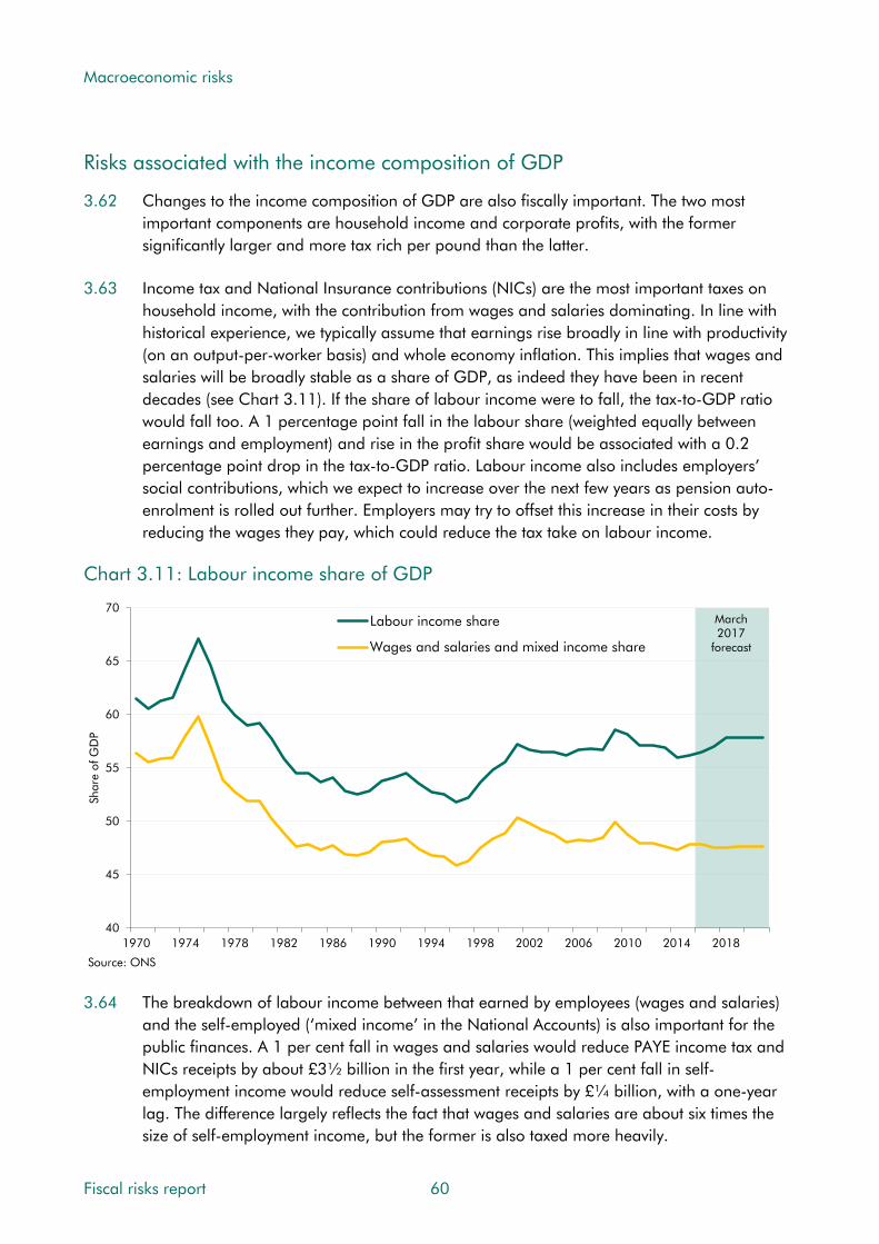
Macroeconomic risks
Risks associated with the income composition of GDP
3.62 Changes to the income composition of GDP are also fiscally important. The two most important components are household income and corporate profits, with the former significantly larger and more tax rich per pound than the latter.
3.63 Income tax and National Insurance contributions (NICs) are the most important taxes on household income, with the contribution from wages and salaries dominating. In line with historical experience, we typically assume that earnings rise broadly in line with productivity (on an output-per-worker basis) and whole economy inflation. This implies that wages and salaries will be broadly stable as a share of GDP, as indeed they have been in recent decades (see Chart 3.11). If the share of labour income were to fall, the tax-to-GDP ratio would fall too. A 1 percentage point fall in the labour share (weighted equally between earnings and employment) and rise in the profit share would be associated with a 0.2 percentage point drop in the tax-to-GDP ratio. Labour income also includes employers’ social contributions, which we expect to increase over the next few years as pension auto-enrolment is rolled out further. Employers may try to offset this increase in their costs by reducing the wages they pay, which could reduce the tax take on labour income.
Chart 3.11: Labour income share of GDP
3.64 The breakdown of labour income between that earned by employees (wages and salaries)
and the self-employed (‘mixed income’ in the National Accounts) is also important for the public finances. A 1 per cent fall in wages and salaries would reduce PAYE income tax and NICs receipts by about £3½ billion in the first year, while a 1 per cent fall in self-employment income would reduce self-assessment receipts by £¼ billion, with a one-year lag. The difference largely reflects the fact that wages and salaries are about six times the size of self-employment income, but the former is also taxed more heavily.
40
45
50
55
60
65
70
1970 1974 1978 1982 1986 1990 1994 1998 2002 2006 2010 2014 2018
Shar
e of
GD
P
Labour income share
Wages and salaries and mixed income share
Source: ONS
March2017
forecast
Fiscal risks report 60
Macroeconomic risks
3.65 We assume a rising share of self-employment in our medium-term forecast, at a slightly slower pace than in recent years. This has been related to a sharp rise in the number of people setting themselves up as a single-director company rather than working as an employee or unincorporated self-employed worker. This issue and the associated fiscal risks are explored in Chapter 5. The distribution within labour income is also fiscally important because the income tax system is progressive. Chapter 5 discusses recent trends in the income distribution and the risks associated with policy changes having led to receipts being more concentrated on a small number of taxpayers with the highest incomes.
3.66 Understanding the risks associated with the changing composition of employment income between employees, self-employed and incorporations is complicated by the available data. Our economy forecast is based on ONS data, while our fiscal forecast includes adjustments based on HMRC data and analysis. The ONS has announced that Blue Book 2017 will include revisions based on HMRC data and forecasts (consistent with our own) on the dividend income earned by incorporated individuals. These will show much higher dividend income than previously estimated.21 One implication for our economy forecast is that more of what is recorded as profit should be interpreted as being similar to labour income. The implications for our receipts forecast are likely to be more complicated (see Chapter 5).
3.67 Non-North Sea, non-financial company profits are a key determinant of our corporation tax forecast. Nevertheless, corporate profits are subject to a lower effective tax rate than labour income. All else equal, a higher share of profits in GDP, and a correspondingly lower share of labour income, will imply a weaker path for tax receipts, although the inverse relationship between the share of profits in GDP and the share of labour income is not a perfect one, given that other elements also enter the income measure of GDP (such as imputed rent, and taxes and subsidies on products and production).
3.68 Existing evidence suggests that profit margins over marginal costs are positively correlated with the economic cycle,22 and our forecast of the path of profits as a share of nominal GDP is partly informed by our forecast of the output gap. Cyclical shocks to the economy may therefore be associated with shocks to the path of the profit share, relative to our central forecast, with possible implications for the aggregate effective tax rate depending on how other elements of income evolve. Our forecast of profits is also conditioned on the latest available data, which can often be subject to significant volatility and revision: the most recent ONS outturns are often subject to sizeable quarterly ‘alignment’ adjustments used to bring the income measure of GDP more closely into line with other measures. Recent data movements can have significant implications for our near-term forecast of annual profit growth, and therefore our forecast of corporation tax receipts. To the extent that such data are subject to significant uncertainty, this also poses a risk to our corporation tax forecast.
21 ONS, National Accounts articles: Impact of Blue Book 2017 changes on the Sector and Financial Accounts, 1997 to 2012, April 2017. 22 Macallan et al, The cyclicality of mark-ups and profit margins for the United Kingdom: some new evidence, Bank of England Working Paper No. 351, 2008.
61 Fiscal risks report

Macroeconomic risks
Housing sector risks
3.69 In additional to different categories of spending and income, GDP can also be broken down by the contribution of different industrial sectors – services, manufacturing, construction and agriculture, and their component parts. Some of these can be particularly important sources of fiscal risk, either because they are prone to shocks or because they are fiscally important. Two stand out: the financial sector (which we discuss in Chapter 4); and the housing sector.
3.70 The housing sector accounts for more than two-thirds of stamp duty land tax (and land and buildings transactions tax in Scotland), around a third of inheritance tax, a sixth of capital gains tax and less than 5 per cent of VAT. Housing construction also contributes around 2 per cent of PAYE income tax and NICs23 and around 3 per cent of corporation tax. Altogether, around 4 per cent of taxes are therefore linked to the housing sector.
3.71 The housing sector is relatively volatile, with large pro-cyclical swings in prices and activity and real terms falls in prices around each of the last four recessions. Various common drivers – such as interest rate rises or shocks to confidence and income expectations – affect both the housing market and the broader economy. The fiscal risk posed is illustrated by the recent post-crisis experience: SDLT receipts from residential properties fell from £6.7 billion in 2007-08 to £3.0 billion in 2008-09, as the number of property transactions halved.24
Chart 3.12: Growth of real GDP and real house prices
23 Close to 90 per cent of income tax and NICs receipts are collected through PAYE, so this is broadly representative of the total. 24 HMRC, UK Stamp statistics 2015 to 2016, September 2016.
-9
-6
-3
0
3
6
9
12
-30
-20
-10
0
10
20
30
40
1969 1972 1975 1978 1981 1984 1987 1990 1993 1996 1999 2002 2005 2008 2011 2014
Percentage change on a year earlierPerc
enta
ge c
hang
e on
a y
ear
earli
er
Real GDP growth (RHS) Real house price inflation (LHS)
Source: ONS, OBR
Fiscal risks report 62

Macroeconomic risks
3.72 Other housing market developments are important too. Property transactions are volatile and heavily taxed (and, as discussed in Chapter 5, in recent years receipts have become more concentrated at the top of the house price distribution). Housing tenure – whether people own or rent their home – also affects public spending. While less volatile from year to year, home ownership rates have been on a downward trend since the late 2000s.
3.73 Housing market shocks are often correlated with other shocks in the economy and have wider indirect effects. For example, consumption and house prices are highly correlated because they are affected by common factors, including income expectations and credit conditions. There may also be causal effects from housing to consumption, for example because housing wealth can be used as collateral for borrowing.25 And moving house is associated with higher expenditure on consumer durable goods, so there is a link from property transactions to consumption and VAT receipts, with small effects on GDP.26
3.74 The proportion of households renting their home – and within that the proportions in the private- and social-rented sectors – is a key driver of spending on housing benefit, which we estimate will cost £23.4 billion in 2017-18. A small proportion of housing benefit is closely linked to the cycle because it is ‘passported’ to those in receipt of jobseeker’s allowance, but most is received by claimants of other benefits – e.g. incapacity benefits or tax credits – that are less closely linked to the economic cycle. The greater the share of households that rent their home, the greater the number of people potentially eligible for housing benefit. In our 2014 Welfare trends report we showed how the rise in private renting – where average rents are higher than in the social-rented sector – had been an important driver of recent growth in housing benefit spending. Growth in rents can also affect the average amount of housing benefit paid per recipient, but rents are less volatile than house prices and limits are set on ‘eligible rent’ that further reduce the sensitivity of spending to changes in market rents.
3.75 As the public sector is the major provider of social housing through housing associations and local authorities, it is also exposed to movements in rents, construction costs and other trends in housing. For example, in a downturn it may receive lower rental income.
3.76 There are also a large number of government-backed schemes to encourage housing supply and home ownership, including various Help to Buy schemes. As discussed in Chapter 7, these could be a source of fiscal risk.
Risks associated with sectoral lending and balance sheets
3.77 The National Accounts framework underpinning our economic forecast allows us to forecast each sector’s net lending or borrowing from the other sectors. These must sum to zero – for each pound borrowed, there must be a pound lent. Our forecasts of these balances are the consequence of judgements and assumptions about other flows, since each sector’s net lending follows arithmetically from our forecasts of income and expenditure. We use the
25 Benito et al, House prices and consumer spending, Bank of England Quarterly Bulletin, June 2006. 26 Benito and Wood, How important is housing market activity for durables spending?, Bank of England Quarterly Bulletin, Summer 2005.
63 Fiscal risks report

Macroeconomic risks
profiles of sectors’ net lending as an important overall diagnostic on the coherence of the economic forecast. They can also point to potential risks around our central forecast.
3.78 Chart 3.13 shows our March 2017 forecasts. These included a narrowing of the public sector deficit, offset by a narrowing of the rest of the world surplus (i.e. a narrowing current account deficit) and a widening of the corporate deficit. The household sector is expected to remain in deficit throughout the forecast period. The persistent household deficit and the assumed narrowing in the current account deficit are key potential sources of fiscal risk. If the household sector moved into surplus – or the current account deficit did not narrow – it is unlikely that the public sector deficit would narrow as much as we forecast.
Chart 3.13: Sectoral net lending
March 2017 forecast
-12
-10
-8
-6
-4
-2
0
2
4
6
8
2000 2002 2004 2006 2008 2010 2012 2014 2016 2018 2020 2022
Per
cent
, rol
ling
annu
al a
vera
ge
Corporate Public
Household Rest of world
Source: ONS, OBR
Household deficit and debt
3.79 The household saving ratio stood at 1.7 per cent in the first quarter of 2017, down from 9.2 per cent in mid-2012. (The latest figure is the lowest on record, but it was heavily influenced by tax-related shifting of dividend income.27) After factoring in households’ investment spending, their overall financial position is in deficit. Our forecast that they will remain so over the next five years is underpinned by the highly accommodative monetary policy upon which the forecast is conditioned. But it would be historically unprecedented. Official and experimental data back to the 1960s28 suggest that sustained periods of relatively large household sector deficits are rare (Chart 3.14). The household sector was typically in surplus up to the early 2000s, while the deficits recorded between 2004 and 2008 averaged 0.8 per cent of GDP – smaller than the average of 1.2 per cent of GDP in our central forecast.
27 For a description of this, see Box 4.3 of our March 2017 Economic and fiscal outlook. 28 Thomas and Nolan, Historical estimates of financial accounts and balance sheets, January 2016.
Fiscal risks report 64

Macroeconomic risks
Chart 3.14: Historical estimates of the household sector balance
-4
-2
0
2
4
6
8
10
1963 1967 1971 1975 1979 1983 1987 1991 1995 1999 2003 2007 2011 2015 2019
Per
cent
, rol
ling
annu
al a
vera
ge
Experimental estimates (Pre-ESA95 basis) National Accounts data as of March 2017 (ESA10 basis)
Note: Latest sector accounts data extends back to 1987 on a consistent basis. Prior to this point estimates are on an experimental basis, and are taken from Thomas, R. and Nolan, L, Historical estimates of financial accounts and balance sheets, January 2016.
March2017
forecast
Source: ONS, OBR
3.80 A persistent household deficit has implications for household debt. Having fallen steadily since the crisis, households’ gross debt has started to rise again relative to their income. Consumer credit net lending has been on an upward trend since 2012, increasing by around 10 per cent in the year to May. Much of this has been attributable to car finance, although credit card lending has also played a growing role. Given the sustained deficit, we expect households to continue to accumulate debt and that their gross debt to income ratio will rise over the next five years (Chart 3.15), but not by enough to top its pre-crisis peak.
Chart 3.15: Household gross debt to income
80
90
100
110
120
130
140
150
160
170
180
1987 1989 1991 1993 1995 1997 1999 2001 2003 2005 2007 2009 2011 2013 2015 2017 2019 2021
Per
cent
Source: ONS, OBR
March 2017 forecast
65 Fiscal risks report

Macroeconomic risks
3.81 Given the historically unprecedented nature of the household deficit in our central forecast, we have considered the risks associated with a sharper adjustment to consumer spending than we are assuming. In our March 2017 EFO we looked at a ‘consumer bust’ scenario, where households were assumed to retrench by reducing consumption relative to incomes. With the labour share of nominal GDP assumed to be unchanged from our central forecast, household incomes fell in line with GDP. But the fall in consumption was proportionately greater, lifting the saving ratio. The fiscal effects were concentrated in lower receipts, due to lower consumer spending, which increased the deficit and net debt.
3.82 Our March 2017 forecasts for household saving and net lending are subject to important data-related uncertainties. Forthcoming revisions in Blue Book 2017 will increase household dividend income, implying a higher saving ratio and improved net lending position. (This relates to trends in self-employment and incorporation discussed above and in Chapter 5.) The ONS has signalled that it will use HMRC data and forecasts (which in turn are consistent with our tax forecasts) rather than estimates based on proportions of income to estimate dividend income. It calculates that this will raise the saving ratio by an average of 0.7 percentage points between 1997 and 2012, although the effect is generally larger in later years. The rising incidence of incorporations means that dividend income is likely to have risen more quickly than overall household income in recent years, so the upward revision to household saving is likely to rise further beyond 2012. It is also likely to be volatile in the most recent years due to the large amounts of dividend income shifting that occurred ahead of the pre-announced dividend tax rise in April 2016 (discussed in Box 4.3 of our March 2017 EFO).
Current account deficit
3.83 Our most recent forecast is also conditioned on a modest narrowing of the historically large current account deficit. The 4.7 per cent of GDP deficit in 2014 was the largest in peacetime since at least 1830. The deficit remained above 4 per cent in 2015 and 2016 (Chart 3.16).
3.84 The UK has run a trade deficit for many years. Much of the recent deterioration in the current account reflects a weaker income balance. In the decade prior to 2012, the income balance averaged a surplus of 1.3 per cent of GDP; since 2013, it has averaged a deficit of 1.1 per cent of GDP. This has been driven by a deterioration in the net rate of return the UK earns (i.e. the rate of return earned on its assets relative to the rate of return earned by overseas investors on their UK assets) as well as an increase in the stock of liabilities.29
29 See Hardie, Hamroush and Hendry, An analysis of Foreign Direct Investment, the main driver of the recent deterioration in the UK’s Current Account, ONS article, 2016.
Fiscal risks report 66

Macroeconomic risks
Chart 3.16: Historical estimates of the current account balance
-15
-10
-5
0
5
10
1772 1792 1812 1832 1852 1872 1892 1912 1932 1952 1972 1992 2012
Per
cent
Source: Bank of England, ONSNote: Shaded areas represent major wars.
3.85 The gradual narrowing of the current account deficit in our central forecast relies on an improvement in the income balance. This in turn reflects a continued recovery in the rates of return on euro area and other assets, which are assumed to normalise by 2020, and the recent depreciation, which increases the sterling value of the income on overseas assets. The assumption that rates of return recover to more normal levels is particularly uncertain, not least because there is uncertainty around why they have fallen so far in the first place.
3.86 Our forecast for the current account is conditioned on an exchange rate forecast that is determined by the ‘uncovered interest parity’ condition. For our March 2017 forecast, this implied a relatively stable outlook for sterling. The large current account deficit means that overseas investors are acting as net lenders to the UK, which could pose a risk to the exchange rate if their confidence in the UK economy was to recede. This could lead to a sharper, demand-led narrowing of the current account deficit than we currently assume.
3.87 Sectoral net lending analysis is a useful diagnostic tool, but it is ultimately an arithmetic relationship and a shock to any one sector may feed through to the others in complicated ways. A stronger household balance (if consumers retrench) would have pretty clear fiscal consequences via lower expenditure tax receipts. But if a slower-than-expected current account improvement resulted from lower rates of return on overseas investments, that might be offset more in the corporate sector balance than in the government sector one.
67 Fiscal risks report
Macroeconomic risks
Economic risks associated with Brexit
3.88 The vote to leave the EU has introduced a new set of uncertainties and risks regarding the economic and fiscal outlook that overlays those discussed in the rest of this chapter. These include uncertainty about the outcome of the Brexit negotiations and those with other trading partners, and about the economic implications of the eventual outcomes.
3.89 We have published two forecasts since the Brexit vote – in November 2016 and March 2017. In both cases we concluded that we had no meaningful basis on which to predict the precise outcome of our negotiations with the European Union and other trading partners, so we made a series of broad-brush adjustments to the pre-crisis forecast that would be consistent with a number of possible outcomes. But there have also been some concrete developments, notably the fall in the exchange rate (14 per cent by November compared with our pre-referendum forecast, which had eased back to 10 per cent by March) and evidence of weakening business investment both before and after the vote.
3.90 Potential Brexit effects on the economy – and thus on the fiscal position – are diverse:
• In our post-referendum forecasts, we assumed that the UK’s exit from the EU would lead to a somewhat less open economy, with a broadly equal effect on exports and imports. Our assumption was based on an average of external estimates, but the effect will no doubt be different from what we have assumed. For example, a more restrictive trading regime with the EU could lead to both lower exports and lower imports, but a more open regime including free trade agreements with countries outside the EU could boost them. The net effect on trade flows in both directions could be more or less than currently assumed in our forecast. And the effect could be asymmetric across exports and imports, in which case it would affect GDP via the composition of expenditure.
• Some external analyses published ahead of the referendum vote suggested that a more restrictive post-Brexit trading regime would lead to lower productivity than would otherwise have been the case, whereas others assumed that it would rise because of the resulting scope to deregulate in some areas.30 As described in paragraph 3.18, the expected return of productivity growth toward historical norms is the most important uncertainty in our forecast, given its persistent weakness in recent years and its importance for wider GDP growth and the fiscal position. Brexit only adds to this uncertainty. Any factors that affect productivity growth over the medium or long term would have significant fiscal implications. Just 0.1 percentage points less productivity growth each year over a 50-year horizon would leave the economy 4.8 per cent smaller than would otherwise be the case, which is equivalent to £97 billion in today’s terms. Given a tax-to-GDP ratio of 37 per cent, it would also imply tax receipts £36 billion lower in today’s terms.
30 The study by the London School of Economics’ Centre for Economic Performance (Dhingra et al, The impact of Brexit on foreign investment in the UK, CEP Brexit Analysis No. 3, March 2016) was one of those that predicted a bigger hit to productivity from leaving the EU. At the opposite end of the spectrum the Economists for Brexit study (The economy after Brexit, April 2016) predicted that productivity and therefore GDP would be boosted by leaving the EU.
Fiscal risks report 68
Macroeconomic risks
• Business investment fell by 1.5 per cent in 2016, probably related to heightened uncertainty before the referendum, as businesses delayed investment ahead of the vote, and after, as they digested its implications. In our post-referendum forecasts, we expected heightened uncertainty to continue to weigh on investment in the near term, but assumed that it would gradually dissipate as the Brexit negotiations move towards their conclusion and future policy settings become clearer. In any negotiation, however, there is the possibility of brinkmanship and conflicting signals. That could result in further uncertainty and investment volatility. Weaker business investment is favourable to the public finances in the near term, but negative in the longer term.
• Uncertainty remains over the post-Brexit rules governing migration, which will directly affect the size of the population and therefore the number of people paying taxes and benefiting from government spending. It will also affect the ease with which UK businesses are able to hire staff. For any given immigration regime, there are further risks around how firms and individuals respond to changing economic conditions.31 The composition of net migration by age or skills is also relevant in determining its fiscal impact. Similar to many examples in this section, the Brexit-related uncertainty around future migration flows only adds to existing uncertainty in this area.
• There are a number of sector-specific risks where Brexit is likely to be a factor. The UK’s large financial sector, for example, could be affected if there are changes to the terms on which UK businesses can access EU markets. Over time, there is also a possibility that globally active firms move operations in or out of the UK. Firms review these decisions on an ongoing basis, so Brexit and the subsequent economic and regulatory environment further complicate those decisions. Possible changes to immigration rules may also have particular impacts on sectors that had previously employed a high proportion of migrant workers. We discuss possible implications for the health and social care sectors in Chapter 6.
Characteristics of economy-related fiscal risks
3.91 This section summarises the characteristics of the fiscal risks identified in this chapter, using the criteria set out in Chapter 1 (namely whether they are discrete or continuous, isolated or correlated, and exogenous or endogenous to government action) and our assessment of the probability that they will crystallise. We would expect whole economy shocks to be bigger fiscal risks than compositional shocks to GDP (by expenditure, income or output), and persistent/permanent effects to be bigger issues for fiscal sustainability than temporary shocks. But sudden effects may well be more difficult for policymakers to manage than bigger, slow-burn effects – they have to tolerate the immediate effects and deal with the consequences later, whereas longer-term effects can be treated as they build up.
31 Forte and Portes, Macroeconomic Determinants of International Migration to the UK, GLO Discussion Paper No. 69, 2017.
69 Fiscal risks report

Macroeconomic risks
Potential output
3.92 Risks to potential output are generally continuous. Small changes in potential output growth can build up over time to deliver significant effects on the size of the economy and therefore the size of the tax base and the affordability of public spending plans. They are frequently correlated with other risks, as they often occur alongside a major cyclical downturn or financial crisis. And though they may be exogenous – for instance reflecting a decline in the rate of technological innovation – they may also be endogenous to government action as policy could affect the equilibrium unemployment rate, the capital stock or migration.
3.93 In our November 2016 EFO we presented a ‘weak productivity’ scenario in which potential productivity grew by 0.8 percentage points. In this scenario, public sector net debt (PSND) as a share of GDP was 8 per cent higher in 2021-22. Viewed in five-year averages, productivity growth has averaged 0.8 per cent a year around 20 per cent of the time since 1976, but nearly 80 per cent of the time since 2008. On this basis we judge the likelihood of this risk materialising as medium, although the latest data paint a gloomier picture.
3.94 Similarly, in our March 2016 EFO we presented a ‘low migration’ scenario, reducing population growth and therefore potential output growth. In this scenario, net migration fell to 105,000 per year by 2021 (compared to 185,000 in the central forecast). The impact is smaller than that of the ‘weak productivity’ scenario – with PSND up 1.4 per cent of GDP after five years. It is difficult to conclude from history the likelihood of this scenario occurring, as net migration has varied substantially from year to year as the policy setting and macroeconomic outlook has changed. But overall, we judge the likelihood as low.
3.95 The impact of these risks builds up over time. In our 2017 FSR, net debt was 31 per cent of GDP higher in the ‘low migration’ variant than in our central projection after 50 years. The long-term projections in our FSRs are relatively insensitive to different productivity growth assumptions – because we assume, broadly in line with historical experience, that most thresholds in the tax and benefit systems on average rise in line with living standards (earnings or real GDP). If instead we consider a scenario where spending is the same as the in the FSR but productivity growth is 0.1 percentage points lower every year, net debt would be 49 per cent of GDP higher after 50 years.
Cyclical shocks
3.96 Large cyclical shocks are discrete events, but the same factors that cause recessions can trigger many other risks. Such risks can be exogenous with respect to government action – with the mid-1970s recession predominantly due to higher global oil prices – or endogenous. As stated above, risks caused by cyclical shocks may well be correlated to others as they may occur alongside risks to potential output or the financial sector.
3.97 There have been seven recessions (i.e. two or more consecutive quarters of falling real GDP) in the last 61 years. This implies a probability of a recession in any given year of 11 per cent. We judge that there is a medium risk of at least one recession in the next five years.
Fiscal risks report 70

Macroeconomic risks
3.98 The fiscal impact of a recession will vary according to its size and characteristics. One illustration of the potential cost is the ‘negative shock’ scenario in our November 2015 EFO. In this scenario, a cyclical shock to the economy opens up a negative output gap and a peak-to-trough fall in real GDP of around 2¾ per cent – similar to the average peak-to-trough fall in past UK recessions. By the final year of the forecast, the debt-to-GDP ratio was around 14 per cent of GDP higher. A more severe illustration is the fiscal stress test reported in Chapter 9, which increases net debt by 34 per cent of GDP after five years.
3.99 Our long-term projections do not incorporate an economic cycle, but if we were to assume that there will be an average-sized recession every 10 years – and that only half their effect were offset by booms – the cumulative addition to net debt would be 35 per cent of GDP.
Composition of GDP
3.100 Many of the risks associated with the composition of GDP differing from our forecast are continuous in that this is likely to be case most of the time. But there are also discrete risks with this effect that only crystallise occasionally, such as natural disasters. Global factors can be considered as beyond the control of the UK government and exogenous. This is less clear for domestic expenditure or the income composition of GDP, which can be influenced by policy. Some composition risks are correlated with other developments in the economy.
3.101 We can assess the implications for the public finances of different expenditure and income compositions of GDP by considering their different effective tax rates. A one percentage point fall in consumption over two years, offset by higher business investment, would raise PSND by 1 per cent of GDP in 2021-22 – a relatively small effect with perhaps medium probability. A one percentage point fall in compensation of employees alongside a one percentage point fall in consumption would raise PSND by 2½ per cent of GDP in 2021-22. Again, a relatively small effect with perhaps a medium probability.
3.102 We generally hold the composition of GDP broadly constant in our long-term projections, but over longer time horizons, there is clearly scope for larger changes in the composition of GDP than we would usually expect to see in the medium-term. During the 1960s, for example, both income and consumption fell as a share of GDP by around 5 percentage points. A similar fall today would raise net debt by 8 per cent of GDP.
Housing sector
3.103 The risks associated with the housing sector are discrete, as they are generally associated with unexpected cyclical shocks. They can be highly correlated with other economic risks, reflecting common drivers such as a fall in household incomes. They are endogenous to government policy, as the impact on the public finances will be amplified by government schemes. Macroprudential policies could reduce the likelihood and impact of shocks.
Flow of funds and sector net lending
3.104 As with many of the risks relating to expenditure or income, those associated with the flow of funds and sector net lending are continuous. Many factors that affect the current account
71 Fiscal risks report

Macroeconomic risks
are global and therefore largely exogenous to government policy, but other risks could be considered partly endogenous: individual government policies can affect the income and expenditure of particular sectors, and the path of sector net lending will be influenced by the overall stance and trajectory of fiscal policy. Many of these risks are correlated in so far as shocks rarely affect one sector in isolation.
Conclusions
3.105 This chapter has considered the various ways in which macroeconomic risks can affect the public finances. History suggests that these are some of the high-impact fiscal risks most likely to crystallise over the medium term and, more particularly, over the long term:
• Risks to potential output growth are the most important long-term macroeconomic risks. They can stem from many underlying drivers, reflecting the different sources of potential growth: population growth (including net migration), the proportion of the population working (reflecting participation rates and the sustainable unemployment rate), the number of hours worked by those in employment and, most important of all, the amount produced per hour worked (i.e. potential productivity growth). Small changes in potential output growth can build up over time to deliver large effects on the size of the economy and therefore the size of the tax base and the affordability of public spending plans. In a world in which thresholds in the tax and benefit system are assumed to rise with living standards over the long term – and most public services spending is assumed broadly constant as a share of GDP – weaker potential output growth leaves everyone poorer (especially if driven by weaker productivity growth) but does not itself pose a threat to fiscal sustainability. It poses more of a fiscal risk over the medium term, when public services spending is planned in cash terms and when thresholds and benefit levels are more often linked to inflation than living standards.
• The risk of a cyclical downturn is reasonably high over any five-year horizon, but well-nigh inevitable over 50 years. Since 1970, no decade has passed without a recession. Each was different, but three pushed the budget deficit over 6 per cent of GDP (the exception being the early 1980s, when fiscal tightening was one factor contributing to the recession). The impact of recessions on net debt depends importantly on the pace of the recovery that follows them. Recessions with lasting negative economic effects – like the most recent one – are associated with the greatest fiscal costs. Recessions are rarely foreseen, and they tend to surprise forecasters more on the downside than booms surprise them on the upside. Recessions are discrete events, but many other risks can be triggered alongside them. Given their near inevitability, but unpredictable timing, there is little policymakers can do in advance beyond recognising that they are likely to have to tolerate their fiscal costs at some point in the future. This is one reason why academic research and IMF advice says that governments should aim to create fiscal space in normal times.
• Risks associated with the sectoral composition of activity can be important, but are generally much less significant than those affecting the whole economy. Two sectors have featured prominently as sources of fiscal risk in the UK’s post-war history: the
Fiscal risks report 72

Macroeconomic risks
financial sector (discussed in Chapter 4) and the housing market. Risks emanating from the housing market are often closely correlated with broader cyclical risks. All UK recessions have been associated with falling real house prices. This is more likely to reflect common underlying causes than the housing market being the source of wider economic downturns. The housing sector is relatively tax-rich, so fiscally important.
• Risks associated with the expenditure or income composition of GDP can similarly be important, but much less significant than whole economy risks. Different components of expenditure and income are taxed at different rates, so changes in composition affect the tax-to-GDP ratio. The labour share of income is the most important source of risk, given the relatively high tax rate on employment income and the relatively low rate on profits. On the expenditure side, consumer spending drives VAT receipts and excise duties, whereas business investment attracts capital allowances that reduce receipts in the short term but may boost them over the longer term.
• Brexit-related uncertainties overlay many of these risks. Will new trading arrangements affect potential productivity growth? Will new migration policies affect working-age population growth? Will there be a period of cyclical weakness around the exit date?
For the Government’s response
3.106 In this chapter we have highlighted a number of issues that the Government is likely to wish to consider when managing its fiscal risks. Among them:
• The sources of weak post-crisis productivity growth and the risk of this continuing;
• The near-inevitability of future recessions – and the risk of persistent effects from them;
• The different effective tax rates imposed on different components of GDP;
• The Government’s fiscal exposure to the housing sector;
• The persistent household financial deficit and current account deficit; and
• The economic risks associated with Brexit.
3.107 When assessing the macroeconomic outlook and its interaction with fiscal risk over the medium and long term, does the Government regard these or other issues as important for its risk management strategy and, if so, how does it intend to address them?
73 Fiscal risks report

4 Risks from the financial sector
Introduction
4.1 The financial sector is of particular importance to the economy and to the public finances. It is a source of employment and tax revenue in its own right, as well as facilitating saving and investment in the wider economy. Moreover, its importance in the UK is greater than in many other countries. But this importance also brings risks – be that the sudden consequences of financial crises, with large direct and indirect costs, or the gradual loss of revenue and economic benefits should the sector suffer a period of relative decline.
4.2 This chapter discusses:
• key features of the financial sector;
• the impact of financial crises on the economy and the public finances;
• risks in the UK financial sector today;
• the associated risks to our medium-term fiscal forecast;
• the possible risks to fiscal sustainability;
• some conclusions that can be drawn; and
• issues for the Government’s response.
Characteristics of the financial sector
4.3 The financial sector’s economic importance arises from its roles in clearing payments between individuals, in intermediating the flow of funds from savers to borrowers and in providing ancillary services to meet investor demand and to reallocate risks towards those who are better able to bear them. In deciding who to provide loans to, banks and other financial intermediaries also play a central allocative function. Disruption to the ability of financial intermediaries to carry out these functions can have very large costs.
4.4 Empirical analysis suggests that an efficient and effective financial sector facilitates economic growth and development. For example, countries with larger banking systems and more developed stock markets have been found to grow faster.1 But there may be a limit to that relationship – some studies have found that an oversized banking system
1 Levine, Financial development and economic growth: views and agenda, World Bank Policy Research Working Paper Series 1678, 1996.
75 Fiscal risks report

Risks from the financial sector
(measured by the credit-to-GDP ratio) actually inhibits economic growth, perhaps by acting as a magnet for scarce skilled resources. In practice, the relationship between credit and economic growth is likely to be influenced by a number of factors, including whether lending finances productive investment or speculative bubbles and how finance is provided, for example via derivative instruments or more traditional bank lending.2
Size and composition of the UK financial sector
4.5 The UK financial sector has grown rapidly in recent decades and, despite shrinking in the aftermath of the recent financial crisis, it remains a prominent part of the economy:
• Measured in terms of the financial sector’s consolidated non-equity liabilities, shown in Chart 4.1, the UK financial sector is around nine times larger than annual nominal GDP. That is greater than in any other major European country.
• Value added by the finance and insurance industry, as defined in the National Accounts, accounted for around 7 per cent of national output in 2016, down from a peak of 9 per cent in 2009 but still above the EU average of around 5 per cent.3,4
• As of December 2016, finance and insurance accounted for 3 per cent of workforce jobs,5 but 10 per cent of the jobs in the top decile of the earnings distribution.6
• Finance and insurance generates a significant trade surplus that partly offsets the deficits in many other sectors – and which is bigger than the equivalent surpluses in most other advanced economies. The UK financial services trade surplus stood at 2.3 per cent of GDP in 2016, almost four times the EU average of 0.6 per cent.
4.6 The financial sector encompasses many activities, including at its core the banking sector. Since the 1970s, the assets of UK banks (known as ‘monetary financial institutions’ in the official statistics) have increased more than fourfold7 and in 2015 stood at around 5½ times GDP (Chart 4.2).8 This makes the UK’s banking sector the largest among major OECD countries and, relative to the size of the economy, more than five times bigger than the banking sector in the US.9 Around half of UK banks’ assets are loans to households, companies and public sector bodies, and half are interbank loans and derivatives.
2 Arcand, Berkes and Panizza, Too much finance?, IMF Working paper 12/161, 2012. 3 ONS, UK GDP(O) low level aggregates, June 2017. 4 OECD, Value added by activity, 2017. 5 ONS, Workforce jobs by industry, 2017. 6 ONS, Number and share of employees within the 90th percentile of the earnings distribution by industry using bonus adjusted ASHE 2016 provisional UK, 2017. This refers to those within and above the 90th percentile of the earnings distribution, not just those within it. 7 Bean, Independent review of UK economic statistic, 2016. 8 This measures the banking system’s assets according to the National Accounts definition of residence. 9 Bush, Knott and Peacock, Why is the UK banking system so big and is that a problem?, Bank of England Quarterly Bulletin Q2, 2014.
Fiscal risks report 76

Risks from the financial sector
Chart 4.1: Consolidated non-equity liabilities of financial corporations in Europe
0 250 500 750 1000 1250 1500 6750 7000 7250
RomaniaLithuania
PolandSlovak Republic
EstoniaHungarySloveniaBulgaria
Czech RepublicLatvia
CroatiaGreece
ItalyNorway
SpainAustria
PortugalFinland
GermanyFrance
SwedenBelgium
DenmarkCyprus
NetherlandsUK
IrelandMalta
Luxembourg
Per cent of GDP in 2015Source: Eurostat
Chart 4.2: Banks’ assets relative to nominal GDP
0 250 500 750 2000 2250
LithuaniaSlovak Republic
PolandSloveniaHungary
EstoniaLatvia
NorwayItaly
AustriaBelgium
SpainFinlandSweden
GermanyPortugalGreece
NetherlandsDenmark
FranceIreland
UKLuxembourg
Per cent of GDP in 2015Source: OECD
Direct implications for the public finances
4.7 The financial sector is more important to the public finances than its 7 per cent contribution to national output might suggest. This reflects both the high average pay rates in the sector and differences in how financial sector companies are taxed relative to other sectors. For example, in 2014-15 the financial sector accounts for only 3 per cent of total jobs, but 7 per cent of total pay and 12 per cent of PAYE income tax and NICs receipts (because of the
77 Fiscal risks report

Risks from the financial sector
progressive design of income tax). The financial sector also contributes a disproportionately large share of corporate taxes, including 17 per cent of onshore corporation tax, plus all receipts from the bank levy and bank surcharge. Together these raised £12.7 billion in 2016-17, but we forecast that will fall to £10.1 billion by 2021-22 as the bank levy rate is cut progressively. It is worth noting that taxable financial company profits differ substantively from the National Accounts measure of ‘financial company gross trading profits’, which excludes estimates of the value of implicit intermediation services provided by the financial sector (and is difficult to interpret).
Market failures in the financial system
4.8 Banking systems tend to be heavily regulated, which reflects the fact that governments believe that the market for banking services, left to its own devices, would deliver economically inefficient outcomes. The potential ‘market failures’ in banking include:
• Systemic risk: the many interlinkages within the financial sector mean that the failure of one institution could precipitate the failure of others and lead to a severe economic downturn. Individual institutions cannot be expected to internalise the cost that their actions might have on the system as a whole.
• Too big to fail (a form of systemic risk): governments often feel compelled to provide financial support when large and complex financial institutions get into serious difficulty (a ‘bail out’), because of the wider economic costs if was allowed to fail. But implicit (or even explicit) state guarantees of this sort means that the bank’s creditors will be insulated from losses, unless there are explicit mechanisms to ‘bail them in’. This implicit subsidy to the bank’s creditors in the event of failure means that the cost of bank debt is artificially low, encouraging excessive expansion of the bank’s balance sheet and increasing the risk of failure. In effect, the gains from banking accrue privately, but the losses in times of severe stress are transferred to the public sector.
• Herding behaviour: financial markets can exhibit herding behaviour, where correlated decisions can lead to inefficient outcomes. If there is imperfect information in the market, firms may feel compelled to follow the actions of competitors that they think may be better informed. Investors may also behave irrationally, for example taking inefficient actions purely for reputational reasons. After the last crisis, the role of league tables in signalling brokers’ status was seen as one cause of herding behaviour, with firms chasing activity to move up the league table and thereby secure more business. The irrational nature of some pre-crisis activity was summed up by the infamous comment in 2007 by Citigroup’s then CEO Chuck Prince that “…as long as the music is playing, you’ve got to get up and dance. We’re still dancing.”
• Myopia: some managers and traders may adopt an overly short-term perspective in taking decisions. That may arise from informational and behavioural factors, but may also reflect remuneration arrangements that pay too much attention to short-term, rather than long-term, performance.
Fiscal risks report 78

Risks from the financial sector
Regulatory responses to market failures
4.9 In the UK, the regulatory framework is set by the Treasury and operated by the Bank of England. The Prudential Regulation Authority (PRA) is responsible for the micro-prudential regulation and supervision of individual institutions, while the Financial Policy Committee (FPC) is responsible for the oversight and regulation of the system as a whole (‘macro-prudential policy’). Box 4.1 summarises the current regulatory framework and the steps that governments have taken to improve its effectiveness since the financial crisis.
4.10 The financial sector is unusual in the volume of regulation that applies if an institution fails. This is due to systemic risk and contagion effects – the possibility of ‘bank runs’ if concerns spread about the health of specific institutions or the system as a whole. The rules governing resolution in the event of failure aim to transfer the direct financial risk from government to the creditors of the institution through ‘bail-in’, reducing the implicit contingent liability and improving the incentives faced by financial institutions and their creditors.
4.11 A key challenge for government is to strike the right balance between over- and under-regulation. Either could be a source of economic and fiscal risk. By imposing greater costs on institutions, excessively heavy and complex regulation could impair the efficiency of the financial system and the wider economy – with lower economic activity feeding through into weaker public finances. Conversely, excessively lax regulation could allow risks to build up that generate large economic and fiscal costs should they materialise. The late-2000s crisis had a deep and lasting effect on output, employment and the public finances.
4.12 This balancing act helps to explain why the scale and scope of regulation ebbs and flows over time, being ramped up after crises and then eased again as the memory of them fades. For example, the US Glass-Steagall Banking Act of 1933 was introduced as a response to the Wall Street crash of 1929 and the Great Depression that followed. It was repealed in 1999 – a decision that has since been linked by some to the build-up of risk that preceded the late 2000s crisis. The Dodd-Frank ‘Wall Street Reform and Consumer Protection Act’ of 2010 saw the pendulum swing back again.
Financial crises and their fiscal impact
Types and frequency of financial crises
4.13 Financial crises come in many forms and have multiple dimensions. It is difficult to characterise them with a single indicator, but there are some common elements that tend to reappear. Most notably, financial crises have been associated with:
• substantial changes in credit volume and asset prices;
• severe disruptions to financial intermediation and the supply of external finance to actors in the economy;
79 Fiscal risks report

Risks from the financial sector
• large-scale balance sheet problems (of firms, households, financial intermediaries and sovereigns); and
• large-scale government support (in the form of liquidity support and recapitalisation).10
Studies distinguish between currency, banking and debt crises, but these often coincide.11
4.14 Financial crises have been relatively frequent historically.12 Based on a global dataset compiled by the IMF, Chart 4.3 shows that there were 147 systemic banking crises globally between 1975 and 2012, directly affecting 116 countries.13 As the chart suggests, the financial crisis of the late 2000s was unique in its global scope, reflecting the increased cross-border exposure of countries’ financial systems.
Chart 4.3: Frequency of systemic banking crisis
0
5
10
15
20
25
1975 1977 1979 1981 1983 1985 1987 1989 1991 1993 1995 1997 1999 2001 2003 2005 2007 2009 2011
Num
ber
of e
piso
des
Source: Laeven and Valencia, 2012
4.15 Based on a survey of academic studies of past financial crises compiled by the Basel Committee on Banking Supervision, the Independent Commission on Banking (ICB) estimated the probability of a crisis occurring in the UK in any given year at 4.5 per cent.14 On this basis, one might expect the UK to experience a financial crisis roughly every 20 years. Of course, financial crises need not be as large as the most recent one. In the UK, for example, the ‘secondary banking crisis’ of the early 1970s was managed with much less damage to the economy, although – following the cyclical pattern highlighted above – it did prompt a tightening of regulation in 1979 that was subsequently relaxed.
10 Claessens and Kose, Financial Crises: Explanations, Types and Implications, IMF Working paper 13/28, 2013. 11 Reinhart and Rogoff, This Time is Different: Eight Centuries of Financial Folly, 2009. 12 Kindleberger, Manias, Panics and Crashes: A History of Financial Crises, 2001. 13 Laeven and Valencia, Systemic Banking crises Database: An Update, IMF, 2012. 14 HM Treasury and the Department of Business Innovation and Skills, The Government response to the Independent Commission on Banking, 2011.
Fiscal risks report 80
Risks from the financial sector
Fiscal costs of financial crises
4.16 Financial crises can have severe fiscal implications. One study estimates that banking crises in advanced economies since 1975 have led to an average increase in public debt of more than 20 per cent of GDP.15 The fiscal impact of financial crises has two elements:
• Direct costs: these include the issuance of debt to finance capital injections into financial institutions (‘bailing out’) plus the impact of bringing institutions onto the public sector balance sheet (nationalisations).
• Indirect costs: these reflect the fiscal consequences of the damage that financial crises do to the economy. For example, a decline in tax revenues from weakness in nominal GDP and an increase in public spending due to higher unemployment.
Direct costs
4.17 Table 4.1 is drawn from our March 2017 Economic and fiscal outlook (EFO). It shows the cash flows associated with the financial sector interventions undertaken in the UK during the late-2000s crisis, plus the sums subsequently recovered, those outstanding and the market value of the Government’s remaining stakes at the end of January. Finally, it includes an estimate of the financing costs associated with these interventions.
4.18 The Government’s cash outlays during the crisis reached £137 billion (9.8 per cent of annual GDP at the time). The snapshot estimate of the eventual net cost is much smaller at £23.5 billion (1.7 per cent of GDP then), including the financing costs. But this figure is only a snapshot. The estimate has ranged from £10.3 billion to £38.4 billion since we started reporting on it in our November 2011 EFO, as share prices have fluctuated and financing costs have risen with the passage of time. The final figure will not be known until the Government has sold all its remaining holdings (notably its 73 per cent stake in RBS).
4.19 The gross outlay attracts considerable public and political attention, but it overstates the direct cost of the interventions because it does not take account of the (admittedly uncertain) long-term value of the assets purchased. Most of the gross outlay raises public sector net debt, at least initially, as few of the assets purchased are liquid. The impact on a broader balance sheet measure like public sector net financial liabilities – which was not published at the time of the latest crisis – would be smaller as it nets off illiquid assets (like mortgages).
15 Laeven and Valencia, Systemic Banking crises Database: An Update, IMF, 2012.
81 Fiscal risks report
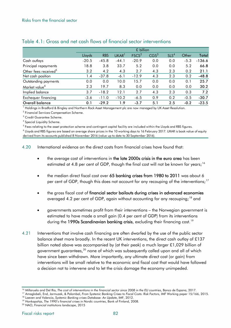
Risks from the financial sector
Table 4.1: Gross and net cash flows of financial sector interventions
Lloyds RBS UKAR1 FSCS2 CGS3 SLS4 Other TotalCash outlays -20.5 -45.8 -44.1 -20.9 0.0 0.0 -5.3 -136.6Principal repayments 18.8 3.8 33.7 5.2 0.0 0.0 5.2 66.8Other fees received5 3.2 4.2 4.3 2.7 4.3 2.3 0.2 21.1Net cash position 1.4 -37.8 -6.1 -12.9 4.3 2.3 0.2 -48.8Outstanding payments 0.0 0.0 10.0 15.7 0.0 0.0 0.1 25.7
Market value6 2.3 19.7 8.3 0.0 0.0 0.0 0.0 30.2Implied balance 3.7 -18.2 12.1 2.7 4.3 2.3 0.3 7.2Exchequer financing -3.6 -11.0 -10.2 -6.5 0.9 0.2 -0.5 -30.7Overall balance 0.1 -29.2 1.9 -3.7 5.1 2.5 -0.2 -23.5
4 Special Liquidity Scheme.5 Fees relating to the asset protection scheme and contingent capital facility are included within the Lloyds and RBS figures.6 Lloyds and RBS figures are based on average share prices in the 10 working days to 16 February 2017. UKAR is book value of equity derived from its accounts published 8 November 2016 (value up to date to 30 September 2016).
£ billion
1 Holdings in Bradford & Bingley and Northern Rock Asset Management plc are now managed by UK Asset Resolution.2 Financial Services Compensation Scheme.3 Credit Guarantee Scheme.
4.20 International evidence on the direct costs from financial crises have found that:
• the average cost of interventions in the late 2000s crisis in the euro area has been estimated at 4.8 per cent of GDP, though the final cost will not be known for years;16
• the median direct fiscal cost over 65 banking crises from 1980 to 2011 was about 6 per cent of GDP, though this does not account for any recouping of the interventions;17
• the gross fiscal cost of financial sector bailouts during crises in advanced economies averaged 4.2 per cent of GDP, again without accounting for any recouping;18 and
• governments sometimes profit from their interventions – the Norwegian government is estimated to have made a small gain (0.4 per cent of GDP) from its interventions during the 1990s Scandinavian banking crisis, excluding their financing cost.19
4.21 Interventions that involve cash financing are often dwarfed by the use of the public sector balance sheet more broadly. In the recent UK interventions, the direct cash outlay of £137 billion noted above was accompanied by (at their peak) a much larger £1,029 billion of government guarantees,20 none of which was subsequently called upon and all of which have since been withdrawn. More importantly, any ultimate direct cost (or gain) from interventions will be small relative to the economic and fiscal cost that would have followed a decision not to intervene and to let the crisis damage the economy unimpeded.
16 Millaruelo and Del Rio, The cost of interventions in the financial sector since 2008 in the EU countries, Banco de Espana, 2017. 17 Amaglobeli, End, Jarmuzek, & Palombal, From Systemic Banking Crises to Fiscal Costs: Risk Factors, IMF Working paper 15/166, 2015. 18 Laeven and Valencia, Systemic Banking crises Database: An Update, IMF, 2012. 19 Honkapohja, The 1990’s financial crises in Nordic countries, Bank of Finland, 2008. 20 NAO, Financial institutions landscape, 2015
Fiscal risks report 82
Risks from the financial sector
Indirect costs
4.22 The indirect fiscal costs of financial crises are those that reflect their impact on the economy. In September 2014, we published a working paper that looked in detail at the differences between the March 2008 Budget forecast produced by the Treasury just before the worst of the financial crisis and recession took hold and what actually transpired.21 This provides a useful benchmark for the effect on the public finances of a large multi-dimensional shock, as the economy fell into a deep recession, house prices fell sharply and the government stepped in to restore stability to the financial system.22
4.23 We summarise these indirect costs in Chapter 9, where we compare them to the results of our fiscal stress test. But the main elements were:
• Public sector net debt was around £450 billion or 35 per cent of GDP higher than expected by 2012-13, the final year of the Budget 2008 forecast horizon; and
• There was a substantial deterioration in the underlying budget deficit during the recession of around 7 per cent of GDP, which was subsequently offset by the fiscal consolidation programme. Fiscal stimulus measures and direct support for the financial sector accounted for only a small share of the initial deterioration.
Risks in the UK financial sector today
Reform of the regulatory framework
4.24 Since the financial crisis, successive governments have taken steps to reduce the level of risk from the financial sector. Thanks to regulation and firms’ own actions, including efforts to increase capital buffers, the probability of a systematically important institution collapsing has diminished in the eyes of the Bank of England’s Financial Policy Committee and other expert observers, while the likely impact is also seen to be smaller if one did. Box 4.1 sets out the new regulatory regime and the government’s stated policy.
21 Riley and Chote, Crisis and consolidation in the public finances, OBR Working Paper No.7, 2014. 22 For a summary of the GDP effect of financial crises see also Brooke, Bush, Edwards, Ellis, Francis, Harimohan, Neiss and Siegert, Measuring the macroeconomic costs and benefits of higher UK bank capital requirements, Financial Stability Paper No. 35, 2015.
83 Fiscal risks report

Risks from the financial sector
Box 4.1: The Government’s regulatory response to the financial crisis
Since the financial crisis, the UK has reformed its regulation of the financial system. One aspect has been the creation of the Financial Policy Committee (FPC). This has primary responsibility for identifying, monitoring and mitigating risks to financial stability, with the aim of ensuring that regulators take a holistic approach to safeguarding financial stability. UK banks have continued to build up capital resources since the financial crisis, more than doubling their risk-weighted capital ratios. At an aggregate level, these are now in line with the levels judged appropriate by the FPC for the UK banking system to withstand potential losses.
The Bank of England also conducts annual stress tests of the banking system to ensure that banks can withstand periods of severe stress. In 2016, the FPC judged that “the banking system is in aggregate capitalised to support the real economy in a severe, broad and synchronised stress scenario”.a This scenario included a severe, synchronised UK and global recession with associated shocks to financial market prices and an independent stress of misconduct costs. This year will be the first that the Bank also runs an ‘exploratory’ scenario to complement the annual cyclical scenario. The aim of the biennial exploratory scenario will be to probe the resilience of the system to risks that may not be neatly linked to the financial cycle.
The UK has carried out reforms aiming to ensure that, in the event that a bank does fail, it can be managed in a way that protects the wider economy and financial sector. Resolution is the process by which the authorities can intervene to manage the failure of a firm in a manner other than allowing it to fall into a disorderly insolvency. In particular, the UK has:
• Implemented a comprehensive bank resolution regime: The UK’s ‘special resolution regime’ provides the authorities with tools to manage the failure of financial sector firms. This includes powers for the Bank of England to ‘bail-in’ shareholders and creditors of failed banks. The bail-in tool can be used to absorb the losses of a failed firm and to recapitalise the firm using the firm’s own resources. In recent years, UK banks have issued substantial amounts of loss-absorbing debt instruments suitable for this purpose.
• Passed the Financial Services (Banking Reform) Act 2013: this requires the largest UK banks to separate core retail banking services from their investment banking activities by 2019 (known as ring-fencing). These reforms enable the resolution authority to resolve retail and investment banking activities separately if required, ensuring that core retail banking services can be treated separately from the large balance sheets that support investment banking activities.
a Bank of England, Stress testing the UK banking system: 2016 results, 2016.
Fiscal risks report 84

Risks from the financial sector
Evidence of financial system related fiscal risk
4.25 Despite regulatory developments and better capitalised institutions, the UK financial sector remains an important potential source of fiscal risk because it is still large. For example:
• The banking system is highly concentrated in a relatively small number of banks, commonly referred to as the ‘big 4’ (RBS, Lloyds, HSBC and Barclays), which account for more than 85 per cent of business current accounts and 90 per cent of business loans.23 The higher the degree of concentration, the greater the proportion of assets that are in institutions that are systemically significant, and the greater the risk that the government will need to step in if one or more of them were to get into trouble. Firm-level analysis published by the Bank of England suggests that the probability of a bank receiving public assistance increases with its size relative to the banking system.24
• The size of the financial sector (as measured by total assets relative to GDP) is, as would be expected, a factor that increases the direct fiscal costs of financial crises. This also applies when looking at leverage ratios in the financial and non-financial sectors.25 That said, one study has suggested that it was not banking system size per se that would have helped to predict which countries suffered a crisis, but other factors including credit booms and capital resilience.26
4.26 There is also evidence that the financial sector has become more important in determining the markets’ perception of a country’s vulnerability to fiscal crises:
• countries with large banking systems, especially those with low capital ratios, tend to experience a greater widening in government bond yields relative to those of the safest governments when aggregate risk increases;27 and
• the vulnerability of domestic banks, measured by the relative size of the financial sector equity index, is an important driver of government bond spreads and this relationship tends to be stronger for countries with high debt-to-GDP ratios.28
Indicators of financial crisis vulnerability
4.27 The Bank of England has argued that the vulnerability of the UK financial sector has declined since the financial crisis and that the sector has become less risky. The Governor of the Bank, in a statement following the EU referendum, said that: “The capital requirements of our largest banks are now ten times higher than before the crisis...This substantial capital and huge liquidity gives banks the flexibility they need to continue to lend to UK businesses and households, even during challenging times.”
23 Financial Conduct Authority, Competition report 2013-16, 2016. 24 Rose and Wieladek, Too big to fail: some empirical evidence on the causes and consequences of public banking interventions in the United Kingdom, Bank of England Working paper No.460, 2012. 25 Amaglobeli, End, Jarmuzek & Palomba, From Systemic Banking Crises to Fiscal Costs: Risk Factors, IMF Working Paper 15/166, 2015. 26 Bush, Knott and Peacock, Why is the UK banking system so big and is that a problem?, Bank of England Quarterly Bulletin Q4, 2014. 27 Gerlach, Schulz and Wolff, Banking and Sovereign Risk in the euro area, Session: Macroeconomics of Banking, No. G12-V3, 2010. 28 Mody and Sandri, The Eurozone Crisis: how banks and sovereigns came to be joined at the hip, IMF Working Paper 11/269, 2011.
85 Fiscal risks report

Risks from the financial sector
4.28 The FPC remains cautious, stating in its June 2017 Financial Stability Report that it assessed “the overall risks from the domestic environment to be at a standard level: most financial stability indicators are neither particularly elevated nor subdued.”
4.29 The FPC’s judgement is consistent with a variety of indicators that are commonly used to assess the degree of vulnerability to a financial crisis over the medium term, including:
• the suite of economic and financial indicators of financial stability used by the FPC itself that track the level of risk to the financial system over time and compare it with historical peaks and troughs;
• a measure of the implied probability of default for the UK sovereign and major banks, based on credit default swap (CDS) premia; and
• a measure of implied government contingent liability that reflects the presence or otherwise of the too-big-to-fail problem.
The FPC’s vulnerability indicators
4.30 The FPC has put forward a scorecard of economic and financial indicators to help assess the vulnerability of the UK financial sector. Table 4.2 shows the capital ratio (a measure of a banks’ core capital measured against their risk-weighted assets) and the leverage ratio (a measure of banks’ capital against their total unweighted assets). In the lead-up to the financial crisis, both fell significantly. Since then, policy has focused on raising them – the capital ratio has risen from 6.2 per cent in 2006 to 13.9 per cent as of June 2017. While higher capital ratios are not a failsafe signal of a banking system’s health, the improvement does suggest that the financial sector has become more resilient and, in the event of a failure, higher capital ratios elsewhere should reduce the potential fallout.
4.31 Despite significant improvements in capital and leverage positions, there remain important sources of vulnerability in the financial system. For example, the household debt to income ratio, which peaked at around 150 per cent in the run-up to the crisis before falling back, remains above its historical average at 135 per cent and has recently started to increase again (as discussed in Chapter 3).
Table 4.2: FPC indicators of financial system vulnerability
Per centAverage Average Minimum Maximum Value (one Latest value
(2000-07) (2011-16) since 1987 since 1987 year ago) (16 June)Bank balance sheet stretch
Capital ratioBasel II core Tier 1 6.5 - 6.1 12.3 - -Basel III common equity Tier 1 - 11.2 - - 12.3 13.9
Leverage ratioSimple 4.6 5.8 2.9 6.6 6.6 6.6Basel III (2014 proposal) - - - - 4.9 4.9
Non-bank balance sheet stretchHousehold debt to income ratio 122.5 133.5 78.2 150.5 132.2 135.0
Fiscal risks report 86

Risks from the financial sector
Sovereign CDS premia
4.32 CDS premia provide a measure of the probability of banks defaulting. Chart 4.4 tracks premia for the UK sovereign and four major UK banks (Lloyds, RBS, Santander and Barclays). There was a notable increase at the height of the European debt crises in 2011 and 2012, but premia have subsequently declined. This has been accompanied by a gradual reduction in the correlation between the sovereign and the banks, suggesting that the new regulatory regime has helped to reduce perceptions that bank failures would increase the risk of sovereign default. That said, given the very low probability that the UK – which borrows primarily in its own currency – would default on its debt, the strength of the signal to be taken from these indicators is limited.
Chart 4.4: Sovereign and UK banks CDS premia
0
50
100
150
200
250
300
350
400
2008 2009 2010 2011 2012 2013 2014 2015 2016
Basi
s po
ints
Average of four major banks (RBS, Lloyds, Santander, Barclays)
UK sovereign
Source: Datastream
Implicit government contingent liability
4.33 The fiscal risk from a systemic banking crisis can be illustrated by estimating the size of the implicit contingent liability created by the expectation of government support for institutions whose failure would have systemic implications. Economists have tried to quantify this by estimating how much more cheaply banks that are assumed to enjoy implicit government backing can borrow than other banks that do not enjoy such backing. This requires assumptions about which group a bank falls in, which can be based on size or on the judgements of credit rating agencies. The resulting estimates are naturally subject to considerable uncertainty. That said, recent studies do suggest that, whatever the scale of the liability, it appears to have fallen since the crisis. This may reflect the introduction of resolution tools that have reduced creditors’ expectations of being bailed out in bad times.
87 Fiscal risks report
Risks from the financial sector
4.34 A recent paper by the Bank of England provides an overview of the various methodologies used to estimate the funding advantage, and their limitations. Previous estimates of the perceived subsidy in the UK suggested a potential peak of around £100 billion in 2009,29 while more recent estimates put the figure at less than £5 billion in 2016.30 These estimates do not tell us how much money the government might have to find in the event of a systemic crisis, but they do suggest that the extent of fiscal risk has reduced. That said, the estimated level of subsidy has returned only to levels comparable to those seen in the pre-crisis period, which of course did not prove a good indicator of what was to follow.
Indicators of sovereign-banking sector feedback
4.35 The global financial crisis highlighted the potential for adverse feedback between the sovereign and the banking sector – the so-called ‘doom loop’ – that could be of particular concern for the UK given the large size of its financial sector:31
• From the sovereign to banks: An increase in sovereign risk could raise bank funding costs and even see funds become impossible to raise. There are several possible transmission channels, including a fall in the market value of banks’ holdings of sovereign debt and a deterioration in the perceived ability or willingness of the sovereign to support the banking sector. There is strong empirical evidence in support of this relationship in periods of financial stress and when domestic banks exhibit strong ‘home bias’, with large exposures to their own sovereign.32
• From banks to the sovereign: The state of the banking system can influence sovereign credit risk via the direct and indirect impact of a banking crisis on the sustainability of the fiscal position. Banking crises can prompt sovereign debt crises by contributing to a sharp decline in tax revenues and large increases in government spending.33 As recent European experience shows, a vicious circle can emerge between the sovereign and the banking sector. This is likely to be particularly dangerous for countries with large and more fragile banking sectors and with high debt-to-GDP ratios, especially during periods of financial stress when investors discriminate more than in ‘normal’ times.
Other risks from the financial sector
4.36 The measures of risk discussed above assume that the build-up to future financial crises will look like the build-up to past ones. But factors other than those leading to conventional financial crises can also generate risk in the financial sector.
Brexit
4.37 Brexit could have significant effects on the risks emanating from the financial sector, quite possibly in both directions. The size and concentration of the financial sector could be
29 Noss and Sowerbutts, The implicit subsidy of banks, Bank of England Financial stability paper No.15, 2012. 30 Written evidence submitted by the Bank of England in response to the Treasury committee’s inquiry into capital, April 2017. 31 For further discussion of these channels, see also BIS, The impact of sovereign credit risk on bank funding conditions, CGFS 43, 2011. 32 See Acharya, Drechsler and Schnabl, A tale of two overhangs: the nexus of financial sector and sovereign credit risks, Banque de France Financial Stability Review, No. 16, April 2012. 33 See Reinhart and Rogoff, The Aftermath of Financial Crises, NBER working paper No. 14656, 2009.
Fiscal risks report 88
Risks from the financial sector
reduced if greater barriers emerge between the EU and UK financial systems, reducing risk in the sector. In addition, less cross-border connectivity could reduce the scope for contagion. Conversely, greater barriers and a smaller financial sector would increase other types of fiscal risk, as future tax receipts from the financial sector would be lower than would otherwise have been the case. Since the referendum, a number of financial institutions have announced plans to move parts of their operations to the EU because of Brexit. Estimates have suggested that, depending on the form that Brexit takes, UK job losses could range from around 3,000 to over 60,000.34
4.38 The FPC has judged that there are several implications for the resilience of the financial system from Brexit. For example, it highlighted that “there are a range of possible outcomes for, and paths to, the United Kingdom’s withdrawal from the European Union”, noting a number of possible financial stability implications, namely “the flow of new banking and insurance services could be disrupted…there could also be material dislocation of some services supplied from the United Kingdom to the European Union…fragmentation of market-based finance could result in higher costs and greater risks for both EU and UK.” This fragmentation could “increase the reliance of both the UK and EU economies on their banking systems and reduce the diversification and resilience of finance.” And Brexit “has the potential to affect the economy through supply, demand and exchange rate channels… economic shocks like these would probably depress the exchange rate, putting upward pressure on inflation. The combination of shocks could therefore possibly create a more challenging trade-off for monetary policy.”35
Cyber security
4.39 One growing source of risk to the financial sector comes from threats to cyber security. Cyber-attacks could lead to instability by disrupting the financial system’s key functions as an intermediary in the economy and its role in the payments system. There is also scope for a major cyber theft to hit banks and/or their customers with implications for confidence. This risk is amplified by the growing digitalisation of financial services.
4.40 The Government has taken a number of steps to improve resilience, including creation of the National Cyber Security Centre to provide advice and support to the public and private sectors. The FPC noted in June 2017 that “Cyber-attacks pose a serious threat to the resilience of the UK financial system…Progress has been made in building resilience to cyber-attack, but the risk continues to build and evolve.”
34 Oliver Wyman, The impact of the UK’s exit from the EU on the UK-based financial services sector, 2016. 35 Bank of England, Financial Stability Report, June 2017, Issue No. 41, 2017.
89 Fiscal risks report

Risks from the financial sector
Other risks
4.41 There are many other potential sources of fiscal risk that relate in some way to the financial sector. For example:
• legal costs faced by financial institutions for past misconduct;36
• the risk that regulators may be ‘captured’ by those they supervise;37
• technological change, which, as in all sectors, creates opportunities and threats;38 and
• threats from the global economy, such as exposure to a slowdown in China.39
Risks to our medium-term forecast
4.42 Our March 2017 EFO forecasts assumed that there would be little change in credit conditions given the orientation of macro-prudential policy, and that the financial system would continue on a path of gradual normalisation. We assumed no financial crises over the next five years. But we did note several related vulnerabilities:
• Despite a recent narrowing, the current account deficit remains large by historical standards. This poses a risk if overseas investors’ confidence in the UK economy were to falter for any reason. That could lead to a sharper fall in sterling, forcing the Bank of England to increase interest rates to prevent inflation getting out of control and in the process generating an economic downturn. This would be a similar set of circumstances to those in the stress test scenario that we explore in Chapter 9.
• The persistence of the household deficit, as a result of private consumption growth outpacing income growth in recent years. This could pose a risk if consumption continues to grow faster than incomes, reducing the saving ratio further and thereby further increasing the household debt to income ratio, a key vulnerability indicator.
• Leading up to and following the UK’s exit from the EU, policies will evolve to replace those associated with EU membership. These policies, and the response of households and businesses to them, are subject to great uncertainty and there is little by way of precedent on which to base any forecast assumptions. This is of particular importance for the financial sector, with crucial policies around the sector’s interaction with the EU remaining uncertain.
4.43 In its June 2017 Financial Stability Report, the Bank highlighted the rapid increase in consumer credit and easing of lending conditions in the mortgage market, uncertainty associated with the possible outcomes of Brexit negotiations, financial vulnerabilities in China and the downside risks that are implied by very low long-term interest rates.
36 Bank of England, Stress testing the UK banking system: 2016 results, 2016. 37 Warwick commission on international financial reform, Chapter 5: regulatory capture, 2009. 38 Starks, Disruptive innovation in financial markets, Financial Conduct Authority speech, 2015. 39 Bank of England, Financial Stability Report, November 2016, Issue No. 40, 2016.
Fiscal risks report 90
Risks from the financial sector
4.44 While financial stability risks appear low, there remain important revenue risks associated with the taxation of financial sector companies and their employees. Reliance on the financial sector for revenues remains significant (see paragraph 4.7). Our medium-term forecast takes some account of the prospect for weaker earnings growth at the top of the earnings distribution, lower bonus growth and weaker financial sector profits due to Brexit. But clearly these broad-brush adjustments are subject to significant uncertainty. A more severe Brexit impact or ‘no deal’ scenario could have bigger negative effects. Leaving aside the additional uncertainty created by Brexit, forecasts of financial sector bonuses, profits and the effects of sector-specific policy measures are always subject to great uncertainty.
4.45 On the basis of the FPC’s judgement, we see a low, but not very low, risk of the financial sector experiencing another crisis in the medium term. We see a medium risk of a more gradual loss of receipts due to the sector faring worse than is implicit in our latest forecast.
Risks to fiscal sustainability
4.46 In our Fiscal sustainability reports (FSR), our fiscal projections do not incorporate any effects from future recessions or financial crises. In Chapter 3 we noted the near certainty of one or more recessions occurring sometime in the next 50 years. Financial crises are less frequent than recessions – and ones like the 2007-09 crisis are rarer still – but history suggests that the likelihood of another significant crisis in the next 50 years is still fairly high.
4.47 Based on the ICB’s estimated probabilities (paragraph 4.15), we might expect the UK to suffer a financial crisis around once in every 20 years. One crisis per generation would be consistent with the regulatory ebbs and flows described in paragraph 4.12 and the fact that suppressing risk in one part of the system often simply displaces it to some other part where regulation is less stringent. Tighter regulation and the actions taken by financial institutions have reduced the risk of further crises, but not eliminated it. But a future crisis need not be as large as the last one: the IMF database of crises suggests that the fiscal costs can vary considerably – from less than 5 to more than 50 per cent of GDP.
4.48 In our FSRs, we estimate the decade-by-decade fiscal tightening needed to achieve a chosen debt-to-GDP ratio in a given year, a measure known as a ‘fiscal gap’. In our 2017 FSR, we estimated that to achieve a 40 per cent debt-to-GDP ratio in 2066-67, the Government would require a series of tax increases or spending cuts worth an additional 1.5 per cent of GDP each decade. If, in addition, we assume that a financial crisis hits the economy every 20 years, adding the median cost of an advanced economy crisis of 21.4 per cent of GDP to debt each time (smaller than the most recent crisis),40 the required decade-by-decade tightening would rise to 1.9 per cent of GDP.
4.49 Given the size of the UK financial sector, the crystallisation of associated contingent liabilities is an important fiscal risk over the long term. History suggests there is a very high probability of at least one crisis in the next 50 years. What is far more difficult to assess is
40 This includes estimates of direct and indirect costs and is based on the median increase in debt (as a per cent of GDP) resulting from a banking crisis in advanced economies as reported in Laeven and Valencia, Systemic Banking crises Database: An Update, IMF, 2012.
91 Fiscal risks report

Risks from the financial sector
the likely impact of any crises. That will depend on how regulation and the other risks discussed in this chapter evolve. As with the medium term, we consider there to be a medium risk of a gradual loss of revenue from the tax-rich financial sector over the longer term.
Conclusions
4.50 The financial sector is a source of fiscal risk in all economies, and a relatively large one in the UK. Financial crises are fiscally costly. Regulation has been tightened since the crisis, but credit-related vulnerabilities remain. And Brexit and cyber-security represent new sources of risk. The risk of a crisis is not the only fiscal risk emanating from the financial sector: its firms are relatively highly taxed (thanks to restrictions on the use of losses and a surcharge on profits) and its employees are too (thanks to their high average pay and bonuses) so that reliance on the financial sector for tax receipts remains significant.
4.51 In terms of the characteristics set out in Chapter 1, financial crises are a prime example of sudden shocks that are closely correlated with many other sources of fiscal risk. This can be because the crisis causes other risks to crystallise (e.g. the associated shock to confidence and credit availability pushing the economy into recession) or because the ultimate cause of the crisis is the cause of other problems (e.g. if subnational layers of government get involved in pre-crisis property or financial market speculation and those investments turn bad). These shocks can be endogenous or exogenous to government action, and are typically a combination of the two, for example with government bearing responsibility for pre-crisis regulation that establishes the incentive structure within which investors, lenders and borrowers act, but not for every action that is taken by banks and their customers. The risks that come from the financial sector being tax-rich are likely to take hold more slowly. They could again be the result of government action or other factors.
For the Government response
4.52 In this chapter we have highlighted a number of issues that the Government is likely to wish to consider when managing its fiscal risks. Among them:
• Cross-country evidence on the frequency of crises and their fiscal cost;
• The tendency for post-crisis tightening of regulation to be loosened over time;
• The comparatively large and highly concentrated UK banking system;
• Potential effects of Brexit on the financial sector and the tax receipts it generates; and
• The growing risk posed by threats to cyber security.
4.53 When assessing financial stability and its interaction with fiscal risk over the medium and long term, does the Government regard these or other issues as important for its risk management strategy and, if so, how does it intend to address them?
Fiscal risks report 92
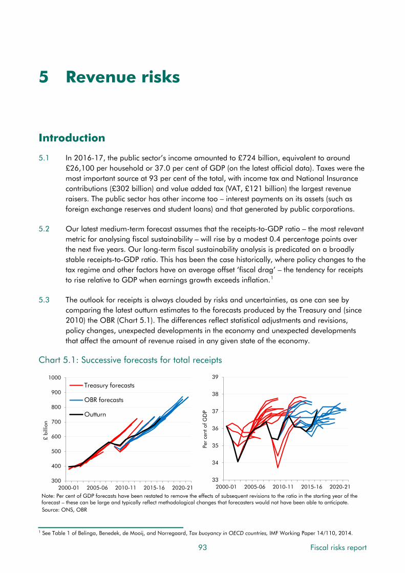
5 Revenue risks
Introduction
5.1 In 2016-17, the public sector’s income amounted to £724 billion, equivalent to around £26,100 per household or 37.0 per cent of GDP (on the latest official data). Taxes were the most important source at 93 per cent of the total, with income tax and National Insurance contributions (£302 billion) and value added tax (VAT, £121 billion) the largest revenue raisers. The public sector has other income too – interest payments on its assets (such as foreign exchange reserves and student loans) and that generated by public corporations.
5.2 Our latest medium-term forecast assumes that the receipts-to-GDP ratio – the most relevant metric for analysing fiscal sustainability – will rise by a modest 0.4 percentage points over the next five years. Our long-term fiscal sustainability analysis is predicated on a broadly stable receipts-to-GDP ratio. This has been the case historically, where policy changes to the tax regime and other factors have on average offset ‘fiscal drag’ – the tendency for receipts to rise relative to GDP when earnings growth exceeds inflation.1
5.3 The outlook for receipts is always clouded by risks and uncertainties, as one can see by comparing the latest outturn estimates to the forecasts produced by the Treasury and (since 2010) the OBR (Chart 5.1). The differences reflect statistical adjustments and revisions, policy changes, unexpected developments in the economy and unexpected developments that affect the amount of revenue raised in any given state of the economy.
Chart 5.1: Successive forecasts for total receipts
1 See Table 1 of Belinga, Benedek, de Mooij, and Norregaard, Tax buoyancy in OECD countries, IMF Working Paper 14/110, 2014.
300
400
500
600
700
800
900
1000
2000-01 2005-06 2010-11 2015-16 2020-21
£ bi
llion
Treasury forecasts
OBR forecasts
Outturn
33
34
35
36
37
38
39
2000-01 2005-06 2010-11 2015-16 2020-21
Per
cent
of G
DP
Note: Per cent of GDP forecasts have been restated to remove the effects of subsequent revisions to the ratio in the starting year of the forecast – these can be large and typically reflect methodological changes that forecasters would not have been able to anticipate.Source: ONS, OBR
93 Fiscal risks report

Revenue risks
5.4 Looking over a two-year horizon, the differences between our forecasts since 2010 and subsequent revenue outturns have been spread across a number of taxes, but dominated by weaker-than-expected income tax and NICs (Chart 5.2). This is the result of productivity-related weakness in earnings growth, but also a lower-than-expected effective tax rate on earnings that is likely to reflect changes in the earnings distribution (including among the self-employed) and subsequent policy changes (e.g. to the income tax personal allowance).
Chart 5.2: Two-year ahead forecast differences from successive OBR forecasts
-50
-40
-30
-20
-10
0
10
20
30
40
50
Jun 10 Nov 10 Mar 11 Nov 11 Mar 12 Dec 12 Mar 13 Dec 13 Mar 14 Dec 14 Mar 15 Jul 15
£ bi
llion
OtherStamp duty land tax (ex. LBTT)Fuel dutyOil and gas (cash)VATOnshore CT (cash)Income tax and NICsTotal receipts
Note: For comparability, 'in-year' is assumed to be 2009-10 and 2014-15 for the June 2010 and July 2015 forecasts respectively.Forecast errors have been adjusted for major classification changes. Source: ONS, OBR
5.5 There are many potential risks to revenues. Since most receipts are in some way related to the state of the economy, the biggest relate to the macroeconomic and financial sector risks described in Chapters 3 and 4. But there are others that could affect the receipts-to-GDP ratio in any given state of the economy. These can arise from two sources:
• changes in the composition of GDP can lead to specific tax bases growing more or less quickly than the economy as a whole; and
• changes in the effective tax rate paid on each tax base due to policy or other factors.
5.6 There are risks of varying sizes to all the lines of our receipts forecast. This chapter explores some of the bigger ones that we consider relevant in any given state of the economy or that may interact with the economy-driven risks described in Chapters 3 and 4. They include:
• loss of revenue from behavioural and technological changes, such as rising fuel efficiency and the declining trend in smoking;
• risks associated with the UK oil and gas industry, including depletion of the tax base and future costs associated with decommissioning;
Fiscal risks report 94
Revenue risks
• avoidance, evasion and other forms of non-compliance and the assumptions – explicit or implicit – that we make about them in our forecasts and long-term projections;
• falling effective tax rates from changing employment patterns, in particular the shift from employee status to self-employment, and from both forms of employment into incorporated businesses;
• policy-related risks, including non-implementation of announced policy (e.g. fuel duty increases), commitments or aspirations yet to be included in Budgets and Autumn Statements (e.g. raising the personal allowance to £12,500 and the higher rate threshold to £50,000 by 2020) and reliance on the relatively uncertain yield from anti-avoidance and operational measures to meet the relatively certain cost of tax cuts; and
• the concentration of tax receipts at the top of various distributions and in specific sectors, and the resulting sensitivity that creates to other risks.
Risks from behavioural or technological change
5.7 In previous Fiscal sustainability reports (FSR) we have discussed a number of long-term trends that pose downside risks to the tax-to-GDP ratio. For this report, we have updated our analysis of two taxes with consistently declining tax bases: fuel duties (due to increased vehicle efficiency) and tobacco duty (due to reduced prevalence of smoking). We discuss a number of other trends at a more summary level.
Fuel duties
5.8 Fuel duty is forecast to raise £27.5 billion (1.4 per cent of GDP) in 2017-18. It is charged on a pence per litre basis, so receipts are driven by demand for fuel (which reflects total distance travelled and the amount of fuel needed to travel that distance – i.e. fuel efficiency) and by the duty rate. This section considers the mostly long-term risks around fuel efficiency. We discuss medium-term risks from decisions on the duty rate from paragraph 5.84.
5.9 Over recent decades there has been a marked improvement in vehicle fuel efficiency, with average new car CO2 emissions falling by 37 per cent since 1997.2 This reflects improvements in engine technology, a shift to lighter cars with more compact engines, and more recently the rising popularity of alternatively fuelled vehicles (AFVs).
5.10 Since 2009, EU-wide mandatory emission reduction targets have prompted manufacturers to produce more fuel efficient cars. UK Government policy has also contributed: the car scrappage scheme in 2009 and the plug-in car grant scheme since 2011 both encouraged the replacement of older vehicles by newer, more efficient, ones. New car efficiencies play a key part in the UK Government’s carbon budgets, which extend to 2032, so Brexit is unlikely to affect the role of emissions targets unless the carbon budgets themselves are revisited.
2 SMMT, New car CO2 report 2017, 2017.
95 Fiscal risks report

Revenue risks
5.11 The proportion of AFVs in total new car sales has risen from 1.1 per cent in 2010 to 3.3 per cent in 2016 (Chart 5.3). Greater availability of electric vehicles and improvements in battery density and costs are expected to raise this further, while the reduction in the generosity of the plug-in grant scheme that came into effect in March 2016 may partly offset this. The effect of this rising trend on average vehicle efficiency across the entire stock of vehicles will take time to feed through, since the average lifetime of a vehicle is around 14 years.3 In 2016, AFVs made up 1.2 per cent of the UK car stock.
Chart 5.3: Sales of alternatively fuelled vehicles
0.0
0.5
1.0
1.5
2.0
2.5
3.0
3.5
2010 2011 2012 2013 2014 2015 2016
Per
cent
of t
otal
new
car
sal
es
Diesel/electric hybrid
Pure electric
Other electric (Plug-in hybrid/range-extender)
Petrol/electric hybrid
Source: SMMT
Risks to our medium-term forecast
5.12 Our latest medium-term forecast is that fuel duty receipts move from £27.9 billion (1.43 per cent of GDP) in 2016-17 to £30.0 billion (1.28 per cent) in 2021-22. The rise in cash receipts is more than explained by assumed rises in the duty rate. Clearances – the volume of fuel on which duty is paid – are expected to fall by 5.0 per cent between 2016-17 and 2021-22. We expect distances travelled to rise, thanks to economic growth, but this is more than offset by further gains in fuel efficiency. Our central forecast assumes that clearances-per-mile driven fall by 2.5 per cent a year on average over the five years.
5.13 There are therefore three sources of downside risk to our medium-term forecast for fuel clearances, each of which could be affected by a large number of underlying factors:
• Weaker GDP growth: with the relationship between miles driven and GDP unchanged from our central assumption, a 1 percentage point shortfall in GDP growth in 2018-19 would reduce clearances by around 0.2 per cent and receipts by £65 million.
3 SMMT, 2017 UK Automotive sustainability report, 2017
Fiscal risks report 96
Revenue risks
• Fewer miles driven per unit of economic activity: one factor supporting miles driven has been light goods vehicle (LGV) traffic, which has risen around 20 per cent in the past five years.4 This probably reflects growth in online shopping deliveries. A reversal in that trend could mean that even if GDP growth comes in as forecast, there might be fewer miles being driven than we assume. 1 per cent fewer miles driven in 2018-19 would reduce clearances by precisely 1 per cent and receipts by £280 million.
• Faster rises in fuel efficiency: if clearances-per-mile driven fell 1 per cent in 2018-19, it would reduce clearances by fractionally under 1 per cent and receipts by £250 million. Compared to incremental improvements in existing technology, a breakthrough in battery technology could produce a much sharper decline in clearances.
Risks to fiscal sustainability
5.14 Over the long term, fuel efficiency trends pose some risk to the broadly stable receipts-to-GDP ratio that underpins our analysis of fiscal sustainability. We consider two long-term scenarios, both of which are based on the following assumptions:
• no changes to our medium-term forecast for the years up to 2021-22;
• fuel duty rates thereafter increased each year in line with RPI inflation;5 and
• oil prices flat in real terms, so rising by 2.0 per cent a year in nominal terms.
5.15 Chart 5.4 shows the alternative efficiency assumptions that we examine, and the outlook for fuel duty receipts under them:
• the less fuel efficient scenario assumes that new car fuel efficiency will continue to improve in line with recent trends, reaching 95gCO2/km in 2030 – around 73 miles per gallon; and
• the more fuel efficient scenario is consistent with the Committee on Climate Change recommendation that new car efficiency reaches 50gCO2/km by 2030 – around 139 miles per gallon.
4 Department for Transport, Provisional Road Traffic Estimates: Great Britain April 2016 – March 2017, May 2017. 5 For simplicity in these projections, we have used our steady-state RPI inflation assumption of 3.0 per cent a year for all years from 2022-23 onwards. In our 2017 FSR, we assumed there would be a period of higher RPI inflation consistent with our assumption for the period over which interest rates normalise (raising the mortgage interest payments component of RPI inflation).
97 Fiscal risks report
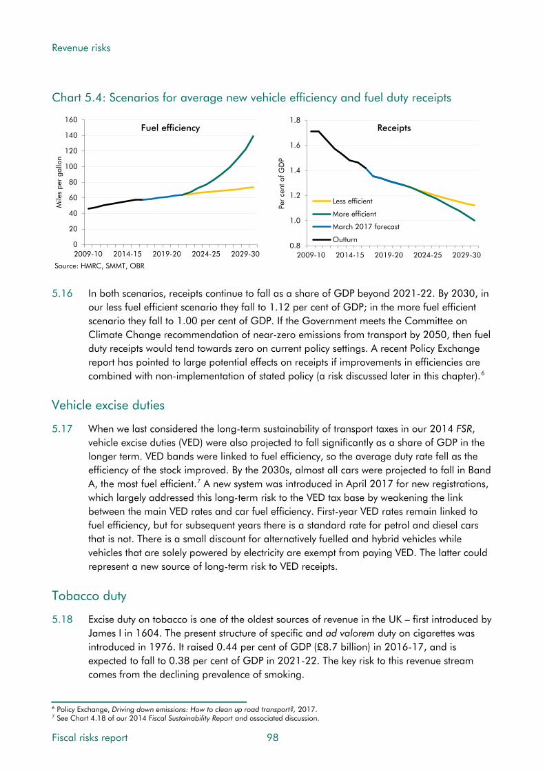
Revenue risks
Chart 5.4: Scenarios for average new vehicle efficiency and fuel duty receipts
0
20
40
60
80
100
120
140
160
2009-10 2014-15 2019-20 2024-25 2029-30
Mile
s pe
r ga
llon
Source: HMRC, SMMT, OBR
Fuel efficiency
0.8
1.0
1.2
1.4
1.6
1.8
2009-10 2014-15 2019-20 2024-25 2029-30
Per
cent
of G
DP
Less efficient
More efficient
March 2017 forecast
Outturn
Receipts
5.16 In both scenarios, receipts continue to fall as a share of GDP beyond 2021-22. By 2030, in
our less fuel efficient scenario they fall to 1.12 per cent of GDP; in the more fuel efficient scenario they fall to 1.00 per cent of GDP. If the Government meets the Committee on Climate Change recommendation of near-zero emissions from transport by 2050, then fuel duty receipts would tend towards zero on current policy settings. A recent Policy Exchange report has pointed to large potential effects on receipts if improvements in efficiencies are combined with non-implementation of stated policy (a risk discussed later in this chapter).6
Vehicle excise duties
5.17 When we last considered the long-term sustainability of transport taxes in our 2014 FSR, vehicle excise duties (VED) were also projected to fall significantly as a share of GDP in the longer term. VED bands were linked to fuel efficiency, so the average duty rate fell as the efficiency of the stock improved. By the 2030s, almost all cars were projected to fall in Band A, the most fuel efficient.7 A new system was introduced in April 2017 for new registrations, which largely addressed this long-term risk to the VED tax base by weakening the link between the main VED rates and car fuel efficiency. First-year VED rates remain linked to fuel efficiency, but for subsequent years there is a standard rate for petrol and diesel cars that is not. There is a small discount for alternatively fuelled and hybrid vehicles while vehicles that are solely powered by electricity are exempt from paying VED. The latter could represent a new source of long-term risk to VED receipts.
Tobacco duty
5.18 Excise duty on tobacco is one of the oldest sources of revenue in the UK – first introduced by James I in 1604. The present structure of specific and ad valorem duty on cigarettes was introduced in 1976. It raised 0.44 per cent of GDP (£8.7 billion) in 2016-17, and is expected to fall to 0.38 per cent of GDP in 2021-22. The key risk to this revenue stream comes from the declining prevalence of smoking.
6 Policy Exchange, Driving down emissions: How to clean up road transport?, 2017. 7 See Chart 4.18 of our 2014 Fiscal Sustainability Report and associated discussion.
Fiscal risks report 98
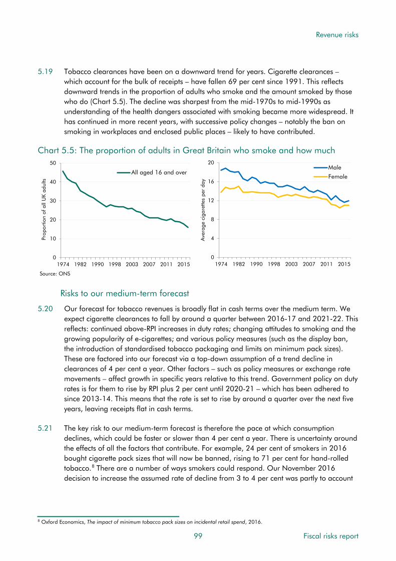
Revenue risks
5.19 Tobacco clearances have been on a downward trend for years. Cigarette clearances – which account for the bulk of receipts – have fallen 69 per cent since 1991. This reflects downward trends in the proportion of adults who smoke and the amount smoked by those who do (Chart 5.5). The decline was sharpest from the mid-1970s to mid-1990s as understanding of the health dangers associated with smoking became more widespread. It has continued in more recent years, with successive policy changes – notably the ban on smoking in workplaces and enclosed public places – likely to have contributed.
Chart 5.5: The proportion of adults in Great Britain who smoke and how much
0
10
20
30
40
50
1974 1982 1990 1998 2003 2007 2011 2015
All aged 16 and over
Prop
ortio
n of
all
UK
adul
ts
Source: ONS
0
4
8
12
16
20
1974 1982 1990 1998 2003 2007 2011 2015
Ave
rage
cig
aret
tes
per
day
Male
Female
Risks to our medium-term forecast
5.20 Our forecast for tobacco revenues is broadly flat in cash terms over the medium term. We expect cigarette clearances to fall by around a quarter between 2016-17 and 2021-22. This reflects: continued above-RPI increases in duty rates; changing attitudes to smoking and the growing popularity of e-cigarettes; and various policy measures (such as the display ban, the introduction of standardised tobacco packaging and limits on minimum pack sizes). These are factored into our forecast via a top-down assumption of a trend decline in clearances of 4 per cent a year. Other factors – such as policy measures or exchange rate movements – affect growth in specific years relative to this trend. Government policy on duty rates is for them to rise by RPI plus 2 per cent until 2020-21 – which has been adhered to since 2013-14. This means that the rate is set to rise by around a quarter over the next five years, leaving receipts flat in cash terms.
5.21 The key risk to our medium-term forecast is therefore the pace at which consumption declines, which could be faster or slower than 4 per cent a year. There is uncertainty around the effects of all the factors that contribute. For example, 24 per cent of smokers in 2016 bought cigarette pack sizes that will now be banned, rising to 71 per cent for hand-rolled tobacco.8 There are a number of ways smokers could respond. Our November 2016 decision to increase the assumed rate of decline from 3 to 4 per cent was partly to account
8 Oxford Economics, The impact of minimum tobacco pack sizes on incidental retail spend, 2016.
99 Fiscal risks report

Revenue risks
for the introduction of standardised packaging. If this proves more effective in reducing smoking than is implicit in our forecast, clearances could fall faster than we have assumed.
5.22 If clearances fall 1 percentage point a year faster than assumed over our five-year forecast, receipts would be around £0.4 billion lower in 2021-22.
Risks to fiscal sustainability
5.23 We have modelled the fiscal impact of three scenarios from the end of the medium-term forecast to 2030-31. In each we assume that, from 2022-23 onwards, duty rates rise by our steady-state assumption for RPI inflation of 3 per cent a year. The three scenarios are:
• a 4 per cent a year decline in consumption, in line with our medium-term forecast;
• a less severe 2 per cent a year decline, which could reflect limits on the effectiveness of further anti-smoking regulations; and
• a more severe 6 per cent a year decline, which could reflect stronger cohort effects as younger generations are less likely to smoke at any point in their lives.
5.24 By 2030-31, tobacco duty receipts will be lower as a share of GDP under all three scenarios. In the less severe scenario, they reach 0.28 per cent of GDP; on our central assumption they reach 0.24 per cent; and in the more severe scenario they fall to 0.21 per cent. On this basis, the declining tobacco duty tax base is likely to be a source of pressure on fiscal sustainability in the long term, albeit a relatively small one.
Chart 5.6: Long-term scenarios for tobacco duty receipts
0.0
0.1
0.2
0.3
0.4
0.5
0.6
0.7
2011-12 2013-14 2015-16 2017-18 2019-20 2021-22 2023-24 2025-26 2027-28 2029-30
Per
cent
of G
DP
Less severe
More severe
Central
Source: HMRC, OBR
Fiscal risks report 100
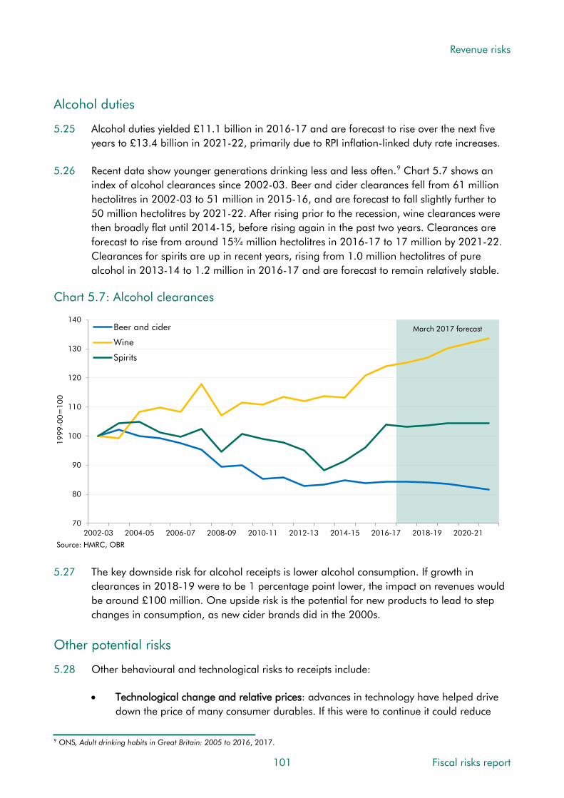
Revenue risks
Alcohol duties
5.25 Alcohol duties yielded £11.1 billion in 2016-17 and are forecast to rise over the next five years to £13.4 billion in 2021-22, primarily due to RPI inflation-linked duty rate increases.
5.26 Recent data show younger generations drinking less and less often.9 Chart 5.7 shows an index of alcohol clearances since 2002-03. Beer and cider clearances fell from 61 million hectolitres in 2002-03 to 51 million in 2015-16, and are forecast to fall slightly further to 50 million hectolitres by 2021-22. After rising prior to the recession, wine clearances were then broadly flat until 2014-15, before rising again in the past two years. Clearances are forecast to rise from around 15¾ million hectolitres in 2016-17 to 17 million by 2021-22. Clearances for spirits are up in recent years, rising from 1.0 million hectolitres of pure alcohol in 2013-14 to 1.2 million in 2016-17 and are forecast to remain relatively stable.
Chart 5.7: Alcohol clearances
March 2017 forecast
70
80
90
100
110
120
130
140
2002-03 2004-05 2006-07 2008-09 2010-11 2012-13 2014-15 2016-17 2018-19 2020-21
1999
-00=
100
Beer and cider
Wine
Spirits
Source: HMRC, OBR
5.27 The key downside risk for alcohol receipts is lower alcohol consumption. If growth in clearances in 2018-19 were to be 1 percentage point lower, the impact on revenues would be around £100 million. One upside risk is the potential for new products to lead to step changes in consumption, as new cider brands did in the 2000s.
Other potential risks
5.28 Other behavioural and technological risks to receipts include:
• Technological change and relative prices: advances in technology have helped drive down the price of many consumer durables. If this were to continue it could reduce
9 ONS, Adult drinking habits in Great Britain: 2005 to 2016, 2017.
101 Fiscal risks report

Revenue risks
VAT revenues, since durables are generally subject to the standard rate. Increasing provision of goods and services via the internet is also likely to put downward pressure on VAT, as it makes collection more difficult with more retailers located offshore.
• Globalisation and the returns on skills: increased specialisation in the world economy and advances in technology have increased the premium on skills and closer integration can increase the mobility of highly skilled labour. Depending whether this leads to an inflow or outflow of labour, the impact on revenues could be positive or negative. Of course, in the current political environment the trend towards greater globalisation and cross-border integration is not irreversible.
• Climate change targets: the UK’s 2008 Climate Change Act and the global 2016 Paris Agreement set targets for emissions. Lower emissions reduce environment revenue streams, such as the carbon price floor and EU emissions trading scheme. These are forecast to raise £1.3 billion in 2017-18, falling to £0.9 billion by 2021-22.
Conclusions
5.29 The long-term declines in the tax bases for fuel duty (due to improvements in vehicle efficiency) and tobacco and alcohol duties (due to declining consumption) pose a fiscal risk. Over the medium term, specific risks such as a 1 per cent shortfall in GDP growth could reduce fuel duties by £65 million in the first year, while if clearances for tobacco and alcohol fell by 1 per cent, receipts would fall by £100 million each in one year. Over the longer term, continued improvements to engine efficiency could result in revenues falling from 1.4 per cent of GDP currently, to around 1 per cent of GDP by 2030. For tobacco duties, declining prevalence of smoking could reduce revenues from 0.4 per cent of GDP currently, to between 0.2 and 0.3 per cent of GDP by 2030. We have also noted the risks of declining alcohol consumption, as well as other technological change, globalisation and climate change targets.
5.30 In terms of some of the characteristics set out in Chapter 1, the long-term risks are gradual and continuous, implying that policy could also respond gradually. However, the point at which this becomes enough of a concern for the Government to change policy is less clear. The risks are largely isolated, as the declining tax bases are not likely to affect other areas of government finances, and generally exogenous, though they can be influenced by policies such as standardised tobacco packaging and the plug-in car grant scheme.
UK oil and gas extraction
5.31 In each FSR we have highlighted the likely long-term decline in oil and gas revenues as a sustainability issue. This reflects gradual exhaustion of the resources remaining within the UK continental shelf, although the path of revenues year to year will depend on volatile prices and temporary factors, like maintenance outages, that affect production. Even with the recent rise in production, related to the high growth in capital expenditure between 2010 and 2013, it has fallen by an average of 5.6 per cent a year since 2000.
Fiscal risks report 102

Revenue risks
Risks to our medium-term forecast
5.32 To a large extent the risk to receipts from production trends has crystallised already, with oil and gas revenues down from £9.6 billion in 2011-12 to minus £0.2 billion in 2015-16, when repayments exceeded payments for the first time. This reflects much lower oil and gas prices and higher tax-deductible capital expenditure (which itself is related to the exhaustion of resources, as those that remain are more expensive to extract). We expect revenues to average £0.9 billion a year over the next five years, based on a market-derived futures price for two years and then an assumption of flat real oil and gas prices. This raises the cash value of production, thus increasing the tax base. The key risks to our medium-term forecast relate to prices and production, the drivers of overall oil and gas sales revenue, and various forms of expenditure, which are deducted to get to taxable income.
Risks to fiscal sustainability
Exhaustion of oil and gas reserves
5.33 Over the longer term, the modelling in our 2015 FSR suggested that even with a ‘high’ oil price (with nominal prices rising to $209 a barrel by 2040), revenues would fall further as a share of GDP. Over the long term, recoverable resources are clearly on a declining path as the basin matures and resources are depleted. But given the very low level of receipts in our medium-term forecast, the scale of this longer-term risk to sustainability is small.
5.34 The potential exploitation of shale oil and gas represents a significant upside risk. Recent work from the British Geological Survey and the Oil and Gas Authority has estimated the volume of shale oil in the Jurassic Weald Basin and shale gas in the Bowland-Hodder Shale Basin, but reliable estimates of commercially recoverable volumes are not yet available. The timing and cost of any potential commercial extraction are also too uncertain at this point to quantify prospective revenues with any confidence. The taxation of profits from shale oil and gas extraction currently falls under the same regime as North Sea profits. Shale producing companies will pay ring-fence corporation tax at 30 per cent and the supplementary charge at 10 per cent. An additional onshore allowance was introduced at Autumn Statement 2013 that exempts from the 10 per cent supplementary charge an amount of profits equal to 75 per cent of the capital expenditure incurred by a company in relation to an onshore site.
Oil and gas field decommissioning
5.35 While risks associated with the tax base have largely crystallised, future repayments associated with decommissioning costs remain a risk. Losses from decommissioning of infrastructure can be carried back and set off against historical profits resulting in a repayment of tax previously paid. Loss carry back for petroleum revenue tax (PRT) is almost indefinite; for corporation tax (CT) decommissioning losses can be carried back to 2002.
5.36 Based upon companies’ survey returns, the Oil and Gas Authority has estimated that the total cost to the industry of decommissioning oil and gas infrastructure will be £59.7 billion
103 Fiscal risks report

Revenue risks
in 2016 prices.10 HMRC has a provision for decommissioning of £6.9 billion in its 2015-16 Accounts. This covers costs out to 2041-42 and only tax repayments of PRT. The overall cost to the Exchequer will be larger given the additional corporation tax effect. Estimates of both the scale and timing of decommissioning costs are very uncertain. The estimate of real costs out to 2040-41(based on survey data from the industry) rose by over £10 billion – around a third – between 2010-11 and 2014-15.
Conclusions
5.37 The downside risk from the gradual exhaustion of the UK’s petroleum resources is a topic we have commented on in all our FSRs, while shale oil and gas represent an as yet unquantified upside risk. A potential greater downside risk is the cost of oil and gas field decommissioning, with HMRC’s provision for profits set off against PRT currently at £6.9 billion for the period out to 2041-42, while the cost including CT would be higher still. These figures are very uncertain and have risen in recent years.
5.38 The risks around oil and gas revenues have largely crystallised, but the costs of decommissioning infrastructure are a continuous risk that will affect revenues as the final costs become more certain. These are isolated risks, as they are not expected to affect other revenue streams, and exogenous, with little government control over their crystallisation.
Non-payment of taxes due
5.39 One important risk to all taxes is that some of those who should pay them do not. That could be for a number of reasons – legal or illegal. As this section shows, the importance of this issue varies across taxes and across time. A related issue is the complexity of the tax system, with each relief or exemption also providing a potential opportunity for taxpayers to structure their affairs to reduce their tax liability.
The tax gap
5.40 HMRC collected £536.8 billion of revenue in 2015-16, falling short of its estimate of “the tax that would be paid if all individuals and companies complied with both the letter of the law and our interpretation of Parliament’s intention in setting law” (i.e. the ‘theoretical tax liability’). The difference between this and the amount collected is known as the ‘tax gap’.11
5.41 HMRC’s most recent estimate of the tax gap is £36 billion for 2014-15, equivalent to 6.5 per cent of the theoretical liability and 2.0 per cent of GDP. Given the shortage of reliable data, these estimates have to rely heavily on assumptions and are therefore hugely uncertain. Not surprisingly the two largest tax groups – income tax, NICs and CGT, and VAT – account for most of the tax gap (£15.5 billion and £12.7 billion respectively). Corporation tax (£3.7 billion) and excise duties (£2.8 billion) are the next largest.
10 Oil and Gas Authority, UKCS decommissioning cost estimate report, 2017. 11 HMRC, Measuring tax gaps 2016 edition, 2016.
Fiscal risks report 104
Revenue risks
5.42 We do not generally try to estimate tax gaps explicitly when we produce our forecasts, as they are usually based on forecasts of growth rates from the latest outturn data collected by HMRC. This means that each forecast contains an implicit assumption about the tax gap – usually that it remains flat in proportional terms. There are two key exceptions to this:
• we include the estimated yield from anti-avoidance and compliance measures; and
• our VAT forecast includes explicit estimates of the theoretical liability and a VAT gap, which we typically set for the initial year of the forecast and hold flat thereafter (other than where it is affected by measures).12
5.43 Many activities contribute to receipts falling short of the theoretical liability. Among them:
• Unintentional errors leading more often than not to underpayment of the tax due (because proportionately equal errors in the reporting of sales and costs when sales exceed cost reduce the tax paid). This includes what HMRC refers to as ‘failure to take reasonable care’ (FTRC) – an ongoing focus of policy.
• Use of avoidance schemes and legal interpretations that reduce liabilities relative to what HMRC deems was intended under the spirit of the law.
• Evasion, undeclared income and criminal activity. This includes the ‘hidden economy’ of undeclared activity and the income that it generates. Criminal activity includes the smuggling of consumer products and the illegal exploitation of VAT-free movement of goods within the EU (‘missing trader intra-community’ fraud or MTIC).
• Non-payment of tax debts, such as when a business that owes tax is declared insolvent and has insufficient assets to cover its liability to HMRC.
5.44 Chart 5.8 presents HMRC estimates of proportional tax gaps across various taxes:
• There is a striking difference between the tax gaps for the two main methods of collecting income tax: The PAYE tax gap – which covers income tax and NICs paid by employees – is 1.1 per cent. The self-assessment (SA) tax gap – which covers income tax and NICs paid by the self-employed, as well as capital gains tax collected through the same system – is 19.2 per cent. As we show later in the chapter, there are growing risks from the concentration of SA receipts in a relatively small number of taxpayers and the shift from employee status to self-employment. The uncertain yield from anti-avoidance and operational measures often relates to the behaviour of SA taxpayers.
• Estimated tax gaps for consumption taxes are relatively high: this includes VAT (10.3 per cent), tobacco duties (12.8 per cent) and alcohol duties (10.4 per cent). The importance of risks to these gaps may be declining, given the trends in tobacco and
12 More information on how our VAT forecast is produced is available in the ‘forecasts-in-depth’ section of our website.
105 Fiscal risks report

Revenue risks
alcohol consumption discussed earlier. The VAT risk might also be reduced by the UK’s decision to leave the EU, which will probably remove the opportunity for MTIC fraud.
• The estimated corporation tax gap for small and medium-sized enterprises (SMEs) is greater than for large businesses: at 9.5 versus 5.8 per cent. This is linked to the risk from the growth in incorporations discussed later in the chapter. As with SA, corporation tax relies largely on self-reporting and it may be that smaller firms face relatively less challenge on their returns. In November 2015, the Government announced an initiative to interact digitally with small businesses across income tax, corporation tax and VAT, using software that will, in the first instance, be designed to reduce record-keeping errors in taxpayer returns. If successful, ‘making tax digital’ should mitigate some of the tax risks from SMEs, although large operational changes like this carry their own risks (as we discuss later in this chapter).
Chart 5.8: Tax gap by tax type
0
4
8
12
16
20
SA (IT, CGT) Tobacco duties Alcohol duties VAT CT (SMEs) CT (Large) PAYE (IT, NICs)All HMRC taxes
Per
cent
Source: HMRC
5.45 Chart 5.9 breaks down the tax gap by activity and by taxpayer group. It shows that SMEs account for half the overall tax gap, and large business around a quarter. Criminals and (non-criminal) individuals are smaller sources of lost revenue. The breakdown by activity suggests that it is the more deliberate forms of illegal evasion and avoidance that account for the majority of the gap, with unintentional errors less significant.
Fiscal risks report 106
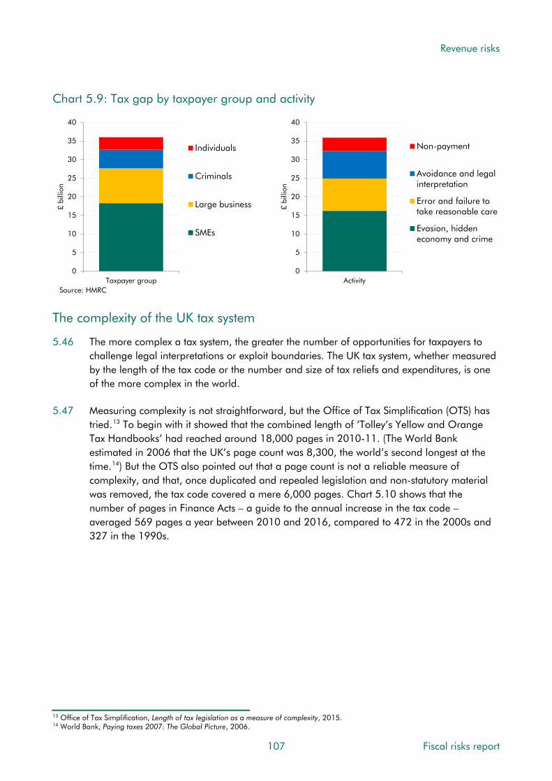
Revenue risks
Chart 5.9: Tax gap by taxpayer group and activity
0
5
10
15
20
25
30
35
40
Activity£
billi
on
Non-payment
Avoidance and legalinterpretation
Error and failure totake reasonable care
Evasion, hiddeneconomy and crime
0
5
10
15
20
25
30
35
40
Taxpayer group
£ bi
llion
Individuals
Criminals
Large business
SMEs
Source: HMRC
The complexity of the UK tax system
5.46 The more complex a tax system, the greater the number of opportunities for taxpayers to challenge legal interpretations or exploit boundaries. The UK tax system, whether measured by the length of the tax code or the number and size of tax reliefs and expenditures, is one of the more complex in the world.
5.47 Measuring complexity is not straightforward, but the Office of Tax Simplification (OTS) has tried.13 To begin with it showed that the combined length of ‘Tolley’s Yellow and Orange Tax Handbooks’ had reached around 18,000 pages in 2010-11. (The World Bank estimated in 2006 that the UK’s page count was 8,300, the world’s second longest at the time.14) But the OTS also pointed out that a page count is not a reliable measure of complexity, and that, once duplicated and repealed legislation and non-statutory material was removed, the tax code covered a mere 6,000 pages. Chart 5.10 shows that the number of pages in Finance Acts – a guide to the annual increase in the tax code – averaged 569 pages a year between 2010 and 2016, compared to 472 in the 2000s and 327 in the 1990s.
13 Office of Tax Simplification, Length of tax legislation as a measure of complexity, 2015. 14 World Bank, Paying taxes 2007: The Global Picture, 2006.
107 Fiscal risks report

Revenue risks
Chart 5.10: The average length of Finance Acts
0
100
200
300
400
500
600
1990s 2000s 2010s (to date)
Ave
rage
num
ber
of p
ages
per
yea
r
Source: Institute for Government 5.48 One area of complexity that the OTS has considered is the number of reliefs in the tax
system. It identified more than 1,100 in force as of March 2015 and says the number has “undoubtedly grown since then”.15 Reliefs are designed to reduce taxpayers’ liability, so use of them does not form part of the tax gap. But the cost and therefore the effect on the tax-to-GDP ratio appears to be growing. In addition, each relief carries with it the risk that revenue will be lost through error, avoidance and fraud.
5.49 HMRC currently reports the estimated annual cost of around 200 reliefs.16 Many – like the exemption from landfill tax for pet cemeteries and the fact that the £10 Christmas bonus for pensioners is not subject to income tax – are relatively inexpensive. But there are some that significantly reduce receipts. Much the biggest are those that HMRC terms ‘structural reliefs’, which are considered “an integral part of the tax structure”. The income tax personal allowance is the largest of all, with an estimated cost of £93.8 billion in 2015-16. This was up from £72.0 billion just three years earlier, thanks to successive decisions to raise the allowance by more than inflation. Of those reliefs that HMRC terms ‘tax expenditures’ – designed “to help or encourage particular types of individuals, activities or products for economic or social objectives” – the biggest is the income tax and NICs foregone on most pension contributions. Chart 5.11 suggests that the revenue cost of tax expenditures in the UK is relatively high when compared to other countries, at around 7 per cent of GDP.
15 Office of Tax Simplification, Tax thresholds and ceilings – the numbers game, 2017. 16 HMRC, Estimated costs of principal tax reliefs, 2016.
Fiscal risks report 108

Revenue risks
Chart 5.11: Revenue cost of tax expenditures
0 1 2 3 4 5 6 7 8 9
PortugalKorea
GermanySwitzerland
TurkeyNetherlands
CanadaArgentina
PeruFrance
NorwayDenmark
AustriaBrazil
GreeceSpain
MexicoPoland
UruguayChile
Dominican Rep.UK (2015-16)United States
Guatemala (2009)Italy
Australia
Per cent of GDPNote: Estimates are for 2010, unless otherwise stated.Source: IMF, HMRC, OBR
5.50 Reliefs tend mostly to be used as intended, but governments view some as ‘imbalances in the tax system’ and regard use of them as avoidance – often after they cost more than originally expected. Reliefs that have fallen out of favour have been targeted with numerous measures, including two Summer Budget 2015 measures restricting the amounts by which landlords can reduce their taxable profits, the Budget 2016 measure to “tighten the scope of the income tax exemption for termination payments to prevent manipulation” and the Autumn Statement 2016 measure to tackle “exploitation of the VAT relief on adapted cars for wheelchair users”. Other reliefs have been growing rapidly in cost, but the Government still regards them as fulfilling a useful policy objective. For example, the cost of film tax relief has risen from £105 million in 2007-08 to £340 million in 2015-16.
5.51 The thinking behind some policy interventions in this area is less clear. As we noted last year, the reductions in the tax generosity for high earners of investing in private pensions has been accompanied by an increase in the limit for tax-free individual savings accounts to £20,000 a year that only high earners are likely to benefit from.17
Conclusions
5.52 In every tax system the amount of tax actually collected is less than that which could theoretically be collected. This is due to a combination of designed reliefs, avoidance activity, evasion, taxpayer errors and write-offs from those unable to pay. HMRC believes that the gap between what it estimates as the theoretical tax liability and the amounts actually collected was 6.5 per cent in 2014-15, or some £36 billion. Though its calculations suggest that this has declined in the past decade, it has persisted near its current level for some years. The complexity of the UK tax system provides taxpayers with many opportunities
17 OBR, Private pensions and savings: the long term effect of recent policy measures, Fiscal sustainability analytical paper, October 2016.
109 Fiscal risks report

Revenue risks
to exploit legal interpretations and boundary definitions. Whether measured by the length of the tax code and Finance Acts, or the number of reliefs, complexity has risen since 2010.
5.53 Using the characteristics set out in Chapter 1, the risk of non-payment of taxes due is continuous, correlated with other risks and endogenous to government activity. The large amounts already lost to the tax gap and surrendered to reliefs make this a continuous risk. It is correlated with other risks we discuss in this chapter: the increasing concentration of receipts received through self-assessment; the policy risks from raising money through anti-avoidance and operational measures; and the trend toward self-employment and away from employee status. The willingness of successive governments to change elements of the tax system – with over 400 tax measures since the Coalition Government came into power – make this risk endogenous. A quarter of these measures have sought to tackle avoidance or improve compliance.
Trends in self-employment and incorporations
5.54 Changes in the structure of the labour market can have a significant impact on the public finances, due to the importance of taxes on individuals as a source of receipts. One key trend observed in recent years has been the rise in the proportion of people working for themselves rather than an employer. This reflects a rise in the number of self-employed or unincorporated businesses, and rapid growth in the numbers of individuals incorporating (managing their business as directors of a limited company). While these populations are often considered together as ‘the self-employed’, they are taxed differently, with those working for their own business subject to lower tax rates than those employed by another company. So these upward trends put downward pressure on the tax-to-GDP ratio and represent risks to our forecast assumptions and to fiscal sustainability more broadly.
How are different kinds of worker taxed?
5.55 The tax system distinguishes three categories of working individual under the headings ‘employees’, ‘self-employed’ and ‘companies’. Employment law also features a ‘worker’ category with employment rights that lie between employees and the self-employed, but who for tax purposes are generally treated the same as the self-employed.
5.56 Employees make up the vast majority of the UK workforce and are characterised by working under an employment contract and having a variety of legal rights such as statutory sick, maternity, paternity and redundancy pay. Their employer must pay Class 1 employer NICs of 13.8 per cent on their wages above the relevant threshold. Their net earnings (excluding employer NICs) are liable to income tax as well as Class 1 employee NICs. Both are collected through the PAYE system.
5.57 Self-employed individuals run their own businesses, reporting the profits as income and having more flexibility to deduct business expenses. They pay income tax at the same rates as employees, but are only liable for Class 4 NICs. These are paid at a lower rate than employee Class 1 – 9 versus 12 per cent on income below the higher rate income tax threshold. The Class 4 NICs rate increases in Spring Budget 2017 would have reduced this
Fiscal risks report 110

Revenue risks
differential, but were abandoned soon after. The self-employed pay tax and NICs liabilities via self-assessment returns due nine months after the end of the financial year.
5.58 Working as a director and employee of a very small limited liability company has been possible for many years, but became much easier when the 2006 Companies Act abolished the need for a company to contain at least two individuals (a director and a distinct company secretary). A single director of a company, or a company with a small number of closely linked directors, can run their business very similarly to the self-employed, but also enjoy the benefits of limited liability status.
5.59 Company directors can minimise their tax burden by paying themselves (as the sole ‘employee’) a wage up to the primary threshold at which employee and employer NICs become liable. As this threshold is below the personal allowance, it also incurs no income tax. This wage can then be deducted from the company’s gross profits, the remainder of which are liable to corporation tax (currently 19 per cent, but set to fall to 17 per cent in April 2020). Post corporation tax profits can then be withdrawn as dividend income for the sole shareholder (the director), which is liable for tax at lower rates than other types of income and attracts its own tax-free allowance (currently £5,000, but set to fall to £2,000 in April 2018). Directors can also benefit by retaining profits within the company, paying the lower entrepreneurs’ relief rate of capital gains tax (of 10 per cent) upon selling it.
5.60 The result of this varying tax treatment is that three people doing very similar work can face very different tax liabilities depending on their form of employment. Imagine a contract being offered for a piece of work (e.g. building a website) offering £50,000 as compensation in 2017-18, with this being the only source of income during the year for the individual concerned. Chart 5.12 shows how much of that £50,000 would be paid in tax depending on whether it was carried out by an employee of a medium-sized company, a self-employed individual or a single-director company.
5.61 The employee faces the largest tax burden, paying 32.3 per cent of the £50,000 income in tax or NICs. That compares with 24.5 per cent for the self-employed individual and 19.7 per cent for the sole director of his or her own company.18 The biggest difference comes from employer NICs for employees. Despite this being paid by the employer, we include it in the individual’s tax burden because it directly reduces the amount available for the employee’s wage. Single-director companies benefit mainly from the lower rates of corporation tax and dividend tax.
18 These calculations assume the individual has only one source of income. The deduction of employer NICs means that less of an employee’s total compensation is made up of their wage, thereby paying less income tax but more NICs than the self-employed. Company directors are assumed to withdraw profits in the most tax efficient way, paying themselves a salary up to the primary threshold for NICs, and taking the rest as dividends, all in the same year.
111 Fiscal risks report

Revenue risks
Chart 5.12: Tax due on £50,000 of income in 2017-18
0
2,000
4,000
6,000
8,000
10,000
12,000
14,000
16,000
18,000
Employee Self-employed Single director
Tota
l tax
due
(£)
Income taxEmployee NICsEmployer NICsSelf-employed NICsCorporation taxDividend tax
Source: OBR
Recent trends
Numbers of self-employed and incorporations
5.62 According to the Office for National Statistics (ONS) Labour Force Survey (LFS), the proportion of self-employed in total employment reached 15.0 per cent (4.8 million people) in 2016-17, up from 13.0 per cent in 2007-08 on the eve of the financial crisis and a low (in the available LFS data) of 11.8 per cent in 2000-01. Relative to employees, self-employment held up after the financial crisis, with much of the rise in the past decade driven particularly by older women and part-time workers.19 However, the LFS includes incorporated single director companies in its definition of the self-employed. These companies’ share of LFS self-employment has risen considerably. We estimate that around half of the growth in self-employment over the past decade has been from them rather than traditional self-employment.
5.63 When analysing incorporations, we use HMRC’s estimates of the number of companies owned by individuals that have a genuine choice over their legal employment status, namely those with positive trading profits (after losses carried forward) of up to £500,000 in 2014 prices. The stock of these companies increased from 400,000 in 2000 to more than 1.2 million in 2015 (an average increase of 7 per cent a year). Single-director companies contributed most of this growth and there were around 500,000 of them in 2015-16, 1.6 per cent of total employment. HMRC estimates that around 60 per cent of incorporations were formerly employees and 40 per cent formerly unincorporated self-employed.
19 See ONS, Trends in self-employment in the UK: 2001 to 2015, 2016 for more detail.
Fiscal risks report 112

Revenue risks
5.64 The LFS asks whether an individual is sole director of their own limited business. As of 2016-17, 664,000 people said they were (2.1 per cent of total employment). The survey relies on individuals correctly self-reporting their status, so the true figure is uncertain. We believe HMRC’s estimates are more reliable, but also subject to some uncertainty due to the way numbers of directors are defined in the databases of companies and how company directors are matched to tax returns. Many companies identified as having two directors before 2008 – when restrictions on single-director companies were relaxed – may have in effect been single-director companies, with an additional non-income taking director to satisfy regulations.20 The number of single-director companies recorded in the LFS and HMRC definitions are now reasonably similar.
5.65 The rise in incorporations has clearly been driven in part by the tax-related financial incentives that companies have to use incorporated individuals as external contractors rather than their own employees, and that individuals have to enjoy higher post-tax income, perhaps at the expense of other benefits associated with employee status.
Chart 5.13: Trends in self-employment and incorporations
0
2
4
6
8
10
12
14
16
2000-01 2002-03 2004-05 2006-07 2008-09 2010-11 2012-13 2014-15
Shar
e of
wor
kfor
ce (p
er c
ent)
Self-employed (ONS definition)
Single director companies (HMRC definition)
Total company population (HMRC definition)
Note: Though there appear to be very few single director companies before 2008, many companies defined as having two directors were in effect acting as single director companies. Source: HMRC, ONS
How these trends affect receipts
5.66 The Exchequer loses from any movement from employee status to self-employment, or from either employee or self-employment to incorporation, regardless of whether the move is tax motivated or not. For this reason, a sustained rise in the share of workers running their own business poses a risk to fiscal sustainability, especially if these movements are not associated with workers becoming more productive.
20 Before the 2006 Companies Act came into force, the distinct company secretary role would often be played by a partner or family member with no real responsibility or income.
113 Fiscal risks report

Revenue risks
5.67 While the total number of people with self-employment income has increased significantly, from 4.9 million in 2007-08 to 5.6 million in 2014-15, the number of people with taxable self-employment income has fallen from 3.9 to 3.3 million in the same period.21 This is mainly due to increases to the personal allowance, but the average taxable self-employment income has risen little in that period – from £22,100 to £23,500 – despite much of the bottom end of the distribution dropping out of this calculation. This is also much less than the increase in the average taxable employment income, which rose from £24,000 to £29,100 over the same period. All this suggests that much of the growth in self-employment has been at the lower end of the income distribution where little or no tax is paid.
5.68 Those who incorporate tend to have relatively high incomes: the average profit of incorporated companies was £56,000 in 2015-16. This has a large effect on receipts, especially as the difference in tax rates between company owners and others is greatest at incomes between £50,000 and £60,000. Around 40 per cent of incorporations come from the self-employed who, if operating in the most tax efficient way, will take small incomes below the personal allowance as an employee in their own company and pay the rest (after corporation tax) in dividends.
5.69 The combined effect has been a rise in the number of self-employed, but a significant fall in the effective tax rate they pay due to the higher personal allowance, concentration of earnings growth at the bottom end of the distribution and a movement to incorporation from the top end. The incorporated population has also risen significantly. Both trends have changed the overall composition of taxable earned income and reduced the effective tax rate, lowering the receipts-to-GDP ratio.
Risks to our medium-term forecast
5.70 There are two key sources of risk. The underlying trends, and their effects on the public finances, are subject to significant uncertainty, so we may have over- or underestimated the effect on receipts for various reasons. But this is also an area where data limitations affect our understanding of the risks these trends may pose. The ONS has recently signalled that it will make significant revisions to the National Accounts later this year to reflect growth in household dividend income that is not currently being captured in the official data.22 While the impact is uncertain, it is clear that these shifts in employment status can have large effects on tax receipts.
Central forecast assumptions
5.71 The LFS self-employment share (which includes single director companies) reached 15.0 per cent of employment in 2016-17. Our forecast assumes that it will rise to 15.7 per cent by 2021-22. We also assume that the upward trend in incorporations will continue. Based on the HMRC definition we assume that the incorporated population will rise 4 per cent a year until 2021-22, much faster than the 0.3 per cent a year average growth in employment.
21 From Tables 3.6 and 3.10 of HMRC’s Personal income statistics. These figures also include a number of employed people who have an additional source of self-employment income, but do not include dividend income from incorporations. 22 ONS, National Accounts articles: Impact of Blue Book 2017 changes on the Sector and Financial Accounts, 1997 to 2012, 2017.
Fiscal risks report 114

Revenue risks
5.72 We adjust our receipts forecast on the basis of these assumptions:
• The rising self-employment share informs the split between PAYE and self-assessment receipts within our overall income tax and NICs forecast. This reduces receipts relative to a flat share because of the lower effective tax rate on self-employment income. In our March 2017 forecast, this reduced receipts by around £1 billion in 2021-22.
• The rising trend in incorporations is factored into our income tax, NICs and corporation tax forecasts using HMRC’s incorporations model. Relative to this company population growing in line with employment, this reduces income tax and NICs, while increasing corporation tax by a less-than-offsetting amount. In our latest forecasts, the net effect has been to reduce receipts by around £3½ billion in 2021-22.23
Risks related to underlying trends
5.73 There are risks in both directions around the assumptions underpinning our forecast. If the self-employment share increased at the same pace over the forecast period as over the past 16 years, it would reach 16.0 per cent by 2021-22. Using the same assumed effective tax rates on employees and the self-employed, that would reduce receipts by £0.5 billion in 2021-22. If the incorporated population increased by 2 per cent a year rather than the 4 per cent we expect, and the receipts loss per incorporation was as assumed in March, receipts would be £1.7 billion higher by 2021-22. If it increased by 6 per cent a year, receipts would be £1.7 billion lower by then. One would expect growth in incorporations to slow at some point, as the proportion of those who are willing and able to incorporate but have not yet done so diminishes. These sensitivities are broadly linear over small changes.
5.74 There are also risks around changes in effective tax rates and what that implies for the receipts effect of individuals moving between employee, self-employed and incorporated status. If the effective tax rate of the average self-employed taxpayer (with an income of around £25,000) were to be one percentage point lower, the rising share of self-employment we forecast in March would take a further £0.1 billion off receipts in 2021-22. If the average Exchequer cost of each additional incorporation was £1,000 higher, receipts would be around £0.4 billion lower by 2021-22. These estimates are sensitive to both policy and the incomes of those who move into self-employment or incorporation.
5.75 Already announced policies, such as cuts to corporation tax and the dividend allowance, would alter the incentives to change employment status as well as the Exchequer cost associated with each move. But wider trends in the labour market, unrelated to tax, will also affect receipts by altering the incentives to become self-employed or incorporate. For example, the results of recent legal challenges to firms that give worker status to self-employed contractors may affect future contracts between employers and the workforce. The Government is also expected to respond to issues around workers’ rights that will be covered by the Taylor review of employment practices in the modern economy.
23 See Box 4.1 of our November 2016 Economic and fiscal outlook for more detail.
115 Fiscal risks report

Revenue risks
Risks related to data limitations
5.76 The rising trend in incorporations and its effect on households’ dividend income has not been properly captured in the National Accounts. As noted in Chapter 3, the ONS will be making revisions in Blue Book 2017 to reflect the stronger growth in dividend income than is currently being recorded. These revisions will rely to an extent on the adjustments in our tax forecasts that have been described in this section. We will need to consider how we generate our self-assessment receipts and incorporations forecasts in light of these Blue Book revisions. We will provide an update in this year’s Forecast evaluation report.
Risks to fiscal sustainability
5.77 Our long-term receipts projections are driven by relatively simple modelling of demographic effects, and implicitly assume that beyond the medium term there are no other trends pushing receipts up or down as a share of GDP. So if shifts to self-employment or incorporations persist over the longer term, they would represent a risk to fiscal sustainability. This could be the case if population ageing itself is a driver of these trends or if other trends, such as technological advances, facilitate these different ways of working for a rising proportion of the population.
Conclusions
5.78 The different tax rates faced by different categories of worker means that the rising number of individuals choosing to work for themselves will continue to weigh on receipts. The self-employment share is expected to reach 15.7 per cent in 2021-22, up from 13.0 per cent in 2007-08. Much of this is explained by tightly controlled companies operating in effect as individuals, the number of which is forecast to reach 1.6 million by 2021-22, more than doubling since 2008 when restrictions on single-director companies were relaxed. If this population were to grow at 6 per cent a year over the next five years, compared to the 4 per cent we currently expect, receipts would be £1.7 billion lower by 2021-22.
5.79 With many newly self-employed workers paying little to no tax, and high-income individuals incorporating, downward pressure on the tax-to-GDP ratio is expected to persist over the medium term. An increase in the cost of each new incorporation since 2016-17 of £1,000 (either from policy or a change in the characteristics of those who incorporate) would reduce receipts by £0.4 billion in 2021-22. If the working patterns of an ageing population and growth in online platforms commonly associated with the ‘gig economy’ continue to drive these trends, then they would also pose long-term risks to tax sustainability.
5.80 In terms of some of the characteristics set out in Chapter 1, the medium- and long-term risks are gradual and continuous. The Government has control over some of the drivers of these trends, such as differing tax rates and employment policies, but less so over structural changes in the labour market. Trends in self-employment and incorporation do not seem correlated with many other fiscal risks, though macroeconomic shocks can cause shifts in the labour market, with self-employment holding up well relative to employment in the years immediately following the financial crisis.
Fiscal risks report 116

Revenue risks
Policy risks
5.81 Parliament requires our medium-term forecasts and long-term projections to be based on current government policy, or on our interpretation of it where it is not clearly defined. So one source of risk is that current policy may change. In this section we discuss a number of tax policy risks, including:
• policies that are announced but not implemented, such as the repeated decisions not to raise fuel duty in line with inflation or the risks associated with changes to the 2017 Finance Bill before the election;
• policy commitments and aspirations that have been stated but not sufficiently clearly specified to be included in our forecasts; and
• the greater reliance on relatively uncertain yield from anti-avoidance and operational measures to meet the relatively certain cost of tax cuts.
Risks associated with stated policy not being implemented
5.82 During the last Parliament, the Government announced and then dropped measures that would have raised VAT on static caravans and hot take-away food (announced in March 2012, dropped in November 2012) and raised NICs rates for the self-employed (announced in March 2017 and dropped a few days later). When policies are abandoned in this way, we include the effect of not going ahead as a policy change in our next forecast.
5.83 As well as setting the parameters of the tax system, governments decide how various rates and thresholds will rise over time in the absence of specific decisions to the contrary (for example, to keep them stable in real terms or relative to average earnings). These ‘default indexation’ policies are set out in the Treasury’s ‘Policy costings document’ alongside each Budget. Consistent with the requirements placed on us by Parliament, we forecast on the basis of those policies. In some cases, despite governments restating these policies each year, they are rarely implemented. The biggest revenue effects from these decisions have been related to fuel duty and alcohol duties, but a similar pattern has been seen with smaller taxes such as the aggregates levy and VED for heavy-goods vehicles.
Fuel duty
5.84 Our fuel duty receipts forecast combines our underlying forecast assumptions about the amount of fuel that will be purchased and the Government’s stated policies on the fuel duty rates that will be levied on those purchases. As Chart 5.14 shows, since the duty cut in Budget 2011, the policy to raise it by RPI inflation has been delayed three times and cancelled six times. On no occasion has it been implemented. Outturn RPI inflation would have taken the main duty rate up to 77.5 pence a litre by 2017-18 if the stated indexation policy underpinning our June 2010 forecast had been followed. We estimate that receipts would have been around £8½ billion higher in 2017-18 on that basis, factoring in the reduction in demand for fuel that would be expected due to the higher prices.
117 Fiscal risks report

Revenue risks
Chart 5.14: Successive Government fuel duty rate policy assumptions
45
50
55
60
65
70
75
80
2008-09 2010-11 2012-13 2014-15 2016-17 2018-19 2020-21
Mai
n fu
el d
uty
rate
(pen
ce p
er li
tre)
June 2010 with outturn RPI
March 2017
Actual fuel duty rate
Source: HMRC, OBR
5.85 Another fuel-related policy that was announced but abandoned before it could take effect was the Budget 2011 ‘fair fuel stabiliser’. The Government stated that it would “abolish the fuel duty escalator and replace it with a fair fuel stabiliser. When oil prices are high, as now, fuel duty will increase by inflation only.”24 In Autumn Statement 2014, the Government announced that “The price based trigger point for changes to both the supplementary charge and fuel duty, set by the Fair Fuel Stabiliser in 2011, will be abolished.”25 Despite low oil prices, the Government neither increased fuel duty by RPI inflation nor by the ‘RPI plus one penny per litre’ required by the fair fuel stabiliser.
Alcohol duties
5.86 Since Budget 2013, the Government has announced cuts to planned alcohol duty rates at most Budgets (although the planned rises at Spring Budget 2017 went ahead). Specifically:
• Budget 2013: the escalator on beer (where duty rates were due to rise by RPI plus 2 per cent a year) was abolished and tax on a pint of beer was cut by 1 penny. The average estimated cost over the five-year forecast period was £0.2 billion a year.
• Budget 2014: tax on a pint of beer was again cut by 1 penny, duty on most ciders and spirits were frozen, and the wine escalator (where duty rates were due to rise by RPI plus 2 per cent a year) was abolished. The average cost was £0.3 billion a year.
• Budget 2015: tax on a pint of beer was again cut by 1 penny, duty on spirits and most ciders were cut by 2 per cent, and wine duty was frozen. The average cost was £0.2 billion a year.
24 Budget 2011, paragraph 1.146. 25 Autumn Statement 2014, paragraph 1.127.
Fiscal risks report 118

Revenue risks
• Budget 2016: beer, spirits and cider duties were all frozen. The average cost was £0.1 billion a year.
5.87 As Chart 5.15 shows, these decisions have resulted in a significant divergence between duty rates today and the levels they would have reached if the default policy had been implemented. Based on the default policy assumed in our Budget 2013 pre-measures forecast, outturn RPI inflation would have seen beer duty 21.3 per cent higher than it is today, spirits duty 10.7 per cent higher and sparkling cider and wine duties 4.2 per cent higher. Receipts would have been around £1 billion higher in 2017-18 on that basis, factoring in the reduction in demand that would be expected due to the higher prices.
Chart 5.15: Stated policy and actual policy
0
50
100
150
200
250
300
350
400
2010-11 2012-13 2014-15 2016-17
£ pe
r he
ctol
itre
of p
rodu
ctWine and sparkling wine
Wine and made-wine
Sparkling wine and made-wine
0
5
10
15
20
25
30
35
2010-11 2012-13 2014-15 2016-17
£ pe
r lit
re o
f pur
e al
coho
l
Spirits
0
5
10
15
20
25
2010-11 2012-13 2014-15 2016-17
£ pe
r 1%
ABV
per
hec
tolit
re
Beer
0
5
10
15
20
25
30
35
40
45
50
2010-11 2012-13 2014-15 2016-17
£ pe
r he
ctol
itre
of p
rodu
ct
Cider
Note: Dashed lines illustrate stated policy before the policy changes announced in Budget 2013.Source: HMRC, OBR
119 Fiscal risks report
Revenue risks
Other examples
5.88 Some smaller taxes have been subject to even longer periods where stated default policy on indexation is overwritten by a new policy measure each year:
• Aggregates levy: in Budget 2009, the levy was “frozen at £2.00 per tonne in 2010-11 to ease pressure on the sector facing difficulties under the downturn of the construction market.”26 It has been frozen ever since, but default indexation policy remains to raise it by RPI inflation each year.
• Vehicle excise duty for heavy-goods vehicles: the rate of VED paid by HGVs was first frozen following the fuel protests in 2000. It has been frozen ever since.
Finance Bill 2017 and related issues
5.89 Following the announcement of the general election, the Government removed 17 measures from Finance Bill 2017 to secure its passage through Parliament in the time available before campaigning began. The net yield from these measures is around £3.5 billion in 2020-21. Following the result, it is no longer clear when they will return to Parliament to be legislated. The Treasury told us simply that “the Government will set out its tax and spending policy at the next fiscal event”. Some of these measures, such as the interest relief restriction in corporation tax, have already been implemented but have yet to be legislated as a permanent part of the tax system. The largest of these measures were:
• ‘Making Tax Digital: reducing errors through record keeping’: this was announced at Autumn Statement 2015 and is an HMRC initiative to interact digitally with small businesses across income tax, corporation tax and VAT, working with the private sector to introduce software that will design out record-keeping errors in taxpayers’ returns. It is expected to raise around £1 billion a year from 2021-22 onwards;
• ‘Corporation Tax: restrict relief for interest’: this was announced at Budget 2016 and restricts the corporate interest expense that affected groups will be allowed to offset against corporation tax. It is expected to raise around £1.1 billion a year on average;
• ‘Dividend Allowance: reduce to £2,000 from April 2018’: this was announced at Budget 2017 and reduces the income that can be earned through dividends before income tax is due. It is expected to raise around £0.9 billion a year from 2021-22;
• ‘Removing employer tax advantage of different forms of remuneration: pay-offs over £30,000’: this was announced at Budget 2016 and has two parts; it tightens the scope of the income tax exemption for termination payments, and applies employer National Insurance contributions to all termination payments over £30,000 where income tax is currently due. Only the first part is in the Finance Bill. Overall the measure is expected to raise around £0.4 billion a year from 2020-21;
26 Budget 2009, paragraph 7.67.
Fiscal risks report 120

Revenue risks
• ‘Corporation Tax: reform loss relief’: this was announced at Budget 2016 and restricts the brought forward losses a business is able to offset against taxable profits. But it also widens the use of losses from different types of income streams for the same purpose. It is expected to raise around £0.3 billion a year on average;
• ‘Non-domiciles: abolish permanent status’: this was announced at the July 2015 Budget and removed the privileged tax status of certain non-domiciled individuals, increasing the UK tax liability on their worldwide income. It is expected to raise around £0.3 billion a year from 2020-21;
• ‘Disguised Remuneration: extend to self-employed and remove company deduction’: this was announced at Autumn Statement 2016, with the main part of the measure aiming to tackle use of schemes by the self-employed to avoid income tax and NICs, by ensuring that all payments to them are taxed, irrespective of their description. It is expected to raise an average of around £0.1 billion a year; and
• ‘Sharing Economy: £1,000 allowance for both trading and property income’: this was announced at Budget 2016 and provides two £1,000 tax-free allowances for individuals: one for property income and one for trading income. It is expected to cost around £0.2 billion a year from 2020-21.
5.90 When the removal of these measures from the Finance Bill was announced, the then Financial Secretary to the Treasury stated that “The Bill is progressing on the basis of consensus and therefore, at the request of the Opposition, we are not proceeding with a number of clauses. However, there has been no policy change. These provisions will make a significant contribution to the public finances, and the Government will legislate for the remaining provisions at the earliest opportunity, at the start of the new Parliament.”
5.91 There is a risk that one or more of these measures could be changed or dropped when they return to Parliament. We would then capture any effect in our next forecast.
5.92 The increase to probate fees – the legal fees payable after death – announced by the Ministry of Justice in February 2017 would have required secondary rather than primary legislation and was not due to be included in the Finance Bill. As we noted at the time, this policy was not shown on the Treasury’s scorecard and the structure of the fees is such that the Treasury expects the ONS to classify them as a tax in the National Accounts. Since then, the Joint Committee on Statutory Instruments has called for the proposals to have the attention of both houses of Parliament. Following the announcement of the general election the Ministry of Justice confirmed a statutory instrument on the proposed revisions will not have time to complete its passage through Parliament. The Treasury has informed us that “Ministers are considering how they wish to proceed on probate fees”. The Government had expected the new fee structure to raise around £300 million a year.
121 Fiscal risks report
Revenue risks
Policy commitments not yet captured in our forecasts
5.93 Parliament requires that our forecasts should only reflect current government policy, but it has also said that this should only be done where the effects can be quantified with reasonable accuracy. Where that is not the case, they must be noted as specific fiscal risks.27 As such, when the Government or governing party sets out ‘ambitions’ or ‘intentions’ we ask the Treasury to confirm whether they are firm policy. A key criterion is that the effects can be quantified in each year of our forecast. Where that is not the case, we note them as a risk.
5.94 In our March 2017 EFO, we listed six policy ambitions or intentions that we considered risks to our forecast, the most important of which was the commitment to raise the income tax personal allowance to £12,500 and the higher rate threshold to £50,000 by the end of the Parliament. This was repeated in the Conservative Party’s 2017 manifesto. Since the cost of meeting that commitment would depend on the path chosen to get there, we were not able to include it in our forecast for each year. But we noted that meeting it in 2020-21 alone would have reduced receipts by £1.3 billion. Other risks included the full transfer of business rates revenue to local authorities, alongside the transfer of as-yet unspecified spending responsibilities, and the devolution of powers over corporation tax rates to the Northern Ireland Assembly, which has said that it will cut the main rate to 12.5 per cent.
Dependence on yield from riskier tax increases
5.95 One source of risk to our forecasts is the need to include the impact of newly announced policies. At each fiscal event the Treasury submits to us its 5-year estimates of the costs or benefits of each policy under consideration. Once we deem a costing to be reasonable and central we give it formal certification – in practice this is an iterative process involving detailed discussions with the analysts in the relevant departments. Once the Government decides on its final policy package it is reproduced with associated costings in the Treasury’s policy costings scorecard and we include them in our forecasts. While the Treasury is free to include an estimate that we do not agree with, this has not happened to date.
5.96 To be transparent about the risks, we assign each certified costing a subjective uncertainty rating. These range from ‘low’ to ‘very high’ and are based on our assessment of the uncertainty arising from each of three sources: the data underpinning the costing; the complexity of the modelling required; and the possible behavioural response to the policy change. We take into account the relative importance of each source of uncertainty when determining the overall uncertainty rating.28 It is important to emphasise that, when we describe a costing as particularly uncertain, we see risks lying to both sides of what we nonetheless judge to be a reasonable and central estimate.
27 Charter for Budget Responsibility, paragraph 4.10. 28 See Annex A of each Economic and fiscal outlook for more on the criteria that we use and a worked example based on the costing of a policy announced in that Budget or Autumn Statement. The full breakdown that underpins each rating is available on our website.
Fiscal risks report 122

Revenue risks
5.97 As Chart 5.16 shows, in recent years governments have increasingly relied on anti-avoidance measures and operational measures that attempt to increase the effectiveness of HMRC’s compliance activity. There have been over a hundred such measures announced since the Coalition Government came into power and the chart shows the cumulative revenue raised each year based on the original costings. It shows that around £10 billion a year in revenue is expected from these measures each year from 2017-18 to 2020-21.
Chart 5.16: Expected yield from anti-avoidance and operational measures announced under the Coalition and Conservative Governments
0
2
4
6
8
10
12
2011-12 2012-13 2013-14 2014-15 2015-16 2016-17 2017-18 2018-19 2019-20 2020-21
£ bi
llion
Source: OBR
5.98 This type of measure typically attracts our highest uncertainty ratings as it targets a subset of taxpayers who are already actively changing their behaviour to lower their tax liabilities. As a result, there is usually relatively high behavioural uncertainty. Similarly, since the measures are directed at uncollected tax, less reliable data are available. Chart 5.17 shows that we have typically assigned higher uncertainty ratings to anti-avoidance measures than other tax-raising measures. Tax giveaways also tend to be less uncertain than tax takeaways.
123 Fiscal risks report

Revenue risks
Chart 5.17: OBR assessment of the uncertainty of tax costings
0
10
20
30
40
50
60
70
80
90
Prop
ortio
n of
mea
sure
s (p
er c
ent)
Higher uncertainty
Lower uncertainty
Tax giveaways Tax takeaways excluding anti-avoidance Anti-avoidance
Note: 'Lower uncertainty' includes our three lowest ratings ('low', 'medium-low' and 'medium') while 'Higher uncertainty' covers our three highest ratings ('very high', 'high' and 'medium-high').Source: OBR
5.99 Given this high level of uncertainty we routinely evaluate anti-avoidance and operational measures after their implementation. We have not found systematic bias in the overall revenue expected – the numbers of measures that under-performed were broadly matched by the number that over-performed.29 However, there have been some high-profile examples where the original revenue expected was significantly higher than the eventual yield. In particular, the UK-Swiss tax agreement announced at Autumn Statement 2012 was expected to raise £3.2 billion from the capital tax charged against past liability, but only brought in £0.9 billion – a shortfall of 70 per cent. With this type of measure we cannot say with absolute certainty, even after the event, whether the difference was due to there being less taxable wealth than originally estimated, whether taxpayers were better able to manoeuvre around the new rules than we expected or some combination of the two.
5.100 Operational measures typically involve enhanced HMRC enforcement and compliance activity, drawing on additional resources or access to better information. While the majority of the yield from these measures is from tax, some is from measures seeking to improve tax credit debt collection or reduce fraud and error in the benefits system.
5.101 Raising money through operational measures carries its own risks, in particular around timing and delivery. As we showed in our January 2016 evaluation, many previous costings underestimated the time it would take before a measure became fully effective. The Autumn Statement 2013 measure ‘error and fraud: additional capacity’ was notable for the number and range of difficulties it encountered. The measure used an external contractor to provide additional resources to identify tax credits compliance interventions. The initial start date was delayed, the productivity of the external provider – Concentrix – was consistently lower than
29 Johal and Sousa, Anti-avoidance costings: an evaluation, OBR Working Paper No.8, January 2016.
Fiscal risks report 124

Revenue risks
expected, and in 2016 the contract was terminated early, forcing HMRC to redeploy over 600 of its own staff to complete the project, adversely affecting its activity elsewhere. A very high proportion of cases were subsequently overturned at the mandatory reconsideration stage. The net effect of all this has been to reduce the expected yield from the original costing of £1.1 billion to £0.2 billion, a shortfall of 80 per cent.
5.102 For both anti-avoidance and operational measures we have incorporated lessons from past costings into our scrutiny of new measures – for example we insist that an appropriate level of contingency is included when assessing delivery timetables. Some risks, such as those around the timely implementation of measures, typically lie in one direction, so the more reliant the Government is on them to raise revenue the more risk to our central forecast.
Policy-related risks to our medium-term forecasts and fiscal sustainability
5.103 The patterns described in this section could be the source of various fiscal risks:
• Repeated decisions not to implement duty rate increases reduce receipts relative to our forecasts, which Parliament requires us to base on stated policy. The longer rates remain frozen, creating an expectation that they will remain so, the greater the political pressure the Government might face if it did decide to implement its stated policy.
• Current policy commitments that have yet to be specified in sufficient detail to include in our forecasts are more likely to reduce receipts than increase them.
• Reliance on relatively uncertain tax rises to pay for relatively certain cuts should pose risks in both directions, especially if we have been right in our judgement that the costings we certify are central. While we have not found systematic bias in these costings, there have been more examples of yields falling well short of initial expectations than of them having significantly exceeded expectations. And there is systematic evidence of delays to the implementation of operational measures.
Conclusions
5.104 Changes to government policy pose a fiscal risk. Non-implementation of stated indexation policies since 2010-11, such as cancellations of fuel and alcohol duty rate increases, are estimated to have lowered receipts by around £8½ billion and £1 billion respectively in 2017-18. All the £2.1 billion rise in fuel duty receipts expected over the next five years results from the RPI indexation assumed in our forecast. Other policy related risks include the general trend to announce more certain tax cuts paid for by tax increases on more risky bases, such as anti-avoidance measures, and the costs of policy commitments that have yet to be specified in sufficient detail to include in our forecasts.
5.105 Policy related fiscal risks are clearly endogenous, as it is the Government’s decisions that create them, and they are discrete to when the policy decision is made.
125 Fiscal risks report

Revenue risks
Concentration of tax receipts
5.106 Across a number of taxes, the Government is increasingly relying on receipts collected from people with relatively high incomes and/or who buy or sell high value assets. This poses various risks to the public finances. It is hard to forecast the activity of a small number of sophisticated, well-advised and financially flexible taxpayers using available data that typically reference the whole economy. This could be down to idiosyncratic events affecting those groups or the fact that wealthier individuals are more likely to engage in tax planning, avoidance or evasion. This could increase the sensitivity of receipts to a sudden downturn, such as the financial crisis of the late 2000s or the fiscal stress test described in Chapter 9. Much of the increase in concentration is the result of recent policy changes.
Income tax
Trends in the concentration of receipts
5.107 Income tax is the biggest source of government revenue. It has become more concentrated over the past decade in two ways: a lower proportion of adults pay income tax and, among taxpayers, a higher share is paid by higher earners.
5.108 We expect receipts in 2017-18 to be only 11.3 per cent higher in cash terms than they were in 2007-08. Given growth in nominal GDP over the past decade, this reduces receipts from 10.2 to 8.6 per cent of GDP over the same period. And while the amount of income tax paid per taxpayer has grown broadly in line with GDP per adult (both of which have recovered only slowly due to weak growth in productivity and real earnings), the proportion of adults paying income tax has fallen sharply, from 65.6 per cent in 2007-08 to 56.5 per cent in 2017-18. Indeed, the share has fallen so much that, despite population growth, the absolute number of income taxpayers has fallen from 32.5 to 30.3 million.30
5.109 Within this smaller number of taxpayers, income tax paid has become more concentrated among higher earners. HMRC data suggest that this has been driven by a rising average tax rate paid by higher earners, rather than their incomes rising faster than at other points in the earnings distribution. For example, the share of pre-tax income received by the top one per cent of taxpayers has fallen from 13.4 to 12.0 per cent.31,32 This contrasts with the share of income tax paid. On HMRC’s latest estimates, the top one per cent are expected to be liable for 27.7 per cent of all income tax in 2017-18, up from 24.4 per cent in 2007-08.
30 From Table 2.1 of HMRC’s Income Tax statistics and distributions. 2017-18 figures are projected estimates based upon the 2014-15 Survey of Personal Incomes and consistent with our latest forecast. 31 This fall needs to be considered in the context of the overall fall in the number of taxpayers, which has two effects working in opposite directions. First, the top 1 per cent of taxpayers would be expected to have higher average incomes because they now represent the top-earning 301,000 taxpayers rather than the top 325,000 taxpayers a decade ago. Against that, the average income of taxpayers should also be higher because more of those with lower average earnings are no longer income taxpayers. 32 We discussed this in Box 4.1 of our March 2017 Economic and fiscal outlook.
Fiscal risks report 126

Revenue risks
Chart 5.18: The distribution of taxpayer income and income tax liabilities
0
10
20
30
40
50
60
70
80
90
100
2007-08 2017-18
Per
cent
Source: HMRCShare of total income
2007-08 2017-18
Top 1 percent
90th to 99thpercentile
50th to 90thpercentile
Bottom half
Share of total tax
What has driven the increase in concentration?
5.110 This rise in the share of income tax paid by top earners is mainly a result of policy changes in recent years. At the bottom of the distribution, the main factor has been above-inflation increases in the personal allowance, which increased from £5,225 in 2007-08 to £11,500 in 2017-18. That 120 per cent rise over a decade was 94 percentage points faster than the increase in consumer prices and 101 percentage points faster than average earnings growth. This has contributed significantly to the drop in the proportion of adults paying income tax. The Conservative Party manifesto retains the commitment to raise the personal allowance to £12,500 in 2020, compared to the £12,310 it would reach via CPI inflation uprating on our March forecast.
5.111 Data on the earnings of the self-employed are scarce, but the HMRC data that are available also suggest that the strong growth in self-employment over the past decade has been concentrated among those reporting earnings at or below the personal allowance. The proportion of self-employment incomes below the personal allowance rose from roughly 30 per cent in 2007-08 to around 55 per cent in 2014-15.33
5.112 At the top of the income distribution there have been many policy changes that have raised the average effective tax rate paid:
• The introduction of the additional rate of income tax for all income over £150,000 a year. This was set at 50p in 2010-11, then cut to 45p in 2013-14. Both changes were pre-announced, leading to significant income-shifting by taxpayers to reduce their liabilities. This makes comparisons of the number of taxpayers difficult, but between
33 From Table 3.10 of HMRC’s Personal income statistics. Excludes self-employment incomes below £1.
127 Fiscal risks report

Revenue risks
2011-12 and 2017-18 – years with relatively little income-shifting – the number of additional rate payers rose 39 per cent, from 0.5 to 0.7 per cent of all adults.
• The introduction of the personal allowance taper in 2010-11, which starts at the fixed threshold of £100,000 and means that an increasing numbers of higher-rate payers face an effective marginal tax rate of 60 per cent. There is evidence of this affecting taxpayers’ behaviour, with declared incomes bunching around the thresholds. There are many legitimate ways in which taxpayers can reduce their taxable incomes to stay under the threshold (e.g. by working fewer hours, contributing more to their pension or giving more to charity), as well as more aggressive forms of avoidance or evasion.34
• Changes to pensions tax relief, with both the annual and lifetime allowance being cut repeatedly in recent years. Both reduce the extent to which higher earners can reduce their effective tax rate by saving into a pension scheme.35
• Below-inflation increases in the higher-rate threshold up to 2014-15 focused the gains from the increases in the personal allowance on basic-rate payers and increased the effective tax rate paid by higher-rate payers.
5.113 Not all policy changes affecting higher earners have increased the effective tax rate paid. Since 2016, the higher-rate threshold has been increased significantly faster than inflation (in line with Conservative Party manifesto commitments at the last two elections to get it to £50,000 by 2020). Large increases in the tax-free ISA limit on savings have taken it to levels that are mainly exploited by those on high incomes, while the introduction of a tax-free savings allowance again benefits those with large amounts of savings the most.36 But these effects are small compared with those pushing in the opposite direction. The number of taxpayers paying tax at the higher rates on some of their income increased from 3.9 million in 2007-08 to 4.9 million in 2015-16. It fell to an estimated 4.5 million in 2017-18.
What fiscal risks might greater concentration pose?
5.114 With a smaller share of adults paying any income tax, one risk is that if employment growth is stronger at the lower end of the earnings distribution it would generate little additional revenue. But the bigger risks are likely to relate to the increased concentration of the tax base towards the top, which makes receipts more sensitive to shocks that affect higher earners and more vulnerable to tax planning among those facing high marginal and average rates. Higher earners are also more likely to be paid via bonuses, shares or dividends, which tend to be more volatile and pro-cyclical than basic salaries.
5.115 In terms of shocks to the top end of the distribution, the progressivity of income tax means that a 1 per cent fall in incomes in the top 10 per cent of the taxpayer distribution would reduce liabilities by 0.9 per cent, compared with 0.4 per cent for the middle 50 per cent
34 IFS, Frictions and the elasticity of taxable income: evidence from bunching at tax thresholds in the UK, 2016. 35 See OBR, Private pensions and savings: the long-term effect of recent policy measures, 2016 for a detailed discussion of the medium- and long-term effects of these policy changes. 36 These policies are also discussed in OBR, Private pensions and savings: the long-term effect of recent policy measures, 2016.
Fiscal risks report 128

Revenue risks
and less than 0.1 per cent for the bottom 10 per cent.37 Greater concentration is therefore likely to amplify the effects of some other risks to our medium-term forecast. For example, Brexit-related risks to the financial sector would have a greater effect on income tax receipts than in other sectors due to the high concentration of top earners in that sector. And greater concentration of the tax base means receipts would be even more sensitive to such a shock than they were a decade ago when the financial crisis hit.
5.116 In terms of potential behavioural responses by higher earners, there are a number of risks:
• Evidence shows that high-income taxpayers in particular respond to increases in their marginal tax rate by reducing the amount they work, migrating to areas with lower tax rates or engaging in tax avoidance schemes. For example, HMRC’s evaluation of the introduction of the 50p additional rate estimated that behavioural responses to the measure (excluding income shifting between years) reduced income tax liabilities in 2010-11 by £5.2 billion and declared incomes by around £10 billion (more than 1 per cent of total taxpayer income in that year).38 These responses may help explain the decline in the taxable income share of top earners over the last decade.
• The fixed thresholds of £100,000 and £150,000 for the personal allowance taper and additional rate respectively have pushed more incomes into higher tax brackets, raising the average tax rate paid by many high earners. Taxpayers are generally less sensitive to changes in average than marginal tax rates, but increasing reliance on mobile taxpayers means that even small responses could have big effects on receipts.39
Taxes on property transactions and capital gains
5.117 One way that property and financial assets are taxed is at the point of transaction. Stamp duty land tax (SDLT) is paid on the purchase price of residential and commercial property. Capital gains tax (CGT) is paid on the gain realised between an asset being purchased and sold. Receipts from both fell sharply during the financial crisis, but have doubled as a per cent of GDP from their low points. They had come close to their pre-crisis peaks by 2016-17 and are forecast to exceed those peaks in the coming years.
5.118 Both taxes are characterised by a very high proportion of receipts coming from transactions at the top ends of their respective distributions. The combination of concentration at the top end and the volatility of asset prices and transactions relative to most other tax bases makes them particularly sensitive to an economic downturn.
37 In cash terms, these figures would equate to £1.5 billion, £0.8 billion and £0.1 billion respectively in 2017-18. These figures have been calculated using tables 2.4 and 2.5 of HMRC’s Income tax liabilities statistics. 38 HMRC, The Exchequer effect of the 50 per cent additional rate of income tax, 2012. 39 IFS, Taxing high-income earners: tax avoidance and mobility, 2016.
129 Fiscal risks report

Revenue risks
Chart 5.19: Recent trends and prospects for SDLT and CGT receipts
March 2017 forecast
0.0
0.1
0.2
0.3
0.4
0.5
0.6
0.7
0.8
1999-00 2001-02 2003-04 2005-06 2007-08 2009-10 2011-12 2013-14 2015-16 2017-18 2019-20 2021-22
Per
cent
of G
DP
Capital gains tax
Stamp duty land tax
Note: CGT receipts are mostly paid in the year following the disposal via self assessment returns. Source: ONS
Trends in the concentration of receipts
5.119 SDLT is paid on the purchase of property or land in England, Wales and Northern Ireland. In Scotland, the land and buildings transaction tax (LBTT) replaced SDLT from April 2015. Much like income tax, SDLT has a lower threshold for prices below which no tax is paid (£125,000 for residential and £150,000 for commercial properties) and progressively higher marginal rates at various thresholds. Due to the large differential in rates on residential property transactions (ranging from 2 to 15 per cent), receipts are particularly concentrated at the top end of the market. For example, just 9,250 residential transactions in Westminster, Kensington and Chelsea (just 0.8 per cent of the total), accounted for £1 billion, or 14.0 per cent, of total residential SDLT receipts in 2015-16.40
5.120 Recent policy changes have combined with house price inflation to increase the concentration of receipts. These include the December 2014 move to a ‘slice’ system of marginal rates and the April 2016 introduction of a 3 per cent surcharge on purchases of second homes. As Chart 5.20 shows, the proportion of residential SDLT receipts from properties worth over £1 million has doubled since 2007-08.41
40 HMRC, UK Stamp Tax statistics 2015 to 2016, 2016. 41 While the tax base has become more concentrated there is still uncertainty in the forecast at the lower end of the distribution due to fiscal drag. In 2015-16 a quarter of residential transactions and nearly a third of commercial transactions were below the lower threshold and therefore did not pay any SDLT, but would become liable with sufficient price inflation. This means that our recent forecasts for SDLT in Wales, where house prices are relatively lower, have shown faster proportional growth than in the rest of the UK.
Fiscal risks report 130

Revenue risks
Chart 5.20: Estimated share of SDLT from residential transactions over £1 million
March 2017 forecast
0
5
10
15
20
25
30
35
40
45
2006-07 2008-09 2010-11 2012-13 2014-15 2016-17 2018-19 2020-21
Per
cent
Note: The estimates in the forecast have been calculated using raw model outputs which are not fully consistent with the overallforecast which includes several off-model judgements.Source: HMRC, OBR
5.121 CGT is levied on profits from the sale of assets. It is paid mainly by individuals, with a small proportion paid by trusts. Roughly a third of receipts come from sales of property and two-thirds from sales of financial assets, particularly unlisted shares. The number of taxpayers can vary significantly from year to year, typically ranging between 150,000 and 300,000. CGT is only paid on annual gains above a threshold (£11,300 in 2017-18) and sales of primary residences are exempt. This means that CGT is typically paid only by relatively high earners with high value assets on which to realise significant gains.
5.122 CGT is paid at different rates depending on an individual’s marginal income tax rate. For basic rate income tax payers the rates on residential property and other assets start at 18 and 10 per cent respectively, whereas for higher and additional rate payers they start at 28 and 20 per cent. Entrepreneurs’ relief is also available for some disposals, attracting a reduced rate of 10 per cent. Despite accounting for only 12 per cent of CGT payers, additional rate payers realise around 40 per cent of total chargeable gains from individuals. By value of the asset disposed of, more than half of gains come from assets worth more than £1 million, despite these making up only 3 per cent of the disposals each year.
131 Fiscal risks report

Revenue risks
Chart 5.21: Distribution of individual taxpayers with CGT liabilities in 2014-15 by income tax band
0 10 20 30 40 50 60 70 80 90 100
Share of chargeable gains
Share of number of taxpayers
Per cent
Basic rate Higher rate Additional rateSource: HMRC
5.123 The very high gains that yield the majority of receipts reflect the sale of very high value
assets or assets that have appreciated in value over a long time – at least 15 per cent of liable gains are from assets held for five years or more. Along with the highly cyclical nature of asset sales, this means that CGT is among the most volatile of all taxes. Some of this volatility stems from the many policy changes introduced over recent years, including a number of changes to the tax rates. There is little evidence to suggest that the policy changes have increased the concentration of CGT receipts at the top end, although the general volatility of CGT receipts makes this hard to confirm.
What risks does the concentration of receipts pose?
5.124 The Government’s reliance on a small number of transactions for a large proportion of SDLT and CGT receipts means that they are highly sensitive to factors affecting specific individuals and groups. Not all are closely related to the broader drivers of tax receipts – for example, high-end London property markets are sensitive to investment decisions by the richest international investors. But they could also amplify the fiscal consequences of more general economic shocks. For example:
• a 1 per cent fall in house prices spread evenly across the price distribution would reduce residential receipts by around 1.8 per cent now and in 2007-08; but
• an average fall of 1 per cent concentrated in the top decile of prices (i.e. a 10 per cent fall among expensive properties, but no change across the rest) would now cut residential receipts by 6.3 per cent, up from 5.2 per cent in 2007-08.
Fiscal risks report 132

Revenue risks
Receipts from the financial sector
5.125 Receipts can also be concentrated in particular industries, with the financial sector being the most tax-rich in the UK. Receipts are slightly less reliant on the financial sector than at the pre-crisis peak in 2006-07, but it still yields a very significant share of income tax, NICs and corporation tax. The bank levy and bank surcharge have also been introduced since the crisis, yielding £4.5 billion in 2016-17.
5.126 Chart 5.22 shows how the contribution the financial sector makes to income tax, NICs and corporation tax has changed between 2006-07 and 2014-15:
• Income tax & NICs receipts from the financial sector still make up around 11.5 per cent of PAYE receipts.42 This is despite the fact that the sector’s share of jobs has fallen from 3.7 to 3.3 per cent and its share of wages and salaries from 8.2 to 6.7 per cent. The difference between the number of jobs and total wages in the financial sector reflects the much higher average wages paid. And the fact that the fall in the share of total wages and salaries from the financial sector has not fed through to a proportionate change in the sector’s PAYE receipts suggests that they have become even more concentrated at the top end of the income distribution.
• Corporation tax liabilities in the financial sector have fallen from 26.5 to 17.3 per cent of the total. This has been driven by a drop in corporation tax paid by banks following the recession, mainly due to the carrying forward of losses – though this has been somewhat offset by the introduction of the bank levy and bank surcharge. Receipts are particularly dependent on the gross trading profits of a few very large banks. However, the sector’s contribution to gross trading profits has changed much less, reflecting how the carry forward of losses can continue to affect receipts for years.
Chart 5.22: Financial sector shares of major tax bases in 2006-07 and 2014-15
0
5
10
15
20
25
30
Total jobs Total wages & salaries IT & NICS receiptscollected through PAYE
Gross trading profits ofCT paying firms
CT liabilities
Per
cent
2006-07
2014-15
Note: The definition of the financial sector differs slightly between measures.Source: HMRC, ONS, OBR
42 Close to 90 per cent of income tax and NICs receipts are collected through PAYE, so this is broadly representative of the total.
133 Fiscal risks report

Revenue risks
Risks posed by reliance on financial sector receipts
5.127 Continued reliance on the financial sector for revenues poses a number of risks:
• The profitability of the financial sector is expected to be lower than in the past, in part due to regulatory changes brought in since the crisis. The move towards higher minimum capital requirements in line with the Basel III framework and ring-fencing of the retail divisions of the largest banks are likely to weigh on profits.
• Our medium-term forecast already assumes weaker earnings at the top end, lower bonuses growth and weaker financial sector profits following Brexit. However, these assumptions are not predicated on a particular outcome for the negotiations. A more severe impact could have a bigger effect on employment, profits and receipts.
• The performance of the financial sector and the effect of measures targeting it have been historically difficult to forecast. Financial sector profits are typically very volatile, being sensitive to the performance of a small number of large banks. Financial sector bonuses are also more volatile than pay, and often one of the main causes of error in our in-year income tax and NICs forecasts due to their effect on March receipts.
Conclusions
5.128 Changes in the tax regime over recent years have seen tax receipts concentrated among an increasingly small number of individuals. Between 2007-08 and 2017-18, the number of income tax payers is expected to fall from 32.5 to 30.3 million, with the proportion of tax paid by the top 1 per cent of taxpayers rising from 24.4 to 27.7 per cent. Receipts have also become more reliant on volatile and highly concentrated taxes such as SDLT and CGT, which have together doubled to 1.0 per cent of GDP since the financial crisis and where the top few per cent of transactions account for more than half of receipts.
5.129 In the medium term, this makes our receipts forecasts particularly vulnerable to shocks that affect high earners (like a potential negative impact of Brexit on the financial sector) or crises that hit asset markets (such as in the stress test in Chapter 9). In the long term, increasing reliance on a small number of taxpayers is likely to make receipts more volatile and harder to forecast, especially as high earners are more mobile and have greater scope to plan their tax affairs.
5.130 In terms of some of the characteristics set out in Chapter 1, the risks of concentration have built up gradually and continuously over the past decade, mainly as a consequence of incremental changes to the tax system. They are largely endogenous, reflecting mainly Government policy decisions to the structure of tax systems. Concentration is also correlated with macroeconomic risks, as it magnifies the effect on receipts of a variety of shocks, particularly those on earnings and asset prices.
Fiscal risks report 134

Revenue risks
For the Government’s response
5.131 In this chapter we have highlighted a number of issues that the Government is likely to wish to consider when managing its fiscal risks. Among them:
• Pressure on tobacco and fuel duties from behavioural and technological change;
• Uncertainty around the projected cost of oil and gas infrastructure decommissioning;
• The growing volume and apparent complexity of tax legislation;
• Loss of revenue as people move to more lightly taxed forms of employment status;
• Periodic policy reversals and persistent failure to implement some default tax rises;
• The substantial ‘tax gap’ for self-assessed income tax and capital gains tax;
• Reliance on anti-avoidance and evasion measures with relatively uncertain impact;
• Narrowing of the income tax base, thanks to increases in the personal allowance; and
• Reliance on a financial sector vulnerable to regulatory and Brexit pressures.
5.132 When assessing the outlook for revenue over the medium and long term, does the Government regard these or other issues as important for its risk management strategy and, if so, how does it intend to address them?
135 Fiscal risks report

6 Primary spending risks
Introduction
6.1 In 2016-17, public spending amounted to £771 billion, equivalent to £27,800 per household or 39.4 per cent of GDP (on the latest official data). In our March forecast we estimated that central and local government would spend £357 billion on the day-to-day (’current’) running costs of public services and administration, and that government departments, local authorities and public corporations would spend £78 billion on capital investment (such as roads, rail and buildings). Cash transfers through the welfare system are expected to have cost £218 billion and net debt interest payments £36 billion.
6.2 Our latest medium-term forecast assumes that the ratio of total spending to GDP – the most relevant metric for analysing fiscal sustainability – will fall by 1.5 percentage points over the next five years (from 39.3 to 37.9 per cent).1 Our long-term fiscal sustainability analysis factors in demographic pressures on demand for public services and welfare transfers, plus non-demographic cost pressures in the health sector. On unchanged policy, these pressures would place spending and debt on an unsustainable upward path over the long term.
6.3 The outlook for spending is always clouded by risks and uncertainties, as one can see by comparing latest outturn estimates to the successive official five-year forecasts produced first by the Treasury and then the OBR (Chart 6.1). The differences reflect methodological changes and other statistical revisions, policy changes, unexpected economic developments and unexpected changes in how spending is affected by a given state of the economy. The charts show that the forecasts more often under-predicted spending than over-predicted it.
Chart 6.1: Successive forecasts for total public spending
300
400
500
600
700
800
900
2000-01 2004-05 2008-09 2012-13 2016-17 2020-21
£ bi
llion
Treasury forecastsOBR forecastsOutturn
32
34
36
38
40
42
44
46
48
50
2000-01 2004-05 2008-09 2012-13 2016-17 2020-21
Per
cent
of G
DP
Source: ONS, OBR
Note: Per cent of GDP forecasts have been restated to remove the effects of subsequent revisions to the ratio in the starting year of the forecast – these can be large and typically reflect methodological changes that forecasters would not have been able to anticipate.
1 Figures do not sum due to rounding.
137 Fiscal risks report

Primary spending risks
6.4 Looking over a shorter two-year horizon, outturns have differed from our forecasts since 2010 in both directions, with slightly more over-prediction than under-prediction. Initially, we over-predicted departmental and local authority spending. We did not foresee the extent to which departments would underspend the limits they had been set by the Treasury and we underestimated local authorities’ desire to continue adding to their reserves. More recently, we have over-predicted debt interest spending (where interest rates have continued to surprise on the downside) and personal tax credits. But the apparent sizeable under-prediction of departmental spending in our December 2014 and March 2015 forecasts reflects subsequent policy decisions by the Government to increase its plans significantly.
Chart 6.2: Two-year ahead forecast differences from successive OBR forecasts
-25
-15
-5
5
15
25
35
Jun 10 Nov 10 Mar 11 Nov 11 Mar 12 Dec 12 Mar 13 Dec 13 Mar 14 Dec 14 Mar 15 Jul 15
£ bi
llion
Public services and capital
Debt interest
Welfare
Other annually managed spending
Total spending
Note: Outturn data have been adjusted for major classification changes, to ensure they are consistent and comparable over time. Two-year ahead errors for the forecasts from December 2014 onwards are calculated using a mixture of provisional outturn and our most recent forecast, depending on the availability of data. For comparability, 'in-year' is assumed to be 2009-10 and 2014-15 for the June 2010 and July 2015 forecast respectively.Source: ONS, OBR
6.5 In this chapter we discuss the drivers of public spending and how governments seek to control their effects, before identifying medium- and long-term risks associated with:
• welfare spending: focusing on demographic drivers of state pensions spending and the role played by the welfare cap in controlling working-age and children’s spending;
• health and social care services: focusing on unit-cost pressures from technological advancements and sector-specific productivity trends;
• the largest provisions and contingent liabilities identified by departments and the Treasury in departmental accounts: in particular, the multi-billion pound costs associated with nuclear decommissioning, clinical negligence and tax litigation;
• spending by other parts of the public sector: in particular how any risks could ultimately flow back to central government; and
Fiscal risks report 138

Primary spending risks
• other activities and events: for example, the risks associated with unexpected events like a foot-and-mouth epidemic or cost overruns in major procurement projects.
6.6 We focus in this chapter on ‘primary’ spending – i.e. spending excluding debt interest, the risks to which are discussed in Chapter 8. The chapter concludes by drawing together these analyses to discuss overall risks to our medium-term forecast – both to the DEL spending totals set out in Spending Review 2015 and to our latest AME spending forecast – and to long-term fiscal sustainability. We end with a list of issues that the Government may wish to address in responding to the report.
Drivers of public spending
6.7 When thinking about risks to public spending, it is helpful to think about its underlying drivers. In most cases, these can be grouped into:
• policy choices: which public services to provide or what financial support to offer through the welfare system;
• demand-side drivers: the number of people to whom a given service will be provided or that will be eligible for a particular benefit; and
• unit-cost drivers: in particular the effect of inflation on the cost of providing each unit of a public service or the average amount awarded to each benefit recipient.
6.8 These drivers vary in importance for different elements of public spending. State pensions spending is projected to rise as a share of GDP over the long term due to the ageing population. As Chart 6.3 shows, ageing is also a source of upward pressure on health and adult social care spending relative to GDP. But, in our latest long-term projections, other unit-cost drivers are expected to be even more important. Policy choices can increase or reduce the effects of the various drivers of public spending.
139 Fiscal risks report

Primary spending risks
Chart 6.3: Average public spending per person by age
0
5
10
15
20
25
30
35
40
1 11 21 31 41 51 61 71 81 91 101+
Spen
ding
in 2
011
resc
aled
to 2
021-
22 (£
thou
sand
)
Age
Other spendingWelfareLong-term careHealthEducationTotal spending
Source: OBR
Control of public spending
6.9 The Treasury uses two administrative ‘control totals’ to manage public spending:
• departmental expenditure limits (DELs)2 cover spending on public services, grants, administration and capital investment, which can be planned over many years; and
• annually managed expenditure (AME) covers categories of spending less amenable to multi-year planning, such as social security spending and debt interest.
6.10 DEL spending is subject to greater control than AME. In particular the Treasury usually requires departments to offset spending pressures in one area of their budget by bearing down on them in another. It therefore tends to be less volatile than AME spending, with the most significant source of changes being policy choices rather than factors beyond the immediate control of government. In 2014, the Coalition Government sought to increase control over a subset of AME spending by introducing a ‘welfare cap’.
6.11 The proportion of total managed expenditure that is subject to DEL controls has declined from 53 per cent in 2009-10 to 46½ per cent in 2016-17 and is set to reach 45½ per cent in 2021-22 (Chart 6.4). This may have increased the fiscal risk associated with spending in general. The trend reflects growth in a number of areas of AME spending, such as pensioner benefits and net public service pension payments, and cuts to DEL spending as successive governments have aimed to reduce the deficit. It also reflects policy choices to
2 Our presentation of expenditure only shows those components of DEL and AME that are included in the fiscal aggregates of PSCE and PSGI, i.e. the elements that affect public sector net borrowing. For budgeting purposes, the Treasury also includes other components in DEL and AME such as non-cash items and financial transactions. The non-cash items do not affect the public finances. Financial transactions are discussed in Chapter 7, which looks at the risks to the public sector balance sheet.
Fiscal risks report 140

Primary spending risks
transfer some spending to AME (for instance, in devolving more control over the use of business rates revenue and more areas of spending responsibility to local authorities).
Chart 6.4: DEL and AME components of total public spending
March 2017 forecast
0
10
20
30
40
50
2007-08 2009-10 2011-12 2013-14 2015-16 2017-18 2019-20 2021-22
Per
cent
of G
DP
AMEDELTotal
Note: Only includes spending that affects PSNB. Outturns adjusted for major classification changes to be consistent across years. The one-off effect on AME of the receipt from the transfer of Royal Mail pension plan in 2012-13 has also been removed. Source: HM Treasury, ONS, OBR
Welfare spending
6.12 As defined in our forecasts, welfare spending covers the state pension and other pensioner benefits, working-age benefits and tax credits, and child benefit. On this basis, it is the largest single item of public spending, accounting for 28 per cent of the total in 2016-17.
6.13 Some welfare spending – notably payments to the unemployed – rises and falls with the ups and downs of the economy, as caseloads (i.e. the number of recipients) and cash spending rise during a recession and fall during the recovery. But most welfare spending is little affected by the economy in cash terms, although it still rises and falls as a share of GDP due to fluctuations in GDP and other factors.3 Nonetheless spending overall has remained within a relatively narrow band of around 10 to 12 per cent of GDP over the past 30 years.
6.14 This section considers the fiscal risks from welfare spending in two parts:
• state pensions, where demographic trends and uprating policy are the key drivers of spending, and the biggest risks are long term; and
• the many forms of spending on working-age adults and children, where policy measures have been the main driver of spending changes in recent years, and some of the bigger risks could crystallise in the medium term.
3 See Box 4.1 in our 2014 Welfare trends report for a discussion of the sensitivity of different welfare spending lines to the economic cycle.
141 Fiscal risks report

Primary spending risks
State pensions
6.15 The state pension is the biggest component of welfare spending. In 2016-17, 12.9 million pensioners received an average £7,110 of state pension payments each. The ageing of the population is the most important underlying driver of spending on pensioner benefits, although policy choices are also important. These include changes to the state pension age (the SPA, which affect the numbers of people eligible) and to uprating policy (which affects the average amount that each eligible person receives).
Drivers of pensions spending: population ageing
6.16 The size and age-structure of the population are important drivers of the public finances in general: the number of children helps drive education spending; the number of working-age adults helps drive tax receipts; and the number of older adults helps drive health, social care and pensions spending. Fiscally, the ageing of the population is the most important demographic factor over the medium- and longer term – specifically the number of elderly adults as a percentage of those of working-age (the ‘old-age dependency ratio’). This is the key driver of spending as a share of GDP and the most important demand-side driver of pensions spending (as well as on health and social care, as discussed in the next section).
6.17 Like many developed nations, the UK’s population is expected to age over the next few decades, with the old-age dependency ratio rising. This reflects increasing life expectancy, relatively low fertility rates, and the 1960s baby-boomer cohorts reaching retirement age. According to the latest ONS population projections (published in 2015), this is somewhat offset by net inward migration, which is concentrated among people of working age.
6.18 As Chart 6.5 shows, the UK population is growing in size and the oldest groups are growing fastest. The adult population increased by about 13 per cent between 2001 and 2016, but the number of adults aged over 65 increased by 26 per cent and the number aged 85 or over by about 38 per cent. Those aged over the SPA increased by a smaller 15 per cent, thanks to rises in the SPA for women. As a result, the old-age dependency ratio – with the elderly defined as those aged above the SPA – increased only slightly from 29.8 to 30.5 per cent. The latest ONS projections assume that population ageing will continue, with the old-age dependency ratio reaching 38.9 per cent by 2070, despite future rises in the SPA. The proportion of the population aged 85 and over is projected to rise more rapidly – from 2.4 per cent in 2016 to 7.3 per cent in 2070 – a trend significant for spending on health and adult social care services and on disability benefits.
Fiscal risks report 142

Primary spending risks
Chart 6.5: UK population structure
0
5
10
15
20
25
30
35
40
45
50
0
10
20
30
40
50
60
70
80
90
100
2016 2020 2030 2040 2050 2060 2070
Per centM
illio
ns o
f peo
ple
85+SPA-8416-SPA0-15Old age dependency ratio (RHS)
Source: ONS
Drivers of pensions spending: unit costs and policy decisions
6.19 The annual increase in the value of the state pension is a policy choice that affects the average cost per pensioner over time. The current uplift is governed by the ‘triple-lock’, which raises its value by the highest of CPI inflation, earnings growth, or 2.5 per cent each year. This applies to the main rate of the new (flat-rate) state pension that new pensioners have been receiving since April 2016, and to the basic state pension that preceded it (which 81 per cent of pensioners will still be in receipt of in 2021-22 in our latest forecast). On average, the triple lock raises state pension awards faster than average earnings growth, which ratchets spending higher as a share of GDP. This is shown in Chart 6.6 where in five of the six years to 2015 the triple lock increased the state pension faster than average earnings. As a result, the basic state pension increased by 22 per cent between 2010-11 and 2016-17 while average weekly earnings increased by only 11 per cent.
143 Fiscal risks report

Primary spending risks
Chart 6.6: Triple lock premium compared to earnings growth
March 2017 forecast
0
1
2
3
4
5
6
7
8
1991 1993 1995 1997 1999 2001 2003 2005 2007 2009 2011 2013 2015 2017 2019 2021
Perc
enta
ge c
hang
e on
a y
ear
earli
er
Triple-lock guaranteeCPI inflationAverage earnings growthTriple lock applies
Note: These figures are consistent with our 2017 FSR, including the data and November 2016 medium-term forecasts on which it wasbased. The figures are used to uprate state pensions in the following financial year.Source: ONS, OBR 6.20 Policy decisions also affect the proportion of the population eligible for state pensions. For
example, the number of years of National Insurance contributions or credits required to qualify has increased with the introduction of the new state pension. This is expected to reduce the number of people eligible by around 35,000 by 2020 (around 2 per cent of the new state pension caseload by 2020).4 As noted below, over the longer term the new state pension is expected to reduce spending, reflecting both caseload and average award effects. The bigger changes to eligibility relate to SPA changes. Previously legislated increases mean that the SPA will have completed its rise from 60 to 65 for women by November 2018. It then rises to 66 for both men and women by October 2020, and again to 67 between 2026 and 2028. Thereafter, the SPA will be subject to a ‘longevity link’, where increases are informed by projected changes in life expectancy, so that on average up to a third of adult life is spent over the SPA. The effect is discussed later in the section.
Medium-term pensioner spending risks
6.21 Between 2016-17 and 2021-22, we forecast that spending on state pensions will rise by about 16 per cent in cash terms, but fall by about 0.1 per cent of GDP. SPA rises reduce the caseload as a share of the population, which more than offsets the effect of awards rising faster than earnings at the start of the forecast due to the triple lock on uprating.5
6.22 There are two main risks to our medium-term forecast:
4 DWP, The single-tier pension: impact assessment, Impact Assessment, May 2014. 5 See Chart 4.8 and related discussion in our March 2017 Economic and fiscal outlook. Among the major items of welfare spending, only for state pensions spending is rising generosity a source of upward pressure on spending as a share of GDP over the forecast period.
Fiscal risks report 144
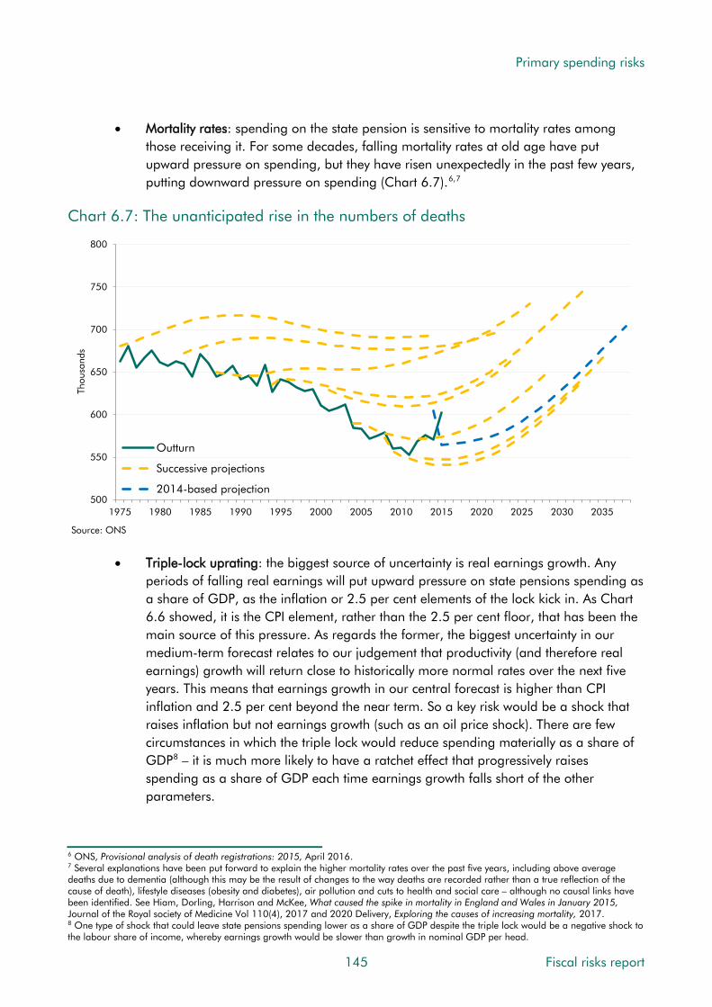
Primary spending risks
• Mortality rates: spending on the state pension is sensitive to mortality rates among those receiving it. For some decades, falling mortality rates at old age have put upward pressure on spending, but they have risen unexpectedly in the past few years, putting downward pressure on spending (Chart 6.7).6,7
Chart 6.7: The unanticipated rise in the numbers of deaths
500
550
600
650
700
750
800
1975 1980 1985 1990 1995 2000 2005 2010 2015 2020 2025 2030 2035
Thou
sand
s
Outturn
Successive projections
2014-based projection
Source: ONS
• Triple-lock uprating: the biggest source of uncertainty is real earnings growth. Any periods of falling real earnings will put upward pressure on state pensions spending as a share of GDP, as the inflation or 2.5 per cent elements of the lock kick in. As Chart 6.6 showed, it is the CPI element, rather than the 2.5 per cent floor, that has been the main source of this pressure. As regards the former, the biggest uncertainty in our medium-term forecast relates to our judgement that productivity (and therefore real earnings) growth will return close to historically more normal rates over the next five years. This means that earnings growth in our central forecast is higher than CPI inflation and 2.5 per cent beyond the near term. So a key risk would be a shock that raises inflation but not earnings growth (such as an oil price shock). There are few circumstances in which the triple lock would reduce spending materially as a share of GDP8 – it is much more likely to have a ratchet effect that progressively raises spending as a share of GDP each time earnings growth falls short of the other parameters.
6 ONS, Provisional analysis of death registrations: 2015, April 2016. 7 Several explanations have been put forward to explain the higher mortality rates over the past five years, including above average deaths due to dementia (although this may be the result of changes to the way deaths are recorded rather than a true reflection of the cause of death), lifestyle diseases (obesity and diabetes), air pollution and cuts to health and social care – although no causal links have been identified. See Hiam, Dorling, Harrison and McKee, What caused the spike in mortality in England and Wales in January 2015, Journal of the Royal society of Medicine Vol 110(4), 2017 and 2020 Delivery, Exploring the causes of increasing mortality, 2017. 8 One type of shock that could leave state pensions spending lower as a share of GDP despite the triple lock would be a negative shock to the labour share of income, whereby earnings growth would be slower than growth in nominal GDP per head.
145 Fiscal risks report

Primary spending risks
6.23 There is also uncertainty associated with the transition to the new state pension. In successive Welfare trends reports (WTR) we have shown how significant changes to the welfare system often come with unexpected fiscal consequences – from the introduction of tax credits in the 2000s to the recent and ongoing reforms to incapacity and disability benefits. We have not yet had reason to make significant changes to our forecast of the impact of the new state pension, but that will remain a possibility as the caseload rises and more information becomes available on its effects.
6.24 Between 2020 and 2026, the pressure from ageing will not be offset by changes to the SPA. This was discussed in our November 2016 EFO, where we noted that following a 2.6 per cent fall in caseloads in the five years to 2020, a 9.1 per cent increase was projected over the following five years. That would raise state pension spending by 0.3 per cent of GDP. This estimate would be sensitive to changes in mortality rates among older people (affecting spending) or to the working-age population (affecting GDP).
Long-term pensioner spending risks
6.25 In our 2017 FSR, we projected that spending on state pensions and other pensioner benefits would rise from 5.0 per cent of GDP in 2021-22 to 7.1 per cent of GDP in 2066-67. The main upward pressures come from the ageing population and triple lock uprating, which we assume would add 0.34 percentage points a year on average to annual uprating over the long term. Partly offsetting these factors are the ‘longevity link’ (leading to further rises in the SPA), less generous pension entitlements under the new state pension,9 and the effect on GDP from higher employment rates among older workers.
6.26 Our long-term projections are sensitive to the assumptions we make about demographic factors, SPA changes and the triple lock. These are discussed below. There are also risks associated with the shift to the new state pension, as with any major changes to a benefit system that affect large numbers of people.
6.27 In terms of sensitivity to demographic assumptions, Chart 6.8 shows the projected increase in spending between 2021-22 and 2066-67 under different variants presented in our 2017 FSR, and how they compare with our central projection of a 2.1 per cent of GDP rise. The variants are affected by differences in the old-age dependency ratio (raising spending and reducing the share of the population that is of working age), by the direct effect of SPA rises on eligibility (reducing spending) and by the indirect effect of SPA changes on employment rates (where we assume, in line with recent evidence, that raising the SPA increases employment rates among those in the age groups affected, which boosts GDP). The employment effect at older ages is sufficient in the old-age scenario (which combines lower fertility, higher life expectancy and lower migration) to reduce spending as a share of GDP relative to the central projection. Only the low migration variant has a higher increase in state pension spending than the central case, because it includes a smaller working-age population, but does not include higher life expectancy that would feed through to SPA
9 In our 2014 FSR, we estimated that while there would be little impact on spending until the 2040s, by 2063-64 it would deliver savings of 0.4 per cent of GDP.
Fiscal risks report 146

Primary spending risks
changes and the employment rate among older people. But even the young-age scenario sees spending rise as a share of GDP in the long term due to ageing and the triple lock.
Chart 6.8: Change in pension spending under different demographic variants
0.0
0.5
1.0
1.5
2.0
2.5
Young age Old age High migration Central Low migration
Per
cent
of G
DP
rise
betw
een
2021
-22
and
2066
-67
Source: OBR
6.28 In terms of assumptions about future changes to the SPA, there are uncertainties around how the longevity link will be applied and the effects of SPA changes on employment among older people. The SPA changes underpinning the projections in Chart 6.8 above were based on our calculations of how the longevity link would apply. Since our 2017 FSR, the first independent report into the state pension age (required by Pensions Act 2014) has been published. It recommended that the SPA should rise to 68 between 2037 and 2039, but that it should not increase by more than one year in any 10-year period.10 At the same time, as required by the same legislation, the Government Actuary’s Department (GAD) reported its analysis of the implications of specifying the ‘up to one third of adult life’ principle as either 32 or 33.3 per cent of adult life from age 20. GAD found that under the 32 per cent scenario the SPA could rise to 68 between 2028 and 2030 and to 69 between 2040 and 2042. Under the 33.3 per cent scenario these dates move back to 2039 to 2041 and 2053 to 2055.11 These timetables differ from those assumed in our 2017 FSR.
6.29 Chart 6.9 illustrates the sensitivity of spending to different assumptions about the number and timing of future SPA changes. On the basis of only currently legislated changes to the SPA, spending in 2066-67 would be 0.5 per cent of GDP higher than our central projection. On the basis of the GAD ’32 per cent’ timetable, spending in 2066-67 would be 0.4 per cent of GDP lower than our central projection.
10 Cridland, State Pension age independent review: final report, 2017. 11 GAD, State Pension age periodic review: report by the Government Actuary, 2017.
147 Fiscal risks report
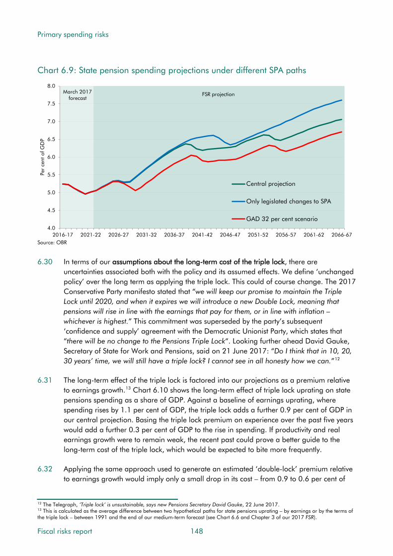
Primary spending risks
Chart 6.9: State pension spending projections under different SPA paths
March 2017 forecast
FSR projection
4.0
4.5
5.0
5.5
6.0
6.5
7.0
7.5
8.0
2016-17 2021-22 2026-27 2031-32 2036-37 2041-42 2046-47 2051-52 2056-57 2061-62 2066-67
Per
cent
of G
DP
Central projection
Only legislated changes to SPA
GAD 32 per cent scenario
Source: OBR
6.30 In terms of our assumptions about the long-term cost of the triple lock, there are uncertainties associated both with the policy and its assumed effects. We define ‘unchanged policy’ over the long term as applying the triple lock. This could of course change. The 2017 Conservative Party manifesto stated that “we will keep our promise to maintain the Triple Lock until 2020, and when it expires we will introduce a new Double Lock, meaning that pensions will rise in line with the earnings that pay for them, or in line with inflation – whichever is highest.” This commitment was superseded by the party’s subsequent ‘confidence and supply’ agreement with the Democratic Unionist Party, which states that “there will be no change to the Pensions Triple Lock“. Looking further ahead David Gauke, Secretary of State for Work and Pensions, said on 21 June 2017: “Do I think that in 10, 20, 30 years’ time, we will still have a triple lock? I cannot see in all honesty how we can.”12
6.31 The long-term effect of the triple lock is factored into our projections as a premium relative to earnings growth.13 Chart 6.10 shows the long-term effect of triple lock uprating on state pensions spending as a share of GDP. Against a baseline of earnings uprating, where spending rises by 1.1 per cent of GDP, the triple lock adds a further 0.9 per cent of GDP in our central projection. Basing the triple lock premium on experience over the past five years would add a further 0.3 per cent of GDP to the rise in spending. If productivity and real earnings growth were to remain weak, the recent past could prove a better guide to the long-term cost of the triple lock, which would be expected to bite more frequently.
6.32 Applying the same approach used to generate an estimated ‘double-lock’ premium relative to earnings growth would imply only a small drop in its cost – from 0.9 to 0.6 per cent of
12 The Telegraph, ‘Triple lock’ is unsustainable, says new Pensions Secretary David Gauke, 22 June 2017. 13 This is calculated as the average difference between two hypothetical paths for state pensions uprating – by earnings or by the terms of the triple lock – between 1991 and the end of our medium-term forecast (see Chart 6.6 and Chapter 3 of our 2017 FSR).
Fiscal risks report 148
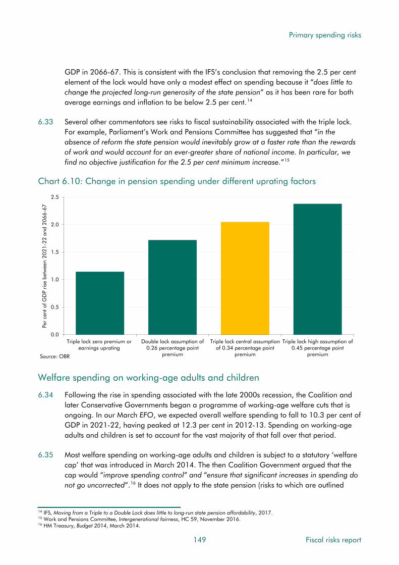
Primary spending risks
GDP in 2066-67. This is consistent with the IFS’s conclusion that removing the 2.5 per cent element of the lock would have only a modest effect on spending because it “does little to change the projected long-run generosity of the state pension” as it has been rare for both average earnings and inflation to be below 2.5 per cent.14
6.33 Several other commentators see risks to fiscal sustainability associated with the triple lock. For example, Parliament’s Work and Pensions Committee has suggested that “in the absence of reform the state pension would inevitably grow at a faster rate than the rewards of work and would account for an ever-greater share of national income. In particular, we find no objective justification for the 2.5 per cent minimum increase.”15
Chart 6.10: Change in pension spending under different uprating factors
0.0
0.5
1.0
1.5
2.0
2.5
Triple lock zero premium orearnings uprating
Double lock assumption of0.26 percentage point
premium
Triple lock central assumptionof 0.34 percentage point
premium
Triple lock high assumption of0.45 percentage point
premium
Per
cent
of G
DP
rise
betw
een
2021
-22
and
2066
-67
Source: OBR
Welfare spending on working-age adults and children
6.34 Following the rise in spending associated with the late 2000s recession, the Coalition and later Conservative Governments began a programme of working-age welfare cuts that is ongoing. In our March EFO, we expected overall welfare spending to fall to 10.3 per cent of GDP in 2021-22, having peaked at 12.3 per cent in 2012-13. Spending on working-age adults and children is set to account for the vast majority of that fall over that period.
6.35 Most welfare spending on working-age adults and children is subject to a statutory ‘welfare cap’ that was introduced in March 2014. The then Coalition Government argued that the cap would “improve spending control” and “ensure that significant increases in spending do not go uncorrected”.16 It does not apply to the state pension (risks to which are outlined
14 IFS, Moving from a Triple to a Double Lock does little to long-run state pension affordability, 2017. 15 Work and Pensions Committee, Intergenerational fairness, HC 59, November 2016. 16 HM Treasury, Budget 2014, March 2014.
149 Fiscal risks report

Primary spending risks
above) or to jobseeker’s allowance and associated housing benefit payments and their equivalents in universal credit (risks to which are largely economy-related).
6.36 The OBR is responsible for assessing adherence to the terms of the cap. If spending is forecast to exceed a stated level in a specific year chosen by the Treasury (currently the November 2016 EFO forecast for 2021-22 plus 3 per cent), the Government must bring spending back below that level or explain itself to Parliament.17 We provide updates or formal assessments on performance in each EFO. To date, the Government has met the terms of the cap once, changed the level of it twice and formally breached the terms twice.
6.37 On the two occasions where the terms of the cap were breached:
• in November 2015 the Government tabled a motion, carried in the House, that the “breach of the Welfare Cap… is justified and that no further debate will be required in relation to this specific breach”;18
• in November 2016 the Government proposed a new, higher welfare cap applying to a single year and that is not to be assessed formally until 2021. The Treasury also decided that the assessment should strip out the effects of inflation on uprating via a methodology of its own choosing. In doing so, the Government decided to tolerate these inflation risks rather than treating them or offsetting their effects elsewhere.
Medium-term spending forecast
6.38 Our medium-term forecast of non-pensioner welfare spending falls by 0.6 per cent of GDP over the five years to 2021-22. This reflects the significant cuts announced in Summer Budget 2015, on top of the ongoing effects of cuts announced by previous governments. In our 2016 WTR we assessed the cumulative impact of welfare spending measures over the 2010-2015 Parliament and what was then expected to be the 2015-2020 Parliament. Against a simple counterfactual of rising costs from uprating and demographic changes, policy changes were estimated to have cut spending by £23 billion a year by the end of the last Parliament plus a further £34 billion a year by the end of the 2015-2020 Parliament.
6.39 The cumulative scale of these cuts is unprecedented and, on current policy, real per capita welfare cap spending in 2021-22 is projected to be around 10 per cent lower than its 2015-16 level. Roughly half the projected savings come from simple changes to uprating – for example, the four-year uprating freeze from 2016-17 to 2019-20 – while the other half relies on the successful operational delivery of more complex changes to the welfare system. These include structural changes to the delivery of incapacity benefits, disability benefits, housing benefit, and universal credit (UC).
17 HM Treasury, Charter for Budget Responsibility, January 2017. 18 House of Commons Hansard, Welfare Cap, Vol 603, December 2015.
Fiscal risks report 150
Primary spending risks
Medium-term spending risks
6.40 There are a number of economy-related risks to welfare spending on working-age adults and children. Outside the periods when uprating is frozen, inflation is a key driver of cash spending for most benefits. Caseloads are also sensitive to trends in the labour market, housing market and health status. The roles played by these and other factors in explaining past fluctuations in welfare spending were discussed in depth in our 2014 WTR. Their effects on our medium-term forecasts have been covered in our EFOs. For example, in March 2016 we showed how new information about the outcomes of assessments being carried out as disability living allowance (DLA) is being replaced by the new personal independence payment (PIP) had led us to revise up spending significantly.19
6.41 Among the factors that we consider key medium-term spending risks are:
• The delivery of reforms to the existing benefits systems: around half the welfare cuts over the five years to 2020 come from more complex reforms. The largest of these are cuts to UC work allowances and payments to larger families, which are taking place while a number of reforms remain unfinished. This type of reform has proven difficult to deliver and is often associated with substantial forecast revisions. Initial forecasts for spending on tax credits, employment support allowance (ESA) and PIP have all been too low. And while the level of savings has tended to disappoint, we have also seen delays in their delivery. Our medium-term forecast is conditioned on reforms such as ESA and PIP overcoming their earlier problems. Key parts of these policies are to be delivered by private companies on relatively short-term contracts where performance has fallen short of required levels early in the contract. It also relies on success rates – the proportion of claims receiving an award – falling closer to original expectations.
• Universal credit: this is probably the biggest welfare reform in decades, combining six benefits and tax credits (worth around £60 billion in 2017-18 in the current system) into a single payment. It includes relatively big and volatile spending lines, such as tax credits (£28 billion), ESA (£11 billion) and housing benefit (£18 billion).20 Relative to these equivalents in the existing benefit system, higher take-up and increased entitlement for certain groups under UC is more than offset by lower entitlement for other groups and administrative savings. All told, spending is expected to be around £2 billion lower under UC in 2021-22 than it would have been under the existing system. While this net marginal saving is relatively small, the offsetting gross costs and savings behind it are much larger, generating significant uncertainty over future spending. It is sensitive to many factors, which we will be exploring in our 2017 WTR. One of them is the rollout timetable, which has repeatedly been pushed back (Chart 6.11). The number of claimants is roughly four years behind schedule, while the latest rollout plans are due to finish around five years later than originally announced. While the gateway now admits and treats more complex cases, the current caseload is still overwhelmingly composed of simpler cases and the resilience of the system and its ability to cope with greater volumes and complexity is yet to be fully tested. The move
19 See from paragraph 4.111 onwards in our March 2016 EFO, in particular Chart 4.9. 20 See Box 4.5 of our March 2017 EFO for a fuller description of the elements of these benefits that UC will replace.
151 Fiscal risks report

Primary spending risks
in administrative responsibility from HMRC to DWP for those cases previously on tax credits poses additional challenges.
Chart 6.11: Successive universal credit rollout assumptions
0
1
2
3
4
5
6
7
8
9
2014-15 2015-16 2016-17 2017-18 2018-19 2019-20 2020-21 2021-22
Ave
rage
cas
eloa
d (m
illio
ns)
March 2013
Successive forecasts
March 2017
Source: DWP, OBR
• Legal challenges: an increasing number of legal challenges pose upward risks to welfare spending. These have included challenges relating to eligibility to PIP, ESA processes and the legality of the so-called ‘bedroom tax’. DWP’s departmental accounts do not report the expected or potential cost of current or anticipated legal challenges.21 This is in contrast to the reporting of similar risks in HMRC’s accounts for tax litigation cases (see paragraph 6.127) and the Department of Health’s accounts for clinical negligence claims (paragraph 6.113).
Risks to fiscal sustainability
6.42 In our 2017 FSR, we projected that spending on non-pensioner benefits and tax credits, plus the marginal saving associated with the move to UC, would fall from 4.5 per cent of GDP in 2021-22 to 4.3 per cent in 2066-67. This relatively flat profile reflects our assumption that most working-age benefits will move broadly in line with the share of the population that is of working-age and that average awards will rise in line with earnings over the long term.
6.43 Long-term risks to welfare spending on working-age adults and children appear less significant than those to pensioner benefits. That said, if increased recognition of health conditions that provide eligibility for disability and incapacity benefits continues as it has in recent years, this would generate upward pressures that are not captured in our long-term projections. Economic downturns also represent a risk that is not factored into our central
21 DWP’s 2016-17 annual report and accounts note that “Judicial review: We have contingent liabilities arising from payments that may become due as a result of judicial review claims against us. We can’t be sure of the timing, likelihood or amount of any settlements at this stage.” The accounts do not include any provisions in relation to legal challenges.
Fiscal risks report 152

Primary spending risks
projections, since employment and income affect both eligibility for, and levels of, some welfare payments. This is only an issue to the extent that economic cycles, or their effects, are not symmetric. History does suggest that recessions tend to surprise forecasters to the downside more than booms surprise them on the upside.
Conclusions
6.44 Medium-term risks tend to be associated more with discrete events. An unexpected drop in real earnings would raise state pensions spending as a share of GDP via the triple lock, with each 1 percentage point increase in state pension awards relative to earnings growth worth 0.05 per cent of GDP (all else equal) in each year. Recent history suggests a higher risk of this than longer historical trends do, so there may be a medium or even high risk that the triple lock costs more in outturn than in our central forecast. Surprises relative to our forecast assumptions about the effects of ongoing reforms to incapacity or disability benefits are also likely, but should be two-sided. That said, recent history has shown that even the upward revisions we have made to our spending forecasts have been insufficient. There is a medium risk that we have to revise them up again. And the risk of further delays or more serious problems in the delivery of universal credit is also judged of medium likelihood.
6.45 Longer-term risks to sustainability tend to be continuously building pressures, which means that policymakers would have time to treat them or offset their effects over time. Ageing is the biggest source of pressure on state pensions spending. It is also an important driver of disability benefits spending. The likelihood of ageing putting upward pressure on spending is very high, despite planned and expected SPA rises. The triple lock is factored into our projections as an average effect each year, but in reality its cost would ratchet up in discrete steps. As well as SPA policy changes, the key potential offsetting source of risk comes from employment rates among older people, which could rise faster than we have assumed.
6.46 In terms of the categorisation of risks described in Chapter 1, risks to welfare spending come in many forms. They include discrete shocks to caseloads and average awards (e.g. when the economy is hit by high unemployment or high inflation) and slowly building pressures (e.g. from an ageing population). There are risks that are largely isolated (e.g. the delivery of universal credit) and those that are correlated with others (e.g. economy-related factors). Some risks are endogenous to government action (most obviously the ratchet effect on state pensions spending from the triple lock) and others are largely beyond government’s immediate control (e.g. adverse legal judgements that expand eligibility). Many of these risks would have been apparent in an assessment made at any point over the past 30 years (e.g. challenges associated with major reforms), but some have risen in prominence more recently (e.g. the pressures of ageing and the triple lock).
153 Fiscal risks report

Primary spending risks
Health and adult social care services
6.47 Taken together health and adult social care are the largest single component of public services spending in the UK. Responsibility for delivering them is split between different levels of government: health care is a responsibility of central government and the devolved administrations, but adult social care is a responsibility of local government. While health care is funded mainly from general taxation, adult social care is currently funded from a combination of central and local taxation and payments by individual service users.
6.48 As regards provision, publicly provided health services are delivered by the NHS in England, while publicly provided adult social care is delivered (or commissioned) by local authorities. Scotland and Wales have relatively similar systems, but both have recently passed legislation to increase integration in delivery. Northern Ireland’s system is more integrated.
6.49 As regards funding in England, treatment by the NHS is largely free at the point of delivery and financed from general taxation. Adult social care in England has to be paid for in full by the recipient until their income and capital falls below a means-tested threshold. When it does, the recipient may still need to pay a user charge based on their income, with the remaining cost met by the local authority. The system in the rest of the UK is somewhat more generous: in particular Scotland offers free personal care to older recipients of social care. Financial support is also provided through disability benefits and carer’s allowance.
6.50 Public spending on health across the UK as a whole totaled £135.3 billion in 2015-16 (7.2 per cent of UK GDP) and on current plans is set to rise to £148.2 billion in 2019-20 (6.8 per cent).22 Net adult social care spending local authorities in England was £14.1 billion in 2015-16 (0.9 per cent of English GDP) and is set to rise to £18.0 billion in 2019-20, thanks to recent increases in central government and council tax financing.23 Spending through the Better Care Fund (BCF) – a joint programme spanning the NHS and local authorities to help join up services – is captured within health spending. It is worth around £2 billion a year, so if it was instead counted with net adult social care spending, that would be around 14 per cent higher, while health spending would be around 1½ per cent lower.
6.51 Chart 6.12 shows OECD estimates of public spending on health and adult social care as a share of GDP in the ‘G7’ major advanced economies. This excludes private sector spending on these services, which is important in some countries – e.g. on health in the US. The chart shows that public spending on these services in the UK is in the middle of the pack among the G7 countries, but somewhat higher than the average across all OECD countries.
22 Health spending on a ‘functional’ basis for the UK, covering both current and capital spending by central government only, taken from HM Treasury, Public expenditure statistical analyses 2016, July 2016. This differs from the outturn figures in Chart 6.13, which are for the public sector, i.e. they include local authority spending. Plans for future spending are only produced for central government. 23 Outturn adult social care data are net current expenditure figures based on Department for Communities and Local Government (DCLG) local authority revenue expenditure and financing data. They exclude social care for children and families and all NHS income such as the Better Care Fund. As social care is delivered by local authorities, there is no equivalent to departmental plans for future years. The forecasts cited here were produced for us by the Department of Health.
Fiscal risks report 154

Primary spending risks
Chart 6.12: Public spending on health and adult social care in the G7
0
2
4
6
8
10
12
14
Italy OECD Average Canada US UK Germany France Japan
Per
cent
of G
DP
Health (2015)
Long-term care (health and social components, 2014)
Source: OECD 6.52 We can think of the fiscal risks arising from this source as the possibility that the government
and/or local authorities will decide to spend more than they currently plan to over the next few years and/or that spending will rise as a share of GDP over the longer term.
Drivers of health and social care spending
6.53 The amount of public money allocated to health and adult social care is ultimately a political choice, involving trade-offs with other spending priorities. But, viewed across time and countries, the amount governments choose to spend does seem to be driven by an identifiable set of factors, the importance of which varies from period to period:
• Demographic factors capture the effect of changes in the age structure of the population, including health status at given ages. The ageing of the population has not been a significant driver of spending in recent decades, but is expected to be more so in the future.24 As Chart 6.5 showed, the proportion of the population aged 85 or more, whose per capita consumption of health and social care spending is greatest, is set to rise sharply over the next half century. It should be noted, however, that the aggregate relationship between age and per capita health spending (shown in Chart 6.3) in part simply reflects the fact that spending rises very sharply in the last year of life (‘death-related costs’) and mortality rates are higher at higher ages. The number of deaths has recently been rising, after years of trending lower (see Chart 6.7).
• Income-related drivers reflect the fact that health and social care are ‘normal’ goods, which means that people generally demand more of them as their incomes rise.
24 De la Maisonneuve and Oliveira Martins, Public spending on health and long-term care: a new set of projections, OECD Policy Papers No. 06, 2013.
155 Fiscal risks report
Primary spending risks
Studies suggest that income effects are an important driver of increases in real-terms health spending, but that they do not raise spending as a share of GDP.
• Non-demographic cost pressures come from various sources:
• First, health and social care are labour-intensive, which leaves less scope for productivity growth than in the rest of the economy. But pay rates have to remain broadly in line with those elsewhere in order to recruit and retain staff, so relative costs rise in a mechanism known as ‘Baumol’s cost disease’.25
• Second, technological advances (e.g. medical equipment, techniques and procedures) often increase rather than reduce spending, even when they reduce unit costs, because they result in treatments being used more widely.
• Third, the rise of chronic conditions is likely to affect both health and social care, increasing the services that people consume before their final years of life.
NHS England estimated that, on average in 2015-16, these non-demographic cost pressures added 2.7 and 1.2 percentage points to growth in primary (GP) and secondary (hospital and community) care spending respectively.26
6.54 These drivers are not entirely independent of each other and in practice it is hard to isolate the individual contribution of each in explaining past trends. Estimates in studies that attempt to do so often differ in part because of the order in which they try to identify them.
Medium-term spending risks
Recent trends in UK health and social care spending
6.55 As a result of these drivers – primarily the non-demographic cost pressures – health spending has grown faster than the economy on average over recent decades – 3.8 per cent a year in real terms versus 2.2 per cent a year since 1978-79.27 This trend is common to most advanced economies.28 Similarly, real terms net spending on adult social care in England has increased by an average of 3.3 per cent a year since 1994-95, while real GDP growth averaged 2.1 per cent a year over that period. This reflects spending by local authority social service departments. If spending through the BCF were included, the average real terms growth would increase to 3.8 per cent.
6.56 But the picture in recent years has been different. Governments have succeeded in squeezing spending on health and social care as a share of GDP to contribute to the deficit reduction programme put in place following the financial crisis (Chart 6.13). In comparison with the pre-crisis trend, the difference is most striking in health. Total health spending
25 Baumol and Bowen, Performing Arts: The Economic Dilemma, New York: The Twentieth Century Fund, 1966. 26 NHS England, NHS Five Year Forward View: Recap briefing for the Health Select Committee, 2016. 27 Based on functional spending on health for the UK. Functional spending also includes spending on health by bodies other than the Department of Health, such as local authorities and devolved administrations. 28 See our Working Paper No. 9 on Fiscal sustainability and public spending on health and Fiscal sustainability reports for more detail.
Fiscal risks report 156

Primary spending risks
increased by 1.0 per cent of GDP in the five years to 2007-08, then by another 1.1 per cent of GDP in the two years to 2009-10 due to crisis-related drop in GDP. Between 2010-11 and 2015-16, the first five years of the deficit reduction programme, spending fell by 0.2 per cent of GDP. We estimate that:
• pay restraint more than explained the drop, as average pay and other staff costs increased more slowly than GDP per person;
• workforce growth contributed little to the change, as it increased only slightly more slowly than the population; but
• non-pay costs offset around half the contribution from pay restraint, as the number of interventions and their average cost increased.
Chart 6.13: Public spending on health and adult social care
0
1
2
3
4
5
6
7
8
9
1978-79 1983-84 1988-89 1993-94 1998-99 2003-04 2008-09 2013-14
Per
cent
of G
DP
Total health spending (UK)
Department of Health (England)
Adult social care (NHS data)
Adult social care (DCLG data)
Source: DCLG, HMT, NHS
Note: NHS data for adult social care is based on net current expenditure for England including the BCF and NHS transfers. DCLG datafor adult social care is based on net current expenditure for England excluding the BCF and NHS transfers.
6.57 As the period of relative spending restraint has lengthened, so pressures have begun to
emerge in both services:
• Higher demand and longer waiting lists: for example, accident and emergency (A&E) attendances and emergency admissions have been rising faster than population growth, while the proportion of people being seen within four hours of admittance to A&E fell from 96.6 per cent in 2011-12 to 89.1 per cent in 2016-17.29
• Knock-on pressures from social care: the number of days during which beds in acute hospitals have been occupied due to delayed transfers of care increased by 37 per cent over two years. Social care was responsible for over half this increase, with the
29 NHS, A&E Attendances and Emergency Admission 2017-18, April 2017.
157 Fiscal risks report

Primary spending risks
two main reported reasons being patients waiting for a care package in their home or a nursing home placement.30
• Financial deficits and overspends: NHS providers, which account for two-thirds of NHS spending, have been in deficit on average since 2013-14.31 This puts pressure on DH’s DEL budget, requiring offsetting savings elsewhere in the departmental group to keep spending within the overall limit set by the Treasury. Despite making savings elsewhere, the department exceeded its total DEL budget by £0.4 billion in 2015-16. The department also overspent its RDEL (excluding depreciation) budget in 2014-15 by £0.2 billion, but this was more than offset by a capital underspend.
Chart 6.14: Indicators of current health spending pressures
-3
-2
-1
0
1
2
3
2010-11 2012-13 2014-15 2016-17
£ bi
llion
Underspend
Overspend
DH RDEL budget outturn
-3
-2
-1
0
1
2
3
2010-11 2012-13 2014-15 2016-17
Surplus
Deficit
NHS providers position
Source: Department of Health Annual Report 2015-16, NHS Improvement
• Brexit-related uncertainties: an estimated 5.5 per cent of the NHS workforce are EU
nationals, including almost 10 per cent of doctors in England’s hospital and community health services.32 UCAS data published in March 2017 showed a 19 per cent fall in unique applicants to nursing and midwifery courses by the March 2017 deadline, compared to the same time point in 2016. Applications from other EU countries were down 25 per cent.33 There was also a 96 per cent drop in the number of nurses from the EU registering to practise in the UK in the year to April 2017.34 Given other policy changes, it is not clear how much of this relates specifically to Brexit.
30 NAO, Health and social care integration, HC 1011, 2017. 31 These providers are responsible for secondary (i.e. hospital and community) and tertiary (highly specialist) care. 32 House of Commons Library, NHS staff from overseas: statistics, April 2017. 33 UCAS, 2017 cycle applicant figures, 24 March deadline. 34 Health Foundation, New data show 96% drop in nurses from EU since July last year, 12 June 2017. Changes to language test requirements over this period may also have been a contributing factor to the drop in registrations.
Fiscal risks report 158

Primary spending risks
6.58 In Spending Review 2015, the NHS was ‘protected’, with spending set to rise by 1.6 per cent a year in real terms on average between 2015-16 and 2020-21 and the increases frontloaded.35 Even so, the NHS has estimated that living within this settlement would require it to make £22 billion of efficiency savings by 2020-21.36
6.59 Comparing the five years to 2020-21 with the five years to 2015-16 (described in paragraph 6.56) is instructive. Spending is set to fall by 0.4 per cent of GDP in the five-year period in progress, up from 0.2 per cent of GDP in the past five years. Pay restraint continues to contribute to the fall, with the 1 per cent ceiling on cash pay rises in place until 2019-20. The effect of this on staff costs per employee is partly offset by a number of new policy-related pressures, the biggest of which are the apprenticeship levy (from 2017-18) and the expected effect of the ongoing pension revaluation (that will take effect in 2019-20). The new immigration skills charge and levy for pension administration costs also hit from 2017-18. Despite these pressures, staff costs per employee are still expected to rise a little more slowly than nominal GDP per person. Unlike the past, it is non-pay costs that are expected to deliver most of the fall in spending as a share of GDP – hence the large efficiency savings the NHS deems necessary. This would require it to overcome both demographic and other cost pressures that have historically led to health spending rising faster than GDP.
6.60 In the context of pressures on the NHS, the Government has injected additional funding in recent years and has allowed DH to use its budget allocation more flexibly. For example:
• Announcements of additional funding: on a number of occasions in recent years, governments have chosen to increase the health budget beyond the amount initially planned. The 2014 Autumn Statement set out £1.2 billion of additional funding from the reserve for frontline NHS services in 2015-16, raising the baseline for DH’s Spending Review settlement. Spring Budget 2017 also committed additional funding for ‘Sustainability and Transformation Plans’ (‘place-based’ local plans for the future of health and care services) and for A&E capital investment “recognising the particular pressure in A&E”. The Government has also put in place the ‘Better Care Fund’ to integrate health and social care services more effectively.
• Switching funds from capital to current spending: the Treasury has allowed DH to move hundreds of millions of pounds from its capital budget to its resource budget to fund day-to-day spending (£640 million in 2014-15, £950 million in 2015-16 and £1.2 billion in 2016-17). The House of Commons Public Accounts Committee has expressed concern and recommended that DH, NHS England and NHS Improvement should “call a halt to crisis driven transfers out of capital budgets”.37
35 The Department of Health budget did not increase by as much as that of the NHS, creating a squeeze on non-NHS elements of health spending. The Health Select Committee noted that reduced spending in some affected areas, such as funding for Public Health England, could create further knock-on pressures for the NHS. See House of Commons Health Committee, Impact of the Spending Review on health and social care, HC 139, 2016. 36 NHS Five-Year Forward View, Recap briefing for the Health Select Committee on technical modelling and scenarios, May 2016 and NAO, Financial Sustainability of the NHS, HC 785, 2016. 37 House of Commons Committee of Public Accounts, Financial sustainability of the NHS, Forty Third Report, Session 2016–17, 2017.
159 Fiscal risks report

Primary spending risks
Medium-term spending risks
6.61 The combination of these emerging pressures and the willingness of successive governments to accede to the NHS’s periodic requests for more money – rather than imposing a hard budget constraint and requiring it to deliver the best service it can within its original allocation – implies a fiscal risk of further increases to current spending plans. The Conservative Party’s 2017 manifesto stated that “we will increase NHS spending by a minimum of £8 billion in real terms over the next five years”, implying further rises beyond those set out in current plans.
6.62 One way to assess the risk is to compare current plans to scenarios based on historical patterns or alternative demographic projections. Chart 6.15 shows four scenarios devised by the Nuffield Trust.38 All have spending higher than current plans, with the difference in 2020-21 ranging from £5.1 billion (to keep DH spending flat as a share of GDP) up to £15.6 billion (using the assumptions that underpin our long-term projections, but applying them from 2017-18 rather than 2022-23). Analysis by the Health Foundation (again based on our 2017 FSR health spending assumptions) suggested that there would be £15 billion (in 2017-18 prices) of spending pressures on top of pre-election spending plans by 2020-21.39 These top-down estimates do not allow us to identify where pressures are likely to be greatest. But combined with the NHS’s own estimate of necessary efficiency savings and our estimate of which broad categories are set to contribute to the fall in spending as a share of GDP, they suggest that the assumed path of unit cost growth is a key risk.
Chart 6.15: DH spending limits versus alternative Nuffield Trust scenarios
120
125
130
135
140
145
150
155
2017-18 2018-19 2019-20 2020-21
£ bi
llion
Nuffield Trust projection based on OBR declining cost pressures
Long run NHS growth
Existing rate of increase in NHS costs and demand
Keep up with GDP growth
Continue existing plans
Note: Data has been converted from real into cash terms.Source: Nuffield Trust
38 Appleby and Gainsbury, NHS funding choices and the 2017 General Election, Nuffield Trust, May 2017. 39 Health Foundation, General Election 2017: what the manifestos might mean for healthcare funding, May 2017.
Fiscal risks report 160

Primary spending risks
6.63 But there are a variety of ways that the Government could reduce spending as a share of GDP. Its focus is on delivering the same output for less by lowering costs and/or increasing productivity, but it could also choose to reduce provision. They all appear challenging:
• Bearing down further on costs? This could be done via pay, non-pay costs or a combination of the two. As noted above, pay restraint has been a significant contributor to the drop in NHS spending as a share of GDP in recent years. The 1 per cent cap on public sector pay increases – which applies to NHS staff – is set to continue until 2019-20. However, the NHS is reported to be facing difficulties in recruiting and retaining staff and shortages persist across some key staff groups,40 to which uncertainty has been added regarding the future rights and status of EU nationals working in the NHS. This has led several commentators to question the sustainability of pay restraint as a cost containment strategy.41 The IFS estimates that every 1 per cent addition to NHS staffing costs would add around £0.5 billion a year to spending.42 Sources of potential non-pay savings include equipment, operations and the NHS estate. The NHS is relying more on these looking forward than was the case over the past five years.
• Improving productivity? The NHS has set itself a target of 2 to 3 per cent productivity gains a year through to 2020. Recent estimates suggest that productivity in the health care sector has been improving, with the ONS reporting average productivity growth of 2.0 per cent a year since 2012.43 But on the University of York measure productivity growth has averaged only 1.0 per cent a year over the same period.44 Over a longer period, productivity growth in the sector averaged 1.2 per cent a year between 1979 and 2014.45 On this measure, it has not averaged more than 2 per cent a year for a period of more than three years.
• Reduced health care provision? Opinion polls identify the NHS (alongside Brexit) as the issue that matters most to the British public and find a majority worried that its performance will decline.46 When the NHS England Chief Executive shares his views on the adequacy of health spending, it is often front-page news.47 In this context, the recent General Election saw all the main parties’ manifestoes promise to protect or increase NHS funding in some way. It therefore seems highly unlikely that health care provision will be rationed in a material way over the next five years.
40 NHS Pay Review Body, Thirtieth Report: 2017, March 2017. 41 Royal College of Midwives, Campaigning to End Pay Restraint in the NHS submissions to NHS Pay Review Body, Thirtieth Report: 2017. 42 Stoye, UK health spending, IFS Briefing Note BN 201, May 2017. 43 ONS, Public service productivity estimates: healthcare, 2014, 2017. 44 Grašič, Howdon, Santana and Street, Productivity of the English NHS: 2014/15 Update, CHE Research Paper 146, 2017. 45 See our 2017 Fiscal sustainability report. 46 Ipsos Mori, Levels of pessimism for future of NHS, policing and education highest for 15 years, April 2017. 47 See, for example, reporting of Simon Stevens appearance at the House of Commons Health Select Committee in October 2016, where he was asked by the Chair if he felt that the “NHS has been given everything it has asked for” and answered that: “For years 1 and 5, yes, you could say that we were kind of in the zone, but for the next three years we did not get the funding that the NHS had requested. This is not a controversial statement. It is what I have already said to the Public Accounts Committee, so it is not a new statement. As a result, we have a bigger hill to climb. It is going to be a more challenging 2017-18 and 2019-20.”
161 Fiscal risks report

Primary spending risks
6.64 On top of these ‘business-as-usual’ risks, there could be one-off events that generate demand for additional health spending, such as a large-scale outbreak of disease (e.g. an influenza pandemic, which the Cabinet Office considers to represent “the most significant civil emergency risk”).48 Long-term systemic cost pressures could also arise from sources such as an increase in antimicrobial resistance, which could greatly increase the costs associated with treating infections in all health care interventions.49
6.65 When considering potential fiscal risks around health spending it is worth bearing in mind the size, complexity and opacity of the system that delivers public health care in the UK. The NHS is the world’s fifth largest employer.50 DH oversees nine non-departmental public bodies, including NHS England with its 209 clinical commissioning groups (CCGs). It also oversees three ‘special health authorities’, five other bodies, 153 NHS foundation trusts, 90 NHS trusts and NHS charities.51 Several commentators have highlighted the challenge that this size and complexity creates for managing health care provision.52
Pressures on the adult social care budget and how Government has responded
6.66 As with health, there are visible signs of pressure on the adult social care system. In the past two years, governments have announced top up funding and delayed reforms that would increase costs further. This Government has stated that “further reform is required to ensure that the system is prepared to meet the challenges of the increasing numbers of over 75s” and that it will “work with partners at all levels, including those who use services and who work to provide care, to bring forward proposals for public consultation”.53
6.67 Signs and sources of pressure on the adult social care budget include:
• Pressure on local authority budgets has fed through to adult social care: For those authorities in England with responsibility for adult social care, it is their largest item of discretionary spending. Local authority budgets have been squeezed by cuts to grant funding and limits on council tax rises. As a result, English local authorities’ total net current expenditure fell by 13.3 per cent in real terms between 2010-11 and 2015-16.54 Within this, total spending on adult social care fell by less, but local authority spending on it still fell by 9.1 per cent over the same period, including transfers from the NHS. Spending on adult (and children’s) social care exceeded local authorities’ budgets in 2014-15 and, by a bigger margin, in 2015-16.55
• Reduced service delivery and spillover effects on the NHS: spending cuts have not been offset by higher productivity – indeed, in a labour-intensive sector, the scope for such an offset is limited. The volume of services being delivered has therefore fallen
48 Cabinet Office, National Register of Civil Emergencies: 2015 edition, 2015. 49 Review on Antimicrobial Resistance, Antimicrobial Resistance: Tackling a crisis for the health and wealth of nations, 2014. 50 Forbes, The World's Biggest Employers, 2015. 51 Department of Health, Annual report and accounts 2015-16, July 2016. 52 See, for example, House of Commons Public Administration Committee, Who's accountable? Relationships between Government and arm's-length bodies, First Report of Session 2014-15, 2014 and PWC, Redrawing the health and social care architecture, 2016. 53 Cabinet Office, The Queen’s speech and associated background briefing, 2017. 54 This fall in local authority spending includes a large fall in education spending due to the ‘academisation’ of schools. When schools switch to become academies, their spending is classified to the central government rather than local authorities sector. 55 See Chart 4.10 in our March 2017 EFO and associated discussion.
Fiscal risks report 162
Primary spending risks
with the decline in funding, with the Health Foundation estimating a fall of 25 per cent between 2009-10 and 2013-14 (with reductions in services for all disability types).56 This has in turn increased pressure on the NHS, as noted above.
• The National Living Wage: in July 2015 the Government announced that the effective minimum wage for employees aged 25 and over – the ‘National Living Wage’ (NLW) – would rise significantly faster than expected earnings growth each year from 2016 to 2020. This will place significant pressure on the unit cost of social care because a high proportion of jobs in the sector are low-wage. Low Pay Commission (LPC) analysis suggests that around 40 per cent of care workers were legally affected by the introduction of the NLW. This generated a substantial compression effect in the bottom half of the wage distribution for care home assistants (including spillover effects for those under 25).57 The LPC analysis found no clear evidence of NLW effects on employment, suggesting that profit margins and, perhaps, care quality were affected by higher labour costs. Our March 2017 EFO forecast implied that the NLW would rise by 17 per cent from its current level of £7.50 an hour to £8.75 an hour in 2020. This implies that much of the growth in adult social care spending in the coming years is required simply to meet faster growth in staff costs.
• Brexit-related workforce uncertainties: ‘Skills for Care’ estimates that around 230,000 social care workers in England were born outside the country, one in six of the total; of these, around 90,000 were born in the EU.58
6.68 While the introduction of the NLW has increased pressure on the social care budget, other Government decisions have postponed costs or increased funding. They include:
• Delaying the Dilnot reforms: the Coalition Government’s plans to reform social care funding, informed by the 2011 Dilnot Commission, would have introduced a lifetime cap of £72,000 on certain expenses that individuals pay towards their long-term care, with the state meeting the remainder (bar up to £12,000 a year in ‘hotel costs’ if the individual is in a care home). This was due to commence in April 2016, at a UK-wide cost of around £6 billion over the first five years. In July 2015, the Conservative Government announced that the introduction would be postponed until April 2020. The new Government now plans to consult on further options for reform.
• Additional council tax funding: in Spending Review 2015, the Government announced that eligible councils would be allowed to increase council tax bills by 2 per cent a year beyond the existing cap for a period of three years, with the money raised dedicated to adult social care. In December 2016, it announced that councils would be allowed to raise bills by 3 per cent a year for two years, bringing forward the funding boost.
• Additional central government funding: in Spring Budget 2017, the Government announced £1 billion of additional grant funding for local authorities in England in
56 NHS Digital, 2017. 57 Giupponi and Machin , The Impact of the National Living Wage on English Care Homes, analysis for the Low Pay Commission, 2017. 58 Skills for Care, National Minimum Data Set on Social Care (NMDS-SC) for England, 2016. 163 Fiscal risks report

Primary spending risks
2017-18 and a further £1 billion spread over 2018-19 and 2019-20. It said that this would “ensure councils can take immediate action to fund care packages for more people, support social care providers, and relieve pressure on the NHS locally.”
6.69 The overall effect has been to put the adult social care budget on an upward path, reversing some of the real per capita reduction in spending over the five years to 2015-16 (Chart 6.16). This trend is strengthened further if spending through the BCF is included, to the extent that there is a small increase in real per capita spending of 0.6 per cent over the 10-year period. This would still be smaller than the rise in real staff costs generated by the NLW. In April 2017 a House of Lords committee stated that it “remain[s] unconvinced that the amount allocated so far for the period to 2020 is sufficient to provide a stable platform of adult social care services on which to build a longer-term funding solution.”59
Chart 6.16: Adult social care spending in England
-3
-2
-1
0
1
2
3
4
5
2010-11 to 2015-16 2015-16 to 2019-20 2010-11 to 2019-20
Ann
ual a
vera
ge g
row
th r
ate
(per
cen
t)
Nominal termsReal terms (2016-17 prices)Real per capita (2016-17 prices)
Source: DCLG
Interactions between health and social care
6.70 Health and social care services interact in a number of ways. First, they share a number of common drivers, although they may be sensitive to them in different ways. This means that pressures on both can build at the same time, but not necessarily at the same pace. Second, the services provided are substitutable, so pressures on one can spill over to the other.
6.71 In terms of common drivers, where the sensitivity of each form of care to them differs, the key issue is that trends in morbidity (i.e. the amount of time spent in ill health) and trends in disability do not necessarily run in parallel. The relationship between risk factors, morbidity
59 House of Lords Select Committee on the Long-term Sustainability of the NHS, The Long-term Sustainability of the NHS and Adult Social Care, HL Paper 151, 2017.
Fiscal risks report 164

Primary spending risks
incidence and prevalence, disability rates (at different intensities), mortality rates, healthy life expectancy and disability-free life expectancy is complex. For example:
• Incidence rates of strokes have been falling, but the proportion of the population that survives a stroke has been rising. This suggests that the need for acute hospital care for stroke has been falling (easing one source of pressure on health care), but that the need for social care for stroke has been rising (increasing pressure there).60
• Prevalence rates of learning disabilities have been rising due to improved survival, including survival into old age. Severe learning disability is a major driver of the need for social care, but is less important for health care.61
• Dementia is frequently cited as pressure on social care budgets. Incidence rates (the risk of getting the illness) and prevalence rates (the proportion of cases in the total population) have been falling, probably as a result of reduced smoking and other lifestyle factors. But whether this will continue is uncertain, especially since the prevalence of diabetes, an important risk factor, is rising. And even if age-specific incidence and prevalence rates do not increase, unless there is a breakthrough in treatment the number of sufferers is likely to rise as the population gets older and more people reach the average age of onset in the early-to-mid 80s. Dementia is not a major driver of hospital admissions, but it is a driver of the length and cost of stays (through admissions for other reasons) and a major driver of need for social care.62
6.72 In terms of how spending on health or social care can influence demand on the other service, NAO analysis suggests that around a fifth of emergency hospital admissions are for existing conditions that could be managed by primary, community or social care.63 It also estimated that delays in discharging patients increased by 37 per cent in the two years to November 2016, with the main reason being that patients were waiting for some form of care package, at home or in residential care.64 The extra costs of keeping patients in hospital who no longer need to receive acute clinical care is around £820 million.65 Longer stays are also likely to harm older people’s health as they lose mobility and ability to do everyday tasks, potentially increasing future health and social care costs.
60 Lee, Shafe and Cowie, UK stroke incidence, mortality and cardiovascular risk management 1999–2008: time-trend analysis from the General Practice Research Database, 2011. See also Koton, Silvia and others, Stroke incidence and mortality trends in US communities, 1987 to 2011, Jama 312.3: 259-268, 2014. 61 Emerson and Hatton, Estimating future need for social care among adults with learning disabilities in England: an update, Durham: Improving Health and Lives Learning Disability Observatory, 2011. 62 Satizabal, Claudia et al., Incidence of dementia over three decades in the Framingham Heart Study, New England Journal of Medicine 374.6: 523-532, 2016. 63 NAO, Adult social care in England: overview, 2014. 64 NAO, Health and social care integration, 2017. 65 NAO, Discharging older patients from hospital, 2016.
165 Fiscal risks report

Primary spending risks
Long-term risks to fiscal sustainability
Risks factored into our central projections
6.73 The central projections in our latest FSR suggest that if governments choose to increase spending on health and social care to accommodate long-term cost and demand pressures – a plausible interpretation of unchanged policy – then spending would rise gradually but significantly over coming decades as a share of GDP. This would pose clear risks to fiscal sustainability if governments did not take action either to reduce the effects of these pressures or to offset them with lower spending elsewhere.
6.74 In our 2017 FSR, our central projections assumed that:
• Spending on health care would rise from 6.9 per cent of GDP in 2021-22 to 12.6 per cent of GDP in 2066-67. Population ageing contributed 1.3 percentage points of the 5.8 per cent of GDP rise, but other non-demographic cost pressures were the biggest factor accounting for 4.5 percentage points of the rise. In terms of the continuous long-term fiscal risks considered in this report, the pressure from ageing, technology and other factors on health spending is the biggest risk we see to fiscal sustainability.
• Spending on adult social care would rise from 1.1 per cent of GDP in 2021-22 to 2.0 per cent of GDP in 2066-67. Similarly, the OECD has estimated that spending on long-term care will increase by 0.9 per cent of GDP between 2010 and 2060. It estimates that only around 10 per cent of the increase is due to demographic factors.66
Chart 6.17: Long-term projections for health and adult social care spending
0
2
4
6
8
10
12
14
2016-17 2021-22 2026-27 2031-32 2036-37 2041-42 2046-47 2051-52 2056-57 2061-62 2066-67
Per
cent
of G
DP
Health
Long-term care
Source: OBR
March 2017 forecast
FSR projection
66 Unlike our long-term methodology based on PSSRU modelling, the OECD’s projection equation allows for easy isolation of the demographic drivers in long term care spending, such as care dependency ratios and life expectancy. For this reason the OECD projection has been sampled for an indication of the level of demographic change.
Fiscal risks report 166

Primary spending risks
6.75 Upward pressure on health and social care spending is not a UK-specific phenomenon. The OECD projects that spending by its member governments will increase by an average of 7.7 per cent of GDP by 2060, from 6.2 to 13.9 per cent (Chart 6.18).67 The projected rise in spending in the UK was the smallest among the G7 major advanced economies, although at 6.8 per cent of GDP it would still be equivalent to around £138 billion a year in today’s terms. Non-demographic pressures are expected to be a more important driver than population ageing, a conclusion shared by the European Commission’s 2015 projections for EU countries.68 (As noted above, the precise contribution of each driver differs from study to study – the OECD attributes more of the pressure in the UK to non-demographic rather than demographic drivers than we do.)
Chart 6.18: OECD projections for rise in health and long-term care spending
0
1
2
3
4
5
6
7
8
9
10
UK US France Germany Canada Italy OECD Japan
Per
cent
of G
DP
rise
betw
een
2010
and
206
0
Demographic effects on health spendingNon-demographic on health spendingDemographic effects on long-term care spendingNon-demographic on long-term care spending
Source: OECD 6.76 The scale of the long-term fiscal risk posed by health and adult social care spending
depends crucially on the assumptions that we make about the various drivers of spending. There is considerable uncertainty around these, including policy uncertainty around adult social care. We therefore undertake sensitivity analyses to illustrate how our results change under different assumptions. But none of the sensitivities we have tested would see spending flat or falling as a share of GDP, so the uncertainty is over the size of the challenge they pose, not whether there is one. There are, of course, many other potential sources of uncertainty beyond those that we have tested.
67 De la Maisonneuve and Oliveira Martins, Public spending on health and long-term care: a new set of projections, OECD Policy Papers No. 06, 2013. 68 European Commission, The 2015 Ageing Report: Economic and Budgetary projections for the EU 28 (2013-2060), 2015.
167 Fiscal risks report

Primary spending risks
Demographic trends
6.77 Chart 6.19 shows how sensitive our projections of the rise in spending between 2021-22 and 2066-67 are to demographic assumptions. These use four variants of the ONS population projections: the old age, young age, high migration and low migration variants. The biggest long-term risk would be associated with the old age variant, in which fertility and net inward migration are assumed to be lower, but life expectancy higher, than in the central projection. This means a higher old-age dependency ratio, which feeds through to lower GDP per person and higher spending per person on health and adult social care. In total, public spending on health and adult social care is projected to increase by 2.1 per cent of GDP more by 2066-67 in the old age variant than in our central projection.
Chart 6.19: Change in spending under different demographic assumptions
0
1
2
3
4
5
6
7
8
9
10
Young age High migration Central Low migration Old age
Per
cent
of G
DP
rise
betw
een
2021
-22
and
2066
-67
Adult social care
Health
Source: OBR
Trends in health status
6.78 A further age-related sensitivity relates to health status at specific ages:
• For health spending, the key assumption relates to morbidity at specific ages when longevity rises. There is significant uncertainty over the relationship between life expectancy and morbidity rates, which could increase, decrease or remain constant as life expectancy rises.69 If we see more years spent in ill health (an expansion of morbidity), pressure on health spending would rise – especially relative to GDP, since individuals in ill health are also likely to contribute less to GDP. If we see more years spent in good health (a compression of morbidity), GDP could rise by more than any age-related increase in health spending. In our 2017 FSR, we moved from assuming full expansion of morbidity (as in previous FSRs) to slower expansion (so that increases
69 See our Working paper No.9 ‘Health spending and fiscal sustainability’ for a fuller discussion.
Fiscal risks report 168

Primary spending risks
in life expectancy are split between extra time spent in good health and in ill health). The effect was to reduce the rise in health spending by around 0.7 per cent of GDP by 2066-67 relative to an assumption of full expansion of morbidity.
• For adult social care spending, the key assumption relates to the prevalence of disability at specific ages. Again, there is considerable uncertainty around the likely impact of rising longevity on disability rates. Some studies have suggested that specific causes of disability may become more prominent with increasing longevity, raising demand for care services.70 Others have argued that as life expectancy increases, the incidence of severe disability is delayed, reducing prevalence for some age-groups.71 A third set of studies suggest a dynamic equilibrium, with increasing periods of life spent needing care but the severity of conditions decreasing.72 Our central projection assumes that the age-specific prevalence of needing care is constant (the ‘base case’). Sensitivity analysis published by PSSRU looks at alternative assumptions for trends in functional disability.73 In the scenario that considers ’continued current trends’, disability prevalence increases among older people. In the base case, the projections show that there would be 2.0 million older people with an ‘activities of daily living’ disability in 2035. This would rise to 2.6 million if current trends continued. This would add around 0.1 per cent of GDP to spending on social care for older people.
The income elasticity of demand for services
6.79 In our long-term health spending projections we have assumed that the income elasticity of demand for health care is one, which means that rising incomes put neither upward nor downward pressure on spending as a share of GDP. Using an income elasticity of 0.8 and 1.2 (in both cases gradually converging to one at the end of the projection period) would add or subtract around 0.5 per cent of GDP to health spending in 2066-67 relative to our central projection. Adult social care is likely to be subject to the same uncertainties.
Non-demographic cost pressures
6.80 Non-demographic cost pressures are the biggest driver of higher health spending in our central projections and an important factor in our adult social care projections. These assumptions represent key sources of uncertainty:
• Health spending: in order to include other cost pressures in our long-term health spending projections, we used the NHS England estimate of non-demographic cost pressures in 2015-16 as the starting point, then assumed that they would decline over time, as might be expected as health spending takes up an ever larger share of national income. Specifically, we assumed a linear convergence for both primary and secondary care to a 1 per cent a year increase from 2036-37 onwards. There is significant uncertainty over the level and speed at which other cost pressures will
70 For example, the number of people with a dementia (Alzheimer's disease) is expected to increase, becoming a major public-health problem worldwide. See OECD, Addressing dementia, The OECD response, March 2015. 71 Fries, The compression of morbidity: near or far?, Milbank Memorial Fund Quarterly, Vol 67(2): 208-232, 1989. 72 Jagger, Trends in life expectancy and healthy life expectancy, Foresight, Government Office for Science, March 2015. 73 PSSRU, Projections of Demand for and Costs of Social Care for Older People and Younger Adults in England, 2015 to 2035, 2015.
169 Fiscal risks report
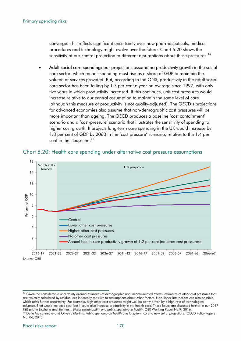
Primary spending risks
converge. This reflects significant uncertainty over how pharmaceuticals, medical procedures and technology might evolve over the future. Chart 6.20 shows the sensitivity of our central projection to different assumptions about these pressures.74
• Adult social care spending: our projections assume no productivity growth in the social care sector, which means spending must rise as a share of GDP to maintain the volume of services provided. But, according to the ONS, productivity in the adult social care sector has been falling by 1.7 per cent a year on average since 1997, with only five years in which productivity increased. If this continues, unit cost pressures would increase relative to our central assumption to maintain the same level of care (although this measure of productivity is not quality-adjusted). The OECD’s projections for advanced economies also assume that non-demographic cost pressures will be more important than ageing. The OECD produces a baseline ‘cost containment’ scenario and a ‘cost-pressure’ scenario that illustrates the sensitivity of spending to higher cost growth. It projects long-term care spending in the UK would increase by 1.8 per cent of GDP by 2060 in the ‘cost pressure’ scenario, relative to the 1.4 per cent in their baseline.75
Chart 6.20: Health care spending under alternative cost pressure assumptions
March 2017 forecast FSR projection
0
2
4
6
8
10
12
14
16
2016-17 2021-22 2026-27 2031-32 2036-37 2041-42 2046-47 2051-52 2056-57 2061-62 2066-67
Per
cent
of G
DP
CentralLower other cost pressuresHigher other cost pressuresNo other cost pressuresAnnual health care productivity growth of 1.2 per cent (no other cost pressures)
Source: OBR
74 Given the considerable uncertainty around estimates of demographic and income-related effects, estimates of other cost pressures that are typically calculated by residual are inherently sensitive to assumptions about other factors. Non-linear interactions are also possible, which adds further uncertainty. For example, high other cost pressures might well be partly driven by a high rate of technological advance. That would increase cost, but it could also increase productivity in the health care. These issues are discussed further in our 2017 FSR and in Licchetta and Stelmach, Fiscal sustainability and public spending in health, OBR Working Paper No.9, 2016. 75 De la Maisonneuve and Oliveira Martins, Public spending on health and long-term care: a new set of projections, OECD Policy Papers No. 06, 2013.
Fiscal risks report 170

Primary spending risks
Other sources of risk
6.81 A number of other factors might affect demand for adult social care and the unit cost of providing it. On the demand side, expectations of care could increase or the supply of unpaid care from family or friends may not rise as fast as demand for it. On the unit cost side, the capital costs of residential care could increase if property prices continue to rise relative to incomes (as they have historically).
6.82 Finally, there are policy-related uncertainties affecting adult social care at the moment. In the last Parliament, the Government decided to delay until April 2020 the introduction of a cap on care costs that had been due to commence in April 2016. The precise details of how the policy would be implemented in 2020 were not specified, so we made some simple assumptions in order to estimate the long-term impact of the policy for our 2017 FSR. The new Government plans to bring forward proposals for public consultation on social care.
Conclusions
6.83 Over the medium term, demand and cost pressures in health and adult social care seem more likely to increase than to decrease as the pressures of ageing and other cost pressures continue. Given the propensity of past governments to top up initial spending allocations under such circumstances, and the Conservative Party’s manifesto commitment to real terms spending increases over the next five years, this suggests that there is a significant fiscal risk of spending being increased again. This looks high in health, but medium in social care where recent policy decisions have already put funding on an upward trajectory. The potential impact is larger from health than from social care simply because the initial level of spending is much greater. A 1 per cent increase in NHS spending plans over the next four years would add £4.6 billion to PSND in 2020-21, whereas a 1 per cent increase in funding for social care, delivered through central government grants, would add £0.5 billion by 2019-20. Raising council tax to increase social care funding is fiscally neutral.
6.84 Over the long term, and on a plausible interpretation of ‘unchanged policy’, there seems a very high risk that health and adult social care spending will be on an upward trajectory as a share of GDP due to demographic and other cost pressures. In terms of magnitude, our latest long-term fiscal projections suggest that the combined effect – on the basis of policy as it stood prior to the election – would be to increase primary spending by 6.7 per cent of GDP in 2066-67, by far the biggest spending pressure in our projections. While these figures are clearly subject to great uncertainty, the direction of travel does not look in doubt.
6.85 In terms of the other characteristics set out in Chapter 1, the long-term risks here are generally gradual and continuous, implying that policy could also respond gradually. However, there is also scope for one-off pressures from time to time if either or both systems come under particular strain, say from a bad winter or if a private sector provider of social care were to fail and the public sector had to take on provision of those services. Health and social care spending risks do not seem correlated with many other fiscal risks.
171 Fiscal risks report
Primary spending risks
Major provisions and contingent liabilities
6.86 Under the Government’s resource accounting and budgeting systems, whenever departments and other public sector bodies undertake activities that are thought likely to result in future costs, then they are required to provision for those costs in their accounts. Departments also record contingent liabilities where the probability of future costs is less than 50 per cent and remote contingent liabilities where the probability is closer to zero.
6.87 Provisions form part of the Whole of Government Accounts (WGA) measure of net expenditure. In the National Accounts, expenditure is recorded when it takes place, as opposed to when the provision is made. For the most part this spending forms part of DEL, with notable exceptions being public service pensions and tax litigation that are in AME.
6.88 As provisions have a probability of greater than 50 per cent, we generally include spending for those expected to crystallise during the forecast period in our central National Accounts based forecasts. We do not generally include estimates for contingent liabilities, given their lower likelihood. So the fiscal risks here are that spending associated with provisions is higher or lower than forecast or that contingent liabilities crystallise at all.
6.89 Chart 6.21 shows how the WGA estimate of provisions and contingent liabilities has evolved since 2009-10. The different categories rise and fall as new liabilities are recorded, existing liabilities are removed and the discount rates used to convert future flows into a single one-off upfront value are revised. Changes in the perceived probability of the risks crystallising can also move liabilities between the three categories. In summary:
• quantified remote contingent liabilities have fallen by 23.8 per cent of GDP, mostly due to various crisis-related financial sector guarantees being closed (see Chapter 4);
• non-remote contingent liabilities have risen by 2.8 per cent of GDP (e.g. the clinical negligence and tax litigation contingent liabilities discussed below); and
• departmental provisions have increased by 9.5 per cent of GDP (e.g. the nuclear decommissioning provision discussed below).
Fiscal risks report 172

Primary spending risks
Chart 6.21: Trends in provisions and contingent liabilities
0
5
10
15
20
25
30
35
40
2009-10 2010-11 2011-12 2012-13 2013-14 2014-15 2015-16
Per
cent
of G
DP
Remote contingent liabilities
Non-remote contingent liabilities
Provisions
Source: ONS, Whole of Government Accounts
Nuclear decommissioning costs
6.90 The uncertain future costs of safely decommissioning the UK’s nuclear sites are a material source of fiscal risk. For the older sites, these are the largest single accounting provision in the WGA. Risks relate to the uncertain scope of the decommissioning work, which in turn reflects uncertainties about the amount of nuclear waste that will have to be cleared up and the technologies that will be available to do so, especially over the very long term.
6.91 The costs are managed in different ways, reflecting distinct phases of construction of nuclear facilities in the UK. They form three broad groups:
• Older sites (the Sellafield reprocessing plant and 16 of the UK’s earliest nuclear sites, including the old Magnox nuclear power stations – the last of which ceased operating at the end of 2015). For these sites, future decommissioning costs fall entirely to government. They are reported as a provision in the Nuclear Decommissioning Authority (NDA) accounts. The cash flows associated with this provision are funded from the Department for Business, Energy and Industrial Strategy (BEIS) DEL.
• The second generation of sites (the advanced gas-cooled reactor power stations and Sizewell B). Ownership of these power stations and the costs of decommissioning and managing their waste were transferred to the private sector through the privatisation of British Energy in 1996. British Energy was restructured and subsequently acquired by EDF Energy in 2009. As part of the arrangements for privatisation, the Government set up the Nuclear Liabilities Fund (NLF), an independent segregated trust. It has around £9 billion of assets (as of 31 March 2016), intended to meet the future costs of
173 Fiscal risks report
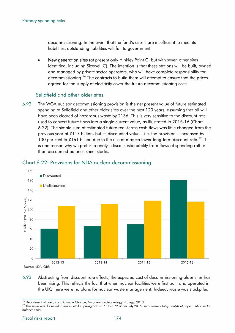
Primary spending risks
decommissioning. In the event that the fund’s assets are insufficient to meet its liabilities, outstanding liabilities will fall to government.
• New generation sites (at present only Hinkley Point C, but with seven other sites identified, including Sizewell C). The intention is that these stations will be built, owned and managed by private sector operators, who will have complete responsibility for decommissioning.76 The contracts to build them will attempt to ensure that the prices agreed for the supply of electricity cover the future decommissioning costs.
Sellafield and other older sites
6.92 The WGA nuclear decommissioning provision is the net present value of future estimated spending at Sellafield and other older sites over the next 120 years, assuming that all will have been cleared of hazardous waste by 2136. This is very sensitive to the discount rate used to convert future flows into a single current value, as illustrated in 2015-16 (Chart 6.22). The simple sum of estimated future real-terms cash flows was little changed from the previous year at £117 billion, but its discounted value – i.e. the provision – increased by 130 per cent to £161 billion due to the use of a much lower long-term discount rate.77 This is one reason why we prefer to analyse fiscal sustainability from flows of spending rather than discounted balance sheet stocks.
Chart 6.22: Provisions for NDA nuclear decommissioning
0
20
40
60
80
100
120
140
160
180
2012-13 2013-14 2014-15 2015-16
£ bi
llion
(201
5-16
pric
es)
Discounted
Undiscounted
Source: NDA, OBR 6.93 Abstracting from discount rate effects, the expected cost of decommissioning older sites has
been rising. This reflects the fact that when nuclear facilities were first built and operated in the UK, there were no plans for nuclear waste management. Indeed, waste was stockpiled
76 Department of Energy and Climate Change, Long-term nuclear energy strategy, 2013. 77 This issue was discussed in more detail in paragraphs 3.71 to 3.72 of our July 2016 Fiscal sustainability analytical paper: Public sector balance sheet.
Fiscal risks report 174

Primary spending risks
in some parts of Sellafield without recording what was being stored. As the NDA has put it: “In a heady atmosphere of scientific discovery, plans for future dismantling were barely considered.”78 Expected costs have increased with successive reviews of the work involved. Chart 6.23 converts the undiscounted cash projections underpinning the provision into 2015-16 prices, showing how expected costs have more than doubled in real terms since 2004-05. Sellafield has accounted for all the rise since 2007-08.
Chart 6.23: NDA estimates of total future decommissioning spending
0
20
40
60
80
100
120
140
2004-05 2005-06 2006-07 2007-08 2008-09 2009-10 2010-11 2011-12 2012-13 2013-14 2014-15 2015-16
£ bi
llion
(201
5-16
pric
es)
Year of estimate
Non Sellafield
Sellafield
Source: NDA, OBR 6.94 Chart 6.24 shows how the NDA‘s annual spending on decommissioning has increased by
nearly 70 per cent in real terms since 2005-06. Relative to GDP, it has increased by around a half. In 2015-16, the NDA spent £3.3 billion, financed by grants from DECC, largely on decommissioning. It also secured £1.1 billion of commercial income, which was surrendered to government and netted off as receipts in DECC DEL. On a net basis, the NDA therefore accounted for about 60 per cent of its parent department’s DEL.79 Managing the fiscal risk associated with variations via the standard approach of absorbing or offsetting changes within a parent department’s fixed DEL limits would clearly be challenging.80
6.95 Chart 6.24 also shows the latest NDA spending plans, based on the forward profile in the 2015-16 accounts. While uneven from year to year, spending generally declines from 2017-18 onwards, with a bump towards the end of this century associated with the expected dismantling of Magnox reactors and final site clearance. The 2015-16 accounts explain
78 Nuclear Decommissioning Authority, Nuclear Provision: the cost of cleaning up Britain’s historic nuclear sites, 2016. 79 At the time, its parent department was the Department of Energy and Climate Change (DECC). Responsibility for energy policy, and therefore the NDA, has since been transferred to the Department of Business, Energy and Industrial Strategy (BEIS). 80 In 2010, in the run up to the 2010 Spending Review, Chris Huhne, the then Energy Secretary, was quoted in the Guardian newspaper warning that the NDA needed to increase its net spending by £4 billion over the Spending Review period, and arguing that “the costs [of decommissioning] are such that my department is not so much the department of energy and climate change, as the department of nuclear legacy and bits of other things”.
175 Fiscal risks report
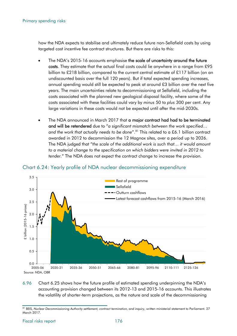
Primary spending risks
how the NDA expects to stabilise and ultimately reduce future non-Sellafield costs by using targeted cost incentive fee contract structures. But there are risks to this:
• The NDA’s 2015-16 accounts emphasise the scale of uncertainty around the future costs. They estimate that the actual final costs could lie anywhere in a range from £95 billion to £218 billion, compared to the current central estimate of £117 billion (on an undiscounted basis over the full 120 years). But if total expected spending increases, annual spending would still be expected to peak at around £3 billion over the next five years. The main uncertainties relate to decommissioning at Sellafield, including the costs associated with the planned new geological disposal facility, where some of the costs associated with these facilities could vary by minus 50 to plus 300 per cent. Any large variations in these costs would not be expected until after the mid-2030s.
• The NDA announced in March 2017 that a major contract had had to be terminated and will be retendered due to “a significant mismatch between the work specified… and the work that actually needs to be done”.81 This related to a £6.1 billion contract awarded in 2012 to decommission the 12 Magnox sites, over a period up to 2026. The NDA judged that “the scale of the additional work is such that… it would amount to a material change to the specification on which bidders were invited in 2012 to tender.” The NDA does not expect the contract change to increase the provision.
Chart 6.24: Yearly profile of NDA nuclear decommissioning expenditure
0.0
0.5
1.0
1.5
2.0
2.5
3.0
3.5
2005-06 2020-21 2035-36 2050-51 2065-66 2080-81 2095-96 2110-111 2125-126
£ bi
llion
(201
5-16
pric
es)
Rest of programme
Sellafield
Outturn cashflows
Latest forecast cashflows from 2015-16 (March 2016)
Source: NDA, OBR 6.96 Chart 6.25 shows how the future profile of estimated spending underpinning the NDA’s
accounting provision changed between its 2012-13 and 2015-16 accounts. This illustrates the volatility of shorter-term projections, as the nature and scale of the decommissioning
81 BEIS, Nuclear Decommissioning Authority settlement, contract termination, and inquiry, written ministerial statement to Parliament. 27 March 2017.
Fiscal risks report 176

Primary spending risks
work continues to be reviewed and refined. It is the uncertainty inherent in these estimates that represents the ultimate source of fiscal risk from the older nuclear sites.
Chart 6.25: Changes in the spending profile for NDA nuclear decommissioning
-0.6
-0.3
0.0
0.3
0.6
0.9
1.2
1.5
2016-17 2026-27 2036-37 2046-47 2056-57 2066-67 2076-77 2086-87 2096-97 2106-07 2116-17 2126-27 2136-37
£ bi
llion
Change in 2013-14
Change in 2014-15
Change in 2015-16
Total change since 2012-13
Source: NDA
The second generation of nuclear power stations
6.97 Steps were taken to transfer some of the risks associated with decommissioning the second generation of nuclear power stations – specifically, the eight owned by EDF Energy Nuclear Generation Group Limited, formerly known as British Energy Group plc. The first plant is expected to retire in 2023, with the rest to be closed progressively up to 2035. Decommissioning is assumed to continue until 2126.
6.98 In 1996, the Government established the Nuclear Liabilities Fund (NLF) to cover certain expected costs of decommissioning and waste management activities for these plants. Future costs of the remaining activities fall to EDF Energy. The Fund’s objective is to generate sufficient returns to meet the future costs for which it is responsible, and in doing so to avoid crystallising any shortfall that would be passed in full to government through the terms of a guarantee agreed in 2002. It currently has assets of around £9 billion and receives ongoing quarterly contributions from EDF.
6.99 The NLF approach creates risks on both the liability and asset side, with the Fund in effect aiming to have sufficient assets by the mid-2020s to start meeting the uncertain costs for which it is responsible. In terms of liabilities, the costs of decommissioning could end up being greater than expected, as with the older sites. In terms of assets, the Fund’s investment return could be lower than required to meet the future costs. A sixth of the Fund is held in a growth portfolio that is subject to various investment risks (e.g. movements in equity prices, exchange rates and interest rates). The rest is held in the National Loans Fund and is therefore subject to limited investment risk, but with relatively low expected returns.
177 Fiscal risks report

Primary spending risks
6.100 Chart 6.26 shows the evolution of estimated future decommissioning costs against the assets held by the NLF. Since the fund has many years in which to grow before any decommissioning costs are incurred, it shows a large funding gap on an undiscounted basis in all years. Future investment returns on NLF assets will contribute towards meeting the eventual costs, so any future shortfall will depend on both investment returns and changes in estimated costs. The gap shown in the chart has risen from £3.8 billion in 2008-09 (when British Energy was sold to EDF Energy) to £10.5 billion in 2015-16. The NLF’s Trustees warned in the 2015-16 Annual Report that “Recent changes in actual and expected interest rates lead the directors to believe that expected investment returns may be insufficient to meet the currently projected nuclear liabilities, based on current assumptions and current investment policy”.82 It also set out a number of steps that it is taking to mitigate these risks.
Chart 6.26: Assets of the NLF and estimated cost of associated decommissioning
0
5
10
15
20
25
2004-05 2005-06 2006-07 2007-08 2008-09 2009-10 2010-11 2011-12 2012-13 2013-14 2014-15 2015-16
£ bi
llion
Assets held to meet decommissioning costs
Estimated cost of decommissioning, undiscounted
Source: DECC (now BEIS), NLF
New nuclear power stations
6.101 The Energy Act 2008 requires operators of new nuclear power stations to meet the full cost of decommissioning, waste management and disposal.83 Hinkley Point C is the first station to be approved. It is being built and operated by a subsidiary of EDF, which will receive a ‘strike price’ of £92.50 (in 2012 prices) for each megawatt hour (MWh) of electricity produced for the first 35 years of operation. The company that will build and operate it expects decommissioning and waste management to cost £7.3 billion (in 2016 prices).84
6.102 The approval process included a funded decommissioning programme comprising:
82 Nuclear Liabilities Fund, Annual Report and Accounts for the year ended March 2016, 2016. 83 Department of Energy and Climate Change, The Energy Act 2008 Funded Decommissioning Programme Guidance for New Nuclear Power Stations, 2011. 84 National Audit Office, Report on Hinkley Point C, 2017.
Fiscal risks report 178

Primary spending risks
• A decommissioning and waste management plan: this sets out the operator’s expected liabilities, to be reviewed every five years and independently verified.
• A funded arrangements plan (FAP): this sets out how the operator will aim to meet these liabilities by paying into an independently managed fund. The Nuclear Liabilities Financing Assurance Board concluded in 2016 that it provides ‘prudent provision’.
• Waste transfer contracts (WTCs): these determine the price the operator will pay the Government to dispose of spent fuel in a yet-to-be-built facility. The cost of disposal is currently estimated at £2.9 billion (in 2016 prices). The price is capped at £5.9 billion, including a fee paid to insure against the possibility of the costs exceeding the cap.
6.103 There is a risk that the cost of the disposal of spent fuel will be higher than provisioned for in the WTCs. In that case, the Government would have to make up any shortfall. The Government judged the likelihood of that as ‘very low’, but if it increased this could result in a contingent liability or provision.85
6.104 There is also a risk that the plant has to be shut down for some reason before the decommissioning fund has been built up sufficiently to meet the costs. A ‘Secretary of State Investor Agreement’ (SOSIA) sets out the obligations of parties in the event that it is shut down for political or other reasons not related to the economic performance of the operator or environmental concerns. According to this agreement, the investors have the right to transfer their shares in the operator to the Government – along with the associated decommissioning and waste management liabilities. In effect, this means that if the Government or an international body requires the plant to be shut, the Government would have to nationalise it with full compensation to EDF investors. If the plant was forced to shut down for technical reasons, the company is liable for any outstanding liabilities, but if they were unable to do so the Government would ultimately be responsible.
6.105 The NAO has noted that the contract provides for the Government to acquire ownership in the event that generation becomes uneconomic or unfeasible as a result of the generator’s own decisions.86 DECC reported to Parliament that the SOSIA “sets out the process for the transfer of the Generator (to the UK Government) in the circumstance where investors are no longer willing to fund the Generator and no-one else is willing to do so either.”87
6.106 As well as risks associated with decommissioning, the NAO also highlighted a range of other risks. In particular, it noted that other projects using the type of reactor planned at Hinkley Point C are experiencing problems, creating a risk that the company could require government support, notwithstanding the agreed terms of the project. Pressures on the timetable and cost of construction have also been reported.
85 Department of Energy and Climate Change, Notification That The Secretary Of State May Approve The Entering Into Of Contracts Regarding The Hinkley Point C Power Station That Could Give Rise To Liabilitites, Departmental Minute, 21 October 2015. 86 National Audit Office, Report on Hinkley Point C, 2017. 87 Department of Energy and Climate Change, Notification That The Secretary Of State May Approve The Entering Into Of Contracts Regarding The Hinkley Point C Power Station That Could Give Rise To Liabilitites, Departmental Minute, 21 October 2015.
179 Fiscal risks report

Primary spending risks
6.107 Across countries, the normal approach to future decommissioning costs is to make the operator or owner responsible for them.88 Financing methods vary, but the most common include funds being set aside in a dedicated trust. The funds for this purpose are typically raised by charging consumers a levy set as a percentage of electricity prices charged. Practice varies as to whether to assess the adequacy of funds using discounted or undiscounted measures of future decommissioning costs.89 The relative costs in EU member states with the largest nuclear generating capacity are shown in Chart 6.27. These vary widely depending, for instance, on the age and type of nuclear power plant. They are particularly high in the UK, where the first generation of nuclear plants were built with less consideration of the ultimate method and cost of decommissioning.
Chart 6.27: Nuclear decommissioning costs by country relative to energy generated
0.0 0.5 1.0 1.5 2.0 2.5 3.0
Sweden
France
Finland
Czech Republic
Belgium
Spain
Hungary
Bulgaria
Slovakia
Lithuania
Germany
UK
¤ billion per GWeSource: European Commission
Conclusions
6.108 Fiscal risks from nuclear decommissioning are generally continuous, isolated from other risks, and endogenous, in that the Government can to some extent choose when to incur the costs. In terms of the ‘four Ts’ of fiscal risk management, the Sellafield approach tolerated the risk, with the uncertain costs borne by the public sector. To differing extents, the second- and third-generation approaches seek to transfer the costs and risks to the private sector. Nuclear decommissioning is the biggest source of provisions in the WGA, but the costs are spread over more than a century and spending is currently expected to peak at £2.9 billion a year in 2017-18. So while the numbers are big from the perspective of the department managing them they are less so from the perspective of the public sector as a whole. That
88 OECD Nuclear Energy Agency, Costs of Decommissioning Nuclear Power Plants, 2016. 89 According to the European Commission’s Working Document on Nuclear Illustrative Programme presented under Article 40 of the Euratom Treaty for the opinion of the European Economic and Social Committee, 2016, EU countries are split roughly half and half as to whether they use discounted or undiscounted future decommissioning costs.
Fiscal risks report 180

Primary spending risks
said, as the range of estimates prepared by the NDA shows, the risk that annual spending rises by more than £1 billion in any year is far from negligible.
Clinical negligence
6.109 The uncertain future costs of settling successful clinical negligence claims against public sector health care providers are another material source of fiscal risk. Future costs reflect the number and value of claims brought forward, the proportion that result in damages, how big those awards are, and the timing with which they are paid. The number of claims is ultimately driven by the number of medical treatments that take place, the proportion of them resulting in an incident, and the proportion of incidents that result in a claim.
6.110 In primary care (e.g. GPs and dentists), practitioners are required to obtain personal medical indemnity insurance. This is provided by medical defence organisations (MDOs) – non-profit institutions owned by their members – and private sector insurers.
6.111 In secondary care in England, NHS Resolution (the operating name of the NHS Litigation Authority from April 2017) manages clinical negligence claims on behalf of the NHS through a number of schemes. These cover:
• Historical liabilities: claims for incidents that occurred on or before 31 March 1995 (‘Existing Liabilities Scheme’), claims brought against the former Regional Health Authorities (‘Ex-RHA Scheme’) and dissolved bodies where there is no successor (‘Department of Health Clinical Liabilities Scheme’). These schemes are all funded by the Department of Health.
• Current liabilities: incidents that have occurred since 1 April 1995, managed through the ‘Clinical Negligence Scheme for Trusts’ (CNST). This scheme is funded through participating members’ contributions, largely from within the public sector.90 In terms of cost, it is by far the largest scheme.
6.112 These schemes account for known claims that have already been submitted plus an estimate for claims ‘incurred but not reported’. That is informed by past and current experience of the cost of claims arising from incidents that are expected to have occurred, but have not been reported at the end of the financial year covered by the accounts.
6.113 NHSR’s accounts record provisions and contingent liabilities in respect of future costs of past events. Provisions relate to claims judged more likely than not to succeed. They are calculated by applying a probability to the estimated value of the claim, then discounting future cash flows into a present cost. Contingent liabilities are calculated as the remaining value of claims after the amount covered by provisions. These provisions and contingent liabilities are among the largest recorded in the WGA. Future costs in relation to primary care are not recorded in the WGA since the MDOs and other insurers are in the private
90 In 2016, NHS Resolution provided indemnity cover to 530 members, including 209 clinical commissioning groups and 81 independent sector providers. CNST opened to the independent sector from 1 April 2013.
181 Fiscal risks report

Primary spending risks
sector. But the cost of the insurance cover is paid by practitioners, so a rise in contribution rates might require an increase in government spending indirectly via provider costs.
Trends in NHS Resolution spending, provisions and contingent liabilities
6.114 As Chart 6.28 shows, NHSR spending on clinical negligence claims has doubled in cash terms over the past six years and has risen by almost half over the past two. All the growth relates to current liabilities managed through the CNST. Spending on clinical negligence has risen from 0.9 per cent of DH’s RDEL in 2010-11 to 1.5 per cent in 2016-17.
Chart 6.28: Annual expenditure on clinical negligence by scheme
0.0
0.2
0.4
0.6
0.8
1.0
1.2
1.4
1.6
1.8
2005-06 2006-07 2007-08 2008-09 2009-10 2010-11 2011-12 2012-13 2013-14 2014-15 2015-16 2016-17
£ bi
llion
Existing Liabilities and Ex-Regional Health Authorities Scheme
Department of Health Clinical Liabilities Scheme
Clinical Negligence Scheme for Trusts
Source: NHS Resolution, OBR 6.115 A similar upward trend can be seen in the provisions and contingent liabilities reported in
NHSR’s annual reports. These are discounted values, so were greatly affected in 2015-16 by the drop in the Treasury’s long-term discount rate described in paragraph 6.92 in relation to its effect on the nuclear decommissioning provision. The effect on the clinical negligence provision in 2015-16 was £25.4 billion. But even abstracting from that jump, the provision has increased by around 13 per cent a year on average over the past eight years – far faster than the 3.0 per cent a year average growth in nominal GDP.
Fiscal risks report 182

Primary spending risks
Chart 6.29: Clinical negligence provisions and contingent liabilities
0
20
40
60
80
100
120
2008-09 2009-10 2010-11 2011-12 2012-13 2013-14 2014-15 2015-16 2016-17
£ bi
llion
, dis
coun
ted
Provisions for known claims
Provisions for incidents incurred but not reported
Total contingent liabilities
Source: NHS Resolution, OBR 6.116 Many factors have driven the higher spending and provisions:
• Growth in the number of claims: population growth and ageing have led to a higher number of patients and medical treatments, which increases the number of incidents potentially leading to claims. The number of new claims reported was rising until 2013-14, but has since fallen slightly each year. From available data, it is not clear whether the underlying drivers relate to the proportion of medical treatments resulting in an incident or the proportion of incidents that result in a new claim.
• Growth in average damages per successful claim: this is affected by the composition of awards by type and changes in the average awards for specific types. Both have raised average claims. Average awards are dominated by maternity incidents because of the very high value of claims arising from brain injuries at birth.91 The value of an average claim received in this category has risen from £4.1 million in 2010-11 to £8.3 million in 2016-17. Factors driving this include increasing life expectancy, which means care is required for more years, and advances in medical treatment, which are often more costly.92 Chart 6.30 shows the distribution of CNST cases received by size over recent years, illustrating that, although the total number of claims has fallen, the number of very large claims has increased. In 2016-17, the number of claims below £1 million was 6 per cent lower than the average of the preceding four years whereas the number of claims over £1 million was 59 per cent higher.
• Personal injury discount rate (PIDR): this is the rate used to calculate lump sum awards in respect of personal injury, including clinical negligence. Unlike the Treasury discount
91 NHSR reports that in 2016-17, 10 per cent of claims by number but 50 per cent by value related to the obstetrics speciality. 92 Department of Health, GP Indemnity Review, July 2016.
183 Fiscal risks report
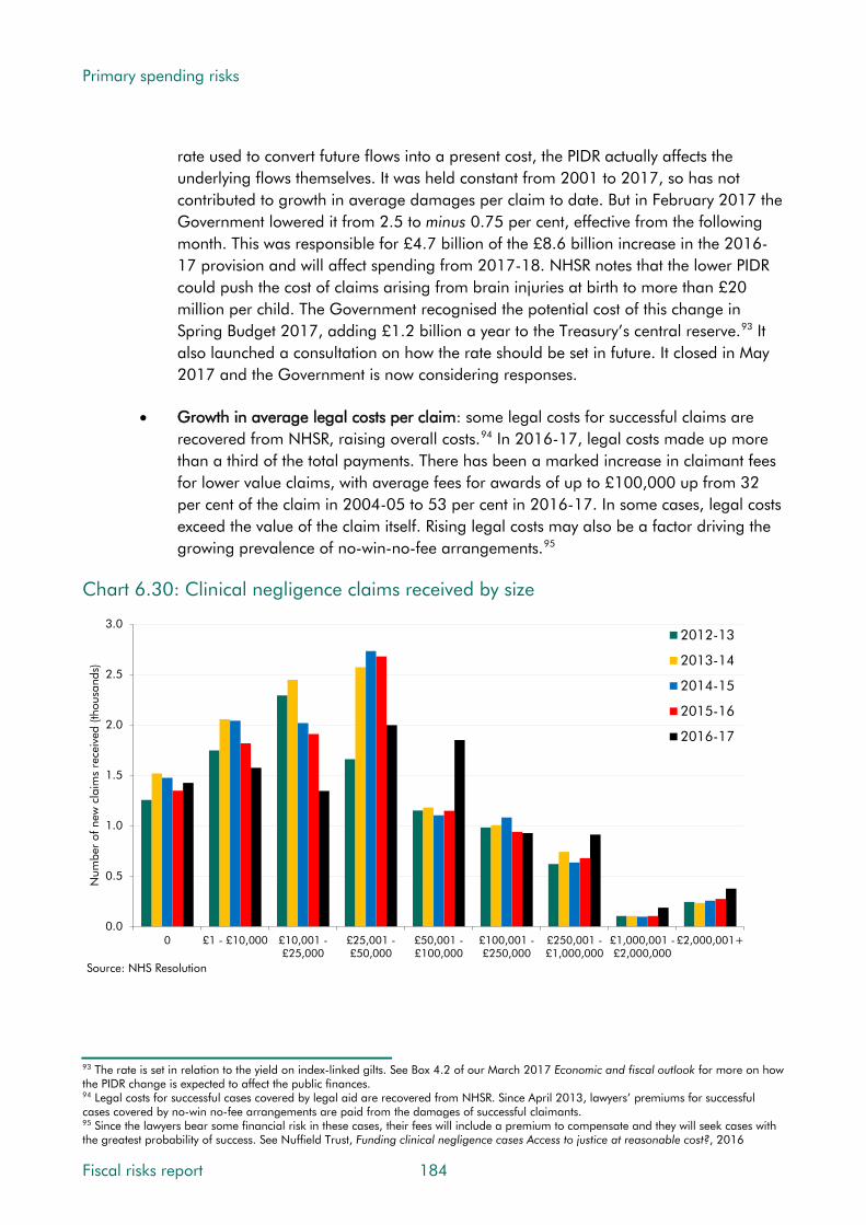
Primary spending risks
rate used to convert future flows into a present cost, the PIDR actually affects the underlying flows themselves. It was held constant from 2001 to 2017, so has not contributed to growth in average damages per claim to date. But in February 2017 the Government lowered it from 2.5 to minus 0.75 per cent, effective from the following month. This was responsible for £4.7 billion of the £8.6 billion increase in the 2016-17 provision and will affect spending from 2017-18. NHSR notes that the lower PIDR could push the cost of claims arising from brain injuries at birth to more than £20 million per child. The Government recognised the potential cost of this change in Spring Budget 2017, adding £1.2 billion a year to the Treasury’s central reserve.93 It also launched a consultation on how the rate should be set in future. It closed in May 2017 and the Government is now considering responses.
• Growth in average legal costs per claim: some legal costs for successful claims are recovered from NHSR, raising overall costs.94 In 2016-17, legal costs made up more than a third of the total payments. There has been a marked increase in claimant fees for lower value claims, with average fees for awards of up to £100,000 up from 32 per cent of the claim in 2004-05 to 53 per cent in 2016-17. In some cases, legal costs exceed the value of the claim itself. Rising legal costs may also be a factor driving the growing prevalence of no-win-no-fee arrangements.95
Chart 6.30: Clinical negligence claims received by size
0.0
0.5
1.0
1.5
2.0
2.5
3.0
0 £1 - £10,000 £10,001 -£25,000
£25,001 -£50,000
£50,001 -£100,000
£100,001 -£250,000
£250,001 -£1,000,000
£1,000,001 -£2,000,000
£2,000,001+
Num
ber
of n
ew c
laim
s re
ceiv
ed (t
hous
ands
)
2012-13
2013-14
2014-15
2015-16
2016-17
Source: NHS Resolution
93 The rate is set in relation to the yield on index-linked gilts. See Box 4.2 of our March 2017 Economic and fiscal outlook for more on how the PIDR change is expected to affect the public finances. 94 Legal costs for successful cases covered by legal aid are recovered from NHSR. Since April 2013, lawyers’ premiums for successful cases covered by no-win no-fee arrangements are paid from the damages of successful claimants. 95 Since the lawyers bear some financial risk in these cases, their fees will include a premium to compensate and they will seek cases with the greatest probability of success. See Nuffield Trust, Funding clinical negligence cases Access to justice at reasonable cost?, 2016
Fiscal risks report 184
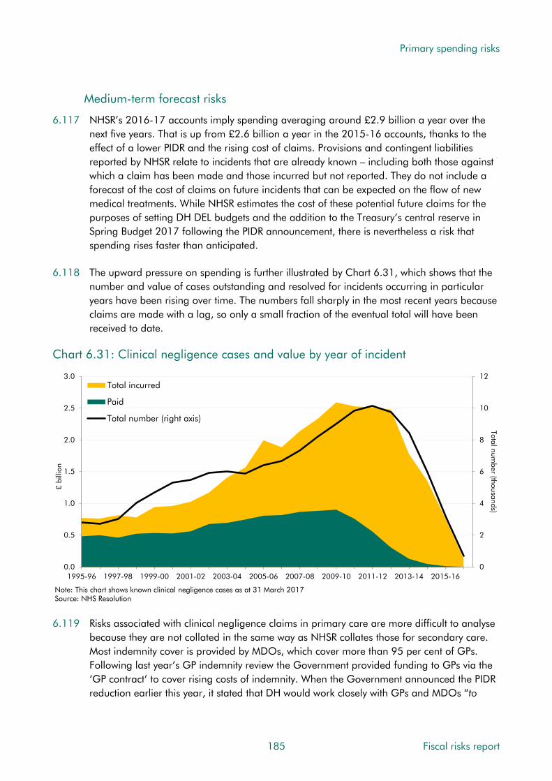
Primary spending risks
Medium-term forecast risks
6.117 NHSR’s 2016-17 accounts imply spending averaging around £2.9 billion a year over the next five years. That is up from £2.6 billion a year in the 2015-16 accounts, thanks to the effect of a lower PIDR and the rising cost of claims. Provisions and contingent liabilities reported by NHSR relate to incidents that are already known – including both those against which a claim has been made and those incurred but not reported. They do not include a forecast of the cost of claims on future incidents that can be expected on the flow of new medical treatments. While NHSR estimates the cost of these potential future claims for the purposes of setting DH DEL budgets and the addition to the Treasury’s central reserve in Spring Budget 2017 following the PIDR announcement, there is nevertheless a risk that spending rises faster than anticipated.
6.118 The upward pressure on spending is further illustrated by Chart 6.31, which shows that the number and value of cases outstanding and resolved for incidents occurring in particular years have been rising over time. The numbers fall sharply in the most recent years because claims are made with a lag, so only a small fraction of the eventual total will have been received to date.
Chart 6.31: Clinical negligence cases and value by year of incident
0
2
4
6
8
10
12
0.0
0.5
1.0
1.5
2.0
2.5
3.0
1995-96 1997-98 1999-00 2001-02 2003-04 2005-06 2007-08 2009-10 2011-12 2013-14 2015-16
Total number (thousands)
£ bi
llion
Total incurred
Paid
Total number (right axis)
Note: This chart shows known clinical negligence cases as at 31 March 2017 Source: NHS Resolution 6.119 Risks associated with clinical negligence claims in primary care are more difficult to analyse
because they are not collated in the same way as NHSR collates those for secondary care. Most indemnity cover is provided by MDOs, which cover more than 95 per cent of GPs. Following last year’s GP indemnity review the Government provided funding to GPs via the ‘GP contract’ to cover rising costs of indemnity. When the Government announced the PIDR reduction earlier this year, it stated that DH would work closely with GPs and MDOs “to
185 Fiscal risks report

Primary spending risks
ensure that appropriate funding is available to meet additional costs to GPs, recognising the crucial role they play in the delivery of NHS care.”96
6.120 Medium-term risks from clinical negligence costs could be related to the pressures on health spending described earlier in this chapter. The Medical Protection Society has argued that with clinical negligence costs absorbing a rising share of NHS spending – and the Spending Review settlement requiring significant efficiency savings relative to historical average rates of growth – there is a risk that greater pressures on medical professionals lead to higher numbers of incidents and future claims.97 This type of adverse feedback seems plausible.
Long-term risks to fiscal sustainability
6.121 The majority of the NHSR provision and contingent liability relates to future claims beyond our five-year forecast horizon. But, as already noted, they do not factor in future claims from future medical activity. The question for fiscal sustainability is whether the cost of clinical negligence claims is likely to continue growing faster than GDP. This is not an issue that we have been able to explore for this report, but to the extent that the cost of clinical negligence is correlated with health spending more generally, our long-term spending projections would suggest it is an additional risk to fiscal sustainability.
Mitigating actions
6.122 NHSR has introduced a range of initiatives over recent years to manage claims more efficiently and to limit the rising cost of clinical negligence. For example, it helps trusts to share experience and manage costs better at a local level. To limit the increase in legal costs, it is also making greater efforts to resolve disputes via alternative mechanisms, such as mediation. Its 2017-18 business plan details these and other propositions.98 In spring 2017, DH consulted on introducing fixed recoverable costs for lower value clinical negligence claims,99 to reduce both the processing time and the cost of these claims. It also consulted on a voluntary alternative compensation scheme for severe birth injury that aims to reduce harmful events through earlier investigation and learning and provide compensation to eligible families without the need to bring a claim through the courts. And one possible outcome of the PIDR consultation could be a rise in the rate, which would offset some of the expected increase in the cost of lump-sum payments.
Conclusions
6.123 In terms of the characteristics set out in Chapter 1, the fiscal risks from clinical negligence are continuous and generally isolated from other risks – although they may be correlated with the those from wider pressures on health spending. They are largely endogenous to government action, in the sense that governments choose what clinical services to provide and are responsible for many of the factors that affect the incidence of negligence. On the other hand, governments have little choice over providing these services, which are
96 Ministry of Justice, Written Ministerial statement - HCWS503, 2017. 97 Medical Protection Society, The Rising Cost Of Clinical Negligence: Who Pays The Price?, 2017. 98 NHS Resolution, Business Plan 2017-18, 2017. 99 Department of Health, Fixed recoverable costs for clinical negligence claims, consultation, 2017.
Fiscal risks report 186
Primary spending risks
expected in advanced economies. Risks from clinical negligence have been rising due to the combined effects of growing demand for medical services, developments in the legal market and rising costs per successful claim – both damages and legal costs. Lowering the PIDR has added to these pressures.
6.124 In terms of the ‘four Ts’, the Government tolerates the risk of the payments managed by NHS Resolution, by absorbing the cost of claims that are awarded compensation, but it also takes steps to treat it by taking action to mitigate costs, including legal costs, and trying to reduce the number of claims that occur via health service improvement programmes to reduce incidents and by looking at ways to address drivers in the legal environment.
6.125 We consider there to be a high likelihood of further increases in spending on clinical negligence beyond the amount currently provisioned over the medium term, largely because the provision relates only to past activity. Whether the flow of future claims not covered by the provision will be higher than has been factored into DH spending plans, plus the addition to the reserve associated with PIDR costs, is more difficult to judge. History suggests at least a medium likelihood that it will. Risks around the other assumptions underpinning the provision seem relatively balanced. We also see a high risk of clinical negligence costs putting upward pressure on spending over the long term, but the impact of this would be small relative to the wider risk from health spending described earlier in the chapter.
Tax litigation
Drivers of spending associated with tax litigation
6.126 HMRC is subject to many legal disputes where its interpretation of tax legislation is being challenged by taxpayers. While HMRC’s success rate in cases that go to court is high, at around 80 per cent, it has had to make settlements averaging £0.9 billion a year over the last 10 years and the amounts at stake can be in the billions of pounds for a single case. We and HMRC both consider it likely that there will be a stream of settlement payments in the future (as reflected in our forecasts and its accounts). Since the ultimate driver of this spending is the judgements made in the courts, there is significant uncertainty about the size and timing of any future payments. For example:
• The amount of tax at risk in each case is often difficult to estimate. The size of a settlement payment is not known until the final judgement has been made. In larger cases a successful challenge from a ‘lead’ plaintiff may trigger subsequent claims from a large number of ‘followers’. A good example is the current case being brought against HMRC by Littlewoods, which relates to whether HMRC should pay interest on refunded VAT payments on a simple basis (as HMRC argues) or on a more generous compound basis (as the plaintiff argues). In this case the potential settlement is directly determined by the issue in question – the methodology behind the interest calculation – with both parties presenting their own detailed calculations to the court. And, if Littlewoods win, a large number of follower cases might be expected. The total potential settlements from such cases would be hard to estimate with precision, but would be likely to be many times larger than the single settlement in the lead case.
187 Fiscal risks report

Primary spending risks
• The protracted nature of large tax litigation cases means the timing of a settlement payment is very unpredictable. There are as many as five different UK court stages – high court, first-tier tribunal, upper tribunal, court of appeal and supreme court – as well as (at present) the European Court of Justice (ECJ). This provides many opportunities for appeals and means that cases can continue for many years before a final judgement is reached and payments made. For example, the ‘franked investment income group litigation’ case has been in the courts since 2003. Predicting when payments will affect the public finances is further complicated by the different ways they are recorded in the accrued borrowing measure (PSNB) and the cash debt measure (PSND). The impact on PSNB depends on when a final settlement is reached, but PSND would be affected sooner if HMRC makes interim payments.100
• A number of large cases in recent years relate to EU law. It is not certain how the flow and size of such cases will be affected by Brexit. The Government may seek legislative solutions currently disallowed under EU law to mitigate future litigation risks. Another uncertainty is the extent to which future ECJ judgements will be binding in UK courts.
The scale of the risk
6.127 HMRC includes both provisions and contingent liabilities in its accounts to cover risks from litigation cases where the tax at risk is over £100 million. We include an expected amount of spending on tax litigation cases in each medium-term forecast:
• Provisions cover cases where HMRC believes a settlement payment is likely, but where uncertainty remains over timing. Our latest forecast was informed by HMRC’s 2015-16 accounts. We assumed that settlement payments would add £7.8 billion to spending cumulatively over the forecast period – the £5.9 billion accounting provision in the accounts plus £1.9 billion of cash payments made in 2015-16 that are expected to be accrued to later years when final settlements are reached. Given the uncertainty over the precise timing, we assumed a flat profile across the five years.
• Contingent liabilities cover cases where HMRC believes there is a less than 50 per cent chance that a settlement will be required. Cases at an earlier stage of the litigation process might score as a contingent liability initially before being reclassified as a provision if the perceived likelihood of a payment rises. Another distinction might be the treatment of lead and follower cases. There is less information on follower cases, so they are more likely to be classified as contingent liabilities initially. HMRC is likely to win a significant proportion of the cases being brought, so the contingent liability is an upper bound on the potential cost of all ongoing cases. But it does not try to anticipate future cases being brought against HMRC that are not currently in progress. Where HMRC deems the probability that a settlement will be required is closer to zero it may choose to record a case as a ‘remote contingent liability’.
100 Since 2015, final settlement payments in litigation cases have been recorded in the public finances as public spending. Interim settlement payments are recorded as financial transactions at the point when the cash payment happens, and only as public spending when the relevant court proceedings have been finalised. An accruals adjustment reconciles these timings.
Fiscal risks report 188
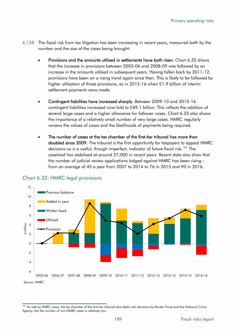
Primary spending risks
6.128 The fiscal risk from tax litigation has been increasing in recent years, measured both by the number and the size of the cases being brought:
• Provisions and the amounts utilised in settlements have both risen. Chart 6.32 shows that the increase in provisions between 2005-06 and 2008-09 was followed by an increase in the amounts utilised in subsequent years. Having fallen back by 2011-12, provisions have been on a rising trend again since then. This is likely to be followed by higher utilisation of those provisions, as in 2015-16 when £1.9 billion of interim settlement payments were made.
• Contingent liabilities have increased sharply. Between 2009-10 and 2015-16 contingent liabilities increased nine-fold to £49.1 billion. This reflects the addition of several large cases and a higher allowance for follower cases. Chart 6.33 also shows the importance of a relatively small number of very large cases. HMRC regularly reviews the values of cases and the likelihoods of payments being required.
• The number of cases at the tax chamber of the first-tier tribunal has more than doubled since 2009. The tribunal is the first opportunity for taxpayers to appeal HMRC decisions so is a useful, though imperfect, indicator of future fiscal risk.101 The caseload has stabilised at around 27,000 in recent years. Recent data also show that the number of judicial review applications lodged against HMRC has been rising – from an average of 45 a year from 2007 to 2014 to 76 in 2015 and 90 in 2016.
Chart 6.32: HMRC legal provisions
-6
-4
-2
0
2
4
6
8
10
12
2005-06 2006-07 2007-08 2008-09 2009-10 2010-11 2011-12 2012-13 2013-14 2014-15 2015-16
£ bi
llion
Previous balance
Added in year
Written back
Utilised
Provision
Source: HMRC
101 As well as HMRC cases, the tax chamber of the first-tier tribunal also deals with decisions by Border Force and the National Crime Agency, but the number of non-HMRC cases is relatively low.
189 Fiscal risks report
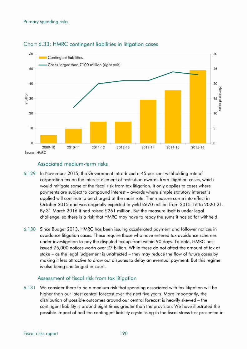
Primary spending risks
Chart 6.33: HMRC contingent liabilities in litigation cases
0
5
10
15
20
25
30
0
10
20
30
40
50
60
2009-10 2010-11 2011-12 2012-13 2013-14 2014-15 2015-16
Num
ber of cases£
billi
on
Contingent liabilities
Cases larger than £100 million (right axis)
Source: HMRC
Associated medium-term risks
6.129 In November 2015, the Government introduced a 45 per cent withholding rate of corporation tax on the interest element of restitution awards from litigation cases, which would mitigate some of the fiscal risk from tax litigation. It only applies to cases where payments are subject to compound interest – awards where simple statutory interest is applied will continue to be charged at the main rate. The measure came into effect in October 2015 and was originally expected to yield £670 million from 2015-16 to 2020-21. By 31 March 2016 it had raised £261 million. But the measure itself is under legal challenge, so there is a risk that HMRC may have to repay the sums it has so far withheld.
6.130 Since Budget 2013, HMRC has been issuing accelerated payment and follower notices in avoidance litigation cases. These require those who have entered tax avoidance schemes under investigation to pay the disputed tax up-front within 90 days. To date, HMRC has issued 75,000 notices worth over £7 billion. While these do not affect the amount of tax at stake – as the legal judgement is unaffected – they may reduce the flow of future cases by making it less attractive to draw out disputes to delay an eventual payment. But this regime is also being challenged in court.
Assessment of fiscal risk from tax litigation
6.131 We consider there to be a medium risk that spending associated with tax litigation will be higher than our latest central forecast over the next five years. More importantly, the distribution of possible outcomes around our central forecast is heavily skewed – the contingent liability is around eight times greater than the provision. We have illustrated the possible impact of half the contingent liability crystallising in the fiscal stress test presented in
Fiscal risks report 190

Primary spending risks
Chapter 9. This adds £25 billion to spending over a two-year period and slightly less to net debt because around a sixth is assumed to be offset by tax paid on litigation payments.
Local authorities and devolved administrations
6.132 The degree of control the Treasury can exert over public spending depends in part on how far it is from the decision-makers ultimately responsible for any action taken and the risks that each entails. In recent years, a growing proportion of public spending responsibility has been passed to local authorities and devolved administrations – a trend set to continue over the medium term at least. This section looks at the emerging risks in these areas.
Local authorities
6.133 Around three-quarters of local authority spending is financed from central government grants (notably the Revenue Support Grant and Dedicated Schools Grant102) with the remainder financed from local sources, including revenue (notably council tax and business rates), borrowing and the use of reserves. We factor the grant elements into our DEL spending forecasts and the locally financed elements into our AME forecast as ‘local authority self-financed expenditure’ or ‘LASFE’. The discussion below relates to all UK local authorities, unless otherwise indicated.
6.134 Local authorities’ total debt currently stands at around £90 billion (4.6 per cent of GDP).103 Of this, £66 billion is from the Public Works Loan Board (PWLB), a statutory body that makes loans from the National Loans Fund (a central government entity) to local authorities in England, Scotland and Wales.104 The other main sources of borrowing include £10 billion of bank loans and £5 billion of bonds.105
6.135 PWLB loans require assurance that the local authority in question is borrowing within the confines of its borrowing powers and the relevant legislation (for example, the affordability criteria of the Prudential Code and Department for Communities and Local Government (DCLG) statutory guidance). Loans are automatically secured, by statute, against the revenues of the borrowing authority. DCLG’s guidance on local authority investment activity was strengthened in April 2010 after the financial crisis. (Some local authorities had placed significant sums on deposit in Icelandic banks that failed during the crisis.)
6.136 Chart 6.34 shows OECD estimates of local government’s share of government spending, revenue and debt in the biggest European economies. It shows that the proportion of spending undertaken by local government is broadly in line with these countries, but that the proportion of revenue raised by local government is low. In other words, local government relies more heavily on grants from central government in the UK, which will diminish if the
102 These are part of the RDEL budgets of the Department for Communities and Local Government and the Department for Education respectively. Local authorities also receive capital grants from various CDEL budgets to finance local capital projects. 103 Net of £6.5 billion lending between local authorities. 104 The ability of central government to borrow cheaply and reflect this in its subsequent lending rates explains why the PWLB is the main source of local authority borrowing. 105 Under the Local Government Act 2003, local authorities can borrow from any willing lender in the UK or overseas, but only in sterling, unless otherwise agreed by the Treasury.
191 Fiscal risks report

Primary spending risks
Government delivers its intention to move to full retention of business rates by local authorities. The share of debt accounted for by local government is also low in the UK.
Chart 6.34: Local government fiscal indicators in 2014
0
5
10
15
20
25
30
Spending Revenue Debt
Shar
e of
gen
eral
gov
ernm
ent t
otal
(per
cen
t)
UK
France
Germany
Italy
Source: OECD
Trends in local authority spending
6.137 Drivers of local authority spending include demand for services and the unit cost of providing them. In some cases, local authorities are required by statute to provide particular services (notably care services for children and adults). These demand and cost pressures have to be balanced against the budget constraint that local authorities face. This reflects central government decisions about grant funding and restrictions placed on local sources of finance – e.g. the requirement to hold a referendum to raise council tax by more than a centrally determined percentage, which no local authority has yet taken up.
6.138 The 2015 Spending Review included 56 per cent real terms cuts to current DEL grants to local authorities between 2015-16 and 2019-20, only partly offset by the devolution of further revenue-raising and spending powers. This includes full local responsibility for council tax reduction schemes and, to date, partial local retention of business rates revenues. Both generate greater uncertainty for local authorities around future income and spending. Chart 6.35 shows our latest forecast for the further decline in net current expenditure of local authorities in England, reflecting the latest plans for DEL grants and our forecasts for other local income. Within this ongoing decline local authorities have to meet the rising cost of adult social care from population ageing and the National Living Wage.
Fiscal risks report 192

Primary spending risks
Chart 6.35: Local authority net current expenditure in England
0
1
2
3
4
5
6
7
8
2010-11 2011-12 2012-13 2013-14 2014-15 2015-16 2016-17 2017-18 2018-19 2019-20 2020-21
Per
cent
of G
DP
Education
Non-education
Total
Note: Responsibility for spending on public health was transferred to local authorities from 2013-14, so numbers in previous years are not directly comparable.Source: DCLG, OBR 6.139 There are a number of signs of pressure on local authority budgets – some of which we had
expected to see earlier in the deficit reduction process. These include:
• Use of reserves: As fiscal consolidation got underway after 2010, we assumed that local authorities would ease the pressure on their spending by drawing down reserves. This was consistent with plans shown in their own budgets. But we were repeatedly surprised that local authorities then underspent their budgets and continued adding to reserves. From March 2013, we assumed that local authorities would continue adding to reserves in the short term, with uncertainty over the scale of future cuts prompting them to save for an even more challenging future rather than easing pressures at the time. By 2015-16, local authorities had built up more than £28 billion of reserves, with most earmarked to specific uses. Additions to them always seemed likely to come to an end at some point. In 2015-16 they appeared to do so, with English local authorities drawing down from their reserves (only by £0.4 billion) for the first time since 2009-10.
• Overspending against specific budget lines: in recent years, local authorities have tended to underspend relative to their overall budgets, but with signs of pressure in some of the bigger areas. In our March 2017 EFO, we noted that spending on children’s social services had exceeded budgets since 2011-12, while spending on adult social care had exceeded plans by increasing amounts over the past two years.
• Pursuit of alternative income sources: Recent reports have highlighted growth in local authorities’ commercial activities, with some arguing that local authorities are focusing capital spending on projects likely to generate future financial returns at the expense of maintaining existing assets. While recent data do not show big increases in capital
193 Fiscal risks report

Primary spending risks
spending or borrowing, concerns have been raised about spending shifting toward higher-risk commercial investments financed with state-backed PWLB borrowing.106
Assessment of medium-term fiscal risks
6.140 Due to the significant role played by grant funding, much of the pressure on local authority spending represents part of the general pressures on DEL spending. The key medium-term fiscal risks from local authorities relate to their ability to deliver the real per capita spending cuts implied by our latest forecasts and current spending plans (Chart 6.35).
6.141 Some of the key risks associated with these continued cuts in spending power include:
• Delivery of core services to standard. Should delivery begin to fall short of legally or politically acceptable levels, pressure for more funding could build. If that were deficit financed, rather than tax financed, it would represent a fiscal risk.
• Use of reserves in response to acute spending pressures. Our March forecast assumed that local authorities would draw down their reserves by around £2 billion cumulatively over the three years to 2018-19 (from the 2015-16 level of more than £28 billion).
• Greater use of potentially risky means of generating local revenue. For example, ‘borrow-to-invest’ schemes (e.g. use of long-term PWLB finance for commercial investments) or issuing debt (e.g. via the new Municipal Bond Agency). If expected revenues were to fall short of expectations, the relevant authorities may not be able to service the borrowing costs while delivering core services. Increases in such payments would ‘crowd out’ spending on service delivery. The NAO estimates that “a quarter of single tier and county councils now spend the equivalent of 9.9% or more of their revenue expenditure on debt servicing.”107
• At the extreme, one or more local authorities could in effect become insolvent if they were unable to deliver services and service debt within existing budgets. But a number of processes are in place to prevent this from happening. Local authorities can borrow from the PWLB to meet short-run liquidity demands or, in a more extreme situation, authorities would be required to cut service delivery before reaching the stage of bankruptcy. It is unlawful for authorities to enter new spending arrangements if they cannot meet their debts.108 And local authorities’ borrowing is secured against their revenues. Since the balanced budget requirement was introduced in 1992, there have been no examples of local authority bankruptcy in the UK. Central government intervention has been rare, but examples of near misses include the fall-out from the interest rate swaps litigation in the early 1990s (notably in relation to Hammersmith and Fulham London Borough Council) and, more recently, when it appeared possible
106 Examples include National Audit Office, Financial sustainability of local authorities: capital expenditure and resourcing, June 2016, Public Accounts Committee, Financial sustainability of local authorities, November 2016 and a series of articles in the Financial Times. 107 National Audit Office, Financial sustainability of local authorities: capital expenditure and resourcing, June 2016. 108 Local authorities are required to issue a Section 114 notice – requiring a meeting of the council within 21 days and preventing members of the council from entering into new spending agreements until the day after that meeting – if it is unable to balance its budget. There have been three examples since 1992 (Hackney in 1998 and 2000, and Hillingdon in 2000).
Fiscal risks report 194

Primary spending risks
that local authorities would lose money deposited at high interest rates in Icelandic banks that failed during the global financial crisis. No local authority has defaulted on a loan since the prudential regime came into force in 2004.
6.142 Fiscal risks associated with local authorities could therefore crystallise: if they decide they need to draw down reserves more aggressively; if central government decides to increase grant funding; or if central government chooses to step in if one or more local authorities was unable to service its borrowing (which could be related to recent commercial investments). The risks around reserves drawdown appear balanced, so there is a medium risk that they are drawn down more quickly than we assume. The risk that the Government chooses to top up grant funding is probably medium too, consistent with our assessment of medium-term social care risks set out in paragraph 6.83. The magnitude of such risks is likely to be relatively small. Given the prudential code and other controls, we consider there to be a low risk of local authorities defaulting on their borrowing and that it is very likely that central government would step in before an authority reached the point of insolvency.
Devolved administrations
6.143 Since the late 1990s control of many public services in Scotland, Wales and Northern Ireland has been devolved to directly elected administrations.109 Most of the funding comes from block grants managed within overall DELs (the ‘department’ in these cases being the devolved administration). They are largely allocated according to the ‘Barnett’ formula, which is based on the proportional per capita change in spending in equivalent non-devolved areas. Welfare spending is already devolved to Northern Ireland, with some demand-led elements also being devolved to Scotland from 2018.
6.144 In recent years the devolved administrations have become much more self-financing, through the devolution of tax revenue and powers (not yet fully implemented).110 The UK Government has agreed fiscal frameworks with the Scottish and Welsh Governments, which will initially reduce their block grants in line with the tax revenue they receive. In future these block grants will be adjusted in line with the per capita change in tax revenues from the equivalent non-devolved tax raised in the rest of the UK. This insulates the devolved authorities from some of the volatility in devolved revenues, by introducing offsetting volatility in their spending limits. This means that more of the risk from moving to greater self-financing is borne by the UK Government than is the case for local authorities.
6.145 As part of the devolution process the UK Government has given the devolved administrations additional borrowing powers to manage fluctuations in revenues and pressures on spending. These are relatively tightly controlled, with limits imposed to mitigate risks. Resource borrowing comes ultimately from the UK Government via the National Loans Fund (NLF). For capital borrowing the devolved authorities can also borrow through commercial loans or by issuing bonds.
109 For a fuller discussion of fiscal devolution – and our role in forecasting devolved taxes – see Chapter 1 of Devolved taxes forecast, March 2017, available on our website. 110 Also explained in our Devolved taxes forecast publication.
195 Fiscal risks report

Primary spending risks
6.146 Taking these in order of the scale of potential fiscal risk:
• From April 2017 the Scottish Government has a resource borrowing limit of £600 million each year with a statutory cap of £1.75 billion. Resource borrowing is made from the NLF with repayment periods between three to five years. Within these overall limits specific annual limits are applied to in-year cash management (£500 million), forecast error (£300 million) and Scottish-specific economic shocks (£600 million). In addition, the Scottish Government can borrow up to £450 million a year for capital spending within a total cap of £3 billion. Capital borrowing can be made via commercial loans and bonds as well as the through the NLF.
• From April 2018 the Welsh Government will have a statutory resource borrowing cap of £500 million from the NLF, with annual limits of £500 million for in-year cash management and £200 million in the case receipts fall short of forecast. The Welsh Government will also be able to borrow up to £150 million a year for capital spending within a separate statutory cap of £1 billion. Capital borrowing can be made via commercial loans and bonds as well as through the NLF.
• The Northern Ireland Executive can borrow up to £250 million from the NLF for in-year cash management (with no separate annual limit). It can borrow up to £200 million a year within a statutory cap of £3 billion for capital spending.111
6.147 While fiscal devolution has many possible implications, the core fiscal risk to the UK public finances is that a devolved administration becomes unable to fund essential services while servicing any debts it has taken on. This could occur if, relative to the rest of the UK, taxable economic output per person grows much more slowly than expected, spending pressures per person rise much faster than expected, or the devolved administrations borrow excessively. In an extreme scenario, a devolved administration could in effect become insolvent and unable to deliver services to such an extent that the UK Government chooses to step in. In reality, risks of this kind would be likely to emerge gradually, allowing policymakers to respond before reaching the point of ‘insolvency’.
Risks to our medium-term forecasts
6.148 Fiscal devolution has made the DELs of the devolved administrations more volatile, and more like AME spending, since they are now explicitly linked to tax revenues via the formulas in the fiscal framework. Risks to our forecasts of devolved taxes are similar to those for UK-wide taxes, relating to economy effects on tax bases, specific risks to individual taxes and policy changes (see Chapters 3 and 5). The link between devolved taxes and DELs is illustrated in the fiscal stress test presented in Chapter 9, where the fiscal effects of lower devolved taxes are transferred to the Exchequer via the block grant adjustment mechanism.
6.149 But the central risk – that the UK Government chooses to ‘bail out’ a devolved administration – appears both relatively unlikely and relatively small. Faced with normal
111 Additional annual flexibilities have sometimes been granted. Note that the Northern Ireland Executive’s capital limit is higher in relative terms than those of the other devolved administrations as it also covers capital borrowing by Northern Irish local authorities.
Fiscal risks report 196

Primary spending risks
spending pressures, the devolved administrations can reallocate resources within the spending limits they have been set. And the fiscal frameworks transfer some risk to the Exchequer via the block grant adjustments, which the Treasury can manage via central reserves and other adjustments. Limits on borrowing powers should constrain potential debt servicing costs. The devolved administrations’ combined resource and capital borrowing is currently capped at £9.5 billion. This is set against annual spending in 2016-17 of £55 billion (2.8 per cent of UK GDP), of which around £5 billion was self-financed. The borrowing limits are also substantially lower than the stock of debt accumulated by local authorities, which stood at £90 billion in 2016-17. The scale of these risks would increase in the event of further devolution of tax, spending or borrowing powers – including devolution to English regions.
6.150 Fiscal devolution poses a number of other risks to our medium-term forecasts, none of which would be large enough on its own to threaten fiscal sustainability. These include:
• Partial coverage: fiscal devolution only covers a limited range of taxes, which could create incentives for the devolved administrations to pursue strategies that encourage growth in areas that are ‘tax-rich’ for them but have negative effects for the UK public finances overall.
• Intra-UK competition: devolved administrations might cut taxes specifically to attract activity from other parts of the UK, which would increase their tax base at the expense of other parts of the UK and reduce the overall effective tax rate.
• Operational risks: the Scottish and Welsh Governments are setting up new institutions to manage some fiscal powers, so there may be delivery risks in the initial period of operation. This could be associated with temporary rises in evasion, fraud or error.
Public corporations
6.151 The activities of public corporations create similar types of risk to those posed by local authorities and devolved administrations. They are part of the public sector, so their activities affect public sector net debt, but the Government exerts little direct control over their borrowing. The largest public corporations are housing associations (which were reclassified into the public sector in October 2015, with effect from 2008) and Transport Trading Limited (the public corporation subsidiary of Transport for London). Both bodies depend on a mixture of fee income (rent and fares) and grants to cover spending.
6.152 Potential fiscal risks from public corporations include:
• Excessive borrowing: to the extent that public corporations are free to take on debt, it adds to overall public debt. If their revenues should fall short of the amounts necessary to meet their debt servicing costs, there could be calls on government for additional grant funding to meet those costs or, in the event that insolvency appeared likely, for the debt to be absorbed onto the central government balance sheet. An example of a public corporation’s broader liabilities being taken on by central government was in
197 Fiscal risks report

Primary spending risks
April 2012, in the run-up to the Government’s privatisation of Royal Mail, when the Government took on Royal Mail’s historical pension liabilities and a share of the pension fund’s assets (as described in Chapter 7).
• Shocks to financing costs: higher interest rates would raise spending and borrowing. The risks posed by this would be greater for entities with higher gearing, where interest rate shocks could squeeze resources available for core activities, potentially prompting calls on government for grant funding to maintain the services that they provide.
• Persistent loss-making: public corporations could fall into persistent financial deficits for many reasons, including inefficiencies or centrally imposed caps on the prices that they charge. Government could choose to plug those deficits through grant funding. An historical example of the UK Government deciding to prop up an ailing nationalised industry was the £2.9 billion of government funds provided to British Leyland by Margaret Thatcher’s Government in the 1980s.112
6.153 It is for departments to manage their relationship with public corporations, taking advice from UK Government Investments (a Treasury-owned company) where appropriate. Departments are expected to set public corporations clear objectives and targets covering return on capital, dividends, efficiency and quality of goods and services. The Treasury works with the departments to mitigate any risks associated with public corporations.113
Other sources of public spending risk
6.154 There are, of course, many more sources of public spending risk than we have been able to analyse in depth in this chapter. Unanticipated events can prompt additional government spending, in some cases to meet the costs associated with its choice to take on tail risks in certain markets – for example, reinsurance services in relation to the potential costs to business of terrorist attacks. Major procurement plans are also exposed to various risks, from general cost overruns to the exposure of procurement from overseas to exchange rate movements. The Treasury maintains an unallocated central reserve within the overall limit for departmental spending to meet some unexpected spending needs each year.
Risks from unanticipated events
Policy responses
6.155 Governments inevitably have to respond to events that either were not or could not be foreseen when spending plans were set. Departmental spending plans include a degree of contingency, but cannot factor in all possible future calls on resources. For example:
• Military operations in Afghanistan, Iraq and Libya: The Ministry of Defence’s departmental budget pays for the military to be ready for operations, but the net additional cost of the operations themselves is met from the central reserve. In 2002,
112 Garel Rhys, quoted in Automotive News Europe, Thatcher saved UK auto industry with bailout, academic says, 9 April 2013. 113 See Chapter 11 of HM Treasury, Consolidated budgeting guidance 2017 to 2018, March 2017.
Fiscal risks report 198
Primary spending risks
the Treasury decided that the reserve would not be able to meet the costs of operations in Afghanistan and created a ‘special reserve’ to supplement it. This was allocated £1 billion in the 2002 Pre-Budget Report and then added to nine times between Budget 2003 and the 2007 Pre-Budget Report – in total, £7.8 billion was allocated. The NAO estimated that the total net additional cost of military operations in Afghanistan, Iraq and Libya had reached almost £30 billion between 2001-02 and 2012-13.114
• The 2001 outbreak of foot and mouth disease: in February 2001, an outbreak of foot and mouth disease was confirmed. By the time the disease had been eradicated in September that year, more than six million animals had been slaughtered. The NAO estimated that the direct cost to the public sector was over £3 billion, funded from the reserve.115 This included the cost of the slaughter programme itself, the compensation paid to farmers for lost livestock and the administration of both.
• The winter floods of 2013-14: extreme weather events in many parts of England affected around 8,300 homes, 4,600 commercial properties and 49,000 hectares of agricultural land. The Government responded by allocating an extra £560 million, distributed between 2013-14 and 2015-16.116 This was funded by reallocating sums within departmental budgets and from the reserve. Despite the high profile of flooding episodes, the direct costs to government have rarely been large.
6.156 While the timing and nature of unanticipated events are, by definition, unpredictable, it is inevitable that some will arise over the medium and longer term. The 2015 National Risk Register of Civil Emergencies assigned ‘high’ and ‘medium-high’ likelihood to terrorist attacks on, respectively, transport systems or crowded places over the following five years, and a ‘medium-low’ likelihood to a catastrophic terrorist attack. Among other risks with both relatively high likelihood and potential impact, it highlighted a possible pandemic influenza outbreak, coastal flooding and widespread electricity failure.117 In recent months, successive terrorist attacks have prompted debate over the funding of police and security services, while the number of tower blocks that have failed fire safety tests since the tragedy at Grenfell Tower could require significant sums to resolve.
Reinsurance services
6.157 Terrorism and flooding are both risks potentially requiring extra spending. In each, the Government also backs the provision of reinsurance cover to insurers:
• Terrorism insurance: Pool Re and Pool Re (Nuclear) are mutual reinsurance companies owned by insurers. They reinsure their members in relation to cover provided for companies’ property and nuclear facilities against damage and business interruption resulting from terrorist attacks involving property damage. Specific member companies meet a certain amount of terrorism-related claims, beyond which they fall to the
114 House of Commons Library, The cost of international military operations, July 2012. 115 National Audit Office, The 2001 Outbreak of Foot and Mouth Disease, June 2002. 116 Department for Communities and Local Government, Winter 2013/14 severe weather recovery progress report: An overview of the Government’s recovery support, November 2014. 117 Cabinet Office, National Risk Register of Civil Emergencies: 2015 edition, March 2015.
199 Fiscal risks report
Primary spending risks
relevant Pool Re company. If losses incurred by either exceeded their available resources, they would be met by the Treasury. Pool Re currently underwrites over £2 trillion of exposure in UK commercial property and holds investment assets of £6.3 billion, so the Treasury would only be exposed in the event of very high cost terrorist attacks. To date, Pool Re has paid out claims of more than £600 million, with no costs incurred by the Treasury. The scale of costs to insurers from recent terrorist attacks – and the proportion that could fall to Pool Re – is not yet known.118
• Flood insurance: Flood Re became operational in 2016 as a not-for-profit mutual reinsurance company. It charges an annual levy on home insurers to take on the flood risk element of eligible products and a fixed cost for each policy ceded to Flood Re (based on council tax bands). Its levy-raising powers mean that it is expected to be classified as a public sector entity by the ONS and its net expenditure is consolidated into the Department for Environment, Food and Rural Affairs’ (DEFRA) accounts. While Flood Re has some similarities to Pool Re, its exposure to claims is limited to £2.1 billion a year by purchasing its own reinsurance and beyond that limit any losses are passed back to insurers that have ceded policies to it.119 Tail risk is therefore held by the private sector rather than DEFRA or the Treasury.
Legal judgements
6.158 The outcome of legal cases cannot be anticipated with certainty. In this chapter we have noted a number of significant fiscal risks associated with ongoing legal action against the Government, including cases involving the tax system, clinical negligence and welfare spending. Judgements against the Government typically lead to fiscal costs, requiring either payments to the successful litigant or changes to the tax or spending system that benefit taxpayers or recipients of public spending. Governments sometimes change policy in response to legal judgements, which can reduce or offset associated costs.
6.159 As well as the major sources of risk already discussed, our March 2017 EFO noted risks to our public service pensions forecast from three recent decisions in legal cases: the McCloud and Sargeant cases relate to transitional protection arrangements in the Ministry of Justice and firefighters’ pension schemes respectively, while the Brewster case relates to entitlement of unmarried partners for death-in-service cases. With appeals processes either ongoing or unclear, we are not yet in a position to estimate the spending effect of these decisions.
Risks from major procurement
Cost overruns
6.160 History provides many examples of government procurement projects that have cost more than expected. Indeed, the tendency for cost overruns is sufficiently well-established that the Treasury has issued ‘Supplementary Green Book Guidance: Optimism Bias’, which states that “There is a demonstrated, systematic, tendency for project appraisers to be overly
118 Pool Re, Post Incident Report: Three Attacks in Three Months – Westminster, Manchester and London Bridge, June 2017. 119 Flood Re, Annual Report and Financial Statements, Year ended 31 March 2016, June 2016.
Fiscal risks report 200
Primary spending risks
optimistic. To redress this tendency appraisers should make explicit, empirically based adjustments to the estimates of a project’s costs, benefits, and duration.” Where the procurement in question is sufficiently large, costs exceeding plans represent a fiscal risk.
6.161 Some prominent examples from the past include:
• The National Programme for IT in the NHS: Launched in 2002, the National Programme was designed to reform information use in the NHS. The Department of Health’s original contract with the supplier totalled £3.1 billion. It encountered many difficulties while in operation. When the Coalition Government decided to dismantle the programme in 2011, the total cost was estimated to have risen to £9.8 billion.120 This is just one example of a big IT project costing more than expected.121
• The Jubilee Line Extension: The project to extend London Underground’s Jubilee line to Docklands was given the go-ahead in 1990 and completed in 1999. When construction work began in 1993, it was expected to cost £2.1 billion; by the time it opened, the estimated cost stood at £3.5 billion.122 Again, this is just one example of a big construction project costing more than expected.123
6.162 With a number of major procurements ongoing – notably the HS2 high-speed rail construction project (initially expected to cost £30 billion (in 2009 prices) and currently expected to cost £56 billion (in 2015 prices, around £51 billion in 2009 prices)) – there remains significant scope for cost overruns to generate spending pressures.
6.163 Governments typically try to treat these risks by managing costs, but history suggests that some of the risk is ultimately tolerated. To the extent that any unanticipated costs cannot be absorbed within the relevant department’s budget, they represent aggregate fiscal risks.
Foreign currency exposures in departmental spending
6.164 While much smaller than the risk to the value of the UK’s foreign currency reserves (see Chapter 7), some departments are also exposed financially to currency movements. For example, the Ministry of Defence (MOD) purchases much of its new equipment in foreign currencies, including the new F35 Lightning II jets and P8 Maritime Patrol Aircraft that are priced in US dollars, while the Foreign and Commonwealth Office (FCO) incurs costs in a wide variety of currencies. These exposures are managed in different ways:
• Natural hedges: where investments and receipts or the overall currency portfolio balances out gains and losses (e.g. FCO estates’ capital budget, where purchases and sales mean that currency movements lead to both gains and losses).
120 House of Commons Committee of Public Accounts, The dismantled National Programme for IT in the NHS, September 2013. 121 House of Commons Public Administration Select Committee, Government and IT – “a recipe for rip-offs”: time for a new Approach, July 2011. 122 Mitchell, The Jubilee Line Extension: From Concept to Completion, 2003. 123 Mott MacDonald, Review of Large Public Procurement in the UK, July 2002.
201 Fiscal risks report

Primary spending risks
• Forward purchasing: this is used for regular and predictable transactions (e.g. MOD procurement and the FCO peacekeeping budget) and provides certainty over future costs during the period covered by the forward purchase. Beyond that period, currency risks remain. The MOD’s arrangement addresses the impact of short-term variations in exchange rates and is part of the routine financial management of the Defence programme. The approach provides the MOD with a degree of price stability to mitigate the impact of foreign exchange changes. Beyond that period, currency risks remain and are dealt with as part of the annual planning cycle.
• Risk transferred to the Exchequer: the resource budgets of the FCO and the former UK Trade and Investment (now part of the Department for International Trade) for spending overseas are protected by the ‘foreign currency mechanism’. Through this the Treasury increases or decreases each department’s annual budget at the spring Supplementary Estimates to account for the effect of currency movements. The mechanism only approximates the effect on budgets of such movements. From a public sector perspective, it does not reduce currency risk but rather centralises it.
• Change or delay programmes: some departments can adjust the volume or timing of activity in light of currency movements that affect the sterling value of their spending. But this is not feasible where fixed or hard-to-adjust foreign currency costs are a high share of spending (as with the overseas spending by diplomatic and trade missions).
6.165 Foreign exchange risks within departmental spending are managed by departments and the Treasury within DELs. Treasury guidance is to use hedging sparingly and to avoid more complex financial instruments, which suggests the Government’s appetite for foreign exchange risk in departmental spending is greater than its exposure. In terms of the ‘four Ts’ of risk management, it chooses largely to tolerate this risk.
Overall risks to primary spending
6.166 This section draws on the analysis in previous sections to consider medium-term risks to departmental spending in the context of overall DEL plans and how they are managed, and draw some conclusions about medium-term risks to non-interest annually managed expenditure and overall primary spending risks to fiscal sustainability.
Medium-term risks to DEL spending
6.167 DELs mostly cover spending on public services, grants, administration and capital investment, which can be planned over extended periods. It is subject to a wide variety of drivers given the range of services provided, but a key factor common to all elements of DEL spending is the direct nature of policy decisions about the amount spent. It is the volume of services rather than the amount spent that varies first when drivers of spending change. This contrasts with AME spending where policy decisions affect spending indirectly, for example by changing eligibility terms for benefits or the rules that apply to local authorities.
Fiscal risks report 202
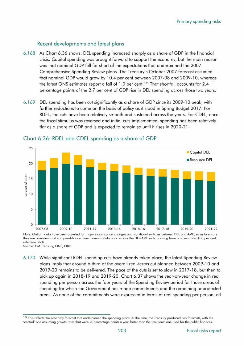
Primary spending risks
Recent developments and latest plans
6.168 As Chart 6.36 shows, DEL spending increased sharply as a share of GDP in the financial crisis. Capital spending was brought forward to support the economy, but the main reason was that nominal GDP fell far short of the expectations that underpinned the 2007 Comprehensive Spending Review plans. The Treasury’s October 2007 forecast assumed that nominal GDP would grow by 10.4 per cent between 2007-08 and 2009-10, whereas the latest ONS estimates report a fall of 1.0 per cent.124 That shortfall accounts for 2.4 percentage points of the 2.7 per cent of GDP rise in DEL spending across those two years.
6.169 DEL spending has been cut significantly as a share of GDP since its 2009-10 peak, with further reductions to come on the basis of policy as it stood in Spring Budget 2017. For RDEL, the cuts have been relatively smooth and sustained across the years. For CDEL, once the fiscal stimulus was reversed and initial cuts implemented, spending has been relatively flat as a share of GDP and is expected to remain so until it rises in 2020-21.
Chart 6.36: RDEL and CDEL spending as a share of GDP
0
5
10
15
20
25
2007-08 2009-10 2011-12 2013-14 2015-16 2017-18 2019-20 2021-22
Per
cent
of G
DP
Capital DEL
Resource DEL
Note: Outturn data have been adjusted for major classification changes and significant switches between DEL and AME, so as to ensure they are consistent and comparable over time. Forecast data also remove the DEL-AME switch arising from business rates 100 per cent retention pilots.Source: HM Treasury, ONS, OBR 6.170 While significant RDEL spending cuts have already taken place, the latest Spending Review
plans imply that around a third of the overall real-terms cut planned between 2009-10 and 2019-20 remains to be delivered. The pace of the cuts is set to slow in 2017-18, but then to pick up again in 2018-19 and 2019-20. Chart 6.37 shows the year-on-year change in real spending per person across the four years of the Spending Review period for those areas of spending for which the Government has made commitments and the remaining unprotected areas. As none of the commitments were expressed in terms of real spending per person, all
124 This reflects the economy forecast that underpinned the spending plans. At the time, the Treasury produced two forecasts, with the ‘central’ one assuming growth rates that were ¼ percentage points a year faster than the ‘cautious’ one used for the public finances.
203 Fiscal risks report

Primary spending risks
the profiles vary across years.125 The chart shows how the pace of cuts to total RDEL picks up in the second half of the period and how the unprotected departments are set to bear the brunt in every year. This provides the context for considering the pressures on DEL spending over the medium term and the challenge they might pose the Treasury’s spending control system in managing the associated risks.
Chart 6.37: Real RDEL spending per person in the Spending Review period
-6
-5
-4
-3
-2
-1
0
1
2
3
PSCE in RDEL NHS Schools Defence Police Other RDEL (largelyunprotected)
Year
-on-
year
gro
wth
rat
e (p
er c
ent)
2016-17
2017-18
2018-19
2019-20
Note: Forecast data remove the DEL-AME switch arising from business rates 100 per cent retention pilots. NHS and schools figures are England only, while police figures are England and Wales only.Source: HM Treasury, OBR
How effective have DELs been as a mechanism for managing spending risks?
6.171 The Treasury expects departments to manage their DEL spending, and the risks that affect it, so that they stay within their limits. This transfers risk from the Exchequer to departments. The evidence points to this system working reasonably well, with departments almost always underspending at least by a little against the final plans submitted to Parliament. The Treasury has a second line of defence within DELs, namely its central reserve, which Treasury Ministers can deploy in specific cases where they agree that departments cannot be expected to absorb additional costs in full (as described from paragraph 6.154). The reserve was 0.6 per cent of forecast total managed expenditure in 2016-17, which put the UK in the middle of the range of countries for which similar data were available.126 The reserve for 2017-18 is currently £6.3 billion, 0.8 per cent of expected total spending.
125 Spending Review 2015 set RDEL budgets for departments up to 2019-20 (or in some cases 2020-21). The specific commitments to ‘protect’ certain areas of spending were as follows: English NHS funding protected in real terms plus an additional £10 billion a year (in real terms) by 2020-21; English schools funding protected in real terms up to 2019-20; 2 per cent of GDP each year committed to defence spending up to 2019-20; 0.7 per cent of GNI each year committed to official development assistance up to 2019-20 (not shown in the chart as the split between RDEL and CDEL varies across years, making the RDEL-only profile misleading); and English and Welsh police spending protected in real terms up to 2019-20. Chart 6.37 is based on those budgets, but also includes subsequent in-year changes (for instance, agreed drawdowns from the reserve and budget exchange). In some cases the budgets that are protected are wider than the RDEL budgets shown. 126 IMF, Fiscal transparency evaluation, Country Report No. 16/351, 2016.
Fiscal risks report 204

Primary spending risks
6.172 The Treasury provides us with its year-by-year plans for DEL spending for our medium-term forecast. Our key judgement is then to consider the extent to which departments will, in aggregate, under- or over-spend against their Treasury limits. We consider this from the perspective of departments’ financial management and, in the short term, evidence of pressures on the reserve. We do not assess demand for the services that departments provide. This reflects the reality that, given the financial and reputational consequences associated with overspending and the obligations place on departmental accounting officers, departments almost always underspend relative to the limits set.
6.173 Underspending is measured relative to ‘final plans’. On this basis the Treasury has exhibited a high degree of control over in-year spending. On average, over the five years to 2015-16, aggregate DEL plans have been underspent by £4.4 billion (around 1.2 per cent of final plans), with RDEL underspends on a downward trend since 2012-13.
6.174 But plans can and do change between when they are initially set in a Spending Review and when the final plans against which underspending is measured are published in the Treasury’s ‘supplementary estimates’ each February, close to the end of the fiscal year.127 If Parliament approves these estimates, which it invariably does, DEL totals are adjusted accordingly and underspends are recorded against these final plans. This provides a procedure by which DELs can be raised to meet additional in-year pressures. Departments are also likely to request more than they need during the supplementary estimates process each year to reduce the risk of overspending.
6.175 The main medium-term risk is not therefore that departments overspend their limits, but that the Treasury increases them over time. In the past three years’ supplementary estimates, total DELs for the current year were revised up relative to the previous summer’s main estimates, with the Department of Health’s RDEL rising each time (see paragraph 6.60).
6.176 It is possible that if a number of departments overspent simultaneously in the face of the challenges posed by the Spending Review, the punitive financial levers at the Treasury’s disposal and the reputational damage to the departments may not provide as strong an incentive to take action as they normally do. This could represent a risk to the strength of the Treasury’s control over departmental spending in the coming years.
6.177 While the DEL system generally reduces fiscal risk by requiring departments to offset pressures by reducing spending elsewhere, those pressures are sometimes simply moved from DELs to elsewhere in the public sector. For example, grants to local authorities within DELs (particularly those from the Department of Communities and Local Government) have been cut most severely since 2010. This has contributed to the pressures on locally funded social care that are now affecting the NHS (see paragraph 6.57). In Spending Review 2015, a number of conventional spending policies were converted into loans (e.g. maintenance grants for lower-income students). This reduces the lifetime cost of the policies, because some loans will be paid back, but it also shifts the recorded costs into the future when write-
127 For example, HM Treasury, Central Government Supply Estimates 2016-17: Supplementary Estimates and New Estimates, February 2017, HC 946.
205 Fiscal risks report
Primary spending risks
offs add to spending because a proportion of borrowers will default on the loans. For example, we recently estimated that converting maintenance grants or bursaries to loans – for students from lower-income households and for nurses – accounted for around three quarters of the increase in our 50-year projections for the cost of student loan write-offs.128
DEL spending beyond any Spending Review plans
6.178 One source of medium-term forecast risk is the approach that the Treasury takes to departmental spending in years that lie within the five-year forecast horizon but beyond the latest Spending Review plans. In these years, the Treasury typically sets a policy assumption for total spending and infers what that means for DEL totals after subtracting our forecast for AME spending in those years. These ‘implied DELs’ are not managed in the same way as actual DEL plans and can vary much more from forecast to forecast.
6.179 Chart 6.38 illustrates this via successive forecasts for RDEL spending (adjusted for major classification changes and switches between DEL and AME so that they are comparable with our latest forecast). Plans for 2015-16 were set in Spending Round 2013, between our March and December forecasts that year, while plans for 2016-17 onwards were set in Spending Review 2015, alongside our November 2015 forecast. The chart shows how steep cuts in ‘implied RDEL’ were pencilled in at Autumn Statement 2014. This reflected a complex interaction between major National Accounts methodology changes, the Coalition Government’s lack of agreement over fiscal plans for the next Parliament and the Treasury’s desired outcomes for borrowing. At the time we highlighted the striking implications the implied totals had for departments under difference scenarios. When plans came to be set in November 2015, the cuts pencilled in via the path for implied DELs were dropped. Our March 2017 forecast only contains two years where RDEL spending plans have yet to be set and only one year for CDEL, so this issue is unlikely to be significant at the moment.
128 OBR, Fiscal sustainability analytical paper: Student loans update, 2016.
Fiscal risks report 206

Primary spending risks
Chart 6.38: Successive forecasts for the change in RDEL from 2014-15 onwards
-40
-30
-20
-10
0
10
20
30
2014-15 2015-16 2016-17 2017-18 2018-19 2019-20 2020-21 2021-22
£ bi
llion
March 2013
December 2013
March 2014
December 2014
March 2015
July 2015
November 2015
March 2016
November 2016
March 2017
Note: Previous forecasts have been adjusted for major classification changes and significant switches between DEL and AME, so as toensure they are comaprable with March 2017. The March 2017 forecast has been adjusted to remove the DEL-AME switch arising from business rates 100 per cent retention pilots.Source: HM Treasury, OBR
What pressures are there on DEL spending in the medium term?
6.180 Preceding sections of this chapter have identified a number of pressures on DEL spending associated with health care, nuclear decommissioning, clinical negligence, major procurement costs and unexpected events. Other sources of pressure include:
• Inflation: around 35 per cent of RDEL spending is on the procurement of goods and services, so economy-wide and sector-specific inflation movements – relative to the assumptions underpinning the spending plans – can be a source of pressure. The fall in the pound since the EU referendum has pushed inflation above our November 2015 forecasts, which accompanied the 2015 Spending Review. Cumulative CPI inflation between 2015-16 and 2019-20 was 7.1 per cent in our November 2015 forecast, but 8.0 per cent in our March 2017 forecast.
• Staff costs: again, around 35 per cent RDEL spending is on staff pay and associated costs. Civil service pay rises are subject to an overall 1 per cent limit that extends until 2019-20, but there are a number of pressures on broader staff costs. The National Living Wage will affect employers with a higher proportion of staff on lower hourly wages – the effect is most significant in the social care sector, which is financed locally, but a number of departments, such as the Home Office and the Department for Work and Pensions, also employ substantial numbers of staff that are likely to be affected. Departments are also having to make higher employer pension contributions following the abolition of the NICs contracting out rebate from April 2016 – this is estimated to have added up to £3 billion a year to the wider public sector paybill. Pension contributions are set to rise again in 2019-20 when the effect of applying a lower discount rate in the latest round of pension valuations hits, adding a further £2 billion a year to departmental paybills. Finally, larger public sector employers are liable to
207 Fiscal risks report

Primary spending risks
pay the apprenticeship levy – adding around another £½ billion a year. These costs all create additional pressure on non-pay budgets within a given DEL total.
• Political and policy pressures: reports of ‘austerity fatigue’ have been growing, with the British Social Attitudes survey this year reporting more support for higher tax and spending than for unchanged levels or reductions for the first time since 2007-08. Debate over ongoing real terms cuts to public sector pay has also intensified. The advent of minority government could also loosen the Treasury’s grip on public spending control. As noted earlier in this chapter, the confidence and supply agreement between the Conservative Party and the DUP superseded the Conservative manifesto commitment to replace the costly ‘triple lock’ on state pension uprating with a slightly less costly ‘double lock’ from 2020. The financial support for Northern Ireland that went with the agreement is set to cost £1 billion, with around 90 per cent of it frontloaded into the first two years. The agreement will be reviewed in two years’ time, presenting an opportunity for further spending increases. It has also prompted calls from Wales and Scotland for parity of treatment.
6.181 Brexit is likely to pose a number of public spending challenges, some of which could represent risks to DELs. When considering these challenges as risks to our latest medium-term forecasts, it is important to note that we have made the simplifying assumption that the amount that would have been spent on net expenditure transfers to EU institutions is recycled into domestic spending. We have kept this ‘amount in lieu of’ those transfers in our AME forecast, although in reality many of the costs are likely to be managed within DELs.
6.182 Brexit-related spending challenges that may be addressed through DEL spending include:
• The ‘divorce bill’: there is huge uncertainty over the size and timing of any payment that the UK might agree to make as part of the Brexit negotiations. The new Government’s manifesto stated that it would “determine a fair settlement of the UK’s rights and obligations as a departing member state, in accordance with the law and in the spirit of the UK’s continuing partnership with the EU.” The European Commission’s ‘Essential principles on financial settlement’ working paper argues for a single financial settlement related to the EU budget, termination of membership of all EU bodies and institutions and the UK’s participation in specific funds and facilities related to EU policies.129 Commentators have cited figures for the possible divorce bill that vary widely, with some estimates as high as €60 billion130 or even €75 billion (both on a net basis).131 Any amount that was agreed could be paid upfront or spread over a number of years. The new Government stated in its manifesto that “the days of Britain making vast annual contributions to the European Union will end”.
129 European Commission, Working paper: Essential Principles on Financial Settlement, May 2017. The paper includes two annexes that list 74 bodies or funds to be included in the financial settlement and 65 programmes underpinned by ‘basic acts’ that have been allocated a reference amount to be spent over the period from 2014 to 2020. 130 Centre for European Reform, The €60 billion Brexit bill: How to disentangle Britain from the EU budget, February 2017. 131 Financial Times, Brussels hoists gross Brexit ‘bill’ to €100bn, 3 May 2017.
Fiscal risks report 208

Primary spending risks
• Matching funding to beneficiaries of selected EU schemes after Brexit: the Government has promised continuing support to a number of groups receiving EU payments, including farmers subsidised by the EU Common Agricultural Policy and researchers awarded funding by the EU Horizon 2020 scheme. The Conservative Party’s manifesto went further, stating that “We will use the structural fund money that comes back to the UK following Brexit to create a United Kingdom Shared Prosperity Fund, specifically designed to reduce inequalities between communities across our four nations”.
• Establishing and running UK-specific regulators: it is likely that the Government will need to set up UK-specific regulators in areas where we leave EU equivalents. This could involve one-off set-up costs and ongoing staff and procurement costs that require additional funding rather than reprioritisation within existing plans.
• Preparing and carrying out Brexit and other negotiations: there may be temporary pay and procurement costs associated with the Brexit negotiations and the steps required to establish new free-trade agreements with other countries – for example, the need to hire trade negotiators or procure the services of consultants with the necessary skills. The Financial Times estimated in May that 295 bilateral agreements would be required to recreate the existing trade deals that the UK is part of via EU membership, including the need to approach 132 separate parties in respect of multilateral agreements based on consensus, plus 202 agreements related to regulatory cooperation and 262 on agriculture, fisheries, nuclear, transport and customs.132 A recent report from the Institute for Government on the implications of Brexit for the civil service suggested that reprioritisation of spending to Brexit-related areas would not be sufficient for some departments to meet additional implementation demands. It argued that spending plans for some would have to be revised up and that recent recruitment behaviour by some departments suggested that they were unlikely to be held to the administrative savings agreed in the 2015 Spending Review.133
• Sector-specific interventions: pressure for support or compensation from companies and industries adversely affected by the UK leaving the single market and customs union could mount. And the removal of EU state aid restrictions could make the provision of that type of subsidy more straightforward.
Might DEL spending exceed our latest medium-term forecast?
6.183 History suggests that there is little risk of final DEL plans being overspent in aggregate in any year, but that there is a risk that plans will be revised up from their current levels before becoming ‘final’. Given the size of the real per capita cuts to departmental budgets planned between now and 2019-20, there is uncertainty over the extent to which they can be achieved by improving efficiency or reducing service delivery, while remaining politically viable. If pressures do prove unmanageable within current plans, it would seem more likely that plans would be revised rather than them being routinely overspent.
132 Financial Times, After Brexit: the UK will need to renegotiate at least 759 treaties, 30 May 2017. 133 Institute for Government and The UK in a Changing Europe, The civil service after Article 50, March 2017.
209 Fiscal risks report
Primary spending risks
6.184 On balance, we judge is that there is a high risk that DEL spending plans will be revised up. Since DELs are a policy choice, this is not an area where we can quantify the risk. But it is possible to illustrate some scenarios using top-down estimates presented by various commentators. For example, NHS spending (covered earlier in this chapter), social care and education spending are areas where they have attempted to estimate these ‘gaps’.134 The biggest are in health, where Nuffield Trust scenarios point to gaps of between £5 billion and £15 billion by 2020-21 if the NHS were not able to maintain ongoing pay restraint or deliver historically challenging efficiency savings.
Medium-term risks to non-interest AME spending
6.185 The preceding sections of this chapter have highlighted some of the key medium-term risks to AME spending relative to our latest forecast. These illustrate the ways in which AME spending can be subject to risks from the demand or unit cost sides, from pressures that build or unexpected events. Among the bigger sources of risk include:
• State pensions: the caseload will be affected by the number of deaths, which has risen unexpectedly in recent years. The average award will be affected by triple lock uprating, risks to which are closely related to risks to our real earnings forecast.
• Working-age welfare spending: key risks include the delivery of reforms to disability benefits and universal credit, and legal cases that, if lost, could lead to wider coverage or higher average awards than assumed in our central forecasts.
• Tax litigation: loss of a major lead case with implications for follower cases could result in much higher spending than is factored into our central forecast.
• Local authority use of reserves: it is possible that local authorities could need to draw down from their more than £28 billion stock of reserves more aggressively than we have assumed given the ongoing pressures on their budgets.
6.186 Over the medium term, none of these risks are large relative to the potential changes in debt interest spending discussed in Chapter 8.
Primary spending risks to long-term fiscal sustainability
6.187 Chart 6.39 shows our January 2017 FSR projections for all primary spending. The biggest risks to fiscal sustainability incorporated in these projections related to health and adult social care spending (due to ageing and, particularly in health, other cost pressures) and state pensions and other pensioner benefits (due to ageing and, for the state pension, triple lock uprating). Our central projections do not point to long-term pressures on spending as a share of GDP in other areas, either by assumption – we do not factor in any long-term pressures on the defence budget, for example – or because demographic trends are not unfavourable – education spending is relatively flat as a share of GDP because the share of the population of school age is not projected to rise.
134 The Health Foundation, Briefing: The social care funding gap: implications for local health care reform, March 2017 and National Audit Office, Financial sustainability of schools, December 2016.
Fiscal risks report 210

Primary spending risks
Chart 6.39: Long-term primary spending projections
0
10
20
30
40
50
60
2016-17 2021-22 2026-27 2031-32 2036-37 2041-42 2046-47 2051-52 2056-57 2061-62 2066-67
Per
cent
of G
DP
Public service pensionsState pensions and pensioner benefitsLong-term careHealthOther primary spending
Source: OBR 6.188 Our long-term projections are sensitive to the assumptions on which they are based. Chart
6.40 shows how total primary spending in 2066-67 would vary according to different underlying assumptions about the population. The key sensitivity is to the old-age dependency ratio embodied in each variant, which determines demand for public spending and, via age-specific employment rates, the level of GDP. For example, the high migration variant includes higher demand for public services because of a larger population, but it includes a proportionately bigger increase to GDP because migrants are assumed to be concentrated among those of working-age. That remains true over a 50-year horizon, even though migrants themselves get older and retire. Primary spending as a share of GDP in 2066-67 is therefore lower in the high migration scenario than in our central projection.
211 Fiscal risks report
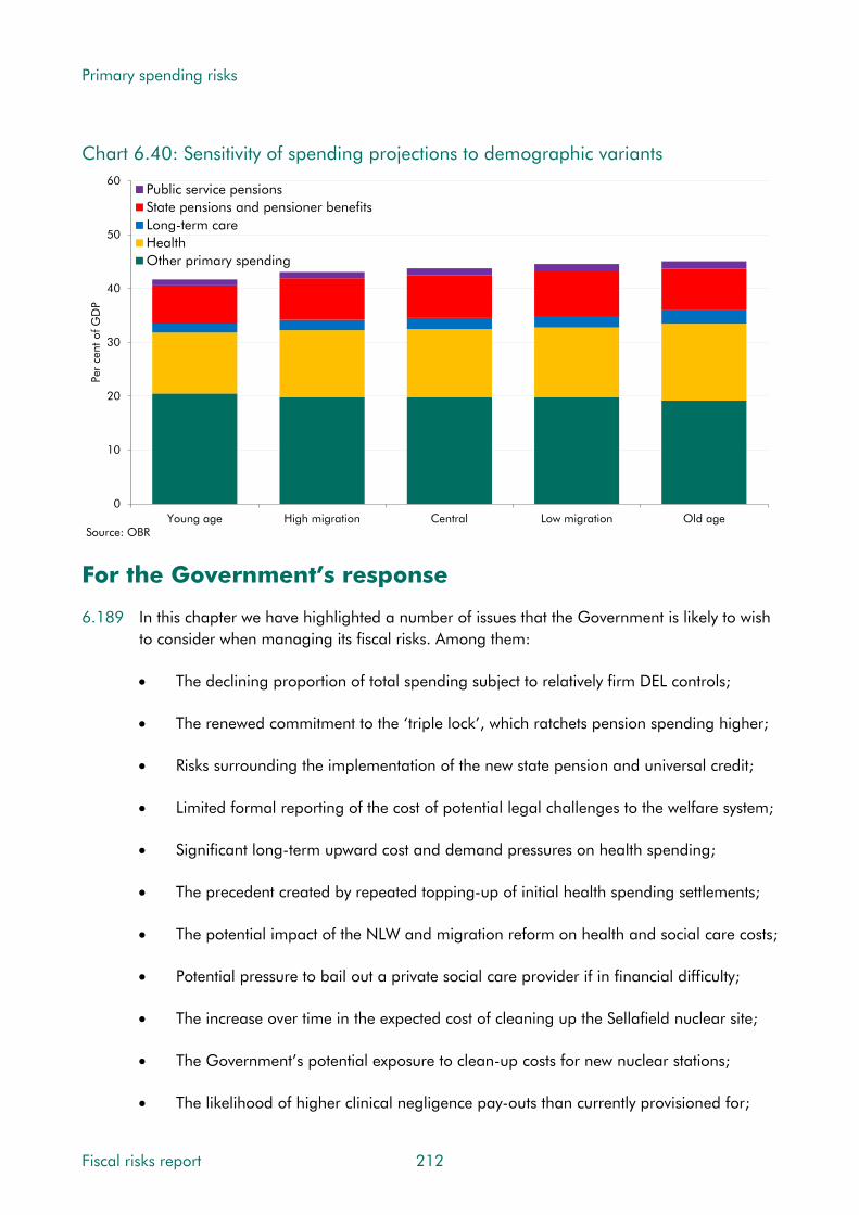
Primary spending risks
Chart 6.40: Sensitivity of spending projections to demographic variants
0
10
20
30
40
50
60
Young age High migration Central Low migration Old age
Per
cent
of G
DP
Public service pensionsState pensions and pensioner benefitsLong-term careHealthOther primary spending
Source: OBR
For the Government’s response
6.189 In this chapter we have highlighted a number of issues that the Government is likely to wish to consider when managing its fiscal risks. Among them:
• The declining proportion of total spending subject to relatively firm DEL controls;
• The renewed commitment to the ‘triple lock’, which ratchets pension spending higher;
• Risks surrounding the implementation of the new state pension and universal credit;
• Limited formal reporting of the cost of potential legal challenges to the welfare system;
• Significant long-term upward cost and demand pressures on health spending;
• The precedent created by repeated topping-up of initial health spending settlements;
• The potential impact of the NLW and migration reform on health and social care costs;
• Potential pressure to bail out a private social care provider if in financial difficulty;
• The increase over time in the expected cost of cleaning up the Sellafield nuclear site;
• The Government’s potential exposure to clean-up costs for new nuclear stations;
• The likelihood of higher clinical negligence pay-outs than currently provisioned for;
Fiscal risks report 212
Primary spending risks
• The significant proportion of clinical negligence costs still accounted for by legal fees;
• Possible further increases in tax litigation pay-outs, including large ‘lead’ cases;
• Initial signs that local authorities have started running down their reserves;
• Examples of local authorities undertaking potentially risky commercial investments;
• Increased and as-yet untested borrowing powers for the devolved administrations;
• Exposure to potentially greater exchange rate volatility as a result of Brexit;
• The possibility of cost overruns for major projects like HS2 and Universal Credit IT;
• The possibility that the UK will have to pay a large ‘divorce bill’ on leaving the EU; and
• Evidence of ‘austerity fatigue’ when planned spending cuts are still to be delivered.
6.190 When assessing the outlook for public spending over the medium and long term, does the Government regard these or other issues as important for its risk management strategy and, if so, how does it intend to address them?
213 Fiscal risks report

7 Balance sheet risks
Introduction
7.1 The public sector balance sheet provides estimates of the assets and liabilities held by central and local government (including the devolved administrations) and public corporations. A number of balance sheet measures are published for the UK, differing in coverage and accounting treatment. All show that the balance sheet is large relative to flows of spending and receipts and to the size of the economy. The asset and liability sides of the balance sheet can both be sources of fiscal risk.
7.2 As discussed in Chapter 1, the broadest National Accounts balance sheet measure is public sector net worth (PSNW). This includes financial and non-financial assets and liabilities, but excludes the present value of future tax revenues and most spending. Unfortunately the Office for National Statistics (ONS) has suspended publication of PSNW, due to issues with the public corporations data. Chart 7.1 therefore shows estimates of assets, liabilities and net worth relative to GDP for selected years up to 2012. It shows the shrinking of the balance sheet and the reduction in PSNW associated with privatisations of public corporations up to the mid-1990s. After this the balance sheet expands slowly, with PSNW relatively stable until the mid-2000s before deteriorating as a result of the large current budget deficits associated with the financial crisis and recession of the late 2000s.
Chart 7.1: Public sector net worth
-150
-100
-50
0
50
100
150
200
1970 1975 1980 1985 1990 1995 2000 2005 2006 2007 2008 2009 2010 2011 2012
Per
cent
of G
DP
General government
Public corporations
Total public sector net worth
Note: General government is the sum of the central and local government sectors.Source: ONS
Assets
Liabilities
215 Fiscal risks report

Balance sheet risks
7.3 For a more up-to-date, but less complete, view we can look at general government net worth (GGNW), this excludes public corporations and the Bank of England. Chart 7.2 shows that GGNW follows a similar path to that for PSNW up to 2012, with liabilities increasing significantly during and after the crisis and only partly offset by increases in assets (including those acquired through interventions in the financial sector and the increasing stock of student loans). In 2015, assets were worth 95 per cent of GDP, of which around two-thirds were non-financial assets (like roads and buildings) and one-third financial (like student loans and foreign currency reserves). Liabilities were worth 116 per cent of GDP.
Chart 7.2: General government net worth
-150
-100
-50
0
50
100
150
2000 2001 2002 2003 2004 2005 2006 2007 2008 2009 2010 2011 2012 2013 2014 2015
Per
cent
of G
DP
Total financial assetsTotal financial liabilitiesNon-financial assetsNet worth
Source: ONS
7.4 The Whole of Government Accounts (WGA) offer an alternative view, based on international accounting standards (as described in Box 1.1 in Chapter 1). These have wider coverage than PSNW, particularly of liabilities such as the present value of future public service pension costs and provisions for items where past activity has generated future expected liabilities (see Chapter 6). In 2015-16 the WGA recorded assets of 92 per cent of GDP (with property, plant and equipment accounting for the majority) and liabilities of 198 per cent (dominated by public sector pensions (76 per cent) and government debt (67 per cent)). The net liability was 105 per cent of GDP. This has risen from 74 per cent in 2010-11 as a result of significant borrowing for current spending and the use of a lower discount rate to value pension liabilities and the provisions for nuclear decommissioning and clinical negligence.
7.5 The WGA, like PSNW and other measures of debt used in this report, exclude the public sector banks. At their peak, including both RBS and Lloyds Banking Group in these measures would have roughly doubled the size of both assets and liabilities.
7.6 Differences in coverage and accounting treatment make it very hard to provide a robust international comparison of public sector balance sheets. Chart 7.3 shows measures of
Fiscal risks report 216
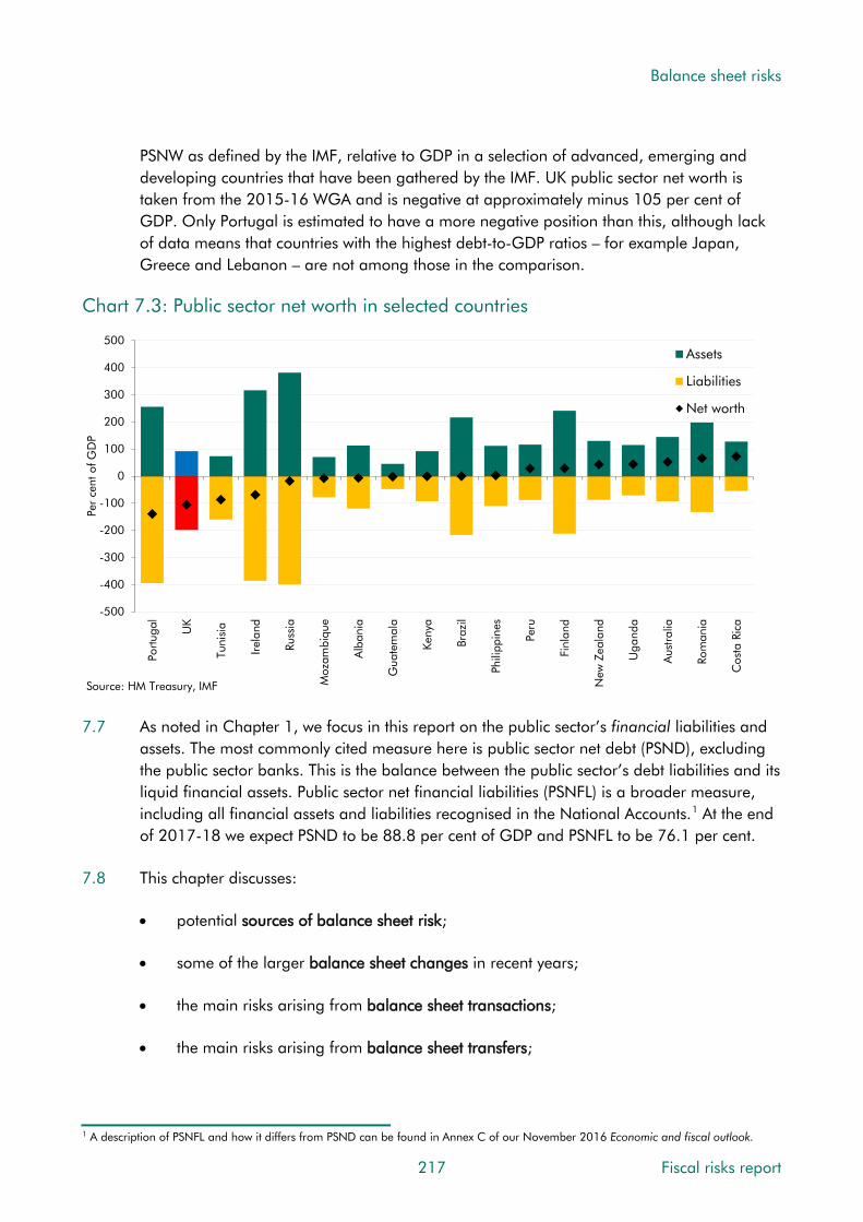
Balance sheet risks
PSNW as defined by the IMF, relative to GDP in a selection of advanced, emerging and developing countries that have been gathered by the IMF. UK public sector net worth is taken from the 2015-16 WGA and is negative at approximately minus 105 per cent of GDP. Only Portugal is estimated to have a more negative position than this, although lack of data means that countries with the highest debt-to-GDP ratios – for example Japan, Greece and Lebanon – are not among those in the comparison.
Chart 7.3: Public sector net worth in selected countries
-500
-400
-300
-200
-100
0
100
200
300
400
500
Portu
gal
UK
Tuni
sia
Irel
and
Russ
ia
Moz
ambi
que
Alb
ania
Gua
tem
ala
Keny
a
Braz
il
Phili
ppin
es
Peru
Finl
and
New
Zea
land
Uga
nda
Aus
tral
ia
Rom
ania
Cos
ta R
ica
Per
cent
of G
DP
Assets
Liabilities
Net worth
Source: HM Treasury, IMF 7.7 As noted in Chapter 1, we focus in this report on the public sector’s financial liabilities and
assets. The most commonly cited measure here is public sector net debt (PSND), excluding the public sector banks. This is the balance between the public sector’s debt liabilities and its liquid financial assets. Public sector net financial liabilities (PSNFL) is a broader measure, including all financial assets and liabilities recognised in the National Accounts.1 At the end of 2017-18 we expect PSND to be 88.8 per cent of GDP and PSNFL to be 76.1 per cent.
7.8 This chapter discusses:
• potential sources of balance sheet risk;
• some of the larger balance sheet changes in recent years;
• the main risks arising from balance sheet transactions;
• the main risks arising from balance sheet transfers;
1 A description of PSNFL and how it differs from PSND can be found in Annex C of our November 2016 Economic and fiscal outlook.
217 Fiscal risks report

Balance sheet risks
• risks from valuation changes;
• where balance sheet surprises may emerge from; and
• the importance of what the IMF has called ‘fiscal illusions’.
7.9 We end by drawing some conclusions and summarising the issues raised in the chapter that the Government may wish to address in its response to this report.
Sources of balance sheet risk
7.10 Chapter 1 describes how the evolution of the debt-to-GDP ratio depends on the primary budget balance (the difference between revenues and primary spending), debt interest and ‘stock-flow adjustments’. The first two are flows that add to the stock year by year, while the latter affect it directly without an associated flow. It is these we investigate in this chapter.
7.11 A variety of stock-flow adjustments are relevant when assessing fiscal sustainability:
• balance sheet transactions, in which the government issues debt to buy an asset or to lend to the private sector (such as the purchase of shares in RBS and Lloyds Banking Group or the Bank of England’s lending to commercial banks through its Term Funding Scheme (which is financed by Bank rather than government liabilities));
• balance sheet transfers, in which the government directly absorbs the assets and liabilities of a private sector entity (this can be a real-world event, like the transfer of the Royal Mail’s historic pension liabilities and associated assets to the public sector in 2012, or a statistical one, as in 2015 when the ONS reclassified housing associations from the private to public sector); or
• changes in the value of existing assets and liabilities, such as the impact of a movement in the exchange rate on the sterling value of the UK’s foreign exchange reserves and debt denominated in foreign currencies.
7.12 Stock-flow adjustments also arise due to timing or other accounting differences. Timing differences arise because public sector net borrowing (PSNB) is recorded on an accruals basis, whereas PSND is largely a cash measure. This means, for example, that tax receipts are usually recorded in PSNB when the underlying economic activity that is being taxed took place, but in PSND when the tax payments are received. Others relate to differences in valuation, of which the most important is the recording of gilts as explained below.
7.13 Timing and accounting differences are not usually relevant to assessments of long-term sustainability, because they typically even out over time. But they are worth scrutiny when the accounting methodology clouds the ‘true’ picture. To take two examples:
• Interest on student loans: this is recorded in PSNB as it accrues, which we expect to subtract £3.0 billion from the deficit this year. Interest starts accruing from the time the
Fiscal risks report 218
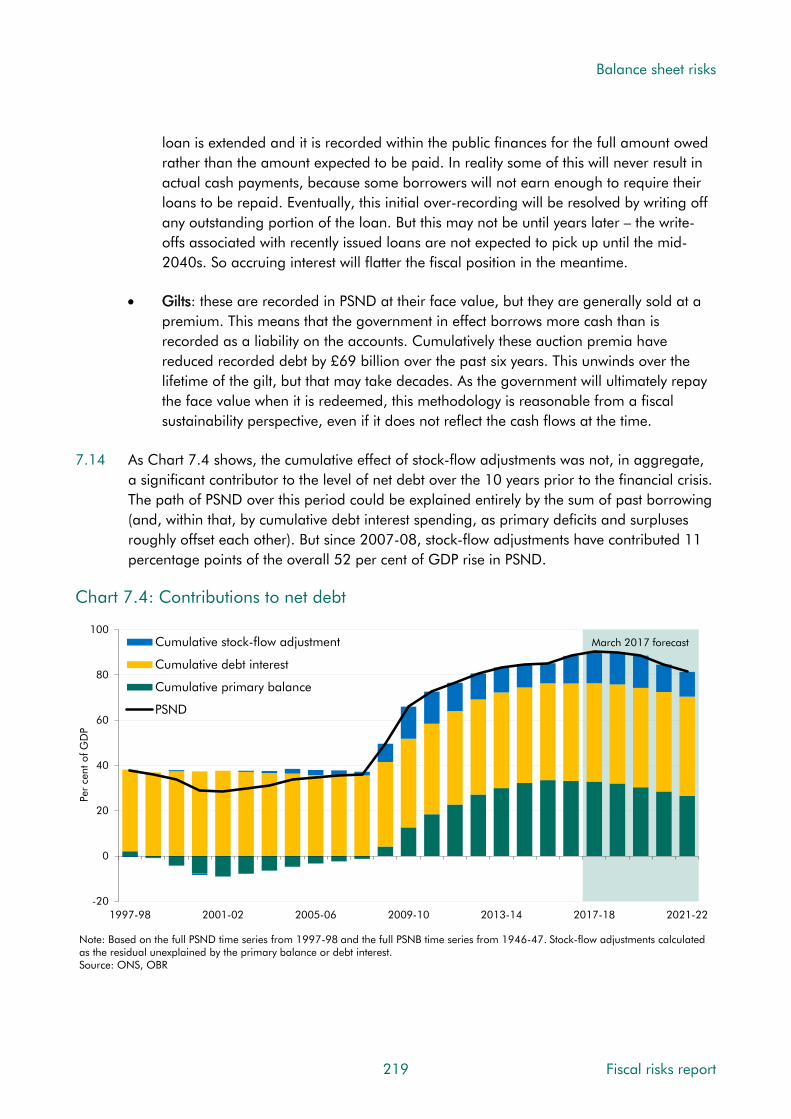
Balance sheet risks
loan is extended and it is recorded within the public finances for the full amount owed rather than the amount expected to be paid. In reality some of this will never result in actual cash payments, because some borrowers will not earn enough to require their loans to be repaid. Eventually, this initial over-recording will be resolved by writing off any outstanding portion of the loan. But this may not be until years later – the write-offs associated with recently issued loans are not expected to pick up until the mid-2040s. So accruing interest will flatter the fiscal position in the meantime.
• Gilts: these are recorded in PSND at their face value, but they are generally sold at a premium. This means that the government in effect borrows more cash than is recorded as a liability on the accounts. Cumulatively these auction premia have reduced recorded debt by £69 billion over the past six years. This unwinds over the lifetime of the gilt, but that may take decades. As the government will ultimately repay the face value when it is redeemed, this methodology is reasonable from a fiscal sustainability perspective, even if it does not reflect the cash flows at the time.
7.14 As Chart 7.4 shows, the cumulative effect of stock-flow adjustments was not, in aggregate, a significant contributor to the level of net debt over the 10 years prior to the financial crisis. The path of PSND over this period could be explained entirely by the sum of past borrowing (and, within that, by cumulative debt interest spending, as primary deficits and surpluses roughly offset each other). But since 2007-08, stock-flow adjustments have contributed 11 percentage points of the overall 52 per cent of GDP rise in PSND.
Chart 7.4: Contributions to net debt
-20
0
20
40
60
80
100
1997-98 2001-02 2005-06 2009-10 2013-14 2017-18 2021-22
Per
cent
of G
DP
Cumulative stock-flow adjustment
Cumulative debt interest
Cumulative primary balance
PSND
Note: Based on the full PSND time series from 1997-98 and the full PSNB time series from 1946-47. Stock-flow adjustments calculated as the residual unexplained by the primary balance or debt interest.Source: ONS, OBR
March 2017 forecast
219 Fiscal risks report

Balance sheet risks
Recent large balance sheet changes
7.15 Table 7.1 reports various significant balance sheet events in recent years. These do not include the full effect of the public sector banks’ balance sheets, which remain outside the ‘excluding public sector banks’ measures we focus on in this report, but do include the effect of the related financial sector interventions on central government. RBS and Lloyds together had gross debt of around £2 trillion when they moved onto the public sector balance sheet in October 2008. They also held around £0.6 trillion of liquid assets, with their loan books and other assets deemed illiquid. They therefore added around £1.4 trillion to PSND relative to the ex-public sector banks measure. Their effect on PSNFL would have been much smaller, since loan assets and other illiquid assets would have been netted off.
7.16 The balance sheet movements fall into five main groups:
• Financial sector interventions: during the financial crisis, the Government acquired stakes in several financial institutions through bail-outs or nationalisation. These interventions were part of the effort to shore up the wider economy and the Government would not expect to have made such investments in normal times. The Government has therefore been returning the stakes to the private sector (e.g. Lloyds, RBS) or allowing them to run down as loans mature (e.g. the former mortgage books of Northern Rock and Bradford & Bingley, now administered by UKAR).
• Bank of England balance sheet expansion: the Bank has bought financial assets, financed by the issuance of central bank reserves, to loosen monetary policy – so-called ‘quantitative easing’. The current policy of the Bank’s Monetary Policy Committee (MPC) is to maintain its stock of UK government bonds at £435 billion and its stock of corporate bonds at £10 billion. The Bank also offers around £100 billion of 4-year loans through its Term Funding Scheme, also financed by issuing reserves.
• Reclassification: entities that the ONS previously considered part of the private sector have moved into the public sector due to changes in (or reassessment of) the perceived level of government control of, or risk exposure to, their activities. For example, Network Rail and housing associations moved into the public sector in recent years.
• Policy acquisition of loan assets: the biggest are student loans, where governments have shifted university funding away from direct spending towards loans for students to pay fees and other costs. The biggest recent change came into effect in 2012, when the Coalition Government trebled the maximum loan available to eligible students. In some cases direct spending has also been replaced by guarantees, for example in relation to a number of infrastructure projects under the UK Guarantees Scheme.
• Transactions related to the sale of non-financial sector assets: these include sales of companies (such as the Royal Mail), as well as non-financial assets (such as public sector land and buildings). They are part of a longer-running policy of successive governments to dispose of assets that are deemed surplus to the public sector’s needs.
Fiscal risks report 220

Balance sheet risks
7.17 Most large balance sheet changes have come from transfers and transactions, and most of them since the onset of the financial crisis. Most have also been sudden, hitting PSND in one or a small number of steps. The expansion of the Bank of England’s balance sheet has come in three rounds – during the 2009 recession that followed the collapse of Lehman Brothers, during the worst of the euro-area debt crisis in 2011-12 and more recently after the EU referendum result in 2016). Student loans have been more incremental.
Table 7.1: Recent large balance sheet changes affecting PSND
Nature of stock-flow Maximum Period Profile
adjustment (£bn)1
Financial sector interventionsSudden with
Lloyds Banking Group Transaction (equity purchase) 2008-09 to 2009-10 21incremental sell off
RBS Transaction (equity purchase) 2008-09 to 2009-10 Sudden 46Transaction (lending) Sudden with
UK Asset Resolution 2008-09 to 2009-10 104and transfer incremental sell off
Depositor compensation Sudden with Transaction 2008-09 11
(not B&B) incremental sell offBank of England balance sheet expansionFirst round 2008-09 to 2009-10
Transaction (purchases of Second round 2011-12 to 2012-13 Incremental 138
debt securities, lending)Third round 2016-17 (ongoing)ReclassificationNetwork rail Decision in 2013-14 30
Transfer SuddenHousing associations Decision in 2015-16 64Policy acquisition of loan assetsStudent loans Transaction (lending) Ongoing since 1991 Incremental 101Transactions related to the sale of non-financial sector assets
Timing effect (rental Sudden with 3G mobile spectrum 2000-01 -23
payment) incremental unwindingTiming effect (rental Sudden with
4G mobile spectrum 2012-13 -2payment) incremental unwinding
Royal Mail Transaction (equity sale) 2013-14 to 2015-16 Sudden -3Sudden with
Royal Mail Pension Plan Transfer 2011-12 -16incremental reversal
1 Estimates are the maximum PSND change from transfers and transactions and are gross of all flows recorded within PSNB. 7.18 These events typically affected PSND, PSNFL and the WGA differently, reflecting differences
in coverage and valuation methodology (Table 7.2). PSNFL and the WGA are generally better guides to the long-term impact of transactions and transfers. For example, financial sector interventions added less to PSNFL than to PSND. When shares in RBS and Lloyds were purchased, PSND (ex-public sector banks) went up by the value of the whole transaction (£66.3 billion) while PSNFL went up only by the excess over the prevailing market price (£12.4 billion). (The WGA begin in 2009-10, after most of these transactions took place, but the effect would have been closer to the PSNFL effect.)
221 Fiscal risks report

Balance sheet risks
7.19 But PSNFL is not always a good guide. This is particularly true for student loans, which are recorded as assets at their nominal value even though a significant proportion will be written off rather than repaid. The true value of these loans will therefore be less than the value recorded in PSNFL (but of course more than the zero recorded in PSND, since student loans are not liquid assets). Student loans assets are recorded in departmental accounts and the WGA at a value that reflects expected future write-offs.
7.20 This issue affects any financial instruments for which there is no observable market value. For example, the revealed market value of the Royal Mail shares sold in the 2013 privatisation was very different to the estimated value before the sale. The shares were valued at 330p for the initial public offering, increased to 455p on the first day of trading and subsequently traded between 455p and 615p in the following five months.2
7.21 Unlike the WGA, which cover all financial and non-financial assets and liabilities, neither PSND nor PSNFL includes physical assets. So the reclassification of housing associations into the public sector resulted in a sharp rise in both measures, since the associated housing assets were not recorded in either. English housing associations held £95 billion of these assets in 2008-09, more than the £42 billion they added to PSND and an estimated £47 billion they added to PSNFL. The WGA do not currently include housing associations.
2 NAO, The Privatisation of Royal Mail, 2014.
Fiscal risks report 222
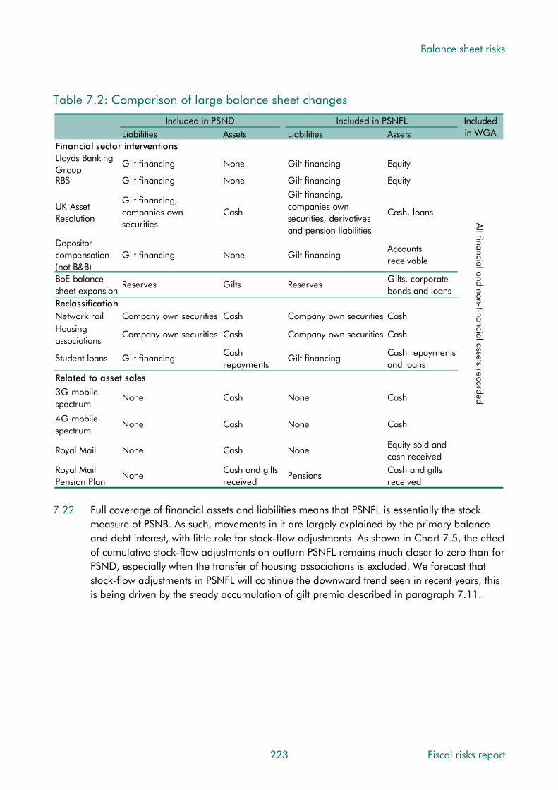
Balance sheet risks
Table 7.2: Comparison of large balance sheet changes
Included in PSND Included in PSNFL Included Liabilities Assets Liabilities Assets in WGA
Financial sector interventionsLloyds Banking
Gilt financing NoneGroup
Gilt financing Equity
RBS Gilt financing None Gilt financing Equity
Gilt financing, UK Asset
companies own CashResolution
securities
Gilt financing, companies own
Cash, loanssecurities, derivatives and pension liabilities
All
Depositor compensation (not B&B)BoE balance sheet expansionReclassification
Gilt financing
Reserves
None
Gilts
financial and non-f
Accounts Gilt financing
receivable
Gilts, corporate Reserves
bonds and loans
Network rail Company own securities Cash
inaCompany own securities CashHousing associations
Company own securities Cash
ncial a
Company own securities Cash
Student loans
Related to asse
Gilt financing
t sales
Cash repayments
ssets reco
Cash repayments Gilt financing
and loans
3G mobile None Cash None Cash
spectrum
rded
4G mobile None Cash None Cash
spectrum
Royal Mail None Cash NoneEquity sold and cash received
Royal Mail None
Pension PlanCash and gilts received
PensionsCash and gilts received
7.22 Full coverage of financial assets and liabilities means that PSNFL is essentially the stock
measure of PSNB. As such, movements in it are largely explained by the primary balance and debt interest, with little role for stock-flow adjustments. As shown in Chart 7.5, the effect of cumulative stock-flow adjustments on outturn PSNFL remains much closer to zero than for PSND, especially when the transfer of housing associations is excluded. We forecast that stock-flow adjustments in PSNFL will continue the downward trend seen in recent years, this is being driven by the steady accumulation of gilt premia described in paragraph 7.11.
223 Fiscal risks report

Balance sheet risks
Chart 7.5: Cumulative stock flow adjustments
-10
-5
0
5
10
15
20
1997-98 2001-02 2005-06 2009-10 2013-14 2017-18 2021-22
Per
cent
of G
DP
PSND
PSND (ex housing associations)
PSNFL
PSNFL (ex housing associations)
Source: ONS, OBR
March 2017 forecast
7.23 While PSNFL generally provides a better indication of the implications of transactions for fiscal sustainability, the initial balance sheet impact is still not the best indication. Ultimately, what matters is the sum of all current and future flows, including interest costs from financing any transaction. This is why our Fiscal sustainability reports (FSR) focus on long-term flow projections rather than balance sheet snapshots. For example, unfunded public sector pension liabilities are not recognised in either the PSND or PSNFL measures. The WGA recognise those related to past employment, but not future employment. In our long-term projections, gross public sector pension expenditure (before offsetting member contributions) fall from 2.1 per cent of GDP in 2021-22 to 1.3 per cent in 2066-67.
Risks from balance sheet transactions
7.24 Our medium-term forecasts and long-term projections include a variety of balance sheet transactions where government plans are known with sufficient certainty to include them. These include the issuance of student loans and running down legacy financial sector assets. Risks to these plans are discussed in this section and risks from new transactions in the next.
Student loans
7.25 The Government provides funds to support higher education, both through grants – including to universities for teaching – and subsidised loans to students. UK loans outstanding reached £100.5 billion by the end of 2016-17 (5.1 per cent of GDP), mostly relating to England. These have increased by more than 150 per cent since 2010-11, reflecting both more loans (the number of students with loans has increased by about 40
Fiscal risks report 224

Balance sheet risks
per cent since 2010-11)3 and much bigger loans (thanks to the decision to increase the maximum from £3,375 in 2011-12 to £9,000 in 2012-13, matching the increase in university tuition fees). Loans issued in other parts of the UK have risen at a slower pace.
Chart 7.6: Student loans outstanding in the UK
0
1
2
3
4
5
6
0
20
40
60
80
100
120
2005-06 2006-07 2007-08 2008-09 2009-10 2010-11 2011-12 2012-13 2013-14 2014-15 2015-16 2016-17
Per cent of GD
P£
billi
on
Rest of UK
England
UK (right axis)
Source: Student Loans Company, ONS, OBR
Medium-term forecast risks
7.26 Our March 2017 forecast assumes that student loans raise the net cash requirement and net debt relative to net borrowing in each year of the forecast. On average, net cash outlays – i.e. new loans issued less repayments received – add 0.8 per cent of GDP a year to net debt. The key risks around this forecast include:
• Student numbers: Higher student numbers would increase current outlays and future repayments and write-offs. We forecast student numbers based on demographic assumptions that are adjusted for expected trends in entry rates. These are themselves determined by trends in application and acceptance rates. There are uncertainties around all these assumptions. Some are specific to Brexit – the last Government confirmed that existing EU students and those starting courses in 2016-17 and 2017-18 would continue to be eligible for loans and home fee status for the duration of their courses.4 It also confirmed that research councils would continue to fund postgraduate students from the EU whose courses start in 2017-18. Our forecast does not include any assumptions about changes to policy on eligibility or funding in 2018-19 or subsequent years. Brexit effects may already be showing up, with applicants from the EU to study at UK universities in 2017-18 down by 6 per cent on the previous year.5 Over the medium term, it is outlays that are most sensitive to changes in student
3 Student Loans Company, Student loans in England, FY 2015-16. 4 The United Kingdom’s exit from and new partnership with the European Union White Paper, February 2017. 5 UCAS, 2017 Cycle applicant figures – March deadline, 2017.
225 Fiscal risks report

Balance sheet risks
numbers, as repayments and write-offs would only be affected over much longer horizons. All else equal, an increase/decrease of 10,000 in the number of students would increase/decrease outlays by around £135 million in 2017-18, rising to £400 million in 2021-22 (in line with the assumed path of average loans per student).
• Economic drivers: Our forecast is also sensitive to assumptions about RPI and RPIX inflation, Bank Rate and earnings growth. Tuition fees and student support are uprated in line with RPIX inflation, affecting the average loan outlay per borrower; repayments are linked to earnings growth; interest payments are linked to RPI inflation and Bank Rate for pre-2012 loans and RPI inflation and earnings growth for post-2012 loans.
• Student loans sales: risks relating to the sale of parts of the pre-2012 student loans book are discussed in paragraph 7.34.
Risks to fiscal sustainability
7.27 In our 2017 FSR, we estimated that student loans would increase PSND by a peak of 11.1 per cent of GDP in the late-2030s before falling to 9.3 per cent by 2066-67. On the PSNFL measure, these figures would be closer to zero, since it includes student loan assets at face value. A better measure of the risks to fiscal sustainability posed by issuing large volumes of student loans is the cost of writing off principal and interest not repaid. This relates to the value of loans issued and the proportion written off. There are uncertainties around both.
7.28 In terms of our long-term projection for the amount of student loans outstanding, Annex B of our 2014 FSR highlighted three key sources of uncertainty:
• Future fees: our central projection assumes that the average tuition fee and maintenance loan rises with earnings rather than inflation. (In the long term, inflation-uprating would steadily reduce university income relative to the size of the economy.) If fee loans were to rise with inflation, we would expect the impact on PSND from student loans to peak at a lower proportion of GDP and then to tail off more quickly.
• Student numbers: our central projection is sensitive to ONS population projections and the share of teenagers in the population. Under the ‘young age structure’ variant, the addition to PSND as a proportion of GDP would be greater than in the central projection in the mid-2040s, then declining only gradually thereafter. Under an ‘old age structure’ variant, we would expect the impact to decline more quickly.
• Graduate income volatility: our projection assumes that fees, loans and thresholds increase with earnings in the long term. The distribution of earnings is also important as repayments are due only if incomes are above the repayment threshold. The interest charged is also linked to a graduate’s earnings. A greater spread of earnings would see student loans add more to PSND as a proportion of GDP.
Fiscal risks report 226

Balance sheet risks
7.29 The proportion of student loans that will eventually be written off depends on many factors, including the repayment conditions and graduates’ future incomes. Currently there is an income-contingent repayment threshold, below which no repayments are made, and unpaid amounts will be written off after 30 years. Write-offs affect PSNB when they happen and PSND indirectly through any future repayments foregone. We project these to remain relatively small up to the mid-2040s, but then to increase to around 0.3 per cent of GDP as graduates under the post-2012 system start to have any outstanding loans written-off.
7.30 The overall impact on sustainability is determined by the cash paid out less cash received (the size of the subsidy), plus the interest paid on debt issued to finance the loans. The government estimates the size of the subsidy (the Resource Accounting and Budgeting (RAB) charge), the percentage of total outlays not covered by the discounted flow of projected future repayments. This was estimated at 45 per cent in the former Department for Business, Innovation and Skills 2014-15 accounts, but revised down to 20 to 25 per cent a year later. This was largely due to using a lower discount rate, which increased the present value of future repayments. If the RAB charge were calculated as the discounted value of write-offs, a lower discount rate would have raised it.
Financial asset sales
7.31 Our March 2017 forecast included the ongoing sale and rundown of UKAR mortgage assets, the sale of the remaining stake in Lloyds Banking Group (since completed) and the sale of £12 billion of the pre-2012 student loans book.
7.32 Asset sales are only included in our forecasts when their size and timing are sufficiently certain. This means there will often be risks to the forecast from asset sales that are planned but not yet sufficiently firm to include in our central forecast. For example, uncertainty over timing and legal issues meant that we did not include the sale of the Green Investment Bank (GIB) in our last forecast, but this has subsequently been confirmed. The GIB was valued at £2.3 billion, split between £1.7 billion of sale proceeds (that will reduce PSND immediately) and £0.6 billion of outstanding commitments being passed to the buyer (which will reduce PSND over time). Our forecast does not include any further sales from the Government’s holding of RBS shares (valued at £19.7 billion at the time of our March forecast).
7.33 Differences between past forecasts and outturns illustrate some of the potential risks. The timing of sales can be sensitive to market conditions and government policy. For example, the first tranche of student loan sales has been pushed back several times since the intention to sell was first announced in Autumn Statement 2013. We first included planned sales of RBS shares in our July 2015 forecast, but only a single tranche was sold before the Government halted further sales pending resolution of uncertainty over legacy issues. There is also uncertainty over the amount that will be raised from such sales. For example, the auction of 4G spectrum licences in 2013 raised £2.3 billion, well below the £3.5 billion we had factored into our December 2012 forecast.
227 Fiscal risks report

Balance sheet risks
7.34 Key risks to the financial asset sales that feature in our central forecast include:
• Student loan sales: These remain subject to market conditions and a final value-for-money assessment. Our March forecast assumed that the first sale would be completed in early 2017-18 and a second by the end of that year. These timings are likely to have been affected by the early general election. Selling the loan book affects the flow of cash to the Exchequer, with more recorded upfront as sales proceeds and less in future years, as repayments flow to the private sector instead. In effect this crystallises losses on the loans sold – the level of debt is permanently higher relative to no loans having been issued, because sale prices will reflect the interest rate and write-off subsidies implicit in the loans.
• UKAR asset sales and rundown: our forecast includes assumptions about the pace at which assets run down as mortgages are repaid and not replaced. The timing and scale of repayments are uncertain. UKAR’s asset sales can be large. Its most recent sale, factored into our March forecast, raised £11.8 billion as part of a sales programme that we expect to be sufficient to repay a £15.7 billion debt to the FSCS. A further £5 billion of sale proceeds are included in our forecast for 2018-19. All major asset sales are subject to risks around market conditions that could affect whether they go ahead and, if they do, whether they raise as much as expected. UKAR has a strong track record on both timing and scale.
7.35 So, there are both upside and downside risks to our forecasts. The largest downside risk is probably further delays to student loans sales, while the biggest upside would be renewed sales of RBS shares. With the exception of the large stake in RBS, the Government has largely exited its post-crisis financial sector holdings, so the size and likelihood of asset-sale risks has probably fallen in recent years. When considering all asset sales of this type, it is important to remember that selling an asset for a fair market price does not improve fiscal sustainability in any meaningful way. It simply swaps one asset (a long-run flow of receipts) for another (a one-off upfront sum). This is more apparent when viewing such sales through the PSNFL or WGA metrics than when using PSND, in which all sales reduce debt.
Monetary policy interventions
7.36 The biggest balance sheet transaction risks to PSND in the medium term could well come from the Bank of England’s monetary policy decisions. This was illustrated in our November 2016 forecast, which incorporated the effect on PSND of the Term Funding Scheme (TFS) and other interventions announced in August 2016. Our forecast assumes that TFS loans will peak at £90 billion this year and will be paid back at their 4-year term, thereby running down to zero over 2020-21 and 2021-22. If the loans were to be rolled over for a longer period and/or the scheme extended, PSND would be higher than we forecast in March. But this would have little implication for fiscal sustainability, since the loans are backed by collateral. This makes it extremely unlikely that the Bank – and therefore the public sector – would ever lose money on the TFS.
Fiscal risks report 228

Balance sheet risks
7.37 There could be even bigger effects on PSND from changes in the Bank’s holdings of gilts (£435 billion at the market prices the Bank paid for them and £371 billion at their face value). The reserves created by the Bank to finance gilt purchases increase PSND and the gilts purchased reduce it, the net effect being the difference between the price paid and their nominal value which increases PSND. As of the end of 2016-17, this added £64 billion to PSND. So long as gilts trade at a premium to nominal values, any further purchases would add more to PSND. As the stress test results in Chapter 9 illustrate, winding down these gilt holdings could have significant consequences for debt interest spending too.
Housing schemes and other guarantees
7.38 In recent years, governments have made greater use of guarantees to achieve economic objectives. Extending guarantees does not significantly affect either PSND or PSNFL until they are called. The ONS put the total value of outstanding government guarantees at £162.6 billion (around 9 per cent of GDP) in 2015-16, of which £65.6 billion related to public corporations. Among the larger examples are the UK Guarantees Scheme (which has a maximum permitted limit of £40 billion in guarantees and has so far issued around £2 billion) and UK Export Finance (£50 billion limit and £11.6 billion in 2015-16 net of reinsurance by other Export Credit Agencies). The National Loan Guarantee Scheme launched in 2012 is now closed to new activity; £5.2 billion of loans were issued under the scheme. These schemes expose the public finances to potentially significant liabilities in the event of shocks affecting the specific companies or sectors involved.
7.39 Alongside these business-focused schemes, there has been a proliferation of housing schemes. As discussed in Chapter 3, the public finances are already sensitive to the housing sector. These schemes intensify that sensitivity. They are most likely to crystallise alongside other economy-related risks. The schemes most likely to involve significant risk are:
• Help to buy equity loans: these are low-interest rate loans to buyers of new-build properties, in effect topping up their deposits. £5.3 billion of equity loans were outstanding as of December 2016, with approved scope for £7 billion more by 2020-21. But take-up could be much greater than forecast, increasing PSND. And losses are possible if house prices fall, reducing the value of outstanding loans below initial purchase prices. Losses only crystalize if borrowers default while in negative equity. Rising unemployment and sharp rises in interest rates are key drivers of default.
• Help to buy mortgage guarantee scheme: this supported lenders in offering high loan-to-value mortgages by sharing default risk. The contingent liability was limited to £12 billion and the scheme closed in December 2016. As of end-March 2016, the maximum potential liability was estimated at £1.1 billion, while the proportion of mortgages three months or more in arrears or in default was just 0.03 per cent.
• Home building fund: this provides development and infrastructure finance and aims to increase the number of new homes being built in England. It has a budget of £3 billion, of which £1 billion is being allocated to small and medium-sized enterprises (SMEs) and £2 billion to long-term infrastructure. Developers can draw down financing
229 Fiscal risks report

Balance sheet risks
up to 2021. Losses are possible if developers fail, which could happen if house prices fall sufficiently to reduce the value of their assets below the liabilities taken on to build them. The likelihood of losses is higher in relation to loans to SME developers.
• Accelerated construction: this scheme enters into partnerships with developers to speed up building on surplus public land, with the Government acting in effect as buyer of last resort if developers are unable to sell all the homes they build. It has a budget of £1.7 billion up to 2021. The main fiscal risk is therefore that developers are left with more unsold homes than the scheme can absorb within its budget, and that the Government chooses to top it up rather than leaving those homes with developers.
7.40 Few liabilities have crystallised on any of these schemes to date, but they would be sensitive to a severe housing downturn. That said, the scale of the risk to PSND is small relative to the broader sensitivity of the public finances to housing shocks.
Risks from balance sheet transfers
7.41 Balance sheet transfers usually relate to ONS classification decisions, although occasionally they result from real-world transfers of entities onto the public sector balance sheet. Sometimes the lag between the ONS announcing and implementing classification decisions means that we include them in our forecast before the ONS includes them in outturn data.
7.42 Major reclassifications occur less frequently than asset sales, but are potentially much larger. Two recent examples are the reclassification of Network Rail from the private sector to central government and the reclassification of housing associations from the private to the public corporations sector. Network Rail added £33.2 billion to PSND in 2013-14, while the reclassification of housing associations across the UK added £66.7 billion in 2015-16.
7.43 Classification decisions may happen in real time in response to government actions, in which case they may reflect a true change in prospects for fiscal sustainability. But often they reflect an ONS review of a current body or a change in accounting rules. When this is the case, reclassifications are often an example of statistics catching up with economic reality, rather than a change in the underlying prospects for fiscal sustainability.
7.44 That said, reclassifications may improve transparency and, in turn, government oversight and control (on the principle that ‘what gets measured gets managed’). For example, the implications of Network Rail’s liabilities for fiscal sustainability were essentially the same when it was classified in the private sector as they are now, but Network Rail now features in our forecasts and its plans are subject to DEL-like spending controls.
7.45 In its forward work plan, the ONS includes plans to look at the classification of a number of currently private sector entities, and is reviewing the Pension Protection Fund. It says the impact on the public finances of any changes would be is ‘small’.6 The ONS is also reviewing funded public pension schemes and here too any impact would be small.
6 ONS, Economic statistics sector classification – classification update and forward work plan: March 2017, 2017.
Fiscal risks report 230

Balance sheet risks
Housing associations
7.46 In 2015, the ONS reclassified housing associations in England into the public sector after reviewing the controls on them in place under the Housing and Regeneration Act 2008. This was later extended to Scotland, Wales and Northern Ireland. Following the decision, the Government quickly made a commitment to deregulate the sector so as to enable a further reclassification back to the private sector.
7.47 Subsequent legislation has removed most of the controls mentioned by the ONS in its classification decision and the Government is introducing legislation to remove the remaining ones in England. So the largest medium-term risk to our PSND forecast is that housing associations are reclassified back to the private sector. On the basis of our March 2017 forecast, if all UK housing associations were reclassified to the private sector this would reduce net debt by £89.8 billion in 2021-22.
7.48 Regardless of where housing associations are classified in the National Accounts, their role as providers of social housing means that their activities are closely related to government policy and objectives, with potential implications for fiscal sustainability.
Hinkley Point C
7.49 The Government has reached a deal to support construction of Hinkley Point C power station. This involves a ‘contract for difference’, which provides for a ‘strike price’ that will guarantee a price for electricity supplied from Hinkley. If prices fall below the strike price the operators will receive top-up payments; if it exceeds the strike price, they will make payments. In essence, this arrangement transfers price risk to consumers.
7.50 The NAO reports that in constructing the deal the Government had been motivated in part by the desire to keep Hinkley off the public sector balance sheet, but that it had not transferred all risks.7 The NAO cites a number of other entities (including Metronet and High Speed 1) where risks were initially transferred to the private sector only for the government to have to step in later and take on more risk than planned. If government actions triggered a reclassification of Hinkley to the public sector, PSND could rise by around £20 billion.
Pension Protection Fund
7.51 The Pension Protection Fund (PPF) was established under the Pensions Act 2004 to pay compensation to members of eligible defined benefit pension schemes when the employer goes bust and there are insufficient assets in the scheme to cover PPF levels of compensation to its members. It imposes a levy on eligible schemes with the aim of having sufficient funds to pay compensation to members of schemes that have transferred to it.
7 National Audit Office, Hinkley Point C, June 2017.
231 Fiscal risks report

Balance sheet risks
7.52 The PPF is currently classified to the public sector but not yet in outturn statistics. The ONS has announced that it is going to review the classification and is awaiting updated guidance from Eurostat. This work forms part of an ongoing review of pensions schemes, which the ONS hopes to conclude this year. Any potential impact on the public finances is unclear.
7.53 The PPF is consolidated into the WGA. As of end-March 2016, it had:
• £40.7 billion of assets, of which £11.9 billion were government bonds. Once consolidated into the WGA balance sheet, these securities reduce overall liabilities rather than adding to overall assets.
• £36.7 billion of liabilities, of which £18.3 billion reflects the actuarial value of future compensation to members of schemes for which the PPF has already taken responsibility and £1.3 billion reflects total provisions for schemes that have been declared insolvent and where eventual entry into the PPF is judged probable. The remaining £17.1 billion are mainly derivative financial instruments that the PPF holds to help manage its balance sheet.
7.54 There is a risk that the PPF needs to take on more and larger pension schemes. It has £1.6 billion of quantified contingent liabilities, which its annual report splits into four categories. The largest – 60 per cent of the total – are in respect of schemes where no insolvency event has taken place but an insolvency event notice is expected in the future.
7.55 The PPF publishes monthly data on the funding positions of eligible schemes. As of end May 2017, 4,310 schemes (74 per cent of the total) were in deficit. As Chart 7.7 shows, the total deficit of those schemes in deficit then was £301 billion. In large part that reflects low interest rates increasing the discounted value of future pension liabilities.
7.56 That aggregate deficit could be considered the maximum value of the public sector’s contingent liability associated with having set up the PPF. Of course, the probability of all – or even a significant proportion of – such firms failing is extremely small. And more importantly, from a fiscal sustainability perspective, the type of recession necessary to prompt such widespread corporate failures would have much bigger consequences for the public finances than just crystallising a PPF liability for future compensation payments.
Fiscal risks report 232
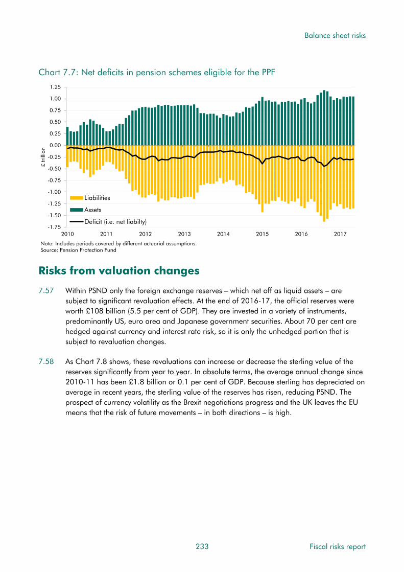
Balance sheet risks
Chart 7.7: Net deficits in pension schemes eligible for the PPF
-1.75
-1.50
-1.25
-1.00
-0.75
-0.50
-0.25
0.00
0.25
0.50
0.75
1.00
1.25
2010 2011 2012 2013 2014 2015 2016 2017
£ tr
illio
n
Liabilities
Assets
Deficit (i.e. net liabilty)
Note: Includes periods covered by different actuarial assumptions.Source: Pension Protection Fund
Risks from valuation changes
7.57 Within PSND only the foreign exchange reserves – which net off as liquid assets – are subject to significant revaluation effects. At the end of 2016-17, the official reserves were worth £108 billion (5.5 per cent of GDP). They are invested in a variety of instruments, predominantly US, euro area and Japanese government securities. About 70 per cent are hedged against currency and interest rate risk, so it is only the unhedged portion that is subject to revaluation changes.
7.58 As Chart 7.8 shows, these revaluations can increase or decrease the sterling value of the reserves significantly from year to year. In absolute terms, the average annual change since 2010-11 has been £1.8 billion or 0.1 per cent of GDP. Because sterling has depreciated on average in recent years, the sterling value of the reserves has risen, reducing PSND. The prospect of currency volatility as the Brexit negotiations progress and the UK leaves the EU means that the risk of future movements – in both directions – is high.
233 Fiscal risks report

Balance sheet risks
Chart 7.8: Revaluation changes in the official reserves
-0.4
-0.3
-0.2
-0.1
0.0
0.1
0.2
0.3
0.4
2000-01 2002-03 2004-05 2006-07 2008-09 2010-11 2012-13 2014-15 2016-17
Per
cent
of G
DP
Source: ONS
Risks from balance sheet surprises
7.59 So far we have discussed risks to things that we know about, but we can also expect some complete surprises. At some point a crisis will occur and the government will intervene. At that point, it will have a range of possible policy responses available, from issuing guarantees that would only affect debt if called, to spending or tax changes that would affect the primary balance, to equity purchases or nationalisations that affect debt directly. Or the government might exert controls over an organisation, perhaps to prevent a crisis or to protect its investments, which may prompt the ONS to reclassify it into the public sector.
7.60 Chapter 4 concludes that the likelihood of another financial crisis is low over the medium term, but very high over the long term. In that event the Government may feel forced to intervene because the consequences of not doing so would be too severe. There are a number of other areas of the economy where governments might similarly feel compelled to act. The Centre for the Protection of National Infrastructure lists thirteen sectors that contain “Those critical elements of national infrastructure (facilities, systems, sites, property, information, people, networks and processes), the loss or compromise of which would result in major detrimental impact on the availability, delivery or integrity of essential services, leading to severe economic or social consequences or to loss of life.”8 These are: chemicals, civil nuclear, communications, defence, emergency services, energy, finance, food, government, health, space, transport and water.
8 See Centre for the Protection of National Infrastructure, Critical National Infrastructure.
Fiscal risks report 234

Balance sheet risks
7.61 Governments’ implicit recognition of these liabilities can be seen in the high degree of regulation of these parts of the economy. Governments also sometimes explicitly recognise the support provided to areas outside the public sector via guarantees. Examples include:
• Thames tideway tunnel (Bazalgette Tunnel Limited): a comprehensive government support package is in place to mitigate key construction risks. The package includes insurance cover of last resort, liquidity support in case of market disruption (in the form of a £500 million ‘market-disruption facility’), contingent equity funding in the event of construction cost overrun and compensation for discontinuation of the project.
• Merseylink: the builder and operator of the bridge over the River Mersey has been given an unconditional and irrevocable guarantee of scheduled principal and interest under the UK Guarantee Scheme (£270 million as reported in Budget 2014).
• Ineos Grangemouth (the owner of a petrochemical facility that primarily produces ethylene): This has been provided an unconditional and irrevocable guarantee of scheduled principal and interest under the UK Guarantee Scheme. The amount reported in 2014 was £230 million.
7.62 Another heavily regulated area where governments may feel compelled to intervene if an entity was in severe financial difficulty is education. Universities are increasingly issuing debt, which investors may assume would be honoured by government if necessary. Indeed, in its rating of a bond issued by the University of Southampton, the credit rating agency Moody’s stated that: “Moody’s assigns a high likelihood that the government of the United Kingdom (Aa1 negative) would act to resolve any acute liquidity stress experienced by the University of Southampton. The high likelihood of support reflects the various remedial measures available to HEFCE in cases of financial distress and our assessment of its willingness to assist a struggling university.”9 HEFCE is the Higher Education Funding Council of England, a non-departmental public body under the Department for Education.
7.63 The key conclusion to draw from this is that a significant proportion of nominally private sector activity in the economy relates to things that governments in effect stand behind and where they might be expected to intervene if necessary. A broad view of risks to fiscal sustainability would therefore require a closer look at the health of these sectors. That said, it is unlikely that the cost of intervening in most would approach the upfront costs of the banking sector interventions during the financial crisis.
7.64 Policy itself could be a source of surprises. For example, pressure for support from companies and industries adversely affected by the UK leaving the EU single market and customs union could mount. And the removal of EU state aid restrictions could make it more straightforward for the Government to provide targeted balance sheet support.
9 Moody’s, University of Southampton Credit Opinion, May 2017.
235 Fiscal risks report

Balance sheet risks
Risks from ‘fiscal illusions‘
7.65 The IMF describes accounting treatments that do not adequately reflect reality as ‘fiscal illusions’.10 These include any transaction that improves or worsens measured fiscal aggregates without genuinely affecting the true health of the fiscal position in the same way. An example would be the effect of financial asset sales on PSND, where they lower the measured aggregate without improving fiscal sustainability. This is not the case with PSNFL and is one reason why the IMF recommends broader measures of balance sheets.
7.66 The government has taken steps to increase fiscal transparency by compiling the Whole of Government Accounts, which present flow and stock information on a much broader commercial accounting basis. But most public and political attention, and the government’s fiscal rules, still concentrate on the National Accounts measures of PSND and PSNB. These are susceptible to a range of fiscal illusions, including:
• The sale of fixed assets: this reduces PSNB and PSND, but may also involve forgoing a future income stream. This would harm sustainability if the income forgone was greater than the debt interest savings associated with the sale. As a rule, selling an asset for what it is worth should have limited effect on fiscal sustainability.
• Switching outlays from conventional expenditure to financial transactions: this reduces PSNB, but more near-term than over a longer horizon. A number of grant schemes have been converted to loans in recent years, including nursing students’ bursaries, poorer students’ maintenance grants and the support for mortgage interest scheme. All reduce PSNB in the near term, but with a partly offsetting future cost when some of the loans are written off. As discussed earlier, the fact that some accrued interest on student loans will not actually materialise is one of the largest current ‘fiscal illusions’.
• Carrying out policy via guarantees: this does not hit the balance sheet unless guarantees are called, while fees reduce borrowing in the near term. Where fees are set at an appropriate rate, the scheme may not harm sustainability overall. But with fees generally paid upfront, and the cost of any guarantees only likely to hit later, they can flatter the finances in the short to medium term.
• Off-balance sheet financing: this can reduce debt in the medium term relative to conventional financing. Private finance initiatives are financed by the private sector up front with the public sector paying the costs over a longer period.
• Private sector delivery of public policy: this can remove liabilities from the balance sheet entirely. This is arguably the case for universities now and it was previously the case for housing associations and Network Rail. Arguably, these bodies carry out public policy, are often funded directly or indirectly through public funds, and typically benefit from implicit or explicit guarantees.
10 Irwin, Dispelling fiscal illusions: how much progress have governments made in getting assets and liabilities on balance sheet?, IMF working paper WP/16/95, 2016.
Fiscal risks report 236

Balance sheet risks
7.67 The use of these instruments or approaches will not necessarily harm fiscal sustainability, but they do create incentives for policymakers to design policies in ways that minimise their impact on chosen fiscal aggregates. Some have argued that the structuring of Network Rail and the pursuit of PFI deals were influenced by the fiscal rules in place at the time. It is not for us to comment on the motivation behind these decisions, but it is possible to see why people might believe that their statistical treatment may have played a part:
• Network Rail: There was extensive discussion about the correct classification of Network Rail after it took over the duties of Railtrack in 2002. The ONS classified it to the private sector under the accounting rules then in place, but the National Audit Office and the Statistics Commission argued that since the government bore the risk, via an indemnity on Network Rail debt, it should be on balance sheet.11 It was suggested that the accounting rules had influenced the design of Network Rail, so that it was just off balance sheet. Those National Accounts rules were changed in 2014, prompting its reclassification into the public sector. Whatever the motivation for the structure of Network Rail, financing rail investment off-balance sheet was then more expensive. The government guarantee reduced Network Rail’s financing costs, but it still faced higher interest rates than were paid on gilts. In 2014, the Department for Transport estimated that removing this additional interest cost would save the taxpayer between £95 million and £190 million a year from 2014 to 2019, on the assumption that the premium was 0.2 to 0.4 per cent and Network Rail debt was £28.5 billion.12
• Private Finance Initiative: PFIs are a form of public-private partnership. Under these contracts the private sector builds and/or maintains infrastructure assets in return for annual payments that typically continue for about 30 years. They are designed to transfer risks to the private sector. Depending on their design they can be either on- or off-balance sheet. The fiscal impact could be recorded as the project is built (on-balance sheet) or over a longer period as annual payments are made (off-balance sheet). PFI arrangements were widely used in the early 2000s when the ‘sustainable investment rule’ target of keeping PSND below 40 per cent of GDP was subject to limited headroom. The WGA report PFI capital liabilities of £39 billion, while PSND includes only £6 billion that are on balance sheet in the National Accounts.
• Housing associations: these provide a particularly transparent example of policy decisions being influenced by statistical treatment. Housing associations were reclassified into the public sector when policy changes revealed the extent of the control government had over them. The Government now plans to pass legislation to reduce its control over them. One of its stated goals is to “return housing associations to the private sector”13. Indeed, the government has chosen not to include housing associations in the 2015-16 WGA because it expects the planned deregulation to gain a reclassification back to the private sector. The proposed legislation explicitly removes the controls mentioned by the ONS in its judgement that housing associations should
11 The Telegraph, Statistics head acts in Rail row, 19 November 2002. 12 UK Parliament, Network Rail: Written question - 208961. 13 UK Parliament, Housing Associations: Written statement – HLWS274.
237 Fiscal risks report
Balance sheet risks
be on the public sector balance sheet. If the legislation is passed, and the ONS deems it sufficient to move housing associations back into the private sector, this will reduce PSND. But it will not obviously reduce risks to fiscal sustainability. It will not, for example, reduce the risk of a housing association failing or, in such circumstances, the probability of the government stepping in to continue the provision of affordable housing. Indeed, the removal of controls and a lower profile in the government’s thinking, which could accompany a reclassification, might even increase fiscal risk.
Conclusions
7.68 History suggests that the public finances are likely to be hit by a series of balance sheet surprises over both the medium and longer term. Many will be small, but a few may be large. In terms of the characteristics set out in Chapter 1, the most serious will be of a sudden nature and come about as government feels compelled to respond to some exogenous event or crisis. This will result in a step change to the level of PSND and possibly to broader balance sheet measures. This risk is likely to be highly correlated with risks to the economy, which will determine the levels of stresses in the private sector. In contrast, more incremental risks arise from the growing stock of student loans.
7.69 It is also highly likely that the initial impact of many risks crystallising on PSND will not provide a good signal about the impact on the long-term sustainability of the fiscal position. This will depend on wider considerations of assets and liabilities than are counted within PSND and the returns on these assets and liabilities.
For the Government’s response
7.70 In this chapter we have highlighted a number of issues that the Government is likely to wish to consider when managing its fiscal risks. Among them:
• The deterioration in broad measures of public sector net worth since the crisis;
• Asset sales that could be delayed or raise less than expected;
• Asset sales that have not been factored into current forecasts;
• The possibility of reclassifications that expand the public sector balance sheet;
• The growing use of guarantees in infrastructure and housing; and
• The impact of ‘fiscal illusions’, where accounting rules drive policy decisions.
7.71 When assessing the outlook for the public sector balance sheet over the medium and long term, does the Government regard these or other issues as important for its risk management strategy and, if so, how does it intend to address them?
Fiscal risks report 238
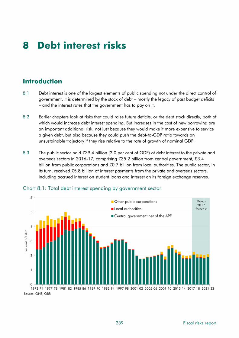
8 Debt interest risks
Introduction
8.1 Debt interest is one of the largest elements of public spending not under the direct control of government. It is determined by the stock of debt – mostly the legacy of past budget deficits – and the interest rates that the government has to pay on it.
8.2 Earlier chapters look at risks that could raise future deficits, or the debt stock directly, both of which would increase debt interest spending. But increases in the cost of new borrowing are an important additional risk, not just because they would make it more expensive to service a given debt, but also because they could push the debt-to-GDP ratio towards an unsustainable trajectory if they rise relative to the rate of growth of nominal GDP.
8.3 The public sector paid £39.4 billion (2.0 per cent of GDP) of debt interest to the private and overseas sectors in 2016-17, comprising £35.2 billion from central government, £3.4 billion from public corporations and £0.7 billion from local authorities. The public sector, in its turn, received £5.8 billion of interest payments from the private and overseas sectors, including accrued interest on student loans and interest on its foreign exchange reserves.
Chart 8.1: Total debt interest spending by government sector
March 2017
forecast
0
1
2
3
4
5
6
1973-74 1977-78 1981-82 1985-86 1989-90 1993-94 1997-98 2001-02 2005-06 2009-10 2013-14 2017-18 2021-22
Per
cent
of G
DP
Other public corporations
Local authorities
Central government net of the APF
Source: ONS, OBR
239 Fiscal risks report

Debt interest risks
8.4 Most outstanding public debt in the UK is the liability of central government. So in this chapter we focus on risks to interest spending on central government gross debt (bearing in mind that some factors we identify would have partly offsetting effects on interest receipts). An important complication is that the Bank of England – also part of the public sector – has bought a substantial quantity of central government debt, financed by the creation of reserves on which it currently pays just a 0.25 per cent rate of interest – an interest rate (Bank Rate) that is set by the Bank’s Monetary Policy Committee (MPC). In effect, this has allowed the government to refinance some of its past fixed interest borrowing at a lower floating rate, reducing interest payments for now but leaving it more exposed to the risk of higher debt servicing costs if the MPC chooses to raise Bank Rate in the future.
8.5 As set out in Chapter 1, when considering interest rate risks to fiscal sustainability, it is important to do so relative to growth rate risks. Changes in the debt-to-GDP ratio depend on the relationship between the effective interest rate on the debt stock and the rate of nominal GDP growth – increases in the former push it up and in the latter push it down. The difference between these is known as the ‘growth-corrected interest rate’. When the effective interest rate and growth rate are affected to the same extent, the growth-corrected interest rate is left unchanged, with little implication for fiscal sustainability. It is shocks that push the effective interest rate up relative to GDP growth that increase spending and debt faster than GDP, threatening fiscal sustainability. These are the focus of the rest of this chapter.
8.6 This chapter discusses:
• the current size and composition of central government debt and the interest rates paid on different types of debt and at different maturities;
• medium-term debt interest spending risks relative to the forecast in our March 2017 Economic and fiscal outlook (EFO);
• sources of long-term risks to debt interest spending and the importance for sustainability of those that affect the ‘growth-corrected interest rate’;
• the conclusions that can be drawn; and
• issues for the Government’s response.
Fiscal risks report 240

Debt interest risks
Central government gross debt
Types of debt
8.7 The government borrows from investors and savers in a variety of ways. Chart 6.2 shows the breakdown of central government gross debt at the end of 2016-17. At this point it totalled £1,700 billion (87 per cent of GDP), up from £622 billion (40 per cent of GDP) at the end of 2007-08 – before the impact of the financial crisis was felt. Interest payments totalled £35.2 billion during the year, giving an effective interest rate – i.e. the level of annual spending divided by the stock at the end of the year – of 2.1 per cent.1
Chart 8.2: Composition of the debt stock and associated interest payments
0.0
0.4
0.8
1.2
1.6
2.0
Stock
£ tr
illio
n
0
8
16
24
32
40
Debt interest
£ billion
Other debt
NS&I products
Treasury bills
Index-linked gilts
Conventional gilts(APF holdings)
Conventional gilts(net of APFholdings)Effective
interest rate (per cent)
1.6
1.50.5
3.4
0.4
2.6
Source: Bank of England, DMO, ONS, OBR
8.8 In terms of the components and the associated interest payments, the main ones are:
• Conventional gilts held by the private and overseas sector: These are government bonds currently with maturities up to 51 years. The interest has two components: the coupon (which is fixed in cash terms when each gilt is issued) and the discount or premium to the redemption (or ‘face’) value paid when the gilt is issued. As both coupon and premia are fixed at issuance the effective interest rate on the stock changes only gradually as new gilts are issued to finance additional borrowing and to ‘roll over’ maturing stock. Gilts are recorded at their face value in PSND. At the end of 2016-17 market holdings were £648 billion, on which £17 billion of interest was paid during the year, at an effective rate of 2.6 per cent. The average rate on new borrowing in 2017-18 is expected to be 1.6 percentage points below the average rate on outstanding gilts.
1 This method of calculating effective interest rate is illustrative. Where stocks have changed greatly through the year or the stock is valued at face rather than market values the true effective interest rate paid by government will differ.
241 Fiscal risks report

Debt interest risks
• Conventional gilts held by the APF: The cost of servicing conventional gilts has been partly offset by the Bank of England’s quantitative easing programme. The Bank’s Asset Purchase Facility (APF) has bought just over a third of the outstanding stock of conventional gilts, £371 billion at the end of 2016-17,2 financed by creating electronic reserves that are held by financial institutions and on which it pays Bank Rate. Bank Rate averaged 0.4 per cent in 2016-17, so the Government in effect paid that rate on the conventional gilts held by the APF, saving it over £10 billion. When Bank Rate changes, the interest paid on outstanding reserves changes in line, so that the effective interest rate on the stock adjusts immediately rather than with a lag.
• Index-linked gilts: These are bonds on which interest is expressed in real terms by linking it to the retail prices index (RPI). The real element is fixed when each gilt is issued, but the inflation element (both coupon and final redemption payment) varies with RPI inflation. By accepting the inflation risk, government should on average pay a lower rate on index-linked than conventional gilts. At the end of 2016-17 there were £386 billion of index-linked gilts outstanding on which £13 billion of interest was paid during the year, an average effective interest rate of 3.4 per cent. In 2016-17, the real component averaged 1.4 percentage points and the RPI inflation component 2.0 percentage points. Real rates on new issuance are currently negative and our March forecast assumed that they would remain negative over the forecast.
• Treasury bills: These are, in effect, conventional gilts with much shorter maturities ranging from 1 to 12 months. They pay no coupon, so interest is determined solely by the discount to face value when issued. Changes to the rate paid on new issues feeds through to the effective rate on the total stock within a year. The interest rate tends to be linked closely to near-term prospects for Bank Rate. At the end of 2016-17 there were £67 billion of Treasury bills outstanding, on which the Government paid £0.3 billion of interest during the year, an effective rate of 0.5 per cent.
• NS&I products: The interest paid on NS&I products varies across them, but each product tends to be benchmarked relatively closely to rates offered on comparable products by commercial banks and building societies. The stock also includes premium bonds, which pay ‘prizes’ that act like interest on the whole stock but with distribution of the interest to individual bond holders by lottery. Occasionally, the Government uses NS&I to subsidise certain types of savings or saver – e.g. the ‘65+ Guaranteed Growth Bonds’ issued in 2015 that were only available to older savers. At the end of 2016-17 savers held £146.2 billion in NS&I products, on which the Government paid £2.2 billion of interest during the year, at an effective rate of 1.5 per cent. The average current rate on new borrowing through NS&I is similar to that on the stock.
• Other central government debt: This added a further £81.5 billion of gross debt at the end of 2016-17. The largest single element is the £27.8 billion remaining debt issued by Network Rail (around £6 billion of which is denominated in foreign currency) before
2 This figure represents the nominal value (or ‘face value’) of the gilts purchased, which is lower than the market values at which they were purchased and that is the subject of the MPC’s monetary policy decisions – hence the figure being lower than the total stock of quantitative easing undertaken by purchasing gilts by the end of 2016-17 of £435 billion.
Fiscal risks report 242
Debt interest risks
it was classified to the public sector in 2014 and the Government started to finance its operations through gilt issuance. Other significant elements are the liabilities of the government’s cash management accounts.
The maturity structure of the debt stock
8.9 The Government’s exposure to interest rate risk depends in part on how quickly a change in the rate on new borrowing feeds through to the effective rate on the outstanding stock. This depends on the maturity mix of the new borrowing and the existing stock. Typically governments have to pay a higher interest rate to borrow long-term, relative to the expected cost of financing through a sequence of short-term bonds. But in doing so it makes itself less immediately vulnerable to rises in borrowing costs or other refinancing risks.
8.10 These considerations underpin the Government’s debt management objective: “to minimise, over the long term, the costs of meeting the government’s financing needs, taking into account risk, while ensuring that debt management policy is consistent with the aims of monetary policy.” As well as interest rate risk, the Debt Management Office (DMO) takes into account four other sources of potential risk: refinancing, inflation, liquidity and execution.3 In practice, this means that it issues debt across a range of maturities.
8.11 By the end of 2016-17the Government had issued £1,405 billion of gilts with relatively long maturities at issuance on which the effective interest rate therefore responds only gradually to changes in market interest rates. Chart 8.3 shows the redemption profile for conventional and index-linked gilts at the end of March 2017. The average maturity for conventional gilts was just under 14 years,4 with 31 per cent of the stock set to mature by 2021-22. The average maturity of the index-linked stock was around 21 years, giving an average across all gilts of around 16 years. As Chart 8.4 shows, as of 2016 the average maturity of government bonds issued in the UK was around twice that in most other ‘G7’ major advanced economies.
3 See Chapter 2 of HM Treasury, Debt management report 2017-18, March 2017. 4 These average maturities are calculated using nominal values of the instruments purchased.
243 Fiscal risks report

Debt interest risks
Chart 8.3: Gilt redemption profile in March 2017
0
20
40
60
80
100
120
2017-18 2023-24 2029-30 2035-36 2041-42 2047-48 2053-54 2059-60 2065-66
£ bi
llion
Index-linked
Conventional
Note: Conventional contains gilts held by the APF.Source: DMO
Chart 8.4: Average maturity of the debt stock in G7 countries in 2016
0
2
4
6
8
10
12
14
16
US Canada Germany Italy France Japan UK
Year
s
Source: Bloomberg
Fiscal risks report 244
8.12 However, as Chart 8.5 shows, the maturity of the debt held is shorter when Treasury bills, NS&I products and the APF’s holdings of conventional gilts (and the associated Bank of England funding) are factored in. Only 6 per cent of outstanding gilts held outside the public sector are set to mature within a year, but that rises to 18 per cent of debt when Treasury bills and NS&I products are included and to 42 per cent when APF funding is added too. This figure better represents the public sector’s exposure to changes in short-

Debt interest risks
term interest rates. On this basis, the average maturity of central government gross debt falls to around 11 years.
Chart 8.5: Maturity structure of outstanding debt
0.0
0.2
0.4
0.6
0.8
1.0
1.2
1.4
1.6
1.8
Central government gilts Plus Treasury bills and NS&Iproducts
Plus central bank reserves tofinance APF purchases
£ tr
illio
n
Over 10 years
Up to 10 years
Up to 5 years
<1 year
Source: Bank of England, DMO
Risks to our medium-term forecast
Our March 2017 forecast
8.13 Table 8.1 summarises our March 2017 debt interest forecast. It shows that:
• Interest rates are assumed to remain low throughout the forecast, based on market expectations in early February. Bank Rate is assumed to rise from its current rate of 0.25 per cent to an average of just 1.0 per cent in 2021-22, and a weighted-average of short-, medium- and long-dated gilt yields is assumed to rise from an average of 1.5 per cent in 2017-18 to an average of 2.2 per cent in 2021-22.
• RPI inflation is expected to pick up in 2017-18, as the depreciation of sterling over the past year feeds through to inflation via higher import prices. It falls back a little thereafter to settle at just above 3 per cent a year.
• The stock of central government debt instruments (equivalent to all the named categories in Chart 8.2) rises in cash terms in every year of the forecast but it falls as a share of GDP from 84.5 per cent of GDP in 2017-18 to 80.5 per cent in 2021-22.
• Central government debt interest payments (net of APF effects) jump in 2017-18, due to the effect of RPI inflation on index-linked debt, then fall in 2018-19 before rising steadily thereafter. This leaves spending slightly lower as a share of GDP in 2021-22 (at 1.9 per cent) than in 2017-18 (2.0 per cent).
245 Fiscal risks report

Debt interest risks
Table 8.1: March 2017 debt interest spending forecast and determinants
Fiscal risks report 246
Per cent, unless otherwise stated2017-18 2018-19 2019-20 2020-21 2021-22
Determinants of the debt interest forecastRPI inflation (percentage change on a year earlier) 3.9 3.4 3.1 3.1 3.2Bank Rate 0.3 0.4 0.6 0.8 1.0Weighted-average gilt rate 1.5 1.7 1.9 2.0 2.2Stock of APF holdings (market value, £ billion) 435 435 435 435 435Central government debt instruments (£ billion) 1714 1772 1807 1839 1884Central government debt instruments (per cent of GDP) 84.5 84.6 83.4 81.7 80.5
£ billionDebt interest spendingCentral government gross debt interest (a) 55.8 52.3 52.2 51.9 53.7of which:
Interest paid to the APF (b) 15.4 15.1 14.7 14.5 14.2Interest on reserves created for APF purchases (c) 1.2 1.8 2.7 3.5 4.5Central government net of the APF (a-b+c) 41.5 39.1 40.1 40.9 44.0Central government net of the APF (per cent of GDP) 2.0 1.9 1.9 1.8 1.9
8.14 Our latest medium-term forecast embodies a favourable differential between interest rates and economic growth. Over the five years from 2017-18 to 2021-22, our central forecast is for annual nominal GDP growth to average 3.6 per cent, while the effective net interest rate on public debt is expected to average just 2.0 per cent. This reduces the debt-to-GDP ratio over the five years to 2021-22 by 6.7 percentage points.
Sensitivity analysis
8.15 Table 8.2 shows the sensitivity of our March forecast for debt interest spending to changes in its underlying drivers. Changes in short rates and RPI inflation act swiftly on short-dated debt and index-linked gilts respectively, with the full effect feeding through to spending almost immediately. Changes to gilt rates only affect new and maturing gilts and so take effect more slowly and build up over time. A persistent increase in the central government net cash requirement – the relevant measure of borrowing for these debt interest payments – also builds over time as the stock of debt increases.
8.16 These ready reckoners are consistent with the assumptions about the composition of debt by maturity and between conventional and index-linked debt in our March forecast. They would themselves be sensitive to changes in those assumptions.
Table 8.2: March 2017 debt interest ready reckoner
£ billion
2017-18 2018-19 2019-20 2020-21 2021-221 percentage point increase in gilt rates 0.4 1.3 2.2 3.1 4.11 percentage point increase in short rates 5.5 5.5 5.5 5.5 5.51 percentage point increase in inflation 4.1 4.6 5.3 5.8 6.6£5 billion increase in CGNCR 0.0 0.1 0.2 0.3 0.4Note: All increases are assumed to take effect at the beginning of 2017-18 and continue throughout the forecast.

Debt interest risks
Evidence from differences between past forecasts and outturns
8.17 Chart 8.6 shows that we have revised our forecasts for debt interest spending down in most of our EFOs. In our December 2014 EFO that reflected a change to the statistical treatment of APF flows,5 but otherwise it has been due to real-world factors. In our March 2012 EFO we forecast that central government would pay £64 billion in debt interest in 2016-17 (an effective rate of 3.7 per cent on a stock of £1,720 billion); in the result it ended up paying £35 billion (an effective rate of 2.1 per cent on a stock of £1,700 billion). Of the £29 billion difference, £13 billion reflected the change in the statistical treatment of APF flows with the remaining £16 billion almost entirely due to lower-than-expected interest rates.
Chart 8.6: Successive forecasts for debt interest, interest rates and the stock of debt
20
30
40
50
60
70
80
90
2008-09 2013-14 2018-19
£ bi
llion
June 2010Successive forecastsOutturn dataMarch 2017
0
1
2
3
4
5
6
2008-09 2013-14 2018-19
Per
cent
40
50
60
70
80
90
100
2008-09 2013-14 2018-19
Per
cent
of
GD
P
Debt interest spending Public sector net debtMarket gilt rates
Note: Between our March and December 2014 forecasts, the statistical treatment of debt interest flows related to the APF was changed. Forecasts before and after these points are therefore not on a consistent basis.Source: ONS, OBR
8.18 Taken in isolation, the downward revisions to our debt interest forecasts have improved the outlook for the public finances. But in most cases they have only partly offset downward revisions to our receipts forecasts that took place at the same time (Chart 8.7). Indeed, in only three forecasts out of our last 15 have our revisions to receipts and debt interest contributed in the same direction to our forecast for borrowing, rather than offsetting each other. This should come as no surprise, since market expectations of future interest rates tend to fall/rise when expectations of future GDP growth are lowered/raised.
5 See Annex B of our March 2014 Economic and fiscal outlook for more details.
247 Fiscal risks report

Debt interest risks
Chart 8.7: Sources of change in borrowing forecasts
-1.5
-1.0
-0.5
0.0
0.5
1.0
1.5
2.0
Nov 10 Mar 11 Nov 11 Mar 12 Dec 12 Mar 13 Dec 13 Mar 14 Dec 14 Mar 15 Jul 15 Nov 15 Mar 16 Nov 16 Mar 17
Per
cent
of G
DP
Other spending Receipts
Debt interest Underlying change
Lower borrowing/lower spending/higher receipts
Higher borrowing/higher spending/lower receipts
Source: OBR
8.19 Changes in our forecasts for the effective interest rate on the debt stock and in the growth of nominal GDP also tend to offset each other in their impact on the outlook for the debt-to-GDP ratio. But the changes are not always of the same size and the long average maturity of the outstanding debt means that only a fraction of any change in market rates feeds through to the effective rate paid each year. As Chart 8.8 shows, nominal GDP growth has fluctuated more than the effective interest rate. On average, our forecasts for the effective interest rate have been revised down more than those for nominal GDP growth, generating more favourable debt dynamics. In part that reflects the reduction in the effective interest rate that comes with some debt in effect being financed through the APF (Chart 8.2).
Chart 8.8: Effective interest rate and nominal GDP growth: forecasts and outturns
0
1
2
3
4
5
6
7
2010-11 2012-13 2014-15 2016-17 2018-19 2020-21
Per
cent
Source: ONS, OBR
Effective interest rate
0
1
2
3
4
5
6
7
2010-11 2012-13 2014-15 2016-17 2018-19 2020-21
Perc
enta
ge c
hang
e on
a y
ear
earli
er
June 2010Successive forecastsMarch 2017Outturn data
Nominal GDP growth
Fiscal risks report 248

Debt interest risks
8.20 Index-linked gilts strengthen the link between changes in the effective interest rate and nominal GDP growth. To the extent that RPI inflation moves in step with whole economy inflation, index-linked issuance means that effective rates move more closely with nominal GDP growth because the associated interest cost is accrued with only a short lag.
Sources of risks to the forecast
8.21 There are a variety of factors that could lead to higher debt interest spending. In preceding chapters we have considered many that could raise the stock of debt on which the public sector would have to pay interest. In this section we consider factors that could raise the effective interest rate. We focus on those that would also lead to a higher growth-corrected interest rate – the key source of wider fiscal risk.
Interest rate risks
8.22 There are a number of risks that could drive the interest rates on government debt higher:
• A faster-than-expected increase in global real long-term interest rates: At a global level, real long-term interest rates have been on a declining trend for many years. Many factors have contributed to this trend, including the prospective ageing of populations in many advanced and emerging countries (with saving boosted by those approaching retirement), the integration of China into global financial markets (allowing Chinese capital to flow into global bond markets), and, since the crisis, a decline in investment (reducing other uses of savers’ capital) and greater demand for safe assets (lowering risk-free rates relative to others).6 Any of these factors could ease or reverse, leading to higher global real interest rates. For example, many populations are reaching the stage where dissaving by retirees will outweigh saving by those approaching retirement, while the development of China’s own financial markets could reduce the extent to which Chinese capital flows into global bond markets. To the extent that these factors were independent of growth prospects in the UK, they would affect the growth-corrected interest rate too.
• Earlier sales of the Bank of England’s gilt holdings: The most likely reason for APF gilt sales to take place earlier would be as a result of monetary policy tightening, prompted by expectations that stronger growth would push inflation above target. But even then, the growth-corrected interest rate would probably rise because the average maturity of the stock would increase. If the sales were prompted by an external shock to inflation, or if they had a bigger-than-expected effect on interest rates, the impact would be more unfavourable.
• A risk premium in UK interest rates: The most unfavourable risk to the growth-corrected interest rate would be a risk premium that raised UK interest rates relative to global interest rates. As well as resulting in higher interest rates, it would be expected to weigh on UK growth prospects by making it more expensive for firms to borrow for investment and households to borrow for spending or house purchases.
6 See also Low for Long? Causes and Consequences of Persistently Low Interest Rates, Geneva Reports on the World Economy 17, 2015.
249 Fiscal risks report

Debt interest risks
8.23 It is not unusual for favourable debt dynamics to persist for some years – and they could become even more favourable. But a movement in the opposite direction does seem the greater risk given current low borrowing costs and the extraordinary effect of the APF. History suggests that sustained movements of a few percentage points are relatively common. Given the long average maturity of government debt, these changes are usually manageable, especially if they coincide with stronger GDP growth.
8.24 Future policy towards the APF is a complicating factor. MPC guidance is that the stock of gilts in the APF will be kept unchanged until Bank Rate reaches a level from which it can be cut materially, which the MPC currently judges to be around 2 per cent. Depending on how markets react, there could be a step change in debt servicing costs if and when Bank Rate approaches that level. On the market expectations underpinning our March forecast this is well beyond our five-year forecast horizon and so our central expectation is for no reductions in the holdings of the APF. Financial market options prices suggest there is a very low probability that Bank Rate will be higher than 2 per cent in 2020.
RPI-specific inflation risks
8.25 With the stock of index-linked gilts amounting to 20 per cent of GDP by the end of 2016-17, and set to rise to 24 per cent by 2021-22 in our latest forecast, RPI inflation risks are an important driver of overall effective interest rate risks. Holding our forecast for the primary balance unchanged, a 1 percentage point increase in RPI inflation sustained over the five years to 2021-22 would raise the debt-to-GDP ratio by 1.2 percentage points.
8.26 Sources of general inflation risk are discussed in Chapter 3. Where an underlying shock raises inflation on the RPI, CPI and GDP deflator measures by similar amounts – for example, due to a positive demand shock affecting wages and prices – higher debt interest spending would probably be more than offset by the boost to receipts and nominal GDP (as was apparent in Chart 8.7). But where a shock raises RPI and CPI inflation relative to the GDP deflator – for example, when import prices rise due to higher commodity prices or a fall in the pound – the offset from receipts and the effect on nominal GDP would be smaller.
8.27 There are also risks that could raise RPI relative to CPI inflation, limiting the offsetting increase in receipts from taxes still linked to RPI inflation (mostly excise duties). For example:
• Higher mortgage interest rates: the RPI includes mortgage interest payments, so would rise by more than CPI inflation if market interest rate were to increase and those movements fed through to mortgage costs.
• Other coverage and measurement differences: the RPI covers more items, and in different ways, than the CPI, which can affect the wedge between the two. This was illustrated in our March 2017 forecast, where higher car insurance premiums (due to a policy change affecting expected lump sum damages payments) had an effect on our RPI inflation forecast that was four times larger than on our CPI inflation forecast.
Fiscal risks report 250
Debt interest risks
Risks from the sensitivity to changes in the effective interest rate
8.28 Holding our forecast for the primary balance unchanged, each 1 percentage point increase in the growth-corrected interest rate sustained over the five years to 2021-22 would raise the debt-to-GDP ratio by 4.1 percentage points relative to our March 2017 forecast. As Chart 8.10 in the next section shows, the growth-corrected interest rate has been negative so far in the 2010s, and 2.4 percentage points below the average in the 2000s, entirely due to lower interest rates. So merely returning to the 2000s average for the next five years would, all else equal, increase the debt-to-GDP ratio by 10.1 percentage points relative to our baseline forecast.
8.29 Debt servicing costs have become more sensitive to changes in the effective interest rate and more exposed to inflation. Comparing pre-crisis levels to last year, this reflects:
• The higher level of gross debt: up from 40 per cent of GDP in 2007-08 to 87 per cent in 2016-17.
• The shorter maturity of the debt stock: Around 38 per cent of the stock in 2007-08 was set to redeem within the next five years or paid a floating rate that would respond quickly to interest rate changes. By 2016-17, largely due to APF purchases, this had risen to 56 per cent.
• The higher proportion of index-linked securities. Index-linked gilts make up 23 per cent of central government gross debt now, up from 20 per cent in 2007-08.
Partly offsetting this, cash borrowing to finance deficits over the five years of our March 2017 forecast (equal to 1.9 per cent of the sum of nominal GDP from 2017-18 to 2021-22) is lower than outturn new issuance of 8.7 per cent of total nominal GDP in the five years from 2008-09.
Inconsistent growth and interest rate forecasts
8.30 Overlaying the real-world risks described in the preceding sections is a methodological one. Our nominal GDP forecast reflects our own view of economic prospects, but we use market expectations as the basis for our interest rate forecasts (considering them to be the best available information). This means that one risk to the growth-corrected interest rate is that the market view of growth prospects might be inconsistent with ours, which would leave our growth forecast too high relative to our interest rate forecast for methodological reasons.
8.31 Unfortunately, we cannot observe market participants’ expectations for GDP growth directly, in the way that we can their interest rate expectations. That said, the average medium-term growth forecasts submitted to the Treasury by outside forecasters are broadly consistent with our own, between 1½ and 2 per cent a year, so methodology does not appear to be a major source of risk. Of course, there is every chance that both sets of forecasts will be proved wrong by developments over the next five years. Both market expectations for gilt
251 Fiscal risks report

Debt interest risks
yields and our forecasts for nominal GDP have been revised down progressively over the past due to the persistent and surprising weakness of productivity growth since the crisis.7
A debt interest fan chart
8.32 In each Debt management report, the DMO presents a probabilistic fan chart around a forecast for debt interest spending over 15 years – approximately equal to the average maturity of the debt stock. The central forecast is consistent with our latest forecast over the first five years and a simple assumption of a zero net cash requirement over the next ten. The DMO then runs 1,000 iterations of its ‘portfolio simulation tool’ drawing possible future yield curves from different distributions – one an imposed statistical distribution and the other an estimated distribution.8 The result of the March 2017 exercise, based on the estimated distribution, is shown in Chart 8.9. Each band either side of the central forecast represents a 10 per cent probability band. On the basis of the DMO’s assumptions, in 2021-22, at 90 per cent probability debt interest costs could vary by as much as £10 billion.
Chart 8.9: DMO debt interest spending fan chart
10
20
30
40
50
60
70
2016-17 2018-19 2020-21 2022-23 2024-25 2026-27 2028-29 2030-31
£ bi
llion
Source: DMO
Long-term debt interest spending risks
8.33 Over the long term, the key fiscal risks associated with debt interest spending are those that would make the growth-corrected interest rate less favourable. This section therefore focuses on risks to interest rates relative to GDP growth.
7 See Chapter 3 of our March 2016 Economic and fiscal outlook for a discussion of the similar relationship between market expectations of Bank Rate and our forecasts for productivity growth. 8 See Annex B of HM Treasury, Debt management report 2017-18, March 2017.
Fiscal risks report 252

Debt interest risks
What determines the interest rates paid on government debt?
8.34 Given the importance of the difference between interest rates and economic growth for the path of the debt-to-GDP ratio, it is worth considering the role played by economic growth in determining the level of interest rates.
8.35 Nominal interest rates can be decomposed into a ‘real’ rate and a component that compensates for expected inflation. The theoretical link between growth and interest rates is at the real level.9 But this is only true under a number of simplifying assumptions, so in reality other factors will play a role. And in any case we would not expect the relationship to hold in any given year, since the concept of growth it refers to is closer to that of potential growth rather than one affected by the economic cycle.
8.36 In reality, domestic rates of economic growth are one – but only one – determinant of the level of domestic interest rates. Empirical estimates suggest that for a globally integrated economy like the UK, domestic GDP growth is not the most important driver of domestic interest rates, with a high degree of correlation between UK and US government bond yields.10 Global interest rates are another important driver of domestic interest rates, which in turn reflect a variety of global influences, including GDP growth in other countries.
8.37 But alongside these global drivers, domestic factors do also play a role. For example, longer-term domestic interest rates are sensitive to domestic monetary conditions and expected inflation rates, which in turn reflect a combination of factors including the current rate of inflation, the cyclical position of the economy and the monetary policy target.11 In the UK, lower inflation has helped to reduce effective interest rates in recent decades.
8.38 Government debt and borrowing can also affect domestic interest rates over time, with higher borrowing and the accumulation of public debt likely to put upward pressure on domestic interest rates, especially over the long term. In an open economy like the UK, capital inflows could finance domestic investment despite high government borrowing, but future national income would be reduced as the proceeds of that investment accrue to those financing it from overseas.12
8.39 Risk premia can be generated by many factors. For example, high levels of public debt could be perceived to create vulnerability to future shocks, with the risk that each incremental fiscal shock could be the one that pushes debt to levels that markets would view as unsustainable. Large implicit contingent liabilities associated with a large financial sector could also be a source of risk premia (see Chapter 4).
9 This is consistent with the Ramsey-Cass-Koopmans growth model with logarithmic preferences. 10 For example, Chinn & Frankel, Debt and Interest Rates: The US and the Euro Area, Kiel Institute Economics Discussion Paper, 2007-11. 11 Several empirical studies have highlighted that inflation and growth expectations are important drivers of long-term interest rates. See for example, Warnock and Warnock, International Capital Flows and US interest Rates, International Finance Discussion Paper Number 840, 2005 and Kitchen and Chinn, Financing U.S. Debt: Is There Enough Money in the World – and At What Cost?, 2011. 12 Baldacci and Kumar, Fiscal Deficits, Public Debt, and Sovereign Bond Yields, IMF Working Paper 2010/184, Congressional Budget Office, Federal Debt and the Risk of a Federal Crisis, 2010, and Gale and Orszag, The Economic Effects of Long-Term Fiscal Discipline, The Urban-Brookings Tax Policy Centre Discussion Paper No 8, 2003.
253 Fiscal risks report

Debt interest risks
8.40 Unconventional monetary policy can directly affect interest rates on government bonds.13 In the UK, there is now a body of empirical evidence to suggest that the Bank of England’s quantitative easing since 2009 has reduced gilt yields. For example, the Bank’s own assessment was that the first round of asset purchases (of £200 billion in 2009) initially reduced gilt yields by a little under 1 percentage point.14 The Bank has also noted that the effectiveness of quantitative easing policies does vary, both across countries and time. For example, interventions appear to be more effective when financial markets are disturbed.15
The growth-corrected interest rate over the long term
Historical evidence in the UK
8.41 As one would expect with many possible drivers of the effective rate of interest on government debt, the past century has seen extended periods where growth in the UK has averaged more or less than the effective interest rate. For example, as Chart 8.10 shows, the effective interest rate exceeded GDP growth in the 1920s and 1930s, and again from the 1980s to the 2000s. The opposite was true from the 1940s to the 1970s.
8.42 Growth has slightly exceeded the effective interest rate on average since 1900 – by 0.6 percentage points. However, that average is influenced by very large differences during the first and second world wars, when wartime spending raised GDP growth while interest rates were held down by the issuance of war bonds and concessional lending from other countries’ governments (notably the US). Excluding the war years, it is the effective interest rate that on average slightly exceeds nominal GDP growth– by 0.3 percentage points. Even this may be lower than a ‘normal’ difference, given the unusual factors described below that pushed the growth-corrected interest rate into negative territory in the 1950s and 1970s.
13 For a summary of the estimated effects of quantitative easing on 10-year bond yields see CEPR, What Else Can Central Banks Do?, Geneva Report 18, 2016. 14 Joyce, Tong and Woods, The United Kingdom’s quantitative easing policy: design, operation and impact, Bank of England Quarterly Bulletin Q3, 2011. 15 Haldane, Roberts-Sklar, Wieladek and Young, QE: the story so far, Bank of England Staff Working Paper No.624, 2016.
Fiscal risks report 254

Debt interest risks
Chart 8.10: Effective interest rates and nominal GDP growth by decade
-10
-5
0
5
10
15
20
1900s 1910s 1920s 1930s 1940s 1950s 1960s 1970s 1980s 1990s 2000s 2010s Wholeperiod
Per
cent
Effective interest rate
Nominal GDP growth
Difference
Source: ONS
8.43 Looking at the distribution of outcomes across individual years rather than decade averages, Chart 8.11 shows that in around a quarter of all years the effective interest rate exceeded nominal GDP growth by a small margin – the median margin is 0.3 percentage points. Two-thirds of the years see a difference between -5 and +5 percentage points. That said, it would be a mistake to assume that future outturns will be drawn from a distribution that matches this historical one given the factors that have influenced it.
8.44 At the extremes of the distribution, there have been twice as many years in which growth exceeded the effective interest rate by more than 10 percentage points than years in which the interest rate exceeded growth by that margin:
• of the eight instances when growth far exceeded the effective interest rate, six occur during the world wars and two in the mid-1970s, when the oil price shock pushed inflation far above the expected rate embodied in the effective interest rate; whereas
• of the four instances when growth fell far short of the effective interest rate, three were in the early 1920s when nominal GDP was shrinking due to deflation.
255 Fiscal risks report

Debt interest risks
Chart 8.11: Distribution of differences between the effective interest rate and nominal GDP growth
0
5
10
15
20
25
30
35
Less than-10
-10 to -7½ -7½ to 5 -5 to -2½ -2½ to 0 0 to 2½ 2½ to 5 5 to 7½ 7½ to 10 More than10
Num
ber
of y
ears
Difference between effective interest rate and nominal GDP growth (percentage points)Source: ONS
More favourable Less favourable
Risks to our growth-corrected interest rate assumption
8.45 In our 2017 Fiscal sustainability report (FSR), we assumed that the difference between the long-term nominal interest rate and nominal output growth would normalise at +0.2 percentage points. This provides a close-to-neutral setting for debt dynamics in our long-term fiscal projections, which means the focus of our conclusions is the primary spending over which policymakers have greater control.
8.46 A difference of +0.2 percentage points is consistent with the UK average since 1990. But given our long-term assumptions about GDP growth, it takes interest rates up to 4.9 per cent in steady state, much higher than current market expectations. For example, Bank Rate expectations at the time that our FSR was published did not exceed 2.3 per cent at any point in the next 20 years. So while there are reasons one might expect interest rates to rise relative to GDP growth – for example the factors influencing global real interest rates described in paragraph 8.24 – there is considerable uncertainty around this assumption.
8.47 Other international institutions, such as the US Congressional Budget Office and the European Commission, also base their long-term fiscal projections on positive growth-corrected interest rates. For example, the CBO recently used a projection of long-term government bond yields rising to 4.5 per cent on average between 2038 and 2047. This compares with a nominal growth rate of 4.0 per cent on average over the same period.16
8.48 The IMF has recently argued that the persistence of low interest rates in part reflects the slow downward adjustment of nominal growth expectations to the lower rates seen in the 1990s
16 CBO, The 2017 Long Term Budget Outlook, March 2017.
Fiscal risks report 256

Debt interest risks
and 2000s, alongside a global reduction in safe assets or decreasing global risk appetite.17 Given the structural nature of these factors, it expected interest-growth differentials to remain lower than they were on average in recent decades, allowing governments to sustain higher levels of public debt.
8.49 The IMF concluded that a permanent decline of 1 percentage point in the interest-growth differential would increase the maximum sustainable level of public debt in advanced economies by an average of 25 per cent of GDP by 2022. Or it could allow governments to reduce public debt-to-GDP ratios from their post-crisis levels while running less stringent primary balances. But if the decline in the interest-growth differential proves transitory, the current favourable level would imply little change in a government’s ability to sustain permanently higher levels of public debt.
Sensitivity analysis
8.50 In our FSRs, we illustrate the sensitivity of our central projections to different assumptions about the effective interest rate relative to GDP growth. Based on our most recent central projections, we showed that the necessary decade-by-decade fiscal tightening required for debt to fall back to 40 per cent of GDP in 50 years’ time would be 1.5 per cent of GDP. Chart 8.12 shows how that number would change if the gap between the effective interest rate and GDP growth was higher or lower by different margins (with lower gaps implying growth exceeding the interest rate).
8.51 The latest market expectations for interest rates are consistent with a more favourable gap than in our central projection – by around 2.5 percentage points. This would reduce the necessary decade-by-decade fiscal tightening by around 0.2 per cent of GDP. But the same difference in the opposite direction, which would take the gap between interest rates and growth back to the average over the 1980s to 2000s, would increase the necessary adjustment by 0.2 per cent of GDP.
17 IMF, Fiscal Monitor, April 2017 – see Box 1.4: Can Countries Sustain Higher Levels of Public Debt?
257 Fiscal risks report

Debt interest risks
Chart 8.12: Fiscal adjustment required under different growth-corrected interest rates
0.0
0.2
0.4
0.6
0.8
1.0
1.2
1.4
1.6
1.8
2.0
-2.5ppts -1.5ppts -0.5ppts Central +0.5ppts +1.5ppts +2.5ppts
Per
cent
of G
DP
Source: OBR
Conclusions
8.52 This chapter has illustrated the sensitivity of debt interest spending to a number of factors, notably the interest rate on new borrowing that feeds through to the effective interest rate on the outstanding stock of debt – in some cases quickly, in others over many years. The most important downside fiscal risks are those that would push interest rates up relative to economic growth, thereby raising debt interest spending proportionately more than GDP.
8.53 Over the medium term, there are many factors that could raise debt interest spending relative to our latest forecast. Higher Bank Rate or RPI inflation would affect spending quickly; higher gilt yields or borrowing would affect it more slowly. The risk of RPI inflation being higher than our March forecast is very high in the short term, but a medium likelihood beyond that. The risk of interest rates – either Bank Rate or gilt yields – being higher looks to be of medium likelihood, with market expectations little changed since March. Other risks that could lead to higher borrowing are discussed in preceding chapters.
8.54 Over the longer term, the key risk to fiscal sustainability is that the growth-corrected interest rate reverts to a historically more normal average. The minus 1.6 percentage point average assumed in our latest medium-term forecast sits at around the 30th percentile of outturns since 1900 and around 2 percentage points below the median peacetime outturn. But even that may understate a ‘normal’ rate given the unusual drivers of negative outturns in the 1970s (due to the oil shocks) and the post-war decades (due to financial repression). For every percentage point increase, our latest long-term projections show debt would be higher at the 50-year horizon by around 25 per cent of GDP. The longer the time horizon one considers, the greater the likelihood that historical norms will reassert themselves.
Fiscal risks report 258

Debt interest risks
8.55 In terms of the characteristics set out in Chapter 1, the risks to debt interest spending come in various forms. Their effects can be sudden (as with changes to short-term interest rates) or slow-building (as with long-term interest rates). Their causes are typically beyond government’s direct control, but can often be driven by investors’ perceptions of the direction or credibility of government policy. And they will often be correlated with other sources of fiscal risk due to common causes, either negatively (as with the cushioning effect of interest rates falling when the growth outlook weakens) or positively (as would be the case with a risk premium that raised interest rates while also weighing on growth prospects).
For the Government response
8.56 In this chapter we have highlighted a number of issues that the Government is likely to wish to consider when managing its fiscal risks. Among them:
• The increase in the debt stock and the issuance of index-linked gilts in recent years;
• The increased sensitivity of debt interest spending to inflation and interest rate risk;
• The temporary impact of the APF in lowering the government’s borrowing costs; and
• The potential impact if interest rates rise to more normal levels relative to GDP growth.
8.57 When assessing the outlook for debt interest spending and debt dynamics over the medium and long term, does the Government regard these or other issues as important for its risk management strategy and, if so, how does it intend to address them?
259 Fiscal risks report
9 A fiscal stress test
Introduction
9.1 The International Monetary Fund (IMF) recommends that fiscal risk analysis should include a ‘fiscal stress test’, which examines how the public finances would respond to a significant economic and financial shock. It argues that this can provide a “more comprehensive and integrated assessment of the potential shocks to government finances” and that it “can help policymakers simulate the effects of shocks to their central forecasts and their implications for government solvency, liquidity, and financing needs.”1
9.2 In this chapter, we present the results of an illustrative fiscal stress test for the UK. The Bank of England carries out annual stress tests of the UK banking system, which has allowed us to base our fiscal stress test on the Bank’s latest ‘annual cyclical scenario’.2 In it, the UK is hit by a period of synchronised domestic and global economic and financial market stress. By filling in a few variables that are important for fiscal outcomes, but which the Bank does not need for its own purposes, we can generate the inputs required to produce an alternative fiscal scenario under these challenging economic conditions.
9.3 At one level, putting ‘bad’ economic news into our fiscal models will simply generate ‘bad’ fiscal news – the worse the inputs, the worse the outputs. But by running the stress test we gain insights that are not apparent from simple linear ready-reckoners. It has shown:
• how the higher stock of debt and large quantity of gilts held by the Bank’s Asset Purchase Facility (APF) have increased sensitivity to interest rate changes;
• how the use of losses in the corporate tax system depress receipts in subsequent years;
• the contrasting sensitivity of taxes on property and other transactions, which fall sharply, and taxes on property itself, which do not; and
• the importance of the composition of GDP to the scale of any receipts shortfall.
9.4 We compare the results with the evolution of the public finances during and after the last recession and financial crisis. The composition of the fiscal damage looks very different, implying different potential challenges for policy makers.
9.5 The stress test is a ‘what if’ analysis of a low-probability, high-impact adverse scenario rather than an event that we judge at all likely in the short term – the Bank refers to it as a
1 IMF, Analyzing and Managing Fiscal Risks – Best Practices, May 2016. 2 Bank of England, Stress testing the UK banking system: key elements of the 2017 stress test, March 2017
261 Fiscal risks report

A fiscal stress test
‘tail-risk scenario’. It assumes that the economy was hit by domestic and global shocks at the start of 2017 and is already in recession, with interest rates raised to deal with a more challenging inflation-output trade-off than is apparent at the moment.
9.6 This chapter:
• summarises the assumptions underpinning the stress test and how they differ from those in our March 2017 Economic and fiscal outlook (EFO);
• describes the results for receipts, spending, financial transactions and the main fiscal aggregates, plus liquidity and financing metrics recommended by the IMF;
• compares the results with what happened during the late-2000s recession; and
• draws some conclusions.
Assumptions underpinning the stress test
Economic assumptions
9.7 The Bank’s scenario assumes a sharp slowdown in global growth, a sudden increase in the return investors demand for holding UK assets (leading to a sharp fall in the pound) and higher funding costs for banks. This results in a sharp fall in UK GDP and house prices, and a sharp rise in unemployment. The fall in the pound raises consumer price inflation, generating a challenging trade-off between growth and inflation that forces the Bank’s Monetary Policy Committee (MPC) to increase Bank Rate – the biggest contrast with the late-2000s crisis. Stock markets and commercial property prices fall sharply.
9.8 We have had to make a number of assumptions about economy variables necessary to run our fiscal models – the expenditure and income composition of GDP, average earnings growth, RPI inflation and property transactions. In most cases it is relatively simple to ensure that they broadly follow the Bank’s scenario. The key assumption is that the shock to output is largely permanent, with the output loss at the five-year horizon assumed to comprise almost entirely a loss of potential output with only a small negative output gap remaining. That is important when considering the implications of the stress test for the Government’s deficit target, which is expressed in terms of the cyclically adjusted budget deficit.
9.9 The following tables detail the main economic assumptions (Table 9.1) and how they differ from our March forecast (Table 9.2), and the key fiscal determinant assumptions (Table 9.3) and how they differ from our March forecast (Table 9.4). In summary:
• Real GDP falls by 4.7 per cent between the end of 2016 and the end of 2017, slightly less than in the late-2000s recession, but more than in the early-1990s one. By 2021-22, real GDP is 9.2 per cent lower than in our March forecast. This is driven by lower investment, particularly residential, and weaker consumer spending as inflation rises.
Fiscal risks report 262

A fiscal stress test
• A negative output gap opens up, but we assume the shock is largely structural – consistent with hysteresis effects from high unemployment and persistent post-shock productivity weakness like that seen over the past decade. This implies a significantly weaker path for potential output and only a relatively small negative output gap despite the large GDP shortfall. The output gap peaks at around 3 per cent at the end of 2017 and narrows slowly to reach 1 per cent in 2021.
• CPI inflation is significantly higher than in our March forecast, driven primarily by the depreciation of sterling. It peaks at just over 5 per cent in 2018. The GDP deflator also picks up, but later and by less than the CPI, as inflation expectations become unanchored, feeding through to higher wage growth and to domestically generated inflation. This means that nominal GDP falls by less than real GDP – ending the period around 7 per cent lower than in our March forecast.
• Employment falls significantly, with the unemployment rate reaching 9.5 per cent in 2018 and remaining elevated throughout the period. There are more than a million fewer people employed at the end of the period than in our March forecast.
• Despite lower employment, productivity growth is also materially weaker than in our March forecast, averaging 0.5 per cent a year from 2017 to 2021 – 1.2 percentage points below our March forecast. But earnings growth is stronger in the first few years as domestic inflationary pressures increase. As inflation eases, earnings growth is weaker in later years, consistent with a weaker path for productivity growth.
• The sterling effective exchange rate depreciates by 30 per cent over 2017. On average, it is 26 per cent below our March assumption over the period.
• Domestic inflationary pressures force the MPC to increase Bank Rate to 4 per cent by the end of this year, where it is assumed to stay until mid-2020. That feeds through to higher mortgage interest payments, which means that RPI inflation increases even more sharply than CPI inflation, peaking at just over 7 per cent in early 2018.
• Long-term interest rates are higher than in our March forecast, reflecting both a higher path for Bank Rate and a risk premium on UK government bonds.
• Oil prices fall below $30 a barrel for three years reflecting slower global growth – around half the level assumed in our March forecast.
• Equity prices fall sharply – down 45 per cent in the year to end-2017.
• House prices fall by a third in the two-and-a-half years to mid-2019. By 2021, house prices are around 40 per cent lower than our March forecast, and roughly in line with their 2009 levels. Property transactions also fall significantly. We assume the fall in demand is more pronounced for higher-value properties.
• As output contracts, corporate profits fall in the near term, with non-oil, non-financial profits falling by around 8 per cent over the course of 2017.
263 Fiscal risks report
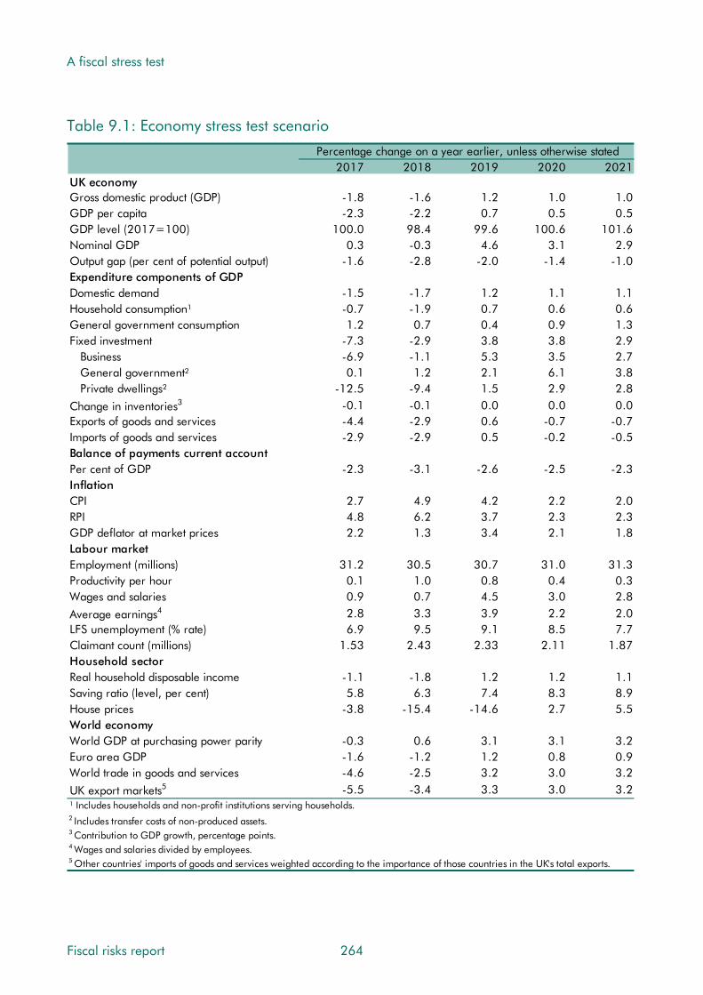
A fiscal stress test
Table 9.1: Economy stress test scenario
Percentage change on a year earlier, unless otherwise stated2017 2018 2019 2020 2021
UK economyGross domestic product (GDP) -1.8 -1.6 1.2 1.0 1.0GDP per capita -2.3 -2.2 0.7 0.5 0.5GDP level (2017=100) 100.0 98.4 99.6 100.6 101.6Nominal GDP 0.3 -0.3 4.6 3.1 2.9Output gap (per cent of potential output) -1.6 -2.8 -2.0 -1.4 -1.0Expenditure components of GDP Domestic demand -1.5 -1.7 1.2 1.1 1.1Household consumption¹ -0.7 -1.9 0.7 0.6 0.6General government consumption 1.2 0.7 0.4 0.9 1.3Fixed investment -7.3 -2.9 3.8 3.8 2.9
Business -6.9 -1.1 5.3 3.5 2.7General government² 0.1 1.2 2.1 6.1 3.8Private dwellings² -12.5 -9.4 1.5 2.9 2.8
3Change in inventories -0.1 -0.1 0.0 0.0 0.0Exports of goods and services -4.4 -2.9 0.6 -0.7 -0.7Imports of goods and services -2.9 -2.9 0.5 -0.2 -0.5Balance of payments current accountPer cent of GDP -2.3 -3.1 -2.6 -2.5 -2.3InflationCPI 2.7 4.9 4.2 2.2 2.0RPI 4.8 6.2 3.7 2.3 2.3GDP deflator at market prices 2.2 1.3 3.4 2.1 1.8Labour marketEmployment (millions) 31.2 30.5 30.7 31.0 31.3Productivity per hour 0.1 1.0 0.8 0.4 0.3Wages and salaries 0.9 0.7 4.5 3.0 2.8
4Average earnings 2.8 3.3 3.9 2.2 2.0LFS unemployment (% rate) 6.9 9.5 9.1 8.5 7.7Claimant count (millions) 1.53 2.43 2.33 2.11 1.87Household sectorReal household disposable income -1.1 -1.8 1.2 1.2 1.1Saving ratio (level, per cent) 5.8 6.3 7.4 8.3 8.9House prices -3.8 -15.4 -14.6 2.7 5.5World economyWorld GDP at purchasing power parity -0.3 0.6 3.1 3.1 3.2Euro area GDP -1.6 -1.2 1.2 0.8 0.9World trade in goods and services -4.6 -2.5 3.2 3.0 3.2
UK export markets5 -5.5 -3.4 3.3 3.0 3.2¹ Includes households and non-profit institutions serving households.2 Includes transfer costs of non-produced assets.3 Contribution to GDP growth, percentage points.4 Wages and salaries divided by employees.5 Other countries' imports of goods and services weighted according to the importance of those countries in the UK's total exports.
Fiscal risks report 264

A fiscal stress test
Table 9.2: Economy: stress test versus March forecast
Percentage change on a year earlier, unless otherwise stated2017 2018 2019 2020 2021
UK economyGross domestic product (GDP) -3.9 -3.2 -0.5 -0.9 -1.0GDP per capita -3.6 -3.0 -0.4 -0.7 -0.8GDP level (2017=100) 0.0 -3.1 -3.6 -4.4 -5.3Nominal GDP -3.5 -3.5 1.2 -0.7 -1.1Output gap (per cent of potential output) -1.8 -2.7 -1.9 -1.4 -1.0Expenditure components of GDP Domestic demand -3.1 -2.9 -0.5 -0.8 -1.0
1Household consumption -2.5 -2.7 -0.9 -1.1 -1.3General government consumption 0.0 0.0 0.0 0.0 0.0Fixed investment -8.1 -6.0 0.4 -0.1 -0.5
Business -6.8 -4.7 1.1 -0.4 -0.9
General government2 0.0 0.0 0.0 0.0 0.02Private dwellings -15.0 -12.3 -0.9 0.0 -0.2
3Change in inventories -0.2 -0.2 0.0 0.0 0.0Exports of goods and services -7.9 -5.9 -0.9 -1.3 -1.1Imports of goods and services -5.0 -4.8 -0.9 -1.0 -1.1Balance of payments current accountPer cent of GDP 1.1 0.1 0.0 -0.4 -0.3InflationCPI 0.3 2.6 2.2 0.2 0.0RPI 1.1 2.6 0.6 -0.8 -0.8GDP deflator at market prices 0.4 -0.2 1.8 0.2 -0.1Labour marketEmployment (millions) -0.7 -1.6 -1.5 -1.3 -1.1Productivity per hour -1.5 -0.4 -0.8 -1.5 -1.6Wages and salaries -2.1 -2.4 1.2 -0.6 -1.0
4Average earnings 0.1 0.5 0.9 -1.2 -1.6LFS unemployment (% rate) 1.9 4.3 4.0 3.3 2.6Claimant count (millions) 0.70 1.57 1.46 1.23 0.99Household sectorReal household disposable income -1.1 -2.6 0.2 -0.4 -0.8Saving ratio (level, per cent) 1.2 1.1 2.0 2.5 3.0House prices -10.3 -19.4 -19.0 -1.8 0.9World economyWorld GDP at purchasing power parity -3.7 -3.0 -0.6 -0.6 -0.5Euro area GDP -3.2 -2.8 -0.3 -0.7 -0.5World trade in goods and services -7.7 -6.1 -0.8 -1.1 -0.9UK export markets5
¹ Includes households and non-profit institutions servi
-8.6 -7.2 -1.0 -1.3 -1.1ng households.
2 Includes transfer costs of non-produced assets.3 Contribution to GDP growth, percentage points.4 Wages and salaries divided by employees.5 Other countries' imports of goods and services weighted according to the importance of those countries in the UK's total exports.
265 Fiscal risks report

A fiscal stress test
Table 9.3: Fiscal determinants: stress test scenario
GDP and its componentsReal GDPNominal GDP1
Nominal GDP (£ billion)1,2
Nominal GDP (centred end-March £bn)1,3
4Wages and salaries4,5Non-oil PNFC profits
4,5Consumer spendingPrices and earningsGDP deflatorRPI (September)6
CPI (September)67Average earnings
'Triple-lock' guarantee (September)Key fiscal determinantsClaimant count (millions)Employment (millions)Implied VAT gap (per cent)Output gap (per cent of potential output)Financial and property sectorsEquity prices (FTSE All-Share index)
1,5,8HMRC financial sector profits9Residential property prices
Residential property transactions (000s)10
10Commercial property prices10Commercial property transactions
Oil and gasOil prices ($ per barrel)5
Oil prices (£ per barrel)5
Gas prices (p/therm)5
Oil production (million tonnes)5
Gas production (billion therms)5
Interest rates and exchange ratesMarket short-term interest rates (%)11
Market gilt rates (%)12
Euro/Sterling exchange rate (€/£)
Percentage change on previous year, unless otherwise specified2017-18 2018-19 2019-20 2020-21 2021-22
-3.3 -0.3 1.3 1.0 1.1-2.5 2.4 4.2 3.0 2.9
1919 1965 2047 2108 21681919 2010 2077 2138 2199-0.1 1.9 4.5 2.7 2.9-0.6 -0.1 4.7 1.3 1.32.0 2.5 4.7 2.8 2.6
1.0 2.6 2.9 2.0 1.85.2 6.0 3.3 2.4 2.33.0 5.1 4.0 2.0 2.02.8 3.4 3.7 1.9 2.13.0 5.1 4.0 2.5 -
1.89 2.44 2.28 2.05 1.8230.9 30.5 30.8 31.1 31.411.3 9.6 8.5 8.2 8.1-2.4 -2.6 -1.8 -1.4 -0.9
2208 2501 2766 3009 3199-5.7 -1.2 0.4 1.9 4.0-8.3 -16.0 -11.2 4.8 5.7879 485 599 603 607
-14.5 -26.2 -0.9 -0.4 3.4-10.1 -19.2 -1.9 11.7 2.0
29.3 24.0 28.4 35.4 42.430.6 28.3 32.7 39.2 45.431.9 29.8 34.4 41.4 47.947.4 47.4 47.4 45.0 42.813.8 13.1 12.5 11.9 11.3
3.6 4.5 4.3 4.1 3.55.6 6.2 5.5 4.7 4.1
0.88 0.86 0.88 0.90 0.931 Not seasonally adjusted.2 Denominator for receipts, spending and deficit forecasts as a per cent of GDP. 3 Denominator for net debt as a per cent of GDP.4 Nominal. 5 Calendar year. 6 Q3 forecast used as a proxy for September.
7 Wages and salaries divided by employees.8 HMRC Gross Case 1 trading profits.9 Outturn data from ONS House Price Index. 10 Outturn data from HMRC information on stamp duty land tax.11 3-month sterling interbank rate (LIBOR).12 Weighted average interest rate on conventional gilts.
Fiscal risks report 266
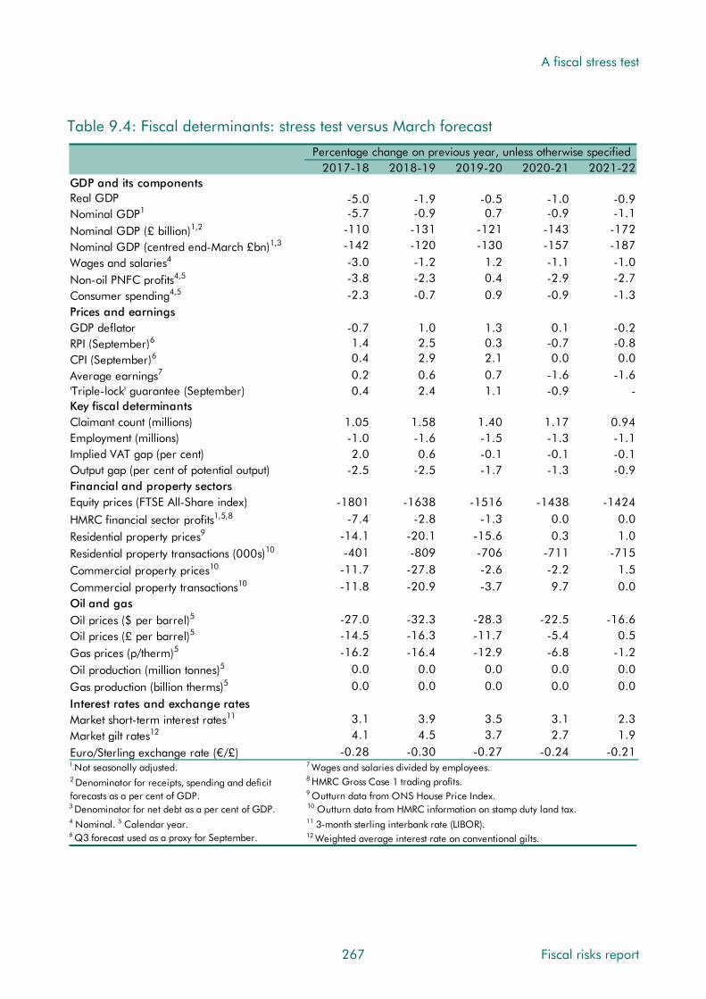
A fiscal stress test
Table 9.4: Fiscal determinants: stress test versus March forecast
GDP and its componentsReal GDPNominal GDP1
Nominal GDP (£ billion)1,2
Nominal GDP (centred end-March £bn)1,3
4Wages and salaries4,5Non-oil PNFC profits
4,5Consumer spendingPrices and earningsGDP deflatorRPI (September)6
CPI (September)67Average earnings
'Triple-lock' guarantee (September)Key fiscal determinantsClaimant count (millions)Employment (millions)Implied VAT gap (per cent)Output gap (per cent of potential output)Financial and property sectorsEquity prices (FTSE All-Share index)
1,5,8HMRC financial sector profits9Residential property prices
Residential property transactions (000s)10
10Commercial property prices10Commercial property transactions
Oil and gasOil prices ($ per barrel)5
Oil prices (£ per barrel)5
Gas prices (p/therm)5
Oil production (million tonnes)5
Gas production (billion therms)5
Interest rates and exchange rates11Market short-term interest rates
12Market gilt ratesEuro/Sterling exchange rate (€/£)
Percentage change on previous year, unless otherwise specified2017-18 2018-19 2019-20 2020-21 2021-22
-5.0 -1.9 -0.5 -1.0 -0.9-5.7 -0.9 0.7 -0.9 -1.1
-110 -131 -121 -143 -172-142 -120 -130 -157 -187-3.0 -1.2 1.2 -1.1 -1.0-3.8 -2.3 0.4 -2.9 -2.7-2.3 -0.7 0.9 -0.9 -1.3
-0.7 1.0 1.3 0.1 -0.21.4 2.5 0.3 -0.7 -0.80.4 2.9 2.1 0.0 0.00.2 0.6 0.7 -1.6 -1.60.4 2.4 1.1 -0.9 -
1.05 1.58 1.40 1.17 0.94-1.0 -1.6 -1.5 -1.3 -1.12.0 0.6 -0.1 -0.1 -0.1
-2.5 -2.5 -1.7 -1.3 -0.9
-1801 -1638 -1516 -1438 -1424-7.4 -2.8 -1.3 0.0 0.0
-14.1 -20.1 -15.6 0.3 1.0-401 -809 -706 -711 -715
-11.7 -27.8 -2.6 -2.2 1.5-11.8 -20.9 -3.7 9.7 0.0
-27.0 -32.3 -28.3 -22.5 -16.6-14.5 -16.3 -11.7 -5.4 0.5-16.2 -16.4 -12.9 -6.8 -1.2
0.0 0.0 0.0 0.0 0.00.0 0.0 0.0 0.0 0.0
3.1 3.9 3.5 3.1 2.34.1 4.5 3.7 2.7 1.9
-0.28 -0.30 -0.27 -0.24 -0.211 Not seasonally adjusted.2 Denominator for receipts, spending and deficitforecasts as a per cent of GDP. 3 Denominator for net debt as a per cent of GDP.4 Nominal. 5 Calendar year. 6 Q3 forecast used as a proxy for September.
7 Wages and salaries divided by employees.8 HMRC Gross Case 1 trading profits.9 Outturn data from ONS House Price Index. 10 Outturn data from HMRC information on stamp duty land tax.11 3-month sterling interbank rate (LIBOR).12 Weighted average interest rate on conventional gilts.
267 Fiscal risks report

A fiscal stress test
Fiscal assumptions
9.10 We have made a number of further assumptions on the fiscal side. Among them:
• No discretionary fiscal policy response by the Government: we assume neither fiscal stimulus in response to the downturn nor subsequent consolidation in response to the emergence of a large structural budget deficit.
• APF gilts rundown: MPC guidance is that the stock of gilts in the APF will be kept unchanged until Bank Rate reaches a level from which it can be cut materially, which it currently judges to be around 2 per cent. We therefore assume that sales begin once Bank Rate exceeds 2 per cent and that the stock of gilts held falls by £25 billion a quarter until it reaches £100 billion (in early 2020). The figures of £25 billion and £100 billion are arbitrary, but look reasonable for the purpose of a stress test. They are not predictions of what the MPC would choose in any future situation.
9.11 We assume the following contingent liabilities crystallise as a result of the stress scenario:
• Significant interventions in the private sector: the late-2000s crisis saw large government interventions in the banking sector. Given the nature of the stress test – with interest rates rising – heavily indebted non-financial sector firms might be more at risk. We have not attempted to model this or to pre-judge the results of the Bank’s actual stress test of commercial banks. But since history suggests that in periods of severe economic stress other costs hit the public sector balance sheet, we have assumed a hit that is half the size of the one experienced in the late 2000s. The cost therefore peaks at £94 billion in 2018-19 before declining.
• Spending related to guarantees in housing and other sectors: we assume a cost of £1 billion as an illustrative sum to reflect possible costs related to schemes such as Help to Buy or the UK Guarantees scheme.
9.12 Experience over time and across countries caution that the fiscal effects of a shock can often be compounded by unrelated costs. To reflect this we assume that a contingent liability crystallises for reasons unrelated to the stress scenario, since the ‘ordinary’ triggers of such events would still be present in times of economic stress. To illustrate this we have added a £25 billion payment on tax litigation, split between 2018-19 and 2019-20. This equals around half the contingent liability reported in HMRC’s 2015-16 accounts.
Results of the stress test
The big picture
9.13 The headline impact of the stress test on the public finances is shown in Chart 9.1. In cash terms, public spending is £89.5 billion higher than our March forecast baseline by 2021-22, of which £65.6 billion reflects higher debt interest and £15.1 billion higher welfare spending. Receipts are £68.9 billion lower, with the shortfall spread across a number of
Fiscal risks report 268

A fiscal stress test
taxes. As discussed later in the chapter, this is in contrast to the late-2000s crisis, where in cash terms the damage relative to pre-crisis expectations was driven much more by receipts.
9.14 The spending overshoot and receipts shortfall together push public sector net borrowing £158.5 billion above the baseline by 2021-22. The cumulative increase in borrowing across the forecast contributes to a £596 billion increase in net debt. The crystallisation of contingent liabilities adds £66 billion to net debt, but this is broadly offset by an accounting effect related to the APF3 and a higher sterling value of the foreign reserves. Net debt reaches 113.7 per cent of GDP in 2021-22, compared to 79.8 per cent in the baseline.
9.15 The relative importance of spending to the increase in borrowing is even more pronounced viewed relative to GDP, because even spending that is little changed in cash terms – like departmental spending – is a larger percentage of the smaller economy. On this basis, by 2021-22 spending is 7.1 per cent of GDP above the baseline but receipts just 0.2 per cent below it. Net borrowing is 7.4 per cent of GDP above and net debt 33.9 per cent above.
9.16 In the rest of this section we look in more detail at the impact of the stress test on receipts, spending, financial transactions and the fiscal aggregates.
Chart 9.1: The public finances: stress test versus March forecast
0
200
400
600
800
1000
1200
£ bi
llion
Receipts (March 2017)Receipts (Stress test)Expenditure (March 2017)Expenditure (Stress test)
30
32
34
36
38
40
42
44
46
48
Per
cent
of G
DP
0
2
4
6
8
10
12
2003-04 2007-08 2011-12 2015-16 2019-20
Per
cent
of G
DP
Public sector net borrowing (March 2017)Public sector net borrowing (Stress test)
0
20
40
60
80
100
120
2003-04 2007-08 2011-12 2015-16 2019-20
Per
cent
of G
DP
Public sector net debt (March 2017)Public sector net debt (Stress test)
Source: ONS, OBR
3 The APF purchased gilts at market prices that were higher than their nominal value. The difference between the market and nominal values adds to PSND. As the APF sells gilts in the stress test scenario, this accounting effect reduces relative to the baseline.
269 Fiscal risks report

A fiscal stress test
Receipts
9.17 The combination of the recession and a particularly sharp drop in asset prices leads to a significant shortfall in receipts in cash terms relative to our March forecast. This rises from £24.6 billion in 2017-18 to £68.9 billion in 2021-22.
9.18 Initially the shortfall is less pronounced than the hit to nominal GDP, so receipts are higher as a share of GDP than in the March baseline – in contrast to the late-2000s recession and the early-2000s slowdown. Receipts rise by 1.1 per cent of GDP in the two years to 2018-19, but then fall back and end up 0.2 per cent of GDP below the baseline by 2021-22.
9.19 The initial rise reflects:
• A relatively favourable composition of GDP during the recession, with the key tax bases weakening less than nominal GDP as a whole. Inflation-driven earnings growth leads to a higher labour share, despite employment falling. VAT receipts rise as a share of GDP because consumer spending falls less sharply than GDP as a whole.
• Higher interest rates boost the return on government financial assets, although this only offsets a fraction of their effect on spending.
• Tax streams with the most stable tax bases – such as business rates and council tax – are only modestly affected in cash terms by the downturn, with the number of properties liable little changed. These tax streams therefore rise as a share of GDP.
9.20 These factors more than offset the steep drop in taxes on assets and property transactions. Within two years, combined receipts from stamp duty land tax, stamp duty on shares, capital gains tax and inheritance tax halve in cash terms and as a share of GDP.
9.21 The decline in receipts relative to GDP later in the period reflects a less favourable composition of GDP, in particular as earnings growth falls back.
Income tax and National Insurance contributions
9.22 With income tax and NICs accounting for over 40 per cent of receipts, trends in earnings, employment and the associated effective tax rates are important drivers of the overall public finances. Relative to the late 2000s, the stress test has a larger hit to employment but nominal earnings growth is actually stronger than the baseline in the near term.
9.23 Relative to the baseline, the shortfall in income tax and NICs receipts is £8.2 billion in 2017-18 and rises to £28.5 billion by 2021-22. Employment is around 1½ million lower than baseline by 2019-20, reducing receipts by around £13 billion in 2018-19 and 2019-20. Higher earnings growth initially cushions the effect, adding £6.2 billion to receipts by 2019-20. But the slowing in the final two years costs £7.6 billion by 2021-22.
9.24 Our March forecast assumes that earnings growth for the top 10 per cent of the distribution will be around a quarter of a percentage point lower than the average for four years from
Fiscal risks report 270

A fiscal stress test
2018-19. This reflects our view that high-paying sectors such as financial and business services are likely to be more adversely affected than others by Brexit. We have raised this to half a percentage point in the stress test. We have also assumed that receipts from financial sector bonuses would be hit in 2017-18 and 2018-19 when asset markets are weakest.
9.25 The effective tax rate on labour income is also expected to be lower than in the baseline. This primarily reflects fiscal drag – in which more income will be taxed at higher rates if earnings growth outpaces inflation-linked increases in tax thresholds and allowances. In our March forecast, fiscal drag intensifies beyond the near term as productivity and earnings growth pick up and inflation falls back to target. In the stress test, fiscal drag goes into reverse in those years, with earnings growth averaging well below inflation. The effective tax rate falls by 0.6 percentage points in the three years to 2021-22 whereas it rises by 0.8 percentage points in the baseline. This takes £7.3 billion off receipts by 2021-22.
9.26 Self-assessment (SA) income tax receipts in the stress test are higher than the baseline throughout. The recession and housing downturn reduce receipts from self-employment income, dividends and rental income. But higher interest rates boost savings income, which is mainly paid via SA since the savings allowance was introduced in Budget 2015.
VAT
9.27 VAT receipts are lower by £7.1 billion in 2017-18, with the shortfall rising to £10.1 billion by 2021-22. This reflects lower consumer spending, a lower proportion of spending subject to the standard rate of VAT and a recession-related rise in the VAT gap (the difference between the theoretical tax liability and actual VAT receipts):
• Weaker consumer spending takes over £4 billion off receipts by 2021-22, although the initial burst of inflation means that nominal consumer spending holds up better than other components of GDP, moderating the impact during the recession. There are also big hits to receipts from the ‘exempt’ sector (primarily the financial sector where VAT on purchases cannot be recovered) and the housing sector.
• Spending on consumer durables (most of which is standard-rated) tends to fall more sharply than overall consumer spending in recessions. We assume that it is 10.5 per cent lower than the baseline by 2018, compared with 2.8 per cent for consumer spending overall. This reduces the share of consumer spending subject to the standard rate of VAT, which is just over 1 percentage point lower than in the baseline.
• In the late 2000s, the VAT gap rose by around 3 percentage points over two years as firms delayed paying HMRC due to cash flow problems. It then fell back sharply. We have assumed the gap rises by 2 percentage points in 2017-18 before returning to the March baseline. This takes £2.7 billion off receipts in 2017-18.
271 Fiscal risks report

A fiscal stress test
Onshore corporation tax
9.28 Onshore corporation tax (CT) is £4.5 billion lower in 2017-18, with the shortfall rising to £6.9 billion by 2021-22. This reflects a number of factors:
• Profits of both non-oil, non-financial companies and financial sector firms fall in 2017 and again in 2018, with sluggish growth thereafter. This takes £5.9 billion off receipts by 2021-22.
• The direct effect of higher interest rates raises companies’ interest income and interest costs, with a broadly neutral effect overall for onshore CT. Indirect effects of higher interest rates – for example, from companies that default on loans or enter insolvency – are implicitly captured via the profits assumption. A restriction on the tax deductibility of corporate interest expenses was announced in Budget 2016, which might be expected to reduce the adverse effect of higher interest costs on receipts. But given lower profits against which to set those expenses, its yield could even fall.
• Trading losses can be set against future profits, lowering receipts in subsequent years. We have assumed higher losses, but only a modest proportion of those generated in the stress scenario are used by 2021-22 reflecting a number of recent policies to limit the extent to which they can be set against future profits. These would continue to depress receipts beyond the medium term.
• Lower investment partially offsets these factors, reducing the use of capital allowances. This reduces the receipts shortfall by around £½ billion.
9.29 One offsetting effect on CT receipts comes from the special 45 per cent withholding tax on litigation payments.4 We have assumed a £25 billion cost that adds to spending. For illustrative purposes, we have assumed a third of the cost would be subject to the special CT rate, so around a sixth of it would be recouped via higher CT receipts. As we noted in Chapter 6, this withholding tax is itself subject to an ongoing challenge in the courts.
Oil and gas revenues
9.30 The stress test assumes that oil prices fall below $30 a barrel for three years, a more prolonged weakness than in 2015 and 2016. But with the pound much weaker against the dollar, sterling prices are around £30 a barrel between 2017 and 2019, similar to their 2015 and 2016 averages. Sterling oil prices then rebound to a similar level to the March baseline by 2021-22. We have assumed that gas prices move in line.
9.31 Oil and gas revenues are negative each year until 2020-21, with repayments of petroleum revenue tax more than offsetting net CT payments. This reflects the impact of lower prices on profitability since we have assumed no change in production or expenditure.
4 See HMRC, Corporation Tax: Restitution Interest, 2015.
Fiscal risks report 272
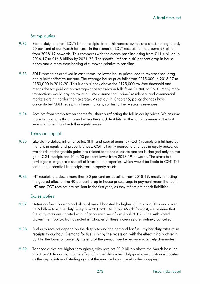
A fiscal stress test
Stamp duties
9.32 Stamp duty land tax (SDLT) is the receipts stream hit hardest by this stress test, falling to only 20 per cent of our March forecast. In the scenario, SDLT receipts fall to around £3 billion from 2018-19 onwards. This compares with the March baseline rising from £11.4 billion in 2016-17 to £16.8 billion by 2021-22. The shortfall reflects a 40 per cent drop in house prices and a more than halving of turnover, relative to baseline.
9.33 SDLT thresholds are fixed in cash terms, so lower house prices lead to reverse fiscal drag and a lower effective tax rate. The average house price falls from £215,000 in 2016-17 to £150,000 in 2019-20. This is only slightly above the £125,000 tax-free threshold and means the tax paid on an average-price transaction falls from £1,800 to £500. Many more transactions would pay no tax at all. We assume that ‘prime’ residential and commercial markets are hit harder than average. As set out in Chapter 5, policy changes have concentrated SDLT receipts in these markets, so this further weakens revenues.
9.34 Receipts from stamp tax on shares fall sharply reflecting the fall in equity prices. We assume more transactions than normal when the shock first hits, so the fall in revenue in the first year is smaller than the fall in equity prices.
Taxes on capital
9.35 Like stamp duties, inheritance tax (IHT) and capital gains tax (CGT) receipts are hit hard by the falls in equity and property prices. CGT is highly geared to changes in equity prices, as two-thirds of chargeable gains are related to financial assets and tax is charged only on the gain. CGT receipts are 40 to 50 per cent lower from 2018-19 onwards. The stress test envisages a large-scale sell-off of investment properties, which would be liable to CGT. This tempers the shortfall in receipts from property assets.
9.36 IHT receipts are down more than 30 per cent on baseline from 2018-19, mostly reflecting the geared effect of the 40 per cent drop in house prices. Lags in payment mean that both IHT and CGT receipts are resilient in the first year, as they reflect pre-shock liabilities.
Excise duties
9.37 Duties on fuel, tobacco and alcohol are all boosted by higher RPI inflation. This adds over £1.5 billion to excise duty receipts in 2019-20. As in our March forecast, we assume that fuel duty rates are uprated with inflation each year from April 2018 in line with stated Government policy, but, as noted in Chapter 5, these increases are routinely cancelled.
9.38 Fuel duty receipts depend on the duty rate and the demand for fuel. Higher duty rates raise receipts throughout. Demand for fuel is hit by the recession, with the effect initially offset in part by the lower oil price. By the end of the period, weaker economic activity dominates.
9.39 Tobacco duties are higher throughout, with receipts £0.9 billion above the March baseline in 2019-20. In addition to the effect of higher duty rates, duty-paid consumption is boosted as the depreciation of sterling against the euro reduces cross-border shopping.
273 Fiscal risks report

A fiscal stress test
9.40 Alcohol duties are little changed from the March baseline, with higher inflation being largely offset by the effect of the downturn on the volumes consumed.
Other taxes
9.41 Business rates are higher as a share of GDP throughout the scenario, and higher in cash terms from 2019-20 onwards as higher inflation boosts the multiplier applied to the rateable value of non-domestic properties. This more than explains the £1.5 billion rise in business rates in 2021-22 relative to the March baseline. We assume only a modest effect on business rates from the recession – a 1 per cent fall in rateable values and £0.2 billion higher empty property relief in 2017-18 and 2018-19.
9.42 Other effects are small. Council tax receipts are little changed from the March baseline, while many smaller taxes are hit by weaker activity (e.g. indirect taxes such as insurance premium tax, air passenger duty and landfill tax). In some cases, there is an offset from indexation due to higher RPI inflation (e.g. vehicle excise duty and the aggregates levy (although this is another tax where indexation is routinely cancelled)).
Other receipts
9.43 Interest and dividend receipts include interest income on the government’s stock of financial assets. Compared with the March baseline, receipts are over £10 billion higher in 2019-20, with the surplus declining to £3.6 billion by 2021-22. Higher interest rates raise returns on the government’s cash deposits and foreign reserves. They also boost accrued interest on some older student loans. Higher RPI inflation boosts accrued interest on more recently issued student loans, where interest is based on RPI plus 3 per cent.
Fiscal risks report 274
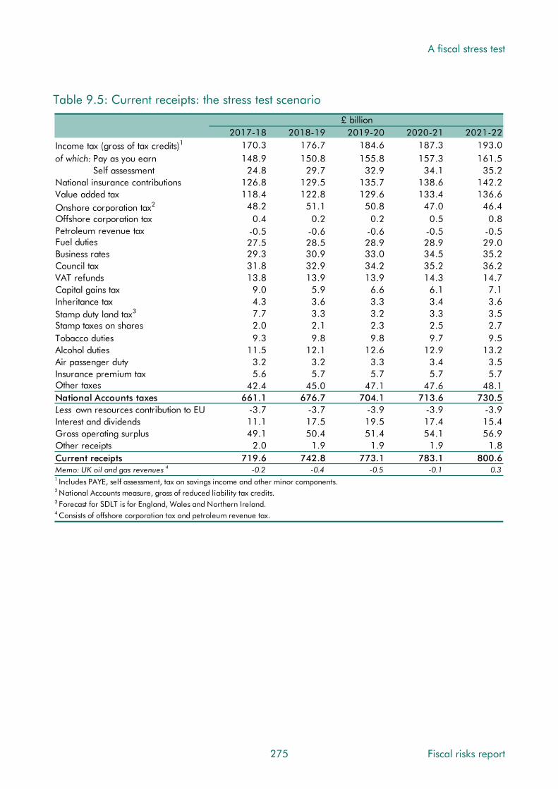
A fiscal stress test
Table 9.5: Current receipts: the stress test scenario
£ billion2017-18 2018-19 2019-20 2020-21 2021-22
Income tax (gross of tax credits)1 170.3 176.7 184.6 187.3 193.0of which: Pay as you earn 148.9 150.8 155.8 157.3 161.5 Self assessment 24.8 29.7 32.9 34.1 35.2National insurance contributions 126.8 129.5 135.7 138.6 142.2Value added tax 118.4 122.8 129.6 133.4 136.6
2Onshore corporation tax 48.2 51.1 50.8 47.0 46.4Offshore corporation tax 0.4 0.2 0.2 0.5 0.8Petroleum revenue tax -0.5 -0.6 -0.6 -0.5 -0.5Fuel duties 27.5 28.5 28.9 28.9 29.0Business rates 29.3 30.9 33.0 34.5 35.2Council tax 31.8 32.9 34.2 35.2 36.2VAT refunds 13.8 13.9 13.9 14.3 14.7Capital gains tax 9.0 5.9 6.6 6.1 7.1Inheritance tax 4.3 3.6 3.3 3.4 3.6
3Stamp duty land tax 7.7 3.3 3.2 3.3 3.5Stamp taxes on shares 2.0 2.1 2.3 2.5 2.7Tobacco duties 9.3 9.8 9.8 9.7 9.5Alcohol duties 11.5 12.1 12.6 12.9 13.2Air passenger duty 3.2 3.2 3.3 3.4 3.5Insurance premium tax 5.6 5.7 5.7 5.7 5.7Other taxes 42.4 45.0 47.1 47.6 48.1National Accounts taxes 661.1 676.7 704.1 713.6 730.5Less own resources contribution to EU -3.7 -3.7 -3.9 -3.9 -3.9Interest and dividends 11.1 17.5 19.5 17.4 15.4Gross operating surplus 49.1 50.4 51.4 54.1 56.9Other receipts 2.0 1.9 1.9 1.9 1.8Current receipts 719.6 742.8 773.1 783.1 800.6
4Memo: UK oil and gas revenues -0.2 -0.4 -0.5 -0.1 0.31 Includes PAYE, self assessment, tax on savings income and other minor components.2 National Accounts measure, gross of reduced liability tax credits.3 Forecast for SDLT is for England, Wales and Northern Ireland.4 Consists of offshore corporation tax and petroleum revenue tax.
275 Fiscal risks report
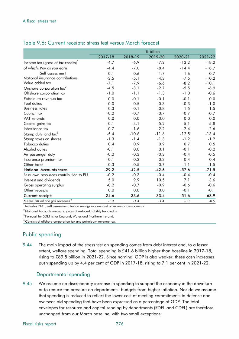
A fiscal stress test
Table 9.6: Current receipts: stress test versus March forecast
£ billion2017-18 2018-19 2019-20 2020-21 2021-22
Income tax (gross of tax credits)1 -4.7 -6.9 -7.2 -13.2 -18.2of which: Pay as you earn -4.4 -7.0 -8.4 -14.4 -18.7 Self assessment 0.1 0.6 1.7 1.6 0.7National insurance contributions -3.5 -5.1 -4.3 -7.5 -10.2Value added tax -7.1 -7.9 -6.6 -8.2 -10.1
2Onshore corporation tax -4.5 -3.1 -2.7 -5.5 -6.9Offshore corporation tax -1.0 -1.1 -1.3 -1.0 -0.6Petroleum revenue tax 0.0 -0.1 -0.1 -0.1 0.0Fuel duties 0.0 0.5 0.3 -0.3 -1.0Business rates -0.3 -0.1 0.8 1.5 1.5Council tax -0.2 -0.7 -0.7 -0.7 -0.7VAT refunds 0.0 0.0 0.0 0.0 0.0Capital gains tax -0.1 -4.1 -5.2 -5.1 -5.8Inheritance tax -0.7 -1.6 -2.2 -2.4 -2.6
3Stamp duty land tax -5.4 -10.6 -11.6 -12.5 -13.4Stamp taxes on shares -1.3 -1.4 -1.3 -1.2 -1.2Tobacco duties 0.4 0.9 0.9 0.7 0.5Alcohol duties -0.1 0.0 0.1 -0.1 -0.2Air passenger duty -0.2 -0.3 -0.3 -0.4 -0.5Insurance premium tax -0.1 -0.3 -0.3 -0.4 -0.4Other taxes -0.3 -0.5 -0.7 -1.1 -1.5National Accounts taxes -29.2 -42.5 -42.6 -57.6 -71.5Less own resources contribution to EU -0.2 -0.3 -0.4 -0.4 -0.4Interest and dividends 5.0 9.9 10.5 7.1 3.6Gross operating surplus -0.2 -0.7 -0.9 -0.6 -0.6Other receipts 0.0 0.0 0.0 -0.1 -0.1Current receipts -24.6 -33.6 -33.4 -51.6 -68.9
4Memo: UK oil and gas revenues -1.0 -1.3 -1.4 -1.0 -0.61 Includes PAYE, self assessment, tax on savings income and other minor components.2 National Accounts measure, gross of reduced liability tax credits.3 Forecast for SDLT is for England, Wales and Northern Ireland.4 Consists of offshore corporation tax and petroleum revenue tax.
Public spending
9.44 The main impact of the stress test on spending comes from debt interest and, to a lesser extent, welfare spending. Total spending is £41.6 billion higher than baseline in 2017-18, rising to £89.5 billion in 2021-22. Since nominal GDP is also weaker, these cash increases push spending up by 4.4 per cent of GDP in 2017-18, rising to 7.1 per cent in 2021-22.
Departmental spending
9.45 We assume no discretionary increase in spending to support the economy in the downturn or to reduce the pressure on departments’ budgets from higher inflation. Nor do we assume that spending is reduced to reflect the lower cost of meeting commitments to defence and overseas aid spending that have been expressed as a percentage of GDP. The total envelopes for resource and capital sending by departments (RDEL and CDEL) are therefore unchanged from our March baseline, with two small exceptions:
Fiscal risks report 276

A fiscal stress test
• Scottish block grant: lower UK tax receipts cause the block grant to be increased automatically, in line with agreed devolved funding arrangements.
• Spending related to guarantees: an illustrative £1 billion is added to CDEL in 2018-19 to reflect the crystallisation of contingent liabilities pertaining to guarantee schemes.
9.46 These cash changes are small, so the main effect on DEL spending as a share of GDP results from nominal GDP being lower. As a result, DEL spending is 1.0 per cent of GDP higher than baseline in 2017-18, rising to 1.5 per cent in 2021-22.
Welfare spending
9.47 Welfare spending increases by £6.5 billion (2.9 per cent) relative to baseline in 2017-18, rising to £15.1 billion (6.3 per cent) by 2021-22 (Table 9.7). Most of the increase is on spending outside the Government’s ‘welfare cap’. It is dominated by higher caseloads that are due to higher unemployment, with some upward pressures on average awards where they are not subject to the uprating freeze. We have not factored in any further costs or delays associated with the rollout of universal credit, although clearly that would be a risk.
9.48 The change in spending outside the welfare cap reflects:
• Higher unemployment: this drives big increases in jobseeker’s allowance and associated housing benefit – by £8 billion in 2018-19 falling to £5 billion by 2021-22.
• Higher CPI inflation: this mainly increases spending on the state second pension – by very little in 2018-19 but rising to £1.8 billion a year from 2020-21.
• Higher triple lock uprating: state pension uprating is significantly more expensive in the stress test than in the baseline, with higher inflation adding 2.4 percentage points to uprating in 2019-20 and an additional 1.1 percentage points in 2020-21, by when the cost reaches £3.1 billion. This falls back to £2.5 billion in 2021-22, when the 2.5 per cent floor drives uprating in the stress test rather than the 3.4 per cent earnings growth in our March forecast. By 2021-22, state pensions spending stands at 5.1 per cent of GDP, 0.6 percentage points higher than the March baseline.
9.49 The change in spending subject to the welfare cap reflects:
• Higher unemployment: this also increases tax credits spending (by £1.8 billion by 2018-19) as some of the newly unemployed would be eligible for child tax credits. This effect declines slowly from 2019-20 onwards as unemployment falls.
• Higher CPI inflation: this feeds through to some uprating from 2018-19. But only from 2020-21, beyond the period covered by the uprating freeze, are its effects felt across the board. It adds £3.7 billion to spending in 2021-22, largely on tax credits and disability benefits. The four-year freeze means that the initial burden of higher inflation falls on benefit recipients rather than adding to spending. For example, the work-
277 Fiscal risks report
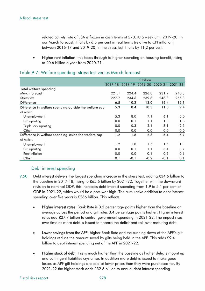
A fiscal stress test
related activity rate of ESA is frozen in cash terms at £73.10 a week until 2019-20. In our March forecast, it falls by 6.5 per cent in real terms (relative to CPI inflation) between 2016-17 and 2019-20; in the stress test it falls by 11.2 per cent.
• Higher rent inflation: this feeds through to higher spending on housing benefit, rising to £0.6 billion a year from 2020-21.
Table 9.7: Welfare spending: stress test versus March forecast
Total welfare spendingMarch forecastStress testDifference
£ billion2017-18
221.1227.7
6.5
2018-19
224.4234.6
10.2
2019-20
226.8239.8
13.0
2020-21
231.9248.3
16.4
2021-22
240.3255.3
15.1Difference in welfare spending outside the welfare capof which:
UnemploymentCPI upratingTriple lock upratingOther
5.3
5.30.00.00.0
8.4
8.00.10.30.0
10.3
7.11.12.10.0
11.0
6.11.83.10.0
9.4
5.01.82.50.0
Difference in welfare spending inside the welfare capof which:
UnemploymentCPI upratingRent inflationOther
1.2
1.20.00.00.1
1.8
1.80.10.0
-0.1
2.6
1.71.10.1
-0.2
5.4
1.63.40.6
-0.1
5.7
1.33.70.60.1
Debt interest spending
9.50 Debt interest delivers the largest spending increase in the stress test, adding £34.6 billion to the baseline in 2017-18, rising to £65.6 billion by 2021-22. Together with the downward revision to nominal GDP, this increases debt interest spending from 1.9 to 5.1 per cent of GDP in 2021-22, which would be a post-war high. The cumulative addition to debt interest spending over five years is £266 billion. This reflects:
• Higher interest rates: Bank Rate is 3.2 percentage points higher than the baseline on average across the period and gilt rates 3.4 percentage points higher. Higher interest rates add £27.7 billion to central government spending in 2021-22. The impact rises over time as more debt is issued to finance the deficit and roll over maturing debt.
• Lower savings from the APF: higher Bank Rate and the running down of the APF’s gilt holdings reduce the amount saved by gilts being held in the APF. This adds £9.4 billion to debt interest spending net of the APF in 2021-22.
• Higher stock of debt: this is much higher than the baseline as higher deficits mount up and contingent liabilities crystallise. In addition more debt is issued to make good losses as APF gilt holdings are sold at lower prices than they were purchased for. By 2021-22 the higher stock adds £32.6 billion to annual debt interest spending.
Fiscal risks report 278

A fiscal stress test
• Higher RPI inflation: this increases accrued spending on index-linked gilts sharply in the first two years, but reduces it thereafter – by £4.1 billion in 2021-22.
Table 9.8: Central government debt interest: stress test versus March forecast
2017-18 2018-19 2019-20 2020-21 2021-22March forecast (net of APF) 41.5 39.1 40.1 40.9 44.0Stress test (net of APF) 76.1 91.6 93.1 101.7 109.6Change 34.6 52.5 53.0 60.7 65.6of which:
Higher interest rates 8.8 17.6 22.6 26.1 27.7Lower savings from the APF 11.3 14.7 12.9 11.2 9.4Higher stock of debt 3.2 12.1 19.6 26.7 32.6Higher RPI inflation and other 11.1 8.1 -2.1 -3.3 -4.1
£ billion
9.51 As noted in Chapter 8, the Government’s exposure to the effect from higher interest rates
depends on how quickly it feeds through to the effective rate on the outstanding stock of debt. Even after taking into account the shortening of average maturities that comes from APF gilt holdings, the UK’s debt has an average maturity of 11 years, well above levels in the other major advanced economies. This limits the effect of interest rate rises by 2021-22, but means that there would be further upward pressure on debt interest spending and the deficit if interest rates remained higher as more debt matured and was rolled over.
9.52 But the stress test also illustrates a number of ways in which debt interest spending has become more sensitive to shocks. The higher starting point for the stock of debt amplifies the effect of higher interest rates. The higher stock of index-linked gilts means a larger near-term response to changes in RPI inflation. And the substantial gilt holdings of the APF mean that the sensitivity to changes in Bank Rate has increased. It is these factors in combination that result in a rise of just 3 percentage points or so in interest rates and inflation pushing debt interest spending to a post-war high as a share of GDP.
Other annually managed expenditure
9.53 Other annually managed expenditure (AME) affected by the stress test includes:
• Public service pensions: higher CPI inflation boosts inflation-indexed payments, raising spending by £2 billion a year by the end of the period.
• Net transfers to the EU: using the same approach as in our March forecast, sterling depreciation would add around £2½ billion a year to this spending line.5
• Locally financed current expenditure: in the face of higher inflation, we assume that local authorities draw down reserves to keep total service expenditure the same in real terms as in the baseline, with additional drawdowns to meet cyclical pressures, such as
5 See paragraph 4.128 onwards in our March 2017 Economic and fiscal outlook for a discussion of the approach we have taken in our forecasts since the EU referendum and ahead of firm information on post-Brexit policy settings.
279 Fiscal risks report

A fiscal stress test
the impact of higher unemployment on council tax exemption schemes. Together this reduces the aggregate level of reserves by around a third by 2021-22. Cash spending is around £3 billion a year higher in the later years of the forecast than in the baseline, with about half attributable to reserve drawdowns and much of the remainder to higher interest income and locally retained business rates.
• Locally financed and public corporations’ capital expenditure: small changes include reduced spending by housing associations and fewer asset sales.
• Tax litigation costs: when HMRC loses a case and must refund tax and pay interest, the amount is treated as a capital grant. We have assumed that the Government is hit by a £25 billion loss, with the associated spending split evenly over 2018-19 and 2019-20.
Table 9.9: Public spending: stress test scenario
Public sector current expenditure (PSCE)PSCE in RDELPSCE in AMEof which:
Welfare spendingNet public service pension payments Expenditure transfers to EU institutions Assumed spending in lieu of EU transfersLocally financed current expenditureCentral government debt interest, net of APFOther current expenditure
£ billion2017-18
318.3443.3
227.712.111.9
-47.276.168.4
2018-19
321.8475.2
234.613.813.7
-50.291.671.3
2019-20
323.9488.7
239.814.3
-15.552.093.174.1
2020-21
330.2512.8
248.316.2
-15.653.5
101.777.5
2021-22
337.3534.7
255.317.7
-16.155.0
109.680.9
Total public sector current expenditure 761.6 797.0 812.6 843.0 872.0Public sector gross investment (PSGI)PSGI in CDELPSGI in AMEof which:
Tax litigationLocally financed capital expenditurePublic corporations' capital expenditure Other capital expenditure
49.033.4
1.67.3
18.06.6
53.246.0
14.16.7
18.46.9
55.445.0
14.16.0
17.17.8
64.334.0
1.65.2
18.48.8
67.736.2
1.65.6
19.69.4
Total public sector gross investment 82.5 99.2 100.4 98.3 103.9Less public sector depreciationPublic sector net investment
-42.839.6
-44.454.9
-46.154.3
-48.050.3
-50.253.7
Total managed expenditure 844.0 896.2 913.0 941.3 975.9
Fiscal risks report 280
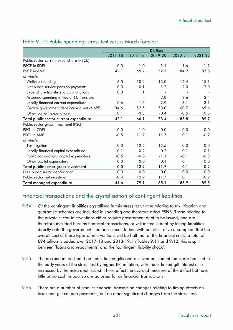
A fiscal stress test
Table 9.10: Public spending: stress test versus March forecast
Public sector current expenditure (PSCE)PSCE in RDELPSCE in AMEof which:
Welfare spendingNet public service pension payments Expenditure transfers to EU institutionsAssumed spending in lieu of EU transfersLocally financed current expenditureCentral government debt interest, net of APFOther current expenditure
£ billion2017-18
0.042.1
6.50.00.3
-0.6
34.60.1
2018-19
1.065.2
10.20.11.1
-1.5
52.5-0.3
2019-20
1.172.3
13.01.2
-2.82.9
53.0-0.4
2020-21
1.684.2
16.42.0
-2.63.1
60.7-0.5
2021-22
1.987.8
15.12.0
-2.43.1
65.6-0.5
Total public sector current expenditure 42.1 66.1 73.4 85.8 89.7Public sector gross investment (PSGI)PSGI in CDELPSGI in AMEof which:
Tax litigationLocally financed capital expenditurePublic corporations' capital expenditure Other capital expenditure
0.0-0.5
0.00.1
-0.50.0
1.011.9
12.50.2
-0.80.0
0.011.7
12.50.2
-1.10.1
0.00.1
0.00.1
-0.10.1
0.0-0.2
0.00.1
-0.30.0
Total public sector gross investment -0.5 12.9 11.7 0.1 -0.2Less public sector depreciationPublic sector net investment
0.0-0.4
0.012.9
0.011.7
0.00.1
0.0-0.2
Total managed expenditure 41.6 79.1 85.1 85.9 89.5
Financial transactions and the crystallisation of contingent liabilities
9.54 Of the contingent liabilities crystallised in this stress test, those relating to tax litigation and guarantee schemes are included in spending and therefore affect PSNB. Those relating to the private sector interventions either require government debt to be issued, and are therefore included here as financial transactions, or will increase debt by taking liabilities directly onto the government’s balance sheet. In line with our illustrative assumption that the overall cost of these types of interventions will be half that of the financial crisis, a total of £94 billion is added over 2017-18 and 2018-19. In Tables 9.11 and 9.12, this is split between ‘loans and repayments’ and the ‘contingent liability shock’.
9.55 The accrued interest paid on index-linked gilts and received on student loans are boosted in the early years of the stress test by higher RPI inflation, with index-linked gilt interest also increased by the extra debt issued. These affect the accrued measure of the deficit but have little or no cash impact so are adjusted for as financial transactions.
9.56 There are a number of smaller financial transaction changes relating to timing effects on taxes and gilt coupon payments, but no other significant changes from the stress test.
281 Fiscal risks report

A fiscal stress test
Table 9.11: Financial transactions: stress test scenario
£ billion
2017-18 2018-19 2019-20 2020-21 2021-22Public sector net borrowing 124.5 153.5 139.9 158.1 175.3Loans and repayments 56.8 43.6 19.1 20.3 19.6Transactions in financial assets -6.4 -2.5 -2.4 -2.4 0.0Bank of England schemes 42.5 0.0 0.0 -50.0 -40.0Contingent liability shock 41.8 -5.9 -8.1 -6.6 -4.1UKAR asset sales and rundown -18.6 -5.2 -0.7 -0.7 -0.7Accruals adjustments -13.7 -8.1 -1.3 5.7 -1.7Other factors -0.8 -0.8 -0.8 -0.8 -0.8Public sector net cash requirement 226.0 174.7 145.6 123.6 147.6 Table 9.12: Financial transactions: stress test versus March forecast
£ billion
2017-18 2018-19 2019-20 2020-21 2021-22Public sector net borrowing 66.2 112.7 118.5 137.5 158.5Loans and repayments 35.7 21.9 -2.6 -1.6 -4.2Transactions in financial assets 0.0 0.0 0.0 0.0 0.0Bank of England schemes 0.0 0.0 0.0 0.0 0.0Contingent liability shock 41.8 -5.9 -8.1 -6.6 -4.1UKAR asset sales and rundown 0.0 0.0 0.0 0.0 0.0Accruals adjustments -13.2 -6.6 5.4 2.8 0.7Other factors 0.0 0.0 0.0 0.0 0.0Public sector net cash requirement 130.5 122.1 113.2 132.1 150.9
Asset Purchase Facility
9.57 The stress test has severe consequences for the APF’s net position. At present, the APF earns around 3¼ per cent interest on its gilt holdings and pays only 0.25 per cent on the associated funding – a healthy profit margin of 3 percentage points. As Bank Rate rises sharply in the stress test, this margin actually turns negative for a period before recovering gradually to +0.4 percentage points in 2021-22 as Bank Rate falls a little and maturing gilts in the residual stock are rolled over at higher rates. The APF also sells many of the gilts at lower prices than they were bought for, thereby crystallising significant losses that the Treasury is obliged to cover under the terms of the APF indemnity.
9.58 All this means that the financial flows between central government and the APF change dramatically. In our March forecast, the APF transfers cash profits of £40.5 billion to the Treasury over the five years to 2021-22, reducing the need for the Government to issue gilts. In the stress test, the flow is reversed with the Treasury transferring £81.4 billion to the APF to cover losses on selling gilts. These transfers are within the public sector, so do not affect PSNB, but they do increase the Government’s need for gilt financing and PSND.
9.59 Even in this particularly adverse scenario, the net effect of the APF on the public finances over its lifetime would be relatively small. To date, the APF has benefited the Exchequer by over £75 billion. Given the cost of just over £80 billion in the stress test, the eventual cost
Fiscal risks report 282

A fiscal stress test
would be around £5 billion by 2021-22, more than a decade after the APF was set up and after hundreds of billions of pounds worth of gilts had been bought and sold.
Fiscal aggregates
Borrowing
9.60 Public sector net borrowing (PSNB) is much higher in the stress test than the baseline. PSNB is £66.2 billion higher in 2017-18, rising to £158.5 billion by 2021-22. Thanks also to lower nominal GDP, this increases PSNB by 3.6 per cent of GDP rising to 7.4 per cent.
9.61 Borrowing rises year-on-year in every year except 2019-20, when it falls in cash terms and as a share of GDP (partly reflecting the sizable cut in departmental spending planned by the Government for that year). The deficit reaches 8.1 per cent of GDP by 2021-22, compared to 0.7 per cent in the baseline. The renewed deterioration in the later years of the forecast reflects the adverse composition of GDP growth at that point, with very sluggish real earnings growth, while debt interest payments also continues to rise.
9.62 Most of the fall in GDP in the stress test is assumed to be permanent and so too therefore is the increase in borrowing. Cyclically adjusted net borrowing is 7.4 per cent of GDP by 2021-22 compared to 0.7 per cent in the baseline. On our estimates, which begin in 1975-76, the structural deficit has only been higher than this once – at 7.9 per cent of GDP in 2009-10. The extent of the fiscal challenge facing policymakers by the end of this scenario would therefore be similar to that facing the Coalition as it took office in 2010.
9.63 As we noted in Chapter 1, two key drivers of the debt-to-GDP ratio are the primary balance (which excludes net interest payments) and the difference between the effective interest rate on government debt and the growth rate of the economy (the ‘growth-corrected interest rate’). In the March baseline, there is a primary surplus from 2019-20 onwards; in the stress test, it is in deficit by between 2¾ and 4 per cent of GDP throughout. The growth-corrected interest rate is negative in the baseline, but positive in the stress test (averaging 2.5 per cent, close to the average of the three decades from 1980). This means that debt interest spending adds to the cash value of debt, raising the debt-to-GDP ratio, faster than economic growth raises the cash value of GDP, reducing the ratio.
Balance sheet measures
9.64 Table 9.13 shows the impact of the stress test on public sector net debt (PSND). In contrast to the March baseline, debt rises in every year and reaches £2.5 trillion or 113.7 per cent of GDP in 2021-22, 33.9 per cent of GDP higher than the baseline. Of the rise, 6.8 per cent of GDP comes from a lower nominal GDP denominator, while the remainder comes from a £596 billion increase in the cash debt level. This reflects:
• Higher borrowing in every year, which increases debt by £597 billion.
• Government interventions in the private sector that add £66 billion, including £49 billion of debt issued and £17 billion of liabilities added directly to the balance sheet.
283 Fiscal risks report

A fiscal stress test
• APF-related accounting effects reduce debt by £51 billion. The APF purchased gilts at market prices that were higher than their nominal value. The difference between the market and nominal values adds to PSND – by £64 billion in 2016-17. As the APF sells gilts in the scenario, this accounting effect reduces relative to the baseline.
• Other factors that reduce net debt by £16 billion, including a £9 billion rise in the sterling value of assets in the international reserves thanks to a weaker pound.
Table 9.13: Public sector net debt: stress test versus March forecast
Per cent of GDP2017-18 2018-19 2019-20 2020-21 2021-22
March forecast 88.8 88.5 86.9 83.0 79.8Stress test forecast 101.2 104.9 107.7 110.0 113.7Change 12.4 16.4 20.8 27.0 33.9of which:
Change in nominal GDP1 6.6 5.3 5.5 6.1 6.8Change in cash level of net debt 5.9 11.1 15.4 20.9 27.1
£ billionMarch forecast 1830 1885 1918 1904 1904Stress test forecast 1942 2109 2238 2351 2500Change in cash level of net debt 113 224 319 447 596of which:
Borrowing 70 183 301 439 597Government interventions 77 94 83 75 66APF -16 -35 -51 -53 -51International reserves -13 -13 -12 -11 -9Other factors -5 -4 -1 -3 -6
1 Non-seasonally-adjusted GDP centred end-March. 9.65 Public sector net financial liabilities (PSNFL) is a broader balance sheet measure that
includes all financial assets and liabilities recorded in the National Accounts. PSNFL is 31.2 per cent of GDP higher by 2021-22 than in our March baseline. As with net debt, the key driver is higher borrowing in the scenario. The increase is marginally smaller than for net debt, because the government interventions in the private sector involve the purchase of financial assets that net off PSNFL but not PSND.
Other fiscal stress indicators
9.66 In addition to the headline fiscal aggregates that we usually focus on, the IMF recommends looking at indicators of government liquidity and the government financing burden.
9.67 The IMF’s ‘liquidity’ metric looks at the government’s gross financing needs to cover deficits and roll over existing debt as it matures. In the stress test, the total financing requirement to cover borrowing and other cash outlays is £859 billion in the five years to 2021-22, some £415 billion more than in the baseline. Adding in maturing debt, the Government would need to sell almost £1.3 trillion of gilts. On top of that, the APF is assumed to sell the majority of the gilts it currently holds, bringing net sales to the private sector to £1.6 trillion.
Fiscal risks report 284
A fiscal stress test
9.68 Gilt issuance including the APF sales peaks at £388 billion (18.5 per cent of GDP) in 2018-19 in the scenario. This is much higher than in the financial crisis. The total financing requirement then peaked at £228 billion (14.9 per cent of GDP) in 2009-10. But the APF bought £185 billion of gilts that year, so in effect net issuance to the private sector was only £43 billion (2.8 per cent of GDP). Net of APF purchases, issuance peaked in 2010-11 at £166 billion (10.4 per cent of GDP).
9.69 The high volume of gilt sales required would no doubt put stress on the gilt market, although actual market capacity would depend on the attractiveness of gilts relative to overseas or private sector instruments at the time. Part of the stress would be due to sales by the APF. But that would be an operational choice. The Bank has stated that, were sales required, the MPC “would consider the appropriate mechanisms for selling assets, having due regard for the impact of those sales on the Government’s debt management operations, but subject to taking the action necessary to meet its policy objectives.”6
9.70 The IMF’s ‘financing burden’ metric looks at the ratio of debt interest payments to receipts. In the stress test, this rises significantly, increasing from 6.8 per cent of receipts in 2016-17 to 13.7 per cent in 2021-22. This compares with a fall to 6.2 per cent in the baseline. Like debt interest spending as a share of GDP, the financing burden rises to a post-war high in the stress test. This would generate a potential squeeze on other spending priorities.
The Government’s fiscal targets
9.71 The Charter for Budget Responsibility contains targets for borrowing and debt:
• Fiscal mandate: Cyclically adjusted PSNB to be below 2 per cent of GDP by 2020-21.
• Supplementary target: Public sector net debt to fall as a share of GDP in 2020-21.
9.72 Both are, not surprisingly, missed by a large margin. Cyclically adjusted PSNB is 6.5 per cent of GDP in 2020-21, breaching the mandate by £94 billion, while PSND rises by 2.2 per cent of GDP in 2020-21. But the Charter states that “in the event of a significant negative shock to the UK economy, the Treasury will review the appropriateness of the fiscal mandate and supplementary targets as a means of returning the public finances to balance as early as possible in the next Parliament.”
6 Letter from the Governor of the Bank of England to the Treasury Select Committee, 18 December 2015.
285 Fiscal risks report
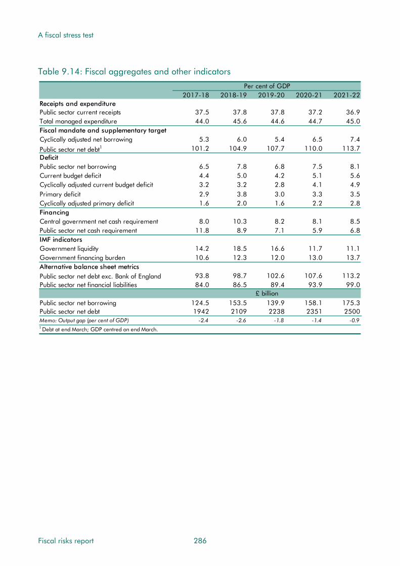
A fiscal stress test
Table 9.14: Fiscal aggregates and other indicators
Per cent of GDP2017-18 2018-19 2019-20 2020-21 2021-22
Receipts and expenditurePublic sector current receipts 37.5 37.8 37.8 37.2 36.9Total managed expenditure 44.0 45.6 44.6 44.7 45.0Fiscal mandate and supplementary targetCyclically adjusted net borrowing 5.3 6.0 5.4 6.5 7.4
Public sector net debt1 101.2 104.9 107.7 110.0 113.7DeficitPublic sector net borrowing 6.5 7.8 6.8 7.5 8.1Current budget deficit 4.4 5.0 4.2 5.1 5.6Cyclically adjusted current budget deficit 3.2 3.2 2.8 4.1 4.9Primary deficit 2.9 3.8 3.0 3.3 3.5Cyclically adjusted primary deficit 1.6 2.0 1.6 2.2 2.8FinancingCentral government net cash requirement 8.0 10.3 8.2 8.1 8.5Public sector net cash requirement 11.8 8.9 7.1 5.9 6.8IMF indicatorsGovernment liquidity 14.2 18.5 16.6 11.7 11.1Government financing burden 10.6 12.3 12.0 13.0 13.7Alternative balance sheet metricsPublic sector net debt exc. Bank of England 93.8 98.7 102.6 107.6 113.2Public sector net financial liabilities 84.0 86.5 89.4 93.9 99.0
£ billionPublic sector net borrowing 124.5 153.5 139.9 158.1 175.3Public sector net debt 1942 2109 2238 2351 2500Memo: Output gap (per cent of GDP) -2.4 -2.6 -1.8 -1.4 -0.91 Debt at end March; GDP centred on end March.
Fiscal risks report 286

A fiscal stress test
Table 9.15: Fiscal aggregates: stress test versus March forecast
Per cent of GDP2017-18 2018-19 2019-20 2020-21 2021-22
Receipts and expenditurePublic sector current receipts 0.8 0.8 0.6 0.1 -0.2Total managed expenditure 4.4 6.6 6.4 6.7 7.1Fiscal mandate and supplementary targetCyclically adjusted net borrowing 2.3 4.1 4.5 5.6 6.7
Public sector net debt1 12.4 16.4 20.8 27.0 33.9DeficitPublic sector net borrowing 3.6 5.9 5.8 6.6 7.4Current budget deficit 3.5 5.1 5.2 6.4 7.2Cyclically adjusted current budget deficit 2.3 3.3 3.8 5.5 6.5Primary deficit 2.0 3.6 3.7 3.9 4.4Cyclically adjusted primary deficit 0.7 1.8 2.3 2.9 3.7FinancingCentral government net cash requirement 5.7 8.0 6.8 6.4 6.9Public sector net cash requirement 7.1 6.4 5.6 6.2 6.9IMF indicatorsGovernment liquidity 8.7 13.1 10.9 5.9 6.2Government financing burden 5.0 7.3 7.1 8.1 8.6Alternative balance sheet metricsPublic sector net debt exc. Bank of England 12.7 17.7 22.9 29.4 36.2Public sector net financial liabilities 7.9 11.5 16.7 23.5 31.2
£ billionPublic sector net borrowing 66.2 112.7 118.5 137.5 158.5Public sector net debt 113 224 319 447 596Memo: Output gap (per cent of GDP) -2.5 -2.5 -1.7 -1.3 -0.91 Debt at end March; GDP centred on end March.
The stress test versus the financial crisis and recession
9.73 Useful insights can be gained by comparing the stress test results with the evolution of the public finances in the late-2000s crisis and its aftermath.
The economy
9.74 Charts 9.2 to 9.9 compare a number of key economic variables in the stress test with their evolution from the first quarter of 2008:
• The profiles of real GDP are similar, although the peak-to-trough fall of 4.7 per cent in the stress test is smaller than the 6.3 per cent drop in the crisis. The recovery is slightly slower in the stress test. The evolution of nominal GDP is also similar, with a slightly stronger recovery in the stress test due to domestic inflationary pressures.
• The stress test and crisis both result in large hits to potential output relative to the preceding trend. The assumed paths are very similar in the first two years; thereafter potential output growth is weaker in the stress test.
287 Fiscal risks report

A fiscal stress test
• The path of Bank Rate differs significantly: it was cut sharply between autumn 2008 and spring 2009, but is assumed to increase to around 4 per cent over the first year of the stress test, reflecting a more challenging trade-off between growth and inflation.
• The peak in CPI inflation in the stress test is similar to the peak in the aftermath of the crisis, but the profile through the five years is somewhat different. Inflation was relatively volatile from 2008, reflecting large fluctuations in the oil price, VAT rate changes and the lagged effects of the depreciation in sterling during the crisis. The stress test incorporates a more sustained increase in CPI inflation, as the initial effects of a weaker pound are followed by a build-up of domestic inflationary pressure as inflation expectations become unanchored from the inflation target.
• The stress test includes a house price shock that is more prolonged and deeper than that in the crisis. The peak-to-trough fall in house prices is around twice as large in the stress test as it was in the crisis.
• The stress test includes a much larger initial increase in unemployment than was seen in the crisis. Thereafter the unemployment rate falls steadily in the later years of the stress test, reaching a similar point after five years to that reached post-crisis.
• Average earnings growth is generally stronger in cash terms in the stress test scenario, as domestic inflationary pressure builds up.
Chart 9.2: Real GDP Chart 9.3: Potential GDP
90
92
94
96
98
100
102
0 1 2 3 4 5
2008
Q1=
100,
201
7Q1
= 1
00
Years from base
Stress test
Late 2000s
Source: ONS, OBR
94
96
98
100
102
104
106
0 1 2 3 4 5
2008
Q1=
100,
201
7Q1
= 1
00
Years from base
Stress test
Late 2000s
Source: ONS, OBR
Fiscal risks report 288

A fiscal stress test
Chart 9.4: Nominal GDP Chart 9.5: CPI inflation
85
90
95
100
105
110
115
0 1 2 3 4 5
2008
Q1=
100,
201
7Q1
= 1
00
Years from base
Stress test
Late 2000s
Source: ONS, OBR
0
1
2
3
4
5
6
0 1 2 3 4 5
Perc
enta
ge c
hang
e on
a y
ear
ealie
rYears from base
Stress test
Late 2000s
Source: ONS, OBR
Chart 9.6: House price inflation Chart 9.7: Bank Rate
-20
-15
-10
-5
0
5
10
0 1 2 3 4 5
Perc
enta
ge c
hang
e on
a y
ear
ealie
r
Years from base
Stress test
Late 2000s
Source: ONS, OBR
0
1
2
3
4
5
6
0 1 2 3 4 5
Per
cent
Years from base
Stress test
Late 2000s
Source: Bank of England, Datastream, OBR
Chart 9.8: Unemployment rate Chart 9.9: Average earnings growth
4
5
6
7
8
9
10
0 1 2 3 4 5
Per
cent
Years from base
Stress test
Late 2000s
Source: ONS, OBR
-4
-2
0
2
4
6
0 1 2 3 4 5
Perc
enta
ge c
hang
e on
a y
ear
earli
er
Years from base
Stress test
Late 2000s
Source: ONS, OBR
289 Fiscal risks report

A fiscal stress test
The public finances
9.75 Public sector net borrowing increases significantly in the early years of both the stress test and following the late 2000s crisis, but somewhat less in the former. In both cases, much of the increase in borrowing is structural and would therefore require fiscal consolidation at some point to return it to a sustainable level.
9.76 There are, however, significant differences in the composition of the fiscal damage, reflecting the different nature of the shocks. The left panels of Chart 9.10 show how revenues and spending evolve relative to the baseline in the stress test, first in cash terms and then as shares of GDP. The right panels show how the outturns following the crisis evolved relative to the Treasury’s pre-crisis March 2008 forecast. Of course, the latter also reflects the discretionary policy responses by both the Government and the MPC.
Chart 9.10: Receipts and spending: stress test versus last recession
-150
-100
-50
0
50
100
£ bi
llion
Expenditure
Receipts
-2
0
2
4
6
8
10
2016-17 2017-18 2018-19 2019-20 2020-21 2021-22
Per
cent
of G
DP
-150
-100
-50
0
50
100
-2
0
2
4
6
8
10
2007-08 2008-09 2009-10 2010-11 2011-12 2012-13
Source: ONS, OBR
Difference between outturn and March 2008 forecast
Difference between stress test and March 2017 forecast
Fiscal risks report 290

A fiscal stress test
9.77 Viewed in cash terms, borrowing rose sharply compared with pre-crisis expectations over the two years from 2007-08, primarily due to a shortfall in receipts. These fell sharply and continued to disappoint in later years. The shortfall was spread across the major taxes, reflecting the weakness of nominal GDP (which fell in absolute terms), falling real wages and weaker financial and asset markets. Spending was slightly higher, reflecting welfare bills and discretionary stimulus spending.
9.78 In the stress test, the rise in borrowing in cash terms comes more from spending than receipts. The spending overshoot is £79.1 billion by 2018-19 (£52.5 billion of which is debt interest), and rises to £89.5 billion by 2021-22. The receipts shortfall is £33.6 billion by 2018-19, rising to £68.3 billion in 2021-22.
9.79 Viewed relative to nominal GDP, it was spending that drove higher borrowing in the crisis. Total spending jumped by 6.3 per cent of GDP over the first two years, compared to the minimal increase expected at Budget 2008. It fell thereafter as the fiscal consolidation began. Higher cash spending was part of the explanation, but the main reason was that existing cash spending plans were a larger proportion of a smaller-than-expected economy. Meanwhile, thanks in part to a temporary VAT cut, receipts fell by 1.0 per cent of GDP in the first two years, rather than rising slightly as had been expected.
9.80 Viewed relative to GDP, higher spending more than explains the rise in borrowing in the early years of the stress test and explains the vast bulk of it thereafter. Spending is 6.6 per cent of GDP above the baseline in 2018-19, rising to 7.1 per cent by 2021-22. Higher cash spending and lower nominal GDP both contribute to the rise in the spending-to-GDP ratio. Receipts are 0.8 per cent of GDP above the baseline in 2018-19 (helped by the initially favourable composition of GDP) and only 0.2 per cent of GDP below it in 2021-22.
9.81 Chart 9.11 looks at how borrowing rises as a share of GDP over the first two years of the stress test and the first two years of crisis, relative to their starting point rather than to baseline expectations. In terms of spending components:
• Departmental spending rose by 2.7 per cent of GDP between 2007-08 and 2009-10, more than a third of the rise in total spending. Cash spending increased by more than planned at Budget 2008, partly reflecting discretionary stimulus spending. Importantly, these spending limits were not reduced in line with the shortfall in nominal GDP (and receipts) relative to the Budget 2008 forecast, so spending rose sharply as a share of GDP. In the stress test, we have assumed no major changes in cash departmental spending. It only rises by 0.8 per cent of GDP over the first two years despite nominal GDP weakness, which reflects the fact that the rise in cash DEL spending in the baseline (4.4 per cent) is much less than the rise in the crisis (11.8 per cent).
• Welfare spending rose by 2.1 per cent of GDP over the first two years of the crisis, reflecting higher caseloads (driven by unemployment) and higher average awards (as inflation uprating outstripped nominal GDP growth). In the stress test, welfare spending rises by only 0.9 per cent of GDP, despite the greater rise in unemployment and inflation. This partly reflects policy measures, in particular the four-year freeze to
291 Fiscal risks report

A fiscal stress test
working-age benefits announced in July 2015, which means that the burden of higher inflation falls on benefit recipients rather than adding to spending.
• Debt interest spending is the one area where the stress test inflicts significantly more fiscal damage than the crisis. Debt interest spending fell by 0.3 per cent of GDP during the crisis, but rises by 2.8 per cent of GDP in the stress test. That reflects four factors:
• interest rates rise sharply in the stress test, having fallen sharply during the crisis;
• the stock of debt is much higher, amplifying the effect of those higher rates;
• the APF is assumed to sell gilts rather than buying them, while the beneficial gap between Bank Rate and gilt yields is smaller or even negative; and
• the peak in RPI inflation is higher and more sustained than during the crisis, affecting the larger stock of index-linked gilts.
9.82 Receipts fell by 1.0 per cent of GDP in the first two years of the crisis, but rise by 1.1 per cent of GDP at the start of the stress test. This largely reflects that:
• PAYE income tax and NICs receipts fell by 0.2 per cent of GDP during the crisis, but rise by 0.3 per cent of GDP in the stress test. This is more than explained by effective tax rates. These dropped sharply during the crisis, reflecting falling real wages, a rise in the share of lower-paid part-time workers, fewer high earners in the financial sector, and policy measures. In contrast, the effective tax rate rises early in the stress test, largely reflecting the relative strength of real earnings growth.
• Onshore corporation tax fell by 0.3 per cent of GDP during the crisis, but falls by just 0.1 per cent of GDP in the stress test. This is again explained by effective tax rates, which again fell sharply during the crisis as companies (particularly in the financial sector) accumulated large stocks of tax-deductible losses. Policy changes in recent years have restricted the use of these losses, which partly explains why the effective tax rate remains relatively more buoyant in the stress test than it was in the crisis.
• VAT receipts fell by 0.4 per cent of GDP during the crisis, largely reflecting the temporary cut in the main rate. VAT receipts are more buoyant in the stress test, despite rising VAT debt and a fall in the share of spending on standard-rated goods.
9.83 By the end of the stress test, PSNB remains 5.5 per cent of GDP higher than in 2016-17, with debt interest spending 3.2 per cent of GDP higher, thanks to the rise in the stock of debt and higher interest rates. Compared with the late 2000s, the initial deterioration is smaller, reflecting the smaller shock and the more favourable composition of GDP, but greater further out. Five years after the crisis hit, the rise in PSNB had already moderated from 7.3 to 4.6 per cent of GDP. Fiscal consolidation was under way, with departmental spending having been cut by more than 3 per cent of GDP from its peak.
Fiscal risks report 292
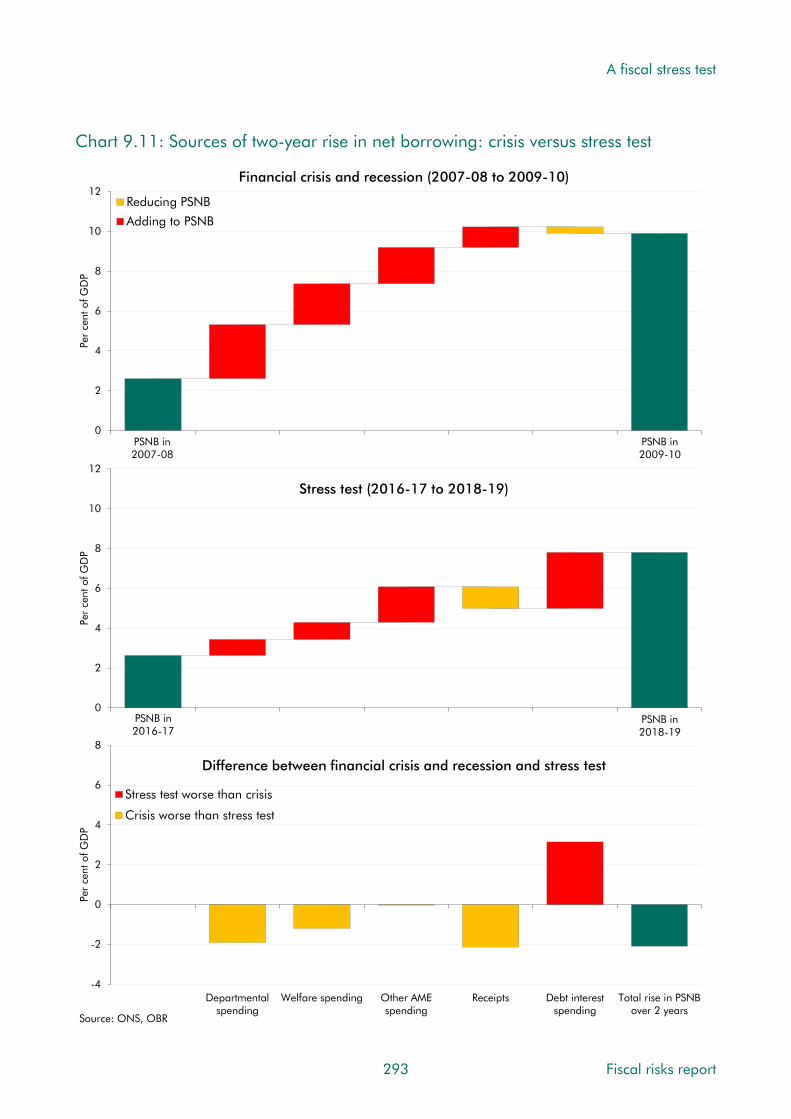
A fiscal stress test
Chart 9.11: Sources of two-year rise in net borrowing: crisis versus stress test
0
2
4
6
8
10
12
Per
cent
of G
DP
Reducing PSNB
Adding to PSNB
Financial crisis and recession (2007-08 to 2009-10)
0
2
4
6
8
10
12
2016-17 = 0 Departmentalspending
Welfare Other AMEspending
Receipts Debt interest Total rise in PSNBover 2 years
Per
cent
of G
DP
Stress test (2016-17 to 2018-19)
-4
-2
0
2
4
6
8
Departmentalspending
Welfare spending Other AMEspending
Receipts Debt interestspending
Total rise in PSNBover 2 years
Per
cent
of G
DP
Stress test worse than crisis
Crisis worse than stress test
Difference between financial crisis and recession and stress test
Source: ONS, OBR
PSNB in 2016-17
PSNB in 2007-08
PSNB in 2009-10
PSNB in 2018-19
293 Fiscal risks report

A fiscal stress test
Conclusion
9.84 The stress test allows us to draw some obvious conclusions: a deep recession and the crystallisation of multi-billion pound contingent liabilities would be fiscally damaging. But the key conclusion for fiscal sustainability is not the damage itself, but what it would mean for the years beyond the stress test. As with the crisis, the most important issue is not the hit from contingent liabilities or the recession, but the lower path for potential GDP. This implies permanently smaller tax bases and lower cash receipts than in the baseline, rendering cash spending plans that appeared affordable in the baseline unaffordable in the stress scenario.
9.85 To restore the public finances to a sustainable path, fiscal consolidation would inevitably have to follow at some point. A structural deficit of more than 7 per cent of GDP in 2021-22 would leave a fiscal challenge every bit as daunting as the one that faced the Coalition in 2010. And it would be faced with net debt already at 114 per cent of GDP. Similar choices would be required over the extent to which cash spending plans should be cut to bring spending back to a desired share of GDP or the tax-to-GDP ratio raised to accommodate those cash spending plans.
9.86 The stress test also highlights the increased vulnerability of the public finances to shocks that result in higher interest rates. In the stress test, the rise in interest rates reflects an increase in the risk premia on UK government bonds, but the same effect could be generated by a higher global real interest rate (which, as discussed in Chapter 8, is an important potential fiscal risk). With the debt-to-GDP ratio in 2016-17 over twice as high as it was pre-crisis, this amplifies the effect of any change in interest rates. And with more debt linked to RPI inflation, shocks to inflation will also quickly raise spending. In the stress test, debt interest costs rise to a post-war high despite interest rates that are only 3 or so percentage points higher than the baseline.
9.87 The stress test also builds on the analysis we have presented in earlier chapters by illustrating some ways in which the public finances are more or less exposed to some types of shock now than they were in the crisis. As well as debt interest spending, the new stamp duty regime is more sensitive to house price shocks, particularly at the top end, than its predecessor. There are also areas of reduced sensitivity. These include the effects of greater restrictions on the use of losses against tax in the corporation tax system and the four-year cash freeze on most working-age benefits and tax credits, which has shifted inflation risk from government to benefit recipients.
9.88 The stress test is only illustrative. It is not a forecast of what we think would happen in a situation like this. In particular it does not factor in any policy changes that might be prompted. In reality, policies would no doubt be changed as events unfolded. For example, fiscal stimulus measures could be deemed necessary, or the burden placed on working-age benefit recipients by the cash freeze could be deemed too great.
Fiscal risks report 294

10 Conclusions
Introduction
10.1 In the preceding chapters we have discussed a wide variety of fiscal risks. Ideally, we would summarise them all by ranking them according to a common measure – a probability-weighted net present value of the stock and flow effects. But this would require more information than is currently available and more uncertain judgements than we feel would be reasonable. So rather than give a spurious impression of precision, we have made broad judgements about the likelihood of different risks crystallising over a five- or 50-year horizon, and the potential impact if they did.
10.2 This chapter:
• summarises our high-level conclusions about the most important sources of fiscal risk;
• identifies gaps that will inform the next steps in our work on fiscal risks;
• highlights some lessons to learn; and
• notes some issues for the Government’s response to this report.
Which are the most important sources of fiscal risk?
10.3 In the preceding chapters we have highlighted 50 issues that the Government might wish to address in its response to this report and we have considered many more potential sources of fiscal risk. But which are the most important?
10.4 The answer should rest on two factors – how likely a risk is to crystallise and how large the impact would be if it did. Quantifying this is not straightforward. Rare events or emerging sources of risk offer little hard evidence from which to estimate probability or impact. And for most risks the two interact: a ‘big’ recession is less likely than a ‘typical’ one. In offering our summary, we have tried to be transparent about the judgements we have made, so that others can use them to inform their own views even if they reach different conclusions. The results are presented below and specific assumptions are reported on our website.
10.5 As regards probability, we place the likelihood of a risk crystallising into one of five broad categories: very high (90 to 100 per cent), high (60 to 90 per cent), medium (40 to 60 per cent), low (10 to 40 per cent) and very low (0 to 10 per cent). But we recognise that even this can rarely be done with precision, while descriptions such as ‘high’ or ‘low’ will not be ideal in all circumstances – 5 per cent might sound an acceptably low probability for losing
295 Fiscal risks report

Conclusions
a court case, but would be worryingly high for suffering a nuclear accident. In some cases – recessions and financial crises, for example – we have drawn probabilities from historical or international experience. But in many cases they reflect broad judgements.
10.6 Our approach to quantifying fiscal impact varies from risk to risk. Here we have tried to attach some numbers to the potential impact, rather than simply relying on high/medium/low-style judgements, but the values assigned should be treated as no more than rough illustrations. Again, historical and international experience can help us to estimate the potential impact of some. We can also draw on ‘ready reckoners’ – issue-specific sensitivity analyses that can be extracted from fiscal forecasting models. And departmental accounts provide useful information on certain future spending pressures.
10.7 For ease of comparison we have shown all the estimated impacts as an effect on public sector net debt (PSND) at the five- and 50-year horizon. For the medium term, these are relative to our March 2017 forecast that PSND would fall to 79.8 per cent of GDP by 2021-22. For the long term, they are relative to a stable debt-to-GDP ratio, so as to proxy risks to fiscal sustainability. The conversions are often very simple and approximate.
Risks to our medium-term forecast
10.8 Figure 10.1 offers a stylised illustration of the main risks to our medium-term forecast by size and likelihood. Since we aim to produce a central forecast – factoring in any event or trend that we consider more likely than not to crystallise – most forecast risks are considered medium or low probability almost by definition. The exceptions are policy risks, since our forecasts are conditioned on the Government’s current stated policy rather than a judgement about the most likely path for policy.
10.9 Grouping the risks as in the chapters of the report, the figure shows that:
• Economy risks are generally low-to-medium probability and medium-to-high impact. This reflects the fact that we are measuring them against a central forecast and that any risk with effects spreading across the whole economy is likely to have a bigger impact than one specific to only a part of economic activity. History suggests that there is a roughly one-in-two chance of being hit by a recession in any five years – a medium likelihood. Our November 2015 EFO ‘negative shock’ scenario suggests a high impact – PSND was 14 per cent of GDP higher in the final year of that scenario. Informed by historical averages, we have also assigned a medium likelihood to trend productivity growth persisting at the lower rates seen post-crisis rather than picking up as forecast, although the latest data might suggest a gloomier prognosis. Our November 2016 EFO ‘weak productivity’ scenario suggests this would have a medium impact after five years – around 8 per cent of GDP. Net migration falling to 105,000 a year by 2021, in line with the ONS ‘low migration’ population projection, is also deemed medium likelihood and impact – adding around 1½ per cent of GDP to debt based on our March 2016 EFO scenario. Compositional risks are generally less costly. A 1 percentage point lower consumption share of expenditure on its own (i.e. a higher
Fiscal risks report 296
Conclusions
saving ratio) would have a low impact, but if accompanied by a 1 percentage point lower labour share of income that would rise to a medium impact.
• The risk of a financial crisis over a five-year horizon is considered low probability. But, even if the impact were only as large as the average of advanced economy crises over the past 40 years, at more than 20 per cent of GDP it would be large relative to most other risks. Only the fiscal stress test result described in Chapter 9, which combines macroeconomic and specific fiscal risks crystallising at once, would have a greater medium-term impact among those that we have considered.
• Specific revenue risks tend to be low impact, but range across the probability scale. Forecast risks are mainly considered low probability. For example, the Government could lose more revenue than we assume from rising self-employment and incorporations, but our central forecast already factors in rising trends in both. Similarly, the decline in fuel, alcohol and tobacco consumption could be greater than we expect, but our central forecasts already factor in some effects. The key policy risks we highlight are considered very high likelihood. Further rises in the income tax personal allowance and higher rate threshold have been Government commitments for some time, while RPI-linked fuel duty rises have been cancelled, or postponed then cancelled, every year since 2010.
• Specific primary spending risks are many and varied. Most are small from a wider fiscal perspective, so are not covered here. But a few could be large. In particular, health spending is set to fall as a share of GDP over the next five years, predicated on continued pay restraint and – more importantly – non-pay efficiencies. Our analysis of the historical upward trend in health spending and of building demographic pressures make current plans look even more challenging. By way of illustration, if actual spending over the next five years were to end up halfway between current plans and a counterfactual consistent with the effects of ageing and the historical trend in other cost pressures, that would add around 1 per cent of GDP to PSND. Since less is spent on adult social care, and recent policy changes have put it on an upward path, the risks here are lower impact. The triple lock could cost more than we have assumed. If the past five years were the best guide to the next five in terms of uprating, higher state pensions spending would raise PSND by around ¼ per cent of GDP.
• Balance sheet risks due to real-world transactions are mostly significant during financial crises, so have not been reported separately here. But statistical classification risks to PSND could be large. Reclassification of housing associations back to the private sector would reduce PSND, but there are a number of other ‘near-government’ sectors noted in Chapter 7 that could be reclassified into the public sector. Major balance sheet transfers in the past have added single-digit amounts to the debt-to-GDP ratio. But where such changes reflect the statistics catching up with economic reality, they are not a true indicator of changes to fiscal sustainability.
• Debt interest risks could be material. Based on the ready-reckoners in Chapter 8, higher interest rates or higher RPI inflation could raise spending and debt significantly.
297 Fiscal risks report

Conclusions
There would typically be some offsetting effects – higher interest rates boost the return
on government assets too, while higher RPI inflation raises excise duty receipts (so long
as the Government follows its stated policy on default indexation). We have made
broad-brush adjustments to the ready-reckoner results to allow for such effects.
Figure 10.1: Sources of fiscal risk over the medium term
Impa
cton
publ
icse
ctor
netd
ebtb
y20
21-2
2 (p
er c
ent o
f GD
P)
Probability of crystallisation (per cent)
Very low(Less than 10)
Low(10-40)
Medium(40-60)
High(60-90)
Very high(Over 90)
Low
(Les
s th
an 1
)M
ediu
m (1
-10
)H
Igh
(Ove
r 1
0)
Source: OBR
• Typical recession
• Fiscal stress test
• Higher interest rates (1ppt)
• Financial crisis
• Weak productivity growth
• Higher inflation (1ppt a year)
• Lower consumption and labour income shares
• Low migration• Higher tax litigation costs
• Triple lock: higher cost
• Lower incomes for high earners• Faster growth in self- employment and incorporations• Lower prices for expensive houses• Lower dutiable consumption
• Income tax policy commitments
• Additional health spending
• Additional adult social care spending
• No fuel duty RPI increases
• Lower consumption share
• Major statistical reclassifications
Fiscal risks report 298
Risks associated with the profile of fiscal policy changes
10.10 Figure 10.1 contains a number of specific policy-related risks – that the Government will
choose to spend more or to tax less over the medium term. In Box 10.1 we look at a more
general source of fiscal risk. In many recent fiscal events, net ‘giveaways’ today have been
financed by the promise of net ‘takeaways’ tomorrow. The risk there, of course, is that
tomorrow never comes. This tendency is known as ‘deficit bias’ and is well documented
across countries and history.1 It is one reason why governments not only set themselves
fiscal targets but also establish fiscal councils like the OBR to hold them to account.2
1 There is a large amount of academic research on this subject, covering both monetary and fiscal policy implications. See, for example, Kydland and Prescott, Rules Rather than Discretion: The Inconsistency of Optimal Plans, The Journal of Political Economy (Vol.85, Issue 3), 1977, and Alesina and Tabellini, A positive theory of fiscal deficits and government debt, Review of Economic Statistics (57 no.3), 1990. 2 See Debrun, Democratic Accountability, Deficit Bias and Independent Fiscal Agencies, IMF Working Paper WP/11/173, 2011.
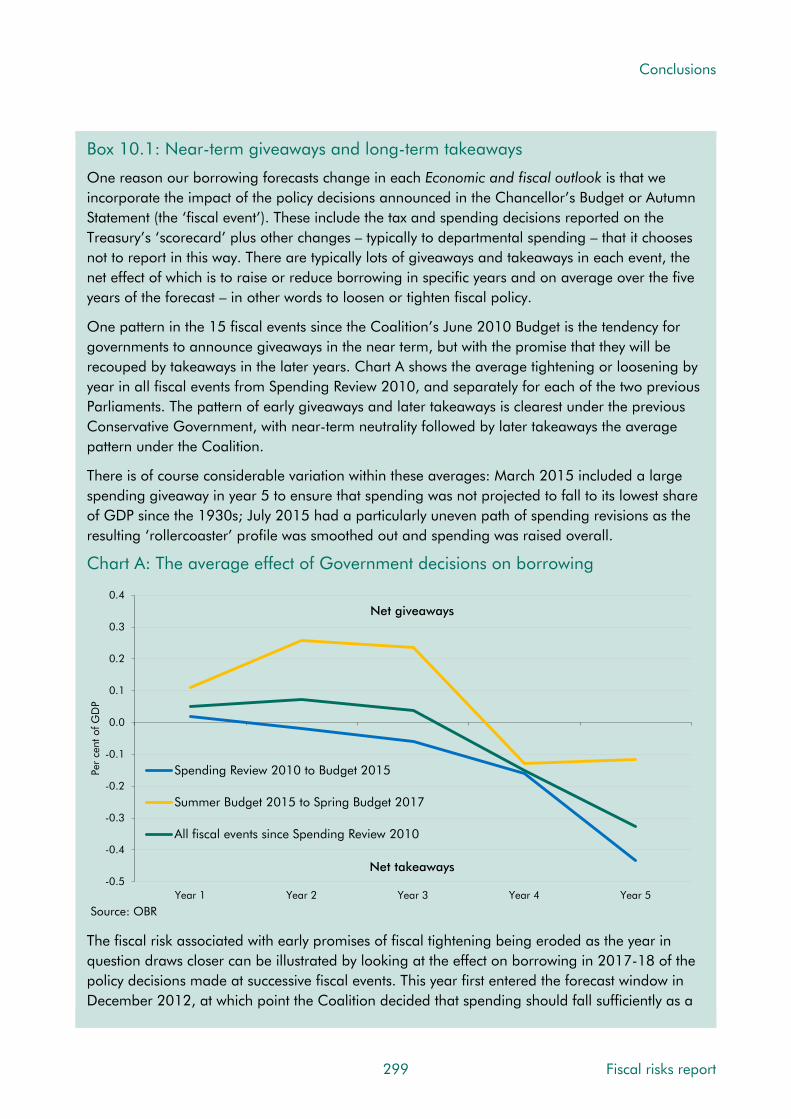
Conclusions
Box 10.1: Near-term giveaways and long-term takeaways
One reason our borrowing forecasts change in each Economic and fiscal outlook is that we incorporate the impact of the policy decisions announced in the Chancellor’s Budget or Autumn Statement (the ‘fiscal event’). These include the tax and spending decisions reported on the Treasury’s ‘scorecard’ plus other changes – typically to departmental spending – that it chooses not to report in this way. There are typically lots of giveaways and takeaways in each event, the net effect of which is to raise or reduce borrowing in specific years and on average over the five years of the forecast – in other words to loosen or tighten fiscal policy.
One pattern in the 15 fiscal events since the Coalition’s June 2010 Budget is the tendency for governments to announce giveaways in the near term, but with the promise that they will be recouped by takeaways in the later years. Chart A shows the average tightening or loosening by year in all fiscal events from Spending Review 2010, and separately for each of the two previous Parliaments. The pattern of early giveaways and later takeaways is clearest under the previous Conservative Government, with near-term neutrality followed by later takeaways the average pattern under the Coalition.
There is of course considerable variation within these averages: March 2015 included a large spending giveaway in year 5 to ensure that spending was not projected to fall to its lowest share of GDP since the 1930s; July 2015 had a particularly uneven path of spending revisions as the resulting ‘rollercoaster’ profile was smoothed out and spending was raised overall.
Chart A: The average effect of Government decisions on borrowing
The fiscal risk associated with early promises of fiscal tightening being eroded as the year in question draws closer can be illustrated by looking at the effect on borrowing in 2017-18 of the policy decisions made at successive fiscal events. This year first entered the forecast window in December 2012, at which point the Coalition decided that spending should fall sufficiently as a
-0.5
-0.4
-0.3
-0.2
-0.1
0.0
0.1
0.2
0.3
0.4
Year 1 Year 2 Year 3 Year 4 Year 5
Per
cent
of G
DP
Spending Review 2010 to Budget 2015
Summer Budget 2015 to Spring Budget 2017
All fiscal events since Spending Review 2010
Source: OBR
Net giveaways
Net takeaways
299 Fiscal risks report

Conclusions
share of GDP to meet its deficit target. In the 11 fiscal events since then around 600 scorecard policy decisions, plus other changes to spending, have affected our forecasts for borrowing in 2017-18. Chart B shows how further tightening was layered on until Autumn Statement 2014, after which point every subsequent fiscal event included net giveaways. The cumulative effect of these was to reverse two-thirds of the peak tightening and one-third of the initial tightening. This Autumn’s Budget could change the final position once more.
This switch from takeaways to giveaways did not occur because the underlying forecast for the public finances had improved in such a way that the earlier takeaways had proved unnecessary. Rather the Government has become less ambitious for net borrowing. In Autumn Statement 2012 the Coalition had set its spending plans consistent with achieving a structural budget deficit of 0.3 per cent of GDP in 2017-18; by Autumn Statement 2014 that was little changed at 0.5 per cent; whereas the Conservative Government opted for one of 2.9 per cent of GDP in March.
Chart B: The effect of Government decisions on borrowing in 2017-18
-3.0
-2.5
-2.0
-1.5
-1.0
-0.5
0.0
0.5
1.0
Dec 12 Mar 13 Dec 13 Mar 14 Dec 14 Mar 15 Jul 15 Nov 15 Mar 16 Nov 16 Mar 17
Per
cent
of G
DP
Individual fiscal events
Cumulative effect
Source: OBR
Net giveaways
Net takeaways
Fiscal risks report 300
Risks to the fiscal mandate
10.11 Only some of the risks we have identified would be sufficient on their own to imperil the Government’s medium-term ‘fiscal mandate’ for the structural deficit to come below 2 per cent of GDP by 2020-21. On our March forecast, it had headroom of just over 1 per cent of GDP (around £26 billion) against that target. Based on the accuracy of past official forecasts, this implies a roughly 35 per cent chance that the mandate would be missed. Around £½ billion of that headroom was used up when the Spring Budget policy measure to raise National Insurance contributions by the self-employed was subsequently dropped.
10.12 Of the risks covered in Figure 10.1, another financial crisis or a sustained shortfall in trend productivity and GDP growth would be enough on their own to breach the mandate. A tail-risk event like the stress test discussed in Chapter 9 would also more than suffice. Given the

Conclusions
high debt-to-GDP ratio, and the sensitivity of much debt to short-term interest rates and RPI inflation, crystallisation of some interest rate or inflation risks could also be large enough.
10.13 Combinations of pressures crystallising together could also be sufficient, among them policy risks. In an environment of ‘austerity fatigue’, there are calls for higher spending in a number of areas, including the possible need for an extensive programme of fire safety measures in the wake of the Grenfell Tower tragedy. The Government also has outstanding commitments to cut income tax and a track-record of failing to implement its default fuel duty rises. Some combination of these policy-related risks could consume most, if not all, the Chancellor’s headroom in the absence of offsetting measures.
Risks to fiscal sustainability
10.14 Figure 10.2 provides a stylised illustration of the main risks to fiscal sustainability, again by size and likelihood. Relative to the medium-term, there are more we consider highly likely to occur and relatively high impact if they did. This is true of both shocks and pressures.
10.15 The figure shows that:
• At least one financial crisis and several recessions are highly likely over such a long horizon. Factoring in the downside cost of these (and assuming, for illustration, that any upside from booms that precede them offsets only half the fiscal cost of the recessions) would add tens of percentage points to the debt-to-GDP ratio. This may seem unduly one-sided, but given the historical propensity for the upside from booms to be spent (as they are not recognised as booms at the time), while the downside from busts is borrowed, the fiscal effects of such shocks could well be of this order of magnitude. And of course any individual future recession or financial crisis could have a bigger or smaller impact than the assumptions underpinning these estimates.
• Upward pressures on health and adult social care spending appear both highly likely and very large. In our 2017 Fiscal sustainability report (FSR), spending on these services was projected to rise from 8.0 to 14.6 per cent of GDP between 2021-22 and 2066-67, which would add more than 150 per cent of GDP to PSND in 2066-67. We have split these pressures into those from an ageing population – an almost inevitable source of future pressure given demographic trends to date – and other unit cost pressures – which are subject to greater uncertainty, but still seem highly likely.
• Persistent weakness in potential output growth is considered a medium likelihood – both in terms of lower net migration and of lower potential productivity growth. The fiscal impact of lower net migration is something that we assess in each FSR. It is based on plausible simplifying assumptions that suggest a significant adverse effect at a 50-year horizon (around 30 per cent of GDP). This is because migrants are more likely to be of working age than the native population, which means that the tax revenue they contribute is higher, and the public spending they consume lower, than the average of the native population. The fiscal impact of persistently weaker productivity growth is not something we typically consider in our FSRs, because the
301 Fiscal risks report

Conclusions
projections start from an assumption that spending per person of given age and gender is fixed as a share of GDP – so if weaker productivity lowered GDP it would by assumption also lower spending. This is equivalent to assuming that spending is adjusted on the basis of means, so while lower productivity growth would leave the population poorer on average it would result in less public spending rather than higher deficits. But this might not happen right away, especially if a permanent reduction in productivity growth were misinterpreted as a temporary one. To illustrate the effect of spending not adjusting to lower resources, we have shown what a small productivity growth shortfall of 0.1 percentage points a year over 50 years would mean if receipts growth fell short by an equivalent amount but spending growth was unchanged. The economy would be around 5 per cent smaller (equivalent to around £100 billion in today’s terms) and the debt-to-GDP ratio around 50 percentage points higher.
• Risks to the ‘growth-corrected interest rate’ – the difference between the effective rate paid on government debt and the growth rate of GDP – could have significant effects when cumulated over 50 years. This rate is currently negative, so reduces the debt-to-GDP ratio over our medium-term forecast. In our long-term projections we assume it is close to zero. But if it were to rise to 2½ per cent – as it averaged from the 1980s to the 2000s – the impact over 50 years would be large, magnifying the effect of other pressures on public spending.
• Tax sustainability risks that we highlight over the medium term could persist over the longer term. It seems highly likely that improvements in vehicle efficiency will continue to weigh on fuel duty receipts and that smoking will continue its long-term decline. Long-term prospects for the trends in self-employment and incorporations are less certain. We have illustrated the possible impact of these risks by extending our medium-term assumptions – over the full horizon for fuel and tobacco, and over another 10 years and at a slower pace for incorporations. Holding all else equal, the effects of these trends on the tax-to-GDP ratio would raise the debt-to-GDP ratio by single-digit amounts at the 50-year horizon.
Fiscal risks report 302
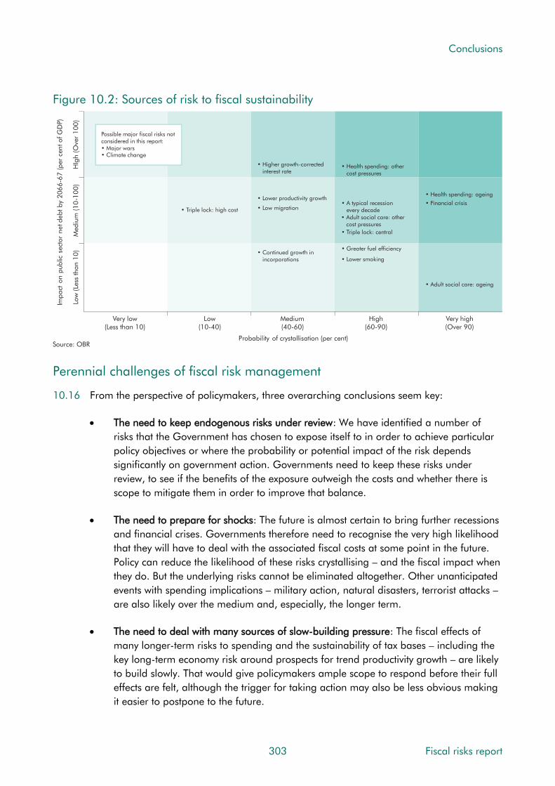
Conclusions
Figure 10.2: Sources of risk to fiscal sustainability
Impa
cton
publ
icse
ctor
netd
ebtb
y20
66
-67
(per
cen
t of G
DP)
Probability of crystallisation (per cent)
Very low(Less than 10)
Low(10-40)
Medium(40-60)
High(60-90)
Very high(Over 90)
Low
(Le
ss th
an 1
0)
Med
ium
(10
-10
0)
HIg
h (O
ver
10
0)
Source: OBR
• Financial crisis
• Higher growth-corrected interest rate
• Low migration
• Continued growth in incorporations
• Lower productivity growth
• Health spending: other cost pressures
• A typical recession every decade
Possible major fiscal risks notconsidered in this report:• Major wars• Climate change
• Adult social care: other cost pressures
• Greater fuel efficiency
• Lower smoking
• Health spending: ageing
• Adult social care: ageing
• Triple lock: central
• Triple lock: high cost
Perennial challenges of fiscal risk management
10.16 From the perspective of policymakers, three overarching conclusions seem key:
The need to keep endogenous risks under review: We have identified a number of
risks that the Government has chosen to expose itself to in order to achieve particular
policy objectives or where the probability or potential impact of the risk depends
significantly on government action. Governments need to keep these risks under
review, to see if the benefits of the exposure outweigh the costs and whether there is
scope to mitigate them in order to improve that balance.
The need to prepare for shocks: The future is almost certain to bring further recessions
and financial crises. Governments therefore need to recognise the very high likelihood
that they will have to deal with the associated fiscal costs at some point in the future.
Policy can reduce the likelihood of these risks crystallising – and the fiscal impact when
they do. But the underlying risks cannot be eliminated altogether. Other unanticipated
events with spending implications – military action, natural disasters, terrorist attacks –
are also likely over the medium and, especially, the longer term.
The need to deal with many sources of slow-building pressure: The fiscal effects of
many longer-term risks to spending and the sustainability of tax bases – including the
key long-term economy risk around prospects for trend productivity growth – are likely
to build slowly. That would give policymakers ample scope to respond before their full
effects are felt, although the trigger for taking action may also be less obvious making
it easier to postpone to the future.
303 Fiscal risks report

Conclusions
Brexit and fiscal risks
10.17 While preparing for shocks and addressing pressures, this Government will also have to negotiate the UK’s exit from the EU and establish post-Brexit policy settings for a number of economically and fiscally important issues. This process could influence the likelihood or impact of many of the risks we note in this report. For example:
• Economy-related risks that could be affected (discussed in Chapter 3) include the outlook for trade and migration flows under post-Brexit policy regimes. To the extent that any changes affect prospects for potential output growth via productivity or population growth, they could have lasting effects on the public finances. Our medium-term forecasts are based on some simple top-down assumptions about how the economy might be affected, but these are clearly subject to great uncertainty.
• Public spending risks include the size and timing of any ‘divorce bill’. The Government will also have to decide (and negotiate) whether to continue to make contributions to any EU schemes that it wishes to retain access to and whether it wishes to replace any current spending undertaken by the EU in the UK. Our medium-term forecasts include a top-down assumption that any post-Brexit savings on expenditure transfers to the EU will be used to finance additional domestic spending rather than to reduce the deficit. Clearly there are risks to both sides of this assumption.
10.18 The ‘divorce bill’ has been a particular focus of commentators, with sums as high as €75 billion in net terms (£66 billion at end-June exchange rates) mooted by some. This would be equivalent to 3.0 per cent of our forecast for nominal GDP in 2019-20 and 7.9 per cent of total spending forecast for that year. But in the context of the possible costs that would be associated with small changes in long-term economic growth prospects, even sums of this size appear less dramatic. As noted above, if GDP and receipts grew just 0.1 percentage points more slowly than projected over the next 50 years, but spending growth was unchanged, the debt-to-GDP would end up around 50 percentage points higher.
The position from which today’s fiscal risks must be faced
10.19 This Government faces the perennial sources of fiscal risk, plus need to negotiate Brexit, from a starting position that is in some key ways more challenging than that prevailing when the Labour Government was hit by the last financial crisis and recession:
• Vulnerabilities in the fiscal position: With the budget deficit at 2 to 3 per cent of GDP (only just back to its pre-crisis level), and with net debt above 85 per cent of GDP (more than twice its pre-crisis level), the fiscal position is more vulnerable to shocks than it was on the eve of the crisis in 2007. The Government is still to some extent cushioned against interest rate movements by the long average maturity of outstanding gilts. But once the APF’s holdings are taken into account – which have swapped around a third of all fixed-coupon conventional gilts for floating rate central bank reserves – the true vulnerability to short-term interest rate movements is much greater. And with index-linked gilts now amounting to nearly 20 per cent of GDP,
Fiscal risks report 304

Conclusions
vulnerability to inflation risk has risen too. The public finances are also more vulnerable than they were pre-crisis to shocks to household incomes, because of the narrower tax base and higher marginal income tax rates.
• A challenging political backdrop: the previous Government had to abandon a number of measures to increase taxes and cut welfare spending, while the new Government has just agreed a ‘confidence and supply’ arrangement that increases public spending significantly in Northern Ireland. The Chancellor of the Exchequer notes of austerity that “people are weary of the long slog”. The British Social Attitudes survey reports more support for higher tax and spending than for unchanged levels or reductions for the first time since 2007-08 (although people will be keener on higher spending than higher taxes). Debate over ongoing real cuts to public sector pay has also intensified.
Next steps
10.20 We have attempted a fairly comprehensive sweep of potential fiscal risks in this report, but there are inevitably important issues to which we have not done justice. Some examples are noted in this section. These gaps will help guide our work on fiscal risks in the coming years. We would welcome material and insights from those with expertise in these areas – and suggestions about any issues that we have missed.
Major issues
10.21 Among the potentially significant sources of fiscal risk that we have not analysed are:
• Major wars: over the very long run, the history of public debt in the UK is one of periodic wartime spikes – with the debt-to-GDP ratio moving far above 100, and even 200, per cent of GDP after the world wars of the twentieth century and the Napoleonic wars of the nineteenth. These spikes have been followed by slow peacetime falls. There are many interesting questions that could be asked about war-related fiscal risks, given the cost of military technology and the nature of geopolitical security risks.
• Climate change: over the medium and longer term, climate change has the potential to pose both sudden shocks and slower-building pressures. The Bank of England has considered the financial risks posed by these developments, noting that “These risks arise through two primary channels: the physical effects of climate change and the impact of changes associated with the transition to a lower-carbon economy.”3 The sources of climate-related fiscal risks are likely to arise through similar channels. Physical effects with fiscal implications might include catastrophic flooding, particularly if private sector insurers were unable to meet claims. Changes associated with the transition to a lower-carbon economy are likely to weigh on some existing tax bases and the tax-to-GDP ratio (as in the case of fuel duty discussed in Chapter 5).
3 Scott, van Huizen and Jung, The Bank of England’s response to climate change, Bank of England Quarterly Bulletin, 2017 Q2.
305 Fiscal risks report

Conclusions
• Cyber security: the theft, compromise or destruction of critical data could generate significant economic costs.4 Cyber-attacks are already widespread, with just under half of all UK businesses – and 70 per cent of large businesses – experiencing a malicious IT security breach over the past year.5 This was highlighted in May 2017, when large numbers of institutions around the world were hit, including the NHS in the UK. In Chapter 4 we discuss how the Bank of England has considered these risks in respect of the financial system. There are numerous ways in which cyber security could generate fiscal risks, including knock-on effects from any damage to the economy or financial system, or direct costs if government entities were the subject of successful attacks.
Cross-cutting themes
10.22 We have structured this report around the macroeconomic and specific fiscal risks that could affect prospects for public debt and fiscal sustainability more broadly. There are a number of themes that appear across different chapters that could usefully be brought together in cross-cutting analyses of the public sector’s exposure to them. For example:
• Inflation affects receipts and spending in direct and indirect ways, with both positive and negative implications for borrowing and debt. The net effect of unexpected movements in inflation will depend on the shocks that cause them. And the sensitivity of the public finances to any changes will vary over time as the tax and spending systems evolve and as the proportion of debt that is inflation-linked changes.
• Housing market fluctuations have been a feature of most economic cycles in the UK, while house prices, transactions and tenure are important drivers of many receipts and spending lines. And in recent years governments have added balance sheet exposures to housing risk via lending and guarantee schemes.
• Mental health and chronic physical conditions have been an important factor in recent upward revisions to our forecasts for spending on incapacity and disability benefits, while many commentators expect them to place further upward pressure on health and social care spending in the future.
• Interactions between different items of tax and public spending could affect fiscal risks and their management, for example where squeezing one element of public spending causes pressures to intensify in another. In Chapter 6 we note how cuts to adult social care spending in England appear to have added to pressures on the NHS. In our 2014 Welfare trends report we noted research that suggested cuts in spending on social housing may have raised the housing benefit bill, by increasing the proportion of the caseload paying higher rents in the private-rented sector.
4 Biancotti, Cristadoro, Di Giuliomaria, Fazio and Partipilo, Cyber attacks: An economic policy challenge, June 2017. 5 Klahr et al, Cyber security breaches survey 2017, April 2017.
Fiscal risks report 306

Conclusions
Lessons to learn
10.23 Each year we carry out a detailed evaluation of past forecasts that allows us to explain why, as is inevitable, the latest estimates of actual economic and fiscal developments differ from our forecasts. This affords us an opportunity to learn lessons that can be applied in future forecasts. In preparing this report, we have covered a number of issues that have not been a focus of our earlier work, and have also considered some familiar issues in new ways. This too has highlighted some lessons to learn. They include:
• Issues related to modern ways of working: in Chapters 3 and 5 we looked at how trends in self-employment and the incorporation of former employees and the self-employed have affected measures of income in the National Accounts and the average effective tax rate on employment earnings broadly defined. The ONS plans to make significant revisions to the National Accounts in this year’s Blue Book to capture these trends more effectively. Following those revisions, we will need to update the various forecast adjustments that we make to factor in their effects on receipts. We will provide an initial update in this year’s Forecast evaluation report.
• The treatment of periodic shocks in our long-term projections: at present, our FSRs focus on the slowly building spending pressures that come with an ageing population and health-related cost pressures. The only event-style risk that we factor in is the likelihood of the state pensions triple lock being triggered periodically, which we do by assuming an average effect of this across all years. In Chapters 3 and 4 we noted the near-inevitability of recessions and financial crises over a 50-year horizon. We have illustrated the effect of cycles on our long-term projections in past FSRs, but could do more to illustrate this source of risk to fiscal sustainability.
• Data completeness in relation to the balance sheet and associated flows: the analysis in Chapters 7 and 8 reinforces concerns about PSND as a measure of fiscal sustainability and notes that PSNFL and the WGA give a better perspective. For all three, there are challenges associated with available data and how to link it to the associated flows to examine underlying trends and their implications. For example, the treatment of debt stocks in PSND and interest flows in PSNB is inconsistent, which makes effective interest rate calculations potentially misleading. In addition, PSNFL and PSNB overvalue the stock and interest respectively on student loans. Meanwhile, the use of changing discount rates in the WGA makes changes over time hard to decipher.
• Information requirements for assessing the fiscal sustainability implications of health and adult social care: one key risk we set out to analyse in this report was the nature and scale of the pressures on health and adult social care spending. Given our remit, our main interest was to compare demand- and cost-led counterfactuals with existing plans to assess the risks to them. In health, this proved challenging – we present an approximate breakdown of how current plans are expected to deliver a fall in Department of Health spending as a share of GDP. In adult social care it did not prove possible – even aggregate spending plans need to be compiled from various sources.
307 Fiscal risks report

Conclusions
Given the importance of these areas to long-term fiscal sustainability, this is an issue where we will continue to work with the relevant bodies to deepen our analysis.
For the Government’s response
10.24 In this chapter we have highlighted a number of issues that the Government is likely to wish to consider when managing its fiscal risks. Among them:
• The need to review risks that governments choose to expose themselves to;
• The need to prepare for near-inevitable future shocks;
• The need to deal with many slow-building pressures;
• The challenges of dealing with those needs while negotiating Brexit;
• The challenges of doing so in an environment of apparent ‘austerity fatigue’;
• The more vulnerable starting fiscal position from which all of this is faced; and
• Sources of fiscal risk that we have not analysed – major wars and climate change.
10.25 When assessing its overall exposure to fiscal risk over the medium and long term, does the Government regard these or other issues as important for its risk management strategy and, if so, how does it intend to address them?
Fiscal risks report 308
Index of charts and tables
Chapter 1 Introduction
Table 1.1: Public sector spending and receipts in 2017-18 ............................................. 19
Table 1.2: Public sector financial liabilities and assets in 2017-18 .................................. 20
Chart 1.1: Public sector debt dynamics since 1800 ........................................................ 24
Chapter 2 The Government’s approach to fiscal risk management
Figure 2.1: The Treasury’s performance and risk reporting timetable .............................. 36
Chapter 3 Macroeconomic risks
Chart 3.1: Contributions of adult population growth to potential output growth ............... 40
Chart 3.2: The evolution of population projections since 1955 ....................................... 42
Chart 3.3: Employment rate ......................................................................................... 43
Chart 3.4: Average weekly hours worked ...................................................................... 44
Chart 3.5: Productivity growth ....................................................................................... 45
Chart 3.6: The economic cycle and its impact on the budget balance ............................. 48
Table 3.1: UK recessions since 1955 ............................................................................. 50
Chart 3.7: Past recessions and the public finances ......................................................... 51
Chart 3.8: Selected components of GDP and associated effective tax rates ...................... 57
Chart 3.9: Contributions to average quarterly GDP growth ............................................. 58
Chart 3.10: Cumulative business investment and GDP growth from the beginning of past recessions ............................................................................................. 59
Chart 3.11: Labour income share of GDP ..................................................................... 60
Chart 3.12: Growth of real GDP and real house prices .................................................. 62
Chart 3.13: Sectoral net lending ................................................................................... 64
Chart 3.14: Historical estimates of the household sector balance .................................... 65
Chart 3.15: Household gross debt to income ................................................................. 65
Chart 3.16: Historical estimates of the current account balance ...................................... 67
309 Fiscal risks report

Chapter 4 Risks from the financial sector
Chart 4.1: Consolidated non-equity liabilities of financial corporations in Europe ............ 77
Chart 4.2: Banks’ assets relative to nominal GDP .......................................................... 77
Chart 4.3: Frequency of systemic banking crisis ............................................................. 80
Table 4.1: Gross and net cash flows of financial sector interventions ............................... 82
Table 4.2: FPC indicators of financial system vulnerability .............................................. 86
Chart 4.4: Sovereign and UK banks CDS premia ........................................................... 87
Chapter 5 Revenue risks
Chart 5.1: Successive forecasts for total receipts ............................................................ 93
Chart 5.2: Two-year ahead forecast differences from successive OBR forecasts ............... 94
Chart 5.3: Sales of alternatively fuelled vehicles ............................................................. 96
Chart 5.4: Scenarios for average new vehicle efficiency and fuel duty receipts ................. 98
Chart 5.5: The proportion of adults in Great Britain who smoke and how much .............. 99
Chart 5.6: Long-term scenarios for tobacco duty receipts ............................................. 100
Chart 5.7: Alcohol clearances ..................................................................................... 101
Chart 5.8: Tax gap by tax type .................................................................................... 106
Chart 5.9: Tax gap by taxpayer group and activity ....................................................... 107
Chart 5.10: The average length of Finance Acts ........................................................... 108
Chart 5.11: Revenue cost of tax expenditures ............................................................... 109
Chart 5.12: Tax due on £50,000 of income in 2017-18 .............................................. 112
Chart 5.13: Trends in self-employment and incorporations .......................................... 113
Chart 5.14: Successive Government fuel duty rate policy assumptions ........................... 118
Chart 5.15: Stated policy and actual policy.................................................................. 119
Chart 5.16: Expected yield from anti-avoidance and operational measures announced under the Coalition and Conservative governments .......................................... 123
Chart 5.17: OBR assessment of the uncertainty of tax costings ...................................... 124
Chart 5.18: The distribution of taxpayer income and income tax liabilities ..................... 127
Chart 5.19: Recent trends and prospects for SDLT and CGT receipts ............................. 130
Chart 5.20: Estimated share of SDLT from residential transactions over £1 million ........ 131
Chart 5.21: Distribution of individual taxpayers with CGT liabilities in 2014-15 by income tax band ....................................................................................... 132
Chart 5.22: Financial sector shares of major tax bases in 2006-07 and 2014-15.......... 133
Fiscal risks report 310

Chapter 6 Primary spending risks
Chart 6.1: Successive forecasts for total public spending .............................................. 137
Chart 6.2: Two-year ahead forecast differences from successive OBR forecasts ............. 138
Chart 6.3: Average public spending per person by age ................................................ 140
Chart 6.4: DEL and AME components of total public spending ..................................... 141
Chart 6.5: UK population structure.............................................................................. 143
Chart 6.6: Triple lock premium compared to earnings growth ...................................... 144
Chart 6.7: The unanticipated rise in the numbers of deaths .......................................... 145
Chart 6.8: Change in pension spending under different demographic variants .............. 147
Chart 6.9: State pension spending projections under different SPA paths ....................... 148
Chart 6.10: Change in pension spending under different uprating factors ..................... 149
Chart 6.11: Successive universal credit rollout assumptions .......................................... 152
Chart 6.12: Public spending on health and adult social care in the G7 ......................... 155
Chart 6.13: Public spending on health and adult social care ........................................ 157
Chart 6.14: Indicators of current health spending pressures ......................................... 158
Chart 6.15: DH spending limits versus alternative Nuffield Trust scenarios .................... 160
Chart 6.16: Adult social care spending in England ....................................................... 164
Chart 6.17: Long-term projections for health and adult social care spending ................ 166
Chart 6.18: OECD projections for rise in health and long-term care spending .............. 167
Chart 6.19: Change in spending under different demographic assumptions ................. 168
Chart 6.20: Health care spending under alternative cost pressure assumptions ............. 170
Chart 6.21: Trends in provisions and contingent liabilities ............................................ 173
Chart 6.22: Provisions for NDA nuclear decommissioning ............................................ 174
Chart 6.23: NDA estimates of total future decommissioning spending .......................... 175
Chart 6.24: Yearly profile of NDA nuclear decommissioning expenditure ...................... 176
Chart 6.25: Changes in the spending profile for NDA nuclear decommissioning ........... 177
Chart 6.26: Assets of the NLF and estimated cost of associated decommissioning ......... 178
Chart 6.27: Nuclear decommissioning costs by country relative to energy generated ..... 180
Chart 6.28: Annual expenditure on clinical negligence by scheme ................................ 182
Chart 6.29: Clinical negligence provisions and contingent liabilities ............................. 183
Chart 6.30: Clinical negligence claims received by size ................................................ 184
Chart 6.31: Clinical negligence cases and value by year of incident ............................. 185
Chart 6.32: HMRC legal provisions ............................................................................. 189
Chart 6.33: HMRC contingent liabilities in litigation cases ............................................ 190
311 Fiscal risks report

Chart 6.34: Local government fiscal indicators in 2014 ................................................ 192
Chart 6.35: Local authority net current expenditure in England ..................................... 193
Chart 6.36: RDEL and CDEL spending as a share of GDP ............................................ 203
Chart 6.37: Real RDEL spending per person in the Spending Review period .................. 204
Chart 6.38: Successive forecasts for the change in RDEL from 2014-15 onwards........... 207
Chart 6.39: Long-term primary spending projections ................................................... 211
Chart 6.40: Sensitivity of spending projections to demographic variants ........................ 212
Chapter 7 Balance sheet risks
Chart 7.1: Public sector net worth ............................................................................... 215
Chart 7.2: General government net worth ................................................................... 216
Chart 7.3: Public sector net worth in selected countries ................................................. 217
Chart 7.4: Contributions to net debt ............................................................................ 219
Table 7.1: Recent large balance sheet changes affecting PSND .................................... 221
Table 7.2: Comparison of large balance sheet changes ............................................... 223
Chart 7.5: Cumulative stock flow adjustments .............................................................. 224
Chart 7.6: Student loans outstanding in the UK............................................................ 225
Chart 7.7: Net deficits in pension schemes eligible for the PPF ...................................... 233
Chart 7.8: Revaluation changes in the official reserves ................................................. 234
Chapter 8 Debt interest risks
Chart 8.1: Total debt interest spending by government sector ....................................... 239
Chart 8.2: Composition of the debt stock and associated interest payments .................. 241
Chart 8.3: Gilt redemption profile in March 2017 ........................................................ 244
Chart 8.4: Average maturity of the debt stock in G7 countries in 2016 .......................... 244
Chart 8.5: Maturity structure of outstanding debt ......................................................... 245
Table 8.1: March 2017 debt interest spending forecast and determinants ..................... 246
Table 8.2: March 2017 debt interest ready reckoner .................................................... 246
Chart 8.6: Successive forecasts for debt interest, interest rates and the stock of debt ...... 247
Chart 8.7: Sources of change in borrowing forecasts ................................................... 248
Chart 8.8: Effective interest rate and nominal GDP growth: forecasts and outturns ........ 248
Chart 8.9: DMO debt interest spending fan chart ........................................................ 252
Chart 8.10: Effective interest rates and nominal GDP growth by decade ....................... 255
Chart 8.11: Distribution of differences between the effective interest rate and nominal GDP growth ...................................................................................... 256
Chart 8.12: Fiscal adjustment required under different growth-corrected interest rates ... 258
Fiscal risks report 312
Chapter 9 A fiscal stress test
Table 9.1: Economy stress test scenario ....................................................................... 264
Table 9.2: Economy: stress test versus March forecast .................................................. 265
Table 9.3: Fiscal determinants: stress test scenario ....................................................... 266
Table 9.4: Fiscal determinants: stress test versus March forecast ................................... 267
Chart 9.1: The public finances: stress test versus March forecast ................................... 269
Table 9.5: Current receipts: the stress test scenario ...................................................... 275
Table 9.6: Current receipts: stress test versus March forecast ........................................ 276
Table 9.7: Welfare spending: stress test versus March forecast ...................................... 278
Table 9.8: Central government debt interest: stress test versus March forecast ............... 279
Table 9.9: Public spending: stress test scenario ............................................................ 280
Table 9.10: Public spending: stress test versus March forecast ...................................... 281
Table 9.11: Financial transactions: stress test scenario ................................................. 282
Table 9.12: Financial transactions: stress test versus March forecast .............................. 282
Table 9.13: Public sector net debt: stress test versus March forecast .............................. 284
Table 9.14: Fiscal aggregates and other indicators ...................................................... 286
Table 9.15: Fiscal aggregates: stress test versus March forecast .................................... 287
Chart 9.2: Real GDP .................................................................................................. 288
Chart 9.3: Potential GDP ............................................................................................ 288
Chart 9.4: Nominal GDP ............................................................................................ 289
Chart 9.5: CPI inflation .............................................................................................. 289
Chart 9.6: House price inflation .................................................................................. 289
Chart 9.7: Bank Rate .................................................................................................. 289
Chart 9.8: Unemployment rate ................................................................................... 289
Chart 9.9: Average earnings growth ........................................................................... 289
Chart 9.10: Receipts and spending: stress test versus last recession ............................... 290
Chart 9.11: Sources of two-year rise in net borrowing: crisis versus stress test ................ 293
Chapter 10 Conclusions
Figure 10.1: Sources of fiscal risk over the medium term .............................................. 298
Chart 10.A: The average effect of Government decisions on borrowing ........................ 299
Chart 10.B: The effect of Government decisions on borrowing in 2016-17.................... 300
Figure 10.2: Sources of risk to fiscal sustainability ........................................................ 303
313 Fiscal risks report