Embed Size (px)
DESCRIPTION
Excel Tutorial 4: Analyzing and Charting Financial Data. Objectives. Use the PMT function to calculate a loan payment Create an embedded pie chart Apply styles to a chart Add data labels to a pie chart Format a chart legend Create a clustered column chart - PowerPoint PPT Presentation
Citation preview

Microsoft Office 2013® ®
Excel Tutorial 4: Analyzing and Charting Financial Data

XPXPXP
New Perspectives on Microsoft Excel 2013
Objectives• Use the PMT function to calculate a loan
payment• Create an embedded pie chart• Apply styles to a chart• Add data labels to a pie chart• Format a chart legend• Create a clustered column chart• Create a stacked column chart
2

XPXPXP
New Perspectives on Microsoft Excel 2013
Objectives• Create a line chart• Create a combination chart• Format chart elements• Modify the chart’s data source• Add sparklines to a worksheet• Format cells with data bars• Insert a watermark
3

XPXPXP
New Perspectives on Microsoft Excel 2013
Visual Overview: Session 4.1
4

XPXPXP
New Perspectives on Microsoft Excel 2013
Chart Elements
5

XPXPXPIntroduction to Financial Functions• Excel provides a wide range of financial functions
related to loans and investments.• One of these is the PMT function, which can be used
to calculate the installment payment and payment schedule required to completely repay a loan.
• Other loan functions include future value, present value, calculating the interest part of a payment, calculating the principle part of a payment, and the loan interest rate.
New Perspectives on Microsoft Excel 2013 6

XPXPXPFinancial Functions for Loans and Investments
New Perspectives on Microsoft Excel 2010 7

XPXPXPWorking with Financial Functions• Cost of a loan to the borrower is largely based
on three factors:–Principal: amount of money being loaned– Interest: amount added to the principal by
the lender• Calculated as simple interest or as
compound interest– Time required to pay back the loan
New Perspectives on Microsoft Excel 2010 8

XPXPXPExplanation of Function Use
New Perspectives on Microsoft Excel 2010 9
Function Use to determine…FV (future value) How much an investment will be worth after a series of
monthly payments at some future timePMT (payment) How much you have to spend each month to repay a
loan or mortgage within a set period of time
IPMT (interest payment)
How much of your monthly loan payment is used to pay the interest
PPMT (principal payment)
How much of your monthly loan payment is used for repaying the principal
PV (present value) Largest loan or mortgage you can afford given a set monthly payment
NPER (number of periods)
How long it will take to pay off a loan with constant monthly payments

XPXPXPPMT Function Variables• To calculate the costs associated with a loan,
you must have the following information:– The annual interest rate– The number of payment periods per year– The length of the loan in terms of the total number
of payment periods– The amount being borrowed– When loan payments are due
New Perspectives on Microsoft Excel 2010 10

XPXPXPUsing the PMT Function
New Perspectives on Microsoft Excel 2010 11

XPXPXPUsing the PMT Function
New Perspectives on Microsoft Excel 2010 12

XPXPXPExcel Charts• Charts show trends or relationships in data
that are easier to see in a graphic representation rather than viewing the actual numbers or data.
• When creating a chart, remember that your goal is to convey important information that would be more difficult to interpret from columns of data in a worksheet.
New Perspectives on Microsoft Excel 2013 13

XPXPXP
New Perspectives on Microsoft Excel 2013
Choosing the Right Chart
14
Chart When to UsePie charts Small number of categories; easy to
distinguish relative sizes of slices
Column or bar chart
Several categories
Line charts Categories follow a sequential order
XY scatter charts
To plot two numeric values against one another
Custom chart Available charts don’t meet your needs

XPXPXP
New Perspectives on Microsoft Excel 2013
Communicating Effectively with Charts
• Keep it simple• Focus on the message• Limit the number of data series• Use gridlines in moderation• Choose colors carefully• Limit chart to a few text styles
15

XPXPXP4 Steps for Creating Excel Charts• Select the range containing the data you want to chart.• On the INSERT tab, in the Charts group, click the
Recommended Chart button or a chart type button, and then click the chart you want to create (or click the Quick
• Analysis button, click the CHARTS category, and then click the chart you want to create).
• On the CHART TOOLS DESIGN tab, in the Location group, click the Move Chart button, select whether to embed the chart in a worksheet or place it in a chart sheet, and then click the OK button.
New Perspectives on Microsoft Excel 2013 16

XPXPXP
New Perspectives on Microsoft Excel 2013
Creating an Excel Chart• Select a range to use as chart’s data source
17

XPXPXP
New Perspectives on Microsoft Excel 2013
Creating an Excel Chart• Select chart type that best represents the data– Use one of 53 built-in charts organized into 10
categories, or…– Create custom chart types based on built-ins
18

XPXPXPInserting a Pie Chart with the Quick Analysis Tool• After you select an adjacent range to use as a
chart’s data source, the Quick Analysis tool appears. It includes a category for creating charts. The CHART category lists recommended chart types, which are the charts that are most appropriate for the data source you selected.
New Perspectives on Microsoft Excel 2013 19

XPXPXPTo create a pie chart with the Quick Analysis tool• Make sure the correct range is selected.• Click the Quick Analysis button in the lower-
right corner of the selected range • Click the CHARTS category. – The chart types you will most likely want to use
with the selected data source are listed.• Click Pie to select the pie chart.
New Perspectives on Microsoft Excel 2013 20

XPXPXPCHARTS Category of the Quick Analysis Tool
New Perspectives on Microsoft Excel 2013 21
XPXPXP
New Perspectives on Microsoft Excel 2013
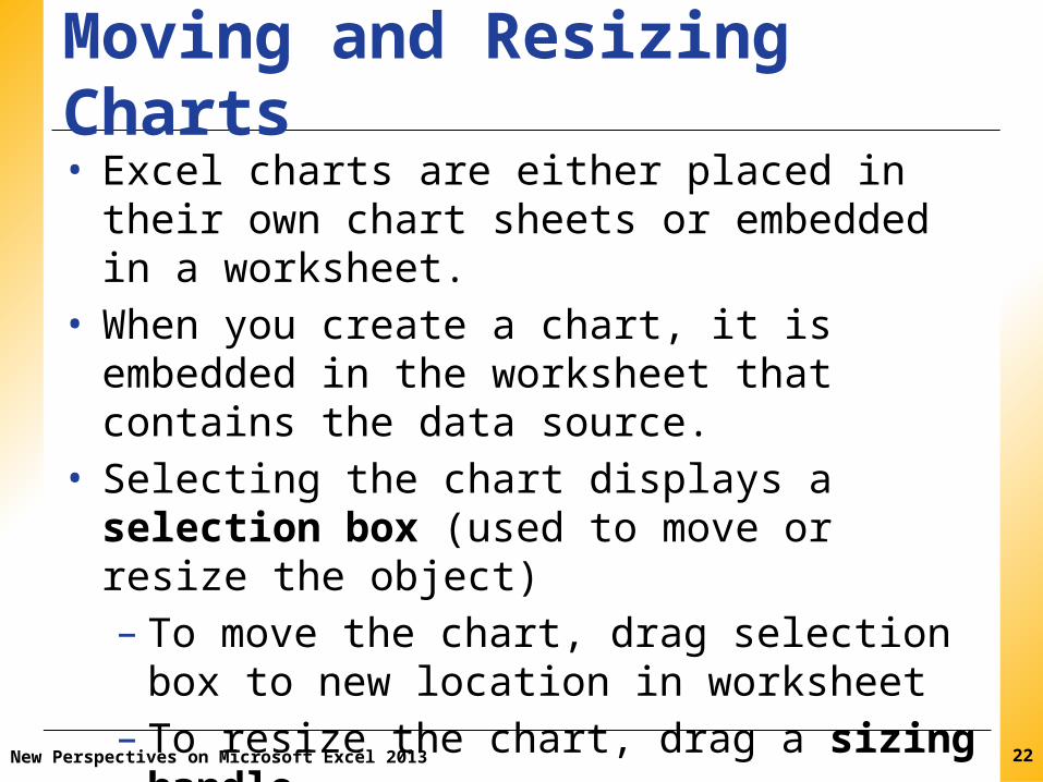
Moving and Resizing Charts• Excel charts are either placed in their own chart
sheets or embedded in a worksheet.• When you create a chart, it is embedded in the
worksheet that contains the data source.• Selecting the chart displays a selection box (used to
move or resize the object)– To move the chart, drag selection box to new
location in worksheet– To resize the chart, drag a sizing handle
22

XPXPXPChoosing a Chart Style• Recall that a style is a collection of formats that
are saved with a name and can then be applied at one time.
• In a chart, the format of the chart title, the location of the legend, and the colors of the pie slices are all part of the default chart style.
• You can quickly change the appearance of a chart by selecting a different style from the Chart Styles gallery.
New Perspectives on Microsoft Excel 2013 23

XPXPXP
New Perspectives on Microsoft Excel 2013
Designing a Pie Chart• Choose location of the legend, and format it
using tools on Chart Tools Layout tab
24
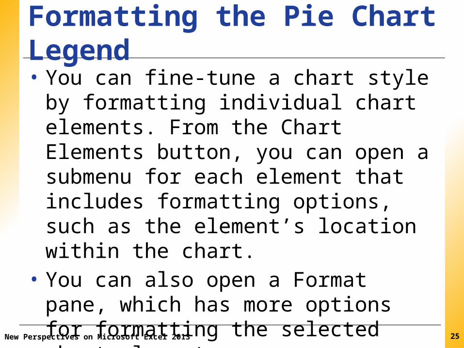
XPXPXPFormatting the Pie Chart Legend• You can fine-tune a chart style by formatting
individual chart elements. From the Chart Elements button, you can open a submenu for each element that includes formatting options, such as the element’s location within the chart.
• You can also open a Format pane, which has more options for formatting the selected chart element.
New Perspectives on Microsoft Excel 2013 25
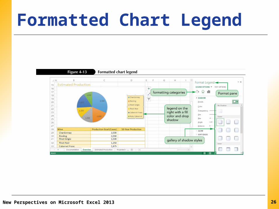
XPXPXPFormatted Chart Legend
New Perspectives on Microsoft Excel 2013 26

XPXPXP
New Perspectives on Microsoft Excel 2013
Formatting Pie Chart Data Labels
27

XPXPXPFormatting the Chart Area• The chart’s background, which is called the
chart area, can also be formatted using fill colors, border styles, and special effects such as drop shadows and blurred edges.
• The chart area fill color used in the pie chart is white, which blends in with the worksheet background.
New Perspectives on Microsoft Excel 2013 28

XPXPXP
New Perspectives on Microsoft Excel 2013
Designing a Pie Chart• Exploded pie charts–Move one slice away from the others–Useful for emphasizing one category above
all of the others
29

XPXPXPPerforming What-If Analyses and Filtering with Charts• A chart is linked to its data source, and as
changes are made to the data source the changes translate to the chart allowing a visual representation of the What-if changes.
• Filtering is another type of what-if analysis that limits the data to a subset of the original values in a process.
New Perspectives on Microsoft Excel 2013 30

XPXPXP
New Perspectives on Microsoft Excel 2013
Creating a Column Chart• Column chart–Displays values in different categories as
columns–Height of each column is based on its value
• Bar chart–Column chart turned on its side– Length of each bar is based on its value
31

XPXPXPFiltered Pie Chart
New Perspectives on Microsoft Excel 2013 32

XPXPXP
New Perspectives on Microsoft Excel 2013
Charts vs Pie Charts• Column/bar charts are superior to pie charts– For large number of categories or categories close
in value– Easier to compare height or length than area– Can be applied to wider range of data– Can include several data series (pie charts usually
show only one data series)
33

XPXPXPComparing Column Chart Subtypes
New Perspectives on Microsoft Excel 2013 34

XPXPXP
New Perspectives on Microsoft Excel 2013
Inserting a Column Chart• Select data source• Select type of chart to create• Move and resize the chart• Change chart’s design, layout, and format by:– Selecting one of the chart styles, or– Formatting individual chart elements
35
XPXPXP
New Perspectives on Microsoft Excel 2013
Moving a Chart to a Different Worksheet• Move Chart dialog box provides options for
moving charts
36

XPXPXP
New Perspectives on Microsoft Excel 2013
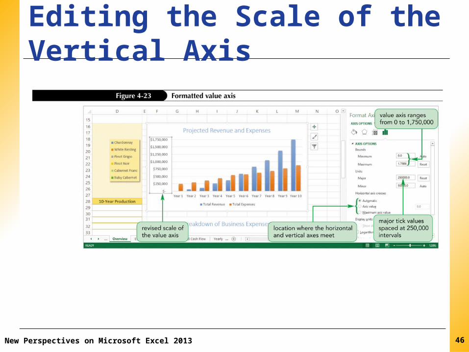
Editing the Axis Scale and Text• Range of values (scale) of an axis is based on
values in data source• Vertical (value) axis: range of series values• Horizontal (category) axis: category values• Primary and secondary axes can use different
scales and labels• Add descriptive axis titles if axis labels are not
self-explanatory (default is no titles)
37

XPXPXPChanging and Formatting a Chart Title
New Perspectives on Microsoft Excel 2013 38
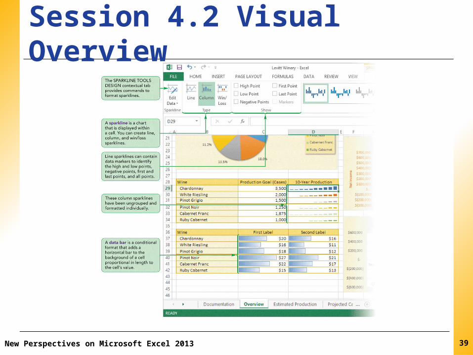
XPXPXPSession 4.2 Visual Overview
New Perspectives on Microsoft Excel 2013 39

XPXPXPCharts, Sparklines, and Data Bars
New Perspectives on Microsoft Excel 2013 40

XPXPXP
New Perspectives on Microsoft Excel 2013
Adding Sparklines and Data Bars• Both convey graphical information about
worksheet data without occupying a lot of space
41

XPXPXP
New Perspectives on Microsoft Excel 2013
Creating Sparklines• A mini chart displayed within a worksheet cell• Compact in size; doesn’t include chart
elements• Goal is to convey maximum amount of
graphical information in a very small space• Can be grouped or ungrouped–Grouped sparklines share a common format–Ungrouped sparklines can be formatted
individually
42

XPXPXP
New Perspectives on Microsoft Excel 2013
Types of Sparklines• Line sparkline– Highlights trends
• Column sparkline– For column charts
• Win/Loss sparkline– Highlights positive and
negative values
43
XPXPXP
New Perspectives on Microsoft Excel 2013
Adding and Formatting Sparkline Markers• Can specify only line color and marker color• Can create line markers for highest value,
lowest value, all negative values, first value, and last value
• Can create markers for all data points regardless of value or position in data source
• Can add an axis to a sparkline – horizontal line that separates positive and negative values
44
XPXPXP
New Perspectives on Microsoft Excel 2013
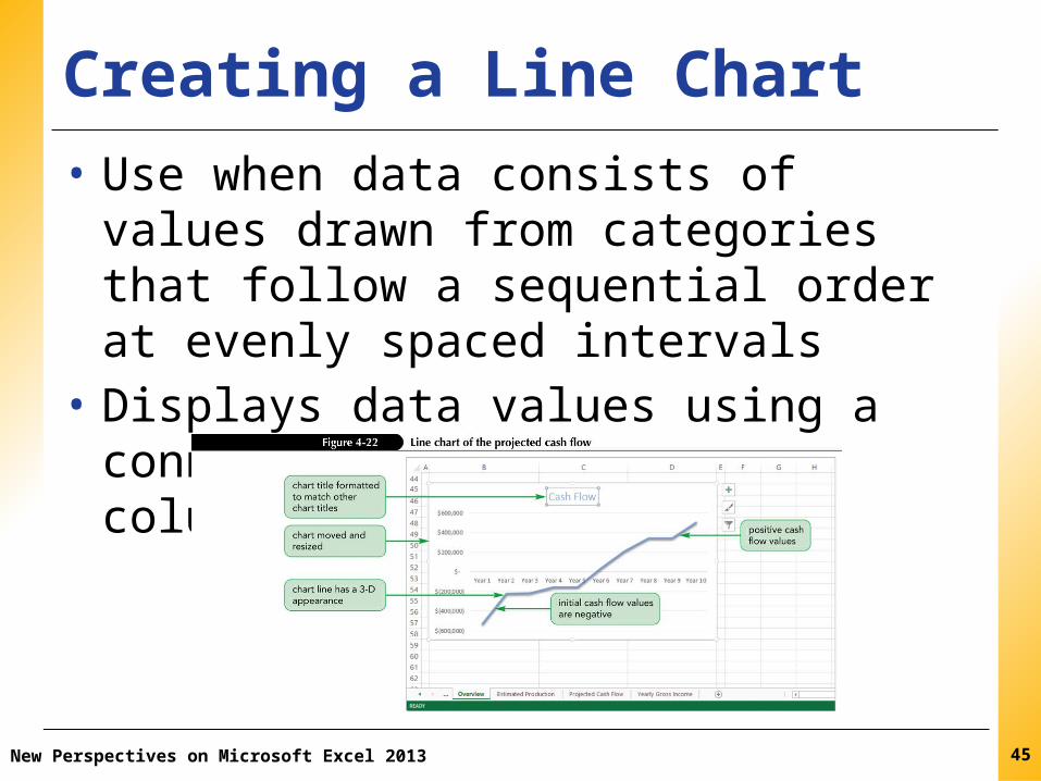
Creating a Line Chart • Use when data consists of values drawn from
categories that follow a sequential order at evenly spaced intervals
• Displays data values using a connected line rather than columns or bars
45
XPXPXP
New Perspectives on Microsoft Excel 2013
Editing the Scale of the Vertical Axis
46

XPXPXP
New Perspectives on Microsoft Excel 2013
Formatting the Chart Columns• Columns usually have a common format –
distinguished by height, not color
47

XPXPXP
New Perspectives on Microsoft Excel 2013
Working with Column Widths
48

XPXPXPFormatting Data Markers
New Perspectives on Microsoft Excel 2013 49

XPXPXPFormatting the Plot Area
New Perspectives on Microsoft Excel 2013 50

XPXPXPCreating a Combination Chart
New Perspectives on Microsoft Excel 2013 51
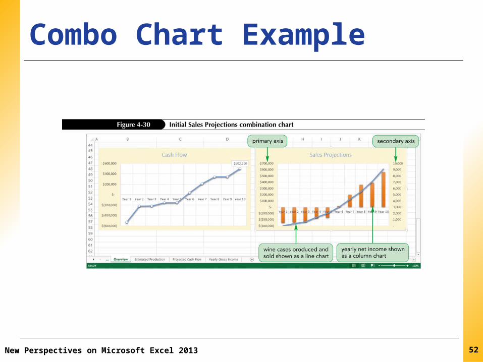
XPXPXPCombo Chart Example
New Perspectives on Microsoft Excel 2013 52

XPXPXPCreating Sparklines
New Perspectives on Microsoft Excel 2013 53

XPXPXP
New Perspectives on Microsoft Excel 2013
Creating Data Bars• Conditional format that adds a horizontal bar to
background of a cell containing a numeric value– Length based on value of each cell in selected
range• Dynamic– Lengths of data bars automatically update if cell’s
value changes
54
XPXPXP
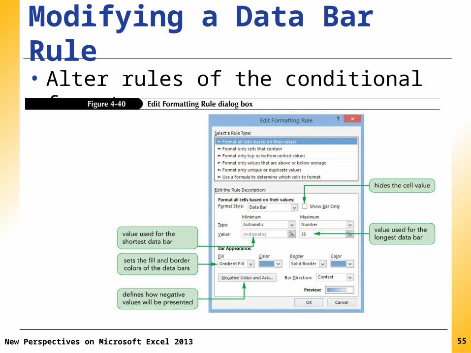
New Perspectives on Microsoft Excel 2013
Modifying a Data Bar Rule• Alter rules of the conditional format
55

XPXPXPInserting a Watermark
New Perspectives on Microsoft Excel 2013 56