Embed Size (px)
Citation preview

UCL EDUCATION & INFORMATION SUPPORT DIVISIONINFORMATION SYSTEMS
Excel 2003
Charting with Excel
Document No. IS-024 v4

Contents
Chart types..............................................................................................2Chart terms 3Choosing an appropriate chart type 4Change the default chart format 5
Creating charts using the Chart Wizard.................................................6Plotting non-adjacent cells...................................................................10Adding unattached text.........................................................................10Changing the appearance of the chart.................................................11Changing the chart type.......................................................................11Adding and removing data sets.............................................................12Formatting a chart................................................................................13
Formatting the chart area 13Formatting the data series 14Formatting the legend 14Formatting gridlines 15Formatting axes 15Picture charts 173-Dimensional charts 18The series function 19Resizing charts and chart objects 19
Using a secondary axis..........................................................................20Plotting error bars................................................................................21Printing a chart.....................................................................................22Common mistakes.................................................................................23Trendlines.............................................................................................25
Using trendlines in a chart 25Copying charts into Word or PowerPoint.............................................27
Terminology 27Embedded objects 27Linked objects 27Inserting a linked or embedded Excel chart 28
Learning more.......................................................................................31
IntroductionThis guide can be used as a reference or tutorial document. To assist your learning, a series of practical tasks are available. You may download a copy of this document from www.ucl.ac.uk/is/training/documentsIf you wish to attempt the exercises contained in the exercise document and you are not using a training account, it is necessary to download the training files used in this workbook from the IS training web site at: www.ucl.ac.uk/is/training/documents. Full instructions on how to do this are provided there.
Document No. IS-024 v4 25/08/2007
Online resources There is also a comprehensive range of online training in Excel available via The Learning Zone at www.ucl.ac.uk/elearning
UCL Information Systems 25/08/2007

Introduction to chartsIt can be difficult to make sense of tables of figures presented in a spreadsheet or table; graphs or charts based on the figures can assist understanding greatly. Charts can be used to:
Compare item to other items (e.g. student numbers for different departments)
Compare data over time (e.g. student numbers since 1980) Make relative comparisons (e.g. the proportion of Labour, Conservative,
Lib Dem and Green votes) Compare data relationships (e.g. marketing expenditure/student
numbers)Charts may involve just continuous, numerical data, or they may combine categorical with continuous (or quantitative) data.
Continuous variables - These can have a very large number of possible values – for example, distance or length.
Categorical variables - These can have a limited number of values, each of which corresponds to a specific category or level – for example, country or eye-colour.
Choice of chart typeYour choice of chart type will depend on whether you are dealing with solely continuous, or categorical and continuous data.
A scatterplot shows the relation of two or more continuous variables. A bar or column chart uses bars or columns to show frequencies or
values for different categories. A line chart uses lines joining data points to show values for different
categories. A pie chart shows percentage values for different categories as a slice
of a pie. A histogram shows the number of points that fall within various numeric
ranges (or bins).
Charting in Excel Creating charts in Excel is very straightforward. You simply highlight a range of data in a Worksheet, and prompt Excel to create the required chart. Charts can be created either as separate sheets or embedded in a Worksheet. Chart sheets update automatically if you change the data on the sheet. In this workbook we will look at different ways of generating charts and some of the formatting and customisation options available. There are 14 standard chart types and numerous subtypes that can be created by Excel. The most popular are the line, column, bar, pie and scatterplot charts.
UCL Information Systems 1 Introduction to charts

Chart typesColumn A column chart allows a comparison of two or more items in different
categories. Values are represented as vertical columns. Each column represents a single value in the Worksheet. They are frequently used to show the variation of different items over a period of time.
Stacked column The stacked column chart can be used to show variations over a period of time, but also shows how each data series contributes to the whole.
Bar Bar charts are very similar to column charts, except that the bars are represented horizontally, rather than vertically. They are often used to compare the sizes of items.
Line A line chart is good for showing trends over time, where regular time intervals (or other units of change) are plotted on the horizontal or x-axis.
Area An area chart shows both the amount of change over time and the sum of these changes.
XY scatter XY charts, or scatter charts, are used to analyse the relationship between two sets of data (“variables”). The data need not be regularly spaced, unlike in a line chart.
Bubble A bubble chart is a type of xy (scatter) chart. The size of the data marker indicates the value of a third variable. To arrange your data, place the x values in one row or column, and enter corresponding y values and bubble sizes in the adjacent rows or columns.
Pie Pie charts are mainly used to compare the sizes of the component parts of one unit or item.
Doughnut The doughnut chart is a variation on the pie chart. The pie chart is restricted to one data series, while the doughnut chart is not.
Radar A radar chart is used to show the relationship between individual and group results. It has a specialist use. Each category in a radar chart has its own axis radiating from the centre point. Data points are plotted along each spoke, and data points belonging to the same series are connected by lines.
Combination A combination chart places one chart type over another. It is useful for showing the relationships between different series.
Stock The high-low-close chart is often used to illustrate stock prices. This chart can also be used for scientific data, for example, to indicate temperature changes. You must organise your data in the correct order to create this and other stock charts. A stock chart that measures volume has two value axes: one for the columns that measure volume, and the other for the stock prices. You can include volume in a high-low-close or open-high-low-close chart.
3-D charts There are 3-D versions of many of the basic chart types. They are often used for enhanced presentation purposes.
3-D surface charts
3-D surface charts present information in an almost topographical layout. They can be used to pinpoint the high and low points resulting from two changing variables. It can be helpful to think of a 3-D surface chart as a 3-D column chart with a rubber sheet stretched over the tops of the columns.
Cone, cylinder and pyramid
Cone, cylinder and pyramid data markers can lend a dramatic effect to 3-D column and bar charts.
Learning more 2 UCL Information Systems

Chart termsExcel uses a number of different terms to identify the elements of a chart as shown below:
Term Meaning
Data points Data points are represented by horizontal bars, lines, columns, sectors points and other data markers. The values from the Worksheet determine the size/position of the data markers.
Data Series Data points which come from the same row or column in a Worksheet are grouped in data series.
Legend The ‘key’ to the chart, identifying which patterns/colours relate to which data series.
Value axis (y-axis) The value axis is the numerical scale which shows the value of the data point. It is plotted on the vertical y-axis.
Category axis (x-axis)
The category axis is the line where the various data series are organised, or x-values in x-y charts.
Embedded charts An embedded chart is a chart displayed in the Worksheet alongside the data. When using the Chart Wizard this is the default.
Chart sheets Workbooks may contain chart sheets as well as Worksheets. A chart sheet is added to the left of the Worksheet that it is based on when you choose to create a chart on a new sheet (Insert | Chart | As New Sheet).
UCL Information Systems 3 Introduction to charts
Monthly sales
0
20,000
40,000
60,000
80,000
100,000
120,000
140,000
Jan Feb Mar Apr May Jun Jul Aug Sep Oct Nov Dec
Month
Sale
s (£
)
2003
2002
Data points (bars, lines, columns, sectors, points)
Series
(data points coming from the same row or column)
Value axis (y-axis)
Category axis (x-axis)
Gridlines
(major & minor)
Scale
(min, max, increments)
Legend

Choosing an appropriate chart typeWhere the data you want to present is divided into categories (for example, student numbers by department, or fees by course type), then a bar chart or a column chart is probably a good choice. However, if you want to plot two sets of numeric data against each other in order to analyse the relationship between them (for example, height against age, or traffic density against air pollution), then you will need to use an XY plot, where the x-axis is used to display one variable (age, traffic density) and the y-axis is used for the other variable (height, pollution). In such cases, it is tempting to use a line chart, but this will not be appropriate, as line charts assume that the data on the x-axis are organised into regular intervals or increments. Rather, you should use an XY plot where the x-axis is divided into equal intervals. The difference between the two is illustrated below – the chart on the left is a line chart; that on the right is an xy plot. At a glance they apprear very similar but look carefully at the x-axis for each chart. The original data show how baby heights vary with age. The age intervals are initially every 3 months, but change to 6 month intervals after 12 months.
Age (months) Girl height (cm) Boy height (cm)0 52 543 58 616 64 689 69 74
12 73 7918 80 9024 85 95
In the line chart (left) the x-axis starts off with even time intervals, but after 12 months the spacing goes wrong – Excel has plotted each time interval as though it were equally spaced. The plot looks like a pretty straight line. In the XY plot (right) the data have been presented correctly, and it is clear that the relationship is slightly curved. It is clear that using the wrong chart type can result in a misleading representation of the data.
Learning more 4 UCL Information Systems
Height against age (line chart)
0
20
40
60
80
100
0 3 6 9 12 18 24
Age (months)
Heig
ht (c
m)
Girl ave.height (cm)Boy ave.height (cm)
Height against age (XY plot)
0
20
40
60
80
100
0 6 12 18 24 30
Age (months)
Heig
ht (c
m)
Girl ave.height (cm)Boy ave.height (cm)
Change the default chart formatThe default chart format for Excel 2002 and 2003 is a column chart with a legend. Although you can modify this format after you create the chart, you can often save time by changing the default chart format, if you routinely use a different format. You can use either the format of the active chart or another format you've already created as the new default format.
Make the format of an active chart the default chart format1. Select the chart and then choose Chart Type from the Chart menu.2. Click the Set as Default Chart button. 3. Click Yes to confirm and then click OK.
Choose a different default chart format1. Select the chart and then choose Chart Type from the Chart menu.2. Select the Type and/or Sub Type required.3. Click the Set as Default Chart button.4. Click Yes to confirm and then click OK.The formats listed include the built-in formats. Any custom formats you've added will be shown on the Custom Types tab.
UCL Information Systems 5 Introduction to charts

Creating charts using the Chart WizardCharts in Excel are created using the Chart Wizard – a four step wizard that makes the procedure fairly straightforward. The steps are as follows:
1. Chart Type2. Chart Source Data3. Chart Options4. Chart Location
Once you have selected the data to be charted, the wizard prompts you for the chart type (bar, column, x-y etc.), the range of cells to be plotted, and offers various formatting options. Once the chart has been created, a new Chart Toolbar will appear – this allows further customisation of the chart.
Chart Wizard step 1 – Chart type1. Before activating the Chart Wizard, you should select the data to be
plotted, remembering to include the data labels as shown.
2. From the Insert menu select Chart or click on the Chart Wizard button on the Toolbar. Step 1 of the Chart Wizard appears as shown. In this step you are offered chart types.
3. Choose a suitable chart type from the left hand panel, and, if you wish, a subtype from the right hand panel, and press Next to continue to Step 2.
Learning more 6 UCL Information Systems

Chart Wizard step 2 – Chart source dataStep 2 of the Wizard, Chart Source Data, shown below has two important tabs; one for controlling the data ranges to be plotted, and the other for selecting what to plot on the x-axis, and which series to show on the y-axis.
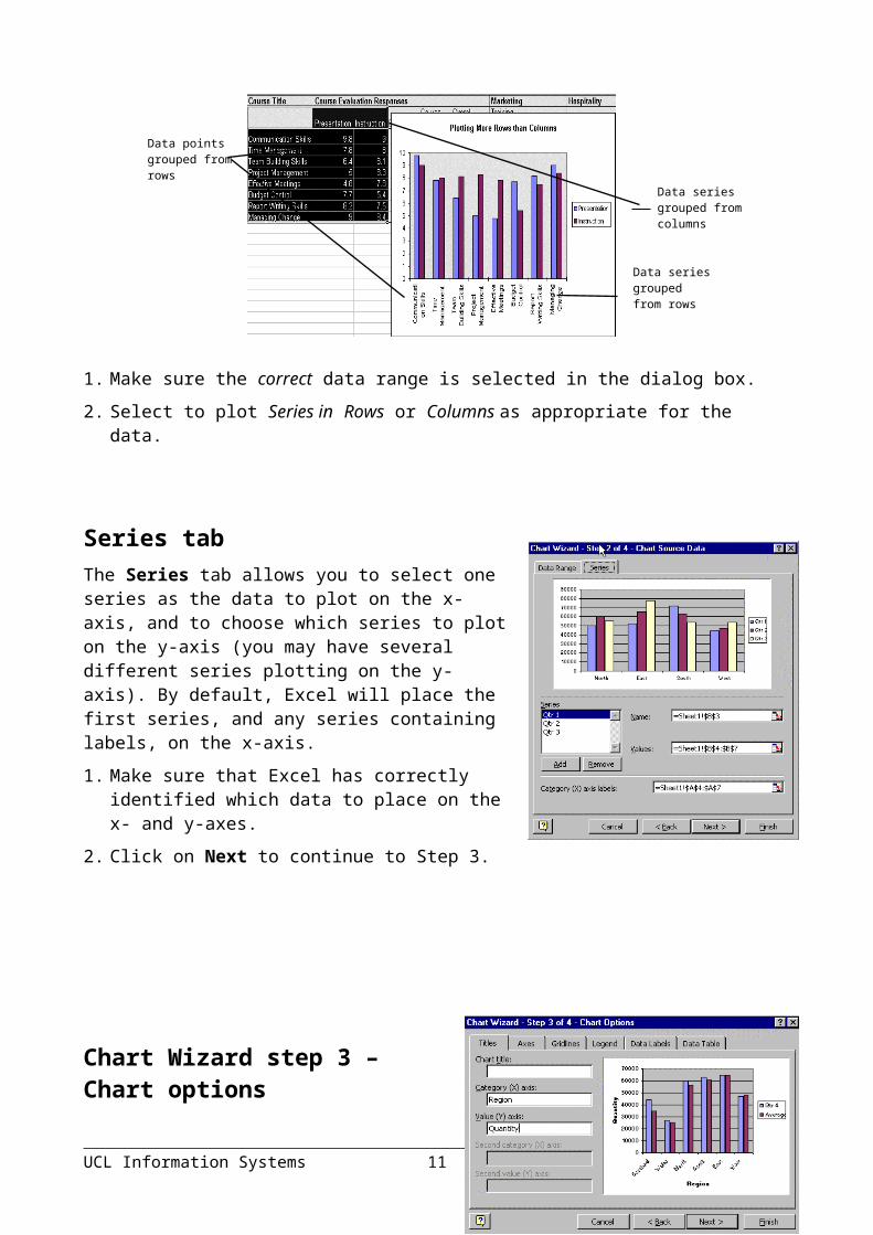
Data range tabThe range of cells selected in Step 1 will be displayed in the Data Range tab. This tab also allows you to specify whether the data are organised in rows or columns. By default, the chart is automatically plotted according to the structure of the data. If the dataset to be plotted has more rows than columns then the default is set to Data Series in Columns. If there are more columns than rows in the dataset, the Chart Wizard default is set to Data Series in Rows.
1. Make sure the correct data range is selected in the dialog box.
UCL Information Systems 7 Introduction to charts
Data points grouped from columns
Data series grouped from columns
Data points grouped from rows
Data Range tab
Series tab
Data series grouped from rows
2. Select to plot Series in Rows or Columns as appropriate for the data.
Series tabThe Series tab allows you to select one series as the data to plot on the x-axis, and to choose which series to plot on the y-axis (you may have several different series plotting on the y-axis). By default, Excel will place the first series, and any series containing labels, on the x-axis.1. Make sure that Excel has correctly identified
which data to place on the x- and y-axes. 2. Click on Next to continue to Step 3.
Chart Wizard step 3 – Chart options
In Step 3 you are presented with many more options for formatting and labelling your chart. Take some time to explore the alternatives offered by the different tabs (Titles, Axes, Gridlines, Legend, Data Labels and Data Table).
Chart elements
Options
Titles Use to label the chart axes, and to add a title to the chart itself.
Axes Use to customise or remove axis labels.
Legend Choose whether to display a legend, and where to place it.
Gridlines Choose whether to show horizontal and vertical gridlines, and at what intervals.
Data Labels Choose to add labels containing data values to the data points.
Data Table Choose to show the actual data values alongside the chart.
Learning more 8 UCL Information Systems

When you have fine-tuned the chart to your liking, click on Next to continue to the final step (Step 4).
UCL Information Systems 9 Introduction to charts
As new sheet
On this sheet
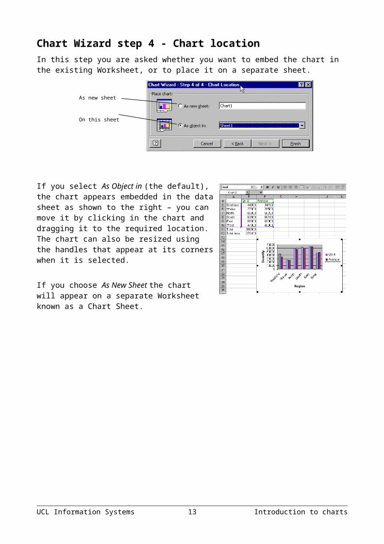
Chart Wizard step 4 - Chart locationIn this step you are asked whether you want to embed the chart in the existing Worksheet, or to place it on a separate sheet.
If you select As Object in (the default), the chart appears embedded in the data sheet as shown to the right – you can move it by clicking in the chart and dragging it to the required location. The chart can also be resized using the handles that appear at its corners when it is selected.
If you choose As New Sheet the chart will appear on a separate Worksheet known as a Chart Sheet.
Learning more 10 UCL Information Systems

Plotting non-adjacent cellsSometimes you may wish to plot data from different parts of a Worksheet. Using the Control Ctrl key, it is possible to select cell ranges that are not adjacent and to base charts on these ranges, e.g., to plot the hospitality data in our example Worksheet whilst using the course labels.1. Select the first range in the
Worksheet.2. Hold down the Ctrl key and select
the second range.3. Click on the Data Range tab in
Step 2 of the Chart Wizard to check that the range is correct, and proceed as before.
Adding unattached textFloating text may be typed directly onto the chart, and then dragged to the desired position. To add floating text to a chart:1. With your chart selected, type the text you want to see displayed on it and
press Enter. (The text will initially appear in the Formatting Bar.)2. Move the text to the desired location by clicking and dragging it.
UCL Information Systems 11 Introduction to charts
Cells selected using Ctrl key
Data range corresponding to
selected cells
Changing the appearance of the chartOnce a chart has been created, it is possible to change the settings selected at any of the steps of its creation (chart type, source data, chart options and location). Chart properties and formatting options may be accessed in several ways: the Chart Menu; the Chart Shortcut Menu; the Chart Toolbar.
The chart menu1. Select the chart by clicking on it – a Chart menu appears on the
menu bar. 2. From the Chart menu select Chart Type, Source, Options or
Location as required and make the necessary changes.
The chart shortcut menuRight-click on the selected chart – the chart short-cut menu appears as shown and includes all four Chart Wizard steps.
The chart toolbar1. Select the chart – the Chart Toolbar appears. (You can also use the View
menu and choose Toolbars to reveal it).
2. From the Chart Objects box select the part of the chart which you wish to amend.
3. Click on the Format icon to access a Format Dialog box which will allow you to modify the selected part of the chart.
4. Once you have amended the format settings in the Format Dialog box, click OK to implement the changes.
Changing the chart type1. Use the Chart Type icon on the Chart Toolbar to select an alternative
chart type.
Learning more 12 UCL Information Systems
List of chart objects from Chart Objects Box
Chart objects Box Format
Chart Type Legend
By Row
By Column
Angle Text
Data Table

2. Use the By Row and By Column icon on the Chart Toolbar to modify the data structure from Rows to Columns and vice versa.
UCL Information Systems 13 Introduction to charts
Adding and removing data setsOnce you have worked through the Chart Wizard step-by-step, you may decide that you want to add a further series to the chart. Rather than repeat the whole chart creation process, you can simply select the data to be added, and drag and drop, or copy and paste the data into the chart. Similarly, you can also remove unwanted data from charts without having to remove the entire chart.This will work with both charts embedded in a Worksheet and with charts stored on separate sheets.
Adding a data set to an embedded chart1. From the Worksheet select the data you want to
add to the chart, including any labels. 2. Point to the border area of the selected data and,
once the pointer is arrow-shaped, click and drag the data (as if moving the data in a normal drag and drop operation) over the chart and release the mouse button.
3. The new data set will automatically be added to the chart.
Adding a data set to a chart sheet1. From the Worksheet select the data you want to add to the chart, including
any labels. Click on the Copy button.2. Select the Chart Sheet.3. Click on the Paste icon.
To gain more control over the way that your data is plotted, choose Paste Special. The Paste Special dialog box is displayed.
4. In the Add cells as group specify whether you are adding a series of data (New Series), or data point(s) (New Point(s)).
5. In the Values(Y) in group specify whether the dataset is organised in Rows or Columns.
6. Choose to include the appropriate label by specifying Series Names in First Row or Categories (X Labels) in First Column.
7. Click on OK to finish.
Deleting a data series from a chart1. Select the chart.
Learning more 14 UCL Information Systems

2. Select the data series in the chart that you wish to delete (either by clicking on it or using the Chart Objects box from the Chart Toolbar).
3. Press the Delete key or select the Edit menu, Clear and Series
UCL Information Systems 15 Introduction to charts
Formatting a chartThere are two approaches to accessing formatting options – you may use the Format Menu , or alternatively double-click the part of the chart which you wish to modify to reveal a dialog box. Note that the Format menu is dynamic and the formatting options depend on the object selected.
Formatting the chart areaYou may choose to add a border to the chart, or add patterns and shading to its background.1. Right-click on the area around the chart
and select Format Chart Area.2. The dialog box pictured to the right will
appear.3. Set the Border option to add a border
around the outside of the chart area.4. Use the Area option to specify background
colours.
5. Click the Fill Effects button to select a Gradient, Texture, Pattern, or Picture.
6. Click the Font tab to set font formatting options for the whole chart.
7. Click on OK when the desired settings have been selected.
Embedded chart propertiesIf your chart is an embedded chart, a third tab page will be available which allows you to position your chart on the Worksheet in relation to cells.If you do not want the chart to be printed when you print your Worksheet, deselect the Print object box.You can also Lock the chart so that, if you protect your Worksheet, the chart cannot be edited.
Learning more 16 UCL Information Systems

Formatting the data seriesTo format the data series:Double click on any of the columns of the graph. The Format Data Series box is displayed.1. Select your choice of border, colour and style.2. Select your choice of colour.3. Click the Fill Effects button to select a
Gradient, Texture, Pattern or Picture (see separate section on Picture Charts).
4. If you want any negative values to have the pattern reversed, click the Invert if Negative button.
5. Click OK when the desired settings have been selected.
Formatting the legendYou can use the Legend icon on the Chart Toolbar to switch the legend on and off.The legend can be selected and formatted like the other chart elements. It can be positioned manually simply by clicking with the mouse and dragging it to a new position on the chart. However, using this method, the chart does adjust itself around the legend. If you position the Legend from the Placement tab using some pre-set positions, the chart will adjust itself automatically to make room for the legend.1. Double click on the legend.2. Select your preferred border, colour, or fill effect.3. Select the font.4. Click the Placement tab to select where you want to
position the legend. 5. Choose from Bottom, Corner (top right), Top, Right or
Left.6. When all the options have been dealt with satisfactorily, click on OK.
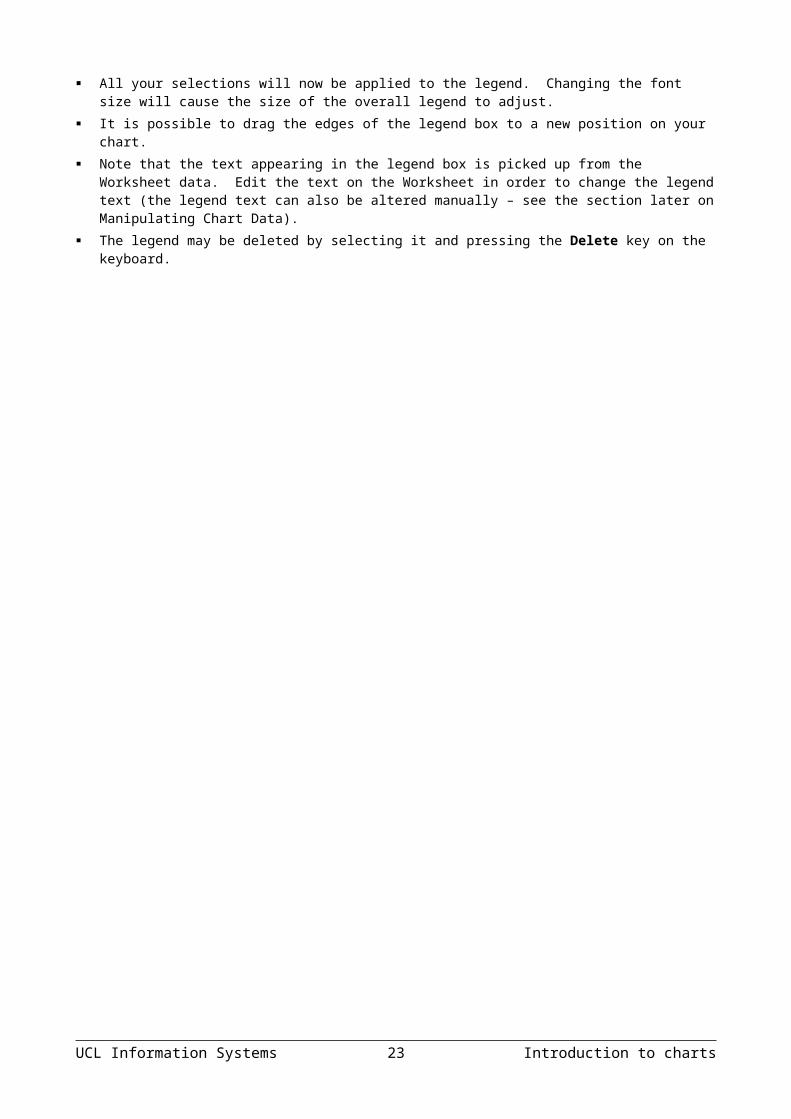
Helpful hints All your selections will now be applied to the legend. Changing the font size will cause the size of the
overall legend to adjust. It is possible to drag the edges of the legend box to a new position on your chart. Note that the text appearing in the legend box is picked up from the Worksheet data. Edit the text on the
Worksheet in order to change the legend text (the legend text can also be altered manually – see the section later on Manipulating Chart Data).
The legend may be deleted by selecting it and pressing the Delete key on the keyboard.
UCL Information Systems 17 Introduction to charts

Formatting gridlinesRight-click on one of the gridlines. The dialog box shown here will be displayed:The Pattern tab allows you to change the Style, Colour, and Weight of the Gridlines.The Scale tab allows you change the Minimum and Maximum values which will appear on the axis, etc. These options are the same as those on the Formatting the Value of the Y Axis box.If your chart values consist of large numbers, you can make the axis text shorter and more readable by changing the Display Units of the axis. For example, if the chart values range from 1,000,000 to 50,000,000, you can display the numbers as 1 to 50 on the axis and display a label that indicates that the unit is the million.
Formatting axesThe axes can be formatted to appear in different ways, or the scales of the axes can be changed. 1. Double click on either the X or Y Axis to bring up the
Format Axis dialog box. Use the Patterns tab, to affect the Line displayed on
the selected axis (see further details below). Use the Scale tab to specify where the value axis will appear, which
categories are labelled, and how many categories will appear between each pair of tick marks (see further details below).
Use the Font tab to specify font formatting for the axis labels. Use the Number tab to specify number formatting for the axis labels. Use the Alignment tab to specify the orientation of the category labels
(see further details below).2. When all options have been set, click OK to apply them to your chart.
Patterns tab Automatic will apply the default thin black
line. Custom will allow you to define the Style,
Colour and Weight of the line. None will stop the axis from showing. Under each of the Tick mark type boxes, you may specify that tick marks on the axis will appear on the inside or outside of the axis line, cross the axis line, or not appear at all. Minor
Learning more 18 UCL Information Systems

tick marks can also be included (click on the Scale... button to set the intervals for major and minor tick marks).The Tick mark labels section allows you to dictate where the labels associated with the selected axis will display. This can be at the high values end of the axis, the low values end of the axis, next to the axis, or not at all (None).
Scale tabFormatting the category (X) axisA series of check boxes allows you to set whether or not the value axis crosses between categories. The default setting is to have this box checked. This produces a value axis at the edge of a given category. Un-checking this box will result in a value axis that cuts down the middle of a category. This will also affect the location of tick marks on the axis. Categories may be displayed in reverse order if desired, and the value axis may be required to cross at the last plotted category on the chart.
Formatting the value (Y) axis1. Follow the steps described above for the
category axis.2. The Scale tab will have different options
relating to the values on the axis.From the Scale tab, you may specify the Minimum and Maximum values to appear on the axis. The intervals to be used as Major and Minor units on the axis may also be set. You may set the point at which the value and category axes cross, whether or not the axes are plotted on a logarithmic scale, or whether to have the values plotted in reverse order.If your chart values consist of large numbers, you can make the axis text shorter and more readable by changing the Display Units of the axis. For example, if the chart values range from 1,000,000 to 50,000,000, you can display the numbers as 1 to 50 on the axis and show a label that indicates that the unit is the million.
Alignment tabThe Alignment tab allows you to change the orientation of the axis values. Drag the pointer around to the required angle, or input the required angel in the Degrees box.
UCL Information Systems 19 Introduction to charts

Learning more 20 UCL Information Systems

Picture chartsIt is possible to substitute pictures or symbols representing data for the usual Excel chart markers. You may use ready-made bitmap files, or may choose to draw your pictures for use in the chart. Any picture that can be copied to the Clipboard may be used for picture charts. Note that the use of such graphics won’t be considered appropriate for all purposes.
Create a picture chartIn order to create a picture chart, you should start by preparing a 2-D column, bar or line chart.1. Select the data series whose markers you
want to replace with pictures.2. Choose Insert from the menu bar, select
Picture, and then From File.3. Locate the folder containing your ClipArt. 4. Select the picture you want to use and
click OK. The picture will appear in place of the previous data marker.
5. If the picture is being pasted into a column or bar chart, it tends to stretch out to the same size as the column or bar which it is replacing. This frequently results in distortion. You may adjust this as necessary and as described below.
Formatting the picture chartTo format the picture settings:1. Select one of the pictures and double click on it.2. From the resulting dialog box, ensure that the
Patterns tab is selected.3. Click the Fill Effects button.4. Select the Picture tab.5. Use the Format options to adjust whether the
picture stretches to the value of the plot point (Stretch), or whether you want to Stack miniaturised pictures or Stack and Scale to a specific scale.
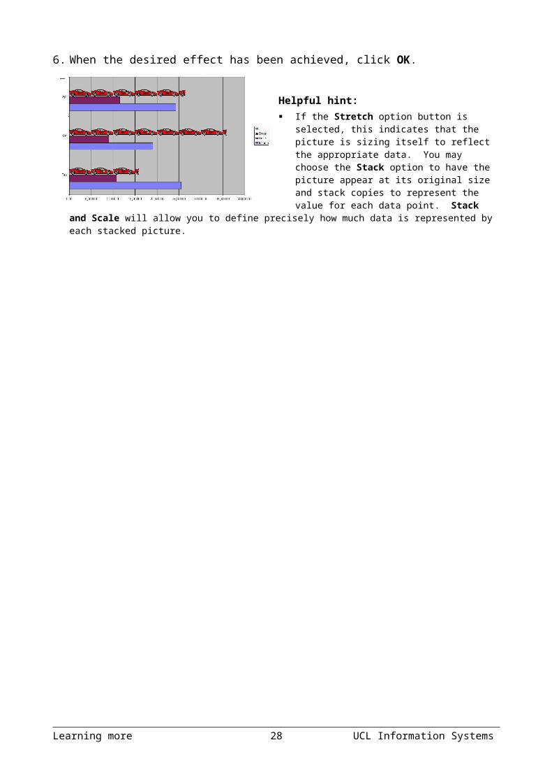
6. When the desired effect has been achieved, click OK.
Helpful hint: If the Stretch option button is selected, this
indicates that the picture is sizing itself to reflect the appropriate data. You may choose the Stack option to have the picture appear at its original size and stack copies to represent the value for
UCL Information Systems 21 Introduction to charts

each data point. Stack and Scale will allow you to define precisely how much data is represented by each stacked picture.
Learning more 22 UCL Information Systems

3-Dimensional chartsNote that 3-D charts can be confusing and more difficult to interpret, and so are probably best avoided in many circumstances. However if you have to use one, this section describes some of the formatting options particular to 3-dimensional charts.While working on a 3-D chart, many settings can be adjusted from the 3-D View dialog box. Depending on the data being displayed, some data markers on a 3-D chart may be obscured. It is possible to adjust the view so that your data may be seen to its best advantage. You may influence the degree of elevation, perspective, or rotation of your chart. A sample chart within the 3-D view dialog box reflects the new views as you change these factors.To access the 3-D View dialog box:1. Ensure the chart is a 3-D chart. If not, right-click on
the chart and select Chart Type, then select the 3-D chart type.
2. Right-click on the 3-D chart and select 3-D View. 3. Make the necessary changes.4. Choose Apply to apply the changes to your chart, but keep the dialog box
visible for more changes or click OK to close the dialog and apply your changes.
Elevation, rotation and perspective (if it is available) can be adjusted either by typing values into the appropriate sections within the dialog box, or by clicking on the arrow buttons displayed around the sample chart. The latter technique is obviously easier.
ElevationElevation sets the height from which you view the data. Ranging from 90° (above the plot area) to - 90° (below), where 0° represents a view level with the centre of the plot. With 3-D pie charts, the range varies from 10° , almost level with the edge of the pie, to 80° , looking down on the surface of the pie.
RotationRotation allows you to turn the graph on its vertical axis. The range goes from 0° to 360°, where zero views the chart from the front, 90°would view it from the side, and 180° would allow you to see it from the back – effectively reversing the order of the data series for the chart display.
PerspectivePerspective can be changed to make the data at the back of a 3-D chart appear more distant. A perspective of zero means that the farthest edge of the chart will appear as equal in width to the nearest edge. Increasing perspective (up to a maximum of 100) will make the farthest edge appear proportionally smaller. You may also affect the height of the graph in relation to its width and whether or not you want the axes to remain at right angles. This latter setting would preclude the use of perspective in 3-D charts.
UCL Information Systems 23 Introduction to charts
Auto-scaling This allows Excel to scale a 3-D chart so that, where possible, it is similar in size to its 2-D equivalent.
Adjusting rotation and elevation manually The rotation and elevation of a 3-D chart can also be adjusted manually. 1. Select any corner of the chart (the reference area should display the word
"Corners"). Black selection handles should now appear. 2. Drag one of the selection handles to a new position. Excel will display a 3-
D framework indicating the results. Release when the desired display has been achieved.
The series functionIf a data series on a chart is selected, the reference area will display the underlying formula. It can be useful to know what elements go to make up the series function, as you may edit it manually if desired. The series function includes four arguments:=SERIES(Series_Name,Categories_Ref,Values_Ref,Plot_Order)
The Series Name can be a reference (Worksheet!Cell) to the cell where the name of this particular data series is being held, or it may consist of text typed in by you and enclosed in quotation marks. The Series Name will be picked up in the legend to describe the data series.
The Categories Reference refers to the Worksheet name and range of cells where the category (or x-axis) labels are to be found. If the data series are in rows, the category references will refer to the labels at the top of each column and vice versa.
The Values Reference refers to the Worksheet name and the range of cells containing the actual values for this data series which are to be plotted on the y-axis (or z-axis on a 3-D chart).
The Plot Order number dictates the order in which the selected data series is plotted on the chart and listed on the legend.
Often, instead of amending the series function manually, you may find it easier to edit a data series using the menu option covered in the next section.
Changing the series plot order1. Select any series on the chart.2. Right-click somewhere on the chart and
select Format Data Series from the shortcut menu.
3. Click the Series Order tab to display the box opposite:
4. Click on the series name whose order you want to change.
Learning more 24 UCL Information Systems

5. Click the Move Up or Move Down buttons to change the order of the selected series.
6. Click OK to close the dialog box and apply the new order.
Resizing charts and chart objects1. Select the chart, or the part of the chart, that you wish to resize.2. A set of handles appears around the selected object. Click and drag a
handle to resize the selected object.
UCL Information Systems 25 Introduction to charts

Using a secondary axisIf you need to plot data with very different ranges on the same chart you will need to use a secondary y-axis. For example, the data below have very different ranges, and different units (currency and percerntage) and so cannot be plotted on the same axis.
Income Profit MarginJan £ 103,522.33 13%Feb £ 102,054.26 11%Mar £ 101,876.59 10%Apr £ 102,356.77 15%May £ 103,453.22 14%Jun £ 104,589.07 15%Jul £ 105,563.45 17%Aug £ 105,321.11 17%Sep £ 104,579.56 15%Oct £ 103,432.22 14%Nov £ 102,364.79 15%Dec £ 101,643.33 9%
7. To plot the series with different axes you need first to plot them on the same axis as shown below.
Income and profit margin
£ -
£ 20,000.00
£ 40,000.00
£ 60,000.00
£ 80,000.00
£ 100,000.00
£ 120,000.00
Jan Feb Mar Apr May Jun Jul Aug Sep Oct Nov Dec
Month
Income
Profit Margin
8. Now right-click on the series which you want to plot on the secondary axis (in this example, the Profit Margin).
9. Choose Format Data Series from the short-cut menu and select the Axis tab as shown.
10. Choose the Secondary axis option and click OK.
11. The chart will now have a second y-axis on the right hand side.
Learning more 26 UCL Information Systems

Plotting error barsSometimes with an XY plot you may wish to include “error bars” showing the range of data about the plotted data points. These error bars may be a fixed value or percentage above and below the data point, they might be expressed in standard deviations, or they might be different for each data point and stored in the original Worksheet. To include error bars in a chart:1. Select the data series in the chart (click on one of the data points).2. From the Format menu click Selected Data Series. The Format Data
Series window appears.3. The Y Error Bars tab offers a range of Error amount options for plotting
your error bars. You may enter fixed values or percentages, standard deviations, or you can use values stored in a Worksheet.
4. Click on the appropriate radio button to choose the type of error amount. Note that the standard deviation option is calculated based on the data in the series, and will be a fixed value for all data points. If each data point has an individual error value stored in the Worksheet, click the Custom radio button, and using the “collapse” button, select the series containing the error values from the Worksheet. If the positive and negative errors are equal, then you need to use the same series in the + and – custom error
boxes.
UCL Information Systems 27 Introduction to charts
Display options for error bars
Error amount options
Boxes for custom error
Collapse buttons
Y Error Bars tab

Printing a chartThe procedure depends on whether the chart is embedded within a Worksheet, or is held as a separate chart sheet.
Chart sheetIf a chart is held on a separate sheet, make sure that the sheet containing the chart is selected, and from the File menu choose Print.
Embedded chart1. For an embedded chart, to obtain a print-
out of the entire Worksheet including the chart, make sure that the chart is not selected, and from the File menu choose Print.
2. To obtain a print-out of an embedded chart on its own, select the chart, and from the File menu choose Print. The Print Dialog appears.
3. In the Print Dialog the Selected Chart option should be chosen.
Print quality and size1. Select the chart. From the File menu choose Page Setup and the Chart
tab. The size and quality of the printed charts can be specified from the Page Setup dialog.
2. Select the required Chart Size and Print Quality options and click OK.
Use the following options to specify how a chart will be scaled when printed:
Learning more 28 UCL Information Systems
Select required chart size. Choose Custom to print the chart as it is displayed in the Worksheet.
Select to print in black and white. When cleared, colours print as greyscale on a black-and-white printer.
Selected sheet option
Use full page Expands the chart to fit the full page. The proportions of the chart are changed to fill the page.
Scale to fit page Expands the chart to fit the full page. The proportions of the chart are preserved.Custom Scales the chart sheet as it appears on your screen so you can
adjust the chart to any size on the page.
UCL Information Systems 29 Introduction to charts

Common mistakesPlotting data out of context: the chart on the left suggests a consistent decline in sales, but the chart on the right shows this decline in a broader context.
Using a misleading scale: the chart on the left, below, suggests significant variation over time, whereas the version on the right suggests stability. It is
important to choose an appropriate scale.
Aspect ratio: You can distort the message conveyed by a chart by making it too wide, or too narrow.
Learning more 30 UCL Information Systems
Sales
0
20,000
40,000
60,000
80,000
100,000
120,000
Mar Apr May Jun Jul
£
Sales
0
20,000
40,000
60,000
80,000
100,000
120,000
140,000
Jan Feb Mar Apr May Jun Jul Aug Sep Oct Nov Dec
£
Income
£ 99,000.00
£ 100,000.00
£ 101,000.00
£ 102,000.00£ 103,000.00
£ 104,000.00
£ 105,000.00
£ 106,000.00
Income
£ -
£ 20,000.00
£ 40,000.00
£ 60,000.00
£ 80,000.00
£ 100,000.00
Sales
0
20,000
40,000
60,000
80,000
100,000
120,000
Mar Apr May Jun Jul
£
Sales
0
20,000
40,000
60,000
80,000
100,000
120,000
Mar Apr May Jun Jul
£

Too many slices of pie: The pie chart on the left is difficult to interpret. The chart on the right is more appropriate and reveals quickly that sales are greatest in March, November and December.
Over-complex chart: This chart is far too complicated and needs to be separated into several separate charts.
Inadequate labels: Every chart needs a title, axis labels, units, and a legend, and must be legible. What is this graph showing?
UCL Information Systems 31 Introduction to charts
0
5000
10000
15000
20000
25000
30000
Bev
erag
es
Con
dim
ents
Con
fect
ions
Dai
ry P
rodu
cts
Gra
ins/
Cer
eals
Mea
t/Pou
ltry
Pro
duce
Sea
food
Buchanan
Callahan
Davolio
Dodsworth
Fuller
King
Leverling
Peacock
Suyama
Drop Page Fields Here
Sum of Price
Category
Employee
Monthly sales
MonthJanFebMarAprMayJunJulAugSepOct
NovDec
Monthly sales
0
20,000
40,000
60,000
80,000
100,000
120,000
140,000
Jan Feb Mar Apr May Jun Jul Aug Sep Oct Nov Dec

TrendlinesTrendlines give a graphical representation of trends in data series. They are used for the study of problems of prediction, also called regression analysis. Using regression analysis, you can extend a trendline in a chart forward or backward beyond the actual data to show a trend. You can also create a moving average, which smoothes out fluctuations in data, showing the pattern or trend more clearly.
Using trendlines in a chartYou can add trendlines to data series in bar, column, line, and XY (scatter) charts. You cannot add trendlines to data series in 3-D, radar, pie, or doughnut charts. If you change a chart that contains data series with associated trendlines to any of these chart types, you lose the trendlines.
Adding a trendline to a data series1. If the chart is embedded on the Worksheet,
double-click the chart. If the chart is on a separate sheet, click the chart sheet tab.
2. Select the data series to which you want to add a trendline or moving average.
3. On the Chart menu, select Add Trendline.
4. On the Type tab, click the type of regression trendline or moving average you want.
5. If you selected Polynomial, enter in the Order box the highest power for the independent variable.
6. If you selected Moving Average, enter in the Period box the number of periods to be used in calculating the moving average.
Helpful hint:
Learning more 32 UCL Information Systems

A moving average is a sequence of averages computed from parts of a data series. In a chart a moving Average smoothes the fluctuations in data, thus showing the pattern or trend more clearly.
If you add a moving average to an XY (scatter) chart, the moving average is based on the order of the x values plotted in the chart. To get the result you want, you might need to sort the x values before adding a moving average.
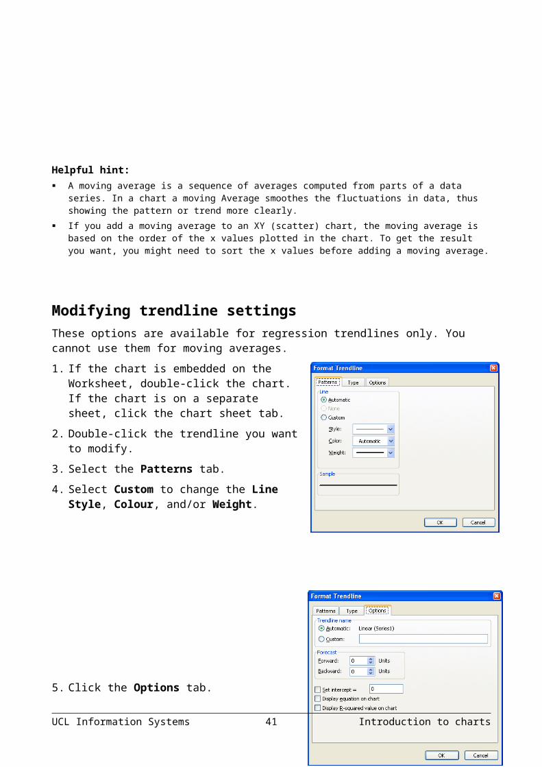
Modifying trendline settingsThese options are available for regression trendlines only. You cannot use them for moving averages.1. If the chart is embedded on the
Worksheet, double-click the chart. If the chart is on a separate sheet, click the chart sheet tab.
2. Double-click the trendline you want to modify.
3. Select the Patterns tab.4. Select Custom to change the Line Style,
Colour, and/or Weight.
5. Click the Options tab.6. To name the trendline, type a name in
the Custom box.7. Select any other options you want and
click OK.
UCL Information Systems 33 Introduction to charts

Deleting a trendline1. If the chart is embedded in the Worksheet, double-click the chart. If the
chart is on a separate sheet, click the chart sheet tab.2. Select the trendline you want to delete, and press the Delete key.
Learning more 34 UCL Information Systems

Copying charts into Word or PowerPointYou can copy and paste any chart created in Excel into a Word document or a PowerPoint slide.The main differences between linked charts and embedded charts are where the data are stored and how you update the data after you place them in the destination file.
TerminologyTerm DefinitionSource file The file that was used to create a linked or embedded chart.Destination file The file that the linked or embedded chart is inserted into.Embedded object Information from one file (a source file) that is inserted into
another file (the destination file).Linked object Information created in a source file and inserted into a
destination file, while maintaining a connection between the two files. The linked information (object) in the destination file can be updated when the source file is updated.
Embedded objectsWhen you embed an object, information in the destination file doesn't change if you modify the source file. Embedded objects become part of the destination file and, once inserted, are no longer part of the source file.Because the information is totally contained in one Word document or PowerPoint presentation, embedding is useful when you want to distribute an online version to people who don't have access to independently maintained Excel worksheets.
Edit embedded objectsTo edit an embedded object, double-click it, and then make changes to it in the source program. If you don't have the source program, you can convert the embedded object to the file format of a program you do have. (You would be prompted to do this.)
Linked objectsWhen an object is linked, information is updated only if the source file is modified. Linked data are stored in the source file. The destination file stores only the location of the source file, and it displays a representation of the linked data. Use linked objects if file size is a consideration.Linking is also useful when you want to include information that is maintained independently, and when you need to keep that information up-to-date in a Word document or PowerPoint presentation.When you link to an Excel object, you can use the text and number formatting from Excel, or you can apply the formats supplied by Word. If you use the Word formats, you can preserve formatting when the data are updated. For UCL Information Systems 35 Introduction to charts
example, you can change table layout, font size, and font colour without losing those changes once the object in the source file is updated.
Inserting a linked or embedded Excel chart12. Click in the Word document or Powerpoint slide where you want to place
the linked or embedded chart. 13. On the Insert menu, click Object. 14. Click Create from File. 15. In the File name box, type the name
of the file from which you want to create a linked or embedded Excel chart, or click Browse to locate your file.
16. Click the Insert button to close the Browse dialog box and insert your object.
17. To create a linked object, select the Link to file check box. 18. Click OK to close the dialog box and insert your object. Helpful hint: When you create a linked or embedded object from an existing Excel workbook, the entire workbook is
inserted into your page. Only one worksheet is displayed at a time. To display a different worksheet, double-click the Excel object, and then click a different worksheet (i.e., the worksheet containing the chart).
Linked charts need to be edited in the Excel.
Icon links to Excel workbooksYou can display the embedded Excel workbook in your Word document or PowerPoint slide as an icon, for example, if you want to minimize the amount of space the object uses in the document. When you double-click on the icon, a separate window will open displaying your specified workbook. To add a link icon to your document:19. Follow points 1-5 of method described above to locate the Excel workbook
to which you wish to link.20. Ensure the Link to file check box is selected.21. Click on the Display as Icon check box.22. You can change the icon if you wish by clicking on
the Change Icon button.
Learning more 36 UCL Information Systems

23. You can also change the caption that appears beneath the icon if you wish by clicking on the Change Icon button.
24. Click OK to close the Change Icon dialog box.25. Click OK again to close the Object dialog box.
UCL Information Systems 37 Introduction to charts

Breaking a linkYou can choose to break the link at any time. Should you choose to break the link, the data in your document will no longer update if the original excel file is updated.To break a link:26. From Word or PowerPoint,
with the chart selected, select Links from the Edit menu.
27. Select the link that you want to break.
28. Click on the Break Link button.29. You will be asked if you are sure you want to break the link. Click Yes.Helpful hint: It is not possible to re-instate the link. You would need to insert the chart again as a link if you change
your mind.
Copy an Excel chart into a Word document or PowerPoint presentation — method oneYou can copy and paste an existing Excel chart into your document or presentation.30. Open both the Word document or PowerPoint presentation and the Excel
worksheet that contains the data from which you want to create a linked or embedded chart.
31. Switch to Excel, and then select the entire worksheet or the chart you want to copy.
32. Click Copy. 33. Switch to the Word document or PowerPoint presentation and then click
where you want the chart to appear.
34. On the Edit menu, click Paste Special.
35. To link or embed the chart, do one of the following: To create a linked
chart, click Paste link. To create an
embedded chart, click Paste.36. In the As box, click the entry with the word "object" in its name. For
example, click Microsoft Excel Worksheet Object.37. Click OK.Learning more 38 UCL Information Systems

38. Click on the chart to select it if you want to move or resize it.Helpful hints: If you link data from a worksheet and select the Keep Source Formatting and Link to Excel option, the
linked data will match the formatting in the Excel source file. If you select the Match Destination Table Style and Link to Excel option, the linked data will be formatted in the Word default table style.
With either option you can change the formatting of the linked object in the Word document. Formatting changes you make will remain when the data are updated in the source file.
Copy an Excel chart into a Word document — method twoNote that this option only applies to Word.1. Open both the Word document and the Excel worksheet that contains the
data from which you want to create a linked or embedded chart. 39. Switch to Excel, and then select the entire worksheet or the chart you
want to copy. 40. Click Copy. 41. Switch to the document and then click where you want the chart to
appear. 42. Click the Paste button on the toolbar (or press Ctrl+V) to place the Excel
data into your document.43. A paste button will appear next to
your inserted chart.44. Click on the down arrow to display a shortcut
menu.45. For embedded data, select your choice of
formatting from the first three options.46. For linked data, select your choice of formatting from the 4th or 5th options.47. Click on the chart to select it if you want to move or resize it.
UCL Information Systems 39 Introduction to charts

Learning moreCentral IT TrainingInformation Systems run courses for UCL staff, and publish documents for staff and students to accompany this workbook as detailed below:
Getting started with Excel
This 3hr course is for those who are new to spreadsheets or to Excel, and wish to explore the basic features of spreadsheet design. Note that it does not cover formulae and functions.
Getting more from Excel (no formulae or functions)
This 3hr course is for users of Excel who wish to learn more about the non-mathematical features of Excel and to work more efficiently.
Using Excel to manage lists
This 3hr course is for those already familiar with Excel who would like to use some of its basic data-handling functions.
Excel formulae and functions
This 3hr course is aimed at introducing users already familiar with the Excel environment, to formulae and functions.
More Excel formulae and functions
This 3.5hr course is aimed at competent Excel users who are already familiar with basic functions and would like to know what else Excel can do and try some more complex IF statements.
Advanced formulae and functions
This 3.5hr course is aimed at competent Excel users who are already familiar with basic functions. It aims to introduce you to functions from several different categories so that you are equipped to try out other functions on your own.
Excel statistical functions
This course aims to introduce you to built-in Excel statistical functions and those in the Analysis ToolPak. The course covers major descriptive, parametric and non-parametric measures and tests.
Excel statistical formulae
This course covers best practice in constructing complex statistical formulae in spreadsheets using common statistical measures as example material.
Excel tricks and tips This is a 2hr interactive demonstration of popular Excel shortcuts. It aims to help you find quicker ways of doing everyday tasks. This fast-paced course is also a good all-round revision course for experienced Excel users.
Pivot tables Pivot tables allow you to organise and summarise large amounts of data by filtering and rotating headings around your data. This 2hr course also shows you how to create pivot charts.
Advanced Excel – Data analysis tools
This course aims to help you learn to use some less common Excel features to analyse your data.
Learning more 40 UCL Information Systems

Advanced Excel – Setting up and automating Excel
Would you like to customise and automate Excel to perform tasks you do regularly? If you are an experienced user of Excel, then this course is for you.
Advanced Excel – Importing data and sharing workbooks
Do you share workbooks with others? Would you like to see who has updated what? Do you know how to import data from text files or databases? This course aims to show you how.
These workbooks are available for students at the Help Desk.
Open Learning Centre The Open Learning Centre is open every afternoon for those members
of staff who wish to obtain training on specific features in Excel on an individual or small group basis. For general help or advice, call in any afternoon between 12:30pm – 5:30pm Monday – Thursday, or 12:30pm – 4:00pm Friday.
If you want help with specific advanced features of Excel you will need to book a session in advance at: www.ucl.ac.uk/is/olc/bookspecial.htm
Sessions will last for up to an hour, or possibly longer, depending on availability. Please let us know your previous levels of experience, and what areas you would like to cover, when arranging to attend.
See the OLC Web pages for more details at: www.ucl.ac.uk/is/olc
On-line learningThere is also a comprehensive range of online training available via TheLearningZone at: www.ucl.ac.uk/elearning
Getting helpThe following faculties have a dedicated Faculty Information Support Officer (FISO) who works with faculty staff on one-to-one help as well as group training, and general advice tailored to your subject discipline:
Arts & Humanities The Bartlett Faculty of the Built Environment Engineering Sciences Mathematical and Physical Sciences Life Sciences Social & Historical Sciences
See the Faculty-based support section of the www.ucl.ac.uk/is/fiso web page for more details.
UCL Information Systems 41 Introduction to charts
A web search using a search engine such as Google (www.google.co.uk) can also retrieve helpful web pages. For example, a search for "Excel tutorial” would return a useful selection of tutorials.
Learning more 42 UCL Information Systems

UCL Information Systems 1 Learning more