Embed Size (px)
Citation preview

Essays in Labor and Public EconomicsThe Harvard community has made this
article openly available. Please share howthis access benefits you. Your story matters
Citation Ganong, Peter. 2016. Essays in Labor and Public Economics.Doctoral dissertation, Harvard University, Graduate School of Arts &Sciences.
Citable link http://nrs.harvard.edu/urn-3:HUL.InstRepos:33493601
Terms of Use This article was downloaded from Harvard University’s DASHrepository, and is made available under the terms and conditionsapplicable to Other Posted Material, as set forth at http://nrs.harvard.edu/urn-3:HUL.InstRepos:dash.current.terms-of-use#LAA

Essays in Labor and Public Economics
A dissertation presented
by
Peter Nathan Ganong
to
The Department of Economics
in partial fulfillment of the requirements
for the degree of
Doctor of Philosophy
in the subject of
Economics
Harvard University
Cambridge, Massachusetts
April 2016

©2016 Peter Nathan Ganong
All rights reserved.

Dissertation Advisors: Author:
Professor Larry Katz Peter Nathan Ganong
Essays in Labor and Public EconomicsAbstract
This dissertation studies labor and public economics. Chapter 1 is titled “How Does
Unemployment A�ect Consumer Spending?” and is coauthored with Pascal Noel. We study
the spending of unemployed individuals using anonymized data on 210,000 checking accounts
that received a direct deposit of unemployment insurance (UI) benefits. Unemployment
causes a large but short-lived drop in income, generating a need for liquidity. At onset
of unemployment, monthly spending drops by 6%, and work-related expenses explain one-
quarter of the drop. Spending declines by less than 1% with each additional month of UI
receipt. When UI benefits are exhausted, spending falls sharply by 11%. Unemployment is
a good setting to test alternative models of consumption because the change in income is
large. We find that families do little self-insurance before or during unemployment, in the
sense that spending is very sensitive to monthly income. We compare the spending data
to three benchmark models; the drop in spending from UI onset through exhaustion fits
the bu�er stock model well, but spending falls much more than predicted by the permanent
income model and much less than the hand-to-mouth model. We identify two failures of the
bu�er stock model relative to the data – it predicts higher assets at onset, and it predicts
that spending will evolve smoothly around the largely predictable income drop at benefit
exhaustion.
Chapter 2 is titled “The Incidence of Housing Voucher Generosity” and is coauthored
with Rob Collinson. Most housing voucher recipients live in low-quality neighborhoods. We
iii

study how changes in voucher generosity a�ect neighborhood poverty, unit-quality and rents
using administrative data. We examine a policy making vouchers more generous across a
metro area. This policy had no impact on neighborhood poverty, little impact on observed
quality, and increased rents. A second policy, which indexed rent ceilings to neighborhood
rents, led voucher recipients to move to higher quality neighborhoods with lower crime,
poverty and unemployment. These results are consistent with a model where the first policy
acts as an income e�ect and the second as a substitution e�ect.
Chapter 3 is titled “A Permutation Test for the Regression Kink Design” and is coau-
thored with Simon Jaeger. This chapter proposes a permutation test for the Regression
Kink (RK) design—an increasingly popular empirical method for causal inference. Analo-
gous to the Regression Discontinuity design, which evaluates discontinuous changes in the
level of an outcome variable with respect to the running variable at a point at which the
level of a policy changes, the RK design evaluates discontinuous changes in the slope of an
outcome variable with respect to the running variable at a kink point at which the slope of
a policy with respect to the running variable changes. Using simulation studies based on
data from existing RK designs, we document empirically that the statistical significance of
RK estimators based on conventional standard errors can be spurious. In the simulations,
false positives arise as a consequence of nonlinearities in the underlying relationship between
the outcome and the assignment variable. As a complement to standard RK inference, we
propose that researchers construct a distribution of placebo estimates in regions with and
without a policy kink and use this distribution to gauge statistical significance. Under the
assumption that the location of the kink point is random, this permutation test has exact
size in finite samples for testing a sharp null hypothesis of no e�ect of the policy on the out-
come. We document using simulations that our method improves upon the size of standard
approaches.
iv
Contents
Abstract iii
Acknowledgments xiii
1. How Does Unemployment A�ect Consumer Spending? 1
1.1. Introduction1 . . . . . . . . . . . . . . . . . . . . . . . . . . . . . . . . . . . 1
1.2. Data and External Validity . . . . . . . . . . . . . . . . . . . . . . . . . . . 7
1.2.1. Finding UI Recipients and Building A Full View of Family Finances . 9
1.2.2. Estimating Income and Comparison to External Benchmarks . . . . 10
1.2.3. Estimating Spending and Comparison to External Benchmarks . . . . 12
1.2.4. External Validity – Geography, Age, and Checking Account Balances 16
1.2.5. Comparison Groups . . . . . . . . . . . . . . . . . . . . . . . . . . . . 17
1.3. Onset of Unemployment . . . . . . . . . . . . . . . . . . . . . . . . . . . . . 19
1.3.1. Basic Facts About Onset . . . . . . . . . . . . . . . . . . . . . . . . . 20
1.3.2. Temporary Income Loss, Permanent Income Loss, or Work-Related
Expenses? . . . . . . . . . . . . . . . . . . . . . . . . . . . . . . . . . 281This research was made possible by a data-use agreement between the authors and the JPMorgan ChaseInstitute (JPMCI), which has created anonymized data assets that are selectively available to be used foracademic research. More information about JPMCI anonymized data assets and data privacy protocols areavailable at www.jpmorganchase.com/institute. All statistics from JPMCI data, including medians, reflectcells with at least 10 observations. The opinions expressed are those of the authors alone and do not representthe views of JPMorgan Chase & Co. While working on this paper, Ganong and Noel were paid contractorsof JPMCI.
v

1.4. Spending Remains Depressed After Re-employment . . . . . . . . . . . . . . 35
1.4.1. Prior Literature Overstated Spending Drop During Unemployment . 36
1.4.2. Low-Asset Families Have a Slower Spending Recovery . . . . . . . . . 40
1.5. UI Benefit Exhaustion . . . . . . . . . . . . . . . . . . . . . . . . . . . . . . 41
1.5.1. Income Drops Sharply at Exhaustion . . . . . . . . . . . . . . . . . . 43
1.5.2. Spending Drops Sharply At Exhaustion . . . . . . . . . . . . . . . . . 44
1.5.3. Decomposition – What Kinds of Spending Drop? . . . . . . . . . . . 46
1.6. Performance of Benchmark Consumption Models . . . . . . . . . . . . . . . 47
1.6.1. Why Unemployment is a Good Test of Alternative Consumption Models 49
1.6.2. Model Setup . . . . . . . . . . . . . . . . . . . . . . . . . . . . . . . . 52
1.6.3. Bu�er Stock Fits the Data Better Than Alternative Models . . . . . 57
1.6.4. Failings of the Bu�er Stock Model . . . . . . . . . . . . . . . . . . . . 60
1.7. Conclusion . . . . . . . . . . . . . . . . . . . . . . . . . . . . . . . . . . . . . 65
2. The Incidence of Housing Voucher Generosity 67
2.1. Introduction . . . . . . . . . . . . . . . . . . . . . . . . . . . . . . . . . . . . 67
2.2. Summary of Model . . . . . . . . . . . . . . . . . . . . . . . . . . . . . . . . 71
2.3. Description of Housing Choice Vouchers and Data . . . . . . . . . . . . . . . 75
2.4. Income E�ects: Impact of Raising the Base Rent Ceiling . . . . . . . . . . . 78
2.4.1. Rebenchmarking of FMRs in 2005 . . . . . . . . . . . . . . . . . . . . 79
2.4.2. 40th æ 50th Percentile FMRs in 2001 . . . . . . . . . . . . . . . . . 91
2.5. Substitution E�ects: Tilting the Rent Ceiling with ZIP-Level FMRs in Dallas 93
2.5.1. Impacts on Neighborhood Quality . . . . . . . . . . . . . . . . . . . 96
2.5.2. Impacts on Voucher Rents and Building Quality . . . . . . . . . . . . 102
2.5.3. Comparing Policies to Improve Neighborhood Quality . . . . . . . . . 105
2.6. Conclusion . . . . . . . . . . . . . . . . . . . . . . . . . . . . . . . . . . . . . 108
vi

3. A Permutation Test for the Regression Kink Design 109
3.1. Introduction . . . . . . . . . . . . . . . . . . . . . . . . . . . . . . . . . . . . 109
3.2. Notation and Review . . . . . . . . . . . . . . . . . . . . . . . . . . . . . . . 115
3.2.1. Identification in the Regression Kink Design . . . . . . . . . . . . . . 115
3.2.2. Estimation and Identification . . . . . . . . . . . . . . . . . . . . . . 118
3.2.3. Asymptotic Bias . . . . . . . . . . . . . . . . . . . . . . . . . . . . . 120
3.3. A Permutation Test for the Regression Kink Design . . . . . . . . . . . . . 120
3.3.1. The Thought Experiment . . . . . . . . . . . . . . . . . . . . . . . . 120
3.3.2. The Permutation Test Statistic . . . . . . . . . . . . . . . . . . . . . 121
3.3.3. The Randomization Assumption . . . . . . . . . . . . . . . . . . . . . 123
3.3.4. Exact Size For Testing the Null Hypothesis of Policy Irrelevance . . . 125
3.4. Applications of the Permutation Test . . . . . . . . . . . . . . . . . . . . . . 126
3.4.1. Illustration of Permutation Test . . . . . . . . . . . . . . . . . . . . . 126
3.4.2. Simulation Study I: Performance of Permutation Test . . . . . . . . . 128
3.4.3. Simulation Study II: Type I and Type II Errors . . . . . . . . . . . . 132
3.5. Conclusion . . . . . . . . . . . . . . . . . . . . . . . . . . . . . . . . . . . . . 135
Bibliography 136
A. Appendix to Chapter 1 (Unemployment) 146
A.1. Data . . . . . . . . . . . . . . . . . . . . . . . . . . . . . . . . . . . . . . . . 146
A.1.1. Sample Construction, Subsamples, and Winsorization . . . . . . . . . 146
A.1.2. Categorizing Income and Spending . . . . . . . . . . . . . . . . . . . 148
A.2. Unemployment Appendix: Robustness Checks . . . . . . . . . . . . . . . . . 148
A.2.1. Empirics – Onset of Unemployment . . . . . . . . . . . . . . . . . . . 148
A.2.2. Empirics – Benefit Exhaustion . . . . . . . . . . . . . . . . . . . . . . 149
A.2.3. Empirics – Income Recovery Rates in Other Datasets . . . . . . . . . 149
vii

A.2.4. Model . . . . . . . . . . . . . . . . . . . . . . . . . . . . . . . . . . . 150
B. Appendix to Chapter 2 (Housing Vouchers) 161
B.1. Model . . . . . . . . . . . . . . . . . . . . . . . . . . . . . . . . . . . . . . . 161
B.1.1. Environment . . . . . . . . . . . . . . . . . . . . . . . . . . . . . . . 161
B.1.2. Solution . . . . . . . . . . . . . . . . . . . . . . . . . . . . . . . . . . 162
B.1.3. Comparative Statics . . . . . . . . . . . . . . . . . . . . . . . . . . . 164
B.1.4. Robustness . . . . . . . . . . . . . . . . . . . . . . . . . . . . . . . . 165
B.2. Data . . . . . . . . . . . . . . . . . . . . . . . . . . . . . . . . . . . . . . . . 168
B.2.1. Sample Construction . . . . . . . . . . . . . . . . . . . . . . . . . . . 168
B.2.2. 2005 FMR Rebenchmarking . . . . . . . . . . . . . . . . . . . . . . . 168
B.2.3. Nonvoucher Rents and 2005 FMR Rebenchmarking . . . . . . . . . . 169
B.2.4. Hedonic Quality . . . . . . . . . . . . . . . . . . . . . . . . . . . . . . 170
B.2.5. Dallas ZIP-Level FMRs . . . . . . . . . . . . . . . . . . . . . . . . . 173
C. Appendix to Chapter 3 (Regression Kink) 183
C.1. Overview of Existing RK Papers . . . . . . . . . . . . . . . . . . . . . . . . 183
C.2. Proof of Finite Sample Size of Permutation Test . . . . . . . . . . . . . . . 185
C.3. Extension of Simulation Study II: t-distributed Errors and Heteroskedasticity 187
C.4. Performance of Estimation Alternatives in Monte Carlo Simulation Study . . 188
viii

List of Tables
1.1. Representativeness: Income in JPMCI Data Compared to External Benchmarks 13
1.2. Representativeness: Spending in JPMCI Data Compared to External Bench-
marks . . . . . . . . . . . . . . . . . . . . . . . . . . . . . . . . . . . . . . . 15
1.3. Representativeness: Assets in JPMCI Data Compared to External Benchmarks 18
1.4. Summary of Changes at Onset, During UI Receipt, and Benefit Exhaustion . 25
1.5. Income and Spending at Onset of Unemployment . . . . . . . . . . . . . . . 29
1.6. Spending Drop Compared to Prior Literature . . . . . . . . . . . . . . . . . 38
1.7. Income and Spending for Families Who Exhaust UI Benefits . . . . . . . . . 48
1.8. Model Parameters . . . . . . . . . . . . . . . . . . . . . . . . . . . . . . . . . 55
2.1. Summary Statistics for Across-the-Board Rent Ceiling Changes . . . . . . . 84
2.2. E�ect of County/Metrowide Price Ceiling Increase on Prices and Quality . . 87
2.3. E�ect of County/Metrowide Rent Ceiling Increase on Rents . . . . . . . . . 89
2.4. E�ect of County/Metrowide Price Ceiling Increase on Prices and Quality . . 94
2.5. E�ect of Tilting Rent Ceilings to ZIP-level on Neighborhood Quality . . . . 99
2.6. E�ect of Tilting Rent Ceilings to ZIP-level on Rents and Building Quality in
Dallas . . . . . . . . . . . . . . . . . . . . . . . . . . . . . . . . . . . . . . . 104
2.7. Comparison of Policies to Improve Neighborhood Quality . . . . . . . . . . . 107
3.1. Simulation Study I: Asymptotic and Randomization Inference in Comparison 131
ix
3.2. Simulation Study II: Type I and Type II Errors For Asymptotic and Ran-
domization Inference in Comparison . . . . . . . . . . . . . . . . . . . . . . . 134
C.1. Overview of Existing RK Papers . . . . . . . . . . . . . . . . . . . . . . . . 184
C.2. Simulation Study II: Type I and Type II Errors - Heteroskedastic Noise . . . 187
C.3. Simulation Study II: Type I and Type II Errors - t-distributed Noise . . . . 188
C.4. Local Polynomials and Cubic Splines Simulation . . . . . . . . . . . . . . . . 190
x

List of Figures
1.1. Representativeness: Income and Asset Distribution . . . . . . . . . . . . . . 11
1.2. Event Study: Income at UI Onset . . . . . . . . . . . . . . . . . . . . . . . . 21
1.3. Event Study: Spending at UI Onset . . . . . . . . . . . . . . . . . . . . . . . 24
1.4. Spending If Stay Unemployed . . . . . . . . . . . . . . . . . . . . . . . . . . 27
1.5. Interpreting Onset: Temporary Income Loss, Permanent Income Loss . . . . 31
1.6. Interpreting Onset: Work-Related Expenses . . . . . . . . . . . . . . . . . . 34
1.7. Spending Drop During Unemployment: Comparison to Prior Work . . . . . 39
1.8. Event Study For 3-Month Completed UI Spells: Heterogeneity By Assets . . 42
1.9. UI Benefit Exhaustion . . . . . . . . . . . . . . . . . . . . . . . . . . . . . . 45
1.10. Welfare Losses By Model . . . . . . . . . . . . . . . . . . . . . . . . . . . . . 51
1.11. Spending If Stay Unemployed – Models Vs. Data . . . . . . . . . . . . . . . 58
1.12. Matching Spending Drop at Exhaustion . . . . . . . . . . . . . . . . . . . . 63
2.1. Unit Availability and Rent Distribution . . . . . . . . . . . . . . . . . . . . . 73
2.2. Event Study for Rebenchmarking . . . . . . . . . . . . . . . . . . . . . . . . 81
2.3. Impacts of Rebenchmarking: Rents and Quality . . . . . . . . . . . . . . . . 86
2.4. Impacts of 40th æ 50th Percentile FMRs: Rents and Quality . . . . . . . . 95
2.5. Impact of Dallas “Tilting” on Rent Ceiling and Rents . . . . . . . . . . . . 97
2.6. Impacts of Dallas “Tilting” on Neighborhood Quality (Timeseries) . . . . . . 100
xi

2.7. Impacts of Dallas “Tilting” on Neighborhood Quality (Distribution) . . . . . 101
3.1. Piecewise Linear and Quadratic Simulated DGPs . . . . . . . . . . . . . . . 112
3.2. RK Example: UI Benefits in Austria . . . . . . . . . . . . . . . . . . . . . . 117
3.3. RK Inference Example: UI Benefits in Austria . . . . . . . . . . . . . . . . . 127
3.4. Conditional Mean Function for Simulation DGPs . . . . . . . . . . . . . . . 130
xii

Acknowledgments
I am grateful to the many professors at Harvard who generously shared their time and advice
– Larry Katz, Je� Liebman, David Laibson, Andrei Shleifer, Gary Chamberlain, Ed Glaeser,
David Cutler, Raj Chetty and Gabriel Chodorow-Reich. In graduate school, I have been
privileged to work with outstanding coauthors – Daniel Shoag, Pascal Noel, Simon Jaeger,
and Rob Collinson. Most importantly, I want to thank my parents, my sister and my wife
for their love and support throughout writing this dissertation.
xiii
1. How Does Unemployment A�ect
Consumer Spending?
1.1. Introduction1
Many Americans have little liquid assets, limited access to credit, and immediately spend
a substantial fraction of tax rebates, suggesting that financial constraints would necessitate
substantial spending reductions during unemployment.2 However, some mainstream eco-
nomic models assume that individuals are able to smooth short-term income fluctuations.3
We analyze anonymized bank account data on the spending of families receiving unemploy-
ment insurance (UI) benefits to test between these competing views.
Bank account data o�er a rich view of the financial lives of families who receive UI. We
analyze anonymized data on monthly checking account inflows and outflows assembled by1This research was made possible by a data-use agreement between the authors and the JPMorgan ChaseInstitute (JPMCI), which has created anonymized data assets that are selectively available to be used foracademic research. More information about JPMCI anonymized data assets and data privacy protocols areavailable at www.jpmorganchase.com/institute. All statistics from JPMCI data, including medians, reflectcells with at least 10 observations. The opinions expressed are those of the authors alone and do not representthe views of JPMorgan Chase & Co. While working on this paper, Ganong and Noel were paid contractorsof JPMCI.
2Evidence for this view includes Parker et al. (2013), Shapiro and Slemrod (2009) and Angeletos et al. (2001).3Shimer and Werning (2008) model optimal unemployment insurance under an assumption of perfect accessto liquidity. Blundell et al. (2008) find in a model calibrated to annual US data that there is completeinsurance of transitory shocks, except among families with permanently low income.
1

the JPMorgan Chase Institute (JPMCI). For the purposes of this research, we identify UI
receipt through direct deposit of benefits. We build a dataset with two key advantages
for studying spending during unemployment relative to surveys used in prior work.4 First,
monthly bank account data enables us to trace out high-frequency drops and rebounds in
spending at unemployment onset, re-employment and UI benefit exhaustion. Second, we can
estimate the role of work-related expenses and how much spending drops on necessities.
Recipients of UI benefits tend to be middle-class families and the JPMCI sample looks similar
to external benchmarks. Most states require UI claimants to have earnings in four of the
five quarters prior to separation, meaning that low-income workers are often ineligible for
benefits. Summary statistics on account holders in the JPMCI data are similar to external
benchmarks for total family income, spending, debt payments, checking account balances
and age.5
The first half of our paper describes the economic lives of families receiving UI. We divide our
empirical analysis into three sections: (1) the onset of UI, (2) spending for those re-employed
while receiving UI and (3) spending for those who exhaust UI benefits.
Spending drops sharply at the onset of unemployment, and this drop is better explained by
liquidity constraints than by a drop in permanent income or a drop in work-related expenses.
We find that spending on nondurable goods and services drops by $160 (6%) over the course
of two months.6 Consistent with liquidity constraints, we show that states with lower UI
4Examples include Cochrane (1991), Gruber (1997), Browning and Crossley (2001), and Stephens (2001).5For each comparison, we choose the sample in the JPMCI data that best matches an easily-accessible externalbenchmark. We compare the family income and age of UI recipients in the JPMCI data to UI recipientsin the SIPP. We compare spending and debt payments of all JPMCI families to all families the ConsumerExpenditure Survey and the Survey of Consumer Finances (SCF). We compare checking account balancesof employed families in the JPMCI data to employed families in the SCF.
6This drop in spending occurs both absolutely and relative to a control group of families with annual incomebetween $30,000 and $80,000. All income and spending estimates in this paper are reported relative to thiscontrol group.
2

benefits have a larger drop in spending at onset. It is unlikely that permanent income can
explain the drop at onset because the average lifetime income loss for UI recipients in the
JPMCI data is only 14% of one year’s income.7 Finally, we define work-related expenses as
those spending categories which decline at retirement for a sample of retirees with substantial
liquid assets. Our definition, which includes food away from home and transportation, closely
mirrors prior work by Aguiar and Hurst (2013). Work-related expenses drop more than other
expenditure categories at onset. We estimate that the excess drop in this category explains
about one-quarter of the total drop in spending at onset.
For UI recipients who are able to find work prior to exhaustion, spending remains depressed
after re-employment as they rebuild their financial bu�er. Prior work studying short-term
unemployment using annual spending data assumed that spending recovered fully upon
re-employment (Chodorow-Reich and Karabarbounis 2015). In fact, someone who is unem-
ployed for three months has 6% lower spending during unemployment and 3% lower spending
(relative to onset) after re-employment. Decreased spending after re-employment was mis-
interpreted as a drop during unemployment, leading researchers to overstate the drop in
spending for the short-term unemployed by as much as factor of three. We provide new
estimates of the spending drop for researchers calibrating optimal UI benefits in a Baily
(1978)-Chetty (2006) framework and studying how unemployment a�ects output over the
business cycle (e.g. Kaplan and Menzio (2015)).
Comparing spending of high- and low-asset families after re-employment provides further
evidence for the central role of liquidity in explaining spending behavior. Some consumption
models predict that families target a specific ratio of wealth to permanent income (Carroll
1997). To smooth an income shock of a fixed size, low-asset families need to draw down a7Both in the JPMCI data, and in a representative sample using the SIPP, we find that average UI recipientsexperience a quick recovery in their labor income. Although a prior literature started by Jacobson et al.(1993b) which studied income paths of high-tenure workers separated in mass layo�s found large permanentincome losses, there is less research about the experience of typical UI recipients.
3

larger fraction of their assets. We find empirically that spending remains depressed after
re-employment for these low-asset families as they rebuild their bu�ers, consistent with the
prediction of target ratio models.
As UI benefit exhaustion approaches, families who remain unemployed barely cut spending,
but then cut spending by 11% in the month after benefits are exhausted. Benefit exhaustion
o�ers a particularly powerful research design for studying excess sensitivity of spending to
income because the drop in income is predictable, it contains little news about a jobseeker’s
future income prospects and does not change the opportunity for home production. When
benefits are exhausted, the average family loses about $1,000 of monthly income.8 In the
same month, spending drops by $260 (11%). Grocery spending drops from $289 per month
during UI receipt to $253 per month immediately after exhaustion. Although we do not
have data on what types of foods people buy, analysis of food diaries by Aguiar and Hurst
(2005) suggests that there is a substantial change in food quality.
We take these empirical facts – the large spending drop at onset, the slow decline during UI
receipt, and the even larger spending drop at exhaustion and compare them to predictions
from three benchmark models of consumption: a permanent income consumer, a bu�er stock
consumer and a hand-to-mouth consumer.
Unemployment is a particularly good setting for testing alternative models of consumption
because it causes such a large change in family income. A literature starting with Akerlof
and Yellen (1985), Mankiw (1985) and Cochrane (1989) has argued that because ignoring
small price changes has a second-order impact on utility, a rule of thumb such as setting
spending changes equal to income changes may be “near-rational.” More recently, many
researchers have documented evidence of an immediate increase in spending in response to8Family income drops by less than the amount of lost benefits because some UI recipients find work at thetime of benefit exhaustion.
4

tax rebates and similar one-time payments.9 Some authors have interpreted this as evidence
of widespread liquidity constraints. Fuchs-Schuendeln and Hassan (2015) argue that the
high sensitivity of income to tax rebates is not su�cient to reject the permanent income
hypothesis, because the welfare cost is small of adopting rule of thumb behavior for tax
rebates. They calculate that in 18 studies using micro evidence the cost of rule of thumb
behavior is 5% or less of annual consumption. For someone who is unemployed and exhausts
UI benefits, the comparable statistic is 20%. Because the stakes are higher for unemployment,
near-rationality is less of a concern and the path of spending o�ers a more convincing test
of alternative models of consumption.
We compare the path of spending during unemployment in the data to three benchmark
models and find that the bu�er stock model fits better than a permanent income model or
a hand-to-mouth model. We calibrate a model of consumption and savings in the tradition
of Deaton (1991), Aiyagari (1994), and Carroll (1997). In our model, the only income risk
comes from unemployment. UI benefits expire after six months. The decline in spending
from onset through exhaustion in the data is equal to the decline predicted by the bu�er stock
model when agents hold assets equal to 0.84 months of income at the start of unemployment.
However, the bu�er stock model has two major failures – it predicts substantially more asset
holdings at onset and it predicts that spending should be much smoother at benefit exhaus-
tion. First, a key prediction of bu�er stock models is that agents accumulate precautionary
savings to self-insure against income risk. Our model, where unemployment is the only risk,
predicts that agents should hold three times as much assets as they do in the data.10 Second,9Examples of work estimating excess sensitivity using one-time payments include Souleles (1999), Hsieh(2003), Johnson et al. (2006), Parker et al. (2013), Baugh et al. (2013), and Kueng (2015). Baker andYannelis (2015) and Gelman et al. (2015) examine a temporary loss of labor income due to the federalgovernment shutdown.
10Models with realistic income processes predict asset holdings which are an order of magnitude larger (Gour-inchas and Parker (2002), Laibson et al. (2015)).
5

models of forward-looking agents with exponential time preferences predict that spending
should evolve smoothly in the face of predictable income changes. Even agents who have zero
assets at onset will avoid spending all of their UI benefits in order to smooth the income drop
at exhaustion. Two channels which could contribute to this sudden drop at exhaustion are
over-optimistic beliefs about UI duration which update suddenly at exhaustion (Spinnewijn
2015) and inattention prior to benefit exhaustion (Reis 2006, Cochrane 1989, Kueng 2015).
To summarize, we find that families do relatively little self-insurance when unemployed as
spending is quite sensitive to current monthly income. We built a new dataset to study
the spending of unemployed families using anonymized bank account records from JPMCI.
Using rich category-level expenditure data, we find that work-related expenses explain only
a modest portion of the spending drop during unemployment. The overall path of spending
for a seven-month unemployment spell is consistent with a bu�er stock model where agents
hold assets equal to less than one month of income at the onset of unemployment. Because
unemployment is such a large shock to income, our finding that spending is highly sensitive to
income overcomes the near-rationality critique applied to prior work. Finally, we document a
puzzling drop in spending of 11% in the month UI benefits exhaust, suggesting that families
do not prepare for benefit exhaustion.
The paper proceeds as follows. Section 1.2 describes the JPMCI data set and why it is
suited for measuring how unemployment a�ects spending. Section 1.3 quantifies the drop
in spending at the onset of unemployment and argues that liquidity constraints are a better
explanation than permanent income loss or work-related expenses. Section 1.4 shows that
families rebuild their liquid assets after re-employment, consistent with a target ratio. Section
1.5 shows that income and spending drop sharply at benefit exhaustion. Section 1.6 compares
predictions from di�erent consumption models to the data. Section 1.7 concludes.
6

1.2. Data and External Validity
We construct a dataset suitable for studying unemployment and spending using JPMCI data
from October 2012 to May 2015.11 We rely primarily on transaction-level checking account
inflows, checking account outflows, and debit card spending, which have been categorized
and aggregated to the monthly level. We also use four additional anonymized datasets
from JPMCI: spending on Chase credit cards, credit bureau records for Chase credit card
customers, estimates of annual income, and estimates of total liquid asset holdings.
Administrative spending data have four advantages over the survey datasets used to study
spending during unemployment in prior work: comprehensiveness, sample size, detailed
spending categories and monthly frequency.12 Many researchers have used the Panel Study
of Income Dynamics (PSID), but it su�ers from an ambiguous reference period and until
recently it only covered food expenditures.13 Changes in food expenditures are di�cult
to interpret around unemployment because of transitions to home production and because
food may be a necessity good (Shimer and Werning 2007). Another data source is surveys
which ask unemployed people how much they have cut spending since their job separation
11Following Aguiar and Hurst (2005), we use the word “spending” to describe a specific subset of checkingaccount outflows in the JPMCI data. We reserve the word “consumption” for discussing models such as thepermanent income consumer, the hand-to-mouth consumer, and the bu�er stock consumer. In the contextof evaluating these models, we assume that the spending in the data actually reflects monthly consumption.Also, for consistency with the prior literature, we use the letter c in equations to describe the spendingvariable.
12One exception to the widespread use of survey data to study spending during unemployment is recent workby Kolsrud et al. (2015a) which uses annual administrative data on income and asset holdings from Swedento infer spending. The Kolsrud et al. (2015a) data are superior to the JPMCI data in that they capture assetholdings across all banks, while the JPMCI data have the advantages of a monthly frequency and detailedexpenditure categories. One example of a survey with some data on income and spending at a monthlyfrequency is Hannagan and Morduch (2015).
13Examples of papers studying the impact of unemployment on food expenditure in the PSID include Cochrane(1991), Gruber (1997), Stephens (2001), Chetty and Szeidl (2007), Saporta-Eksten (2014), Chodorow-Reichand Karabarbounis (2015) and Hendren (2015). The PSID asks about “usual” weekly expenditure on food athome and then about food away from home without prompting a frequency. Most analysts have interpretedthis as referring to the prior year’s expenditure (Blundell et al. (2008), Chodorow-Reich and Karabarbounis(2015)).
7

(Browning and Crossley 2001, Hurd and Rohwedder (2010)). Relative to this prior work, the
JPMCI data cover all types of spending and a sample size of 235,000 UI recipients enables
us to study subsamples such as benefit exhaustees or low-asset families re-employed after
three months. With debit and credit card expenditure categories, we can estimate the role
of work-related expenses and understand whether someone is cutting necessity goods when
unemployed. Finally, we use the monthly frequency of the data to test predictions from
di�erent consumption models about how spending should change at re-employment and at
UI exhaustion.
Families in the JPMCI dataset look similar to external benchmarks on family income, spend-
ing in certain categories, liquid assets and age.14 This representativeness is a strength of the
JPMCI spending data in comparison with spending data from personal finance websites.15
For example, Kueng (2015) reports that median after-tax family income in Alaska in the
personal finance website dataset was about 50% higher than for a representative sample.
However, these personal finance websites have strengths relative to the JPMCI dataset, such
as better coverage of asset holdings and families with multiple checking accounts. Another
strength of the JPMCI data is the availability of anonymized information derived from credit
bureau records, including all outstanding debts and delinquencies.
14Following Baker (2014), we assume the sample unit to be analogous to a “consumer unit” in the ConsumerExpenditure Survey, a family in the Survey of Income and Program Participation, and a “primary economicunit” in the Survey of Consumer Finances. We refer to the sampling unit as a “family”, even though thefamily may have only one member.
15Recent work using data from these websites includes Baker and Yannelis (2015), Gelman et al. (2015), Baughet al. (2013), Kuchler (2014), and Kueng (2015). From a representativeness perspective, the best data sourceis administrative datasets on income and asset holding which cover all citizens like those used by Kolsrudet al. (2015a) and Kostøl and Mogstad (2015).
8

1.2.1. Finding UI Recipients and Building A Full View of Family
Finances
We look at checking account transaction descriptions to tag UI payments received by direct
deposit. Particular text descriptions are associated with electronic transfers from state UI
agencies.16 The population-weighted average of state-level direct deposit adoption rates was
45% in 2012 (Saunders and McLaughlin (2013)).17
One challenge for measuring a family’s spending is that some families have multiple checking
accounts and we take three steps to achieve the best possible coverage of families’ spending.
The McKinsey Consumer Financial Life Survey showed that 39% of banked families had
multiple accounts in 2013 (Welander 2014). Of these families, 39% had an additional account
at the their primary bank and 71% had an additional account at another bank. First, to
address this concern, we study all of the checking accounts which each family has linked
together (see Appendix A.1.1 for details). Second, we focus on families who use Chase as
their primary bank. Most people “home” on a single credit or debit card for point-of-sale
payments (Cohen and Rysman 2013, Shy 2013). Given that changing cards is easier than
changing checking accounts, we believe that the same “homing” behavior exists for checking
accounts and study accounts with at least five monthly outflows.18 Finally, sometimes two
customers will form a family unit without linking their accounts. In our robustness checks,
we study unlinked checking accounts which appear to reflect the same family.
16Altogether, we found transaction descriptions associated with 32 states. The bank has branches in 21 ofthese states.
17In addition, as evidence for external validity, we estimate that the share of US families receiving UI viadirect deposit is close to the share of families in the data. Across the US, an average of 2.9 million peoplereceived UI benefits each week in 2014. We estimate that in an average week in 2014, 1.0% of families inthe US received UI benefits via direct deposit. In the bank data, the average monthly UI recipiency rate in2014 was 0.8%.
18How many payments make a checking account primary? We do not have the data to answer this questiondirectly, but 94% of people with one checking account have at least five outflows per month according to theSurvey of Consumer Payment Choice.
9

1.2.2. Estimating Income and Comparison to External
Benchmarks
To construct economically meaningful measures of income, JPMCI has applied extensive
logic to categorize checking account inflows into twenty-two groups. We organize inflows
into four major groups: payroll paid using direct deposit (61% of inflows three months prior
to onset of UI), government income (4%), transfers from outside savings and investment
accounts (“dissaving”, 10%) and other income (4%).19 Together, these categories cover 79%
of total inflows and we place the remainder of inflows – which are largely made up of paper
checks – into a residual category (21%).
Subjects in the JPMCI dataset who receive direct deposit of their UI benefits have similar
incomes to a representative sample of UI recipients, suggesting that our analysis will have
external validity for all UI recipients. In the SIPP, we construct the distribution of family
income in the 12 months prior to UI receipt. In the JPMCI data, we use checking account
inflows (except dissaving), rescaled into pre-tax dollars. Median family income is $61,000
using the SIPP and $54,000 using checking account income. Figure 1.1 shows that the income
distribution of families receiving UI in the JPMCI data is broadly similar to the distribution
for families receiving UI in the SIPP.20
19Appendix A.1.2 provides additional detail on the types of inflows observed in the JPMCI data. AppendixTable 1.1 shows additional summary statistics for each category. Measurement error is widespread and wewinsorize all inflow variables at the 95th percentile.
20The share of direct deposit labor income in inflows (67%) is a bit lower than our estimated external bench-marks (78%). We calculate the external benchmark estimate by multiplying labor income as a share offamily income (91% prior to UI receipt in the SIPP) times fraction of payroll dollars distributed by directdeposit (86% in the SCF). Because some paper checks likely reflect transfers between di�erent accounts, thetrue ratio of direct deposit labor income to total income likely exceeds 67%. Table 1.1 provides additionalstatistics on the income of UI recipients in the SIPP, with comparisons to the JPMCI data. See Rothsteinand Valetta (2014) for additional details on income of UI recipients.
10
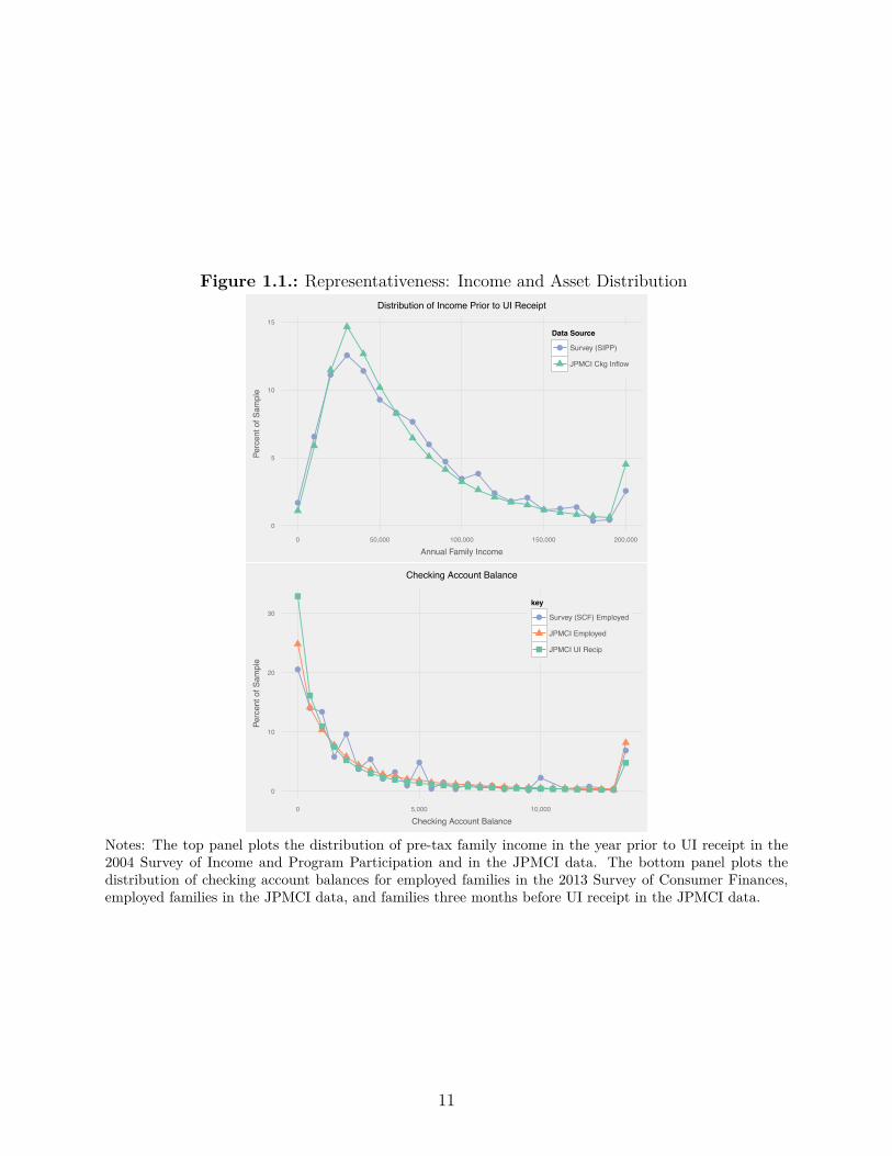
Figure 1.1.: Representativeness: Income and Asset Distribution
●
●
●
●
●
●
●●
●
●
●●
●● ●
● ● ●
● ●
●
0
5
10
15
0 50,000 100,000 150,000 200,000
Annual Family Income
Perc
ent o
f Sam
ple
Data Source
● Survey (SIPP)
JPMCI Ckg Inflow
Distribution of Income Prior to UI Receipt
●
● ●
●
●
●
●
●●
●
●
●●
●●
● ● ● ● ●
●
● ● ●
●
0
10
20
30
0 5,000 10,000
Checking Account Balance
Perc
ent o
f Sam
ple
key
● Survey (SCF) Employed
JPMCI Employed
JPMCI UI Recip
Checking Account Balance
Notes: The top panel plots the distribution of pre-tax family income in the year prior to UI receipt in the2004 Survey of Income and Program Participation and in the JPMCI data. The bottom panel plots thedistribution of checking account balances for employed families in the 2013 Survey of Consumer Finances,employed families in the JPMCI data, and families three months before UI receipt in the JPMCI data.
11

Although bank account data may not provide a good window into spending for everyone,
such data provide good coverage for UI recipients, because they tend to be in middle-class
families. To be eligible for UI benefits, a claimant needs substantial work history in the
prior year. Table 1.1 shows the impact of this requirement quantitatively using the SIPP. In
the twelve months prior to unemployment, UI recipients had median monthly pre-tax family
income of about $5,100 and a poverty rate of only 8%. While UI recipients are poorer than
all employed people, they are higher-income and older than the general pool of unemployed
people. Finally, we find using the Survey of Consumer Finances (SCF) that only 5% of
employed families lack a bank account, suggesting that the vast majority of UI recipients
have a bank account.
1.2.3. Estimating Spending and Comparison to External
Benchmarks
Much as with income, checking account outflows can be hard to interpret and JPMCI has
categorized them into thirty di�erent groups. We organize outflows under four broad head-
ings: spending on goods and services consumed immediately (54% of outflows), consumer
debt payments (17%), unclassifiable payments (23%) and saving (6%).21
Most of our analysis in this paper focuses on spending on goods and services consumed
immediately. Our definition of spending has three components: (1) debit and credit card
spending ($1484 monthly, 34% of total outflows), (2) cash withdrawals ($613, 14%) and (3)
bill payments ($314, 7%). Note that this definition includes spending on Chase credit cards
at the time goods are purchased, rather than when the credit card bill is paid, which may
21Appendix A.1.2 provides additional detail on the content of each of these categories. We winsorize all inflowvariables at the 95th percentile.
12
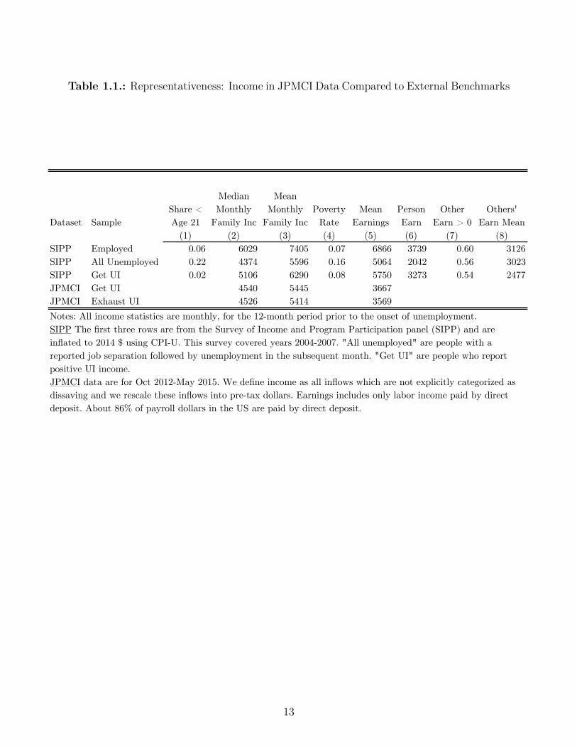
Table 1.1.: Representativeness: Income in JPMCI Data Compared to External Benchmarks
Dataset SampleShare < Age 21
Median Monthly
Family Inc
Mean Monthly
Family IncPoverty
RateMean
EarningsPerson Earn
Other Earn > 0
Others' Earn Mean
(1) (2) (3) (4) (5) (6) (7) (8)SIPP Employed 0.06 6029 7405 0.07 6866 3739 0.60 3126SIPP All Unemployed 0.22 4374 5596 0.16 5064 2042 0.56 3023SIPP Get UI 0.02 5106 6290 0.08 5750 3273 0.54 2477JPMCI Get UI 4540 5445 3667JPMCI Exhaust UI 4526 5414 3569
[xxx discuss winsorization, define other]
Notes: All income statistics are monthly, for the 12-month period prior to the onset of unemployment. SIPP The first three rows are from the Survey of Income and Program Participation panel (SIPP) and are inflated to 2014 $ using CPI-U. This survey covered years 2004-2007. "All unemployed" are people with a reported job separation followed by unemployment in the subsequent month. "Get UI" are people who report positive UI income.JPMCI data are for Oct 2012-May 2015. We define income as all inflows which are not explicitly categorized as dissaving and we rescale these inflows into pre-tax dollars. Earnings includes only labor income paid by direct deposit. About 86% of payroll dollars in the US are paid by direct deposit.
13

be months later.22 In addition, all credit and debit card transactions include a Merchant
Category Code that enables us to test whether specific expenditure categories change in the
way predicted by theories of home production (Aguiar and Hurst (2013)).
When we compare the JPMCI spending data to external benchmarks, we find under-coverage
of total consumption using a “top-down” approach while we find better coverage of eight
clearly-identified expenditure categories using a “bottom-up” approach. First, for the “top-
down” approach, we focus on nondurable goods and services in the Consumer Expenditure
Survey (CEX) and in the Bureau of Economic Analysis’ Personal Consumption Expenditures
(PCE).23 We estimate that our spending measure is 94% of the CEX benchmark and 44%
of the PCE benchmark. We believe that our true coverage of spending for UI recipients is
somewhere between these two numbers: the CEX is too low because of underreporting and
PCE is too high because it includes the consumption of very wealthy people who are not
relevant for our study. Second, using a “bottom-up” approach, we compare spending on
food away from home, food at home, fuel and utilities in Table 1.2. Estimated spending by
families in the JPMCI sample is 119-144% of the CEX benchmark and 62-95% of the PCE
benchmark. We similarly compare spending on mortgages, auto loans, credit card payments,
and student loans; conditional on making a payment, mean outflows are 63-112% of what is
reported in the SCF by families making the same payments.
14
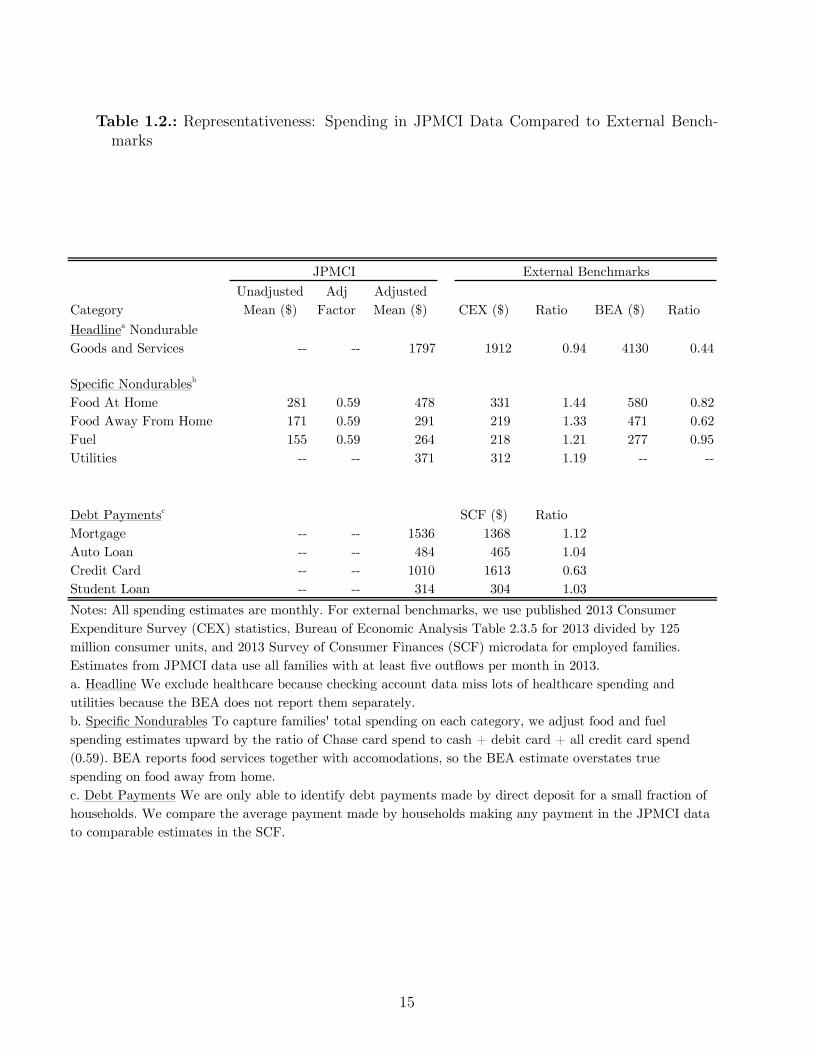
Table 1.2.: Representativeness: Spending in JPMCI Data Compared to External Bench-marks
CategoryUnadjusted Mean ($)
Adj Factor
Adjusted Mean ($) CEX ($) Ratio BEA ($) Ratio
Headlinea Nondurable Goods and Services -- -- 1797 1912 0.94 4130 0.44
Specific Nondurablesb
Food At Home 281 0.59 478 331 1.44 580 0.82Food Away From Home 171 0.59 291 219 1.33 471 0.62Fuel 155 0.59 264 218 1.21 277 0.95Utilities -- -- 371 312 1.19 -- --
Debt Paymentsc SCF ($) RatioMortgage -- -- 1536 1368 1.12Auto Loan -- -- 484 465 1.04Credit Card -- -- 1010 1613 0.63Student Loan -- -- 314 304 1.03
1.7
Notes: All spending estimates are monthly. For external benchmarks, we use published 2013 Consumer Expenditure Survey (CEX) statistics, Bureau of Economic Analysis Table 2.3.5 for 2013 divided by 125 million consumer units, and 2013 Survey of Consumer Finances (SCF) microdata for employed families. Estimates from JPMCI data use all families with at least five outflows per month in 2013.a. Headline We exclude healthcare because checking account data miss lots of healthcare spending and utilities because the BEA does not report them separately.b. Specific Nondurables To capture families' total spending on each category, we adjust food and fuel spending estimates upward by the ratio of Chase card spend to cash + debit card + all credit card spend (0.59). BEA reports food services together with accomodations, so the BEA estimate overstates true spending on food away from home.c. Debt Payments We are only able to identify debt payments made by direct deposit for a small fraction of households. We compare the average payment made by households making any payment in the JPMCI data to comparable estimates in the SCF.
JPMCI External Benchmarks
15
1.2.4. External Validity – Geography, Age, and Checking Account
Balances
The JPMCI sample also looks broadly representative of US families in terms of geography,
checking account balances and age, lending additional support to our argument for external
validity. Chase has physical branches in 23 states, including the five most populous states in
the US: California, Texas, Florida, New York and Illinois. We compare the age distribution of
UI recipients in the JPMCI data to the SIPP in Appendix Figure 1.1 and find that these two
distributions are closely aligned. Because we only observe the age of the primary account
holder in the JPMCI data, we compare it to the age of the family head in the SIPP. UI
recipients in the JPMCI data (mean age: 41.1) are slightly younger than UI recipients in the
SIPP (mean age: 44.3).
To understand how representative the JPMCI sample is in terms of assets, we compared it to
the SCF. We compared balances for employed families in the data to balances for employed
families in “the checking account you use the most” in the SCF. Figure 1.1 shows that the
distribution of balances is similar between the two samples. Table 1.3 reports summary
statistics comparing the JPMCI and SCF samples. In the SCF, the median total liquid
assets for an employed family is $4,900 and the median balance in a family’s primary checking
account is $1,500. The di�erence in medians highlights a limitation of checking account data,
which is that most liquid assets are held outside a family’s checking account. The median
22Mean monthly Chase credit card spend is $208. Because our sample screen requires five outflows in everymonth, our sample is skewed toward frequent debit card users and away from frequent credit card users.
23We exclude healthcare and pensions because employers often pay for these services directly. We excludehousing because we are unable to measure rent, which is typically paid using paper checks, and we excludeutilities because PCE combines housing and utility costs into a single category. For 2013, CEX estimatedtotal mean monthly spending of $4,258 and PCE estimated $7,615. It is well known that CEX understatesconsumption expenditures. Passero et al. (2011) carefully crosswalk CEX and PCE expenditure categoriesand found the ratio of CEX to PCE was 0.60 across all categories and 0.77 across comparable categories. Toensure comparability with these external data sources, the statistics from the JPMCI data reported in thissection are for all accounts with 5 monthly outflows, rather than just for UI recipients.
16

checking account balance in the data is $1,460, suggesting that on this dimension, families in
the JPMCI data are similar to a cross-section of US families. In the data, we see substantial
inflows from outside accounts during unemployment so even though we are unable to measure
total asset holdings reliably, we can measure the extent to which families draw down their
assets or draw on funds from informal insurance networks during unemployment.
1.2.5. Comparison Groups
To eliminate seasonality, inflation, secular trends, and business cycle fluctuations, all results
for income and spending are presented relative to a comparison group. In the JPMCI data,
there is an upward secular trend in spending of five percent per year and in labor income of six
percent per year. This increase is larger than can be explained by economic fundamentals
during this period. We believe that this trend reflects secular growth in the use of debit
cards, credit cards and ACH (Federal Reserve System 2013). We considered three di�erent
comparison groups to address this issue: families which (1) received UI in at least one
month, (2) received direct deposit payroll in 21-31 of the 32 months in the sample and (3)
had annual income estimates between $30,000 and $80,000. All three groups have similar
means for checking account income and spending. More importantly, as shown in Appendix
Figure 1.2, all three groups have similar trends in spending. We chose the annual income
estimate sample as our control group and adjust income and spending using this formula:
y
it
= y
it,raw
≠1y
30K≠80K
t
≠ y
30K≠80K
2
where i is a family, t is a month, and y
it,raw
are the original data. We create an adjusted
series y
it
by subtracting a term equal to the mean for the control group in month t minus
the grand mean for the control group across all months in the sample. This modification
enables us to examine how income and spending of a family receiving UI change relative to
17
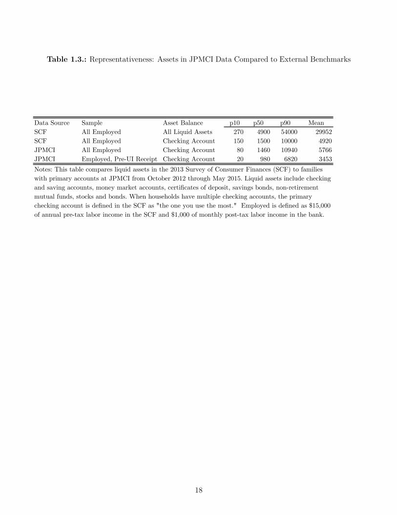
Table 1.3.: Representativeness: Assets in JPMCI Data Compared to External Benchmarks
Data Source Sample Asset Balance p10 p50 p90 MeanSCF All Employed All Liquid Assets 270 4900 54000 29952SCF All Employed Checking Account 150 1500 10000 4920JPMCI All Employed Checking Account 80 1460 10940 5766JPMCI Employed, Pre-UI Receipt Checking Account 20 980 6820 3453Notes: This table compares liquid assets in the 2013 Survey of Consumer Finances (SCF) to families with primary accounts at JPMCI from October 2012 through May 2015. Liquid assets include checking and saving accounts, money market accounts, certificates of deposit, savings bonds, non-retirement mutual funds, stocks and bonds. When households have multiple checking accounts, the primary checking account is defined in the SCF as "the one you use the most." Employed is defined as $15,000 of annual pre-tax labor income in the SCF and $1,000 of monthly post-tax labor income in the bank.
18
a sample of similar families.
1.3. Onset of Unemployment
In Section 1.3.1, we show that income and spending fall immediately at the onset of un-
employment. Labor income falls prior to UI receipt, because there is a delay between job
separation and arrival of the first UI check. Workers typically cannot file for benefits un-
til they have separated from their job. State UI websites suggest that if everything goes
smoothly, a worker will wait three to four weeks between filing her claim and receiving her
first benefit check.24 In the two months before a worker first receives UI, her labor income
paid by direct deposit falls by about $400. Spending on nondurable goods and services falls
by $160, which is 6% of its pre-onset mean. The drop in spending does not reflect shifts
to alternative payment channels. Families make up for lost income by drawing down their
liquid assets rather than borrowing on their credit cards.
Browning and Crossley (2001) describe three reasons why spending may fall at the start of
an unemployment spell – a temporary income loss, a permanent income loss and a decrease
in work-related expenses – and Section 1.3.2 argues that the temporary income loss appears
to be the most important explanation. First, in an attempt to isolate the role of temporary
income, we show that spending drops more at onset in states where income drops more.
Second, to understand the role of permanent income losses, we examine the path of family
income in the wake of a UI spell and find that by 24 months after onset it has recovered to
95% of its pre-onset level and is on an upward trend. This finding may seem surprising in
light of prior work by Jacobson et al. (1993b), but is largely attributable to the fact that we
24https://labor.ny.gov/directdeposit/directdepositfaq.shtm#DD5
19

study all UI recipients whereas prior work has focused on high tenure workers who separate
in mass layo�s. Finally, we use category-level spending changes at retirement to construct
an estimate of work-related spending. We find that an excess drop in work-related expenses
can explain 26-37% of the total drop in expenditure at onset.
1.3.1. Basic Facts About Onset
1.3.1.1. Spending Drops by $160 (6%)
Labor income falls sharply at the start of an unemployment spell and UI benefits make up
for much of the immediate drop in income. The top panel of Figure 1.2 shows the path of
labor income and UI for a family that receives UI benefits for exactly one month. Labor
income starts to decline two months before UI benefits are received and continues to decline
through the month in which UI benefits are received. Because labor income drops before
UI benefits arrive, the two-month period with the largest decline in income is from three
months before UI receipt to one month before UI receipt. Throughout Section 1.3, this is
the two-month window that we study. Because these UI recipients claimed only one month
of benefits, they likely found a job during that month and labor income recovers over the
subsequent two months.
We construct an aggregate series of income during unemployment and it shows a sharp
decline at onset followed by modest declines through the second month in which UI checks
are received in the bottom panel of Figure 1.2. Prior to onset, all future UI recipients are
20
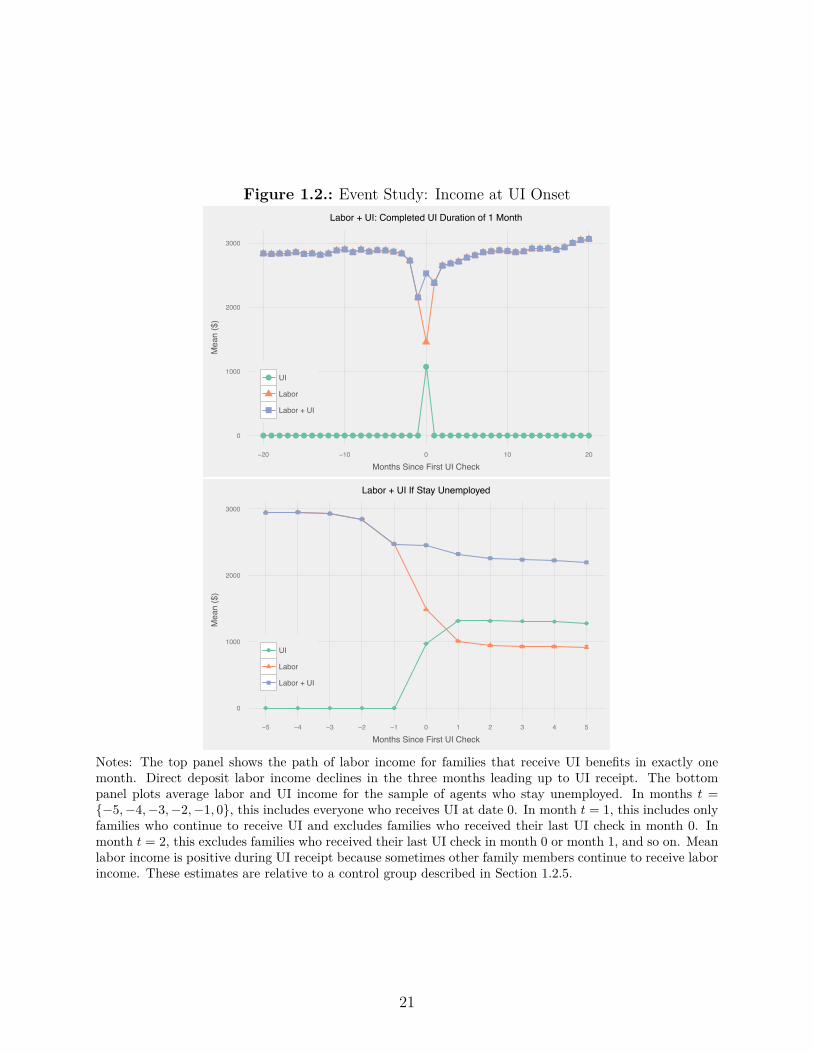
Figure 1.2.: Event Study: Income at UI Onset
●●●●●●●●●●●●●●●●●●●●
●
●●●●●●●●●●●●●●●●●●●●0
1000
2000
3000
−20 −10 0 10 20
Months Since First UI Check
Mea
n ($
)
● UI
Labor
Labor + UI
Labor + UI: Completed UI Duration of 1 Month
● ● ● ● ●
●
● ● ● ● ●
0
1000
2000
3000
−5 −4 −3 −2 −1 0 1 2 3 4 5
Months Since First UI Check
Mea
n ($
)
● UI
Labor
Labor + UI
Labor + UI If Stay Unemployed
Notes: The top panel shows the path of labor income for families that receive UI benefits in exactly onemonth. Direct deposit labor income declines in the three months leading up to UI receipt. The bottompanel plots average labor and UI income for the sample of agents who stay unemployed. In months t ={≠5,≠4,≠3,≠2,≠1, 0}, this includes everyone who receives UI at date 0. In month t = 1, this includes onlyfamilies who continue to receive UI and excludes families who received their last UI check in month 0. Inmonth t = 2, this excludes families who received their last UI check in month 0 or month 1, and so on. Meanlabor income is positive during UI receipt because sometimes other family members continue to receive laborincome. These estimates are relative to a control group described in Section 1.2.5.
21
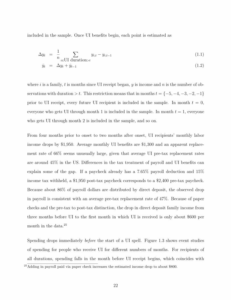
included in the sample. Once UI benefits begin, each point is estimated as
�y
t
= 1n
ÿ
iœUI duration>t
y
i,t
≠ y
i,t≠1
(1.1)
y
t
= �y
t
+ y
t≠1
(1.2)
where i is a family, t is months since UI receipt began, y is income and n is the number of ob-
servations with duration > t. This restriction means that in months t = {≠5,≠4,≠3,≠2,≠1}
prior to UI receipt, every future UI recipient is included in the sample. In month t = 0,
everyone who gets UI through month 1 is included in the sample. In month t = 1, everyone
who gets UI through month 2 is included in the sample, and so on.
From four months prior to onset to two months after onset, UI recipients’ monthly labor
income drops by $1,950. Average monthly UI benefits are $1,300 and an apparent replace-
ment rate of 66% seems unusually large, given that average UI pre-tax replacement rates
are around 45% in the US. Di�erences in the tax treatment of payroll and UI benefits can
explain some of the gap. If a paycheck already has a 7.65% payroll deduction and 15%
income tax withheld, a $1,950 post-tax paycheck corresponds to a $2,400 pre-tax paycheck.
Because about 86% of payroll dollars are distributed by direct deposit, the observed drop
in payroll is consistent with an average pre-tax replacement rate of 47%. Because of paper
checks and the pre-tax to post-tax distinction, the drop in direct deposit family income from
three months before UI to the first month in which UI is received is only about $600 per
month in the data.25
Spending drops immediately before the start of a UI spell. Figure 1.3 shows event studies
of spending for people who receive UI for di�erent numbers of months. For recipients of
all durations, spending falls in the month before UI receipt begins, which coincides with25Adding in payroll paid via paper check increases the estimated income drop to about $800.
22

the start of unemployment, as discussed above. The vertical dashed lines in Figure 1.3
indicate the last month in which UI was received for the bolded data series. For short-
duration UI recipients, spending jumps up at the end of a UI spell, although to less than
its pre-unemployment level. This spending pattern is consistent with families drawing down
savings at the start of an unemployment spell and then building up a bu�er stock after the
return to work. We explore the recovery in spending further in Section 1.4.
What exactly is captured by the drop in spending from three months before UI receipt to
one month before UI receipt? With i indexing families, t indexing time, and Post
it
as a
dummy for one month before UI receipt, we estimate — using the equation
c
it
= – + —Post
it
+ Á
it
(1.3)
and report the results in Table 1.4. Conceptually, this drop in spending reflects three distinct
economic channels: (1) the direct loss in income from t≠3 to t≠1 , (2) the news gained from
t≠3 to t≠1 about the path of future income, and (3) the drop in work-related expenses, if the
worker has stopped working between t≠ 3 and t≠ 1. For equation 1.3 to capture the causal
impact of the three channels, we need to assume that E(Áit
|Post
it
) = 0, which means that
the timing of UI receipt is not correlated with something else that might a�ect spending
directly. Because the start dates of UI spells are highly idiosyncratic, this orthogonality
restriction seems plausible.
We construct an aggregate series of spending during unemployment and it shows a sharp
decline at onset followed by modest declines in subsequent months. The top panel of Figure
1.4 plots spending separately for each duration group from Figure 1.3. Each series terminates
before the last month of UI receipt, which is when spending recovers for short-duration
UI recipients. The bottom panel of Figure 1.4 plots a composite series of spending while
23
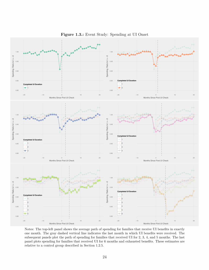
Figure 1.3.: Event Study: Spending at UI Onset
●●●●●●●
●●
●●●●●●●●●
●
●
●●●
●●
●●●●
●●●●●
●●●●●
●●
0.80
0.85
0.90
0.95
1.00
−20 −10 0 10 20
Months Since First UI Check
Spen
ding
: Rat
io to
t = −3
Completed UI Duration
● 10.80
0.85
0.90
0.95
1.00
−20 −10 0 10 20
Months Since First UI Check
Spen
ding
: Rat
io to
t = −3
Completed UI Duration
1
2
0.80
0.85
0.90
0.95
1.00
−20 −10 0 10 20
Months Since First UI Check
Spen
ding
: Rat
io to
t = −3
Completed UI Duration
1
2
30.80
0.85
0.90
0.95
1.00
−20 −10 0 10 20
Months Since First UI Check
Spen
ding
: Rat
io to
t = −3
Completed UI Duration
1
2
3
4
0.80
0.85
0.90
0.95
1.00
−20 −10 0 10 20
Months Since First UI Check
Spen
ding
: Rat
io to
t = −3
Completed UI Duration
1
2
3
4
50.80
0.85
0.90
0.95
1.00
−20 −10 0 10 20
Months Since First UI Check
Spen
ding
: Rat
io to
t = −3
Completed UI Duration
1
2
3
4
5
6
Notes: The top-left panel shows the average path of spending for families that receive UI benefits in exactlyone month. The gray dashed vertical line indicates the last month in which UI benefits were received. Thesubsequent panels plot the path of spending for families that received UI for 2, 3, 4, and 5 months. The lastpanel plots spending for families that received UI for 6 months and exhausted benefits. These estimates arerelative to a control group described in Section 1.2.5.
24
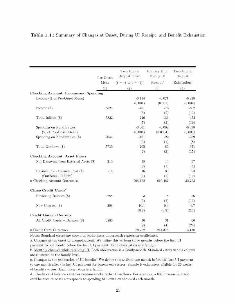
Table 1.4.: Summary of Changes at Onset, During UI Receipt, and Benefit Exhaustion
Pre-Onset Mean
Two-Month Drop at Onset
(t = -3 to t = -1)a
Monthly Drop During UI Receiptb
Two-Month Drop at
Exhaustionc
(1) (2) (3) (4)Checking Account: Income and Spending
Income (% of Pre-Onset Mean) -0.114 -0.021 -0.228(0.001) (0.001) (0.004)
Income ($) 3520 -401 -73 -802(5) (2) (13)
Total Inflows ($) 5822 -216 -136 -452(7) (2) (19)
Spending on Nondurables -0.061 -0.008 -0.098 (% of Pre-Onset Mean) (0.001) (0.0004) (0.003)Spending on Nondurables ($) 2644 -161 -22 -259
(3) (1) (8)Total Outflows ($) 5739 -205 -89 -351
(6) (2) (15)Checking Account: Asset Flows
Net Dissaving from External Accts ($) 210 38 14 97(2) (1) (5)
Balance Pre - Balance Post ($) -16 16 30 93 (Outflows - Inflows) (4) (1) (10)
n Checking Account Outcomes 208,162 616,467 32,753
Chase Credit Cardsd
Revolving Balance ($) 2288 -3 8 56(5) (2) (13)
New Charges ($) 208 -10.1 0.4 -0.7(0.9) (0.3) (2.3)
Credit Bureau RecordsAll Credit Cards -- Balance ($) 6883 36 31 66
(9) (4) (24)n Credit Card Outcomes 79,782 241,378 13,138Notes: Standard errors are shown in parentheses underneath regression coefficients.a. Changes at the onset of unemployment. We define this as from three months before the first UI payment to one month before the first UI payment. Each observation is a family.b. Monthly changes while receiving UI. Each observation is a family-month. Standard errors in this column are clustered at the family level.c. Changes at the exhaustion of UI benefits. We define this as from one month before the last UI payment to one month after the last UI payment for benefit exhaustees. Sample is exhaustees eligible for 26 weeks of benefits or less. Each observation is a family. d. Credit card balance variables capture stocks rather than flows. For example, a $36 increase in credit card balance at onset corresponds to spending $18 extra on the card each month.
25

unemployed on the basis of this changing sample using the same methodology as in equation
1.1. Equation 1.2 is modified to c
t
= 1
c
base
(�c
t
+ c
t≠1
), where c
base
is mean spending before
UI onset. The small vertical bars around each point indicate the 95% confidence interval
for �c
t
. In this composite spending series, spending drops by about 6% at the onset of
unemployment (from t≠ 3 to t≠ 1) and then falls by less than 1% per month in subsequent
months.
The drop in spending at onset is substantial relative to the drop in income. To facilitate
comparisons of magnitudes, we summarize the drops in income and spending with regressions
in Table 1.4. Labor income paid by direct deposit drops by $400 from t = ≠3 to t = ≠1 .
Spending on goods and services consumed immediately – which is only 58% of non-saving
outflows – falls by $160, or about 16% of the drop in income. In Appendix A.2.1, we
document that the shift in spending appears to reflect a true drop in family-wide spending
rather than a shift in spending to alternative payment channels and that our results for this
sample are likely to have external validity for other UI recipients.
1.3.1.2. Decomposition – What Kinds of Spending Drop At Onset? How Is
Consumption Smoothing Financed?
Families are able to protect their most important commitments and cut spending most on
expenses which might have been related to work. Table 1.5 shows the drop in spending at
onset for several selected categories. Student loans, cash withdrawals, food away from home,
and auto expenses all drop sharply.26 If the family owned a car with average gas mileage, the
26The drop in the fraction of families making student loan payments could reflect debtors becoming delinquentor obtaining deferments on the basis of their unemployment. We believe that it likely reflects delinquency be-cause it takes substantial time to apply for deferment (and related options such as Income-Based Repayment)and debtors are advised to keep making payments until they obtain a deferment.
26
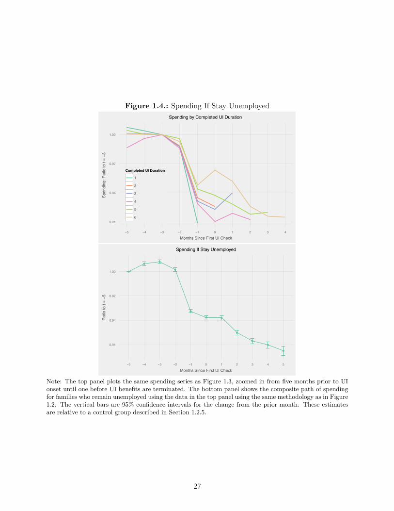
Figure 1.4.: Spending If Stay Unemployed
0.91
0.94
0.97
1.00
−5 −4 −3 −2 −1 0 1 2 3 4
Months Since First UI Check
Spen
ding
: Rat
io to
t = −3
Completed UI Duration
1
2
3
4
5
6
Spending by Completed UI Duration
●
●●
●
●
● ●
●
●
●
●
0.91
0.94
0.97
1.00
−5 −4 −3 −2 −1 0 1 2 3 4 5
Months Since First UI Check
Rat
io to
t = −5
Spending If Stay Unemployed
Note: The top panel plots the same spending series as Figure 1.3, zoomed in from five months prior to UIonset until one before UI benefits are terminated. The bottom panel shows the composite path of spendingfor families who remain unemployed using the data in the top panel using the same methodology as in Figure1.2. The vertical bars are 95% confidence intervals for the change from the prior month. These estimatesare relative to a control group described in Section 1.2.5.
27
drop in auto expenditures corresponds to driving about 200 fewer miles per month. Notably,
mortgage payments are stable at the onset of unemployment.27
To the extent that families smooth their consumption, they do so mostly by drawing down
liquid assets. Table 1.4 indicates that families increase inbound transfers from savings, money
market accounts, investment accounts and checking accounts and cut outbound transfers to
the same types of accounts.28 Although we are only able to categorize electronic transfers,
we believe that families also use paper checks to implement these types of transfers. Table
1.5 shows that paper check inflows rise during unemployment, even though paper checks
from labor income almost surely fell. We find little evidence of actual smoothing on credit
cards – the monthly increase in balances across all cards is equal to about 10% of the drop
in spending and spending on Chase credit cards falls at onset. See Appendix A.2.1 for
additional credit outcomes.29
1.3.2. Temporary Income Loss, Permanent Income Loss, or
Work-Related Expenses?
1.3.2.1. Spending Drops Most In States Where Income Drops Most
States that pay higher UI benefits show smaller drops in spending at onset, consistent with
an important role for temporary income losses. The top panel of Figure 1.5 plots the change27Our findings here di�er from Gelman et al. (2015), who find that some federal workers delayed mortgagepayments during the government shutdown of 2012. However, that shutdown was expected to end in a matterof weeks, meaning that mortgage payment delay carried little financial risk. In contrast, unemployment isof uncertain duration, and so mortgage payment delay carries more serious risks.
28We do not know whether the source accounts were owned by the owners of the checking account, or if theseare transfers from family members or friends in response to unemployment.
29Herkenho� et al. (2015) document that families in MSAs with high housing prices instrumented using landunavailability have more access to credit and longer nonemployment durations. This seems to conflictwith our findings that average credit utilization is stable during an unemployment spell. One possiblereconciliation is that there is some other feature of these MSAs such as higher wages or di�erent skill mixwhich can explain the di�erences in nonemployment durations. Another is that increased access to credita�ects search behavior even though little of that credit is used in practice.
28
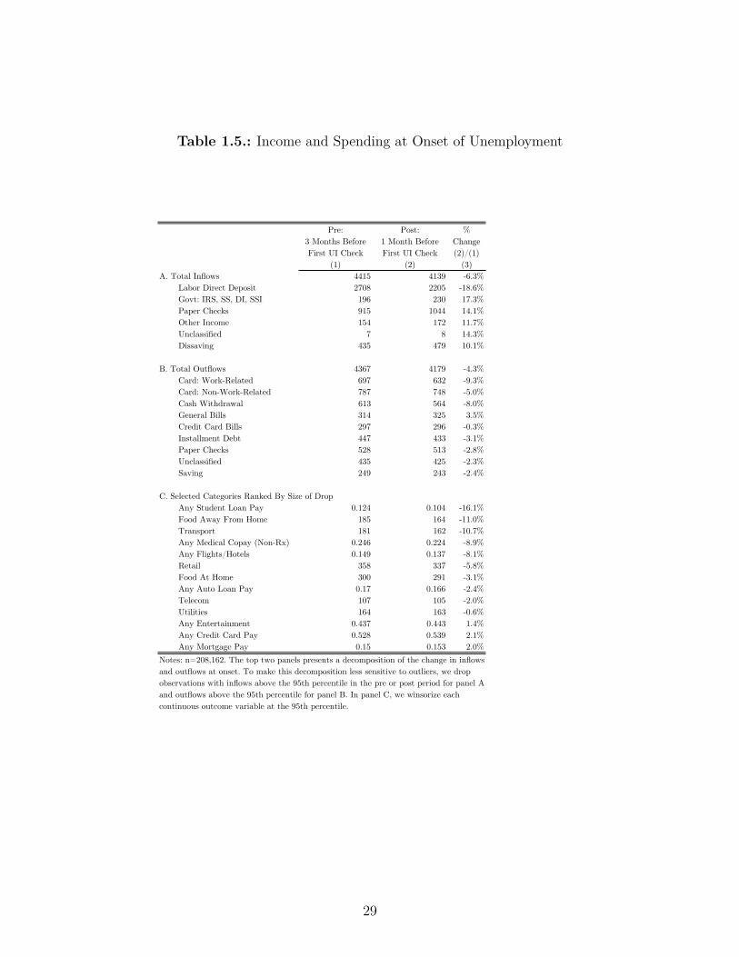
Table 1.5.: Income and Spending at Onset of Unemployment
Pre: 3 Months Before First UI Check
Post: 1 Month Before First UI Check
% Change (2)/(1)
(1) (2) (3)A. Total Inflows 4415 4139 -6.3%
Labor Direct Deposit 2708 2205 -18.6%Govt: IRS, SS, DI, SSI 196 230 17.3%Paper Checks 915 1044 14.1%Other Income 154 172 11.7%Unclassified 7 8 14.3%Dissaving 435 479 10.1%
B. Total Outflows 4367 4179 -4.3%Card: Work-Related 697 632 -9.3%Card: Non-Work-Related 787 748 -5.0%Cash Withdrawal 613 564 -8.0%General Bills 314 325 3.5%Credit Card Bills 297 296 -0.3%Installment Debt 447 433 -3.1%Paper Checks 528 513 -2.8%Unclassified 435 425 -2.3%Saving 249 243 -2.4%
C. Selected Categories Ranked By Size of DropAny Student Loan Pay 0.124 0.104 -16.1%Food Away From Home 185 164 -11.0%Transport 181 162 -10.7%Any Medical Copay (Non-Rx) 0.246 0.224 -8.9%Any Flights/Hotels 0.149 0.137 -8.1%Retail 358 337 -5.8%Food At Home 300 291 -3.1%Any Auto Loan Pay 0.17 0.166 -2.4%Telecom 107 105 -2.0%Utilities 164 163 -0.6%Any Entertainment 0.437 0.443 1.4%Any Credit Card Pay 0.528 0.539 2.1%Any Mortgage Pay 0.15 0.153 2.0%
Notes: n=208,162. The top two panels presents a decomposition of the change in inflows and outflows at onset. To make this decomposition less sensitive to outliers, we drop observations with inflows above the 95th percentile in the pre or post period for panel A and outflows above the 95th percentile for panel B. In panel C, we winsorize each continuous outcome variable at the 95th percentile.
29

in spending at onset against the change in income at onset for the sixteen largest states
in the data, which have at least 3,000 UI recipients. There are many complex rules which
a�ect UI benefit levels and we summarize them by measuring the drop in the sum of labor
income plus UI benefits at onset. Our estimated income drop measure accords with outside
measures of UI benefit levels; Louisiana, Florida and Arizona are among the five states in the
US with the lowest maximum UI benefit levels and New Jersey and Washington are among
the three states in the US with the highest maximum benefit levels. States with large income
drops also have large spending drops. The slope of the best fit line is 0.23. If we predict out
of sample what would the spending drop be in a state which had no income drop at all, we
estimate a drop in spending of $75. In other words, of the $160 drop in spending at onset,
this exercise implies that the majority of the drop in spending is attributable to a temporary
income drop rather than lost permanent income or a drop in work-related expenses.
1.3.2.2. Family Income Recovers Quickly
The bottom panel of Figure 1.5 shows that family labor income recovers to about 90%
of its pre-spell level within 24 months and continues to trend upwards, suggesting that
unemployment for this sample may not reflect a large shock to permanent income.30 This
finding may be surprising to readers familiar with Jacobson et al. (1993b), where mass layo�s
of high-tenure workers cause long-term earnings losses of 30%.31 Intuitively, high-tenure
workers who separate in a mass layo� are the most likely of any worker to be adversely
a�ected by a separation. Our paper, in contrast, focuses on typical UI recipients, who may
not have been part of a mass layo� and may not have had high tenure at their firm. We
have compared the path of earnings around UI receipt in the data to a sample in the SIPP,
30To be precise, income recovers in 24 months to 90% of the value of a control group. In the raw data, incomesfor both UI recipients and the control group are trending up.
31Similar results are present in Couch and Placzek (2010), Wachter et al. (2009), Davis and von Wachter(2011), and Jarosch (2015).
30
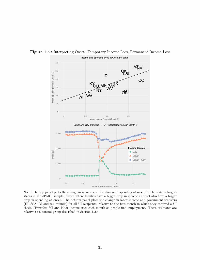
Figure 1.5.: Interpreting Onset: Temporary Income Loss, Permanent Income Loss
AZ
COFL
GA
ID
IL
KY
LA
MINJ
NV
NYOH
OK
OR
TX
UTWAWI
WV
0
50
100
150
200
250
300
0 200 400 600
Mean Income Drop at Onset ($)
Mea
n Sp
endi
ng D
rop
at O
nset
($)
Income and Spending Drop at Onset By State
●●●●●●●●●●●●●●●●●●●●
●●
●
●●●
●●●●●●●●●●●●●●●●●●●●●●
$0
$1,000
$2,000
$3,000
−20 −10 0 10 20
Months Since First UI Check
Mea
n ($
)
Income Source● Gov
LaborLabor + Gov
Labor and Gov Transfers −− UI Receipt Beginning in Month 0
Note: The top panel plots the change in income and the change in spending at onset for the sixteen largeststates in the JPMCI sample. States where families have a bigger drop in income at onset also have a biggerdrop in spending at onset. The bottom panel plots the change in labor income and government transfers(UI, SSA, DI and tax refunds) for all UI recipients, relative to the first month in which they received a UIcheck. Transfers fall and labor income rises each month as people find employment. These estimates arerelative to a control group described in Section 1.2.5.
31

which also shows a similarly rapid recovery in family earnings.32 Consistent with the view
that the high-tenure mass-layo� selection criteria induce larger earnings losses, we find using
the SIPP that earnings losses are larger for high tenure workers and involuntary separations
than for all UI spells.
Other government transfers provide additional insurance and, together with the recovery
in labor income, family-level insurance is nearly complete. Average monthly government
transfers – which include Social Security for the elderly, Disability Insurance, and tax refunds
– rise from $196 per month prior to UI receipt to $345 per month two years after UI receipt.
This increase is concentrated in payments to workers age 59 or older from the Social Security
Administration, so we believe that this is driven by people retiring. By month 24, labor
income plus government benefits are equal to 95% of their pre-onset level and are trending
upwards.
1.3.2.3. Work-Related Expenses Explain 26-37% of Total Drop At Onset
A person without a job may use her time and money di�erently, even without any change
in family income. A series of papers by Aguiar and Hurst (2005, 2013) has argued that
the drop in expenditure at retirement reflects a shift to home production, rather than a
failure of consumption smoothing. Non-employment may enable someone to avoid work-
related expenses (e.g. fuel to drive to work) and o�ers an increase in leisure time, with
32Appendix Figure 1.4 compares the monthly path of earnings in the JPMCI data and in the 2004 SIPP. Weuse the 2004 SIPP rather than the 2008 SIPP because long follow-up horizons in the 2008 SIPP are availableonly for people who separated at the start of the Great Recession and therefore faced unusually bad jobopportunities. This is consistent with findings in Jacobson et al. (1993a) that income for UI recipientsrecovers after six years to its level immediately prior to separation. Another strand of the literature focuseson displaced workers in surveys such as the PSID and the Current Population Survey (CPS), and does findevidence of persistent earnings losses (Stephens (2001), Farber (2015)). Understanding why the SIPP andadministrative records deliver di�erent results from the PSID and CPS is a valuable area for future work.See Appendix A.2.3 for additional discussion.
32

possible substitution to home production (e.g. cooking at home instead of eating out) and
increased time spent shopping for low prices (Aguiar and Hurst (2007)). To assess the
empirical relevance of these arguments for unemployment, we first categorize expenditures
by whether they decline at retirement and then examine the drop in spending for these
retirement-sensitive categories at the onset of unemployment.
We use changes in spending at retirement to identify which expenditure categories are sen-
sitive to labor force status. We identify retirement transitions using people ages 62 to 70
who started receiving Social Security, and had liquid assets above $100,000, suggesting that
they should be relatively able to smooth their consumption at retirement. The top panel of
Figure 1.6 plots the change in expenditure for 16 merchant categories at retirement and un-
employment. The darkness of a each bar is proportional to dollar spending on the category.
Some of the merchant categories which drop the most during unemployment are Auto, Food
Away From Home, Flights/Hotels, and Department Stores. This aligns well with Aguiar and
Hurst (2013)’s findings that Food Away From Home, Transportation, and Clothing decline in
the cross-section with age in the CEX. We estimate that work-related expenditures account
for 41% of our spending measure.33
The spending drop at the onset of unemployment is concentrated in work-related expenses,
consistent with the predictions of Aguiar and Hurst (2013). The bottom panel of Figure 1.6
plots the three components of our headline spending measure – work-related expenses on
debit or credit cards, other spending on debit and credit cards, and cash withdrawals and
bills. While other categories fall by about 5%, work-related expenses fall by 9%.
We estimate that the excess drop in work-related expenses can account for 26-37% of the33Work-related card expenditures are 29% of total spending on nondurable goods and services. If we assumethat cash withdrawals are allocated proportionally to the same categories as card expenditures, then work-related expenditures are 41% of total spending. For comparison, Aguiar and Hurst (2013) estimate thatwork-related expenses are 31% of nondurable expenditures.
33
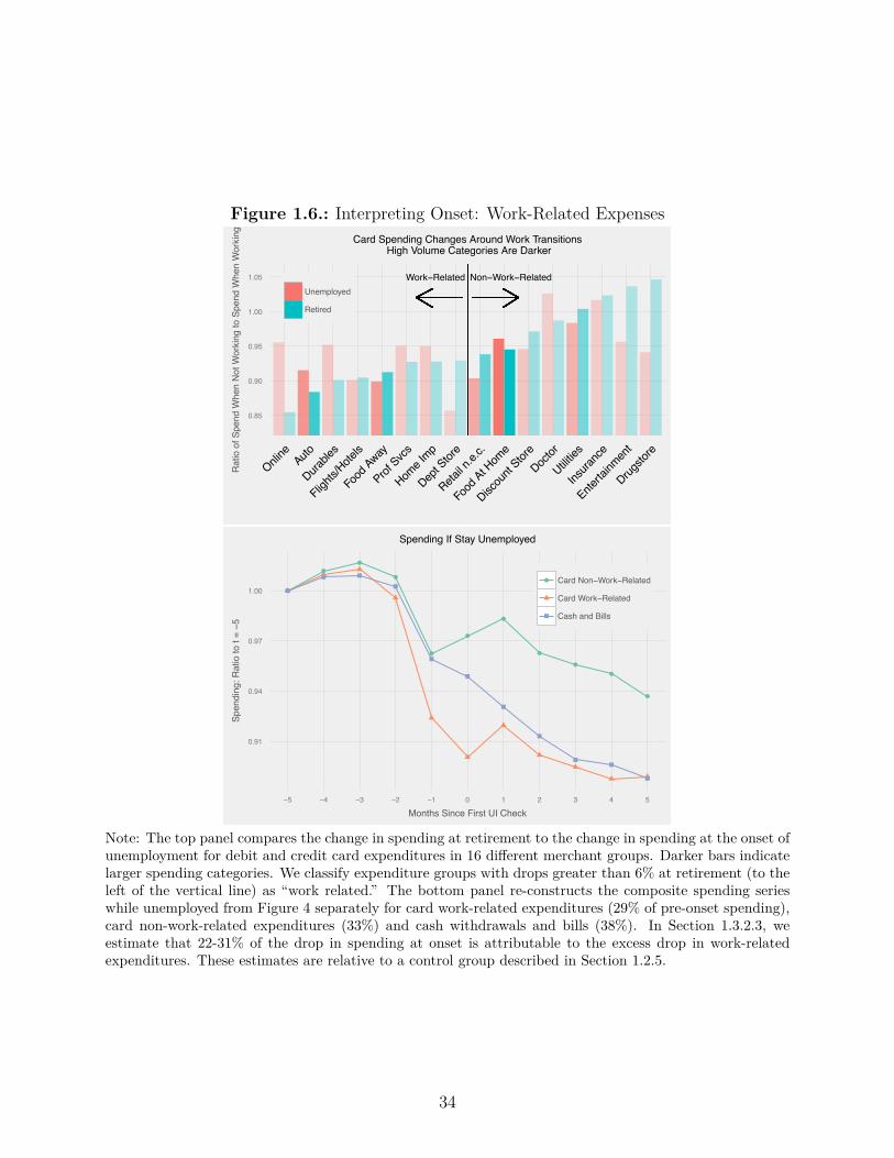
Figure 1.6.: Interpreting Onset: Work-Related Expenses
Work−Related Non−Work−Related
0.85
0.90
0.95
1.00
1.05
Online
Auto
Durable
s
Flights/
Hotels
Food
Away
Prof Svcs
Home I
mp
Dept S
tore
Retail n
.e.c.
Food
At Hom
e
Discou
nt Stor
eDoc
tor
Utilities
Insura
nce
Enterta
inmen
t
Drugsto
re
Rat
io o
f Spe
nd W
hen
Not
Wor
king
to S
pend
Whe
n W
orki
ng
Unemployed
Retired
Card Spending Changes Around Work Transitions High Volume Categories Are Darker
●
●
●
●
●
●
●
●
●
●
●
0.91
0.94
0.97
1.00
−5 −4 −3 −2 −1 0 1 2 3 4 5
Months Since First UI Check
Spen
ding
: Rat
io to
t = −5
● Card Non−Work−Related
Card Work−Related
Cash and Bills
Spending If Stay Unemployed
Note: The top panel compares the change in spending at retirement to the change in spending at the onset ofunemployment for debit and credit card expenditures in 16 di�erent merchant groups. Darker bars indicatelarger spending categories. We classify expenditure groups with drops greater than 6% at retirement (to theleft of the vertical line) as “work related.” The bottom panel re-constructs the composite spending serieswhile unemployed from Figure 4 separately for card work-related expenditures (29% of pre-onset spending),card non-work-related expenditures (33%) and cash withdrawals and bills (38%). In Section 1.3.2.3, weestimate that 22-31% of the drop in spending at onset is attributable to the excess drop in work-relatedexpenditures. These estimates are relative to a control group described in Section 1.2.5.
34
total drop in spending at onset, by comparing the actual drop in work-related expenses to
two counterfactuals with no change in labor force status.34 The causal impact of interest
is how spending would have changed if someone switched from working to not working and
began receiving a monthly government income payment of equal value. One way to calculate
this is to take the actual drop in work-related spending at onset and subtract a counterfactual
for how much work expenditures would have changed given a $500 change in income and no
change in work status. One counterfactual comes from using the drop in non-work-related
expenses at onset, which implies a $43 fixed cost of working. Another counterfactual comes
from multiplying the marginal propensity to consume out of work-related expenses at benefit
exhaustion (8 cents for each dollar of lost income) by the drop in income at onset, which
implies a $59 fixed cost of working.
1.4. Spending Remains Depressed After
Re-employment
In this section, we study the path of spending for workers who find jobs prior to exhausting
UI benefits. As already shown in Figure 1.3, spending recovers slowly upon re-employment.
This slow recovery is consistent with a model where agents who have depleted their bu�er
stock during unemployment rebuild it after they find a job. First, in Section 1.4.1 we show
that this slow recovery after re-employment led to an upward bias in prior estimates of
the spending drop during unemployment. We also discuss how our findings might be used
by economists studying optimal UI formulas and models of the business cycle. Second, in
Section 1.4.2, we show that the slow recovery in spending is concentrated among families
34Baker and Yannelis (2015) estimate the role of work-related expenses using federal government furloughs.They find an estimate larger than ours, but with a confidence interval which contains our point estimate.
35
who had little assets at onset. This evidence is consistent with a central role for liquidity in
explaining spending fluctuations during unemployment and in particular with models which
predict that agents have a target ratio of wealth to income.
1.4.1. Prior Literature Overstated Spending Drop During
Unemployment
A key challenge for prior studies of unemployment was the absence of reliable high-frequency
expenditure data. Chodorow-Reich and Karabarbounis (2015) (henceforth CRK) use annual
spending data in the CEX to estimate the spending drop during unemployment.35 Without
higher-frequency data on spending, analysts typically assumed that monthly spending took
two values, c
e when employed and c
u when unemployed. For example, if someone was
unemployed for 1 month and spent 3% less annually, the CRK-KLNS method would estimate
a drop in spending of 36% during unemployment. Formally, with c
e as the pre-unemployment
sample mean, and c
i,D
as the annual spending of someone unemployed for D months, this
methodology would estimate the average drop during unemployment as
[c
u
/c
e = 1n
ÿ
iœu
ÿ
Dœ{1...12}
c
i,D
/c
e
D/12 (1.4)
Families engage in substantial smoothing within the year of an unemployment spell and
methodologies which neglect this overstate the drop in spending during unemployment. The
top panel of Figure 7 plots the average monthly spending of a family with a completed
UI duration of three months. Average spending during unemployment was 6% lower than
the pre-onset mean while receiving UI, and 2.5% lower than the pre-onset mean in the
subsequent 9 months. The light blue arrows indicate the estimated spending drop using35Although the CEX has quarterly spending data, it only has employment information on an annual basis.
36
equation 1.4; an analyst using this equation would have estimated a drop in spending of
13% during unemployment. The bottom panel repeats the exercise separately for families of
di�erent UI durations and shows that the bias is substantial at short durations. Table 1.6
reports the drop in spending at onset for various categories as well as the drop estimated
from implementing equation 1.4. The drop at onset is 6% for all nondurables and 6% for
food. Applying equation 1.4 in the data, we estimate drops of 20% and 9% respectively.
Suitably adjusted, our estimates are broadly in line with prior work using survey data. CRK
estimate that spending on nondurables drops by 13% in the CEX and spending on food in
the PSID drops by 8%.36 Replicating their methodology in the data yields a 16% drop in
nondurables and a 10% drop in food expenditures. Browning and Crossley (2001) study a
survey which asked UI recipients after six months how much their monthly expenditure had
fallen since the time of their job separation. The mean drop in spending was 14%, which is
a bit larger than our estimate of a 10% drop from onset to six months later.37
There are two distinct research literatures which are interested in the drop in spending
during unemployment – economists evaluating optimal UI using the Baily (1978)-Chetty
(2006) formula and economists building models of the business cycle. Substituting our
estimates of the spending drop during unemployment for CRK’s and subtracting the fixed
cost of work shrinks the estimated gap in marginal utilities between the employed and
unemployed states, lowering the apparent benefits of UI. However, a dynamic model which
incorporated decreased spending after re-employment would o�set this to some extent. We36Table 2 in their paper reports a drop in nondurables spending in the CEX of 23% and of food spending inthe PSID of 14% for a family transitioning from all its adult members being employed to all its membersbeing unemployed. Separated workers are responsible on average for 57% of family earnings (Table 1.1), sowe adjust the CRK estimate to 13% for nondurables and 8% for food respectively. Finally, because CRKare interested in the average spending of an unemployed family relative to an employed family, we weighteach family’s estimated spending drop using equation 1.4 by its duration of UI receipt.
37However, this method of estimating spending drops may be biased upward due to telescoping, where respon-dents accidentally include expenditures prior to the sample reference period, as discussed in Browning et al.(2014).
37
Table 1.6.: Spending Drop Compared to Prior Literature
Pre-Onset Mean
Onseta
(t=-1)While
Receiving UIbAnnualc
(t=-1,0,…10)CRK
Replicationd
(1) (2) (3) (4) (5)(a) Total Nondurables (i + ii + iii) 2683 -6.0% -7.4% -7.1% -19.8%
(i) Work-Related 679 -8.7% -10.3% -8.4% -22.6%(ii) Non-Work-Related 780 -5.3% -4.5% -5.6% -16.4%(iii) Cash and Bills 1224 -4.8% -7.7% -7.3% -20.3%
(b) Foode 492 -6.3% -5.3% -4.0% -8.9%Notes: This table computes the spending drop for various time horizons and various spending concepts. Our preferred estimate for calibrating the Baily-Chetty formula is 7.4% (row a, column 3). In each column, we compute Loss/Spend-3. Time subscripts are relative to the first month of UI receipt and T is the last month of UI receipt. a. Loss = Spend-1 - Spend-3. b. Loss = Mean(Spend-1,Spend0 ... SpendT) - Spend-3
c. Loss = Mean(Spend-1,Spend0 ... Spend10) - Spend-3. d. Loss = (Mean(Spend-1,Spend0 ... Spend10) - Spend-3)/(T/12). This is the calculation done by Chodorow-Reich and Karabarbounis (2015) and is described in detail in Section 4.e. Gruber (1997) estimates an annual drop in food spending of 5.9%. Our comparable estimate is 4.0%.
Spending Drop Compared to 3 Months Before UI Onset
38
Figure 1.7.: Spending Drop During Unemployment: Comparison to Prior Work
● ● ● ●
●
●
●
●
●
●
●●
●● ●
●●
● ●
0.85
0.90
0.95
1.00
−6 −3 0 3 6 9 12
Months Since First UI Check
Spen
ding
: Rat
io to
t = −3
Monthly Spending Data vs Prior Work Using Annual Data Completed UI Duration = 3 Months
0.65
0.70
0.75
0.80
0.85
0.90
0.95
1.00
1 2 3 4 5 6
Completed UI Duration
Spen
ding
: Rat
io to
t = −3
Spending Concept
1−Month Drop At Onset
12−Month Drop Since Onset
12−Month / UI Dur (CRK−KLNS)
Comparison to Prior Work
Note: The top panel plots the path of spending for families that received UI for exactly three monthswith navy blue circles. Chodorow-Reich and Karabarbounis (2015) (CRK) analyze annual spending dataand assume spending drops only during unemployment. The light blue arrows depict their calculationmethodology applied to the data. This overstates the true drop in spending because families engage insmoothing from month to month. The bottom panel shows: (1) the annual drop in spending in the 12months following onset in orange (2) the calculated drop in spending during unemployment using the CRKmethodology in blue and (3) the monthly drop in spending at onset in green.
39

leave a formal reevaluation of the Baily-Chetty formula to future work. Separately, for
business cycle modelers who are interested in how unemployment a�ects output through
product demand, the relevant statistic is probably the annual spending decrease associated
with an unemployment spell, rather than the drop in spending during unemployment (CRK,
Kaplan and Menzio (2015)).
1.4.2. Low-Asset Families Have a Slower Spending Recovery
A broad class of consumption models predict that agents will have a “target ratio” of wealth
to permanent income, but this prediction is not a feature of the permanent income model or
the hand-to-mouth model. By target ratio, we mean that when wealth is below this level,
agents will consume less until their wealth returns to this level. Examples of models with
this property include Carroll (1997), Laibson et al. (2015), Gourinchas and Parker (2002),
and Kaplan and Violante (2014). In a permanent income model, in contrast, agents consume
the annuity value of their wealth each period and so their consumption is insensitive to small
wealth fluctuations. In a hand-to-mouth model, by definition, consumption is insensitive to
wealth.
For an income shock of a fixed size, families with little initial assets need to draw down a
larger share of their assets in order to achieve the same amount of consumption smoothing.
Then, having drawn down assets to weather the income shock, models with a target ratio,
and su�cient curvature of utility around that target ratio, predict that spending will remain
depressed longer for families with little initial assets. We test this prediction by studying
high-, medium- and low-asset families that receive UI for exactly three months.38 The top38We stratify families using JPMorgan Chase’s internal estimate of a family’s total liquid assets – across allfinancial institutions. These estimates are based on a wide variety of data sources which update at di�erentfrequencies and are suitable for examining heterogeneity in long-run asset holdings, but not for understanding
40
panel of Figure 1.8 shows that the path of labor income plus UI benefits is very similar
for three groups. Integrating over the path of income for families with a three month UI
spell indicates a total income loss equal to 0.58 months of pre-onset income for the low-asset
group, 0.61 months for the medium-asset group, and 0.66 months for the high-asset group.
The low-asset group uses up a larger share of its assets and recovers spending more slowly,
which is consistent with target ratio behavior. On the basis of the gap between the drop in
spending and the drop in income, we estimate that high-asset families use up 0.46 months
of assets (which is 15% of the median total liquid assets within this group), while low-asset
families use up 0.27 months of assets (which is 97% of the median total liquid assets within
this group). The bottom panel of Figure 1.8 shows spending recovers quickly for the high-
asset group and more slowly for the low-asset group. Quantitatively, after re-employment,
high-asset families cut spending enough to rebuild 0.11 months of lost income, while low-
asset families cut spending enough to rebuild 0.43 months of lost income. Understanding
the source of heterogeneity in asset holdings would be useful to interpret our findings in this
section further. Low-asset groups could have lower optimal target ratios because of di�erent
time preferences or di�erent income risk profiles or they could simply have experienced a
series of negative income shocks.
1.5. UI Benefit Exhaustion
UI benefit exhaustion provides an informative test of theories of consumption behavior be-
cause exhaustion causes no change to opportunities for home production and no change
to labor market productivity.39 The change in income at benefit exhaustion is large, withmonth-to-month changes in total liquid assets.
39Formally, UI recipients are required to search for jobs and so UI recipients might have more time for homeproduction after benefit exhaustion. However, our understanding is that these search requirements are rarely
41
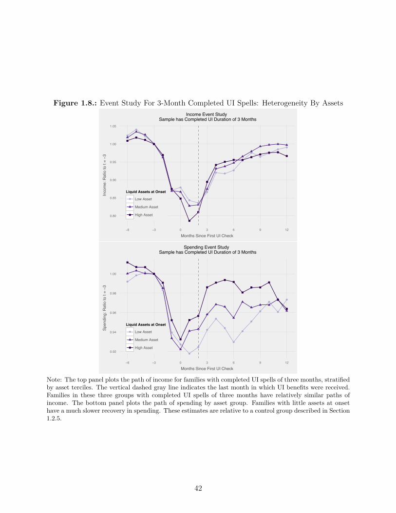
Figure 1.8.: Event Study For 3-Month Completed UI Spells: Heterogeneity By Assets
●
●
●
●
●
●●
●●
●
● ●●
●
●
●
●
●●
0.80
0.85
0.90
0.95
1.00
1.05
−6 −3 0 3 6 9 12
Months Since First UI Check
Inco
me:
Rat
io to
t = −3
Liquid Assets at Onset
● Low Asset
Medium Asset
High Asset
Income Event Study Sample has Completed UI Duration of 3 Months
●
●●
●
●
●
●
●
●
●
●
●
●
●
●
●
●
●
●
0.92
0.94
0.96
0.98
1.00
−6 −3 0 3 6 9 12
Months Since First UI Check
Spen
ding
: Rat
io to
t = −3
Liquid Assets at Onset
● Low Asset
Medium Asset
High Asset
Spending Event Study Sample has Completed UI Duration of 3 Months
Note: The top panel plots the path of income for families with completed UI spells of three months, stratifiedby asset terciles. The vertical dashed gray line indicates the last month in which UI benefits were received.Families in these three groups with completed UI spells of three months have relatively similar paths ofincome. The bottom panel plots the path of spending by asset group. Families with little assets at onsethave a much slower recovery in spending. These estimates are relative to a control group described in Section1.2.5.
42

$1,350 of lost benefits, and is predictable. With a monthly job-finding rate of 25%, the
probability of exhaustion is 75% one month before, 56% two months before, and so on.40
What should happen to spending at exhaustion? A liquidity-constrained consumer with no
assets at the onset of unemployment may cut spending gradually, but will have no excess
drop in the month in which she exhausts benefits (Jappelli and Pistaferri (2010), Section
3.2). We formalize this prediction in the model.
In practice, we find that spending drops sharply by $259 in the month benefits are exhausted.
Spending drops when benefits are exhausted, so it drops sooner in Florida, which o�ers at
most 16 weeks of benefits, than it does in most states, where benefits last for 26 weeks.
Spending drops across a wide variety of categories, including food at home, retail purchases,
entertainment and medical copays. To the extent that families are able to smooth this
income shock, they do so by drawing down their liquid assets. Such a discontinuous drop is
quite surprising and we explore possible explanations in the model section.
1.5.1. Income Drops Sharply at Exhaustion
The exhaustion of UI benefits causes a substantial negative loss in monthly family income,
as shown in the top panel of Figure 1.9.41 Lost UI benefits were about $1,350 per month, or
enforced.40To study the experience of typical UI recipients, our analysis studies people who exhausted benefits inFebruary 2014 or later. These people were eligible for at most 26 weeks of benefits. Some states had lowerpotential benefit durations: Kansas (20 weeks), Michigan (20 weeks), Florida (16 weeks) and Georgia (18weeks).
41We define exhaustees as families who received UI benefits equal to the maximum number of allowed weeks ineach state, with a window of two weeks to allow for administrative noise. Some UI recipients (perhaps 20%)with limited earnings histories are eligible for less than the maximum duration of benefits and we are unableto identify these exhaustees. To adjust for di�erences in benefit duration across states, we organize our plotsin this section around the month in which the last UI check was received for benefit exhaustees. AppendixFigure 1.6 shows an event study of UI benefits for exhaustees for the six largest states in the JPMCI sample– the shorter duration of UI benefits for Florida and Michigan is clearly evident.
43

37% of median income prior to onset. Labor income rises by about $400 and other income
rises by $50 per month, so the drop in monthly family income is about $900. Labor income
rises at exhaustion for three reasons: (1) some UI recipients would have found jobs even if
benefits continued, (2) other family members may increase their labor supply (Cullen and
Gruber (2000), Stephens (2002), Rothstein and Valetta (2014), Blundell et al. (2015)), and
(3) search e�ort and job-finding rates are higher at benefit exhaustion (Katz and Meyer
(1990), Schmieder et al. (2012), Card et al. (2007), Krueger and Mueller (2010), DellaVigna
et al. (2014)).
1.5.2. Spending Drops Sharply At Exhaustion
Spending drops by $22 per month in the months leading up to exhaustion and by $259
(11%) in the month after benefits are exhausted, as shown in the bottom panel of Figure
1.9.42 The estimating equation for exhaustion is the same as the equation for onset: (cit
=
– + —Post
it
+ Á
it
). The orthogonality restriction for this regression is E(Áit
|Post
it
) = 0,
which means that the timing of exhaustion is not correlated with something that might a�ect
spending directly. Because the start dates of UI spells are highly idiosyncratic, exhaustion
dates are also idiosyncratic and so this orthogonality restriction seems plausible. Note this
restriction does not rule out extra job search at exhaustion or that exhaustion causes families
to make new plans for their spending; this is part of the causal impact of exhaustion. In the
rest of our analysis, to deal with time aggregation, we define the drop at exhaustion as the
change in spending over a two-month window so that we can study all exhaustees.43
42Table 1.4 reports the percent change at exhaustion relative to the pre-onset mean, which is 10%. Here, wereport the drop as a percent of the spending level prior to exhaustion, which is 11%.
43One important technical wrinkle for estimating the spending drop at benefit exhaustion comes from timeaggregation – we have monthly income and spending data, but benefits are paid on a weekly or biweeklybasis. In our plots in Figure 1.9, we limited the sample to exhaustees who received their last UI check onthe 25th of the month or later. These families have a sharp drop in UI income from one month to the nextand also a sharp drop in spending. However, the monthly structure of the data means that UI benefitsappear to phase out over two months for most families. Appendix Figure 1.7 shows that the magnitude of
44
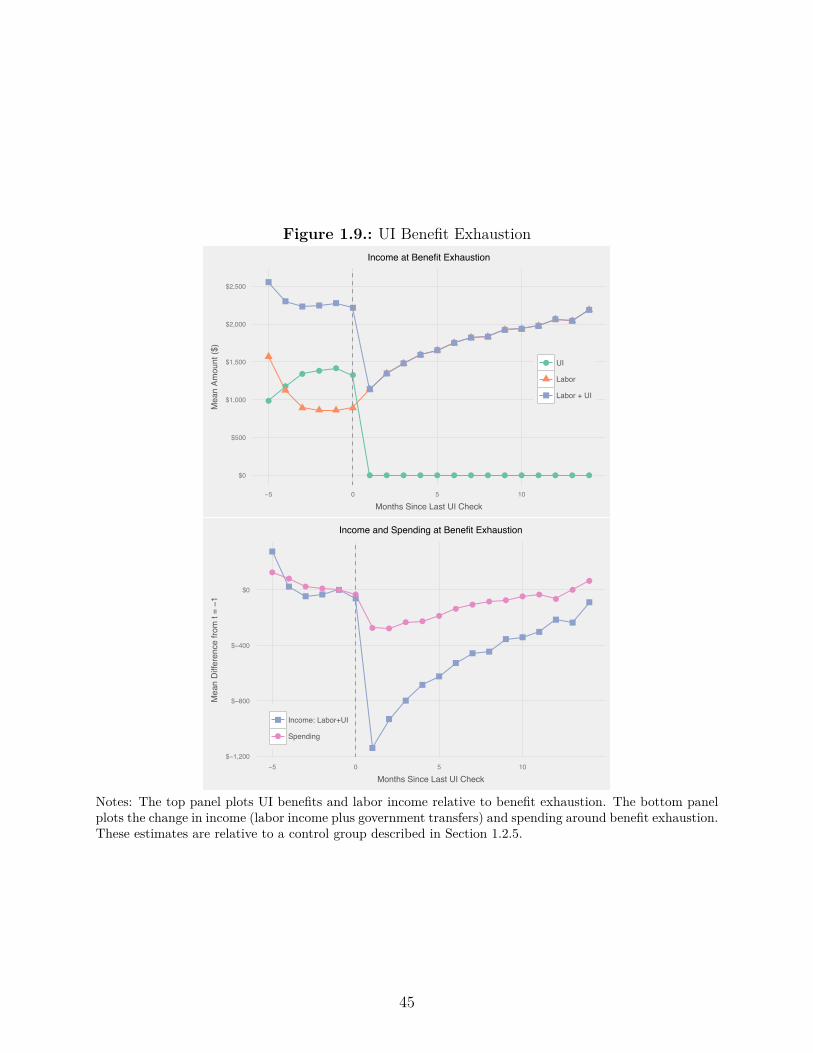
Figure 1.9.: UI Benefit Exhaustion
●
●
● ● ●●
● ● ● ● ● ● ● ● ● ● ● ● ● ●$0
$500
$1,000
$1,500
$2,000
$2,500
−5 0 5 10
Months Since Last UI Check
Mea
n Am
ount
($)
● UI
Labor
Labor + UI
Income at Benefit Exhaustion
●●
● ● ●●
● ●● ●
●●
● ● ● ● ●●
●●
$−1,200
$−800
$−400
$0
−5 0 5 10
Months Since Last UI Check
Mea
n D
iffer
ence
from
t = −1
●
Income: Labor+UI
Spending
Income and Spending at Benefit Exhaustion
Notes: The top panel plots UI benefits and labor income relative to benefit exhaustion. The bottom panelplots the change in income (labor income plus government transfers) and spending around benefit exhaustion.These estimates are relative to a control group described in Section 1.2.5.
45

The best evidence that the drop in spending at benefit exhaustion is caused directly by
benefit exhaustion comes from di�erences across states. Appendix Figure 1.6 shows the
path of spending over time for UI exhaustees for the six largest states in the data. Florida
and Michigan o�er maximum durations of UI benefits less than 26 weeks. Spending declines
at the same time benefits are exhausted in these states, which is well before the time when
spending declines in states that o�er the traditional 26 weeks of benefits.
1.5.3. Decomposition – What Kinds of Spending Drop?
The drop in spending at benefit exhaustion appears to reflect a change in a family’s ac-
tual consumption bundle from the prior month, rather than simply a delay in purchases of
durable goods or a decrease in payments on outstanding debts. The top half of Table 1.7
decomposes the drop in outflows into nine di�erent categories. In a reversal of the patterns
we documented at onset, non-work-related expenses on cards fall more than work-related ex-
penses. The categories which drop most are food at home, retail purchases and the presence
of any medical copay, as shown in Table 1.7. Aguiar and Hurst (2005) compare the diets of
employed and unemployed people, controlling for a wide variety of observables, and report
a similarly-sized gap in spending on food at home between the employed and unemployed
(9-15%) to the drop we see at exhaustion. They estimate that unemployment causes a five
percentage point increase in any hot dog consumption and a nine percentage point decrease
in any fresh fruit consumption, suggesting that there is a substantial change in diet quality
at exhaustion. In addition, the share of families with any entertainment expenditures, which
was stable at onset, drops by about 10% at exhaustion.
At exhaustion, families appear to prioritize their most important financial commitments,the two-month spending drop for all UI exhaustees is very similar to the magnitude of the one-month dropfor exhaustees who get their last check at the end of the month.
46

which show relatively small drops in spending. Table 1.7 shows that the drop in spending
is smallest for utility payments, auto loans and mortgage payments. Delinquency measured
in credit bureau records and credit scores are all relatively stable (Appendix Table 1.2).
There is little evidence to suggest that benefit exhaustion does immediate damage to a fam-
ily’s long-term financial health.44 The data are consistent with prior work on consumption
commitments by Chetty and Szeidl (2007), where families cut spending on some flexible
expenditure categories sharply to protect their long-run commitments.
To the extent agents smooth their spending at exhaustion, they do so by drawing down
liquid assets. Dissaving inflows spike, as do paper checks, as shown in Table 1.7. Agents
also draw down their checking account balance, as shown in Table 1.4. Again, we find only a
modest increase in credit card borrowing; spending on Chase credit cards does not increase,
and balances rise because families make smaller payments on their outstanding credit card
debt.
1.6. Performance of Benchmark Consumption Models
In this section, we compare the actual path of spending during unemployment to benchmark
models of consumption. First, in Section 1.6.1 we show that unemployment is a good way
to test alternative consumption models, since unemployment is a large shock to income,
implying that hand-to-mouth behavior cannot be consistent with near-rationality. Then,
we describe the setup of our model in Section 1.6.2. To capture “bu�er stock” consumers
in the tradition of Deaton (1991), and Aiyagari (1994), we do not allow agents to borrow
at all in our baseline parametrization. As an alternative scenario, to capture “permanent
income” consumers in the spirit of Friedman (1957), Modigliani and Brumberg (1954), and44The decline in the presence of medical copayments, however, could imply that families are delaying importanthealth expenditures.
47
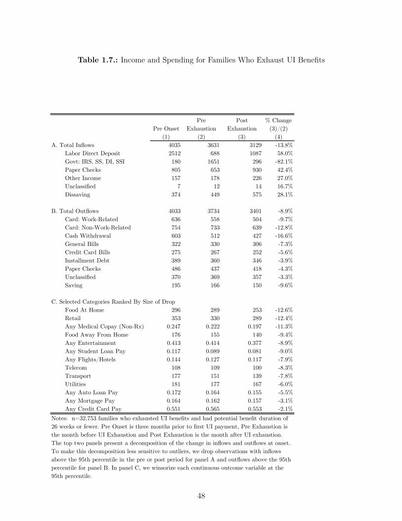
Table 1.7.: Income and Spending for Families Who Exhaust UI Benefits
Pre OnsetPre
ExhaustionPost
Exhaustion% Change
(3)/(2)(1) (2) (3) (4)
A. Total Inflows 4035 3631 3129 -13.8%Labor Direct Deposit 2512 688 1087 58.0%Govt: IRS, SS, DI, SSI 180 1651 296 -82.1%Paper Checks 805 653 930 42.4%Other Income 157 178 226 27.0%Unclassified 7 12 14 16.7%Dissaving 374 449 575 28.1%
B. Total Outflows 4033 3734 3401 -8.9%Card: Work-Related 636 558 504 -9.7%Card: Non-Work-Related 754 733 639 -12.8%Cash Withdrawal 603 512 427 -16.6%General Bills 322 330 306 -7.3%Credit Card Bills 275 267 252 -5.6%Installment Debt 389 360 346 -3.9%Paper Checks 486 437 418 -4.3%Unclassified 370 369 357 -3.3%Saving 195 166 150 -9.6%
C. Selected Categories Ranked By Size of DropFood At Home 296 289 253 -12.6%Retail 353 330 289 -12.4%Any Medical Copay (Non-Rx) 0.247 0.222 0.197 -11.3%Food Away From Home 176 155 140 -9.4%Any Entertainment 0.413 0.414 0.377 -8.9%Any Student Loan Pay 0.117 0.089 0.081 -9.0%Any Flights/Hotels 0.144 0.127 0.117 -7.9%Telecom 108 109 100 -8.3%Transport 177 151 139 -7.8%Utilities 181 177 167 -6.0%Any Auto Loan Pay 0.172 0.164 0.155 -5.5%Any Mortgage Pay 0.164 0.162 0.157 -3.1%Any Credit Card Pay 0.551 0.565 0.553 -2.1%
Notes: n=32,753 families who exhausted UI benefits and had potential benefit duration of 26 weeks or fewer. Pre Onset is three months prior to first UI payment, Pre Exhaustion is the month before UI Exhaustion and Post Exhaustion is the month after UI exhaustion. The top two panels present a decomposition of the change in inflows and outflows at onset. To make this decomposition less sensitive to outliers, we drop observations with inflows above the 95th percentile in the pre or post period for panel A and outflows above the 95th percentile for panel B. In panel C, we winsorize each continuous outcome variable at the 95th percentile.
48
Hall (1978), we allow agents to borrow against their future income at interest rate R.45 The
drop in spending from onset through exhaustion in the data matches the bu�er stock model,
assuming that agents start their unemployment spell with liquid assets equal to one month
of income. Next, in Section 1.6.3, we show that the bu�er stock model does a better job of
fitting the data than either a permanent income model, or a hand-to-mouth model. Finally,
in Section 1.6.4, we explore two major shortcomings of the bu�er stock model relative to the
data – it predicts substantially more asset holdings at onset and it predicts a much smoother
path of spending around benefit exhaustion.
1.6.1. Why Unemployment is a Good Test of Alternative
Consumption Models
Unemployment is a powerful setting for testing alternative consumption models, since it
causes a large shock to income, implying that myopic behavior is not approximately ra-
tional using a welfare metric. A large literature uses the spending response to temporary
income shocks such as tax rebates to test between models with and without liquidity con-
straints. Most papers in this literature consistently find a higher marginal propensity to
consume (MPC) than would be predicted for a permanent income consumer without liquid-
ity constraints. Many authors interpret these high MPCs as evidence in favor of bu�er stock
models. However, an alternative interpretation is that agents’ choices are consistent with
near-rationality (Cochrane (1989)).46 Proponents of this view argue that the welfare costs of
failing to smooth income shocks of the magnitude observed in the literature are quite small,45In the “permanent income” models cited above, because agents can borrow against their future income,spending is insensitive to temporary income fluctuations. Not all models which allow agents to borrowagainst their future income have a low sensitivity of spending to current income (see Carroll (1997) for acounterexample), but our model does have this feature.
46Papers which use near-rationality to explain consumption fluctuations include Kueng (2015), Reis (2006)and Caballero (1995).
49

and that such small deviations from optimality are not su�ciently compelling evidence to
reject the permanent income model.
Fuchs-Schuendeln and Hassan (2015) develop a framework to evaluate the near-rationality
claim. For a given temporary income change, they calculate the welfare cost of behaving like
a hand-to-mouth consumer and failing to adjust spending in order to perfectly smooth the
shock. Specifically, consider an agent with regular monthly income y who receives a one-time
tax rebate of x. They calculate a measure of equivalent variation as the additional monthly
income v that a consumer would require to be indi�erent between consuming all of the tax
rebate x in one month plus v in every month over the year, and smoothing the tax rebate
over one year. In other words, they find the v which solves
u (y + x+ v)¸ ˚˙ ˝
MPC=1
+11 · u(y + v) = 12 · u
3y + x
12
4
¸ ˚˙ ˝perm income
, (1.5)
for CRRA utility with “ = 2, and they define EV = v
y
. They perform this calculation for
the income changes examined in 18 recent empirical papers in this literature. Their findings
are shown in the green bars in Figure 10. They find that acting like a hand-to-mouth
consumer who fails to smooth spending has a welfare loss smaller than losing 1% of monthly
consumption over a year in most cases, and no more than 5% in any case. We perform the
same calculation for the income loss associated with an unemployment spell which lasts at
least six months, and show this as the orange bar in Figure 10. The welfare cost of failing
to smooth the income loss associated with a UI spell terminating in exhaustion, and instead
acting like a hand-to-mouth consumer, is equivalent to 20% of annual consumption.47
The large income change associated with unemployment also enables us to test theories of47Formally, we calculate this as the scalar v in monthly consumption which solves
qj wj
q15t=1 —
tu(cPIH
t,j ) =q
j wj
q15t=1 —
tu(cH2M
t,j + v) where j indexes di�erent employment histories after benefit exhaustion and wj
is the probability of each employment history.
50
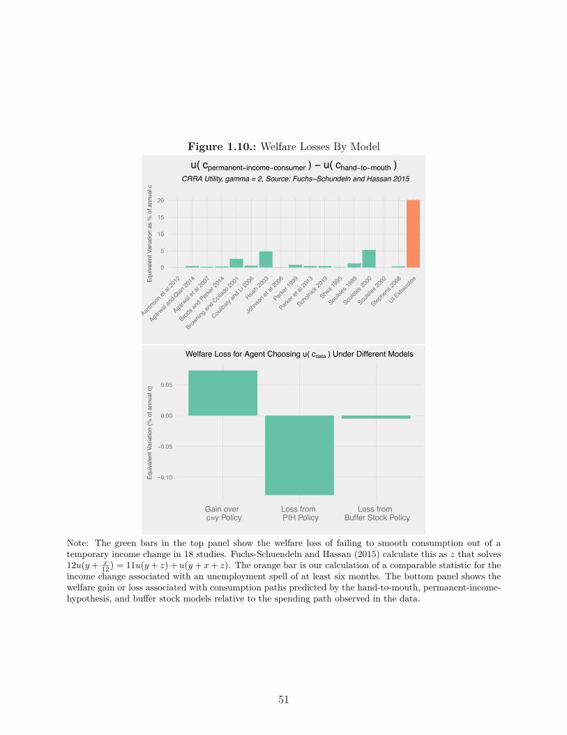
Figure 1.10.: Welfare Losses By Model
0
5
10
15
20
Aarons
on et
al 20
12
Agarw
al an
d Qian
2014
Agarw
al et
al 20
07
Broda a
nd Park
er 20
14
Brownin
g and
Collado
2001
Couliba
ly and
Li 20
06
Hsieh 2
003
John
son e
t al 2
006
Parker
1999
Parker
et al
2013
Scholn
ick 20
13
Shea 1
995
Soulele
s 199
9
Soulele
s 200
0
Soulele
s 200
2
Stephe
ns 20
08
UI Exh
auste
eEqui
vale
nt V
aria
tion
as %
of a
nnua
l c
u( cpermanent−income−consumer ) − u( chand−to−mouth ) CRRA Utility, gamma = 2, Source: Fuchs−Schundeln and Hassan 2015
−0.10
−0.05
0.00
0.05
Gain over c=y Policy
Loss from PIH Policy
Loss from Buffer Stock Policy
Equi
vale
nt V
aria
tion
(% o
f ann
ual c
)
Welfare Loss for Agent Choosing u( cdata ) Under Different Models
Note: The green bars in the top panel show the welfare loss of failing to smooth consumption out of atemporary income change in 18 studies. Fuchs-Schuendeln and Hassan (2015) calculate this as z that solves12u(y + x
12 ) = 11u(y + z) + u(y + x+ z). The orange bar is our calculation of a comparable statistic for theincome change associated with an unemployment spell of at least six months. The bottom panel shows thewelfare gain or loss associated with consumption paths predicted by the hand-to-mouth, permanent-income-hypothesis, and bu�er stock models relative to the spending path observed in the data.
51

excess sensitivity motivated by transaction costs. Kaplan and Violante (2014) build a model
with a transaction cost of accessing an illiquid asset which o�ers higher returns than liquid
asset holding. A key prediction of their model is that the excess sensitivity of spending
to tax rebates is falling in rebate size: agents immediately consume 15% of a $500 rebate,
but only immediately consume 3% of a $5,000 rebate, as shown in Kaplan and Violante’s
Figure 8. The average UI spell entails an average loss of $8,500 of income. Because the size
of the income loss is uncertain, the motive to liquidate at UI onset is even stronger than
when the rebate size is known with certainty. As a result, the logic of the model suggests
that Kaplan and Violante (2014) predict a withdrawal from the illiquid asset at the start
of an unemployment spell, followed by relatively stable consumption during unemployment.
However, we have not explicitly modeled the dynamics of when the agent would choose to
pay the liquidation cost and this is a fruitful area for further research.
1.6.2. Model Setup
We calibrate a finite-horizon bu�er stock model of consumption and savings. Agents have
Constant Relative Risk Aversion (CRRA) utility, and choose their level of consumption each
month, ct
, to maximize their expected discounted flow of lifetime utility. Agents earn a
monthly return of R on their beginning of month assets a
t
. Income z
t
is risky because
of unemployment; this risk is partially insured by unemployment benefits, which expire
after six months. Employment follows a Markov process � where agents transition between
employment and unemployment. The agent’s problem in month t can be written as
52
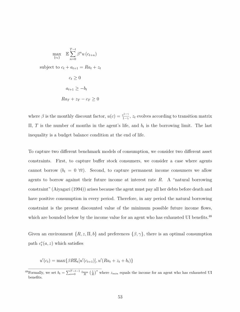
max{c
t
}E
T≠tÿ
n=0
—
n
u (ct+n
)
subject to c
t
+ a
t+1
= Ra
t
+ z
t
c
t
Ø 0
a
t+1
Ø ≠b
t
Ra
T
+ z
T
≠ c
T
Ø 0
where — is the monthly discount factor, u(c) = c
1≠“
1≠“
, zt
evolves according to transition matrix
�, T is the number of months in the agent’s life, and b
t
is the borrowing limit. The last
inequality is a budget balance condition at the end of life.
To capture two di�erent benchmark models of consumption, we consider two di�erent asset
constraints. First, to capture bu�er stock consumers, we consider a case where agents
cannot borrow (bt
= 0 ’t). Second, to capture permanent income consumers we allow
agents to borrow against their future income at interest rate R. A “natural borrowing
constraint” (Aiyagari (1994)) arises because the agent must pay all her debts before death and
have positive consumption in every period. Therefore, in any period the natural borrowing
constraint is the present discounted value of the minimum possible future income flows,
which are bounded below by the income value for an agent who has exhausted UI benefits.48
Given an environment {R, z,�, b} and preferences {—, “}, there is an optimal consumption
path c
út
(a, z) which satisfies
u
Õ(ct
) = max{—REt
[uÕ(ct+1
)], uÕ(Ra
t
+ z
t
+ b
t
)}
48Formally, we set bt =qT≠t≠1
s=0zmin
R
! 1R
"s where zmin equals the income for an agent who has exhausted UIbenefits.
53
We calibrate the model using the JPMCI data and the standard preference parameters
summarized in Table 1.8.
• Income – We normalize income to 1.0 in the employed state. To match the data, we
set income to 0.84 while receiving UI benefits and 0.53 after UI benefit exhaustion.
Income does not fall to zero after exhaustion because our income concept includes
labor income from all family members, non-labor income, and government transfers.
• Transition Rates – The transition rate from unemployment to employment is 25%,
which matches the UI exit rate in the data. We do not observe job-finding after
benefit exhaustion; we assume that it is 25% in all months except the month benefits
are exhausted, when we set the job-finding rate to 30% to match evidence from Card
et al. (2007). In a robustness check, we consider an alternative specification where the
job-finding rate is permanently lower after exhaustion. We choose a separation rate
to UI of 3.25% in order to match the 11.5% of families with an unemployed member
during 2013 and 2014 (Bureau of Labor Statistics, 2014).
• Preferences and Environment – For the preference parameters — and “ we choose
standard values of 0.996 (translating to an annual discount rate of 5%) , and 2.0. We
choose a monthly real interest rate of 0.25%, which translates to an annual interest
rate of 3%. We consider a time horizon of 240 months, corresponding to a middle-aged
worker with 20 years left in her career.
Given these parameter values, we solve the consumer’s problem numerically using the method
of endogenous gridpoints suggested in Carroll (2006). This method returns optimal consump-
tion c
út
(at
, e
t
) as a function of the agent’s beginning of month assets and their employment
54
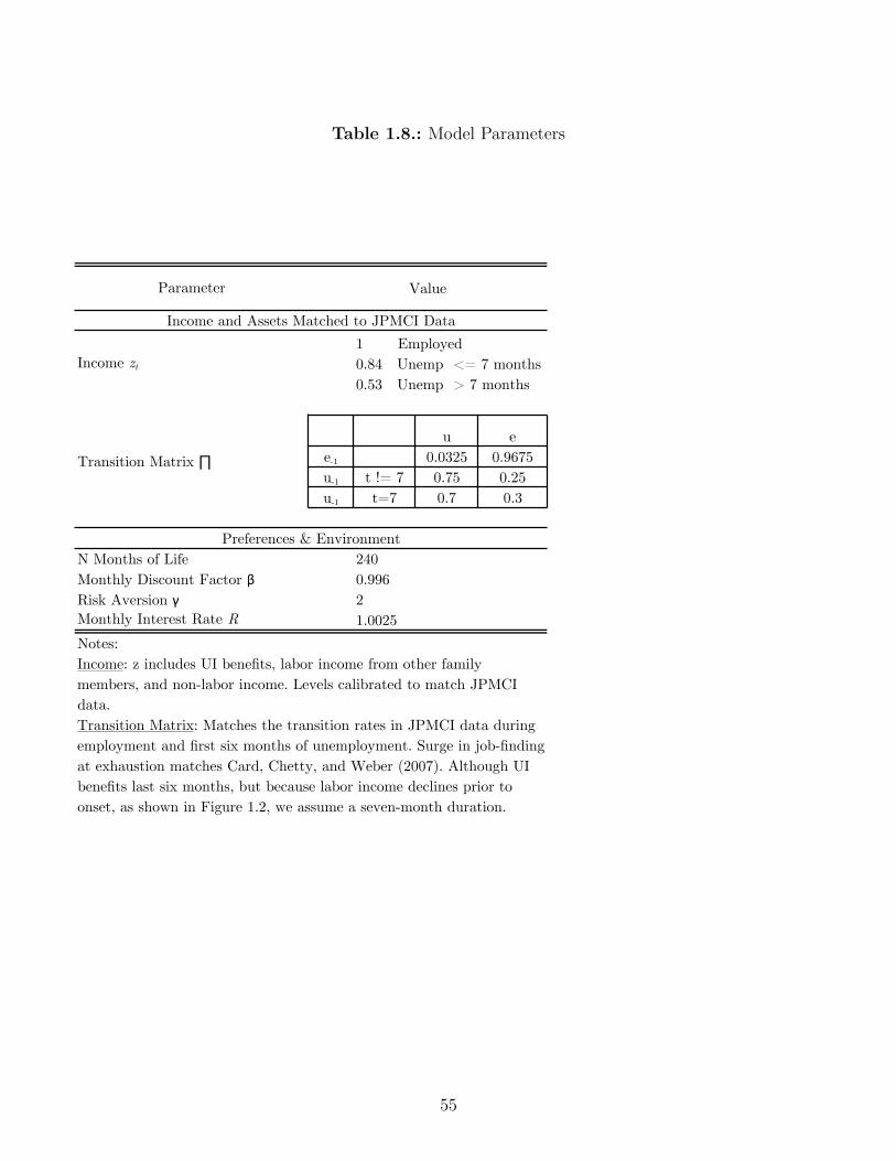
Table 1.8.: Model Parameters
Parameter
1 Employed0.84 Unemp <= 7 months0.53 Unemp > 7 months
u ee-1 0.0325 0.9675u-1 t != 7 0.75 0.25u-1 t=7 0.7 0.3
N Months of Life 240Monthly Discount Factor β 0.996Risk Aversion γ 2Monthly Interest Rate R 1.0025
Value
Notes: Income: z includes UI benefits, labor income from other family members, and non-labor income. Levels calibrated to match JPMCI data.Transition Matrix: Matches the transition rates in JPMCI data during employment and first six months of unemployment. Surge in job-finding at exhaustion matches Card, Chetty, and Weber (2007). Although UI benefits last six months, but because labor income declines prior to onset, as shown in Figure 1.2, we assume a seven-month duration.
Transition Matrix ∏
Preferences & Environment
Income and Assets Matched to JPMCI Data
Income zt
55

status et
= {E,U1, U2, U3, U4, U5, U6, U7, U8}, where U8 represents benefit exhaustion.49
1.6.2.1. An Over-identification Test Using Liquid Asset Holdings
We choose the asset holdings at onset which best match the spending drop for an agent
who cannot borrow and this comes very close to matching the actual liquid asset hold-
ings in the data. An agent who becomes unemployed after t = 0 with assets a
0
and
stays unemployed through benefit exhaustion sees a consumption drop of �c
model(a0
) ©
c
úpost≠exhaust,t
(aút
(a0
), U8)/cú0
(a0
, E). We choose a
best≠fit
0
such that
�c
model(abest≠fit
0
) = c
data
post≠exhaust
/c
data
pre≠onset
Because our model has exactly one free parameter (abest≠fit
0
) and we match one samplemoment (cdata
post≠exhaust
/c
data
pre≠onset
), the model is exactly identified and we estimate assets atonset equal to 0.84 months of income. We do not observe total liquid asset holdings in theJPMCI data, so we estimate them using an adjustment factor from the SCF. Specifically,we estimate
a
data0 = (Total liquid assets)SCF
(Checking account balance)SCF
· (Checking account balance)Chase
(Pre unemployment monthly income)Chase
= 0.71,
This is very close to the 0.84 months which fits the spending drop from onset through
exhaustion.50 There are many reasons that liquid assets held by agents at onset might not
reflect the total amount of assets they might have available to help them smooth a large shock
49The combination of asset level and employment status determines beginning-of-period cash on hand mt =Rat + zt(e), which is formally how the model is solved. In Section 1.3.1, we documented that the decline infamily income occurs one month before UI receipt begins because of a time lag between job separation andthe beginning of UI receipt. To match this feature of the data in the model, we assume that UI benefitsactually last 7 months rather than six months.
50This is slightly smaller than the one month’s income worth of liquid asset holdings prior to unemploymentestimated by Chetty (2008) in survey data.
56

such as unemployment. For example, agents might receive transfers from their parents, or
they might be able to sell consumer durables. Our results suggest that these channels are
not quantitatively important channels for consumption smoothing.
1.6.3. Bu�er Stock Fits the Data Better Than Alternative Models
We compare the path of consumption predicted by our bu�er stock model to the path
of spending observed in the data. To enable this comparison, we need to assume that
the nondurables spending in the data is the same as consumption in the model.51 In our
robustness checks, we examine total spending as well. The bu�er stock model fits some
aspects of the spending path during unemployment, as shown in the top panel of Figure
1.11. By construction, the bu�er stock model matches the level of spending at onset and
exhaustion. Not by construction, the bu�er stock model matches the drop at the onset of
unemployment. In the model, families cut spending additionally each month that they stay
unemployed. This matches the data qualitatively – families in the data are cutting spending
from months two through 5 – but not quantitatively, since the model predicts larger spending
cuts while receiving UI and no excess drop in spending at benefit exhaustion. We focus on
this failing of the model in Section 1.6.4.
Next, we show that the bu�er stock model outperforms the permanent income benchmark
and the hand-to-mouth benchmark using the Cochrane (1989)-Fuchs-Schuendeln and Hassan
51To ensure comparability between the model and the data, we make two adjustments to our prior dataanalysis. First, we analyze the subset of UI spells where potential benefit duration was 26 weeks at thestart and end of UI receipt. Second, we adjust the spending series to reflect the spending of agents whoremain unemployed after benefit exhaustion. In the data, we observe average spending in the month afterbenefit exhaustion for the unemployed and the re-employed together. We assume that spending is constantfor the 30% of agents that are re-employed in the month of benefit exhaustion (as it is for agents who arere-employed after 3, 4, or 5 months of unemployment) and estimate the drop in spending for the unemployedalone as 1.43 times the drop for the pooled sample.
57
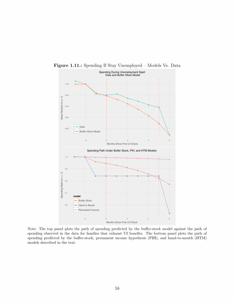
Figure 1.11.: Spending If Stay Unemployed – Models Vs. Data
●
●
●●
●
●
●
●
●
●
0.80
0.85
0.90
0.95
1.00
−2 0 2 4 6
Months Since First UI Check
Valu
e R
elat
ive to
t=−2
● Data
Buffer Stock Model
Spending During Unemployment Spell Data and Buffer Stock Model
0.6
0.7
0.8
0.9
1.0
−2 0 2 4 6
Months Since First UI Check
Spen
ding
Rat
io to
t = −2
modelBuffer Stock
Hand to Mouth
Permanent Income
Spending Path Under Buffer Stock, PIH, and HTM Models
Note: The top panel plots the path of spending predicted by the bu�er-stock model against the path ofspending observed in the data for families that exhaust UI benefits. The bottom panel plots the path ofspending predicted by the bu�er-stock, permanent income hypothesis (PIH), and hand-to-mouth (HTM)models described in the text.
58

(2015) welfare metric. As discussed above, we implement a permanent income benchmark
by allowing the agent to borrow out of her future income. We also consider a hand-to-mouth
agent who sets consumption equal to current income each period.52 We calculate v, the
increment to monthly spending needed to make the agent indi�erent between her choices in
the data and her predicted choices under the di�erent benchmark models. This is given by
a modified equation (1.5) where w
j
reflects probabilities of di�erent employment histories:
ÿ
j
w
j
15ÿ
t=1
—
t
u(cmodel
t,j
) =ÿ
j
w
j
15ÿ
t=1
u(cdatat,j
≠ v) (1.6)
We aggregate over all possible job-finding histories in the eight months after exhaustion.53
We find that the path of spending we observe in the data represents a 7% gain relative to
the hand-to-mouth path, and a 13% loss relative to the smooth permanent income path, as
shown in the bottom panel of Figure 1.11. In contrast, the welfare loss of the deviations from
the bu�er-stock path shown in Figure 1.10 is about 1%. We interpret this as evidence in
favor of the bu�er-stock model with little assets at onset, relative to either of the alternatives
considered here.
Two key lessons from the model are that we can fit the drop in spending from onset through
exhaustion assuming families hold little liquid assets at onset, but that we cannot fit the
monthly drop at exhaustion. These conclusions continue to hold under a number of alter-
native assumptions which we discuss in Appendix A.2.4 and show graphically in Appendix
Figure 1.8.
52This corresponds to a special case of the rule-of-thumb consumer in Campbell and Mankiw (1989), wherect = –zt, with – = 1. This model is commonly used in the public economics literature when studyingunemployment. Examples include Mortensen (1977), Shimer and Werning (2007), Rothstein (2011), andKrueger and Mueller (2014).
53For cdatat we assume that the agent behaves optimally between exhaustion and re-employment according tothe bu�er-stock model given the assets they have left at this point, and then once re-employed, they adjusttheir spending such that they match the assets of bu�er-stock agents by month 15.
59

Nevertheless, our conclusions are highly sensitive to assumptions about families’ assets prior
to unemployment. In the bottom right panel of Appendix Figure 1.8 we show the model
predictions assuming agents either have no assets, or have assets equal to one year’s worth of
income. Agents with assets equal to one year’s worth of income smooth spending considerably
throughout the spell, whereas agents with no assets cut their spending substantially more
as the spell progresses.
1.6.4. Failings of the Bu�er Stock Model
While the bu�er-stock model does a reasonable job of matching the overall path of spending,
it has two major failings relative to the data. First, it predicts substantially more asset
holdings at onset. Second, it predicts that spending does not drop discontinuously at benefit
exhaustion.
1.6.4.1. Failure 1: Agents Hold Too Little Liquid Assets at Onset
A key prediction of bu�er stock models is that agents should accumulate precautionary
savings to self-insure against income risk. In our model with only temporary income risk,
we calculate that agents should hold liquid assets equal to about 2.4 months of income,
which is three times the asset holdings which fit the spending drop from onset to exhaustion.
Models with realistic income processes – including permanent income risk and retirement –
predict much higher asset holdings. Gourinchas and Parker (2002) estimate that an agent’s
target bu�er stock is about 12 months of assets early in life and rises to over 60 months as
retirement approaches. Laibson et al. (2015) estimate a model where they match illiquid
wealth holdings equal to 31 months of income.
60

Why might agents be holding so little liquid assets, even when this means that spending
appears to be so sensitive to income? There are two broad classes of reasons why this might
be the case. First, monthly spending on nondurable goods from bank accounts may not
accurately capture fluctuations in consumption. Purely from a measurement perspective,
this could arise if consumption rises through in-kind transfers or purchases made with cash
not deposited in the bank account. Even if bank accounts accurately capture the goods
a family purchases each month, even nondurables have a shelf life such that consumption
flows are more stable than expenditures. Second, even if consumption does fluctuate from
month to month, there are some preferences which can rationalize this behavior. With a
low coe�cient of risk aversion, a family could be very willing to substitute consumption
across periods. A model with quasi-hyperbolic preferences such as Laibson (1997) predicts
low liquid asset holdings from highly impatient consumers.
A related puzzle which merits further work is why agents do not seem to use the borrowing
channels which are available to them. For example, we have documented almost no change
in credit card borrowing during unemployment. The monthly interest rate on credit cards
is about 1% in the UI recipient sample. And to the extent that agents can default on credit
card debt if their income remains low as in Herkenho� (2015), the argument for borrowing
on credit cards while unemployed is even stronger.
1.6.4.2. Failure 2: Agents Cut Spending Too Slowly During UI Receipt and
Too Much at Exhaustion
We have not been able to find a parametrization of our model in which agents have rational
expectations which matches the very slow average monthly decline during UI receipt (0.6%
per month) and the 11% drop in spending at benefit exhaustion. Two specific scenarios
61

shown in the top panels of Figure 12 help clarify why this pattern is di�cult to model. First,
we consider a scenario where agents have no assets two months prior to their unemployment
spell. These agents cut spending rapidly at the start of an unemployment spell to the level of
UI benefits. As the unemployment spell wears on, they cut spending further, below the level
of UI benefits, in order to build a bu�er which will help o�set the income drop at benefit
exhaustion. Second, we consider a scenario where agents have a 10% monthly discount rate
(e.g. DellaVigna and Paserman (2005)). These agents draw down their assets at the start
of an unemployment spell such that by month two, consumption is equal to the level of UI
benefits. As exhaustion approaches, even these agents build a small bu�er.
Benefit exhaustion does not appear to be associated with a permanent change in re-employment
wages (von Wachter et al. (2015)) and this enables us to rule out certain theories about the
drop at benefit exhaustion. First, if agents discretely received negative news about their
productivity at benefit exhaustion, then we would expect re-employment wages to be per-
manently lower. Second, if agents were present-biased then they would face a liquidity
shortfall in every month after benefit exhaustion and again we would expect permanently
lower re-employment wages. If von Wachter et al. (2015)’s findings also hold in the US then
our results are hard to reconcile with productivity updating or present-bias.
One simple deviation from rationality which can explain the drop at exhaustion is over-
optimism about job-finding at the end of a UI spell combined with pessimism (or lack of
e�ort) earlier on in the a spell. Spinnewijn (2015) finds that on average unemployment
spells last more than three times longer than workers expect at onset. Why might workers
be over-optimistic and then cut their spending at exhaustion? One possibility is that if they
searched little while receiving UI, they might have an inflated view of how easily they can
get a job. When they raise their search e�ort at exhaustion and do not find a job, this leads
them to update their beliefs about how quickly they can get a job. Another possibility is
62
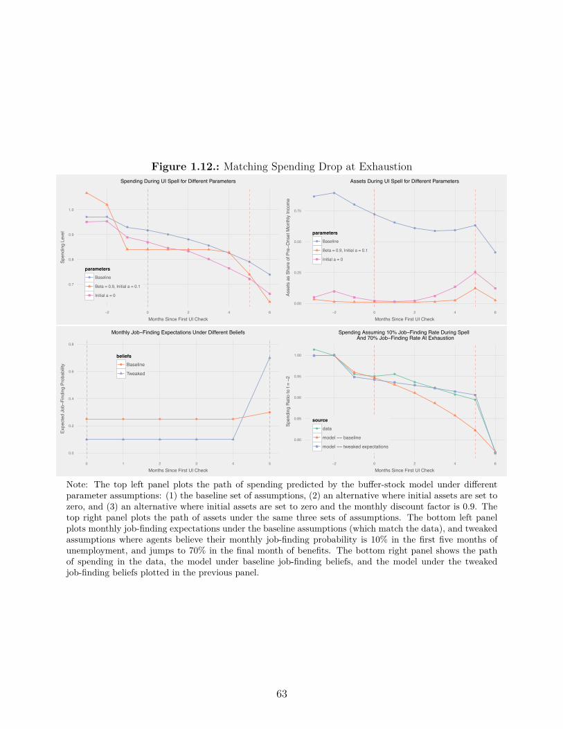
Figure 1.12.: Matching Spending Drop at Exhaustion
● ●
●●
●
●
●
●
●
●
0.7
0.8
0.9
1.0
−2 0 2 4 6
Months Since First UI Check
Spen
ding
Lev
el
parameters● Baseline
Beta = 0.9, Initial a = 0.1
Initial a = 0
Spending During UI Spell for Different Parameters
●●
●
●
●
●● ●
●
●
0.00
0.25
0.50
0.75
−2 0 2 4 6
Months Since First UI Check
Asse
ts a
s Sh
are
of P
re−O
nset
Mon
thly
Inco
me
parameters● Baseline
Beta = 0.9, Initial a = 0.1
Initial a = 0
Assets During UI Spell for Different Parameters
● ● ● ● ●
●
0.0
0.2
0.4
0.6
0.8
0 1 2 3 4 5
Months Since First UI Check
Expe
cted
Job−F
indi
ng P
roba
bilit
y
beliefs● Baseline
Tweaked
Monthly Job−Finding Expectations Under Different Beliefs
●
●
●●
●
●
●
●
●
●
0.80
0.85
0.90
0.95
1.00
−2 0 2 4 6
Months Since First UI Check
Spen
ding
Rat
io to
t = −2
source● data
model −− baseline
model −− tweaked expectations
Spending Assuming 10% Job−Finding Rate During Spell And 70% Job−Finding Rate At Exhaustion
Note: The top left panel plots the path of spending predicted by the bu�er-stock model under di�erentparameter assumptions: (1) the baseline set of assumptions, (2) an alternative where initial assets are set tozero, and (3) an alternative where initial assets are set to zero and the monthly discount factor is 0.9. Thetop right panel plots the path of assets under the same three sets of assumptions. The bottom left panelplots monthly job-finding expectations under the baseline assumptions (which match the data), and tweakedassumptions where agents believe their monthly job-finding probability is 10% in the first five months ofunemployment, and jumps to 70% in the final month of benefits. The bottom right panel shows the pathof spending in the data, the model under baseline job-finding beliefs, and the model under the tweakedjob-finding beliefs plotted in the previous panel.
63

that they were expecting to be recalled to their previous job but this did not pan out (Katz
and Meyer (1990)).
We find that we can match both the drop from onset to the last month of benefits and the
drop at exhaustion if we assume that agents believe their job-finding rate is only 10% while
receiving UI, but jumps dramatically to 70% in the last month of benefits. (Recall that in
fact the job-finding rate is about 25% in most months of UI receipt and 30% in the month UI
benefits are exhausted.) The path of consumption predicted by such a model is plotted by
the yellow line in the bottom right panel of Figure 12. In this scenario, exhaustion without
finding a job is much more unexpected than it is with accurate beliefs about job-finding
probabilities. One month before exhaustion, families believe there is only a 30% chance of
being unemployed at exhaustion. Two months before, the probability is 23%. Since the
potential income drop associated with exhaustion is (erroneously) assumed to be a low-
probability event, families rationally choose not to cut spending much in anticipation of this
event.
Another possibility is that agents have correct beliefs about their job-finding probabilities,
but are inattentive in their monthly consumption decisions. We showed in Section 1.6.3
that an agent whose optimal spending path followed a bu�er stock model would incur little
welfare loss from making the choices observed in the data. One example of a specific friction
comes in a model developed by Reis (2006). In his model, agents rationally respond to the
costs of processing information about their finances by infrequently updating their budgets,
remaining inattentive between updating dates. Inattention among some agents during UI
receipt, followed by attention from all agents at benefit exhaustion, might explain the pat-
terns we see in the data. Estimating a model with inattention using these spending patterns
is an interesting area for future research.
64

1.7. Conclusion
In this paper, using spending records from the JPMorgan Chase Institute, we built a dataset
to study how unemployment a�ects spending. To summarize our results, we find that families
do insu�cient self-insurance, in the sense that spending is quite responsive to income. We
document that unemployment causes a large but short-lived drop in income, generating a
need for liquidity. Spending on nondurables falls by 6% at the onset of unemployment and
work-related expenses explain about one-quarter of the drop in spending. People receiving
UI keep their spending low after re-employment, perhaps in order to rebuild their financial
bu�er. For people who exhaust UI benefits, spending drops by an additional 11%.
We compare the path of spending in the data to three benchmark consumption models: bu�er
stock, permanent income and hand-to-mouth. Prior work on excess sensitivity of spending
to income had been criticized on the grounds that the observed behavior was consistent with
near-rationality; because unemployment is such a large shock to income, this criticism is less
relevant for our work. The predictions of the bu�er stock model are much closer to the data
than the alternatives. However, there are two important failings of the bu�er stock model:
families in the data have less assets at onset than predicted by the model and spending drops
much more in the data at exhaustion than predicted by the model.
We see at least three fruitful avenues for future work. First, we find that families act during
unemployment as if they have little liquid assets and little access to credit. But we see in
the data that these families have room to borrow on their credit cards and from surveys that
these cash-poor families have substantial illiquid assets in housing and retirement accounts
(Angeletos et al. (2001), Kaplan and Violante (2014)). Why do families not use these
mechanisms to help smooth spending? And why do families not hold more of a liquid
bu�er stock against risks like unemployment and health shocks? Second, we documented a
65

sharp drop in spending at the exhaustion of UI benefits which is hard to fit into a model
with forward-looking agents who have rational expectations about job finding. Future work
should try to understand which theories of unemployment and/or consumption best explain
this drop. Finally, we have focused in this paper entirely on a partial equilibrium model of
unemployment and spending. Understanding the general equilibrium e�ects of spending by
UI recipients is important for both models of optimal UI and models of the business cycle
(Kekre (2015)).
66

2. The Incidence of Housing Voucher
Generosity
2.1. Introduction
Who benefits from a change in housing voucher generosity? If tenants use their more gen-
erous voucher to lease a unit in a better neighborhood or a higher quality unit, then the
incidence falls on tenants. If, on the other hand, landlords are able to raise rents without
improving the quality of their unit, then the incidence falls on landlords. In this paper,
we empirically estimate the incidence of changes in voucher generosity using natural exper-
iments and administrative data on the universe of housing vouchers. We find that a policy
of across-the-board increases in the rent ceiling increases voucher rents, with little impact
on observed quality, but that a policy which incentivizes moves using ZIP code-specific rent
ceilings is a cost-e�ective way to increase neighborhood quality.
Housing Choice Vouchers, formerly known as Section 8, paid rent subsidies for 2.2 million
low-income families in 2015. Voucher recipients typically pay 30% of their income as rent
and the government pays the rest, up to a rent ceiling which is usually set at the 40th
percentile of metro area or countywide rents. We show empirically that a voucher covers the
cost of 68% of units in a low-quality neighborhood, but only 15% of units in a high-quality
67

neighborhood. In principle, a voucher recipient could rent a unit of typical quality in a
neighborhood where the median rent was at the 40th percentile of countywide rents or a
unit of very high quality in a low-quality neighborhood.
In fact, housing voucher recipients seem to leave money on the table. They overwhelmingly
live in low-quality neighborhoods and a majority lease units with rents below the rent ceil-
ing. For example, voucher recipients in Dallas live on average in neighborhoods one standard
deviation below the mean in terms of a neighborhood quality index (defined below). These
neighborhoods o�er limited economic opportunity (Chetty and Hendren, 2015). Moreover,
several recent studies show that giving a family a housing voucher yields very little improve-
ment in neighborhood quality as measured by poverty rates and crime rates.1
There are a few reasons why it may be hard for a voucher recipient to find a unit in a
good neighborhood. First, audit studies have found that landlords discriminate, refusing
to rent to people with a voucher (Lawyers Committee for Better Housing Inc (2002); Perry
(2009)). Second, many voucher recipients have high transportation costs; participants with
cars in the Moving to Opportunity experiment seemed to move to and stay in higher-quality
neighborhoods in terms of crime and school quality(Pendall et al. (2014)). Third, while a
voucher can theoretically be used at any rental unit which meets some minimum standards,
in practice they often are steered towards a short list of units by public housing authority
(PHA) recommendations (Abt Associates (2001)).
In an environment where it is hard to find a good unit, it is theoretically ambiguous whether
landlords or tenants benefit from an increase in the generosity of housing vouchers. In
a world without frictions, more generous housing vouchers would benefit tenants through
increased neighborhood quality and increased structure quality. However, housing is costly1Two studies with random assignment of housing vouchers a lottery in Chicago (Jacob et al. (2013)) andHUD’s Welfare to Work Voucher Experiment (Eriksen and Ross (2013), Patterson et al. (2004)). Two otherstudies which use matching methods are Carlson et al. (2012) and Susin (2002).
68

to search for, with prices that can be negotiated, and is indivisible. These features mean
that an increase in housing voucher generosity may result in landlords raising rents without
improving unit quality.
We develop a model to examine how the incidence of a change in housing voucher generosity
depends on the ease with which voucher recipients can find units in good neighborhoods.
The first policy lever we consider is an across-the-board increase in the rent ceiling across
all neighborhoods. This acts like an income e�ect in a consumer demand model because
voucher recipients can choose to allocate this increase to increasing the chance of finding a
unit or to finding a unit in a better neighborhood. The second policy lever we consider is a
“tilting” of the rent ceiling so that it is higher in high-quality neighborhoods and lower in
low-quality neighborhoods, which acts like a substitution e�ect.
Using two natural experiments and a variety of quality measures, we show that across-the-
board increases in the rent ceiling increase rental prices with a minimal impact on observed
unit quality. In 2005, HUD revised county-level rent ceilings to correct for a decade of accu-
mulated forecast error. We estimate that a $1 increase in the rent ceiling caused aggregate
rents to rise by 46 cents, while hedonic unit quality rose by only 5 cents over the next six
years. Our hedonic model includes both neighborhood quality – as measured by median
tract rent – and physical structure quality – as measured by structure age and structure
type. These empirical results could reflect unmeasured quality increases or landlords price
discriminating. One piece of evidence consistent with the price discrimination story is when
we include address fixed e�ects in an attempt to hold unit quality constant, we still find that
rents increase. Nevertheless, our quality measures in this research design are quite limited,
which motivates an alternative research design.
Using a second research design with richer unit quality measures, we also find that prices
respond more than observed quality to an across-the-board increase in the rent ceiling. We
69
use a di�erence-in-di�erence strategy to examine a policy change in 2001 where HUD began
setting rent ceilings on the basis of the 50th percentile of local rents rather than the 40th
percentile. The advantage of this research design is that we can capture time-varying unit
quality within an address using a 28-question HUD survey, with detail comparable to the
American Housing Survey. We find that for each $1 increase in the rent ceiling, rents paid
on voucher units rose by 47 cents, with no significant impact on observed unit quality. This
is consistent with marginal changes in voucher generosity benefiting landlords who are price
discriminating or benefiting tenants through increased in unobserved unit quality; our results
do not speak to whether on average landlords receive more from vouchers or private tenants
for the same unit.2
Unlike across-the-board increases in the rent ceiling, we find from a third natural experiment
that tilting the rent ceiling toward higher-quality neighborhoods raises neighborhood quality.
Housing authorities in Dallas, Texas switched from a single metro-wide ceiling to ZIP-code-
level ceilings in 2011, giving voucher recipients a stronger incentive to move to higher-quality
neighborhoods. We construct a neighborhood quality index using the violent crime rate,
test scores, the poverty rate, the unemployment rate and the share of children living with
single mothers. A di�erence-in-di�erence design using neighboring Fort Worth, Texas as a
comparison group shows that new leases signed after the policy were in tracts where quality
was 0.23 standard deviations higher. This is a substantial improvement, comparable in
magnitude to other randomized voucher interventions for public housing residents (Kling
et al. (2005); Jacob et al. (2013)) and larger than interventions for unsubsidized tenants
(Jacob and Ludwig (2012)) or across-the-board increases in housing voucher generosity.2We have deliberately chosen to focus on marginal changes rather than average di�erences, because the latterinvolves more significant empirical hurdles. Both the costs and benefits of renting to a voucher recipientrelative to a private tenant are di�cult to quantify. From conversations with practitioners, we learned thatsome landlords perceive voucher recipients to be more costly than other tenants due to the risk of damage tothe unit, while other landlords prefer voucher recipients because the housing authority guarantees a steadystream of rental payments. See Table 6.7 in Olsen (2008) for a summary of older studies comparing di�erencesin average costs and ORC/Macro (2001) for more recent evidence.
70

This policy appears to have been budget-neutral in Dallas. Absent any tenant behavioral
response, this policy would have been cost-saving for the government, because rent increases
in expensive ZIP codes were o�set by larger decreases in low-cost ZIP codes and voucher
recipients tend to live in inexpensive neighborhoods at baseline. Incorporating tenants’
improved neighborhood choices, the Dallas intervention had zero net cost to the government.
In this paper, we show empirically that an across-the-board increase in rent ceilings fails to
raise neighborhood quality, but that a tilting of rent ceilings is successful. In our model,
these two policies correspond to income and substitution e�ects respectively. For many
consumer goods, economists think that substitution e�ects are larger than income e�ects.
In the case where housing voucher recipients worry about their ability to find a unit, our
model can explain three empirical facts: (1) why an across-the-board increase does not raise
neighborhood quality (2) why tilting the rent ceiling does raise neighborhood quality and
(3) why voucher recipients live in low-quality neighborhoods to begin with.
Section 2.2 describes the model, Section 2.3 reviews the program and data, Section 2.4
studies changes in county and metro-wide rent ceilings, Section 2.5 studies the Dallas ZIP
code-level demonstration, and Section 2.6 concludes.
2.2. Summary of Model
We build a model to understand why voucher recipients leave money on the table and what
policies benefit voucher recipients versus landlords. This model is in Appendix B.1 and here
we provide a verbal summary. Our key assumption is that it is harder for a new voucher
recipient to find a unit in a high-quality neighborhood than in a low-quality neighborhood,
which is supported by several pieces of empirical evidence. First, because vouchers typically
71

pay a flat amount across a metro area, a voucher can cover the cost 68% of units in the lowest-
rent neighborhoods but only 15% of units in higher-rent neighborhoods, as shown empirically
in Figure 2.1. Second, once a tenant is issued a voucher, she typically has three months to
use it or lose it. These challenges are exacerbated for reasons unique to housing voucher
recipients such as discrimination and high transportation costs. Given these constraints, it
is not surprising that roughly one-in-three families issued a voucher are unable to lease-up
in the allotted time (Abt Associates (2001)).
Voucher recipients face a trade-o� between finding a unit at all and finding a unit in a high-
quality neighborhood. In the model, a larger fraction of units in low-quality neighborhoods
have rent below the ceiling than units in high-quality neighborhoods, which generates a
compensating di�erential. Because of this trade-o�, voucher recipients choose to look in
lower-quality neighborhoods than they otherwise would. We use the model to examine two
policy levers.
The first policy lever we consider is an increase in the rent ceiling across all neighborhoods.
Voucher recipients can choose to allocate this increase to increasing their chance of finding a
unit or to finding a unit in a better neighborhood. If raising the matching probability is an
attractive “good” for voucher recipients to “buy” then increasing the rent ceiling will do little
to improve quality. Formally, this policy is like an income e�ect in a Marshallian consumer
demand model – only through second-order terms does it increase chosen neighborhood
quality.The second policy lever we consider is a “tilting” of the rent ceiling so that it is
higher in high-quality neighborhoods and lower in low-quality neighborhoods. This acts
like a substitution e�ect in a consumer demand model. Unlike the metro-wide increase in
the price ceiling, tilting the rent ceiling causes a first-order improvement in the voucher
recipient’s choice of optimal neighborhood quality.
Increasing the rent ceiling also raises the rent paid for voucher units. Voucher recipients
72
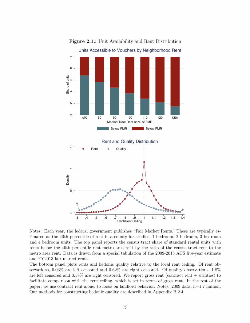
Figure 2.1.: Unit Availability and Rent Distribution
0.2
.4.6
.81
Shar
e of
uni
ts
<70 80 90 100 110 120 130+Median Tract Rent as % of FMR
Units Accessible to Vouchers by Neighborhood Rent
Below FMR Below FMR
0.0
5.1
.15
Den
sity
.3 .4 .5 .6 .7 .8 .9 1 1.1 1.2 1.3 1.4Rent/Rent Ceiling
Rent Quality
Rent and Quality Distribution
Notes: Each year, the federal government publishes “Fair Market Rents.” These are typically es-timated as the 40th percentile of rent in a county for studios, 1 bedroom, 2 bedroom, 3 bedroomand 4 bedroom units. The top panel reports the census tract share of standard rental units withrents below the 40th percentile rent metro area rent by the ratio of the census tract rent to themetro area rent. Data is drawn from a special tabulation of the 2009-2013 ACS five-year estimateand FY2013 fair market rents.The bottom panel plots rents and hedonic quality relative to the local rent ceiling. Of rent ob-servations, 0.03% are left censored and 0.62% are right censored. Of quality observations, 1.8%are left censored and 0.58% are right censored. We report gross rent (contract rent + utilities) tofacilitate comparison with the rent ceiling, which is set in terms of gross rent. In the rest of thepaper, we use contract rent alone, to focus on landlord behavior. Notes: 2009 data, n=1.7 million.Our methods for constructing hedonic quality are described in Appendix B.2.4.
73

typically pay 30% of their income in rent, meaning that they are less price-sensitive than
private tenants. Within each level of neighborhood quality, we assume that there is an
exogenous distribution of markups. Because voucher recipients are not price-sensitive, they
are more willing to accept markups and average rents rise when the price ceiling rises, even
within a neighborhood.3
As far as we know, our emphasis on the challenge of finding a suitable unit is new to
the literature studying vouchers and does a better job of explaining this paper’s empirical
findings than two existing benchmark models. In one benchmark model, people frictionlessly
trade-o� housing and non-housing consumption and housing vouchers introduce a kink into
the budget constraint (Collinson et al. (2015)). This model predicts that housing voucher
recipients should rent units with prices at least as high as the rent ceiling. In fact, 60 percent
of housing voucher recipients rent units below the ceiling (Figure 2.1). Another explanation
for why families with vouchers choose low-quality neighborhoods is preferences. For example,
in Geyer (2011) and Galiani et al. (2015), voucher recipients have a preference for neighbors
of the same race and also a preference for high-poverty neighborhoods.
Our model is better than a preference model at fitting our empirical findings for two reasons:
neighborhood quality improves over time for voucher recipients and increases in across-the-
board generosity have little impact on observed unit quality. First, the dynamic path of
voucher recipients’ neighborhood choices is consistent with it being hard to find a good unit
upon initial lease-up rather than a preference for low-quality neighborhoods. Eriksen and
Ross (2013) document that in the Welfare to Work Voucher experiment, voucher recipi-
ents signed their first lease in neighborhoods of no better quality than their prior residence
(as measured by poverty and employment rates); however, neighborhood quality improved3Rents may also rise if landlords deliberately raise rents in response to changes in the rent ceiling, but thisis outside of our model. Any attempt to price discriminate will be limited to the extent that the rentreasonableness process described in Section 2.3 is e�ective.
74
subsequently over the next four years. This is qualitatively consistent with a model where
at first voucher recipients worry about finding a unit to lease and only then worry about
neighborhood quality.4 A preference model with voucher recipients valuing structure over
neighborhood quality predicts that voucher recipients in low-quality neighborhoods will live
in high-quality units. However, as mentioned above, voucher recipients actually live in units
with rents below the ceiling and as we document below, when there is an across-the-board
increase in the rent ceiling, there is at most a modest improvement in observable structure
quality.
2.3. Description of Housing Choice Vouchers and Data
Housing Choice Vouchers use the private market to provide rental units for 2.3 million low-
income households. There are four key actors in the voucher program: the Department of
Housing and Urban Development (HUD), local housing authorities, private landlords and
tenants.
Each year, HUD announces “Fair Market Rents” (FMRs) for every metro- and county-
bedroom pair in the US. The geographic level at which FMRs are set is usually the metropoli-
tan area in urban places and the county in rural places. HUD typically sets FMRs at the 40th
percentile of area-level gross rent (rent to landlord plus utility costs). We defer a discussion
of how FMRs are updated until Section 2.4 where we describe the natural experiments which
we exploit in two research designs.
The local housing authority chooses a local rent ceiling r (or “Payment Standard”) from
4One interesting question is why voucher rents do not gradually asymptote to the rent ceiling as tenure rises.One possibility is that once a lease is signed in a bad neighborhood, inertia may lead some people not tomove yet again to a better neighborhood.
75

90%-110% of the federally-set FMR (U.S. Department of Housing and Urban Development
(2001)).5 Housing authorities are typically allocated a fixed budget for vouchers, and this
budget does not vary with FMR changes (McCarty (2006)). When a housing authority
increases its rent ceiling, it is able to finance fewer vouchers. Although an FMR increase
allows housing authorities to increase the rent ceiling, housing authorities may use their
discretion to smooth out FMR changes. Local housing authorities are also responsible for
finding eligible tenants. Housing assistance is frequently oversubscribed, so housing author-
ities ration vouchers using preferences or lotteries to select tenants from a pool of very low
income applicants (Collinson et al. (2015)).6
The tenant pays at least 30% of her income in rent and the housing authority pays the
di�erence, up to the rent ceiling. For tenants renting units below the rent ceiling, when
rents rise by $1, the housing authority pays an extra dollar and the tenant pays nothing.
When tenants rent units with costs higher than the rent ceiling, they pay the di�erence
out of pocket.7 To the extent that tenants who pay the final dollar out-of-pocket behave
like price-sensitive private tenants, our rent estimates will understate the extent to which
landlords raise prices when housing vouchers become more generous.8
When a housing voucher recipient finds a suitable unit, she asks the housing authority to per-
5Housing authorities may request higher or lower “exception” payment standards from HUD. Exceptionpayment standards below 120% of FMR may be approved by HUD Field O�ces, exception requests above120% FMR require approval from the Assistant Secretary for Public and Indian Housing.
6In a 2012 HUD survey, housing authorities reported more than 4.9 million households on waitlists for housingvouchers. Though this count likely includes some duplicate due to households appearing on multiple housingauthorities’ waitlists. (Collinson et al. (2015)). Among the 20 largest voucher-issuing housing authorities,40 percent use a lottery-based system to select among eligible tenants.
7There is debate within HUD over how common it is for tenants to pay the final dollar of rent. Our tabulationof the micro-data shows that 40%of voucher recipients have rents greater than the rent ceiling. However,we suspect that these estimates are inflated by measurement error in rents and in rent ceilings in theadministrative records.
8An earlier design of the housing voucher program, operated from 1983 until the early 2000s, eliminated thisprice insensitivity by o�ering tenants a fixed subsidy equal to the payment standard minus a fixed percentageof tenant’s adjusted income (Olsen 2003). In this design, payment standards were constrained to be lessthan the applicable FMR.
76

form an inspection to check that the unit is up to code and to check for “rent reasonableness”.
The median housing authority rejects between one-quarter and one-half of units on the first
inspection (Abt Associates (2001), Exhibit 3-5). Housing authorities have strong incentives
to negotiate down rents, both because holding down per-unit rents enables them to serve
more tenants and because they are reimbursed for administrative expenses on a per-unit
basis. HUD routinely audits housing authorities’ leasing process, and rent reasonableness is
consistently found to be one of the inspection categories with the highest compliance rates
(ICF Macro (2009)). We conducted interviews with several experts to learn more about this
process. One housing authority o�cial described the following rent reasonableness process:
[we] contract with Go-Section-8 [a web portal] to identify comparables. Go-Section-8 has over 20,000 listings in our area... We enter information on bed-rooms, size and age, and Go-Section-8 provides the three closest listings withsimilar characteristics. . . We select the median of the three listings and use thatas the rent we could o�er.
When landlords request rents above comparables, the housing authority will begin a negoti-
ating process where they exchange rent o�ers with the landlord. One housing authority we
interviewed required that landlords asking for rents above their comparables furnish “three
current leases for unsubsidized tenants” in the building as evidence that the asking rent is
in line with market rent.9
We analyze housing vouchers using a partial equilibrium framework and changes in voucher
generosity are unlikely to have much impact on general equilibrium rents. Vouchers account
for only 6% of the U.S. rental housing market. If average voucher rents in a tract rose by
30% (a change larger than any we observe in this paper), the average user cost of housing in
the tract would rise by only 1.8%.10 We therefore find it unlikely that the policy variation we
9Appendix Figure 2.2 shows empirically that rents are lower for units with lower hedonic quality.10Of course, there is some heterogeneity in the concentration of vouchers, but even relatively concentrated
77
study had substantial impacts on nonvoucher rents. However, we note that other researchers
using other variation have found general equilibrium impacts of the housing voucher program
(Susin (2002); Eriksen and Ross (2015)), and so we conduct robustness checks which examine
how non-voucher rents change with a change in FMRs in Appendix Table 2.3.
We use a HUD internal administrative database called PIC which contains an anonymous
household identifier, an anonymous address identifier, building covariates, contract rent re-
ceived by landlord, and landlord identifier, on an annual basis beginning in 2002. The address
identifier, coded as a 9-digit ZIP code, enables us to follow a single address over time if it
has multiple voucher occupants. Appendix B.2.1 discusses sample construction.
2.4. Income E�ects: Impact of Raising the Base Rent
Ceiling
We estimate the causal e�ect of across-the-board rent ceiling changes on housing quality
(unit and neighborhood) and voucher rents using two natural experiments. In Section 2.4.1,
we study a 2005 change in FMRs due to availability of updated 2000 Decennial Census data.
We examine this change using rich data on the universe of housing vouchers, which includes
the ability to track households and addresses over time. Unfortunately, this database only
came into widespread use in 2003. The advantage of this research design is that the it uses
variation across all counties giving us enough statistical power to detect even small quality
and rent responses. In Section 2.4.2, we study a 2001 change which raised FMRs from the
40th percentile to the 50th percentile of rents in 39 metro areas. We use a detailed HUDvoucher households are still a small share of the market. For example, for a voucher household at the 90thpercentile of the voucher concentration distribution, 9% of all units in its tract are vouchers.
78

survey, which was administered to voucher recipients on a widespread basis from 2000 to
2003 to evaluate the e�ects of this change on housing quality. The advantage of this research
design is that the survey o�ers an in-depth look at unit quality, including quality attributes
which might vary over time within the same unit. Across both research designs, we find
similar results: raising the rent ceiling results in higher rents with little evidence of positive
quality impacts.
2.4.1. Rebenchmarking of FMRs in 2005
For many years, data constraints meant that FMRs changed little in a typical year, punc-
tuated by very large swings once every ten years, which o�ers useful variation for a quasi-
experimental analysis. In most years, FMRs are updated using local CPI rental measures for
26 large metro areas and 10 regional Random Digit Dialing (RDD) surveys for the rest of the
country. These estimates are very coarse; for example, they were a bit worse at predicting
local rent changes than using a single national trend from 1997 to 2004. The availability of
new decennial Census data results in a “rebenchmarking.” Because the local CPI and RDD
estimates are so noisy, large swings in FMRs occurred from 1994 to 1996, when 1990 Census
data were incorporated into FMRs, and again in 2005, when 2000 Census data were added
in 2005.11
The 2005 rebenchmarking o�ers substantial variation in FMR changes, suitable for a quasi-
experimental research design. As an example, we show FMR revisions for two-bedroom
units in Eastern New England for 2003-2004 and for 2004-2005. From 2003 to 2004, FMRs
rose by 5.5% in Eastern Massachusetts and rose by 1.6% in outlying areas. The next year
shows large revisions, with Rhode Island experiencing 22% increases in 2-bedroom FMRs
and Greater Boston experiencing 11% decreases. Figure 2.2 shows an event study of FMRs11See Appendix Figure 2.1 for a plot of changes in FMR by year as well as projected revisions under acounterfactual of a single national trend from 1997 to 2004.
79

for four groups of county-bed pairs, stratified by the size of their revision from 2004 to
2005. In nominal terms, the bottom quartile fell by 7%, while the top quartile rose by 24%.
These four groups had similar trends in the six years after the revision, so we can study the
rebenchmarking as a one-time, permanent change.12
To clarify the sources of variation that we use for identification, we show that the rebench-
marking can be decomposed into three pieces: changes in nonvoucher rents, measurement
error from annual updates, and measurement error in the Census. Define ‡
t
as an annual
estimate of the change in log rents based on a regional RDD or CPI survey from year t ≠ 1
to t.13 Define exp(rt
+ Ï
t
) as an observation from decennial Census data, where exp(rt
)
is the true rent and exp(Ït
) is measurement error. We can use these definitions to write
logFMR
2004 = q2004
t=1991
‡
t
+ r
1990
+ Ï
1990
, and logFMR
2005 = q2005
t=2001
‡
t
+ r
2000
+ Ï
2000
.
Taking the di�erence gives
�FMR = r
2000
≠ r
1990¸ ˚˙ ˝true rent change
+ ‡
2005
≠1999ÿ
t=1990
‡
t
¸ ˚˙ ˝annual meas error
+ (Ï2000
≠ Ï
1990
)¸ ˚˙ ˝
Census meas error
Consistent with measurement error as a source of variation, places where FMRs drifted
upward due to noise over the prior ten years were subject to downward revisions in 2005,
and places where FMRs drifted downward due to noise were subject to upward revisions.
Suppose that outcomes y such as unit and neighborhood quality or voucher rents may be
a�ected by the rent ceiling r as well as contemporaneous shocks to supply and demand ÷,12Throughout the paper, all regression specifications studying rent or hedonic quality use a log transformation.There is tremendous heterogeneity in FMR levels; in 2004, FMR levels for a 2-bedroom unit ranged from$370 in rural Alabama to $1800 in San Jose. Clearly, a $50 increase in the FMR would have a very di�erentimpact in percent terms in Alabama than in San Jose. Additional empirical details on our use of therebenchmarking are provided in Appendix B.2.2.
13The RDD and CPI surveys are used to produce adjustment factors which modify the base, not to provide anew estimate of the level.
80
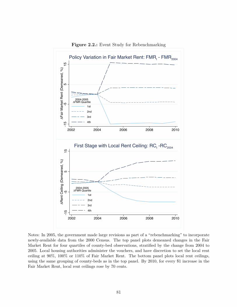
Figure 2.2.: Event Study for Rebenchmarking
-15
-55
15Δ
Fair
Mar
ket R
ent (
Dem
eane
d, %
)
2002 2004 2006 2008 2010
1st
2nd
3rd
4th
2004-2005ΔFMR Quartile
Policy Variation in Fair Market Rent: FMRt - FMR2004
-15
-55
15Δ
Ren
t Cei
ling
(Dem
eane
d, %
)
2002 2004 2006 2008 2010
1st
2nd
3rd
4th
2004-2005ΔFMR Quartile
First Stage with Local Rent Ceiling: RCt -RC2004
Notes: In 2005, the government made large revisions as part of a “rebenchmarking” to incorporatenewly-available data from the 2000 Census. The top panel plots demeaned changes in the FairMarket Rent for four quartiles of county-bed observations, stratified by the change from 2004 to2005. Local housing authorities administer the vouchers, and have discretion to set the local rentceiling at 90%, 100% or 110% of Fair Market Rent. The bottom panel plots local rent ceilings,using the same grouping of county-beds as in the top panel. By 2010, for every $1 increase in theFair Market Rent, local rent ceilings rose by 70 cents.
81
as expressed by the empirical model �y = h(r) ≠ h(r2004
) + ÷. Our identifying assumption
is the shocks after 2004 were orthogonal to the level of FMRs in 2005, conditional on their
2004 level.
Identification Assumption in Rebenchmarking Research Design
÷ ‹ FMR
2005
|FMR
2004
As detailed above, �FMR consists of measurement error, which is by construction orthog-
onal to future trends, and the true nonvoucher rent change, r2000
≠ r
1990
. Note that this
research design allows the rebenchmarking to bring rental rents closer in line with the level
of market fundamentals. We require only that the change in FMR be uncorrelated with the
subsequent shocks ÷. Available empirical evidence supports this identification assumption.
First, rents are about flat from 2002 to 2004, prior to the policy change. Second, contempo-
raneous changes in nonvoucher rents have no significant correlation with the FMR change.14
2.4.1.1. Impacts on Housing Quality and Voucher Rents
First, we assess the e�ects of across-the-board rent ceiling changes on the housing quality and
rents of all voucher holders. Our unit of analysis is the county-bed, summary statistics for our
sample appear in Table 2.1. We present three measures of quality: median tract rent, tract14Appendix B.2.3 analyzes prior and contemporaneous changes in nonvoucher rents in more detail and Ap-pendix Table 2.3 shows the relevant regression results.
82
poverty rates, and a measure of hedonic housing quality.15 To construct our hedonic quality
measure, we run a hedonic regression in the American Community Survey using covariates
for structure age, structure type (e.g. single-family, multi-family, or apartment building)
and neighborhood rent. We then constructed our dependent variable quality measure �y
j
=
—
hedonic
(xt,j
≠ x
2004,j
) using covariates xt,j
on structure type and median tract rent from the
voucher data where xt,j
is the unconditional average of x in county-bed j, including units that
newly entered and exited the sample.16 Census tracts typically have 4,000 residents and 77%
of voucher moves cross tract boundaries, so this measure captures even very short-distance
moves to higher-quality neighborhoods or higher-quality units within the same neighborhood.
We construct our voucher rent measure in a similar fashion as �y
t,j
= r
voucher
t,j
≠ r
voucher
2004,j
.
We estimate our model using two stage least squares, because local housing authorities have
some discretion in setting rent ceilings, as discussed in Section 2.3. Formally, we estimate a
first stage:
r
j
= – + “FMR
2005j
+ FMR
2004j
+ r
2004j
+ Á
j
(2.1)
where the exogenous variation comes from FMR in 2005, we control for FMR in 2004, the
rent ceiling r in 2004, and Á is an error term.17 Housing authorities use their discretion to
15The tract rent measure is �yt,j = log(tract rentt,j) ≠ log(tract rent2004,j), the di�erence in average mediantract rent for vouchers in county-bed j from year 2004 to year t. The census tract poverty rate is �yt,j =tract povt,j ≠ tract pov2004,j where tract povt,j is the average tract poverty rate of voucher holders in county-bed j.
16We estimate our hedonic coe�cients in the American Community Survey, where the smallest geographic unitsare Public Use Microdata Areas (PUMAs) with about 150,000 residents. However, when predicting hedonicquality for voucher units, we use median tract rent (tracts have about 4,000 residents), which providesmuch more geographic detail than PUMAs. The results from our hedonic regression in the ACS appear inAppendix Table 2.1. More details on construction of the hedonic measure are provided in Appendix B.2.4.
17The motivation for controlling for 2004 FMR is driven by the nature of our quasi-experimental variation.Prior to the FMR change, average rents across all units were rising for places about to receive a downwardrevision and that rents were falling for places about to be revised upward; this was likely because of mean
83
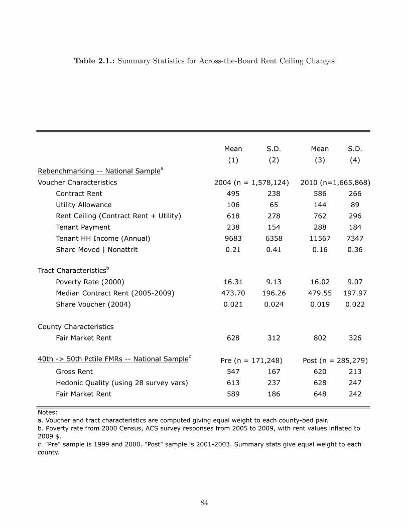
Table 2.1.: Summary Statistics for Across-the-Board Rent Ceiling Changes
Mean S.D. Mean S.D.
(1) (2) (3) (4)
Rebenchmarking -- National Samplea
Voucher Characteristics
Contract Rent 495 238 586 266
Utility Allowance 106 65 144 89
Rent Ceiling (Contract Rent + Utility) 618 278 762 296
Tenant Payment 238 154 288 184
Tenant HH Income (Annual) 9683 6358 11567 7347
Share Moved | Nonattrit 0.21 0.41 0.16 0.36
Tract Characteristicsb
Poverty Rate (2000) 16.31 9.13 16.02 9.07
Median Contract Rent (2005-2009) 473.70 196.26 479.55 197.97
Share Voucher (2004) 0.021 0.024 0.019 0.022
County Characteristics
Fair Market Rent 628 312 802 326
40th -> 50th Pctile FMRs -- National Samplec
Gross Rent 547 167 620 213
Hedonic Quality (using 28 survey vars) 613 237 628 247
Fair Market Rent 589 186 648 242
2004 (n = 1,578,124) 2010 (n=1,665,868)
Pre (n = 171,248) Post (n = 285,279)
Notes: a. Voucher and tract characteristics are computed giving equal weight to each county-bed pair.b. Poverty rate from 2000 Census, ACS survey responses from 2005 to 2009, with rent values inflated to 2009 $.c. "Pre" sample is 1999 and 2000. "Post" sample is 2001-2003. Summary stats give equal weight to each county.
84

o�set the immediate impact of FMR changes, but a $1 increase in the FMR from 2004 to
2005 corresponded to a 58 cent increase in the rent ceiling by 2010. It takes time for FMR
changes to absorb into local policy, as shown in the bottom panel of Figure 2.2. We estimate
our second stage:
�y
j
= – + —
‚r
j
+ FMR
2004j
+ r
2004j
+ ÷
j
(2.2)
Table 2.2 columns (1)-(3) show the e�ects of a $1 chance in the rent ceiling on neighborhood
and housing quality. There is virtually no impact of raising the ceiling on observable quality.
A $1 increase in the ceiling has no detectable impact on the neighborhood quality of voucher
tenants, as measured by neighborhood rents (column 1) or poverty rates (column 3), and
raises composite hedonic quality by a mere 5 cents. In contrasts, average rents by 46 cents
in response to a $1 increase in the rent ceiling (Table 2.2, column 4). Figure 2.3 plots the
year-by-year coe�cients of the reduced form impact of the FMR change on rents, and shows
rents rise steadily in response to the rent ceiling increase through the first four years after
the re-benchmarking, while hedonic quality rises minimally throughout this period. Either
tenants saw big increases in unobserved unit quality or landlords saw increases in profits of
roughly 40 cents for each $1 change in the rent ceiling.
2.4.1.2. Impacts on Same-Address Voucher Rents
How much do landlords benefit from a $1 rent ceiling increase? To explore this question
further we examine the e�ect of rent ceiling increase on voucher rents at a given address.
reversion in regional rents combined with infrequent FMR resets. Controlling for the 2004 FMR leveleliminates this pretrend. We also try the following first-di�erences specification. We estimate a first stage:�rj = –+“�FMRj+Áj , where �rj = rj ≠r2004j and second stage: �yj = –+—
‰�rj+÷j . This specificationproduces very similar point estimates.
85
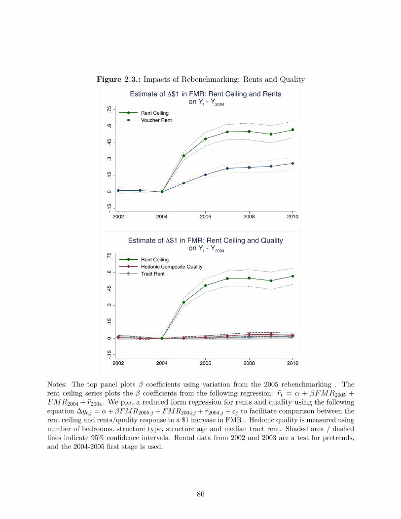
Figure 2.3.: Impacts of Rebenchmarking: Rents and Quality
-.15
0.1
5.3
.45
.6.7
5
2002 2004 2006 2008 2010
Rent CeilingVoucher Rent
Estimate of Δ$1 in FMR: Rent Ceiling and Rents on Yt - Y2004
-.15
0.1
5.3
.45
.6.7
5
2002 2004 2006 2008 2010
Rent CeilingHedonic Composite QualityTract Rent
Estimate of Δ$1 in FMR: Rent Ceiling and Quality on Yt - Y2004
Notes: The top panel plots — coe�cients using variation from the 2005 rebenchmarking . Therent ceiling series plots the — coe�cients from the following regression: r
t
= – + —FMR
2005
+FMR
2004
+ r
2004
. We plot a reduced form regression for rents and quality using the followingequation �y
t,j
= – + —FMR
2005,j
+ FMR
2004,j
+ r
2004,j
+ Á
j
to facilitate comparison between therent ceiling and rents/quality response to a $1 increase in FMR.. Hedonic quality is measured usingnumber of bedrooms, structure type, structure age and median tract rent. Shaded area / dashedlines indicate 95% confidence intervals. Rental data from 2002 and 2003 are a test for pretrends,and the 2004-2005 first stage is used.
86
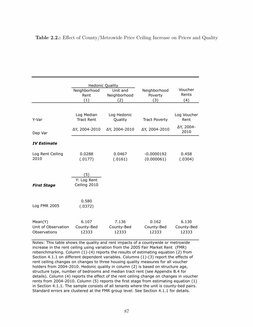
Table 2.2.: E�ect of County/Metrowide Price Ceiling Increase on Prices and Quality
Neighborhood Rent
Unit and Neighborhood
Neighborhood Poverty
Voucher Rents
(1) (2) (3) (4)
Y-VarLog Median Tract Rent
Log Hedonic Quality Tract Poverty
Log Voucher Rent
Dep Var∆Y, 2004-2010 ∆Y, 2004-2010 ∆Y, 2004-2010 ∆Y, 2004-
2010
IV Estimate
0.0288 0.0467 -0.0000192 0.458(.0177) (.0161) (0.000061) (.0304)
0.0000608
(5)
First StageY: Log Rent Ceiling 2010
0.580(.0372)
Mean(Y) 6.107 7.136 0.162 6.130Unit of Observation County-Bed County-Bed County-Bed County-BedObservations 12333 12333 12333 12333
Notes: This table shows the quality and rent impacts of a countywide or metrowide increase in the rent ceiling using variation from the 2005 Fair Market Rent (FMR) rebenchmarking. Column (1)-(4) reports the results of estimating equation (2) from Section 4.1.1 on different dependent variables. Columns (1)-(3) report the effects of rent ceiling changes on changes to three housing quality measures for all voucher holders from 2004-2010. Hedonic quality in column (2) is based on structure age, structure type, number of bedrooms and median tract rent (see Appendix B.4 for details). Column (4) reports the effect of the rent ceiling change on changes in voucher rents from 2004-2010. Column (5) reports the first stage from estimating equation (1) in Section 4.1.1. The sample consists of all tenants where the unit is county-bed pairs. Standard errors are clustered at the FMR group level. See Section 4.1.1 for details.
Log Rent Ceiling 2010
Log FMR 2005
Hedonic Quality
87

One empirical strategy uses people who stayed at the same address throughout the sample
period (“stayers”). A complementary strategy uses data on voucher recipients who moved
into a unit previously occupied by another voucher recipient (“movers”). If time-varying unit
quality is constant, then landlords are capturing any increase in rents we observe. This could
arise through deliberate price discrimination, or, as in the model, through price-insensitive
voucher recipients not avoiding units whose markups were rising due to random variation.
This could also be explained by within-unit changes in quality.
Table 2.3 column (2) shows the results – a $1 change in the rent ceiling corresponded to a
9 cent increase in rents for stayers from 2004 to 2010. This estimate is economically quite
small and statistically precise, with a standard error of three cents. The magnitude of the
point estimate suggests that the “rent reasonableness” policy may be e�ective at regulating
rent increases for incumbent tenants.
We also examine changes in rents for addresses which were occupied by di�erent households
before and after the rebenchmarking. We exploit the fact that about one-third of movers
and new admits from 2005-2010 went to an address that was occupied by a di�erent voucher
recipient in 2003 or 2004. We calculate mean pre-2005 rent at every address (9 digit ZIP
code-bedroom) and then merge this file with the addresses of voucher recipients in later
years. Formally, we estimate equation 2.2 with �y
hj
= r
voucher
2010,hi
Õj
≠ r
voucher
2004,hij
where i changes
to i
Õ, to reflect a change in household, while address h is constant. For these movers, we
find that a $1 increase in the rent ceiling caused rents to rise by 20 cents, as reported in
Table 2.3 column (3). We believe that these estimates are slightly larger than the stayers
estimates because of tenure discounts, where landlords are less likely to raise rents for a
tenant renewing their lease.
We conduct several robustness checks to assess our result that landlords raise rents for
88

Table 2.3.: E�ect of County/Metrowide Rent Ceiling Increase on Rents
Policy Variation
Sample All Tenantsa
Same Address w/Same Voucher
Tenantb
Same Address w/Different Voucher
Tenantc
(1) (2) (3)
First Stage Y: ΔLog Rent Ceiling, 2004-20100.580 0.561 0.583
(0.036) (0.047) (0.043)
IV Rent Estimate Y: ΔLog Voucher Rent, 2004-20100.444 0.087 0.197
(0.031) (0.033) (0.043)
Unit of Observation Address Address Addressn 1,662,807 290,731 553,577
Notes: This table shows the rent impacts of a countywide or metrowide increase in the rent ceiling using variation from the 2005 Fair Market Rent (FMR) rebenchmarking. Standard errors shown in parentheses are clustered at FMR group level. See Section 4.1.2 for details.a. Sample contains all tenants.b. Sample contains households whose address (9-digit zip code) was unchanged from 2004 to 2010.c. Sample contains addresses where a new voucher recipient arrived in 2005 or later and a different voucher recipient was observed in 2003 or 2004.
Rebenchmarking of FMRs in 2005
Log FMR 2005
ΔLog Rent Ceiling 2010
89

tenants at the exact same address.18 First, we add county fixed e�ects, so that identification
comes only from within-county variation comparing the FMR change for 1-bedroom units
to the FMR change for 4-bedroom units, and not at all from di�erences in secular trends
across counties. Again, we find that a $1 increase in rent ceiling raises rents for stayers.
Second, recall that most tenants pay 30% of their income as rent, but some paid 30% of
their income plus the di�erence between the unit’s rent and the local rent ceiling. We build
a sample of households which are very unlikely to be the residual payer in 2010 using baseline
characteristics in 2004, and find a substantial increase in rents, combined with no change
in tenant payments.19 Third, we attempt to test for kickbacks. While it would be easy
for a mom-and-pop operation to give kickbacks, it would be much more di�cult for a large
business with accountants and auditors to do so. We think that kickbacks from landlords
to voucher recipients are unlikely to explain the results, because we find substantial rent
increases among these larger landlords.
In this section, we used two empirical strategies to assess incidence with apparently dis-
parate results – comparing total price increases to hedonic quality increases and controlling
for quality with unit fixed e�ects – but this di�erence can likely be explained by some insti-
tutional details of the voucher program. In Section2.4.1.1, we showed increases in rents for
all addresses of 46 cents with just 5 cents in quality improvements for voucher holders. In
contrast, Section 2.4.1.2, our findings from the two address fixed e�ects specifications sug-
gest rent increases of 9-20 cents for each dollar increase in the rent ceiling. One possibility
is that when a unit is leased to a voucher recipient for the first time that a landlord can
justify a wide range of rents in the “rent reasonableness” process, but that once it has been
leased then a PHA sta� member will reject a large increase in rent for a unit where rent
18Point estimates and standard errors are in Appendix Table 2.4.19We plot tenant payments to landlords and housing authority payments to landlords against the FMR changefrom rebenchmarking in Appendix Figure 2.3. Tenant payments are unresponsive to changes in FMR, whilepayments from the government to landlords rise substantially.
90

reasonableness was previously established.
2.4.2. 40th æ 50th Percentile FMRs in 2001
A concern with the first research design is an inability to measure detailed elements of
unit quality which might vary over time at the same address. In a di�erent dataset, HUD
measured quality in much more detail from 2000 to 2003. Using this dataset requires a
di�erent identification strategy based on a policy change in 2001, when HUD switched from
setting FMRs at the 40th percentile of the local nonvoucher rent distribution to the 50th
percentile in 39 MSAs. This policy was implemented not in response to recent housing
market conditions, but rather with the explicit goal of “deconcentration” of vouchers from
the lowest-quality neighborhoods.20
From 2000 to 2003, HUD conducted a Customer Satisfaction Survey (CSS) of repeated cross-
sections of about 100,000 voucher households. This survey included numerous questions on
unit quality and came close to matching the level of detail in the American Housing Survey
(AHS), which is the state-of-the-art data source on housing quality in the US. In particular, it
asked many questions about unit attributes which could plausibly vary at the same address
over time including: “How would you rate your satisfaction with your unit?”, “Has your
heat broken down for more than 6 hours?”, “ Does your unit have mildew, mold, or water
20The 39 metro areas were chosen on the basis of three factors, which are not obviously related to the trendin voucher rents or neighborhood quality:
• a size requirement (must contain at least 100 census tracts)
• an FMR neighborhood access measure – 70 percent or fewer census tracts with at least 10 two bedroomrental units are census tracts in which at least 30 percent of the two bedroom rental units have grossrents at or below the two bedroom FMR
• a high concentration of voucher holders in a limited number of census tracts – 25 percent or moreof tenant-based voucher recipients reside in 5% of tracts with FMR area with largest number ofparticipants
91

damage?” and “Have you spotted cockroaches in your home in the last week?” A full list of
quality measures is in Appendix B.2.4. We transform these questions into a hedonic quality
measure along with tract median rents from the 2000 Census. To compute hedonic quality,
we identified the 26 questions on time-varying quality in the CSS which also appeared in the
AHS.21 We ran a hedonic regression in the AHS using these 26 questions, building age, and
building type and a measure of median neighborhood rent then used tenants’ responses in
the CSS to predict hedonic quality.
We estimate the impacts of this policy change on Fair Market Rents, actual voucher rents
and unit quality using a di�erence-in-di�erence model. Our estimation equations are
First Stage: rijt
= – + “1(FMR = 50)j
Post
t
+ 1(FMR = 50)j
+ Post
t
+ Á
ijt
(2.3)
Second Stage: yijt
= – + —
‰r
ijt
+ 1(FMR = 50)j
+ Post
t
+ ÷
ijt
(2.4)
Our identification condition is the standard di�erence-in-di�erence condition: E(÷ijt
|1(FMR =
50)◊Post) = 0. Figure 2.4 shows the results visually and Table 2.4 Panel A shows regression
results. Setting FMRs at the 50th percentile of the local nonvoucher rent distribution raised
rent ceilings by an average of 11 percent. For every $1 increase in FMRs, rents rose by 47
cents (column 5) and composite hedonic quality rose by less than 5 cents (Table 2.4, panel
A, column 3), with a standard error of 9 cents. The results from this analysis reinforce the
conclusions from the prior section that increases in FMRs do not seem to improve quality.
21Appendix Table 2.2 compares the predictive performance of our hedonic characteristics across data sets. Inthe AHS, the CSS variables perform nearly as well as the “kitchen sink” AHS model (R-squared 0.31 forCSS variables compared to 0.42 for the full AHS model).
92
We also estimate the average e�ect of the policy (”) in Table 2.4 panel B using:
y
ijt
= – + ”1(FMR = 50j
◊ Post
t
) + 1(FMR = 50)j
+ Post
t
+ ÷
ijt
(2.5)
Moving from the 40th to 50th percentile FMR raises the rent ceiling by 11 percent with
no measurable improvement in neighborhood quality, as measured by tract median rents
and poverty rates, or in composite hedonic quality. We can reject improvements in the
neighborhood poverty rates of voucher holders of more than a half a percentage point.
Our empirical results from two separate natural experiments which raised county and metro
rent ceilings suggest that across-the-board changes in the ceiling act like an income e�ect
doing little to improve either neighborhood or observed unit quality for voucher tenants
while rents increase substantially.
2.5. Substitution E�ects: Tilting the Rent Ceiling with
ZIP-Level FMRs in Dallas
In contrast to the results in the previous section, we find that tilting the rent ceiling has
a big impact on prices and quality. Following a court settlement, HUD replaced a single
metro-wide FMR with ZIP code-level FMRs in early 2011. The demonstration caused sharp
changes in local rent ceilings, ranging from a decrease of 20% to an increase of 30%, as
shown in the top panel of Figure 2.5. In Section 2.5.1, we build a neighborhood quality
index and document an improvement in quality of 0.23 standard deviations. In Section
2.5.2, we document that voucher rents and unit quality rose in ZIP codes where FMRs
rose and fell in ZIP codes where FMRs fell. Finally, in Section 2.5.3, we establish that the
93

Table 2.4.: E�ect of County/Metrowide Price Ceiling Increase on Prices and Quality
Policy Variation
Sample All Tenantsa
Same Address w/Same Voucher
Tenantb
Same Address w/Different Voucher
Tenantc
(1) (2) (3)
First Stage Y: ΔLog Rent Ceiling, 2004-20100.580 0.561 0.583
(0.036) (0.047) (0.043)
IV Rent Estimate Y: ΔLog Voucher Rent, 2004-20100.444 0.087 0.197
(0.031) (0.033) (0.043)
Unit of Observation Address Address Addressn 1,662,807 290,731 553,577
Notes: This table shows the rent impacts of a countywide or metrowide increase in the rent ceiling using variation from the 2005 Fair Market Rent (FMR) rebenchmarking. Standard errors shown in parentheses are clustered at FMR group level. See Section 4.1.2 for details.a. Sample contains all tenants.b. Sample contains households whose address (9-digit zip code) was unchanged from 2004 to 2010.c. Sample contains addresses where a new voucher recipient arrived in 2005 or later and a different voucher recipient was observed in 2003 or 2004.
Rebenchmarking of FMRs in 2005
Log FMR 2005
ΔLog Rent Ceiling 2010
94
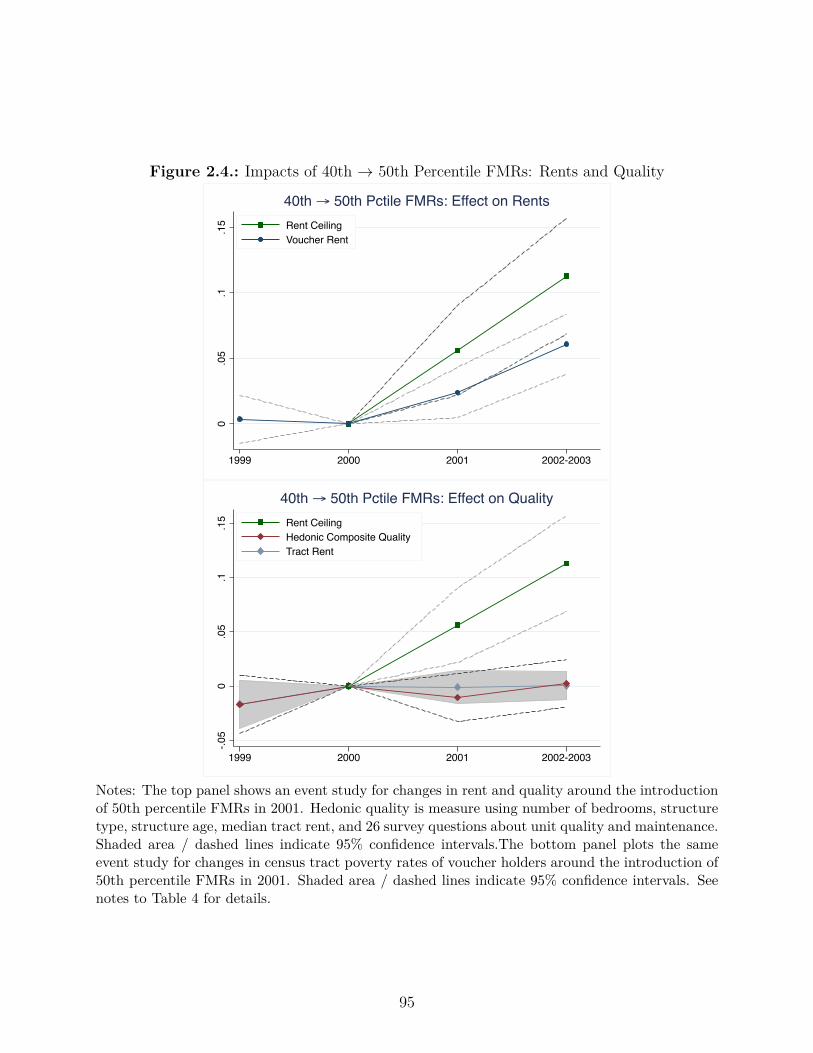
Figure 2.4.: Impacts of 40th æ 50th Percentile FMRs: Rents and Quality
0.0
5.1
.15
1999 2000 2001 2002-2003
Rent CeilingVoucher Rent
40th → 50th Pctile FMRs: Effect on Rents-.0
50
.05
.1.1
5
1999 2000 2001 2002-2003
Rent CeilingHedonic Composite QualityTract Rent
40th → 50th Pctile FMRs: Effect on Quality
Notes: The top panel shows an event study for changes in rent and quality around the introductionof 50th percentile FMRs in 2001. Hedonic quality is measure using number of bedrooms, structuretype, structure age, median tract rent, and 26 survey questions about unit quality and maintenance.Shaded area / dashed lines indicate 95% confidence intervals.The bottom panel plots the sameevent study for changes in census tract poverty rates of voucher holders around the introduction of50th percentile FMRs in 2001. Shaded area / dashed lines indicate 95% confidence intervals. Seenotes to Table 4 for details.
95

e�ects on neighborhood quality are comparable to the results from more costly alternative
interventions. . Appendix B.2.5 contains added supplementary empirical details.
2.5.1. Impacts on Neighborhood Quality
We assemble data on five measures of neighborhood quality: poverty rate, 4th grade test
scores at zoned school, unemployment rate, share of children in families with single mothers,
and the violent crime rate.22 We compute a neighborhood quality index, which equally
weights all five measures.23 Voucher recipients tend to live in lower-quality neighborhoods,
often on the south side of the city.
To formally estimate the impact of the change to ZIP code-level FMRs, we use a simple
di�erence-in-di�erence design with a comparison group of Fort Worth – a nearby city which
continued to have a single metro-wide rent ceiling. The identifying assumption is that quality
di�erence between Dallas voucher tenants and Fort Worth voucher tenants would have been
stable absent the policy intervention. We estimate
Y
it
= – + ”Dallas
i
Post
t
+Dallas
i
+ Post
t
+ ÷
it
(2.6)
where i indexes households and t indexes years. The results are shown in Table 2.5, where
” shows an intent-to-treat (ITT) improvement of 0.1 standard deviations in quality. This
estimate is statistically precise, with a t-statistic greater than 3 using standard errors clus-
tered at the tract level. Of course, neighborhood quality could only improve for tenants who
moved. From 2010 to 2013, 44% of continuing voucher recipients moved units, so the impact
22Poverty rate, unemployment, and share of kids in families with single mothers are ACS tract-level datafrom 2006 to 2010. Test scores are the percent of 4th grade students’ scoring proficient or higher on stateexams in the 2008-2009 academic year at zoned school. Violent Crime is number of homicides, non-negligentmanslaughter, robberies, and aggravated assaults per capita in 2010, and is calculated over the tract levelfor tracts in the city of Dallas, and at the jurisdiction level (city or county balance) for suburban voucherresidents.
23Each component is standardized to have mean zero and unit standard deviation over the Dallas metro area.
96
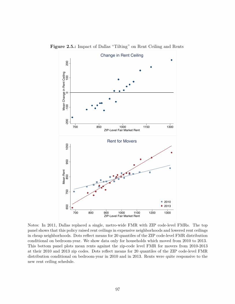
Figure 2.5.: Impact of Dallas “Tilting” on Rent Ceiling and Rents
-200
-100
010
020
0M
ean
Cha
nge
in R
ent C
eilin
g
700 850 1000 1150 1300ZIP-Level Fair Market Rent
Change in Rent Ceiling
650
750
850
950
1050
Mea
n R
ent
700 800 900 1000 1100 1200 1300ZIP-Level Fair Market Rent
20102013
Rent for Movers
Notes: In 2011, Dallas replaced a single, metro-wide FMR with ZIP code-level FMRs. The toppanel shows that this policy raised rent ceilings in expensive neighborhoods and lowered rent ceilingsin cheap neighborhoods. Dots reflect means for 20 quantiles of the ZIP code-level FMR distributionconditional on bedroom-year. We show data only for households which moved from 2010 to 2013.This bottom panel plots mean rents against the zip-code level FMR for movers from 2010-2013at their 2010 and 2013 zip codes. Dots reflect means for 20 quantiles of the ZIP code-level FMRdistribution conditional on bedroom-year in 2010 and in 2013. Rents were quite responsive to thenew rent ceiling schedule.
97

estimate for treatment-on-the-treated (TOT) is 0.23 standard deviations.24
Table 2.5 also provides impacts separately for each of the five quality measures. We find small
and statistically insignificant improvements of 0.09 SD in test scores at zoned schools and 0.05
SD in the rate of children living with single mothers. We find medium-sized improvements
of 0.19 SD in the poverty rate and 0.21 in the unemployment rate. In Appendix Figure 2.4
we contrast these improvements in poverty reduction with our findings from both across-the-
board policy changes. The largest improvements are in the violent crime rate, which improves
by 0.33 SD. If these relative improvements reflect voucher recipients’ valuations, then it seems
that voucher recipients prioritize getting away from high crime areas. This is consistent with
evidence from the Moving to Opportunity (MTO) experiment, where treatment households
chose tracts with much lower crime rates, less gra�ti, and better police response when a call
was made (Kling et al. (2005)).
The timing and distribution of neighborhood choices is consistent with attributing the results
in Table 2.5 to the impact of the policy. Figure 2.6 shows that neighborhood quality moves
in tandem for Dallas and Fort Worth through 2010; beginning in 2011, there is an immediate
and sustained increase in Dallas which does not appear in Fort Worth. Figure 2.7 shows that
the distribution of neighborhood qualities chosen by movers; movers after the policy change
appear to have a broad-based monotonic shift away from lower-quality neighborhoods and
to higher-quality quality neighborhoods. No such change is evident for the control group in
98
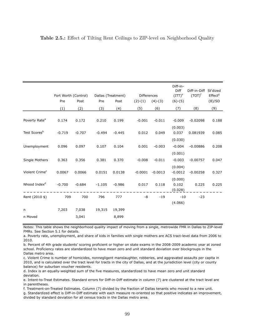
Table 2.5.: E�ect of Tilting Rent Ceilings to ZIP-level on Neighborhood Quality
Diff-in-Diff
(ITT)eDiff-in-Diff
(TOT)fSt'dized Effectg
Pre Post Pre Post (2)-(1) (4)-(3) (6)-(5) (8)/SD
(1) (2) (3) (4) (5) (6) (7) (8) (9)
Poverty Ratea 0.174 0.172 0.210 0.199 -0.001 -0.011 -0.009 -0.02098 0.188
(0.003)Test Scoresb -0.719 -0.707 -0.494 -0.445 0.012 0.049 0.037 0.081939 0.085
(0.030)
Unemployment 0.096 0.097 0.107 0.104 0.001 -0.003 -0.004 -0.00886 0.208
(0.001)
Single Mothers 0.363 0.356 0.381 0.370 -0.008 -0.011 -0.003 -0.00757 0.047
(0.004)Violent Crimec 0.0067 0.0066 0.0151 0.0138 -0.0001 -0.0013 -0.0012 -0.00258 0.327
(0.000)Nhood Indexd -0.700 -0.684 -1.105 -0.986 0.017 0.118 0.102 0.225 0.225
(0.028)
Rent (2010 $) 709 700 796 777 -8 -19 -10 -23
(4.066)
n 7,203 7,038 19,315 19,399
n Moved 3,041 8,899
Fort Worth (Control) Dallas (Treatment) Differences
Notes: This table shows the neighborhood quality impact of moving from a single, metrowide FMR in Dallas to ZIP-level FMRs. See Section 5.1 for details.a. Poverty rate, unemployment, and share of kids in families with single mothers are ACS tract-level data from 2006 to 2010.b. Percent of 4th grade students’ scoring proficient or higher on state exams in the 2008-2009 academic year at zoned school. Proficiency rates are standardized to have mean zero and unit standard deviation over blockgroups in the Dallas metro area. c. Violent Crime is number of homicides, nonnegligent manslaughter, robberies, and aggravated assaults per capita in 2010, and is calculated over the tract level for tracts in the city of Dallas, and at the jurisdiction level (city or county balance) for suburban voucher residents.d. Index is an equally-weighted sum of the five measures, standardized to have mean zero and unit standard deviation.e. Intent-to-Treat Estimates. Standard errors for Diff-in-Diff estimate in column (7) are clustered at the tract level are in parentheses.f. Treatment-on-Treated Estimates. Column (7) divided by the fraction of Dallas tenants who moved to a new unit.g. Standardized effect is Diff-in-Diff estimate with each measure re-oriented so that positive indicates an improvement, divided by standard deviation for all census tracts in the Dallas metro area.
99
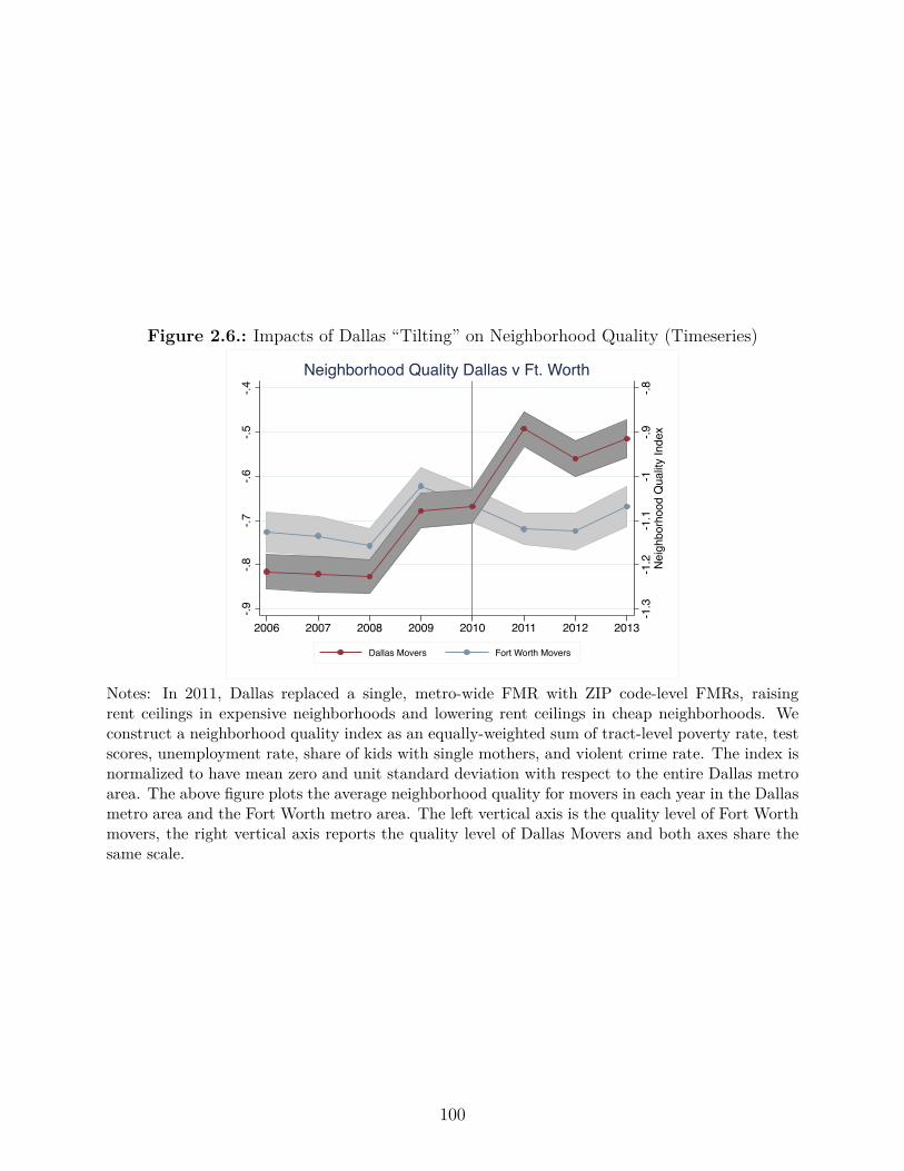
Figure 2.6.: Impacts of Dallas “Tilting” on Neighborhood Quality (Timeseries)
-1.3
-1.2
-1.1
-1-.9
-.8N
eigh
borh
ood
Qua
lity
Inde
x
-.4-.5
-.6-.7
-.8-.9
2006 2007 2008 2009 2010 2011 2012 2013
Dallas Movers Fort Worth Movers
Neighborhood Quality Dallas v Ft. Worth
Notes: In 2011, Dallas replaced a single, metro-wide FMR with ZIP code-level FMRs, raisingrent ceilings in expensive neighborhoods and lowering rent ceilings in cheap neighborhoods. Weconstruct a neighborhood quality index as an equally-weighted sum of tract-level poverty rate, testscores, unemployment rate, share of kids with single mothers, and violent crime rate. The index isnormalized to have mean zero and unit standard deviation with respect to the entire Dallas metroarea. The above figure plots the average neighborhood quality for movers in each year in the Dallasmetro area and the Fort Worth metro area. The left vertical axis is the quality level of Fort Worthmovers, the right vertical axis reports the quality level of Dallas Movers and both axes share thesame scale.
100
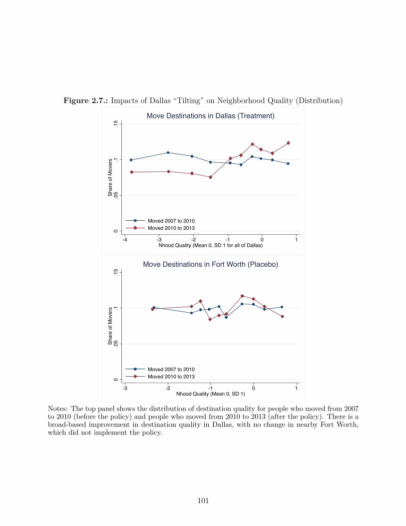
Figure 2.7.: Impacts of Dallas “Tilting” on Neighborhood Quality (Distribution)
0.0
5.1
.15
Shar
e of
Mov
ers
-4 -3 -2 -1 0 1Nhood Quality (Mean 0, SD 1 for all of Dallas)
Moved 2007 to 2010Moved 2010 to 2013
Move Destinations in Dallas (Treatment)0
.05
.1.1
5Sh
are
of M
over
s
-3 -2 -1 0 1Nhood Quality (Mean 0, SD 1)
Moved 2007 to 2010Moved 2010 to 2013
Move Destinations in Fort Worth (Placebo)
Notes: The top panel shows the distribution of destination quality for people who moved from 2007to 2010 (before the policy) and people who moved from 2010 to 2013 (after the policy). There is abroad-based improvement in destination quality in Dallas, with no change in nearby Fort Worth,which did not implement the policy.
101

Fort worth.
2.5.2. Impacts on Voucher Rents and Building Quality
We examine the impacts of this policy change on building quality and voucher rents across
all tenants, and separately for rents paid by stayers and for address with a voucher tenant
change. The identifying assumption for this analysis is that the FMR change had no di�er-
ential impact across zip codes on changes in nonvoucher rents from the base year (2010) to
the most recent data available (2013):
Identification Assumption in ZIP Code-Level Research Design
÷ ‹ FMR ◊ Post|FMR
Because FMR in 2010 was constant across Dallas, using the 2011 FMR level as the regressor
is the same as using the change from 2010 to 2011 as the regressor. With j indexing ZIP
codes and Post
t
as a dummy for 2013, we estimate
First Stage: pijt
= – + “FMR
j
Post
t
+ FMR
j
+ b
ijt
+ Á
ijt
(2.7)
Second Stage: yijt
= – + —
‰p
ijt
+ FMR
j
+ b
ijt
+ ÷
ijt
(2.8)
24The court settlement which precipitated the policy change also funded voluntary mobility counseling, pro-vided by Inclusive Communities Project, the organization which filed the lawsuit. There were 303 voucherhouseholds who already had conventional (non-Walker) vouchers in 2010 and took advantage of these coun-seling services by the end of 2012. Appendix Table 5 shows that households which received counselingshowed dramatic improvements in neighborhood quality of 1.17 standard deviations. These large impactsmay reflect self-selection or the causal impact of the intervention. If the quality improvement for these 303households is entirely attributable to the causal impact of mobility counseling (and not to the ZIP code-levelFMRs), then our estimates for the impact of ZIP code-level FMRs shrinks by about 20%.
102

Rents at the ZIP code-level were highly responsive to the policy change, as shown in Figure
2.5. Table 6 reports results from equations 2.7 and 2.8. Changes in FMRs are a strong
predictor of changes in rent ceiling, with coe�cients around 60 cents. We find that for
every dollar increase (decrease) in FMR, rents for stayers rose (fell) by 13 cents. Among
addresses where the tenants changed, we find a much stronger e�ect of 56 cents. Evidently,
rent reasonableness is enforced much more seriously in Dallas for lease renewals than for new
leases, even when the new leases occur at addresses previously occupied by other voucher
tenants. Finally, looking across all tenants who moved, we find substantial rent increases
in more expensive areas and rent decreases in cheaper areas; every $1 change in FMR was
associated with a 62 cent change in rents. This could reflect changes in landlord pricing or
unit quality.
Across Dallas average voucher rents were roughly constant (Table 2.5), but given the ten-
dency of voucher recipients to live in low-quality neighborhoods, it is surprising that in-
stituting ZIP code-level FMRs did not save money. Two statistical properties of the rent
distribution in Dallas help to explain this. First, the share of renters is sharply declining in
block group income, from 70% for the lowest-income neighborhoods to 10% for the highest-
income neighborhoods. As a result, the median rent of all units in Dallas is substantially
lower than the rent paid in a neighborhood of median quality. Second, the data suggest that
there is a minimum cost to rental housing; median rents are the same in neighborhoods with
a quality index of -4 and an index of -1. Finally, implementation costs were also minimal,
at only about $10 per household.25
We also examine whether this change in the schedule led voucher recipients to move to higher-25Implementation cost estimate comes from correspondence with Matthew Hogan of Dallas Housing Authority,October 23, 2012.
103
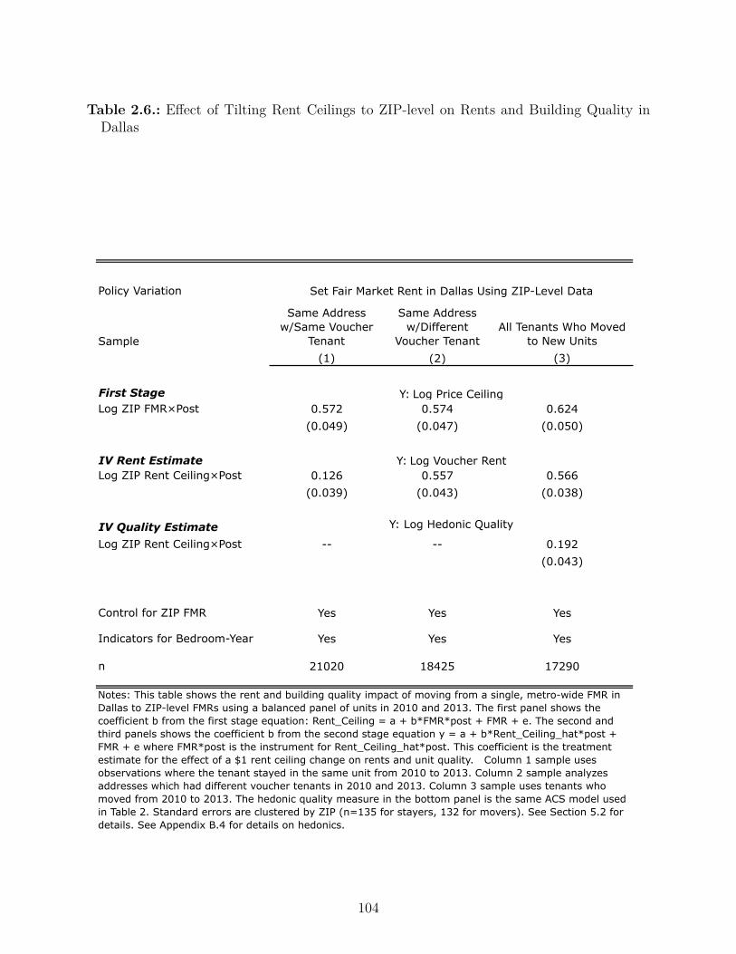
Table 2.6.: E�ect of Tilting Rent Ceilings to ZIP-level on Rents and Building Quality inDallas
Policy Variation
Sample
Same Address w/Same Voucher
Tenant
Same Address w/Different
Voucher TenantAll Tenants Who Moved
to New Units(1) (2) (3)
First StageLog ZIP FMR×Post 0.572 0.574 0.624
(0.049) (0.047) (0.050)
IV Rent EstimateLog ZIP Rent Ceiling×Post 0.126 0.557 0.566
(0.039) (0.043) (0.038)
IV Quality EstimateLog ZIP Rent Ceiling×Post -- -- 0.192
(0.043)
Control for ZIP FMR Yes Yes Yes
Indicators for Bedroom-Year Yes Yes Yes
n 21020 18425 17290
Notes: This table shows the rent and building quality impact of moving from a single, metro-wide FMR in Dallas to ZIP-level FMRs using a balanced panel of units in 2010 and 2013. The first panel shows the coefficient b from the first stage equation: Rent_Ceiling = a + b*FMR*post + FMR + e. The second and third panels shows the coefficient b from the second stage equation y = a + b*Rent_Ceiling_hat*post + FMR + e where FMR*post is the instrument for Rent_Ceiling_hat*post. This coefficient is the treatment estimate for the effect of a $1 rent ceiling change on rents and unit quality. Column 1 sample uses observations where the tenant stayed in the same unit from 2010 to 2013. Column 2 sample analyzes addresses which had different voucher tenants in 2010 and 2013. Column 3 sample uses tenants who moved from 2010 to 2013. The hedonic quality measure in the bottom panel is the same ACS model used in Table 2. Standard errors are clustered by ZIP (n=135 for stayers, 132 for movers). See Section 5.2 for details. See Appendix B.4 for details on hedonics.
Set Fair Market Rent in Dallas Using ZIP-Level Data
Y: Log Price Ceiling
Y: Log Voucher Rent
Y: Log Hedonic Quality
104

quality buildings. We predict physical structure quality by applying the hedonic coe�cients
to data in Dallas on number of bedrooms, structure type, and structure age (but not building
location).26 In 2010, voucher recipients who lived in higher-quality neighborhoods had lower
structure quality, as would be expected given the existence of a single, metro-wide rent
ceiling. We find that for every dollar change in the rent ceiling, structure quality for movers
changed by 19 cents, as reported in Table 2.6. This may understate the true e�ect on
unit quality - our hedonic measure doesn’t capture unobserved quality changes to units
(reductions or improvements). This measure also does not incorporate the improvements in
neighborhood quality detailed in 2.5.1.
2.5.3. Comparing Policies to Improve Neighborhood Quality
The impact on neighborhood poverty rates for voucher recipients of the Dallas policy is
substantial in comparison with the across-the-board increases studied in Section2.4. We
consider three scenarios: (1) a 10% increase in the rent ceiling, multiplied by the coe�cient
from the rebenchmarking estimate, (2) a shift of FMRs from the 40th to the 50th percentile,
and (3) the Dallas policy. The rebenchmarking yields a precise zero, the shift to the 50th
percentile yields an imprecise zero, and the Dallas policy yields an improvement which is
statistically large and economically significant.27
We compare the neighborhood quality impacts in Dallas to other randomized housing inter-
ventions in Table 2.7. Voucher recipients’ access to areas with good schools and low crime
has been a major focus of research in recent years (Lens et al. (2011); Horn et al. (2014)).
Two prominent studies with random assignment of vouchers where the tract-level poverty
rate and violent crime rate are available as outcome measures are the MTO experiment and
voucher random assignment in Chicago (Jacob and Ludwig (2012), Jacob et al. (2013)). We26See Appendix B.2.4 for details.27The results are shown in a bar graph in Appendix Figure 2.4.
105

consider two types of policy interventions: giving a voucher to someone in public housing
and giving a voucher to someone receiving no housing assistance. From largest to smallest,
the improvements are largest for the MTO experimental group, who were required to move to
low-poverty tracts, medium-sized for people leaving public housing with unrestricted vouch-
ers and zero for unassisted tenants given unrestricted vouchers. The improvements for people
leaving public housing are unusually large in part because recipients were leaving distressed
public housing with a high concentration of poverty.
For each intervention, we construct a cost estimate and summary measure of the change in
opportunity for a child a�ected by the policy. Chetty et al. (2014) document heterogeneity in
intergenerational mobility across US commuting zones. Chetty and Hendren (2015) estimate
that two-thirds of the cross-sectional variation is causal. We regress the predicted income
rank of child whose parents are at the 10th percentile of the income distribution on local
violent crime and poverty rates.28 To predict the causal impact of voucher interventions on
children’s outcomes, we assume: (1) the child lived in the new location from birth to age 18
and (2) the cross-Commuting-Zone coe�cients are accurate for the causal impacts of tract-
level variation in neighborhood quality. The Chetty et al. (2014) results, combined with our
assumptions, suggest that their children’s income rank at around age 30 would rise by 4.3
percentage points, so from the 39th percentile to the 43rd percentile. This improvement
for Dallas is smaller than the predicted improvement for the MTO Experimental group (20
percentage points), but similar in magnitude to o�ering vouchers to public housing residents,
and larger than o�ering vouchers to unassisted tenants.29 O�ering vouchers, however, is very
28To be precise, across commuting zones j we regress E(rank|parentRankj = 0) + 0.1 úE(drank/dparentRankj) = – + —Crimej + ”Povertyj and then predict the impact of an intervention as�Rank = 2
3 (≠21.8 ◊ �Crime ≠ 0.231 ◊ �Poverty) where the crime rate is measured as violent crimes per10,000 residents and poverty rate is the fraction of residents with incomes below the federal poverty line.
29This 20 percentage point prediction is if the policy moved children at birth and they stayed in the sameneighborhood until age 18. In fact, the improvement neighborhood quality for the MTO experimental groupdecayed by about 80%, so the quality impact of MTO was smaller than the impact of the hypothetical policyconsidered here which permanently implemented voucher restrictions.
106
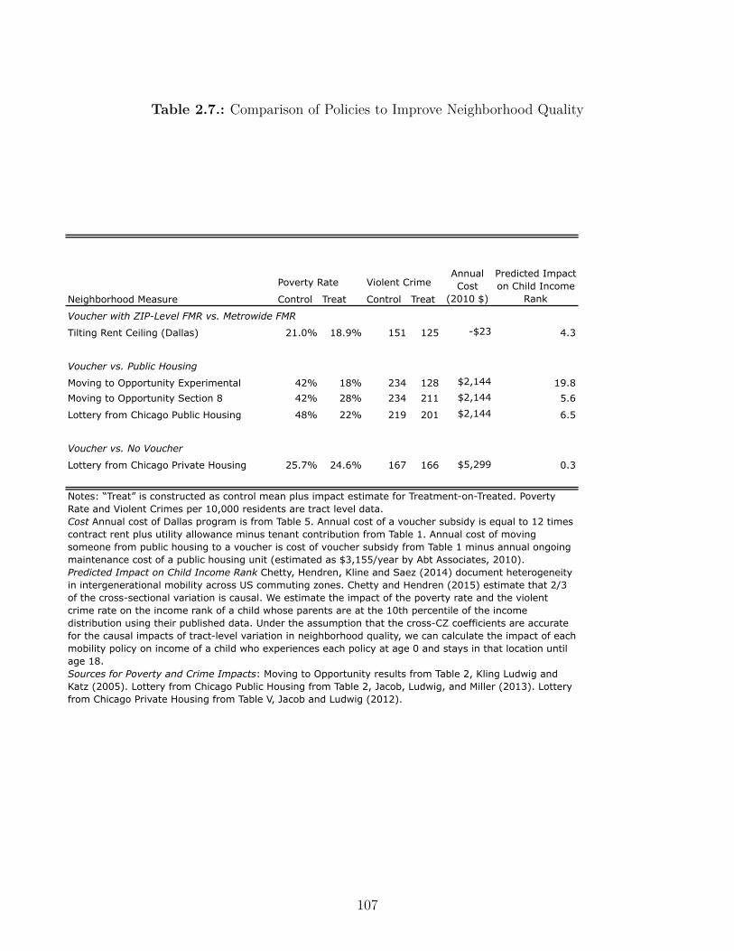
Table 2.7.: Comparison of Policies to Improve Neighborhood Quality
Poverty Rate Violent Crime
Neighborhood Measure Control Treat Control Treat
Voucher with ZIP-Level FMR vs. Metrowide FMR
Tilting Rent Ceiling (Dallas) 21.0% 18.9% 151 125 -$23 4.3
Voucher vs. Public Housing
Moving to Opportunity Experimental 42% 18% 234 128 $2,144 19.8Moving to Opportunity Section 8 42% 28% 234 211 $2,144 5.6
Lottery from Chicago Public Housing 48% 22% 219 201 $2,144 6.5
Voucher vs. No Voucher
Lottery from Chicago Private Housing 25.7% 24.6% 167 166 $5,299 0.3
Coefs on Pov rate and crime rate-21.8
-0.231
Annual Cost
(2010 $)
Predicted Impact on Child Income
Rank
Notes: “Treat” is constructed as control mean plus impact estimate for Treatment-on-Treated. Poverty Rate and Violent Crimes per 10,000 residents are tract level data. Cost Annual cost of Dallas program is from Table 5. Annual cost of a voucher subsidy is equal to 12 times contract rent plus utility allowance minus tenant contribution from Table 1. Annual cost of moving someone from public housing to a voucher is cost of voucher subsidy from Table 1 minus annual ongoing maintenance cost of a public housing unit (estimated as $3,155/year by Abt Associates, 2010).Predicted Impact on Child Income Rank Chetty, Hendren, Kline and Saez (2014) document heterogeneity in intergenerational mobility across US commuting zones. Chetty and Hendren (2015) estimate that 2/3 of the cross-sectional variation is causal. We estimate the impact of the poverty rate and the violent crime rate on the income rank of a child whose parents are at the 10th percentile of the income distribution using their published data. Under the assumption that the cross-CZ coefficients are accurate for the causal impacts of tract-level variation in neighborhood quality, we can calculate the impact of each mobility policy on income of a child who experiences each policy at age 0 and stays in that location until age 18.Sources for Poverty and Crime Impacts: Moving to Opportunity results from Table 2, Kling Ludwig and Katz (2005). Lottery from Chicago Public Housing from Table 2, Jacob, Ludwig, and Miller (2013). Lottery from Chicago Private Housing from Table V, Jacob and Ludwig (2012).
107

costly to unassisted renters, and more expensive than maintaining the existing public housing
stock (Abt Associates (2010)). The Dallas ZIP-level FMRs, in contrast, appear to thus far
have had no net cost to the government.
The neighborhood quality improvements here stand in sharp contrast to the county-level
rent ceiling results in Section 2.4. However, our model o�ers a straightforward reconciliation.
Across-the-board rent ceiling increases operate like an income e�ect, with a minimal impact
on quality. Tilting the rent ceiling, however, operates like a substitution e�ect and tenants
substitute to higher quality.
2.6. Conclusion
We examine how changes in housing voucher generosity a�ect voucher rents and unit quality.
Across all units, a $1 increase in the rent ceiling raises rents by 46 cents; consistent with
this policy change acting like an income e�ect, we find very small observed quality increases
of around 5 cents. A tilting of the rent ceiling, which is equivalent to a substitution e�ect,
increases neighborhood quality substantially. The latter policy, without any net cost to
the government, appears to have raised a neighborhood quality index by 0.23 standard
deviations.
A simple model built around an assumption that it is more di�cult to find a unit in a
high-quality neighborhood can explain our empirical findings, as well as why voucher recip-
ients tend to live in low-quality neighborhoods. Although the tilting of the rent ceiling is
highly cost-e�ective and voucher recipients move to better neighborhoods, the destination
neighborhoods are still of a relatively low quality relative to the distribution for Dallas as a
whole. Future research should seek to identify other barriers or preferences which a�ect the
neighborhood quality of voucher recipients.
108

3. A Permutation Test for the
Regression Kink Design
3.1. Introduction
We develop a permutation test for Regression Kink (RK) designs which rely on an identifi-
cation principle analogous to the one underlying the better-known Regression Discontinuity
(RD) designs. RD designs estimate the change in the level of an outcome Y at the threshold
level of the assignment variable V at which the level of the policy changes discontinuously
(see, e.g., Thistlethwaite and Campbell (1960), Imbens and Lemieux, 2008). RK designs
exploit discontinuous changes in the slope of a policy B at a specific level of the assignment
variable - the kink point V - and assess whether there is also a discontinuous change in the
slope of the outcome variable. By comparing the ratio of the slope change in the outcome
variable to the slope change in the policy variable at the kink point, the RK design recovers
a causal e�ect of the policy on the outcome at the kink point. This is again analogous to RD
designs which calculate the ratio of changes in the level of the outcome to the change in the
level of treatment (or treatment probability) at the discontinuity. The parameter of interest
that the slope change at the kink point identifies is the average e�ect of increasing the policy
conditional on the level of the assignment variable at the kink point. Key identification and
inference results for the RK design were derived in Nielsen, Sørensen, and Taber (2010),
109
Card, Lee, Pei, and Weber (2015), and Calonico et al. (2014b).
This article discusses a permutation test for the RK design, its underlying assumptions and
implementation. For motivation, we begin by describing the regression kink design based on
an example from a growing body of literature that implements the RK design to estimate the
causal e�ect of unemployment benefitsB on an outcome Y such as unemployment duration or
employment (see, e.g., Britto, 2015, Card et al., 2015, Card et al., 2015, Kolsrud et al., 2015b,
Kyyrä and Pesola, 2015, Landais, 2015, and Sovago, 2015). Even though crucial for policy
design, the question of whether unemployed individuals stay out of work for longer if they
receive more generous benefits is hard to address in the absence of a randomized experiment.
RK studies of unemployment insurance aim to fill this gap by exploiting the fact that many
unemployment insurance systems pay out benefits B that rise linearly with income V that
an individual earned before becoming unemployed—up to a benefit cap B for individuals
earning above a reference income V , the kink point. In such a schedule, the slope between the
policy variable B (unemployment benefits) and the assignment variable V (previous income)
changes discontinuously at V . To study the e�ect of benefits B on unemployment duration,
researchers estimate by how much the slope of the outcome variable Y — unemployment
duration — with respect to the assignment variable changes discontinuously at such kink
points. Intuitively, if unemployment benefits have no impact on unemployment duration,
one would not expect to see discontinuous changes in the slope of unemployment duration
Y and previous income V at a kink point V . However, if unemployment benefits do deter
individuals from finding employment, then one would expect discontinuous changes in the
slope of unemployment duration with respect to previous income at kink points that depend
on the strength of the causal e�ect of benefits B on unemployment duration Y . Section 2
provides a more detailed review of the RK design and key identification results.
While the RK design has become increasingly popular, RK estimators as typically imple-
mented may su�er from non-negligible misspecification bias and consequently too narrow
110

confidence intervals (Calonico et al., 2014b). In most applications of the RK design, re-
searchers use local linear or quadratic estimators to estimate the slope change at the kink
(see overview of studies in Table in Appendix ) and choose bandwidths with the goal of
minimizing mean squared error (Fan and Gijbels, 1996). In these specifications, misspecifica-
tion bias can arise as a consequence of non-linearity in the conditional expectation function.
To see how, consider Figure 3.1 which displays data with a piecewise linear data generat-
ing process (DGP) featuring a kink and a quadratic DGP with no kink. For both DGPs,
local linear estimators that are common in the RK literature indicate statistically highly
significant slope changes at the kink, even though the quadratic DGP does not feature a
discontinuous slope change. Calonico et al. (2014b) prove that such misspecification bias is
non-negligible with standard bandwidth selectors and leads to poor empirical coverage of the
resulting confidence intervals. As a remedy, Calonico et al. (2014b) develop an alternative
estimation and inference approach for RD and RK designs based on a bias-correction of the
estimators and a new standard error estimator that reflects the bias correction.
111
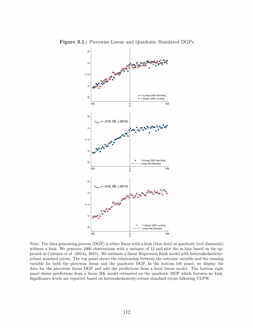
Figure 3.1.: Piecewise Linear and Quadratic Simulated DGPs
-10
-50
510
Y
-500 0 500V
Y (Linear DGP with Kink)Y (Quad. DGP, no Kink)
τRKD = -.016, SE: (.0015)
-10
-50
510
Y
-500 0 500V
Y (Linear DGP with Kink)Linear RK Estimator
τRKD = -.016, SE: (.0014)
-10
-50
510
Y
-500 0 500V
Y (Quad. DGP, no Kink)Linear RK Estimator
Note: The data generating process (DGP) is either linear with a kink (blue dots) or quadratic (red diamonds)without a kink. We generate 1000 observations with a variance of 12 and plot the in bins based on the ap-proach in Calonico et al. (2014a, 2015). We estimate a linear Regression Kink model with heteroskedasticity-robust standard errors. The top panel shows the relationship between the outcome variable and the runningvariable for both the piecewise linear and the quadratic DGP. In the bottom left panel, we display thedata for the piecewise linear DGP and add the predictions from a local linear model. The bottom rightpanel shows predictions from a linear RK model estimated on the quadratic DGP which features no kink.Significance levels are reported based on heteroskedasticity-robust standard errors following CLPW.
112
To provide a complement and robustness check to existing RK inference, we draw on ran-
domization inference and propose a permutation test—treating the location of the kink point
V as random—that has exact size in finite samples. The key assumption underlying our test
is that the location of the policy kink point is randomly drawn from a set of potential kink
locations. This assumption is rooted in a thought experiment in which the data are taken as
given and only the location of the kink point V is thought of as a random variable. In many
RK contexts, this assumption is appealing because the kink point’s location is typically not
chosen based on features of the DGP or—as in the case of kinks in many unemployment
insurance schedules—is determined as the outcome of a stochastic process (see Section 3).
Under the null hypothesis that the policy has no e�ect on the outcome and the assumption
that the location of the policy kink is randomly drawn from a specified support, the distri-
bution of placebo estimates provides an exact null distribution for the test statistic at the
policy kink. We prove that the permutation test controls size exactly in finite samples.
We simulate data to assess the performance of asymptotic and permutation test-based in-
ference for linear and quadratic RK estimators based on data with linear and non-linear
data-generating processes. These Monte Carlo simulations document that asymptotic p-
values can be misleading in settings in which the relationship between the outcome and the
assignment variable is non-linear; RK estimates are statistically significant using asymptotic
methods even when the kink is fact zero. Our permutation test, in contrast, is robust to
non-linearity and indicates no statistical significance in settings without a kink but detects
actual non-zero kinks in the examples we study. A second simulation study additionally il-
lustrates that the permutation test has exact size control in finite settings when the location
of the kink point is in fact randomly drawn. We also document that asymptotic inference
is reliable in settings in which the relationship between outcome and assignment variable
is, in fact, linear or piece-wise linear. In the simulations, we also document examples of
settings in which the permutation test fails to detect non-zero kinks. This can occur when
113

the relationship between the outcome and the assignment variable is su�ciently non-linear
relative to the magnitude of the kink. Importantly, while the permutation test has low power
in such settings, the permutation test still has exact size when the basic assumption that
the location of the kink point can be thought of as a random variable holds.
Our permutation test builds on the principles of randomization inference, which has a long
tradition in the statistics literature (Fisher, 1935; Lehmann and Stein, 1949; Welch and
Gutierrez, 1988; Welch, 1990; Rosenbaum, 2001; Ho and Imai, 2006, see Rosenbaum, 2002,
for an introduction) and has seen new interest in recent years from econometricians (see, for
instance, Bertrand, Duflo, and Mullainathan, 2004; Imbens and Rosenbaum, 2005; Chetty,
Looney, and Kroft, 2009; Abadie, Diamond, and Hainmueller, 2010; Abadie, Athey, Imbens,
and Wooldridge, 2014; Cattaneo, Frandsen, and Titiunik, 2015). In particular, Cattaneo
et al. (2015) develop a randomization inference approach for RD designs based on an inter-
pretation of RD designs as local randomized experiments in a narrow window around the
RD cuto�. While the procedure developed by Cattaneo et al. (2015) treats the locations of
observations above and below the cuto� as random within a narrow window, our test o�ers
a complementary approach by treating the location of the kink point (or cuto�) itself as ran-
dom. In doing so, our approach generalizes a suggestion by Imbens and Lemieux (2008) for
the RD design, “testing for a zero e�ect in settings where it is known that the e�ect should
be 0”, to the RK design by estimating slope changes in regions where there is no change in
the slope of the policy (see also the placebo analyses in Engström et al. (2015)). We then
use this distribution of placebo kink estimates to test a sharp null hypothesis of no e�ect of
the policy on the outcome variable. Our paper builds on Calonico et al., 2014b in developing
new methods to deal with misspecification bias in RK and RD designs. In related work,
Landais (2015) proposes an alternative way of gauging the robustness in RK estimates by
constructing di�erence-in-di�erences RK estimates which are based on the same kink point
but using data from time periods with and without the presence of an actual policy kink.
114
Ando (2013) uses Monte Carlo simulations to argue that linear RK estimates are biased in
the presence of plausible amounts of curvature.
3.2. Notation and Review
3.2.1. Identification in the Regression Kink Design
The following section reviews key results and notation for the RK design based on Card et al.
(2015), also abbreviated as CLPW in the following, and illustrates the method based on RK
designs aimed at estimating the causal e�ect of unemployment benefits B on an outcome Y ,
e.g., unemployment duration, by exploiting kinks in the unemployment insurance schedule
(see, e.g., Britto, 2015, Card et al., 2015, Card et al., 2015, Kolsrud et al., 2015b, Kyyrä and
Pesola, 2015, Landais, 2015, and Sovago, 2015).
Formally, the outcome Y - here thought of as unemployment duration - is modeled as
Y = y(B, V, U) (3.1)
where B denotes the policy variable, unemployment benefits, V denotes a running variable,
here thought of as previous labor income, which determines the assignment of B, and U
denotes an error term. The parameter of interest is the e�ect of the policy variable, B, on
the outcome Y . Analogous to treatment e�ects for binary treatments, defined as y(1, V, U)≠
y(0, V, U) in a potential outcomes framework, the treatment parameter that RK design intend
to estimate is the marginal e�ect of increasing the level of the policy B on the outcome Y ,
115
i.e.
dy(B, V, U)dB
(3.2)
Integrating this marginal e�ect over the distribution of U conditional on B = b and V = v
leads to the “treatment on the treated” parameter in Florens, Heckman, Meghir, and Vytlacil
(2008):
TT
B=b,V=v
=ˆ
ˆy(b, v, u)ˆb
dF
U |B=b,V=v
(u) (3.3)
where F
U |B=b,V=v
denotes the conditional c.d.f. of the error term U . In the context of
unemployment benefits, this corresponds to the average e�ect of marginally increasing un-
employment benefits on unemployment duration for individuals with unemployment benefits
B = b and previous income V = v.
The key feature that RK designs exploit is a discrete slope change in the assignment mech-
anism of the policy. Let B = b(V ) denote the policy function or, in the context of unem-
ployment insurance, the benefit schedule. In many unemployment systems, benefits B rise
linearly with the previous income V that an individual earned before becoming unemployed.
A maximum level of benefits is also typically o�ered for individuals earning above a higher
reference income V . This implies that the slope between the policy variable B (unemploy-
ment benefits) and the assignment variable V (previous income) changes discontinuously at
V when the previous income rises above the reference income. To illustrate, the upper panel
of Figure 3.2 shows plots of unemployment benefits plotted against earnings in the previous
year based on Austrian UI data (CLPW). The benefit schedule or policy function B = b(V )
can be simply described as follows:
116
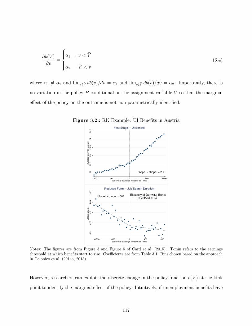
ˆb(V )ˆv
=
Y___]
___[
–
1
, v < V
–
2
, V < v
(3.4)
where –
1
”= –
2
and limvø ¯V db(v)/dv = –
1
and limv¿ ¯V db(v)/dv = –
2
. Importantly, there is
no variation in the policy B conditional on the assignment variable V so that the marginal
e�ect of the policy on the outcome is not non-parametrically identified.
Figure 3.2.: RK Example: UI Benefits in Austria
Slope+ - Slope- = 2.22222
.523
23.5
2424
.5Av
erag
e D
aily
UI B
enefi
t
-1800 -900 0 900 1800Base Year Earnings Relative to T-min
First Stage -- UI Benefit
Elasticity of Dur w.r.t. Bens:= 3.8/2.2 = 1.7Slope+ - Slope- = 3.8
4.5
4.55
4.6
4.65
4.7
Log(
Dur
atio
n)
-1800 -900 0 900 1800Base Year Earnings Relative to T-min
Reduced Form -- Job Search Duration
Notes: The figures are from Figure 3 and Figure 5 of Card et al. (2015). T-min refers to the earningsthreshold at which benefits start to rise. Coe�cients are from Table 3.1. Bins chosen based on the approachin Calonico et al. (2014a, 2015).
However, researchers can exploit the discrete change in the policy function b(V ) at the kink
point to identify the marginal e�ect of the policy. Intuitively, if unemployment benefits have
117
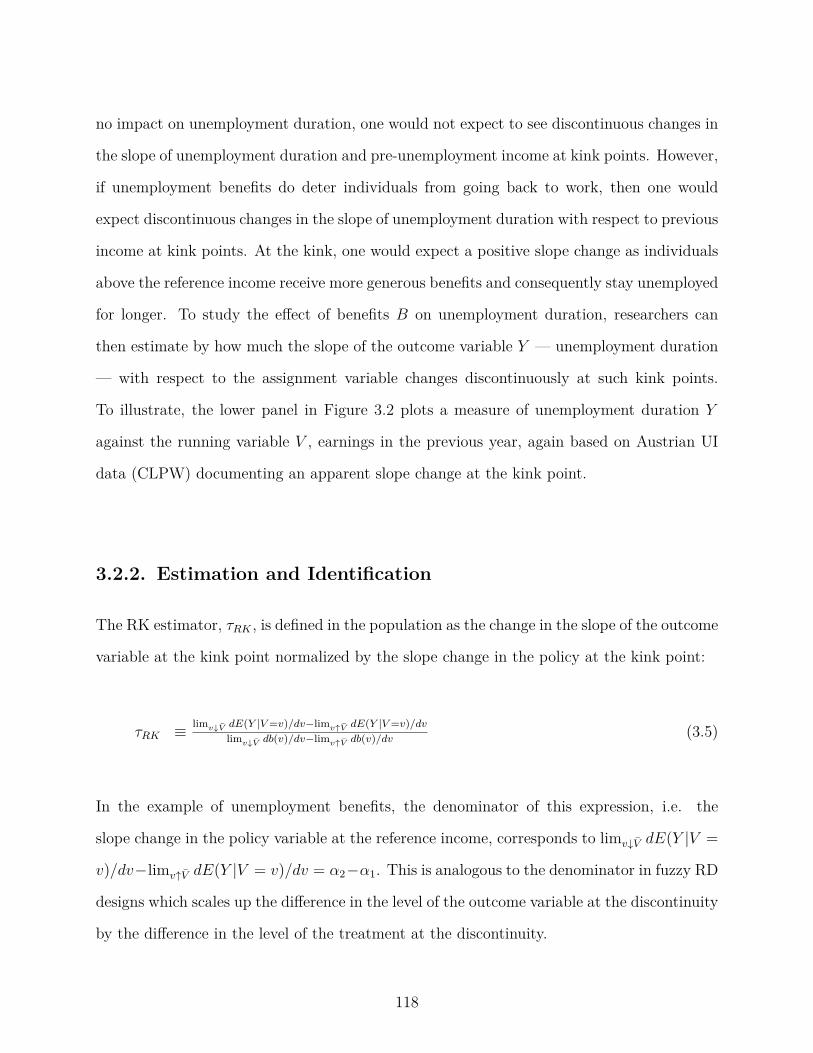
no impact on unemployment duration, one would not expect to see discontinuous changes in
the slope of unemployment duration and pre-unemployment income at kink points. However,
if unemployment benefits do deter individuals from going back to work, then one would
expect discontinuous changes in the slope of unemployment duration with respect to previous
income at kink points. At the kink, one would expect a positive slope change as individuals
above the reference income receive more generous benefits and consequently stay unemployed
for longer. To study the e�ect of benefits B on unemployment duration, researchers can
then estimate by how much the slope of the outcome variable Y — unemployment duration
— with respect to the assignment variable changes discontinuously at such kink points.
To illustrate, the lower panel in Figure 3.2 plots a measure of unemployment duration Y
against the running variable V , earnings in the previous year, again based on Austrian UI
data (CLPW) documenting an apparent slope change at the kink point.
3.2.2. Estimation and Identification
The RK estimator, ·
RK
, is defined in the population as the change in the slope of the outcome
variable at the kink point normalized by the slope change in the policy at the kink point:
·
RK
© lim
v¿V dE(Y |V=v)/dv≠lim
vøV dE(Y |V=v)/dv
lim
v¿V db(v)/dv≠lim
vøV db(v)/dv
(3.5)
In the example of unemployment benefits, the denominator of this expression, i.e. the
slope change in the policy variable at the reference income, corresponds to limv¿ ¯V dE(Y |V =
v)/dv≠limvø ¯V dE(Y |V = v)/dv = –
2
≠–
1
. This is analogous to the denominator in fuzzy RD
designs which scales up the di�erence in the level of the outcome variable at the discontinuity
by the di�erence in the level of the treatment at the discontinuity.
118

Local polynomial regression techniques (Fan and Gijbels, 1996) are used for estimation of
·
RK
. The data is split into two subsamples to the left and right of the kink point (denoted
by + and -, respectively) and a local polynomial regression is estimated separately for each
subsample. For the sharp RK design, in which the slope change in the policy at the kink
point is known, this amounts to solving the following least squares problem in the sample:
min{—
≠j
}
qN
≠
i=1
{Y ≠i
≠ qp
j=0
—
≠j
(V ≠i
)j}2K3
V
≠i
h
4
min{—
+j
}
qN
+i=1
{Y +
i
≠ qp
j=0
—
+
j
(V +
i
)j}2K3
V
+i
h
4
subject to —
≠0
= —
+
0
·
p
RK
© —
+
1
≠ —
≠1
(3.6)
Here, p denotes the order of the polynomial, K the kernel function, and h the bandwidth
used for estimation. In the literature, the bandwidth is typically chosen based on the formula
in Fan and Gijbels, through cross-validation, or the procedure in Calonico et al. (2014b).
The denominator of the left-hand side of equation X is identified as —
+
1
≠ —
≠1
. The papers in
the RK literature have primarily adopted a uniform kernel as choice of K and overwhelming
use local linear and quadratic specifications.
CLPW prove that this RK estimator in (3.5) identifies the “treatment on the treated” pa-
rameter in (3.3) (Florens et al., 2008) for individuals at the kink point under mild regularity
conditions, in particular an assumption of smoothness of y, so that:
·
RK
=ˆ
ˆy(b, v, u)ˆb
dF
U |B=b,V=V
(u). (3.7)
119

3.2.3. Asymptotic Bias
A potential problem of RK designs is that non-linearities of the conditional expectation
function E[Y |V = v] can generate bias in the estimator ·
P
RK
. Panel 3 of Figure 3.1 illustrates
the intuition of this result as curvature of the conditional expectation function generates
bias of linear RK estimators. A formal argument supporting this intuition follows from
Calonico et al. (2014b) who derive a general formula for the asymptotic bias of RK and RD
estimators. Based on the general formula, the asymptotic misspecification bias of local linear
RK estimators is shown to be proportional to (m(2)
+
+ m
(2)
≠ )h, which is the sum of second
derivatives of the moment function and the bandwidth h. The terms m(j)
+
and m
(j)
≠ denote
the limits of the j
th derivative of m(v) © E[Y |V = v] from above and below at the kink. A
similar expression can be derived for local quadratic estimators for which first-order bias is
proportional to third-order terms of the conditional mean function. Calonico et al. (2014b)
prove that such misspecification bias is non-negligible with standard bandwidth selectors
and, as a consequence, leads to poor empirical coverage of the resulting confidence intervals.
3.3. A Permutation Test for the Regression Kink
Design
3.3.1. The Thought Experiment
We propose a simple permutation test to assess the null hypothesis that treatment has no
e�ect on the outcome of interest. At the core of our test is the assumption that the location
of the policy kink can be considered as randomly drawn from a known set of placebo kink
points—an assumption that needs to be evaluated in the context of the specific research
120

design under scrutiny. We describe a method for how researchers can estimate a distribution
of placebo kink points in the context of unemployment insurance systems. In this interval,
we can reassign the location of the kink and calculate RK estimates, ·
p
RK
, at these placebo
kinks. As discussed above, inference based on conventional robust standard errors can be
misleading when non-linearity in the data biases RK estimates. By drawing on data away
from the kink, this permutation test o�ers an exact finite sample inference procedure which
researchers can use as an alternative. The test assesses the extremeness of the estimated
change in the slope at the kink point relative to estimated slope changes at non-kink points
under the null hypothesis that the policy does not a�ect the outcome.
The thought experiment underlying this permutation test (and randomization inference more
generally) is di�erent from the one underlying asymptotic inference. Whereas the idea un-
derlying asymptotic inference is one of sampling observations from a large population, the
thought experiment in randomization inference is based on a fixed population that the re-
searcher observes in the data, with the realizations of the running variable v and the outcome
variable y, in which the assignment of treatment is sampled repeatedly. In the latter ap-
proach, treatment assignment is thought of as the random variable. Our test therefore does
not treat the sample as being drawn from a (super) population for which we seek inference
but rather takes the observed sample as given and tests hypotheses regarding this particular
sample, treating the location of the policy kink as a random variable.
3.3.2. The Permutation Test Statistic
We let y denote the vector of yi
values, v denote the vector of vi
realizations and k denote a
potential kink point, with a policy kink featuring a discontinuous slope change in the policy
or a placebo kink not featuring such a discontinuous slope change. The data are a vector of n
121
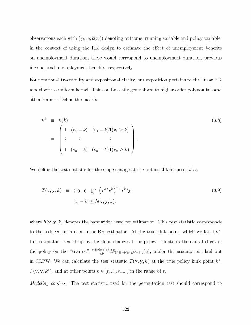
observations each with (yi
, v
i
, b(vi
)) denoting outcome, running variable and policy variable:
in the context of using the RK design to estimate the e�ect of unemployment benefits
on unemployment duration, these would correspond to unemployment duration, previous
income, and unemployment benefits, respectively.
For notational tractability and expositional clarity, our exposition pertains to the linear RK
model with a uniform kernel. This can be easily generalized to higher-order polynomials and
other kernels. Define the matrix
vk © v(k) (3.8)
©
Q
cccccca
1 (v1
≠ k) (v1
≠ k)1(v1
Ø k)... ... ...
1 (vn
≠ k) (vn
≠ k)1(vn
Ø k)
R
ddddddb.
We define the test statistic for the slope change at the potential kink point k as
T (v,y, k) © ( 0 0 1)Õ1vk Õvk
2≠1
vk Õy, (3.9)
|vi
≠ k| Æ h(v,y, k),
where h(v,y, k) denotes the bandwidth used for estimation. This test statistic corresponds
to the reduced form of a linear RK estimator. At the true kink point, which we label kú,
this estimator—scaled up by the slope change at the policy—identifies the causal e�ect of
the policy on the “treated”,´
ˆy(b,v,u)
ˆb
dF
U |B=b(k
ú),V=k
ú,
(u), under the assumptions laid out
in CLPW. We can calculate the test statistic T (v,y, k) at the true policy kink point k
ú,
T (v,y, kú), and at other points k œ [vmin
, v
max
] in the range of v.
Modeling choices. The test statistic used for the permutation test should correspond to
122

the RK estimator and preferred modeling choices, including bandwidth (or a bandwidth
selection mechanism), polynomial order and bias-correction, implemented by the researcher
for the RK estimator at the actual policy kink. The permutation test approach can be easily
generalized to incorporate alternative RK estimators, polynomial orders, and bandwidth
choices. The Monte Carlo studies we present in Section 4 provide some guidance for the
modeling choices and suggest that estimators based on the procedure in Calonico et al.
(2014b) perform relative to local polynomial estimators with bandwidth choice based on Fan
and Gijbels (1996).
3.3.3. The Randomization Assumption
The core assumption underlying our permutation test is that the location of the policy kink
point kú can be thought of as being randomly drawn:
Assumption: Random Kink Placement. k
ú is a realization of a random variableK distributed
according to a known distribution P .
The assumption that the policy kink location can be thought of a being randomly drawn is
a strong one but natural in the context of many RK designs. Its plausibility needs to be
evaluated in the context of a given research design. It would be violated if, for instance,
policy-makers had chosen a kink location explicitly or implicitly in response to the shape of
the conditional expectation function E[Y |V ], e.g., at a location where curvature is partic-
ularly high or low. We discuss several implementable strategies for researchers to identify
P .
1. Estimation of stochastic process based on institutional features. In the example of esti-
mating the causal e�ect of unemployment benefits on unemployment duration that we follow
throughout the paper, researchers implementing the permutation test for the RK design can
123

exploit features of many unemployment insurance systems to directly estimate the distri-
bution P . In many unemployment insurance systems, the location of the kink point—the
earnings ceiling at which unemployment benefits are capped—is determined as a consequence
of past aggregate wage growth in the economy. For instance, in Austria—the setting of the
study by CLPW—the earnings ceiling in the unemployment insurance system changes as
a function of aggregate wage growth from the third to the second previous calendar year
(§ 108 Allgemeines Sozialversicherungsgesetz). Therefore, past data on past wage growth
can be used to directly estimate the properties of the stochastic process that determines the
realization of kú in a given year.
2. Documentary evidence on rule-making. If directly estimating the stochastic process
determining k
ú is infeasible, researchers can still proxy P by drawing on information on the
institutional environment of the relevant RK application. In the spirit of randomization
inference, K should correspond to the actual range of proposals for kinks that could have
been adopted. If, for example, several policy proposals existed in a political debate regarding
the choice of a reference income V in the example of unemployment insurance we discussed,
researchers could use the discretized minimum range [v, v] that includes all of these proposals.
For instance, prior to switching to a system of automatic updates of the earnings ceiling based
on aggregate wage growth in 1969, the German Bundestag adjusted the earnings ceiling in
a discretionary fashion so that the minutes of plenary proceedings can be used to gauge the
range of discussed proposals.
In addition, we also suggest that researchers implement the permutation test based on two
additional benchmarks:
3. Local randomization neighborhood (Cattaneo et al., 2015). In the context of developing
a randomization inference approach for the RD design treating observations—rather than
the cuto� itself as in our approach—as randomly assigned, Cattaneo et al. (2015) design a
data-driven procedure to select a window around an RD cuto� based on balance tests of pre-
124

treatment covariates in which treatment status is arguably as good as randomly assigned.
A natural extension of their procedure is to treat the location of the cuto� or kink—rather
than the observations—as randomly assigned within this window.
4. Range of available data. As a final benchmark, we suggest that researchers consider the
whole range of available data [vmin
, v
max
] and treat the empirical distribution of V as the
distribution of K. This follows the approach in Section 4 of Gelman and Imbens (2014) for
selecting pseudo-thresholds in the context of evaluating RD designs.
3.3.4. Exact Size For Testing the Null Hypothesis of Policy
Irrelevance
The goal of our permutation test is to assess whether the data reject the null hypothesis that
the policy does not a�ect outcomes. We formalize this as a sharp null hypothesis where B
and V denote the range of the policy and assignment variable, respectively:
Null Hypothesis: Policy Irrelevance. The policy does not a�ect outcomes at any v: dy(b,v,U)
db
=
0, ’b œ B,’v œ V .
Note that this hypothesis implies that in the range the policy is irrelevant: y(b1
, v, U) =
y(b2
, v, U), ’b1
, b
2
œ B,’v œ V . Under the Policy Irrelevance Hypothesis and the Assumption
of Random Kink Placement, the distribution of kink estimates over P corresponds to the
exact distribution of possible estimates which could have arisen had the policy kink been
at a di�erent location in the same dataset. Under these assumptions, we can construct an
exact test following the logic of Fisher (1935) and Pitman (1937).
125

Proposition 1. Under the Null Hypothesis of Policy Irrelevance and the Random Kink
Location assumption, there exists a test function „(v,y, k) for significance level – which has
an exact finite sample level of –.
In Appendix , we follow the structure of a simple proof in Romano (1990) documenting that,
under the Null Hypothesis of Policy Irrelevance and the Random Kink Location assumption,
there exists a test function „(v,y, k) for significance level – which has an exact finite sample
level of –.
Under the assumption of Random Kink Placement, the Null Hypothesis thus leads to a
testable implication which can be assessed by measuring how unusual a given realization of
the test statistic is at the policy kink. Analogous to the test outlined above, researchers can
also calculate p-values for assessing the likelihood that the Null Hypothesis is true given the
RK estimate at the policy kink k
ú and the distribution of placebo kink estimates. Suppose
a researcher had calculated 1000 placebo kink estimates and the estimate at the policy kink
k
ú were the 20th lowest of these estimates. Then the two-sided p-value would be calculated
to be 4% corresponding to twice the one-sided p-value of 2%. More generally, the two-sided
p≠value can be calculated as twice the minimum of the two one-sided p-values, i.e., the
minimum of the fraction of placebo estimates—including the one at the actual policy kink
k
ú—that are no greater than or no smaller than the test statistic at the policy kink k
ú.
3.4. Applications of the Permutation Test
3.4.1. Illustration of Permutation Test
We implement the permutation test for a Regression Kink design based on data simulated
to match moments of the empirical distribution in the RK application in CLPW. As in the
126
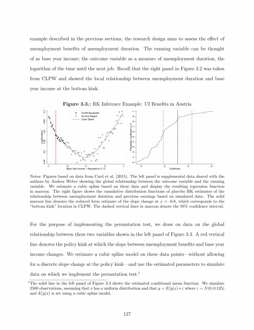
example described in the previous sections, the research design aims to assess the e�ect of
unemployment benefits of unemployment duration. The running variable can be thought
of as base year income; the outcome variable as a measure of unemployment duration, the
logarithm of the time until the next job. Recall that the right panel in Figure 3.2 was taken
from CLPW and showed the local relationship between unemployment duration and base
year income at the bottom kink.
Figure 3.3.: RK Inference Example: UI Benefits in Austria
4.45
4.5
4.55
4.6
4.65
4.7
Log(
Dur
atio
n)
-1 -.5 0 .5 1Base Year Income -- Rescaled to [-1,1]
CLPW BandwidthNo-Kink RegionCubic Spline
0.1
.2.3
.4.5
.6.7
.8.9
1Pr
obab
ility,
Coe
ffici
ent <
= X
0 .2 .4 .6Coefficient
Notes: Figures based on data from Card et al. (2015). The left panel is supplemental data shared with theauthors by Andrea Weber showing the global relationship between the outcome variable and the runningvariable. We estimate a cubic spline based on these data and display the resulting regression functionin maroon. The right figure shows the cumulative distribution functions of placebo RK estimates of therelationship between unemployment duration and previous earnings based on simulated data. The solidmaroon line denotes the reduced form estimate of the slope change at x = -0.8, which corresponds to the“bottom kink” location in CLPW. The dashed vertical lines in maroon denote the 95% confidence interval.
For the purpose of implementing the permutation test, we draw on data on the global
relationship between these two variables shown in the left panel of Figure 3.3. A red vertical
line denotes the policy kink at which the slope between unemployment benefits and base year
income changes. We estimate a cubic spline model on these data points—without allowing
for a discrete slope change at the policy kink—and use the estimated parameters to simulate
data on which we implement the permutation test.1
1The solid line in the left panel of Figure 3.3 shows the estimated conditional mean function. We simulate2500 observations, assuming that x has a uniform distribution and that y = E(y|x)+Á where Á ≥ N(0, 0.125)and E(y|x) is set using a cubic spline model.
127

Following the RK literature (e.g., CLPW), we use a standard RK estimator based on local
linear regression with bandwidth choice as proposed in Fan and Gijbels’ (1996) and calculate
robust standard errors.2 We estimate a positive, statistically significant slope change at the
policy kink point (p = 0.002) using asymptotic inference even though the data generating
process—by our assumption—does not feature a discrete slope change at the policy kink
point.
We then implement the permutation test by estimating slope changes at 91 equally spaced
placebo kink points ranging from the 5th to the 95th percentile of the assignment variable.
The c.d.f. of the resulting distribution of placebo RK estimates is shown in the right panel of
Figure 3.3. The figure also shows the point estimate of the slope change at the actual policy
kink and the corresponding confidence interval based on asymptotic inference in maroon.
While standard inference procedures would have led the researcher to erroneously conclude
that there had been a statistically significant slope change at the kink point, the permutation
test leads to a p≠value of 0.165. To be clear, this does not suggest that there is no discrete
slope change in the data considered by CLPW; but rather that RK estimates with standard
inference might lead a researcher to conclude that there is a discrete slope change when in
fact the DGP is smooth.
3.4.2. Simulation Study I: Performance of Permutation Test
We now generalize our analysis and extend the permutation test to several other data-
generating processes (DGPs). The conditional mean functions for these DGPs are displayed
2Fan and Gijbels (1996) propose a “rule-of-thumb” bandwidth h = CP
ˇ2(0)
{m(p+1)(0)}2f(0)
È 12p+3
n
≠ 12p+3which is
approximately MSE-optimal. We follow CLPW’s implementation of this bandwidth choice and estimate‡
2(0) and m
(p+1)(0) based on a global polynomial of the outcome on the assignment variable allowing fora kink at the threshold. The constants are C1 = 2.35 and C2 = 3.93 for the linear and quadratic case,respectively. We choose the order of the polynomial based on the Akaike Information Criterion (AIC) andestimate f(0) based on a fourth order polynomial fitted to a histogram of the assignment variable.
128

in Figure 3.4.3 We have chosen several non-linear as well as piece-wise linear conditional
mean functions. For each of these conditional mean functions, we simulate data with and
without a kink at zero. DGP 1 is a linear function and piece-wise linear in the specification
with a kink. DGPs 2 through 3 are based on combinations of trigonometric, polynomial and
exponential functions functions with and without kinks. DGP 4 follows a sine function.
3A full description of these processes can be found in the note of Table 3.1.
129
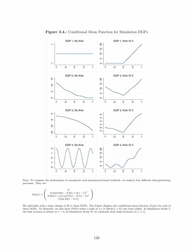
Figure 3.4.: Conditional Mean Function for Simulation DGPs
-11
-1 -.5 0 .5 1
DGP 1, No Kink
05
1015
20
-1 -.5 0 .5 1
DGP 1, Kink @ 0
05
1015
-1 -.5 0 .5 1
DGP 2, No Kink
05
1015
20-1 -.5 0 .5 1
DGP 2, Kink @ 0
-15
-10
-50
-1 -.5 0 .5 1
DGP 3, No Kink
-4-2
02
46
-1 -.5 0 .5 1
DGP 3, Kink @ 0
-2-1
01
2
-1 -.5 0 .5 1
DGP 4, No Kink
05
1015
20
-1 -.5 0 .5 1
DGP 4, Kink @ 0
Note: To compare the performance of asymptotic and permutation-based methods, we analyze four di�erent data-generating
processes. They are:
E(y|x) =
Q
a0
0.3 sin(10(x ≠ 0.25) + 3(x ≠ 1)
2
0.3(0.5 + |x|) cos2(5(x ≠ 0.1)) ≠ 5e
x
2 (sin 10(x ≠ 0.1))
R
b
We add kinks with a slope change of 20 to these DGPs. The Figure displays the conditional mean function E(y|x) for each of
these DGPs. To illustrate, we also show DGPs where a kink at x= 0 (20x1(x > 0)) has been added. In Simulation Study I,
the kink location is always at x = 0, In Simulation Study II, we randomly draw kink locations on [≠1, 1].
130
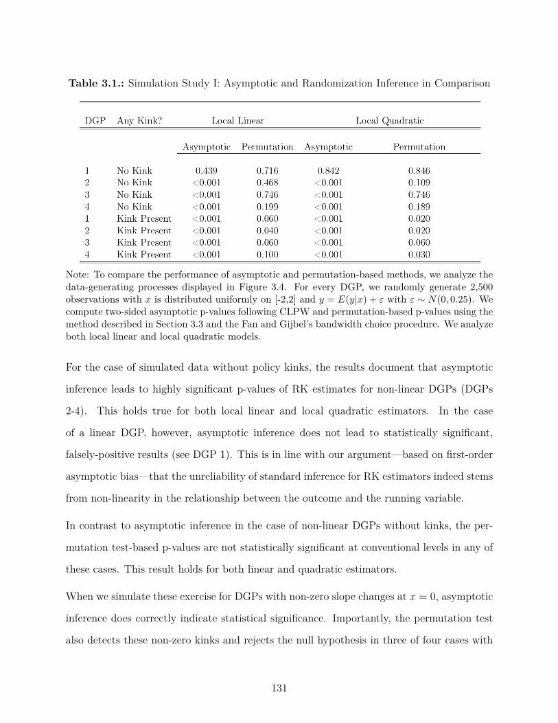
Table 3.1.: Simulation Study I: Asymptotic and Randomization Inference in Comparison
Note: To compare the performance of asymptotic and permutation-based methods, we analyze thedata-generating processes displayed in Figure 3.4. For every DGP, we randomly generate 2,500observations with x is distributed uniformly on [-2,2] and y = E(y|x) + Á with Á ≥ N(0, 0.25). Wecompute two-sided asymptotic p-values following CLPW and permutation-based p-values using themethod described in Section 3.3 and the Fan and Gijbel’s bandwidth choice procedure. We analyzeboth local linear and local quadratic models.
For the case of simulated data without policy kinks, the results document that asymptotic
inference leads to highly significant p-values of RK estimates for non-linear DGPs (DGPs
2-4). This holds true for both local linear and local quadratic estimators. In the case
of a linear DGP, however, asymptotic inference does not lead to statistically significant,
falsely-positive results (see DGP 1). This is in line with our argument—based on first-order
asymptotic bias—that the unreliability of standard inference for RK estimators indeed stems
from non-linearity in the relationship between the outcome and the running variable.
In contrast to asymptotic inference in the case of non-linear DGPs without kinks, the per-
mutation test-based p-values are not statistically significant at conventional levels in any of
these cases. This result holds for both linear and quadratic estimators.
When we simulate these exercise for DGPs with non-zero slope changes at x = 0, asymptotic
inference does correctly indicate statistical significance. Importantly, the permutation test
also detects these non-zero kinks and rejects the null hypothesis in three of four cases with
131

p < 0.1. An exception that we deliberately designed to illustrate a setting in which the
permutation test may not detect a non-zero kink is DGP 4 with an actual kink. Here, the
permutation test - based on a linear specification - does not indicate statistical significance
even though there is a notable, discrete slope change at x = 0. The distribution of placebo
kink estimates is very dispersed as the DGP is highly non-linear in regions away from the
kink but locally linear.4 The limits of the practical relevance of this example are, however,
obvious: while in the simulation study, we have control over the data generating process,
researchers who would want to argue against applying the permutation test in their RK
application would need to make a compelling case that the conditional mean function is
non-linear in large segments of their data but that local polynomial approaches are still
powerful enough to detect discrete slope changes at specific kink points. More generally, this
example serves to illustrate that the permutation test may not detect slope changes that are
small relative to the overall non-linearity in the DGP.
3.4.3. Simulation Study II: Type I and Type II Errors
We generalize the analysis from the previous section to study type I and type II error rates
for the di�erent DGPs under study. To do so, we again generate 2,500 observations with the
running variable uniformly distributed on the interval [≠2, 2]. In addition, we now randomly
draw a potential kink location k
ú on the interval [≠1, 1]. With probability p = 0.5, we then
add an actual slope change component to the DGP at this potential kink location k
ú. With
probability p = 0.5, we add no slope change at the kink location. This process is repeated
for a total of 1000 times.5
4Note that the permutation test in the local quadratic specification does reject the null hypothesis in thiscase.
5We require balance so that we have 500 DGPs with and 500 DGPs without a slope change at the randomlydrawn kink point.
132

This setup allows us to study systematically in what fraction of cases the di�erent estimators
and inference methods detect a statistically significant slope change at the kink location when
the slope does in fact not change discontinuously (type I error rate). In addition, we can
also study in what fraction of cases the null hypothesis is not rejected when there is in fact
a violation of the null hypothesis as there is a discontinuous slope change at the kink point
(type II error rate). We show results for these simulations in Table 3.2.
Mirroring the results from simulation study I, we find that the standard inference methods
applied in the RK literature do not control size well for non-linear DGPs and have a type
I error rate that is much higher than the nominal level.6 This results holds for both linear
and quadratic estimators. In contrast, this simulation illustrates the intuition that the
permutation test has exact size in finite samples for testing a sharp null hypothesis of no
e�ect when the assumption of random kink location holds. Based on 1000 simulations (500
with a non-zero kink, 500 without one), we find that the type I error rate is close to nominal
(10%) in all cases.
We assess type II error rates in the bottom panel of Table 3.2 and find for the permutation
test that the probability with which the null hypothesis is accepted when there is in fact a
violation (a slope change of 20 at the kink point k
ú) is less than 15% and 8% in three of
four cases for linear and quadratic estimators, respectively.7 Note that in the case of DGP
4, which we included to demonstrate a setting in which the permutation test may not have
enough power to detect slope changes as the overall non-linearity in the DGP is so high that
the distribution of placebo estimates is very dispersed, the type II error rate is substantially
higher at 76% and 92% for the linear and quadratic setup, respectively. However, a DGP
with such extensive non-linearity may not be a good setting for a Regression Kink analysis6In this exercise, we set the nominal size of the test at 10% such that when the null hypothesis is true it isrejected 10% of the time.
7Standard inference leads to lower type II error rates which we also report for the sake of completeness.However, as standard inference has very poor size control the seemingly superior type II error rates do notmake standard inference overall more compelling.
133
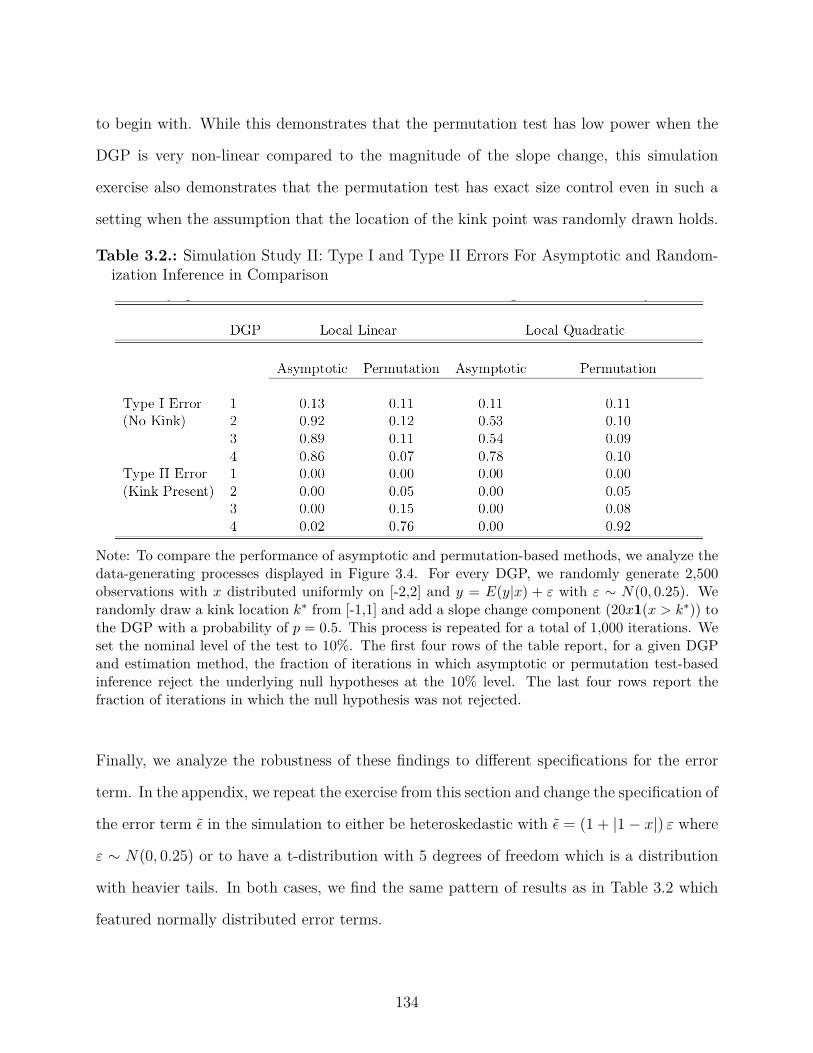
to begin with. While this demonstrates that the permutation test has low power when the
DGP is very non-linear compared to the magnitude of the slope change, this simulation
exercise also demonstrates that the permutation test has exact size control even in such a
setting when the assumption that the location of the kink point was randomly drawn holds.
Table 3.2.: Simulation Study II: Type I and Type II Errors For Asymptotic and Random-ization Inference in Comparison
Note: To compare the performance of asymptotic and permutation-based methods, we analyze thedata-generating processes displayed in Figure 3.4. For every DGP, we randomly generate 2,500observations with x distributed uniformly on [-2,2] and y = E(y|x) + Á with Á ≥ N(0, 0.25). Werandomly draw a kink location k
ú from [-1,1] and add a slope change component (20x1(x > k
ú)) tothe DGP with a probability of p = 0.5. This process is repeated for a total of 1,000 iterations. Weset the nominal level of the test to 10%. The first four rows of the table report, for a given DGPand estimation method, the fraction of iterations in which asymptotic or permutation test-basedinference reject the underlying null hypotheses at the 10% level. The last four rows report thefraction of iterations in which the null hypothesis was not rejected.
Finally, we analyze the robustness of these findings to di�erent specifications for the error
term. In the appendix, we repeat the exercise from this section and change the specification of
the error term ‘ in the simulation to either be heteroskedastic with ‘ = (1 + |1 ≠ x|) Á where
Á ≥ N(0, 0.25) or to have a t-distribution with 5 degrees of freedom which is a distribution
with heavier tails. In both cases, we find the same pattern of results as in Table 3.2 which
featured normally distributed error terms.
134
3.5. Conclusion
We have developed a permutation test for the regression kink design and document its per-
formance compared to standard asymptotic inference. The thought experiment underlying
our test di�ers from the one of standard asymptotic inference which has is based on the
thought experiment of drawing observations from a large population so that standard errors
reflect sampling uncertainty. Our test follows the randomization inference approach in tak-
ing the sample as given and takes the assignment of treatment, here the location of the kink
point, as a random variable and thus the source of uncertainty. This approach is particularly
appealing in the context of the recent rise in the use of administrative, population data for
empirical research (see Chetty, 2012). When full population data are available the usual
thought experiment of sampling from a population needs to appeal to a notion of a super-
population from which the population data are drawn whereas randomization inference tests
hypotheses pertaining the drawn sample and not a super-population. Finally, in the specific
context of RK designs, our test can o�er a complement to standard inference which will be
more robust in the presence of non-linearity which is ubiquitous in many of the settings in
which RK designs are applied. Based on the results of our simulation studies, we recommend
that practitioners: (1) avoid using linear and quadratic RK estimators with FG bandwidth
choice, (2) use the distribution of placebo estimates to assess whether they will have power
to detect economically meaningful results in their context, (3) report p-values constructed
by comparing their point estimate to the distribution of placebo estimates, and (4) use the
robust procedure in Calonico et al. (2014b) as preferred procedure for estimating kinks.
135

BibliographyAbadie, A., S. Athey, G. Imbens, and J. Wooldridge (2014). Finite population causal standard
errors. mimeo.
Abadie, A., A. Diamond, and J. Hainmueller (2010). Synthetic control methods for comparative casestudies: Estimating the e�ect of california’s tobacco control program. Journal of the AmericanStatistical Association 105 (490).
Abt Associates (2001). Study on Section 8 Voucher Success Rates. Technical report.
Abt Associates (2010). Capital Needs in the Public Housing Program. Technical report.
Aguiar, M. and E. Hurst (2005, October). Consumption versus Expenditure. Journal of PoliticalEconomy 113 (5), 919–948.
Aguiar, M. and E. Hurst (2007). Life-Cycle Prices and Production. American Economic Re-view 97 (5), 1533–1559.
Aguiar, M. and E. Hurst (2013). Deconstructing Life Cycle Expenditure. Journal of PoliticalEconomy 121 (3), 437 – 492.
Aiyagari, S. R. (1994). Uninsured Idiosyncratic Risk and Aggregate Saving. The Quarterly Journalof Economics 109 (3), 659–84.
Akerlof, G. A. and J. L. Yellen (1985). A Near-rational Model of the Business Cycle, with Wageand Price Intertia. The Quarterly Journal of Economics 100 (5), 823–38.
Ando, M. (2013). How much should we trust regression-kink-design estimates? Department ofEconomics Working Paper 2013:22 Uppsala University.
Angeletos, G.-M., D. Laibson, A. Repetto, J. Tobacman, and S. Weinberg (2001). The HyberbolicConsumption Model: Calibration, Simulation, and Empirical Evaluation. Journal of EconomicPerspectives 15 (3), 47–68.
Baily, M. N. (1978). Some aspects of optimal unemployment insurance. Journal of Public Eco-nomics 10 (3), 379–402.
Baker, S. R. (2014). Debt and the Consumption Response to Household Income Shocks. workingpaper .
Baker, S. R. and C. Yannelis (2015, March). Income Changes and Consumption: Evidence from the2013 Federal Government Shutdown. SSRN Scholarly Paper ID 2575461, Social Science ResearchNetwork, Rochester, NY.
Baugh, B., I. Ben-David, and H. Park (2013). Disentangling Financial Constraints, PrecautionarySavings, and Myopia: Household Behavior Surrounding Federal Tax Returns. working paper .
Bertrand, M., E. Duflo, and S. Mullainathan (2004). How much should we trust di�erences-in-di�erences estimates? Quarterly Journal of Economics 119, 249–75.
Blouin, A. (2013). Culture and contracts: The historical legacy of forced labour. University ofWarwick Working Paper .
136

Blundell, R., L. Pistaferri, and I. Preston (2008). Consumption Inequality and Partial Insurance.American Economic Review 98 (5), 1887–1921.
Blundell, R., L. Pistaferri, and I. Saporta-Eksten (2015). Consumption inequality and family laborsupply. American Economic Review.
Böckerman, P., O. Kanninen, and I. Suoniemi (2014). A kink that makes you sick: The incentivee�ect of sick pay on absence. IZA DP No. 8205 .
Bravo, J. (2011). The e�ects of intergovernmental grants on local revenue: Evidence from chile.Documentos de Trabajo (Instituto de Economía PUC) (393), 1.
Britto, D. G. C. d. (2015). Unemployment insurance and the duration of employment: Evidencefrom a regression kink design. Available at SSRN 2648166 .
Browning, M. and T. Crossley (2001). Unemployment insurance benefit levels and consumptionchanges. Journal of Public Economics 80 (1), 1–23.
Browning, M., T. F. Crossley, and J. Winter (2014). The Measurement of Household ConsumptionExpenditures. Annual Review of Economics 6 (1), 475–501.
Bulman, G. B. and C. Hoxby (2015). The returns to the federal tax credits for higher education.In Tax Policy and the Economy, Volume 29, pp. 13–88. University of Chicago Press.
Caballero, R. J. (1995). Near-Rationality, Heterogeneity, and Aggregate Consumption. Journal ofMoney, Credit and Banking 27 (1), 29–48.
Calonico, S., M. D. Cattaneo, and R. Titiunik (2014a). Robust data-driven inference in theregression-discontinuity design. Stata Journal 14 (4), 909–946.
Calonico, S., M. D. Cattaneo, and R. Titiunik (2014b). Robust nonparametric confidence intervalsfor regression-discontinuity designs. Econometrica 82 (6), 2295–2326.
Calonico, S., M. D. Cattaneo, and R. Titiunik (2015). Optimal data-driven regression discontinuityplots. Journal of the American Statistical Association 110 (512), 1753–1769.
Campbell, J. Y. and N. G. Mankiw (1989). Consumption, Income and Interest Rates: Reinterpretingthe Time Series Evidence. NBER Chapters, National Bureau of Economic Research, Inc.
Card, D., R. Chetty, and A. Weber (2007). The Spike at Benefit Exhaustion: Leaving the Unem-ployment System or Starting a New Job? American Economic Review 97 (2), 113–118.
Card, D., A. Johnston, P. Leung, A. Mas, and Z. Pei (2015). The e�ect of unemployment benefitson the duration of unemployment insurance receipt: New evidence from a regression kink designin missouri, 2003-2013. American Economic Review 105 (5), 126–30.
Card, D., D. S. Lee, Z. Pei, and A. Weber (2015). Inference on causal e�ects in a generalizedregression kink design. Econometrica 83 (6), 2463–2483.
Carlson, D., R. Haveman, T. Kaplan, and B. Wolfe (2012). Long-term e�ects of public low-incomehousing vouchers on neighborhood quality and household composition. Journal of Housing Eco-nomics 21, 101–120.
Carroll, C. D. (1997, February). Bu�er-Stock Saving and the Life Cycle/Permanent Income Hy-pothesis. The Quarterly Journal of Economics 112 (1), 1–55.
Carroll, C. D. (2006). The method of endogenous gridpoints for solving dynamic stochastic opti-mization problems. Economics Letters 91 (3), 312–320.
Cattaneo, M., B. Frandsen, and R. Titiunik (2015). Randomization inference in the regressiondiscontinuity design: An application to party advantages in the u.s. senate. Journal of CausalInference 3 (1), 1–24.
137

Chetty, R. (2006). A general formula for the optimal level of social insurance. Journal of PublicEconomics 90 (10-11), 1879–1901.
Chetty, R. (2008). Moral Hazard versus Liquidity and Optimal Unemployment Insurance. Journalof Political Economy 116 (2), 173–234.
Chetty, R. (2012). Time trends in the use of administrative data for empirical research. HarvardUniversity manuscript.
Chetty, R. and N. Hendren (2015). The Impacts of Neighborhoods on Intergenerational Mobility:Childhood Exposure E�ects and County-Level Estimates. mimeo.
Chetty, R., P. Kline, N. Hendren, and E. Saez (2014). Where is the Land of Opportunity? QuarterlyJournal of Economics 129, 1553–1623.
Chetty, R., A. Looney, and K. Kroft (2009). Salience and taxation: Theory and evidence. TheAmerican Economic Review 99 (4), 1145–1177.
Chetty, R. and A. Szeidl (2007). Consumption Commitments and Risk Preferences. The QuarterlyJournal of Economics 122 (2), 831–877.
Chodorow-Reich, G. and L. Karabarbounis (2015). The Cyclicality of the Opportunity Cost ofEmployment. Journal of Political Economy forthcoming.
Cochrane, J. H. (1989). The Sensitivity of Tests of the Intertemporal Allocation of Consumptionto Near-Rational Alternatives. American Economic Review 79 (3), 319–37.
Cochrane, J. H. (1991). A Simple Test of Consumption Insurance. Journal of Political Econ-omy 99 (5), 957–76.
Cohen, M. and M. Rysman (2013). Payment Choice with Consumer Panel Data. Federal ReserveBank of Boston Working Paper .
Collinson, R., I. Gould Ellen, and J. Ludwig (2015). Low-Income Housing Policy. Handbook ofUrban Economics.
Conlin, M. and P. N. Thompson (2015). Impacts of new school facility construction: An analysisof a state-financed capital subsidy program in ohio.
Couch, K. and D. Placzek (2010). Earnings Losses of Displaced Workers Revisited. AmericanEconomic Review 100 (1), 572–589.
Cullen, J. B. and J. Gruber (2000). Does Unemployment Insurance Crowd Out Spousal LaborSupply? Journal of Labor Economics 18 (3), 546–72.
Dahlberg, M., E. Mörk, J. Rattsø, and H. Ågren (2008). Using a discontinuous grant rule to identifythe e�ect of grants on local taxes and spending. Journal of Public Economics 92 (12), 2320–2335.
d’Astous, P. and S. H. Shore (2015). Liquidity constraints and credit card delinquency: Evidencefrom raising minimum payments. Working Paper .
Davis, S. J. and T. von Wachter (2011). Recessions and the Costs of Job Loss. Brookings Paperson Economic Activity 43 (2, Fall), 1–72.
Deaton, A. (1991). Saving and Liquidity Constraints. Econometrica 59 (5), 1221–48.
DellaVigna, S., A. Lindner, B. Reizer, and J. Schmieder (2014). Reference-Dependent Job Search:Evidence from Hungary. working paper .
DellaVigna, S. and M. D. Paserman (2005). Job Search and Impatience. Journal of Labor Eco-nomics 23 (3), 527–588.
138

Dobbie, W. and P. M. Skiba (2013). Information asymmetries in consumer credit markets: Evidencefrom payday lending. American Economic Journal: Applied Economics 5 (4), 256–282.
Dobridge, C. L. (2016). Fiscal stimulus and firms: A tale of two recessions.
Dong, Y. (2016). Jump or kink? identifying education e�ects by regression discontinuity designwithout the discontinuity. Working Paper .
Engels, B., J. Geyer, and P. Haan (2015). Labor supply and the pension system-evidence from aregression kink design.
Engström, P., K. Nordblom, H. Ohlsson, and A. Persson (2015). Tax compliance and loss aversion.American Economic Journal 7 (4), 132–164.
Eriksen, M. and A. Ross (2013). The Impact of Housing Vouchers on Mobility and NeighborhoodAttributes. Real Estate Economics 41 (2), 255–277.
Eriksen, M. and A. Ross (2015). Housing Vouchers and the Price of Rental Housing. AmericanEconomic Journal: Economic Policy forthcoming 7 (3), 154–176.
Fan, J. and I. Gijbels (1996). Local Polynomial Modelling and its Applications., Volume 66. Chapmanand Hall.
Farber, H. (2015). Job Loss in the Great Recession and its Aftermath: U.S. Evidence from theDisplaced Workers Survey. working paper .
Fe, E. and B. Hollingsworth (2012). Estimating the e�ect of retirement on mental health via paneldiscontinuity designs. Working Paper .
Fidrmuc, J. and J. d. D. Tena (2013). National minimum wage and employment of young workersin the uk. CESifo Working Paper, No. 4286 .
Fisher, R. (1935). The Design of Experiments. Oliver and Boyd, Oxford, England.
Florens, J.-P., J. J. Heckman, C. Meghir, and E. Vytlacil (2008). Identification of treatment e�ectsusing control functions in models with continuous, endogenous treatment and heterogeneouse�ects. Econometrica 76 (5), 1191–1206.
Friedman, M. (1957). A Theory of the Consumption Function. National Bureau of EconomicResearch, Inc.
Fritzdixon, K. and P. M. Skiba (2016). The consequences of online payday lending.
Fuchs-Schuendeln, N. and T. A. Hassan (2015). Natural Experiments in Macroeconomics. NBERWorking Paper 21228, National Bureau of Economic Research, Inc.
Galiani, S., A. Murphy, and J. Pantano (2015). Estimating Neighborhood Choice Models: Lessonsfrom a Housing Assistance Experiment. American Economic Review.
Garmann, S. (2014). The causal e�ect of coalition governments on fiscal policies: Evidence from aregression kink design. Applied Economics 46 (36), 4490–4507.
Gelber, A., T. Moore, and A. Strand (2015). The e�ect of disability insurance on beneficiariesmortality. GSPP Working Paper .
Gelman, A. and G. Imbens (2014). Why high-order polynomials should not be used in regressiondiscontinuity designs. Technical report, National Bureau of Economic Research.
Gelman, M., S. Kariv, M. Shapiro, D. Silverman, and S. Tadelis (2015). How Individuals SmoothSpending: Evidence from the 2013 Government Shutdown Using Account Data. working paper .
Geyer, J. (2011). Essays in Low-Income Housing Policies, Mobility, and Sorting. manuscript.
139

Glaeser, E. L. and J. Gyourko (2006). Housing Dynamics. NBER Working Paper 12787 .Gordon, N. (2004, August). Do Federal Grants Boost School Spending? Evidence from Title I.
Journal of Public Economics 88 (9-10), 1771–1792.Gourinchas, P.-O. and J. A. Parker (2002). Consumption Over the Life Cycle. Econometrica 70 (1),
47–89.Green, P. and B. Silverman (1994). Nonparametric regression and generalized linear models: a
roughness penalty approach. Chapman and Hall, London.Gruber, J. (1997, March). The Consumption Smoothing Benefits of Unemployment Insurance. The
American Economic Review 87 (1), 192–205.Hall, R. E. (1978). Stochastic Implications of the Life Cycle-Permanent Income Hypothesis: Theory
and Evidence. Journal of Political Economy 86 (6), 971–87.Hannagan, A. and J. Morduch (2015). Income Gains and Month-to-Month Income Volatility: House-
hold evidence from the US Financial Diaries. working paper .Hanson, A. (2012). The incidence of the mortgage interest deduction: Evidence from the market
for home purchase loans. Public Finance Review 40 (3), 339–359.Hendren, N. (2015). Knowledge of Future Job Loss and Implications for Unemployment Insurance.
working paper .Herkenho�, K. (2015). The Impact of Consumer Credit Access on Unemployment. working paper .Herkenho�, K., G. Phillips, and E. Cohen-Cole (2015). How Credit Constraints Impact Job Finding
Rates, Sorting & Aggregate Output. working paper .Ho, D. E. and K. Imai (2006). Randomization inference with natural experiments: An analysis of
ballot e�ects in the 2003 california recall election. Journal of the American Statistical Associa-tion 101 (475), 888–900.
Horn, K. M., I. G. Ellen, and A. E. Schwartz (2014). Do Housing Choice Voucher holders live neargood schools? Journal of Housing Economics 23, 28–40.
Hsieh, C.-T. (2003). Do Consumers React to Anticipated Income Changes? Evidence from theAlaska Permanent Fund. American Economic Review 93 (1), 397–405.
Huang, P.-C. and T.-T. Yang (2016). Evaluation of optimal unemployment insurance with reem-ployment bonuses using regression discontinuity (kink) design.
Hurd, M. and S. Rohwedder (2010). E�ects of the Financial Crisis and Great Recession on AmericanHouseholds. working paper .
ICF Macro (2009). Quality Control for Rental Assistance Subsidies Determinations, Final Reportfor FY 2009, Prepared for the Department of Housing and Urban Development. Technical report.
Imbens, G. W. and T. Lemieux (2008). Regression discontinuity designs: A guide to practice.Journal of Econometrics 142 (2), 615–635.
Imbens, G. W. and P. R. Rosenbaum (2005). Robust, accurate confidence intervals with a weakinstrument: quarter of birth and education. Journal of the Royal Statistical Society: Series A(Statistics in Society) 168 (1), 109–126.
Jacob, B. A. and J. Ludwig (2012). The E�ects of Housing Assistance on Labor Supply: Evidencefrom a Voucher Lottery. American Economic Review 102 (1), 272–304.
Jacob, B. A., J. Ludwig, and D. L. Miller (2013). The E�ects of Housing and NeighborhoodConditions on Child Mortality. Journal of Health Economics 32, 195–206.
140

Jacobson, L., R. LaLonde, and D. Sullivan (1993a). The Costs of Worker Dislocation. Kalamazoo,Michigan: Upjohn Institute for Employment Research.
Jacobson, L., R. LaLonde, and D. Sullivan (1993b). Earnings Losses of Displaced Workers. AmericanEconomic Review 83 (4), 685–709.
Jappelli, T. and L. Pistaferri (2010). The Consumption Response to Income Changes. AnnualReview of Economics 2 (1), 479–506.
Jarosch, G. (2015). Searching for Job Security and the Consequences of Job Loss. working paper .Johnson, D. S., J. A. Parker, and N. S. Souleles (2006, December). Household Expenditure and the
Income Tax Rebates of 2001. American Economic Review 96 (5), 1589–1610.Jones, M. R. (2013). The eitc and labor supply: Evidence from a regression kink design. Washington,
DC: Center for Administrative Records Research and Applications, US Census Bureau.Kaplan, G. and G. Menzio (2015). Shopping Externalities and Self-Fulfilling Unemployment Fluc-
tuations. Journal of Political Economy forthcoming.Kaplan, G. and G. L. Violante (2014). A Model of the Consumption Response to Fiscal Stimulus
Payments. Econometrica 82 (4), 1199–1239.Katz, L. F. and B. D. Meyer (1990). Unemployment Insurance, Recall Expectations, and Unem-
ployment Outcomes. The Quarterly Journal of Economics 105 (4), 973–1002.Kekre, R. (2015). Unemployment Insurance in Macroeconomic Stabilization. working paper .Kisin, R. and A. Manela (2014). Funding and incentives of regulators: Evidence from banking.
Available at SSRN .Kling, J., J. Ludwig, and L. F. Katz (2005). Neighborhood E�ects on Crime For Female and
Male Youth: Evidence from a Randomized Housing Voucher Experiment. Quarterly Journal ofEconomics (February), 87–130.
Kolsrud, J. (2013). Precaution versus risk aversion: Decomposing the e�ect of unemploymentbenefits on saving. Working Paper .
Kolsrud, J., C. Landais, P. Nilsson, and J. Spinnewijn (2015a). The Optimal Timing of Unemploy-ment Benefits: Theory and Evidence from Sweden. working paper .
Kolsrud, J., C. Landais, P. Nilsson, and J. Spinnewijn (2015b). The optimal timing of unemploymentbenefits: Theory and evidence from sweden. IZA Discussion Paper 9185 .
Kostøl, A. R. and M. Mogstad (2015). Earnings, Disposable Income, and Consumption of Allowedand Rejected Disability Insurance Applicants. American Economic Review 105 (5), 137–41.
Kristensen, S. R., E. Fe, M. Bech, and J. Mainz (2013). Is the quality of hospital care price sensitive?regression kink estimates from a volume dependent price setting scheme. COHERE-Centre ofHealth Economics Research, University of Southern Denmark.
Krueger, A. B. and A. Mueller (2010). Job search and unemployment insurance: New evidence fromtime use data. Journal of Public Economics 94 (3-4), 298–307.
Krueger, A. B. and A. Mueller (2014). A Contribution to the Empirics of Reservation Wages.working paper .
Kuchler, T. (2014). Sticking to Your Plan: Hyperbolic Discounting and Credit Card Debt Paydown.working paper .
Kueng, L. (2015). Explaining Consumption Excess Sensitivity with Near-Rationality: Evidencefrom Large Predetermined Payments. working paper .
141

Kyyrä, T. and H. Pesola (2015). The e�ects of unemployment insurance benefits on subsequentlabor market outcomes: Evidence from an rkd approach.
Laibson, D. (1997). Golden Eggs and Hyperbolic Discounting. The Quarterly Journal of Eco-nomics 112 (2), 443–77.
Laibson, D., A. Repetto, and J. Tobacman (2015). Estimating Discount Functions with Consump-tion Choices over the Lifecycle. working paper .
Landais, C. (2015). Assessing the welfare e�ects of unemployment benefits using the regression kinkdesign. American Economic Journal: Economic Policy 7 (4), 243–278.
Lawyers Committee for Better Housing Inc (2002). Locked Out: Barriers to Choice for HousingVoucherholders. Technical report.
Lehmann, E. and C. Stein (1949). On the theory of some non-parametric hypotheses. The Annalsof Mathematical Statistics 20 (1), 28–45.
Lens, M., I. G. Ellen, and K. O’Regan (2011). Neighborhood Crime Exposure Among HousingChoice Voucher Households. Assisted Housing Research Cadre Report.
Lundqvist, H., M. Dahlberg, and E. Mörk (2014). Stimulating local public employment: Do generalgrants work? American Economic Journal: Economic Policy 6 (1), 167–92.
Mankiw, N. G. (1985). Small Menu Costs and Large Business Cycles: A Macroeconomic Model.The Quarterly Journal of Economics 100 (2), 529–38.
Manoli, D. and N. Turner (2014). Cash-on-hand and college enrollment: Evidence from populationtax data and policy nonlinearities. NBER Working Paper 19836 .
Marx, B. and L. Turner (2015). Borrowing trouble? human capital investment with opt-in costsand implications for the e�ectiveness of grant aid. Working Paper .
McCarty, M. (2006). Changes to Section 8 Housing Voucher Renewal Funding, FY2003-FY2006.Technical report, Congressional Research Service.
Messacar, D. (2015). Do workplace pensions crowd out other retirement savings? evidence fromcanadian tax records. Statistics Canada Working Paper .
Minnesota Population Center (2011). National Historical Geographic Information System: Version2.0. Minneapolis, MN: University of Minnesota.
Modigliani, F. and R. Brumberg (1954). Utility analysis and the consumption function: an inter-pretation of cross-section data. In K. Kurihara (Ed.), Post- Keynesian Economics, pp. 388–436.New Brunswick, NJ: Rutgers University Press.
Mortensen, D. T. (1977). Unemployment insurance and job search decisions. Industrial and LaborRelations Review 30 (4), 505–517.
Nielsen, H. S., T. Sørensen, and C. R. Taber (2010). Estimating the e�ect of student aid on collegeenrollment: Evidence from a government grant policy reform. American Economic Journal:Economic Policy 2, 185–215.
of Labor Statistics, B. (2014). Employment Characteristics of Families. Technical report, Bureauof Labor Statistics.
Olsen, E. O. (2003). Housing Programs for Low-Income Households. In R. A. Mo�tt (Ed.), Means-Tested Transfer Programs in the United States, pp. 365–441. University of Chicago Press.
Olsen, E. O. (2008). Getting More from Low-Income Housing Assistance. Technical Report Septem-ber, The Hamilton Project.
142

ORC/Macro (2001). Quality Control for Rental Assistance Subsidies Determinations. Technicalreport.
Parker, J. A., N. S. Souleles, D. S. Johnson, and R. McClelland (2013). Consumer Spending andthe Economic Stimulus Payments of 2008. American Economic Review 103 (6), 2530–53.
Passero, B., C. Blair, R. Cage, T. Garner, and C. McCully (2011). The Devil’s in the Details —AConcordance for the CE, CPI, and PCE.
Patterson, R., M. Wood, K. Lam, S. Patrabansh, and G. Mills (2004). Evaluation of the Welfare toWork Voucher Program Report to Congress. Technical report, U.S. Department of Housing andUrban Development O�ce of Policy Development and Research.
Peck, J. R. (2014). Can hiring quotas work? the e�ect of the nitaqat program on the saudi privatesector. Working Paper, MIT .
Pendall, R., C. Hayes, A. George, Z. McDade, C. Dawkins, J. S. Jeon, E. Knaap, E. Blumenberg,G. Pierce, and M. Smart (2014). Driving to Opportunity: Understanding the Links amongTransportation Access, Residential Outcomes, and Economic Opportunity for Housing VoucherRecipients. Technical report, Driving to Opportunity.
Perry, J. (2009). Housing Choice in Crisis. Technical report, Greater New Orleans Fair HousingAction Center.
Pitman, E. (1937). Significance tests which may be applied to samples from any populations.Supplement to the Journal of the Royal Statistical Society 4 (1), 119–130.
Reis, R. (2006). Inattentive consumers. Journal of Monetary Economics 53 (8), 1761–1800.
Romano, J. P. (1990). On the behavior of randomization tests without a group invariance assump-tion. Journal of the American Statistical Association 85 (411), 686–692.
Rosen, S. (1986). The Theory of Equalizing Di�erences. In Handbook of Labor Economics, Chap-ter 12, pp. 641–692.
Rosenbaum, P. R. (2001). Stability in the absence of treatment. Journal of the American StatisticalAssociation 96 (453), 210–219.
Rosenbaum, P. R. (2002). Observational studies (2 ed.). New York: Springer.
Rothstein, J. (2011). Unemployment Insurance and Job Search in the Great Recession. BrookingsPapers on Economic Activity 43 (2 (Fall)), 143–213.
Rothstein, J. and R. Valetta (2014). Scraping By: Income and Program Participation After theLoss of Extended Unemployment Benefits. working paper .
Ruggles, S., J. T. Alexander, K. Genadek, R. Goeken, M. B. Schroeder, and M. Sobek. (2010).Integrated Public Use Microdata Series: Version 5.0 [Machine-readable database]. Minneapolis:University of Minnesota.
Saporta-Eksten, I. (2014). Job Loss, Consumption and Unemployment Insurance. working paper .
Saunders, L. and J. McLaughlin (2013). Survey of Unemployment Prepaid Cards. Technical report,National Consumer Law Center.
Scharlemann, T. C. and S. H. Shore (2015). The e�ect of negative equity on mortgage default:Evidence from hamp pra. Working Paper .
Schmieder, J. F., T. v. Wachter, and S. Bender (2012, April). The E�ects of Extended Unemploy-ment Insurance Over The Business Cycle: Evidence From Regression Discontinuity EstimatesOver 20 Years. The Quarterly Journal of Economics, qjs010.
143

Seim, D. (2014). Behavioral responses to an annual wealth tax: Evidence from sweden. WorkingPaper, University of Toronto.
Shapiro, M. D. and J. Slemrod (2009). Did the 2008 Tax Rebates Stimulate Spending? AmericanEconomic Review 99 (2), 374–79.
Shimer, R. and I. Werning (2007). Reservation Wages and Unemployment Insurance. The QuarterlyJournal of Economics 122 (3), 1145–1185.
Shimer, R. and I. Werning (2008, December). Liquidity and Insurance for the Unemployed. TheAmerican Economic Review 98 (5), 1922–1942.
Shy, O. (2013). How Many Cards Do You Use? Federal Reserve Bank of Boston Working Paper .
Simonsen, M., L. Skipper, and N. Skipper (2016). Price sensitivity of demand for prescription drugs:Exploiting a regression kink design. Journal of Applied Econometrics 31 (2).
Souleles, N. S. (1999). The Response of Household Consumption to Income Tax Refunds. AmericanEconomic Review 89 (4), 947–958.
Sovago, S. (2015). The e�ect of the ui benefit on labor market outcomes-regression kink evidencefrom the netherlands. Working Paper .
Spinnewijn, J. (2015). Unemployed But Optimistic: Optimal Insurance Design With Biased Beliefs.Journal of the European Economic Association 13 (1), 130–167.
Stephens, M. (2001, February). The Long-Run Consumption E�ects of Earnings Shocks. Review ofEconomics and Statistics 83 (1), 28–36.
Stephens, M. (2002). Worker Displacement and the Added Worker E�ect. Journal of Labor Eco-nomics 20 (3), 504–537.
Suarez-Serrato, J. C. and P. Wingender (2014). Estimating Local Fiscal Multipliers. mimeo.
Sukhatme, N. U. and J. N. Cramer (2014). How much do patent applicants care about patent term?cross-industry di�erences in term sensitivity. Working Paper, Princeton University.
Susin, S. (2002, January). Rent Vouchers and the Price of Low-income Housing. Journal of PublicEconomics 83 (1), 109–152.
System, F. R. (2013). The 2013 Federal Reserve Payments Study. Technical report.
Thistlethwaite, D. L. and D. T. Campbell (1960). Regression-discontinuity analysis: An alternativeto the ex post facto experiment. Journal of Educational psychology 51 (6), 309.
Turner, L. J. (2014). The road to pell is paved with good intentions: The economic incidence offederal student grant aid. Working Paper University of Maryland.
U.S. Department of Housing and Urban Development (2001). Housing Choice Voucher Guidebook,Document 7420.10G. Technical report.
von Wachter, T., J. Schmieder, and S. Bender (2015). The E�ect of Unemployment Insurance andNonemployment Duration on Wages. American Economic Review forthcoming.
Wachter, T. v., J. Song, and J. Manchester (2009). Long-Term Earnings Losses due to Mass Layo�sDuring the 1982 Recession: An Analysis Using U.S. Administrative Data from 1974 to 2004.working paper .
Wahba, G. (1990). Spline models for observational data, Volume 59. Siam.
Welander, T. (2014). Trends in Consumer Payments and Retail Banking: Report 1 of 4. Technicalreport, GC Insights Marketing Research Services.
144

Welch, W. J. (1990). Construction of permutation tests. Journal of the American Statistical Asso-ciation 85 (411), 693–698.
Welch, W. J. and L. G. Gutierrez (1988). Robust permutation tests for matched-pairs designs.Journal of the American Statistical Association 83 (402), 450–455.
Wong, M. (2013). Estimating ethnic preferences using ethnic housing quotas in singapore. TheReview of Economic Studies 80 (3), 1178–1214.
145
A. Appendix to Chapter 1(Unemployment)
A.1. Data
A.1.1. Sample Construction, Subsamples, and Winsorization
Unit of Observation. The core unit of observation is a set of bank accounts linked arounda single primary account owner in the JPMCI. Many of these accounts have secondaryowners who can also access the account. Some accounts have two people who jointly ownthe account. Sometimes, members of a family will not administratively link their accountstogether; we exploit this feature of the data in Section A.2.1 to understand how missingaccounts a�ect our analysis.Classifying Primary Accounts with UI Spells.Errors in transaction classification lead to measurement error of UI receipt, so we developedthree criteria to establish whether a UI spell is plausible. First, families must receive atleast two UI payments. Second, the checks must have an amount and frequency which isreasonable given UI program rules – less than $3,000 per month and fewer than 6 checks permonth. Third, months with UI payments must be contiguous and observed duration must beless than or equal to program rules on potential benefit duration.1 These restrictions serveto reduce measurement error due to erroneously classified non-UI transactions and providea clear benefit exhaustion date, which is necessary for our analysis in Section 1.5. Of theroughly 1 million families with any potential UI receipt, 57% meet these criteria.
We classify families who bank primarily with Chase as those with five outflows from theirchecking accounts each month. To be conservative, we select families who have five outflowsin each of the three months prior to their UI spell, five monthly outflows during their UIspell, and five monthly outflows in each of the three months following their UI spell, if theirUI spell ends before the end of the panel. This restriction also reduces sample size – of the586,000 families with a UI spell, about 376,000 meet this primary account criteria. In our
1In practice, this means that we also require the UI spell to be fifteen months or less. We are only able tocompute the duration of UI spells which begin in November 2012 or later. Extended benefits which werelegislated in response to the Great Recession expired in December 2013 and the last payments for thesebenefits were made in January 2014, which is why fifteen months is the maximum in the JPMCI data.
146

robustness analysis in Section A.2.1, we repeat our analysis dropping this sample criteriaand also using subsamples which o�er even better coverage of family finances, but come atthe expense of studying a more highly-selected sample.
Finally, we study UI spells which start in January 2013 or later, so that we have at leastthree months of pre-UI data on each family. This screen brings us to our baseline analysissample of about 235,000 families.
Subsamples. We use three subsamples of these data in our analysis:
• While Unemployed – In some places, we analyze the spending of families where amember is unemployed. Because spending jumps up in the month prior to the last UIcheck, if a family received benefits for T months, we define this sample using months0 to T ≠ 1. Figures 1.2, 1.4 and 1.6 as well as Table 1.4 use this sample.
• Exhausted Benefits – We analyze the spending of exhaustees who had a potentialbenefit duration of 26 weeks or less, by focusing on UI recipients whose last UI checkwas paid in February 2014 or later. We measure duration in weeks as the date from thefirst UI check to the last UI check. Exhaustees are those who received benefits for anumber of weeks equal to the current potential benefit duration in their state (usually26 weeks, but lower in Florida, Michigan and Georgia), plus or minus two weeks foradministrative error. We use this sample in Table 1.4, Table 1.7, Figure 1.9, AppendixFigure 1.6 and Appendix Figure 1.7.
• 26-Week Potential Benefit Duration – In the model, we are specifically interestedin the forward-looking behavior of a family eligible for 26 weeks of benefits. Here, weanalyze UI recipients whose last UI check was paid in February 2014 or later and didnot live in Florida, Michigan or Georgia.
Winsorization In general, we winsorize all variables at the 95th percentile of the set ofobservations with positive values. The one exception is in Table 1.5, 1.7 and AppendixTable 1.1 to preserve an additive decomposition across inflow and outflow categories, weinstead drop families with inflows or outflows greater than the 95th percentile.
147
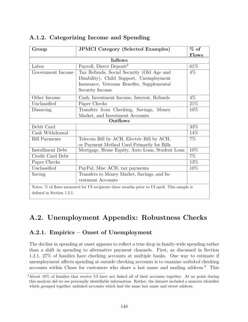
A.1.2. Categorizing Income and Spending
Group JPMCI Category (Selected Examples) % ofFlows
InflowsLabor Payroll, Direct Deposit2 61%Government Income Tax Refunds, Social Security (Old Age and
Disability), Child Support, UnemploymentInsurance, Veterans Benefits, SupplementalSecurity Income
4%
Other Income Cash, Investment Income, Interest, Refunds 4%Unclassified Paper Checks 21%Dissaving Transfers from Checking, Savings, Money
Market, and Investment Accounts10%
OutflowsDebit Card 33%Cash Withdrawal 14%Bill Payments Telecom Bill by ACH, Electric Bill by ACH,
or Payment Method Used Primarily for Bills7%
Installment Debt Mortgage, Home Equity, Auto Loan, Student Loan 10%Credit Card Debt 7%Paper Checks 13%Unclassified PayPal, Misc ACH, tax payments 10%Saving Transfers to Money Market, Savings, and In-
vestment AccountsNotes: % of flows measured for UI recipients three months prior to UI spell. This sample isdefined in Section 1.2.1.
A.2. Unemployment Appendix: Robustness Checks
A.2.1. Empirics – Onset of Unemployment
The decline in spending at onset appears to reflect a true drop in family-wide spending ratherthan a shift in spending to alternative payment channels. First, as discussed in Section1.2.1, 27% of families have checking accounts at multiple banks. One way to estimate ifunemployment a�ects spending at outside checking accounts is to examine unlinked checkingaccounts within Chase for customers who share a last name and mailing address.3 This
3About 10% of families that receive UI have not linked all of their accounts together. At no point duringthis analysis did we see personally identifiable information. Rather, the dataset included a numeric identifierwhich grouped together unlinked accounts which had the same last name and street address.
148

could occur if, for example, two Chase customers formed a family unit without linkingtheir accounts administratively. We find that spending in these unlinked accounts falls by$51 at the onset of unemployment. Because the spending drop is computed using a largerdenominator, we now find a 6% drop at onset across all accounts in this subsample, ratherthan an 8% drop in only the linked accounts. Second, families could shift spending fromthe debit card linked to their checking account to a credit card which did not need to bepaid immediately. Outstanding balances on all credit cards in the credit bureau records riseby $60 over a two-month period, so families either increase card spending or reduce cardpayments by $30 each month. It is unclear whether this reflects increased spending on creditcards or reduced payments on outstanding credit card debt. We estimate that the change inspending through alternative payment channels is $35 (27%*$51 + 72%*$30).4
Our results for the sample of families with direct deposit of UI and at least five outflowsper month appear to have external validity for other UI recipients. One concern is thatfamilies who adopt direct deposit of UI will be more financially sophisticated and better atsmoothing than the typical family. We analyze the drop in spending at onset for the fivestates in the data with the highest adoption rate of direct deposit of UI: Georgia, Ohio, NewJersey, Florida, and Utah. According to Saunders and McLaughlin (2013), at least 65% ofUI claimants receive their benefits using direct deposit. In these states, the drop in spendingat onset is 8%, which is close to our overall estimate of 6%.
A.2.2. Empirics – Benefit Exhaustion
We implement the same robustness checks for internal and external validity at exhaustionas we did at onset. The empirical strategies are described in detail in Section A.2.1 andhere we review only the results. Spending out of unlinked accounts rises slightly at benefitexhaustion, by $48 per month. Because the spending drop is computed using a largerdenominator, we now find an 8% drop at exhaustion across all accounts in this subsample,rather than an 14% drop in only the linked accounts. Remember that this modificationapplies to only the one-quarter of families with accounts at multiple banks, so the impact onour modification on our overall results is limited. Borrowing on Chase credit cards rises byabout $30 per month (Table 1.2), which appears to be driven by decreased payments ratherthan substituting consumption to credit cards. Credit bureau records show no additionalborrowing on non-Chase credit cards.
A.2.3. Empirics – Income Recovery Rates in Other Datasets
One area where the literature has not reached consensus is in understanding the path ofearnings prior to a separation. Jacobson et al. (1993b) and Jacobson et al. (1993a) find that
4The Survey of Consumer Payment Choice estimated that 72% of people have at least one credit card.
149

mass layo� separators as well as UI recipients show declining wages in the years prior toseparation. JLS argue that this reflects declining worker productivity as well as declining firmlabor demand (e.g. overtime). The JPMCI data as well as our plots from the SIPP showroughly constant earnings prior to separation. Wachter et al. (2009) show sharply risingearnings in the years prior to separation. Understanding the reasons for these disparatetrends is an important area for future work.
Our analysis uses the 2004-2007 SIPP panel, because the economic climate during this surveybetter reflects the labor market in 2013 and 2014 than the 2008-2012 SIPP panel. Earningslosses are deeper for UI recipients in the 2008 SIPP panel, where UI recipients searched forwork in the midst of a severe recession.
One additional challenge for this exercise is estimating the earnings counterfactual in theabsence of the UI separation. The analysis above has focused on whether earnings returnto their pre-separation level. Some researchers have used workers who never separate as acontrol group. This choice seems problematic because UI recipients have lower labor incomeprior to separation and education than the typical employee and earnings rise faster over thelifecycle for employees with more education. Finding a suitable control group that matchesUI recipients on observables seems necessary for accurately calculating a counterfactual.
A.2.4. Model
Below, we describe some alternative parameterizations of the model which do not changeour substantive results. The results are shown graphically in Appendix Figure 1.8.
• Duration dependence in job-finding – We change the model by assuming that the job-finding rate falls permanently after exhaustion from 25% to 15%. With this change, wefind that agents reduce their consumption slightly more during UI receipt to preparefor the possibility of longer unemployment.
• More expansive definition of spending – We consider an alternative expenditure serieswhere we categorize all non-saving outflows as consumption. The path of spendingusing this definition is slightly smoother, with slightly smaller discrete drops at onsetand exhaustion and a larger monthly drop as the spell progresses. In addition, in thetwo months prior to exhaustion there is a slight uptick in spending.
• Higher risk aversion to reflect consumption commitments – Chetty and Szeidl (2007)find that individuals with large consumption commitments e�ectively have larger riskaversion while unemployed. To allow for this case, we consider a case with coe�cientof risk aversion “ = 4. As the figure shows, the risk aversion parameter has very littleimpact on the predicted consumption path.
150
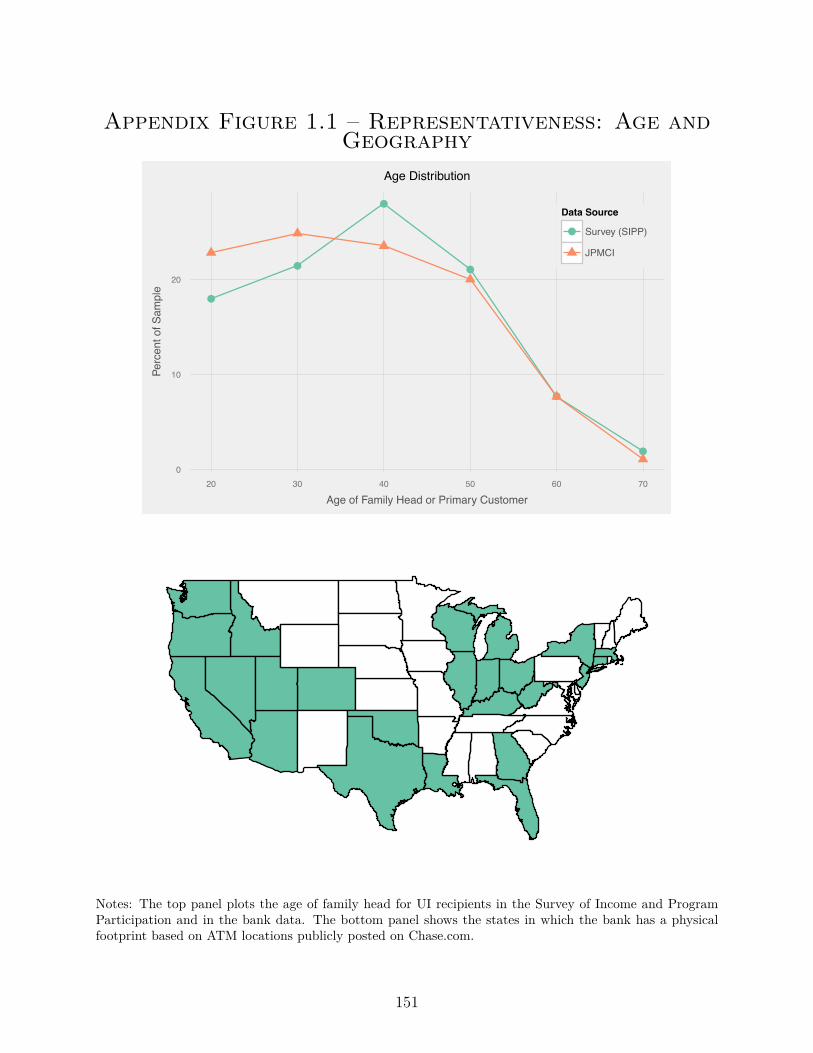
Appendix Figure 1.1 – Representativeness: Age andGeography
●
●
●
●
●
●
0
10
20
20 30 40 50 60 70
Age of Family Head or Primary Customer
Perc
ent o
f Sam
ple
Data Source
● Survey (SIPP)
JPMCI
Age Distribution
Notes: The top panel plots the age of family head for UI recipients in the Survey of Income and ProgramParticipation and in the bank data. The bottom panel shows the states in which the bank has a physicalfootprint based on ATM locations publicly posted on Chase.com.
151
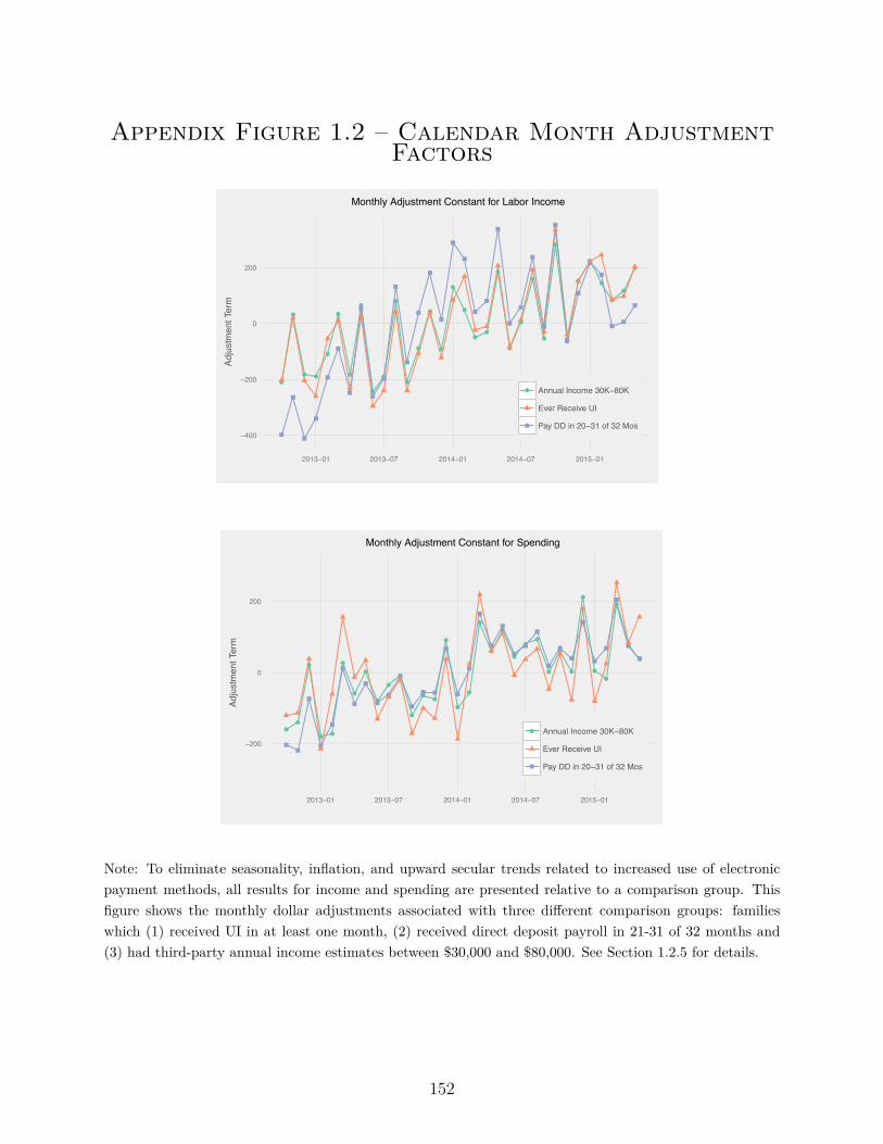
Appendix Figure 1.2 – Calendar Month AdjustmentFactors
●
●
● ●
●
●
●
●
●
●
●
●
●
●
●
●
●
●●
●
●
●
●
●
●
●
●
●
●
●
●
●
−400
−200
0
200
2013−01 2013−07 2014−01 2014−07 2015−01
Adju
stm
ent T
erm
● Annual Income 30K−80K
Ever Receive UI
Pay DD in 20−31 of 32 Mos
Monthly Adjustment Constant for Labor Income
●●
●
● ●
●
●
●
●
●
●
●
●●
●
●
●
●
●
●
●
●●
●
●
●
●
●
●
●
●
●
−200
0
200
2013−01 2013−07 2014−01 2014−07 2015−01
Adju
stm
ent T
erm
● Annual Income 30K−80K
Ever Receive UI
Pay DD in 20−31 of 32 Mos
Monthly Adjustment Constant for Spending
Note: To eliminate seasonality, inflation, and upward secular trends related to increased use of electronicpayment methods, all results for income and spending are presented relative to a comparison group. Thisfigure shows the monthly dollar adjustments associated with three di�erent comparison groups: familieswhich (1) received UI in at least one month, (2) received direct deposit payroll in 21-31 of 32 months and(3) had third-party annual income estimates between $30,000 and $80,000. See Section 1.2.5 for details.
152
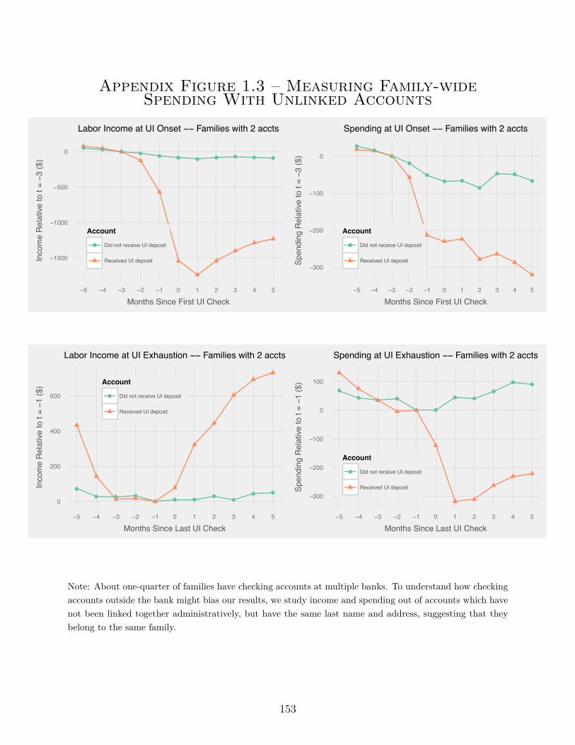
Appendix Figure 1.3 – Measuring Family-wideSpending With Unlinked Accounts
● ● ● ●● ● ● ● ● ● ●
−1500
−1000
−500
0
−5 −4 −3 −2 −1 0 1 2 3 4 5
Months Since First UI Check
Inco
me
Rel
ative
to t
= −3
($)
Account
● Did not receive UI deposit
Received UI deposit
Labor Income at UI Onset −− Families with 2 accts
●●
●
●
●
● ●
●
● ●
●
−300
−200
−100
0
−5 −4 −3 −2 −1 0 1 2 3 4 5
Months Since First UI CheckSp
endi
ng R
elat
ive to
t = −3
($)
Account
● Did not receive UI deposit
Received UI deposit
Spending at UI Onset −− Families with 2 accts
●
● ● ●● ● ●
●●
● ●
0
200
400
600
−5 −4 −3 −2 −1 0 1 2 3 4 5
Months Since Last UI Check
Inco
me
Rel
ative
to t
= −1
($) Account
● Did not receive UI deposit
Received UI deposit
Labor Income at UI Exhaustion −− Families with 2 accts
●
● ● ●
● ●
● ●
●
● ●
−300
−200
−100
0
100
−5 −4 −3 −2 −1 0 1 2 3 4 5
Months Since Last UI Check
Spen
ding
Rel
ative
to t
= −1
($)
Account
● Did not receive UI deposit
Received UI deposit
Spending at UI Exhaustion −− Families with 2 accts
Note: About one-quarter of families have checking accounts at multiple banks. To understand how checkingaccounts outside the bank might bias our results, we study income and spending out of accounts which havenot been linked together administratively, but have the same last name and address, suggesting that theybelong to the same family.
153
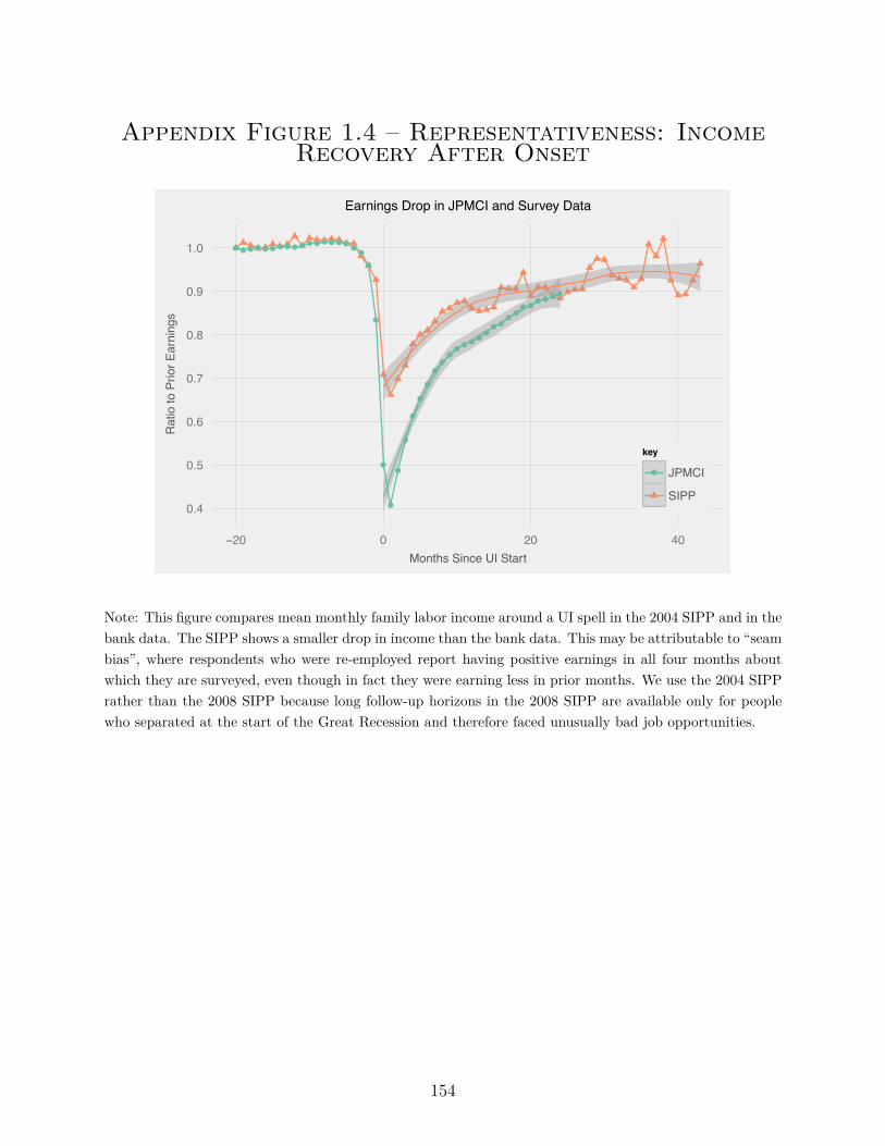
Appendix Figure 1.4 – Representativeness: IncomeRecovery After Onset
●●●●●●●●●●●●●●●●●●
●
●
●
●
●
●
●
●
●
●●●●●●●
●●●
●●●●
●●●●
0.4
0.5
0.6
0.7
0.8
0.9
1.0
−20 0 20 40Months Since UI Start
Rat
io to
Prio
r Ear
ning
s
key
● JPMCI
SIPP
Earnings Drop in JPMCI and Survey Data
Note: This figure compares mean monthly family labor income around a UI spell in the 2004 SIPP and in thebank data. The SIPP shows a smaller drop in income than the bank data. This may be attributable to “seambias”, where respondents who were re-employed report having positive earnings in all four months aboutwhich they are surveyed, even though in fact they were earning less in prior months. We use the 2004 SIPPrather than the 2008 SIPP because long follow-up horizons in the 2008 SIPP are available only for peoplewho separated at the start of the Great Recession and therefore faced unusually bad job opportunities.
154
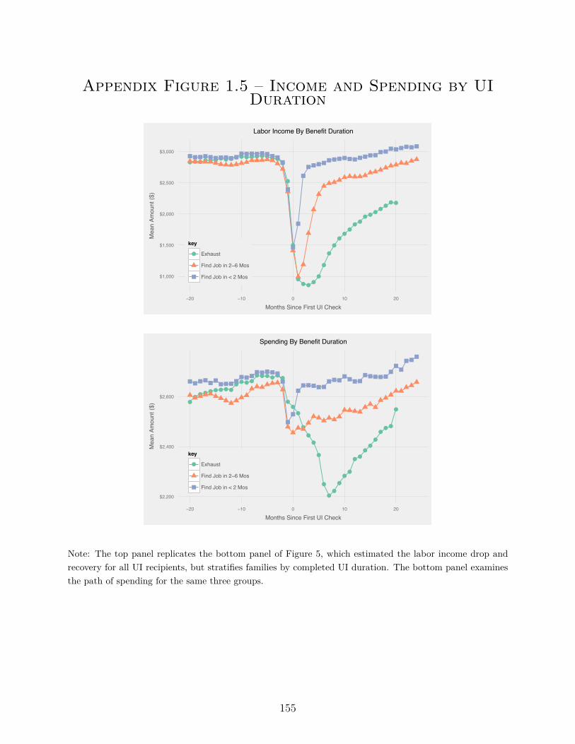
Appendix Figure 1.5 – Income and Spending by UIDuration
●●●●●●●●●●●●●●●●●●●
●
●
●●●
●●
●
●
●●●●●●
●●●●●●●
$1,000
$1,500
$2,000
$2,500
$3,000
−20 −10 0 10 20
Months Since First UI Check
Mea
n Am
ount
($)
key
● Exhaust
Find Job in 2−6 Mos
Find Job in < 2 Mos
Labor Income By Benefit Duration
●●●●●●●●●
●●●●●●●●●●
●●●
●
●
●
●
●
●●
●
●●
●●●●●
●●●
●
$2,200
$2,400
$2,600
−20 −10 0 10 20
Months Since First UI Check
Mea
n Am
ount
($)
key
● Exhaust
Find Job in 2−6 Mos
Find Job in < 2 Mos
Spending By Benefit Duration
Note: The top panel replicates the bottom panel of Figure 5, which estimated the labor income drop andrecovery for all UI recipients, but stratifies families by completed UI duration. The bottom panel examinesthe path of spending for the same three groups.
155
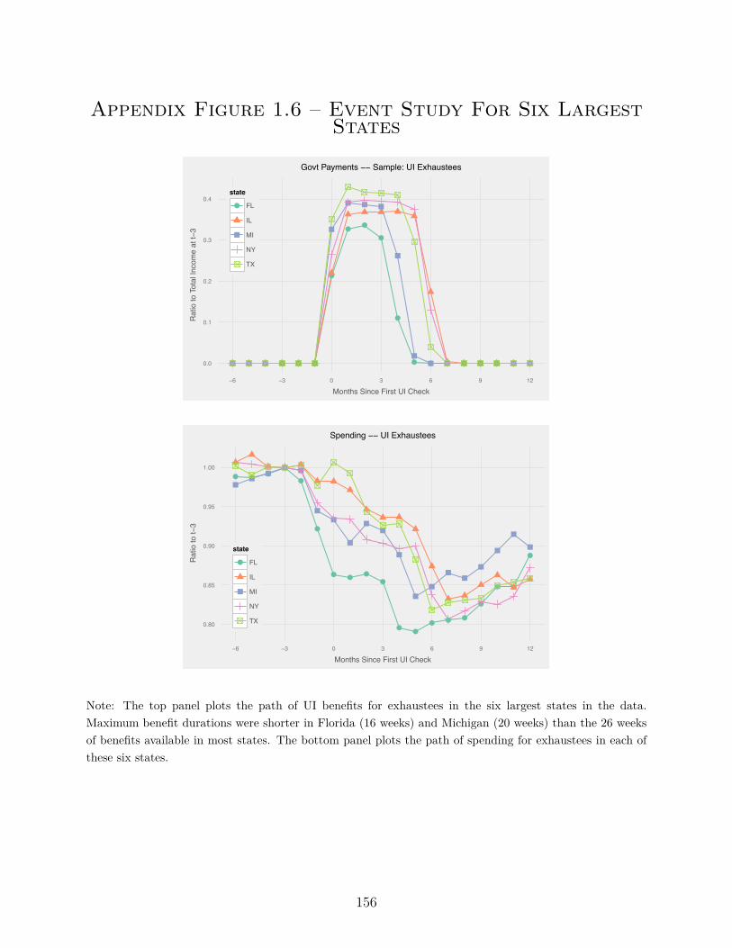
Appendix Figure 1.6 – Event Study For Six LargestStates
● ● ● ● ● ●
●
●●
●
●
● ● ● ● ● ● ● ●0.0
0.1
0.2
0.3
0.4
−6 −3 0 3 6 9 12
Months Since First UI Check
Rat
io to
Tot
al In
com
e at
t−3
state
● FL
IL
MI
NY
TX
Govt Payments −− Sample: UI Exhaustees
● ●●
●
●
●
● ● ●●
●●
● ● ●
●
● ●
●
0.80
0.85
0.90
0.95
1.00
−6 −3 0 3 6 9 12
Months Since First UI Check
Rat
io to
t−3
state
● FL
IL
MI
NY
TX
Spending −− UI Exhaustees
Note: The top panel plots the path of UI benefits for exhaustees in the six largest states in the data.Maximum benefit durations were shorter in Florida (16 weeks) and Michigan (20 weeks) than the 26 weeksof benefits available in most states. The bottom panel plots the path of spending for exhaustees in each ofthese six states.
156
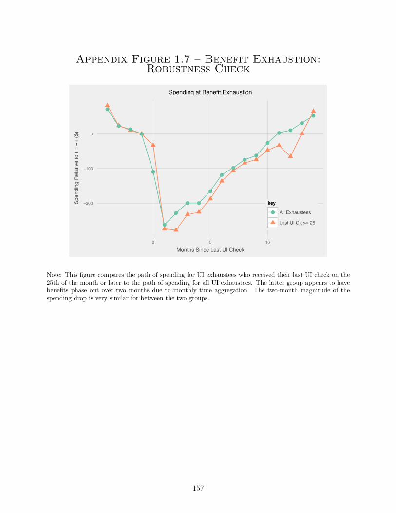
Appendix Figure 1.7 – Benefit Exhaustion:Robustness Check
●
●●
●
●
●
●
● ●
●
●
●
●●
●
●●
●
●
−200
−100
0
0 5 10
Months Since Last UI Check
Spen
ding
Rel
ative
to t
= −1
($)
key
● All Exhaustees
Last UI Ck >= 25
Spending at Benefit Exhaustion
Note: This figure compares the path of spending for UI exhaustees who received their last UI check on the25th of the month or later to the path of spending for all UI exhaustees. The latter group appears to havebenefits phase out over two months due to monthly time aggregation. The two-month magnitude of thespending drop is very similar for between the two groups.
157
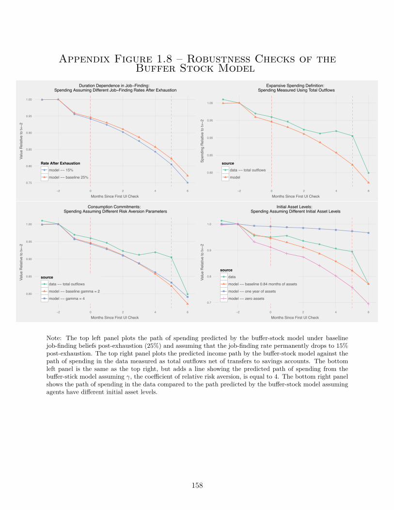
Appendix Figure 1.8 – Robustness Checks of theBuffer Stock Model
● ●
●
●
●
●
●
●
●
●0.75
0.80
0.85
0.90
0.95
1.00
−2 0 2 4 6
Months Since First UI Check
Valu
e R
elat
ive to
t=−2
Rate After Exhaustion● model −− 15%
model −− baseline 25%
Duration Dependence in Job−Finding: Spending Assuming Different Job−Finding Rates After Exhaustion
●
●
●
●
●
●
●●
●
●0.80
0.85
0.90
0.95
1.00
−2 0 2 4 6
Months Since First UI CheckSp
endi
ng R
elat
ive to
t=−2
source● data −− total outflows
model
Expansive Spending Definition: Spending Measured Using Total Outflows
●
●
●
●
●
●
●●
●
●0.80
0.85
0.90
0.95
1.00
−2 0 2 4 6
Months Since First UI Check
Valu
e R
elat
ive to
t=−2
source● data −− total outflows
model −− baseline gamma = 2
model −− gamma = 4
Consumption Commitments: Spending Assuming Different Risk Aversion Parameters
●
●
●●
●
●
●
●
●
●
0.7
0.8
0.9
1.0
−2 0 2 4 6
Months Since First UI Check
Valu
e R
elat
ive to
t=−2
source● data
model −− baseline 0.84 months of assets
model −− one year of assets
model −− zero assets
Initial Asset Levels: Spending Assuming Different Initial Asset Levels
Note: The top left panel plots the path of spending predicted by the bu�er-stock model under baselinejob-finding beliefs post-exhaustion (25%) and assuming that the job-finding rate permanently drops to 15%post-exhaustion. The top right panel plots the predicted income path by the bu�er-stock model against thepath of spending in the data measured as total outflows net of transfers to savings accounts. The bottomleft panel is the same as the top right, but adds a line showing the predicted path of spending from thebu�er-stick model assuming “, the coe�cient of relative risk aversion, is equal to 4. The bottom right panelshows the path of spending in the data compared to the path predicted by the bu�er-stock model assumingagents have di�erent initial asset levels.
158
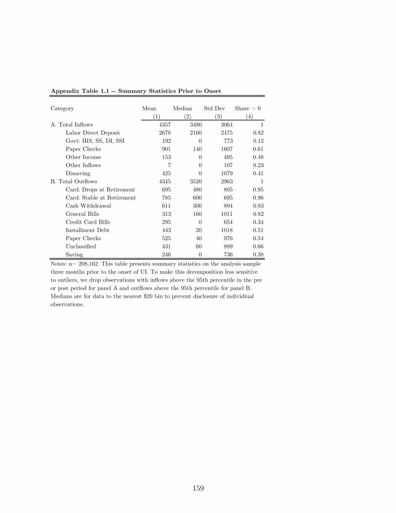
Appendix Table 1.1 -- Summary Statistics Prior to Onset
Category Mean Median Std Dev Share > 0(1) (2) (3) (4)
A. Total Inflows 4357 3480 3064 1Labor Direct Deposit 2678 2160 2475 0.82Govt: IRS, SS, DI, SSI 192 0 773 0.12Paper Checks 901 140 1607 0.61Other Income 153 0 495 0.48Other Inflows 7 0 107 0.23Dissaving 425 0 1079 0.41
B. Total Outflows 4345 3520 2963 1Card: Drops at Retirement 695 480 805 0.95Card: Stable at Retirement 785 600 695 0.96Cash Withdrawal 611 300 894 0.83General Bills 313 160 1011 0.82Credit Card Bills 295 0 654 0.34Installment Debt 443 20 1018 0.51Paper Checks 525 40 976 0.54Unclassified 431 60 889 0.66Saving 246 0 736 0.38
Notes: n= 208,162. This table presents summary statistics on the analysis sample three months prior to the onset of UI. To make this decomposition less sensitive to outliers, we drop observations with inflows above the 95th percentile in the pre or post period for panel A and outflows above the 95th percentile for panel B. Medians are for data to the nearest $20 bin to prevent disclosure of individiual observations.
159
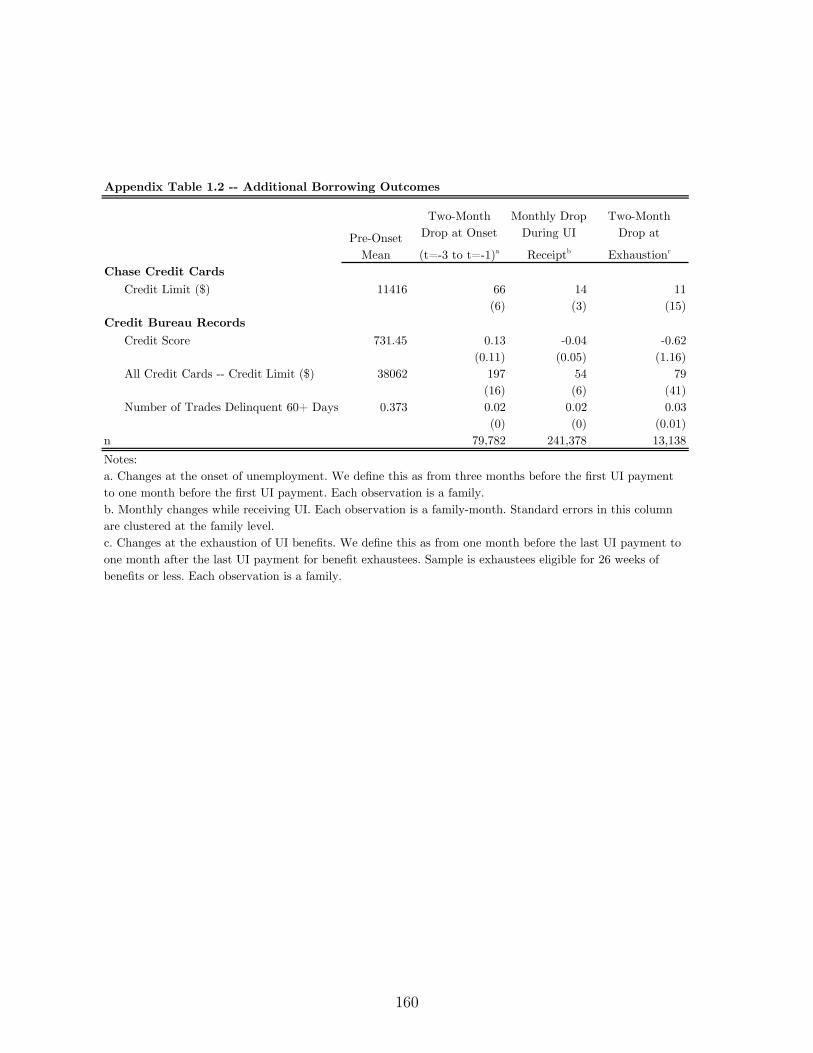
Appendix Table 1.2 -- Additional Borrowing Outcomes
Pre-Onset Mean
Two-Month Drop at Onset(t=-3 to t=-1)a
Monthly Drop During UI Receiptb
Two-Month Drop at
Exhaustionc
Chase Credit CardsCredit Limit ($) 11416 66 14 11
(6) (3) (15)Credit Bureau Records
Credit Score 731.45 0.13 -0.04 -0.62(0.11) (0.05) (1.16)
All Credit Cards -- Credit Limit ($) 38062 197 54 79(16) (6) (41)
Number of Trades Delinquent 60+ Days 0.373 0.02 0.02 0.03(0) (0) (0.01)
n 79,782 241,378 13,138Notes: a. Changes at the onset of unemployment. We define this as from three months before the first UI payment to one month before the first UI payment. Each observation is a family.b. Monthly changes while receiving UI. Each observation is a family-month. Standard errors in this column are clustered at the family level.c. Changes at the exhaustion of UI benefits. We define this as from one month before the last UI payment to one month after the last UI payment for benefit exhaustees. Sample is exhaustees eligible for 26 weeks of benefits or less. Each observation is a family.
160

B. Appendix to Chapter 2 (Housing
Vouchers)
B.1. Model
Finding an apartment is hard, especially for voucher recipients. We build a partial equilib-rium directed search model with price posting to analyze the incidence of changes in vouchergenerosity.People issued a voucher choose a quality submarket in which to search for housing.Only some voucher recipients are able to find units because of search frictions. Higher qual-ity units are more attractive, but it is harder to find a unit in a higher-quality submarket,generating a compensating di�erential (Rosen (1986)). We develop two propositions whichexamine how rent and quality change in response to an increase in the rent ceiling as well asa tilting of the rent ceiling with respect to neighborhood quality.
B.1.1. Environment
There is a continuum of neighborhoods with heterogeneous quality q where q is an observable,dollar-denominated index with positive measure for all q Ø q
min
.1A subset of renters, toosmall to have any general equilibrium impact on rents, is o�ered a voucher.
1We define q as a neighborhood because definition best matches our empirical work for the natual experimentin Dallas. However, it is possible to also think of q as a summary measure of many di�erent inputs to qualitysuch as neighborhood, building type, and unit size, so long as the landlord cannot change the quality of herunit. This alternative definition of q generates an additional empirical prediction which is that across-the-board increases in voucher generosity may not have much impact on unit quality in the presence of searchfrictions.
161

Landlords There is a unit mass of landlords in each neighborhood q who each choose rentmarkups (or discounts) m ≥ F with m œ [m
low
,m
high
]. Assume that F is twice-di�erentiablewith df(m)
dm
< 0, so that f(.)
F (.)
exhibits the monotone likelihood ratio property. Heterogeneity inm can be thought of as arising from di�erences in landlord’s outside options. When occupied,a landlord receives rent equal to the markup plus the base quality index m + q, and whenvacant, a landlord receives no rent.
Private Tenants Because this analysis is primarily focused on vouchers, we do not model pri-vate tenants’ choice of neighborhood. They are randomly matched to units in neighborhoodq and have a dollar-denominated willingness to pay markups of ÷ ≥ G, again arising fromdi�erences in outside options.
Voucher Recipients People who accept a voucher are not price sensitive so they will rent anyunit which costs less than the rent ceiling. Voucher recipients consume one unit of housing.Voucher recipients choose a quality level q to maximize utility, subject to the constraintimposed by the rent ceiling r in conjunction with landlord markups. Landlords have thepolicy:
Accept voucher if q +m < r(q)
so the fraction of landlords in neighborhood q who will accept a voucher is F (r(q) ≠ q).Recipients solve:
maxq
U(P (q), q) subject to P (q) = F (r(q) ≠ q)
Recipients maximize expected utility. Let V (q) (with V
Õ(q) > 0 and V
ÕÕ(q) < 0) denotethe relative utility gain from finding a unit with quality q over remaining unmatched, whichoccurs with probability P (q). Finally, assume that the rent ceiling has a linear structurer = r
base
+ cq with c œ [0, 1). The tenant’s problem can be rewritten as
maxq
F (rbase
+ cq ≠ q)¸ ˚˙ ˝Match Probability
V (q)¸ ˚˙ ˝
Utility if Matched
B.1.2. Solution
Voucher Tenants’ Quality Choices We solve the voucher recipient’s problem using the first
162

order condition:
(1 ≠ c) = U
q
U
P
= F (rbase
+ cq ≠ q)f(r
base
+ cq ≠ q)V
Õ(q)V (q) (B.1)
The solution q = q
ú is unique.2
Markups Private tenants observe markupm and rent the unit if it is better than their outsideoption (i.e. the rent is lower than their willingness to pay): ÷ ≠ m > 0. The share of theprivate tenant population that will accept an o�er of m is G(m). Average transacted pricesare
µ
private
=ˆ
m
high
m
low
mG(m)f(m)dm/
Aˆm
high
m
low
G(m)f(m)dmB
+ q
Finally, we compute rents paid on behalf of voucher units in q. Voucher tenants will acceptany unit o�ered to them with rent less than r ≠ q, so:
µ
voucher
=ˆ
r≠q
m
low
mf(m)dm/
Aˆr≠q
m
low
f(m)dmB
+ q (B.2)
The average di�erence in rents between voucher and private units in neighborhood q is
�(q) =´
r≠q
m
low
mf(m)dm´r≠q
m
low
f(m)dm≠
´m
high
m
low
mG(m)f(m)dm´m
high
m
low
G(m)f(m)dm
Intuitively, the gap in average rents is larger when private tenants are more price sensitive(g(m) falls rapidly in m) and when the rent ceiling is higher.3
2This follows from the negative second-order condition in the maximand Uqq = (≠1 + c)2 df(.)dq V (q) +
2f(.)V Õ(q)(≠1 + c) + F (.)V ÕÕ(q) < 0’q. The first term is negative because df(.)dq is negative by assumption,
the second term is negative because c < 1 and the third term is negative because V
ÕÕ< 0 by assumption.
3Our model also implies that holding quality fixed, the average rent paid by a voucher recipient may behigher than the average rent paid by a private tenant, but we do not examine this empirically. See Table6.7 in Olsen (2003) for a summary of older studies comparing di�erences in average costs and ORC/Macro(2001) for more recent evidence. From conversations with practitioners, we learned that some landlordsperceive voucher recipients to be more costly than other tenants due to the risk of damage to the unit,while other landlords prefer voucher recipients because the housing authority guarantees a steady stream ofrental payments. Both the costs and benefits of renting to a voucher recipient relative to a private tenantare di�cult to quantify. For this reason, we focus instead on policy changes to the rent ceiling, rather thandi�erences in average costs.
163

B.1.3. Comparative Statics
Proposition 1 Within a neighborhood q, the average voucher rents rise when the rent ceilingrises.
ˆµ
voucher
ˆr
= [r ≠ µ
voucher
] f(r ≠ q)F (r ≠ q)
Proof: Di�erentiate equation B.2 with respect to r.The size of the change in average voucher rents depends on how many landlords in q areon the margin, with markups equal to r ≠ q. This comparative static will understate theextent to which rents rise if landlords deliberately raise rents in response to changes in therent ceiling. Any attempt to price discriminate will be limited to the extent that the rentreasonableness process described in Section 2.3 is e�ective.
Next, we analyze the impact on quality of raising r
base
versus the impact of raising c (witha compensating change in r
base
), which can be depicted visually as:Across-the-board r increase Tilting r
!!
!
!!!!!!!!!!!!!!!!!!!!!! !!!!! Quality!q!
Rent!Ceiling!!
€
r !!!
!!!!!!!!!!!!
!!!!!!!!!!
!!
!!
! Quality!q!
Rent!Ceiling!!
€
r !
Inside the model, these comparative statics correspond to an income e�ect and a substitutione�ect.
First-Order Second-Order
Income E�ect ˆq
ú
ˆr
base
à ≠(1 ≠ c) ˆf(.)ˆr
base
V (.)¸ ˚˙ ˝
U
PP
+ f(.)V Õ(.)¸ ˚˙ ˝
U
Pq
Substitution E�ect ˆq
ú
ˆc
à f(.)V (.)¸ ˚˙ ˝
U
P
≠(1 ≠ c) ˆf(.)ˆr
base
V (.)¸ ˚˙ ˝
U
PP
q
ú + f(.)V Õ(.)¸ ˚˙ ˝
U
Pq
q
ú
Proposition 2 Raising the rent ceiling in a search model a�ects quality chosen in the same
164

way that an income e�ect does in a consumer demand model. Tilting the rent ceiling in a
search model a�ects quality chosen in the same way as a substitution e�ect.
Proof: Di�erentiate equation B.1 with respect to r
base
and c.4
Across-the-board increases are like an income e�ect in that voucher recipients may use thefunds for moves to a better neighborhood or improved matching probability in the previously-chosen neighborhood. Raising the base rent ceiling raises quality, but only through second-order terms U
PP
and U
Pq
. Just as in a consumer demand problem where expanding ahousehold’s budget set will raise their consumption through diminishing marginal utilityof each good, quality here increases only through diminishing marginal utility of matchingprobability and the complementarity between matching probability and unit quality. Incontrast, raising the subsidy for high-quality units also works through a first-order e�ectU
P
, whereby the penalty for moving to a higher-quality unit, which takes the form of a lowermatching probability, is diminished. This suggests that tilting the rent schedule may bemore e�ective at improving quality than raising the base rent ceiling.
B.1.4. Robustness
Two of the the simplifying assumptions in the baseline model are the use of a representativeagent and focusing on voucher units below the rent ceiling. Here, we show how the modelchanges when we relax these assumptions. Our key conclusions remain unchanged. Forsimplicity, we focus on the case where there is one constant rent ceiling racross a metro area,rather than letting the rent ceiling vary with quality q.
B.1.4.1. Heterogeneity in Outside Options
Our baseline model examines a representative agent, while in fact voucher recipients choose awide variety of neighborhoods. Adding heterogeneity in a voucher recipient’s outside option
4To see the exact analogy with for a model with labor and leisure, assume agent has utility U(c, ¸) where c isconsumption and ¸ is leisure. Assume c = W (T ≠ ¸) + Y where W is the wage, time spent working is T ≠ ¸
and Y captures unearned income. This model has first-order condition of ≠Uc(W (T ≠¸
ú(Z))+Y, ¸
ú(Z))W +U¸(W (T ≠ ¸
ú(Z)) + Y, ¸
ú(Z)) = 0 where Z captures exogenous parameters Y and W . Di�erentiation gives
First-Order Second-OrderIncome E�ect ˆ¸ú
ˆY Ã +WUcc + Uc¸
Substitution E�ect ˆ¸ú
ˆW Ã ≠Uc + [WUcc + U¸c] [T ≠ ¸
ú]
This is formally isomorphic to the model above with T ≠ ¸ = q, c = P and W = ≠(1 ≠ c).
165

generates heterogeneity in neighborhood choices. Voucher recipients with better outsideoptions will search in better neighborhoods and their neighborhood choice will be moreresponsive to changes in the rent ceiling. Formally, let i index di�erent individuals, and letq
i
be individual i’s outside option. All individuals have utility over unit quality u(q), withu
Õ> 0, uÕÕ
< 0. Now the tenant’s maximization problem and first order condition become:
V
i
= maxq
F (r ≠ q)V (q) + (1 ≠ F (r ≠ q))V (qi
)
First Order Condition ≠f(r ≠ q
úi
)1V (qú
i
) ≠ V (qi
)2+ F (r ≠ q
úi
)V Õ(qúi
) = 0
Under the regularity condition already specified in Section B.1.1, there is a unique, globalsolution, with q
úi
> q
i
. Choosing to search in a higher quality neighborhood q means adecreased chance of matching. This is most painful for someone with low V (q
i
) and sopeople with worse outside options use their voucehr in worse neighborhoods. Di�erentiatingwith respect to r and solving for ˆq
úi
ˆr
gives
ˆq
úi
ˆr
à ≠ˆf(.)ˆr
1V (qú
i
) ≠ V (qi
)2+ f(.)V Õ(qú
i
)
These terms are the same as in the baseline model, except that the utility gain V (qú)≠V (qi
)now a�ects the responsiveness to a price ceiling increase, whereas in the baseline model V (q
i
)was normalized to zero. People with a lot to lose from failing to find a unit with their voucherwill be less responsive to the increase in the price ceiling.
B.1.4.2. Out-of-Pocket Payments for Expensive Housing
One important institutional feature of the housing voucher program which is omitted fromthe baseline model is that a voucher recipient can sometimes rent a unit above the rentceiling. Adding this feature does not change the core results from the model: that theimpact of a rent ceiling increase on neighborhood quality is blunted by search frictions andthat increases in the price ceiling raise markups. In particular, if a voucher recipient new tothe program finds a unit whose rental cost is greater than the rent ceiling but lower thanthe rent ceiling plus 10% of her income then she can choose to rent it and pay the di�erencebetween the rent ceiling and the unit’s rent out of pocket.5
In the baseline model above with only housing consumption, voucher recipients solved:
maxq
ˆr≠q
÷
min
V (q)dF (÷)
Now, redefining V to have two arguments, q for housing quality and c for non-housing
5This rule does not apply to voucher recipients who are renewing their lease.
166

consumption, voucher recipients instead solve:
maxq
ˆr≠q
÷
min
V (q, 0.7y)dF (÷) +ˆ
r+0.1y≠q
r≠q
V (q, 0.7y ≠ ÷ ≠ (r ≠ q))dF (÷)
where voucher recipients have non-housing consumption of at most 70% of their income y.The optimal choice of quality q
ú is given by the first-order condition:
F (r + 0.1y ≠ q
ú)Vq¸ ˚˙ ˝
choosing higher q improves quality...≠ f(r + 0.1y ≠ q
ú)V (.)¸ ˚˙ ˝
...but risks not matching≠
ˆr+0.1y≠q
ú
r≠q
úV
c
dF (÷)¸ ˚˙ ˝
...and lowers non-housing cons
= 0
Raising the rent ceiling a�ects quality through the same second-order terms as in the baseline,plus a new term which captures utility gain from reduced out-of-pocket payments for housing.Intuitively, the new term blunts the impact of the recent ceiling increase on housing qualitybecause adding non-housing consumption to the model gives voucher recipients another“good” to buy other than housing quality. The comparative static of quality with respect tothe price ceiling is:
ˆq
ú
ˆr
à ≠f(.)Vq
+ ˆf(.)ˆr
V + d
dr
[ˆ
r+0.1y≠q
ú
r≠q
úV
c
dF (÷)]
The new term d
dr
[´
r+0.1y≠q
ú
r≠q
ú V
c
dF (÷)] is most likely negative because its first and third com-ponents are negative and because the second term is small. Using the Leibniz rule, it isequal to
ˆr+0.1y≠q
ú
r≠q
úV
cc
(1 ≠ ˆq
ú
ˆr
) + V
cq
ˆq
ú
ˆr
dF (÷) + [F (r + 0.1y ≠ q
ú) ≠ F (r ≠ q
ú)]Vc
(.)(1 ≠ ˆq
ú
ˆr
)
The first term is negative under the assumption of diminishing marginal utility. The sign ofthe second term is ambiguous and depends on whether housing and non-housing consumptionare complements or substitutes. Even in the case where they are complements, the term isstill proportional to ˆq
ú
ˆr
, which we show empirically in the paper to be small. The thirdterm is negative under our distrbutional assumption from the baseline model that F hasdecreasing mass further into the tail of markups.Raising the rent ceiling a�ects prices entirely through changes in the set of units rented.Because there is no bargaining between landlords and tenants in this model, adding out-of-pocket tenant payments does not a�ect the economic conclusions from this comparativestatic.
ˆµ
voucher
ˆr
= [r + 0.1y ≠ µ
voucher
] f(r + 0.1y ≠ q)F (r + 0.1y ≠ q)
167
B.2. Data
B.2.1. Sample Construction
We use HUD’s “PIH Information Center” database, also known as PIC. In principle, every voucher issupposed to appear in PIC when admitted, when leaving the voucher program, for a regularly scheduledannual recertification, and for any unscheduled interim recertification due to, for example, a change in tenantpayment or a move. Coverage is quite good for an administrative dataset with decentralized data entry;HUD estimates that in 2012, some record appeared in PIC for 91% of vouchers (Public and Indian HousingDelinquency Report (2012)). We construct years according to the federal government’s fiscal year (e.g.FY2012 starts in October 2011), since this is the calendar used for applying Fair Market Rent changes.We consider observations with non-missing rent, household id, address text, and lease date (also known as“e�ective date”). Addresses are standardized using HUD’s Geocoding Service Center, which uses Pitneyand Bowes’ Core-1 Plus address-standardizing software. For each raw text address, this produces a cleanedtext address, a 9-digit ZIP code and an 11-digit ZIP code. Within each household-year, we choose theobservation with the most recent lease date and most recent server upload date. Our final step is to dropduplicate household-year observations, which amount to 2.3% of the sample and project-based vouchers,where the housing authority chooses the unit, rather than the tenant, which are less than 1% of the sample.This leaves us with a sample of about 1.6 million annual household records. Conditional on appearing in thesample in 2004, the probability of that household appearing in 2005 is 75%, and the probability of appearingin 2005, 2006, or 2007 is 84%, indicating that there often are substantial lags between appearances in PIC.
B.2.2. 2005 FMR Rebenchmarking
Constructing the FMR Cells: We use HUD’s published Fair Market Rent rates, with slight modifications(http://www.huduser.org/portal/datasets/fmr.html). Fair Market Rents are published on an annual basiscorresponding to the federal fiscal year, so FY2005 rents were e�ective from October 1, 2004 to September30, 2005. FMR geographies are largely stable over time; HUD added 14 new city geographies in Virginia,and we code prior FMRs for these cities using the county-level FMRs. Our policy variation is at the county-bed cell level and measurement error Ï2000 ≠ Ï1990 is larger for thinner cells. To maximize the variation inour instrument which can be attributed to measurement error, we weight each county-bed equally. In NewEngland, FMRs are set by NECTAs, which cross county lines and we merge on FMRs to the appropriatesub-state geographies there. However, we weight each county-bed pair equally everywhere, including NewEngland; were we to give equal weight to each geographic unit, then 1/3 of the sample weight would bein New England. Gordon (2004) and Suarez-Serrato and Wingender (2014) also use decennial Censusrebenchmarkings as source of exogenous variation to examine the incidence of federal expenditures.Sample Restrictions: The rebenchmarking resulted in large swings in local rents, and many housing author-ities lobbied HUD for upward revisions to their local FMRs. In a revision to the 2005 FMRs, HUD acceptedproposals from 14 counties. All documentation associated with the rebenchmarking is posted at
http://www.huduser.org/portal/datasets/fmr/fmr2005r/index.html For these counties, we recode the FMR
back to its pre-lobbying level. Coincident with the rebenchmarking, HUD administered Random Digit Dialing
(RDD) surveys in 49 metropolitan areas. The results from these surveys, where available, superseded the
results from the 2000 Census. Since these surveys were initiated and administered by HUD, we are less
concerned about endogeneity of this data source, and we use the post-RDD FMRs for these areas. For these
168

areas, the orthogonality restriction is that rental market changes from 1990 to 2004 need to be uncorrelated
with subsequent short-run changes (E(�r
Nonvoucher2004≠t |�r
Nonvoucher1990≠2004 ) = 0). Finally we drop eight geographies,
with specific reasons listed below.
Places Dropped – Reason
Miami, FL, Honolulu, HI, Navarro County, TX, and Assumption Parish, LA – rebenchmarked in 2004
Okanogan County, WA – Lobbied for higher FMR in 2005, no counterfactual available
Louisiana – Hurricane Katrina severely disturbed rental markets (among other things)
Kalawao County, HI – No FMR published before 2005
Measuring the First Stage: The administrative data report the rent ceiling r at the household level. Althoughmuch of our analysis limits the voucher sample in various ways (e.g. stayers, movers), we always computerjt as the unconditional mean of all observations in a county-bed-year cell.Trimming and Standard Errors: We winsorize county-by-bed FMR changes at the 1st and 99th percentile,so that our results will not be unduly influenced by outliers. While FMRs are published at the county-bedlevel, sometimes counties are grouped together for the purpose of setting a common FMR. Throughout ourrebenchmarking analysis, we cluster our standard errors at the FMR group level (n=1,484).
B.2.3. Nonvoucher Rents and 2005 FMR Rebenchmarking
In Section 2.4.1, our key identification condition is
÷ ‹ FMR2005|FMR2004 = 0
Here we examine the correlation of the FMR change with contemporaneous changes in nonvoucher rents.Data availability make it di�cult to measure nonvoucher rents at a high frequency and with a high degreeof geographic specificity. (Recall that these di�culties are exactly what generated the policy variation westudy here!) Using the notation developed in Section 2.4.1,
Cov(�rt,�FMR) = Cov(rt + Át ≠ r2000 ≠ Á2000,�FMR) = V ar(Á2000) < 0 (B.3)
Even if E(�rt|�rt≠1) = 0, we estimate a negative covariance because of the negative auto-correlation ofgains measured with error. Similarly, Glaeser and Gyourko (2006) calculate serial correlation in housingprice changes and rent changes at five-year horizons and find negative serial correlation.
First, we compare changes in voucher rents to changes in tract-level median rents published by the Census.6Data at the tract level are available from the 2000 Census (Minnesota Population Center (2011)) and the2005-2009 American Community Survey with a consistent geographic identifier. In regression form, with i
indexing tracts and j indexing counties, we estimate
r
Nonvoucher2005≠2009,ij ≠ r
Nonvoucher2000,ij = – + —1�FMRj + Áij
6The Census estimates include voucher recipients themselves, making this an imperfect measure of nonvoucherrent changes. Internal HUD data indicate that subsidized households typically report their rental payment(30% of income) in the Census, rather than the total rent received by the landlord. This measurement errormeans that rent reports by voucher recipients are unlikely to change in response to changes in the FMR.
169

where �FMRj is the average FMR change across bedroom sizes. We find that rent changes from 2000onward are negatively correlated with FMR changes (—1 < 0), as reported in reported in Appendix Table 3,column 2. This is consistent with measurement error, since �FMRj is a function of the change in Censusrents from 1990 to 2000, there is a mechanical negative correlation between FMR changes and Census rentchanges from 2000 to a later date. This generates a sharp contrast – places with relative increases invoucher rents had relative decreases in nonvoucher rents. This mean reversion pattern is most pronouncedin rural areas. When we limit the sample to counties with at least 100,000 residents, we find that —1 isnot statistically di�erent from zero (column 4).7 Finally, we pool the observations in columns 1 and 2 toestimate �r
{V oucher,Nonvoucher}ij = – + —1�FMRj + —2�FMRj ◊ V oucherij + Áij where V oucherij is an
indicator for whether the rental change is observed for voucher stayers or nonvouchers. Then, we computethe probability that we would observe data like this or more extreme, under the null hypothesis that the twocoe�cients are equal (—1 = —2), and find p < 0.01. Likewise, we find that the probability —1 = —2 for in theurban sample is very low.
Another source of data on nonvoucher rents comes from the ACS public use microdata. These data arepreferable because they more closely correspond to the time horizon of interest (data observed in 2000 andannually from 2005 to 2009) and because they identify the number of bedrooms the unit has, rather thanjust the location, allowing us to exploit the county-by-bed variation in FMR changes. However, since thisis a public use file, geographic identifiers are available only for units located in counties which have morethan 100,000 residents. We find a strong negative coe�cient from 2000 to 2005 (column 5), consistent withmeasurement error at the bedroom level within counties. Analyzing the correlation of rent changes from2005 to 2009 with FMR changes, which is perhaps our strongest test of E(�r
Nonvoucher2004≠t |�FMR) = 0, we
find a coe�cient of 0.02, very close to zero, although the estimate is imprecise. These estimates o�er a jointtest of two distinct hypotheses: (1) selection – contemporaneous neighborhood trends were correlated withFMR changes and (2) general equilibrium spillovers – FMR changes causally a�ected nonvoucher rents. Thedata are not consistent with these hypotheses.
B.2.4. Hedonic Quality
We build our hedonic quality measure using regression coe�cients from a model of rents in the ACS alongwith building age, structure type, number of bedrooms and median tract rent. For our hedonic measuresin the analyses of the re-bencmaking change and the Dallas ZIP-level ceiling change, we use administrativedata from our PIC database and coe�cients from a model of rents in the 2005-2009 public use sample ofthe American Community Survey, inflated to 2009 $ (Ruggles et al. (2010)). The following unit covariatesappear in both the Census and in PIC: Public Use Microdata Area (PUMA), number of bedrooms, structuretype, and structure age. The PIC file reports an exact building age, which we code into the 10 bins forstructure age available in the ACS. The PIC file reports 6 di�erent structure categories and the ACS has 10categories. We crosswalk these categories as best as we can, as
7This is consistent with plausible parameterizations of a tract-level data-generating process. Suppose thattract-level rents follow an auto-regressive process, with Yj = flYj≠1 + ÷j . A regression of tract-level rentchanges from 2000 to 2005-2009 on county-level FMR changes, which are e�ectively rent changes from 1990to 2000, of the form �Y
tractj = – + —�Y
countyj,t≠1 + Áj would yield a biased estimate — ≠ — = ≠ n
tract
ncounty
(1 ≠fl) V ar(÷)
V ar(�Yj,t≠1) . Analyzing tract-level rent changes indicates that V ar(÷) ¥ V ar(�Yj,t≠1), fl = 0.88. Tracts
in counties with 40,000 units or more have small values of ntract
ncounty
, such that — ≠ — = ≠0.005 and tracts incounties with less than 40,000 units have large n
tract
ncounty
, resulting in — ≠ — = ≠0.070.
170
PIC ACS 2005-2009Single family detached Single family detachedSemi-detached 1-family house, attached, 2-family buildingRowhouse/townhouse 3-4 family buildingLow-rise 5-9 family building, 10-19 family buildingHigh-rise 20-49 family building, 50+ family buildingMobile home or trailer Mobile home or trailer
We have 710,957 observations of households with positive cash rent in the ACS. Unfortunately, we have noway to drop subsidized renters (13% of sample). This is an added source of measurement error. We estimateusing least squares
Rentijklm = – +Bedj + StrucTypek +Agel + PUMAm + Ái (B.4)
where Bedj is a set of indicators for 5 possible numbers of bedrooms, StrucTypek is a set of indicators for 6possible structure types, Agel is a set of indicators for 10 possible structure age bins, and PUMAm is a setof indicators for 2,067 PUMAs. The results from this regression appear in Appendix Table 1. This regressioncomputes a vector of hedonic coe�cients —census. This hedonic regression has substantial predictive power,with an R-squared of 0.48. We then apply the coe�cients from this hedonic regression to the vouchercovariates for bedrooms, structure type and building age to construct a measure of hedonic unit qualityq
hedonic = —censusxvoucher + r
tractvoucher where r
tractvoucher is the median tract rent. The standard deviation of
actual rent is $497 and the standard deviation of predicted rent is $331. For our Dallas analysis in Table6, where we are interested in only structure quality and not neighborhood quality, we instead computeq
hedonic = —censusxvoucher, omitting neighborhood quality. We compare the predictive power of these samecovariates in the American Housing Survey against a benchmark “kitchen-sink” regression of all hedoniccharacteristics in the AHS (60+ variables) in Appendix Table 2. The ACS variables approximate the fullmodel fairly well with an R
2 of 0.30 compared to 0.42 with the full model.
To evaluate the e�ect of the 40th to 50th percentile FMR policy change on housing quality we construct
a quality measure with building age, structure type, number of bedrooms and median tract rent plus 26
questions from HUD’s Customer Satisfaction Survey (CSS) and hedonic coe�cients from a model of rents
in the 2011 American Housing Survey (AHS). We identify 26 quality measures which can be matched to
variables in the AHS. These are:
171

• Building has working elevator • Home cold for 24 hours or more
• Working cooktop/burners • Fuses blown or circuit breakers tripped regularly
• Unit lacks hot water • Heating break down for 6 hours or more
• Access to a laundry room • Wiring metal coverings
• Working outlets • Water leaking inside
• Unit has safe porch or balcony • Mildew, mold ,or water damage
• Working refrigerator • Smell bad odor such as sewer, natural gas
• Use oven to heat the unit • Large peeling paint
• Large open cracks • Toilet not working for 6 hours or more
• Windows have broken glass • Unsafe handrails, steps or stairs
• Roof sagging, holes, or missing roofing • Electrical outlets/switches have cover plates
• Home has cockroaches • Rate unit good
• Home has rodents • Rate unit poor
We estimate the contribution of unit characteristics to rent using equation 13 where vector s includes the
26 measures listed above along with the number of bedrooms, age of housing, structure type and is a set of
indicators for the American Housing Survey “Zone” a coarser analog to ACS Public Use MicroData Areas
(the coe�cient on median Zone rents is approximately $1) . This regression produces a vector of coe�cient
“. We then construct our hedonic measure: q
hedoniccss = “AHSxcss + r
tractvoucher. The CSS adds many more
time-varying quality factors, together with the basic ACS variables this model achieves about 75 percent of
the predictive performance of the full “kitchen-sink” AHS model (Appendix Table 2). We believe that our
actual hedonic measure, which uses tract rent rather than PUMA or Zone rents, likely explains much more of
the actual variation in cross-sectional rents than the AHS R
2 numbers suggest. Rents in the AHS appear to
be substantially higher variance than voucher rents in the CSS. Impressively, our hedonic measures explain
nearly 70 percent of the cross sectional variation in voucher rents in the CSS.
Rentijklm = fi + s
Õi“ + Ái (B.5)
172

B.2.5. Dallas ZIP-Level FMRs
Constructing the Analysis Sample: This Dallas “Small Area FMR Demonstration” applied to eight counties:Collin, Dallas, Delta, Denton, Ellis, Hunt, Kaufman, and Rockwall. Several housing authorities administervouchers in these counties. Most adopted the new policy in December 2010, but the Dallas Housing Authorityadopted the policy in March 2011. We use a balanced panel of all vouchers in these eight counties from2010 to 2013 because beginning in 2009 the Dallas Housing Authority allocated many of its new vouchersto homeless individuals. These individuals also needed other non-housing services and are a very di�erentpopulation from standard voucher recipients.
Constructing the Neighborhood Quality Measures: Tract-level data on poverty rate, unemployment rate, andshare with a bachelor’s degree are for 2006-2010 in the American Community Survey. Tract-level 2010 violentcrime o�ense data was provided to HUD by the Dallas Police Department under a privacy certificate betweenHUD and Dallas (March 2012). Data on the percent of 4th grade students’ scoring proficient or higher onstate exams in the 2008-2009 academic year was provided to HUD by the U.S. Department of Education.We map these scores to zoned schools at the block group level. “Single Mothers” is defined as share of ownchildren under 18 living with a female householder and no husband present.
173
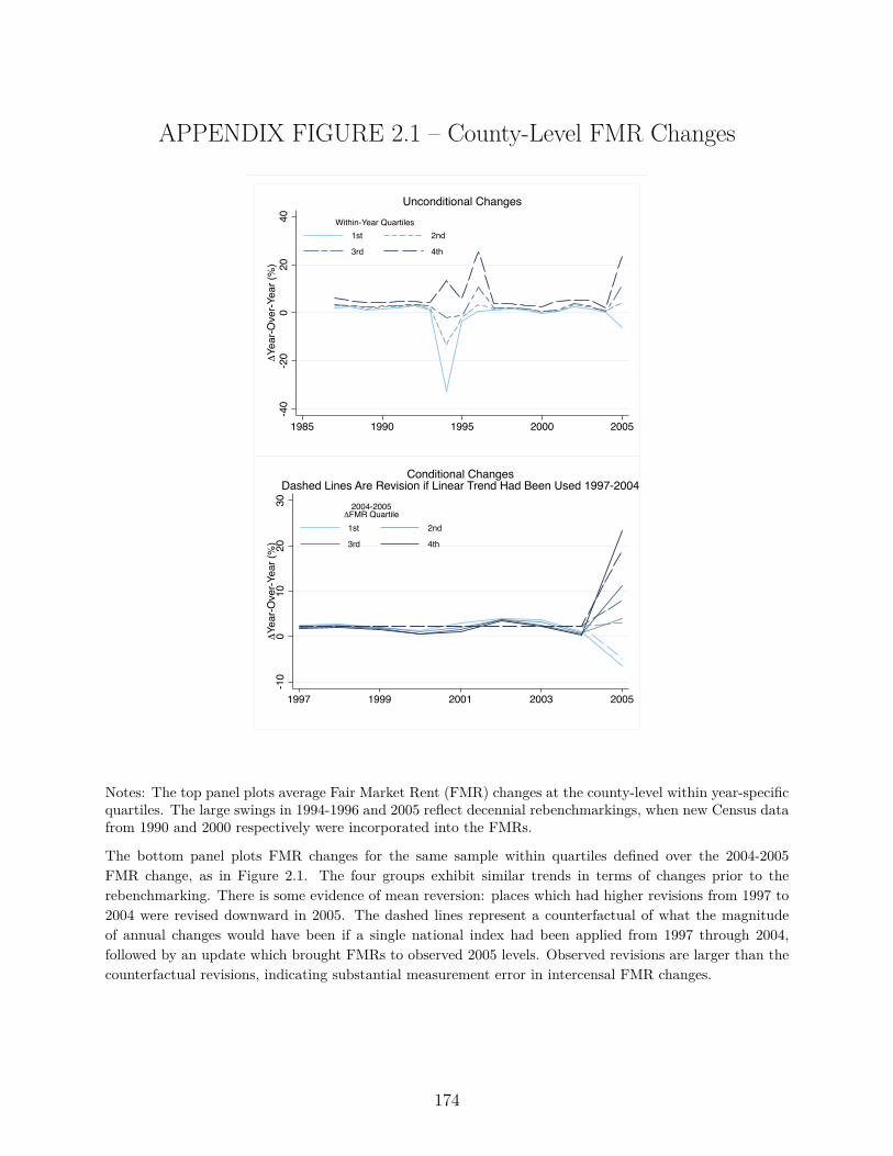
APPENDIX FIGURE 2.1 – County-Level FMR Changes
-40
-20
020
40Δ
Year
-Ove
r-Yea
r (%
)
1985 1990 1995 2000 2005
1st 2nd
3rd 4th
Within-Year Quartiles
Unconditional Changes
-10
010
2030
ΔYe
ar-O
ver-Y
ear (
%)
1997 1999 2001 2003 2005
1st 2nd
3rd 4th
2004-2005ΔFMR Quartile
Conditional ChangesDashed Lines Are Revision if Linear Trend Had Been Used 1997-2004
Notes: The top panel plots average Fair Market Rent (FMR) changes at the county-level within year-specificquartiles. The large swings in 1994-1996 and 2005 reflect decennial rebenchmarkings, when new Census datafrom 1990 and 2000 respectively were incorporated into the FMRs.
The bottom panel plots FMR changes for the same sample within quartiles defined over the 2004-2005FMR change, as in Figure 2.1. The four groups exhibit similar trends in terms of changes prior to therebenchmarking. There is some evidence of mean reversion: places which had higher revisions from 1997 to2004 were revised downward in 2005. The dashed lines represent a counterfactual of what the magnitudeof annual changes would have been if a single national index had been applied from 1997 through 2004,followed by an update which brought FMRs to observed 2005 levels. Observed revisions are larger than thecounterfactual revisions, indicating substantial measurement error in intercensal FMR changes.
174
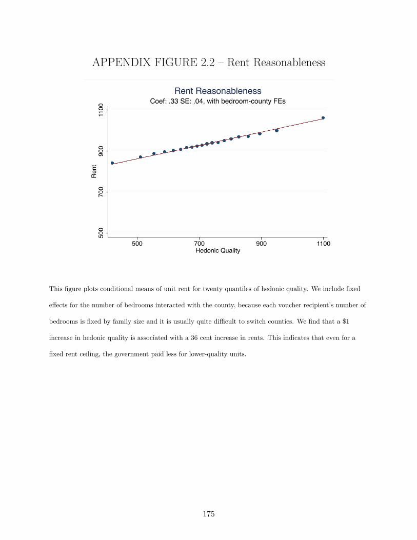
APPENDIX FIGURE 2.2 – Rent Reasonableness
500
700
900
1100
Ren
t
500 700 900 1100Hedonic Quality
Coef: .33 SE: .04, with bedroom-county FEsRent Reasonableness
This figure plots conditional means of unit rent for twenty quantiles of hedonic quality. We include fixed
e�ects for the number of bedrooms interacted with the county, because each voucher recipient’s number of
bedrooms is fixed by family size and it is usually quite di�cult to switch counties. We find that a $1
increase in hedonic quality is associated with a 36 cent increase in rents. This indicates that even for a
fixed rent ceiling, the government paid less for lower-quality units.
175
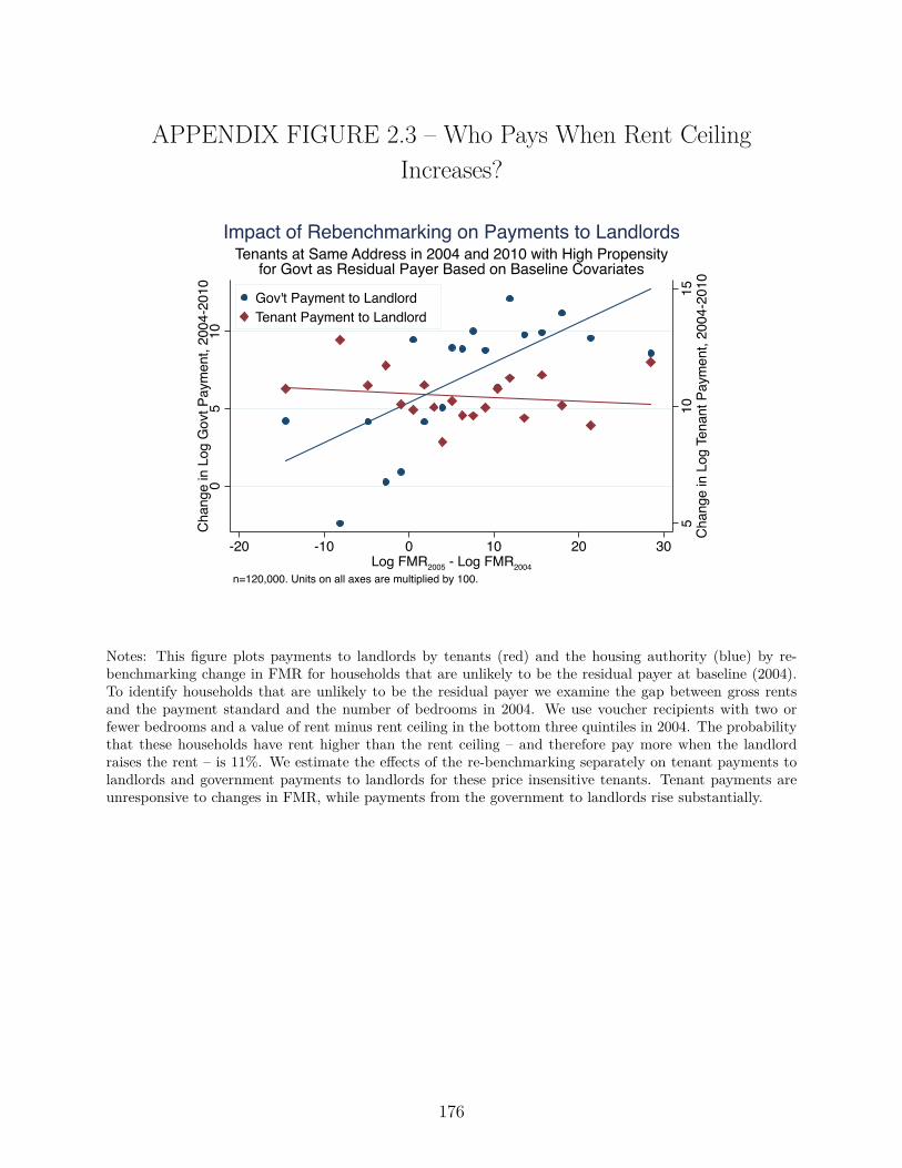
APPENDIX FIGURE 2.3 – Who Pays When Rent Ceiling
Increases?
510
15C
hang
e in
Log
Ten
ant P
aym
ent,
2004
-201
0
05
10C
hang
e in
Log
Gov
t Pay
men
t, 20
04-2
010
-20 -10 0 10 20 30Log FMR2005 - Log FMR2004
Gov't Payment to LandlordTenant Payment to Landlord
n=120,000. Units on all axes are multiplied by 100.
Tenants at Same Address in 2004 and 2010 with High Propensityfor Govt as Residual Payer Based on Baseline Covariates
Impact of Rebenchmarking on Payments to Landlords
Notes: This figure plots payments to landlords by tenants (red) and the housing authority (blue) by re-benchmarking change in FMR for households that are unlikely to be the residual payer at baseline (2004).To identify households that are unlikely to be the residual payer we examine the gap between gross rentsand the payment standard and the number of bedrooms in 2004. We use voucher recipients with two orfewer bedrooms and a value of rent minus rent ceiling in the bottom three quintiles in 2004. The probabilitythat these households have rent higher than the rent ceiling – and therefore pay more when the landlordraises the rent – is 11%. We estimate the e�ects of the re-benchmarking separately on tenant payments tolandlords and government payments to landlords for these price insensitive tenants. Tenant payments areunresponsive to changes in FMR, while payments from the government to landlords rise substantially.
176
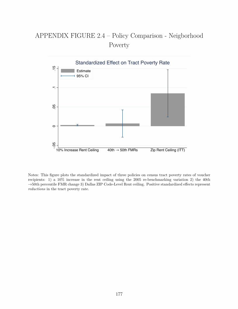
APPENDIX FIGURE 2.4 – Policy Comparison - Neigborhood
Poverty
-.05
0.0
5.1
.15
10% Increase Rent Ceiling 40th → 50th FMRs Zip Rent Ceiling (ITT)
Estimate95% CI
Standardized Effect on Tract Poverty Rate
Notes: This figure plots the standardized impact of three policies on census tract poverty rates of voucherrecipients: 1) a 10% increase in the rent ceiling using the 2005 re-benchmarking variation 2) the 40thæ50th percentile FMR change 3) Dallas ZIP Code-Level Rent ceiling. Positive standardized e�ects representreductions in the tract poverty rate.
177
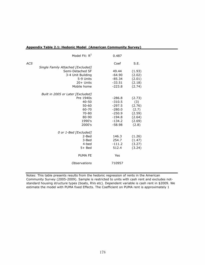
Model Fit: R2 0.487
ACS Coef S.E.Single Family Attached [Excluded]
Semi-Detached SF 49.44 (1.93)3-4 Unit Building -64.90 (2.02)
5-9 Units -85.34 (2.01)20+ Units -33.51 (2.18)
Mobile home -223.8 (2.74)
Built in 2005 or Later [Excluded]Pre 1940s -286.8 (2.73)
40-50 -310.5 (3)50-60 -297.5 (2.76)60-70 -280.0 (2.7)70-80 -250.9 (2.59)80-90 -194.8 (2.64)1990's -134.2 (2.69)2000's -58.98 (2.8)
0 or 1-Bed [Excluded]2-Bed 146.3 (1.26)3-Bed 254.7 (1.47)4-bed -111.2 (3.27)
5+ Bed 512.4 (3.24)
PUMA FE Yes
Observations 710957
Appendix Table 2.1: Hedonic Model (American Community Survey)
Notes: This table presents results from the hedonic regression of rents in the American Community Survey (2005-2009). Sample is restricted to units with cash rent and excludes not-standard housing structure types (boats, RVs etc). Dependent variable is cash rent in $2009. We estimate the model with PUMA fixed Effects. The Coefficient on PUMA rent is approximately 1
178
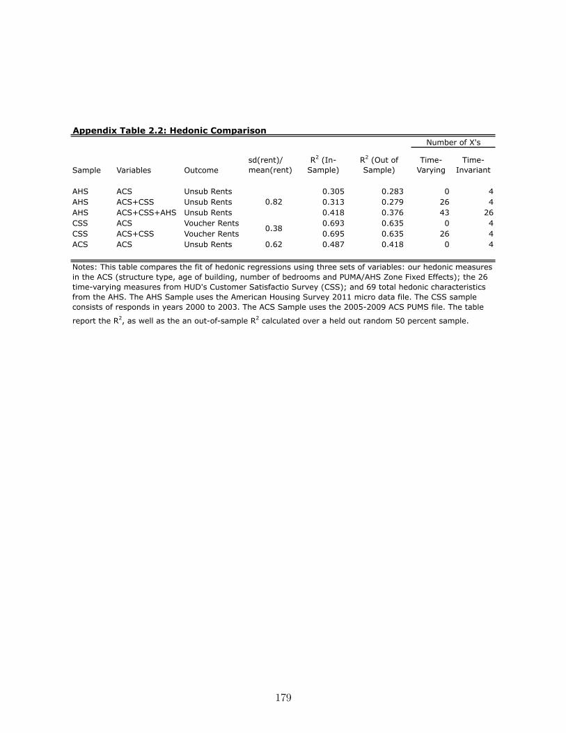
Sample Variables Outcomesd(rent)/mean(rent)
R2 (In-Sample)
R2 (Out of Sample)
Time-Varying
Time-Invariant
AHS ACS Unsub Rents 0.305 0.283 0 4AHS ACS+CSS Unsub Rents 0.313 0.279 26 4AHS ACS+CSS+AHS Unsub Rents 0.418 0.376 43 26CSS ACS Voucher Rents 0.693 0.635 0 4CSS ACS+CSS Voucher Rents 0.695 0.635 26 4ACS ACS Unsub Rents 0.62 0.487 0.418 0 4
Appendix Table 2.2: Hedonic Comparison
0.82
0.38
Notes: This table compares the fit of hedonic regressions using three sets of variables: our hedonic measures in the ACS (structure type, age of building, number of bedrooms and PUMA/AHS Zone Fixed Effects); the 26 time-varying measures from HUD's Customer Satisfactio Survey (CSS); and 69 total hedonic characteristics from the AHS. The AHS Sample uses the American Housing Survey 2011 micro data file. The CSS sample consists of responds in years 2000 to 2003. The ACS Sample uses the 2005-2009 ACS PUMS file. The table
report the R2, as well as the an out-of-sample R2 calculated over a held out random 50 percent sample.
Number of X's
179
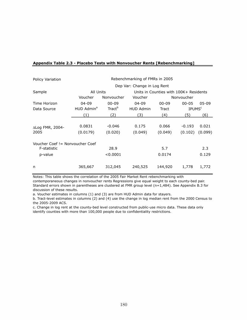
Appendix Table 2.3 - Placebo Tests with Nonvoucher Rents [Rebenchmarking]
Policy Variation
SampleVoucher Nonvoucher Voucher
Time Horizon 04-09 00-09 04-09 00-09 00-05 05-09Data Source HUD Admina Tractb HUD Admin Tract
(1) (2) (3) (4) (5) (6)
0.0831 -0.046 0.175 0.066 -0.193 0.021
(0.0179) (0.020) (0.049) (0.049) (0.102) (0.099)
Voucher Coef != Nonvoucher Coef F-statistic 28.9 5.7 2.3
p-value <0.0001 0.0174 0.129
n 365,667 312,045 240,525 144,920 1,778 1,772
ΔLog FMR, 2004-2005
Notes: This table shows the correlation of the 2005 Fair Market Rent rebenchmarking with contemporaneous changes in nonvoucher rents Regressions give equal weight to each county-bed pair. Standard errors shown in parentheses are clustered at FMR group level (n=1,484). See Appendix B.3 for discussion of these results.a. Voucher estimates in columns (1) and (3) are from HUD Admin data for stayers.b. Tract-level estimates in columns (2) and (4) use the change in log median rent from the 2000 Census to the 2005-2009 ACS.c. Change in log rent at the county-bed level constructed from public-use micro data. These data only identify counties with more than 100,000 people due to confidentiality restrictions.
Rebenchmarking of FMRs in 2005
Dep Var: Change in Log Rent
All Units Units in Counties with 100K+ ResidentsNonvoucher
IPUMSc
180
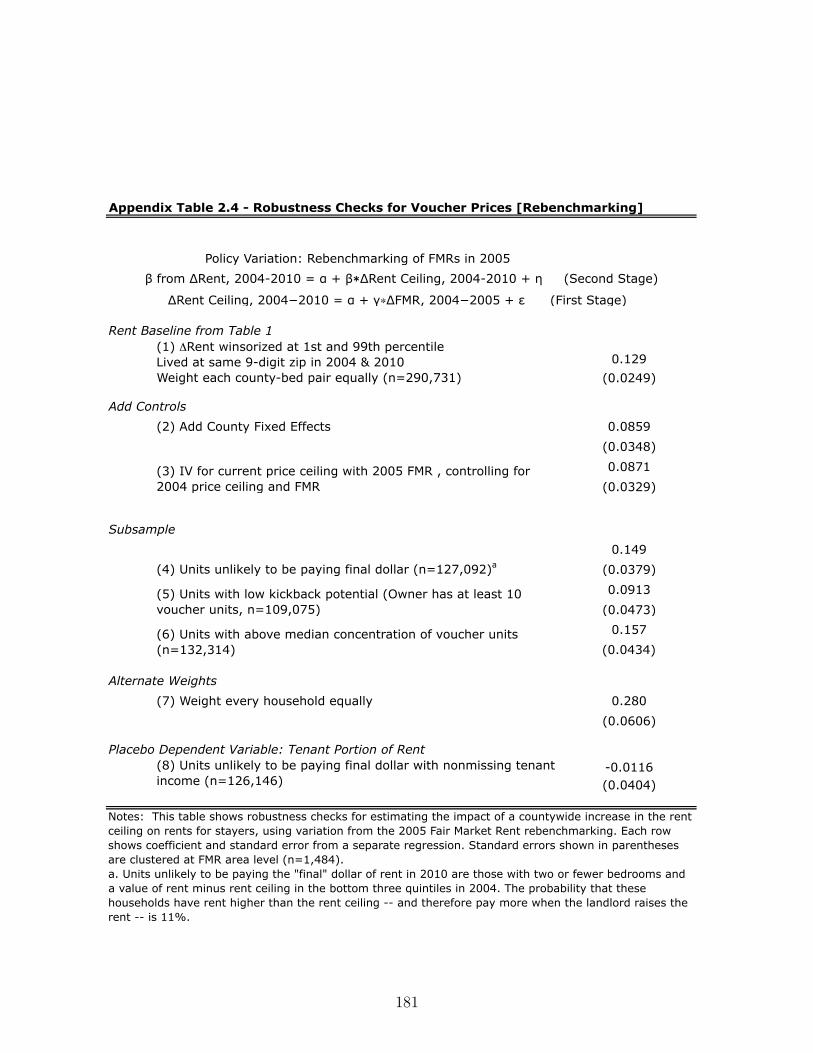
Appendix Table 2.4 - Robustness Checks for Voucher Prices [Rebenchmarking]
Policy Variation: Rebenchmarking of FMRs in 2005
Rent Baseline from Table 1
0.129 (0.0249)
Add Controls
(2) Add County Fixed Effects 0.0859
(0.0348)
0.0871
(0.0329)
Subsample
0.149
(0.0379)
0.0913
(0.0473)
0.157
(0.0434)
Alternate Weights
(7) Weight every household equally 0.280
(0.0606)
Placebo Dependent Variable: Tenant Portion of Rent-0.0116(0.0404)
(6) Units with above median concentration of voucher units (n=132,314)
(8) Units unlikely to be paying final dollar with nonmissing tenant income (n=126,146)
Notes: This table shows robustness checks for estimating the impact of a countywide increase in the rent ceiling on rents for stayers, using variation from the 2005 Fair Market Rent rebenchmarking. Each row shows coefficient and standard error from a separate regression. Standard errors shown in parentheses are clustered at FMR area level (n=1,484).a. Units unlikely to be paying the "final" dollar of rent in 2010 are those with two or fewer bedrooms and a value of rent minus rent ceiling in the bottom three quintiles in 2004. The probability that these households have rent higher than the rent ceiling -- and therefore pay more when the landlord raises the rent -- is 11%.
β from ΔRent, 2004-2010 = α + β∗ΔRent Ceiling, 2004-2010 + η (Second Stage)
ΔRent Ceiling, 2004−2010 = α + γ∗ΔFMR, 2004−2005 + ε (First Stage)
(1) ΔRent winsorized at 1st and 99th percentile Lived at same 9-digit zip in 2004 & 2010 Weight each county-bed pair equally (n=290,731)
(3) IV for current price ceiling with 2005 FMR , controlling for 2004 price ceiling and FMR
(4) Units unlikely to be paying final dollar (n=127,092)a
(5) Units with low kickback potential (Owner has at least 10 voucher units, n=109,075)
181
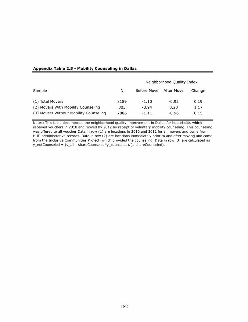
Sample N Before Move After Move Change
(1) Total Movers 8189 -1.10 -0.92 0.19(2) Movers With Mobility Counseling 303 -0.94 0.23 1.17(3) Movers Without Mobility Counseling 7886 -1.11 -0.96 0.15
Appendix Table 2.5 - Mobility Counseling in Dallas
Neighborhood Quality Index
Notes: This table decomposes the neighborhood quality improvement in Dallas for households which received vouchers in 2010 and moved by 2012 by receipt of voluntary mobility counseling. This counseling was offered to all voucher Data in row (1) are locations in 2010 and 2012 for all movers and come from HUD administrative records. Data in row (2) are locations immediately prior to and after moving and come from the Inclusive Communities Project, which provided the counseling. Data in row (3) are calculated as y_notCounseled = (y_all - shareCounseled*y_counseled)/(1-shareCounseled).
182

C. Appendix to Chapter 3
(Regression Kink)
This appendix reports additional tables and a proof of a proposition in Chapter 3.
C.1. Overview of Existing RK Papers
Table reported on next page.
183

TableC.1.:
Overview
ofEx
istingRK
Pape
rs
Pape
r:Po
licyVa
riable
OutcomeVa
riable
PreferredPo
lyno
mial/Es
timation
And
o(2013)
FederalS
ubsid
yGov’tEx
pend
iture
Linear/Q
uadratic
Blou
in(2013)
Forced
Labo
rInterethnicTr
ust
Cub
ic/Q
uintic
Böckerman
,Kan
ninen,
andSu
oniemi(2014)
Sickness
Insurance
Durationof
Sickness
Absence
Linear
Bravo(2011)
FederalS
ubsid
yLo
calR
evenue
Qua
dratic
Britt
o(2015)
UIb
enefits
Employmentdu
ratio
nLinear/Q
uadratic
Bulm
anan
dHoxby
(2015)
FederalT
axCredits
College
Attenda
nce
Linear/Q
uad/
Cub
icCardet
al.(2015)
UIB
enefits
UnemploymentDuration
Linear/Q
uadratic
Card,
John
ston
,Leung
,Mas,a
ndPe
i(2015)
UIB
enefits
UnemploymentDuration
Linear/Q
uadratic/C
CT
bias-corrected
Con
linan
dTho
mpson
(2015)
Cap
italS
ubsid
yTa
xRevenue,T
estscores
Qua
dratic/C
ubic
d’Astou
san
dSh
ore(2015)
Minim
umPa
yments
Delinqu
ency
Linear
(Di�-in
-Di�)
Dah
lberg,
Mörk,
Rattsø,
andÅgren
(2008)
FederalG
rant
Gov’tEx
pend
iture
Qua
dratic
Dob
biean
dSk
iba(2013)
Paycheck
Loan
Defau
ltLinear
Dob
ridge
(2016)
TaxRefun
dInvestment,CashHolding
Qua
dratic
Don
g(2016)
Retire
ment
Food
Expe
nditu
reQua
dratic
Engelset
al.(2015)
Pensiondedu
ctions
Labo
rsupp
lyLinear
Engström
,Nordb
lom,O
hlsson
,and
Persson(2015)
TaxLiab
ility
TaxBe
havior
Linear,Q
uadratic,C
ubic
Fean
dHollin
gswo
rth(2012)
Retire
ment
Health
Outcomes
Quintic
Fidrmuc
andTe
na(2013)
Minim
umWage
EmploymentStatus
Qua
dratic
Fritz
dixo
nan
dSk
iba(2016)
Loan
size
Loan
repa
yment
Linear,Q
uadratic,C
ubic
Garman
n(2014)
Vote
Share
Mun
icipal
Expe
nditu
re/T
axes
Cub
icto
6thorderpo
lyn.
Gelbe
ret
al.(2015)
Disa
bilityInsurance
Earnings
Linear,Q
uadratic,C
ubic
Han
son(2012)
Loan
Amou
ntInterest
Rates
Linear
Hua
ngan
dYa
ng(2016)
Reemploymentbo
nus
Labo
rsupp
lyLinear
Jones(2013)
EITC
Hou
rsWorked
Linear/Q
uadratic
Kisinan
dMan
ela(2014)
Fees
paid
byba
nks
Leniency
ofregu
latio
nQua
dratic/C
ubic
Kolsrud
(2013)
UIB
enefits
Asset
Accum
ulation
Linear/Q
uadratic
Kolsrud
etal.(2015b)
UIB
enefits
Unemploymentdu
ratio
nLinear/Q
uadratic/C
ubic
Kris
tensen,F
e,Be
ch,a
ndMainz
(2013)
Reimbu
rsem
entRate
HospitalP
rocess
Qua
lity
qMLE
Kyy
räan
dPe
sola
(2015)
UIb
enefits
Employment/earnings
Linear/Q
uadratic
Land
ais(2015)
UIB
enefits
Search
Duration
Linear
Lund
qvist
,Dah
lberg,
andMörk(2014)
FederalS
ubsid
yLo
calE
mployment
Qua
dratic
Man
olia
ndTu
rner
(2014)
EITC
College
Enrollm
ent
Linear
Marxan
dTu
rner
(2015)
College
Subsidy
Stud
entLo
ans
Linear
Messacar(2015)
PensionPlan
Retire
mentSa
ving
Linear
Nielse
n,Sø
rensen,a
ndTa
ber(2010)
College
Subsidy
Enrollm
ent
Linear
Peck
(2014)
%Em
ployees
Hiring
Linear/Q
uadratic
Scha
rleman
nan
dSh
ore(2015)
MortgageBa
lanceReductio
nMortgageDelinqu
ency
Linear
Seim
(2014)
TaxLiab
ility
Wealth
Accum
ulation
Linear
Simon
sen,
Skippe
r,an
dSk
ippe
r(2016)
DrugSu
bsidy
DrugEx
pend
iture
Linear
Sovago
(2015)
UIb
enefits
Unemploymentdu
ratio
n/re-employmentjobqu
ality
Linear/Q
uadratic
Sukh
atmean
dCramer
(2014)
App
licationPe
ndency
ofPa
tent
StockPr
ice
Linear
Turner
(2014)
College
Subsidy
Enrollm
ent
Linear
Won
g(2013)
%Et
hnic
grou
psHou
singPr
ices
Qua
rtic
184

C.2. Proof of Finite Sample Size of Permutation Test
Proposition: Under the Null Hypothesis of Policy Irrelevance and the Random Kink Locationassumption, there exists a test function „(v,y, k) for significance level – which has an exactfinite sample level of –.
Proof: Let K denote the number of potential kink points k drawn according to distribution
P . For any data vector (v,y) let
T
(1)(v,y) Æ T
(2)(v,y) Æ ... Æ T
(
¯
K)(v,y)
denote the kink estimates of T (v,y, k) ranked from smallest to largest.
For a given nominal level – œ (0, 1) and a two-sided test, we define the critical values c and
c as
c =5–
2 K6
and c = K ≠5–
2 K6
whereË
–
2
K
Èdenotes the largest integer less than or equal to –
2
K.
Let K+(v,y) and K
≠(v,y) denote the number of values T (j)(v,y) (j = 1, ... , K) that are
smaller than T
(c)(v,y) and greater than T
(c)(v,y), respectively, and let K
0(v,y) be the
total number of values of T (j)(v,y) (j = 1, ... , K) equal to T
(c)(v,y) or T (c)(v,y).
Define
a(v,y) = –K ≠ (K+(v,y) +K
≠(v,y))K
0(v,y)as the rejection probability in the case of a tie.
185

We can define a permutation test function „(v,y, k) which determines the probability of
rejecting the null hypothesis given a test statistic T (v,y, k):
„(v,y, k) =
Y________]
________[
1 , T (v,y, k) < T
(c)(v,y) or T (v,y, k) > T
(c)(v,y)
a(v,y) , T (v,y, k) = T
(c)(v,y) or T (v,y, k) = T
(c)(v,y)
0 , T
(c)(v,y) < T (v,y, k) < T
(c)(v,y)
This implies that for any realization of (v,y) we have that:
ÿ
kœK„(v,y, k) = K
+(v,y) +K
≠(v,y) + a(v,y) ·K0(v,y) = –K.
Note that under the Null Hypothesis of Policy Irrelevance, the distribution of (v,y) is invari-
ant to the realized location of the kink point. This implies that the test statistic T (v,y, k)
is also invariant to the realization of the kink point k
ú, since the test statistic depends on
the policy variable only through its e�ect on the outcome. Taking expectations of the ex-
pressions above over the distribution of the location of kink points which we had denoted as
P , we thus have
–K = E
P
[ÿ
kœK„(v,y, k)] =
ÿ
kœKE
P
[„(v,y, k)] = KE
P
[„(v,y, k)]
Thus, it follows that E
P
[„(v,y, k)] = – proving that the exact finite sample level of the
permutation test is –. ⌅
186
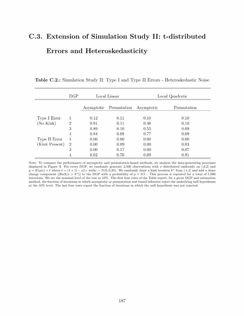
C.3. Extension of Simulation Study II: t-distributed
Errors and Heteroskedasticity
Table C.2.: Simulation Study II: Type I and Type II Errors - Heteroskedastic Noise
Note: To compare the performance of asymptotic and permutation-based methods, we analyze the data-generating processes
displayed in Figure 4. For every DGP, we randomly generate 2,500 observations with x distributed uniformly on [-2,2] and
y = E(y|x) + ‘ where ‘ = (1 + |1 ≠ x|) Á withÁ ≥ N(0, 0.25). We randomly draw a kink location k
úfrom [-1,1] and add a slope
change component (20x1(x > k
ú)) to the DGP with a probability of p = 0.5 . This process is repeated for a total of 1,000
iterations. We set the nominal level of the test to 10%. The first four rows of the Table report, for a given DGP and estimation
method, the fraction of iterations in which asymptotic or permutation test-based inference reject the underlying null hypotheses
at the 10% level. The last four rows report the fraction of iterations in which the null hypothesis was not rejected.
187
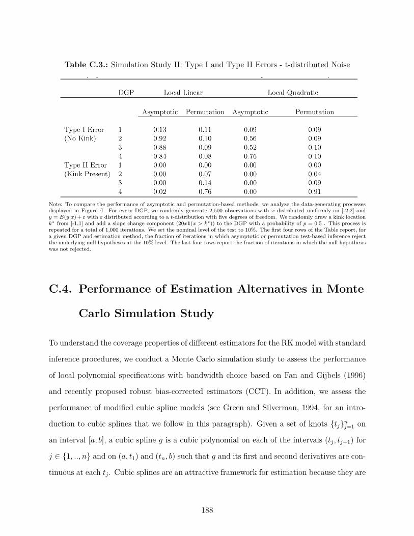
Table C.3.: Simulation Study II: Type I and Type II Errors - t-distributed Noise
Note: To compare the performance of asymptotic and permutation-based methods, we analyze the data-generating processes
displayed in Figure 4. For every DGP, we randomly generate 2,500 observations with x distributed uniformly on [-2,2] and
y = E(y|x)+ Á with Á distributed according to a t-distribution with five degrees of freedom. We randomly draw a kink location
k
úfrom [-1,1] and add a slope change component (20x1(x > k
ú)) to the DGP with a probability of p = 0.5 . This process is
repeated for a total of 1,000 iterations. We set the nominal level of the test to 10%. The first four rows of the Table report, for
a given DGP and estimation method, the fraction of iterations in which asymptotic or permutation test-based inference reject
the underlying null hypotheses at the 10% level. The last four rows report the fraction of iterations in which the null hypothesis
was not rejected.
C.4. Performance of Estimation Alternatives in Monte
Carlo Simulation Study
To understand the coverage properties of di�erent estimators for the RK model with standard
inference procedures, we conduct a Monte Carlo simulation study to assess the performance
of local polynomial specifications with bandwidth choice based on Fan and Gijbels (1996)
and recently proposed robust bias-corrected estimators (CCT). In addition, we assess the
performance of modified cubic spline models (see Green and Silverman, 1994, for an intro-
duction to cubic splines that we follow in this paragraph). Given a set of knots {tj
}nj=1
on
an interval [a, b], a cubic spline g is a cubic polynomial on each of the intervals (tj
, t
j+1
) for
j œ {1, .., n} and on (a, t1
) and (tn
, b) such that g and its first and second derivatives are con-
tinuous at each t
j
. Cubic splines are an attractive framework for estimation because they are
188

shown to be the solution to an optimal interpolation problem. More precisely, the solution
to the problem of finding the smoothest function that interpolates point (ti
, y
i
) is a natural
cubic spline. A cubic spline is a natural cubic spline if it is linear on the extreme intervals
[a, t1
] and [tn
, b]. We adjust the cubic splines framework so that it can be used for estimation
of an RK model by placing a knot at 0 and additionally allowing for a change in the first
and second derivative at this special knot. We choose the total number of equally-spaced
knots based on a generalized cross-validation criterion (Wahba, 1990).
For the Monte Carlo study, we use the same DGPs as in the previous section (see Figure 4)
and include a non-zero kink at x = 0. For each of 250 draws, we compute an RK estimate
and a 95% confidence interval using asymptotic heteroskedasticity-robust standard errors
or CCT’s standard errors for their bias-corrected estimators. Coverage denotes the fraction
of confidence intervals - for a given specification - that cover the true slope change of 20.
Interval length is the average length of the confidence interval for a given estimation method.
Both linear and quadratic models have quite low empirical coverage of the true estimate
when the DGP is non-linear. Coverage is better and close to nominal for the piece-wise
linear model further supporting our conjecture that non-linearity is the underlying root
cause for poor performance of local linear and quadratic models in some RK settings. Cubic
specifications come close to attaining 95% nominal coverage. The model based on CCT’s
bias-corrected estimator leads to larger intervals than both local polynomial estimators but
has coverage that is close to nominal for DGPs 2 through 4 and a coverage of 1 in the case
of the piece-wise linear DGP 1. The cubic spline model attains close to nominal coverage for
DGPs 1, 2, and 4 and coverage of 84% for DGP 3. However, the interval length for the cubic
spline specifications is substantially larger than that of CCT’s cubic estimator suggesting
that the latter may be a more e�cient estimator for RK setup. We conclude that in RK
settings for these DGPs, cubic specifications based on CCT’s procedure are the preferred
estimator.
189
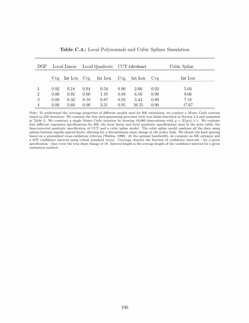
Table C.4.: Local Polynomials and Cubic Splines Simulation
Note: To understand the coverage properties of di�erent models used for RK estimation, we conduct a Monte Carlo exercise
based on 250 iterations. We examine the four data-generating processes with true kinks described in Section 4.2 and examined
in Table 2. We construct a single Monte Carlo iteration by drawing 10,000 observations with y = E(y|x) + Á. We evaluate
four di�erent regression specifications for RK: the local linear and local quadratic specifications used in the prior table, the
bias-corrected quadratic specification of CCT and a cubic spline model. The cubic spline model analyzes all the data using
splines between equally-spaced knots, allowing for a discontinuous slope change at the policy kink. We choose the knot spacing
based on a generalized cross-validation criterion (Wahba, 1990). At the optimal bandwidth, we compute an RK estimate and
a 95% confidence interval using robust standard errors. Coverage denotes the fraction of confidence intervals - for a given
specification - that cover the true slope change of 10. Interval length is the average length of the confidence interval for a given
estimation method.
190