Embed Size (px)
Citation preview
Data Visualisation in SPM:
An introduction
Data Visualisation in SPM:Data Visualisation in SPM:
An introductionAn introduction
Alexa MorcomAlexa Morcom
Edinburgh SPM course, April 2013Edinburgh SPM course, April 2013

Visualising results
• After the results table - what next?
• Exploring your results
• Displaying them for publication
SP
Mm
ip
[-3
0,
3,
-9]
<
< <
SPM{T25
}
remembered vs. fixation
SPMresults: .\dm rfx\enc\fxvsbase\rvbaseP
Height threshold T = 5.948441 {p<0.05 (FWE)}
Extent threshold k = 0 voxels
Design matrix
0.5 1 1.5 2 2.5
5
10
15
20
25
contrast(s)
3
0 0.1 0.2 0.3 0.4 0.5 0.6 0.7 0.8 0.9 10
50
100
150
200
250
Statistics: p-values adjusted for search volume
set-levelc p
cluster-levelp
FWE-corrq
FDR-corrp
uncorrk
E
peak-levelp
FWE-corrq
FDR-corrpuncorr
T (Z≡
)mm mm mm
table shows 3 local maxima more than 8.0mm apart
Height threshold: T = 5.95, p = 0.000 (0.050)Extent threshold: k = 0 voxels, p = 1.000 (0.050)Expected voxels per cluster, <k> = 1.925Expected number of clusters, <c> = 0.05FWEp: 5.948, FDRp: 8.239, FWEc: 1, FDRc: 9
Degrees of freedom = [1.0, 25.0]FWHM = 14.5 14.7 14.6 mm mm mm; 4.8 4.9 4.9 {voxels}Volume: 1572858 = 58254 voxels = 457.1 reselsVoxel size: 3.0 3.0 3.0 mm mm mm; (resel = 114.58 voxels)
0.000 20 0.000 0.000 460 0.000 0.000 0.000 16.85 7.84 0.000 3 0 60
0.000 0.000 271 0.000 0.000 0.002 10.99 6.58 0.000 -30 3 -9
0.000 0.013 8.80 5.88 0.000 -21 3 12
0.004 0.135 7.25 5.27 0.000 -33 30 -12
0.000 0.000 816 0.000 0.000 0.003 10.26 6.37 0.000 -45 12 24
0.000 0.003 10.23 6.36 0.000 -48 0 51
0.000 0.006 9.57 6.15 0.000 -54 -6 45
0.000 0.000 90 0.000 0.000 0.003 10.01 6.29 0.000 -30 -93 -18
0.000 0.013 8.88 5.91 0.000 -30 -93 -9
0.000 0.000 207 0.000 0.000 0.006 9.51 6.13 0.000 -45 -60 -21
0.000 0.006 9.41 6.10 0.000 -42 -48 -27
0.000 0.001 35 0.000 0.000 0.013 8.84 5.90 0.000 63 3 27
0.002 0.049 9 0.034 0.002 0.076 7.62 5.43 0.000 45 0 15
0.000 0.013 16 0.007 0.002 0.089 7.51 5.38 0.000 -27 -63 45
0.000 0.001 32 0.000 0.003 0.108 7.39 5.33 0.000 57 -6 39
0.000 0.000 55 0.000 0.004 0.138 7.21 5.26 0.000 27 0 0
0.008 0.243 6.84 5.09 0.000 27 3 -9
0.016 0.429 6.51 4.94 0.000 21 12 3
0.000 0.001 33 0.000 0.005 0.151 7.14 5.22 0.000 30 -96 -15
0.004 0.101 6 0.076 0.005 0.164 7.06 5.19 0.000 9 6 27
0.000 0.008 19 0.004 0.017 0.429 6.50 4.93 0.000 -27 -48 45
Page 1
• What to plot?
• Overlays
– Slices, sections, render in SPM
– Utilities
• Effect plots
– Types of plot options in SPM
– For 1st & 2nd level models
– Utilities
Overview
What to plot?
Golden rule:
• Plot what you are using to make your inferences
• Applies to overlays e.g. thresholding
• Applies to contrast and event-related plots e.g. use of peri-stimulus time histograms
What to plot?
• Overlays
– Visualisation of regional results on a brain
image
– ‘Big picture’ – distribution, location
• Effect plots
– Visualisation of effects at a single voxel
Overlay: sections
• From Results
– Display � overlay
• Sections
– Plots the current thresholded SPM
– Superimposes it on orthogonal sections
– Can use any image for display
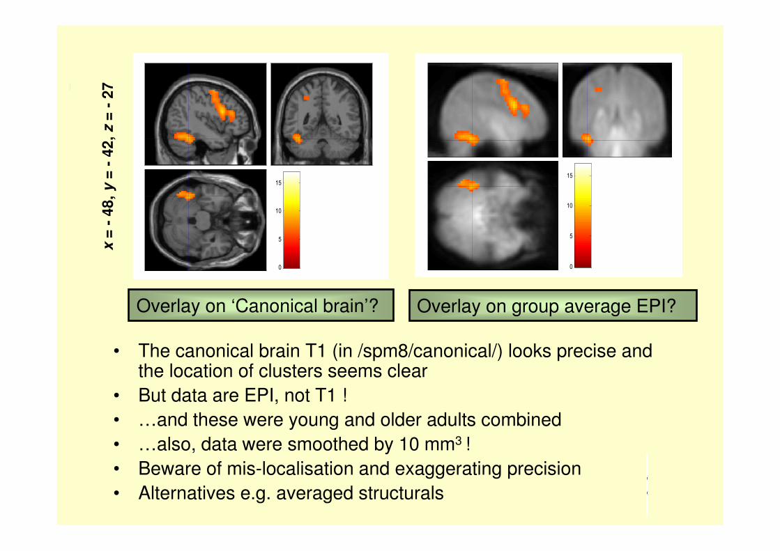
Overlay on ‘Canonical brain’? Overlay on group average EPI?
• The canonical brain T1 (in /spm8/canonical/) looks precise and the location of clusters seems clear
• But data are EPI, not T1 !
• …and these were young and older adults combined
• …also, data were smoothed by 10 mm3 !
• Beware of mis-localisation and exaggerating precision
• Alternatives e.g. averaged structurals
0
5
10
15
0
5
10
15
x =
-4
8,
y=
-4
2,
z=
-2
7
Overlay: slices
• From Results
– Display � overlay
• Slices
– Plots the current thresholded SPM
– Superimposes it on horizontal slices
– Can use any image for display

Activity overlaid on slices from a ‘canonical brain’ T1 image
• Plots 3 horizontal slices
• Uses the slices above & below the slice with the index voxel
• Crosshairs (if seen) are at same x and y coordinates
• Distance apart depends on voxel size after normalisation
• NOTE: T values are relative
x =
-4
8,
y=
-4
2,
z=
-2
7
z = -30mm z = -27mm z = -24mm T value
0
2
4
6
8
Overlay: render
• From Results
– Display � overlay
• Render
– Plots the current thresholded SPM
– Projects it onto the surface of the brain
– Can use any image for display if create
your own render file from it

Activity for 2 subject groups for the same contrast rendered on ‘canonical brain’ T1 image
• Here thresholds are P < 0.001, 5 voxels (previously FWE)
• Active voxels are projected onto brain surface so
highlights surface clusters
• Display is of integral of T values
• Increasing depth � exponential decay of intensity (50% at 10 mm)

Overlay guidelines
Show what your inference is based on
• Ideally, thresholds the same for analysis & figures
• Scatterplots for individual differences analysis
Give sufficient details for publication
• e.g. note in legend any ‘masking out’ of some regions
in creating overlay
Whole-image inspection & possible publication
• Unthresholded statistical maps & effect size images
• …are non-significant effects really absent?
• Useful for meta-analysis
• Can check brain mask
Plots in SPM
Different options for 1st or 2nd level model
• Single subject plots
– Show single subject effects
– Effects fitted to individual timeseries
• Group level plots
– Show group level effects
– Effects fitted to group con* images

Single subject plots
At 1st level
• Contrast estimates with 90% CI
• Fitted/ adjusted responses
• Event-related responses
• Parametric plots
• Volterra plots
At 2nd level
• Contrast estimates with 90% CI
• Fitted/ adjusted responses
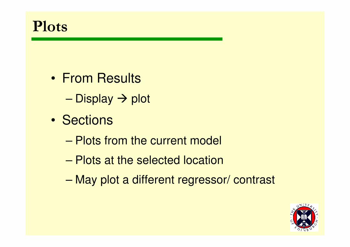
Plots
• From Results
– Display � plot
• Sections
– Plots from the current model
– Plots at the selected location
– May plot a different regressor/ contrast
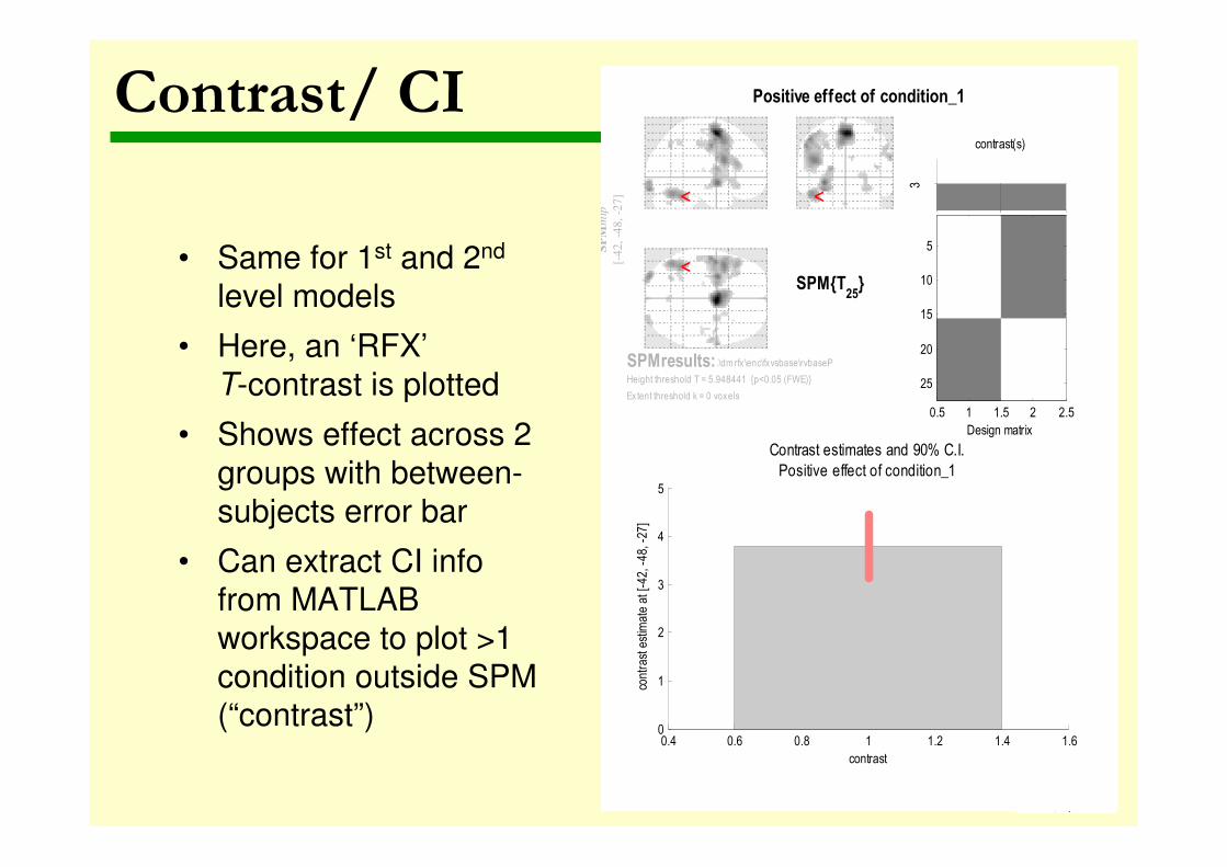
Contrast/ CI
• Same for 1st and 2nd
level models
• Here, an ‘RFX’
T-contrast is plotted
• Shows effect across 2
groups with between-
subjects error bar
• Can extract CI info
from MATLAB
workspace to plot >1
condition outside SPM (“contrast”)
SP
Mm
ip
[-4
2,
-48,
-27]
<
< <
SPM{T25
}
Positive effect of condition_1
SPMresults: .\dm rfx \enc\fxvsbase\rvbaseP
Height threshold T = 5.948441 {p<0.05 (FWE)}
Extent threshold k = 0 voxels
Design matrix
0.5 1 1.5 2 2.5
5
10
15
20
25
contrast(s)
3
0.4 0.6 0.8 1 1.2 1.4 1.60
1
2
3
4
5
contrast
cont
rast
est
imat
e at
[-42
, -48
, -27
]
Contrast estimates and 90% C.I.
Positive effect of condition_1

Contrast/CI
• Here, a ‘FFX’ F-contrast
is plotted
• Shows same contrast at single subject level
• But here an F-contrast
is used to look at effects for the 3 basis
functions – canonical,
and temporal/
dispersion derivatives
• Can do for >1 condition
within same model if
create F contrast

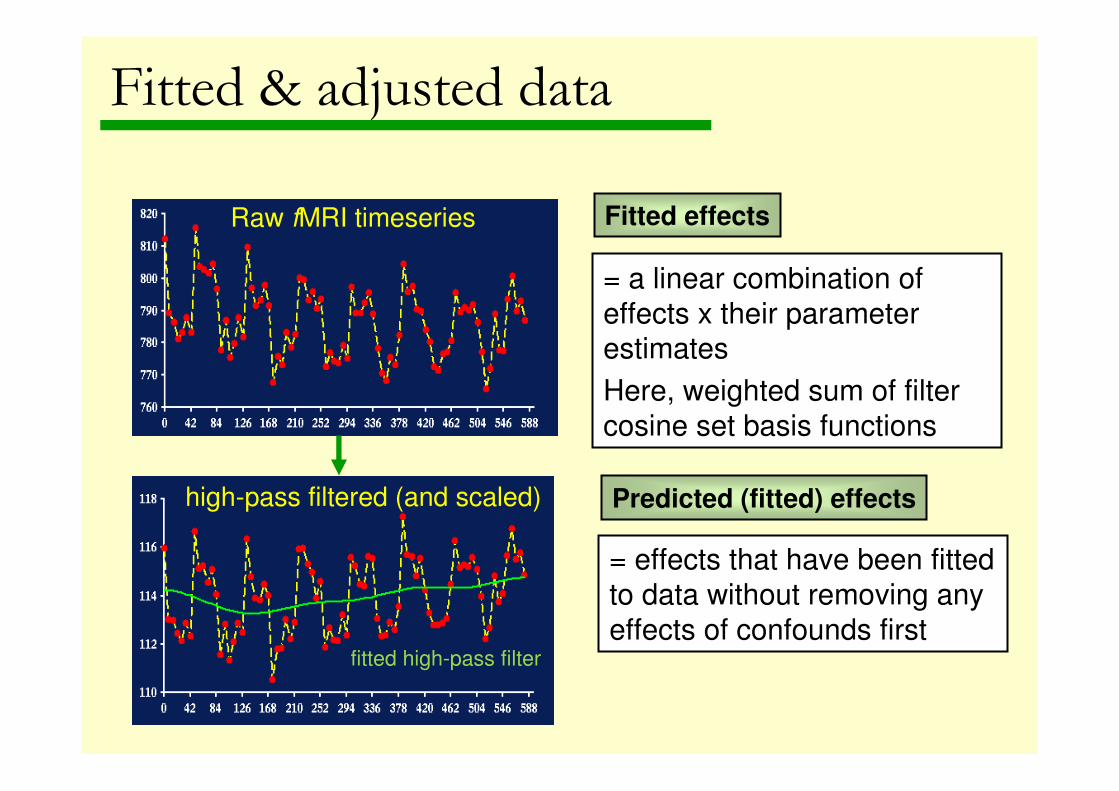
Raw fMRI timeseries
Residuals high-pass filtered (and scaled)
fitted high-pass filter
Adjusted data
fitted box-car
Fitted & adjusted data
Raw fMRI timeseries
high-pass filtered (and scaled)
fitted high-pass filter
Fitted & adjusted data
Fitted effects
= a linear combination of
effects x their parameter estimates
Here, weighted sum of filter
cosine set basis functions
Predicted (fitted) effects
= effects that have been fitted
to data without removing any
effects of confounds first
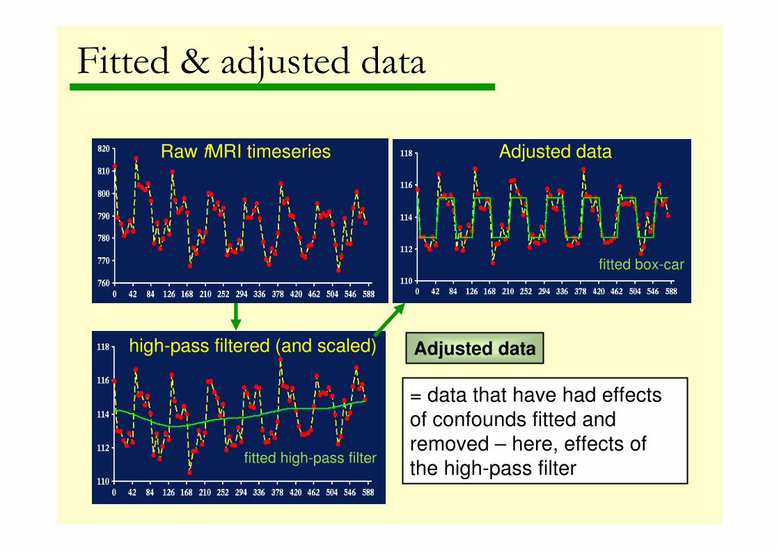
Raw fMRI timeseries
high-pass filtered (and scaled)
fitted high-pass filter
Adjusted data
fitted box-car
Fitted & adjusted data
Adjusted data
= data that have had effects
of confounds fitted and
removed – here, effects of
the high-pass filter

Predicted responses
Adjusted responses
Contrast fitted to raw data
Contrast fitted to
adjusted data
A note on units
• Parameter estimate beta (condition) is NOT the percent
voxel signal change associated with that condition
• Data have usually been scaled by multiplying every voxel
in every scan by '100/g' where g is the average value over
all time points and scans in that session
• Therefore the time series should have average = 100
• So beta (condition) is in units of % of 'global' signal, g.
• Can report in units of percent of 'local' signal by dividing
by the beta for the session constant, i.e. average signal in that voxel over and above the ‘global’ average
• (see utilities especially MarsBaR & rfxplot)

Fitted/ adjusted responses
Plot against
• A explanatory variable
– A variable in the model e.g. behavioural covariate
• (Scan or time)
• A user-specified ordinate
– Any array of correct size e.g. rescale x-axis to
show time (secs) not scan
– E.g. in 2nd level model…
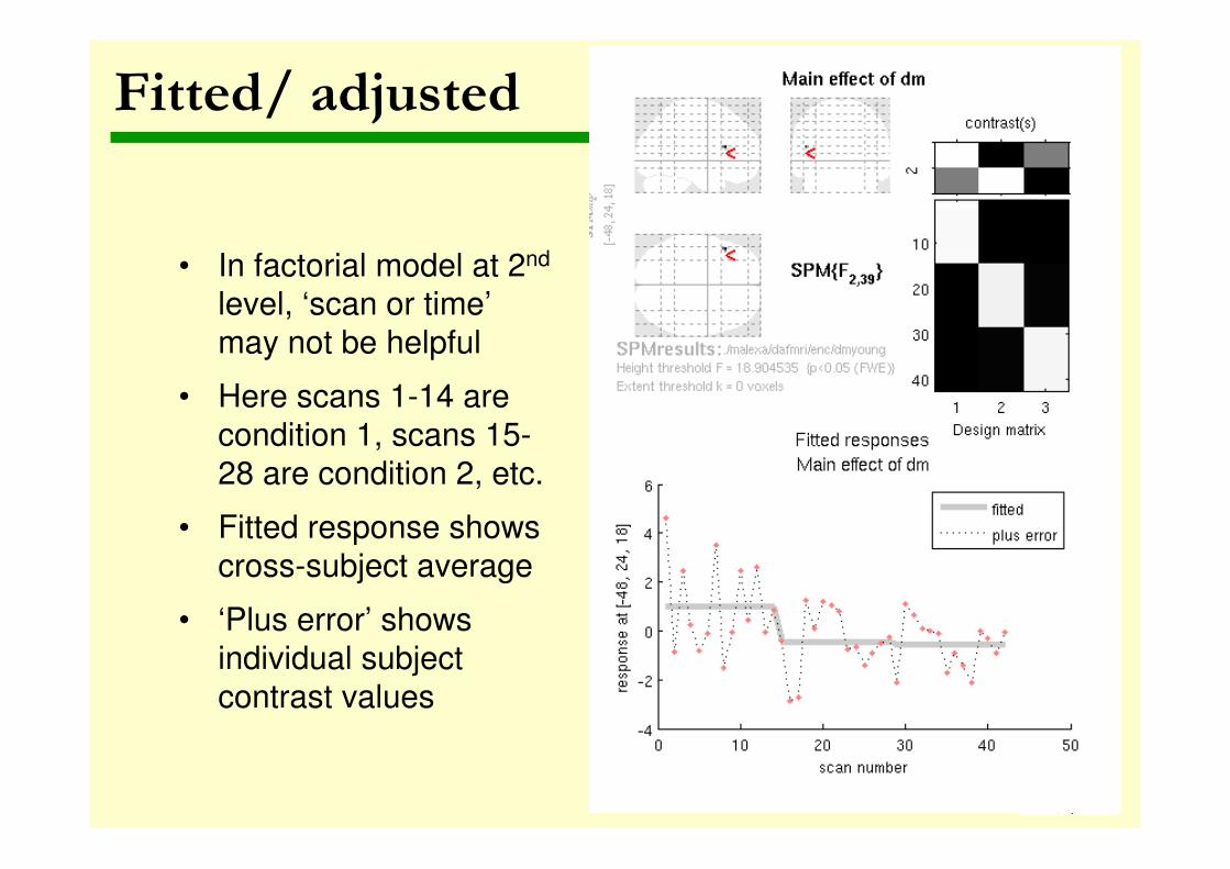
Fitted/ adjusted
• In factorial model at 2nd
level, ‘scan or time’
may not be helpful
• Here scans 1-14 are
condition 1, scans 15-
28 are condition 2, etc.
• Fitted response shows
cross-subject average
• ‘Plus error’ shows
individual subject
contrast values
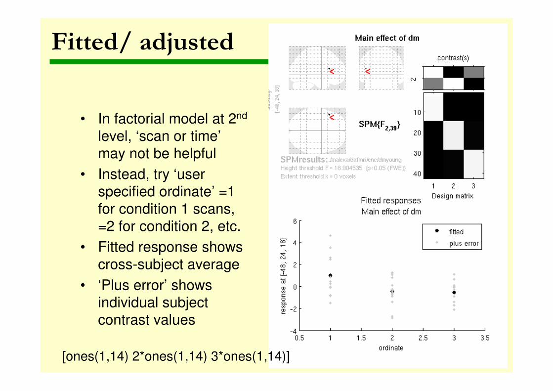
Fitted/ adjusted
• In factorial model at 2nd
level, ‘scan or time’
may not be helpful
• Instead, try ‘user
specified ordinate’ =1
for condition 1 scans,
=2 for condition 2, etc.
• Fitted response shows
cross-subject average
• ‘Plus error’ shows individual subject
contrast values
[ones(1,14) 2*ones(1,14) 3*ones(1,14)]
Event-related responses
Event-related responses are
• To a given event type
• Plotted in peri-stimulus, i.e., onset-centred, time
There are 3 types
• Fitted response and PSTH (Peri-Stimulus Time Histogram):
the ‘average’ response to an event type with mean signal
+/- SE for each peri-stimulus time bin.
• Fitted response and 90% CI: the ‘average’ response in peri-stimulus time along with a 90% confidence interval.
• Fitted response and adjusted data: plots the ‘average’
response in peri-stimulus time along with adjusted data

PSTH
• Peri-stimulus time: centered
around event onset
• Responses to event X are
‘averaged’ over the
timeseries
• SPM fits a Finite Impulse
Response (FIR) model to
do this – often NOT the
regressors used in the analysis
• Time bin size = TR
• Confidence intervals are
within subject/session
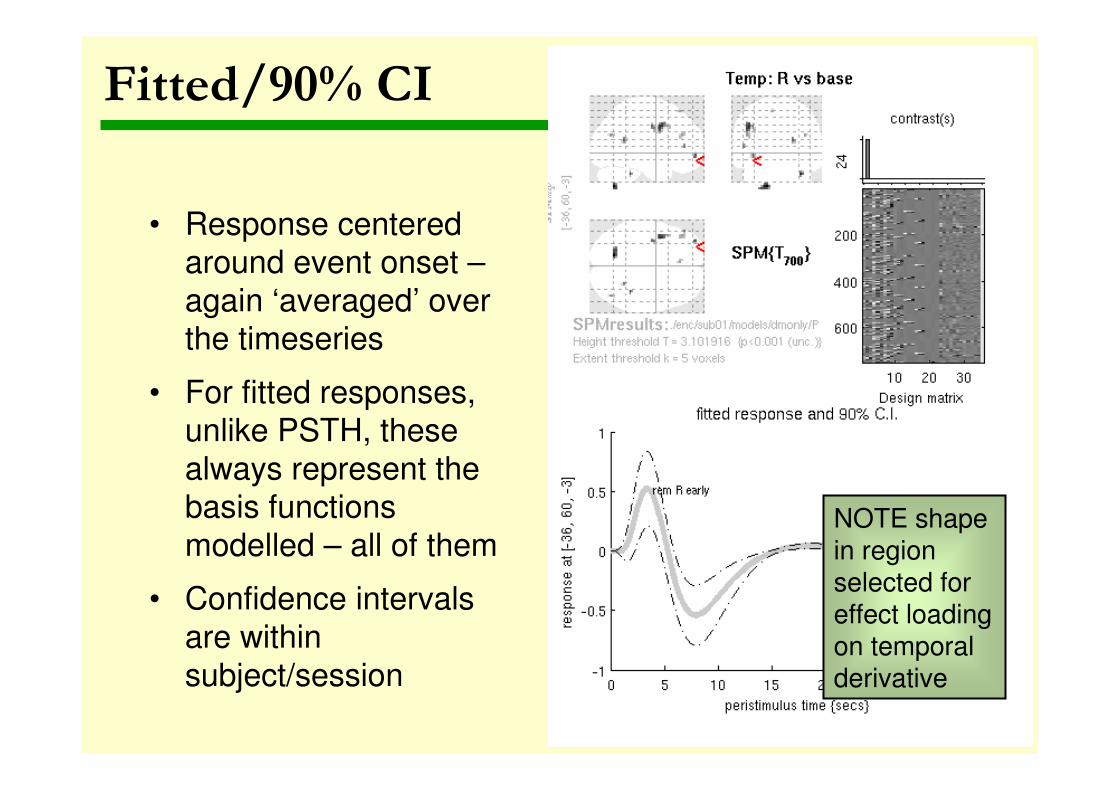
Fitted/90% CI
• Response centered around event onset –
again ‘averaged’ over the timeseries
• For fitted responses, unlike PSTH, these
always represent the basis functions
modelled – all of them
• Confidence intervals
are within
subject/session
NOTE shape in region selected for effect loading on temporal derivative
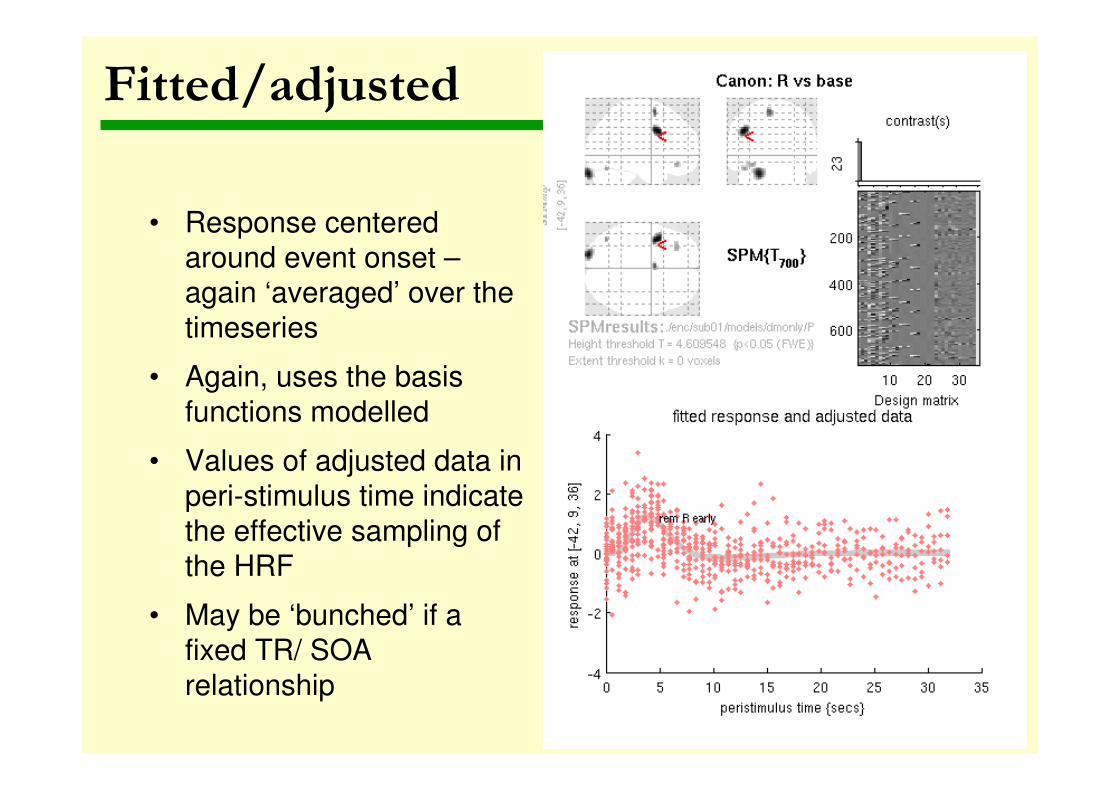
Fitted/adjusted
• Response centered
around event onset –again ‘averaged’ over the
timeseries
• Again, uses the basis
functions modelled
• Values of adjusted data in
peri-stimulus time indicate
the effective sampling of
the HRF
• May be ‘bunched’ if a
fixed TR/ SOA
relationship

Parametric responses
Effect of a ‘parametric modulator’
• Available at 1st level – select for any effect
with a pmod
• E.g. RT across trials – how does response
vary with speed?
• E.g. effect of time after which a stimulus
repeats – analysis of effects of ‘lag’ in trials
from face example dataset

Parametric responses
Parametric modulator is ‘lag’ (between repeated faces) An increase in ‘lag’ is associated with an decrease and then an increase in the BOLD responseImmediate repetition of a face produces a decrease (suppression) – then an increase, maximal for lag ~= 40
Other tips
• To make across-subject plots of first level
responses, e.g. event-related responses,
some tweaking is necessary
• Variables containing fitted & adjusted data
are in the MATLAB workspace: “Y” has the
fitted data, “y” the adjusted data
• Other utilities may help here
Utilities & resources
• FreeSurfer: http://surfer.nmr.mgh.harvard.edu/ - cortical models from
T1 sMRI for rendering & other functions
• PSTH utility – spm_graph hack for group PSTH with options by RH/
AM/ DG at http://www.brain.northwestern.edu/cbmg/cbmg-tools/
• MarsBaR – M Brett’s region of interest toolbox with RFX plot utilities at http://marsbar.sourceforge.net/
• Rfxplot – excellent utility by J Glascher, shortly to be updated for
SPM8, at http://neuro.imm.dtu.dk/wiki/Rfxplot
• Short guidelines: Poldrack RA, Fletcher PC,Henson RN, Worsley KJ,
Brett M,Nichols TE. Guidelines for reporting an fMRI study.
Neuroimage. 2008 40(2): 409–414. Unthresholded maps: Jernigan TL,
Gamst AC, Fennema-Notestine C, Ostergaard AL. More "mapping" in
brain mapping: statistical comparison of effects. Hum Brain Mapp.
2003. 19(2):90-5.
• On error bars: Masson, M. E. J., & Loftus, G. R. Using confidence
intervals for graphically based data interpretation. Can J Exp Psychol.
2003. 57: 203-220.


![SPM-Course Edinburgh, April 2010 DCM: Dynamic Causal ... · DCM: Dynamic Causal Modelling for fMRI Wellcome Trust Centre for Neuroimaging SPM-Course Edinburgh, April 2010 DCM [default]](https://img.pdfslide.us/doc/110x75/5e1fe72a6b658d4a1a769163/spm-course-edinburgh-april-2010-dcm-dynamic-causal-dcm-dynamic-causal-modelling.jpg)