Embed Size (px)
Citation preview
Data and Data Data and Data AnalysisAnalysis
Measures of Central Measures of Central TendencyTendency
Used to interpret data by choosing one number to represent all Used to interpret data by choosing one number to represent all the numbers in the data set.the numbers in the data set.
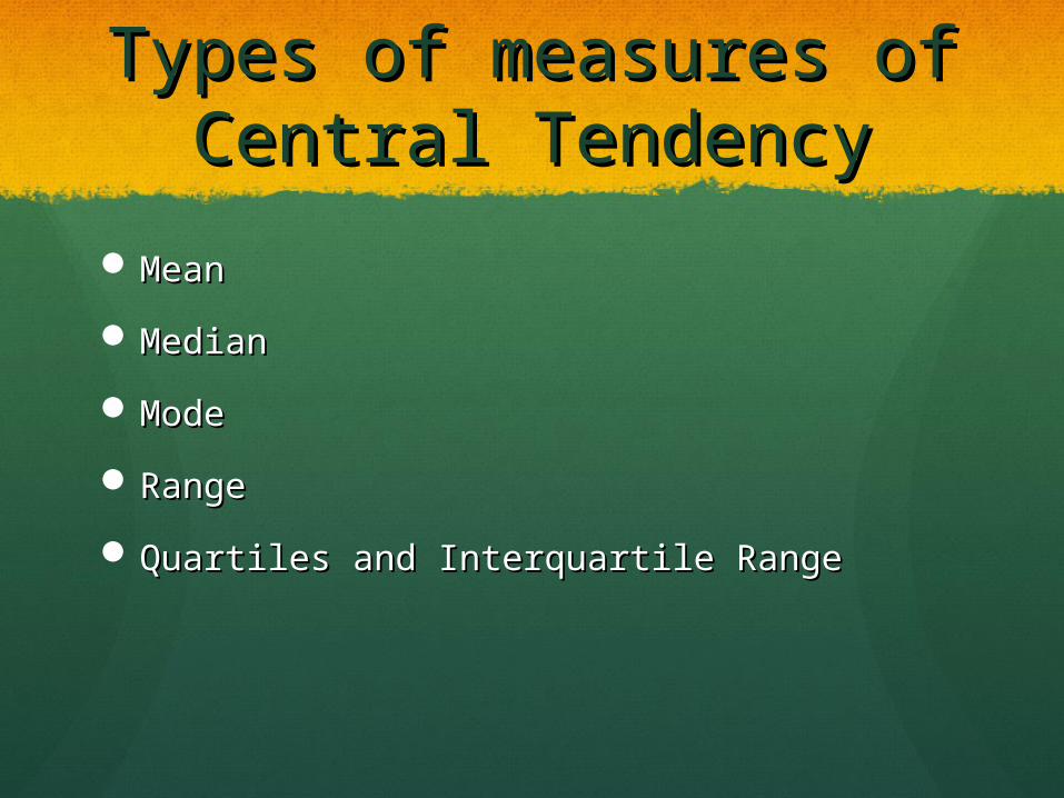
Types of measures of Types of measures of Central TendencyCentral Tendency
MeanMean
MedianMedian
ModeMode
RangeRange
Quartiles and Interquartile RangeQuartiles and Interquartile Range
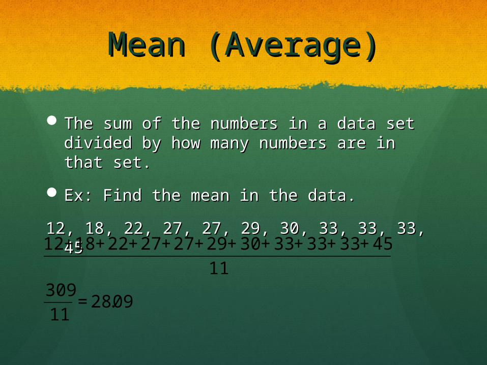
Mean (Average)Mean (Average)
The sum of the numbers in a data set divided The sum of the numbers in a data set divided by how many numbers are in that set.by how many numbers are in that set.
Ex: Find the mean in the data.Ex: Find the mean in the data.
12, 18, 22, 27, 27, 29, 30, 33, 33, 33, 4512, 18, 22, 27, 27, 29, 30, 33, 33, 33, 45
€
12 +18 +22 +27 +27 +29 + 30 + 33+ 33+ 33+ 45
11309
11= 28.09
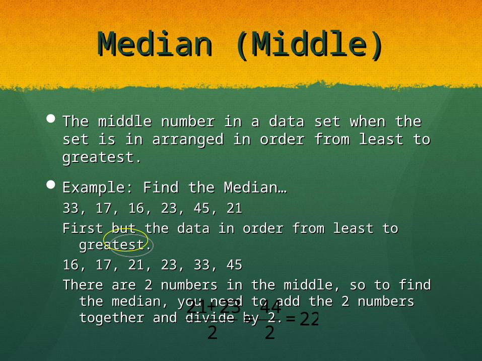
Median (Middle)Median (Middle)
The middle number in a data set when the set The middle number in a data set when the set is in arranged in order from least to greatest.is in arranged in order from least to greatest.
Example: Find the Median…Example: Find the Median…33, 17, 16, 23, 45, 2133, 17, 16, 23, 45, 21
First but the data in order from least to greatest.First but the data in order from least to greatest.
16, 17, 21, 23, 33, 4516, 17, 21, 23, 33, 45
There are 2 numbers in the middle, so to find the There are 2 numbers in the middle, so to find the median, you need to add the 2 numbers median, you need to add the 2 numbers together and divide by 2.together and divide by 2.
€
21+23
2=44
2= 22
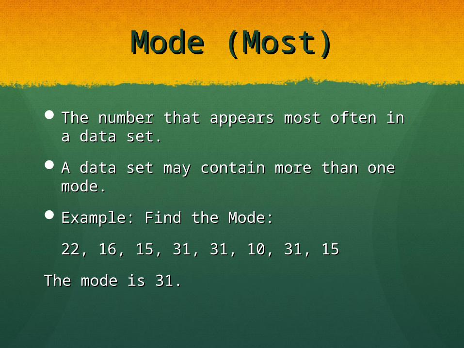
Mode (Most)Mode (Most)
The number that appears most often in a The number that appears most often in a data set.data set.
A data set may contain more than one mode.A data set may contain more than one mode.
Example: Find the Mode:Example: Find the Mode:
22, 16, 15, 31, 31, 10, 31, 1522, 16, 15, 31, 31, 10, 31, 15
The mode is 31.The mode is 31.
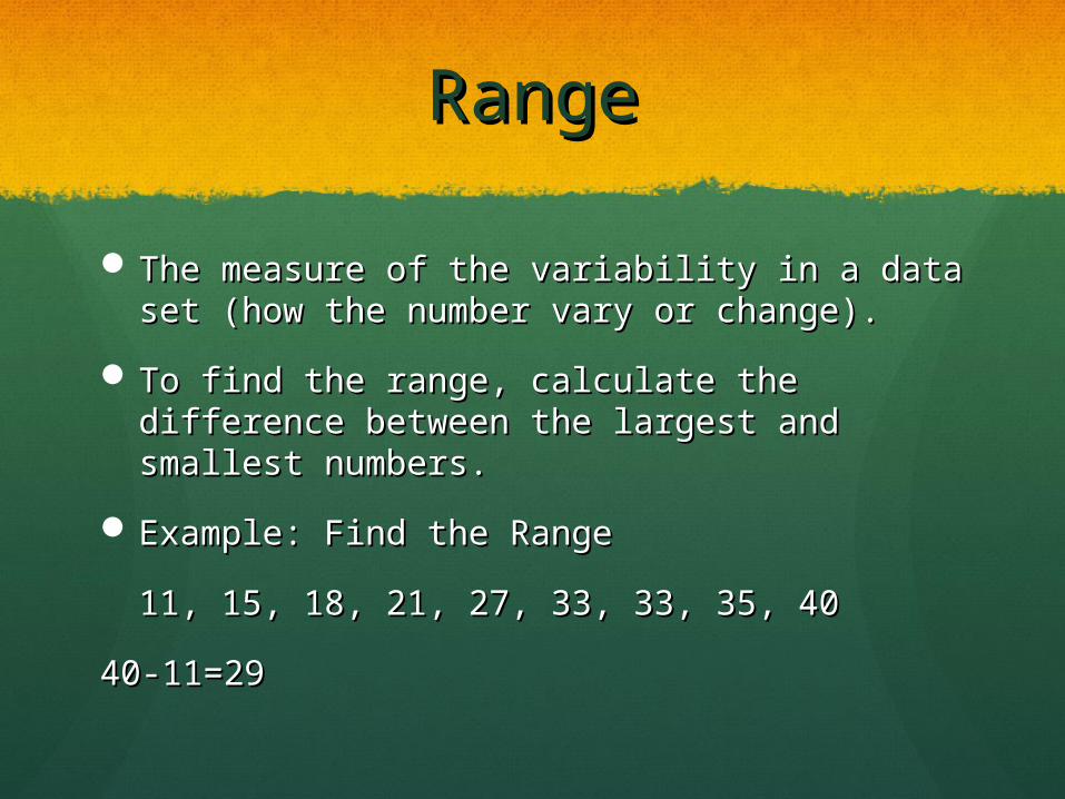
RangeRange
The measure of the variability in a data set The measure of the variability in a data set (how the number vary or change).(how the number vary or change).
To find the range, calculate the difference To find the range, calculate the difference between the largest and smallest numbers.between the largest and smallest numbers.
Example: Find the RangeExample: Find the Range
11, 15, 18, 21, 27, 33, 33, 35, 4011, 15, 18, 21, 27, 33, 33, 35, 40
40-11=2940-11=29
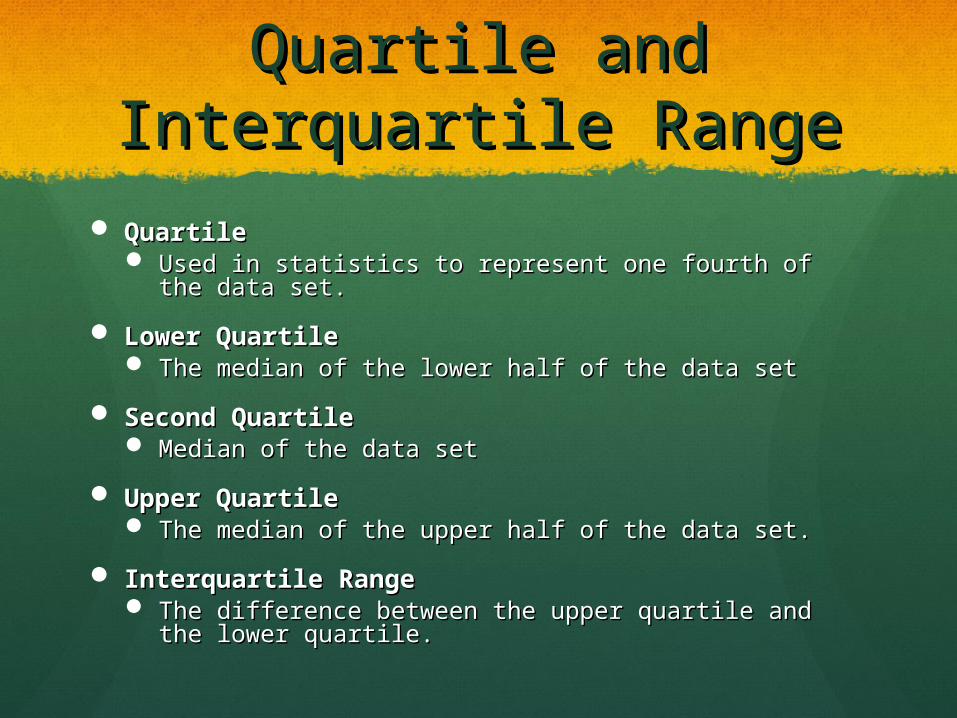
Quartile and Quartile and Interquartile RangeInterquartile Range
QuartileQuartile Used in statistics to represent one fourth of the data Used in statistics to represent one fourth of the data
set.set.
Lower QuartileLower Quartile The median of the lower half of the data setThe median of the lower half of the data set
Second QuartileSecond Quartile Median of the data setMedian of the data set
Upper QuartileUpper Quartile The median of the upper half of the data set.The median of the upper half of the data set.
Interquartile RangeInterquartile Range The difference between the upper quartile and the The difference between the upper quartile and the
lower quartile.lower quartile.
Quartile ExampleQuartile Example
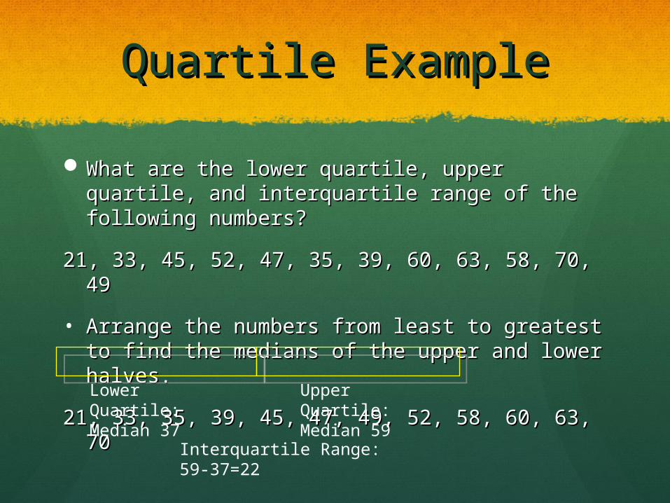
What are the lower quartile, upper quartile, What are the lower quartile, upper quartile, and interquartile range of the following and interquartile range of the following numbers?numbers?
21, 33, 45, 52, 47, 35, 39, 60, 63, 58, 70, 4921, 33, 45, 52, 47, 35, 39, 60, 63, 58, 70, 49
• Arrange the numbers from least to greatest Arrange the numbers from least to greatest to find the medians of the upper and lower to find the medians of the upper and lower halves. halves.
21, 33, 35, 39, 45, 47, 49, 52, 58, 60, 63, 7021, 33, 35, 39, 45, 47, 49, 52, 58, 60, 63, 70Lower Quartile:Median 37
Upper Quartile:Median 59
Interquartile Range:59-37=22
PercentilesPercentiles
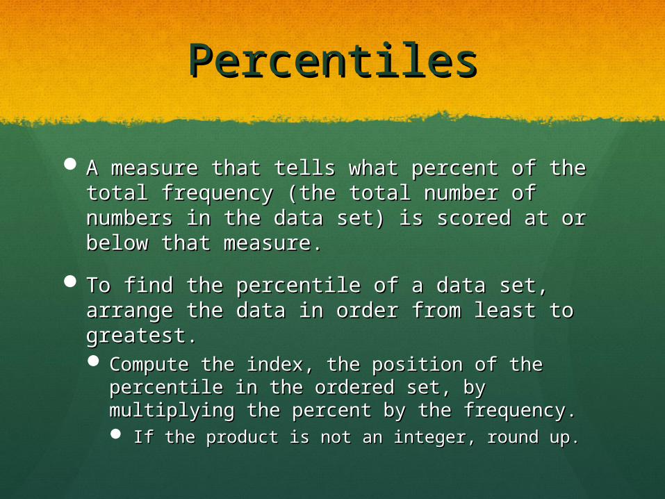
A measure that tells what percent of the total A measure that tells what percent of the total frequency (the total number of numbers in frequency (the total number of numbers in the data set) is scored at or below that the data set) is scored at or below that measure.measure.
To find the percentile of a data set, arrange To find the percentile of a data set, arrange the data in order from least to greatest.the data in order from least to greatest. Compute the index, the position of the Compute the index, the position of the
percentile in the ordered set, by multiplying the percentile in the ordered set, by multiplying the percent by the frequency.percent by the frequency. If the product is not an integer, round up.If the product is not an integer, round up.
Percentile ExamplePercentile Example
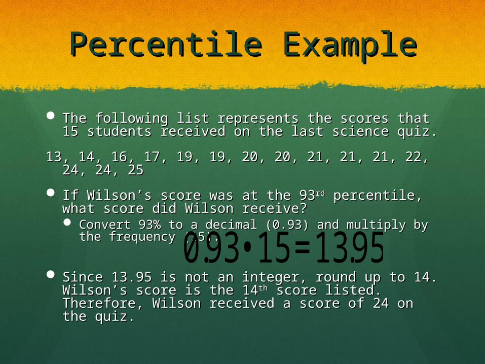
The following list represents the scores that 15 The following list represents the scores that 15 students received on the last science quiz.students received on the last science quiz.
13, 14, 16, 17, 19, 19, 20, 20, 21, 21, 21, 22, 24, 24, 13, 14, 16, 17, 19, 19, 20, 20, 21, 21, 21, 22, 24, 24, 2525
If Wilson’s score was at the 93If Wilson’s score was at the 93rdrd percentile, what percentile, what score did Wilson receive? score did Wilson receive? Convert 93% to a decimal (0.93) and multiply by the Convert 93% to a decimal (0.93) and multiply by the
frequency (15).frequency (15).
Since 13.95 is not an integer, round up to 14. Since 13.95 is not an integer, round up to 14. Wilson’s score is the 14Wilson’s score is the 14thth score listed. Therefore, score listed. Therefore, Wilson received a score of 24 on the quiz.Wilson received a score of 24 on the quiz.
€
0.93 • 15 =13.95
Representing DataRepresenting DataHere are the different graphs that can be used to represent Here are the different graphs that can be used to represent
data…data…
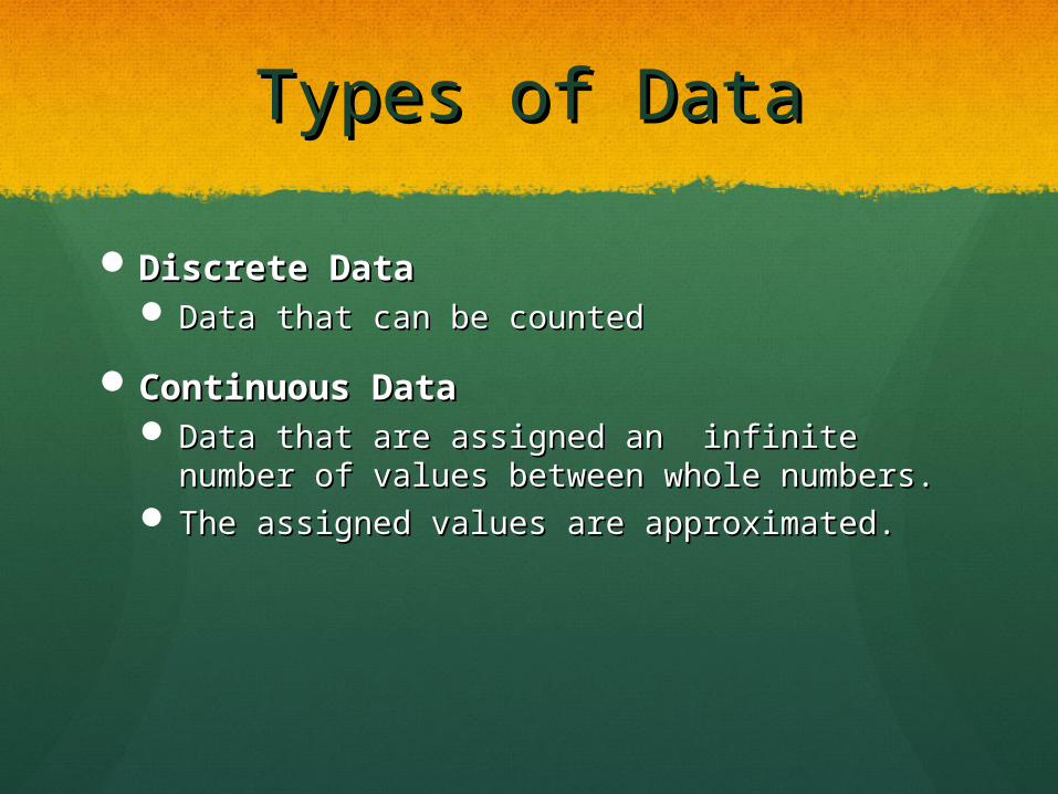
Types of DataTypes of Data
Discrete DataDiscrete Data Data that can be countedData that can be counted
Continuous DataContinuous Data Data that are assigned an infinite number of Data that are assigned an infinite number of
values between whole numbers.values between whole numbers. The assigned values are approximated.The assigned values are approximated.
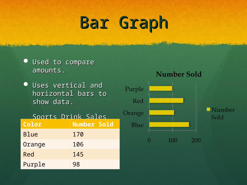
Bar GraphBar Graph
Used to compare Used to compare amounts.amounts.
Uses vertical and Uses vertical and horizontal bars to show horizontal bars to show data.data.
Sports Drink Sales Sports Drink Sales Color Number
Sold
Blue 170
Orange 106
Red 145
Purple 98
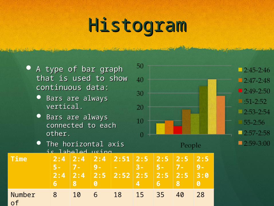
HistogramHistogram
A type of bar graph that A type of bar graph that is used to show is used to show continuous data:continuous data: Bars are always Bars are always
vertical.vertical. Bars are always Bars are always
connected to each connected to each other.other.
The horizontal axis is The horizontal axis is labeled using intervals.labeled using intervals.
Theater ArrivalsTheater ArrivalsTime 2:45-2:46
2:47-2:48
2:49-2:50
2:51-2:52
2:53-2:54
2:55-2:56
2:57-2:58
2:59-3:00
Number of People
8 10 6 18 15 35 40 28
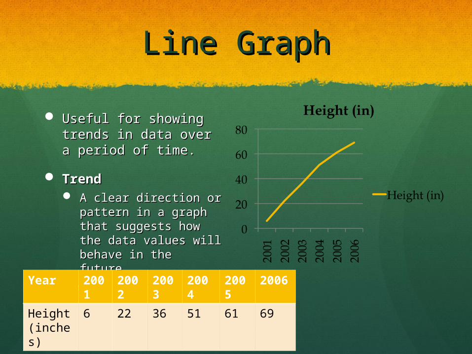
Line GraphLine Graph
Useful for showing Useful for showing trends in data over a trends in data over a period of time.period of time.
TrendTrend A clear direction or A clear direction or
pattern in a graph that pattern in a graph that suggests how the data suggests how the data values will behave in values will behave in the future.the future.
Pine Tree GrowthPine Tree GrowthYear 200
12002
2003
2004
2005
2006
Height (inches)
6 22 36 51 61 69
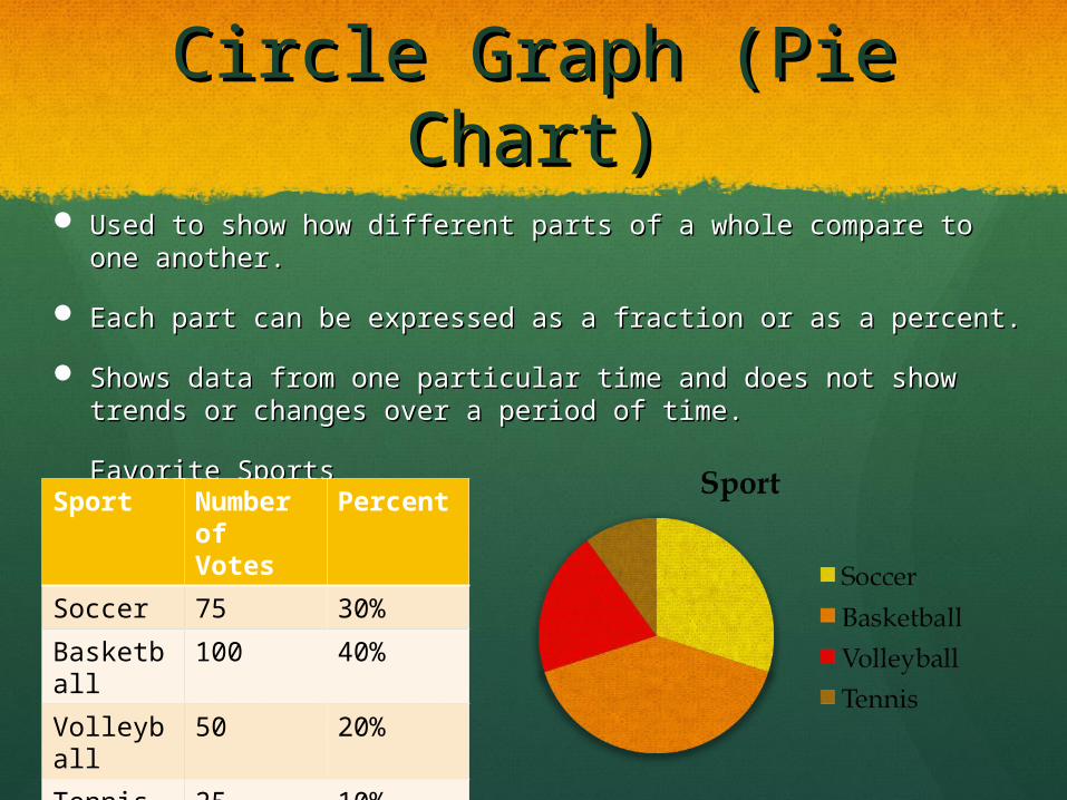
Circle Graph (Pie Chart)Circle Graph (Pie Chart)
Used to show how different parts of a whole compare to one Used to show how different parts of a whole compare to one another.another.
Each part can be expressed as a fraction or as a percent.Each part can be expressed as a fraction or as a percent.
Shows data from one particular time and does not show Shows data from one particular time and does not show trends or changes over a period of time.trends or changes over a period of time.
Favorite SportsFavorite SportsSport Number of Votes
Percent
Soccer 75 30%
Basketball
100 40%
Volleyball
50 20%
Tennis 25 10%
Total 250 100%
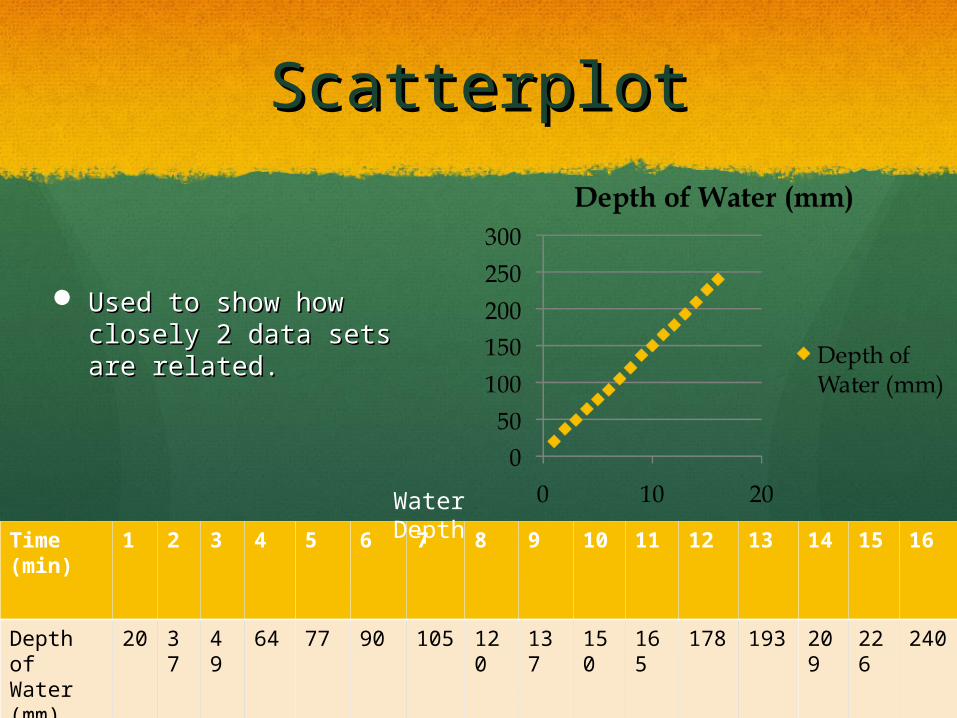
ScatterplotScatterplot
Used to show how Used to show how closely 2 data sets are closely 2 data sets are related.related.
Time (min)
1 2 3 4 5 6 7 8 9 10 11 12 13 14 15 16
Depth of Water (mm)
20
37
49
64 77 90 105
120
137
150
165
178 193
209
226
240
Water Depth
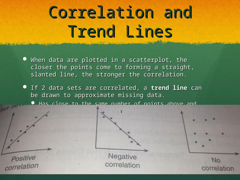
Correlation and Trend Correlation and Trend LinesLines
When data are plotted in a scatterplot, the closer the When data are plotted in a scatterplot, the closer the points come to forming a straight, slanted line, the points come to forming a straight, slanted line, the stronger the correlation.stronger the correlation.
If 2 data sets are correlated, a If 2 data sets are correlated, a trend linetrend line can be can be drawn to approximate missing data.drawn to approximate missing data. Has close to the same number of points above and below Has close to the same number of points above and below
it.it.