Embed Size (px)
Citation preview

4-1
Collect & Interpret DataCollect & Interpret Data
TheQualityImprovementModel
Use SPC to Maintain Current Process
Collect & Interpret
Data
Collect & Interpret
Data
Select Measures
Define Process
IsProcessCapable
?
Improve Process
Capability
IsProcessStable
?
Investigate & Fix
Special Causes
No
Yes
No
Yes
Collect & Interpret Data: Displaying MeasuresPurpose:
Begin collecting and analyzing data from the process.

4-2
Collect & Interpret DataCollect & Interpret Data
Graphical Tools for Displaying Measures from Processes
Run Charts Histograms Pareto Charts

4-3
Collect & Interpret DataCollect & Interpret Data
Run Charts
A plot of the data in time order.
Time is on the horizontal axis and the data values are plotted on the vertical axis.
Run charts show the process variation over time. -100
-50
0
50
100
150
200
5 10 15 20 25 30
Day
Measure

4-4
Collect & Interpret DataCollect & Interpret Data
Histograms
A bar chart showing frequency of occurrence is shown on the vertical axis.
Histograms show the pattern of variation.
-50 0 50 100 150 200
Frequency
Measure
0
5
10
15
20
25

4-5
Collect & Interpret DataCollect & Interpret Data
Pareto Charts
A bar chart showing the relative importance of some observed characteristic.
The frequency, percent or cost is shown on the vertical axis.
The characteristic (type of defect, cause, etc.) is shown on the horizontal axis.
The characteristic is usually plotted in order of decreasing magnitude.
Frequency
Cause
0
5
10
15
20
25
C A E B D F

4-6
Collect & Interpret DataCollect & Interpret Data
Pump Maintenance
For each week (time period) record the number of pump failures.
One possible run chart would be to plot the number of pump failures for each week (time period). The opportunity for failures should remain constant from week to week.
Collect information about causes for each failure for use in a Pareto Chart. Pareto Charts could also be based on pump location, pump environment, etc.
Week # Failures Failure Type
1 6 Seal, Align...
2 1 Fitting, Seal...
3 2 Align, Gear...
4 4 Seal, Fitting...
. . .
. . .
20 7 Align, Seal...
PumpMaintenance
PumpMaintenance
Pump Failure
Week 1 Week 2 Week 3 Week 4 Week 20
6 failed 1 failed 2 failed 4 failed 7 failed

4-7
Collect & Interpret DataCollect & Interpret Data
Pump Maintenance Data
1 3 5 7 9 11 13 15 17 19 21 23 250
2
4
6
8
10
12
14
16
18
20 Run Chart
Numberof
Failures
Week
Pareto Chart
Seal Alignment Fitting Gear Other0
10
20
30
40
50
60
# Failures
Type Failure
Frequency
0-1 2-3 4-5 6-7 8-9 10-11 12-130
1
2
3
4
5
6
Histogram
# Failures
4-8
Collect & Interpret DataCollect & Interpret Data
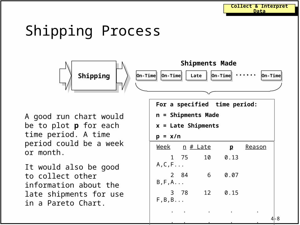
Shipping Process
ShippingShipping On-TimeOn-Time
Shipments Made
On-TimeOn-Time LateLate On-TimeOn-Time On-TimeOn-Time
For a specified time period:
n = Shipments Made
x = Late Shipments
p = x/n
A good run chart would be to plot p for each time period. A time period could be a week or month.
It would also be good to collect other information about the late shipments for use in a Pareto Chart.
Week n # Late p Reason
1 75 10 0.13 A,C,F...
2 84 6 0.07 B,F,A...
3 78 12 0.15 F,B,B...
. . . . .
. . . . .
30 70 10 0.14 B,F,I...

4-9
Collect & Interpret DataCollect & Interpret Data
Shipping Data
Run Chart
0.00
0.05
0.10
0.15
0.20
0.25
2 4 6 8 1012141618202224262830
Proportion Late Week
0.050 0.075 0.100 0.125 0.150 0.175 0.200
HistogramFrequency
Proportion Late
Pareto Chart
Reason for Being Late
Frequency
B F A E I D J C G H0
10
20
30
40
50
60
70
80
90
100

4-10
Collect & Interpret DataCollect & Interpret Data
Purchase Order Process
PurchaseOrder
Process
PurchaseOrder
Process
Completed Purchase Orders
5 Purchase Orders are selected each week. The time (in days) it took to process each of the 5 PO’s is recorded, and the average of the 5 calculated. The average is the measure tracked.
A possibility would be to subgroup the data( i.e. combine 5 purchase orders and plot their average.)
It might also be informative to plot a histogram of all the times to see the pattern of variation.
Week A B C D E Average
1 2 7 5 4 5 4.6
2 3 10 2 5 3 4.6
3 5 7 3 12 1 5.6
4 4 7 8 3 5 5.4
. . . . . . .
. . . . . . .
20 3 3 9 2 4 4.2
Week 1 Week 2 Week 3 Week 4 Week 20
2,7,5,4,5 3,10,2,5,3 5,7,3,12,1 4,7,8,3,5 3,3,9,2,4

4-11
Collect & Interpret DataCollect & Interpret Data
Purchase Order Data
1 3 5 7 9 11 13 15 17 1901234567891011121314
Run Chartof 20 Averages (of size 5)Time
(Days)
Histogramof 100 total observations
Time (Days)
Frequency
Week Sample Taken
1 2 3 4 5 6 7 8 9 10 11 12 13 14 15>150
5
10
15
20
25

4-12
Collect & Interpret DataCollect & Interpret Data
Polymer Manufacturing Process
One possibility would be to collect a sample of the product every 4 hours, and measure the characteristic of interest on that sample. A run chart could then be constructed of this data.It would also be informative to plot a histogram of all the times to see the pattern of variation.
ProductionProcess
ProductionProcess
Material Produced (lots)
Samples
A quality characteristic is measured on each sample. Sample b*
1 1.51
2 1.89
3 1.42
. .
. .
134 1.63
b* is a measure of yellowness

4-13
Collect & Interpret DataCollect & Interpret Data
Polymer Manufacturing Data
-1
0
1
2
3
4
5
6
20 40 60 80 100 120 140
b*
Sample
Run Chart
Note: b* is a measure of yellowness
LS is the Lower Specification LimitUS is the Upper Specification Limit
0 1 2 3 4 5
b*
Histogram
LS US


![[PPT]The Quality Improvement Model - Purdue Universitykuczek/stat513/SPC Course Slides/7... · Web viewDefine Process The Quality Improvement Model Select Measures Collect & Interpret](https://img.pdfslide.us/doc/110x75/5ad5eb487f8b9a5d058dc5bd/pptthe-quality-improvement-model-purdue-kuczekstat513spc-course-slides7web.jpg)