Embed Size (px)
Citation preview
Microsoft Excel
Creating a Pie Chart on a Picture
Name _________________________ Date ________________________
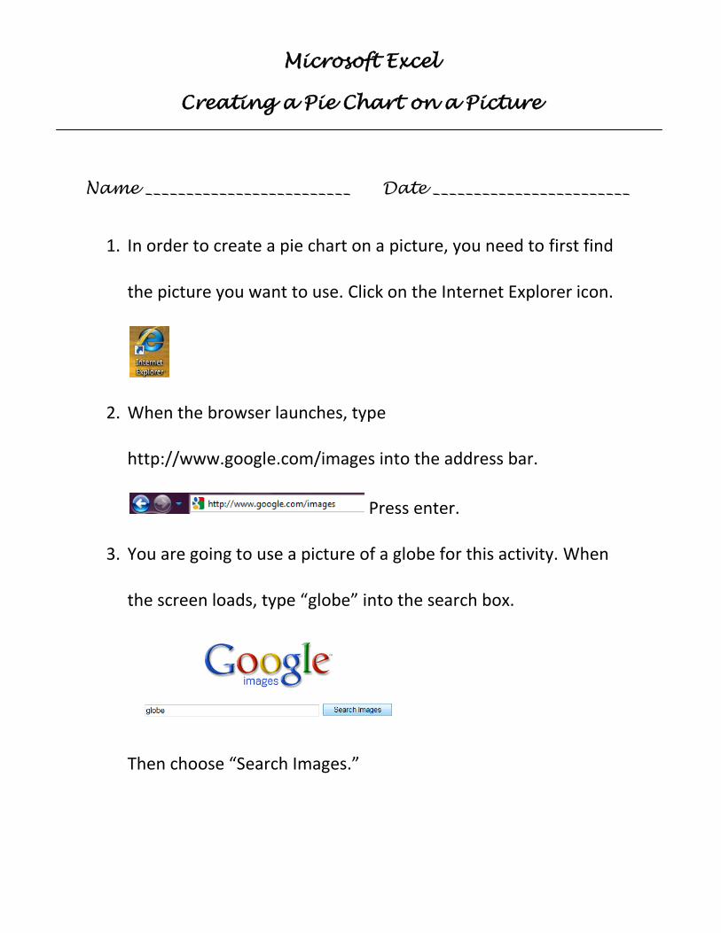
1. In order to create a pie chart on a picture, you need to first find
the picture you want to use. Click on the Internet Explorer icon.
2. When the browser launches, type
http://www.google.com/images into the address bar.
Press enter.
3. You are going to use a picture of a globe for this activity. When
the screen loads, type “globe” into the search box.
Then choose “Search Images.”
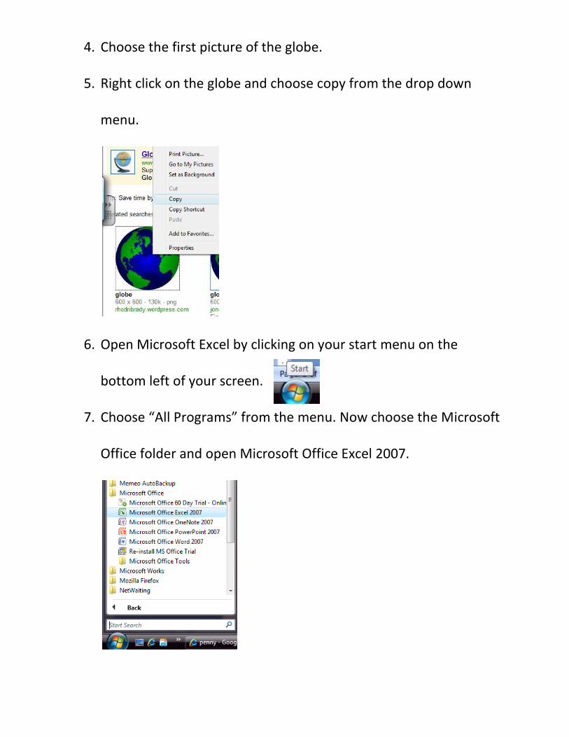
4. Choose the first picture of the globe.
5. Right click on the globe and choose copy from the drop down
menu.
6. Open Microsoft Excel by clicking on your start menu on the
bottom left of your screen.
7. Choose “All Programs” from the menu. Now choose the Microsoft
Office folder and open Microsoft Office Excel 2007.
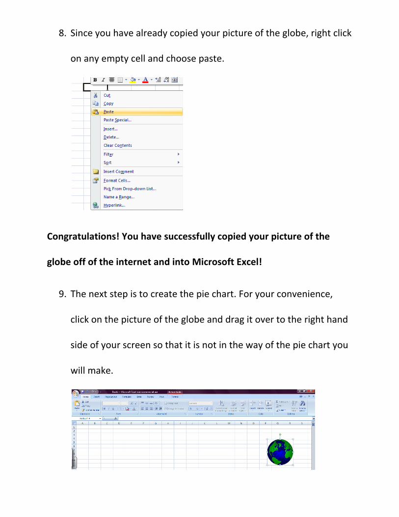
8. Since you have already copied your picture of the globe, right click
on any empty cell and choose paste.
Congratulations! You have successfully copied your picture of the
globe off of the internet and into Microsoft Excel!
9. The next step is to create the pie chart. For your convenience,
click on the picture of the globe and drag it over to the right hand
side of your screen so that it is not in the way of the pie chart you
will make.

10. The pie chart you will create represents the number of
people in millions who speak certain languages throughout the
world. Copy the following information into the corresponding
cells:
A B
1
Language Population in Millions
Chinese, Mandarin 1120
English 480
Spanish 332
Arabic 235
Bengali 189
Hindi 182
Russian 180
Portuguese 170
Japanese 125
German 98
2
3
4
5
6
7
8
9
10
11
Your spreadsheet should look like this:
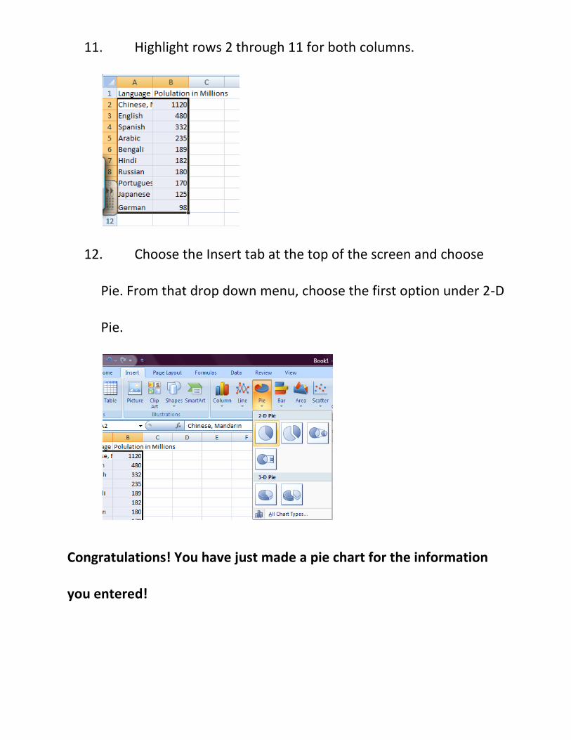
11. Highlight rows 2 through 11 for both columns.
12. Choose the Insert tab at the top of the screen and choose
Pie. From that drop down menu, choose the first option under 2-D
Pie.
Congratulations! You have just made a pie chart for the information
you entered!
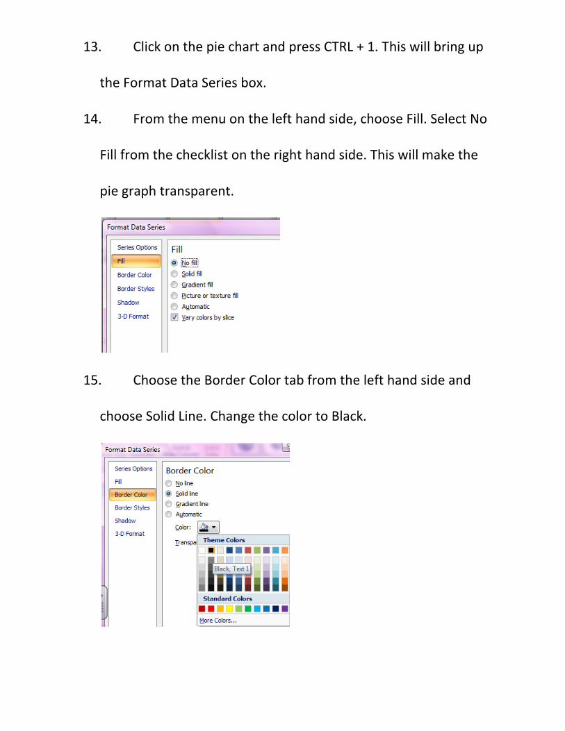
13. Click on the pie chart and press CTRL + 1. This will bring up
the Format Data Series box.
14. From the menu on the left hand side, choose Fill. Select No
Fill from the checklist on the right hand side. This will make the
pie graph transparent.
15. Choose the Border Color tab from the left hand side and
choose Solid Line. Change the color to Black.
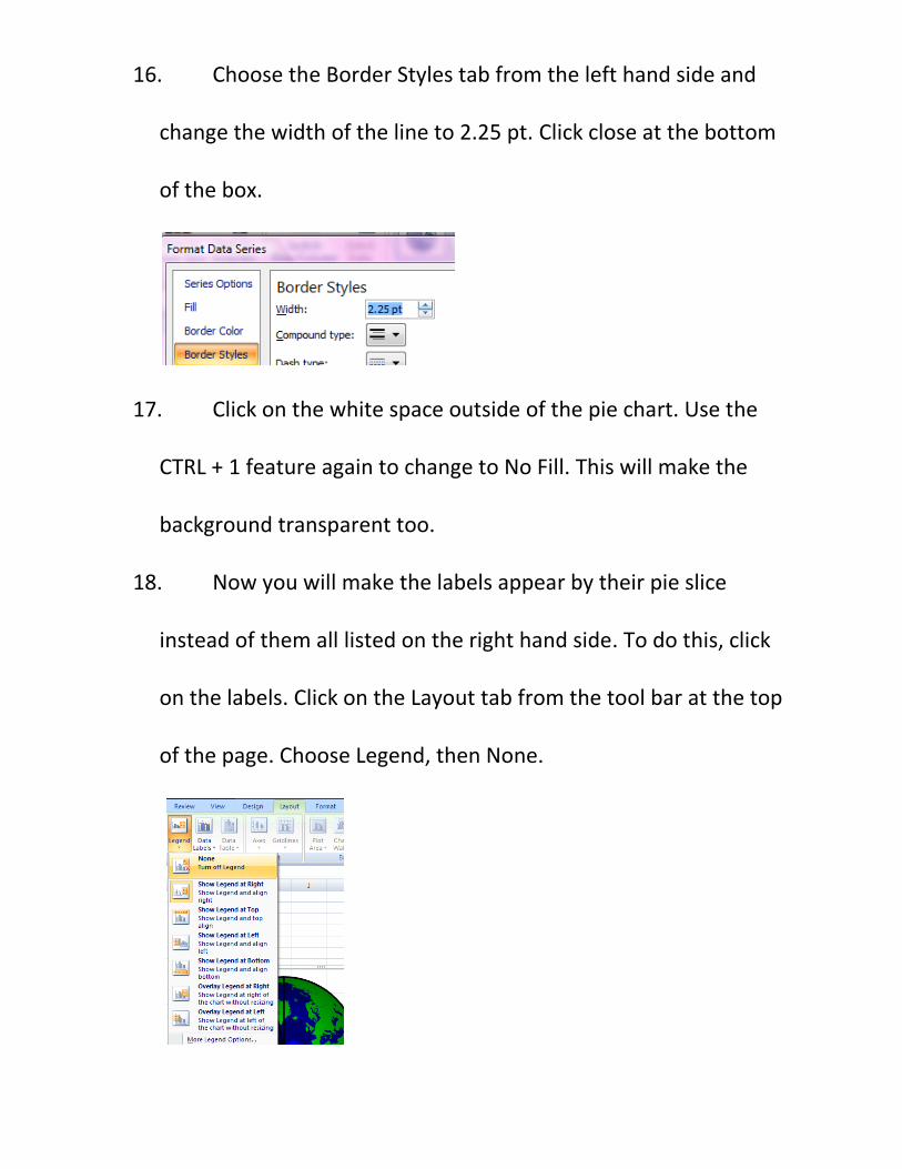
16. Choose the Border Styles tab from the left hand side and
change the width of the line to 2.25 pt. Click close at the bottom
of the box.
17. Click on the white space outside of the pie chart. Use the
CTRL + 1 feature again to change to No Fill. This will make the
background transparent too.
18. Now you will make the labels appear by their pie slice
instead of them all listed on the right hand side. To do this, click
on the labels. Click on the Layout tab from the tool bar at the top
of the page. Choose Legend, then None.
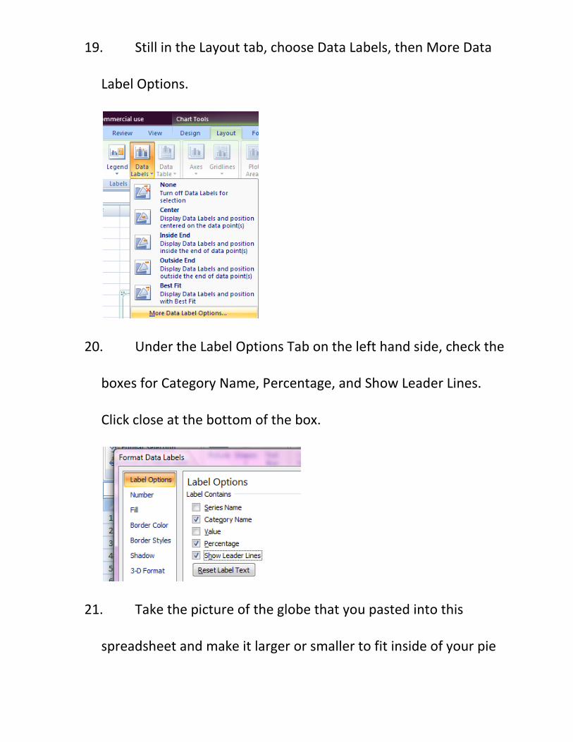
19. Still in the Layout tab, choose Data Labels, then More Data
Label Options.
20. Under the Label Options Tab on the left hand side, check the
boxes for Category Name, Percentage, and Show Leader Lines.
Click close at the bottom of the box.
21. Take the picture of the globe that you pasted into this
spreadsheet and make it larger or smaller to fit inside of your pie

chart. Drag the picture of the globe into the pie chart and resize
the picture so that the sections of the pie chart are dividing up the
globe.
22. If the labels of the pie chart are on top of the picture and
you can’t read them, drag the label off of the picture. It will make
a line to that piece instead.
Congratulations! You have just made your pie chart on a picture!
23. Now you have the completed graph and can answer the
following questions:
a. What percentage of people in the world speaks English?
b. What percentage speaks Hindi?
c. What percentage speaks Japanese?
d. What language do most people speak?

e. What language does the least amount of people speak?
f. Draw your pie chart below:
Try it yourself!
Make a pie chart on a picture just like above.
Larry Bird was a famous basketball player. He played from 1979 to 1992
for the Boston Celtics. Use the following information to create a pie
chart on a picture of a basketball.
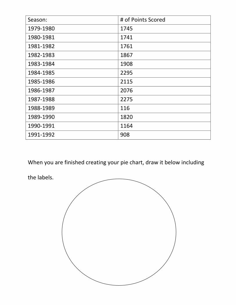
Season: # of Points Scored
1979-1980 1745
1980-1981 1741
1981-1982 1761
1982-1983 1867
1983-1984 1908
1984-1985 2295
1985-1986 2115
1986-1987 2076
1987-1988 2275
1988-1989 116
1989-1990 1820
1990-1991 1164
1991-1992 908
When you are finished creating your pie chart, draw it below including
the labels.

Answer the following questions using your pie chart:
a. In what season did Larry Bird score the most points?
b. In what season did he score the least amount of points?
c. What percent of his career points came from the 1983
season?
d. What percent of his career points came from the 1980
season?
Created by: Edith Franks