Embed Size (px)
Citation preview
Chapter 5 Understanding and Comparing Distributions
Another Useful Graphical Method: Boxplots
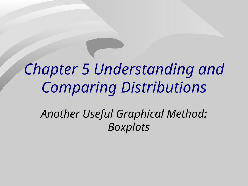
Pulse Rates n = 138
# Stem Leaves4*
3 4. 5889 5* 00123344410 5. 555678889923 6* 0001111112223333334444423 6. 5555666666777778888888816 7* 0000011222233444423 7. 5555566666677788888899910 8* 000011222410 8. 55556677894 9* 00122 9. 584 10* 0223
10.1 11* 1
Median: mean of pulses in locations 69 & 70: median= (70+70)/2=70
Q1: median of lower half (lower half = 69 smallest pulses); Q1 = pulse in ordered position 35;Q1 = 63
Q3 median of upper half (upper half = 69 largest pulses); Q3= pulse in position 35 from the high end; Q3=78
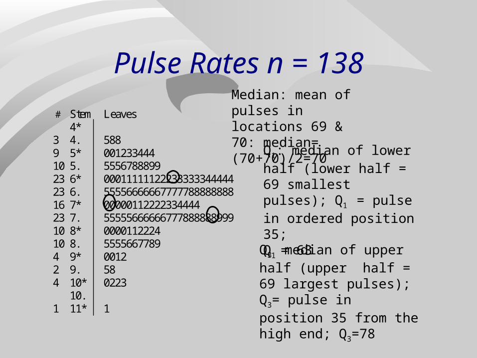
Recall the 5-number summary of data from Chapter 4
Minimum Q1 median Q3 maximum Pulse data 5-number summary
45 63 70 78 111
A boxplot is a graphical display of the 5-number summary
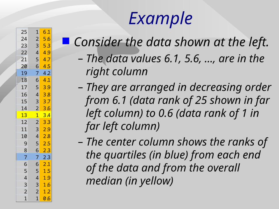
Example Consider the data shown at the left.
– The data values 6.1, 5.6, …, are in the right column
– They are arranged in decreasing order from 6.1 (data rank of 25 shown in far left column) to 0.6 (data rank of 1 in far left column)
– The center column shows the ranks of the quartiles (in blue) from each end of the data and from the overall median (in yellow)
25 1 6.124 2 5.623 3 5.322 4 4.921 5 4.720 6 4.519 7 4.218 6 4.117 5 3.916 4 3.815 3 3.714 2 3.613 1 3.412 2 3.311 3 2.910 4 2.89 5 2.58 6 2.37 7 2.36 6 2.15 5 1.54 4 1.93 3 1.62 2 1.21 1 0.6
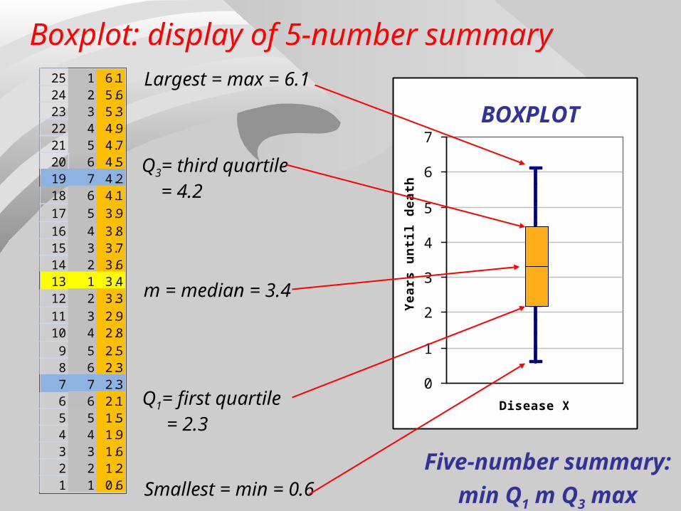
m = median = 3.4
Q3= third quartile = 4.2
Q1= first quartile = 2.3
25 1 6.124 2 5.623 3 5.322 4 4.921 5 4.720 6 4.519 7 4.218 6 4.117 5 3.916 4 3.815 3 3.714 2 3.613 1 3.412 2 3.311 3 2.910 4 2.89 5 2.58 6 2.37 7 2.36 6 2.15 5 1.54 4 1.93 3 1.62 2 1.21 1 0.6
Largest = max = 6.1
Smallest = min = 0.6
Disease X
0
1
2
3
4
5
6
7
Yea
rs u
nti
l dea
th
Five-number summary:
min Q1 m Q3 max
Boxplot: display of 5-number summary
BOXPLOT

Boxplot: display of 5-number summary
Example: age of 66 “crush” victims at rock concerts 1999-2000.
5-number summary:13 17 19 22 47
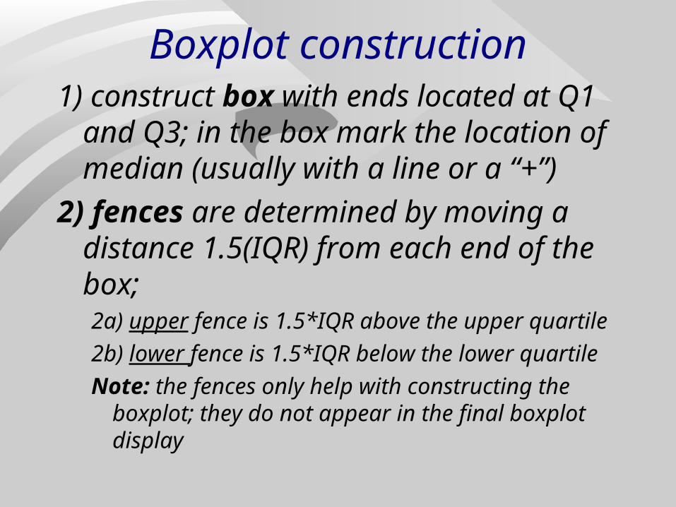
Boxplot construction1) construct box with ends located at Q1
and Q3; in the box mark the location of median (usually with a line or a “+”)
2) fences are determined by moving a distance 1.5(IQR) from each end of the box;2a) upper fence is 1.5*IQR above the upper quartile
2b) lower fence is 1.5*IQR below the lower quartile
Note: the fences only help with constructing the boxplot; they do not appear in the final boxplot display
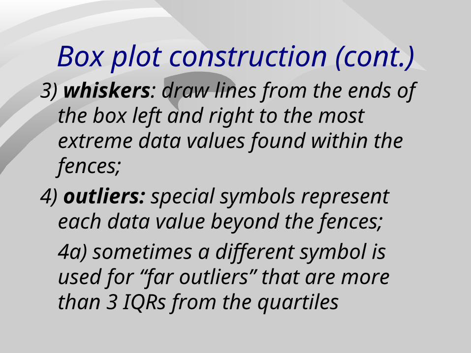
Box plot construction (cont.)3) whiskers: draw lines from the ends of
the box left and right to the most extreme data values found within the fences;
4) outliers: special symbols represent each data value beyond the fences;
4a) sometimes a different symbol is used for “far outliers” that are more than 3 IQRs from the quartiles
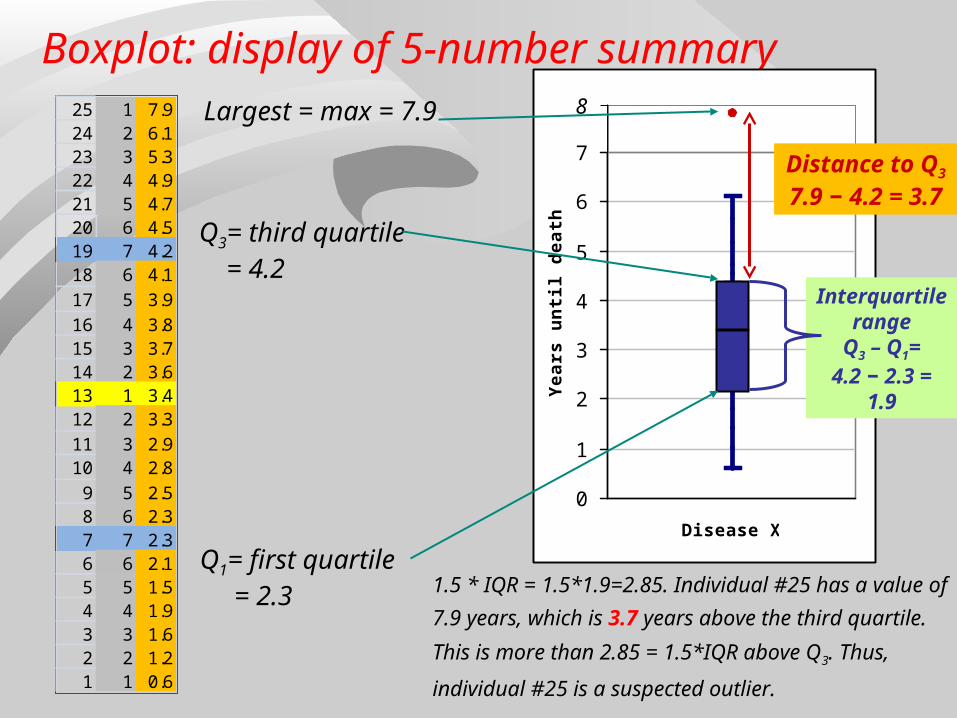
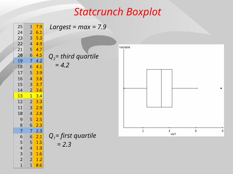
Q3= third quartile = 4.2
Q1= first quartile = 2.3
25 1 7.924 2 6.123 3 5.322 4 4.921 5 4.720 6 4.519 7 4.218 6 4.117 5 3.916 4 3.815 3 3.714 2 3.613 1 3.412 2 3.311 3 2.910 4 2.89 5 2.58 6 2.37 7 2.36 6 2.15 5 1.54 4 1.93 3 1.62 2 1.21 1 0.6
Largest = max = 7.9
Boxplot: display of 5-number summary
BOXPLOT
Disease X
0
1
2
3
4
5
6
7
Yea
rs u
nti
l dea
th
8
Interquartile range
Q3 – Q1=4.2 − 2.3 =
1.9
Distance to Q3
7.9 − 4.2 = 3.7
1.5 * IQR = 1.5*1.9=2.85. Individual #25 has a value of
7.9 years, which is 3.7 years above the third quartile.
This is more than 2.85 = 1.5*IQR above Q3. Thus,
individual #25 is a suspected outlier.
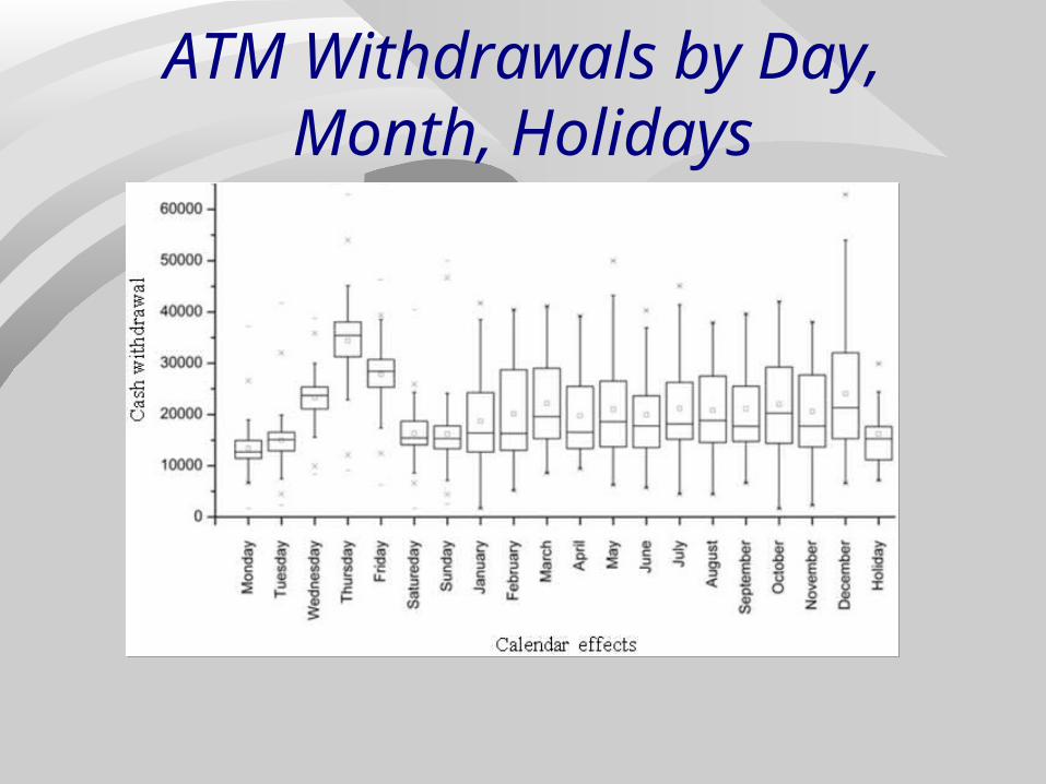
ATM Withdrawals by Day, Month, Holidays
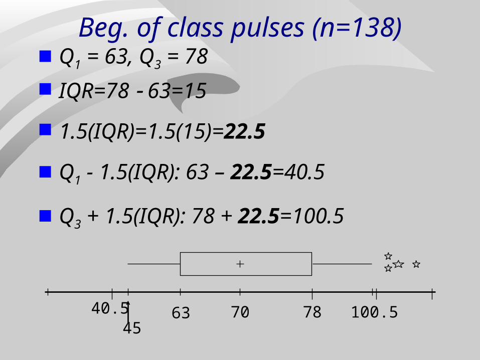
Beg. of class pulses (n=138) Q1 = 63, Q3 = 78 IQR=78 63=15
1.5(IQR)=1.5(15)=22.5
Q1 - 1.5(IQR): 63 – 22.5=40.5
Q3 + 1.5(IQR): 78 + 22.5=100.5
7063 7840.5 100.545

Below is a box plot of the yards gained in a recent season by the 136 NFL receivers who
gained at least 50 yards. What is the approximate value of Q3 ?
1 2 3 4
0% 0%0%0%
0 136273
410547
684821
9581095
12321369
Pass Catching Yards by Receivers
1. 450
2. 750
3. 215
4. 545CountdownCountdown
10
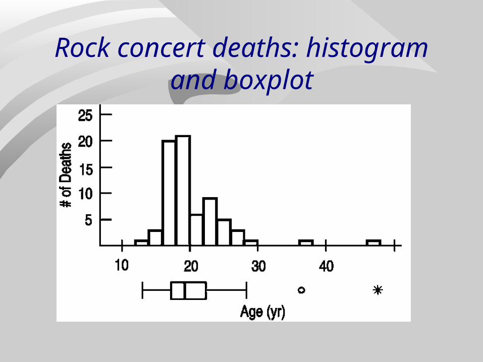
Rock concert deaths: histogram and boxplot
Automating Boxplot Construction
Excel “out of the box” does not draw boxplots.
Many add-ins are available on the internet that give Excel the capability to draw box plots.
Statcrunch (http://statcrunch.stat.ncsu.edu) draws box plots.
Q3= third quartile = 4.2
Q1= first quartile = 2.3
25 1 7.924 2 6.123 3 5.322 4 4.921 5 4.720 6 4.519 7 4.218 6 4.117 5 3.916 4 3.815 3 3.714 2 3.613 1 3.412 2 3.311 3 2.910 4 2.89 5 2.58 6 2.37 7 2.36 6 2.15 5 1.54 4 1.93 3 1.62 2 1.21 1 0.6
Largest = max = 7.9
Statcrunch Boxplot
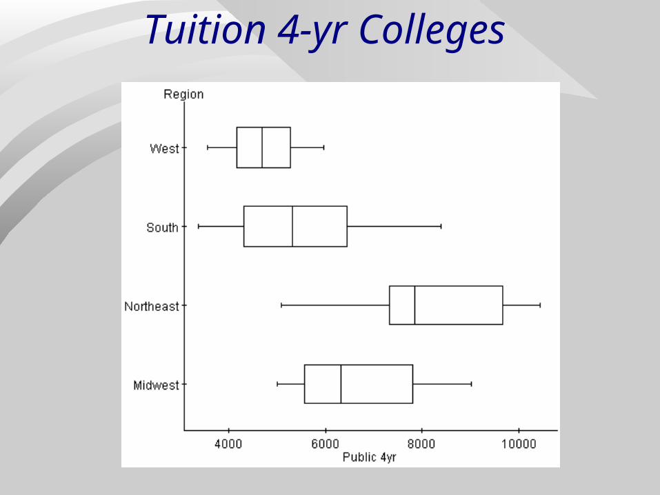
Tuition 4-yr Colleges
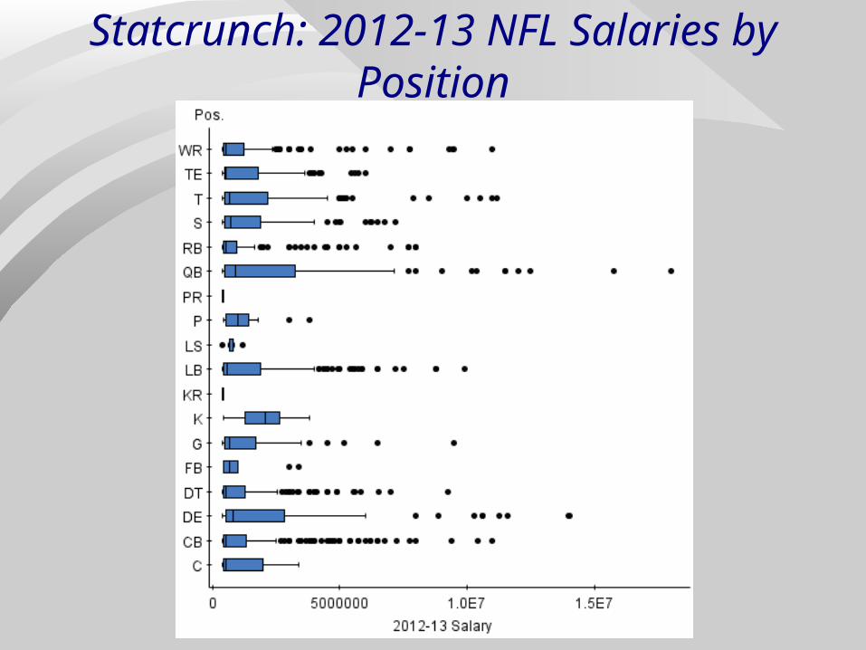
Statcrunch: 2012-13 NFL Salaries by Position
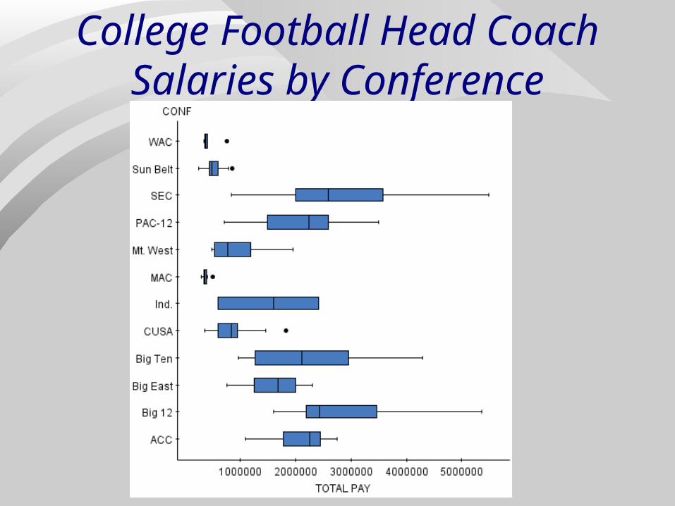
College Football Head Coach Salaries by Conference
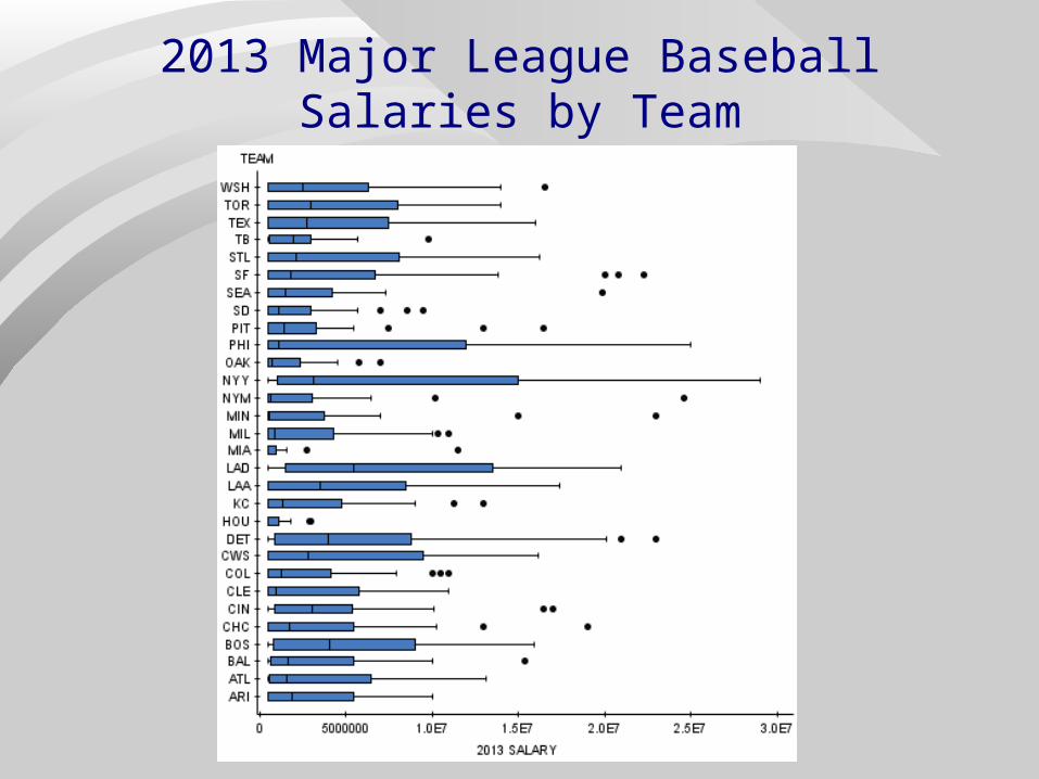
2013 Major League Baseball Salaries by Team

End of Chapter 5