Embed Size (px)
Citation preview
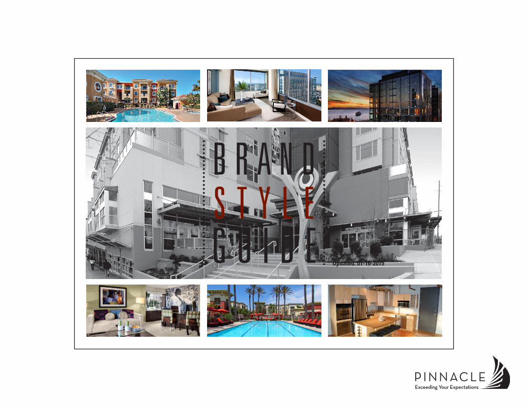
B R A N D S T Y L E G U I D E Updated: 01-16-2015
PINNACLE | BRAND STYLE GUIDE | 01-16-2015 2
IntroductionPinnacle Brand ......................................................................3
Logos & ColorPinnacle Logo ........................................................................4Logo Color Options ...............................................................5Correct Logo Usage ..............................................................6Incorrect Logo Usage ............................................................7Clear Space Requirements ...................................................8Logo Size & Resolution .........................................................9
Font StyleAccepted Corporate Typefaces ........................................... 10Text Alignment, Spacing and Scaling .................................. 11Formatting of Numbers, Time and Email Addresses ..........12
Email GuidelinesEmail Signatures .................................................................13Email Communications .......................................................14
Templates & StandardsMicrosoft Word Templates ..................................................15PowerPoint Presentations & Template ................................16
Photography & ImagesAcceptable Photography ..................................................... 17Unacceptable Photography .................................................18Property Photography Tips ..................................................19
File Format TypesFile Usage ...........................................................................20
Property Marketing GuidelinesWriting Content ...................................................................21Brand Application ................................................................22Property Logos ....................................................................23Promotional Items ...............................................................24
Internet BrandingProperty Website .................................................................25Social Media ........................................................................26
Disclaimers & Legalities .................................................27
ContactResources ...........................................................................28
C O N T E N T S
PINNACLE | BRAND STYLE GUIDE | 01-16-2015 3
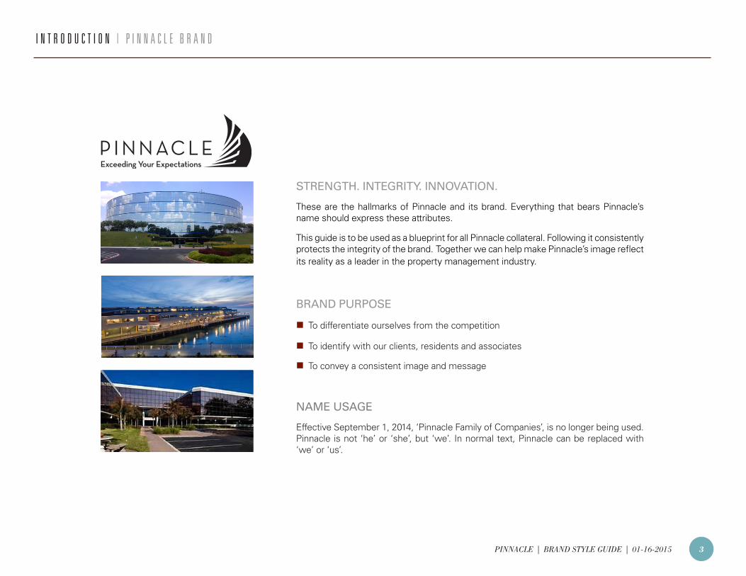
STRENGTH. INTEGRITY. INNOVATION.
These are the hallmarks of Pinnacle and its brand. Everything that bears Pinnacle’s name should express these attributes.
This guide is to be used as a blueprint for all Pinnacle collateral. Following it consistently protects the integrity of the brand. Together we can help make Pinnacle’s image reflect its reality as a leader in the property management industry.
BRAND PURPOSE
n To differentiate ourselves from the competition
nTo identify with our clients, residents and associates
n To convey a consistent image and message
NAME USAGE
Effective September 1, 2014, ‘Pinnacle Family of Companies’, is no longer being used. Pinnacle is not ‘he’ or ‘she’, but ‘we’. In normal text, Pinnacle can be replaced with ‘we’ or ‘us’.
I N T R O D U C T I O N | P I N N A C L E B R A N D
PINNACLE | BRAND STYLE GUIDE | 01-16-2015 4
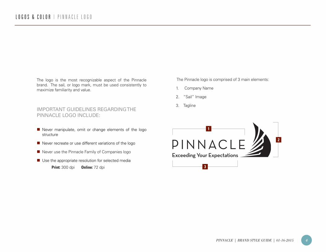
The logo is the most recognizable aspect of the Pinnacle brand. The sail, or logo mark, must be used consistently to maximize familiarity and value.
IMPORTANT GUIDELINES REGARDING THE PINNACLE LOGO INCLUDE:
n Never manipulate, omit or change elements of the logo structure
n Never recreate or use different variations of the logo
n Never use the Pinnacle Family of Companies logo
n Use the appropriate resolution for selected media
Print: 300 dpi Online: 72 dpi
L O G O S & C O L O R | P I N N A C L E L O G O
The Pinnacle logo is comprised of 3 main elements:
1. Company Name
2. “Sail” Image
3. Tagline
1
2
3
PINNACLE | BRAND STYLE GUIDE | 01-16-2015 5
L O G O S & C O L O R | L O G O C O L O R O P T I O N S
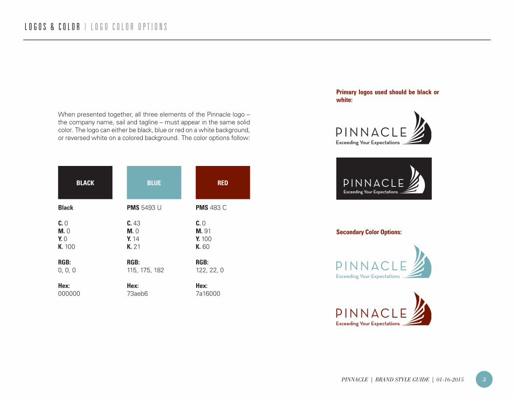
When presented together, all three elements of the Pinnacle logo -- the company name, sail and tagline – must appear in the same solid color. The logo can either be black, blue or red on a white background, or reversed white on a colored background. The color options follow:
Secondary Color Options:
Primary logos used should be black or white:
Black
C. 0M. 0Y. 0K. 100
RGB:0, 0, 0
Hex:000000
PMS 5493 U
C. 43M. 0Y. 14K. 21
RGB:115, 175, 182
Hex:73aeb6
PMS 483 C
C. 0M. 91Y. 100K. 60
RGB:122, 22, 0
Hex:7a16000
BLACK BLUE RED
PINNACLE | BRAND STYLE GUIDE | 01-16-2015 6
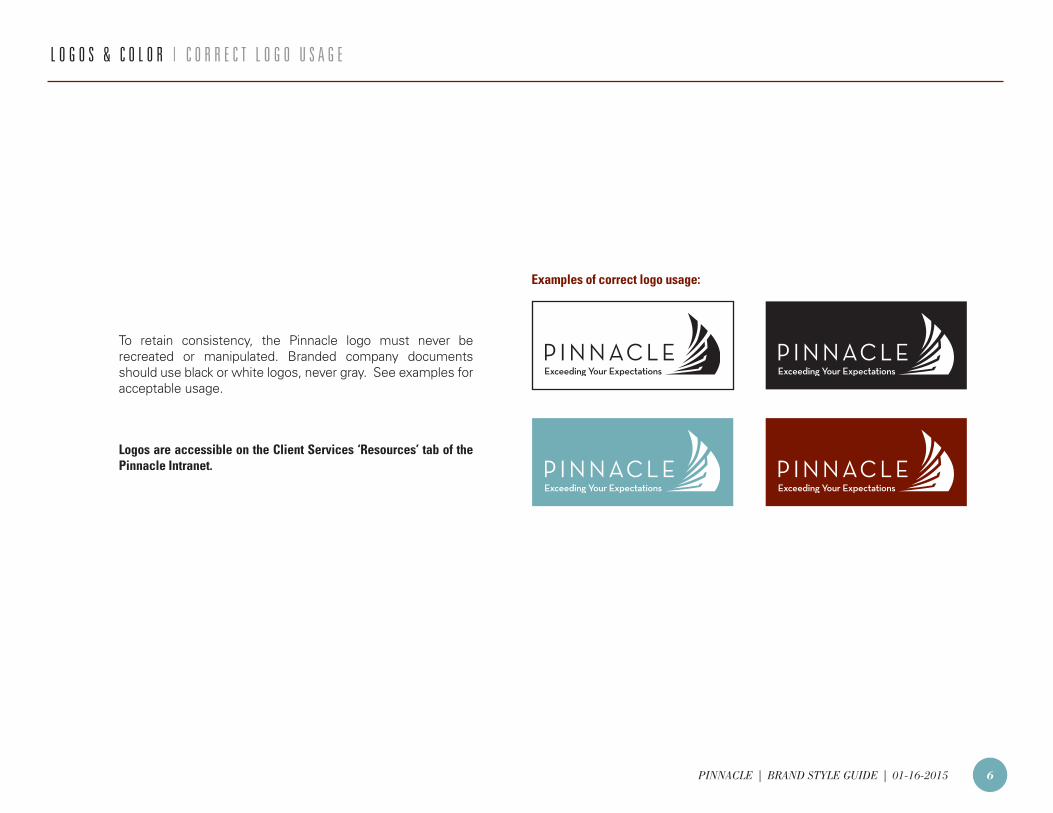
Logos are accessible on the Client Services ‘Resources’ tab of the Pinnacle Intranet.
L O G O S & C O L O R | C O R R E C T L O G O U S A G E
To retain consistency, the Pinnacle logo must never be recreated or manipulated. Branded company documents should use black or white logos, never gray. See examples for acceptable usage.
Examples of correct logo usage:
PINNACLE | BRAND STYLE GUIDE | 01-16-2015 7
Exceeding your Expectation
L O G O S & C O L O R | I N C O R R E C T L O G O U S A G E
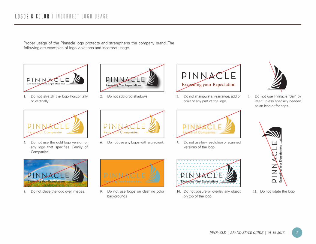
Proper usage of the Pinnacle logo protects and strengthens the company brand. The following are examples of logo violations and incorrect usage.
1. Do not stretch the logo horizontally or vertically.
5. Do not use the gold logo version or any logo that specifies ‘Family of Companies’.
8. Do not place the logo over images.
2. Do not add drop shadows.
6. Do not use any logos with a gradient.
9. Do not use logos on clashing color backgrounds
3. Do not manipulate, rearrange, add or omit or any part of the logo.
4. Do not use Pinnacle ‘Sail’ by itself unless specially needed as an icon or for apps.
7. Do not use low resolution or scanned versions of the logo.
10. Do not obsure or overlay any object on top of the logo.
11. Do not rotate the logo.
PINNACLE | BRAND STYLE GUIDE | 01-16-2015 8
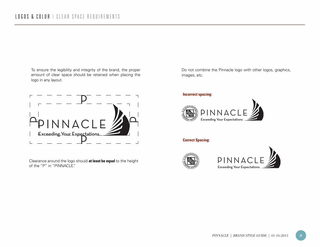
Clearance around the logo should at least be equal to the height of the “P” in “PINNACLE”.
Incorrect spacing:
Correct Spacing:
To ensure the legibility and integrity of the brand, the proper amount of clear space should be retained when placing the logo in any layout.
Do not combine the Pinnacle logo with other logos, graphics, images, etc.
L O G O S & C O L O R | C L E A R S P A C E R E Q U I R E M E N T S
PINNACLE | BRAND STYLE GUIDE | 01-16-2015 9
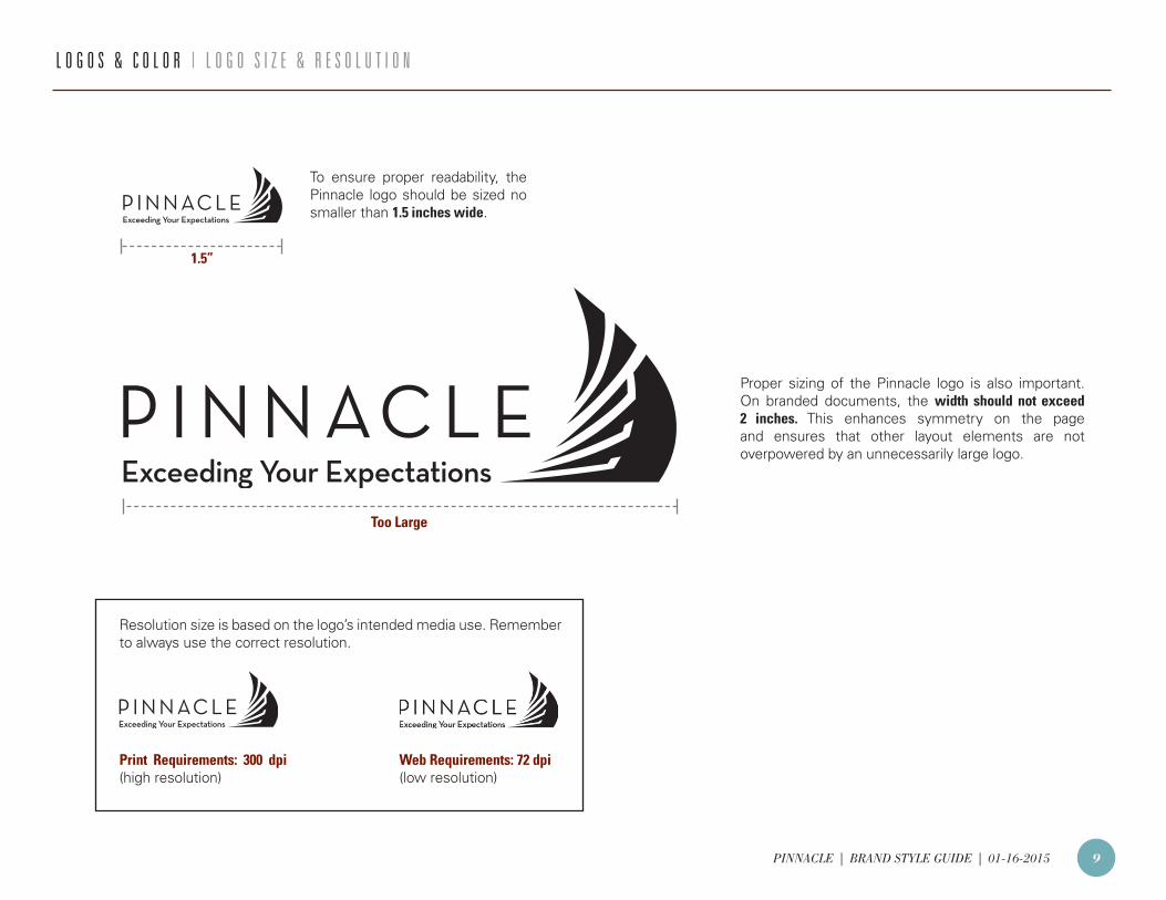
To ensure proper readability, the Pinnacle logo should be sized no smaller than 1.5 inches wide.
Proper sizing of the Pinnacle logo is also important. On branded documents, the width should not exceed 2 inches. This enhances symmetry on the page and ensures that other layout elements are not overpowered by an unnecessarily large logo.
1.5”
Too Large
Print Requirements: 300 dpi (high resolution)
Web Requirements: 72 dpi (low resolution)
Resolution size is based on the logo’s intended media use. Remember to always use the correct resolution.
L O G O S & C O L O R | L O G O S I Z E & R E S O L U T I O N
PINNACLE | BRAND STYLE GUIDE | 01-16-2015 10
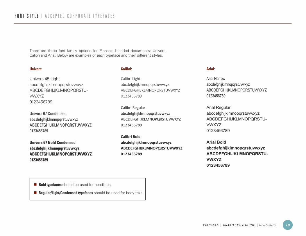
Univers 45 LightabcdefghijklmnopqrstuvwxyzABCDEFGHIJKLMNOPQRSTU-VWXYZ0123456789
Univers 67 CondensedabcdefghijklmnopqrstuvwxyzABCDEFGHIJKLMNOPQRSTUVWXYZ0123456789
Univers 67 Bold CondensedabcdefghijklmnopqrstuvwxyzABCDEFGHIJKLMNOPQRSTUVWXYZ0123456789
Calibri Light abcdefghijklmnopqrstuvwxyzABCDEFGHIJKLMNOPQRSTUVWXYZ0123456789
Calibri RegularabcdefghijklmnopqrstuvwxyzABCDEFGHIJKLMNOPQRSTUVWXYZ0123456789
Calibri BoldabcdefghijklmnopqrstuvwxyzABCDEFGHIJKLMNOPQRSTUVWXYZ0123456789
Arial NarrowabcdefghijklmnopqrstuvwxyzABCDEFGHIJKLMNOPQRSTUVWXYZ0123456789
Arial RegularabcdefghijklmnopqrstuvwxyzABCDEFGHIJKLMNOPQRSTU-VWXYZ0123456789
Arial BoldabcdefghijklmnopqrstuvwxyzABCDEFGHIJKLMNOPQRSTU-VWXYZ0123456789
F O N T S T Y L E | A C C E P T E D C O R P O R A T E T Y P E F A C E S
There are three font family options for Pinnacle branded documents: Univers, Calibri and Arial. Below are examples of each typeface and their different styles.
Univers: Calibri: Arial:
n Bold typefaces should be used for headlines.
n Regular/Light/Condensed typefaces should be used for body text.
PINNACLE | BRAND STYLE GUIDE | 01-16-2015 11
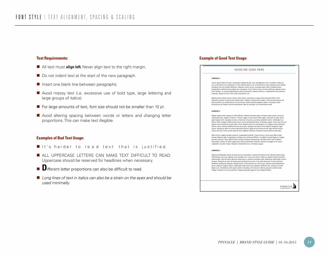
F O N T S T Y L E | T E X T A L I G N M E N T , S P A C I N G & S C A L I N G
Text Requirements:
n All text must align left. Never align text to the right margin.
n Do not indent text at the start of the new paragraph.
n Insert one blank line between paragraphs.
n Avoid messy text (i.e. excessive use of bold type, large lettering and large groups of italics).
n For large amounts of text, font size should not be smaller than 10 pt.
n Avoid altering spacing between words or letters and changing letter proportions. This can make text illegible.
Examples of Bad Text Usage:
n I t ’ s h a r d e r t o r e a d t e x t t h a t i s j u s t i f i e d.
n ALL UPPERCASE LETTERS CAN MAKE TEXT DIFFICULT TO READ. Uppercase should be reserved for headlines when necessary.
n Different letter proportions can also be difficult to read.
n Long lines of text in italics can also be a strain on the eyes and should be used minimally.
H E A D L I N E G O E S H E R E
SUBHEAD 1
Lorem ipsum dolor sit amet, consectetur adipiscing elit. Cras sed dignissim arcu. Curabitur mollis est orci, at tincidunt nunc volutpat in. Proin ultricies ipsum nisl, ut fermentum metus pharetra sed. Nullam interdum risus at suscipit hendrerit. Aliquam a lacus cursus, tristique quam vitae, tristique lectus. Suspendisse molestie luctus ligula non consequat. Fusce rhoncus lacus id enim vehicula, egestas varius enim facilisis. In suscipit pellentesque metus id maximus. Mauris nibh orci, condimentum nec pretium molestie, aliquet et sem. Proin vitae consectetur nisi.
Morbi pretium libero ipsum. Donec nulla metus, venenatis ut neque sed, lacinia porttitor enim. Phasellus semper ex quis lacinia ullamcorper. Nullam ut elementum sapien. Sed accumsan ipsum vel felis tincidunt, eu condimentum nisl accumsan. Donec lobortis dapibus sapien, in tempor tortor fermentum vel. Nullam rutrum elementum nibh eu euismod. Ut ut elementum velit.
SUBHEAD 2
Nullam sapien velit, tempus et nibh efficitur, lobortis tincidunt diam. Aenean metus ipsum, varius et sollicitudin quis, sodales ut lorem. In tortor augue, rutrum quis finibus eget, venenatis id nulla. Nunc eget magna enim. Quisque orci leo, ornare non urna non, accumsan pharetra tortor. Vestibulum eu dictum odio. Integer id elementum lacus. Fusce sed blandit turpis, et faucibus augue. Fusce quis risus at sapien cursus maximus at quis tellus. Proin aliquet luctus nisi vel congue. In in augue id purus pretium dictum. Nunc ultrices eleifend erat vel accumsan. Quisque non diam a eros lobortis feugiat ac eget ipsum. Sed porta, dolor sit amet malesuada ultrices, ligula erat fermentum elit, eget laoreet metus mauris vel sem. Proin ornare velit vel nunc dapibus maximus. Praesent rutrum lacinia commodo.
Nam et est a magna semper pulvinar. Suspendisse potenti. Fusce ex lacus, luctus quis libero vitae, tempor lobortis odio. Suspendisse tristique arcu id lacinia efficitur. Curabitur suscipit ligula ac magna posuere ultricies. Class aptent taciti sociosqu ad litora torquent per conubia nostra, per inceptos himenaeos. Donec sit amet magna quis massa sollicitudin molestie. Aenean vel augue ut ex varius vulputate ut auctor neque. Aliquam vel pharetra arcu, id tempus augue.
SUBHEAD 3
Maecenas bibendum quam sit amet cursus consectetur. Aenean tincidunt id nisl ultricies ullamcorper. Pellentesque nisi eros, egestas non convallis non, cursus non tortor. Etiam eu sapien id lorem pretium ullamcorper. Sed dui justo, placerat vitae lectus a, pretium tincidunt velit. Maecenas sollicitudin rutrum tempus. Praesent eu sem vel neque porta pretium et eu sem. Cras vehicula purus in enim vehicula eleifend. Vestibulum aliquam semper ipsum, et fermentum ex viverra quis. Aenean vitae elementum purus. Aliquam magna neque, sollicitudin vitae lorem quis, aliquam eleifend nunc. Aenean sit amet ligula nunc. Vestibulum ante ipsum primis in faucibus orci luctus et ultrices posuere cubilia Curae; Integer maximus ac erat ac pretium. Aliquam gravida augue ac risus aliquet finibus.
Example of Good Text Usage:
PINNACLE | BRAND STYLE GUIDE | 01-16-2015 12
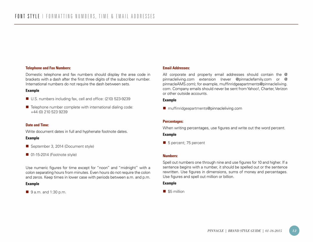
Telephone and Fax Numbers:
Domestic telephone and fax numbers should display the area code in brackets with a dash after the first three digits of the subscriber number. International numbers do not require the dash between sets.
Example
n U.S. numbers including fax, cell and office: (210) 523-9239
n Telephone number complete with international dialing code: +44 (0) 210 523 9239
Date and Time:
Write document dates in full and hyphenate footnote dates.
Example
n September 3, 2014 (Document style)
n 01-15-2014 (Footnote style)
Use numeric figures for time except for “noon” and “midnight” with a colon separating hours from minutes. Even hours do not require the colon and zeros. Keep times in lower case with periods between a.m. and p.m.
Example
n 9 a.m. and 1:30 p.m.
Email Addresses:
All corporate and property email addresses should contain the @pinnacleliving.com extension (never @pinnaclefamily.com or @pinnacleAMS.com); for example, [email protected]. Company emails should never be sent from Yahoo!, Charter, Verizon or other outside accounts.
Example
Percentages:
When writing percentages, use figures and write out the word percent.
Example
n 5 percent; 75 percent
Numbers:
Spell out numbers one through nine and use figures for 10 and higher. If a sentence begins with a number, it should be spelled out or the sentence rewritten. Use figures in dimensions, sums of money and percentages. Use figures and spell out million or billion.
Example
n $5 million
F O N T S T Y L E | F O R M A T T I N G N U M B E R S , T I M E & E M A I L A D D R E S S E S
PINNACLE | BRAND STYLE GUIDE | 01-16-2015 13
E M A I L G U I D E L I N E S | E M A I L S I G N A T U R E S
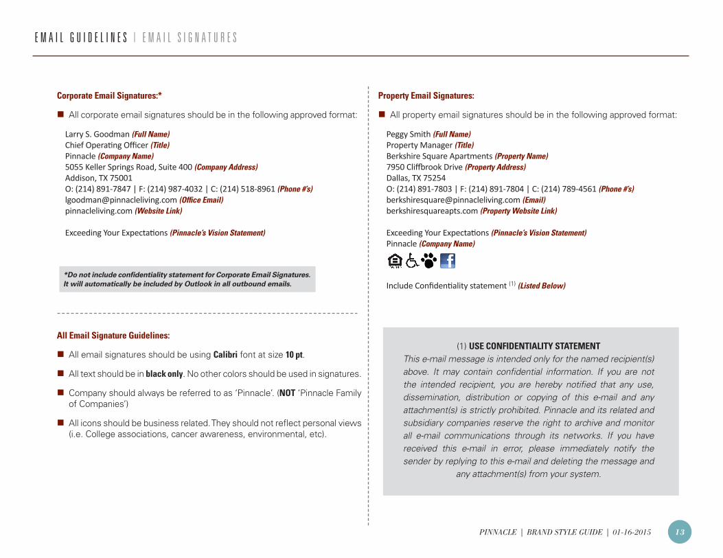
Corporate Email Signatures:*
n All corporate email signatures should be in the following approved format:
Larry S. Goodman (Full Name)Chief Operating Officer (Title)Pinnacle (Company Name)5055 Keller Springs Road, Suite 400 (Company Address)Addison, TX 75001O: (214) 891-7847 | F: (214) 987-4032 | C: (214) 518-8961 (Phone #’s)[email protected] (Office Email)pinnacleliving.com (Website Link)
Exceeding Your Expectations (Pinnacle’s Vision Statement)
Property Email Signatures:
n All property email signatures should be in the following approved format:
Peggy Smith (Full Name)Property Manager (Title)Berkshire Square Apartments (Property Name)7950 Cliffbrook Drive (Property Address)Dallas, TX 75254O: (214) 891-7803 | F: (214) 891-7804 | C: (214) 789-4561 (Phone #’s)[email protected] (Email)berkshiresquareapts.com (Property Website Link)
Exceeding Your Expectations (Pinnacle’s Vision Statement)Pinnacle (Company Name)
Include Confidentiality statement (1) (Listed Below)
All Email Signature Guidelines:
n All email signatures should be using Calibri font at size 10 pt.
n All text should be in black only. No other colors should be used in signatures.
n Company should always be referred to as ‘Pinnacle’. (NOT ‘Pinnacle Family of Companies’)
n All icons should be business related. They should not reflect personal views (i.e. College associations, cancer awareness, environmental, etc).
(1) USE CONFIDENTIALITY STATEMENTThis e-mail message is intended only for the named recipient(s) above. It may contain confidential information. If you are not the intended recipient, you are hereby notified that any use, dissemination, distribution or copying of this e-mail and any attachment(s) is strictly prohibited. Pinnacle and its related and subsidiary companies reserve the right to archive and monitor all e-mail communications through its networks. If you have received this e-mail in error, please immediately notify the sender by replying to this e-mail and deleting the message and
any attachment(s) from your system.
*Do not include confidentiality statement for Corporate Email Signatures. It will automatically be included by Outlook in all outbound emails.
PINNACLE | BRAND STYLE GUIDE | 01-16-2015 14
E M A I L G U I D E L I N E S | E M A I L C O M M U N I C A T I O N S
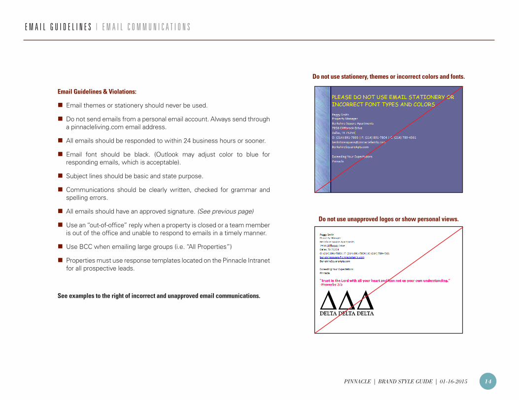
Email Guidelines & Violations:
n Email themes or stationery should never be used.
n Do not send emails from a personal email account. Always send through a pinnacleliving.com email address.
n All emails should be responded to within 24 business hours or sooner.
n Email font should be black. (Outlook may adjust color to blue for responding emails, which is acceptable).
n Subject lines should be basic and state purpose.
n Communications should be clearly written, checked for grammar and spelling errors.
n All emails should have an approved signature. (See previous page)
n Use an “out-of-office” reply when a property is closed or a team member is out of the office and unable to respond to emails in a timely manner.
n Use BCC when emailing large groups (i.e. “All Properties”)
n Properties must use response templates located on the Pinnacle Intranet for all prospective leads.
See examples to the right of incorrect and unapproved email communications.
Do not use stationery, themes or incorrect colors and fonts.
Do not use unapproved logos or show personal views.
PINNACLE | BRAND STYLE GUIDE | 01-16-2015 15
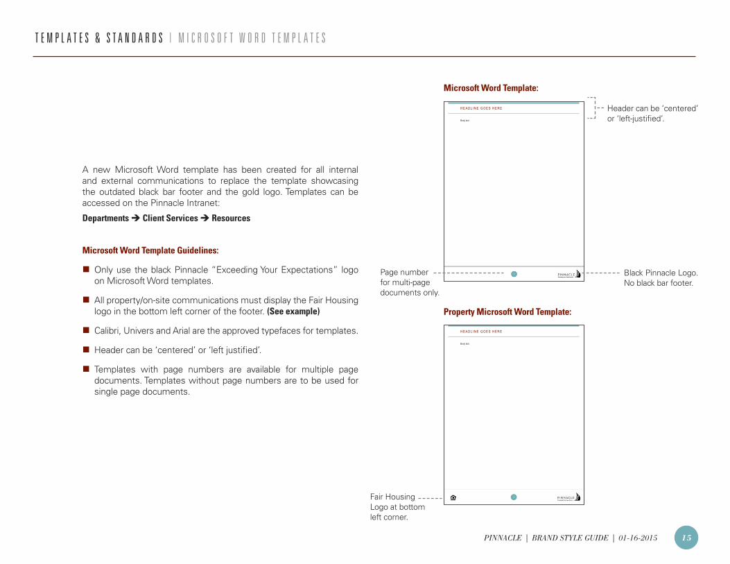
T E M P L A T E S & S T A N D A R D S | M I C R O S O F T W O R D T E M P L A T E S
A new Microsoft Word template has been created for all internal and external communications to replace the template showcasing the outdated black bar footer and the gold logo. Templates can be accessed on the Pinnacle Intranet:
Departments Client Services Resources
Microsoft Word Template Guidelines:
n Only use the black Pinnacle “Exceeding Your Expectations” logo on Microsoft Word templates.
n All property/on-site communications must display the Fair Housing logo in the bottom left corner of the footer. (See example)
n Calibri, Univers and Arial are the approved typefaces for templates.
n Header can be ‘centered’ or ‘left justified’.
n Templates with page numbers are available for multiple page documents. Templates without page numbers are to be used for single page documents.
H E A D L I N E G O E S H E R E
1
Body text
H E A D L I N E G O E S H E R E
Body text
Microsoft Word Template:
Property Microsoft Word Template:
Black Pinnacle Logo. No black bar footer.
Header can be ‘centered’ or ‘left-justified’.
Page number for multi-page documents only.
Fair HousingLogo at bottom left corner.
PINNACLE | BRAND STYLE GUIDE | 01-16-2015 16
Your PowerPoint presentation should be seen as a visual aid that enhances your spoken presentation; it is not a story in itself. A screen presentation makes use of key words to communicate the subjects of your talk: this is not only useful for our audience; it also acts as a prompt.
In Brief:
n Utilize Pinnacle-branded PowerPoint template. The slides form the basis for your spoken presentation.
n The slides contain the most important facts only; you should communicate the rest verbally.
n All text used in slides must be brief, distinct and be formulated point by point.
USE THE FOLLOWING TEXT ELEMENTS TO BUILD A WELL-ORGANIZED SLIDE:
Headings:
n Give each slide a heading which is appropriate to the slide’s subject matter.
n A good heading is brief and to the point. Try to keep headings to a single line only.
Text & Bullets Used on Slides:
n Always keep the amount of text on a slide to the absolute minimum.
n The purpose of a slide is to enhance your verbal presentation by displaying the key words. Using a lot of text only makes it difficult to read. Limit your text to a maximum of 10 lines for each slide.
n Enumeration is a good way to set out the subjects you deal with in your presentation. Restrict the number of bullet levels to one per slide.
Captions:
n When using captions to explain a photo or illustration, use as few words as possible. However, try to avoid using captions by selecting photographs and illustrations that are self-explanatory.
Quotations:
n All quotations used in your presentation should be in italics and placed inside quotation marks.
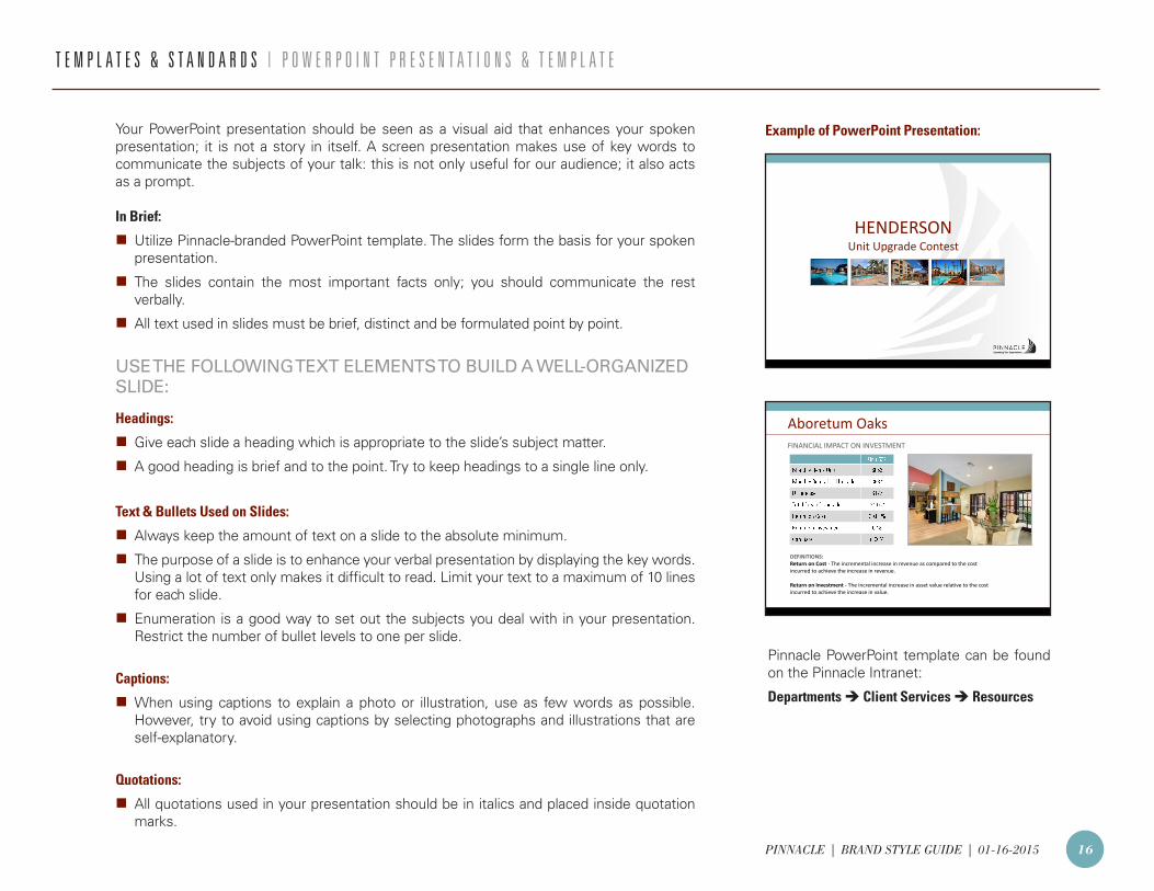
HENDERSON Unit Upgrade Contest
FINANCIAL IMPACT ON INVESTMENT
Aboretum Oaks
DEFINITIONS: Return on Cost - The incremental increase in revenue as compared to the cost incurred to achieve the increase in revenue. Return on Investment - The incremental increase in asset value relative to the cost incurred to achieve the increase in value.
T E M P L A T E S & S T A N D A R D S | P O W E R P O I N T P R E S E N T A T I O N S & T E M P L A T E
Example of PowerPoint Presentation:
Pinnacle PowerPoint template can be found on the Pinnacle Intranet:
Departments Client Services Resources
PINNACLE | BRAND STYLE GUIDE | 01-16-2015 17
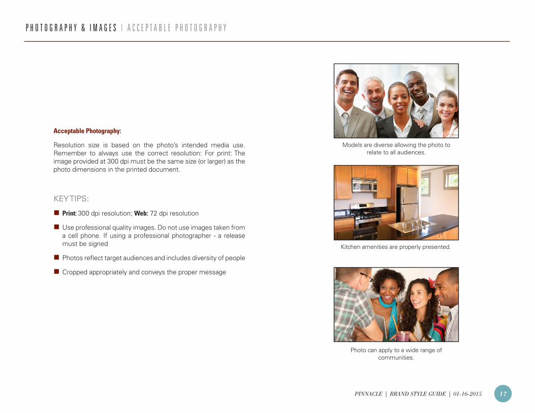
Acceptable Photography:
Resolution size is based on the photo’s intended media use. Remember to always use the correct resolution: For print: The image provided at 300 dpi must be the same size (or larger) as the photo dimensions in the printed document.
KEY TIPS:
n Print: 300 dpi resolution; Web: 72 dpi resolution
n Use professional quality images. Do not use images taken from a cell phone. If using a professional photographer - a release must be signed
n Photos reflect target audiences and includes diversity of people
n Cropped appropriately and conveys the proper message
Photo can apply to a wide range of communities.
Models are diverse allowing the photo to relate to all audiences.
Kitchen amenities are properly presented.
P H O T O G R A P H Y & I M A G E S | A C C E P T A B L E P H O T O G R A P H Y
PINNACLE | BRAND STYLE GUIDE | 01-16-2015 18
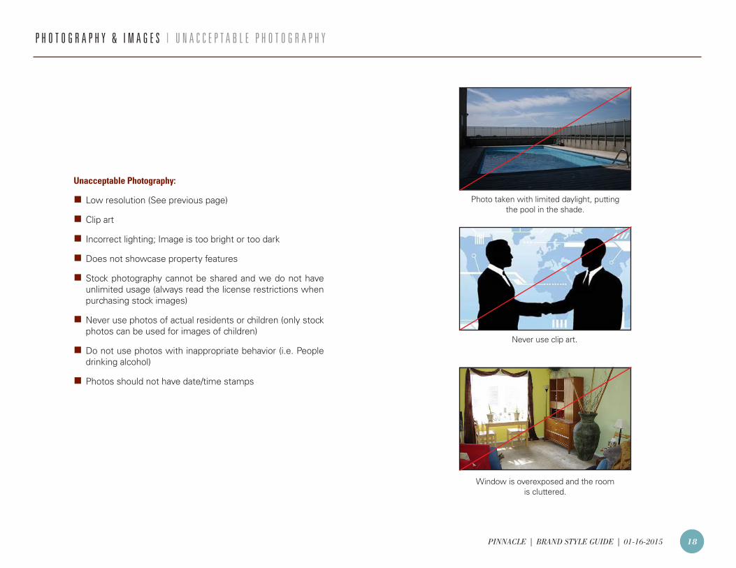
Unacceptable Photography:
n Low resolution (See previous page)
n Clip art
n Incorrect lighting; Image is too bright or too dark
n Does not showcase property features
n Stock photography cannot be shared and we do not have unlimited usage (always read the license restrictions when purchasing stock images)
n Never use photos of actual residents or children (only stock photos can be used for images of children)
n Do not use photos with inappropriate behavior (i.e. People drinking alcohol)
n Photos should not have date/time stamps
P H O T O G R A P H Y & I M A G E S | U N A C C E P T A B L E P H O T O G R A P H Y
Window is overexposed and the room is cluttered.
Photo taken with limited daylight, putting the pool in the shade.
Never use clip art.
PINNACLE | BRAND STYLE GUIDE | 01-16-2015 19
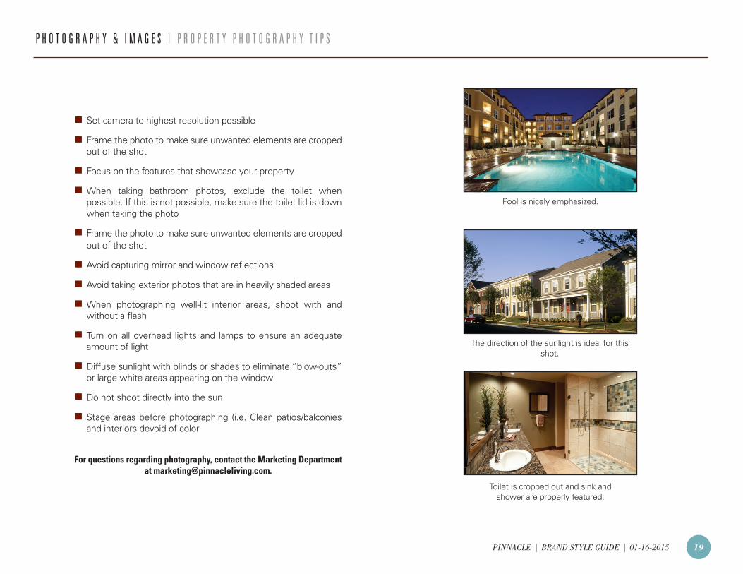
n Set camera to highest resolution possible
n Frame the photo to make sure unwanted elements are cropped out of the shot
n Focus on the features that showcase your property
n When taking bathroom photos, exclude the toilet when possible. If this is not possible, make sure the toilet lid is down when taking the photo
nFrame the photo to make sure unwanted elements are cropped out of the shot
nAvoid capturing mirror and window reflections
nAvoid taking exterior photos that are in heavily shaded areas
nWhen photographing well-lit interior areas, shoot with and without a flash
nTurn on all overhead lights and lamps to ensure an adequate amount of light
nDiffuse sunlight with blinds or shades to eliminate “blow-outs” or large white areas appearing on the window
nDo not shoot directly into the sun
nStage areas before photographing (i.e. Clean patios/balconies and interiors devoid of color
For questions regarding photography, contact the Marketing Department at [email protected].
P H O T O G R A P H Y & I M A G E S | P R O P E R T Y P H O T O G R A P H Y T I P S
Toilet is cropped out and sink and shower are properly featured.
Pool is nicely emphasized.
The direction of the sunlight is ideal for this shot.
PINNACLE | BRAND STYLE GUIDE | 01-16-2015 20
F I L E F O R M A T T Y P E S | F I L E U S A G E
EPS (Encapsulated PostScript):
EPS files are scalable to any size making them ideal for logos and for all forms of print application. Always send logos at .eps files to printing companies. EPS files support Pantone, CMYK and RGB color spaces.
Use EPS for:
n Logos
n Print Applications
JPEG:
JPEG files are ideally suited for online applications at 72 dpi (low resolution). Files at 300 dpi (high resolution) can be used for print as long as they are the same size or larger than the photo dimensions in the document. JPEG’s are not ideal for logos because of the white background behind the image.
Use JPEG for:
n Online photos (i.e. Websites, Internet Listing Services, etc)
n Print Applications - must be 300 dpi (See above)
PNG (Portable Network Graphics):
PNG files are ideally suited for online applications because they support RGB color spaces. They can be used to display logos online and have a transparent background. PNGs do not support CMYK are not to be used for any print applications.
Use PNG for:
n Online photos
n Logos (Internet only - No Print Applications)
GIF (Graphics Interchange Format):
GIF files are resolution-dependent at 72 dpi with a limited maximum color palette. This makes the GIF format unsuitable for reproducing color photographs and other images with continuous color. GIF files are well-suited for online use of image with simpler images with solid blocks of color. They should only be used for electronic media only and never for print.
Use GIF for:
n Online use with simple images and colors (For photographs use JPEGS)
PINNACLE | BRAND STYLE GUIDE | 01-16-2015 21
ROMANCE PARAGRAPH:A romance paragraph is the ideal place to sell a community. It is essential that the paragraph contain key components to relay the proper message to a potential resident.
The paragraph should contain the following:
n Property Name
n City, State
n 1 or 2 interior amenities and 1 or 2 community amenities
n Local Attractions (i.e. Shopping/dining, major freeways, tourist attractions, lakes/rivers/oceans, etc.)
n Types of units (i.e. Spacious 1 and 2 bedroom homes)
n Paragraph should not contain more than 800 characters
n Keywords such as “luxury” and “affordable”
n Call to Action (i.e. Lease Today)
WORD USAGE:The community must be properly conveyed in all marketing materials. The following words should not be used because they are either dated, add no differentiating value to your message or have legal reasons to discourage usage.
Avoid “illegal” and unfriendly marketing terms:
P R O P E R T Y M A R K E T I N G G U I D E L I N E S | W R I T I N G C O N T E N T
n Secure/Safe
n Child/Children
n Tenant/Occupant/Renter (use Resident)
n Courtesy Patrol (Use Courtesy Monitor)
n Gated Community (Use Limited Access Gates or Limited Access Community)
n Quiet
n Unit (Use Apartment Home)
n Complex (Use Community)
n Party (Use Resident Events)
n Spiritual (Anything that implies religious preferences)
n Any word that relates to a specific group (i.e. “Family-oriented” or “Singles”)
n Use descriptive words (i.e. “Refreshing” Pool)
n Disabled

PINNACLE | BRAND STYLE GUIDE | 01-16-2015 22
Open Floorplans
Private Garages**
Walk In Closets
Tiled Flooring & Lush Carpeting
Resident Events
Fully Equipped Kitchens
Over Sized Bathrooms
Tot Lot
Friendly Onsite Staff
DIRECTIONSFrom Austin Peay Hwy take
Raleigh Millington Rd. North, turn left on Addington Dr., Blueberry Hill will greet you on the right.
NNew Allen
Raleig
h Millin
gton
Austin P
eay Hwy
Egypt Central
Yale
Single
ton Pk
wyBolen Huse
* Restrictions apply, **In select homes
LIMITED TIME ONLYONE MONTH FREE!*
D E S I G N E D W I T H Y O U I N M I N D
LEASE TODAY!
Blueberry Hill Apartments features spacious 1 and 2 bedroom apartment homes, 24-hour emergency maintenance and great customer service. Enjoy all the conveniences and amenities Blueberry Hill has to offer.
Stop looking and start living today!
(901) 377-07004715 Hedges Drive | Memphis, TN 38128
[email protected] | pinnacleliving.com
BLUEBERRY HILL APARTMENTSThe property flyer to the right is an ideal example of effective usage of the Pinnacle brand.
Name and/or Logo
Tagline
High Resolution Photo
Call to Action
Current Offer
Romance Paragraph
Disclaimer
Fair Housing Logo
ADA Logo (if applicable)
Pet Friendly Logo (if applicable)
Community Contact Info - Phone Number, Address, Website, Email
Pinnacle Logo (should be placed in the bottom right corner when possible)
All necessary industry logos should be on the left side
P R O P E R T Y M A R K E T I N G G U I D E L I N E S | B R A N D A P P L I C A T I O N
1
1
2
3
4
5
6
7
8
9
10
11
12
3
4
5
6
7
8
9 10 11 12
2
PINNACLE | BRAND STYLE GUIDE | 01-16-2015 23
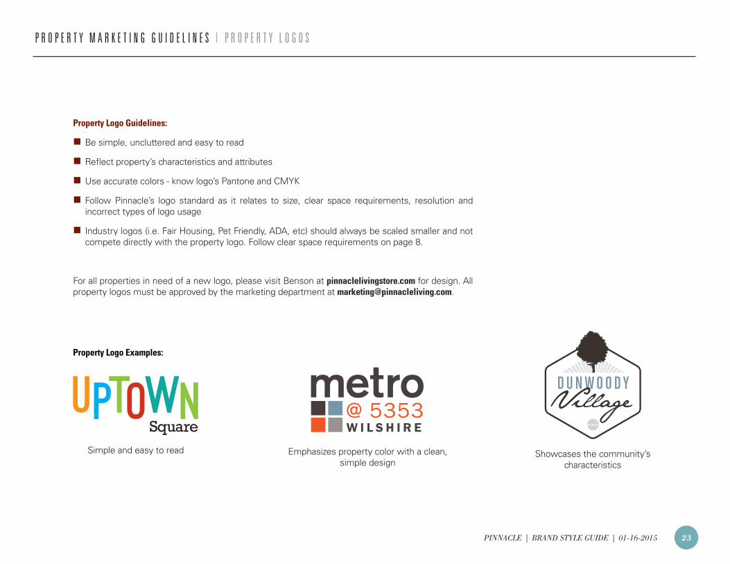
Emphasizes property color with a clean, simple design
Property Logo Examples:
Showcases the community’s characteristics
Simple and easy to read
P R O P E R T Y M A R K E T I N G G U I D E L I N E S | P R O P E R T Y L O G O S
Property Logo Guidelines:
n Be simple, uncluttered and easy to read
n Reflect property’s characteristics and attributes
n Use accurate colors - know logo’s Pantone and CMYK
n Follow Pinnacle’s logo standard as it relates to size, clear space requirements, resolution and incorrect types of logo usage
n Industry logos (i.e. Fair Housing, Pet Friendly, ADA, etc) should always be scaled smaller and not compete directly with the property logo. Follow clear space requirements on page 8.
For all properties in need of a new logo, please visit Benson at pinnaclelivingstore.com for design. All property logos must be approved by the marketing department at [email protected].
PINNACLE | BRAND STYLE GUIDE | 01-16-2015 24
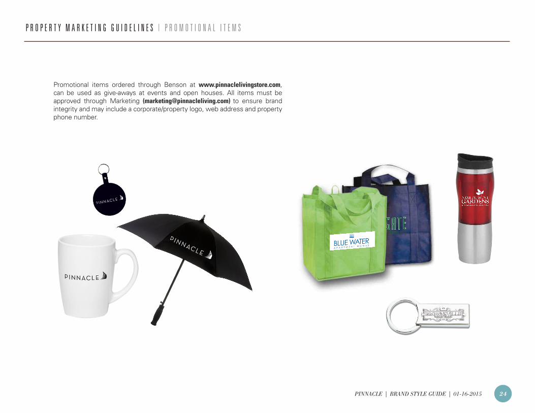
P R O P E R T Y M A R K E T I N G G U I D E L I N E S | P R O M O T I O N A L I T E M S
Promotional items ordered through Benson at www.pinnaclelivingstore.com, can be used as give-aways at events and open houses. All items must be approved through Marketing ([email protected]) to ensure brand integrity and may include a corporate/property logo, web address and property phone number.
PINNACLE | BRAND STYLE GUIDE | 01-16-2015 25
Fair Housing logo
ADA logo
Logos can be found on the Pinnacle Intranet:
Departments Client Services Resources
I N T E R N E T B R A N D I N G | P R O P E R T Y W E B S I T E
Property Website Guidelines:
n Review website weekly to ensure information is correct.
n Pinnacle logo should appear at the bottom of the website page.
n Call to action should be predominately displayed (i.e. Lease Today).
n Use Professional quality photos. See pages 17-19 for more information.
n Romance paragraphs should be located on the home page.
n Property contact information should appear at the bottom of every page.
n Disclaimers should appear on every page.
n Fair Housing and ADA logos should appear at the bottom of every page.
PINNACLE | BRAND STYLE GUIDE | 01-16-2015 26
I N T E R N E T B R A N D I N G | S O C I A L M E D I A
Social Media Tips:
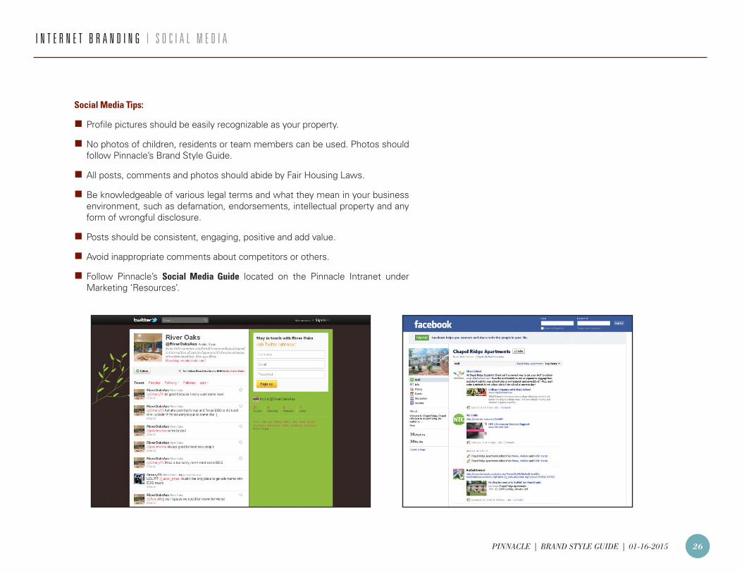
n Profile pictures should be easily recognizable as your property.
n No photos of children, residents or team members can be used. Photos should follow Pinnacle’s Brand Style Guide.
n All posts, comments and photos should abide by Fair Housing Laws.
n Be knowledgeable of various legal terms and what they mean in your business environment, such as defamation, endorsements, intellectual property and any form of wrongful disclosure.
n Posts should be consistent, engaging, positive and add value.
n Avoid inappropriate comments about competitors or others.
n Follow Pinnacle’s Social Media Guide located on the Pinnacle Intranet under Marketing ‘Resources’.
PINNACLE | BRAND STYLE GUIDE | 01-16-2015 27
D I S C L A I M E R S & L E G A L I T I E S
Disclaimers:
Disclaimers must be used on ALL marketing collateral. Minimum font size for all disclaimers is 6pt.
DISCLAIMER EXAMPLES:Price sheets:
To reserve an apartment home, application fee(s) and deposit are required. Rates and availability are subject to change without notice.
Requesting an email address:
Pinnacle collects and uses personal information to respond to requests for information, marketing, and services. Your email and personal information will only be used for the purpose for which you have provided it. It is our policy not to sell or pass on any personal information that you may have provided to us unless we have your consent to do so.
Promotions, drawings, or prizes:
Restrictions apply, see Leasing Associate for details.
For pet friendly communities:
Breed restrictions apply. Additional deposits and pet rent may apply.
Legalities
Federal Fair Housing:
In adherence to Federal Fair Housing regulations, be sure to represent all population segments when developing marketing collateral. Diversity is key in photography, copy, and distribution.
Visit www.hud.gov/offices/fheo/FHLaws/ to view a copy of the Federal Fair Housing Advertising Guidance document.
Registered trademarks and patents:
Following copyright laws is vital when developing any kind of marketing material. Stay up to date and adhere to registered trademark and patent laws.
PINNACLE | BRAND STYLE GUIDE | 01-16-2015 28
C O N T A C T | R E S O U R C E S
If you have any questions regarding Pinnacle’s Brand Standards, please contact Marketing at [email protected].
Resources:
n Pinnacle Logos
Pinnacle Intranet: Departments Client Services Resources
n Industry Logos (i.e. Fair Housing, ADA, etc.)
Pinnacle Intranet: Departments Client Services Resources
n Microsoft Office Templates (Word & PowerPoint)
Pinnacle Intranet: Departments Client Services Resources
n Social Media Guide
Pinnacle Intranet: Departments Marketing Resources