Embed Size (px)
Citation preview

The An Tir College of Scribes
Award Charter Guidebook
First Edition ~ 2010 ~
Copyright Information
Contained within these pages is standard information based on the culture and traditions of the Kingdom of An Tir of the Society for Creative Anachronism, Inc., and the Kingdom‟s College of Scribes and College of Heralds. © Copyright 2010 An Tir College of Scribes, Society for Creative Anachronism, Inc. This is not a corporate publication of the Society for Creative Anachronism, Inc., and does not delineate SCA policies. The Society of Creative Anachronism, Inc. and its members have permission to reproduce this work continuously, in whole or in part, for educational purposes.

“The Word of the Crown is Law”
Those who rule as King and Queen in the Sovereign Lands of the Kingdom of An Tir need only to speak Their will ~ and we shall gladly serve Them
this Guide is only fitting and proper as long as it is in agreement with the will of Their Most Royal Majesties An Tir

i
TABLE OF CONTENTS
Letter of Introduction…………………………………………………………………………..………. iv
CHARTER FUNDAMENTALS The An Tir Charter – from Conception to Presentation……………….…………..…………… 02
CHARTER REQUIREMENTS Design Guide - for Kingdom “Charter Masters”……………………………………………… 04 Designer‟s “Art Release Form”……………………………………………………………………… 05 “Artists Release Form” for Multiple Works……………………………………………………… 06
CHARTER DESIGN Tools and Materials Basic Designer‟s Kit………………………………………………………………………..…………… 08 Design Elements Charter Texts………………………………………………………………………………..…………… 10 An Tir‟s Great Seal & Signet Ring Seal……………………………………………..…………… 11 Layout Examples - Landscape….………………………………………………………………….. 12 Layout Examples – Portrait………………………………………………………………………….. 13 Heraldry on Charters – Do‟s and Don‟ts……………………………………………………….. 14 An Tir Grant Award Badges…………………………………………………………………………. 15 Technique Basic Charter Construction – by Carla Sans Question………………………..…………… 17 Charter Construction – by Elisabetta Annisa Gabrielli………………………..…………… 18 Process for Charter Masters - by Eleanor de Sackville.…………………………………….. 19 Calligraphy Charter Calligraphy Basics………………………………………………………………………….. 21 Ruling off Guidelines for Calligraphy……………………………………………………………. 22 Using the Correctly Sized Pen Nib……………………………………………………………….. 23 Foreign Hands
pseudo-Arabic ductus…………………………………….………………………………… 24 pseudo-Cyrillic ductus………………………………………………………………………. 25 pseudo-Greek ductus………………………………………………………………………. 26 Elder Futhark – Germanic – 2nd to 8th Centuries………………………………….. 27 Younger Futhark – Scandinavian – 8th to 12th Centuries………………….…… 28
Glossing a Foreign Text……………………………………….………………………..…………… 29

ii
Illumination Charter Illumination Basics………………………………………………………………………….. 31 Charter Master Examples Gothic Style “AoA‟ - by Wynn Constantine……………………………………………………. 33 Norse Style “AoA” – by Ragnar Haerulangr…………………………………………………… 34 Russian Style “Goutte de Sang” – by Bronwen Elgars……………………..…………….. 35
CHARTER PAINTING Tools and Materials Basic Painter‟s Kit…………………………………………………….…………………...…………… 38 Special Element Painting Requirements Heraldic Colors………………………………………………………………………….…….………… 40 Badge of the Order of the Goutte de Sang…………………………………….…………….. 41 Badge of the Order of the Grey Goose Shaft….……...………………………….…………. 42 Badge of the Ordo Hastae Leonis…………..…………………………………………………… 43 Badge of the Order of the Jambe de Lion…………………………………………………….. 44 Badge of the Order of the Lion et de la Lance………..……………………….……………. 45 Badge of the Order of the White Scarf of An Tir……………………………………………. 46 Technique Color Theory…………………………………………………………………………………………….. 48 Claude Boutet‟s 12 Color Wheel – circa 1708……………………………………………….. 49 Owen Jones‟ Color Tips – circa 1856…………………………………………………………… 50 Charter Painting – The Basic Two Dimensional Technique…………………………….. 51 Charter Painting – The Basic Three Dimensional Technique…………………………... 52 Charter Painting – The Basic Detailing Techniques………………………………………… 53 Charter Painting – Technique Examples……………………………………………………….. 54

iii
Letter of Introduction
This First Edition of the An Tir College of Scribes - Award Charter Guidebook was written expressly to provide information to those individuals interested in volunteering to serve ~ or ~ who are already serving the Sable Lion Throne as Scribal Artisans. It is intended as a handbook for those Scribes working to create Award Charters for Their Majesties use. This Guidebook illustrates the current customs of the Kingdom of An Tir and should be updated by the Kingdom Scribe as customs change. Needed corrections, modifications or augmentations should be forwarded to Sable Sable, Kingdom Scribe. This Guide is dedicated to the greater glory of The Kingdom of An Tir, to the past, present and future Royalty of An Tir, and to the An Tir College of Scribes. May it be that our service is ever joyful and an enrichment to An Tir, Bronwen Sable Sable, Kingdom Scribe August - A.S. XLV (being 2010 in the common era)

1
CHARTER
FUNDAMENTALS

2
The An Tir Charter ~ from Conception to Presentation ~
by Bronwen Elgars – November 2008
-----------------------------------------------------------------------------------------
The AnTir Crown Tournament decides our new Royal Heirs. From that eventful day, the Crown Prince and Princess of AnTir begin to prepare for Their ascension to the Sable Lion Throne. One of the most important things that They will do during Their Reign is to recognize the good works of Their noble subjects with tokens and awards. In AnTir, the Award Charter is one of the tools that can be used in the award ceremony. In preparation:
Their Royal Highnesses… determine if Their Reign will have a Theme. choose a Royal Scribe to serve Them. create Charter Texts (with assistance from Sable Sable, Kingdom Scribe), typically for the:
Award of Arms Goutte de Sang Jambe de Lion others as desired
convey to the Royal Scribe Their desires, in terms of design and number of each type of Charter. Order Their Royal Scribe to guide the College of Scribes in creating the Charter Masters for Their Reign.
The Royal Scribe… assists Their Highnesses as may be needed in developing texts and design criteria for Their Charters. prepares a Charter Criteria Document outlining Their Highnesses design preferences. communicates Their Highnesses‟ directive to the AnTir College of Scribes to create Charter Masters per the
approved Charter Criteria Document. sets the deadline for the Masters to be turned in per Their Highnesses‟ decree.
Members of the AnTir College of Scribes… create Charter Masters for Their Highnesses per the Charter Criteria Document. submit Masters to the Royal Scribe by the decreed deadline.
The Royal Scribe… contacts Sable Sable to provide Charter Paper from the Kingdom stores. collects the Charter Masters from the Scribes and presents them to Their Royal Highnesses for approval. arranges for the “selected” Masters to be photocopied onto Charter Paper creating the Charter Blanks. mails packets of Charter Blanks out to the College of Scribes for painting and embellishing.
Members of the AnTir College of Scribes… paint and embellish the blank Charters to create beautiful and unique award documents. return the illuminated Charters to the Royal Scribe by the requested deadlines.
The Royal Scribe…
amasses the illuminated Charters received from the Scribes and does any extra finish work as may be needed.
Their Royal Highnesses… attend Their Coronation and are Crowned as Their Most Royal Majesties AnTir.
Their Royal Majesties… decide upon individuals They would like to recognize with tokens and awards, grants and patents of arms. instruct Their Royal Scribe, when appropriate, to prepare illuminated Charters by adding the recipients‟ names
and the dates They intend to make awards. place Their Signatures and either the Kingdom Seal or the Signet Seal upon the prepared Charters. when seated in Their Royal Court, instruct Their Herald to call forth the recipient to stand before Them. instruct Their Royal Herald to read the words of the Charter for all to hear. present The recipient with the Illuminated Charter.
NOTE: When the reign is over, the original Charter Masters, any unused illuminated Charters and leftover Charter Blanks are sent to the Kingdom Scribe. These documents are safely stored for possible future use in replacing what may become lost or damaged and providing what may have been promised during the reign. At the time of this writing, Sable Sable, Kingdom Scribe retains a Past Reign Charter Deputy who is responsible for the organizing, filing and safekeeping of these documents and for fulfilling any legitimate requests.

3
CHARTER
REQUIREMENTS

4
Kingdom CHARTER MASTER Design Guide by Bronwen Elgars – November 2008
a “Charter Master” is essentially, a black and white line drawing (reminiscent of what you might find in a coloring book)
The Charter Master is used to replicate a batch of “charter blanks” ~ photocopied onto heavyweight archival papers ~ that ~ illuminators can embellish and beautify with paint ~
GENERAL
The Master must be created on 11 x 17 white paper. The final Linework and Calligraphy must be black. The dimensions of the Final Overall Design (including margins) must measure 11” x 14”.
Use the 3 inch Leftover Space - on the 11 x 17 Master – for information or instructions to the Royal Scribe and/or the illuminators, as may be needed.
The Master must be clean of any blemish that might transfer to the photocopied blanks. A Scribal Art Release Form should accompany each Master that is submitted.
WORDS and CALLIGRAPHY
Approved texts will be provided to you by the Royal Scribe. Any change to the text wording must go through the Royal Scribe for Royalty approval. The final Calligraphy must be carefully lettered so as to be uniform, even and neat. Lightly ruled lettering guidelines are encouraged, but must be erased clean from the final. One entire text line must be left blank for the Recipient‟s Name. A Blank text space, large enough to letter the Award Date: month, day, year and year descriptor
(“A.S.”, or “anno-societatis”) must be provided – do NOT letter in the year. Before breaking a word between two lines, make sure it is an accepted practice.
Do NOT use a foreign calligraphic hand or simulated foreign hands unless you have permission to do so and if you do, include the full alphabet key in the 3” leftover space.
Do NOT gloss a foreign hand unless you have permission to do so. If you use a foreign hand or a simulated-foreign hand and have not glossed the text in English,
include a neatly lettered translation of the text for the Royal Scribe to photocopy on the back of the charter blanks.
The calligraphic hand should be consistent with the culture and period style of the illustration.
LINEWORK and ILLUSTRATION
Reign “theme” information and charter design requirements will be provided to you by the Royal Scribe.
The Illustration Lineweights (width of the drawn lines) should be strong enough to create a perfect copy, but not so strong as to actually look like a child‟s color book page.
Linework should be crisp and continuous and not appear to be sketched. The illustration should have strong, clear paintable elements and should NOT include fine and
dainty detail (be mindful of the illuminator‟s task). Do NOT fill in or shade areas in your illustration. Leave a 1” framing margin at top, left and right, with a slightly larger margin at the bottom. Designate space for Their Royal Majesties‟ signatures, but do NOT write their names. Include either a 3 1/2" diameter space, designated for the Kingdom Seal, or a 2” diameter space,
designated for the Royal Signet Ring Seal. Goutte de Sang and Jambe de Lion charters must include the Badge of the Order as a design
element – but do NOT include any other registered Kingdom or Personal Heraldry. Do NOT designate a space for the recipient‟s Heraldry. The culture and period style of the illustration should be consistent with the calligraphic hand.

5
The Kingdom of An Tir and The An Tir College of Scribes
SCRIBAL ART RELEASE FORM
OVERVIEW: Whereas The Kingdom of An Tir of the Society for Creative Anachronism, Inc. (the “Kingdom”) is undertaking to provide its award recipients with hand-lettered and hand-painted documents, which record in writing, the customary particulars of the award being given and accomplishes this using either; a one-of-a-kind Scroll, or many “like” Charters created from a single Master Design, which are individually and uniquely painted by volunteers, and whereas the An Tir College of Scribes of the Society for Creative Anachronism, Inc. (the “College”) is undertaking to provide exemplar images of scribal art and close-up images of details of the same works, either digitally on its educational website, or in future hardcopy educational publications, for the purpose of enlightening those individuals interested in the study of the medieval scribal arts,
and whereas I am submitting my work (Title of Artwork) _______________________________________________________ to be
used for those purposes, either; complete in total, or with areas intentionally left blank for use by a Kingdom official to fill in the customary award particulars, and knowing full well that each and every piece selected for use by the Kingdom, will be modified with the addition of the Kingdom Seal and Signatures of the authorized Royalty and that pieces involving heraldic achievement will be further modified with the addition of the Kingdom Herald‟s Seal and the signature of the authorized Herald,
I, (Legal Name) ____________________________________________, the Artist, (being known in the Society for
Creative Anachronism as (Name) _____________________________________________________, hereby agree to the
following terms and conditions of this release:
1. I am the legal owner of, or have the legal authority to license, all copyrights and all other intellectual property rights
in visual art, and/or written works (the “Artwork”) that I intend to license to the Kingdom and the College. 2. The Kingdom and the College shall be granted a non-exclusive, royalty-free, perpetual and irrevocable license to
utilize, reproduce and/or display the Artwork in whole or in part in the Kingdom‟s and College‟s print and electronic media in connection with the Kingdom‟s and College‟s purposes as stated in the Overview above.
3. Said license shall not infringe or violate the rights of any third party, including any copyright interests and I shall
indemnify, defend and hold the Kingdom and the College harmless from any claims, losses, damages, or reasonable attorney‟s fees incurred in connection to any claim of alleged copyright infringement or other property right infringement, in connection to said license.
4. The Kingdom and the College shall render reasonable effort in disclosing copyright notice to third parties, whereby
the Artist or the designee identified accordingly by the Artist, shall be identified as the copyright owner. 5. The Kingdom and the College reserve the right to select the said licensed Artwork to be utilized, reproduced and/or
displayed in the Kingdom‟s or College‟s print and electronic media and furthermore, reserve the right to reject any Artwork that the Kingdom or College decides is not up to the standards which are desired for utilization, reproduction or display.
6. The Kingdom and the College have the right to enlarge or reduce the Artwork size if the image does not fit into the
print and electronic media and (choose either option [a] or [b] by placing a checkmark in the box)
[a] other than what is agreed to in the Overview above, the Kingdom HAS the right to modify and/or amend the Artwork if it is deemed unsuitable in its present form for the Kingdom‟s stated purpose.
[b] except as agreed to in the Overview above, the Kingdom DOES NOT have the right to modify and/or amend the Artwork if it is unsuitable in its present form for the Kingdom‟s stated purposes, and if not outright rejected, shall return the Artwork to the Artist for such revisions, additions or other changes that will render the Artwork suitable for use.
IN WITNESS WHEREOF, I, or my authorized representative, have hereto affixed the dated signature.
_________________________________________________________________ _____________ Printed name of Artist (and parent/legal guardian thereof if under 18 years of age) Date
_________________________________________________________________ _____________ Signature of Artist (and parent/legal guardian thereof if under 18 years of age) Date

6
The Kingdom of An Tir and The An Tir College of Scribes
SCRIBAL ART RELEASE FORM – MULTIPLE WORKS
OVERVIEW: Whereas The Kingdom of An Tir of the Society for Creative Anachronism, Inc. (the “Kingdom”) is undertaking to provide its award recipients with hand-lettered and hand-painted documents, which record in writing, the customary particulars of the award being given and accomplishes this using
either; a one-of-a-kind Scroll, or many “like” Charters created from a single Master Design, which are individually and uniquely painted by volunteers, and whereas the An Tir College of Scribes of the Society for Creative Anachronism, Inc. (the “College”) is undertaking to provide exemplar images of
scribal art and close-up images of details of the same works, either digitally on its educational website, or in future hardcopy educational publications, for the purpose of enlightening those individuals interested in the study of the medieval scribal arts,
and whereas I am submitting my work (Titles of Artwork) _______________________________________________________ _______________________________________________________
_______________________________________________________ _______________________________________________________
_______________________________________________________ _______________________________________________________ _______________________________________________________ _______________________________________________________
_______________________________________________________ _______________________________________________________
_______________________________________________________ _______________________________________________________
to be used for those purposes, either; complete in total, or with areas intentionally left blank for use by a Kingdom official to fill in the customary award particulars, and knowing full well that each and every piece selected for use by the Kingdom, will be modified with the addition of the Kingdom Seal and
Signatures of the authorized Royalty and that pieces involving heraldic achievement will be further modified with the addition of the Kingdom Herald‟s Seal and the signature of the authorized Herald,
I, (Legal Name) ____________________________________________, the Artist, (being known in the Society for Creative
Anachronism as (Name) _____________________________________________________, hereby agree to the following terms and
conditions of this release:
7. I am the legal owner of, or have the legal authority to license, all copyrights and all other intellectual property rights in visual art,
and/or written works (the “Artwork”) that I intend to license to the Kingdom and the College. 8. The Kingdom and the College shall be granted a non-exclusive, royalty-free, perpetual and irrevocable license to utilize, reproduce
and/or display the Artwork in whole or in part in the Kingdom‟s and College‟s print and electronic media in connection with the Kingdom‟s and College‟s purposes as stated in the Overview above.
9. Said license shall not infringe or violate the rights of any third party, including any copyright interests and I shall indemnify, defend
and hold the Kingdom and the College harmless from any claims, losses, damages, or reasonable attorney‟s fees incurred in connection to any claim of alleged copyright infringement or other property right infringement, in connection to said license.
10. The Kingdom and the College shall render reasonable effort in disclosing copyright notice to third parties, whereby the Artist or the
designee identified accordingly by the Artist, shall be identified as the copyright owner. 11. The Kingdom and the College reserve the right to select the said licensed Artwork to be utilized, reproduced and/or displayed in
the Kingdom‟s or College‟s print and electronic media and furthermore, reserve the right to reject any Artwork that the Kingdom or College decides is not up to the standards which are desired for utilization, reproduction or display.
12. The Kingdom and the College have the right to enlarge or reduce the Artwork size if the image does not fit into the print and
electronic media and (choose either option [a] or [b] by placing a checkmark in the box)
[a] other than what is agreed to in the Overview above, the Kingdom HAS the right to modify and/or amend the Artwork if it is deemed unsuitable in its present form for the Kingdom‟s stated purpose.
[b] except as agreed to in the Overview above, the Kingdom DOES NOT have the right to modify and/or amend the Artwork if it is unsuitable in its present form for the Kingdom‟s stated purposes, and if not outright rejected, shall return the Artwork to the Artist for such revisions, additions or other changes that will render the Artwork suitable for use.
IN WITNESS WHEREOF, I, or my authorized representative, have hereto affixed the dated signature. ___________________________________________________________________ _____________ Printed name of Artist (and parent/legal guardian thereof if under 18 years of age) Date ___________________________________________________________________ _____________ Signature of Artist (and parent/legal guardian thereof if under 18 years of age) Date

7
CHARTER
DESIGN
Tools and Materials

8
Basic Designer’s Kit _________________________________________
Mechanical Pencil - Typically a .5mm holder with a medium lead, i.e., 2H, H, F or HB, will work well. Leads that are too hard make a light, easily erasable line, but often leave indentations in the paper that cannot be removed. Leads that are too soft leave so much graphite on the paper that it can be difficult to clean completely off.
Pencil Eraser – Use an eraser that works well with the pencil lead you have chosen. The standard Pink erasers, like those on the ends of pencils, are NOT the best choice as they can smear the graphite and damage the paper.
Technical Pen(s) – Also called Rapidograph Pens. You may want a variety of sizes, the 0, 1 and 2 make a good set. Some people prefer instead to use disposable Pigma Micron Pens or something similar, because Technical Pens require frequent and careful cleaning. Do not use a pen that bleeds ink.
Finely divided Scale – Some people call this tool a “Ruler”. The common “US Customary Units” Scale usually comes with 1/16” divisions. Metric Scales are more finely divided in millimeters. Some find Engineer‟s and Architect‟s triangular Scales to be useful because of the fineness of the divisions. A transparent plastic scale with 1/16” divisions on one edge and millimeter divisions on the other is a good choice. This instrument is not designed as the proper tool to use for ruling ink lines, as the ink can be sucked under the edge thus spoiling the line.
Drafting Straightedge or Ruling Edge – You do not need to use a true Drafting Straightedge. A common Drafting Triangle with raised inking edges works well.
Calligraphy Pens – You will probably want a variety of nib sizes on hand as you will need to fit Their Majesties‟ chosen text into the design. The Rotring 1.1, 1.5 and 1.9 pens make a nice balanced set of nib sizes.
Ink – Because you will probably use this also when making original scrolls, this should be archival, fade-proof, permanent, black ink. CAREFUL – as Ink bottles always seem to spill or leak their contents on the other tools in the kit.
Disposable Droppers – If your bottle of Ink does not have a built-in dropper some of your tools may require you to carry disposable droppers.
Whiteout – Only use this on Charter Masters. Never use this on Original Scrolls.
Clear Tape – In the photocopy process, clear tape can successfully eliminate the shadow lines that occur when a separate text sheet is applied on top of a design master. When you completely tape all the edges of the smaller text document down to the master document, the join shadows should disappear from the copies.
Protective papers or cloths – This is whatever you want to use to lay over completed artwork so that you do not touch it with your clothed or bare forearm or the base of your wrist when you are working.
Some “Nice to Have” Optional Tools
Erasing Shield – This tool helps to contain the erasing motion to a small and precise area.
Drafting Brush – This tool is used to brush off eraser crumbs instead of using your hands - which helps to keep your skin oils from coming in contact with the paper and attracting dirt.
Drafting Templates – These are purchased and used per an Artists preference. Common tools are a protractor, French Curves and various shape templates.
Bow Compass – These normally come with a mounted Pencil Lead and you will need some means of keeping the lead sharp, like a small piece of fine grit sandpaper. If you are using Rapidiograph Pens, you can purchase a Bow Compass that allows for the interchange of the Pencil Lead with the Pen points.

9
CHARTER
DESIGN
Design Elements

10
Charter Texts Simply put, Charter Texts are developed by Their Majesties, Themselves, specifically for Their Reign. The official Texts are given to the Royal Scribe who is then responsible for publishing the information to the An Tir College of Scribes in Their Majesties "Charter Criteria Document". If you have a need to change one of the texts for a Charter you are creating, you must seek permission for the change from Their Majesties, working through Their Royal Scribe. If you wish to author a text yourself, to complement your Charter design, do not be shy. Present your text to the Royal Scribe, asking that it be forwarded to Their Majesties for Their permission to proceed with its use.

11
An Tir Kingdom Seal Examples

12
Layout Examples – Landscape

13
Layout Examples – Portrait

14
Charter Heraldry ~ DO‟s and DONT‟s ~
DO Always incorporate the Heraldic Badge of the Award Order in your Charter Design – if there is one.
DON’T Never use the Kingdom‟s Heraldic Device in your Charter Design. You may however include separate elements of the heraldry in the design. Never incorporate any personal heraldry into your Charter Design
DON’T - unless Try not to incorporate blank heater shaped shields into your Charter Design. However, if you must have a shield in your design, draw in the outlines for “vair” or “potent” ~ or ~ put a note in the margin to the scribes that they may only color the shield with a “single” tincture (one heraldic color or metal)
VAIR POTENT
You may use An Tir‟s Populace Ensign and/or Populace Badge, however many scribes do not know how to properly color these and having one or the other in your design would mean an absolute must that you also provide notes in the excess margin explaining exactly what to do. It is easier to just not go there.

15
An Tir’s Grant Award Badges
Goutte de Sang
Grey Goose Shaft
Hastae Leonis
Jambe de Lion
Lion et de la Lance
White Scarf
16
CHARTER
DESIGN
Technique

17
Basic Charter Construction Outline by Carla Sans Question
Research historical design elements for period and culture. Photocopy design elements you wish to use for inspiration, carefully noting all source and bibliographical details to document your design choices.
Create thumbnail sketches that illustrate basic composition and layout of required elements including margins, border, text, illuminated letters, artwork, seals, signatures, etc. This will give a general idea of the compositions balance and effectiveness.
Draw the original on non-photo blue lined graph paper in pencil. Charter originals are normally drawn on non-photo blue line graph paper as the blue lines do not reproduce in a photocopy and the graph makes it much easier to plot your layout of art and text.
Place a sheet of design vellum over the text area of your design, trace the outline of any elements that border or infringe upon the text area.
Lightly pencil your intended text onto the design vellum to determine best spacing and text layout. Be sure that you have left adequate space for royalty to sign the scrolls, full blank line for recipient‟s name, and space left blank for day, month [plan for longest month name] and year.
Confirm that your penciled text works with the penciled illumination; make any adjustments to the illumination or
text. When you are satisfied with your text layout, ink the text onto the vellum. I use Rotring Calligraphy Pens 1.1 and
1.9 for writing text. When ink has dried, carefully erase any remaining pencil marks. Confirm that your inked/completed text works with the penciled illumination; make any adjustments to the
illumination or text. Ink your drawing--when you are satisfied with your pencil drawing and assured that all required elements [see
above] are included then proceed to ink. I use a Micron brand .05 pen [or same size Rapidograph brand] for artwork, with a .03 for any fine detail.
When ink has dried, carefully erase any remaining pencil marks. Cut out the text and affix it in the reserved area of the drawing using archival, double-stick, „repositionable‟ tape,
glue or spray mount. At this point I usually place the completed charter into a protective cover and press it under a book or board
overnight to set the adhesive and smooth any wrinkles or curling edges. This also gives me the chance to look at the charter with a fresh eye the next day and paint out, scrape, erase or otherwise repair any elements I am dissatisfied with.
Place your makers mark/glyph [not a full signature] DISCREETLY on the charter. Full credit will be on back of the charter.
Type up a translation of your scroll text using a plain, clear font of at least 12 point. Include a descriptive title and charter credits i.e. „AoA Charter w/ Rampant Lion, Illum&Callig by Lady Quill the Scribe‟
Photocopy the original artwork onto 11x17 white copy paper. Check the copy for flaws such as misalignment, specs, shadows, etc. Once satisfied with the first copy, copy again
to create your „master‟. Check the „master‟ for misalignment, etc. Have the professional copy technician make one copy of the „master‟ onto the front side of your selected finish
paper, with the text translation copied onto the back side [the court herald should be able to hold the front of the scroll up to the audience while reading text from the back]. <see note below>
Check the copy for misalignment, etc., if satisfactory have the copy technician make as many additional copies as you need. <see note below>
Trim the excess length off of finished charters. <see note below>
Paint one of the charters to confirm that your design „works‟. This is your last chance to spot any flaws such as missing lines or poor composition before the charter is distributed and/or displayed. <see note below>
Turn a „master‟ and copies in to the Royal Scribe for use and distribution to painters. You should also courtesy copy a „master‟ to the group Charter Deputy and/or Chief Scribe. <see note below>
NOTE: When creating Kingdom Level Charter Masters, the Royal Scribe is responsible for all the steps that deal with copying the Master onto the finish paper. Do not copy any information to the backside of your Charter Master. Turn in both a Front Side and Back Side Master to the Royal Scribe.
18
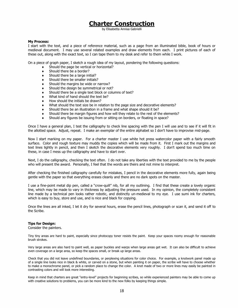
Charter Construction by Elisabetta Annisa Gabrielli
My Process: I start with the text, and a piece of reference material, such as a page from an illuminated bible, book of hours or medieval document. I may use several related examples and draw elements from each. I print pictures of each of these out, along with the exact text, so I can tape them to my desk and refer to them while I work. On a piece of graph paper, I sketch a rough idea of my layout, pondering the following questions:
Should the page be vertical or horizontal? Should there be a border? Should there be a large initial? Should there be smaller initials? Should the margins be wide or narrow? Should the design be symmetrical or not? Should there be a single text block or columns of text?
What kind of hand should the text be? How should the initials be drawn? What should the text size be in relation to the page size and decorative elements? Should there be an illustration in a frame and what shape should it be? Should there be margin figures and how will they relate to the rest of the elements? Should any figures be issuing from or sitting on borders, or floating in space?
Once I have a general plan, I test the calligraphy to check line spacing with the pen I will use and to see if it will fit in the allotted space. Adjust, repeat. I make an exemplar of the entire alphabet so I don't have to improvise mid-page. Now I start marking on my paper. For a charter master I use white hot press watercolor paper with a fairly smooth surface. Color and rough texture may muddy the copies which will be made from it. First I mark out the margins and text lines lightly in pencil, and then I sketch the decorative elements very roughly. I don't spend too much time on these, in case I mess up the calligraphy and have to start over. Next, I do the calligraphy, checking the text often. I do not take any liberties with the text provided to me by the people who will present the award. Personally, I feel that the words are theirs and not mine to interpret. After checking the finished calligraphy carefully for mistakes, I pencil in the decorative elements more fully, again being gentle with the paper so that everything erases cleanly and there are no dark spots on the master. I use a fine-point metal dip pen, called a “crow-quill” nib, for all my outlining. I find that these create a lovely organic line, which may be made to vary in thickness by adjusting the pressure used. In my opinion, the completely consistent line made by a technical pen looks rather robotic, and distinctly un-medieval to my eye. I use sumi ink for charters, which is easy to buy, store and use, and is nice and black for copying. Once the lines are all inked, I let it dry for several hours, erase the pencil lines, photograph or scan it, and send it off to the Scribe. Tips for Design: Consider the painters. Tiny tiny areas are hard to paint, especially since photocopy toner resists the paint. Keep your spaces roomy enough for reasonable brush strokes. Very large areas are also hard to paint well, as paper buckles and warps when large areas get wet. It can also be difficult to achieve even coverage on a large area, so keep the spaces small, or break up large areas. Check that you did not leave undefined boundaries, or perplexing situations for color choice. For example, a knotwork panel made up of a single line looks nice in black & white, or carved on a stone, but when painting it on paper, the scribe will have to choose whether to make a monochrome panel, or pick a random place to change the color. A knot made of two or more lines may easily be painted in contrasting colors and will look more interesting. Keep in mind that charters are great "entry-level" projects for beginning scribes, so while experienced painters may be able to come up with creative solutions to problems, you can be more kind to the new folks by keeping things simple.

19
Process for Charter Masters by Eleanor de Sackville
1. Determine what TRM‟s, TRH‟s or Their Excellencies want. This info will come from the Royal Scribe, Principality
Scribe or Baronial Scribe. If you have a question or need clarification... ask. A. Particular style. (We love 14th Century but, we don't like vine work) B. Particular Period. (We are 10th Century Irish so we want the majority to be 10th century Irish but will
accept some Norse) C. Script/hand (if they want Norse do the want Runes. If yes, what type) D. What awards are they requesting charters for? (beside the “normal”, are they asking for stuff like a
Pernicious Lily-best death of the field) 2. When do they need it? This will be supplied by the Scribe. 3. The Scribe may have prepared text for you to use. If not please send The Royal‟s a copy of the text you propose to
use. As a matter of courtesy They should have the right to edit/refuse it. After all it is going out over Their names. 4. If there is prepared text. Read it. Check what styles/period They want. Then make your choice as to what you want
to do, i.e., AoA, warrior with shield, Norse with Runes-Younger Futhark. This all presupposes that you can do your own calligraphy. If you can‟t do calligraphy, check locally for someone to do it. If you can't find anyone locally, check with the Scribe, they MAY have someone to do it for you.
5. At this point I start looking on line and in books. I have a fairly extensive library, luckily. You can also check out
inter-library loans, friends books, your local SCA branch may also have some books or try a local Scribal Laural. 6. Check the Scribal Site for requirements for Charter Masters:
http://scribes.antir.sca.org/Scribes/CHARTER-MASTER-Guide.pdf 7. I start by drawing or tracing the design on either graph paper (the kind that a copy machine won't see- blue lines)
or cheap drawing paper. This is in pencil. If I will be using Runes, I put them on the trial drawing to make sure I have enough room.
8. I use a light box to transfer the basic design to good paper, using technical pens (like Micron).
A. Period calligraphy: I don't put in all the detail because I still need to do the calligraphy and that is my weakest link.
B. Runes: I transfer everything.
9. If using calligraphy, I do it now. I may have to do it a couple of times so, I only transfer the most basic design. Once I get the calligraphy looking the way I want it to, I transfer the rest of the design.
10. Be sure to include at the bottom of the sheet (17 x 11, design is 11x14 so you have 3 inches on the bottom) a key
for your calligraphy, Rune hand and any special instructions. 11. I take the completed design to KINKOS and make copies. This does several things. First, you should keep a copy.
Second, I send a couple of copies to the Scribe and third, it shows up any flaws (dots, flecks, smudges) that might not have shown up before.
12. Where do you send your Charter design. This will be supplied by the Scribe. A. Keep a copy for your portfolio. B. Don‟t forget to sign the Charter design and include contact info. C. Send a copy of the Artist Release Form.
13. Don't forget that there is no guarantee it will be used. It's not personnel. If it isn't used this reign maybe you could
resubmit it to another reign. 14. Mail in an envelope that has some rigidity to it. Mark "Do Not Fold"

20
CHARTER
DESIGN
Calligraphy

21
Charter Calligraphy Basics
INSPIRATION AND LEARNING: There are a lot of published books and websites available that can teach a new Calligrapher how to correctly handle a calligraphy pen in order to form the letters of our modern alphabet in various pleasing ways. Once this knowledge is obtained, the key to becoming an accomplished Calligrapher is to “Practice, Practice, Practice”. In the Society for Creative Anachronism, the ultimate goal of the Calligrapher is to learn to comfortably create letter forms that mimic the forms of Medieval Lettering. There are a couple of published books that delve into the various named Medieval Lettering Styles. For the beginner re-creationist Calligrapher, Marc Droggin‟s Medieval Calligraphy offers graphic instructions on how to form each letter of a number of basic Medieval Styles. Later, extant manuscripts can guide a more experienced Calligrapher in developing a personal hand for a favorite ductus or two.
BEST PRACTICES: In learning penmanship, the most important rule to follow is to make use of guidelines. For beginning Calligraphers, practicing with both horizontal and vertical guidelines help the hand to learn the habits of forming proper calligraphic shapes. Later, when the hand has been well trained, vertical guidelines can be left behind, but horizontal guidelines are always a must for neat and proper work. Secondly, match the design of your lettering style to your illumination design. For example, do not use the Younger Futhark with a design drawn from an Elizabethan inspiration. Likewise, do not place a beautiful Gothic Quadrata ductus with a Jellinge Style Animal design. Your calligraphy should be in balance with your illumination design. Not too tall, not too short, not too thin, not to heavy, and always, the letters should come into contact with your guidelines. Not too short to miss touching the guideline and not too tall to overrun the guideline. Keep it neat, clean and crisp. Do not break words to completely fill a given space, unless the style you are mimicking does that and you have permission from Their Majesties to copy the technique. Do not use foreign or pseudo-foreign calligraphy unless it meets with Their Majesties approval and if you do, do not gloss the text unless it also meets with Their Majesties approval. If your design style calls for it, do make letters that are intended to be filled in with color, but do not fill in large letters yourself, with black. Let the Painters do that. Also, if your design style calls for it, use letters inside of the actual illumination design. Always remember to leave adequate space for recipient‟s names and award dates to be filled in by the Royal Scribe. Some names are very long and it is recommended that you leave an entire row of lettering space blank. Use the charter texts given to you by the Royal Scribe unless you have permission to do otherwise.

22
Ruling off Guidelines for Calligraphy

23
Using the Correctly Sized Pen Nib This is not really an instruction page about “Using the Correctly Sized Pen Nib”. The title was intended to draw you in to the real instruction which is “Understanding How to Create Proper Proportioned Letters with Your Different Pen Nibs”. Each Medieval Lettering Style has defined proportions which are what give the letters their intrinsic beauty. If you do not understand how to create proportion guidelines for each of your Nibs, your lettering will undoubtedly loose its charm & good looks and leave you unsatisfied with your work.
How to use your pen to create proper proportion for the letters you will make
Set the pen down on the paper at a 90° angle and draw a block. This is the pen nib width.
Move your pen one block up (or down), touch the corner of the first block and draw another block.
Continue making blocks until you have the required
number.
These blocks will be used to create guidelines which are normally called: the drop line, the base line, the waist line and the cap line
(don’t forget, you will typically need “a space” between each drop line and the cap line that follows it)
A good Calligraphy Instruction Book should call out the standard number of pen nib widths normally used to create the beauty of each lettering style you are learning. This most common reason that new calligraphers lose faith in their abilities is because the most common mistake of a new calligrapher is to draw letters in guidelines that are TOO BIG for the Pen Nib. This makes the writing look gangly, clumsy and inelegant. Starting with the proper proportion will make all the difference in the world. It allows you to have a wonderfully rewarding experience and builds your confidence as you practice your penmanship.

24

25

26
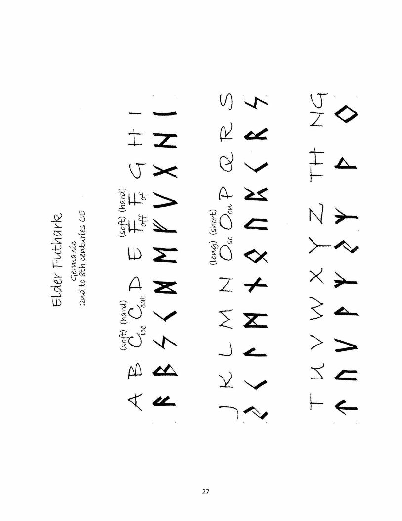
27

28

29
A Note on GLOSS
Here, Gloss is defined as; a translation of the written text, usually inserted between the lines of the text or in the margin of the text.
MODERN EXAMPLE OF GLOSSED PAGE Laurel Scroll in Old Russian Cyrillic - by Bronwen Elgars
DOCUMENTATION Probably between 950 and 970, the Latin text of the Lindisfarne Gospels was translated into a form of old English. The translation was inserted, word for word, between the lines of the original. The translator, Aldred, Provost of Chester-le-Street, wrote a note in the book about his task of glossing the text. This note, in modern translation, reads:
“And Aldred, unworthy and most miserable priest, glossed it in English with the help of God and St Cuthbert ...”
PERIOD EXAMPLE OF GLOSSED PAGE
From the Lindisfarne Gospel

30
CHARTER
DESIGN
Illumination

31
Charter Illumination Basics
INSPIRATION: The best sources of inspiration for the illumination design on your Charter Masters are from early Manuscripts and other diverse art forms gathered from our periods and cultures of study. Countless specialty books and facsimiles have been published, which contain images of favored manuscript pages. Many of these books can be purchased from common bookstores or borrowed from a local library. Books about specific cultures, i.e., Vikings, Celts, Byzantines, etc. often contain a chapter or two on the art of that culture and include photos and reproduction drawings of choice fine art pieces representing typical design styles and motifs. The internet offers hundreds of sites where these images are also available for viewing and searching the Internet has become an integral tool for research. If you do not have personal access to the Internet, you should be able to obtain access at your local public library.
BEST PRACTICES: The most important rule to follow in illumination design is to match the design with your calligraphy style. For example, do not draw your illumination design from an Elizabethan inspiration and then use the Younger Futhark for the text. Likewise, do not draw Jellinge Style animals and then place a beautiful gothic quadrata ductus on the page. The second most important rule to follow is to put the “Badge of the Award” into the design – if there is one. Your line work should be of a nice thickness. Not too thin, not too heavy, although being on the heavy side is better than being on the thin side. When copied onto the charter paper, your design, now made of copier toner, resists paint. A good line thickness helps the novice painters to stay within the lines. Do not create large black shapes, they do not copy well onto the Charter paper. Let the painters do that job. Do not draw lines or hatching - or anything else - that represents shading. Let the painters do that job too. Do not draw spaces that are really small. Remember that the painters need to color every space in the design that you create for them. On the flip side, do not design spaces that are really big and will take a lot of paint to cover. Large areas of paint tend to buckle. Make sure that every space intended to be painted is fully edged. Be careful not to lead the painters off into open air. Your final image should look like it could be published in an adult coloring book. Note: You should be placing your entire 11” x 14” charter design on an 11” x 17” piece of paper. If you use a foreign text, put an alphabet translation cheat sheet in the extra 3” area that is intended to be cut off… along with any special notes to the painters.

32
CHARTER
DESIGN
Charter Master Examples

33
Note: This border represents the edges of 11 x 17 paper.

34
Note: This border represents the edges of 11 x 17 paper.

35
Note: This border represents the edges of 11 x 17 paper.
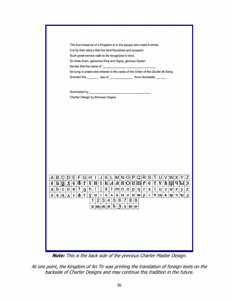
36
Note: This is the back side of the previous Charter Master Design.
At one point, the Kingdom of An Tir was printing the translation of foreign texts on the
backside of Charter Designs and may continue this tradition in the future.
37
CHARTER
PAINTING
Tools and Materials

38
Basic Painter’s Kit _________________________________________
Brushes - Typically you want to use Watercolor Round-Point Brushes. You will probably want a variety of sizes on hand. A collection of sizes 000, 0, 1 and 3 make a nice balanced set of brush sizes.
Plastic Paint Palette – You can get these in circle or squared shapes. They usually have between 6 and 12 paint wells. Purchase ones with small paint wells, as you do not need a lot of paint.
Paints – Use Artist or Student Grade “Gouache” paint. The pigments in Gouache are more opaque than watercolors. Make sure the paints you purchase have NO acrylic in them.
Basic Colors – (The colors listed below are from the Windsor & Newton color collection. The color chart can be seen at www.winsornewton.com/products/gouache/designers-gouache/colour-chart/)
Ivory Black Zinc White (for mixing) Permanent White (for whitework) Ultramarine Cobalt Blue Spectrum Red Spectrum Yellow Permanent Green Mid Brilliant Violet
Distilled Water – Normal drinking water usually contains minerals that can chemically react to the paint pigments and muddy the colors. Use distilled water for mixing with your paints to achieve the desired consistency. You won‟t need very much, even when rehydrating dry paint in your palette - just a few drops.
Water Containers – If you use a container to hold water for cleaning your brushes, make sure that you clean it out often and do not use the dirty water for hydrating your paint. Dirty water contaminates the purity of the paint colors.
X-acto Scalpel Blade - The #11 is a good choice. This tool is only to be used for scraping very minor blemishes.
Disposable towels – You need these for cleaning up spills. Paper towels or paper napkins are good – unless you‟re “Green”.
Wet wipes and drying towels - Always have something available for cleaning your hands. Use whatever it is that you prefer.
Protective papers or cloths – This is whatever you want to use to lay over completed artwork so that you do not touch it with your clothed or bare forearm or the base of your wrist when you are working.
39
CHARTER
PAINTING
Special Element Painting Requirements

40
Heraldic Colors In Heraldry, the colors used to emblazon a device are called Tinctures. The two basic types of tinctures are the Metals and the Colors.
The Metals
Or = Yellow/Gold (cadmium yellow pale, imitation gold, gold leaf)
Argent = White/Silver (zinc white, Chinese white) The Colors
Azure = Blue (ultramarine, cobalt blue)
Gules = Red (cadmium red pale, spectrum red)
Purpure = Purple (purple lake, mix carmine and ultramarine)
Sable = Black (lamp black)
Vert = Green (mistletoe green, permanent green middle)
When the blazon describes an object as Proper, it means that the object is to be emblazoned in its own natural color. This can sometimes be a matter of heraldic convention rather than the actual natural color of an object.
Proper
Proper = The object's Natural Color (this is a version of flesh coloring)
Furs are patterns of colors meant to represent actual furs. The two types of Furs are the Ermines and the Vairs. The Ermine patterns are made up of a field of color, usually White (Silver), Yellow (Gold) or Black, covered in a semy of Ermine Spots (tails). Vair is depicted as rows of bell-like shapes alternating Blue and White/Silver and called Vairy when different colors are called out in the blazon.
The Furs
Ermine = White/Silver with Black Tails Ermines = Black with White/Silver Tails (also known as counter-ermine or contra-ermine) Erminois = Yellow/Gold with Black Tails Pean = Black with Yellow/Gold Tails
Vair = Bells of each row are upright Counter-vair = Bells of each row alternate upright and upside-down Vair en pointe = Alternate color in each row resembling barry wavy Vair in pale = Bells are lined up to make columns of each color Vairy = Named when colors other than Blue and White/Silver are used
Other Patterns of colors include Potent, Papellone and Plumete.
Other Patterns Potent = same variations as Vair; o. only using a T-shape instead of a Bell shape Papellone = Scales Plumete = Feathers

41
Badge of the Order of the Goutte de Sang In An Tir tradition, any Charter or Scroll created for Their Majesties' use in welcoming an individual into the Most Noble Order of the Goutte de Sang, needs to have this badge included somewhere in the design.
Blazon: Checky Or and argent, a goutte de sang.
A Blazon is the formal or legal written description of a heraldic device. A Blazon also tells the scribe with words, how a heraldic image is to be drawn and colored. It describes the field (background) and the charge or charges (graphic images) placed upon the field. The very first words of a blazon indicate how the background (field) is to be depicted. In this instance “Checky Or and argent” means that the field is to be a checkerboard of squares (Checky) of the alternating colors gold/yellow (Or) and silver/white (argent). NOTE: The first color called out (Or) is the color to be used in painting the first square of the checkerboard (i.e., the upper leftmost square). The next two words of this blazon “a goutte” indicate the single charge upon the field of a stylized drop. The last two words “de sang” are words used to describe the charge. Normally, these words would be the heraldic tincture (color) of the charge. However, “gouttes” are sometimes treated differently. Each different color of “goutte” has a special name. Our “goutte de sang” is a drop of blood and its tincture is red (gules). NOTE: A “goutte de vin ” is a drop of wine with a tincture of purple (purpure) and a “goutte d'or” is a drop of gold, etc. An attempt to draw or color a heraldic device differently than the blazon describes would make it no longer the appropriate device. In other words, heraldic emblazons permit little, if any, artistic license. A scribe should never stray from the instructions given in the blazon.

42
Badge of the Order of the Grey Goose Shaft In An Tir tradition, any Charter or Scroll created for Their Majesties' use in welcoming an individual into the Most Noble Order of the Grey Goose Shaft, needs to have this badge included somewhere in the design.
by Symmonne Deccarrete de Villette
Blazon: Checky Or and argent, a goose within four arrows lying as on a mascle sable.
A Blazon is the formal or legal written description of a heraldic device. A Blazon also tells the scribe with words, how a heraldic image is to be drawn and colored. It describes the field (background) and the charge or charges (graphic images) placed upon the field. The very first words of a blazon indicate how the background (field) is to be depicted. In this instance “Checky Or and argent” means that the field is to be a checkerboard of squares (Checky) of the alternating colors gold/yellow (Or) and silver/white (argent). NOTE: The first color called out (Or) is the color to be used in painting the first square of the checkerboard (i.e., the upper leftmost square). The next three words of this blazon “a goose within” indicate the major charge upon the field of a goose (which by default is drawn in a nesting position, without legs, facing to the left). The next seven words “four arrows lying as on a mascle” indicate the minor charges of four arrows arranged upon the field in the shape of a mascle (which is an heraldic symbol in and of itself). The final word in the blazon “sable” tells the scribe that all the charges already named in the blazon are to be colored black (sable). An attempt to draw or color a heraldic device differently than the blazon describes would make it no longer the appropriate device. In other words, heraldic emblazons permit little, if any, artistic license. A scribe should never stray from the instructions given in the blazon.

43
Badge of the Ordo Hastae Leonis In An Tir tradition, any Charter or Scroll created for Their Majesties' use in welcoming an individual into the Most Noble Ordo Hastae Leonis, needs to have this badge included somewhere in the design.
Blazon: Checky Or and argent, a spearhead gules.
A Blazon is the formal or legal written description of a heraldic device. A Blazon also tells the scribe with words, how a heraldic image is to be drawn and colored. It describes the field (background) and the charge or charges (graphic images) placed upon the field. The very first words of a blazon indicate how the background (field) is to be depicted. In this instance “Checky Or and argent” means that the field is to be a checkerboard of squares (Checky) of the alternating colors gold/yellow (Or) and silver/white (argent). NOTE: The first color called out (Or) is the color to be used in painting the first square of the checkerboard (i.e., the upper leftmost square). The next three words of this blazon “a spearhead gules” indicate the single charge upon the field of a spearhead colored red (gules). An attempt to draw or color a heraldic device differently than the blazon describes would make it no longer the appropriate device. In other words, heraldic emblazons permit little, if any, artistic license. A scribe should never stray from the instructions given in the blazon.

44
Badge of the Order of the Jambe de Lion In An Tir tradition, any Charter or Scroll created for Their Majesties' use in welcoming an individual into the Most Noble Order of the Jambe de Lion, needs to have this badge included somewhere in the design.
Blazon: Checky Or and argent, a lion’s jambe bendwise inverted erased sable.
A Blazon is the formal or legal written description of a heraldic device. A Blazon also tells the scribe with words, how a heraldic image is to be drawn and colored. It describes the field (background) and the charge or charges (graphic images) placed upon the field. The very first words of a blazon indicate how the background (field) is to be depicted. In this instance “Checky Or and argent” means that the field is to be a checkerboard of squares (Checky) of the alternating colors gold/yellow (Or) and silver/white (argent). NOTE: The first color called out (Or) is the color to be used in painting the first square of the checkerboard (i.e., the upper leftmost square). The next three words of this blazon “a lion’s jambe” indicate the single charge upon the field of a lion‟s forearm. The last four words “bendwise inverted erased sable” are all words used to describe the charge. The word “bendwise” means that the lion's foreman is placed lengthwise in the middle of the field like to the “Bend” (the “Bend” is a heraldic ordinary extending from the upper left corner of the field to the lower right corner). The word “inverted” means that the charge is turned upside down. Since the normal way to draw a lion's forearm in heraldry is with the claws pointing skyward, “inverted” means to draw the forearm with the claws pointing downward. The word “erased” means to be forcibly or violently torn off from the body, leaving (or drawn with) a jagged edge. The word “sable” is the color black and indicates that the lion's forearm is to be colored black. An attempt to draw or color a heraldic device differently than the blazon describes would make it no longer the appropriate device. In other words, heraldic emblazons permit little, if any, artistic license. A scribe should never stray from the instructions given in the blazon.

45
Badge of the Order of the Lion et de la Lance
A badge for this Order has not yet been registered with the College of Heralds.

46
Badge of the Order of the White Scarf of An Tir In An Tir tradition, any Charter or Scroll created for Their Majesties' use in welcoming an individual into the Most Noble Order of the White Scarf of An Tir, needs to have this badge included somewhere in the design.
Blazon: Checky Or and argent, on a fess sable a maunch argent.
A Blazon is the formal or legal written description of a heraldic device. A Blazon also tells the scribe with words, how a heraldic image is to be drawn and colored. It describes the field (background) and the charge or charges (graphic images) placed upon the field. The very first words of a blazon indicate how the background (field) is to be depicted. In this instance “Checky Or and argent” means that the field is to be a checkerboard of squares (Checky) of the alternating colors gold/yellow (Or) and silver/white (argent). NOTE: The first color called out (Or) is the color to be used in painting the first square of the checkerboard (i.e., the upper leftmost square). The next four words of this blazon “on a fess sable” indicate that there is a fess, (which is the heraldic ordinary consisting of a broad horizontal band), colored black (sable) and with a single charge lying on top of it. The last three words “a maunch argent” describe the charge that is lying on top of the fess. In this case it is a maunch (a stylized sleeve) colored white/silver (argent). An attempt to draw or color a heraldic device differently than the blazon describes would make it no longer the appropriate device. In other words, heraldic emblazons permit little, if any, artistic license. A scribe should never stray from the instructions given in the blazon.

47
CHARTER
PAINTING
Techniques

48
Basic Color Theory
The Color Wheel is made of twelve colors described as Primary, Secondary and Tertiary Hues.
image used with permission
The Three Primary Colors are Red, Blue and Yellow
The Three Secondary colors are Violet, Green and Orange
The Secondaries are created by mixing equal parts of the Primary colors they fall between; ie, mixing Red and Yellow will create Orange.
The Six Tertiary colors
are the result of mixing the Primary and Secondary colors on either side of them.
Color Terms
HUE the pure color
SHADE TINT Hue + Black Hue + White

49
Claude Boutet’s 12 Color Wheel – circa 1708

50
Owen Jones’ Color Tips from
The Grammer of Ornament – London 1856
Primary colors work best in small amounts/areas, balanced by Secondary and Tertiary colors in larger amounts/areas.
Blue retires, Yellow advances and Red is intermediate.
When two tones of the same colour are used together, the lighter will appear lighter and the darker will appear darker.
Colors on white grounds will appear darker and vice-versa for dark grounds.
When colored objects are used on a contrasting ground they should be set apart by an
edging of a lighter shade of the colour used. E.g. Red flowers on a green ground should be outlined in a lighter shade of red.
Colors on a gold ground should be edged with a darker color.
Metallic objects on a colored ground should be outlined in black.
Colors on any colour ground can be edged in black, white or gold.
Work from the least used color to the most and finish all work in that color before going onto the next.
When lightening a color use white, except green, use yellow.

51
Charter Painting The Basic Two Dimensional Technique
MEDIUM: It is recommended that you use Gouache. Gouache is usually a mixture of pigment, water and gum-arabic and is considered opaque. Gouache can be thinned with water to produce something more akin to a transparent watercolor paint. Do NOT use Colored Markers, Colored Pencils, Pastels, Crayons or Acrylics when painting Kingdom Charters.
PREPARING THE PAINT: You do not need a large amount of paint out of the tube. Put only very small dabs of color into your palette cups until you are experienced with how much paint actually meets your need. Gouache can be rehydrated, so don‟t wash out your palette, instead, keep a few palettes so that you have enough cups for all your colors and add another palette of cups to mix colors in. When mixing colors, remember that you will probably not be able to exactly match your mix again and so you will need to make enough for the whole piece. To create the correct consistency in your gouache, add drops of water, one at a time, and mix it well until it feels like thick runny cream. The mixture will dry in the palette as you paint and you will need to continue to add water to keep the same consistency.
LAYING ON THE COLOR: Color can be placed upon the paper in one layer so that the effect remains flat and two dimensional or it can be placed, using slightly differing colors in several layers or by blending to produce a three dimensional effect giving depth and dimension to your work. For Two Dimensional results, to begin, load your brush with paint and set it close to the paper so that the paint makes contact with it, then immediately make strokes with the brush to pull the surface tension of the paint across the paper filling the space with color. Continue pulling the paint over the area you want to cover, loading the brush with more paint as needed. Do not let the brush become empty so that is begins to make dry brush strokes, as you want the paint to appear as one continuous area of even color. When the paint in the palette starts to thicken, add water to keep its consistency creamy. For small areas, begin by loading the brush with less paint.
Another technique is to use a clean brush to fill the space that you want to cover with a light layer of water. You then touch your color loaded brush into the dampened area and the color spreads across the surface tension of the water. This technique totally eliminates any brush strokes but also lays a less opaque layer of paint. Ox Gall is often added to the water in this technique as it makes the water wetter and lets the paint spread more smoothly. You need only a few drops of Ox Gall to one cup of water.

52
Charter Painting The Basic Three Dimensional Techniques
Please read the instructional page on the Basic Two Dimensional Technique for information on Charter paint, its preparation and the basic laying on of color.
CREATING DIMENSION: Adding dimension to our work is achieved by shading with dark and highlighting with light which is then interpreted by our eye as a receding or an advancing in distance, creating depth. We can work this effect on our two dimensional paper by blending slightly differing colors or placing them on in several layers. One way to work in dimension is to start by placing your single chosen color in three palette cups. One cup of color should be left alone. The other two cups will be darkened and lightened by mixing in other colors. Usually this is achieved by adding small amounts of black to darken and small amounts of white to lighten. Sometimes adding black or white does not result in the intended color. This is especially noticeable when adding white to red, which makes pink instead of a lighter shade of red and adding black to yellow which can make a green or brown. To get a different red you can add a bit of the neighboring color on the wheel to lighten and darken it correctly. Adding a bit of purple to yellow will effectively darken it. Now start by first painting the whole area you want to work with the pure base color and letting it completely dry. Next, imagine where your light source is coming from (you can draw a sun on your paper lightly in pencil if it will help you remember where the light source is). To be successful your light source will need to come from the same place for the entire piece. Next, begin by adding your darker shade of color to the areas that are furthest from the light source or that you want to have appear bent under away from the source. Use thicker strokes at the darkest area and thinner as you get closer towards the light. Let this layer of paint dry. Finally, add your lighter shade of color to highlight the areas closest to the light source or that you want to appear bent towards the light. Use thicker strokes at the lightest area and thinner strokes as you get further from the light source. You can achieve this same effect using different colors too, i.e., yellow is often used as a highlight for green.
Another way to achieve dimension is to blend your paints as you are working. This method takes a lot of practice and requires that you work quickly. The paint that you wish to blend must still be a bit damp for this method to work. Here, your start by laying the two colors next to each other on the page but not touching. Use a clean brush to add a film of water between the two colors and just into the edges of the color. Slightly agitate the water and the two colors should begin to blend. Do not overwork the brush and paint as paper may buckle and stretch.

53
Charter Painting The Basic Detailing Techniques
Please read the instructional page on the Basic Two Dimensional Technique for information on Charter paint, its preparation and the basic laying on of color.
ADDING DETAIL: There are many styles of detailing and most are achieved using a very fine brush or a pen with a drawing nib, both loaded with thinned down gouache. The consistency of your paint should be similar to ink when using a pen and only a little thicker when using a brush. The most well-known detailing style is “White Work”. We know this as fine lines, swirls and dots placed on top of already fully dry paint work. White work is usually the last thing added to your painted areas. Note that placing white detailing on top of red and the redder shades of violet usually ends with the red bleeding through and turning the white to pink. To help eliminate this problem make sure that all your white detailing is done with a “permanent white”.
There are other examples of period detailing that do not have common names and are not white, such as adding red, black or blue dots around the outlined edge of a painted area or diapering, which is painting a particular symbology over and over, usually in a grid format, to detail an area. Viewing period manuscripts will give you the best inspiration for creating your detail work.
Do Not use waterbased ink on top of paint for detailing. The ink has too much water in it and will blend and muddy work making it necessary to repaint the area. Outlining is not really considered detailing but should be considered as the final technique to use on your work. Normally this is done with black ink or paint, with similar tools and mediums as used in white work. Your intent is to re-ink all of the lines of the design to create crisp and tidy edges. You will especially want to outline if you have inadvertently painted over your design lines. Miniatures may however not require any outlining.

54
Charter Painting Technique Examples
PERIOD EXAMPLE OF TWO DIMENSIONALTECHNIQUE
PERIOD EXAMPLE OF THREE DIMENSIONAL TECHNIQUE
PERIOD EXAMPLES OF DETAILING TECHNIQUES