Embed Size (px)
Citation preview
THE METAFUNCTION OF VISUAL TEXTS OF
INDONESIAN TRADITIONAL COSMETIC
ADVERTISEMENTS
Iis Kurnia Nurhayati1 Faculty of Communication and
Business Telkom University, Bandung
Dadang Suganda3 Faculty of Art
Padjajdaran University
Gartika Rahmasari2 Faculty of Management
BSI University Bandung
Atwar Bajari Faculty of Communication
Padjajdaran University
Abstract— This study aims to explain the importance of visual
texts in conveying meaning in advertisements in addition to
verbal texts. Just as verbal / linguistic expressions that can be
adapted in terms of different word classes and sentence
structures, visual structures can also be communicated through
different choices and uses of colors, participant interactions and
other composition structures that will ultimately affect the
meaning in the text. The method used in analyzing data is
qualitative descriptive by using multimodal analysis. The results
show that the metafunction of visual markers in Indonesian
cosmetic dvertisements becomes infrasrtuktur that can bridge
the success or acceptance of these ads by viewers.
Keywords— metafunction; visual markers; Indonesian
Cosmetic Ads; Multimodal Analysis
I. INTRODUCTION
One of the texts with complexity of meaning is advertisement, both printed and electronic. The meaning is complex because it is used to convey the message, not only in the forms of elements of language but also nonverbal and other visual means. Gombrich (1982) expressed his opinion entitled The Visual about the importance of visual texts in conveying meanings in addition to verbal texts1. Just as verbal/linguistic expressions that can be adapted in terms of different word classes and sentence structures, visual elements can also be communicated through different choices and uses of colors, participant interactions and other composition structures that will ultimately affect the meaning in the text. Kress & Van Leeuwenmentioned that grammar in the language explains words, clauses, phrases, sentences, and texts. While visual grammar shows people, places, and objects combined with the complexity and extension of visual explanations of an object. 2
Visual language is not universally understood because it is culturally specific, for example: visual communication in the
western world is different from one in the eastern. An interesting case example is traditional Indonesian cosmetics advertisements published on the internet through social media. Through verbal/linguistic and visual signs in the advertisements, beauty images are shown, such as fairy skin, slim body, straight hair, and other images accompanied by persuasive sentences or phrases. This image is developed just like a project, to be constantly and continuously reconstructed by beauty products producers. Companies seek to create relationships between cosmetic products and the media through advertising to attract consumers for the product through the creation of social symbols of middle or upper class that are attached with the necessity to always look beautiful as part of the lifestyle3. The significant influence of cosmetic advertising on beauty construction that eventually becomes viewers’understanding on it can be known from how the ad maintains the standard of beauty. It can be argued that the 'visual language of beauty' is produced through the incorporation of the use of linguistic/verbal and visual semiotics that serves to maintain the standard of beauty.
The focus of visual grammar is on the aesthetic descriptions of images and, the way imaginary compositions are used to attract the attention of the viewers or readers2. This is in line with the statement of who states that:
Grammar goes beyond the formal rules of correctness. It is a means of representing patterns of experience .... It enables human beings to build a mental picture of reality, to make sense of their experience of what goes on them and inside them4.
The analogy is that the visual structures realize the meanings
as the linguistic structures do, hence it results in different
interpretations of experience and different forms of social
interaction. Meanings can be realized in language, while
visual communication is expressed both in verbal and visual.
Although both are different, language is through the choice of
3rd International Conference on Transformation in Communication (ICoTiC 2017)
Copyright © 2018, the Authors. Published by Atlantis Press. This is an open access article under the CC BY-NC license (http://creativecommons.org/licenses/by-nc/4.0/).
Advances in Social Science, Education and Humanities Research, volume 150
294
word classes and semantics for instance, in visual
communication however, expression is done through system
selection, in some ways such as: the use of color and structure
of the prominent composition. It's interesting to explore how
visual marker metafunctions are depicted in Indonesian
cosmetic advertisements on the internet.
II. LITERATURE REVIEW
The main theory used in this research is Multimodal, especially Sinar’s theory5 which adopts the theory of semiotics combination analysis by O'Halloran6. To analyze the structure of advertising, the theory used is the theory of Generic Structure Potential of a Print Advertisement by Cheong which states that print ads consist of verbal text, visual text and a combination of both7. The visual marks in Indonesian cosmetic advertisements were analyzed using the visual sign metaphysics by Kress and Van Leuween2
A. The Generic Structure of Printed Advertisements
The Theory of Generic Structure of a Printed Advertisement
by Cheong mentions that print ads consist of verbal text,
visual texts and a combination of the two7. He produced an
advertising model consisting of (I) verbal/linguistic
components, namely Announcement, Enhancer, Emblem, Tag
and Call, and Visit Information,
(2) visual components: Lead, Display and Emblem. Visual
component Lead describes the size, position and or color that
should have the potential to store the impression and meaning
for the user7. Cheong classified the Lead component into
Locus of Attention (LoA) and Complement to the Locus of.
Display serves to describe the product in real and explicitly.
Visual component of display Congruent functions to realize
the product without going through symbolization and display
Incongruent realizes the product through symbolization. On
the other hand, the emblem is divided into visual emblems that
are realized through the logo of the advertised product, and
linguistic emblem through brandname or trademark. The
Emblem functions to assigns an identity or status to a product
that has a position on either side adjusting the proportion of ad
text7. Here is The Generic Structure of a Printed
Advertisement by Cheong, Y.Y
Visual
Components
Lead : Locus
of attention,
Component Locus of
Attention
Verbal/Linguistic
Display : Explicit,
Implicit, Congruent
(prevalent),
Incongruent
(Metaforical)
Emblem (Verbal)
Components Announcement : Primer,
Secondary
Emblem (Nonverbal)
Tag
Enhancer
Call and Visit
Information
Table 1: Generic Structure of Advertisement7
B. Metafunction of Visual Signs
The concept of metafunction was originally introduced by Halliday then developed by some experts for other semiotic sources in addition to verbal texts3. As stated by O'Halloran (2009: 3), Halliday's theory has been developed for visual semiotic sources by O'Toole 10 Krees and Van Leeuwen (1996); symbols and mathematical signs by O'Halloran (2005); music and sound by Van Leeuwen (1999); motion and gesture by Martinec 12 space and architects by O'Toole 10 Pang (2004), Stenglin (2004); and multimodal analysis of printed texts by Baldry and Thibault (2006), Krees and van Leeuwen (2006).
In multimodal analysis, the hierarchical structure among the important elements shown by image visually are size, color, and focus. Kress and van Leeuwen emphasized "how color is very important in creating meaning2" The metafunction realized by the image is interpersonal. When analyzing an image, we look critically at how relationships are created and owned between the maker, the viewer, and the objects present in the image. In the image, this is realized through gazes (gaze, and direction of gaze), frame and shot size, as well as perspective/angle. These three realizations represent “demands”, or “bids”, social distance, (intimate, near, far, or public), the power and attitudes possessed by the object against the viewer and vice versa. The third metafunction realized by image is textual. That is, we must see how the image is organized and presented. As in the sentence in the verbal language, how the elements in sentences are composed will affect the meaning of the sentence as a whole. Different composition in the image allows textual meaning as well as different information values. Some possible composition arrangements in the image include Given-New (right-left), Ideal-Real, Center-Margins, Polarized, and Triptych. This composition also affects, though not always, the reading path of those who see the image.
In addition to the above mentioned points, when analyzing the images, we should also consider the framing and colors used. Unsworth defined framing as "an element or set of elements in a layout (that) can be disconnected and distinguished from one another or linked, connected together"8. In line with framing, Goffman provides the basic idea that "the context and organization of messages influence the mind and subsequent actions of the audience on the message9." In this paper, framing is interpreted as how the elements in the image are displayed with which, the views, attitudes, and actions of the audience on what they appear can be influenced. Meanwhile, color is also considered to have a particular meaning which is generally influenced by the situation and culture in which the color is used. Kress and van Leeuwen argued that color is a semiotic mode, because color has and can be used to convey meaning3
Advances in Social Science, Education and Humanities Research, volume 150
295
III. METHODOLOGY
A. Method
This research applies multimodal analysis by analyzing visual and verbal signs on cosmetic advertisement from 3 big companies in Indonesia that used English in their advertisements and published on the internet. However, this research is focused on visual text metaphysics analysis on Indonesian cosmetic advertisement.
Multimodal analysis reveals a visual and verbal representation of the language and explains the different types of images that exist within the sociocultural context.
Multimodal analysis is as a result of the rise of modern texts that not only contain verbal texts but also visual texts caused by technological advances in the printing industry1. According to Sinar in multimodal analysis, the texts are analyzed and interpreted not only from the physical language of verbal or verbally written, but also the expressed and interpreted from the visual appearance as in print media advertisements5. In other words, in the classification of semiological perspectives, the tendency of multimodal analysis is that all aspects of semiotics that appear in the text are analyzed entirely in an integrated, both aspects and elements of language semiotics as well as aspects and elements of nonlinguistic semiotics. The latter is commonly referred to as aspects and elements categorized as visual representation2.
Added by Kress and van Leeuwen multimodal texts are "any text whose meanings are realized through more than one semiotic code"3. Multimodal analysis can be integrated with the analysis of language semiotics code, for example with the language metafunction aspect to explain how grammar can explain the expression of visual effects of images or symbols, colors, symbols with verbal aspects in multimodal text. In the writing tools, multimodal aspect lies in the visual design of punctuation, spaces, colors, fonts or styles, images and other means of representation and communication. All these aspects of multimodal potentials become semiotic resources decorating a communication to show the potential for reinforcement of discourse as a social semiotics.
B. Data Sources
The growth of the use of the internet as a media campaign continues to experience developments to date, including in Indonesia. This is also supported by the increasing number of internet users in Indonesia. Various types of industries have also been utilizing internet as one of the important advertising media. Among them is cosmetics industry including Indonesian cosmetics companies. Various cosmetics companies in Indonesia use internet marketing strategies, including four major cosmetics companies in Indonesia, including PT Martha Tilaar Group which produces Sariayu cosmetics; PT Moeryati Soedibyo Tbk with cosmetics brand of Mustika Ratu; PT Vitafarm with brand Viva utilizing the internet to get loyal consumers on the internet that can be categorized as a community that is likely to buy products or disseminate information from the cosmetic account. The source of the data is online cosmetic advertising. Data was
taken from the official Facebook accounts of Indonesian cosmetic products. Due to the limitation of space, there are only 3 data would be discussed thoroughly in this paper.
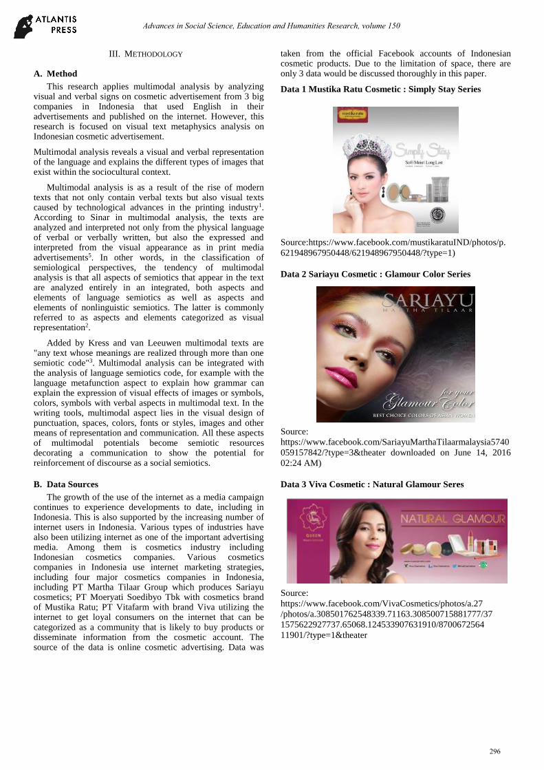
Data 1 Mustika Ratu Cosmetic : Simply Stay Series
Source:https://www.facebook.com/mustikaratuIND/photos/p.
621948967950448/621948967950448/?type=1)
Data 2 Sariayu Cosmetic : Glamour Color Series
Source:
https://www.facebook.com/SariayuMarthaTilaarmalaysia5740
059157842/?type=3&theater downloaded on June 14, 2016
02:24 AM)
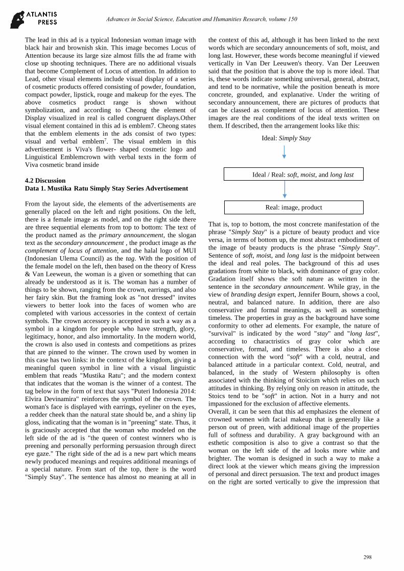
Data 3 Viva Cosmetic : Natural Glamour Seres
Source:
https://www.facebook.com/VivaCosmetics/photos/a.27
/photos/a.308501762548339.71163.308500715881777/37
1575622927737.65068.124533907631910/8700672564
11901/?type=1&theater
Advances in Social Science, Education and Humanities Research, volume 150
296
C. Data analysis technique
The initial stage of the data of traditional Indonesian
cosmetic advertisements is analyzed by using the theory of
Generic Structure of a Printed Advertisement by Cheong to
identify visual components in traditional Indonesian cosmetic
advertising. After visual components that make up the
advertisement are identified, the data are analyzed using visual
metaphysical theory by Kress and Van Leeuwen2. Kress and
van Leeuwen did not explicitly sort one by one in the analysis
steps using his theory, but they elaborated in great detail the
important points to consider when doing visual text analysis
using Reading Images.
IV. RESEARCH RESULTS AND DISCUSSION
A. Research Results
The results of the structure analysis of Indonesian traditional
cosmetic advertisement are as follows:
Data 1.
Based on the theory of Generic Structure of a Printed
Advertisement by Cheong (2004), this ad does not have
complete visual elements.
The visual elements contained in this ad are only Lead
consisting of Locus of Attention and complement of locus of
attention in addition to the Display element. Locus of
Attention in this ad is a female visual by using a crown that
reveals face and other body parts (only upper body part). The
woman’s face is shown to wear earrings, with eyeliner on the
eyes, redder cheeks than the natural state should be, and
glossy lip gloss. The series of product packaging on this ad is
a visual display element. The packaging of the cosmetics
product that becomes the display element above is a congruent
display because, as stated by Cheong, display element in
advertisement explicitly serves to describe the product in real,
implicitly it functions to realize the form of product or service
that is not real through other medium. Another visual element
in this advertisement is that the advertised product brand logo
is placed on the top left corner of the ad frame, where Mustika
Ratu logo is equipped with the owner's name as well as the
founder of Mustika Ratu cosmetic company, BRA Moeryati
Soedibyo.
Data 2.
This ad does not have a complete Visual Element based on the
Cheong’s ad structure (2004). In this ad, there is only Lead
consisting of Locus of Attention and Complement Locus of
Attention, and Emblem element. No Display element is found
in the product image in this ad
Data 2.
Lead in this ad is shown in the form of image of a woman with
Asian facial characteristics of brownish brown eyes, medium
size and not too pointed nose, thick lip and black hair. This
image becomes Locus of Attention because of its large size
that almost fills the ad frame. Abstract images resemble batik
(a traditional Indonesian pattern) is a complement of Locus of
Attention with a position behind the Locus of Attention and
was displayed with gradation of gray and tend to blur. The
visual emblem in this ad is a logo and brand name of the
product placed at the top right of the ad. No Display of
product is found in this ad.
Data 3.
Based on the advertisement structure by Cheong this ad has a
complete visual element, including lead, display and visual
emblem7.
Visual & Linguistical Emblem
Advances in Social Science, Education and Humanities Research, volume 150
297
Ideal: Simply Stay
The lead in this ad is a typical Indonesian woman image with
black hair and brownish skin. This image becomes Locus of
Attention because its large size almost fills the ad frame with
close up shooting techniques. There are no additional visuals
that become Complement of Locus of attention. In addition to
Lead, other visual elements include visual display of a series
of cosmetic products offered consisting of powder, foundation,
compact powder, lipstick, rouge and makeup for the eyes. The
above cosmetics product range is shown without
symbolization, and according to Cheong the element of
Display visualized in real is called congruent displays.Other
visual element contained in this ad is emblem7. Cheong states
that the emblem elements in the ads consist of two types:
visual and verbal emblem7. The visual emblem in this
advertisement is Viva's flower- shaped cosmetic logo and
Linguistical Emblemcrown with verbal texts in the form of
Viva cosmetic brand inside
4.2 Discussion
Data 1. Mustika Ratu Simply Stay Series Advertisement
From the layout side, the elements of the advertisements are
generally placed on the left and right positions. On the left,
there is a female image as model, and on the right side there
are three sequential elements from top to bottom: The text of
the product named as the primary announcement, the slogan
text as the secondary announcement , the product image as the
complement of locus of attention, and the halal logo of MUI
(Indonesian Ulema Council) as the tag. With the position of
the female model on the left, then based on the theory of Kress
& Van Leeweun, the woman is a given or something that can
already be understood as it is. The woman has a number of
things to be shown, ranging from the crown, earrings, and also
her fairy skin. But the framing look as "not dressed" invites
viewers to better look into the faces of women who are
completed with various accessories in the context of certain
symbols. The crown accessory is accepted in such a way as a
symbol in a kingdom for people who have strength, glory,
legitimacy, honor, and also immortality. In the modern world,
the crown is also used in contests and competitions as prizes
that are pinned to the winner. The crown used by women in
this case has two links: in the context of the kingdom, giving a
meaningful queen symbol in line with a visual linguistic
emblem that reads "Mustika Ratu"; and the modern context
that indicates that the woman is the winner of a contest. The
tag below in the form of text that says "Puteri Indonesia 2014:
Elvira Devinamira" reinforces the symbol of the crown. The
woman's face is displayed with earrings, eyeliner on the eyes,
a redder cheek than the natural state should be, and a shiny lip
gloss, indicating that the woman is in "preening" state. Thus, it
is graciously accepted that the woman who modeled on the
left side of the ad is "the queen of contest winners who is
preening and personally performing persuasion through direct
eye gaze." The right side of the ad is a new part which means
newly produced meanings and requires additional meanings of
a special nature. From start of the top, there is the word
"Simply Stay". The sentence has almost no meaning at all in
the context of this ad, although it has been linked to the next
words which are secondary announcements of soft, moist, and
long last. However, these words become meaningful if viewed
vertically in Van Der Leeuwen's theory. Van Der Leeuwen
said that the position that is above the top is more ideal. That
is, these words indicate something universal, general, abstract,
and tend to be normative, while the position beneath is more
concrete, grounded, and explanative. Under the writing of
secondary announcement, there are pictures of products that
can be classed as complement of locus of attention. These
images are the real conditions of the ideal texts written on
them. If described, then the arrangement looks like this:
That is, top to bottom, the most concrete manifestation of the
phrase "Simply Stay" is a picture of beauty product and vice
versa, in terms of bottom up, the most abstract embodiment of
the image of beauty products is the phrase "Simply Stay".
Sentence of soft, moist, and long last is the midpoint between
the ideal and real poles. The background of this ad uses
gradations from white to black, with dominance of gray color.
Gradation itself shows the soft nature as written in the
sentence in the secondary announcement. While gray, in the
view of branding design expert, Jennifer Bourn, shows a cool,
neutral, and balanced nature. In addition, there are also
conservative and formal meanings, as well as something
timeless. The properties in gray as the background have some
conformity to other ad elements. For example, the nature of
"survival" is indicated by the word "stay" and "long last",
according to charactristics of gray color which are
conservative, formal, and timeless. There is also a close
connection with the word "soft" with a cold, neutral, and
balanced attitude in a particular context. Cold, neutral, and
balanced, in the study of Western philosophy is often
associated with the thinking of Stoicism which relies on such
attitudes in thinking. By relying only on reason in attitude, the
Stoics tend to be "soft" in action. Not in a hurry and not
impassioned for the exclusion of affective elements.
Overall, it can be seen that this ad emphasizes the element of
crowned women with facial makeup that is generally like a
person out of preen, with additional image of the properties
full of softness and durability. A gray background with an
esthetic composition is also to give a contrast so that the
woman on the left side of the ad looks more white and
brighter. The woman is designed in such a way to make a
direct look at the viewer which means giving the impression
of personal and direct persuasion. The text and product images
on the right are sorted vertically to give the impression that
Ideal / Real: soft, moist, and long last
Real: image, product
Advances in Social Science, Education and Humanities Research, volume 150
298
there is an ideal idea of "Simply Stay" and a real, concrete
realization in the form of a product image.
Data 2 .Sariayu Martha Tilaar Advertisement
Female image as LoA is featured in large size and uses close
up shot. The large size of the represented participant possibly
means that the viewer has no more power than the represented
participant in the ad. Meanwhile, the close up shot capture can
be interpreted that the viewer or ad reader has a very close
social relationship with the represented participant. The
represented participant is considered very close with the life
of Viewer. The represented participant's eye gaze does not
lead directly to the viewer, but to the other direction and leads
slightly downward. This can be interpreted that there is no
interactive process between represented participant and
viewer3. Based on this fact, it can be interpreted that the
represented participant does not demand the viewer, but
offers. The viewer is only placed as an observer to notice what
is in the face of the represented participant, that is makeup
with many colors on each part of her face. From the point of
view of the layout composition, the woman's position as the
LoA is to the left of the picture.
According to Kress and Van Leeweun, anything placed on
the left of the picture is given, while what is placed on the
right of the image is new3. In the ad above, the woman with all
makeup on her face is given, while the logo of a brand name
Sariayu product and announcement in the form of text on the
right of the image is new. For literacy culture from left and
right like Indonesia, this given-new composition can be used.
The meaning obtained is that the image or ad elements placed
on the left, in this case a typical Asian woman with all the
makeup on her face, is something that has been normal,
reasonable and should be known by the viewer. Meanwhile,
something placed on the right of the image of the Emblem
element in the form of logo/brand product name and
Announcement element in the form of text For your glamor
skin; The best choice of Asian Women placed on the right is
more important to know and see by the viewer.
If linked between Primary Announcement element, which
is Best Choice Colors Of Asian Women, and LoA element that
is image of woman by using lot of color on her face, it can be
interpreted that SARIAYU Martha Tilaar costemetics offer the
best make up color for Asian women. Female image use pink
color lipstick. According to the color theory, pink has a red
base mixed with white that has the meaning of energy,
strength, warmth, love, lust and aggression. Pink is also
interpreted as something happy in oriental culture.
The color of the logo used is a gray color that has the
meaning of intellect, and simplicity. This color is most easily
seen by the eye. The white color of Primary announcement
and Enhancer elements means holiness, cleanliness, accuracy
and purity: the font used by The Primary Announcement is
Egyptian which has the meaning of revealing the old
memories, while the font used in the Enhancer element is
script that gives meaning to personal and intimate traits. The
sentence on the Primary Announcement element is written in
italics to attract the eyes as it contrasts with the text of the
Enhancer element written in normal font.
Data 3. Viva Natural Glamor Series Advertisement
In this ad, the Locus of Attention is a female image on the left.
The woman is highlighted with medium close up technique so
that not only her face is visible but also some parts of her body
like neck and shoulders. The eye gaze of the female image
leads to the viewer, giving rise to both personal and persuasive
impression.
This ad is made in landscape format so it is easy to read from
left to right. According to Kress & Van Leeuwen, left-right
composition shows the given and new positions. The left
position, although there are some tags, can be ignored first
because of its unappealing nature (due to its small size). The
image of the woman on the left, who becomes the Locus of
Attention, is given because such image is intentionally
produced so as to be understood immediately by viewer as
something embedded in her culture (female picture, in general,
draws more attention from the male image)3.
Meanwhile, the right side shows "new" which means the
reproduction of a new meaning resulting from a given female
image on the left. The words "natural glamor" and the eight
product pictures as primary and secondary announcements are
actually less understandable if not given the initial information
as shown by the left picture. That is, the words "natural
glamor" and the image of the product is a construction of
meaning that is "new" that is not given naturally as the image
on the left. But on the right, there is also a vertical
arrangement, which according to Van Leeuwen, also has
meaning3. The top is the ideal meaning while below is the real
meaning. This is indicated by the words "natural glamor"
which shows a wish or a desired state. This "natural glamor"
does not indicate a state that is happening but will happen.
Concretely, "natural glamor" becomes achieved when it is
associated with the concrete side under it which is the product
image.
The product image is a real part that shows the current
condition and understood by the viewer as the way it is. The
real part also does not require deep insights and can be directly
understood, especially when it is associated with the natural
glamour statement above it. Hence, based on the layout, it can
be read as follows: "This woman invites you to be 'natural
glamor' by using these products." In terms of color, the
dominant of this ad is purple and there is also little white.
According to the theory of color, purple can be interpreted as
sacred, spiritual, as well as passion and vitality. Even, it is
very attached to wealth and generosity. That is, the purple
color in this image is close to the association with the word
"natural". However, what is sacred and spiritual is also
spiritually natural. In religious ceremonies, sacredness and
spirituality can only be derived from how the religious
congregation experiences the natural. Then the purple that
exists in the context of the purple-white gradation can be
interpreted as richness and generosity so that it is attached to
the word "glamor". This advertisement has sufficient implicit
Advances in Social Science, Education and Humanities Research, volume 150
299
elements. However, the image of a woman who appears in the
medium close up is enough to give explicit information. The
medium close up image is an ad builder so viewer can see
more body parts. The body that looks dominant is of course
the skin of the woman. The advertiser wants the skin to be
massively expressed so that the viewer can know in a given
about the meaning of being caught. Images of women want
tobe shown to have a tension between "natural" and "glamor".
"Natural" in this case is shown through her makeup that tends
to light but still looks exaggerated like the color of purple lips.
Jewelry used by the woman also tends to be simple : a light
necklace with less visible pendant. On the other hand, there is
an attempt to show the "glamor" side with choppy, shiny, and
brown hair. Such hair is a symbol of women who take care of
themselves and spend time and money to go to the salon for
the sake of beauty. Thus, such attitudes are closely related to
the word "glamor".
V. CONCLUSION
The result of the visual element metafunction analysis on
Indonesian cosmetics advertisements indicates that every
visual marker in the cosmetic advertisement has the ability to
represent the aspects of world experience out of the sign
system either directly or indirectly. The visual marker
metapfunction system in the Indonesian cosmetics
advertisements is also capable of projecting a social
relationship between the text, text creator, and the viewers. In
addition, the metafunction system represented by visual signs
in Indonesian cosmetic advertisements has the ability to form
text, complex marks that are attached to each other, both
internally and with the context within.
References
[1] Young, L., & Fitzgerald, B. The power of language. London: Equinox.
(2006)
[2] Kress, G. dan Van Leeuwen, T. Front Pages: (The Critical) Analysis of Newspaper Layaout. In Bell, Allan. and Garret, Peter (Eds), Approaches to Media Discourse. Oxford: Blackwell (1996)
[3] Kress, G & Leuwen T. Reading Images (2nd ed).NewYork: Taylor&Francis e-Library,(2006)
[4] Halliday, M. A. K. An Introduction to Functional Grammar. London: Arnold.(1985)
[5] Sinar, Tengku Silvana. Multimodal Analysis of Language and Power Through The Print Advertisements. Makalah Universitas Sumatera Utara. (2011).
[6] O’Halloran, K. L. Multimodal Discourse Analysis:
Systemic-Functional Perspectives .London; New York: Continuum 109-130. (2004). Countries and their Culture; Indonesia. 2015. www.everyculture.com
[7] Cheong, Y. Y.. The construal of Ideational meaning in print advertisements. In Multimodal discourse analysis: Systemic functional perspective, ed. Kay L. O’Halloran, London: Continuum(2004)163-195.
[8] Unsworth, L. 2001. Describing Visual Literacy. In Teaching Multiliteracy Across Curriculum: Changing context of text and image in classroom (pp. 71-112). Buckingham; Philadelphia: Open University Press.
[9] Rodriguez, L & Dimitrova, Daniela. 2011. The Levels of Visual Framing. Visual Literacy, 48-65.
[10] Kress, G. dan Van Leeuwen, T. 2002. Colour as A Semiotic Mode: Notes for A Grammar of Colour. Visual Communication, 1-27.
[11] O’Toole, M. The Language of Displayed Art . London: Leicester University Press. (1994).
[12] Kress, G. dan Van Leeuwen, T. 1998. Front Pages: (The Critical) Analysis of Newspaper Layaout. In Bell, Allan. And Mardiasmo, Diaswati & Barnes, Paul H. (2013) Community Response to Disasters in Indonesia: Gotong Royong; a Double. eprints.qut.edu.au/61482/1/D2.1.pdf Garret, Peter (Eds), Approaches to Media Discourse. Oxford: Blackwell.
[13] Martinec, Radan. dan Salway, Andrew. 2005. A System for Image-Text Relation in New (and Old) Media. Visual Communication, 4:337
Advances in Social Science, Education and Humanities Research, volume 150
300