Embed Size (px)
Citation preview

1. Chapter: Why do we need conscious visual design on the web?
1.1 Introduction
One of the most important skills for almost everyone to have in the next decade and
beyond will be those that allow us to create valuable, compelling, and
empowering information and experiences for others (Shedroff, 1994).
1.2 Motivation
Informatics was traditionally concerned with hardware and software, algorithms and programming languages. While those issues remain important, there is a relatively new area of interest for informaticians – internet. Internet user interface brings into focus the need for structuring information as well as the visual aspect of how is this information displayed. And this is the meeting point of two previously disjoint worlds – the world of informatics and the world of sensory perceptions: visual art, graphic design and audio design.
From my own experience and that of my fellow informatics students, we are usually content if what we make looks nice, but we have no concern for the effect our visual design and structure might have on users. We have no way of knowing that our visual-language may convey a message that is in direct confrontation, and working against, our intended message. In their article Visual Representation
1

and the Web (Karabeg&Akkøk, 2004a), authors point out that while we are trained in writing, grammar and spelling at school, we do not learn very much about making images work for our purpose, or about the impact images have on us. Another problem might be, that everything concerning colours and layout is considered as art, and therefore not scientific and not objective, therefore not the subject of studies at the scientific field of informatics.
Just some decades ago, visual representations were thought of as
belonging to arts, and arts and sciences were considered as fields with little
intersection (Karabeg&Akkøk, 2004a).
In my opinion it is crucial to learn how to make the different visual entities of a web-site, like typography, colour, animations and pictures, work together in order to convey the right end-message to the user.
Some internet researchers are starting to realize that colour use is important, but this is mostly on the account of usability, for instance in the case of colour-blind users. On the other hand what is usability really? I think there is more to usability than good structuring. For me nothing can be optimal in its usability, without taking into account the effect of stimulating our visual intelligence has on our opinion and our ability to learn. Kristiina Karvonen (Karvonen) emphasizes the fact that beauty may actually be the decisive factor when we decide whether or not to trust a service enough to conduct online business with them.
if it looks pleasant, I just trust it (Karvonen, 2000).
2

Karvonen also relates the fact that user-interface is more likely to be considered easy-to-use, when it is initially perceived as beautiful or aesthetically pleasing in some way. This is also true for user-interfaces that have been used for some time (Tractinsky, 1997). Still when in comes to things like beauty and aesthetics, there is a general feeling that this is something that cannot be scientifically studied, it has to do with feelings and intuition.
We make web-sites that are amazingly beautiful in its coding and structure of code, but the user neither knows nor cares about these things. I believe that this just fulfils the basic need we have for functionality, and from users point of view is the very least that is expected. What users care about next is to find what they want, and not how well it is built. When buying a house we do not care where (and how) the nails are placed, as long as the house keeps the elements of nature on the outside. Similarly, when we read a book we do not marvel at the fact that the manufacturers of the book have managed to get all the pages in the right place, that they are all attached the same way, or that the thin paper is used for the pages and the thicker one for the cover. This is what we take for granted when buying a book. Many people pick books to read on the basis of what the cover looks like. One just needs to look at the fashion industry to see that some, even many, people judge by looks and not functionality. I believe that both aspects are equally important – in the words of Donald A. Norman:
Good design means that beauty and
usability are in balance (Norman, 2002). There are other aspects of internet design in addition to beauty,
which are even more important. Those are easy access to information,
3

support for comprehension, learning and remembering. This is understood in many areas, perhaps very different from each other, such as cartography, advertising, newspaper layout, art and design of pedagogical material. In all these areas visual information is used consciously in order to e.g. enhance the message, help understanding, aid retention, persuade, deceive, and entertain.
‘Good’ graphics usually means linking perceptual cues to important
information, which means both identifying and capturing what is important, and
guiding the reader with appropriate cues (Petre, 1995).
The whole culture is becoming increasingly visual. And visual literacy and intelligence are needed skills. I believe that informaticians, in particular those concerned with user interface and internet, should develop these skills. We have to understand and utilise to our advantage the visual language. This thesis is a step in that direction.
2. Chapter: Problem Definition
4

2.1 Objective
In my thesis I will explore the scattered and highly cross disciplinary pool of knowledge of visual design, with the objective of creating a framework for talking about, and creating visual representations for the internet medium. This framework should provide some concepts for identifying good or bad aspects of design for the web. I will also attempt to justify the use of these concepts by providing a set of principles guiding our perception of visual stimuli.
Theoretical part:1. defining the elements and processes of visual web design2. defining characteristics identifying good and bad aspects of
visual design for the Web3. identifying some principles supporting and explaining the
concepts
Practical part:1. using the framework to create a website as well as to evaluate
the success of my design2. refining the model based on the test results
2.2 Disposition
The theoretical part of the thesis is divided into three chapters. These are chapters 3 – Theoretical basis for the guidelines, 4 – Practical basis for the guidelines and 5 – The Guidelines. Chapter 3 attempts to define a basic language and methodology for talking
5

about, and conducting visual design; as well as to some extent explaining why certain visual constructions tend to be perceived as attractive. In chapter 4 I try to explain how good visual design can be achieved in practise, through e.g. colours, typography, shapes, layouts, and composition. Chapter 5 lists the characteristics and principles found in chapter 3 and 4, and also some guidelines to colour use, typography and layout.
The practical part of my thesis will be found in chapters 6 – Creating the Authenticore Site and 7 – Testing the Design. Chapter 6 goes through the entire process of creating a website with the use of my characteristics, principles, guidelines, and methodology. Chapter 7 explains the method used for testing the website design, and the results this testing yielded.
6

3. Chapter: Theoretical Basis for the Guidelines
This chapter provides the basic theory on which I have based my characteristics and principles. The basic theory is a survey of material found in different areas, like art, neuroscience, and information design. I start by defining the basic visual elements used to make a website and the basic actions that one can apply to these building blocks. Next I define basic actions by which one creates websites, and then I explain the concepts of Visual Immediacy, Impetus and Impedance, as characteristics of visual representations.
3.1 The Basic Visual Building Blocks
3.1.1 Basic Elements
The Basic Elements can be viewed as certain amount of pixels covering an area in a layout or composition, be it a computer screen or a canvas. These entities have visual properties – they can be given
7

colours, shapes, textures, placements in space etc. Typical examples in web design are:
Button (everything clickable) Text Background Bar/Navigation bar Ideogram Logo Icon/Symbol Image
A related type of basic entity, White Space, which in typography, is defined as Blank spaces on a printed page, inserted in the text by characters such as spaces, tabs, line feeds, and form feeds (HTDictionary). In art one talk about white space as the empty areas on a canvas, as they are white before adding elements. In web design one should more correctly talk about Grey Space, since grey is the default background colour of websites. To make the term more universal, I choose refer to it as just Space, as this would cover all types of area be it canvas, screen or paper that is not covered with any element.
Another aspect of websites one needs to define, has an impact on how we look on Space. A typical website today consists of several pages (one page filling the screen at a time) linked together. This implies that in visual design for web a composition can be said to have several Spaces which one can manipulate, as opposed to a canvas for painting which has only one.
When designing one needs to consider dynamics created by Basic Elements, the relationship between Basic Elements, and the relation of Basic Elements and Space. This applies to three different
8

subtypes of Basic elements: Stationary Elements (elements which stay in one area of the layout), Animated Stationary Elements (elements which stay in one area of the layout, but have internal movement), and Moving Elements (elements which move about the layout). The dynamic between the Basic Elements and the Space, depends on which types of Basic Elements one chose to include in ones composition.
All Basic Elements can play one or more of three primary roles in a layout. In order for someone to be able to use and navigate a website one needs Functional Elements like Buttons (everything clickable). Next Informative Elements are needed. These can be elements like Text or Ideograms. The last type is the Representational Elements or Decorative Elements, which governs the aesthetics, personality and mood of a website. Examples of possible Representational Elements are Images, Backgrounds and Icons.
3.1.2 Visual Reasoning
Diagrams or pictures probably rank among the oldest forms of human
communication. They are not only used for representation but can also be used to
carry out certain types of reasoning, and hence play a particular role in logic and mathematics (Stanford Encyclopedia of
Philosophy).
9

Karabeg and Akkøk (Karabeg&Akkøk, 2004b) talk about two different kinds of Visual Reasoning. One is Diagrammatic Reasoning, which is a type of reasoning that allows the formulation of a problem as seen in the example below (Webscapades).
The London Underground map shows a visual entity that cannot be seen as a whole in reality, but as a diagram allows the solving of problems regarding transportation from point A to point B. In chapter 3.1.3.2.1 the second type of Visual Reasoning will be discussed.
In order to explain Karabeg and Akkøk’s (Karabeg&Akkøk, 2004b) differentiation between two different kinds of elements present in visual representations – which are Pictorial Elements and Spatial Elements, I will try to show how they relate to the Basic Elements and Space. This will later help in the understanding of the important distinction between Karabeg and Akkøk’s Images and
10

Diagrams. Pictorial Elements equals in my opinion the Basic Elements, while the Spatial Elements equals the regions of composition and relative spatial arrangements, created by the Basic Elements combined with Space, or the Basic Elements combined with each other. Images are constructions made up of Pictorial Elements to represent concrete visible entities. Diagrams on the other hand are conceptual constructions representing conceptual reality. This contains all pictorial constructions, but does not necessarily have a counterpart in the physical reality.
3.1.3 Basic Actions
According to Akkøk (Akkøk, 2004) one should start the process of creating a visual composition by defining the usage and representation domain, which is simply mapping out certain essential aspects of the desired composition. It creates a framework of what to design. This framework is built through Usage Domain Characterisation - UDC and Representation Domain Characterisation – RDC, which I think should be two of the Basic Actions.
One may start with the UDC, doing User Analysis, Task Analysis and Environment Analysis.
It is first necessary to understand your audience; what their needs, abilities,
interests, and expectations are; and how to reach them (Shedoff, 1994)
11

This will yield a preliminary characterisation, which will next be refined by the RDC. The three RDC tasks are Design Criteria Identification, Paradigm Identification and Metaphor, Analogy, Association Choice. For web design I think it is more appropriate to exchange the Paradigm Identification for Layout.
Both UDC and RDC are internally cyclic processes; this means that internal tasks are not completed separately, but may be refined through several cycles. They are also mutually dependant cycles, as they can be conducted simultaneously, and produce changes in one another.
There are also Basic Actions which concerns the realisation of a website design. These are the appearance of Basic Elements – Designing, and combining them with each other and Space – Combining. These actions are not to be conducted separately and sequentially, but as a part of the mutually cyclic processes of UDC and RDC.
3.1.3.1 Usage Domain Characterisation
The User Analysis entails the choice and characterization of the Target Group – who are the audience and spectators of the website in making? The aspects of
12

the Target Group that we need to take into account is how, according to Collins (Akkøk, 2004), cultural, cognitive, sensory/motor and physiological characteristics influence their perception and understanding of, and ability to use, the website. When doing Task Analysis in the case of websites (which are a type of GUI design), our aim is to capture the essence of the tasks to be automated or represented.
To explain what the Environment Analysis is, I will attempt to give a short UDC, where the Environment Analysis can be understood by its relation to User and Task Analysis.
Target Group: Colour blindTask: Reading textEnvironment: The background on which the text will be read
One of my design criteria based on this analysis will be: making sure the text and background colour combination can be read by colour blind persons – e.g. avoiding the combination of red and green.
In the case of web design, the environment will always be the internet, with its strengths and weaknesses. Limitations that may arise when using Internet as the Environment are for example: differences between browsers (which have to be addressed by creating separate bits of code handling a websites behaviour for each browser) or the fact that one has only a very limited set of fonts available (this can be worked around by exchanging text with image of text). Though the solutions to the stated limitations are available, the price is increased loading time of the site. As the font choice is an important part of the visual makeup of a website, the above example shows how important environment analysis is to good design.
13

3.1.3.2 Representation Domain Characterisation
As stated earlier RDC comprise Layout, Metaphor, Analogy and Association Choice (MAA Choice), and Design Criteria Identification. Identifying design criteria, is locating important traits that one wants the website to incorporate when finished. They can be of both visual and functional nature, and should be
determined on the basis of the UDC.Concerning Layout and MAA Choice, there is quite a lot to be
said; therefore I have dedicated one chapter to each of them.
3.1.3.2.1 Metaphor, Analogy, and Association Choice
Visual Reasoning (Karabeg&Akkøk, 2004b), through visual representation, helps the user to comprehend and remember messages. Visual representations do this is done by inference or recall, which again can be created by using metaphors, analogies and associations. This explains the importance of the MMA Choice. They can all three be applied both on each Basic Element separately, and all Basic elements as a whole.
Karabeg and Akkøk define metaphors as:
the representation of a new system by means of visual attributes
corresponding to a different system,
14

familiar to the user, which behaves in a similar way (Karabeg&Akkøk, 2004b).
A metaphor is a literal picture, which gets it material from another area of life than that which it is about (Kloken). In other words, the transfer of qualities and characteristics from one area to another; “he is a sheep” (Ordbok). Metaphors are used, when one has no prior system that resembles the new system. So in order to make it easier for the user to comprehend the new system, one finds a different system with attributes that corresponds to the new. A well-known example of this is the fact that instead of looking at a command window when using a computer, one is presented with a different but similar system – that of the office. The computer thus has a trashcan, a desktop, and a file cabinet.
The metaphor is by many considered the heart of poetry (Wikipedia), which might also account for its importance in visual language. Ramachandran describes metaphor as a mental tunnel between two concepts or percepts that appear grossly dissimilar on the surface (Ramachandran, 2003). In his article he tries to explain why humans have positive reactions to metaphors, as one of 10 universal laws of art, which he tries to prove from the perspective of neuroscience. These laws are more or less based on what causes pleasing (or displeasing) effects in the human brain. He does not deny that cultural factors play a big role in what kind of art is enjoy, but he believes that there are certain basic features, that are based on the construction and evolution of the brain, that produce enjoyment and positive reactions in human beings. To Ramachandran, metaphors might be so attractive, because they allow people to ignore irrelevant and potentially distracting aspects of an idea or entity. To explain this he uses Shakespeare’s play Romeo and Juliet, in which Romeo says: “Juliet is the sun”. The visualisation of the sun, makes the reader
15

aware of Juliet’s radiant and warm qualities, and allows him to disregard the fact that she has nails, teeth or legs. Ramachandran suggests this about the capacities of metaphors:
the metaphor is effective even before one is conscious of it (Ramachandran, 2003)
The reason why metaphors are so rewarding, Ramachandran believes is connected to the discovery of similarities. Linking of superficially dissimilar entities leads to limbic activation (the limbic system is regarded as the centre of emotions). Being able to categorize objects is vital to survival (being able to distinguish between prey and predator, edible and inedible etc), hence the limbic reinforcement when this is managed.
most enigmatic is the use of visual ‘puns’ or metaphors in art. Such visual
metaphors are probably effective because discovering hidden similarities between
superficially dissimilar entities is an essential part of all visual pattern
recognition and it would thus make sense that each time such a link is made, a
signal is sent to the limbic system (Ramachandran, 2003).
Although metaphors can be extremely effective in helping people understand more quickly, they can sometimes be a false crutch to cling to. According to Shedroff (Shedroff, 1994), they are neither required nor always the best approach, in good design. I believe that metaphors should be used with care, and only when appropriate. It
16

should be used for the sake of comprehension and not for the sake of the metaphor it self (see chapter 4.1.3 about design being a “duck”). The same goes for analogies and associations.
Analogies are almost the same phenomena as metaphors, but the system familiar to the user should be similar, and not different from the system it represents. Analogies represent parallel instances (Ordbok). During the Second World War analogous stories about the occupation were popular in Norway. Examples of stories that were considered analogous are Sir Walter Scott’s historical novels about the repressed Scotland, or the Bible’s stories about the Jewish people and the Romans (Kloken). Karabeg and Akkøk give a visual example; that of comparing voice messaging with a mailbox (Karabeg&Akkøk, 2004b). The system of sending messages is similar, behaves in the same way, and has similar attributes to sending text mail.
Associations concerns familiar systems. A different system (with the wanted qualities) is used to represent the familiar system, in order to make the user associate the two systems (Karabeg&Akkøk, 2004b). So what does this imply in practise? The picture below shows a
man out fishing. Outdoors activities are by many people connected to healthy living. The familiar system here would be smoking, which is associated with the very different system – fishing. This yields the impression that smoking is a healthy, sensible activity just like fishing.Associations have to do with value bound thoughts and feelings in connection with a specific word,
17

expression or image (Ordbok). Englishmen – stiff upper lip, Scotsmen – cheap, Pal Mall - pleasure etc.
3.1.3.2.2 Layout
Data is fairly worthless to most of us; it is the product of research of creation (such as writing), but it is not an adequate
product for communicating. To have informational value, it must be organized, transformed, and presented in a way that
gives it meaning (Shedroff, 1994)
Layout is one of the initial actions made on the Basic Elements, when creating a website. It is the action of deciding what and where Spaces and Basic Elements should be available. One can say that Layout is for a website, what a blueprint is for a building. It tells what rooms there are, where they are located, and what furniture and equipment each room contains, but not what colour or style the room or the interior should have. For a website one makes up a general layout of Spaces, navigation and the connection between them. There should also be a general description of what information, and Basic Elements are to be found in each Space.
Dino Karabeg’s Polyscopic Modeling (Karabeg, 2002/2003) is a good way of doing the Layout; as it is designed to yield presentations of information that facilitate e.g. understanding, information access. When doing Polyscopic Modeling one creates scopes on the
18

information one wants to present – one creates Polyscopic Information.
The image above is a reproduction of the Polyscopic Information Ideogram (Karabeg, 2002/2003).
Ideograms are one of the main tools in information design and polyscopic
modelling. They can be viewed as visual metaphors that are designed to be simple, so that they are easily retained in the long
term memory […..]. each ideogram consists of four parts: the visual part, its
explanation, its usage and its message. The idea with ideograms is that […..] one
remembers the “punch line” (Karabeg&Akkøk, 2004a)
It shows different aspects of what polyscopic information is. The I in the centre stand for information. Its circle (a dot on the I)
19

represents art, and the rectangular part (brick foundation) represents science. Both shapes seem also to underline their nature. By connecting science with the square, one also hints to science’s sometimes rigid qualities. This is also supported in the imagery of language. A rigid person is sometimes called a square person, while a more flexible person could be called soft around the edges – a square with soft edges tilts more and more in the direction of a circle or an oval shape. Karabeg and Akkøk (Karabeg&Akkøk, 2004a) describe the circle as giving the perspective while the square gives precision and credibility. Science and art is therefore complimenting entities, which together creates complete and effective information. The circle and the square also represent high-level and low-level information respectively. The circle gives the ‘big picture’, while the rectangle supplies the details.
If one combines the I with the triangle, which can be seen as a mountain, then the circle is the view one gets from the top. It only gives an overview of the landscape beneath – high-level information. One might make out that one side is steep, and another is a grassy slope. There might be the outline of a village, and a river. This is important information to have in order to choose the right direction. The square on the other hand gives detailed information – low-level information. Descending the mountain, one gets to see beautiful flowers, different types of rock, small paths and the rocks in the stream.
Another aspect of the triangle, is the scopic part of polyscopic information. Just like a mountain, information has many different views or scopes. The first way of changing scope, is vertically. This gives high-level and low-level views, which can be viewed semantically as levels of abstraction versus detail (Karabeg&Akkøk, 2004a). Secondly, one may also change scope horizontally. This corresponds to the fact that information, like a mountain, has not only
20

a top (overview) and a bottom (details), but it has different sides. Standing on top of the mountain one can, in one direction, see the ocean. In another direction one sees a deep forest, a mountain chain or a big city with smoking chimneys.
3.1.3.3 Designing
This is the action of adding appearance to the Basic Elements specified by Layout. It is the application of e.g. colour, style and shape to the chosen elements. According to Chandrasekaran (Chandrasekaran, 1999) we can divide the process of Designing into the four subtasks of: Purpose, Verify, Critique, and Modify. The Purpose subtask suggests design commitments, which partially attempts to satisfy some of the Design Criteria identified during RDC. During the task of Verifying one takes a partial or complete design specification and compares it to the relevant Design Criteria. If aspects of the Design Criteria are not satisfied, one uses the task of Critique to try to find an explanation. Then one tries during Modify to make changes to the design, which may become either a finished result, or the Modify task can be seen as a new Purpose in a cyclic process.
This means that Designing, as UDC and RDC, is internally cyclic (See figure below).
21

3.1.3.4 Combining
Combining is the act of arranging the Basic Elements in the right position in the created structure. One needs to consider the role an element plays in a Space, and what neighbouring elements it has. What is the best placement for an element to give it the right amount of attention? Another consideration is the effect an element’s attributes, like colour and shape, have on the other elements present.
3.2 Visual Immediacy, Visual Impedance and Visual Impetus
Visual Immediacy, Impedance and Impetus tell about the nature of a websites visual design. Through these three concepts one can evaluate the successfulness of the Basic Actions preformed, but they can also be a guide in the process of creating something new. In their article Visual Representations and the Web (Karabeg&Akkøk, 2004a), Karabeg and Akkøk, give another perspective on the Polyscopic
22

Information Ideogram discussed earlier. They interpret the ideogram, as a methodology for successful Web design in the following way:
Triangle (one scope): Initial impression upon entering a site: Circle: Visual impetus – aesthetic base – the first
impression. Square: Visual immediacy – cognition at the “first glance”. Change of
scope – view of the information at a “second glance”, “third glance” etc.
(Karabeg&Akkøk, 2004a)
So what are Visual Impetus and Visual Immediacy? They are two of three basic concepts that are suggested by Karabeg and Akkøk (Karabeg&Akkøk, 2004a), (Karabeg&Akkøk, 2004b) as the first steps in evaluating a website’s design. They also have a normative aspect, since they can be used as rules by which one will produce better websites in regard to long term retention, interest, understanding, aesthetic satisfaction etc. A third concept is Visual Impedance (Karabeg&Akkøk, 2004a). Below is an example (Karabeg&Akkøk, 2004b) of Visual Immediacy, Impetus, and Impedance, in relation to Metaphor, Analogy, and Association.
Immediacy Impetus ImpedanceVisual Metaphor
Metaphors need cognitive elaboration. Not much immediacy.
Metaphor causes curiosity, thus possesses impetus.
Related to the design quality.
Visual Analogy
Analogies are expected to have a high degree of immediacy.
Emphasizes the relations. Have less impetus than the metaphor.
Visual Association
Associations should have immediacy.
No impetus.
23

3.2.1 Visual Immediacy
immediacy : The quality or condition of being immediate (OE Dictionary)
immediate knowledge : knowledge of self-evident truth; intuitive knowledge, as
distinguished from that arrived at by means of demonstration or proof. (OE
Dictionary)
Originally Visual Immediacy was defined by Akkøk (Akkøk, 2003a), (Akkøk, 2003b) in relation to Diagrammatic Modeling Languages (DMLs). It is related to the intuitiveness and directness possessed, not only by the visual nature of the diagram, but also its faster cognitive processing. Visual Immediate diagrams enable the user, both to cognitively process and to perceive the information offered ‘at a glance’.
3.2.2 Visual Impetus
impetus : In reference to immaterial things, as feelings, actions, etc.: Moving force, impulse, stimulus. (OEDictionary)
24

Visual Impetus is defined by Karabeg and Akkøk as an impulse, incentive, stimulus through visual elements of web design whose aim is to increase activity and curiosity (Karabeg&Akkøk, 2004a). It is related to the aesthetic aspect
of the web-site, and what our first impression is regarding its ‘feel’ and ‘mood’. Compared to Visual Immediacy, Visual Impetus is the concept that is closest related to first impression.
3.2.3 Visual Impedance
impedance : prevention of progress – something that delays or prevents
progress, or the preventing of progress (Encarta)
Visual Impedance is defined as the hindrance or(often unintended) negative implicature in a visual design that causes the receiver to be less receptive to the visual representation itself, or causes deviance/deterioration in the message communicated trough the visual representation (Karabeg&Akkøk, 2004b). Impedance produces a feeling of something being wrong, which again may cause dislike, or even distrust the presentation. It is first of all the feeling of something being ‘off’ in the design, and then trying to figure out what it is. The impedanced object seizes all the attention, so that one may not be able to concentrate on the intended message.
Knauff and Johnson-Laird (Knauff&Johnson-Laird, 2002) suggests another type of impedance, caused not by inconsideration to
25

rules of visual presentation, but due to use of irrelevant visual elements. This can cause impedance, as it puts an unnecessary load on working memory.
3.3 Beauty, Aesthetics, & Art
3.3.1 General
The first question one might ask is why beauty, aesthetics and art are important. Would we not do perfectly well without? Jakob Nielsen talks a lot about the importance of usability, and he gives five attributes that he finds essential to achieving it. These are learnability, efficiency, memorability, errors and satisfaction (Nielsen, 2003). They do not say anything about aesthetics; or do they? In my opinion they all do. Books on informatics often contain nothing but page up and page down of text. Not one single picture. It contains all the information one needs in order to learn, probably in a well structured way, but it does not contain anything to motivate the desire to read it, and to enjoy learning. I think it is clear that aesthetics and beauty can play a big role in, at least, learnability. Actually, I think this type of book might also have been more efficient for me to reach the goal of learning its contents, had it been a little more aesthetically pleasing. Memorability on the other hand, goes both ways. One often remember something because of its astonishing beauty, or the lack of it, because of annoying frames, pictures, colouring and typography or the opposite – design that works, that aids learning and amuses the user in the process. What one does not remember is what is totally plain, boring, or common. This is in my opinion what Nielsen advocates when he urges us to make simple
26

designs in the name of usability – no glossing, no entertainment, no aid in the learning process, just plain information. Who is remembered in a crowd? The ones that stand out in some way: the ones that are very beautiful, hideous, or possessing special features of some kind. The ones that are not remembered are the ones that are totally plain and ordinary, the ones that is not visually intriguing.
What about errors? Has that got anything to do with beauty and aesthetics? According to Karvonen (Karvonen) and Norman (Norman, 2002) is does. They believe that beauty make the user more positively inclined to errors. Karvonen refers to Tractinsky, who believes that beauty makes people perceive user-interfaces as more easy to use, both as first impressions and after some time of use. Norman emphasises that one tend to be more tolerant of difficulties and problems, when the design is perceived as pleasant.
Attractive things work better. (Norman, 2002)
This seems to imply that a beautiful design – a design with Visual Impetus, would reduce the effect of Visual Impedance.
Looking at satisfaction, Karvonen asks two very enlightening questions on this point. First of all she suggests that satisfaction includes the feeling of pleasure one gets, when encountering a beautiful object. I agree with her, as I do not think that one can be fully satisfied if ones visual intelligence is not getting its fair share of attention. Visual information has such a strong effect on human beings, that to imagine that we would be totally satisfied without any visual stimulation would, in my opinion, have serious effects on any design.
Her second question is whether there can be satisfaction at all without beauty. In this case I think there can be, but on different
27

levels. There are many different ways to be satisfied, all depending on what ones needs are. One can say that the other attributes together with beauty, would be the preconditions for complete satisfaction. That is they are the sub-attributes of satisfaction. One could also consider sub-sub-attributes. Examples could be clarity and recall, which would be a sub-attribute of learnability. If one of these is ignored, the user might be satisfied, but not fully. Therefore I believe that beauty should be considered when designing for satisfaction.
The problem is if there can be made rules or laws assigned to govern the aesthetic properties of a web-site – or even any piece of art work? Beauty is often thought of as something variable and personal – as something immeasurable. One cannot make up a mathematical law, which will produce a beautiful output; nor measure the beauty of something – it is merely a feeling. This is a way of thought that dates far back. Kant (Karvonen) wrote, in 1790, in his ‘Kritik der Urteilskraft’; that aesthetic knowledge is something apart from other forms of knowledge. Late in the 1920s and the early 1930s, G. D. Birkenhoff, worked on a project of reducing aesthetics to mathematics. He attempted to do this by defining the aesthetic measure of an object, as the ratio of its symmetry to its complexity (Birkenhoff, 1928 ;1933). This attempt was as a whole regarded as a failure, because of its lacking ability to work on more complex entities than simple figures, like logos. What this endeavour did contribute, was an understanding of how limited approaches like these are (Goguen, 1999). Of aesthetic knowledge it is difficult or even impossible to get precise information, while in the case of theoretical and practical knowledge one can. So clearly this means that trying to find usable laws in this area, is a total waste of time? Or might there actually be some general principles, which one unconsciously rely on to be able to decide whether or not something passes as beautiful or not? According to Zeki, art is basically a by-product of (the)
28

abstracting, concept-forming, knowledge-acquiring system of the brain and can only be understood biologically in that context (Zeki, 2002).
3.3.2 Art and the Brain
Art has a biological basis. It is a human activity and, like all human activities, including morality, law and religion,
depends upon, and obeys, the laws of the brain (Zeki, 2002).
Ramachandran’s suggests 10 basic laws of art (as mentioned when talking about metaphors). I believe that further explanation of some of these laws belong here, as they in many ways explain the process of seeing. It is really a process of creation, as it is not the eyes that sees, but the brain. The eyes are merely magnifying and conveying information about the surroundings to the brain. Without the visual processing parts of the brain, one would not be able to see or interpret visual information, even if the eyes were in perfect working condition. It is important to learn about the way the brain interprets, in order not to create visuals that is prone to misinterpretations, and causing strain. This section also offers some answers to how Visual Immediacy and Impetus works, as it does to some extent explain this question: Why do some visual compositions intrigue us more than others?
The 10 laws are as follows:1. Peak shift 6. Symmetry
29

2. Grouping 3. Isolation4. Contrast5. Perception problem solving
7. Abhorrence of coincidence/generic viewpoint 8. Repetition, rhythm and orderliness 9. Balance 10. Metaphor
3.3.2.1 Peak Shift
The principle of peak shift is explained by Ramachandran and Hirstein (Ramachandran&Hirstein, 1999), by alluding to the habits of seagull chicks. Their way of begging for food, are to peck at their mother’s beak. What is peculiar is that the chicks do not care whether or not the beak is attached to the mother; they will even peck at a stick with a red dot at the end. The conclusion is that the red dot is what Ramachandran and Hirstein call a ‘trigger feature’. A red dot is, as far as the chick’s visual system is concerned, as good as the entire mother bird.
The peak shift is exemplified when the chick is shown an even longer and skinnier stick, with 3 red stripes at the end. This happens to be even more effective than the original beak.
Indeed, if there were an art gallery in the world of the seagull, this ‘super beak’
would qualify as a great work of art – a Picasso. (Ramachandran&Hirstein, 1999)
Ramachandran and Hirstein also tell of mice trained to favour a rectangle of certain proportions over squares. These mice showed an even greater response to a longer and skinnier rectangle. They
30
conclude that what the mice learn is rectangularity, and that this is the reason for the bigger response to a more rectangular rectangle.
In relation to humans, Ramachandran and Hirstein give the example of caricature. When drawing a famous face, one unconsciously takes the average of all faces, subtract the average of the person one is drawing and then amplify this.
When we abstract an image through cartooning, we’re not so much eliminating
details as we are focusing on specific details. By stripping down an image to its essential “meaning”, an artist can amplify
that meaning in a way that realistic art can’t. (McCloud, 1993)
To me, peak shift is what caused women to wear corsets, or insert silicon into their breasts in order to obtain the perfect silhouette (see picture of Lolo Ferrari
(Ferrari) on the left, and Cathie Jung (Cathie) on the right). A ‘super woman’ with ‘super breasts’ and ‘super waist’. They take the elements of a woman’s body that they know men associate with femininity, just like in Ramachandran and Hirstein’s caricature example. What is typically female is what one is left with, when the male average body is subtracted from the female. The question one is left with regarding peak shift is where the line between art and caricature is drawn.
31

3.3.2.2 Grouping, Contrast and Perception problem solving
In order to understand Grouping, one could take a look at the two pictures below. What do they show?
The first picture (Ramachandran&Hirstein, 1999) looks at first glance like a lot of black splotches. This picture actually involves both Visual Immediacy and Visual Impetus. According to Ramachandran and Hirstein pictures like this causes limbic reinforcement even before one knows what one sees, which corresponds to Visual Impetus – a ‘first glance’ positive effect. Then the picture is processed, and as Ramachandran puts it, aha, one sees the Dalmatian dog. Since the picture of the Dalmatian dog can take much longer to process than a normal photography of a dog, it does not have much of Visual Immediacy; but the Visual Impetus is stronger than an ordinary picture of a dog (unless it is ones favourite dog and best friend from childhood). This is an example of strong Visual Impetus being able to completely overshadow poor Visual Immediacy.
32

The second picture (Stick), to the right, seems to be a jumble of twigs and sticks, but somewhere in there is a stick insect. Looking at this picture one gets a hint of why the process of discovering correlations and of ‘binding’ correlated features to create unitary objects or events must be reinforcing for the organism – in order to provide incentive for discovering such correlations (Ramachandran&Hirstein, 1999). One is often in situations where it is important to recognize objects in very noisy environments. When the stick insect is finally discovered, its camouflage is broken. There are many things in nature that are as good as, or even better than the stick insect at hiding itself. According to Ramachandran and Hirstein this is why Perception Problem Solving receives limbic reinforcement, because it might be an encouragement to look for hidden objects.
The mechanism of Grouping, is according to Ramachandran and Hirstein also active in ‘colour space’. This would in practice mean that wearing lets say red earrings, belt and shoelaces, or using a blue paspartou to pick up flecks of blue in the painting.
The difference between Grouping and Contrast is spatial. While Grouping occurs between similar features even though they are very far apart in space, Contrast occurs between dissimilar features that are close together. Contrast finds the edges in an object, while Grouping recovers its surface. Ramachandran and Hirstein use a naked woman wearing a baroque gold necklace as an example. The woman and the necklace have very different texture, so they are in sharp contrast to one another. Because Contrast causes limbic activation, and homogeneity does not, this arrangement is more effective than just a naked woman, or a dressed woman with the necklace. A simpler example is found in the picture below, borrowed from Kator’s article Quick Tips in Design (Kator, 2003).
33

3.3.2.3 Isolation – about attention
Looking at these two pictures by Henri Matisse – ‘Hair’ and ‘Nude With Oranges’, one can clearly see what Ramachandran and Hirstein mean when they claim
that an outline drawing or sketch is more effective as ‘art’ than a full colour picture. The reason for this, is that being allowed to concentrate ones attention on one single area (like form, depth etc), is more effective because of our limited attention resources. Too much
34

information distracts our attention, and thereby causes less limbic reinforcement. The fact that outlines in art are effective, is according to Ramachandran and Hirstein, nothing new.
ever since David Hubel and Torsten Wiesel (1979) originally pointed out that
this principle may reflect the fact that cells in the visual pathways are
adequately stimulated by edges and are indifferent to homogenous regions (Ramachandran&Hirstein, 1999).
This would explain why outlines are effective, but it does not explain why are they more effective. When looking at a picture one gets a lot of information about the object. In a photo portrait one gets skin tone, skin texture and every single little blemish. Ramachandran and Hirstein believe that the fact that one gets all this information, is the reason for it not being as effective. It distracts ones attention from the features that are essential in identifying the object in question – hence the saying ‘less is more’.
In reference to Visual Immediacy, one can say that a photograph would have less inherent immediacy than an outline, because it takes longer to process it (although not consciously noticeable).
3.3.2.5 Symmetry
Since most biologically important objects – such as predator, prey or mate are
symmetrical, it may serve as an early-
35

warning system to grab our attention to facilitate further processing of the symmetrical entity until it is fully
recognised. As such, this principle complements the other laws [……..]
geared towards discovering ‘interesting’ object-like entities in the world
(Ramachandran&Hirstein, 1999)
In regards to Visual Impetus, the fact that Ramachandran and Hirstein calls it an early-warning system to grab our attention to facilitate further processing, indicates that Symmetry also has high Impetus, because of the fact that it facilitate further processing (Visual Immediacy).To Ramachandran and Hirstein it is hardly surprising that humans have a built in preference for symmetry, as it has been shown that people prefers symmetrical mates.
Only high-quality individuals can maintain symmetric development under
environmental and genetic stress; therefore symmetry can serve as an
indicator of the quality of an individual as well as the quality of their genes. For
example, individuals with genes coding for strong immune function will be more resistant to infection, allowing their
bodies to grow more symmetrically than individuals with lower immune capacity
(Little&Perrett, 2002).
36

3.3.2.6 Abhorrence of Coincidence/Generic Viewpoint
if an artist is trying to please the eye, he [….] should avoid coincidences
(Ramachandran&Hirstein, 1999)
One good example of ‘abhorrence of coincidence’ is Hoffmann’s 2 first rules (Hoffmann, 1998:27):
1. Always interpret a straight line in an image as a straight line in 3D.
2. If the tips of two lines coincide in an image, then always interpret them as coinciding in 3D.
These rules explain why the left hexagon is not interpreted as a cube, while the right Necker Cube is.If one wants a cube to be Visual Immediate as a cube, then one needs to
heed these rules. According to Ramachandran and Hirstein, the reason for this fact, is that the hexagon rely on a unique vantage point, which is something that ones visual system loathes just as much as suspicious coincidences, because it is highly improbable. Ones visual system prefers a generic viewpoint, which is far more probable. Two other good examples of optical illusions caused by this principle, is the Necker Cube devised by Heywood Petry and Drake Bradley (Petry&Bradly). It is highly improbable that the white lines in the circles
37

are just coincidently coinciding; therefore one sees the white lines continuing between the circles, as if a cube were obstructing our view of the circles.Kator (Kator, 2003) has a simpler, and maybe easier to understand, way of putting it:
Humans tend to visually close a space by completing a contour and ignoring gaps in
the figure. When something is left to the imagination, people tend to find visual
images more interesting than when the entire image is “complete”. People
naturally fill in the missing information. (Kator, 2003)
3.3.2.7 Repetition, Rhythm and Orderliness
Ramachandran does not explain his rule of repetition, rhythm and orderliness explicitly; therefore this is only a free interpretation of what he could mean. The rules of grouping, contrast and perception problem solving all have to do with the discovery of objects. When discovering an object one relies on, among many things, finding edges and difference in texture or colour. Defining an object based on colour would rely on repetition, while the defining of a textured area or an edge relies on rhythm and orderliness. This might imply that the rule might be related to, and even constitute as basis for the grouping, contrast and perception problem solving rules.
3.3.2.8 Balance
38

As Ramachandran does not offer any explanation to this rule, I offer Rudolf Arnheim’s explanation to the importance of balance.
Why is balance an indispensable factor of aesthetic composition? One of the reasons, which is often overlooked in discussions of
the subject, is that visually, just as physically, balance represent the state of
distribution in which all elements have come to rest. In a balanced composition,
all factors of shape, direction, location, etc. are mutually determined by each
other in such a way that no change seems possible and the whole assumes the
character of “necessity” in all its parts. (Arnheim, 1972:76)
Arnheim (Arnheim, 1972:76) finds an unbalanced composition to look transitory and accidental, thus invalid, as the elements show a tendency to move around or change their shape. The unbalanced elements seem to inhibit the visual dynamics of a composition, making it look paralysed and retained in place by force. Visual dynamics is the perceived motion in a composition – the illusion of movement. This means that actual movement in a composition, caused by unbalanced elements, has a tendency to block the sought after dynamic effect of visual dynamics.
The best way of ensuring balance, is according to Arnheim (Arnheim, 1974:19), to use the eyes, as measuring instrument. Except for very regular shapes, one has no known method of ensuring balance that surpasses the eye’s intuitive sense of balance.
39

3.3.2.9 Metaphor
Metaphor has been discussed in 3.1.3.2.1 and no further comments on metaphor will be offered here.
3.3.2.10 Emphasis – doing the unexpected
A point not covered completely by these laws, is that of Emphasis. Emphasis is also referred to as point of focus, or interruption. It is usually an interruption in the fundamental pattern or movement of the viewers eye through the composition, or break in the rhythm (Jirousek). This effect is used to call attention to something, or it is done in order to hold on to the user’s attention by providing visual surprises. I believe this principle to be closely related to Ramachandran’s Perception Problem Solving, as an unexpected element, or feature of an element, poses a visual problem to be solved. This will probably cause limbic activation and feedback, but as seen with the Peak Shift principle, there is a balance between art and caricature. In this case there would be a balance between Visual Impetus and Visual Impedance.
The example below shows the use of Emphasis. Here there are two examples of emphasises, one created by breaking rules, and the other by breaking the pattern. The most important example is the fact that the use of majuscules and minuscules is reversed. Secondly the g in group breaks the visual pattern by extending below the baseline of the sentence.
iNFORMATION dESIGN gROUP
40

Chapter 4: Practical Basis for the Guidelines
This chapter is about colour, typography, visual elements and my approach to layout and composition. In chapter 3 I offered some explanation as to how and why certain laws of art have negative or positive effect on human beings. In this chapter, some of the same topics are treated, but from the aspect of how to successfully implement these laws in practice.
4.1 Colour
Why is colour so important in visual compositions? According to marketing psychologists (Color.com), a lasting impression is made within the first 90 seconds, and 60% of the acceptance or rejection is due to colour alone. This means that decisions regarding colour are critical, and need to be considered very carefully, as they are crucial for success of any visual expression.
Colour is among the strongest stimuli that our brains receive from the outside world.
It has been found to affect heart rate, perceptions of time, estimates of weight, size, and temperature, as well as how we experience loudness and noise. (Collopy)
41

Colouring, is giving (or choosing not to give) colour to an element. This is applies to all the basic elements. They all have the intrinsic ability to take on different colours, which can give the elements different qualities. The colour choice can help bring different elements forward to ones attention, or ensure a certain effect on the user. Take a look at the three pictures below. They are different versions of the same motive, painted by Edvard Munch, called “To kvinner på stranden” – Two Women on the Beach.
In all three pictures, the scene and the two figures are the same. This is a very good example of how very effective the choice of colour can be. By only changing the colours, one achieves completely different moods.
The colours of the different elements should work well together, not causing strain – but applying the right amount of attention to each element. Another important aspect of colouring is that the elements should give a coherent mood to the site, which is in consistency with the message one wants to convey.
4.1.1 General
42

Color is life; for a world without color appear to us as dead. (Itten, 1970)
Donald A. Norman writes in his article Emotion & Design: Attractive Things Work Better (Norman 2002) of his first encounter with colour computer screens. He writes that colour added no value, from a cognitive point of view, which could not be provided by the right use of shading. Still people kept buying colour screen, despite the lack of scientific benefit. This puzzled Norman so much that he borrowed a colour screen, in order to understand the phenomenon. After using it for some time, he refused to give the colour screen up, despite the fact that he deemed his initial assessment to be correct. Colour adds no discernible value for everyday work (Norman, 2002). Meier (Meier, 1988) also found this to be true in experiments done by Christ (Christ, 1975) and Tullis (Tullis, 1981). In these experiments, it was found that colour affects the user’s acceptance of a system. The users also believe themselves to be performing better with colour. Since colour is less monotonous, the users also seem to believe the fatigue and eyestrain to be less with colour screens.
Nothing affects the human mind more dramatically than the apparition of a
gigantic color corona in the heavens. Thunder and lightning frighten us; but the
colors of the rainbow and the northern lights soothe and elevate the soul. (Itten,
1961)
Colour has not only a psychological effect, it has also been found to affect body temperature; both actual temperature and perceived temperature (Barry, 1997). Blue environments tend to make people
43

feel colder, and red makes them feel warmer. According to Barry, colour can also be used to create dimension. This can be done by using a combination of warm and cold colours. The warm colours tend to advance, while the cold ones usually recede.
So what other things can colour do? It can, according to Shneiderman (Shneiderman, 1987) soothe, increase subtle discrimination, evoke emotional responses, emphasize organization, attract and create interest. Meier (Meier, 1988) claims it can be used to group, distinguish, and to label items, and it has the quality of showing temporal or magnitude differences, call attention to items, signal and show relations. Colours also appeal to the senses by associating it with other inputs, as smell, taste, touch, sound and sight. Although rare, there are people who, upon hearing a sound, see the corresponding colour:
The word synesthesia, meaning "joined sensation", shares a root with anesthesia,
meaning "no sensation." It denotes the rare capacity to hear colors, taste shapes,
or experience other equally startling sensory blendings whose quality seems
difficult for most of us to imagine. A synesthete might describe the color,
shape, and flavor of someone's voice, or music whose sound looks like "shards of glass," a scintillation of jagged, colored triangles moving in the visual field. Or,
seeing the color red, a synesthete might detect the "scent" of red as well. The
experience is frequently projected outside
44

the individual, rather than being an image in the mind's eye. (Cytowic, 1995)
Researchers have also found out that sound has the ability to affect the human colour perception (Birren, 1992). A low pitch tends to shift the colours into deeper hues. Red becomes darker and more blueish, orange more redish, green more bluish and so on. High pitches have the opposite effect, and also cause more after images, sharpen perception and dark adaptation.
So ones senses have the ability to affect the perception of colour, as well as colour seeming to have several physiological effects; one important is the effect on memory.
The National Retail Merchants Association has found that if the object isn’t familiar,
colour will increase retention by 50% and our memory for colour is so strong that
when we see black and white, we visualise colour. Hicks and Essinger (1991:107)
also finds that memory for colour attributes deteriorates less than memory
for various shape attributes. (Wynn, 1995)
Meier (1998) supports Hicks and Essinger on the point that colour attributes are remembered longer than shapes, but includes that to also be true of orientation and size.Though adding as many colours as possible to a presentation will not necessarily be helpful to the user. For Wynn (Wynn, 1995) limiting the number of different colours is an important rule. Maintaining more than five to seven elements in short term memory simultaneously poses a challenge to the human brain. To Aaron Marcus this means
45
that when maximum five colours (give or take two) are used, one is able to store five words or shapes, six letters, seven colours and eight digits, because one gets about 20 seconds extra short term memory (Wynn, 1995).
Another limitation is bright colours, which cause strain to the eyes. The reader’s eyes are, according to Sue Wynn (Wynn, 1995), naturally attracted to the brightest object or the only coloured object. The reason for this is their tendency to attract ones focus. What happens is that the pupil contract when looking at bright colours, and then dilates when looking at colours of a lesser brightness. The quality of reading will deteriorate as one naturally tries to focus on these items. The same goes for moving objects.
Then the eyes will follow reading gravity, which means that they will descend the page roving between graphics and text. This makes it important to place the most significant object (and the most eye-catching) at the top of the page. This will avoid interruption of the reading pattern. All other text and graphic can be placed in a “z-pattern” to facilitate reading pattern and gravity.
4.1.2 Theory
Another name for colour is hue. The outer rim in the picture is composed of hues. A hue contains no black, white or grey. If a colour is blended with white, which results in a lighter value (how light or dark a colour appear), one gets
46

a tint. The opposite of a tint, is a shade. A shade is a colour added black. This delivers the darkest versions of the colours. If a colour is added grey, another colour or varying degrees of its complementary colour, one gets a tone. The result of a tone is a darker value.
Intensity/Saturation/Chromaticity are the concepts used when discussing how bright/dull a colour appears. Examples of this are greys, which are achromatic. They have no hue and are therefore low in intensity.
There are also three groups of colour (Kennedy, 1999), (Shaw Floors). These are (as seen above) primary colours (red, blue and yellow), secondary colours (orange, green and violet – the results of two primary colours being mixed) and tertiary colours (red-violet, red-orange, yellow-orange, yellow-green, blue-green and blue-violet – the result of mixing one primary- and one secondary colour).
The colours can also be grouped according to their perceived “temperature”. This yields warm (reds, yellows and oranges) and cold (blues, greens and purples) colours (ArtGlossary). Warm colours tend to stand out, while the cold ones recede. The same applies to bright and dull colours respectively (ArtGlossary).
47
4.1.3 Background Colour
If one limits strong, heavy, rich, and solid colors to the small areas of extremes, then
expressive and beautiful colored area patterns occur.........Large area
background or base-colors do their work most quietly, allowing the smaller, bright
areas to stand out most vividly, if the former are muted, grayish or neutral.
(Imhof, 1982)
Grey as the default colour might actually not be a bad choice. The fact that the use of spots of colour against this background highlights the data, is confirmed by Gill (Gill, 1997), who also reports that this is a combination that is easy on the viewer’s eyes. On the other hand, heavy use of grey usually indicates a lack of confidence and fears of exposure see above (Wright, 2000-2004). Gill also explains that strong or very bright colours (which are loud) are spread across large areas with little relief, and then the result can be unbearable to ones eyes.
Noise is not music. Only a piano allows a crescendo and then a forte, and only on a
quiet background can a colourful theme be constructed. (Gill, 1997).
Another point that Gill makes, is that (as many studies validate) a black background with a reverse type (white or a light colour) are
48

more difficult to read than the black on white standard, though the exact opposite is true, when the illumination of ones surroundings is weak (Birren, 1992 (p. 245)).
According to Faber Birren, the most legible colour combination is black on yellow. Next comes green on white, red on white, blue on white, white on blue and black on white (Birren, 1992 (p. 244)). On the other hand, he continues to state that this is better adapted to road signs and posters, because this order goes on visibility and does not take ease of reading into account. After prolonged concentration bright colours like yellow will cause eyestrain, and legibility of the text will suffer. This one can see in Gill’s graph (above), where ease of reading is taken into account.
On background colour Faber Birren (Birren, 1992 (p. 244)) sites the work of Ferree and Rand, which states that: All colouring is inferior to white if the printed characters are to be black. Legibility is
49

according to Birren, directly related to the degree of contrast offered, which is best offered by black on white, or black on ivory.
The combination of complementary colours with similar light intensity creates a very powerful effect. When using such combinations on text and background, the text would seem to the user to be vibrating. This causes strain, and will draw the user’s attention from the message. This might instead be used for important error messages because vibrating edges will attract the user’s attention even if only peripherally watching (Shubin&Falck&Johansen, 1996). What Shubin, Falck and Johansen says here, is in agreement with Imhofs second rule, which says: The placing of light, bright colors mixed with white next to each other usually produces unpleasant results, especially if the colors are used for large areas (Tufte, 1990, page 82). The unpleasant results alluded to here are vibrating edges and afterimage, which are examples of a family of similar problems, which he calls 1 +1 = 3. This is combinations of elements which cause visual clutter.
We simply can't become conscious of and remember everything that we see. Multiple representations of objects in our visual field are constantly competing with
each other for our brain's limited visual processing capacity. What's more, they mutually cancel each other out; visual clutter actually suppresses the brain's
responsiveness. (NIMH)
As seen with vibrating edges, visual compositions can have straining effect on the user. This is especially true for afterimages. Gregory (Gregory) explains that an afterimage occur after intense or
50

prolonged stimulation of the retina by light, which will turn the positive image into a negative image. Afterimages occur due to local retinal adaptation, caused by physical stimulation persisting beyond normal. To experience an afterimage, one can follow the instructions accompanying the image below (Afterimage). If seen on a computer screen, the effect will be even more powerful, as the screen adds additional glare. Afterimage is
51

52

defined as: an image (usually a negative image) that persists after stimulation has ceased (Hyperdictionary). The negative afterimage is defined as follow: An afterimage in which the
lightness relationship is reversed; (Medical Dictionary). The example on the left is an example of a negative afterimage. One can also talk about chromatic afterimages, which appear in the original images complementary colour. Another example of this kind of clutter, is Moiré effects. The figure at the left shows six different examples (Moiré). What happens with Moiré effects is that the brain generates something which is not there (white lines, squares etc). There is also the effect called duck (Tufte, 1990, page 116). The duck has its name from a store called Big Duck, which is located on Long Island between the towns of Flanders and Hampton Bayswere, and is shaped as a big white duck, as seen in the picture to the right (Big Duck). This name is used when a graphic is taken over by decorative forms, when data and structure become design elements. It is when decoration and not
53

information becomes the overall design goal – decoration for the sake of decoration, not as an aid to information.
4.1.4 Colour Deficiencies
Color perception problems are more wide-spread than people think, and have more
causes and variations. As many as one male in twelve may be affected to some
degree; the number is much less for females, but definitely not zero (one
estimate is around 0.4%). (Wilson, 1996-2003)
Another important aspect of colour combination is that of making it legible to colour-blind users. Most people are trichromate (see picture to the right (Wilson, 1996-2003)), which means that their eyes are sensitive to all three wavelengths of light: red, green and blue. Diane Wilson (Wilson, 1996-2003) gives four types of different vision defects in relation to colours. What is normally thought of as colour blindness is called dichromacy, and occurs in two different varieties.
54

In this case the person has trouble distinguishing between red and green. Below is an example of what happens to red when having either type of Dichromacy (Wilson, 1996-2003).
Normal vision Red-insensitive Dichromates
Green-insensitive Dichromates
What happens is either that the red cones contain the pigment for the green, or the green contain the pigment for the red. This would correspond to the red curve overlapping the green curve in the picture above, or vice versa. No matter which is the case, the result is complete loss of sensitivity to part of the visible spectrum.
The other two types of defects are called anomalous trichromates. In this type either the sensitivity curve for red is shifted towards green or the green towards red (see picture to the left (Wilson, 1996-2003)). The result is that all three colours can be distinguished, but
the sensitivity for red and green are lowered. If the saturation of either red or green is low, the colour will ‘disappear’. Anomalous trichromats with deficiency in the green range, account according to Wilson, for over half of people with colour vision deficiencies. This condition exists in about 5 % of all males (Wilson, 1996-2003).
55

Summary of Wilson’s rules for colour safety (does not take anomalous trichromats into account, because their insensitivities are much more subtle):
Colour on black is risky (except white)o Blue is safer than the other colours (but not on black
because of readability)o Purple and turquoise will be seen as blue with black by
dichromates (but there are still readability issues)o Dichromates can not see either red or green on black
Text on mixed-colour background are risky Black on white is safest Black on red or green is not safe, because it may be seen as
black on black Yellow with black is fairly safe (even most dichromates will see
it as yellow with black, because insensitivity to both red and green is rare)
Red or green text on white should be large and bold enough to be legible in yellow
o Red or green on white will be seen as black on white by red dichromates
o Red or green on white will be seen as yellow on white by green dichromates
Combination of strong blue and red should be avoided for everyone’s sake. The eye has to refocus to go from one colour to the other, which will make it seem like the border between the colours keeps ‘popping’.
4.1.5 Colour Schemes
56

What palette of colors should we choose to represent and illuminate information? A grand strategy is to use colors found in nature, especially those on the lighter
side, such as blues, yellows, and grays of the sky and shadow. Nature’s colors are
familiar and coherent, possessing a widely accepted harmony to the human eye – and
their source has a certain definitive authority. A palette of nature’s colors
helps suppress production of garish and content-empty colorjunk. Local emphasis
for data is then given by means of spot highlights of strong color woven through
the serene background (Tufte, 1990, page 90).
There are four basic types of colour schemes (Kennedy, 1999) and (Shaw Floors). These are Monochromatic (one colour scheme), Complementary (opposite colour scheme), Triadic and Analogous.
In order to achieve a monochromatic scheme (Fig. 1), one needs to use different tints, shades and tones of the chosen colour. In addition one or more of the basic neutrals
(black/white/grey) can be used. When making a complementary
Fig. 1
57

Scheme (Fig. 2), one does the direct opposite, one uses the opposite colours tints, shades and tones; in addition to the basic neutrals. It is also possible to make a double complementary scheme (ex. red/green blue/orange). A complimentary scheme achieves to make both colours more vibrant.
To create a bold, yet balanced decorating palette a triadic colour scheme (Fig. 3) may be useful. This one is made by using one of the triad of colours.
The colours are obtained by drawing an equilateral triangle within the colour wheel. An analogous colour scheme (Fig. 4) is what one gets, when using two or more colours side by side on the colour wheel. This is one of the most simple, yet elegant schemes one can use. Mother Nature paints the best examples of the analogous colour scheme. Analogous colour schemes based on colours
seen in nature, are called Naturalistic (ArtGlossary).There is yet another way of making a colour scheme. This fifth
way of combining colours, take into account the fact that the most effective colour schemes are those that contain a balance of wavelengths (Wright, 2000-2004). I would like to use Angela Wright’s very good example of the operating theatres as an example of this. When focusing at red (which blood provides plenty of in an operating theatre), for about 30 seconds, a chromatic
Fig. 2
Fig. 3
Fig. 4
58

afterimage, will linger in the eyes for a few moments. Since red also is a colour of long wave length, it is more straining to look at, because it requires the eyes to constantly adjust (Wright, 2000-2004). Then, when looking away from all the red, the green walls of the operating room will be relaxing, because of it’s short wave length. The two colours balance each other out. This last type of colour scheme does not contradict the others, but rather complements them.
4.2 Typography
A good example of making the most out of typography is George Herbert’s (1593 - 1633) poem Easter-wings. The lines double-function: the longer lines describe wealth, plenty, largess, and rising to flight; the shorter lines tell of poverty and becoming ”most thinne”; and lines of intermediate length indicate transition and change (decaying, rising, combining, becoming) (Tufte, 2001, page 143).
Easter-wings.
Lord, who createdst man in wealth and store,Though foolishly he lost the same,
Decaying more and more,Till he became,
Most poore:With thee
O let me riseAs larks, harmoniously,
And sing this day thy victories :Then shall the fall further the flight in me.
59

My tender age in sorrow did beginne :And still with sickness and shame
Thou didst so punish sinne,That I becameMost thinne.
With theeLet me combine
And feel this day thy victorie :For, if I imp my wing on thine,
Affliction shall advance the flight in me.
4.2.1 General
Using type can be so much more that just choosing between Times New Roman, Arial or Courier. There are typefaces that have the distinct air of a certain era or different parts of the world, like the examples below (FontPool), which in order of appearance are: Chinese, Egyptian and Art Deco.
Typefaces can also have different personality – fun, scary, brave, sweet or ironic. Below one can see good examples of this. Figure 1, is part of Peter Flötner’s Anthropomorphic Alphabet, made in Germany in 1540. Fritz Janschka has made Figure 2, which is the N from his
60

Ulysses Alphabet, which was made in Dortmund in 1983. Both these alphabets have a very distinct erotic feel.
There are no good and bad typefaces, there are appropriate and inappropriate typefaces. Think about your reader and
the feeling you want to convey, then choose a typeface that fits. Simplistic?
Maybe so. But if everyone followed these two rules, you would have read more
things in your life, and understood better what you did read. (Will-Harris, 2000).
As colours, typefaces and typography can have different effects on ones emotions and moods. This means that knowing the basic theory (the structure of type, line-length, word- and line spacing, type size etc.) and the combination of types are crucial when it comes to making the right impression. Readability can affect the emotions one tries to evoke in ones audience. Annoyance caused by
61
underestimation of readability, might even overpower all the other plans. One can also make ones blocks of text into different shapes, like Easter-Wings at the beginning of this chapter. This though should not be done on to long block, because it reduces readability. In contrary to colour, typefaces are not so clear in their effect. There are also divided views on combination of typefaces. Some people are convinced that Times New Roman can not be combined with Century, while others are convinced of the complete opposite.
When writing either on paper or on the web, the proper use of typography is important if one wants to facilitate readability. The art and science of designing for paper is old and thoroughly investigated to find the best way possible to convey information. Strangely enough the art of graphic design is rarely used when it comes to designing web pages.
One good example is typography. Many people consider capital letters to be the easiest to read, because of their size. According to Sue Wynn (Wynn, 1995) and Tufte (Tufte, 2001, page 183) the exact opposite is the case. Capital letters are actually considered a typographic sin. First of all they reduce reading speed by 12%, and they also take up 30% more space than proportionally spaced characters (Marcus, 1992). The reason for this is the shape and colour of the words in a text. When reading a text in capital letter, all the words have the same shape and colour. On the contrary, a text consisting of lower case letters, gives each word a unique shape and colour. This in turn speeds up reading, because instead of spelling each word, one recognizes the word by its shape and colour. That is, one reads figures instead of single letters.
Another important characteristic of typography is the letter form. When using the two main types, serifs and sans-serifs, there are several concerns. On web pages, especially those who should be accessible to a variety of users, including those with visual
62

impairments, the most effective use of the letter forms, is to use serifs only for headings (or as little as possible) and sans-serifs for the bulk of the text (Wynn, 1995).
The reason for this is that it can be harder to tell serifs apart when the letters are small or woozy, because the strokes disappear. Sans-serifs on the other hand have more white space inside each character (more open counters), which gives them more x-height (see the picture above borrowed from the-internet-eye.com (Singh, 2000-2002)). This makes sans-serifs more legible. Another source states the complete opposite:
Because serifs define individual letters more sharply and make them easier to
recognize, serif fonts are generally easier to read than non-serif fonts. (Indeed,
research indicates that most readers can read a message in a serif font more
quickly--and with greater comprehension and retention--than they can read the
same message in a non-serif format.) A similar point can be made for variable-
width fonts: because they bind letter groups more snugly (and thus make the
resulting text seem slightly more
63

cohesive), most readers prefer them to fixed-width fonts. (typo2)
Tufte (Tufte, 2001, page 183) and Will-Harris (Will-Harris, 2000) support serifs as the best type for the main bulk of the text, and only encourage the use of san serifs in small amounts. Kator (Kator, 2003) names serifs as the type of font that helps the reader to follow the baseline, and facilitates reading. One reason why Wynn and the others disagree on the use of serifs might be because Wynn is mainly designing for overheads, and is probably lending web-sites the same properties as overhead. She is correct in assuming that serifs are harder to read when the contrast is bad, and the font size is small, but one should also take contrast and size into account as well as consider the fact that computer screens are only getting better, and that it has been almost 10 years since Wynn’s article was written. On the other hand if one wants to use a colour combination that provides little contrast, and a very small type size (<12) Wynn’s advise might be the best to follow.
For this thesis I have chosen to use Garamond, which is a serif font that is said to be traditional, cool, serious, businesslike, elegant and classic (Will-Harris, 2000). These are in my opinion all important traits in a thesis, the fact that I like the look of the font, also played a part in the choice. I wanted something traditional and serious, which was not as obvious and standard a choice as Times New Roman, Helvetica or Arial, and was not being used ad nauseam. It is a typeface that has survived for over 400 years, and has been adapted through all new technologies. This might be because it has the important qualities of readability and versatility (Williams).
This font will also work well for both the printed and the electronic version, since I have also been careful not to use type size under 12, and I have kept the lines short enough to ensure ease of
64

reading. The contrast is ensured by default, as at least I have yet to see a thesis printed on coloured background, or with coloured text.
4.2.2 Theory
The Major Components of Type (Singh, 2000-2002)
The Anatomy of Type (typo)
According to Will-Harris (Will-Harris, 2000) there are two ways to space type - monospaced and proportional spacing. Monospaced letters have the same width whether it's an I or a W. Examples are Courier and Letter Gothic. Proportionally spaced letters are just the width of the character (four I's fit in the space of one W). This means
65

that the space between monospaced letters is always the same, while proportionally spaced letters have different amount of space between them. One example of this is Times Roman. Proportional spacing is considered to be the easiest to read. Typefaces usually come in several weights - Regular, Italic, Bold, and Bold Italic. Different weights of the same typeface are called a family. Body and display are to other ways of categorizing type (Will-Harris, 2000). Body typefaces, are typefaces designed for paragraphs and pages (can also be used for display), and is usually serifs. Display typefaces are larger, and designed for headings and headlines (to be used for only a few words at a time). This means that display type should not be used for body text, because they are too difficult to read in smaller sizes.
Will-Harris’ general guidelines (Will-Harris, 2000): Leading is the space between the lines. A general rule for
determining leading is to add 20% to the type size. One should never use less, because it can diminish the readability. It is important not to make lines too short or too long, and use only one space after a period. The optimum size for readability is: More than 30 characters and less than 70 characters. Do not underline anything, especially not headlines or subheads since lines separate them from the text with which they belong. If one wants to emphasis something use italics or bold instead of underlines, but not for long blocks of text. This is because it is harder to read long blocks in italics, bold, or all capitals.
Headlines and subheads should have more space above them, than below them - and they should not be set in all caps. Text should not be justified, if not absolutely necessary. This can create rivers in the text which will make it harder to read, because one focuses on the rivers and not the words.
66

4.3 Reading Visual Objects
4.3.1 Lines
The most familiar of all the elements of art, line is capable of infinite variety and is
able to convey all sorts of moods and feelings. A major characteristic of line is
DIRECTION [….] Lines may also have other characteristics. They may be thick
or thin; wavy, jagged, straight, etc; actual or implied (the “line” between a pointing
finger and its object). A line may consist of an edge, contour, or outline or may be created by the coming together of two
areas of color. (ArtGlossary)
According to Rick Drecker (Drecker), lines tend to draw the users gaze into the picture whether they are simple (fences, roads) of complex (curves, shapes, tones or colours). He also gives a name, Leading lines to lines that lead the eyes or direct attention towards an element. A good leading line reaches the point of interest unbroken form one of the bottom corners (Drecker).
4.3.1.1. Horizontal
67

According to Jirousek (Jirousek) and (ArtGlossary), this type of line may suggests a feeling of rest or repose. Drecker (Drecker) supports this by saying that horizontal lines represent peace, tranquillity, and quietness. The reason for this, is that objects which are parallel to the earth seem to be at rest with gravity (Jirousek). This can be used to create a quiet and restful interface, by letting horizontal lines dominate the composition.
4.3.1.2 Vertical
Vertical lines communicate a feeling of loftiness and spirituality
(Jirousek). This is because erect lines that seems to reach towards the sky, give the feeling of something being beyond ones reach. One example is extended perpendicular lines, which seem to suggest an overpowering grandeur - beyond ordinary human measure.
Lines that extend vertically also imply strength and solidity (ArtGlossary). To Drecker (Drecker) this type of line communicates strength, rigidity, power and solidarity.
4.3.1.3 Horizontal and Vertical
This combination communicates stability, solidity, permanence,
reliability and safety. These constructions stay, according to Jirousek,
68

put in relation to gravity, and are not likely to tip over. Both tend to reduce any feeling of movement, because their stabilizing ability (ArtGlossary).
4.3.1.4 Diagonal
Jirousek and Drecker suggest that lines like these might suggest
a feeling of movement, speed, activity or action, and direction. The reason for this might be that human beings perceive objects in a diagonal position to be unstable in relation to gravity, since they are neither vertical nor horizontal. They can be seen as either as about to fall, or as already in motion. Diagonal lines can also be used to indicate depth in a tow dimensional composition.
4.3.1.5 Curved
Drecker attributes these general characteristics to curved lines: the sense of grace, smoothness and dignity.
Jirousek says that if one uses deep and acute lines, one may try to convey turbulence, frenzy (waves in a storm), chaos or turmoil.
69

She also points out that a line which is soft and shallow, is the complete opposite to the deep and acute line. It suggests comfort, safety, familiarity and relaxation. They also have a sensual quality to them, because they recall the curves of the human body.
4.3.2 Geometric Shapes
There are in general five simple basic shapes (Kator, 2003), which are also called geometric shapes (Kator, 2003 and ArtGlossary). These are the square, the rectangle, the triangle, the circle and the ellipse. With these five shapes one has the foundation for all other shapes. According to Andrew Kator (Kator, 2003), squares, rectangles, triangles, and other shapes with straight lines, are the most common in man-made objects, and what one encounters daily is mostly composed of these shapes.
4.3.2.1 Square/Rectangle
Since squares and rectangles are something constantly encountered, they do according to Kator, represent something familiar, safe and comforting. They can also create a rigid and conservative effect, because of their uniformity. Truth and stability are other effects that Kator suggests. The stability of rectangular shapes is corroborated by Jirousek, and both agree that the placement in relation to gravity is important. If an angular shape is placed diagonally, it suggests instability.
70

As placement has its own effect, so has a certain form of angular – the square. According to Kator it is considered the most honest shape, because of its mathematical and visual simplicity. Its symmetry is the cause of its positive visual and emotional reactions – completion and honesty.
4.3.2.2 Triangle
Jirousek writes nothing of triangular forms, but Kator suggests that triangular shapes equals movement, because of their corners pointing in a direction. They also hint of growth or “reaching the top”. An example of this use of a triangle can be seen in the Polyscopic Information Ideogram (Karabeg, 2002/2003), in chapter 3, where a triangle is partly seen as a mountain.
As with rectangular forms there is one triangle that is considered to have special capacities. This is the equilateral triangle (a triangle where all the sides have the same length, and all angles are 60), which is regarded as the most stable triangle (Kator, 2003).
4.3.2.3 Circles
According to Kator, circles are, in contrast to rectangles, squares and triangles, less common in man-made objects. This and the closure of their shape are useful for focusing attention (Kator, 2003). Jirousek and Kator seem first to disagree on the matter of the circles effects, but they both use words that contain some of the same values: quiet, comfort and sensuality (Jirousek) and infinity, completion, softness and security (Kator, 2003). Kator also report that circles, like
71

squares, get its positive visual and emotional responses (completion, honesty etc) from their symmetry.
The ellipse is a type of circle, but can also be considered a composite of circle and a rectangle. It inherits its effects form the circle, depending on how close it is to a true circle.
4.3.2.4 Complexes
As seen with circular shapes, more specifically the ellipse, people are encountered by shapes that are complexes of several of the basic shapes. In this case the effect can be predicted by how many overall similarities the complex has to the basic shapes (Kator, 2003). Below are examples of shape complexes borrowed from Quick Tips in Design (Kator, 2003).
In addition to changing their effect by complex formation, placement, scale and rotation can alter their stability and predictability, as can be seen in the example below, also borrowed from Quick Tips in Design (Kator, 2003).
72

4.3.2.5 Natural Shapes
Natural shapes are usually complex and most often represent real world objects
(Kator, 2003).
As the name for these shapes imply, they are the shapes found in nature. This also means that they are more irregular, asymmetrical, and random than the geometric shapes. The perfect symmetry one can find in geometric shapes can create an unnatural, conservative and stagnant appearance (Kator, 2003). Slight asymmetry creates more interest, as the symmetry has to be discovered. This corresponds to grouping, contrast, and perception problem solving (see chapter 3.3.2.2). One can make a geometric shape more natural and less monotonous, by making the edges more irregular or making breaks in the edge of a line or a shape (Kator, 2003). One could also add asymmetry to a balanced composition, like a face, to make it more natural.
73

4.3.2.6 Abstract Shapes - Symbols
These are the kind of shapes used in for example logo design. They are images that convey concise meaning, and are often silhouettes and exaggerated forms which focus on recognition rather than being realistic (Kator, 2003). Several of these shapes have been used for so long that they are taken for granted. They are used and understood by everyone across all cultures. Two of these are the arrow and the stick man. Other shapes may have a more cultural flavor, and are not as easily recognized by someone from another culture. Yet, this is a flexible quality, people learn to recognize new objects, and over time they become familiar. A few centuries ago the silhouette of a motorcycle or a car would not have triggered recognition, but now as these have become familiar objects across the world, recognition is effortless. The same applies to the technological symbols of play, stop, pause, forward and rewind, seen in the picture below (Kator, 2003).
With the internet, and people spending more time traveling to far of countries, the
cultural differences become more diffuse, and may over time disappear completely.
74

The reason why utilizing abstract shapes for logo design is so effective, is that they allow the logo to transcend language and cultural barriers, and be instantly recognizable (Kator, 2003). A good example of this is the Nike logo, as seen in the pictures above. What one sees are respectively the real Nike logo (Nike), and a fake one (Nike2). What started out as both text and shape has become so familiar that now only the shape is in use, and it still is instantly recognized, even in items that are not even remotely connected to Nike.
4.3.3 Texture
Jirousek describes texture as the quality of an object which can be sensed through touch. It is also a surface that we can see, and image the sensation of touching. There are many kinds of texture: Bristly, rough, hard, smooth, cold, soft, warm, wet or dry. Any tactile sensation imaginable is in fact a texture.
When selecting paper, choose a texture that is related to the concept of
your design and doesn't overwhelm or get in the way of the message. While you can
75

make a bold statement with texture, sometimes a subtle texture that stays 'in
the background' is most appropriate. Make sure that your texture works with your choice of type and images so that
text does not become unreadable or images unrecognizable. It may be
necessary to use a bolder typeface if your paper is rough or strongly patterned.
(Bear, )
4.3.4 Pattern
The example above (Kator, 2003) is a good example of what a pattern is, as it makes use of almost all the ways we can create a pattern by repeating an element. The only element not used is colour. This is a very strong pattern, because patterns usually are stronger when there are more than two repeating elements. According to Kator (Kator, 2003) pattern is also a very powerful method of focusing the viewer’s attention, which can add interest as well as visual information
Common implementations are:
Bullets and other shapes
76

Alternating row colours Grid-based layout where similar shapes create a common
theme (different pictures made the same size, shape and arranged in a grid)
Colour-coding
As with the other design elements, it is important that a possible patterned background (or other patterned element) is considered part of a whole. That is, the pattern is designed to fit with the other elements, or is left out if it is distracting the viewer’s attention from other content. This is likely to happen, as patterns naturally draw attention to themselves by means of rhythm and repetition (see chapter 4.4). Another drawback to consider is Moiré effects (see chapter 4.1).
4.4 Layout and Composition
The horizon, where the earth meets the sky, is a long horizontal line when seen
from a standing position with a clear view into distance. These instinctive visual
interpretations make horizontal alignment the strongest method of visually arranging
objects. Vertical alignment (90 from horizontal) is also a strong method, but
not as strong as horizontal. (Kator, 2003)
How should one best produce a layout? Kator (Kator, 2003) believes that human beings naturally tend to align objects either
77

horizontally or vertically. He bases this upon the instinctive interpretations of the world around us. In this reality there gravity, which aligns objects to the earth’s surface – horizontally.
4.4.1 Rhythm
The presence of rhythm creates predictability and order in a composition.
(Jirousek)
Rhythm is the repetition of elements like line, shape and space to give the design vitality. In order to understand the concept of rhythm in a composition, thinking in musical terms can be helpful. There are two main ways of creating rhythm according to space. These are Vertical and Horizontal (Art Studio). A vertical design can symbolize heavenward or inspiration, while horizontally expresses peace and repose. Jirousek mentions four different ways of creating rhythm. Three of these are applicable in web design: Repetition, Alternation and Gradation.
4.4.1.1 Repetition
Repetition is creation of a timed movement, or a visual ‘beat’, by use of patterning. It may be a clear repetition of elements in the composition, or a more subtle repetition in the underlying structure. It
78

can be the repetition of line movements, or similar shapes or forms throughout the design (Art Studio).
4.4.1.2 Alternation
This is done by presenting a sequence of repeating motives. Jirousek gives the example of switching between short and long, fat and thin, round and square, and dark and light.
4.4.1.3 Gradation
This is achieved by series of progression steps, which shows how two objects relate to each other. The steps taken when going from a square to a circle is one example. Another is the gradation between large and small, which would be medium.
In some ways it resembles comic strips, where one is shown the progression between events (Jirousek). Gradation can also be called Transition, and can be used as a harmonizing tool as it makes dissimilar elements look more alike and harmonious (Art Studio).
4.4.2 Balance
Balance is the concept of visual equilibrium, and relates to our physical
sense of balance. It is a reconciliation of opposing forces in a composition that
results in visual stability. (Jirousek)
79

According to Jirousek some form of balance can be identified in most successful compositions. There are two kinds of balance: formal balance, and informal balance (Jirousek) and (Drecker). More commonly one can speak of formal balance and informal balance, as respectively symmetry and asymmetry.
4.4.2.1 Symmetry
[Symmetrical] Balance in a three dimensional object is easy to understand;
if balance isn't achieved, the object tips over. To understand balance in a two
dimensional composition, we must use our imaginations to carry this three
dimensional analogy forward to the flat surface. (Jirousek)
Symmetrical balance is, according to Jirousek, Drecker and (ArtGlossary), what one sees when there is equal "weight" on both sides of a centrally placed fulcrum. When the elements are arranged equally on either side of a central axis (which may be either horizontal or vertical), the result is Bilateral symmetry (Jirousek).This is the symmetry humans are used to as bilaterally symmetrical beings, and it gives us a sense of stability – on a vertical plane, half of ones body is a mirror image of the other half. This kind of equal geometry is at the heart of the classical sense of design with an emphasis on stability, order and tradition and it effectively communicates these ideas to the
80

viewer. As vertical and horizontal beings, human beings find these kinds of lines and design arrangements stable.
Another way of creating symmetry is by balancing the elements equally around a central point. The result of this is called Radial symmetry (Jirousek).
Symmetrically arranged compositions may end up looking static and unexciting, but on the positive side do present an air of dignity (Drecker).
4.4.2.2 Asymmetry
In its simplest form, asymmetry is an arrangement of forms, which is not equal on both sides of an imaginary centre line (ArtGlossary).
Asymmetrical balance, is more complex and difficult to envisage. It involves
placement of objects in a way that will allow objects of varying visual weight to
balance one another around a fulcrum point. This can be best imagined by
envisioning a literal balance scale that can represent the visual "weights" that can be
imagined in a two dimensional composition. (Jirousek)
81

A way to achieve asymmetrical balance is to balance out a large object with a cluster of small objects. Jirousek and (ArtGlossary) also describe two other ways of creating this kind of balance. It can be done by imagining visual objects to have both weight and mass (1 kg feathers and 1 kg lead). When an asymmetrical balance is achieved, the weight on each side of the fulcrum is the same, but the mass may be different. Another way of balancing out objects with different mass/weight characteristics is by moving the fulcrum on an imaginary scale.
Asymmetry is about motion, instability and contrast and is used to give a sense of excitement and movement to a design. Dynamic line or unbalanced arrangements create a sense of movement, energy and dynamic of change and the kinetic. It communicates a tension which is a very effective way of directing the eye (About.com). This kind of arrangement does according to Drecker, tend to yield a more interesting result than symmetrical compositions, but is more difficult to achieve than symmetrical balance. This is because it is problematic to establish relative weight values for dissimilar elements, in addition to achieving some form of stability.
4.4.2.3 Aspects of Balance
How to achieve balance in practice? How is the imagined weight of the object present in a design, measured? Drecker offers some pointing rules to this problem.
82

Objects close to the centre of the composition seem to weigh less than those in the periphery
Objects in the upper part of the composition tend to weigh more than those in the lower areas
Elements on the right side of the composition seem to have more weight than those on the left side
Isolation seems to increase the weight of an object Intensely interesting objects tend to weigh more Regular shapes seem to weigh more that irregular shapes Movement may disrupt balance, because weight seems to
increase on the side of the direction of the movement (this is true for both lines, shapes or even the gaze of a person)
Rudolph Arnheim (Arnheim, 1974:11-41) sites Heinrich Wölfflin, who corroborates the fact that right side objects weigh more than those on the left side. He also mentions the difference between top and bottom objects, but in relation to right and left. According to him, weight increases at a diagonal from top left towards right bottom; and from left bottom towards right top (see illustration below).
Even though Drecker and Arnheim at first seem to have a bit different views on heaviness in design space, their views are not contradictory. They can in fact quite easily be combined. If one assumes Drecker to be right about the bottom being lighter than the top, then the point of
83

lowest weight would be bottom left corner. This would also mean that the top left corner has to be heavier than the lower left, which is not contradictory to Arnheim, as he does not specify the diagonals relations to one another. So a complete picture might be found in the combination of the two, as seen in the illustration below.
In addition to corroborating Drecker’s rules about isolation and shape, Arnheim adds rules of colour, size, depth and knowledge. When it comes to colours, light colours seem to be heavier than dark colours (e.g. white is heavier than black), while red is heavier than blue. Size works as it often does in the physical world; big objects are heavier than small. Areas of great depth in a picture seem to also be heavier than the surroundings. Knowledge relates to the common puzzle of one kg lead and one kg feathers. The fact that many answers lead when asked what weighs more, also relates to pictures, where it is common to regard an area covered with the reproduction of feathers as lighter than an area covered in lead like texture.
84

4.4.3 Emphasis
Emphasis can also be called dominance or dominant, and is a means to draw attention to the point of focus or main interest (Art Studio). This is exactly what Drecker has to say about contrast, which is one of three ways of achieving emphasis. It can also be achieved through repetition and placement (Jirousek). When using repetition, one creates emphasis in the basis of sheer force of numbers.
ContrastThe use of opposing elements: light and dark, large and small, sooth and rough, etc. Contrast makes it possible to show
differences between elements [….] (ArtGlossary)
To Drecker contrast is simply a means of directing the viewer’s attention to a point of interest. Jirousek points out exactly how contrast can achieve the emphasis: contrast sets something apart form the rest of its surroundings, thus making it stand out. She also gives examples on features that can cause contrast. These are colour, texture, shape, size, scale (Jirousek) and (line-) movement (Art Studio). This can be seen in thermography charts, where yellows, reds and pinks are used as a contrast to blues to highlight warm areas, as seen in the picture below (NTU).
85

As one can see in the thermography picture, the places where certain colours cluster, will attract attention, and contribute to clarity and variety in the image (Art Studio).
When it comes to positioning, emphasis is achieved by placing an element in a strategic position (Jirousek). The most important area of a design space, is the left side. Gaffron (Arnheim, 1974:34-35), points this out very clearly, with an example from the performing arts, that the left side of the visual field is more central, important, and emphasised. In a theatre, people are naturally inclined to first look to the left, and identify with the characters appearing there. This is due to the dominance of the left cerebral cortex in the brain, which contains the centres for speech, writing, and reading. According to Gaffron this might account for the right visual field being more articulate, if the same dominance exists in the left visual centre. A more articulate visual field might explain why objects appearing to the right tend to seem conspicuous. Heightened attentiveness to the left side would compensate for the imbalance in the visual fields, and lead to a natural movement from left (the place of first attention) to right (the area of articulate vision).
86

In the western cultures we read from left to right, and top to bottom. This might indicate that the upper left corner is regarded as the most important area of the visual field. With the Internet this might change, as the reading pattern seem to change form left to right, into up-down scanning of pages.
4.4.4 Text on Image
According to one article (Typographic) one often run into legibility issues when combining text with pictures, this is especially prone to happen with high contrast images. The article also offers an answer to, what the most legible combination is. Six different solutions to the problem (Typographic) are given below.
The first solution is to put a black box behind white text. This allows for optimal legibility, but on the downside obscures most of the picture. A refinement of this solution can be seen in the second picture. By making the black box transparent, one can see more of the picture while keeping the legibility. The drawback with this solution is that it still obscures important information, and it breaks up the image horizontally. Solution #3 is to make a blurred box in the picture, in which one can place the text. This will ensure quite good legibility, but will still cover a large proportion of the picture. A way
87

to keep most of the picture visible is seen in the fourth picture. No box is used in this example. Instead the type has gotten a one pixel black outline, which will increase legibility, but will distort the shape of the letters. The most common solution in online documents is seen in picture 5, where a drop shadow is added instead of a black outline. This solution will give a marginal increase of legibility, but is otherwise a good solution. According to the article (Typographic), the best solution is to blur an area of the picture just larger than the text, in order to achieve a maximum legibility of text and image area, though it does specify that one may draw ones own conclusions based on the circumstances. If the details of the picture are less important, then obviously the first solution would be the best one, due to its optimal legibility.
4.5 What can we learn from text creation?
Denise Vitola (Vitola, 2000) has written a short article on the advantages of combining story-telling techniques in web-design. She suggests that fiction writers, and visual designers will benefit from learning from each in order to create better web-sites. Her article is mostly about what visual designers can do to aid writers in creating web-sites for their books, but I feel that some of the advice she gives, can be universally applied in designing web experiences.
Her first suggestion is to suspend the visitor’s disbelief. By this she means that one should be careful not to disappoint ones visitors.
They want and need irresistible color, shape, and theme. Their visitors will
expect nothing less (Vitola, 2000).
88

One should also be careful not to design web-sites that are visually just ok, or just good enough. It is too easy to underestimate what is good enough; one should go for more than good enough. Vitola stresses the importance of not making the visitor leave, feeling that he has just surfed into any old site (Vitola, 2000). The same rule applies to writers; one should not write the same old story over again for the 10th time. That would be underestimating the audience’s intelligence. They will be bored and move on to another writer, another book, or in this case, another web-site.
The second advice she gives, is to look for a theme. A theme is a message, which in this case, the writer wants to convey to his audience. This though does not necessarily only hold for writers. When a company wants a web-site presenting them, or their product, they probably to have a message they want to get across. It may be “our product make you cooler, braver, sexier, funnier………….”, “we are environmentally aware” or “we are not like every other company that just want to exploit your needs, so that we can make more money. We actually care about your well-being, that’s why you should buy our product”. This theme, when properly captured and stated, enhances Visual Immediacy. (Karabeg&Akkøk).
Next, the visual design should not overpower the writers (company, product etc) voice. If the author’s voice, that is how word choices, metaphors etc. helps create theme, tone and setting, is light, playful and happy, then the visual design should support this, not negate or overpower it with wrong use of colours, typography etc.. The same would go for let’s say Coca Cola. If their web site was created in dark gloomy colors, with an old-fashioned Goth-like type, it would not support, but rather negate the image Coca Cola is trying to communicate. I see this as very closely related to the designing of a theme for a web-site. If initially one has been able to locate the
89

correct theme, one probably will have found the correct voice too. Finding the theme is about locating the message in a text, while the voice is more about the actual text that promotes the theme. A theme can be conveyed in different ways, both a love story and a murder mystery can have the same message, but the voice is very different in the two. The same goes for two similar products where the producers might have the same message to convey – “our product is healthy for you”. The voice though, might be complete opposites. One might use old-fashioned words and phrasing, sounding a bit like a nice old grandmother, who obviously knows very well what is good for you. Another one may utilise a youthful language, in order to make the audience feel like outcasts if they do not use the same product as these cool people. I feel that this is true both for the textual language and the visual language.
Just as hard as the writer works with his opening sentence and chapter, one should work at the opening page of a web-site. Vitola claims that the first sentence/opening page should “breathe fire”. This is what makes the reader continue further into a book, or equally a visitor of a web-site to bother taking a closer look at it in stead of just heading of to the next web-site offering something similar.
If the writer doesn’t get that first sentence right, he will lose his audience (Vitola,
2000).
This corresponds to Visual Impetus (Karabeg&Akkøk).If these advices are followed as much as possible, one has
probably managed to hold on to some of the visitors of the web-site. According to Vitola, what one now needs to do is to make the web-site memorable. If a reader feels cheated by the ending of a book, there is a good chance he’ll move on to a different writer for his next
90

reading experience, and he will certainly not read the book again. To me the same applies to web-sites. If one has managed to keep a visitor at ones site, one should make sure that a little something extra is included, which not only satisfies the user, but also makes the user feel like he is getting even more than he came for, a positive surprise of some kind.
5. Chapter: The Characteristics, Principles and Guidelines of Visual Web Design
Criteria, characteristics, principles and guidelines presented in this chapter can be used both as a designing and an evaluating tool. The difference between designing and evaluation processes with respect to criteria, characteristics, principles and guidelines is in that design uses all four of them, while for evaluation criteria and characteristics suffice (as these are the desired results of well used guidelines and principles).
5.1 Criteria:
a standard by which you judge, decide about or deal with something (Cambridge)
91

a standard on which a judgment or decision may be based (Merriam-Webster)
The Criteria are a set of traits and qualities that should define how we design, or evaluate a web-site. They are the result we want to achieve though our design, e.g. recall, clarity, values, difference, and the different needs of our user group. My modification of Nielsen’s attributes (see chapter 3.3.1) would be good candidates for criteria.
In a design situation we should always remember the design criteria, as a guide to what will enhance or diminish different Characteristics (see chapter 4.2). One should also consider which Principles (see chapter 4.3) and Guidelines (see chapter 4.4) will support, and which will undermine the Criteria.
5.2 Characteristics:
That serves to indicate the essential quality or nature of persons or things; displaying character; distinctive; typical (OEDictionary).a distinguishing trait, quality, or property (Merriam-Webster).
The characteristics are as seen above, the traits and qualities of a website.
Visual Immediacy Visual Impetus Visual Impedance
5.3 Principles:
92

a basic idea or rule that explains or controls how something happens or works (Cambridge)
The principles are the mechanisms that lie behind the Characteristics. They try, and do to some extent explain why something has immediacy, impetus or impedance, and are all important to visual reasoning.
Analogy Metaphor Associations Peak shift Isolation Grouping, Contrast and Perception Problem solving Abhorrence of coincidence Balance Emphasis Rhythm
5.4 Guidelines:
information intended to advise people on how something should be done or what something should be (Cambridge)
The guidelines are advice on how to achieve the Characteristics, through the use of the Principles. They should be a guide in how
93

the Principles work in practice, but also offer some standalone advice on accomplishing the Characteristics and in turn the Criteria. The remaining text in this Chapter provides examples of Guidelines as they relate to Colour, Text, Layout etc.
5.4.1 Colour
- No more then 5 different colours should be used at a time.
- Use a purposely designed colour scheme.
- Modify the colour choice to fit the user-group’s culture.
- Avoid extensive use of colour combinations that causes strain.
- Colour should never be the only visual cue for something. All information should be available without being able to distinguish between colours – in greyscale.
- Background colours for text are most effective being either greys, or colour mixed with grey. Strong colours like red and yellow should be avoided, because it diminishes legibility. Good combinations are (in descending order):
o Black on white
o Dark blue on white
o White on black
o Black on light grey
o White on dark blue
94

- The natural point of attraction is a brightly coloured, or the only coloured object.
- Attraction grabbing colours and colour combinations should be handled carefully, but may be used very effectively on small objects like warnings, or other objects one wants to draw attention to. Highly visible combinations are (in descending order):
o Black on yellow
o Green on white
o Red on white
o Blue on white
o White on blue
- Avoid visual clutter (1+1=3), because it causes eyestrain and legibility of text will suffer:
o Afterimages
o Vibration
o Moiré
- Colour blindness:o Avoid black on red or green, because colour blind people
may see it as black on blacko Be careful combining red or green text with white
background (or opposite), because green-dichromates see it as yellow with white. Big and bold letters may help legibility.
o Avoid blue, purple, turquoise, red or green with black, because it lowers legibility.
95

5.4.2 Text
- Choose typefaces that fit the mood, personality, era and style of the website.
- Use serifs (this is the most legible letter type for most people) for everything other than very small blocks of text, unless specific problems like dyslexia dictate the use of san-serifs.
- Choose proportional spacing for everything other than very short blocks of text, because it is considered to be the easiest to read.
- Limit the use of writing in just capital letters. Text set in all capital letters severely impede reading. This is especially important for dyslexic people, because it is even harder for them to make the right jump from one line to another.
- Use Body typefaces for paragraphs and pages of text, and Display typefaces for headings, headlines (or only on a few words at a time).
- Leading should be no more than 20% added to the type size. Smaller leading can diminish the readability.
- Do not underline anything, especially not headlines or subheads. If one wants to emphasis something, one should use italics or
96

bold instead of underlines, but only for short text blocks, otherwise it will diminish readability.
- Do not justify text, if not absolutely necessary. This can create rivers in the text which will make it harder to read.
- Text lines should be no longer than 70, and no shorter than 30 characters.
- Shaped blocks of text should be done carefully, and not on longer blocks of text, cause it diminishes readability.
5.4.3 Layout
- On pages with lot of text to be read, one should place the most eye-catching element in the top left corner of the page.
- Limit the amount of elements on one page.
- Use repetition, contrast and placement to achieve vitality, and emphasis on elements.
- When combining text and picture, one should use one of two solutions: blur out only an area a little bigger than the text, or give the text a drop shadow.
- Horizontal alignment is the strongest method of arranging objects.
97

- Introduce balance in the design through symmetry or asymmetry.
5.4.4 Other
- Use visual effects only when it clarifies the message, and assists the user in remembering and understanding the message. Visual effects that are “ducks”, are not necessarily helpful, but more likely distracting.
- Use patterns with care, as they can distract the user. Utilized effectively they can be a powerful method of focusing attention, and adding interest and visual information.
- Abstract shapes work well in logos.
6. Chapter: Creating the Authenticore Site
6.1 Authenticore
For my thesis I was so lucky as to get a real life design project, to base my pilot web-site on. This was the redesigning of the website of an agency called Authenticore. Authenticore is run by Karin Fürst, and provides meetings, incentives, conferences, and events for businesses in Europe. What makes her approach unique is the contact
98

she offers to local people, who supply authentic and magical experiences. They are genuinely passionate about their work, and the places where they live. They are what Fürst calls “ildsjeler” – firesouls.
An authentic experience is highly individual, as most people have a personal opinion of what authenticity is. What Fürst believes, is that it is an experience that touches people deeply, and changes them. Authenticore is not about “collecting” experiences, like I find so many people do these days. Most travelling seems to be about being able to say that one has been somewhere and watched something. I believe that real experience involve being in the moment, it has an effect on people, and leave them with something. This is, in my opinion, what Authenticore is about. Karin Fürst says: It is about BEING not DOING. (Fürst)
In practice, authentic experience involves the creation of meaningful activities in different locations in Norway, done by local “ildsjeler”. The goal of the experience is to bring people together, communicate values like tolerance, understanding and caring, strengthen human bonds, and create inspiration and enthusiasm.
6.2 Usage Domain Characterisation
99

6.2.1 User Analysis
The target group of the Authenticore pages consists mostly of men, whose job it is to arrange incentives, meetings, conferences and events for companies situated in Europe. They are between 30-50 years old and work from an office. In the figures below the average screen size (ScreenSize), and average screen resolution used by the age group 26-50 (ScreenResolution), both dated 1998, can be found.
Screen Size: Screen Resolution:
As both screen size and resolution has been getting better since 1998, and the target group is using computers in a professional context, I am going to assume that the computers used is at least 18 in, and with a resolution of 800x600 or above.
100
Europe
Valid
10-12 in 5.3
13 in 1.8
14 in 12.0
15 in 24.0
16-18 in 41.8
19-21 in 11.1
Don't Know 3.1
Total 99.1
Missing System .9
Total 100.0%
640x480 10.9
800x600 30.7
1024x768 29.0
1152x900 4.4
1280x1024 9.5
Other 3.2
Don't Know 12.4
Total 100.0%

6.2.2 Task Analysis
The task in the case of the Authenticore pages can be outlined using two of the basic questioning words – what and how, as these are the questions I want to provide customers and potential customers with an answer to.
First of all there is a need to give the user an instant idea of what Authenticore is – what type of firm is this, and what type of service it provides. In this case it is especially important to get through that all the different activities and places offered by Authenticore, are based on “ildsjeler”. This is what makes Authenticore unique, and it should be emphasised. Secondly, the maybe most important task is to represent what Authenticore’s values are. Karin Fürst believes that genuine experiences touch people, and create a room where people can feel safe and open. She also believes that incentive travel should provide inspiration and motivation and joy of working together. Next there should be a way to answer where Authenticore offers its services, and what they can provide. Finally, the user should be provided with information concerning how to get in contact with the agency.
As Fürst prefers direct contacting methods like telephone, the websites successfulness relies more on memorability than recall. It is not necessary for the customers to remember a lot of details, as long as they get a lasting impression that will make them remember the website longer, and with fonder feelings, than they do the competitors.
101

The Authenticore site also has a need for clarity and trust, as the user should have an instant understanding of, and confidence in the company and the services provided. Visual and structural clutter would most likely be hindering this, so what is needed is a design where every element has a clear purpose. Another requirement was the distinguishability – i.e. that it looks different than the sites of competitors.
6.2.3 Environment Analysis
As the internet is full of different strengths and limitations, I cannot mention them all here. I will limit the description to those that I find important to my design. My knowledge of the Target Group tells me nothing of which browser they might prefer, so I find it important to make the website as browser independent as possible. It would be too time-consuming to make it completely browser independent, and not very good use of ones time as many of the older or unusual versions are barely in use, as one can see from the figure below (Browser).
NET BROWSER Netscape (Navigator and Communicator) 5% MS Internet Explorer 91% All Others 4%
Approximately 96% of both Netscape and Internet Explorer users are "wearing" 5.xx (or higher) versions of their respective browsers (Browser)
102

For this website I chose to design mainly for Internet Explorer 5.x and higher as they rank very high in the survey and Opera, the browser I personally use and prefer, does not appear to be widely used. One reason for Internet Explorer seeming to have such an enormous distribution, might in part be due to the fact that Opera has the possibility to identify as other browsers. For Opera 7.x one of the 5 possibilities is Internet Explorer 6.0, which might account for its extremely high hit rate in this graph. Another reason is that design which works with Opera, has the useful side effect of being almost certain to work with almost any other browser.
In my design I would almost certainly have to use images of some sort, and there was a good chance that they would have to be transparent. A limitation of transparency is seen when using .gifs, which has a tendency to get unwanted white edges and spots. This can be remedied by utilising .png image files instead, but this means having to create a script that separates between Internet Explorer and other browsers. The reason for doing this is due to the fact that it is necessary to load .pngs with a special JavaScript command, when using Internet Explorer.
Another aspect of the internet I might have to take into consideration is speed. Even if I decide to use a lot of pictures, the site needs to display something useful, after a few seconds.
6.3 Representation Domain Characterisation
6.3.1 Design Criteria
Clarity Trust
103

Values (doing - not seeing, genuinity, joy and togetherness) Uniqueness and difference Old vs. new Browser independence (Opera, Explorer 5 and above) Download speed
6.3.2 Layout
All pages should contain bookmarks for Main, Gallery, Map and Contact. Only Main contains links to MICE: Meeting, Incentive, Conference, and Event.
6.4 Designing and Combining
104

The design described below has been through several rounds of refinement, but as it would be both very time-consuming, and not very interesting reading, I have chosen for most part only to provide the argumentation behind the design finally arrived upon. Only in cases when the options presented through the design process were limited, or the different possibilities may enlighten the choice eventually made, have I chosen to include more than the solution eventually used.
6.4.1 The Book Metaphor
As I wanted to show the balance in Authenticore between “old” and “new” aspects, I realized that the book would be a good candidate for showing the “old”, while other elements e.g. buttons, would be obvious candidates and better suited for the new. Books have been around for hundreds of years, while buttons are something that has been introduced along with modern technology. In the end I found The Lindisfarne Gospels (British Library), which had the old look I wanted (see picture below).
105

The book would also nicely achieve separating Authenticore visually form its competitors, as they mostly have traditional looking websites (photographs of places that take people to, nature and like).
Another aspect of the book metaphor is the consequences it has on the layout. Inside physical books (of the European tradition of writing from left to right) one consistently finds that the book (and often also chapters) starts with a right side page. I wanted to utilise the natural inclination to start with the right page in the website design, even if the upper left side is said to be most important in a layout. As I chose the book as metaphor, I felt it would be more reasonable to consider the left side of each page (and not the whole screen) to be the most important.
The book metaphor also affects the way I chose to think about the balance of the design. Since a single page is normally viewed separately from the other pages in the book (text and other elements does normally only span one page), I chose to view the book pages in the website as single layout entities, inside the whole site layout. Arriving from this, each page should be balanced internally, but not in relation to its neighbour page.
As the metaphor of the website was to be the book, I wanted to support one of the functionalities of physical books – the turning of the pages to get to new areas of information. This was done in order to support the underlying metaphor of the book. In the website this would not be the only means of navigation, but only an assisting functionality to the main navigation. Though, since most people are not used to websites behaving like books, I wanted to support the functionality by including a visual clue to its presence. The visual clue eventually chosen was the hand usually seen on the web, over clickable elements. This would help making the user understand the need to click when wanting to turn a page. A different aspect of the choice was the fact that the hand might also be associated with the
106

physical hand, which is what we usually think of as turning pages. Another aid for the user to understand, and discover, the functionality was adding colour to the hand. The colour chosen was the red from the title, as I wanted a colour that would attract attention, but at the same time blend in. I also chose to place the hands in the bottom left and right corner of the book, as the hand element is of lesser importance. It is also quite common to turn pages in the physical world, by taking hold of the bottom edge of a sheet, before flipping it over.
6.4.2 Intro Page
6.4.2.1 Heading
If a headline does not instantly give an indication of not only what a site is all
about but also the reasons why visitors should browse further the moment they hit it, it will actually deter prospects. In fact, headlines that do not communicate
any benefit in navigating the site will dissuade visitors from browsing deeper
(Fortin,2003)
I start with the element called heading, title or caption, as this is the element that first communicates to the user where he has arrived. The letters in the heading were chosen from The Lindisfarne Gospels (British Library), which was also used as the background for information, because I liked the way they have both a very old-
107

fashioned look to them, as well as a geometric and simplistic modern look. This works well with the criterion of combining old and new. They also have impetus, and make use of the emphasis principle. Below I show the transition between the original letters and the finished caption.
The shapes in the text give both a geometric and an organic feel to the letters. Most of them have an overall geometric shape, but with a slight asymmetry (created by natural shape to the strokes) which is said to add interest. It also has the prospect of making the letters less monotonous, conservative and stagnant in their appearance, which may happen with strictly geometric shapes.
As I had chosen to consider the upper right page as the most important one, that was a natural place for the heading. This is both because this is the traditional and most intuitive place to look for it, and because it deserves an important place, being the element which introduces the company to you by name.
6.4.2.2 New World Image
The second element I want to discuss is the left-side image. It is placed on the introduction page as a mean to achieving immediacy, by giving the user an instant understanding of what type of travel
108
Authenticore offers. The image should also have impetus if designed well.
Originally, I found 3 different versions of an image that would serve this purpose well, if combined with a modern image to also support the old/new criterion (see images below).
All three images depict the same scene, only in different colour combinations. They show a person crawling through a gap in the sky of his/her universe, out into a new universe.
The choice finally fell on the second one in blue, green and yellow tones, as it attracted interest without being too attention grabbing in its colour combination. It also offered an interest, by use of colours, which the black and white image did not offer. My reason for not choosing the third image was its darkness and poor contrast.
The new universe in the image is nothing like the old, as it has all new and different planets circling its sky. To strengthen this effect, as well as the new/old contrast, I chose to exchange the new universe with a more modern image of a different universe. I also wanted to support the feeling of contrast by letting the modern and the old image contrast in colour. As the old is mainly in light shades of blue, yellow and green, I chose a darker image containing more attention grabbing colours like strong, clear, crisp and intense yellows and reds, to challenge the calm feel of the colours of the old universe. The
109

colours in the new universe should have energy and interest, inviting the traveller in to explore; leaving a boring and bland world behind.
After trying and abandoning several different new universes, the choice fell on the solution below, as it best embodied the requirements above.
6.4.2.3 MICE
To present the four entities of MICE – meeting, incentive, conference and event, I choose to introduce the first solely modern element of the page. They would be designed as buttons, as I wanted to allow the user to access more information on each, but on a lower information level. The divide between high and low level information in MICE, was established to avoid cluttering the initial visual expression with unnecessary information, which might diminish the Visual Immediacy and Impetus.
As MICE is very important to convey to the user, I wanted to use a variation on the highly visible colour combination of black and yellow. This solution was abandoned since this colouring might be in danger of giving a wrong impression, as this is a common combination
110

used in nature as well as in traffic to symbolise danger. A modified solution was to use black and white, as this is a combination that offers good contrast and readability, and moderate visibility. As a black and white combination would create a very hard and sterile effect, I chose to swap black with the dark brown of the heading. This would soften the look, as well as allowing the buttons to blend better with the soft background of the book, while still keeping the required quality of readability and visibility.
To avoid the buttons looking too much like floating on top of the book, not being an integrated part of it, I lent them the brown background the texture of the book. The intention was to remove some of the solidity from the buttons, without introducing another texture to the design. Introducing texture made the buttons look a bit older than wanted, therefore the clear-cut silver edge and 3-dimentionality was introduced to support modernity. Below is the result finally decided upon after discarding many earlier and often very different attempts.
As the placement in relation to gravity is important, since angular shapes placed diagonally suggest instability, I chose to place all buttons relative to the horizon of the layout. The font used on the buttons will be described in chapter 6.4.6: The Font, and for the information on shape see chapter 6.4.2.5: The Bookmarks.
6.4.2.4 The Cross
111

The cross is a redesign of a medieval cross used to mark the pilgrimage road between Oslo and Trondheim. As I needed something to bind the MICE buttons together, I chose to use something old, but try to give it a modern look. Another advantage using the pilgrimage cross is that it is both used to point out directions, as well as actually being four combined arrows. This supports the metaphor of MICE being the different directions one can chose to go, when travelling with Authenticore. Further supporting MICE being the different directions, I placed the cross in the centre, with one MICE radiating from each arrow point.
To create the modern look, I enhanced the edges, to get a look that was closer to geometric than natural. I also made it 3D with a metallic look to it.
The placement of MICE and the cross was chosen on the basis that like the heading, they show us the simple facts about what Authenticore is – a business called Authenticore, offering Meetings, Incentives, Conferences and Events. On the left side we find the New World image which gives us the philosophical aspect of Authenticore. This result in a design that hopefully has placed elements needing enhancement and attention on the left, and the ones that is capable of supporting themselves on the right. A design like this would be supported by Arnheims (Arnheim, 1974:34-35) claims that the right visual field is more articulate, and that heightened attentiveness to the left field counter weights it.
6.4.2.5 The Bookmarks
The buttons were chosen to be elliptic in their shape, as this can be considered a composite of a circle and a rectangle, thus inheriting
112

its qualities from both shapes. What I hoped to achieve, was to incorporate the familiarity, truth and stability of the rectangle, with the circles proficiency for focusing attention, its completion and its softness. I also hoped that by rounding the edges of the rectangle, I would counteract unwanted trait in rectangular shapes like rigidity, conservatism and uniformity.
To give the user a better sense of location, I chose to let the bookmark representing the current page to be on top of the book. The other bookmarks were to be partially covered by the books pages. An additional scheme to accentuate the current location was to make the other bookmarks a bit smaller and a bit diffuse. This would also add a 3D feel to the design, as things nearer is perceived to be bigger and objects further away are perceived as diffuse and small.
As the bookmarks are important to the design, being one of the important tools of navigation and also let the user know his possibilities upon entering the site, I chose to place them on the left side of the book. This would place them in a highly visible area, which is desirable as they are important to the use and understanding of the page. Initially the idea was to place them on the right side, as this would put the bookmarks in the right physical location (every page would be further back in the book). A construction like this might be a helpful support for the turning of pages by the hand in the corners, as one would get a visual clue as to what comes next. This might make reasoning easier, but as some people prefer not to maximize their browser, the bookmarks might be out of view. Placing them on the right side would also create an unbalanced design, as the right side would be too heavy.
6.4.2.6 The Size of the Book
113

The book was made to almost fill a 17” screen, as I had earlier assumed that the users of the site would most likely access it by stationary computers with normally sized screens, and not by laptops. A little space was added around the book, as this to me had the most impetus. One major drawback implementing the design in this way, is that people viewing the internet through laptops, can usually only view the site area by area. This problem will probably occur once in a while, but as discussed earlier, I consider this to happen quite rarely.
6.4.3 Picture Gallery
The framework of the picture gallery was chosen on the basis of breaking the norm, and showing the difference between Authenticore and its competitors. Usually one finds picture galleries created as many small clickable pictures arranged in rows, which is highly effective, but not very interesting or fun to browse. These kinds of galleries satisfy only the functionality needs, and ignore the need for beauty, fun, play or surprise. This underlines another important aspect of the choice, which is the immediacy it offers.
Another important reason for choosing the circular framework, was the quiet, comfort, honesty and security, which may be found in circles. Circles were also chosen to avoid the interface becoming conservative and rigid, because of too many rectangular shapes in the design.
In the gallery page, the framework is what represents “old”, while the pictures themselves represent the “new”. This framework was placed on the right page of the book, as it is the most important element initially appearing in the gallery. The text guiding the user is
114

of less consequence, as it is guiding and assisting us in the use of the only other object present. To achieve a clear, uncluttered and simple look, nothing but the framework was allowed to appear on the right page. This meant that the guiding text had to be placed on the left page.
The initial reason for needing a guiding text is that the pictures in the frame are blurred out, to create more curiosity and playfulness in the gallery page. I wanted to create something different for Authenticore, as one of the criteria is to show the difference between them and the competition. Flipping through a traditional gallery can be a boring and time-consuming process, which busy people might not take the time to do. Presenting only four pictures at a time, allows for bigger pictures, which will make it easier for the user when choosing what they are interested in taking a closer look at. It also allows for optimal recall.
As the pictures in the frame are blurred, there was a need to introduce a way of seeing a bigger and unblurred version. This was done by adding an image map to the picture, allowing the user to click anywhere in the frame, and the right picture would appear.
The creation of a more interactive picture gallery also supports the Authenticore value of “doing not seeing”.
The placement of the guiding text would also have the advantage of the text only being present until the use of the gallery is understood by the user. As soon as an area of the picture frame is clicked, the text is swapped with the picture. When showing the bigger pictures, I have chosen to keep the shape they have in the framework, but to make them look more modern, I have made them into perfect circles with defined edges. This contrasts with the old part of the design, where the circles are less perfect in their shape. The fact that the bigger pictures are frameless also supports
115

modernity. Old pictures invariably have big elaborate frames, while the minimalism of today supports frameless pictures.
I have also chosen to give each picture a short supporting text (no more than 2 or 3 lines long). This is placed below the picture, since it is less important than the picture itself.
6.4.4 The Map
As the different locations and their activities comprise the “soul” of Authenticore, I found it important to design a medium through which these could be shown. One is used to seeing this implemented as a map, which I think is a good idea, because it gives you a better feel for location, which would be much harder to provide with a list of destinations, not shown in relation to each other. This implementation
116

also makes it easier to relate to the places mentioned. One might also get a better sense of location in relation to one self.
Where I did defer from ordinary location-map design, was in the style of the map. The maps usually seen implemented nowadays, whether it is in web-sites, books or other presentations, tend to be just a section from an ordinary map, or very high tech. Good things about this type of map are that one gets a lot of details, they are designed for usability, and they are fairly easy to read. Because of their clarity, and computerized look, they also tend to have bit of a sterile and impersonal feel to them. This is something I do not want in this design. As I wanted to create a web-site that mirrors the values, magic, adventure and enthusiasm of Authenticore, I needed to find a map that had these things in it.
My initial idea for locating a map like this was the travels of Marco Polo – which I find to include all the magic, enthusiasm and adventure needed. This finally led me to the National Library of Norway, and its map collection (NL). Here I found two maps called the Barentsmap (Barents) and the Nordenmap (Norden) which were both published by J. H. Van Linschoten, based on Willem Barents travels. Both of these maps contain a lot of elements that separate them from modern maps, and ads to the feeling of magic, enthusiasm and adventure. The two maps, the Barentsmap and the Nordenmap respectively, are found below.
What separates them form other maps, is that they both contain small ships on expedition, whales, seals, fishes, polar bears and old-fashioned compass roses, which are elements not found in modern maps as they are excess and potentially distracting. In this case the excess and distracting elements are exactly what give the map some of its impetus (see chapter 3.2.2).
117

118

The Barentsmap also assists in emphasising the uniqueness of Authenticore, as it is shown from a less common standing point – the North Pole. What made me chose the Nordenmap, was the fact that this map is in colour, while the Barentsmap is not. Another point is that I could not fit the whole map into one book page anyway, so I would have had to go with a cut-out of Norway and some surroundings.
The map was placed on the right side of the book, since, as in the gallery pages, it is the first and most important element to appear. Originally the map contained two textboxes. These were kept in the design, as the map would loose some of its air, if they were to be removed. They also happened to fit very well with the idea of high-level and low-level information. The idea was to use the boxes for high-level information (see chapter 3.2.1), when moving the mouse over a location, while more elaborate low-level information (see chapter 3.2.1) would be displayed when clicking on a location.
The frame around the map was chosen for its simplicity, as I did not want it to seize the attention away from the map. As for choosing to use a frame, this was done to embed the map better within the book and to avoid the map appearing to be floating on top of the book.
The text one would see when actually committing to a location, by clicking on it, would be provided on the left side of the book, and would be scrolling. This design was chosen to limit the width of the lines an acceptable length for easy and comfortable reading. A problem with this design would be the limitation one should have on text-length, to avoid the user being annoyed by extensive scrolling. Though in this case several pages of information is not the issue, as Fürst only wants a short presentation of each location, which again is a reason for choosing the design. Recently it has also been shown that scrolling does not have as big an effect as commonly considered.
119

To mark the different locations on the map, I chose to use small fireplaces, as these would represent the fire-souls and togetherness e.g. togetherness around the fireplace. The colour of the fireplace would also make it ideal visually, as yellow and orange are colours that instantly attract attention. This is important, as it is the destinations, and not the map it self that should be in focus. Additionally I added animation to the flames, as movement would help giving the destinations their due attention, and add to the Visual Immediacy and Impetus.
6.4.5 The Background
As background I chose pattern instead of plain colour, since it looked unnatural for a book to be lying on an even-coloured and un-textured background. A reason for allowing the use of pattern (despite the fact that it can grab too much attention, and diminish readability), was the fact that only the book would be displayed directly on the texture, and there was to be no text or any other important elements that would need the sole attention. Since text was not an issue, readability was not either.
Another limitation would be the darkness of the colour, as dark colours could give the site a gloomy and undesired look. It would on the other hand be useful to choose a dark colour, as light colours (like the book) advance while dark ones recede, and in turn give the design more depth. The colour also had to be one that would not steal attention, like red or yellow might have done. Below is the background finally chosen. The pattern and the colours inspire both associations to old medieval metalwork, and modern jewellery design. This yields the desired tension and dynamic between old and new.
120
Another reason for choosing this pattern was its impetus. It creates interest, but is still unobtrusive enough.
6.4.6 The Font
The font was chosen to be one of the modern elements on the page. This also meant that the default browser fonts would not do the job, though they are not medieval looking, they can be perceived as old fashioned in a conservative way. They are usually the standard used on the web, which means that even if they are not in them selves conservative, they have, to many people become boring, unexciting and stereotypical by overuse.
The font finally chosen is called Fragile Bombers. It is a san-serif with square and clearly defined corners supporting the
121

modernity required. As further support of modernity, it resembles computer fonts, but looks even more modern as it is so clearly defined.
As part of the scheme to reduce the number of colours, I chose
the basic neutral black as text colour. This would also assure enough contrast for reading. To further ensure readability it was important to make the text 12 pt or bigger, but as the font chosen has a big initial size, 12 pt was big enough.
6.4.7 The Colours
First of I designed several colour schemes for the Authenticore site, but as the work progressed, I realised that the use of old artwork for frames etc. very much dictated and limited my choice of colours. My solution to this problem was to choose artwork that matched the book in colour, so they would integrate well, as well as limiting the number of colours on each page.
6.4.8 Sequencing the Pages
122

As I had chosen to make it possible to flip through the book, as can be done with a physical book, I had to decide in what sequence I wanted to show the different pages. How would they best make up a readable story? The easiest part was placing the opening page, as this would resemble the first page in a physical book, it would also be the only page where one could only precede further into the book and not backwards. Thus it would have a hand in the lower right corner.
So what would the opening page lead on to? As the important MICE have already been presented (and included links to) on the opening page, they are no longer as important for a user only using the hands to browse through the pages. What is important is to show the destinations available to the user. Therefore, I chose the map-page as the second in the sequence. The map-page in turn would lead on to the gallery, as I felt that the natural preceding would be to show images of the places introduced through the map-page.
After the gallery-pages, which are linked only by the turning of pages (a design choice I am not quite certain about, and which will have to be tested), I included the MICE pages (in spelling order). I included them at this point in the sequence, because I think it would be natural to want some more information about the activities, after having been presented the destinations.
As the last item I included a contact-page. It is natural to leave this one until the end, as this is what one is used to seeing in e.g. advertising. Ads usually present the product first, and then the way of acquiring that product.
6.4.9 Result
123

124

125

126

127

128

7. Chapter: Testing the Design
In Chapter 6 I have described my decisions and justification of design according to the principles, guidelines and criteria. I have also intended to design in Visual Immediacy and impetus, as well as to eliminate impedance. This chapter is very much about measuring the success of the process and evaluation of the Authenticore website design.
7.1 Method
129

As the Characteristics of visual design (defined in chapter 5) are subjective, collection of larger number of opinions about the site can give an indication as to how successful the design has been. Early in the design process, I have decided to use some of my knowledge about qualitative research and build it into the questionnaires. I will start this section by giving a very brief overview of what qualitative research is.
7.1.1 Qualitative Research
The underlying epistemology of qualitative research is usually divided into 3 or 4 perspectives (Myers):
positivist, interpretive and criticalor positivism, post-positivism, critical theory and constructivism
A positivist survey assumes that reality can be described objectively (by looking at certain measurable properties) by an observer/researcher who does not affect the reality by his/her presence. Positivist research tends to work more along the line of quantitative research, by testing hypothesis and measuring variables (Myers).
Interpretive research on the other hand does not believe that reality has any measurable properties, but assumes that reality can be seen through human beings and their personal and collective understanding and experience of it. In order to find something out about the reality, the researcher uses social constructions such as language, consciousness and shared meanings (Myers). An interpretive researcher does not attempt to understand phenomena by
130

looking at the phenomena itself, but prefers to look at the meanings that people assign to them in order to understand. I believe that this is a good approach, because human beings affect and are affected by their surroundings simultaneously. When using e.g. a computer, one might not use the system or program as it was intended to be used, and therefore the system might react differently than planned for when it was designed. In addition people are influenced by the use of colour, sounds, layout, symbols and the construction of communication between the system and themselves, and respond in different ways.
In critical research one studies at a higher level than what is common in interpretive research. One looks at social structures and circumstances as well as economic, cultural and political structures in order to explain reality. According to Michael D. Myers, a critical researcher assumes that social reality is historically constituted and that it is produced and reproduced by people (Myers). That is, history repeats itself, which means that one can to a certain extent study social history in order to predict the future. The main task of a critical researcher is to eliminate the causes of alienation and domination (Myers) by focusing on oppositions, conflicts and contradictions in contemporary society (Myers).
For this survey, I think that a combination of quantitative and interpretive qualitative philosophy is the right way to go, as parts of the criteria are of a quantitative nature. These are the criteria of speed and browser independence, which are entities that have the quality of producing simple measurable answers. Browser independence will produce a true or false answer, depending on whether or not the website works in all specified browsers. Speed is a more complicated matter, as there are no definite download lengths that can be said to be universally acceptable. What people find acceptable varies among different groups, and over time.
131

Ideally, try to keep your download time for your home page size under 20 seconds (sites that take more than 20
seconds to load lose up to 50% of their visitors) (SpeedTest).
To have something to measure speed against, I chose 20 seconds.For the rest of the criteria I have chosen to use the interpretive
qualitative philosophy, as it takes into account the fact that most (if not all) people are affected by their surroundings, which is in fact what I want to test – the effect a visual design have. It will also help ensure that I consider the effect my way of asking a question has on the participants. I should avoid leading the participants, by letting them understand through my questions what answer I want.
As I did not want the participants to be affected by my, or any others presence, I chose not to conduct a survey with a group of people gathered in a room together. I wanted them to have the comfort of being able to choose for them selves, the time and place to do the survey. This would hopefully leave them more open to answering the questions.
The qualitative research methods (e.g. Grounded Theory, Action Research) do not fit well with my thesis, as e.g. Grounded Theory requires doing research without a hypothesis, only with a phenomenon to explore. Therefore I chose not to use any of the qualitative methods, only the philosophy.
7.1.2 Designing the Questionnaire
132

I hope to test the Characteristics, and the first 5 Criteria – Clartiy, Trust, Values, Uniqueness and Difference, and Old vs. New, by an online survey. In practice this was done by sending mail to several people (some of them students at the Institute for Informatics – IFI ([email protected]), some students at Kunsthøgskolen i Oslo – KHIO, and some ordinary people with no special knowledge of either informatics, communication design or art), internet debates (http://aftenposten.transact.no/Thread.asp?GroupID=1&Group=Nett%20og%20IT, ) and mailinglists ([email protected], [email protected], [email protected], [email protected], [email protected], [email protected], [email protected]), asking them to complete a short questionnaire. When choosing friends or family to participate, I only asked the ones I had not discussed the project with, and therefore had no prior knowledge of what the site was about. I also took care not to send it to anyone knowing that I did the design, as I wanted an honest opinion – not a biased one.
The questionnaire was created using a survey design tool at www.zoomerang.com. In the case of survey design, Zoomerang offers non-paying users the full range of tools, but limited access to survey result tools (e.g. analysis, mailing of the results). The only one having impact on my survey, was their limited storage of survey results. This resulted in the survey being launched for three periods of ten days, instead of only once over thirty days.
To test Visual Immediacy, the participants are first asked to access a link showing the website for seven seconds before timing out. After time out a white page with a text telling them to complete the first three questions was displayed. This was done to check whether or not the users were able to understand straight away what type of site they have arrived at. I chose to give five different general categories to
133

choose from (private/personal, commercial, educational, informational and entertaining), hoping for most hits being in the commercial category, as the site presents a company selling a product (authentic travel). It is of course possible for a website to be in more than one category (entertaining educational site), but with this question I want only the category that stand out most clearly. For respondents not able to choose one of the five categories, I have included the choice of other, allowing them to explain in question 2.
Question 3 is designed to test Visual Impetus. Is the immediate feeling for the site good enough to make you want to explore further? In the questionnaire I have designed this question as a range of 5 possibilities between yes and no, allowing for a middle range between yes and no for the ones with no distinct opinion. Giving only four or two, would only give the respondent the possibility of various degrees of yes and no.
Before continuing with the questionnaire, the respondents are at this point asked to explore the site for as long as they like (and until they have seen the whole site), before answering the next 14 questions. These next questions are made to test the 5 criteria for this project, and Visual Impetus.
In question 4 I return to question 1, to see if further exploration of the site has given the respondents a clearer or different view of the type of site they are visiting. The hits for commercial are expected to be higher this time, as Visual Immediacy is not as connected to ‘first impression’ as Visual Impetus.
Even if Visual Impetus is connected to ‘first impression’, I have included question 6, 7, 11 -14 to get information on the Visual Impetus of the different parts of the site (including only the most important parts: opening page, destinations and gallery). The Visual Impetus test of the opening page is included, as I want to see if the site gains or looses impetus after some time to explore and having a
134

closer look. The question asked in these three instances, are ‘what is your experience of the the page in question page’. Questions 6, 11 and 13 have answer possibilities divided into dislike, ok and good, where ok is the middle ground between dislike and ok. A choice of something more/different is needed is added for the ones finding the site ok, but wants to comment on why it does not receive to score. Other is added for respondents who are not able to put themselves in either category. Both respondents of the something more/different is needed and other category, are asked to explain in question 7, 12 and 14.
The clarity criterion was tested indirectly through question 4, as this question checks the clarity of the page theme. Other questions dealing with clarity is question 8 and 9, which asks the respondents to classify the quality of the websites structure (tidiness and organisation). Here they are given the choices of bad, ok and good, where ok is the middle ground between bad and good. A choice of other has been added for the respondents with other opinions of the structure. These respondents are asked to clarify their answer in question 9.
When testing the rest of the criteria, Trust, Values, Uniqueness and Difference, and Old vs. New, I have chosen to test only trust and old vs. new specifically. The Value criterion is indirectly tested through question 10 (trust), as a high score here should indicate that the values are communicated clear enough for the respondents to trust the site. Trust is tested using the same setup as in question 3, asking the respondents to place their trust for the site on a scale of 5 between yes and no.
Question 15 and 16 handles the Old vs. New criterion, and are based on the same setup as question 6 and 7, asking the users how they like the way old and new is combined.
135
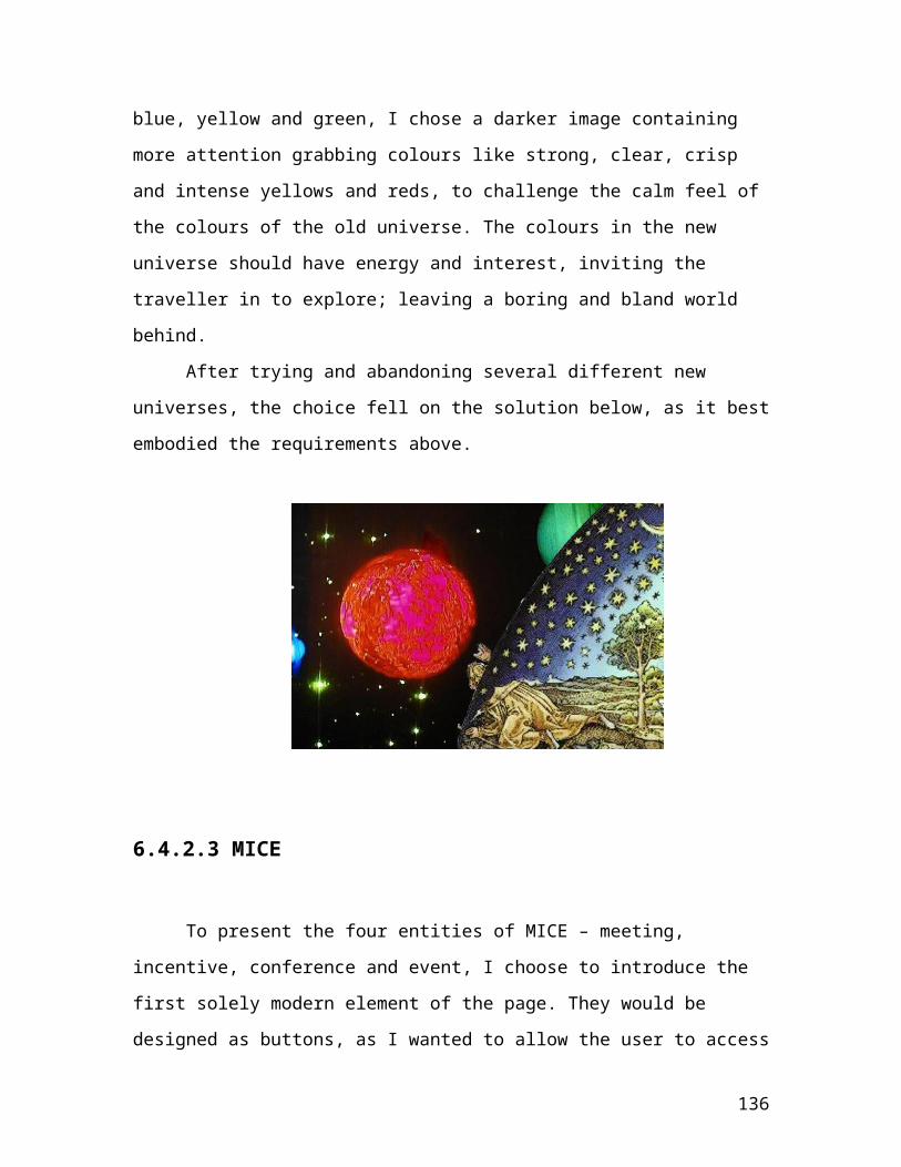
In question 18 and 19, question 1, 2, 4, and 5 are revisited after having given a textual explanation of the site, its content and its philosophy. This is done to be able to compare the score between a group knowing what the site is about, and a group not familiar with the site. Ideally the score in question 4 should be close to the score in question 18.
Questions 17 and 20 are added not to specifically check characteristics and criteria, but to check whether or not the navigation works well enough, which would indirectly have an effect on the clarity criterion. I have chosen not to ask directly about the quality of the navigation, as many people have certain expectations of a site’s navigation, disregarding whether new implementations might also be good. Instead I chose to simply ask which tools had actually been used, as this would supply me with information on which tools were used and to what extent, independently of the users’ biases towards certain ways of navigation. I also needed to check whether or not the hands in the corner of the book, came clear enough through in the design.
I chose to add an open comment (question 21) at the end of the questionnaire, as this might supply me with useful information about issues not handled through the criteria and characteristics.
The colour scheme for the questionnaire was chosen to be in light blue tones, as blue is considered to be a universally well liked colour. This will hopefully create a look with Visual Impetus, making sure that the look of the questionnaire does not repel the respondent. I wanted to use colour to add to the questionnaires Visual Impetus, but not bias their choices. It is also kept very simple not to distract the respondent, only to carefully guiding the user by utilising a clear and simple structure. The finished questionnaire can be found in Appendix 1.
136

7.1.3 Testing Browser Independence and Downloading Speed
The last two criteria – Browser independence and Downloading speed, will be tested separately, using online tools (http://www.websiteoptimization.com/services/analyze/) and browsers at my disposition.
As these two design criteria were mainly chosen to show the whole spectrum of the design method, and several more criteria regarding functionality and accessibility could have been added, they received less attention than they would have in a real life project. Both the testing of these, and the note put on them during the design process, has been less than they deserve. The reason for this is that I wanted to concentrate on testing the Characteristics, Principles and Guidelines.
7.2 Result
7.2.1 Questionnaire
See Appendix 2.
7.2.2 Browser Independence and Downloading Speed
7.2.2.1 Browser Independence
137

The website worked and looked as it should with most new Internet Explorer versions (5 and above), and Opera 6 and 7. One problem occurred with Internet Explorer up to 5.5, as transparency with .png did not work. As a plus it also looked and worked almost as it should in Netscape 7. The only function not working properly were the up and down scrolling arrows in the destinations page.
7.2.2.2 Downloading Speed
Below there is an excerpt from the speed test (conducted May 24, 2004), which shows the download time for the three biggest of the Authenticore pages: main, gallery and destinations.
Main *
Connection Rate
Download Time
14.4K 22.91 seconds
28.8K 11.95 seconds
33.6K 10.39 seconds
56K 6.63 secondsISDN 128K 2.73 secondsT1 1.44Mbps 1.15 seconds
*Note that these download times are based on the full connection rate for ISDN and T1 connections. Modem connections (56Kbps or less) are corrected by a packet loss factor of 0.7. All download times include delays due to round-trip latency with an average of 0.2 seconds per object. With 5 total objects for this page, that computes to a total lag time due to latency of 1 seconds. Note also that this download time calculation does not take into account delays due to XHTML parsing and rendering.
138

Gallery *
Connection Rate
Download Time
14.4K 7.77 seconds28.8K 4.29 seconds33.6K 3.79 seconds56K 2.59 secondsISDN 128K 1.35 secondsT1 1.44Mbps 0.85 seconds
*Note that these download times are based on the full connection rate for ISDN and T1 connections. Modem connections (56Kbps or less) are corrected by a packet loss factor of 0.7. All download times include delays due to round-trip latency with an average of 0.2 seconds per object. With 4 total objects for this page, that computes to a total lag time due to latency of 0.8 seconds. Note also that this download time calculation does not take into account delays due to XHTML parsing and rendering.
Destinations *
Connection Rate
Download Time
14.4K 31.87 seconds
28.8K 16.73 seconds
33.6K 14.57 seconds
56K 9.38 secondsISDN 128K 3.98 secondsT1 1.44Mbps 1.81 seconds
*Note that these download times are based on the full connection rate for ISDN and T1 connections. Modem connections (56Kbps or less) are corrected by a packet loss factor of 0.7. All download times include delays due to round-trip latency with an average of 0.2 seconds per object. With 8 total objects for this page, that computes to a total lag time due to latency of 1.6 seconds. Note also that this download time calculation does not take into account delays due to XHTML parsing and rendering.
139

7.3 Analysis
7.3.1 Questionnaire
7.3.1.1 Site type
Question 1 show that the answers have been spread across all categories. This is not unexpected, as the test persons has only been given a short glimpse of the site, and easily effected by uncontrollable outside factors like the situation and environment where the questionnaire was completed. I would however have hoped for the site to have more Visual Immediacy.
In question 2 (answered when Other was chosen in question 1) I found these suggestions as to what the site was about: unfinished
private page, althougt "Authenticore travel" indicates a commercial interest, phantasie, A religious one. Some kind of a sekt, New age or esoterisme, alternative thinking and living, Astrology and Roleplay, adventure site. The first seems to be undecided between private and commercial, while the others state, on a more detailed level than intended, what the site is about. This is not necessary in opposition to the categories in question 1, as they are merely stating what type of commercial, informational etc. site this is. E.g. a fantasy site can be a commercial site. These specifications gives a useful pointer in the direction of what style is perceived, but as not everyone has chosen to specify, but rather stuck to the categories, I can draw no certain conclusions from this. Though several of the comments indicate that the impression made by the site, is a little different from what was intended. New age or Lord of the Rings was a little more excitement, adventure and peculiarity than expected.
140

When asked in question 4 to place the site in one of the categories, most of the people that chose Other, has stated travelling or some sort of alternative travelling in question 5. One also wrote “a very unfinished commercial site, but I'm still not certain. No information what so ever.”, which might indicates that the person has got the idea, but dislikes the fact that the site at this point offers little textual information, and therefore refuses to make the choice. As these people has all seem to have gotten the idea of the site, I have made a new chart on question 4, attributing Other to Commercial, as this was the answer that I hoped would encompass everyone who had understood that the site was about travel.
Question 4
0
5
10
15
20
25
30
35
40
45
Private (a personal site) Commercial (company orproduct)
Educational Informational Entertaining Other
Where the prior chart of question 4 showed that Commercial ranked high above the other categories, this new chart makes it even clearer that most people seem to get the idea behind the site after having had a closer look.
As predicted the score in question 4 lies very close to that of question 18, which indicates that the users immediate understanding of the site through visual clues, is just as good as (or better than,
141

since the respondents of question 18 has already been subjected to the visual clues that respondents of question 4 relies on) the understanding of the site after the textual explanation.
Question 18
0
5
10
15
20
25
30
35
40
45
Private (a personal site) Commercial (company orproduct)
Educational Informational Entertaining Other
This row of questions gave me more or less the result I expected, as the answers to question 18 and question 4 were so similar.
7.3.1.2 Site Experience
When it comes to the experience of the site in general, the respondents seem at first to be divided into 3 more or less equal groups: dislike, good and something more/different is needed. Though when analysing the answers given by the something more/different is needed group, it seems like more would have given a positive response if the site had included more textual information (e.g. including the information that the finished page
142

would have, and not only test information). Other respondents in the something more/different is needed and other groups actually chose this category to simply state more clearly that they liked or disliked the site. These findings I have included in a new version of the chart for question 6, where I have given ok score when the comment is about the extent of information given, dislike when the comment clearly shows dislike, and good when the comment is showing only praise.
It is exiting. Conveys an atmosphere of jurney, in time and space. It is a happy
sight, inspires to playfulness. Gives also a feeling of safety, of being in contact with
something serious and trustworthy.
Some of the comments I have excluded, as they have nothing to do with the visual experience of the site (e.g. does not validate in http://validator.w3.org/ as it should do [translated]).
143

0
2
4
6
8
10
12
14
16
Dislike Ok Good Something more/different isneeded
Other
When asked whether of not they would like to explore the site further (after 7sec viewing of the site), the respondents seems to be divided in half. 21 on the negative side, against 23 on the positive side of the scale, while about 1/5 seem to have no distinct opinion in the matter (see chart below).
Question 3
0
5
10
15
20
No Yes
The comments regarding the experience of the gallery is mainly connected with the amount of pictures presented. Almost all the respondents that had chosen something more/different is needed or other, seemed to think that there should be more pictures in a picture gallery. Nothing was said by these respondents about the experience beyond the lack of pictures, which is natural as the gallery
144

shown to the respondents only contain a few test pictures to show them how the gallery works, therefore I assume that they found the gallery otherwise ok (and maybe even good). Therefore I chose to attribute these answers to ok in a modified chart of comment 11.
One of the answers to comment 12 I chose to exclude from the new chart, as it is not about the gallery design, but about the all over design of the site (site being to big for the users screen).
Question 11
0
5
10
15
20
25
Dislike Ok Good Something more/different isneeded
Other
As one can see from the chart not all of the respondents that chose something more/different is needed or other, has bothered to fill out comment 12, but most of the ones that have seem to have a positive impression of the site.
In the Other category for question 13 (experience of the destinations page), most of the answers were about the lack of textual information and the need for more destinations. Another few only wanted to state that the approach was interesting. All these I have attributed to ok in a revised version of the chart (seen below).
145
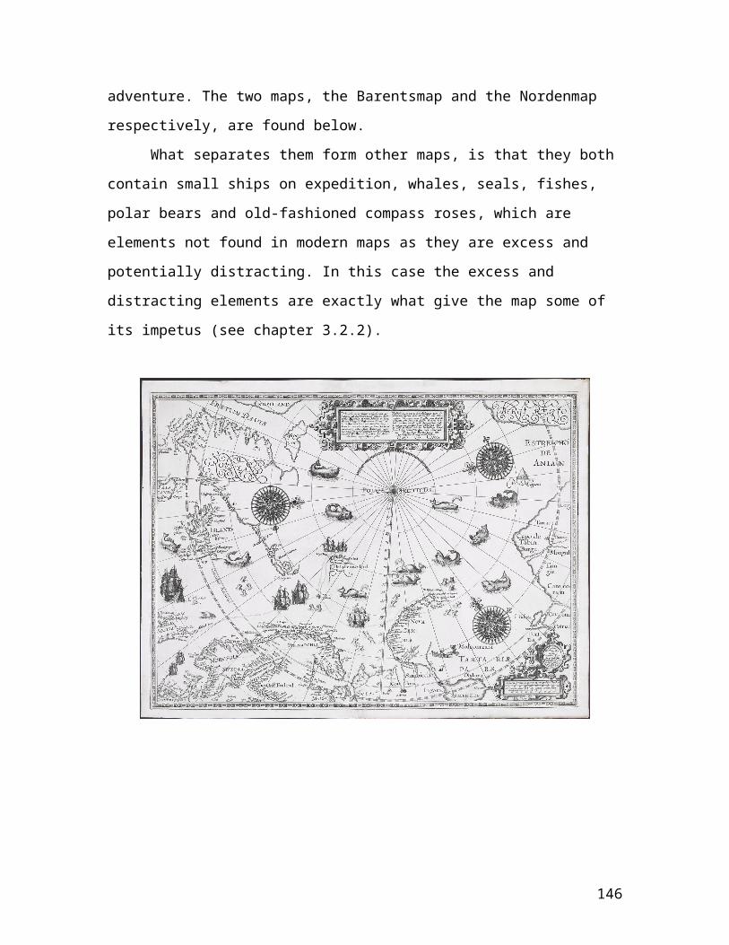
Question 13
010203040
Dislike Ok Good Somethingmore/different is
needed
Other
As seen from the chart, most of the respondents have a positive or very positive impression of this site, and one even comments in question 9: Wouldnt it be good to be confronted with the interactive map at
once? This indicates that this respondent finds this page important and probably good enough to be displayed as a starting page for the site.
When evaluating the combination of old and new elements, the users seem to be more positively that negatively inclined (see chart below), though a percent of 26 answering Dislike is too much.
Question 15
05
101520
Dislike Ok Good Somethingmore/different is
needed
Other
146

7.3.1.3 Trust
Question 10
0
2
4
6
8
10
12
14
16
No Yes
When it comes to trusting the site, the respondents seems to be quite clearly leaning towards not trusting the site. Approximately half of the respondents are located on the negative side of the scale, versus less than a third has given a positive answer. The group of respondents (a little more than a third) being neutral, only helps the impression to a certain extent. My conclusion still has to be that most people do not trust the site. Reasons for this I have found in the open comments throughout the questionnaire, but I would have gotten a clearer answer had I included a comment box for question 10 as well. The respondents seem to loose fait in the company, as the site looks unprofessional and like a sect with bad intentions. Other possible reasons might be due to screen size and downloading speed reported by a few of the respondents, and the fact that my graphic skills are limited, since I have no formal training in using graphic tools. Having the
147

graphics redone by a professional according to the original ideas, might be the remedy to this problem. When it comes to downloading speed and screen size this is being discussed in chapter 7.3.1.6 Speed and Size.
7.3.1.4 Textual Information
In the open comments through out the questionnaire I received several comments regarding the amount of textual information present in the design. This of course is quite natural, as the site only contained test information at the time I ran the questionnaire. Some also questioned the need for a picture gallery, since the lack of textual information made them unsure about the purpose the gallery played. I assume that this is a problem that will disappear, when proper information is added to the visual framework of the site. Taking the gallery as an example, the explanatory text following the pictures in the test site (‘here you can add text……………’), will be replaced by relevant information. The same goes for the destinations page, about which some respondents feel there is too little information about each destination. This will be improved in the finished version, as the test information will be replaced by a more appropriate, and to the point, text (possibly with links and images).
7.3.1.5 Functional Problems
One of the main functional issues I wanted to explore with the questionnaire was the accessibility of the gallery pages, through clicking the hands in the lower corners of the book. Initially I feared
148

that the hands alone would not be a strong enough cue, for the user to understand that the gallery consist of several pages – as in a photo album.
The results of the questionnaire revealed that several people only found the first gallery page. Common answers to question 12, were about there being too few pictures (is 4 pictures a gallery), while question 17 disclose that just a little above half of the respondents used the hands as navigation. These two questions show that the gallery pages are not completely understood by the users. Below are the diagrams showing the answers to question 17 and 20, which supports the fact that the hands might not be a good enough tool on their own.
Question 17
0102030405060
Buttons Bookmarks Hands Fires Clickable Pictures Text Links
Question 20
0102030405060
Buttons Bookmarks Hands Fires Clickable Pictures Text Links
The difference between the two diagrams is minimal, therefore it does not seem like the users are more inclined to use all the navigational tools even though they know how they work, and where to find them. Only about 60% of the respondents have checked Bookmarks as used, although almost all respondents have made use of the Fires and Clickable Pictures. As the Hands have about the same rating as the Bookmarks in both questions, it is probable that about
149

half the respondents used the Hands to get to the Destinations- or Gallery page, while the other half used the Bookmarks. The downside here is that if only half of the respondents have used the Hands, then only half of the respondents have seen the second Gallery Page. This means that there need to be made some changes to the navigation of the Gallery Pages.
A solution to this problem would be to include a cover for the gallery pages (being the destination of the Gallery bookmark), giving either links to the different picture themes, or an explanation to the usage of the gallery. Another solution is to make sub bookmarks which would appear on the left side of the book after having entered the gallery, and disappearing when leaving. To me the second solution seems to be better, as it does not break the book metaphor.
A problem seen is the mouse cursor not changing over clickable images. This is a cue commonly used, and it can be useful to people not familiar with the internet, but I believe it to be crippling as one does not thinking for one selves. Instead of using ones common sense to deduce what elements are clickable, one simply scan the page with the mouse looking for the cursor to change. In sites where unusual elements like lines or background are clickable, this is very helpful as this is not something that is easily deduced, but in a site where all elements are representations of something familiar like bookmarks or hands (seen in children’s pointing books) this should not be a crucial effect.
The visibility of images (and text implemented as images) was mentioned in 3 of the answers. As these were in reply to 3 separate questions, I have no way of knowing whether this is the same respondent repeating himself or not. This is a serious problem, but I am assuming that a browser not included in my browser independence design is used. As browser independence was not part of the questionnaire, I did not ask the respondents to state which
150

browser they were using. If I had done this, I could have explained this problem more clearly. Though if the 3 replies are accounted as one person, this makes out 2% of a randomly selected audience, which I think is a very good result when it comes to accessibility.
A few people have noticed a programming bug on the destinations page, which appears when a destination is chosen. The arrows on the side of the text, works opposite intuition, making the text go the wrong way when pushed. This is a minor, but annoying bug, which can be fixed in the matter of a few minutes. Still it is very important that this was discovered as it is the type of thing that gets very annoying after a few times use.
7.3.1.6 Organisation and tidiness
To the diagram of the answers to question 8, one cannot make much change through the answers in the other category, as these are very clear and to the point. Only one of the comments seems to be simply a specification of the category ok (or even good). The new chart created is found below.
Question 8
05
1015202530
Bad Ok Good Other
A little over half of the respondents seem to find the organisation and tidiness satisfying, but not impressing. What I find problematic, is that a group of about a third of the respondents finds the organisation and tidiness bad. Here I should have added an open comment to get a clearer idea of what they dislike.
151

7.3.1.7 Speed and Size
Although I did not plan to test downloading speed and size in the questionnaire, I got some useful feedback about this through the open comment boxes.
- Download time is excessive @56k.
- I am using an old laptop with small screen. The book does not appear
completely. I have to scroll all the time.
- Siden er i alt for stor oppløsning, jeg kjører 1024x768, og fikk hverken
plass i høyde og bredde, hvis ikke oppløsningen blir browser styrt burde
den ikke være større enn 800x600 da sikkert 50% av hjemme PCer ikke
kjører på høyere oppløsning.
- I am scrolling all the time. It is really annoying.
- Some graphicsI feel are excessive, the background particularly, this would
be less of an issue if download was quicker.
- The page contains too much "heavy graphics" and therefore takes to
much time to load. I didn't see the hands because they fell outside the
frame (too big for 600*800 screens).
- The site doesn't fit in my borwser window, and I use 1024*768, which is a
common resolution.
- In addition, something in the pages seems to be locking up my browser,
and I've got a pretty powerful setup.
- It really requires user to see the whole interface.[….] does not fit perfectly
in my screen.
- BUT the page is sort of too big for my screen so i have to use my mouse
to move the picture around a great deal - and that is a drawback: I don't
get a good view/overlook of the whole page.
152

- The site did not scale to my screen so I couldn't see it without horizontal
and vertical scrolling. 2. The performance (speed) was slow and
sometimes without progress indicators
- it is not designed for my monitor 17”
The main problem seems to be the size of the site (10 of the users had complaints about the site not fitting their computer screen). As this was not a question I had intended to find the answer to in the questionnaire, I did not include questions that would have made this kind of information more useful. I would have needed to include monitor size, screen resolution and setting (e.g. office, home computer). This would have provided me with a reason and explanation to the answers. Another problem with these comments is that the people who participated have very different backgrounds, and not all match the target group. This might account for the high count of people having a problem with the size (about 20%). In a group more similar to the target group, I assume the number would have been much lower.
I am aware (as some of the respondents have stated in their comments), that the site looses impetus when one is not able to see the whole book. It is annoying to scroll, but more importantly it is hard to get an impression of the site when one cannot see the whole book at once.
The picture is to large for my computer screen. Have to scroll a lot, and that
makes the site less positive to me.
Some of the respondents (4) also gave personal opinions about average screen size, resolution and proper file size for download.
153

On my end, the browsing was VERY slow. I doubt it is because of my internet
connection. I tried to time it, and found that the homepage took about 45 sec. to
load, and the page size was almost 2 MB. In my opinion, thats too much.
I cannot rely too much on these comments, as I have a mixed group of respondents, and no way of connecting each response to the background of the respondent.
When it comes to speed, a couple of respondents stated that this was due to heavy graphics, which I did anticipate as this was only a prototype made to test the concepts and the visual design. Creating the prototype I decided to concentrate on this, and only put emphasis on speed to a certain extent (making the site fast enough to test).
7.3.2 Browser Independence and Downloading Speed
7.3.2.1 Browser Independence
As the website did not work as it should with all desired Internet Explorer versions, the criteria of browser independence was not fulfilled as I had stated it. The problem with some early versions of Internet Explorer 5, is as I discovered, non support for transparent .png files. This can be solved by using .gif versions of the same images when the browser is between 5 and 5.5. The downside is that .gif images usually get white dots in the transparent area. Beside the lack of transparency, and hence unsatisfying visual design, the site works as it should.
154

7.3.2.2 Downloading Speed
For the main page, the test results show that all connection types have a downloading time lower than 20 seconds, as was set as a time limit on the downloading time in the Environment characterisation. This is a good result considering this being the first page one would attempt downloading, and delay here would mean potential loss of visitors.
For the destinations and the gallery pages, the results show that the 14.4 K modem uses more than 20 seconds to download the pages. The situation is worst for the destinations page, as the results show that it uses 10 seconds too much, while it is barely 1 second for the gallery pages. Below one can see from the statistics (ConnectionSpeed), that in 1998 only 0.9 % used a 14K connection (or lower). This suggests that although the Authenticore pages take too long to download with this type of connection, it occurs quite rarely. Therefore I choose not to emphasise this result.
Connection Speed
Location Frequency
Percent
Valid Percent
Cumulative Percent
Europe
Valid
Under 14k 1 .4 .4 .4
14k 2 .9 .9 1.3
28k 25 11.1 11.1 12.4
33k 31 13.8 13.8 26.2
56k 30 13.3 13.3 39.6
155

128k 41 18.2 18.2 57.8
1m 36 16.0 16.0 73.8
4m 4 1.8 1.8 75.6
10m 24 10.7 10.7 86.2
45m 7 3.1 3.1 89.3
Over 45m 9 4.0 4.0 93.3
Unsure 15 6.7 6.7 100.0
Total 225 100.0 100.0
The most commonly used connection type in 1998, were 128 K (ISDN) and 1m (T1). For the Authenticore pages these to types get quite a good result, as one can see from the excerpts of the speed test. All pages are well below 20 seconds, even when considering the 28K, 33K, and 53K connection rates.
Main Connection
RateDownload
TimeISDN 128K 2.73 secondsT1 1.44Mbps 1.15 seconds
Destinations Connection
RateDownload
TimeISDN 128K 3.98 secondsT1 1.44Mbps 1.81 seconds
156

Gallery Connection
RateDownload
TimeISDN 128K 1.35 secondsT1 1.44Mbps 0.85 seconds
From these results, my conclusion is that the download speed of the Authenticore site is more than well enough, especially considering the amount of images used in the design. As with every website, one would in a perfect world wish for instant access, but as it is I find the test results acceptable. One must also take into account that the average connection rate dates back to 1998, and that this average must have gone up after 5 years.
8. Chapter: Conclusion
One of the most important lessons I have learned doing the Authenticore project and the thesis, is that one can have the best intentions and ideas, but without having the required knowledge and skill in utilising editing programs like Illustrator or Paint Shop, creating a site with high Visual Impetus is hard. Amateur illustrations looking homemade do not awaken trust in people, and they generally expect more from visual design on the web. This supports my belief
157
that when creating websites graphic designers and information designers need to cooperate. What I realised during the creation of the Authenticore site, was that I am not always capable of putting my ideas into life; thus limiting my design choices. Having a graphic designer to whom I could send a detailed specification of the elements I wanted (including colour, shape, style description), would have rendered a better result.
I have also learned that designing a good questionnaire is one of the hardest things to do, but that exercise and experience will help ensure better and more useful information.
Another lesson learned is that one has to limit ones scope, especially doing a thesis like this, being cross disciplinary. The more one reads, the more one realises that one has just scratched the surface. To me this has at times been very frustrating; as I usually crave to know all there is to know when I get interested in a subject. After having seen all there is out there to learn in the area of visual design, I see the need for writing several more theses.Colour, typography and the psychology of art are examples of areas I especially feel deserve to be considered separately.
In other areas, like that of visual language (e.g. using lines, patterns, texture, shapes to communicate), there is a need for more firm and certain knowledge. It would be very useful to explore this area further, trying to collect more evidence and knowledge, as what one mostly finds on this is unsupported opinions.
References:
158

About.com : http://desktoppub.about.com/library/weekly/aa052301c-asymmetrical.htm and http://graphicdesign.about.com/library/weekly/aa021000a.htm (Last visited 23.04.04)
Afterimage : http://www.grand-illusions.com/face.htm (Last visited 23.04.04)
Akkøk, 2003a : Akkøk, M. N. (2003). Designing Visual Immediacy into a Diagrammatic Modeling Language. Information Design Journal. In (Karabeg&Akkøk).
Akkøk,2003b : Akkøk, M. N. (2003). Defining Visual Immediacy, the Underused Gift of Diagrammatic Modeling Languages. (in preparation for submission to) Journal of Visual Languages and Computing. In (Karabeg&Akkøk).
Akkøk, 2004 : Akkøk, M. N. (2004). Towards the Principles of Defining Diagrammatic Modeling Languages: Some Visual and Cognitive Aspects. PhD (DrScient) Thesis in Institute of Informatics, Mathematics and Natural Sciences Faculty, University of Oslo.
Arnheim, 1974 : Arnheim, Rudolf (1974). Art and Visual Perception – A Psychology of the Creative Eye. The New Version. University of California Press Berkeley and Los Angeles, California. ISBN: 0-520-02613-6
159

Arnheim, 1972 : Arnheim, Rudolf (1972). Towards A Psychology of Art. University of California Press Berkeley and Los Angeles, California. ISBN: 0-520-00038-2
ArtGlossary : http://www.artsmia.org/animals/glossary.html (Last visited 23.04.04)
Art Studio : Art Studio. Principles of Design In Art and Design. http://victorian.fortunecity.com/literary/431/comp.htm (Last visited 23.04.04)
Bear : Bear, Jacci Howard. Desktop Publishing. Section 1: Elements of Design. Class 5: Texture. http://desktoppub.about.com/library/weekly/aa030701a-s1c5.htm (Last visited 24.05.04) Barents : Kartsamlingen, Nasjonalbiblioteket, avd. Oslo. Kart 4846.
Barry, 1997 : Barry, Ann Marie Seward (1997). Visual Intelligence: Perception, Image, and Manipulation in visual communication. State University of New York Press, Albany. ISBN 0-7914-3435-4 (p.21)
Big Duck : http://www.southamptonwest.com/photos/bigduck.htm (Last visited 23.04.04)
Birkenhoff, 1928 : Birkenhoff, G. D. (1928). Atti Congressi Bologna, 1, pp. 31533. In (Goguen, 1999).
Birkenhoff, 1933 : Birkenhoff, G. D. (1933). Aesthetic Measure (Cambridge: Cambridge University Press). In (Goguen, 1999).
160
Birren, 1992 : Birren, Faber (1992). Color Psychology And Color Therapy. ISBN 0-8065-0653-9. Page 244.
British Library : http://www.bl.uk/collections/treasures/treasures.html (Last visited 23.04.04)
Browser : http://www.dreamink.com/design5.shtml (Last visited 14.04.04)
Cambridge : http://dictionary.cambridge.org/ (Last visited 23.04.04)
Cathie : http://www.cathiejung.com/index.html (Last visited 23.04.04)
Chandrasekaran, 1999 : Chandrasekaran, B., 1999. Multimodal Perceptual Representations And Design Problem Solving. Visual and Spatial Reasoning In Design: Computational And Cognitive Approaches. 15-17 June 1999, MIT, Cambridge, USA.
Christ, 1975 : Christ, R. (1975). Review and analysis of color coding research for visual displays. Human Factors, 17. In (Meier, 1988).
Collopy : Collopy, Fred. Color, Form, and Motion – Dimensions of a Musical Art of Light. Leonardo, Vol. 33, No. 5, 2000, 335-360. http://RhytmicLight.com/archives/bibliography.html
Color.com : http://www.colorcom.com/color.html (Last visited 28.04.04)
161

ConnectionSpeed : http://www.cc.gatech.edu/gvu/user_surveys/survey-1998-10/graphs/technology/q01.htm (Last visited 23.04.04)
Cytowic, 1995 : Cytowic, Richard E. 1995.Synesthesia: Phenomenology And Neuropsychology. http://www.geometry.net/psychology/neuropsychology.html (Last visited 23.04.04)
Drecker : Drecker, Rick. Basics of Composition. http://www.sd9.org/comp/comp.htm (Last updated 22.08.03, last visited 23.04.04)
Encarta : http://encarta.msn.com/dictionary_/impedance.html (Last visited 23.04.04)
Ferrari : http://adult-pornstar-mall.com/starpgs/Lolo_Ferrari.htm (Last visited 23.04.04)
FontPool : http://www.fontpool.com/ (Last visited 23.04.04)
Fortin, 2003 : Fortin, Michel. (25.07.2003). Secrets of Successful Headlines. http://www.webpronews.com/ebusiness/smallbusiness/wpn-2-20030725SecretsofSuccessfulHeadlines.html (Last visited 9.08.04)
Fürst : Fürst, Karin. Something About Authenticore.
Gill, 1997 : Gill, Kathy E. (1997). Design for Usability. Presented at WWW6 - Santa Clara, California HTML Writer’s Guild Pre-Conference
162

Session. http://webdesign.ittoolbox.com/documents/document.asp?i=856 (Last visited 23.04.04)
Goguen, 1999 : Goguen, Joseph A. (1999). Art and the Brain : Editorial Introduction. J. Consc. Studies 6, No. 6/7, June/July 1999, pages 5-14.Gregory : Gregory, R. L. Perceptual Illusions and Brain Models. Proc. Royal Society B 171 179-296. http://www.richardgregory.org/papers/brainmodels/illusions-and-brain-models.pdf (Last visited 28.04.04)
Hoffmann, 1998 : Hoffmann, Donald D. (1998). Visual Intelligence : how we create what we see. W. W. Norton & Company, Inc. ISBN 0-393-04669-9
HTDictionary : http://www.computeruser.com/resources/dictionary/definition.html?lookup=5779 (Last visited 23.04.04)
Hyperdictionary : http://www.hyperdictionary.com/dictionary/ (Last visited 23.04.04)
Imhof, 1982 : Imhof, Eduard. Cartographic Relief Presentation (Berlin, 1982) in Envisioning Information page 63. In (Tufte, 1990)
Itten, 1970 : Itten, Johannes (1970). The Elements of Color. Van Nostrand Reinhold Company, New York, NY. In Shubin, Falck, Johansen (1996). Exploring Color in Interface Design. ACM Press, New York, NY. Volume 3, Issue 4, pages 36-48. ISSN: 1072-5520.
163

Itten, 1961 : Itten, Johannes. The Art of Color. 1961. ISBN 0-442-24037-6. Van Nostrand Reinhold. N.Y.
Jirousek : Jirousek, Charlotte. An online, interactive textbook designed to support TXA 125: Art, Design, and Visual Thinking, taught at Cornell University in the Department of Textiles and Apparel. http://char.txa.cornell.edu/ (Last visited 23.04.04)
Karabeg, 2002/2003 : Karabeg, Dino. Designing Information Design. Information Design Journal. 11/1 2002/2003. http://www.ifi.uio.no/in-id/readings/ (Last visited 22.04.04)
Karabeg&Akkøk, 2004a : Karabeg, Almira and Akkøk, M. Naci. Visual Representations and the Web. 2004.Karabeg&Akkøk, 2004b : Karabeg, Almira and Akkøk, M. Naci. Towards a Language for Talking About Visual and Spatial Reasoning. 2004.
Karvonen : Karvonen, Kristiina. The Beauty of Simplicity.
Karvonen, 2000 : Karvonen, K., Cardholm, L. and Karlsson, S. (2000). Cultures of Trust. A Cross-Cultural Study of the Formation of Trust in an Electronic Environment. In Proceedings of the 3rd Nordic Workshop on Security (NordSec 2000), Reykjavik, Iceland, October 12-13. In (Karvonen).
Kator, 2003 : Kator, Andrew, 2003. Quick Tips In Design. http://www.atpm.com/9.07/design.shtml (Last visited 23.04.04)
Kennedy, 1999 : Kennedy, Jane Rock (1999). Color Theory 101. http://www.webdesignclinic.com/ezine/v1i1/color/index.html (Last
164

visited spring 2003) http://itwebmaster.iit.edu/resources/colortheory.html (Last visited ........)
Kloken : http://www.kloken.no/kreativ/skriving.asp (Last visited 23.04.04)
Knauff&Johnson-Laird, 2002 : Knauff, Markus and Johnson-Laird, P.N. 2002. Visual imagery can impede reasoning. Psychonomic Society, Inc. Memory & Cognition, 30(3), 363-371
Little&Perrett, 2002 : Little, Anthony and Perrett, David (2002). Putting Beauty Back in the Eye of the Beholder. The Psychologist Vol. 15 No. 1 https://www3.bps.org.uk/publications/thepsychologist/little.pdf
Marcus, 1992 : Marcus, Aaron (1992). Graphic Design for Electronic Documents and User Interfaces. ACM Press, New York, New York.
McCloud, 1993 : McCloud, Scott (1993). Understanding Comics : The Invisible Art. Northampthon, Massachusetts: Kitchen Sink Press. Page 30-31. In (Barry, 1997). Medical Dictionary : http://www.books.md/N/dic/negativeafterimage.php (Last visited 23.04.04)
Meier, 1988 : Meier, Barbara J. (1988). ACE: A Color Expert System for User Interface Design. ACM 0-89791-283-7/88/0010/0117
Merriam-Webster : http://www.m-w.com/ (Last visited 23.04.04)
165

Moiré : http://www-unix.oit.umass.edu/~mee/Image9.gif (Last visited 23.04.04)
MonitorResolution : http://www.cc.gatech.edu/gvu/user_surveys/survey-1998-10/graphs/technology/q128.htm (Last visited 23.04.04)
Myers : Myers, M. D. Qualitative Research in Information Systems. MIS Quarterly (21:2), June 1997, pp. 241-242. MISQ Discovery, archival version, June 1997, http://www.misq.org/discovery/MISQD_isworld/. MISQ Discovery, updated version, last modified: February 27, 2004 www.qual.auckland.ac.nz
NL : Kartsamlingen, Nasjonalbiblioteket, avd. Oslo. http://www.nb.no/html/kartsamlingen.html (Last visited 23.04.04)
Nielsen, 2003 : Nielsen, Jakob (2003). Usability 101. http://www.useit.com/alertbox/20030825.html (Last visited 23.04.04)
Nike : http://www.marciodearruda.com.br/palmback.htm (Last visited 23.04.04)
Nike2 : http://www.geneva-link.ch/portier/nike.jpg (Last visited 23.04.04)
NIMH : Focusing Attention Cancels Brain-Dampening Effects of Visual Clutter. National Institute of Mental Health (NIMH). http://www.nih.gov/news/pr/oct98/nimh-01.htm (Last visited 23.04.04)
166
Norden : Kartsamlingen, Nasjonalbiblioteket, avd. Oslo. Kart 1641.
Norman, 2002 : Norman, Donald A. (2002). Emotions & Design : Attractive things work better. Interactions…july + august 2002. Preview of his book with the working title Emotions and Design.
NTU : Nanyang Technological University. http://www.ntu.edu.sg/home/mykng/legs.jpg (Last visited 23.04.04)
OEDictionary : http://dictionary.oed.com/ (Last visited 23.04.04)
Ordbok : http://www.vgskole.net/teachers/norsk/ressurser/ordbok.htm (Last visited 23.04.04)
Petre, 1995 : Petre, Marian. (1995). Why Looking Isn’t Always Seeing: Readership Skills and Graphical Programming.
Petry&Bradley : http://psylux.psych.tu-dresden.de/i1/kaw/diverses%20Material/www.illusionworks.com/html/depth_ambiguity.html (Last visited 23.04.04)
Ramachandran, 2003 : BBC Reith Lectures 2003. Ramachandran, Vilayanur S. http://www.bbc.co.uk/radio4/reith2003/lecture3.shtml (Last visited 23.04.04) Ramachandran&Hirstein, 1999 : Ramachandran, Vilayanur S. and Hirstein, William (1999). The Science of Art: A Neurological Theory of Aesthetic Experience. Journal of Consciousness Studies, 6, No. 6-7, pp. 15-51.
167

ScreenSize : http://www.gvu.gatech.edu/user_surveys/survey-1998-10/graphs/technology/q127.htm (Last visited 23.04.04)
Shaw Floors : http://www.shawfloors.com/DesignCenter/MyColor/ColorWheel.asp (Last visited 23.04.04)
Shubin&Falck&Johansen, 1996 : Shubin, Falck, Johansen (1996). Exploring Color in Interface Design. ACM Press, New York, NY. Volume 3, Issue 4, pages 36-48. ISSN: 1072-5520.
Singh, 2000-2002 : Singh, Kulraj. 2000-2002. http://www.the-internet-eye.com/features/2000/Aug/Typo1/default.htm (Last visited 23.04.04)
Stick : http://members.aol.com/gunghey2/insects.html (Last visited 23.04.04)
Stanford Encyclopedia of Philosophy : http://plato.stanford.edu/entries/diagrams/ (Last visited 28.04.04)
Tractinsky, 1997 : Tractinsky, N. (1997). Aesthetic and Apparent Usability: Empirically Assessing Cultural and Methodological Issues. CHI 97 proceedings, Atlanta, 1997, pp. 115-123. In [Karvonen].
Tufte, 1990 : Tufte, Edward R. (1990). Envisioning Information. Graphic Press. Conneticut.
Tufte, 2001 : Tufte, Edward R. (2001) The Visual Display of Quantitative Information. Second Edition. Graphic Press. Conneticut.
168

Tullis, 1981 : Tullis, T. (1981). An Evaluation of Alphanumeric, graphic, and color information displays. Human Factors 23:5. October, 1981. In (Meier, 1988).
typo2 : http://collaboratory.nunet.net/dsimpson/typography.html (Last visited 23.04.04)
Typographic : http://www.rsub.com/typographic/ (Last visited 23.04.04)Vitola, 2000 : Vitola, Denise. 2000. Designing A Web Site Is Like Writing A Book! The Internet Eye Magazine. http://www.the-internet-eye.com/features/2000/Dec/Literary/default.htm (Last visited 23.04.04)
Webscapades : http://www.webscapades.com/england/subway.gif (Last visited 28.04.04)
Wikipedia : http://en.wikipedia.org/wiki/Metaphor (Last visited 24.04.04)
Williams : Williams, Robin. http://www.eyewire.com/magazine/columns/robin/newmillennium/ (Last visited 23.04.04)
Willis : Willis, D. (1999). Effects of Using Enhancing Visual Elements in Web Design. American Communication Journal. 3(1).
Will-Harris, 2000 : Will-Harris, Daniel. 2000. http://www.will-harris.com/use-type.htm (Last visited 23.04.04)
169

Wilson, 1996-2003 : Wilson, Diane. Color Vision, Color Deficiency. http://www.firelily.com/opinions/color.html (Last visited 23.04.04)
Wright, 2000-2004 : Angela Wright, Colour Affects, 908 Keyes House Dolphin Square, London, SW1V 3NB. 2000-2004. http://www.colour-affects.co.uk/ (Last visited 23.04.04)
Wynn, 1995 :Wynn, S. (1995). Design Principles for slides and overheads. In Summers, L.(Ed), A Focus on Learning, p287-291. Proceedings of the 4th Annual Teaching Learning Forum, Edith Cowan University, February 1995. Perth: Edith Cowan University. http://lsn.curtin.edu.au/tlf/tlf1995/wynn.html (Last visited 23.04.04)
Zeki, 2002 : Zeki, Semir (2002). Neural Concept Formation & Art : Dante, Michelangelo, Wagner. Journal of Consciousness Studies, 9, no. 3, page 53-76
170