Embed Size (px)
Citation preview

Editing; Magazine
Initial Photo
• This was the original photo in which I had taken of Fred. What I was trying to do while taking this photo was use conventions of urban dramas. One of the main conventions in which was used was the hoodie and this because this a stereotypical clothing in which “hoodlums” tend to wear. The reasoning behind the white/grey hoodie was to amplify to the audience that the main character is not your stereotypical hoodlum and that he has a plot twist to him and therefore rather than the character just wearing a common black hoodie I choose to subvert to the common regularities of hood characters. Also with this photo this was the first and there was no editing done to the photo and what I knew that I wanted to add a chiaroscuro lighting to give the effect of a dark character to therefore show that he is a mysterious character.

Photoshop
• These are some of the editing processes in which I went through. The main software in which I was using was Photoshop. The reason for this is because it allowed me edit and cut out unnecessary parts off. As you can see from the first image that is was just a plain image and the image was quite dark so I had realised that I needed to lighten up the face so I needed to brighten the contrast of his face. While playing around with his face I started to darken a shade of his face giving the mystery effect by lighting up his face it brought out the characters stern face more. Colour Vibrancies and Colour Balance were the features which mainly helped to make the photo come out this way. Also with the hoodie as it was grey and I wanted a white hoodie what I done was lighten up the shade of the jumper to make it look m ore white and this done once again through colour vibrancies and the brightening the contrast in a particular area
Dra
fting
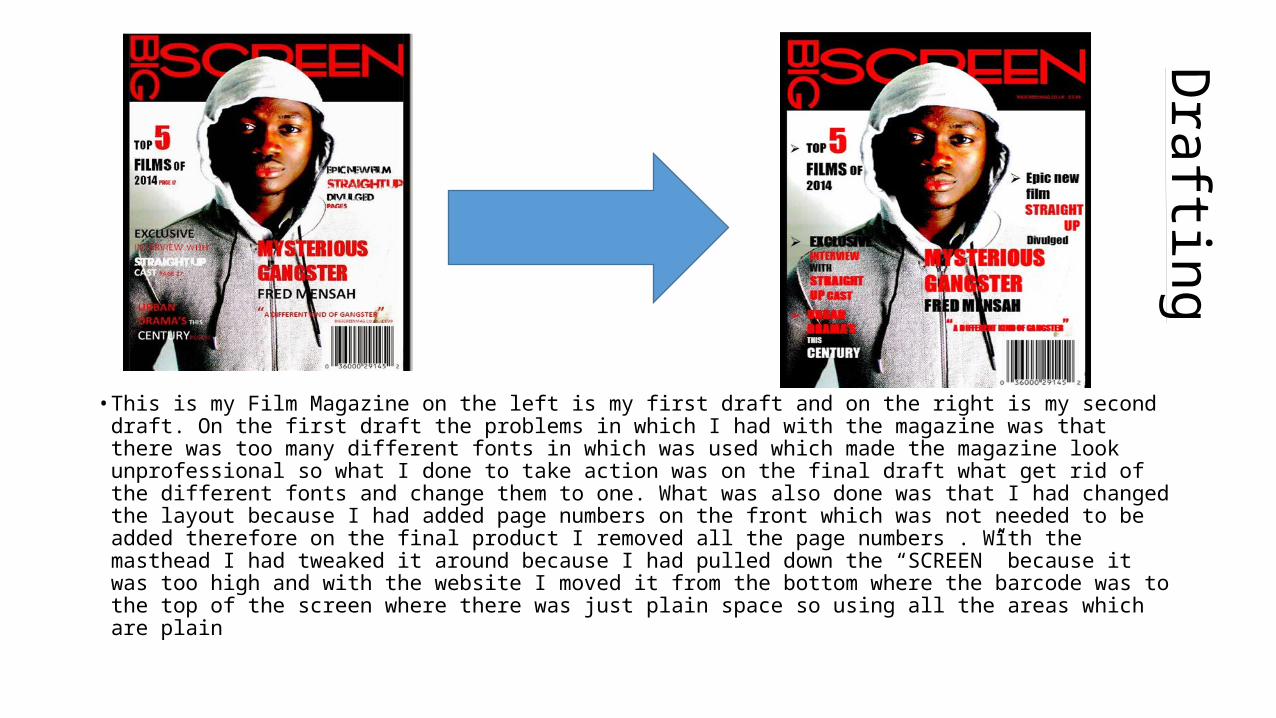
• This is my Film Magazine on the left is my first draft and on the right is my second draft. On the first draft the problems in which I had with the magazine was that there was too many different fonts in which was used which made the magazine look unprofessional so what I done to take action was on the final draft what get rid of the different fonts and change them to one. What was also done was that I had changed the layout because I had added page numbers on the front which was not needed to be added therefore on the final product I removed all the page numbers . With the masthead I had tweaked it around because I had pulled down the “SCREEN” because it was too high and with the website I moved it from the bottom where the barcode was to the top of the screen where there was just plain space so using all the areas which are plain