Embed Size (px)
Citation preview

Codes and Conventions
Of the contents page in an indie music magazine
• Using NME, Q and Kerrang! Magazines

Banner • Recent information• Informative• (uses and grat)• Included logo and
house colours (red white and black)
Alley• Outside alley• Used effectively to add
extra information• Enticing the reader to
flick to the pages
Boost Photo• Promoting the
featured story• Keeping the
readers attention-appealing
• Centre of visual interest.
List• To show the
magazines vast information on loads of different bands.
• To out-do competitors
Cutlines & kickers• Providing
information on the photo
• Developing stages of engagement with the reader.
Exclusivity• ‘Plus’ even more articles and
information after such an extensive contents page
• Shows the reader its full of information (uses and grat)
• ‘Uks No.1’ beats all the other indie music magazine
• Deal advertisement• Appealing
Font• Keeping to house colours but using a
mixture of Sans and Sans serif to catch the readers eye
Sub headlines• Followed with straplines that
include pull quotes and overlines of the articles inside.
• Enticing reader with info (uses and grat)
Page numbers• Throughout contents• Easy to read – different
colours

Stereotypical colours• Red, black and white• Classic colours for this style of magazine• Appealing for the target audience
Banner• Containing info for the reader, such as the
logo and issue number- direct info- (uses and grats)
• Simplistic yet effective and clear.
Logo • Consistently
positioned in the top left hand corner
• Gains brand awareness
subconsciously
Decked overlines• Various
featured pages presented clearly with the page number in columns
• List format to show a lot is in the magazine
Boost Photos• Various sizes to attract the reader.• Large numbers in the corners of the
images for quick reference to gain more info (uses and grats)
Preview • Other issues
shown to get the reader to possibly collect or gain interest.
• Also previews of the double spreads in the magazine giving a professional edgy look.
No negative space• Full of images and text, the contents page
for Q wants to give the effect of having the most up to date info and music news for the reader and that they are not short.
Standfirst• Containing
an overall review of the magazine, it hooks the reader as it is sociable.

Logo• Same position as its front cover• Reabsorbing brand awareness for
the reader• Hypodermic needle
Main boost photo• Direct mode of address- personal
relationship with reader- (uses and grats)
• Positive and bold model pose, pleasant to the eye.
Other boost photos• Previews of double spreads-real
insight into the magazine• Clearly presented with almost box
out page numbers- exclusivity- enticing
• Hermeneutic images as the reader gets the idea but wants to read fully
Box out• Linked towards the article shown• Badge like- linking to possible target
audiences with their fashion• Eye catching
Font and House colours• Sans font- bold- matches the logo
font- increasing brand awareness• House colours go against the
streotypical- different- standing out from other magazines
Banner• Containing issue number and date• Recent information – information – (uses and
grats)
Decked Overlines• Bold subheadings in contrasting
colours• Clear sections• Hermeneutic questions – making
the reader go further• Pull quotes and buzz words
relating to the target audience• Providing more info –(uses and
grats)
No negative space• The style that other indie magazines
go for-ability to compete for sales• Showing how much they have to
offer-attractive• Providing loads of info to the reader
(uses and grats)
Promotions• Celebrity promotions- out beating
other magazines• Buzz word ‘subscribe’ promoting
the sales of the magazine- sub-consciously selling the magazine-hypodermic needle.
• Linking the reader even more into the music world and magazine.
Byline from the editor• Connects reader directly to the magazine- personal relationship-(uses and grats)• Positive image-positive feeling towards the magazine
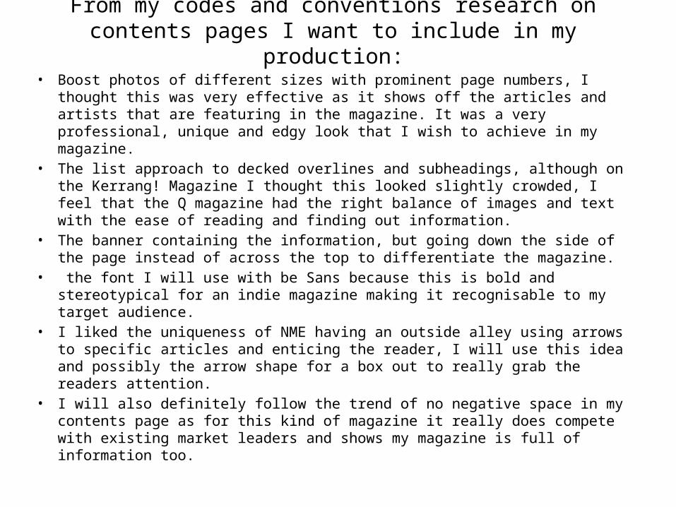
From my codes and conventions research on contents pages I want to include in my production:
• Boost photos of different sizes with prominent page numbers, I thought this was very effective as it shows off the articles and artists that are featuring in the magazine. It was a very professional, unique and edgy look that I wish to achieve in my magazine.
• The list approach to decked overlines and subheadings, although on the Kerrang! Magazine I thought this looked slightly crowded, I feel that the Q magazine had the right balance of images and text with the ease of reading and finding out information.
• The banner containing the information, but going down the side of the page instead of across the top to differentiate the magazine.
• the font I will use with be Sans because this is bold and stereotypical for an indie magazine making it recognisable to my target audience.
• I liked the uniqueness of NME having an outside alley using arrows to specific articles and enticing the reader, I will use this idea and possibly the arrow shape for a box out to really grab the readers attention.
• I will also definitely follow the trend of no negative space in my contents page as for this kind of magazine it really does compete with existing market leaders and shows my magazine is full of information too.