Embed Size (px)
Citation preview
LOOKING AT LOUD ALBUM BY RIHANNA
LOOKING AT MY BEAUTIFUL DARK TWISTED FANTASY BY KANYE WEST
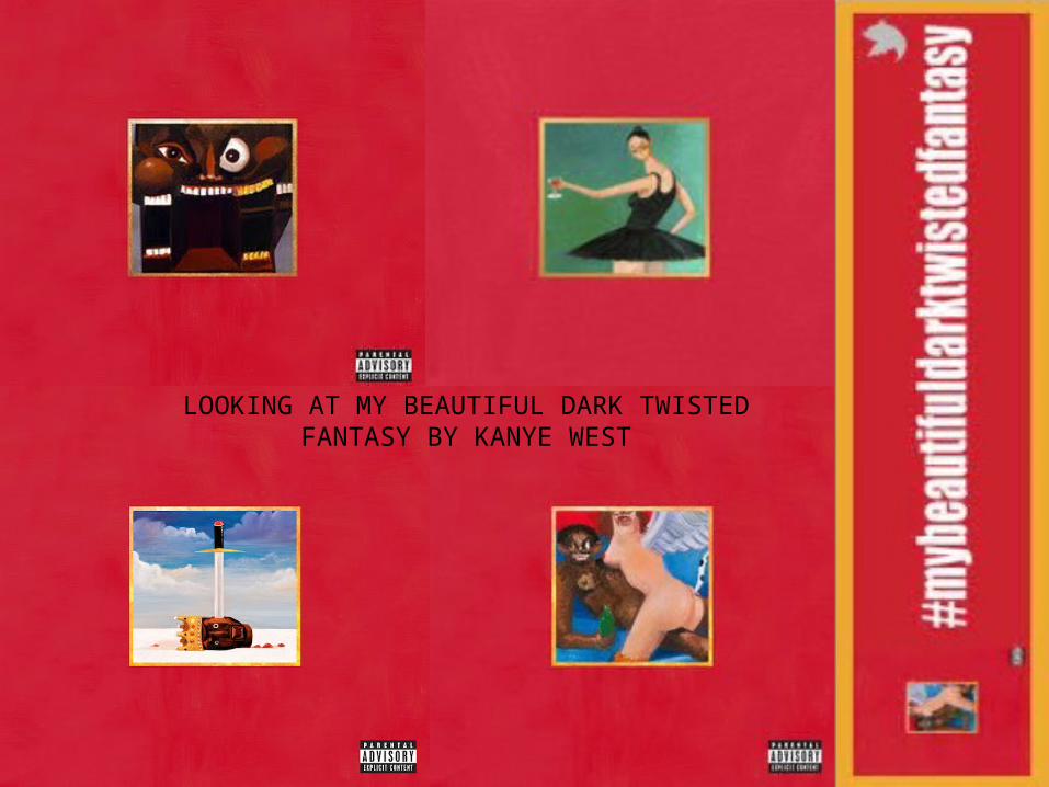
Main Image:Doesn’t use the gaze, it is a cartoon image of two ‘humans’ which are abstract. I think that it stands out because it is so abstract and different. I also think that it stands out because people don’t know who it is. This kind of thing can only be done with well established artists like Kanye West.
Colour Scheme: The colours used are Red, Blue, green and skin colours. I found out the precise colours by going onto Photoshop and clicking the different colours to see there exact colour. I think that these colours work really well together because the red stands out. I also think that they are quite subtle colours which works well.
Font: There is no font on the cover but as people are aware of Kanye West, fans of his will know that it’s his album anyway.
Improvements:I think that maybe the album name needs to be clearer to the audience because if you were unaware of the album then you wouldn’t know who’s it was. I also think the image may freak some people out so I think maybe another image would be more appropriate but in the same style.
Strengths: I think that having such an abstract image attracts the audience to look at this album because it is very different from other albums it stands out and because it doesn't’t have a name people wonder who’s album it is which intrigues people into having and look and seeing what's inside. I really like the bold red colour and the contrast of the blue against it which I think works well. It also used Kanye West’s signature colours which are red and yellow.
Weaknesses: I think that the image isn’t obvious of who the artist is and also there is not album name which means people can’t tell what it’s called straight away, they would need to open it to see.
MY BEAUTIFUL DARK TWISTED FANTASY ALBUM COVER
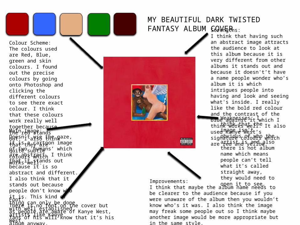
Colour Scheme: The colours used are all quite similar to the front of the album however there are less colours. The colours used are the red which is the main colour of the front cover and also the yellow which isn’t in the album cover but it is almost the same as the skin colour. I think that the colours relate to each other which makes it link together and therefore makes it work well. Also the writing is very abstract like the cover and therefore it works well as the cover is abstract as well as the writing.
Track list: The font of the Track list is very abstract and quite unreadable but it works really well. The font is very abstract which links with the abstract image used on the cover. Also the fonts are in a square shape where some of the writing is bigger and some smaller which I think works really well.
Improvements:I think that the writing needs to be neater in order to be able to read it easier and this would help with it being more understandable.
Image: There is no image on the back cover which means there is no obvious relation with the artist. I think that this however works really well because it keeps it very simple rather than having it overpowering by an image.
Strengths: I really like how there isn’t an image because it makes the track list a piece of artwork itself. I also like how the colours contrast each other and how they are both bright.
BACK OF MY BEAUTIFUL DARK TWISTED FANTASY ALBUM
COVER
Barcode: The barcode is at the back of the album, this is put at the back because it isn’t aesthetically pleasing therefore it is hidden at the back rather than in your face and in the front. It is on the side which means that it’s out of the way from the writing and so it isn’t a main focus.
Details:The names of the songs are written down in random places and also the name of the artist.
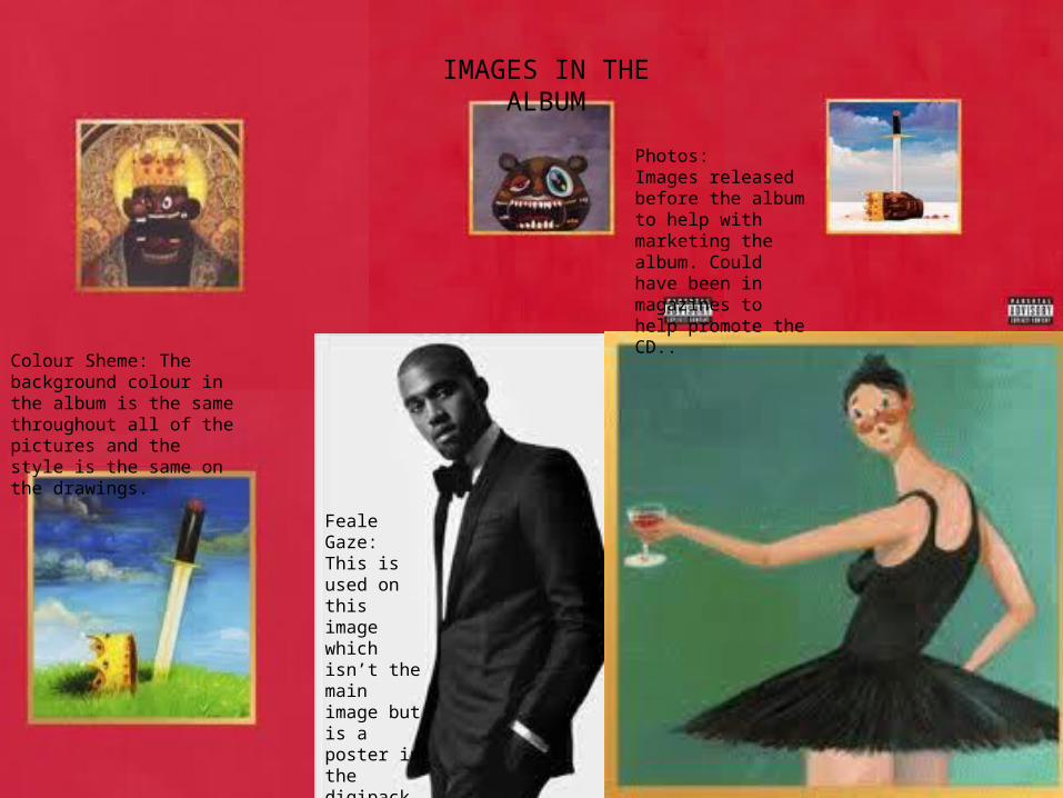
IMAGES IN THE ALBUM
Photos:Images released before the album to help with marketing the album. Could have been in magazines to help promote the CD..
Feale Gaze:This is used on this image which isn’t the main image but is a poster in the digipack.
Colour Sheme: The background colour in the album is the same throughout all of the pictures and the style is the same on the drawings.