Embed Size (px)
Citation preview

WebRTC
Joshua Marantz [email protected] Make the Web Fast team
Delivering Optimized Images on the Modern WebVelocity/Europe, BarcelonaNovember 17, 2014
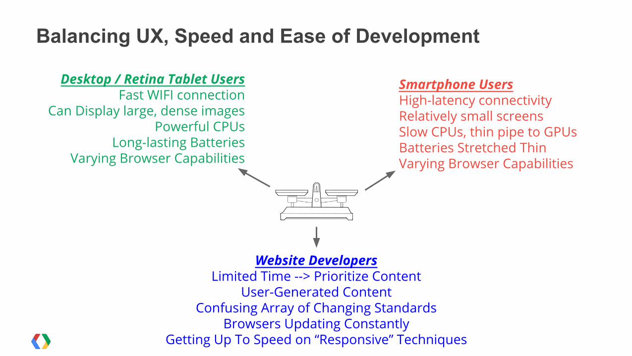
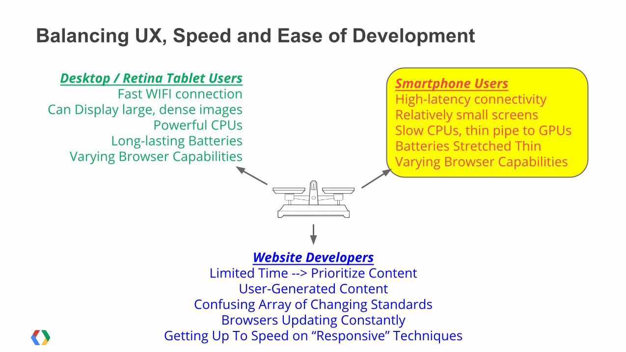
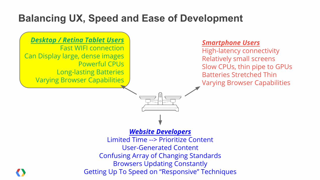
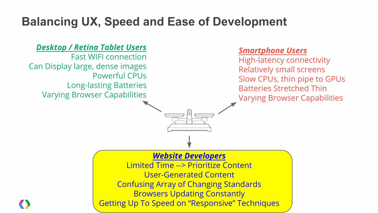
Balancing UX, Speed and Ease of Development
Smartphone Users High-latency connectivityRelatively small screensSlow CPUs, thin pipe to GPUs Batteries Stretched ThinVarying Browser Capabilities
Desktop / Retina Tablet UsersFast WIFI connection
Can Display large, dense imagesPowerful CPUs
Long-lasting BatteriesVarying Browser Capabilities
Website DevelopersLimited Time --> Prioritize Content
User-Generated ContentConfusing Array of Changing Standards
Browsers Updating ConstantlyGetting Up To Speed on “Responsive” Techniques
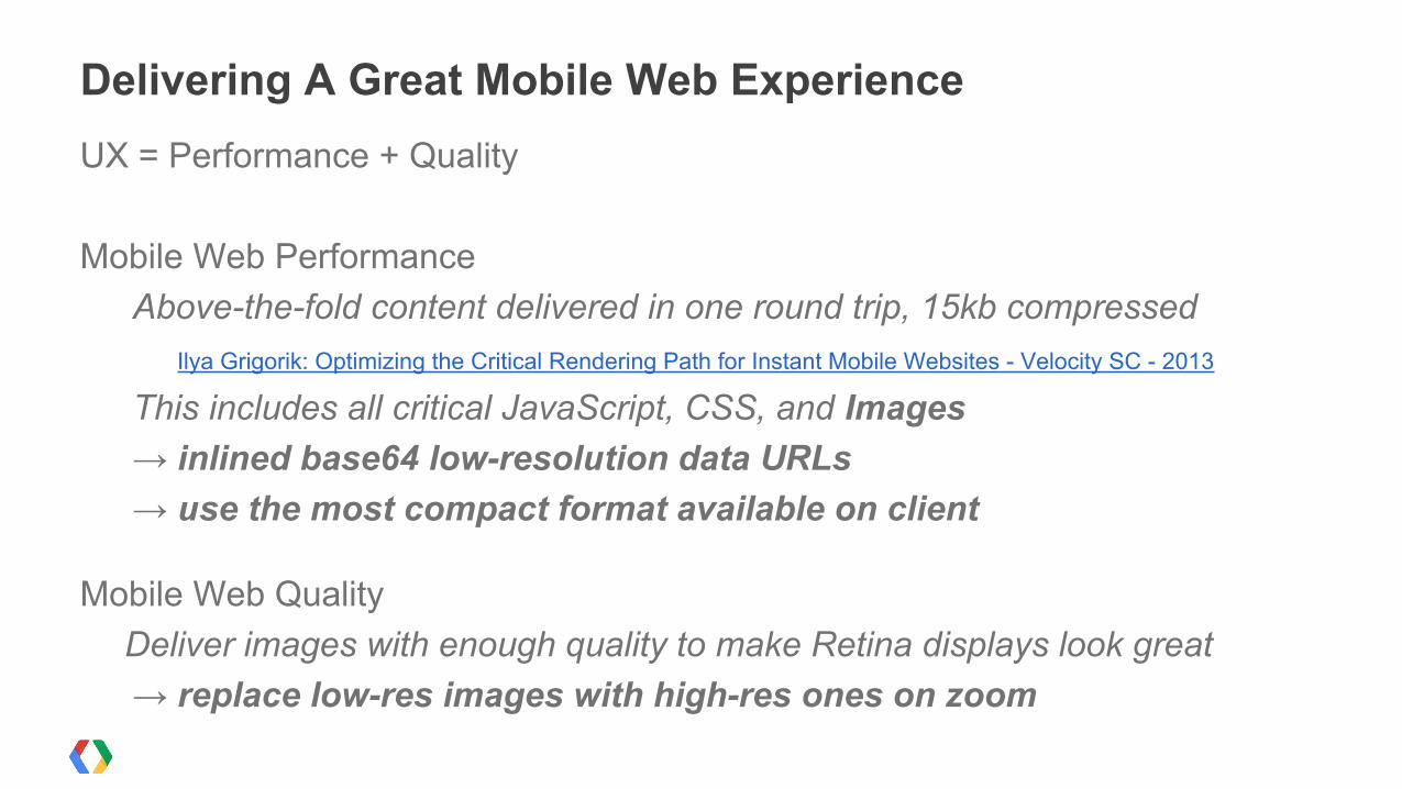
UX = Performance + Quality
Mobile Web PerformanceAbove-the-fold content delivered in one round trip, 15kb compressed
Ilya Grigorik: Optimizing the Critical Rendering Path for Instant Mobile Websites - Velocity SC - 2013
This includes all critical JavaScript, CSS, and Images→ inlined base64 low-resolution data URLs→ use the most compact format available on client
Mobile Web QualityDeliver images with enough quality to make Retina displays look great→ replace low-res images with high-res ones on zoom
Delivering A Great Mobile Web Experience
Balancing UX, Speed and Ease of Development
Smartphone Users High-latency connectivityRelatively small screensSlow CPUs, thin pipe to GPUs Batteries Stretched ThinVarying Browser Capabilities
Desktop / Retina Tablet UsersFast WIFI connection
Can Display large, dense imagesPowerful CPUs
Long-lasting BatteriesVarying Browser Capabilities
Website DevelopersLimited Time --> Prioritize Content
User-Generated ContentConfusing Array of Changing Standards
Browsers Updating ConstantlyGetting Up To Speed on “Responsive” Techniques
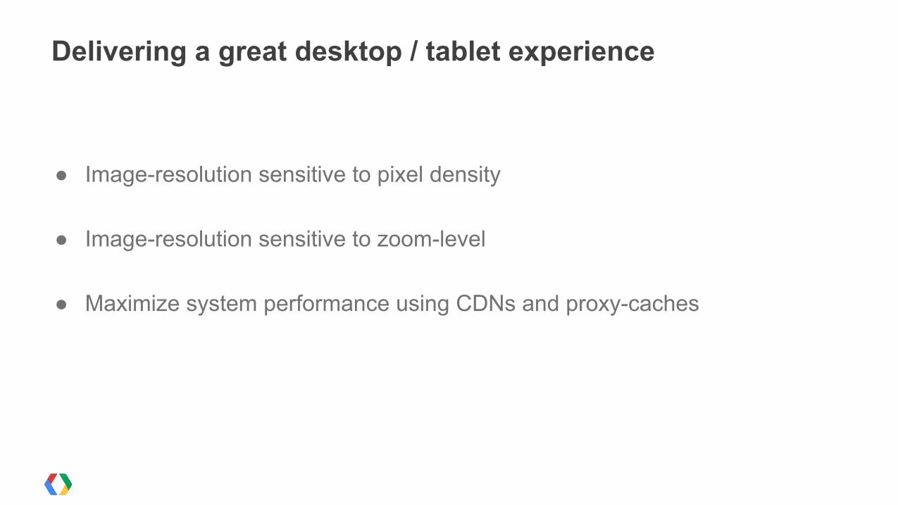
● Image-resolution sensitive to pixel density
● Image-resolution sensitive to zoom-level
● Maximize system performance using CDNs and proxy-caches
Delivering a great desktop / tablet experience
Balancing UX, Speed and Ease of Development
Smartphone Users High-latency connectivityRelatively small screensSlow CPUs, thin pipe to GPUs Batteries Stretched ThinVarying Browser Capabilities
Desktop / Retina Tablet UsersFast WIFI connection
Can Display large, dense imagesPowerful CPUs
Long-lasting BatteriesVarying Browser Capabilities
Website DevelopersLimited Time --> Prioritize Content
User-Generated ContentConfusing Array of Changing Standards
Browsers Updating ConstantlyGetting Up To Speed on “Responsive” Techniques

Most Website developers are not performance expertsMost Website developers are not mobile expertsMost Website developers are not responsive-design experts
Most Website developers don’t come to Velocity
Many websites are not owned or maintained by their developerscontractors, sons-in-law, nephews...
Website Developers
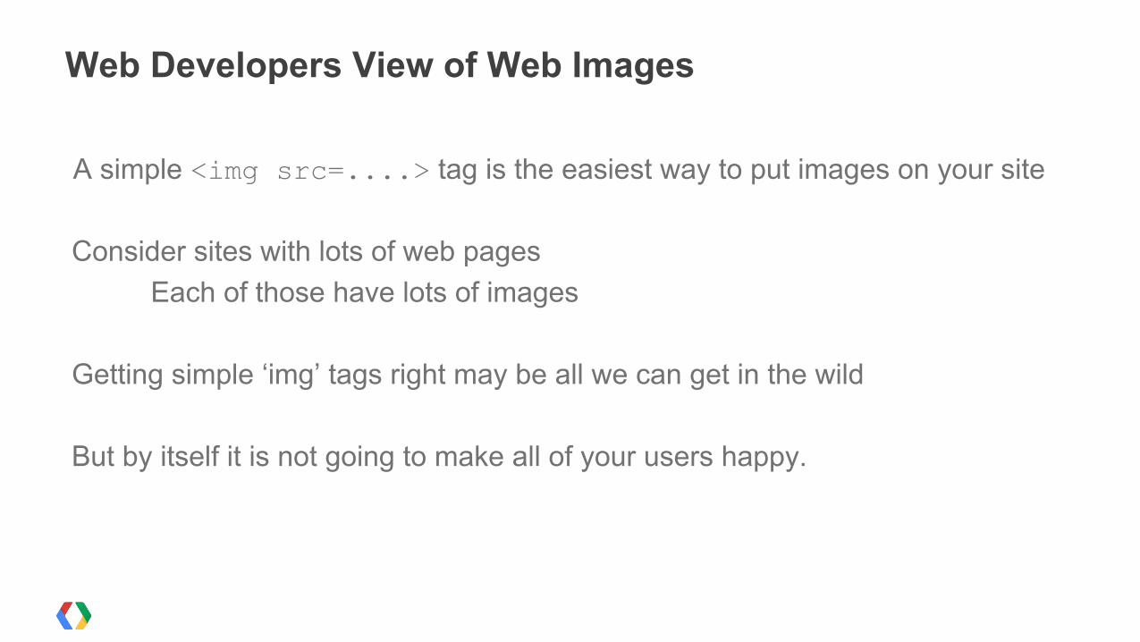
A simple <img src=....> tag is the easiest way to put images on your site
Consider sites with lots of web pagesEach of those have lots of images
Getting simple ‘img’ tags right may be all we can get in the wild
But by itself it is not going to make all of your users happy.
Web Developers View of Web Images
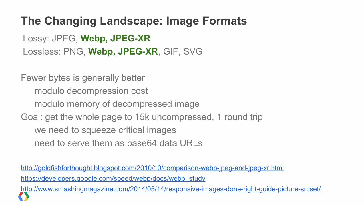
Lossy: JPEG, Webp, JPEG-XRLossless: PNG, Webp, JPEG-XR, GIF, SVG
Fewer bytes is generally bettermodulo decompression costmodulo memory of decompressed image
Goal: get the whole page to 15k uncompressed, 1 round tripwe need to squeeze critical imagesneed to serve them as base64 data URLs
http://goldfishforthought.blogspot.com/2010/10/comparison-webp-jpeg-and-jpeg-xr.htmlhttps://developers.google.com/speed/webp/docs/webp_studyhttp://www.smashingmagazine.com/2014/05/14/responsive-images-done-right-guide-picture-srcset/
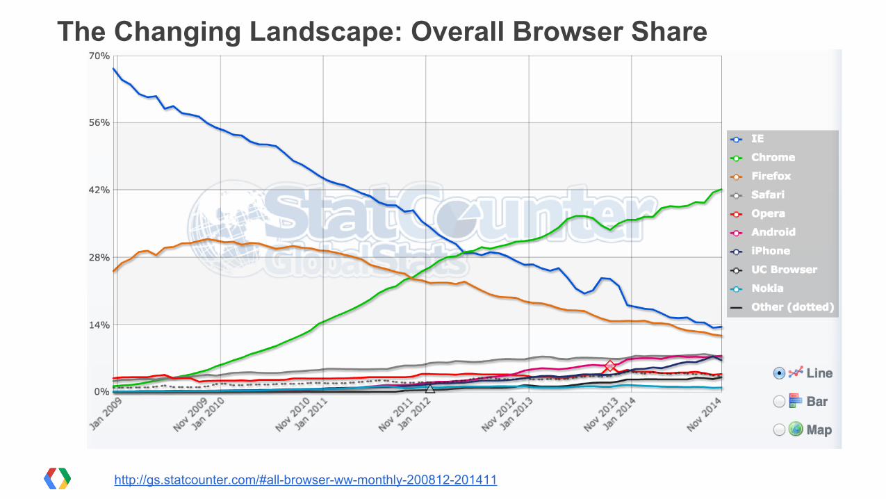
The Changing Landscape: Image Formats
http://gs.statcounter.com/#all-browser-ww-monthly-200812-201411
The Changing Landscape: Overall Browser Share
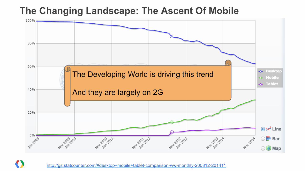
The Changing Landscape: The Ascent Of Mobile
http://gs.statcounter.com/#desktop+mobile+tablet-comparison-ww-monthly-200812-201411
The Developing World is driving this trend
And they are largely on 2G
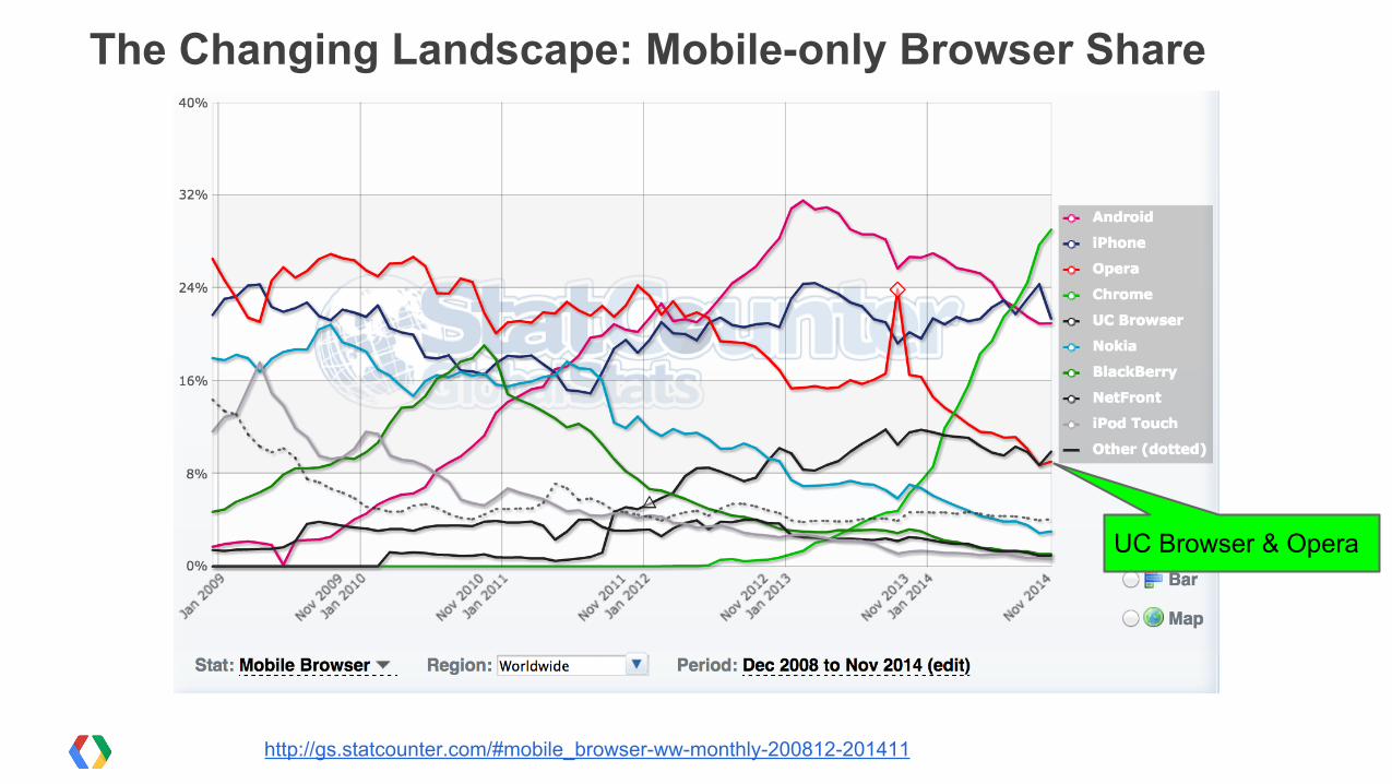
The Changing Landscape: Mobile-only Browser Share
UC Browser & Opera
http://gs.statcounter.com/#mobile_browser-ww-monthly-200812-201411
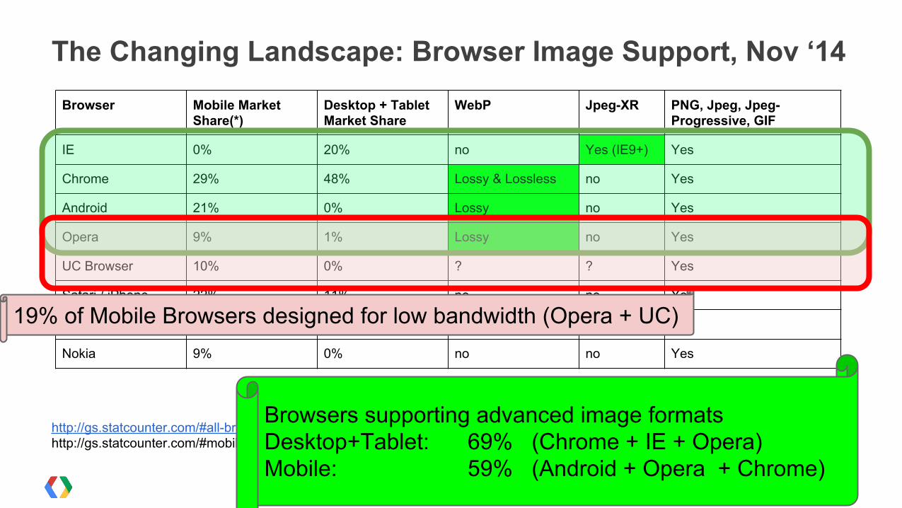
The Changing Landscape: Browser Image Support, Nov ‘14Browser Mobile Market
Share(*)Desktop + Tablet Market Share
WebP Jpeg-XR PNG, Jpeg, Jpeg-Progressive, GIF
IE 0% 20% no Yes (IE9+) Yes
Chrome 29% 48% Lossy & Lossless no Yes
Android 21% 0% Lossy no Yes
Opera 9% 1% Lossy no Yes
UC Browser 10% 0% ? ? Yes
Safari / iPhone 22% 11% no no Yes
Firefox 0% 17% no no Yes
Nokia 9% 0% no no Yes
http://gs.statcounter.com/#all-browser-ww-monthly-200812-201405, http://gs.statcounter.com/#mobile_browser-ww-monthly-200812-201406-bar
Browsers supporting advanced image formatsDesktop+Tablet: 69% (Chrome + IE + Opera)Mobile: 59% (Android + Opera + Chrome)
19% of Mobile Browsers designed for low bandwidth (Opera + UC)
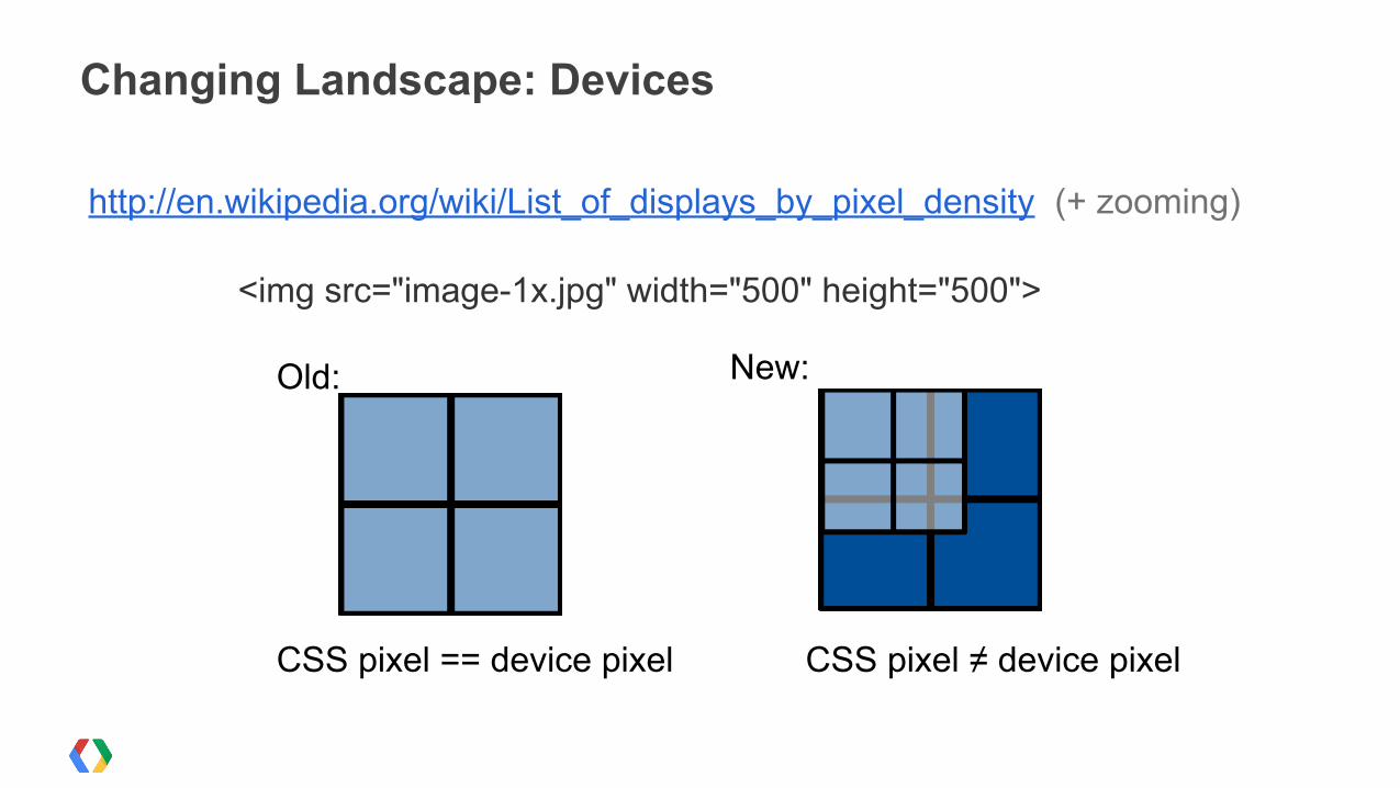
http://en.wikipedia.org/wiki/List_of_displays_by_pixel_density (+ zooming)
Changing Landscape: Devices
<img src="image-1x.jpg" width="500" height="500">
CSS pixel == device pixel CSS pixel ≠ device pixel
Old: New:
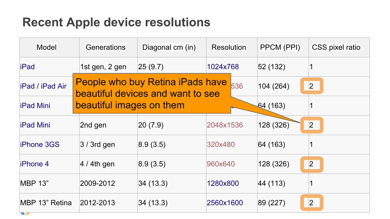
Recent Apple device resolutions
Model Generations Diagonal cm (in) Resolution PPCM (PPI) CSS pixel ratio
iPad 1st gen, 2 gen 25 (9.7) 1024x768 52 (132) 1
iPad / iPad Air 3rd gen, 4th gen 25 (9.7) 2048x1536 104 (264) 2
iPad Mini 1st gen 20 (7.9) 1024x768 64 (163) 1
iPad Mini 2nd gen 20 (7.9) 2048x1536 128 (326) 2
iPhone 3GS 3 / 3rd gen 8.9 (3.5) 320x480 64 (163) 1
iPhone 4 4 / 4th gen 8.9 (3.5) 960x640 128 (326) 2
MBP 13” 2009-2012 34 (13.3) 1280x800 44 (113) 1
MBP 13” Retina 2012-2013 34 (13.3) 2560x1600 89 (227) 2
People who buy Retina iPads have beautiful devices and want to see beautiful images on them
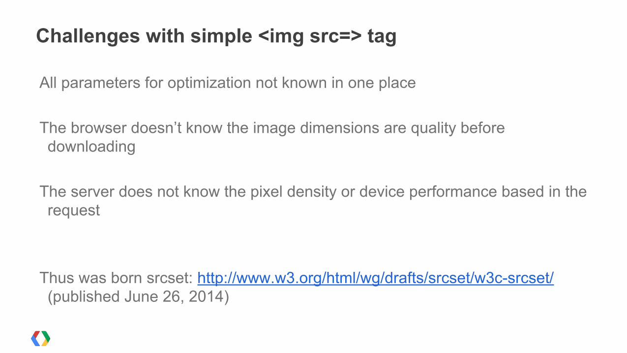
Challenges with simple <img src=> tag
All parameters for optimization not known in one place
The browser doesn’t know the image dimensions are quality before downloading
The server does not know the pixel density or device performance based in the request
Thus was born srcset: http://www.w3.org/html/wg/drafts/srcset/w3c-srcset/ (published June 26, 2014)
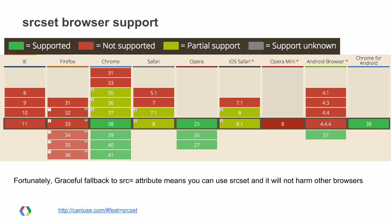
srcset browser support
http://caniuse.com/#feat=srcset
Fortunately, Graceful fallback to src= attribute means you can use srcset and it will not harm other browsers
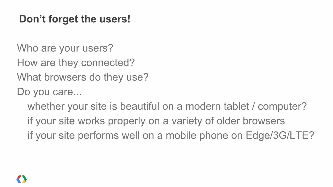
Who are your users?How are they connected?What browsers do they use?Do you care...
whether your site is beautiful on a modern tablet / computer?if your site works properly on a variety of older browsersif your site performs well on a mobile phone on Edge/3G/LTE?
Don’t forget the users!
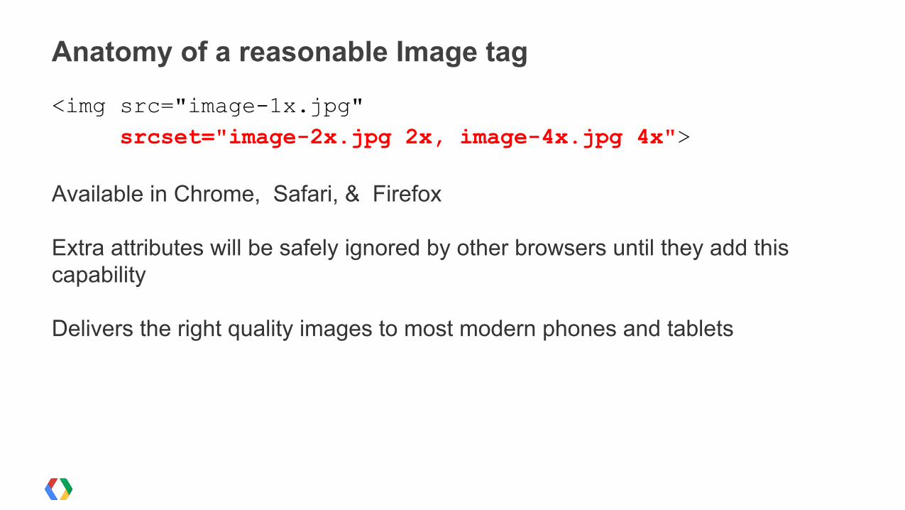
<img src="image-1x.jpg" srcset="image-2x.jpg 2x, image-4x.jpg 4x">
Available in Chrome, Safari, & Firefox
Extra attributes will be safely ignored by other browsers until they add this capability
Delivers the right quality images to most modern phones and tablets
Anatomy of a reasonable Image tag
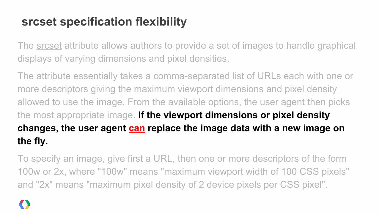
The srcset attribute allows authors to provide a set of images to handle graphical displays of varying dimensions and pixel densities.
The attribute essentially takes a comma-separated list of URLs each with one or more descriptors giving the maximum viewport dimensions and pixel density allowed to use the image. From the available options, the user agent then picks the most appropriate image. If the viewport dimensions or pixel density changes, the user agent can replace the image data with a new image on the fly.
To specify an image, give first a URL, then one or more descriptors of the form 100w or 2x, where "100w" means "maximum viewport width of 100 CSS pixels" and "2x" means "maximum pixel density of 2 device pixels per CSS pixel".
srcset specification flexibility
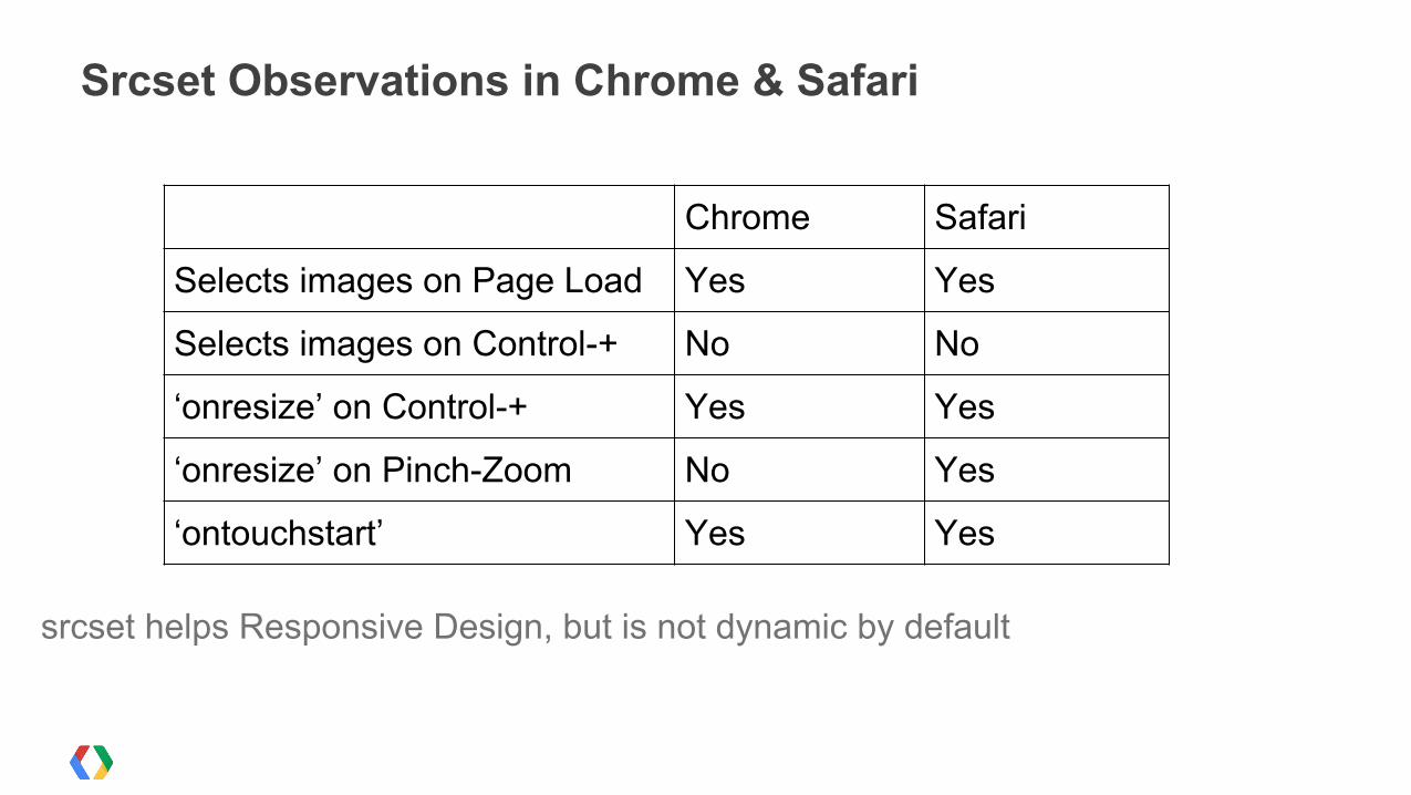
srcset helps Responsive Design, but is not dynamic by default
Srcset Observations in Chrome & Safari
Chrome Safari
Selects images on Page Load Yes Yes
Selects images on Control-+ No No
‘onresize’ on Control-+ Yes Yes
‘onresize’ on Pinch-Zoom No Yes
‘ontouchstart’ Yes Yes
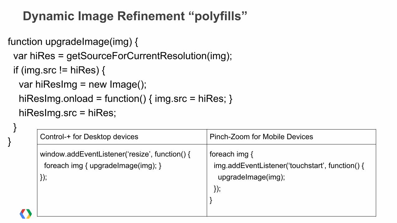
function upgradeImage(img) { var hiRes = getSourceForCurrentResolution(img); if (img.src != hiRes) { var hiResImg = new Image(); hiResImg.onload = function() { img.src = hiRes; } hiResImg.src = hiRes; }}
Dynamic Image Refinement “polyfills”
Control-+ for Desktop devices Pinch-Zoom for Mobile Devices
window.addEventListener(‘resize’, function() { foreach img { upgradeImage(img); }});
foreach img { img.addEventListener(‘touchstart’, function() { upgradeImage(img); });}
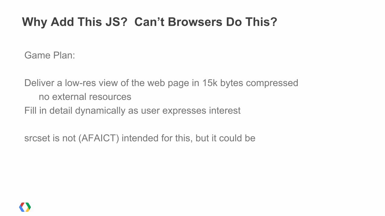
Game Plan:
Deliver a low-res view of the web page in 15k bytes compressedno external resources
Fill in detail dynamically as user expresses interest
srcset is not (AFAICT) intended for this, but it could be
Why Add This JS? Can’t Browsers Do This?
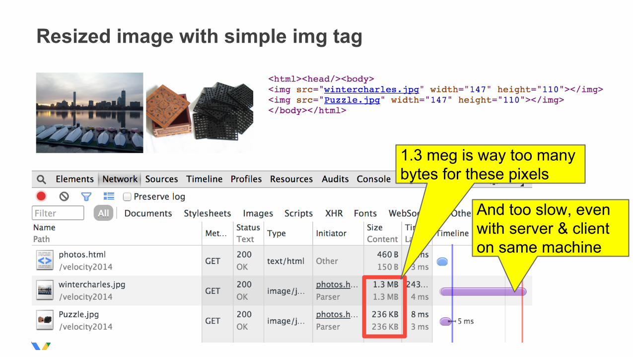
Resized image with simple img tag
1.3 meg is way too many bytes for these pixels
And too slow, even with server & client on same machine
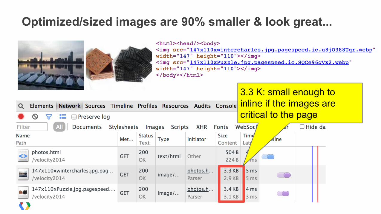
Optimized/sized images are 90% smaller & look great...
3.3 K: small enough to inline if the images are critical to the page
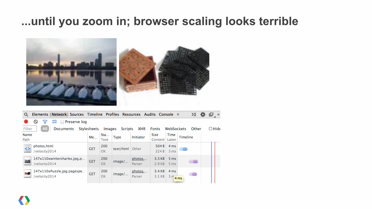
...until you zoom in; browser scaling looks terrible
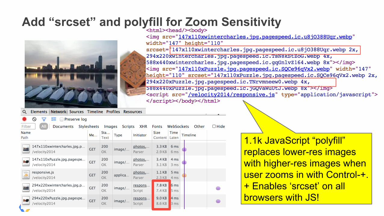
Add “srcset” and polyfill for Zoom Sensitivity
1.1k JavaScript “polyfill” replaces lower-res images with higher-res images when user zooms in with Control-+. + Enables ‘srcset’ on all browsers with JS!

Demo
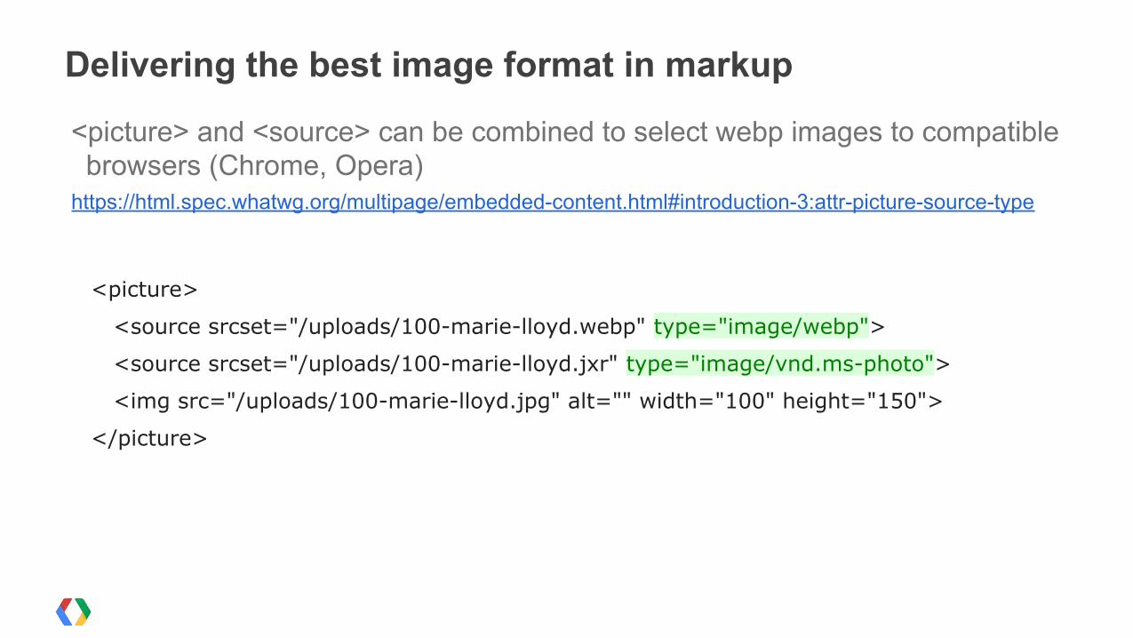
<picture> and <source> can be combined to select webp images to compatible browsers (Chrome, Opera)
https://html.spec.whatwg.org/multipage/embedded-content.html#introduction-3:attr-picture-source-type
<picture>
<source srcset="/uploads/100-marie-lloyd.webp" type="image/webp">
<source srcset="/uploads/100-marie-lloyd.jxr" type="image/vnd.ms-photo">
<img src="/uploads/100-marie-lloyd.jpg" alt="" width="100" height="150">
</picture>
Delivering the best image format in markup
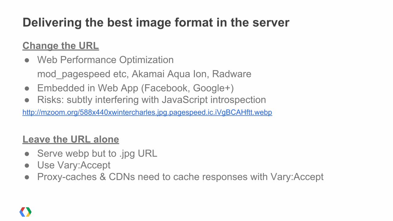
Change the URL ● Web Performance Optimization
mod_pagespeed etc, Akamai Aqua Ion, Radware● Embedded in Web App (Facebook, Google+) ● Risks: subtly interfering with JavaScript introspectionhttp://mzoom.org/588x440xwintercharles.jpg.pagespeed.ic.iVgBCAHftt.webp
Leave the URL alone● Serve webp but to .jpg URL● Use Vary:Accept● Proxy-caches & CDNs need to cache responses with Vary:Accept
Delivering the best image format in the server
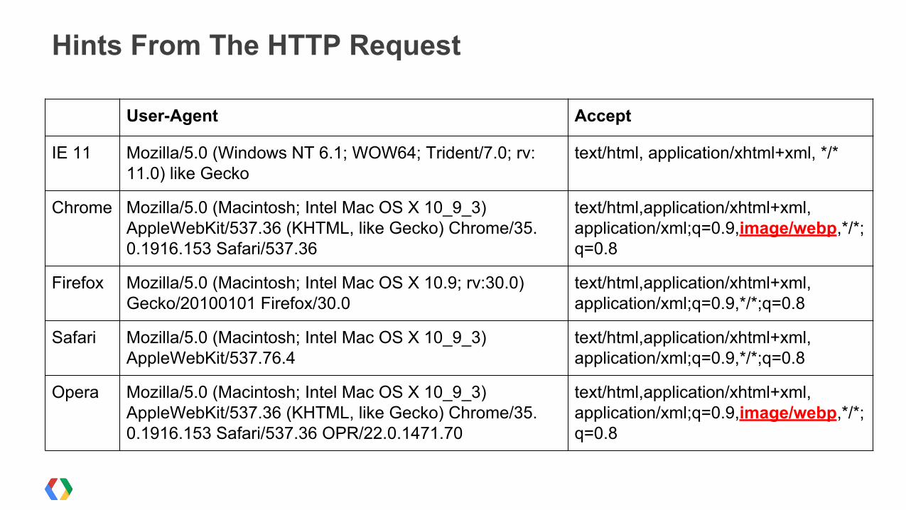
Hints From The HTTP Request
User-Agent Accept
IE 11 Mozilla/5.0 (Windows NT 6.1; WOW64; Trident/7.0; rv:11.0) like Gecko
text/html, application/xhtml+xml, */*
Chrome Mozilla/5.0 (Macintosh; Intel Mac OS X 10_9_3) AppleWebKit/537.36 (KHTML, like Gecko) Chrome/35.0.1916.153 Safari/537.36
text/html,application/xhtml+xml,application/xml;q=0.9,image/webp,*/*;q=0.8
Firefox Mozilla/5.0 (Macintosh; Intel Mac OS X 10.9; rv:30.0) Gecko/20100101 Firefox/30.0
text/html,application/xhtml+xml,application/xml;q=0.9,*/*;q=0.8
Safari Mozilla/5.0 (Macintosh; Intel Mac OS X 10_9_3) AppleWebKit/537.76.4
text/html,application/xhtml+xml,application/xml;q=0.9,*/*;q=0.8
Opera Mozilla/5.0 (Macintosh; Intel Mac OS X 10_9_3) AppleWebKit/537.36 (KHTML, like Gecko) Chrome/35.0.1916.153 Safari/537.36 OPR/22.0.1471.70
text/html,application/xhtml+xml,application/xml;q=0.9,image/webp,*/*;q=0.8
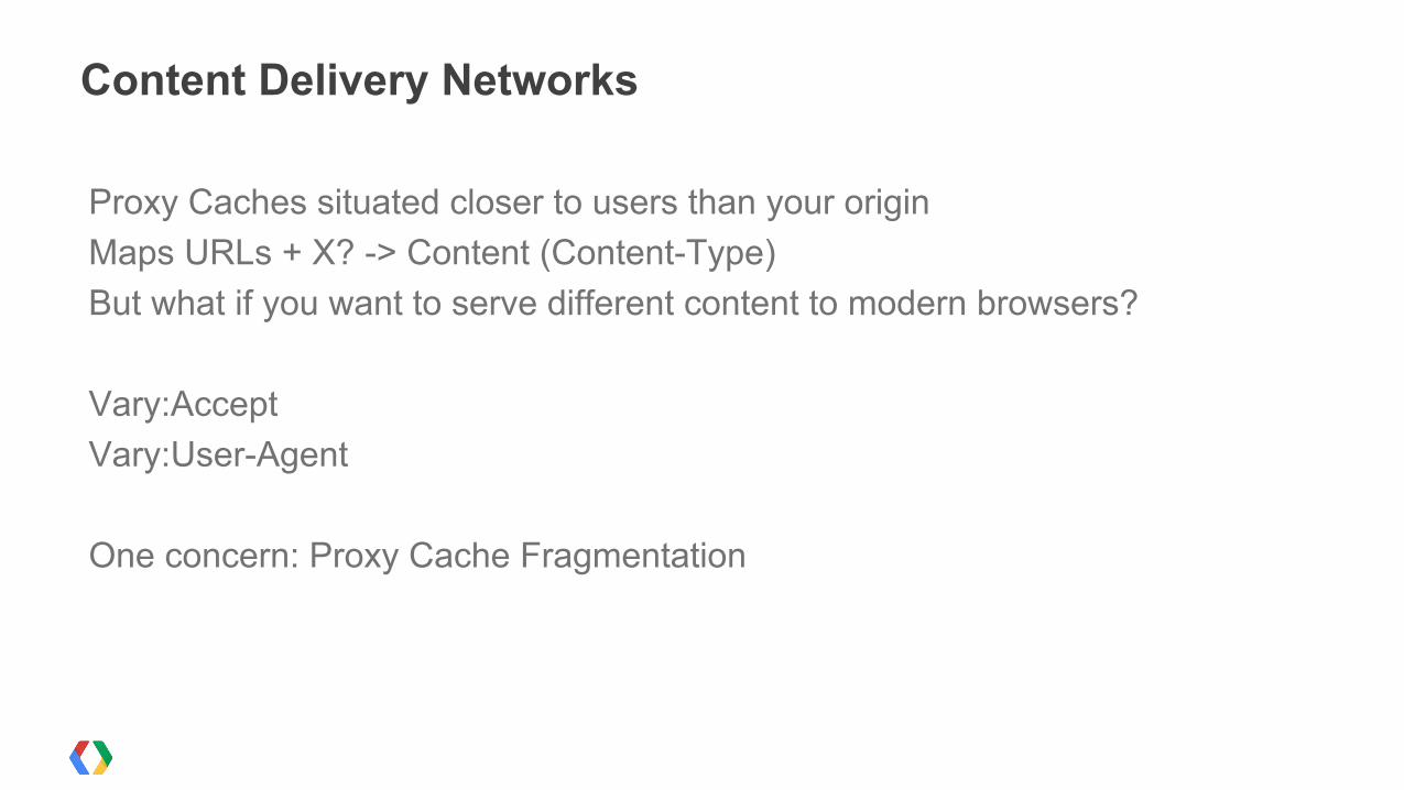
Proxy Caches situated closer to users than your originMaps URLs + X? -> Content (Content-Type)But what if you want to serve different content to modern browsers?
Vary:AcceptVary:User-Agent
One concern: Proxy Cache Fragmentation
Content Delivery Networks
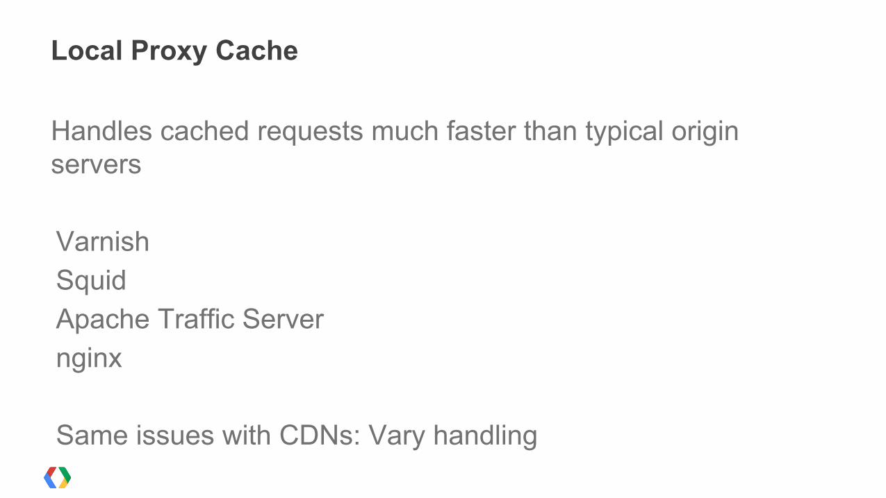
Handles cached requests much faster than typical origin servers
VarnishSquidApache Traffic Servernginx
Same issues with CDNs: Vary handling
Local Proxy Cache
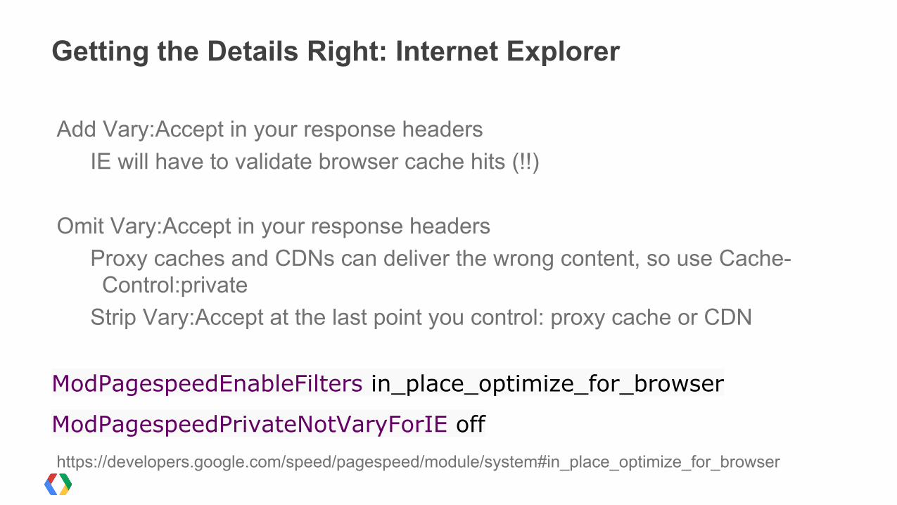
Add Vary:Accept in your response headersIE will have to validate browser cache hits (!!)
Omit Vary:Accept in your response headersProxy caches and CDNs can deliver the wrong content, so use Cache-Control:private
Strip Vary:Accept at the last point you control: proxy cache or CDN
ModPagespeedEnableFilters in_place_optimize_for_browser
ModPagespeedPrivateNotVaryForIE offhttps://developers.google.com/speed/pagespeed/module/system#in_place_optimize_for_browser
Getting the Details Right: Internet Explorer
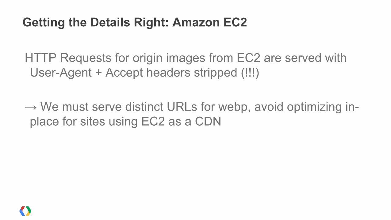
HTTP Requests for origin images from EC2 are served with User-Agent + Accept headers stripped (!!!)
→ We must serve distinct URLs for webp, avoid optimizing in-place for sites using EC2 as a CDN
Getting the Details Right: Amazon EC2
→ Evangelize web development best practices→ Make faster browsers→ Make better CDNs→ Automate content generation to exploit browsers & CDNs
Making A Better Web
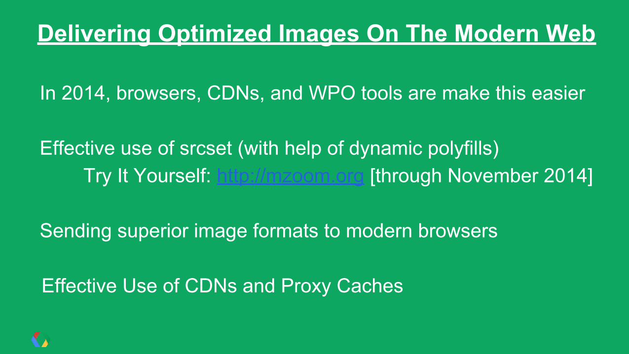
In 2014, browsers, CDNs, and WPO tools are make this easier
Effective use of srcset (with help of dynamic polyfills)Try It Yourself: http://mzoom.org [through November 2014]
Sending superior image formats to modern browsers
Effective Use of CDNs and Proxy Caches
Delivering Optimized Images On The Modern Web