Embed Size (px)
Citation preview

Table of Contents Special Upgrade Offer
Foreword
Preface
Who This Book Is For
Who This Book Is Not For
What This Book Will Do For You
How This Book Works
Why I Wrote This Book
Other Resources
Are You Sure You Want Bootstrap?
Conventions Used in This Book
Using Code Examples
Help This Book Grow
Safari® Books Online
How to Contact Us
Acknowledgments
1. Bootstrap Scaffolding
What Is Bootstrap?
Bootstrap File Structure
Basic HTML Template
Global Styles
Default Grid System
Basic Grid HTML
Offsetting Columns
Nesting Columns
Fluid Grid System
Container Layouts
Responsive Design
What Is Responsive Design?
Helper classes
2. Bootstrap CSS
Typography
Headings
Lead Body Copy

Emphasis
Bold
Italics
Emphasis Classes
Abbreviations
Addresses
Blockquotes
Lists
Unordered list
Ordered list
Definition list
Code
Tables
Optional Table Classes
Striped table
Bordered table
Hover table
Condensed table
Table Row Classes
Forms
Optional Form Layouts
Search form
Inline form
Horizontal form
Supported Form Controls
Inputs
Textarea
Checkboxes and radio buttons
Selects
Extended Form Controls
Prepended and appended inputs
Form Control Sizing
Relative input controls
Grid sizing
Uneditable text

Form actions
Help text
Form Control States
Input focus
Disabled input
Validation states
Buttons
Button Sizes
Disabled Button Styling
Images
Icons
GLYPHICONS Attribution
Usage
Button groups
Navigation
3. Bootstrap Layout Components
Dropdown Menus
Options
Right-align
Submenu
Button Groups
Button Groups as Radio Buttons and Checkboxes
Buttons with Dropdowns
Split Button Dropdowns
Dropup Menus
Navigation Elements
Tabular Navigation
Basic Pills Navigation
Disabled class
Stackable Navigation
Dropdowns
Navigation Lists
Horizontal divider
Tabbable Navigation
Tab position

Navbar
Navbar Links
Forms
Navbar Menu Variations
Fixed top navbar
Fixed bottom navbar
Static top navbar
Responsive navbar
Inverted navbar
Breadcrumbs
Pagination
Pager
Labels
Badges
Typographic Elements
Hero Unit
Page Header
Thumbnails
Alerts
Progress Bars
Media Object
Miscellaneous
Wells
Helper Classes
Pull left
Pull right
Clearfix
4. Bootstrap JavaScript Plugins
Overview
Programmatic API
Transitions
Modal
Usage
Options
Methods
Options
Toggle
Show
Hide
Events
Dropdown
Usage
Dropdown Usage via JavaScript
Method
Scrollspy
Usage
Usage via JavaScript
.scrollspy('refresh') Method
Options
Event
Toggleable Tabs
Usage
Events
Tooltips
Usage
Options
Methods
Options
Show
Hide
Toggle
Destroy
Popover
Usage
Options
Methods
Options
Show
Hide
Toggle

Destroy
Alerts
Usage
Close Method
Events
Buttons
Loading State
Single Toggle
Checkbox Buttons
Radio Buttons
Usage
Methods
Toggle
Loading
Reset
String
Collapse
Usage
Via data attributes
Via JavaScript
Options
Methods
Options
Toggle
Show
Hide
Events
Carousel
Usage
Options
Methods
Options
Cycle
Pause
Number

Prev
Next
Events
Typeahead
Usage
Options
Affix
Usage
Option
5. Using Bootstrap
GitHub Project
Customizing Bootstrap
Using LESS
Text Snippets
Photoshop Templates
Themes
Built with Bootstrap
Conclusion
Index
About the Author
Colophon
Special Upgrade Offer
Copyright

Bootstrap
Jake Spurlock
Beijing • Cambridge • Farnham • Köln • Sebastopol • Tokyo

Special Upgrade Offer If you purchased this ebook directly from oreilly.com, you have the following benefits:
DRM-free ebooks—use your ebooks across devices without restrictions or
limitations
Multiple formats—use on your laptop, tablet, or phone
Lifetime access, with free updates
Dropbox syncing—your files, anywhere
If you purchased this ebook from another retailer, you can upgrade your ebook to take
advantage of all these benefits for just $4.99. Click here to access your ebook upgrade.
Please note that upgrade offers are not available from sample content.

Foreword
Dave Winer editor, Scripting News, January 2013, New York
I was a software developer before Mac existed, so I remember how the tech industry
reacted to it. For the most part, the community reacted with a fair amount of skepticism. The interesting thing is that the negative things people say about Bootstrap today sound
exactly like the negative things people said about the Mac in 1984. And in both cases, the things that people didn’t like were what made them important.
Apple realized that there is a set of things that all software has to do, so why shouldn’t they
all do them the same way? If they did, software would be easier to develop and debug, but
more important—it would be easier to use. If there was only one way to create menus, then
once a user learned how to use the menus of one app, he would already know how to use the menus of all others. The same is true with scrollbars, windows, the keyboard, the
mouse, printing, and sound.
The reason programmers didn’t like it, (and I was one of them) was that they took what we did and commoditized it. Further, there were limits to the one-size-fits-all approach. There
were some apps that didn’t take to the UI standards very well. What to do about them? Well, you adapted, that’s what you did.
This is a well-known technical process called factoring. If you see yourself doing something
over and over, do it one more time really well, work on the API so it’s easy and flexible, and
that’s it. You never do it again. It’s how you build ever-taller buildings out of software. What
was the leading edge five years ago is baked into the operating system today. Progress. It’s a wonderful thing!
The same patterns are observable in the Web. In fact, it’s kind of sad how much of a repeat it is, how backward today’s development environment is compared to the one envisioned
by the Mac. But at least Bootstrap is out there doing the factoring. If I want to put up a
menu, I can just use the code that creates menus. Sure, my menu looks like all the others,
but that’s a good thing for users. There is no need to learn a second or third way to use a
menu.
That this is needed, desperately needed, is indicated by the incredible uptake of Bootstrap.
I use it in all the server software I’m working on. And it shows through in the templating language I’m developing, so everyone who uses it will find it’s “just there” and works any
time you want to do a Bootstrap technique. Nothing to do; no libraries to include. It’s as if it
were part of the hardware. It’s the same approach that Apple took with the Mac OS in 1984.
Like all important technologies, Bootstrap is “good enough” but not too good. In other
words, the designers, Mark Otto and Jacob Thornton, could have factored more than they did. However, while they could have created something more compact and perhaps more

elegant, it wouldn’t have been nearly as approachable. The great thing about Bootstrap for
a guy like me, who has been busy building software behind websites, is that it solves a whole bunch of problems that we all have when putting a user interface on those sites.
However, I think that will turn out to be just the beginning. I see the opportunity for
Bootstrap to become an integral part of the Web—a toolkit that you can count on being present in every environment you work in. Further, someday, perhaps soon, designers will
be able to plug in skins for Bootstrap that transform the appearance of a site without any modification to the code or to its styles or scripts. I don’t see any limits to what can be done
with Bootstrap. Rather than being a replacement for designers, it creates opportunities for designers to have more power and reach.
These days, part of the maturing process of any new technology is the release of its O’Reilly
book. Now Bootstrap has one. The author, Jake Spurlock, a web developer, has been building sites with Bootstrap, has spoken at conferences about it, and he credits me for
getting him started with a series of enthusiastic blog posts I wrote as I was discovering its
power and elegance. Now, I can happily turn you over to Jake’s able hands. He will show
you how the Bootstrap magic works, so you too can help move the web development world forward.

Preface Bootstrap is a front-end framework for building responsive websites. Whether it is
application frameworks, blogs, or other CMS applications, Bootstrap can be a good fit, as it can be as vanilla as you like. Its combination of HTML, CSS, and JavaScript make it easy to
build robust sites without adding a lot of code. With a default grid system, layouts come
together with ease, and the styling of buttons, navs, and tables make basic markup look great from the get-go. A dozen or so JavaScript plugins catapult you into adding interactive
elements to your site.
Who This Book Is For
This book is mostly for people who have a good handle on HTML/CSS and JavaScript, and are curious about building responsive sites, adding the Bootstrap JavaScript plugins, or
building sites faster by using this popular open source framework.
Who This Book Is Not For
This book is not for people who get all they need out of the Bootstrap online
documentation. Like a lot of people, the online docs are where I got started—building my
first site with Bootstrap 1.3 and then upgrading it to Bootstrap 1.4. After that, I built a big
project with Bootstrap 2.0, and so on. If you are comfortable writing semantic HTML, then
jumping into Bootstrap should be easy for you.
What This Book Will Do For You
If you have some background in writing HTML/CSS and JavaScript, this book will help you get off the ground writing some flexible code for responsive websites. In practical terms,
the concepts and code syntax should come easily, as the book follows the patterns for writing semantic HTML and CSS.
How This Book Works
This book builds a site with Bootstrap, starting at the foundation of the project and the file
structure, moving up through the grid system and layout types, and into HTML elements and styling like forms, tables, and buttons. Once the walls are up, we move into the
aesthetic elements like navbars, breadcrumbs, and media objects. After that, we move on to

the JavaScript elements, such as dropdowns, the carousel, and modals, that provide the
interaction for a site.
Why I Wrote This Book
I’m not a Bootstrap expert hoping to create more Bootstrap experts to get a lot of work done.
I’m a developer and writer who encountered Bootstrap through a post on Dave Winer’s
blog, and I thought it would be cool to apply it to a new site that I was working on. I feel compelled to share some of what I’ve learned. I’m hoping that the path I followed will work
for other people, probably with variations, and that a book written from a beginner’s perspective (and vetted by experts) will help more people find and enjoy Bootstrap.
Other Resources
This book may not be the best way for you to learn Bootstrap. It all depends on what you
want to learn and why.
If your primary interest is to get started building Bootstrap websites, the online documentation will likely suit you perfectly. The authors, Jacob Thornton and Mark Otto,
have been meticulous in providing examples of the codebase, HTML code samples, and more to kickstart your project. It is top notch, and I’ve used it to gather the structure for
this book.
If you want to contribute to the work of the open source project, you can submit pull
requests or use the issue tracker on the GitHub project for updates, downloads,
documentation, and more.
Are You Sure You Want Bootstrap?
If you are looking for JavaScript plugins, or a CSS reset, Bootstrap may be overkill. If you aren’t in love with some of the default interface elements, they can be overwritten easily or
you can just strip out the associated tags. If you are looking for an easy way to build fast, responsive websites, Bootstrap is a great way to get going. I use it on all of my projects, and
I’m really happy with it.
Conventions Used in This Book
The following typographical conventions are used in this book:
Italic Indicates new terms, URLs, email addresses, filenames, and file extensions.
Used for program listings, as well as within paragraphs to refer to program elements such as variable or function names, statements, and keywords.

Shows commands or other text that should be typed literally by the user.
Shows text that should be replaced with user-supplied values or by values determined by context.
TIP
This icon signifies a tip, suggestion, or general note.
WARNING
This icon indicates a warning or caution.
Using Code Examples
The examples in this book are meant to teach basic concepts in small bites. While you may certainly borrow code and reuse it as you see fit, you won’t be able to take the code of this
book and build a stupendous application instantly (unless perhaps you have an unusual fondness for bacon and cats). You should, however, be able to figure out the steps you need
to take to build a great website.
You can download the code from the Examples link on the book’s page.
This book is here to help you get your job done. In general, if this book includes code
examples, you may use the code in this book in your programs and documentation. You do not need to contact us for permission unless you’re reproducing a significant portion of the
code. For example, writing a program that uses several chunks of code from this book does
not require permission. Selling or distributing a CD-ROM of examples from O’Reilly books does require permission. Answering a question by citing this book and quoting example
code does not require permission. Incorporating a significant amount of example code from this book into your product’s documentation does require permission.
We appreciate, but do not require, attribution. An attribution usually includes the title,
author, publisher, and ISBN. For example: "Bootstrap, by Jake Spurlock (O’Reilly). Copyright 2013 Jake Spurlock, 978-1-4493-4391-0.”
If you feel your use of code examples falls outside fair use or the permission given above,
feel free to contact us at [email protected].
Help This Book Grow
While I hope that you will enjoy reading this book and will learn from it, I also hope that
you can contribute to helping other readers learn to use Bootstrap. You can help your
fellow readers in a number of ways: If you find specific technical problems, bad explanations, or things that can be
improved, please report them through the errata system.

If you like (or don’t like) the book, please leave reviews. The most visible places to do so are on Amazon.com (or its international sites) and at the O’Reilly page for the book. Detailed explanations of what worked and what didn’t work for
you (and the broader target audience of programmers new to Bootstrap) are helpful to other readers and to me.
If you find you have much more you want to say about Bootstrap, please consider sharing it, whether on the Web, in a book of your own, in training classes, or in whatever form you find easiest.
I’ll update the book for errata and try to address issues raised in reviews. Even once the
book is published, I may still add some extra pieces to it. If you purchased it as an ebook,
you’ll receive these updates for free until it’s time for a whole new edition. I don’t expect that new edition declaration to come quickly, however, unless the Bootstrap world changes
substantially.
Hopefully this book will engage you enough to make you consider sharing.
Safari® Books Online
Safari Books Online is an on-demand digital library that delivers expert content in both
book and video form from the world’s leading authors in technology and business.
Technology professionals, software developers, web designers, and business and creative professionals use Safari Books Online as their primary resource for research, problem
solving, learning, and certification training.
Safari Books Online offers a range of product mixes and pricing programs for organizations,
government agencies, and individuals. Subscribers have access to thousands of books, training videos, and prepublication manuscripts in one fully searchable database from
publishers like O’Reilly Media, Prentice Hall Professional, Addison-Wesley Professional,
Microsoft Press, Sams, Que, Peachpit Press, Focal Press, Cisco Press, John Wiley & Sons, Syngress, Morgan Kaufmann, IBM Redbooks, Packt, Adobe Press, FT Press, Apress,
Manning, New Riders, McGraw-Hill, Jones & Bartlett, Course Technology, and dozens more. For more information about Safari Books Online, please visit us online.
How to Contact Us
Please address comments and questions concerning this book to the publisher:
O’Reilly Media, Inc.
1005 Gravenstein Highway North
Sebastopol, CA 95472
800-998-9938 (in the United States or Canada)
707-829-0515 (international or local)

707-829-0104 (fax)
We have a web page for this book, where we list errata, examples, and any additional
information. You can access this page at http://oreil.ly/bootstrap-web.
To comment or ask technical questions about this book, send email to
For more information about our books, courses, conferences, and news, see our website at
http://www.oreilly.com.
Find us on Facebook: http://facebook.com/oreilly
Follow us on Twitter: http://twitter.com/oreillymedia
Watch us on YouTube: http://www.youtube.com/oreillymedia
Acknowledgments
Many thanks to Dave Winer for introducing me to Bootstrap in the first place, and to Simon
St. Laurent for the opportunity to write this book. Detailed feedback from my friends Roseanne Fallin and Tony Quartorolo has made it possible; I hope that this book can get
readers started on the right track. I would also like to thank Melissa Morgan for letting me
take a few risks and develop the way that I like at MAKE.
In particular, thanks to my wonderful wife, Melissa, for putting up with me and
encouraging me to finish. And thanks to my son, Rush, for understanding that I needed to “work” and to my daughter, Hailey, for the warm smiles and huge hugs. I love my family,
and am so glad for everything they offer me.

Chapter 1. Bootstrap Scaffolding
What Is Bootstrap?
Bootstrap is an open source product from Mark Otto and Jacob Thornton who, when it was initially released, were both employees at Twitter. There was a need to standardize the
frontend toolsets of engineers across the company. In the launch blog post, Mark Otto introduced the project like this:
In the earlier days of Twitter, engineers used almost any library they were familiar with to meet front-end requirements. Inconsistencies among the individual applications made it difficult to scale and maintain them.
Bootstrap began as an answer to these challenges and quickly accelerated during Twitter’s first Hackweek. By the end of Hackweek, we had reached a stable version that engineers could use across the company.
— Mark Otto https://dev.twitter.com/
Since Bootstrap launched in August 2011, it has taken off in popularity. It has evolved from
being an entirely CSS-driven project to include a host of JavaScript plugins and icons that go
hand in hand with forms and buttons. At its base, it allows for responsive web design and features a robust 12-column, 940px-wide grid. One of the highlights is the build tool on
Bootstrap’s website, where you can customize the build to suit your needs, choosing which CSS and JavaScript features you want to include on your site. All of this allows frontend web
development to be catapulted forward, building on a stable foundation of forward -looking design and development. Getting started with Bootstrap is as simple as dropping some CSS
and JavaScript into the root of your site.
For someone starting a new project, Bootstrap comes with a handful of useful elements. Normally, when I start a project, I start with tools like Eric Meyer’s Reset CSS and get going
on my web project. With Bootstrap, you just need to include the bootstrap.css CSS file and, optionally, the bootstrap.js JavaScript file into your website and you are ready to go.
Bootstrap File Structure
The Bootstrap download includes three folders: css, js, and img. For simplicity, add these to
the root of your project. Minified versions of the CSS and JavaScript are also included. It is not necessary to include both the uncompressed and the minified versions. For the sake of
brevity, I use the uncompressed version during development and then switch to the
compressed version in production.

Basic HTML Template
Normally, a web project looks something like this:
With Bootstrap, we include the link to the CSS stylesheet and the JavaScript:
NOTE
Don’t forget the HTML5 Doctype.
By including <!DOCTYPE html>, all modern browsers are put into standards mode.
Global Styles
With Bootstrap, a number of items come prebuilt. Instead of using the old reset block that
was part of the Bootstrap 1.0 tree, Bootstrap 2.0 uses Normalize.css, a project from Nicolas Gallagher that is part of the HTML5 Boilerplate. This is included in the bootstrap.css file.
In particular, the following default styles give special treatment to typography and links:
has been removed from the body, and content will snug up to the edges of the browser window.
is applied to the body.
Bootstrap is using the , , and attributes as our typographic base. This allows the height of headings and other content around the site to maintain a similar line height.
Bootstrap sets the global link color via and applies link underlines
only on .
NOTE
Remember, if you don’t like the colors or want to change a default, this can be done by changing the globals in any
of the .less files. To do this, update the scaffolding.less file or overwrite colors in your own stylesheet.
Default Grid System
The default Bootstrap grid (see Figure 1-1) system utilizes 12 columns, making for a 940px-wide container without responsive features enabled. With the responsive CSS file
added, the grid adapts to be 724px or 1170px wide, depending on your viewport. Below
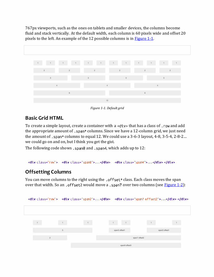
767px viewports, such as the ones on tablets and smaller devices, the columns become
fluid and stack vertically. At the default width, each column is 60 pixels wide and offset 20 pixels to the left. An example of the 12 possible columns is in Figure 1-1.
Figure 1-1. Default grid
Basic Grid HTML
To create a simple layout, create a container with a that has a class of and add the appropriate amount of columns. Since we have a 12-column grid, we just need
the amount of columns to equal 12. We could use a 3-6-3 layout, 4-8, 3-5-4, 2-8-2… we could go on and on, but I think you get the gist.
The following code shows and , which adds up to 12:
Offsetting Columns
You can move columns to the right using the class. Each class moves the span
over that width. So an would move a over two columns (see Figure 1-2):

Figure 1-2. Offset grid
Nesting Columns
To nest your content with the default grid, inside of a , simply add a new with
enough that it equals the number of spans of the parent container (see Figure 1-3):
Figure 1-3. Nesting grid
Fluid Grid System
The fluid grid system uses percentages instead of pixels for column widths. It has the same
responsive capabilities as our fixed grid system, ensuring proper proportions for key screen resolutions and devices. You can make any row “fluid” by changing to
. The column classes stay exactly the same, making it easy to flip between fixed and fluid grids. To offset, you operate in the same way as the fixed grid system—add
to any column to shift by your desired number of columns:
Nesting a fluid grid is a little different. Since we are using percentages, each resets the
column count to 12. For example, if you were inside a , instead of two
elements to divide the content in half, you would use two divs (see Figure 1-4). This
is the case for responsive content, as we want the content to fill 100% of the container:

Figure 1-4. Nesting fluid grid
Container Layouts
To add a fixed-width, centered layout to your page, simply wrap the content in
. If you would like to use a fluid layout but want to wrap everything in a container, use the following: .
Using a fluid layout is great when you are building applications, administration screens, and other related projects.
Responsive Design
To turn on the responsive features of Bootstrap, you need to add a tag to the
of your web page. If you haven’t downloaded the compiled source, you will also need to add
the responsive CSS file. An example of required files looks like this:
WARNING
If you get started and find that the Bootstrap responsive features aren’t working, make sure that you have these tags. The responsive features aren’t added by default at this time because not everything needs to be responsive.
Instead of encouraging developers to remove this feature, the authors of Bootstrap decided that it was best to
enable it as needed.
What Is Responsive Design?
Responsive design is a method for taking all of the existing content that is on the page and
optimizing it for the device that is viewing it. For example, the desktop not only gets the
normal version of the website, but it might also get a widescreen layout, optimized for the larger displays that many people have attached to their computers. Tablets get an
optimized layout, taking advantage of their portrait or landscape layouts. And then with
phones, you can target their much narrower width. To target these different widths,
Bootstrap uses CSS media queries to measure the width of the browser viewport and then, using conditionals, changes which parts of the stylesheets are loaded. Using the width of

the browser viewport, Bootstrap can then optimize the content using a combination of
ratios or widths, but it mostly relies on min-width and max-width properties.
At the core, Bootstrap supports five different layouts, each relying on CSS media queries.
The largest layout has columns that are 70 pixels wide, contrasting with the 60 pixels of the
normal layout. The tablet layout brings the columns to 42 pixels wide, and when narrower than that, each column goes fluid, meaning the columns are stacked vertically and each
column is the full width of the device (see Table 1-1).
Table 1-1. Responsive media queries
Label Layout width Column width Gutter width
Large display 1200px and up 70px 30px
Default 980px and up 60px 20px
Portrait tablets 768px and up 42px 20px
Phones to tablets 767px and below Fluid columns, no fixed widths
Phones 480px and below Fluid columns, no fixed widths
To add custom CSS based on the media query, you can either include all rules in one CSS file
via the media queries below, or use entirely different CSS files:
For a larger site, you might want to divide each media query into a seperate CSS file. In the
HTML file, you can call them with the tag in the head of your document. This is useful for keeping file sizes smaller, but it does potentially increase the HTTP requests if
the site is responsive. If you are using LESS to compile the CSS, you can have them all
processed into one file:
Helper classes
Bootstrap also includes a handful of helper classes for doing responsive development (see
Table 1-2). Use these sparingly. A couple of use cases that I have seen involve loading

custom elements based on certain layouts. Perhaps you have a really nice header on the
main layout, but on mobile you want to pare it down, leaving only a few of the elements. In this scenario, you could use the class to hide either parts or entire dom
elements from the header.
Table 1-2. Media queries helper classes
Class Phones Tablets Desktops
.visible-phone Visible Hidden Hidden
.visible-tablet Hidden Visible Hidden
.visible-desktop Hidden Hidden Visible
.hidden-phone Hidden Visible Visible
.hidden-tablet Visible Hidden Visible
.hidden-desktop Visible Visible Hidden
There are two major ways that you could look at doing development. The mantra that a lot
of people are shouting now is that you should start with mobile, build to that platform, and
let the desktop follow. Bootstrap almost forces the opposite, where you would create a full-featured desktop site that “just works.”
If you are looking for a strictly mobile framework, Bootstrap is still a great resource.

Chapter 2. Bootstrap CSS At the core of Bootstrap is a set of basic HTML elements that have been styled to allow for
easy enhancement via classes and user styles.
Typography
Starting with typography, Bootstrap uses Helvetica Neue, Helvetica, Arial, and sans-serif in its default font stack. These are all standard fonts and are included as defaults on all major
computers. If by chance these fonts don’t exist, they fall back to (the catchall)
to tell the browser to use the default font for the browser. All body copy has the set at 14 pixels, with the set at 20 pixels. The tag has a of
10 pixels, or half the .
Headings
All six standard heading levels have been styled in Bootstrap (see Figure 2-1), with the at 36 pixels tall, and the down to 12 pixels (for reference, default body text is 14
pixels tall). In addition, to add an inline subheading to any of the headings, simply add around any of the elements and you will get smaller text in a lighter color. In the
case of the , the small text is 24 pixels tall, normal font weight (i.e., not bold), and gray instead of black:

Figure 2-1. Headings
Lead Body Copy
To add some emphasis to a paragraph, add (see Figure 2-2). This will give
you larger font size, lighter weight, and a taller line height. This is generally used for the first few paragraphs in a section, but it can really be used anywhere:

Figure 2-2. Lead body copy classes
Emphasis
In addition to using the tag within headings, as discussed above, you can also use it
with body copy. When is applied to body text, the font shrinks to 85% of its
original size.
Bold
To add emphasis to text, simply wrap it in a tag. This will add
to the selected text.
Italics
For italics, wrap your content in the tag. The term “em” derives from the word “emphasis” and is meant to add stress to your text.
NOTE
You might be thinking, why not just use the or tags instead of or ? In HTML5, is meant to
highlight words or phrases without conveying additional importance—for example, key terms or names—while is mostly for voice, technical terms, internal dialogue, and so on. For more information about the semantic
changes to and , check out W3.org’s article.
Emphasis Classes
Along with and , Bootstrap offers a few other classes that can be used to
provide emphasis (see Figure 2-3). These could be applied to paragraphs or spans:
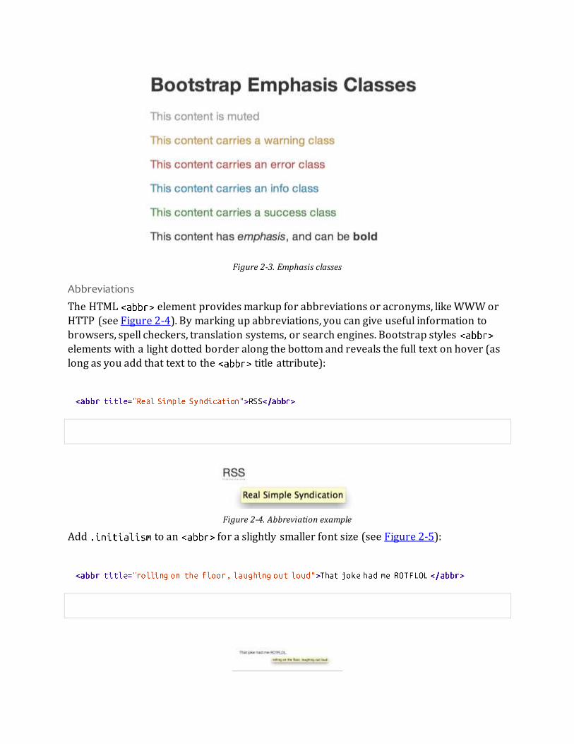
Figure 2-3. Emphasis classes
Abbreviations
The HTML element provides markup for abbreviations or acronyms, like WWW or
HTTP (see Figure 2-4). By marking up abbreviations, you can give useful information to
browsers, spell checkers, translation systems, or search engines. Bootstrap styles elements with a light dotted border along the bottom and reveals the full text on hover (as
long as you add that text to the title attribute):
Figure 2-4. Abbreviation example
Add to an for a slightly smaller font size (see Figure 2-5):

Figure 2-5. Another abbreviation example
Addresses
Adding elements to your page can help screen readers and search engines locate any physical addresses and phone numbers in the text (see Figure 2-6). It can also be used
to mark up email addresses. Since the defaults to you’ll need to
use tags to add line breaks to the enclosed address text (e.g., to split the street address and city onto separate lines):
Figure 2-6. Address tag
Blockquotes
To add blocks of quoted text to your document—or for any quotation that you want to set
apart from the main text flow—add the tag around the text. For best results,
and for line breaks, wrap each subsection in a tag. Bootstrap’s default styling indents
the text and adds a thick gray border along the left side. To identify the source of the quote,
add the tag, then add the source’s name wrapped in a tag before closing the tag:
When you put it all together, you get something that looks like Figure 2-7.

Figure 2-7. Basic blockquote
NOTE
If you want a with content that is right aligned, add to the tag. In addition to the right-
aligned text, the entire is floated to the right. This creates nice pull-quotes in your content, as shown in
Figure 2-8.
Figure 2-8. Pull right blockquote
Lists
Bootstrap offers support and styling for the three main list types that HTML offers:
ordered, unordered, and definition lists. An unordered list is a list that doesn’t have any particular order and is traditionally styled with bullets.
Unordered list
If you have an ordered list that you would like to remove the bullets from, add to the opening tag (see Figure 2-9):

Figure 2-9. Unordered list
NOTE
Personally, I hold a strong aversion to using the tag. When I want a single-spaced line break, I place each line
in an unstyled, unordered list. For example, if you want a condensed address box, like in Figure 2-6, you could code each line as . In my mind, this is a more semantic way to mark up the text.
Ordered list
An ordered list is a list that falls in some sort of sequential order and is prefaced by
numbers rather than bullets (see Figure 2-10). This is handy when you want to build a list of numbered items like a task list, guide items, or even a list of comments on a blog post:
Figure 2-10. Ordered list
Definition list
The third type of list you get with Bootstrap is the definition list. The definition list differs
from the ordered and unordered list in that instead of just having a block-level element, each list item can consist of both the and the elements. stands for
“definition term,” and like a dictionary, this is the term (or phrase) that is being defined.
Subsequently, the is the definition of the .
A lot of times in markup, you will see people using headings inside an unordered list. This
works, but may not be the most semantic way to mark up the text. A better method would
be creating a and then styling the and as you would the heading and the text
(see Figure 2-11). That being said, Bootstrap offers some clean default styles and an option for a side-by-side layout of each definition:

Figure 2-11. Definition list
To change the to a horizontal layout, with the on the left side and the on the
right, simply add to the opening tag (see Figure 2-12).
Figure 2-12. Horizontal definition list
NOTE
Horizontal description lists will truncate terms that are too long to fit in the left column with .
Additionally, in narrower viewports, they will automatically change to the default stacked layout.
Code
There are two different key ways to display code with Bootstrap. The first is the tag
and the second is the tag. Generally, if you are going to be displaying code inline, you should use the tag. But if the code needs to be displayed as a stand-alone block
element or if it has multiple lines, then you should use the tag:
WARNING
Make sure that when you use the and tags, you use the unicode variants for the opening and closing
tags: and .

Tables
One of my favorite parts of Bootstrap is the nice way that tables are handled. I do a lot of
work looking at and building tables, and the clean layout is a great feature that’s included in Bootstrap right off the bat. Table 2-1 lists the various elements supported by Bootstrap.
Table 2-1. Table elements supported by Bootstrap
Tag Description
Wrapping element for displaying data in a tabular format
Container element for table header rows ( ) to label table columns
Container element for table rows ( ) in the body of the table
Container element for a set of table cells ( or ) that appears on a single row
Default table cell
Special table cell for column (or row, depending on scope and placement) labels. Must be used within a
Description or summary of what the table holds, especially useful for screen readers
If you want a nice, basic table style with just some light padding and horizontal dividers,
add the base class of to any table (see Figure 2-13). The basic layout has a top border on all of the elements:
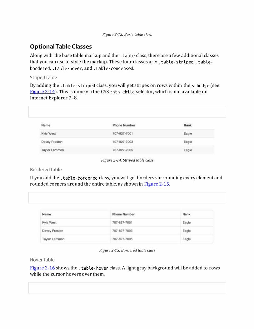
Figure 2-13. Basic table class
Optional Table Classes
Along with the base table markup and the class, there are a few additional classes
that you can use to style the markup. These four classes are: ,
, , and .
Striped table
By adding the class, you will get stripes on rows within the (see Figure 2-14). This is done via the CSS selector, which is not available on
Internet Explorer 7–8.
Figure 2-14. Striped table class
Bordered table
If you add the class, you will get borders surrounding every element and
rounded corners around the entire table, as shown in Figure 2-15.
Figure 2-15. Bordered table class
Hover table
Figure 2-16 shows the class. A light gray background will be added to rows
while the cursor hovers over them.
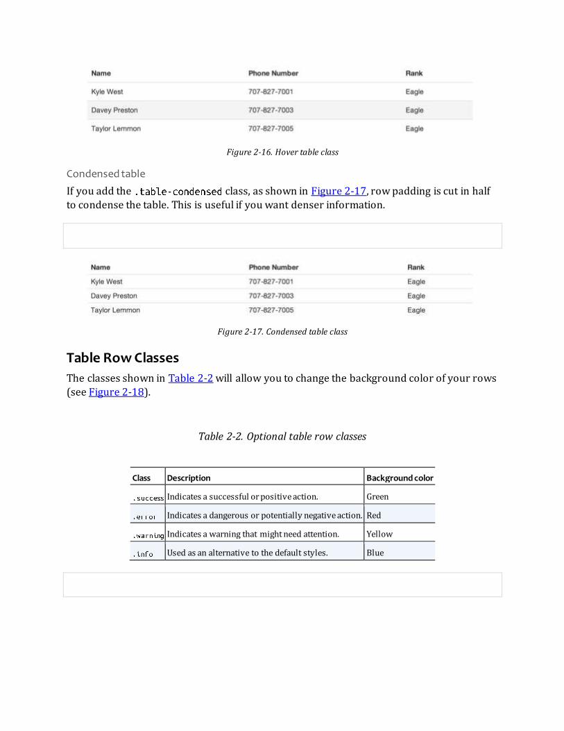
Figure 2-16. Hover table class
Condensed table
If you add the class, as shown in Figure 2-17, row padding is cut in half to condense the table. This is useful if you want denser information.
Figure 2-17. Condensed table class
Table Row Classes
The classes shown in Table 2-2 will allow you to change the background color of your rows (see Figure 2-18).
Table 2-2. Optional table row classes
Class Description Background color
Indicates a successful or positive action. Green
Indicates a dangerous or potentially negative action. Red
Indicates a warning that might need attention. Yellow
Used as an alternative to the default styles. Blue

Figure 2-18. Table row classes
Forms
Another one of the highlights of using Bootstrap is the ability to create forms with ease. As
a web developer, styling forms is one of my least favorite tasks. Bootstrap makes it easy with the simple HTML markup and extended classes for different styles of forms.
The basic form structure comes with Bootstrap; there is no need to add any extra helper
classes (see Figure 2-19). If you use the placeholder, keep in mind that it is only supported in newer browsers. In older browsers, no placeholder text will be displayed:

Figure 2-19. Basic form
Optional Form Layouts
With a few helper classes, you can dynamically update the layout of your form. Bootstrap
comes with a few preset styles to choose from.
Search form
Add to the tag, and then add to the for an
input box with rounded corners and an inline submit button (see Figure 2-20):
Figure 2-20. Search form
Inline form
To create a form where all of the elements are inline and labels are alongside, add the class to the tag (see Figure 2-21). To have the label and the input on the
same line, use this inline form code:
Figure 2-21. Inline form
Horizontal form
Bootstrap also comes with a prebaked horizontal form; this one stands apart from the others not only in the amount of markup, but also in the presentation of the form.
Traditionally you’d use a table to get a form layout like the one shown in Figure 2-22, but

Bootstrap manages to do it without using tables. Even better, if you’re using the responsive
CSS, the horizontal form will automatically adapt to smaller layouts by stacking the controls vertically.
To create a form that uses the horizontal layout, do the following:
Add a class of to the parent element.
Wrap labels and controls in a with class .
Add a class of to the labels.
Wrap any associated controls in a with class for proper alignment.
Figure 2-22. Horizontal form
Supported Form Controls
Bootstrap natively supports the most common form controls. Chief among them are ,
, , , and .
Inputs
The most common form text field is the input—this is where users will enter most of the
essential form data (see Figure 2-23). Bootstrap offers support for all native HTML5 input

types: , , , , , , , , , ,
, , , and :
Figure 2-23. Input
NOTE
Both and default to a nice blue glow when in the state.
Textarea
The is used when you need multiple lines of input (see Figure 2-24). You’ll find
you mainly modify the attribute, changing it to the number of rows that you need to
support (fewer rows = smaller box, more rows = bigger box):
Figure 2-24. Both the :active default and the textarea
Checkboxes and radio buttons
Checkboxes and radio buttons are great when you want users to choose from a list of preset options (see Figure 2-25). When building a form, use if you want the user
to select any number of options from a list. Use if you want to limit him to just one
selection:

Figure 2-25. Checkbox and radio buttons
If you want multiple checkboxes to appear on the same line together, add the class
to a series of checkboxes or radio buttons (see Figure 2-26):
Figure 2-26. Inline checkboxes
Selects
A select is used when you want to allow the user to pick from multiple options, but by default it only allows one (see Figure 2-27). It’s best to use for list options with
which the user is familiar, such as states or numbers. Use to allow
the user to select more than one option. If you only want the user to choose one option, use
:

Figure 2-27. Select
Extended Form Controls
In addition to the basic form controls listed in the previous section, Bootstrap offers a few
other form components to complement the standard HTML form elements; for example, it
lets you easily prepend and append content to inputs.
Prepended and appended inputs
By adding prepended and appended content to an input field, you can add common
elements to the user’s input (see Figure 2-28). For example, you can add the dollar symbol, the for a Twitter username, or anything else that might be common for your application
interface. To add extra content before the user input, wrap the prepended input in a with class . To append input, use the class . Then, within
that same , place your extra content inside a with an class, and place
the either before or after the element:
Figure 2-28. Prepend and append
If you combine both of them, you simply need to add both the and
classes to the parent (see Figure 2-29):

Figure 2-29. Using both the append and prepend
Rather than using a , you can instead use with a class of to attach
(surprise!) a button or two to the input (see Figure 2-30):
Figure 2-30. Attach multiple buttons to an input
If you are appending a button to a search form, you will get the same nice rounded corners
that you would expect (see Figure 2-31):
Figure 2-31. Append button to search form
Form Control Sizing
With the default grid system that is inherent in Bootstrap, you can use the system for sizing form controls. In addition to the span column-sizing method, you can also use a
handful of classes that take a relative approach to sizing. If you want the input to act as a

block-level element, you can add and it will be the full width of the
container element, as shown in Figure 2-32:
Figure 2-32. Block-level input
Relative input controls
In addition to using for input sizing, you can also use a few different class names
(see Figure 2-33):
Figure 2-33. Relative input controls
NOTE
In future versions of Bootstrap, these input classes will be altered to match the button sizes. For example,
will increase the padding and font size of an input.

Grid sizing
You can use any from to for form control sizing (see Figure 2-34):
Figure 2-34. Span-sized inputs
If you want to use multiple inputs on a line, simply use the modifier class to
apply the proper spacing (see Figure 2-35). It floats the inputs to collapse the white space;
sets the correct margins; and, like the class, clears the float:

Figure 2-35. Control row
Uneditable text
If you want to present a form control without allowing the user to edit the input, simply
add the class (see Figure 2-36):
Figure 2-36. Uneditable input
Form actions
When you place the form actions at the bottom of a , the inputs will
correctly line up with the floated form controls (see Figure 2-37):

Figure 2-37. Form controls
Help text
Bootstrap form controls can have either block or inline text that flows with the inputs (see Figure 2-38):
Figure 2-38. Inline help
To add a full width block of content, use the after the (see Figure 2-39):
Figure 2-39. Block help
Form Control States
In addition to the state, Bootstrap offers styling for disabled inputs and classes for
form validation.
Input focus
When an input receives (i.e., a user clicks into the input or tabs onto it), the outline of the input is removed and a is applied. I remember the first time that I saw
this on Twitter’s site; it blew me away, and I had to dig into the code to see how they did it. In WebKit, this is accomplished in the following manner:

The has a small inset , which gives the appearance that the input sits
lower than the page (see Figure 2-40). When is applied, an 8px light blue border appears. The tells the browser to apply the effect in a linear manner
over 0.2 seconds:
Figure 2-40. Focused input
Nice and subtle; a great effect.
Disabled input
If you need to disable an input, simply adding the attribute will not only disable
it; it will also change the styling and the mouse cursor when the cursor hovers over the element (see Figure 2-41):
Figure 2-41. Disabled input
Validation states
Bootstrap includes validation styles for error, warning, info, and success messages (see Figure 2-42). To use, simply add the appropriate class to the surrounding :

Figure 2-42. Validation states
Buttons
One of my favorite features of Bootstrap is the way that buttons are styled. Dave Winer,
inventor of RSS and big fan of Bootstrap, has this to say about it:
That this is needed, desperately needed, is indicated by the incredible uptake of Bootstrap. I use it in all the server software I’m working on. And it shows through in the templating language I’m developing, so everyone who uses it will
find it’s “just there” and works, any time you want to do a Bootstrap technique. Nothing to do, no libraries to include. It’s as if it were part of the hardware. Same approach that Apple took with the Mac OS in 1984.
— Dave Winer scripting.com
I like to think that Bootstrap is unifying the Web and allowing a unified experience of what an interface can look like across the Web. With the advent of Bootstrap, you can usually
spot the sites that have adopted it by the buttons that they use. A grid layout and many of
the other features fade into the background, but buttons, forms, and other unifying elements are a key part of Bootstrap. When I come across a site that is using Bootstrap, I
want to give a high five to the webmaster at that domain, since he probably “just gets it.” I felt the same way a few years ago whenever I saw in the HTML of sites that I
visited.
Now, buttons and links can all look alike with Bootstrap. Anything that is given a class of will inherit the default look of a gray button with rounded corners. However, you can
add color to the buttons by adding extra classes (see Table 2-3).
Table 2-3. Button color examples

Buttons Class Description
Standard gray button with gradient
Provides extra visual weight and identifies the primary action in a set of buttons (blue)
Used as an alternative to the default styles (light blue)
Indicates a successful or positive action (green)
Indicates caution should be taken with this action (orange)
Indicates a dangerous or potentially negative action (red)
Alternate dark-gray button, not tied to a semantic action or use
De-emphasizes a button by making it look like a link while maintaining button behavior
WARNING
There are issues with buttons not appearing in Internet Explorer 9 because it doesn’t crop background gradients on rounded corners. Also, Internet Explorer doesn’t work well with disabled button elements. The rendered text is
gray with a nasty text shadow that hasn’t been fixed.
Button Sizes
If you need larger or smaller buttons, simply add , , or to
links or buttons (see Figure 2-43):

Figure 2-43. Different button sizes
If you want to create buttons that display like a block-level element, simply add the
class (see Figure 2-44). These buttons will display at 100% width:
Figure 2-44. Block-level button
Disabled Button Styling
For anchor elements, simply add the class of to the tag and the link will fade in
color, and lose the gradient (see Figure 2-45):
Figure 2-45. Disabled link
NOTE
The class is being used much like the class. So, there’s no prefix, and remember, this is only for looks. You will need to use some JavaScript to actually disable the link.
For a button, simply add the attribute to the button (see Figure 2-46). This will
actually disable the button, so JavaScript is not directly needed:

Figure 2-46. Disabled button
Images
Images have three classes (see Figure 2-47) that can be used to apply some simple styles:
adds to give the image rounded corners, makes the entire image round by adding , and adds a
bit of padding and a gray border:
Figure 2-47. Images
Icons
Bootstrap bundles 140 icons into one sprite that can be used with buttons, links, navigation, and form fields. The icons are provided by GLYPHICONS; see Figure 2-48.

Figure 2-48. Icons by GLYPHICONS
GLYPHICONS Attribution
Users of Bootstrap are fortunate to use the GLYPHICONS for free on Bootstrap projects. The
developers have asked that you link back to GLYPHICONS when practical.
GLYPHICONS Halflings are normally not available for free, but an arrangement between Bootstrap and the GLYPHICONS creators have made this possible at no cost to you as developers. As a thank you, we ask you to include an optional link back to GLYPHICONS whenever practical.
— Bootstrap Documentation http://getbootstrap.com
Usage
To use the icons, simply use an tag with the namespaced class. For example, if you want to use the edit icon, you add the class to the tag:

If you want to use the white icon, simply add the class to the tag:
Button groups
By using button groups combined with icons, you can create nice interface elements with
minimal markup (see Figure 2-49):
Figure 2-49. Button groups
Navigation
When you are using icons next to a string of text, make sure to add a space to provide the
proper alignment of the image (see Figure 2-50). Navigation code will be covered further in the next chapter.
Figure 2-50. Basic navigation list

Chapter 3. Bootstrap Layout Components In addition to all of the markup provided in the previous chapter, Bootstrap provides a
toolkit of flexible components that can be used in designing application interfaces, web features, and more. All of the plugins are available in one separate JavaScript file, or you
can use the Bootstrap customizer to pick and choose which plugins you want. Personally,
on the projects that I build, I lump them all together. That way I have options.
Dropdown Menus
Dropdown menus are toggleable, contextual menus for displaying links in a list format. The dropdowns can be used on a variety of different elements, navs, buttons, and more. You can
have a single dropdown or extend the dropdown into another submenu. You can see a basic
dropdown menu in Figure 3-1.
Figure 3-1. Basic dropdown menu
The following code creates a basic dropdown menu:
Options
Right-align
Add to a to right-align the dropdown menu to the parent
object:

Submenu
If you would like to add a second layer of dropdowns (see Figure 3-2), simply add to any in an existing dropdown menu for automatic styling:
Figure 3-2. Dropdown menu and submenu
Button Groups
Button groups allow multiple buttons to be stacked together (see Figure 3-3). This is useful
when you want to place items like alignment buttons together. To create a button group,
simply wrap a series of anchors or buttons in a that has as a class:
Figure 3-3. Left, middle, and right button group
If you have multiple button groups (see Figure 3-4) that you want to place on a single line,
wrap multiple classes with :

Figure 3-4. Button toolbar
For more information about using icons with buttons, follow the examples in Chapter 2.
To stack the buttons vertically (see Figure 3-5), add to the
class:
Figure 3-5. Vertical button group
Button Groups as Radio Buttons and Checkboxes
To have the checkboxes function as radio buttons, where only one option can be selected at
a time, or checkboxes, where multiple options can be selected, you simply need to add some extra markup and then Bootstrap’s JavaScript will provide the rest. This will be
covered in detail in Chapter 4. NOTE
To use a button with a dropdown, it must be individually wrapped in its own within a for proper rendering.

Buttons with Dropdowns
To add a dropdown to a button (see Figure 3-6), simply wrap the button and dropdown
menu in a . You can also use to act as an indicator that the button is a dropdown:
Figure 3-6. Button with a dropdown
You can use the dropdowns with any button size: , , , or
. Figure 3-7 shows several examples of different button sizes.
Figure 3-7. Button dropdown sizes
Split Button Dropdowns
Split button dropdowns (see Figure 3-8) use the same general style as the dropdown button but add a primary action along with the dropdown. Split buttons have the primary
action on the left and a toggle on the right that displays the dropdown.

Figure 3-8. Split button dropdown
Here’s the code for a split button dropdown:
Dropup Menus
Menus can also be built to drop up rather than down (see Figure 3-9). To make this change, simply add to the container. To have the button pull up from the
righthand side, add to the (take note: the caret is now pointed up because the menu will be going up instead of down):

Figure 3-9. Dropup menu
Navigation Elements
Bootstrap provides a few different options for styling navigation elements. All of them
share the same markup and base class, .
Bootstrap also provides a helper class, . In principle, it generally adds distinction to
the current element and sets it apart from the rest of the navigation elements. You can add
this class to the home page links or to the links of the page that the user is currently on.
Tabular Navigation
To create a tabbed navigation menu (see Figure 3-10), start with a basic unordered list with the base class of and add :
Figure 3-10. Tabbed navigation
Basic Pills Navigation
To turn the tabs into pills (see Figure 3-11), use instead of :
Figure 3-11. Tabbed navigation
Disabled class
For each of the classes, if you add the class, it will create a gray link that
also disables the state (see Figure 3-12):

Figure 3-12. Disabled navigation
The link is still clickable unless the is removed with JavaScript or some other method.
Stackable Navigation
Both tabs and pills are horizontal by default. To make them appear vertically stacked, just
add the class. See Figures 3-13 and 3-14 for examples of verticaly stacked
tabs and pills.
Here’s the code for stacked tabs:
Figure 3-13. Stacked tabs
Here’s the code for stacked pills:
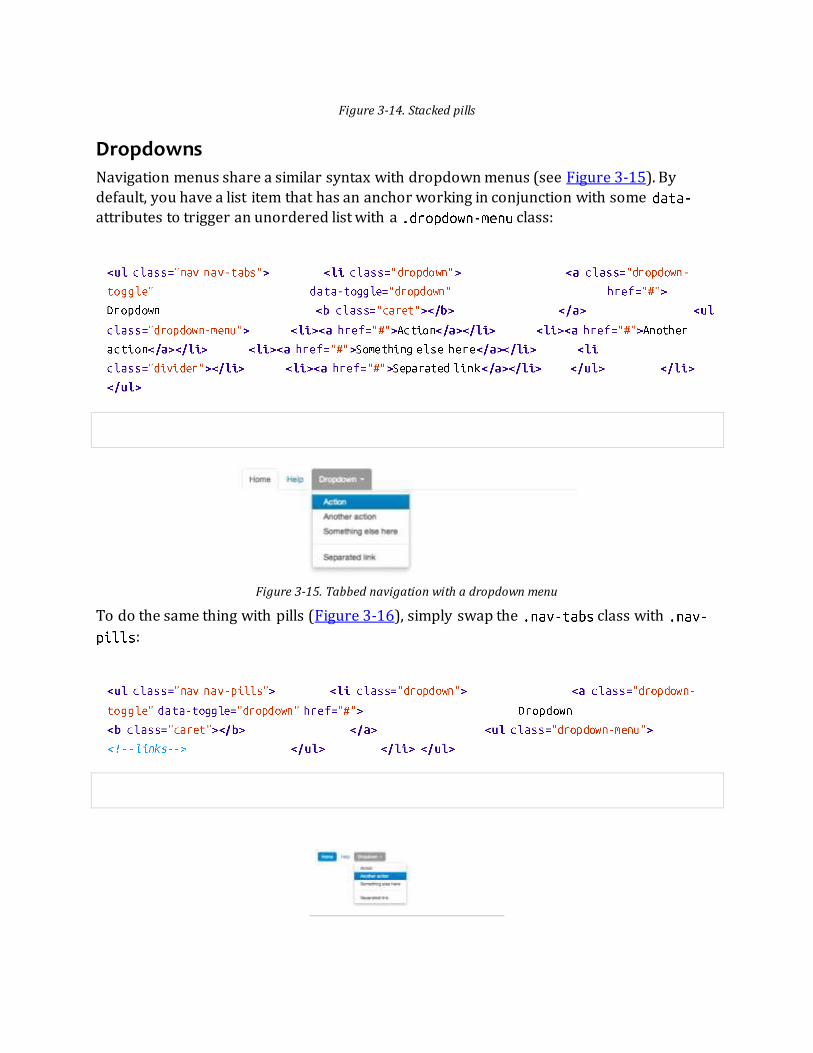
Figure 3-14. Stacked pills
Dropdowns
Navigation menus share a similar syntax with dropdown menus (see Figure 3-15). By
default, you have a list item that has an anchor working in conjunction with some attributes to trigger an unordered list with a class:
Figure 3-15. Tabbed navigation with a dropdown menu
To do the same thing with pills (Figure 3-16), simply swap the class with
:

Figure 3-16. Pill navigation with dropdowns
Navigation Lists
Navigation lists are useful when you need to display a group of navigation links. This type
of element is common when building admin interfaces. In the MAKE admin interface, for example, I have one of these on the sidebar of every page with quick links to common pages
(see Figure 3-17). Bootstrap developers use a form of this for their documentation. Like all of the lists that we have discussed thus far, navigation lists are unordered lists with the
class. To give it its specific styling, we add the class:
Horizontal divider
To create a divider, much like an , use an empty with a class of :
Figure 3-17. Navigation list
Tabbable Navigation
Not only can you create a tabbed navigation, but by using the JavaScript plugin, you can also add interaction by opening different windows of content (see Figure 3-18). To make
navigation tabs, create a with a unique ID for every tab, and then wrap them in
:

Figure 3-18. Tabbable navigation example
If you want to make the tabs fade when switching, add to each .
Tab position
The tabs are fully positionable; you can have them above, below, or on the sides of the
content (see Figure 3-19).
Figure 3-19. Bottom tabs
Here’s the code for positioning tabs:

Tabs on the left (see Figure 3-20) get the class. For this, you need to swap the
tab content and the tabs:
Figure 3-20. Left tabs
Tabs on the right get the class (see Figure 3-21):
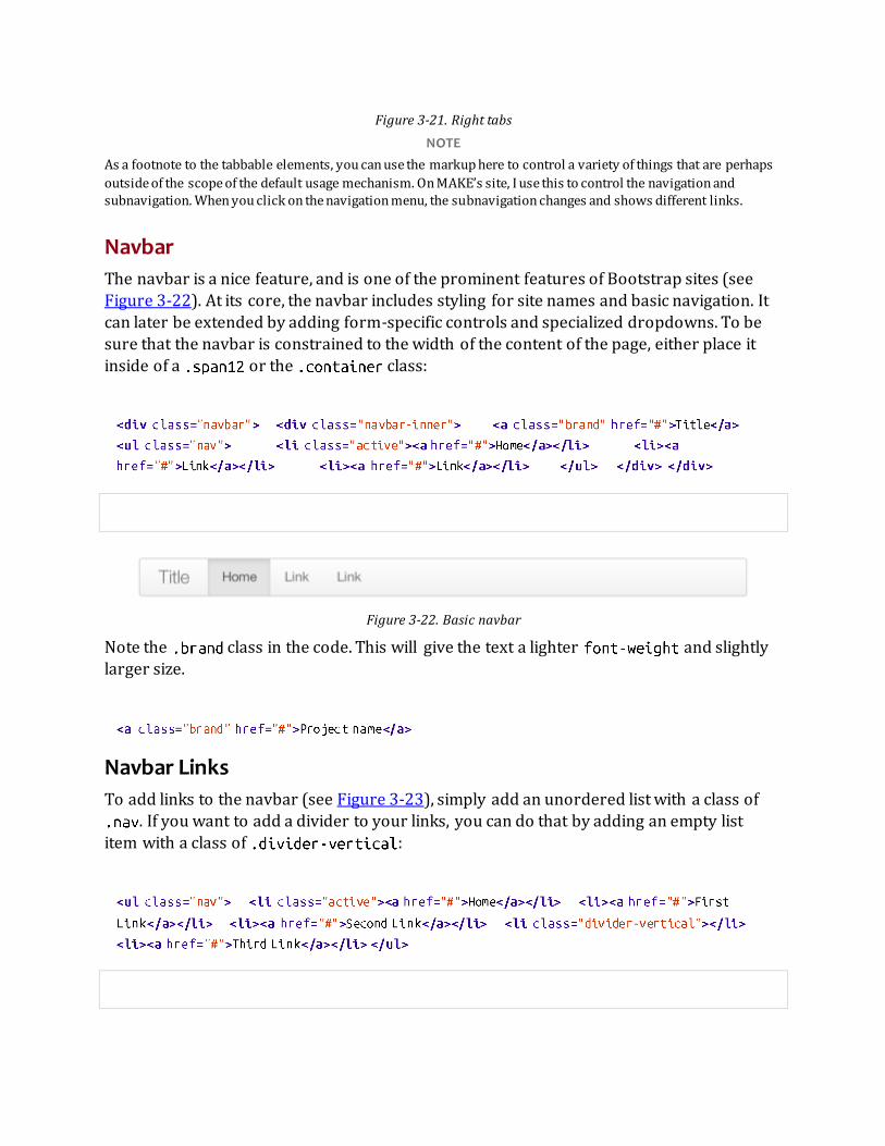
Figure 3-21. Right tabs
NOTE
As a footnote to the tabbable elements, you can use the markup here to control a variety of things that are perhaps
outside of the scope of the default usage mechanism. On MAKE’s site, I use this to control the navigation and subnavigation. When you click on the navigation menu, the subnavigation changes and shows different links.
Navbar
The navbar is a nice feature, and is one of the prominent features of Bootstrap sites (see
Figure 3-22). At its core, the navbar includes styling for site names and basic navigation. It
can later be extended by adding form-specific controls and specialized dropdowns. To be sure that the navbar is constrained to the width of the content of the page, either place it
inside of a or the class:
Figure 3-22. Basic navbar
Note the class in the code. This will give the text a lighter and slightly
larger size.
Navbar Links
To add links to the navbar (see Figure 3-23), simply add an unordered list with a class of . If you want to add a divider to your links, you can do that by adding an empty list
item with a class of :
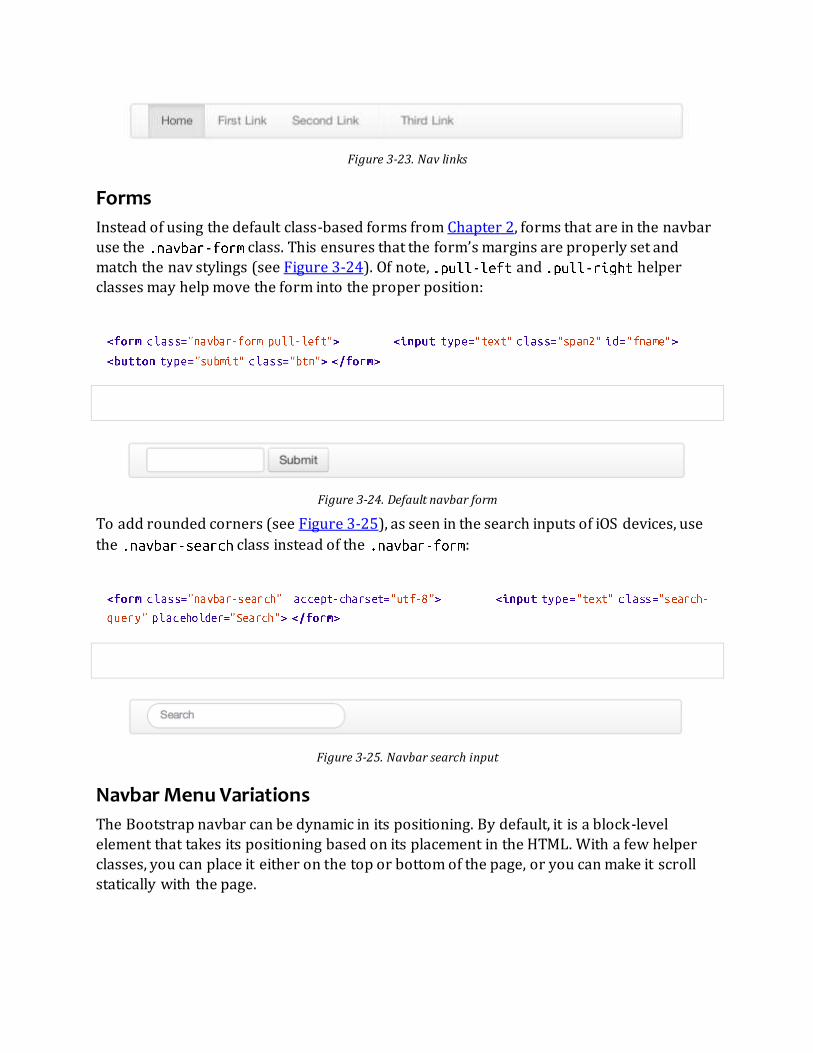
Figure 3-23. Nav links
Forms
Instead of using the default class-based forms from Chapter 2, forms that are in the navbar use the class. This ensures that the form’s margins are properly set and
match the nav stylings (see Figure 3-24). Of note, and helper classes may help move the form into the proper position:
Figure 3-24. Default navbar form
To add rounded corners (see Figure 3-25), as seen in the search inputs of iOS devices, use
the class instead of the :
Figure 3-25. Navbar search input
Navbar Menu Variations
The Bootstrap navbar can be dynamic in its positioning. By default, it is a block-level
element that takes its positioning based on its placement in the HTML. With a few helper
classes, you can place it either on the top or bottom of the page, or you can make it scroll
statically with the page.

Fixed top navbar
If you want the navbar fixed to the top, add to the class. To prevent the navbar from sitting on top of other content in the body o f the page, add at least
40 pixels of padding to the tag:
Fixed bottom navbar
To affix the navbar to the bottom of the page, simply add the class
to the navbar. Once again, to prevent overlap, add at least 40 pixels of padding to the tag:
Static top navbar
To create a navbar that scrolls with the page, add the class. This class does not require adding the padding to the :
Responsive navbar
Like the rest of Bootstrap, the navbar can be totally responsive as shown in Figure 3-26. To
add the responsive features, the content that you want to be collapsed needs to be wrapped in a with as a class. The collapsing nature is tripped by a
button that has a the class of and then features two elements. The first,
, is used to tell the JavaScript what to do with the button, and the second, , indicates which element to toggle. Three with a class of
create what I like to call the hamburger button. This will toggle the elements that are in the . For this feature to work, the bootstrap-responsive.css and either the
collapse.js or the full bootstrap.js files must be included.

Figure 3-26. Responsive navbar
Use the following code to create a responsive navbar:
Inverted navbar
To create an inverted navbar with a black background and white text as shown in Figure 3-27, simply add to the class:

Figure 3-27. Inverted navbar
Breadcrumbs
Breadcrumbs are a great way to show hierarchy-based information for a site (see Figure 3-
28). In the case of blogs, breadcrumbs can show the dates of publishing, categories, or tags. A breadcrumb in Bootstrap is simply an unordered list with a class of . There
is a also a helper class of that mutes the colors and makes the text a little smaller.
You can use forward slashes, arrows, or any divided that you choose. Note that the divider in the breadcrumbs has a slightly different markup than the navbar example.
The following code uses the class :
Figure 3-28. Breadcrumb
Pagination
Bootstrap handles pagination like a lot of other interface elements, an unordered list, with
wrapper a that has a specific class that identifies the element. In the basic form,
adding to the parent creates a row of bordered links. Each of the list
items can be additionally styled by using the or class. See Figures 3-29 and 3-30 for examples of this.

Here’s the code for basic pagination:
Figure 3-29. Basic pagination
And here’s the code for pagination using helper classes:
Figure 3-30. Pagination with helper classes
In addition to the and classes for list items, you can add
to the parent . This will center the contents of the . If you want the
items right-aligned in the , add . For sizing, in addition to the normal size, there are three other sizes that can be applied by adding a class to the wrapper
: , , and (see Figure 3-31):

Figure 3-31. Pagination sizes
Pager
If you need to create simple pagination links that go beyond text, the pager can work quite
well. Like the pagination links, the markup is an unordered list that sheds the wrapper . By default, the links are centered (see Figure 3-32).
Figure 3-32. Basic pager
The following is the code for a basic pager:
To left- or right-align the links, you just need to add the and class as to the
list items (see Figure 3-33). Also, like in Figure 3-31, you can add the
class for a muted look.
Figure 3-33. Aligned page links
The following is the code for aligning page links:

Labels
Labels are great for offering counts, tips, or other markup for pages. They’re another of my
favorite little Bootstrap touches. Figure 3-34 shows some labels that can be used.
Figure 3-34. Labels
Here’s the code to use these labels:
Badges
Badges are similar to labels; the primary difference is that the corners are more rounded. The colors of badges reflect the same classes as labels (see Figure 3-35).
Figure 3-35. Badges
The following code shows how to use badges:
Typographic Elements
In addition to buttons, labels, forms, tables, and tabs, Bootstrap has a few more elements
for basic page layout.
Hero Unit
The hero unit is a large content area that increases the size of headings and adds a lot of margin for landing page content (see Figure 3-36). To use the hero unit, simply create a

container with the class of . In addition to a larger , the
is reduced to 200 :
Figure 3-36. Hero unit
Page Header
The page header (see Figure 3-37) is a nice little feature to add appropriate spacing around the headings on a page. This is particularly helpful on a blog archive page where you may
have several post titles and need a way to add distinction to each of them. To use a page header, wrap your heading in a with a class of :

Figure 3-37. Page header
Thumbnails
A lot of sites need a way to lay out images in a grid, and Bootstrap has an easy way to do
this. To create a thumbnail, add an tag with the class of around an image. This adds four pixels of padding and a gray border (see Figure 3-38). On hover, an
animated glow outlines the image.
Figure 3-38. Basic thumbnail
Use the following code to create a thumbnail:
Now that you have your basic thumbnail, you can add headings, buttons, and more as
shown in Figure 3-39; just change the tag that has a class of to a .
Inside of that , you can add anything you need. Since this is a , we can use the
default span-based naming convention for sizing. If you want to group multiple images, place them in an unordered list, and each list item will be floated to the left.

Figure 3-39. Extended thumbnail
The following code shows how to extend and add more to the thumbnail:
Alerts
Like the modals that will be described in Chapter 4, alerts provide a way to style messages to the user (see Figure 3-40). The default alert is added by creating a wrapper and
adding a class of :

Figure 3-40. Basic alert
The uses the alerts jQuery plugin that is discussed in Chapter 4. To close the alert,
you can use a button that contains the attribute. Mobile Safari and Mobile Opera browsers require an to close.
If you have a longer message in your alert, you can use the class. This
provides a little more padding above and below the content contained in the alert, which is
particularly useful for multi-page lines of content (see Figure 3-41).
Figure 3-41. Alert block
There are also three other color options as shown in Figure 3-42 to help provide a more semantic method for the alert. They are added by using either ,
, or .
Figure 3-42. Alert color options
Progress Bars
The purpose of progress bars is to show that assets are loading, in progre ss, or that there is
action taking place regarding elements on the page. Personally, I think that these elements are just an exercise in markup and have little purpose beyond that in the Bootstrap
framework. That being said, among the thousands of people using Bootstrap, there are
likely a few outliers who have a good reason for building progress bars. By nature, these are static elements that need some sort of JavaScript method to provide any interaction.

The default progress bar has a light gray background and a blue progress bar as shown in
Figure 3-43. To create it, add a with a class of . Inside, add an empty with a class of . Add a style attribute with the width expressed as a percentage. I added
to indicate that the progress bar was at 60%:
Figure 3-43. Default progress bar
To create a striped progress bar (see Figure 3-44),[1] just add to the
container :
Figure 3-44. Striped progress bar
Like the striped version of the progress bar, you can animate the stripes (see Figure 3-45 for a static image of this), making it look like a blue light special barbershop pole.
Figure 3-45. Animated progress bar
Here’s the code to animate the progress bar:
In addition to the blue progress bar, there are options for green, yellow, and red using the
, , and classes. Progress bars can be stacked (see
Figure 3-46), indicating a graph of sorts by adding multiple elements together using this code:

Figure 3-46. Stacked progress bar
Media Object
When you look at social sites like Facebook, Twitter, and others, and strip away some of the formatting from timelines, you will see the media object (see Figure 3-47). Driven by the
Bootstrap community and based on principles from the oocss community, the goal of the
media object is to make the code for developing these blocks of information drastically shorter. Nicole Sullivan-Hass shares a few elements of the media object similar to
Bootstrap’s on her site. The media object is designed to literally save hundreds of lines of
code, making it easy to customize.
Figure 3-47. Media object
Bootstrap leaves the design and formatting to you but provides a simple way to get going.
Like a lot of other tools in Bootstrap, the goal of media objects (light markup, easy
extendability) is achieved by applying classes to some simple markup. There are two forms to the media object: and . Figure 3-48 shows the former form. If you
are preparing a list where the items will be part of an unordered list, use . If
you are using only just elements, use the object:

Figure 3-48. Default media object
To use media list (shown in Figure 3-49), change the container to an and add
the class . Since you can nest media objects, it is handy to markup for comments or other lists.

Figure 3-49. Media list example
The following code creates a media list:
Miscellaneous
There are a few more Bootstrap components that we have yet to cover in this chapter.
Some of these components are layout-based, and a few are production-based helper
classes. The first among these are the wells.
Wells
A well is a container that causes the content to appear sunken on the page (see
Figure 3-50). I have used wells for blog post meta information like author, date, and
categories. To create a well, simply wrap the content that you would like to appear in the well with a containing the class of :
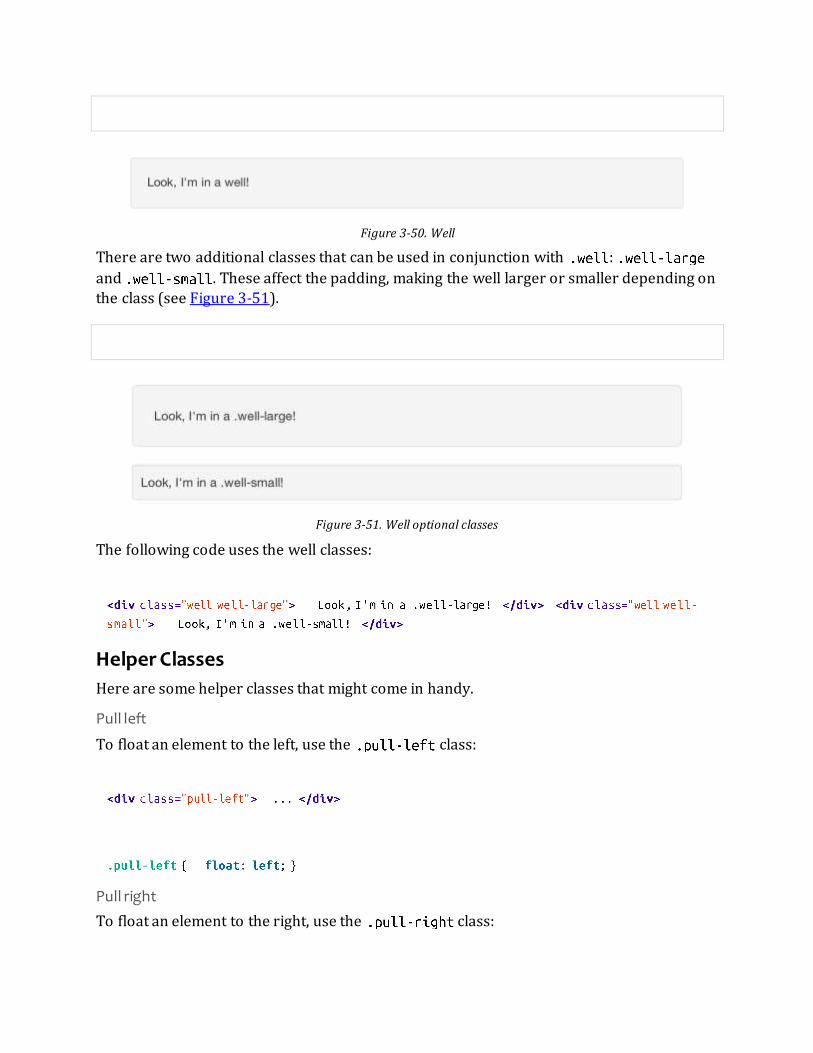
Figure 3-50. Well
There are two additional classes that can be used in conjunction with :
and . These affect the padding, making the well larger or smaller depending on
the class (see Figure 3-51).
Figure 3-51. Well optional classes
The following code uses the well classes:
Helper Classes
Here are some helper classes that might come in handy.
Pull left
To float an element to the left, use the class:
Pull right
To float an element to the right, use the class:

Clearfix
To clear the float of any element, use the class. When you have two elements of different sizes that are floated alongside each other, it is necessary to force the following
elements in the the code below or to clear the preceding content. You can do this with a simple empty with the class :of :
[1] Striped progress bars are not available in Internet Explorer 7 and 8.

Chapter 4. Bootstrap JavaScript Plugins The components discussed in Chapter 3 are just the beginning. Bootstrap comes bundled
with 13 jQuery plugins that extend the features and can add more interaction to your site. To get started with Bootstrap’s JavaScript plugins, you don’t need to be an advanced
JavaScript developer. In fact, by utilizing Bootstrap Data API, most of the plugins can be
triggered without writing a single line of code.
Overview
Bootstrap can be included on your site in two forms, either compiled or raw. In Bootstrap 2.2.2, the uncompressed file is 59KB and the minimized version is only 32KB. All of the
Bootstrap plugins are accessible using the included Data API. With this, you don’t need to
include a single line of JavaScript to invoke any of the plugin features.
Typically, JavaScript lies in a either a separate file or at the bottom of the page before the
closing tag. You can either use the attribute to link to another file, or you can write the contents of the file between the opening and closing tags:
Generally, it is best to include all JavaScript calls into a check that ensures that the DOM has been loaded on the page. If you have the JavaScript trying to fire earlier, it may miss
elements as the browser parses the page. With jQuery, adding a check is easily done by selecting the or the entire content of the page, and then applying the
method:
As mentioned above, Bootstrap has a Data API where you can write data attributes into the HTML of the page. If you need to turn off the Data API, you can unbind the attributes by
adding the following line of JavaScript:
If you need to disable a single plugin, you can do it programmatically using the namespace
of the plugin along with the namespace:

Programmatic API
The developers of Bootstrap believe that you should be able to use all of the plugins
throughout the JavaScript API. All public APIs are single, chainable methods and return the collection acted upon.
All methods should accept an optional options object, a string which targets a particular method, or nothing (which initiates a plugin with default behavior).
Transitions
The transition plugin provides simple transition effects. A few examples include: Sliding or fading in modals
Fading out tabs
Fading out alerts
Sliding carousel panes
Modal
A modal is a child window that is layered over its parent window (see Figure 4-1).
Typically, the purpose is to display content from a separate source that can have some interaction without leaving the parent window. Child windows can provide information,
interaction, or more. I use them as a window for holding slideshows and login/registration
information. The modal plugin is probably one of my favorite Bootstrap features.
To create a static modal window, use this code:

Figure 4-1. Static modal window
To invoke the modal window, you need to have some kind of a trigger. Normally I use a button or a link. If you look in the code below, you will see that in the tag, the
is the target of the modal that you want to load on the page. This code allows you to create multiple modals on the page and then have different triggers for each
of them. Now, to be clear, you don’t load multiple modals at the same time, but you can
create many on the page to be loaded at different times.
There are three classes to take note of in the modal. The first is , which is simply
identifying the content of the as a modal. The second is , which tells the browser to hide the content of the until we are ready to invoke it. And last, the
class. When the modal is toggled, it will cause the content to fade in and out.
Usage
Using the Bootstrap JavaScript Data API, you simply need to pass a few data attributes to
toggle the slideshow. To start with, set on the link or button that you want to use to invoke the modal and then set the to the ID of the
modal that you’d like to use.
To call a modal with , use a single line of JavaScript:

Options
Options can either be passed in via data attributes or with JavaScript. To use the data
attributes, prepend to the option name (e.g., ). See Table 4-1 for descriptions of some modal options.
Table 4-1. Modal options
Name Type Default Description
backdrop Boolean true Set to false if you don’t want the modal to be closed when the user clicks outside of the modal.
keyboard Boolean true Closes the modal when escape key is pressed; set to false to disable.
show Boolean true Shows the modal when initialized.
remote path false Using the jQuery method, inject content into the modal body. If an with a valid URL is added, it will load that content.
Methods
The following are some useful methods to use with modals.
Options
Activates your content as a modal. Accepts an optional options object.
.
Toggle
Manually toggles a modal.
.
Show
Manually opens a modal.
.

Hide
Manually hides a modal.
.
Events
Bootstrap provides the events listed in Table 4-2 if you need to hook into the function.
Table 4-2. Modal events
Event Description
show Fired after the method is called.
shown Fired when the modal has been made visible to the user.
hide Fired when the instance method has been called.
hidden Fired when the modal has finished being hidden from the user.
As an example, after the modal is hidden, you could cause an alert to fire:
Dropdown
The dropdown was covered extensively in Chapter 3, but the interaction was glossed over.
As a refresher, dropdowns can be added to the navbar, pills, tabs, and buttons.
Usage
To use a dropdown (Figure 4-2), add to a link or button to toggle
the dropdown.
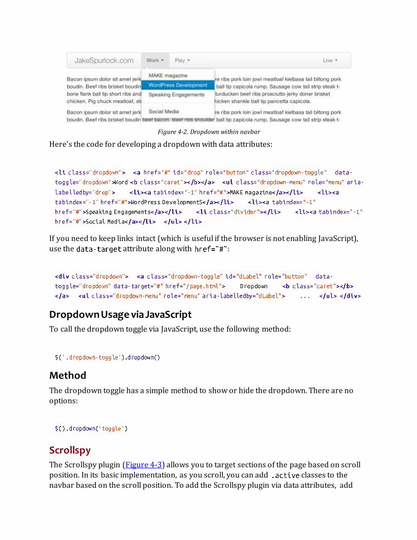
Figure 4-2. Dropdown within navbar
Here’s the code for developing a dropdown with data attributes:
If you need to keep links intact (which is useful if the browser is not enabling JavaScript),
use the attribute along with :
Dropdown Usage via JavaScript
To call the dropdown toggle via JavaScript, use the following method:
Method
The dropdown toggle has a simple method to show or hide the dropdown. There are no options:
Scrollspy
The Scrollspy plugin (Figure 4-3) allows you to target sections of the page based on scroll position. In its basic implementation, as you scroll, you can add classes to the
navbar based on the scroll position. To add the Scrollspy plugin via data attributes, add

to the element you want to spy on (typically the body) and
to the navbar that you want to apply the class changes to. For this to work, you must have elements in the body of the page that have matching IDs of th e links
that you are spying on.
Figure 4-3. Scrollspy example
Usage
For Scrollspy, you will need to add to the tag, along with that references the element that you are spying on:
In the navbar, you will need to have page anchors that will serve as indicators for the element to spy on:
Usage via JavaScript
If you would rather invoke the scrollspy with JavaScript instead of using the data attributes,
you can do so by selecting the element to spy on, and then invoking the
function:
.scrollspy('refresh') Method
When calling the scrollspy via the JavaScript method, you need to call the method
to update the DOM. This is helpful if any elements of the DOM have changed.

Options
Options can be passed via data attributes or JavaScript. For data attributes, prepend the
option name to , as in (see Table 4-3).
Table 4-3. Scrollspy option
Name Type Default Description
offset number 10 Pixels to offset from top of page when calculating position of scroll.
The offset option is handy when you are using a fixed navbar. You will want to offset the
scroll by about 50 pixels so that it reads at the correct time (see Table 4-4).
Event
Table 4-4. Scrollspy event
Event Description
activate This event fires whenever a new item becomes activated by the scrollspy.
Toggleable Tabs
Tabbable tabs were introduced in Chapter 3. By combining a few data attributes, you can easily create a tabbed interface (Figure 4-4). To do so, create the nav interface, and then
wrap the content of the tabs inside a with a class of :

Figure 4-4. Toggleable tabs
Usage
To enable the tabs, you can use the Bootstrap Data API or use JavaScript directly. With the Data API, you need to add to the anchors. The anchor targets will activate the
element that has the class and relative ID. Alternatively, may be
used instead of to apply the same action. Here is one way to enable tabs:
Here’s an example of different ways to activate tabs:
Events
Tabs panes have two different events that can be hooked into, as shown in Table 4-5.
Table 4-5. Toggleable tab events
Event Description
show This event fires on tab show, but before the new tab has been shown. Use and to target the active tab and the previous active tab (if available), respectively.

shown This event fires on tab show after a tab has been shown. Use and to target the active tab and the previous active tab (if available), respectively.
Here’s a code example of a shown method:
For information about the method, refer to the jQuery website.
Tooltips
Tooltips (Figure 4-5) are useful when you need to describe a link or (used in conjunction with the tag) provide the definition of an abbreviation. The plugin was originally
based on the jQuery.tipsy plugin written by Jason Frame. Tooltips have since been updated to work without images, animate with a CSS animation, and work with the Bootstrap
JavaScript API.
Figure 4-5. Tooltip placement
Usage
To add a tooltip, add to an anchor tag. The title of the anchor will be the text of a tooltip. The following two examples show how to do this in the Bootstrap Data API and
JavaScript, respectively:
Options
Like all of the plugins, there are options that can be added via the Bootstrap Data API or
invoked via JavaScript. All options need to have prepended to them. So, the option would become (see Table 4-6).

Table 4-6. Tooltip options
Name Type Default Description
animation Boolean true Applies a CSS fade transition to the tooltip.
html Boolean false Inserts HTML into the tooltip. If false, jQuery’s method will be used to insert content into the dom. Use text if you’re worried about XSS attacks.
placement string/function ‘top’ Specifies how to position the tooltip (i.e., top, bottom, left, or right).
selector string false If a selector is provided, tooltip objects will be delegated to the specified targets.
title string/function '' The title option is the default title value if the attribute isn’t present.
trigger string ‘hover’ Defines how the tooltip is triggered: click, hover, focus, or manually.
delay number/object 0 Delays showing and hiding the tooltip in ms—does not apply to manual trigger type. If a number is supplied, delay is applied to both hide/show. Object
structure is:
Methods
Here are some useful methods for tooltips.
Options
Attaches a tooltip handler to an element collection:
Show
Reveals an element’s tooltip:
Hide
Hides an element’s tooltip:
Toggle
Toggles an element’s tooltip:

Destroy
Hides and destroys an element’s tooltip:
Popover
The popover (see Figure 4-6) is a sibling of the tooltip, offering an extended view complete
with a heading. For the popover to activate, a user just needs to hover the cursor over the element. The content of the popover can be populated entirely using the Bootstrap Data
API. This method requires a tooltip.
Figure 4-6. Popover placement
Use the following code for popover placement:
Usage
To enable the popover with JavaScript, use the function, passing in any options
that you might need:
Options
All options can be passed via the Bootstrap Data API, or directly with JavaScript (see
Table 4-7).
Table 4-7. Popover options

Name Type Default Description
animation Boolean true Applies a CSS fade transition to the tooltip.
html Boolean false Inserts HTML into the popover. If false, jQuery’s method will be used to insert content into the
dom. Use text if you’re worried about XSS attacks.
placement string function right
Specifies how to position the popover (i.e., top,
bottom, left, right)
selector string false
If a selector is provided, tooltip objects will be delegated to the
specified targets.
trigger string click
How the popover is triggered (i.e., click, hover, focus, manual)
title string function
'' Default title value if title
attribute isn’t present
content string
function '' Default content value if data-
content attribute isn’t present
delay
number object 0 Delays showing and hiding the popover in ms—does not apply to manual trigger type. If a number
is supplied, delay is applied to both hide/show. Object structure is:
.
Methods
Here are some useful methods for popovers.
Options
Initializes popovers for an element collection:
Show
Reveals an element’s popover:

Hide
Hides an element’s popover:
Toggle
Toggles an element’s popover:
Destroy
Hides and destroys an element’s popover:
Alerts
With the Data API, it is easy to add dismiss functionality to alert messages (Figure 4-7).
Figure 4-7. Error alert message
Usage
You can close an alert manually with the JavaScript method or use data attributes
in conjunction with an anchor or button.
Here is how to dismiss via JavaScript:
Here is how to dismiss via Data API:

Close Method
To enable all alerts to be closed, add the following method. To enable alerts to animate out
when closed, make sure they have the and class already applied to them.
Events
There are two events that can be tied to Bootstrap’s class as shown in Table 4-8.
Table 4-8. Alert class events
Event Description
close This event fires immediately when the close instance method is called.
closed This event is fired when the alert has been closed (will wait for CSS transitions to complete).
As an example, if you wanted to trigger a function after an alert has closed, you could use
this function:
Buttons
Buttons were introduced in Chapter 3. With Bootstrap, you don’t need to do anything to make them work as links or as buttons in forms. With this plugin you can add in some
interaction, such as loading states or button groups with toolbar-like functionality.
Loading State
To add a loading state to a button (shown in Figure 4-8), simply add as an attribute to the button:
When the button is clicked, the class is added, giving the appearance that it can no longer be clicked.

Figure 4-8. Loading button
Single Toggle
When clicking on a button with the attribute (Figure 4-9), a class of is added:
Figure 4-9. Toggle button
Checkbox Buttons
Buttons can work like checkboxes (as in Figure 4-10), allowing a user to select many of the options in a button group. To add this function, add for
checkbox style toggling on :
Figure 4-10. Checkbox buttons
Radio Buttons
Radio buttons (Figure 4-11) function similarily to checkboxes. The primary difference is
that a radio button doesn’t allow for multiple selections—only one button in the group can be selected. To add radio-style toggling on , add :

Figure 4-11. Radio buttons
Usage
The method can be applied to any class or ID. To enable all buttons in the
via JavaScript, add the following code:
Methods
The following methods are useful to use with buttons.
Toggle
Toggles push state. Gives the button the appearance that it has been activated:
Loading
When loading, the button is disabled and the text is changed to the option from the
attribute:
Reset
Resets button state, bringing the original content back to the text. This method is useful
when you need to return the button back to the primary state:
String
String in this method is referring to any string declared by the user:

To reset the button state and bring in new content, use the string method:
Collapse
The collapse plugin makes it easy to make collapsing divisions of the page (see Figure 4-
12). Whether you use it to build accordion navigation or content boxes, it allows for a lot of content options.
Figure 4-12. Accordion
The following code creates collapsible groups:

You can also use the data attributes to make all content collapsible:
Usage
Via data attributes
Like all of the plugins that use the Data API, you can add all needed markup without writing any JavaScript. Add and a to the element to
automatically assign control of a collapsible element. The attribute will accept
a CSS selector to apply the collapse to. Be sure to add the class to the collapsible element. If you’d like it to default open, include the additional class .
To add accordion-like group management to a collapsible control, add the data attribute .
Via JavaScript
The collapse method can activated with JavaScript as well:
Options
The options listed in Table 4-9 can be passed via data attributes or with JavaScript.
Table 4-9. Collapse options
Name Type Default Description
parent selector false If selector, then all collapsible elements under the specified parent will be closed when this collapsible item is shown. (Similar to traditional accordion behavior.)
toggle Boolean true Toggles the collapsible element on invocation.
Methods
The following methods are useful to use with collapsible elements.
Options
Activates your content as a collapsible element. Accepts an optional options object:

Toggle
Toggles a collapsible element to shown or hidden:
Show
Shows a collapsible element:
Hide
Hides a collapsible element:
Events
There are four events that can be hooked into with the collapse plugin, described in
Table 4-10.
Table 4-10. Collapse events
Event Description
show This event fires immediately when the instance method is called.
shown This event is fired when a collapse element has been made visible to the user (will wait for CSS transitions to complete).
hide This event is fired immediately when the method has been called.
hidden This event is fired when a collapse element has been hidden from the user (will wait for CSS transitions to complete).
After a has been collapsed, you could use the following code to execute a function:
Carousel
The Bootstrap carousel (Figure 4-13) is a flexible, responsive way to add a slider to your site. In addition to being responsive, the content is flexible enough to allow images, iframes,
videos, or just about any type of content that you might want.
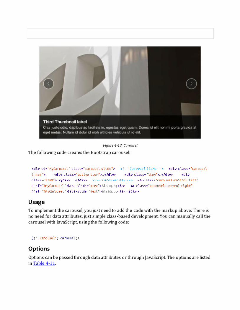
Figure 4-13. Carousel
The following code creates the Bootstrap carousel:
Usage
To implement the carousel, you just need to add the code with the markup above. There is
no need for data attributes, just simple class-based development. You can manually call the carousel with JavaScript, using the following code:
Options
Options can be passed through data attributes or through JavaScript. The options are listed
in Table 4-11.

Table 4-11. Carousel options
Name Type Default Description
interval number 5000 The amount of time to delay between automatically cycling an item. If false, carousel will not automatically cycle.
pause string “hover” Pauses the cycling of the carousel on mouseenter and resumes the cycling of the carousel on mouseleave.
Methods
The following methods are useful carousel code.
Options
Initializes the carousel with an optional object and starts cycling through items:
Cycle
Cycles through the carousel items from left to right:
Pause
Stops the carousel from cycling through items:
Number
Cycles the carousel to a particular frame (0-based, similar to an array):
Prev
Cycles to the previous item:
Next
Cycles to the next item:

Events
The carousel has two events that can be hooked into, described in Table 4-12:
Table 4-12. Carousel events
Event Description
slide This event fires immediately when the slide instance method is invoked.
slid This event is fired when the carousel has completed its slide transition.
Typeahead
Typeahead allows you to easily create typeahead inputs in forms (Figure 4-14). For
example, you could preload states in a state field or, with some JavaScript, get search
results using some AJAX calls.
Figure 4-14. Typeahead
Usage
Using Data API, you can add sources via the attribute. Items should be listed in either a JSON array or a function:
To call directly with JavaScript, use the following method:

Options
Table 4-13 shows a list of options.
Table 4-13. Carousel options
Name Type Default Description
source array, function
[ ] The data source to query against. May be an array of strings or a function. The function is passed through two arguments: the value in the input field and the callback. The function may be used synchronously by
returning the data source directly or asynchronously via the
callback’s single argument.
items number 8 The maximum number of items to display in the dropdown.
minLength number 1 The minimum character length needed before triggering autocomplete
suggestions.
matcher function case insensitive The method used to determine if a query matches an item. Accepts a single argument, the item against which to test the query. Accesses the current
query with . Return a Boolean true if query is a match.
sorter function exact match,
case sensitive, case insensitive
Method used to sort autocomplete results. Accepts a single argument item
and has the scope of the typeahead instance. Reference the current query with .
updater function returns selected item
The method used to return the selected item. Accepts a single argument item and has the scope of the typeahead instance.
highlighter function highlights all default matches
Method used to highlight autocomplete results. Accepts a single argument item and has the scope of the typeahead instance. Should return HTML.
Affix
The affix plugin allows a to become affixed to a location on the page. A common
example of this is social icons. They will start in a location, but as the page hits a certain mark, the will become locked in place and will stop scrolling with the rest of the
page.
Usage
To apply the affix plugin to a , you can use either data attributes, or you can use
JavaScript directly. Note that you must position the element so that it can be affixed to the
page. Position is controlled by the attribute, using either , , or . You then use the to calculate the position of the scroll.

Option
Name Type Default Description
offset number/function/object 10 Pixels to offset from screen when calculating position of scroll. If a single number is provided, the offset will be applied in both top and left
directions. To listen for a single direction or multiple unique offsets, just
provide an object . Use a function when you need to dynamically provide an offset (useful for some responsive designs).

Chapter 5. Using Bootstrap
GitHub Project
Like a lot of great open source projects, the power of Bootstrap comes not just from the developers at the core of the project but also from the development community that
supports it. GitHub is a large code repository for projects, and at time of writing, Bootstrap is the most popular project. With over 42,000 stars and over 10,000 forks, the project is
bustling with activity. As I mentioned in Chapter 1, if you want to use Bootstrap, you can simply download the .zip archive from the site, or you can download using .
For the uninitated, is a free and open source version control system. Bootstrap and a
host of other projects manage everything using GitHub, which is an online code repository for projects. To download the source for Bootstrap, run the following commands from
the command line:
Cloning Bootstrap will give you a full download of all the files—not just the CSS/JavaScript,
but also all of the documentation pages and the LESS files for the dynamic JavaScript elements.
If desired, using the LESS files, you can compile your own version of Bootstrap with the
features or customizations that you need.
Customizing Bootstrap
You can download the source, or if you want to easily customize a few of the colors, sizing, or plugins, you can cater the Bootstrap to your needs via the Bootstrap website.
When you use the customize page (Figure 5-1), you decide what components you need. For example, you might choose to leave off all of the responsive features, or maybe you would
like to leave off the button classes that conflict with styles that you already have. You can
also opt out of any of the jQuery plugins. If you know that you aren’t going to be using the modals or the carousel, you can leave it out of the build so that you have a smaller file to
request.

Figure 5-1. Customize page
Lastly, you can configure the LESS variables. Everything from column count to typography colors can be modified here. With these options, you can cater Bootstrap to your needs.
Using LESS
There are a few different ways to use LESS with Bootstrap (Figure 5-2). The first, and
perhaps the easiest, is to use a preprocessor like CodeKit (Figure 5-3) or SimpLESS. You can use these tools to watch certain files or folders. Then when you save any of those files, they
build the master CSS files. In addition to using traditional CSS techniques, you can use
advanced features like mixins and functions to dynamically change the look of your site just
by changing some variables.

Figure 5-2. Using Bootstrap with LESS
Figure 5-3. CodeKit and the Bootstrap code base
LESS is a dynamic stylesheet language for writing CSS. It allows you to write variables,
functions, and mixins for your CSS. The Bootstrap /less/ folder has a few files, but for
setting globals, check the variables.less and mixins.less files.

In the variables.less file, you will find all of the global variables for Bootstrap. Let’s say you
wanted to change the color of all of the links. You would simply update LESS to compile the CSS, and all of the links would change color.
Now, all links are changed to a purple color, and buttons and other interface elements that call for will be updated throughout your site.
In the beginning, I was really hesitant to use LESS. After all, I have been writing CSS for a
long time, and I didn’t feel the need to change. The nesting alone is such a huge timesaver that I’m really glad to have added it to my workflow.
Text Snippets
To rapidly develop Bootstrap sites, I like to use Sublime Text 2 and the Bootstrap snippets
(shown in Figure 5-4) from DEVtellect on GitHub. This makes adding any component as easy as adding a keyboard shortcut.
Figure 5-4. Bootstrap snippets
To install the snippets, clone the git repository into your packages folder:
There are clippings for lots of popular IDEs/text editors.

Photoshop Templates
In addition to snippets, there have been a few Photoshop documents of all of th e Bootstrap
markup elements. My favorite comes from Repix Design. Their website is shown in Figure 5-5.
Figure 5-5. Repix design
Here are the features: Adjustable colors
Separate layers
Vector-based
The PSD is free, but the author requests that you pay with a tweet. Kind of a new spin on the free-as-in-free-speech mantra of open source programming.
Themes
If you have a vanilla installation of Bootstrap, but want to add a bit of panache, there are
few different ways to find free, and premium themes for Bootstrap. My two favorites are {Wrap}Bootstrap, and Bootswatch. Both have some great options, and make it easy to get a
new style on your site.

Built with Bootstrap
If you are looking for even more inspiration, check out Built With Bootstrap, a Tumblr that
features screen grabs of user-submitted Bootstrap sites. It is a fun way to see the sites using Bootstrap.
Conclusion
As you can see, whatever the project, Bootstrap can fill the needs of just about any Web
project. Its blend of responsive framework, extensive JavaScript plugins, and robust interface components make developing easy, fast, and feature rich. It has been great
working with Bootstrap over the last year, and I look forward to the future development of the project. Cheers, kudos, and all of the accolades to Jacob Thornton and Mark Otto for
creating a project that is so versatile and fun to develop around.

Index A NOTE ON THE DIGITAL INDEX
A link in an index entry is displayed as the section title in which that entry appears. Because some sections
have multiple index markers, it is not unusual for an entry to have several links to the same section. Clicking on any link will take you directly to the place in the text in which the marker appears.
A
<abbr> tag, Abbreviations
abbreviations, Abbreviations, Tooltips
accordion navigation, Collapse
active helper class, Navigation Elements
<address> tag, Addresses
addresses, Addresses
admin interfaces, Navigation Lists
affix plugin, Affix
alerts, Alerts, Alerts
appending user input, Extended Form Controls

autocomplete, Typeahead
B
<b> tag, Italics
badges, Badges
basic pills navigation, Basic Pills Navigation
block help, Help text
block level elements, Form Control Sizing
block quotes, Blockquotes
<blockquote> tag, Blockquotes
bold, Bold
Bootstrap
additional resources, Other Resources
customizing, Customizing Bootstrap–Themes
downloading, GitHub Project

enabling responsive features, Responsive Design
evolution of, What Is Bootstrap?
factoring and, Foreword
future of, Foreword
initial files needed, What Is Bootstrap?
jQuery plugins included in, Bootstrap JavaScript Plugins
overview of, Preface
prerequisites to learning, Who This Book Is Not For
scaffolding, What Is Bootstrap?–Helper classes
selection of, Are You Sure You Want Bootstrap?
similarities to Mac OS, Foreword
themes for, Photoshop Templates

Bootstrap Data API, Bootstrap JavaScript Plugins
Bootswatch, Photoshop Templates
bordered table class, Bordered table
box-shadow text, Input focus
<br> tag, Unordered list
breadcrumbs, Breadcrumbs
Built With Bootstrap, Built with Bootstrap
bulleted lists, Unordered list
buttons
button groups, Button groups, Button Groups
button toolbars, Button Groups
interactive, Buttons
radio buttons, Checkboxes and radio buttons, Button Groups as Radio Buttons and
Checkboxes, Radio Buttons
split button dropdowns, Split Button Dropdowns
styling of, Buttons–Disabled Button Styling
vertical buttons, Button Groups
with dropdowns, Buttons with Dropdowns, Dropdown
C
carousel panes, Transitions
carousels, Carousel
checkboxes, Checkboxes and radio buttons, Button Groups as Radio Buttons and
Checkboxes, Checkbox Buttons
child windows, Modal
<code> tag, Code
code, displaying, Code

CodeKit preprocessor, Using LESS
collapsing navbars, Responsive navbar
collapsing page divisions, Collapse
colors
changing for buttons, Buttons
changing for links, Global Styles, Using LESS
changing for rows, Table Row Classes
columns
nesting, Nesting Columns
offsetting, Offsetting Columns
condensed table class, Condensed table
containers, layouts for, Container Layouts
controls, for forms, Supported Form Controls, Extended Form Controls
CSS (Cascading Style Sheets)

buttons, Buttons–Disabled Button Styling
customized layouts, What Is Responsive Design?
displaying code, Code
forms, Forms–Validation states
icons, Icons
images, Images
media queries, What Is Responsive Design?
responsive CSS file, Responsive Design
tables, Tables–Table Row Classes
typography, Typography–Definition list
D
data attributes, Usage
data input, Inputs
(see also forms)

data-target attribute, Usage
<dd> tag, Definition list
default styles, Global Styles
definition lists, Definition list
disabled buttons, Disabled Button Styling
disabled input, Disabled input
disabled links, Disabled Button Styling, Disabled class
divider helper class, Breadcrumbs
dividers, horizontal, Horizontal divider
dropdown menus, Dropdown Menus, Buttons with Dropdowns, Dropdown
dropup menus, Dropup Menus
<dt> tag, Definition list

E
elements
clearing float, Clearfix
floating left/right, Pull left
<em> tag, Italics
email addresses, Addresses
emphasis classes, Emphasis Classes
F
Facebook, Media Object
factoring, definition of, Foreword
fades, Transitions
file structure, Bootstrap File Structure
fluid grid systems, Fluid Grid System
focused input, Input focus
fonts, Global Styles
(see also typography)
forms
basic layout, Forms
extended form controls, Extended Form Controls
form control sizing, Form Control Sizing
form control states, Form Control States
form controls, Supported Form Controls
horizontal forms, Horizontal form
inline forms, Inline form
navbar forms, Forms
search forms, Search form
typeahead, Typeahead

uneditable input, Uneditable text
G
GitHub code repository, GitHub Project
global styles, Global Styles
GLYPHICONS, Icons
grid sizing, Grid sizing
grid systems, default, Default Grid System
H
headings, Headings, Hero Unit
help text, Help text
helper classes, Helper classes, Pull left
hero units, Hero Unit
hierarchy-based information, display of, Breadcrumbs

horizontal definition lists, Definition list
horizontal dividers, Horizontal divider
horizontal forms, Horizontal form
hover table class, Hover table
HTML elements, Bootstrap CSS
(see also CSS (Cascading Style Sheets))
HTML templates, Basic HTML Template
HTML5 Doctype, Basic HTML Template
HTML5 input types, Inputs
I
<i> tag, Italics, Icons
icons, Icons, Affix
iframes, Carousel
images, Images, Thumbnails, Carousel

inline button groups, Button Groups
inline forms, Inline form
inline help, Help text
inline subheadings, Headings
input
autocomplete/typeahead, Typeahead
focus on, Input focus
prepending/appending, Extended Form Controls
types supported, Inputs
interactive navigation, Tabbable Navigation
Internet Explorer 9, Buttons
inverted navbars, Inverted navbar

italics, Italics
J
JavaScript plugins, Overview–Usage
affix, Affix
alerts, Alerts
buttons, Buttons
carousels, Carousel
collapse, Collapse
disabling, Overview
dropdowns, Dropdown
modal windows, Modal
popovers, Popover
programmatic API, Programmatic API
scroll position targeting, Scrollspy

toggleable tabs, Toggleable Tabs
tooltips, Tooltips
transitions, Transitions
typeahead, Typeahead
usage, Overview
L
labels, Labels
layered windows, Modal
layout components, Bootstrap Layout Components–Clearfix
alerts, Alerts
badges, Badges
breadcrumbs, Breadcrumbs
button groups, Button Groups

buttons with dropdowns, Buttons with Dropdowns
dropdown menus, Dropdown Menus
helper classes, Pull left
labels, Labels
media objects, Media Object
navbars, Navbar–Inverted navbar
navigation elements, Navigation Elements–Tab position
pagination, Pagination
progress bars, Progress Bars
thumbnails, Thumbnails
typographic elements, Typographic Elements
wells, Wells

layouts
creating simple, Basic Grid HTML
optimized by device, What Is Responsive Design?
supported in Bootstrap, What Is Responsive Design?
lead body copy, Lead Body Copy
LESS stylesheet variables, Customizing Bootstrap
line breaks, Unordered list
links
changing color of, Using LESS
default styles for, Global Styles
describing, Tooltips
disabled, Disabled Button Styling, Disabled class
navbar links, Navbar Links
pagination links, Pager

lists, Lists, Navigation Lists
loading states, Buttons
login/registration information, Modal
M
Mac OS, similarities to Bootstrap, Foreword
media objects, Media Object
media queries, What Is Responsive Design?, Helper classes
menus
dropdown, Dropdown Menus, Buttons with Dropdowns, Dropdown
dropup, Dropup Menus
messages, Alerts, Alerts
meta tags, Responsive Design
mobile frameworks, Helper classes

modal windows, Modal
N
navbars, Navbar–Inverted navbar, Dropdown
navigation elements
basic pills navigation, Basic Pills Navigation
dropdowns, Dropdowns
navigation lists, Navigation Lists
stackable navigation, Stackable Navigation
styling of, Navigation Elements
tabbable navigation, Tabbable Navigation
tabular, Tabular Navigation
nesting grids, Nesting Columns
O
Object Oriented CSS (OOCSS), Media Object

offset grids, Offsetting Columns
ordered lists, Ordered list
Otto, Mark, Foreword, Other Resources, What Is Bootstrap?, Conclusion
P
page headers, Page Header
pagination, Pagination
pagination links, Pager
paragraphs, adding emphasis to, Lead Body Copy
parent windows, Modal
phone numbers, Addresses
Photoshop templates, Photoshop Templates
pills navigation, Basic Pills Navigation, Dropdown
placeholder text, Forms

plugins, Bootstrap JavaScript Plugins
(see also JavaScript plugins)
popovers, Popover
positioning, of navbars, Navbar Menu Variations
<pre> tag, Code
prepending user input, Extended Form Controls
programmatic API, Programmatic API
progress bars, Progress Bars
pull-quotes, Blockquotes
Q
quick links, Navigation Lists
quotes, Blockquotes

R
radio buttons, Checkboxes and radio buttons, Button Groups as Radio Buttons and
Checkboxes, Radio Buttons
relative input controls, Relative input controls
Repix Design, Photoshop Templates
responsive design
automatic stacking, Horizontal form
definition of, What Is Responsive Design?
enabling in Bootstrap, Responsive Design
helper classes for, Helper classes
navbars, Responsive navbar
right alignment, Blockquotes, Right-align, Pagination
row classes, Table Row Classes
rows, changing color of, Table Row Classes

S
scaffolding
container layouts, Container Layouts
default grid systems, Default Grid System
file structure, Bootstrap File Structure
fluid grid systems, Fluid Grid System
global styles, Global Styles
helper classes, Helper classes
HTML templates, Basic HTML Template
responsive design, Responsive Design, What Is Responsive Design?
Scrollspy plugin, Scrollspy
search forms, Search form, Forms
selects, Selects
sidebars, Navigation Lists

SimpLESS preprocessor, Using LESS
sizing
of buttons, Button Sizes
of form controls, Form Control Sizing
of grids, Grid sizing
sliders, Carousel
slideshows, Modal
<small> tag, Headings, Emphasis
snippets, Text Snippets
social icons, Affix
social media sites, Media Object
split button dropdowns, Split Button Dropdowns

stackable navigation, Stackable Navigation
striped table class, Striped table
<strong> tag, Bold
styles
applied with images, Images
global, Global Styles
Sublime Text 2, Text Snippets
submenus, Submenu
subnavigation menus, Tab position
Sullivan-Hass, Nicole, Media Object
T
tabbable navigation, Tabbable Navigation, Dropdown
tabbed navigation, Tabular Navigation, Toggleable Tabs
table row classes, Table Row Classes

tables, Tables–Table Row Classes
templates
HTML, Basic HTML Template
Photoshop, Photoshop Templates
text snippets, Text Snippets
textarea form control, Textarea
themes, Photoshop Templates
Thornton, Jacob, Foreword, Other Resources, What Is Bootstrap?, Conclusion
thumbnails, Thumbnails
toggleable tabs, Toggleable Tabs
toolbars, button toolbars, Button Groups
tooltips, Tooltips

transitions, Transitions
Twitter, What Is Bootstrap?, Media Object
typeahead, Typeahead
typography
abbreviations, Abbreviations, Tooltips
addresses, Addresses
block quotes, Blockquotes
bold, Bold
default styles for, Global Styles, Typography
emphasis, Emphasis
emphasis classes, Emphasis Classes
headings, Headings
italics, Italics

layout elements, Typographic Elements
lead body copy, Lead Body Copy
lists, Lists
U
UIs (user interfaces)
standardization of, Foreword, What Is Bootstrap?, Buttons
uneditable text, Uneditable text
unordered lists, Unordered list, Navigation Lists
V
validation states, Validation states
videos, Carousel
W
web browsers, standards mode, Basic HTML Template
web development, responsive framework for, What Is Bootstrap?, What Is
Responsive Design?

WebKit, Input focus
wells, Wells
windows, layered, Modal
Winer, Dave, Foreword, Why I Wrote This Book
WrapBootstrap, Photoshop Templates

About the Author
Jake Spurlock is a developer for O’Reilly Media where he works for MAKE magazine. MAKE
publishes a DIY magazine, produces Maker Faire, and is trying to make the world a better place by teaching people that they can make things. Jake is a Utah native, but a year and a
half ago was grafted into the California wine country.

Colophon
The animal on the cover of Bootstrap is the Finnhorse. The Finnhorse is the official horse of Finland, and is nicknamed as the “universal horse” for its ability to meet the agricultural,
economic, and recreational needs that a person might require from a horse. Though it has been fully bred and cultivated in Finland for centuries, the exact origin of this horse is
unknown.
The vast majority of Finnhorses are a chestnut color, with a very small percentage being
black, silver, or bay-colored. In the 1800s, the chestnut-colored Finnhorse only accounted
for roughly half the population, but through selective breeding throughout the 19th and 20th centuries, most other genes were bred out, as it was determined that chestnut was the
original color of the breed and the national Finnish horse breeding association sought to eliminate “foreign” colors. It was also selectively bred to be an average-sized horse—the
average height is 61 inches—with the ability and muscles to do hard labor and the agility to
be used for the purposes of riding or entertainment.
Today, most Finnhorses are used for harness racing and other recreational purposes. It was
originally the only horse used for racing in Finland, but after the middle of the 20th century, other horses were introduced into the sport. The horse is also used frequently at
riding schools and for therapy.
The cover image is from a loose plate of German origin, exact source unknown. The cover font is Adobe ITC Garamond. The text font is Adobe Minion Pro; the heading font is Adobe
Myriad Condensed; and the code font is Dalton Maag’s Ubuntu Mono.

Special Upgrade Offer If you purchased this ebook from a retailer other than O’Reilly, you can upgrade it for $4.99
at oreilly.com by clicking here.

Bootstrap
Jake Spurlock
Editor
Meghan Blanchette
Editor
Simon St. Laurent
Revision History
2013-05-07 First release
Copyright © 2013 Jake Spurlock
O’Reilly books may be purchased for educational, business, or sales promotional use. Online editions are also available for most titles (http://my.safaribooksonline.com). For more information, contact our
corporate/institutional sales department: 800-998-9938 or [email protected].
Nutshell Handbook, the Nutshell Handbook logo, and the O’Reilly logo are registered trademarks of O’Reilly Media,
Inc. Bootstrap, the image of a Finnhorse, and related trade dress are trademarks of O’Reilly Media, Inc.
Many of the designations used by manufacturers and sellers to distinguish their products are claimed as trademarks. Where those designations appear in this book, and O’Reilly Media, Inc., was aware of a trademark
claim, the designations have been printed in caps or initial caps.
While every precaution has been taken in the preparation of this book, the publisher and authors assume no responsibility for errors or omissions, or for damages resulting from the use of the information contained herein.
O’Reilly Media 1005 Gravenstein Highway North Sebastopol, CA 95472
2013-05-07T12:58:28-07:00


![[BOOK] [Bootstrap] [Awesome] Bootstrap-Programming-Cookbook](https://img.pdfslide.us/doc/110x75/577ca6bf1a28abea748c023f/book-bootstrap-awesome-bootstrap-programming-cookbook.jpg)