Embed Size (px)
Citation preview
MAGAZINE EVALUATIONCharley Box
In what ways does your magazine use, develop or challenge forms and conventions of real magazines?
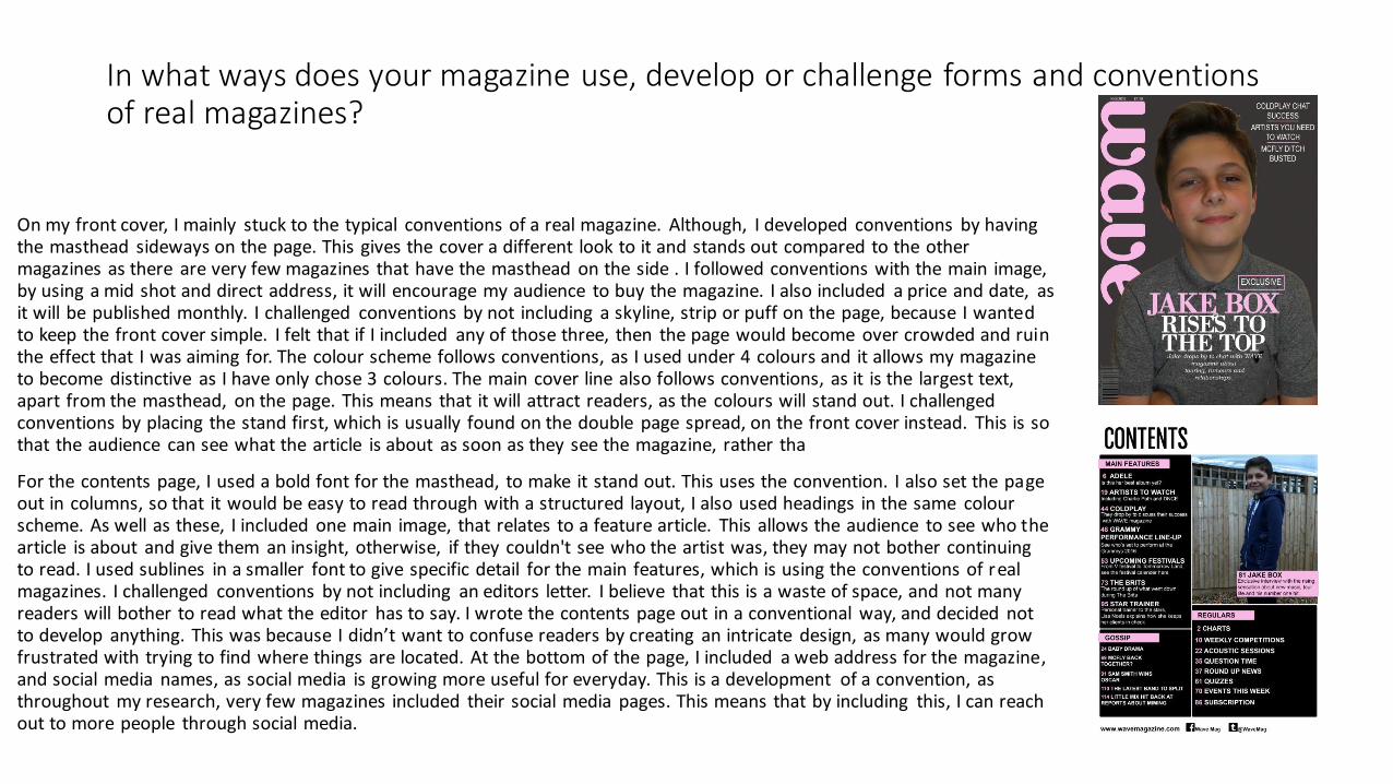
On my front cover, I mainly stuck to the typical conventions of a real magazine. Although, I developed conventions by having the masthead sideways on the page. This gives the cover a different look to it and stands out compared to the other magazines as there are very few magazines that have the masthead on the side . I followed conventions with the main image, by using a mid shot and direct address, it will encourage my audience to buy the magazine. I also included a price and date, as it will be published monthly. I challenged conventions by not including a skyline, strip or puff on the page, because I wanted to keep the front cover simple. I felt that if I included any of those three, then the page would become over crowded and ruin the effect that I was aiming for. The colour scheme follows conventions, as I used under 4 colours and it allows my magazine to become distinctive as I have only chose 3 colours. The main cover line also follows conventions, as it is the largest text, apart from the masthead, on the page. This means that it will attract readers, as the colours will stand out. I challenged conventions by placing the stand first, which is usually found on the double page spread, on the front cover instead. This is sothat the audience can see what the article is about as soon as they see the magazine, rather tha
For the contents page, I used a bold font for the masthead, to make it stand out. This uses the convention. I also set the page out in columns, so that it would be easy to read through with a structured layout, I also used headings in the same colourscheme. As well as these, I included one main image, that relates to a feature article. This allows the audience to see who the article is about and give them an insight, otherwise, if they couldn't see who the artist was, they may not bother continuingto read. I used sublines in a smaller font to give specific detail for the main features, which is using the conventions of realmagazines. I challenged conventions by not including an editors letter. I believe that this is a waste of space, and not manyreaders will bother to read what the editor has to say. I wrote the contents page out in a conventional way, and decided not to develop anything. This was because I didn’t want to confuse readers by creating an intricate design, as many would grow frustrated with trying to find where things are located. At the bottom of the page, I included a web address for the magazine, and social media names, as social media is growing more useful for everyday. This is a development of a convention, as throughout my research, very few magazines included their social media pages. This means that by including this, I can reach out to more people through social media.
In what ways does your magazine use, develop or challenge forms and conventions of real magazines?
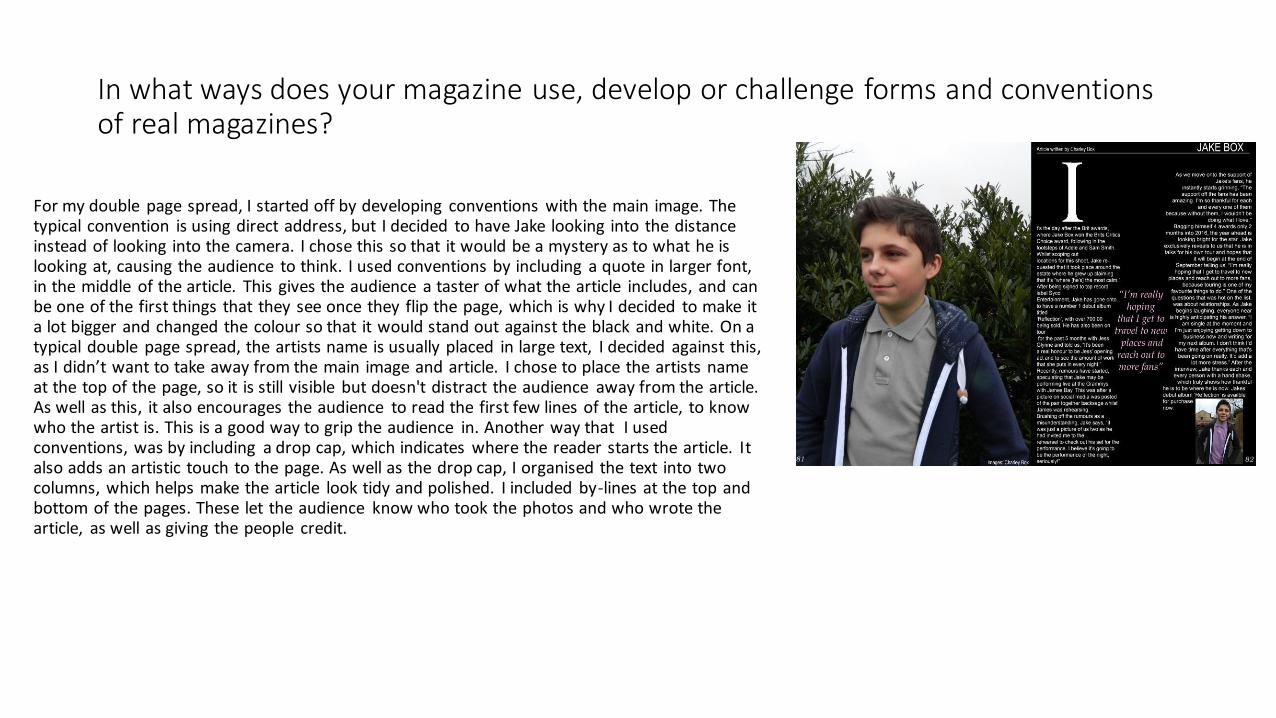
For my double page spread, I started off by developing conventions with the main image. The typical convention is using direct address, but I decided to have Jake looking into the distance instead of looking into the camera. I chose this so that it would be a mystery as to what he is looking at, causing the audience to think. I used conventions by including a quote in larger font, in the middle of the article. This gives the audience a taster of what the article includes, and can be one of the first things that they see once they flip the page, which is why I decided to make it a lot bigger and changed the colour so that it would stand out against the black and white. On a typical double page spread, the artists name is usually placed in large text, I decided against this, as I didn’t want to take away from the main image and article. I chose to place the artists name at the top of the page, so it is still visible but doesn't distract the audience away from the article. As well as this, it also encourages the audience to read the first few lines of the article, to know who the artist is. This is a good way to grip the audience in. Another way that I used conventions, was by including a drop cap, which indicates where the reader starts the article. It also adds an artistic touch to the page. As well as the drop cap, I organised the text into two columns, which helps make the article look tidy and polished. I included by-lines at the top and bottom of the pages. These let the audience know who took the photos and who wrote the article, as well as giving the people credit.
How does your magazine represent particular social groups?
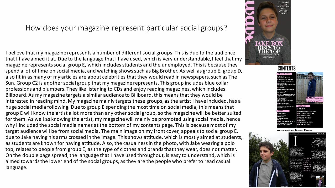
I believe that my magazine represents a number of different social groups. This is due to the audience that I have aimed it at. Due to the language that I have used, which is very understandable, I feel that my magazine represents social group E, which includes students and the unemployed. This is because they spend a lot of time on social media, and watching shows such as Big Brother. As well as group E, group D, also fit in as many of my articles are about celebrities that they would read in newspapers, such as The Sun. Group C2 is another social group that my magazine represents. This group includes blue collar professions and plumbers. They like listening to CDs and enjoy reading magazines, which includes Billboard. As my magazine targets a similar audience to Billboard, this means that they would be interested in reading mind. My magazine mainly targets these groups, as the artist I have included, has a huge social media following. Due to group E spending the most time on social media, this means that group E will know the artist a lot more than any other social group, so the magazine will be better suited for them. As well as knowing the artist, my magazine will mainly be promoted using social media, hence why I included the social media names at the bottom of my contents page. This is because most of my target audience will be from social media. The main image on my front cover, appeals to social group E, due to Jake having his arms crossed in the image. This shows attitude, which is mostly aimed at students, as students are known for having attitude. Also, the casualness in the photo, with Jake wearing a polo top, relates to people from group E, as the type of clothes and brands that they wear, does not matter. On the double page spread, the language that I have used throughout, is easy to understand, which is aimed towards the lower end of the social groups, as they are the people who prefer to read casual language.
What kind of media institution might distribute your magazine and why?
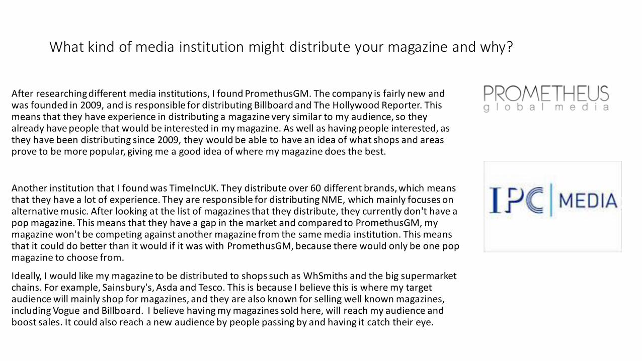
After researching different media institutions, I found PromethusGM. The company is fairly new and was founded in 2009, and is responsible for distributing Billboard and The Hollywood Reporter. This means that they have experience in distributing a magazine very similar to my audience, so they already have people that would be interested in my magazine. As well as having people interested, as they have been distributing since 2009, they would be able to have an idea of what shops and areas prove to be more popular, giving me a good idea of where my magazine does the best.
Another institution that I found was TimeIncUK. They distribute over 60 different brands, which means that they have a lot of experience. They are responsible for distributing NME, which mainly focuses on alternative music. After looking at the list of magazines that they distribute, they currently don't have a pop magazine. This means that they have a gap in the market and compared to PromethusGM, my magazine won't be competing against another magazine from the same media institution. This means that it could do better than it would if it was with PromethusGM, because there would only be one pop magazine to choose from.
Ideally, I would like my magazine to be distributed to shops such as WhSmiths and the big supermarket chains. For example, Sainsbury's, Asda and Tesco. This is because I believe this is where my target audience will mainly shop for magazines, and they are also known for selling well known magazines, including Vogue and Billboard. I believe having my magazines sold here, will reach my audience and boost sales. It could also reach a new audience by people passing by and having it catch their eye.
Who would be the audience for your magazine?
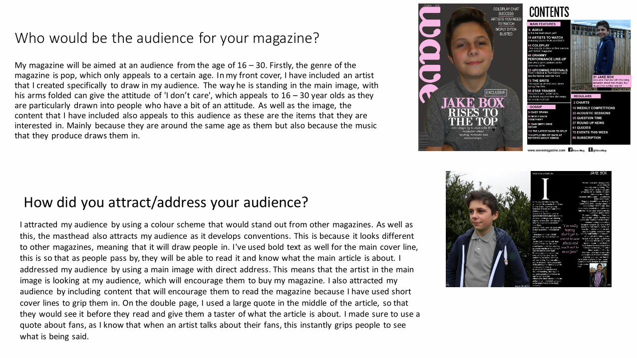
My magazine will be aimed at an audience from the age of 16 – 30. Firstly, the genre of the magazine is pop, which only appeals to a certain age. In my front cover, I have included an artist that I created specifically to draw in my audience. The way he is standing in the main image, with his arms folded can give the attitude of 'I don’t care', which appeals to 16 – 30 year olds as they are particularly drawn into people who have a bit of an attitude. As well as the image, the content that I have included also appeals to this audience as these are the items that they are interested in. Mainly because they are around the same age as them but also because the music that they produce draws them in.
How did you attract/address your audience?
I attracted my audience by using a colour scheme that would stand out from other magazines. As well as
this, the masthead also attracts my audience as it develops conventions. This is because it looks different to other magazines, meaning that it will draw people in. I've used bold text as well for the main cover line, this is so that as people pass by, they will be able to read it and know what the main article is about. I
addressed my audience by using a main image with direct address. This means that the artist in the main image is looking at my audience, which will encourage them to buy my magazine. I also attracted my audience by including content that will encourage them to read the magazine because I have used short
cover lines to grip them in. On the double page, I used a large quote in the middle of the article, so that they would see it before they read and give them a taster of what the article is about. I made sure to use a quote about fans, as I know that when an artist talks about their fans, this instantly grips people to see
what is being said.
What have you learnt about technologies from the process of constructing your magazine?
Through constructing my magazine, I have learnt a lot about technologies used. The first technology that I learnt more about was the physical side. This includes cameras. For the images that I took, I got to use my camera, which is a Nikon L310. As I hadn't used it many of the different settings before, this process allowed me to learn more about the settings on my camera and I got to experiment. It helped me learn a lot more, as well as working out how I want the lighting to look and how to make it look different. Software is the biggest technology process where I have learnt the most. Before I began constructing my magazine, the only thing I knew how to use in Photoshop was the font and paint bucket tools. I used Photoshop for my whole magazine, from enhancing images to making each piece of work. I learnt how to remove things from the background, how to remove shadows and how to create textured backgrounds. Being able to use Photoshop, has made me a lot moreconfident in designing things, because I now have a better understanding to make my work look more professional. Digital technology was another category that helped me. Without computer hardware, I wouldn't have been able to create my magazine, as I used a computer for the whole process, from researching information, to using Photoshop. I also used a memory card to transfer the images from my camera to my laptop. Without this, I wouldn't have been able to use high quality images to give my magazine a professional look. The use of a memory card also sped up time during the process, meaning that I could edit my images quicker. The other type of technology that is used in constructing a magazine is printing, but as we didn't print our magazines, this process wasn't needed.
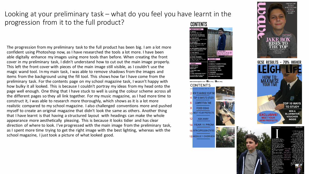
Looking at your preliminary task – what do you feel you have learnt in the progression from it to the full product?
The progression from my preliminary task to the full product has been big. I am a lot more confident using Photoshop now, as I have researched the tools a lot more. I have been able digitally enhance my images using more tools than before. When creating the front cover in my preliminary task, I didn't understand how to cut out the main image properly. This left the front cover with pieces of the main image still visible, as I couldn't use the magic wand tool. In my main task, I was able to remove shadows from the images and items from the background using the fill tool. This shows how far I have come from the preliminary task. For the contents page on my school magazine task, I wasn't happy with how bulky it all looked. This is because I couldn't portray my ideas from my head onto the page well enough. One thing that I have stuck to well is using the colour scheme across all the different pages so they all link together. For my music magazine, as I had more time to construct it, I was able to research more thoroughly, which shows as it is a lot more realistic compared to my school magazine. I also challenged conventions more and pushed myself to create an original magazine that didn't look the same as others. Another thing that I have learnt is that having a structured layout with headings can make the whole appearance more aesthetically pleasing. This is because it looks tidier and has clear direction of where to look. I've progressed with the main image from the preliminary task, as I spent more time trying to get the right image with the best lighting, whereas with the school magazine, I just took a picture of what looked good.