Embed Size (px)
Citation preview
EVALUATION
1) In what ways does your media product use, develop or challenge forms and conventions of real media products?
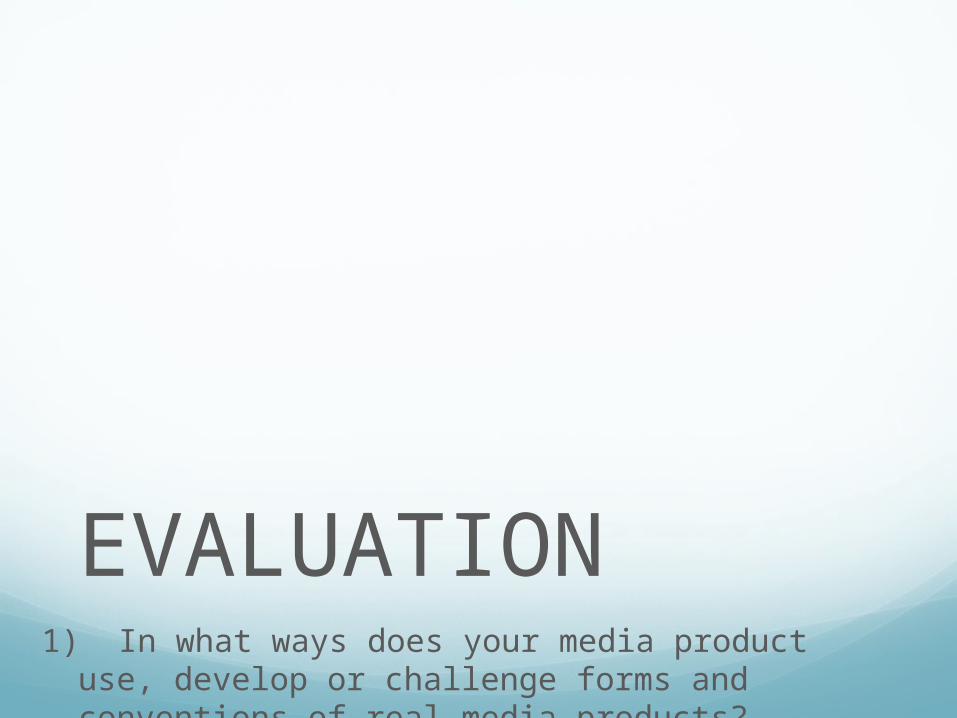
Front cover
Use I used Q magazine as inspiration for my music magazine. A technique used is having a powerful main image on the front cover, the main image represents what the main story of the article will be about it also represents the artists personality and genre to the audience. My main image does represent conventions for example the black clothing has connotations of mystery. I want these to be the ideas to relate to my artist and for the audience to associate with her. Furthermore the connotation links to the main story as the artist is new she is a mystery for the audience to find out about. A similarity is there is a few sub stories on the front cover this is because the main image gets more focus and attention.
Develop ChallengeI developed my front cover by using different font sizes for the more important subheadings where as Q magazine uses same font but different background box. I also made the parts that relate to the genre of topics and my target audience would have interest in bold in-comparison to the rest of the text. I have used a free gift inside the magazine this will encourage my target audience to want to purchase where as Q magazine uses a puff instead.
I wanted my music magazine to represent the colour red connotations for example being passionate and determined. However because my artist lips and makeup was more faded I opted for a mix of black and red producing a darker red this has a combination of black colour connotations such as power and red such as danger put together make it aggressive. I tried to further represent this idea by the meaning of the masthead and the scratches below. Another challenge to real music magazines was the background for the front cover I thought of simple coloured ideas or blurred images in background however they would not complement the whole front cover instead I opted for a white background so connotations of innocence and goddess like contrast to the facial expressions and the connotations of the rest of the colour scheme. Also the white background allows the typography of the text and main image to stand out more.
My media product Real media product
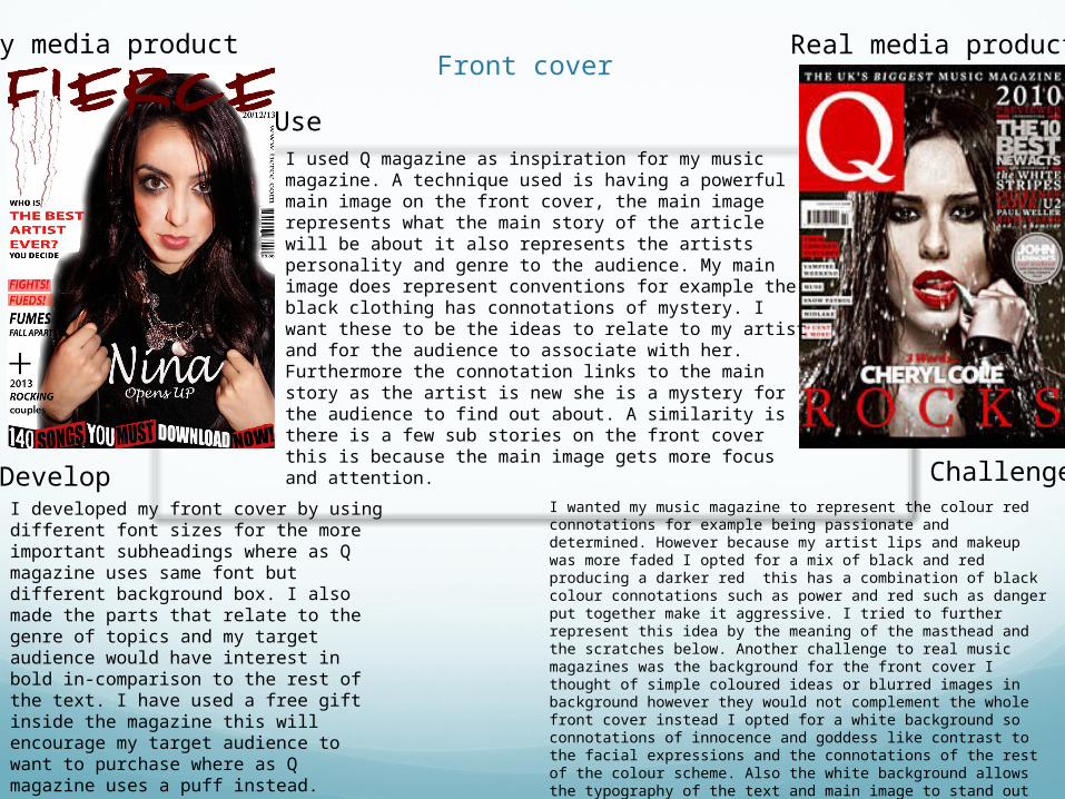
Double page spread
use
My media product Real media product
I used a medium long shot and artist looking over at the text this suggests the text importance also the artist body language is similar to Q magazine artist they both represent power, fierceness and determination. They are also feminine by using different aspect of mise en scene for example the make-up and props such as jewelry as well as seductiveness, both magazine artist skin is on show. In addition the large letter in middle of the text is used in both magazines, this technique represents the artist initial suggesting their importance as well as indicating that the interview will be about the artist which makes it more interesting. Simple white background is also used in both this is because the black colour text complements with the black colour clothing on artist and so that their importance is not over shadowed by other contrasting colours.
Develop
ChallengeMy media product challenges the real media product by having a quote with font size and boldness varying, it is as if a ladder which the artist has gone up to reach where she is now, this makes the quote unique and eye catching which may interest the reader to carry on into the interview. The real media product uses similar typography and font through out jus a change of colour. I challenged the interview side of my product by structuring it in question based paragraphs instead of having a large size letter at start of important paragraph all my questions are bold instead as they are all important to my artist. Where as the real product is a constant block of writing this does not attract the eye.
My media product developed the large ‘N’ initial by making it go through the whole text from bottom to the top. The colour grey I used does not overpower the writing on top, the typography is sophisticated similar to the typography on the heading ‘nina’. The colour grey connotes this idea as well as strength and self-confidence which the image and interview both represent.
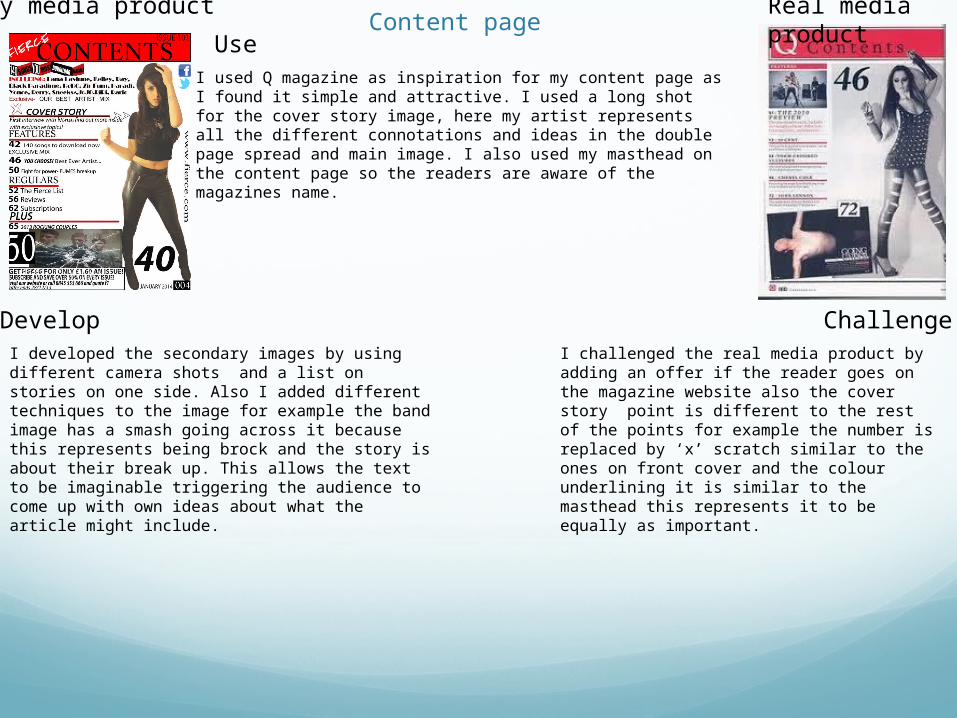
Content page
UseI used Q magazine as inspiration for my content page as I found it simple and attractive. I used a long shot for the cover story image, here my artist represents all the different connotations and ideas in the double page spread and main image. I also used my masthead on the content page so the readers are aware of the magazines name.
DevelopI developed the secondary images by using different camera shots and a list on stories on one side. Also I added different techniques to the image for example the band image has a smash going across it because this represents being brock and the story is about their break up. This allows the text to be imaginable triggering the audience to come up with own ideas about what the article might include.
Challenge
Real media product
My media product
I challenged the real media product by adding an offer if the reader goes on the magazine website also the cover story point is different to the rest of the points for example the number is replaced by ‘x’ scratch similar to the ones on front cover and the colour underlining it is similar to the masthead this represents it to be equally as important.