Embed Size (px)
Citation preview
Music MagazineSigns and Signifiers
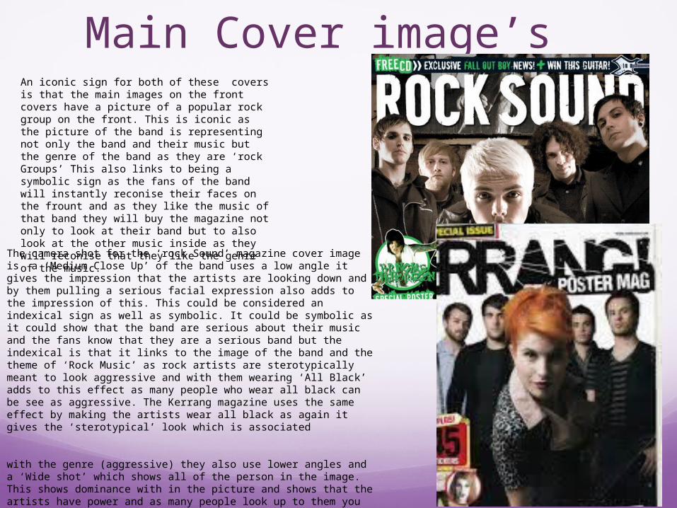
Main Cover image’sAn iconic sign for both of these covers is that the main images on the front covers have a picture of a popular rock group on the front. This is iconic as the picture of the band is representing not only the band and their music but the genre of the band as they are ‘rock Groups’ This also links to being a symbolic sign as the fans of the band will instantly reconise their faces on the frount and as they like the music of that band they will buy the magazine not only to look at their band but to also look at the other music inside as they will reconise that they like the genre of the music.
The camera shot for the ‘rock Sound’ magazine cover image is a ‘Medium Close Up’ of the band uses a low angle it gives the impression that the artists are looking down and by them pulling a serious facial expression also adds to the impression of this. This could be considered an indexical sign as well as symbolic. It could be symbolic as it could show that the band are serious about their music and the fans know that they are a serious band but the indexical is that it links to the image of the band and the theme of ‘Rock Music’ as rock artists are sterotypically meant to look aggressive and with them wearing ‘All Black’ adds to this effect as many people who wear all black can be see as aggressive. The Kerrang magazine uses the same effect by making the artists wear all black as again it gives the ‘sterotypical’ look which is associated with the genre (aggressive) they also use lower angles and a ‘Wide shot’ which shows all of the person in the image. This shows dominance with in the picture and shows that the artists have power and as many people look up to them you would expect them to have power. It may make them also look ‘scary’ and weith their straight facial expressions people may argue that this links in to the camera shot which links back into the theme of them looking ‘aggressive which links back into the theme.
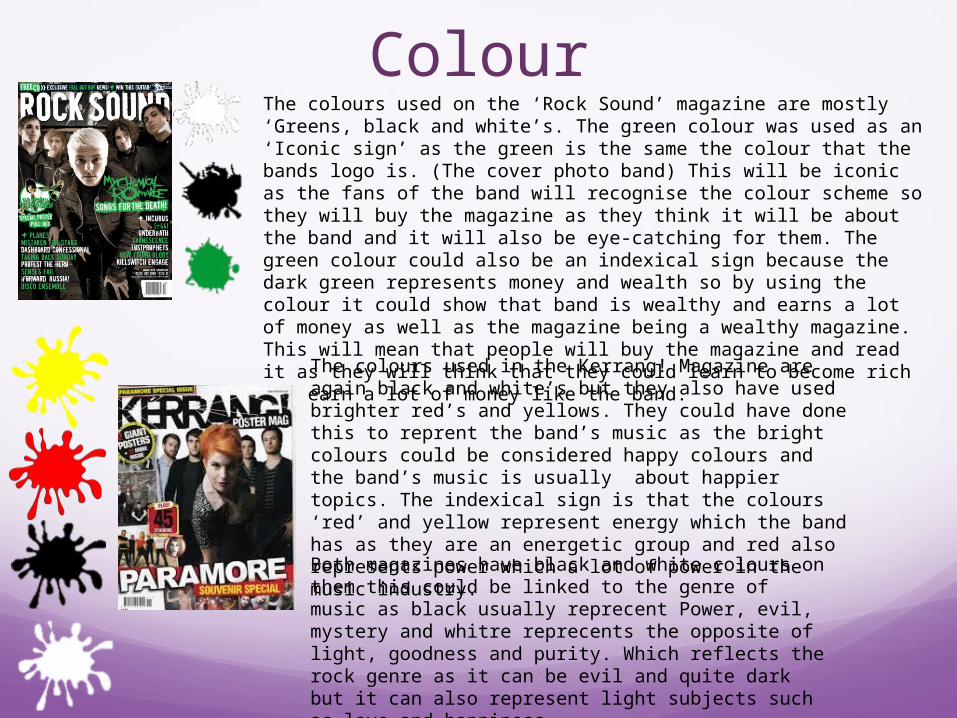
ColourThe colours used on the ‘Rock Sound’ magazine are mostly ‘Greens, black and white’s. The green colour was used as an ‘Iconic sign’ as the green is the same the colour that the bands logo is. (The cover photo band) This will be iconic as the fans of the band will recognise the colour scheme so they will buy the magazine as they think it will be about the band and it will also be eye-catching for them. The green colour could also be an indexical sign because the dark green represents money and wealth so by using the colour it could show that band is wealthy and earns a lot of money as well as the magazine being a wealthy magazine. This will mean that people will buy the magazine and read it as they will think that they could learn to become rich and earn a lot of money like the band.
The colours used in the Kerrang! Magazine are again black and white’s but they also have used brighter red’s and yellows. They could have done this to reprent the band’s music as the bright colours could be considered happy colours and the band’s music is usually about happier topics. The indexical sign is that the colours ‘red’ and yellow represent energy which the band has as they are an energetic group and red also represents power which a lot of power in the music industry.Both magazines have black and white colours on them this could be linked to the genre of music as black usually reprecent Power, evil, mystery and whitre reprecents the opposite of light, goodness and purity. Which reflects the rock genre as it can be evil and quite dark but it can also represent light subjects such as love and happiness.
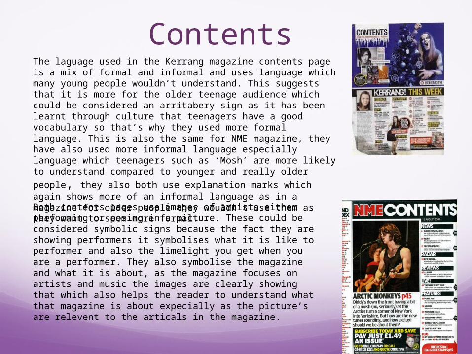
ContentsThe laguage used in the Kerrang magazine contents page is a mix of formal and informal and uses language which many young people wouldn’t understand. This suggests that it is more for the older teenage audience which could be considered an arritabery sign as it has been learnt through culture that teenagers have a good vocabulary so that’s why they used more formal language. This is also the same for NME magazine, they have also used more informal language especially language which teenagers such as ‘Mosh’ are more likely to understand compared to
younger and really older people, they also both use explanation marks which again shows more of an informal language as in a magazine for older people they wouldn’t use them as they want to seem more formal.Both contents pages use images of artists either performing or posing in a picture. These could be considered symbolic signs because the fact they are showing performers it symbolises what it is like to performer and also the limelight you get when you are a performer. They also symbolise the magazine and what it is about, as the magazine focuses on artists and music the images are clearly showing that which also helps the reader to understand what that magazine is about expecially as the picture’s are relevent to the articals in the magazine.
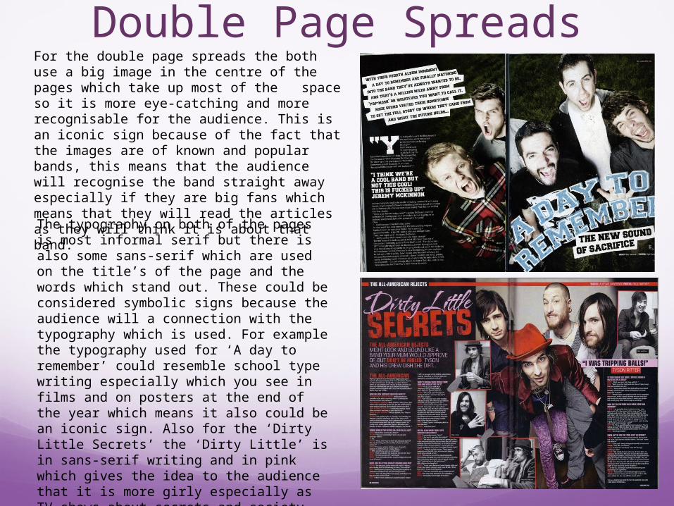
Double Page SpreadsFor the double page spreads the both use a big image in the centre of the pages which take up most of the space so it is more eye-catching and more recognisable for the audience. This is an iconic sign because of the fact that the images are of known and popular bands, this means that the audience will recognise the band straight away especially if they are big fans which means that they will read the articles as they will think it is about that band. The typography on both of the pages is most informal serif but there is also some sans-serif which are used on the title’s of the page and the words which stand out. These could be considered symbolic signs because the audience will a connection with the typography which is used. For example the typography used for ‘A day to remember’ could resemble school type writing especially which you see in films and on posters at the end of the year which means it also could be an iconic sign. Also for the ‘Dirty Little Secrets’ the ‘Dirty Little’ is in sans-serif writing and in pink which gives the idea to the audience that it is more girly especially as TV shows about secrets and society stereotypically link girls to secrets and as pink is a girly colour it defiantly resembles this to the audience.