Embed Size (px)
Citation preview

Music Magazines – Signs and SignifiersBy Olivia Ahmadi

Kerrang!The Genre My chosen magazine is one of the Rock genre, appealing to those who have an interest within the old as well as new talent within the industry. The main conventions of this genre of magazine are often their high profile main cover images, which appeal to those who are followers of the leading bands within the rock world, along with the use of bold cover lines that discus anything from music related topics, to one to one interviews with bands, discussing their latest albums and revealing truths about their personal lives.Magazines similar to Kerrang! often make use of dark colours such as black, red and blue to state the masculinity and rage that the genre itself usually entails, however the magazines are targeted at both male and female audiences.

Conventions - Cover Line
The cover line of any magazine is the main point of focus for any possible consumer, however this particular cover line targets those who are fans of the popular band ‘Biffy Clyro’ would see the cover line (backed up by the main cover image) as an iconic sign, recognising the main focus in this issue of the magazine being on their favourite, therefore enticing them to buy it. The use of serif typography on this particular cover line is eye catching due to the use of the electric blue and yellow colour scheme, not typically used within this genre, which appeals to the preferred reader as they will engage with not only the colour but the context of the cover line, ‘REHAB, REBIRTH, AND MENTAL HEALTH’, stating that the interview inside is the ‘most honest interview ever’, of course it with make consumers curious to know the contents inside regarding their favourite band. However oppositional readers will view this as a bad representation of how people in the public eye should be perceived by the public, as it is not the way in which people should lead their own lives, as they fear fans will copy.

Conventions – Cover ImageThe image used on this magazine cover is one typically associated with the genre of rock and its magazines, Simon Neil, the front man of the band Biffy Clyro is seen in a medium shot, open mouthed and topless. This is an iconic sign of the stereotyped rock singer, enforced by the fact he is topless, it suggests he is a rebellious male, who aims to rule break, as suggested by his open mouth in the photo, which also infers he is a loud character, and not afraid to speak his mind. His image is however brought back down to earth by the colour scheme of the colour, the bright and vibrant colours make the magazine look less brash and dark, and soften the image. A preferred reader will of course be eager to buy this magazine as its promoting a popular band, however oppositional readers may see the presentation of the main image as it being made acceptable for people in the public eye to stand out for the wrong reasons.

Conventions – Contents Page
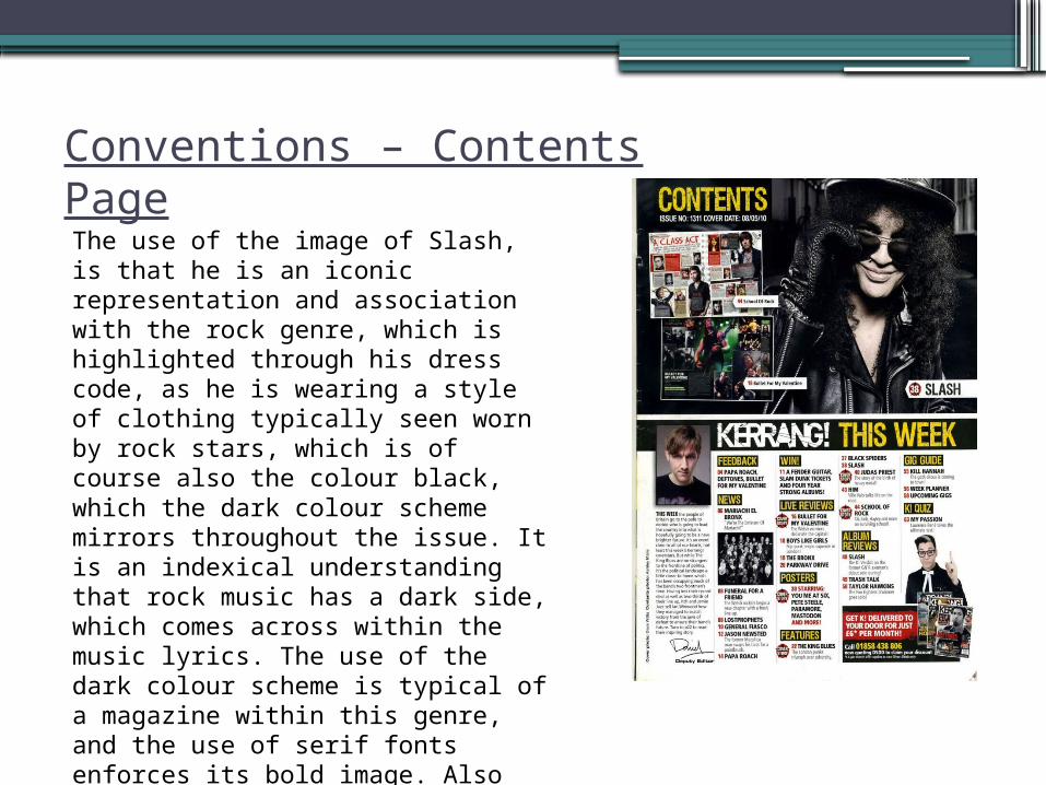
Conventions – Contents PageThe use of the image of Slash, is that he is an iconic representation and association with the rock genre, which is highlighted through his dress code, as he is wearing a style of clothing typically seen worn by rock stars, which is of course also the colour black, which the dark colour scheme mirrors throughout the issue. It is an indexical understanding that rock music has a dark side, which comes across within the music lyrics. The use of the dark colour scheme is typical of a magazine within this genre, and the use of serif fonts enforces its bold image. Also the use of smaller images throughout the contents page give hints to allow the reader to infer, as to what is to come within the issues, they all also are associated with the rock genre.

Double Page Spread – Kerrang!

Double Page Spread - Conventions
The colour scheme of this double page spread is kept to a minimum of three colours, black, white and red, which are typically seen within the genre of which this magazine is, not only that but the black background allows the white font to stand out and the red gives the page a bold edge. The images incorporated are also taken from angels that enhance their passion and love of music, which is backed up by the use of the colour red which has connotations of not only love, but of the passion and anger within the theme of some of the bands lyrics.
The text type on this double page spread is Sans Serif, which is an iconic sign as a rock icon, however is accentuated by the use of … text. The preferred reading of this informal text would be that they are dangerous and seen as a ‘rebel’. The oppositional reading of this from readers outside the target audience is that it can make the magazine look messy and rough around the edges. This type of text is also used to highlight cover lines, headlines and pugs.

Comparisons - NME

Comparisons - NME• When comparing ‘Kerrang!’ to ‘NME’ , there are several similarities as well as differences. For
instance, when looking at the cover line of ‘NME’, rather than over whelming the consumer with bright vibrant colours, ‘NME’ uses a bold san serif font, in white to advertise themselves, as well as a full page close up of the featured celebrity to entice monthly readers into buying the issue. This magazine presents itself as a clean cut and professional, compared to the likes of ‘Kerrangs!’ which uses of loud primary colours, as well as a posed stereotypical image of the front man of band ‘Biffy Clyro’.
• Secondly, when looking at Kerrangs! Contents page, it follows a very different colour scheme to its front cover. The theme is dark and typical to genre of rock, however, still using the shade of yellow for subheading text. The colour yellow is unusual of the indie-rock genre, however is subtle enough to still fit. Preferred readers may see this as a positive as the design is not sticking completely to the one of the stereotypical style. Nevertheless, both magazines contents pages are set out very similarly, as they both have clear layouts, and subheadings clearly indict where articles are to be found within the magazine.
• Lastly, both magazines double page spreads are similar in layout, as one side features a close up/medium image of leading men from two well known bands, and the second side of the double page spread is dedicated to the articles text. The major difference between both however is the colour scheme used, NME using a lighter grey scale as its main theme, with bursts of pink and yellow highlighting main quotes and other important information, and a light blue being used for the colour of the headline text, opposed to Kerrangs! double page spread which sticks to the theme of the stereotypical Indie-Rock magazines, which will be favoured more by ‘old school’ die hard band fans, rather than the more modernised look that NME have.