Embed Size (px)
Citation preview
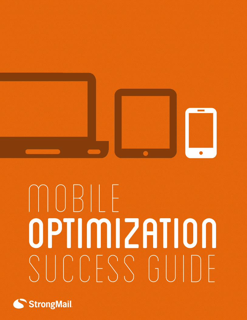
OPTIMIZATIONMOBILE
Success Guide
Copyright © 2013 StrongMail Systems, Inc. All rights reserved.
No part of the contents of this publication may be reproduced or transmitted in any form
or by any means without the written permission of StrongMail Systems, Inc.
STRONGMAIL and the STRONGMAIL logo are registered trademarks in the United States,
other countries or both. All Rights Reserved.
StrongMail Systems UK, Ltd is a company registered in England and Wales at 5 New Street
Square, London EC4A 3TW. Reg. No. 6398867. VAT # GB 925 07 6228. Trading Address:
Atlantic House, Imperial Way, Reading, RG2 OTD.
www.strongmail.com
US Headquarters UK Headquarters APAC Headquarters
StrongMail Systems, Inc. StrongMail Systems UK, Ltd XCOM Media
1300 Island Drive, Suite 200 Atlantic House Unit 1
Redwood City, CA 94065 Imperial Way 15 Lamington Street
United States Reading New Farm
P: +1 (650) 421-4200 RG2 0TD Queensland 4005
F: +1 (650) 421-4201 United Kingdom Australia
P: +44 (0) 118 903 6068 P: +61 7 3666 0544
PUBLISHED BY
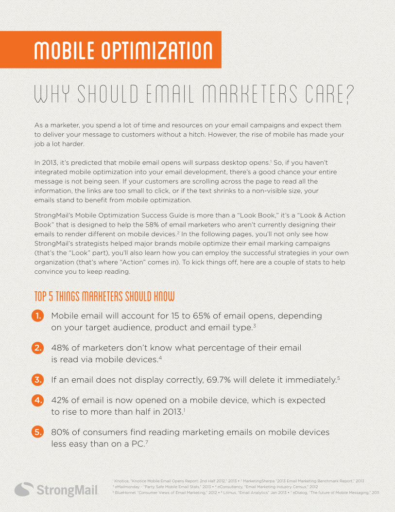
Why Should Email Marketers Care?As a marketer, you spend a lot of time and resources on your email campaigns and expect them
to deliver your message to customers without a hitch. However, the rise of mobile has made your
job a lot harder.
In 2013, it’s predicted that mobile email opens will surpass desktop opens.1 So, if you haven’t
integrated mobile optimization into your email development, there’s a good chance your entire
message is not being seen. If your customers are scrolling across the page to read all the
information, the links are too small to click, or if the text shrinks to a non-visible size, your
emails stand to benefit from mobile optimization.
StrongMail’s Mobile Optimization Success Guide is more than a “Look Book,” it’s a “Look & Action
Book” that is designed to help the 58% of email marketers who aren’t currently designing their
emails to render different on mobile devices.2 In the following pages, you’ll not only see how
StrongMail’s strategists helped major brands mobile optimize their email marking campaigns
(that’s the “Look” part), you’ll also learn how you can employ the successful strategies in your own
organization (that’s where “Action” comes in). To kick things off, here are a couple of stats to help
convince you to keep reading.
Mobile Optimization
1 Knotice, “Knotice Mobile Email Opens Report: 2nd Half 2012,” 2013 • 2 MarketingSherpa “2013 Email Marketing Benchmark Report,” 20133 eMailmonday - “Party Safe Mobile Email Stats,” 2013 • 4 eConsultancy, “Email Marketing Industry Census,” 20125 BlueHornet “Consumer Views of Email Marketing,” 2012 • 6 Litmus, ”Email Analytics” Jan 2013 • 7 eDialog, “The future of Mobile Messaging,” 2011
Top 5 Things Marketers Should Know 1. Mobile email will account for 15 to 65% of email opens, depending
on your target audience, product and email type.3
2. 48% of marketers don’t know what percentage of their email
is read via mobile devices.4
3. If an email does not display correctly, 69.7% will delete it immediately.5
4. 42% of email is now opened on a mobile device, which is expected
to rise to more than half in 2013.1
5. 80% of consumers find reading marketing emails on mobile devices
less easy than on a PC.7
MOBILE OPTIMIZATION?
Think PlatformWhile you cannot design independently for every device, you can start by designing with different
platforms in mind. For instance, a desktop user probably has more time than someone reading an
email on a smartphone.
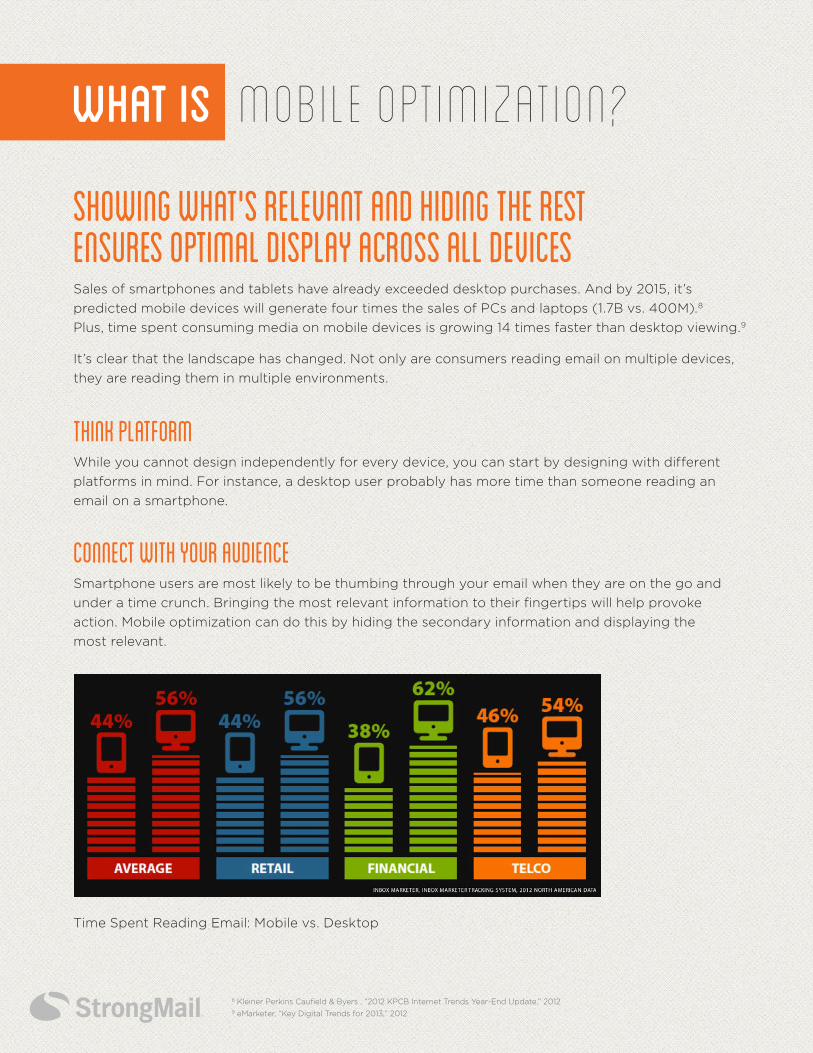
Showing What's Relevant and Hiding the Rest Ensures Optimal Display Across All Devices Sales of smartphones and tablets have already exceeded desktop purchases. And by 2015, it’s
predicted mobile devices will generate four times the sales of PCs and laptops (1.7B vs. 400M).8
Plus, time spent consuming media on mobile devices is growing 14 times faster than desktop viewing.9
It’s clear that the landscape has changed. Not only are consumers reading email on multiple devices,
they are reading them in multiple environments.
WHAT IS
CONNECT with your audienceSmartphone users are most likely to be thumbing through your email when they are on the go and
under a time crunch. Bringing the most relevant information to their fingertips will help provoke
action. Mobile optimization can do this by hiding the secondary information and displaying the
most relevant.
8 Kleiner Perkins Caufield & Byers , “2012 KPCB Internet Trends Year-End Update,” 20129 eMarketer, “Key Digital Trends for 2013,” 2012
Time Spent Reading Email: Mobile vs. Desktop
MOBILE OPTIMIZATION?
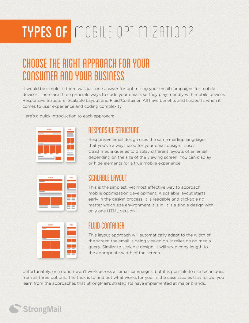
RESPONSIVE STRUCTUREResponsive email design uses the same markup languages
that you’ve always used for your email design. It uses
CSS3 media queries to display different layouts of an email
depending on the size of the viewing screen. You can display
or hide elements for a true mobile experience.
SCALABLE LAYOUTThis is the simplest, yet most effective way to approach
mobile optimization development. A scalable layout starts
early in the design process. It is readable and clickable no
matter which size environment it is in. It is a single design with
only one HTML version.
FLUID CONTAINER This layout approach will automatically adapt to the width of
the screen the email is being viewed on. It relies on no media
query. Similar to scalable design, it will wrap copy length to
the appropriate width of the screen.
Choose the Right Approach for Your Consumer and Your Business It would be simpler if there was just one answer for optimizing your email campaigns for mobile
devices. There are three principle ways to code your emails so they play friendly with mobile devices:
Responsive Structure, Scalable Layout and Fluid Container. All have benefits and tradeoffs when it
comes to user experience and coding complexity.
Here’s a quick introduction to each approach:
Unfortunately, one option won’t work across all email campaigns, but it is possible to use techniques
from all three options. The trick is to find out what works for you. In the case studies that follow, you
learn from the approaches that StrongMail’s strategists have implemented at major brands.
Types of
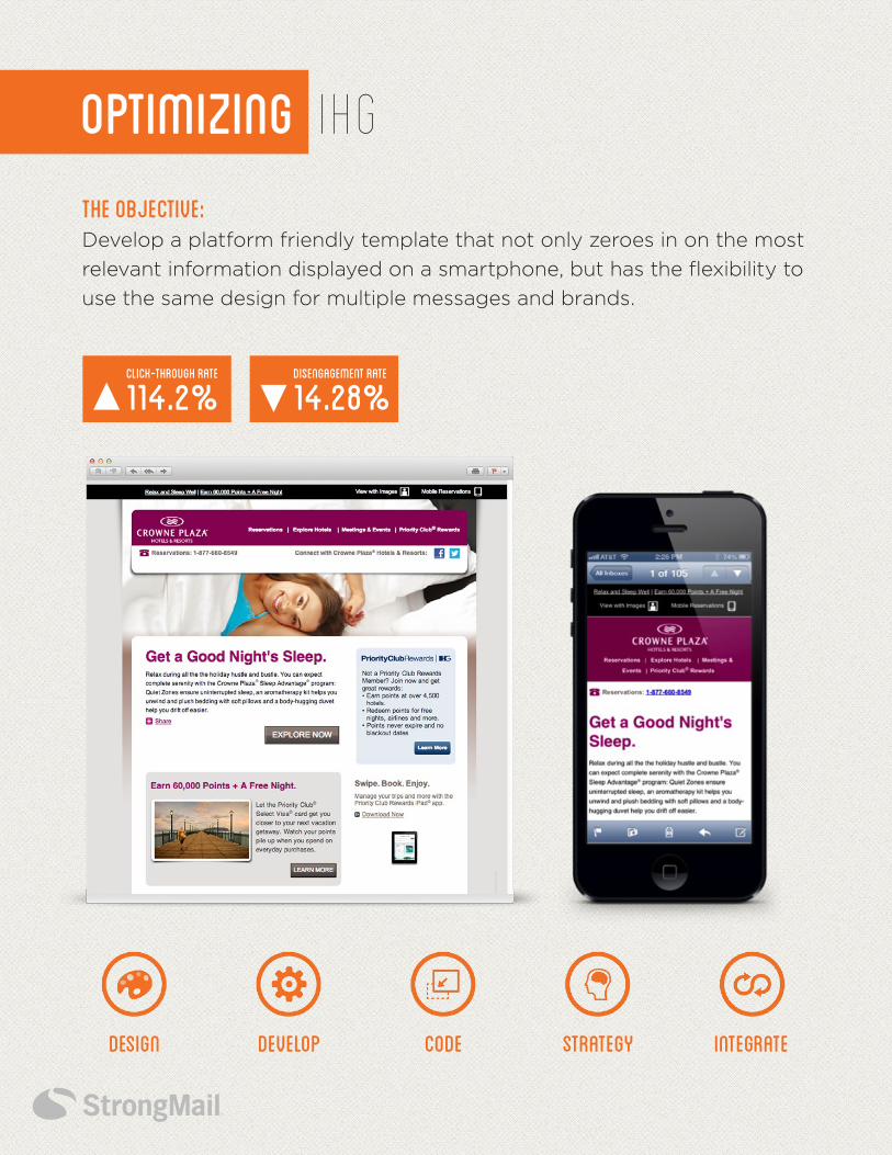
IHGOPTIMIZING
THE OBJECTIVE: Develop a platform friendly template that not only zeroes in on the most
relevant information displayed on a smartphone, but has the flexibility to
use the same design for multiple messages and brands.
DevelopDesign StrategyCode Integrate
Click-Through RATE
114.2%Disengagement RATE
14.28%
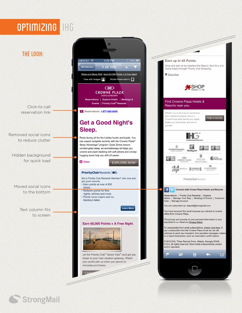
IHGOPTIMIZING
Click-to-call
reservation link
Removed social icons
to reduce clutter
Moved social icons
to the bottom
Hidden background
for quick load
Text column fits
to screen
THE Look:
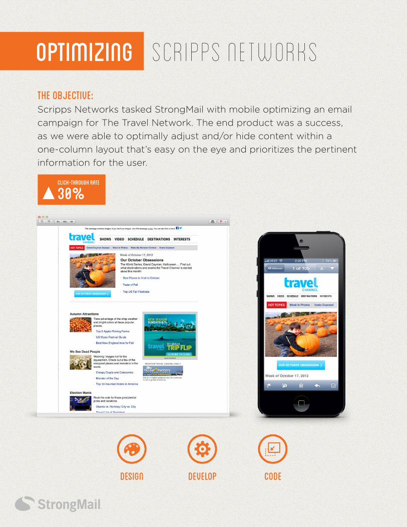
SCRIPPS NETWORKsOptimizing
The Objective: Scripps Networks tasked StrongMail with mobile optimizing an email
campaign for The Travel Network. The end product was a success,
as we were able to optimally adjust and/or hide content within a
one-column layout that’s easy on the eye and prioritizes the pertinent
information for the user.
DevelopDesign Code
Click-Through RATE
30%
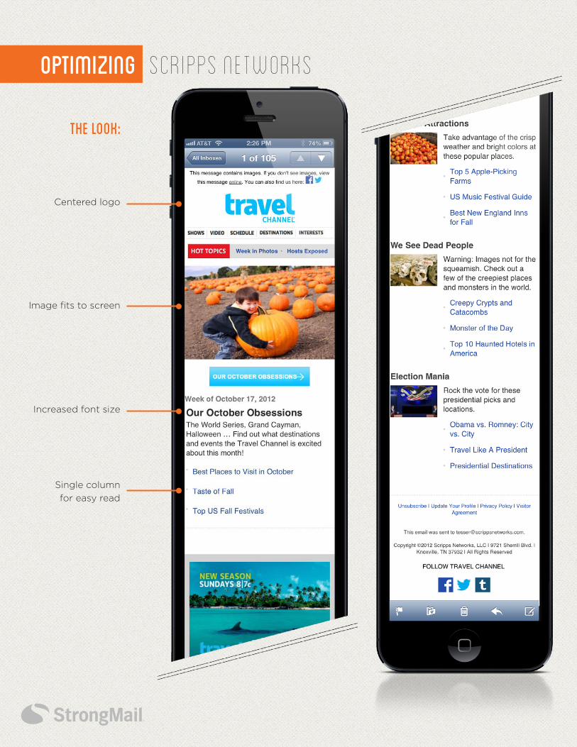
OPTIMIZING
Increased font size
Image fits to screen
Single column
for easy read
SCRIPPS NETWORKs
Centered logo
THE Look:
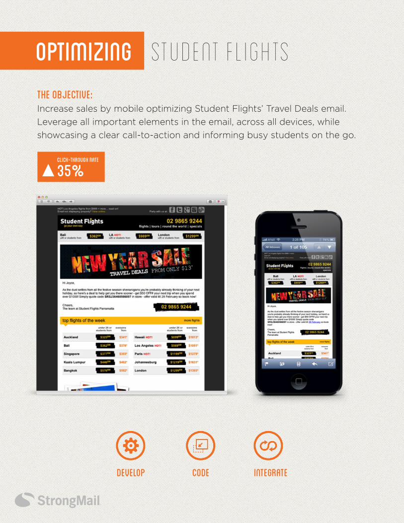
Student FlightsOptimizing
THE OBJECTIVE: Increase sales by mobile optimizing Student Flights’ Travel Deals email.
Leverage all important elements in the email, across all devices, while
showcasing a clear call-to-action and informing busy students on the go.
CODEDEVELOP Integrate
Click-Through RATE
35%
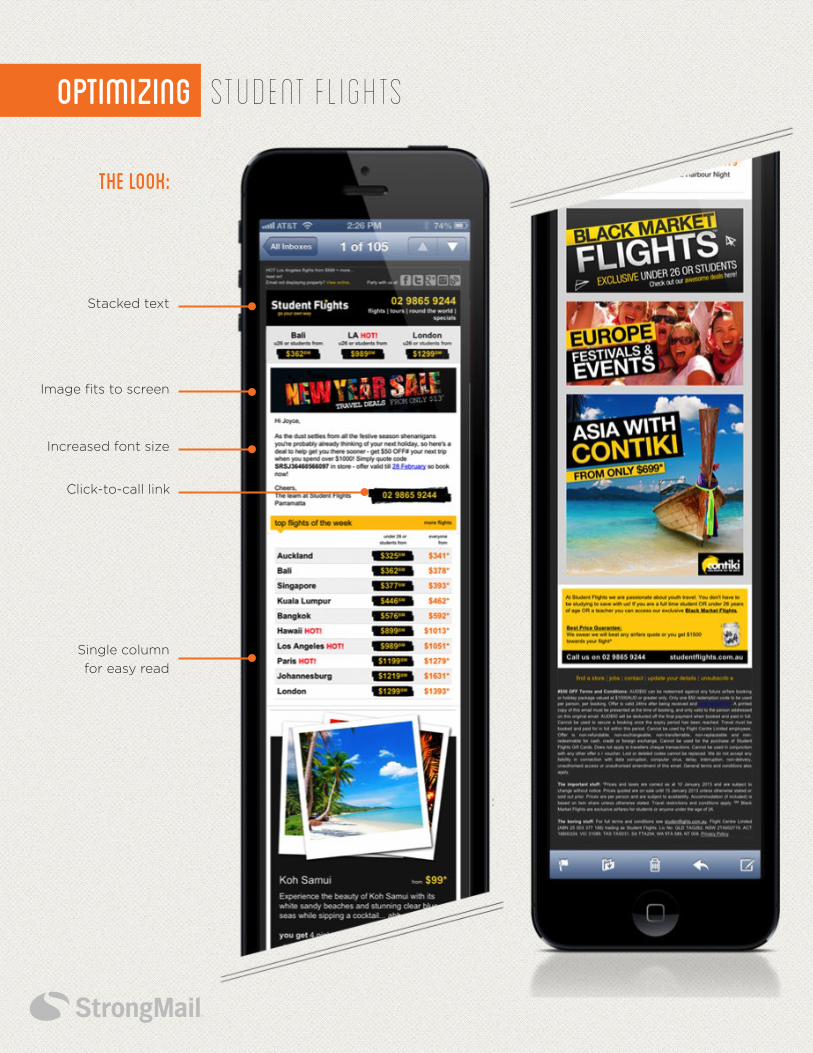
OPTIMIZING Student Flights
Click-to-call link
Increased font size
Image fits to screen
Single column
for easy read
Stacked text
THE Look:
How Well Did You Do?If you checked all of the boxes above, you are well on your way to taking advantage of mobile
optimized email. However, if you missed a few boxes or have questions about getting started,
you don’t want to wait too long before getting on the right path.
As mobile viewing of email eclipses the desktop later this year, you (and parts of your template)
don’t want to be left in the dark. At StrongMail, we helped all of the brands above take their
marketing to the next level with mobile optimized email. Our strategists understand the latest
technologies and techniques that can provide the best experience for your customers across
devices of various shapes and sizes. Talk to us today to find out how we can help you as well.
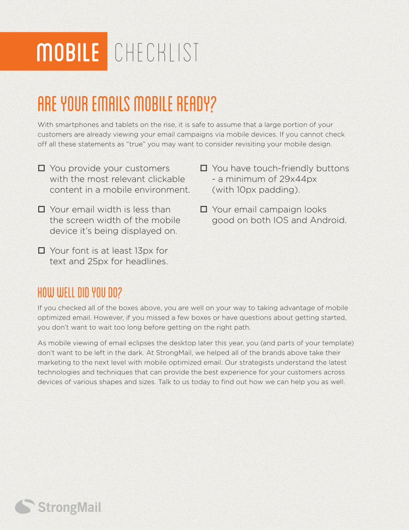
Are Your Emails Mobile Ready? With smartphones and tablets on the rise, it is safe to assume that a large portion of your
customers are already viewing your email campaigns via mobile devices. If you cannot check
off all these statements as “true” you may want to consider revisiting your mobile design.
ChecklistMOBILE
o You provide your customers with the most relevant clickable content in a mobile environment.
o Your email width is less than the screen width of the mobile device it’s being displayed on.
o Your font is at least 13px for text and 25px for headlines.
o You have touch-friendly buttons - a minimum of 29x44px (with 10px padding).
o Your email campaign looks good on both IOS and Android.
StrongMail empowers marketers to achieve their acquisition, retention and loyalty objectives
with powerful email and cross-channel marketing solutions. With StrongMail’s market-
leading solutions and services, brands can quickly, simply and effectively employ these vital
communication channels to expand both reach and revenue. StrongMail provides marketers
with the tools they need to drive more value from their marketing programs: a drag-and-drop
interface for lifecycle marketing, real-time testing and optimization, dynamic reporting and
unparalleled data access. StrongMail has a proven track record helping leading brands with
sophisticated data needs boost the performance of their marketing initiatives across email,
mobile and social channels.
StrongMailToll free U.S. +1 (800) 971-0380
Toll U.S. +1 (650) 421-4255
Toll U.K. +44 (0) 118 903 6068
StrongmailAbout
Mobile Optimization: Email Look & Action Book © 2013 StrongMail Systems, Inc. SM-DI-10313


![[US] Mobile Optimization - Jordan Koene](https://img.pdfslide.us/doc/110x75/5887e5211a28abfb678b7031/us-mobile-optimization-jordan-koene.jpg)