Embed Size (px)
Citation preview

/ @VickeKaravanVicke Cheung
How Visualising Data Helps Us See
Designing Creative Content
We create pieces of content to earn attention
for our clients

Getting coverage requires either:
1. breaking news2. new insight

We tend to focus on:
1. breaking news2. new insight

New insight meansallowing people to see
something in a new way

This is where visualising data comes in

Simplifying the complex
Visualising data provides insight by

concerthotels.com/100-years-of-rock

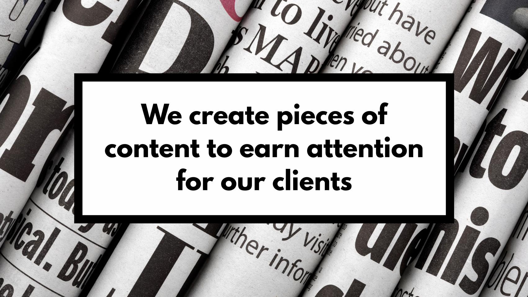
wikipedia.org

wikipedia.org

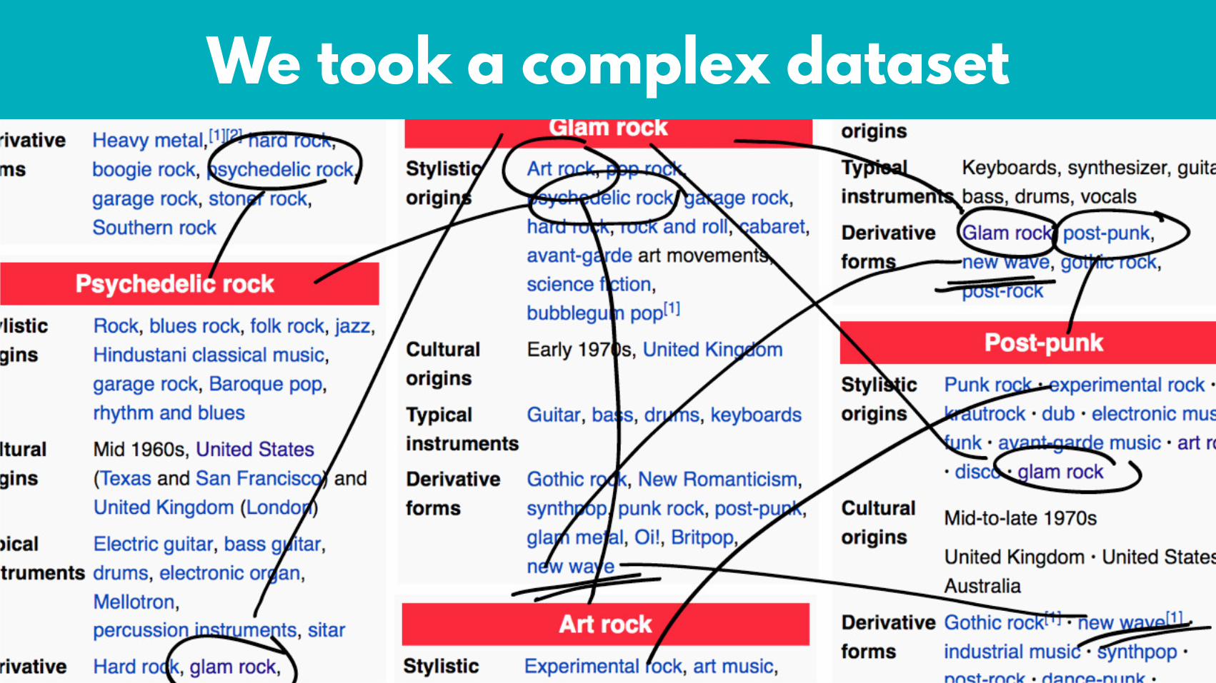
We took a complex dataset

…and simplified it
concerthotels.com/100-years-of-rock
shortlisted for_______________________________________
featured in ___________________________________________
122,708 8,366 558
Simplifying things makes it easier to consume and draw insight

Putting things into context
Visualising data provides insight by

We aren’t good at wrapping our heads around big numbers
:(

On average, there are 60 million photos uploaded
to Instagram each day

Impressive stat,but pretty meaningless by itself

Let’s make it concrete!

photoworld.com/photos-on-the-web
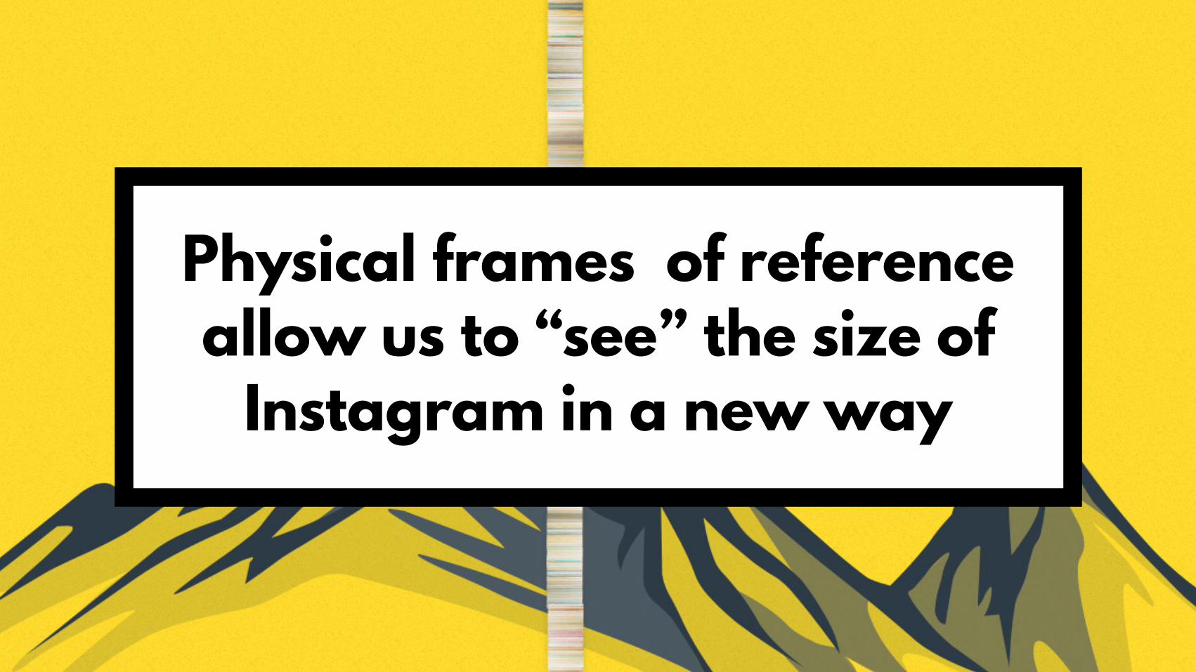
Physical frames of reference allow us to “see” the size of
Instagram in a new way

hereistoday.com
Monday 19, October
Give insight by putting things into context

Fear not:Putting things into context isn’t
about fancy animations

Simple static images can do the job just as well

bbc.co.uk/news/uk-14975549

howithappened.com

howithappened.com

Revealing patterns
Visualising data provides insight by

Can money buy happiness?

Data taken from Cabinet Office Wellbeing & Policy Report 2014

bbc.co.uk/news/magazine-26671221
The BBC wrote an article about this

This was their insight
bbc.co.uk/news/magazine-26671221

It’s hard to drawinsight from this

We wanted to domore with it

michaelpage.co.uk/minisite/salary-vs-happiness

Curve of best fit

Plotting the data and the curve allowed us to identify outliers

Outlying occupations

Outlying sectors

The interest is in the outliers, which were only identifiable
through visualisation

Another great example of revealing patterns and clusters…

nytimes.com/interactive/2011/05/03/us/20110503-osama-response.html


Visualising the data brought the hidden patterns
and relationships to light

One big caveat

Any data can bevisualised

But not all datashould be!

You need to know where you’re adding value

Wow vs. Aha

You just listened to Wikipedia!
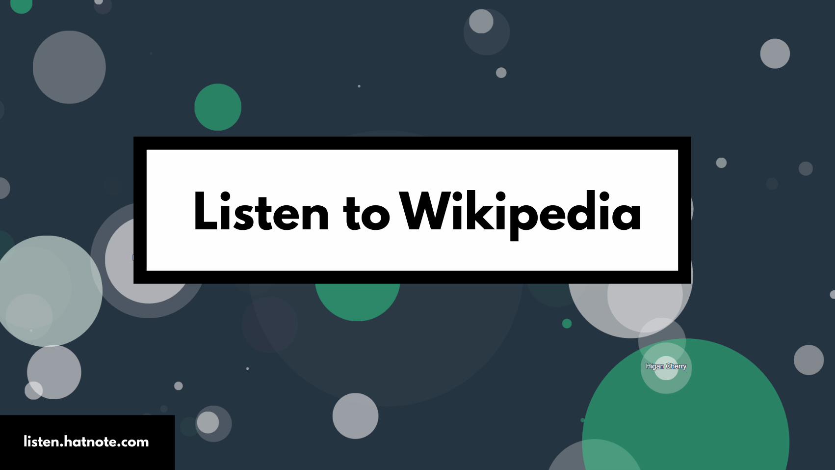
Listen to Wikipedia
listen.hatnote.com

The value is not to learn about Wikipedia

The value lies in the novelty of the execution and experience

This is “Wow”
listen.hatnote.com
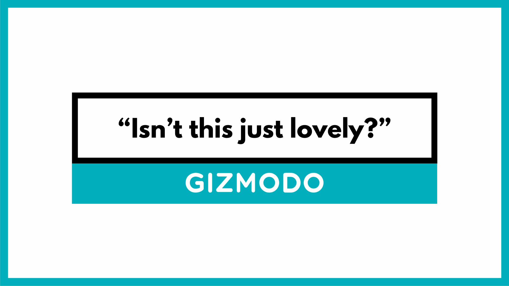
“Isn’t this just lovely?”

“Well, this is mesmerising”

shows you something you’ve literally never seen before
Wow

Moving on to“Aha”
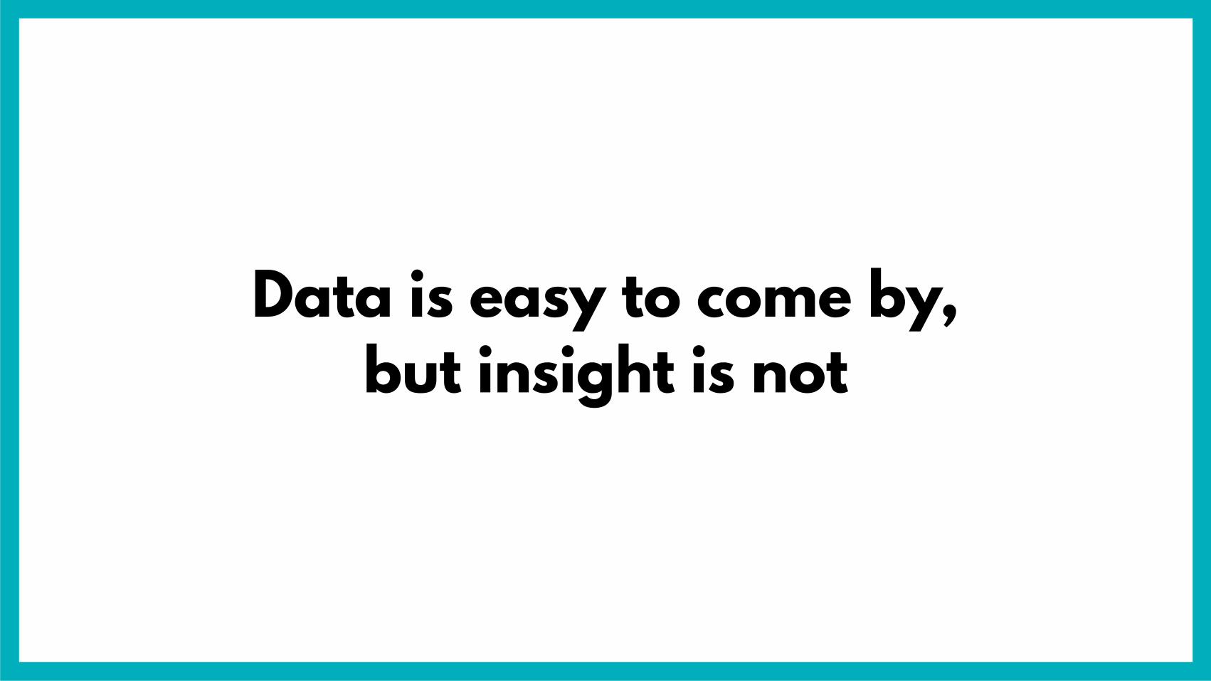
Data is easy to come by,but insight is not

priceonomics.com/the-hipster-music-index

It shares insight by applying a new meaning
to the two sets of data

huffingtonpost.com/benjamin-moore/overrated-underrated-movies_b_5319488.html

huffingtonpost.com/benjamin-moore/overrated-underrated-movies_b_5319488.html
overrated

huffingtonpost.com/benjamin-moore/overrated-underrated-movies_b_5319488.html
underrated

It’s about what they mean,not how they look

This is “Aha”

shows you something in a new light
Aha

“Wow” and “Aha” are not often as clear-cut

The Wow & Aha Spectrum
Wow Aha

Listen to Wikipedia
The Wow & Aha Spectrum
Wow Aha

Hipster Music IndexListen to Wikipedia
The Wow & Aha Spectrum
Wow Aha

100 Years of Rock
Listen to Wikipedia Hipster Music Index
The Wow & Aha Spectrum
Wow Aha

If you printed all the Instagram photos…
Listen to Wikipedia Hipster Music Index
100 Years of Rock
The Wow & Aha Spectrum
Wow Aha

Listen to Wikipedia Hipster Music Index
100 Years of Rock
If you printed all the Instagram photos…
Happiness vs.Salary
The Wow & Aha Spectrum
Wow Aha

Listen to Wikipedia Hipster Music Index
100 Years of Rock
If you printed all the Instagram photos…
Happiness vs.Salary
The Wow & Aha Spectrum
Wow Aha

Regardless of what value you choose to offer

Don’t make your audiencework for it

findproperly.co.uk/tube-map.php

Where’s the data?

Oh, didn’t even see that…
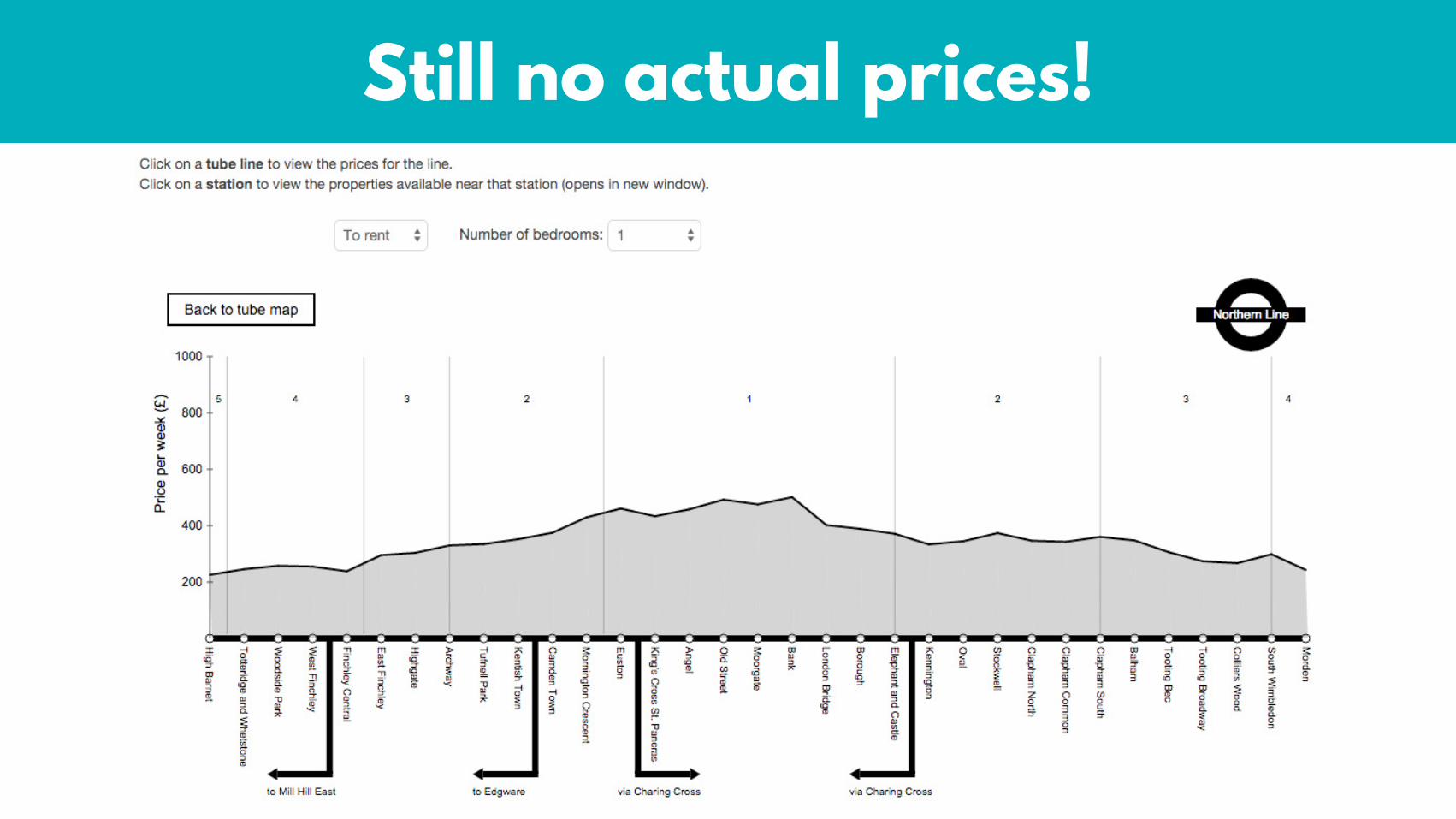
Still no actual prices!

…until you hover again

Don’t make your audience work!

thrillist.com/lifestyle/london/london-underground-rent-map
Thrillist made their own version

It’s a big hit

It succeeded wherethe other failed

Unnecessary friction
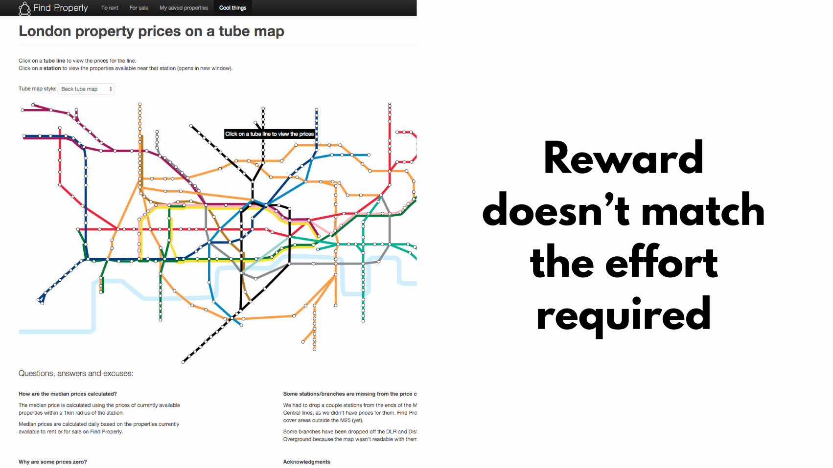
Reward doesn’t match
the effort required

Tried to do too much:
option-overload

Overcooked execution

Allows for quick scanning and
locatingdata points of interest

No learning curve

Reward surpasses
effort required

Simple and intuitive

It can be tempting to try to do too much at once

What’s the one thing you want to show?

Gender pay gap

V1.

V1.
Not showing theone thing we want it to

V2.

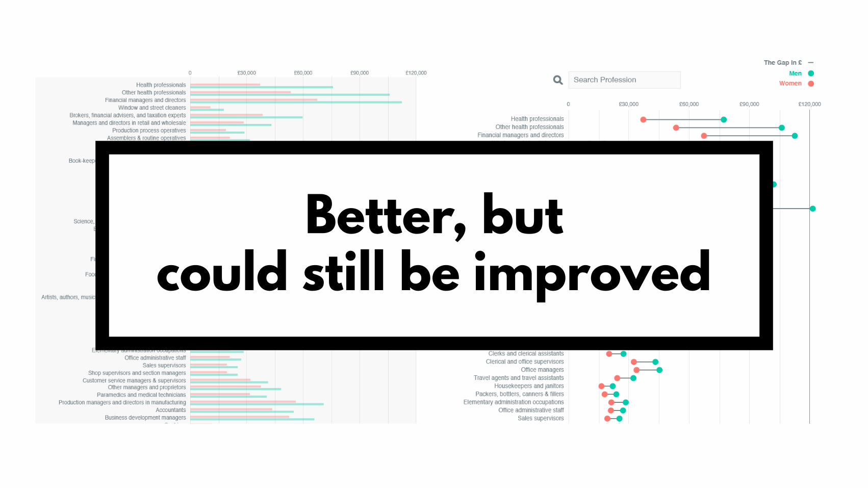
Better, but could still be improved


Pay gap made more obvious

Introduced visual metaphor

Ask yourself:What’s the one thing I
want to show?

And follow up with:Am I really showing this?

Sometimes you need to show people how to see it

“The annotation layer is the most important thing we do…
otherwise it’s a case of here it is, you go figure it out”
Amanda Cox, NYT Graphics Editor

Annotation layer=
labels, introductions, explanatory text, captions

Surely the visualisation itself is more important
than the annotationsanonymous sceptic


Indecipherable without annotations

nytimes.com/interactive/2014/06/05/upshot/how-the-recession-reshaped-the-economy-in-255-charts.html?_r=0

Annotations can help you deliver insight without making
your audience work for it

Recap

The value in visual content is in helping people see things they
couldn’t previously see by…

Simplifying the complex

Putting things in context

Revealing patterns

Know where you’re adding value
Listen to Wikipedia Hipster Music Index
100 Years of Rock
If you printed all the Instagram photos…
Happiness vs.Salary
Wow Aha
Don’t make youraudience do the work
That’s your job!
But above all else…