Embed Size (px)
Citation preview
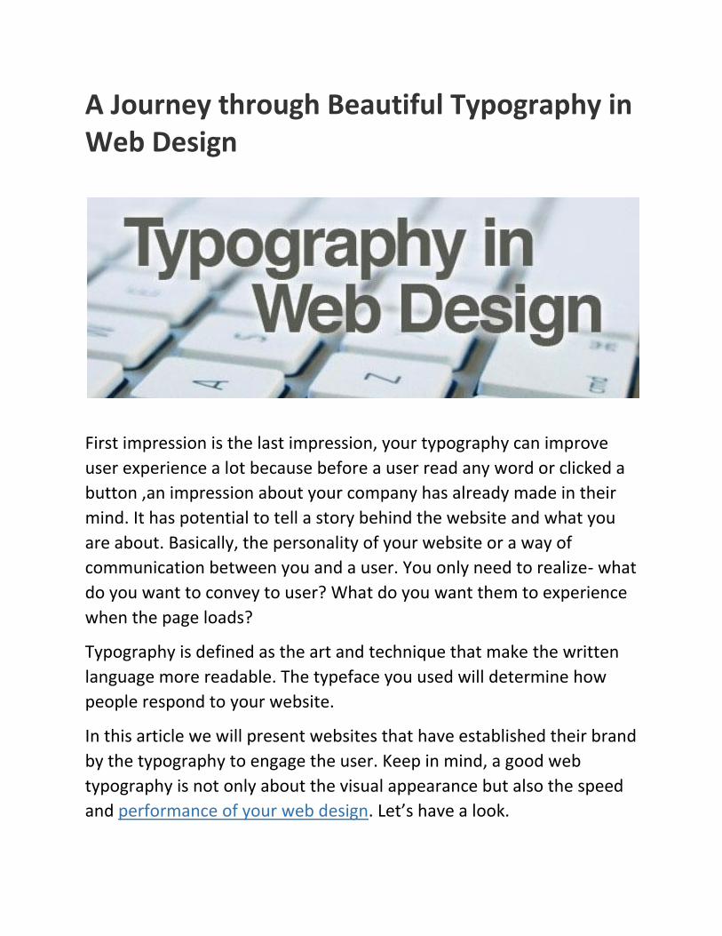
A Journey through Beautiful Typography in Web Design
First impression is the last impression, your typography can improve
user experience a lot because before a user read any word or clicked a
button ,an impression about your company has already made in their
mind. It has potential to tell a story behind the website and what you
are about. Basically, the personality of your website or a way of
communication between you and a user. You only need to realize- what
do you want to convey to user? What do you want them to experience
when the page loads?
Typography is defined as the art and technique that make the written
language more readable. The typeface you used will determine how
people respond to your website.
In this article we will present websites that have established their brand
by the typography to engage the user. Keep in mind, a good web
typography is not only about the visual appearance but also the speed
and performance of your web design. Let’s have a look.
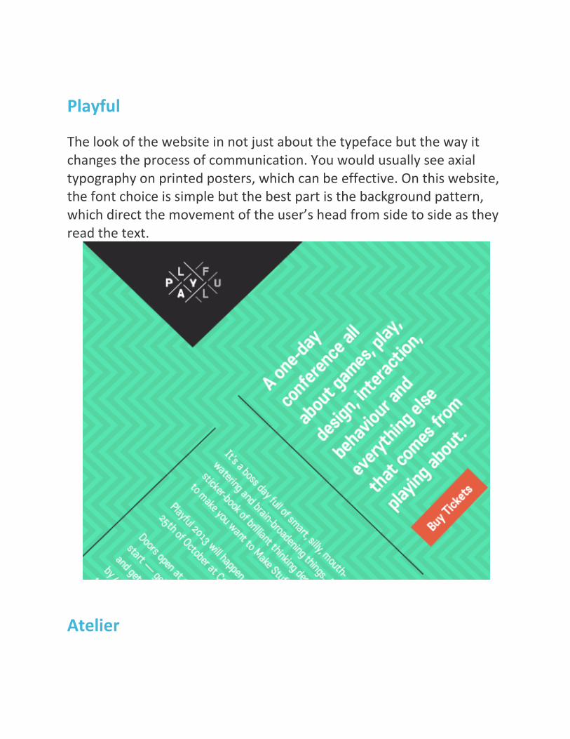
Playful
The look of the website in not just about the typeface but the way it changes the process of communication. You would usually see axial typography on printed posters, which can be effective. On this website, the font choice is simple but the best part is the background pattern, which direct the movement of the user’s head from side to side as they read the text.
Atelier

The website gives a dynamic feel, created by the different elements on it. The name Atelier” means “a workshop or a studio” and it is in a bold, aggressive yet elegant typeface, setting the tone for the design. The rhythm for the website established by the diagonal lines and the running slideshows grabs your attention. However, the main background image is large 2560 x 5330 pixel, central graphic which is 2.4MB in size.
Cirq The website is in the old-style design yet looks modern and updated. The website is for a vineyard and hence lived up to its vintage feel with new Technology for graphics. It is interesting to see how the shadow behind “Russian River” moves with your mouse and the text is
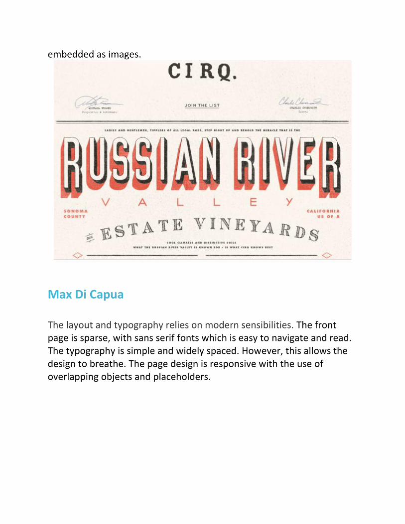
embedded as images.
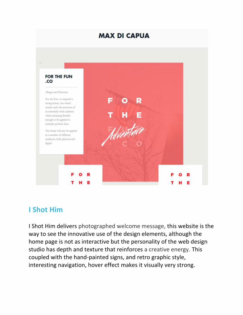
Max Di Capua The layout and typography relies on modern sensibilities. The front page is sparse, with sans serif fonts which is easy to navigate and read. The typography is simple and widely spaced. However, this allows the design to breathe. The page design is responsive with the use of overlapping objects and placeholders.
I Shot Him I Shot Him delivers photographed welcome message, this website is the way to see the innovative use of the design elements, although the home page is not as interactive but the personality of the web design studio has depth and texture that reinforces a creative energy. This coupled with the hand-painted signs, and retro graphic style, interesting navigation, hover effect makes it visually very strong.

Rijksmuseum This site render the beautiful photographs of the museum’s contents .The name Rijksmuseum seem larger than life and rich in typography. The main categories are interesting with their unique innovative design. The page size is less than 1MB, and is well optimized.

Conclusion
The journey is not about what you want to say but how you say it. Depending on your objectives, you can experiment more and get creative with these different typefaces. We can be playful with the large letters, or get quirky and unique with handwritten type. Keep in mind, choose a typeface which is readable because there’s no use in showing off type that no one can read. Type can improve your whole deigning experience when sets rhythm and creates an atmosphere. It’s easy to attract your targeted users with large Retina-ready background images. But speed and performance of a website are also very important factor as Custom Web fonts can slow down loading times, finally, if you’d like to explore more interesting websites with a heavy focus on typography iMediaDesigns is a full-service web design and development digital agency that helps brand create unique identity and successful marketing campaigns.