Embed Size (px)
Citation preview

Atlanta Regional CommissionFor more information, contact:
Public Health in Metro Atlanta: Exploring How Healthy Our Neighborhoods Are
Public Health issues are often reflective of the social and economic state of a community and can say a lot about its overall wellbeing. In this Snapshot, we will explore public health issues and trends in the region’s neighborhoods and the Metro area as a whole.
Specifically, we analyze data about:
• Mortality (i.e. how long people live), from OASIS (GA Dept. of Public Health).
• Morbidity (i.e. how healthy people feel), from OASIS (GA Dept. of Public Health).
• 2015 County Health Rankings, which include the above plus more.
• Demographics from Neighborhood Nexus.
Measuring Public Health

• Based on Years of Potential Life Lost (YPLL), public health generally seems to be improving in most counties over the past decade or so. There are some notable exceptions, though.
• The latest County Health Rankings also show that health is generally improving across metro Atlanta, but again, there are some notable exceptions in mostly the same places.
• We also took a quick look into the state of cardiovascular disease, as it is the number one public health threat in the U.S. It is also on the decline in metro Atlanta.
A Closer Look at Public Health in Metro Atlanta
• There are some areas that haven’t seen the same levels of overall improvement. Low Birthweight Births and Diabetes are outliers in the general improvement of public health in the Atlanta area.
• Place matters. As suspected, there seems to be a common denominator among the increasing public health threats in Atlanta. Years of Potential Life Lost, Diabetes and Low Birthweight all are correlated with where poverty levels are highest in metro Atlanta.
• Race Matters. Race also appears to be a common denominator among the increasing health threats in Metro Atlanta. Both Low Birthweight Rates and Diabetes discharges are also correlated with race.
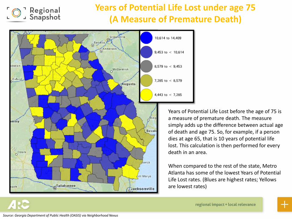
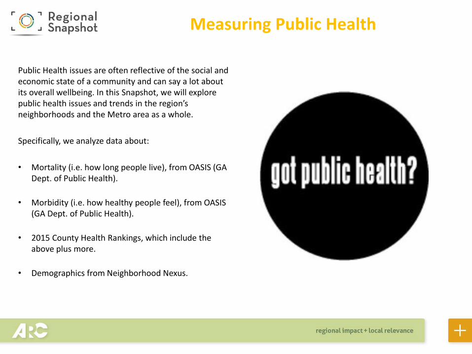
Years of Potential Life Lost under age 75 (A Measure of Premature Death)
Years of Potential Life Lost before the age of 75 is a measure of premature death. The measure simply adds up the difference between actual age of death and age 75. So, for example, if a person dies at age 65, that is 10 years of potential life lost. This calculation is then performed for every death in an area.
When compared to the rest of the state, Metro Atlanta has some of the lowest Years of Potential Life Lost rates. (Blues are highest rates; Yellows are lowest rates)
Source: Georgia Department of Public Health (OASIS) via Neighborhood Nexus
The chart illustrates an improving trend in metro Atlanta. Here we are comparing the number of years of potential life lost before the age of 75 (YPLL) between 2000-2002 to 2011-2013. The chart shows that YPLL has decreased significantly in every county, with the exception of Spalding and Walton. But, as the chart shows, the increases in these two counties are very small. Still, Spalding does have the highest levels of premature death in the 20-county region.
Years of Potential Life Lost under age 75 (A Measure of Premature Death)
Source: Georgia Department of Public Health (OASIS)
0.00
2,000.00
4,000.00
6,000.00
8,000.00
10,000.00
12,000.00
TPLL 2000-2002 TPLL 2011-2013YPLL, 2000-2002 YPLL, 2011-2013
Total Years of Potential Life Lost

Place matters. While YPLL is on the decline as a whole, there are several neighborhoods that still have high levels of premature death. Here we compare poverty rates (map on the left) to YPLL (map on the right). There are clusters of neighborhoods that stand out when comparing the two maps. South DeKalb and Fulton, North Clayton, and outer counties like Bartow, Hall, Carroll all have high levels of poverty and premature deaths.
Number of Years of Potential Life Lost before 75 years of age, 2009-2013
Percent of Population in Poverty, 2009-2013
Source: Georgia Department of Public Health (OASIS), ACS- 2009-2013 via Neighborhood Nexus
People in Poverty and Years of Potential Life Lost
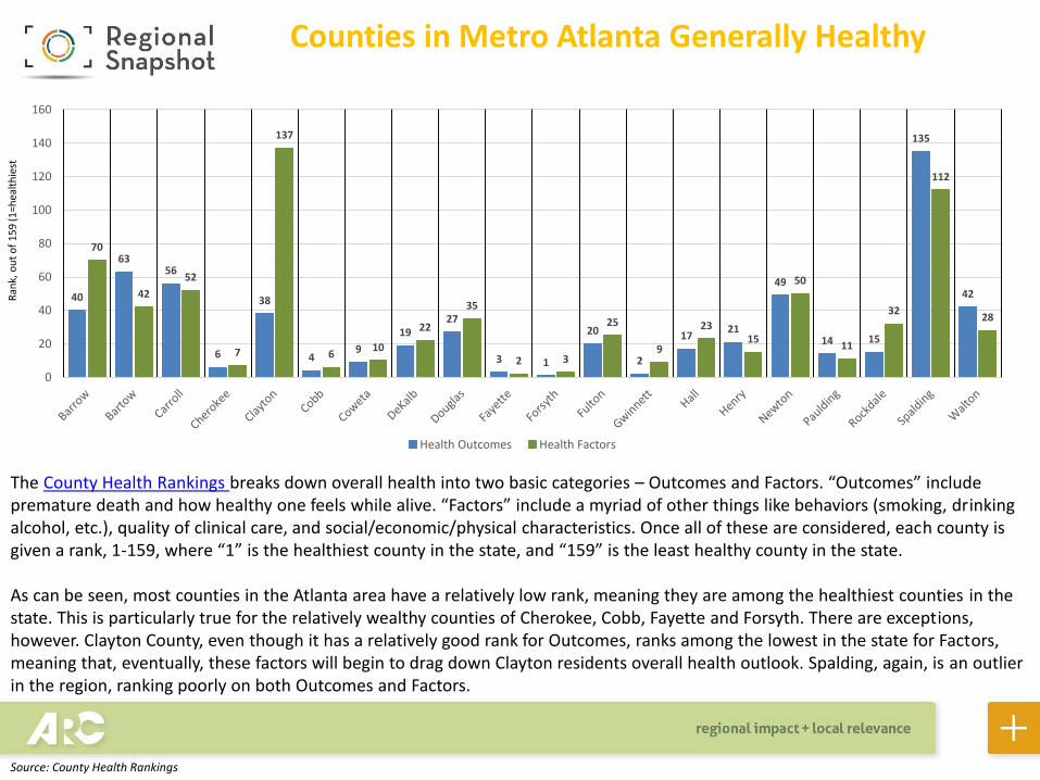
The County Health Rankings breaks down overall health into two basic categories – Outcomes and Factors. “Outcomes” include premature death and how healthy one feels while alive. “Factors” include a myriad of other things like behaviors (smoking, drinking alcohol, etc.), quality of clinical care, and social/economic/physical characteristics. Once all of these are considered, each county is given a rank, 1-159, where “1” is the healthiest county in the state, and “159” is the least healthy county in the state.
As can be seen, most counties in the Atlanta area have a relatively low rank, meaning they are among the healthiest counties in the state. This is particularly true for the relatively wealthy counties of Cherokee, Cobb, Fayette and Forsyth. There are exceptions, however. Clayton County, even though it has a relatively good rank for Outcomes, ranks among the lowest in the state for Factors, meaning that, eventually, these factors will begin to drag down Clayton residents overall health outlook. Spalding, again, is an outlier in the region, ranking poorly on both Outcomes and Factors.
Counties in Metro Atlanta Generally Healthy
Source: County Health Rankings
40
6356
6
38
49
1927
3 1
20
2
1721
49
14 15
135
42
70
42
52
7
137
610
22
35
2 3
25
9
2315
50
11
32
112
28
0
20
40
60
80
100
120
140
160
Health Outcomes Health Factors
Ran
k, o
ut
of
15
9 (1
=hea
lth
iest

Factors Outcomes
Metro Atlanta is a healthy place when compared to the rest of the state, and especially the southern half. However, in the Factors map, Spalding and Clayton counties stand out as poorly ranked counties within the metro area with rankings of 137 and 112 respectively.
How Metro Atlanta Compares
Source: 2015 County Health Rankings via Neighborhood Nexus

Cardiovascular Disease in Georgia
One of the biggest NATIONAL public health threats is cardiovascular disease. This map shows how this disease is distributed throughout the state, with blues representing the highest rates, and yellows representing the lowest.
As illustrated in the map, Metro Atlanta has the lowest cardiovascular rates when compared to the state as a whole, with Spalding, again, being a notable exception.
Discharge rate, per 100,000, Major Cardiovascular Diseases, (deduplicated), 2011-2013
Source: Georgia Department of Public Health (OASIS) via Neighborhood Nexus
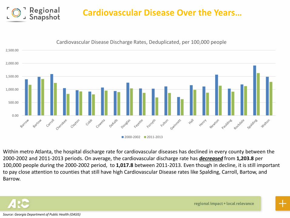
Cardiovascular Disease Over the Years…
Within metro Atlanta, the hospital discharge rate for cardiovascular diseases has declined in every county between the 2000-2002 and 2011-2013 periods. On average, the cardiovascular discharge rate has decreased from 1,203.8 per 100,000 people during the 2000-2002 period, to 1,017.8 between 2011-2013. Even though in decline, it is still important to pay close attention to counties that still have high Cardiovascular Disease rates like Spalding, Carroll, Bartow, and Barrow.
0.00
500.00
1,000.00
1,500.00
2,000.00
2,500.00
Cardiovascular Disease Discharge Rates, Deduplicated, per 100,000 people
2000-2002 2011-2013
Source: Georgia Department of Public Health (OASIS)

Overall Health Improving, Except for…
As previously discussed, overall health is improving in metro Atlanta. However, unlike the cardiovascular-related diseases, hospital discharges for diabetes are increasing in many counties. Fifteen out of the 20 counties have higher discharge rates for diabetes today (2011-2013) than in the 2000-2002 period. As a whole, metro Atlanta has gone from an average discharge rate of 108.7 per 100,000 people from 2000-2002 to 119.54 from 2011-2013. Clayton has seen an increase of 59.9 discharges per 100,000, the highest increase in metro Atlanta. Diabetes is related to nutrition, so this increase could be due to less-healthy diets or increasingly limited access to healthy foods.
0
50
100
150
200
250
Diabetes: Discharge Rate per 100,000 Population
Discharge rate, per 100,000, for diabetes, deduplicated, 2000-2002 Discharge rate, per 100,000 for diabetes, deduplicated , 2011-2013
Source: Georgia Department of Public Health (OASIS)
0
10
20
30
40
50
60
70
Diabetes Discharge Rates for Children <18 years of Age (per 100,000 population <18)
DISCHARGE RATE, 2000-2002 DISCHARGE RATE, 2011-2013
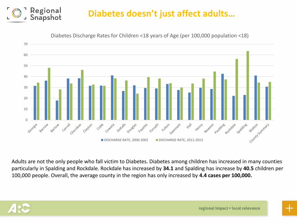
Diabetes doesn’t just affect adults…
Adults are not the only people who fall victim to Diabetes. Diabetes among children has increased in many counties particularly in Spalding and Rockdale. Rockdale has increased by 34.1 and Spalding has increase by 40.5 children per 100,000 people. Overall, the average county in the region has only increased by 4.4 cases per 100,000.

Like YPLL, these maps explore the relationship between diabetes and poverty. The distribution of diabetes (discharge rate) between 2009-2013 looks similar to the distribution of poverty in metro Atlanta. The highest rate of diabetes discharge rates are found in southern DeKalb and Fulton and most of Clayton county. These rates reflect the highest rates of poverty in the core of Metro Atlanta.
Percent of Population in Poverty, 2009-2013Diabetes Discharge Rates, per 100,000, 2009-2013
Source: Georgia Department of Public Health (OASIS) & Neighborhood Nexus, ACS-2009-2013
Diabetes is Also Related to Income…
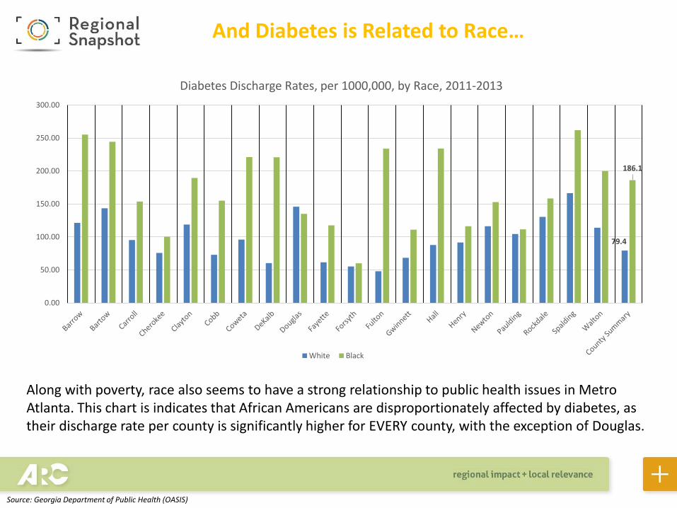
Along with poverty, race also seems to have a strong relationship to public health issues in Metro Atlanta. This chart is indicates that African Americans are disproportionately affected by diabetes, as their discharge rate per county is significantly higher for EVERY county, with the exception of Douglas.
79.4
186.1
0.00
50.00
100.00
150.00
200.00
250.00
300.00
Diabetes Discharge Rates, per 1000,000, by Race, 2011-2013
White Black
Source: Georgia Department of Public Health (OASIS)
And Diabetes is Related to Race…

Overall Birth Rates are on the Decline…
0
10
20
30
40
50
60
70
Birth Rate, 2000-2002 BIRTH RATE, 2010-2012
Source: Georgia Department of Public Health (OASIS)
Changing course a bit, here we explore maternal health and find that, overall, birth rates are declining in every county in the Atlanta region.
Births per 1,000 women age 10-55
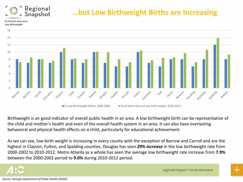
…but Low Birthweight Births are Increasing
Birthweight is an good indicator of overall public health in an area. A low birthweight birth can be representative of the child and mother’s health and even of the overall health system in an area. It can also have everlasting behavioral and physical health effects on a child, particularly for educational achievement.
As we can see, low birth weight is increasing in every county with the exception of Barrow and Carroll and are the highest in Clayton, Fulton, and Spalding counties. Douglas has seen 29% increase in the low birthweight rate from 2000-2002 to 2010-2012. Metro Atlanta as a whole has seen the average low birthweight rate increase from 7.9% between the 2000-2002 period to 9.0% during 2010-2012 period.
0
2
4
6
8
10
12
14
16
% Low Birthweight Births, 2000-2002 % all births that are low birth weight, 2010-2012
Source: Georgia Department of Public Health (OASIS)
% of births that were Low Birthweight
Low Birthweight Births <2,500 grams Per 100,000 2008-2012
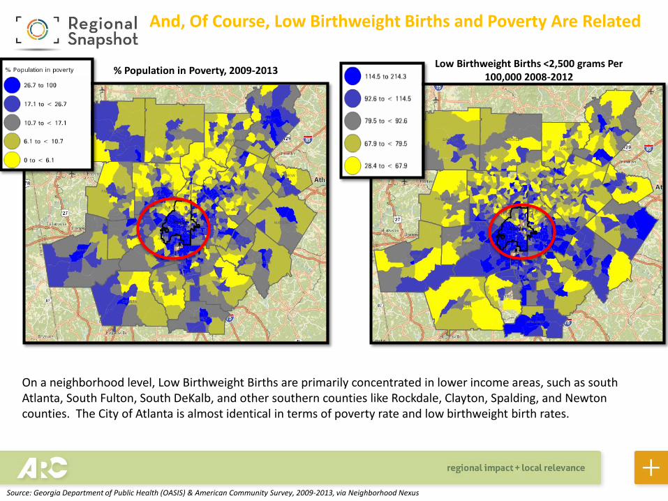
On a neighborhood level, Low Birthweight Births are primarily concentrated in lower income areas, such as south Atlanta, South Fulton, South DeKalb, and other southern counties like Rockdale, Clayton, Spalding, and Newton counties. The City of Atlanta is almost identical in terms of poverty rate and low birthweight birth rates.
% Population in Poverty, 2009-2013
And, Of Course, Low Birthweight Births and Poverty Are Related
Source: Georgia Department of Public Health (OASIS) & American Community Survey, 2009-2013, via Neighborhood Nexus

Low Birthweight Birth rates tell a similar story. As the chart indicates, the disparity between black and white low birthweight babies is significant in EVERY county. Overall, there is about a 5.7 percentage point difference in the Atlanta region between White births and Black births.
7.1
12.8
0
5
10
15
20
25
Low Birthweight Birth Rates According to Race, 2010-2012
White Black
Source: Georgia Department of Public Health (OASIS)
And Low Birthweight Births are also Related to Race…