Embed Size (px)
Citation preview
Music Magazine Contents Page Analysis
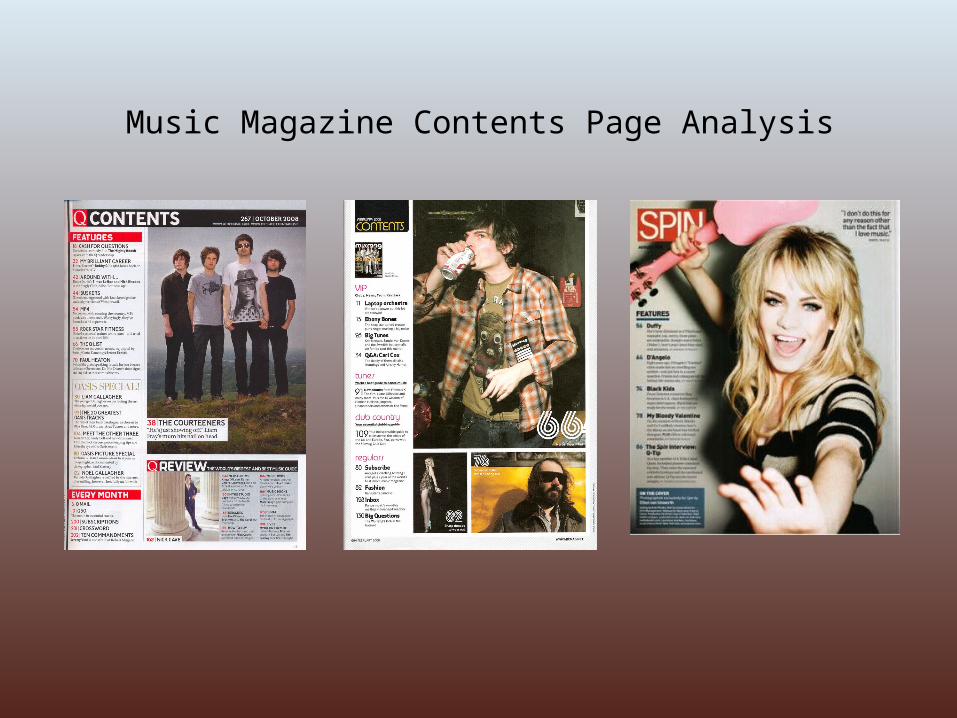
I don’t like this contents page much because I think it looks too thrown together and not thought about, especially the main picture. I don’t think the overall style fits in with the magazine’s house style of being a fun, energetic dance music magazine – the pictures are quite boring and not enough colour is used anywhere on the page. Also, looking at this magazine on the shelf, I wouldn’t think there is much inside to read or look at. I think the overall look is amateur.
The contents page has kept with the house style in that they have carried on using a sans serif font to show their fun style, and a bubbly, unusual font for page numbers of the pictures.
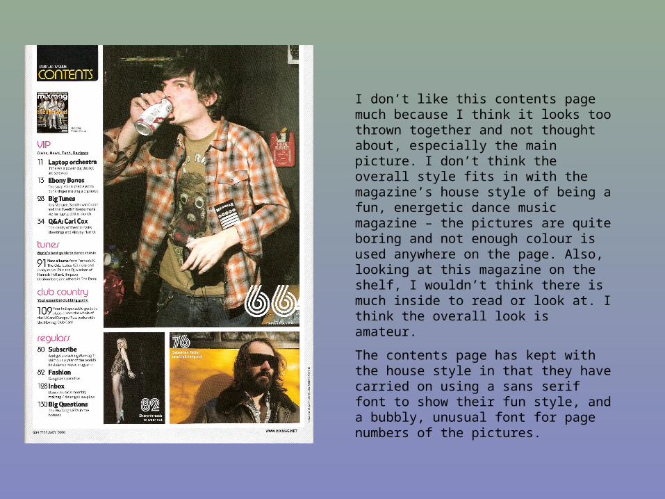
I think this contents page from Q magazine has kept it’s house style better than the previous magazine. They look as though they have thought more about the images they’ve used and this makes them look more professional. They’ve used pull quotes here too, to draw the reader in to the main article – making this stand out by putting it on the main image.
The whole page looks quite pulled together and professional and is easy to understand. They’ve used a combination of sans serif and serif fonts.
They’ve used a different colour for the page numbers and the article titles are in bold to make the page more legible. To keep things simple and easy to understand they’ve used three main colours for the page, also fitting in with the house style – black, red and white.
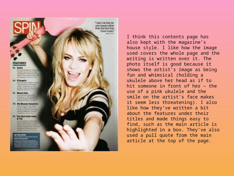
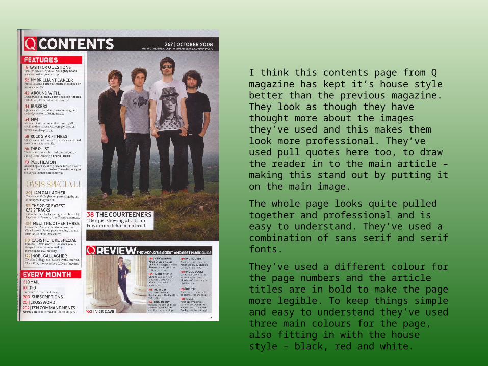
I think this contents page has also kept with the magazine’s house style. I like how the image used covers the whole page and the writing is written over it. The photo itself is good because it shows the artist’s image as being fun and whimsical (holding a ukulele above her head as if to hit someone in front of her – the use of a pink ukulele and the smile on the artist’s face makes it seem less threatening). I also like how they’ve written a bit about the features under their titles and made things easy to find, such as the main article is highlighted in a box. They’ve also used a pull quote from the main article at the top of the page.