Embed Size (px)
Citation preview

Q1. In what ways does your media product use, develop and challenge
forms and conventions of real media products?

How I used and developed forms and conventions
I used forms and conventions by using a masthead and placing it at the top of the cover. I made the text bold and red so that it stands out – getting inspiration from Q where the letter ‘Q’ is in a red box at the left top of the page. I stuck to the conventions of music magazines by having the masthead at the top of the page. By having it at the top of the page it means that the reader’s eyes are drawn to it, as it is easily seen.
Inspired by Q’s bold theme of red, black and white I used red for the text and a black drop shadow. The reason I didn’t use white in my masthead was because the background of my image was light so it wouldn’t stand out.
I used inspiration from ‘Rolling Stone’ by having the image of the featuring artist overlap the masthead. However, I didn’t have any of the letter’s fully covered by the overlap of the image as, obviously ‘Rolling Stone’ is a well known magazine and I didn’t want any uncertainty of the name of mine.

I was conventional when I did the headline for my cover, as the font I used was bold and fits with the theme of the magazine. The font is large so that a lot of the focus is on the headline as it is an important form of my cover. I took inspiration form Q as they used a sub headline in their cover with Muse which makes it more interesting for the readers and would make them want to read on. I also had the headline half way down the page underneath Jackie’s face which is also seen in the cover featuring Muse. I knew that Q were successful with this cover so I decided to do mine in a similar style.
Headline and sub headline

The photo that I took sticks to the conventions of a magazine as she maintains eye contact with the camera which draws attention because it appears she is looking directly at you. I placed the photo so that she is the center of the page meaning that she would be the main focus, this is conventional. The type of photo is also conventional as it is a mid shot, meaning she isn’t too close or too far away. I used dark eye shadow on her eyes to emphasize her her bold style, similar to what was seen in Cheryl Cole’s cover for Q.
Image
I used the convention of a pull quote on my cover. This pull quote is taken from the article later on in the magazine. Using a pull quote draws readers into the magazine because it will make them want to read the whole article (if the quote chosen is interesting) I decided to use the quote that I did because it doesn’t give much away but it makes you want to know what it was about. It’s also conventional as it is down the right side of the cover, which is where pull quotes are usually found.
Pull quote

For my cover lines I used two different sizes of font and colour. The names of the artists are in a bigger font and are red which draws attention to it, whereas the other text is smaller and black so that it doesn’t steal the attention away from the artists. The reason I did this was so fans of these artists would be more likely to buy the magazine. I placed the coverlines on the left side of the cover. They will be easily spotted – having them on the left side – as your eyes automatically go to the left side of the page. I also have one coverline on the right side, which is underneath the masthead. I have used the same idea of having the most interesting phrase in a bigger font which is red.
Cover lines

The strapline I have placed at the bottom of the page. It doesn’t particularly catch your eyes when you first look at it because it isn’t vibrant and it doesn’t have anything to make it stand out, but this is what I aimed for as this gives a little more detail about what readers should expect to see inside therefore should not draw too much attention at a first glance. I have purposely not given much information so that readers have to look inside the magazine. I was inspired by NME to have the strapline at the bottom as it fills up the cover – giving a busy look which is what I was going for.
Strapline
I have included a barcode on my cover as it is expected to be seen on a real magazine in order for it to be able to be bought. I had it horizontal along the right side of the magazine as it is commonly seen here on magazines as it is easily seen.


The title for my contents page is conventional as it is large and it is placed at the top and centre of the page. The text is all in capital letters so that it stands out more, as the title should be (besides any images) the most noticeable part. I have used the same font as I used on my cover to keep the same theme running through my magazine and to make all the pages link together. I have also stuck with the colour scheme of using red text.
Title

ImagesThis is the photo that I used for the main image of my contents page. I wanted to use a photo of Jackie (the ‘artist’ being featured in my magazine) for the main image as I wanted to make the readers really interested in what her article is. This mid shot shows her more edgy style through the facial expression she is pulling – and also by the way her hair is surrounding her head. It appears that she is shouting in the photograph. Having her wear a leather jacket also helps her edginess be expressed. I placed this image on the right side of the page so that as readers quickly flicked through the first couple of pages they wouldn’t miss out the contents because the image would catch their eyes.
This photograph was taken by me at The Vamps’ concert. I felt it fits in with the style of my magazine nicely as the electric guitar screams rock pop. Also the bright blue colour of the lighting is very striking. I placed this image just below the main image (having a few images packed together in a magazine is commonly seen).

Subscription
In a lot of magazine’s contents pages there is a subscription box found which persuades the readers to subscribe to the company of the magazine for a certain amount of money. I wanted to make the subscription box stand out in some way because I feel editors want to make this stand out most because this will potentially make them a profit. I took inspiration from NME as I saw in one of their contents pages, they made the subscription box stand out by making it yellow. I used the same font for ‘subscribe to us’ as used on my cover and also made this bi of text bigger to make it stand out more.

Feature column
I have separated the feature column into two parts – one for featuring artists , the other for other things included inside. I separated it by a red box with black bold text in labeling what each part is about, making it clearer for the reader. The page numbers are red to make them more prominent than the other text. Underneath each artists name (or other information inside the magazine) I have some detail about what the reader to expect on each o the pages. I made this text small. As I didn’t want to put people off the magazine by thinking there would be lots of writing, but the detail is there if they do want to read it.

Pull quotes
This pull quote is taken from the article. I decided to use this one as it expresses her anger and her personality. It implies that she is really angry about something which would make it interesting to read. I placed it as a caption for the image I used on the contents page as I felt that what it said linked well with her facial expression and style of the photo.

Article

Title
For the title of the article I was inspired by Q’s article with Cheryl Cole as I thought it worked really well with having the title of the page as the artist it is featuring. The first name is italic and the second name is regular. I decided not to do exactly as they have done in the article from Q and have her second name in capitals as I thought it fit better with my article to have it in lower case. Also, I used a similar font. I have this on the right corner of the right page so, when flicking through, the reader can easily see that this is the page her article is on.
Pull Quote
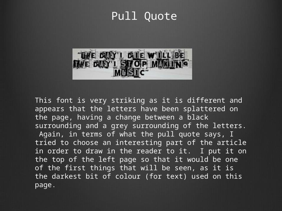
This font is very striking as it is different and appears that the letters have been splattered on the page, having a change between a black surrounding and a grey surrounding of the letters. Again, in terms of what the pull quote says, I tried to choose an interesting part of the article in order to draw in the reader to it. I put it on the top of the left page so that it would be one of the first things that will be seen, as it is the darkest bit of colour (for text) used on this page.

Image
Her pose in this photo shows her edginess and it is a bold photo expressing the personality of the artist. I have the image on the left page, as I tried having it the other way round and it looked much better having the image on the left side of the text, in my case.
I used inspiration from the photo shoot Cheryl Cole did for her feature in Q for ideas of what she could wear. I could see that leather was used so I got her to wear a leather jacket with gold zips, as Cheryl had gold studs on her top.

Text
I had the text on the right page of the article, contrasting the double page spread I was using for inspiration as it was on the left. I did this because I felt it looked better this way round on mine. I have arranged the text so that it is in three columns. This gives it a busy look, while still remaining sleek. The article is a Q&A with the artist, I wanted to do this style of article because I feel in many cases that it is the most popular and interesting.

How I challenged conventions
I kept my magazine conventional, as I knew that by doing this it couldn’t really go badly wrong and I knew that it had already worked on many magazines already.
However an example of an unconventional magazine is for the cover to have no cover lines or pull quotes and for it to be almost completely bare of text. An example of this is is i-D: Another unconventional feature of a magazine is for the person on the cover not to be looking into the camera or for it to be a long shot.