Embed Size (px)
Citation preview
Color & Human Vision
Sania correyaRoll No:31

Sketch of horizontal section of the Human eye

The Lens• The longer wavelengths (red) being focused farther
back than the shorter wavelengths (blue).
• The result is that colors of a different wavelength from the color actually being focused by the lens will appear out of focus.
• Excessive refocusing (such as between red and blue) can lead to eye fatigue.
• The lens does not transmit all light wavelengths equally.
• It absorbs more wavelengths in the blue region of the spectrum than those in the other regions.

As the lens ages, it tends to yellow, filtering out the shorter blue wavelengths.
Thus, as people get older, their sensitivity to blue decreases.
The lens also refocuses for light waves of different brightness.
Sharp contrasts in brightness in things being viewed can lead to visual fatigue as the eye continually makes muscular adjustments
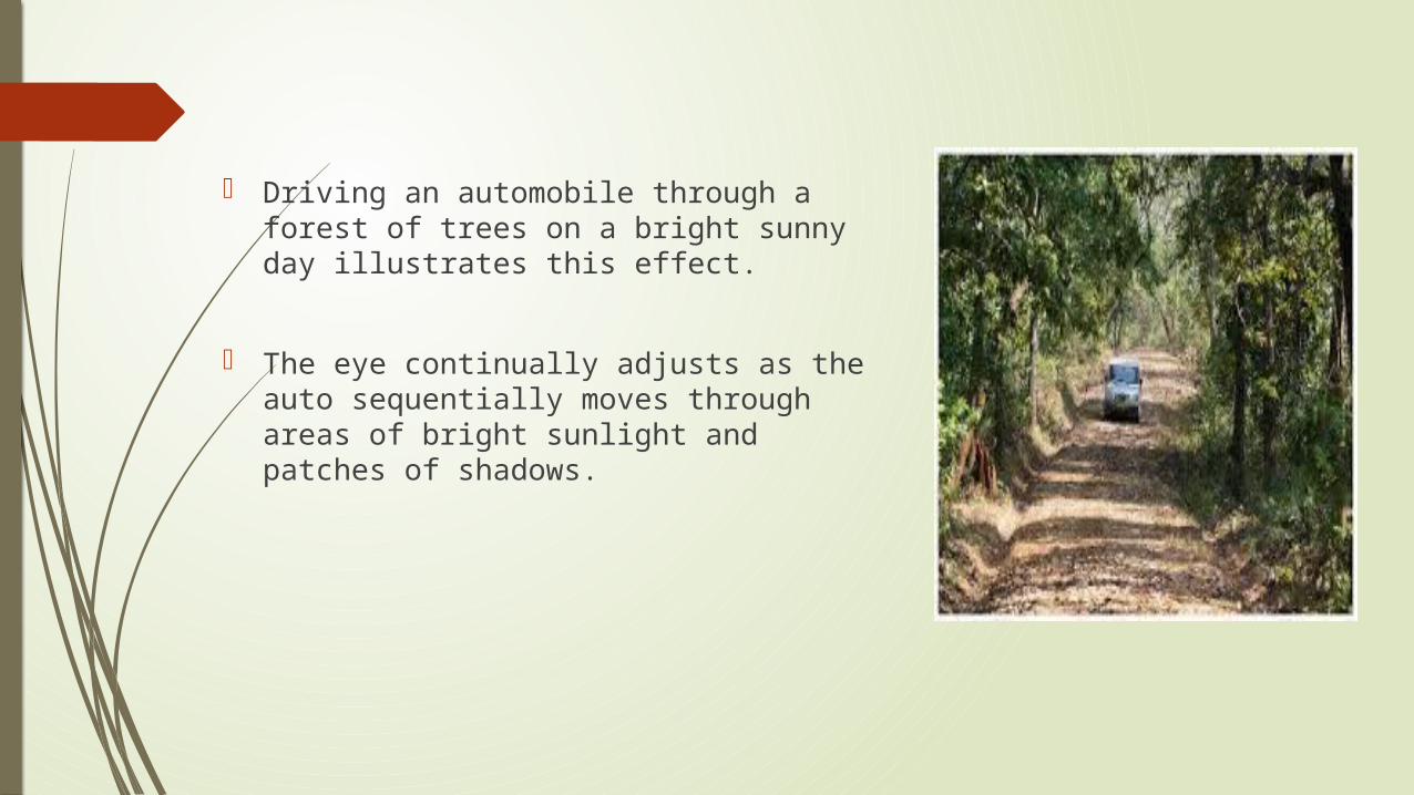
Driving an automobile through a forest of trees on a bright sunny day illustrates this effect.
The eye continually adjusts as the auto sequentially moves through areas of bright sunlight and patches of shadows.
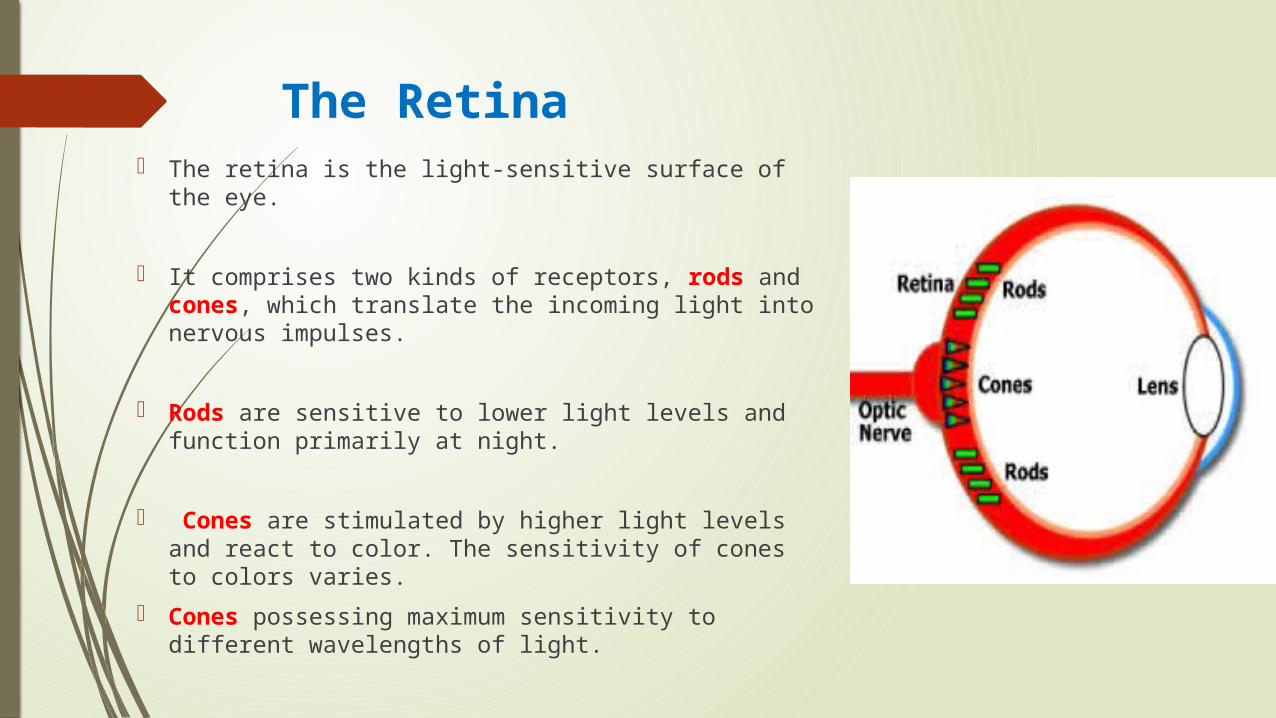
The Retina The retina is the light-sensitive surface of the eye.
It comprises two kinds of receptors, rods and cones, which translate the incoming light into nervous impulses.
Rods are sensitive to lower light levels and function primarily at night.
Cones are stimulated by higher light levels and react to color. The sensitivity of cones to colors varies.
Cones possessing maximum sensitivity to different wavelengths of light.

About two thirds(64 percent) of the cones are maximally sensitive to longer light wavelengths. These cones have traditionally been referred to as “red” sensitive cones.
About one-third (32 percent) of the cones achieve maximum sensitivity at about 535 millimicrons, referred to as “green” sensitive cones.
The remainder (2 percent) primarily react to short light wavelengths, achieving maximum sensitivity at about 445 millimicrons.These are known as “blue” sensitive cones.
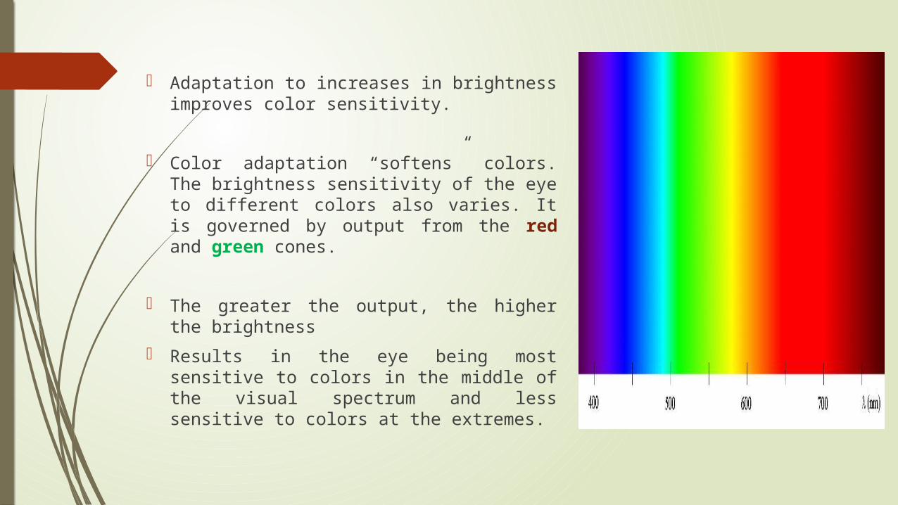
Adaptation to increases in brightness improves color sensitivity.
Color adaptation “softens” colors. The brightness sensitivity of the eye to different colors also varies. It is governed by output from the red and green cones.
The greater the output, the higher the brightness Results in the eye being most sensitive to colors in
the middle of the visual spectrum and less sensitive to colors at the extremes.

The ability of the eye to detect a form is accomplished by focusing the viewed image on the body of receptors to establish edges.
Distinct edges yield distinct images. Edges formed by color differences alone cannot be accurately brought into focus and thus create fuzzy and indistinct images.

A clear, sharp image requires a difference in brightness between adjacent objects, as well as differences in color.
The components of the eye—the lens and retina—govern the choices, and combinations, of colors to be displayed on a screen.
Improper colors will have the opposite effect, as well as increase the probability of visual fatigue.

Choosing ColorsWhen choosing colors for display, one must consider these
factors:
1. The human visual system
2. The possible problems that the colors’ use may cause
3. The viewing environment in which the display is used
4. The task of the user, how the colors will be used
5. The hardware on which the colors will be displayed

The primary objective in using color is communication, to aid the transfer of information from the screen to the user

— If different parts of the screen are attended to separately, color-code the different parts to focus selective attention on each in turn.
Categories

— If screen searching is performed to locate information of a particular kind or quality, color-code these kinds or qualities for contrast.

— If the sequence of information use is constrained or ordered, use color to identify the sequence
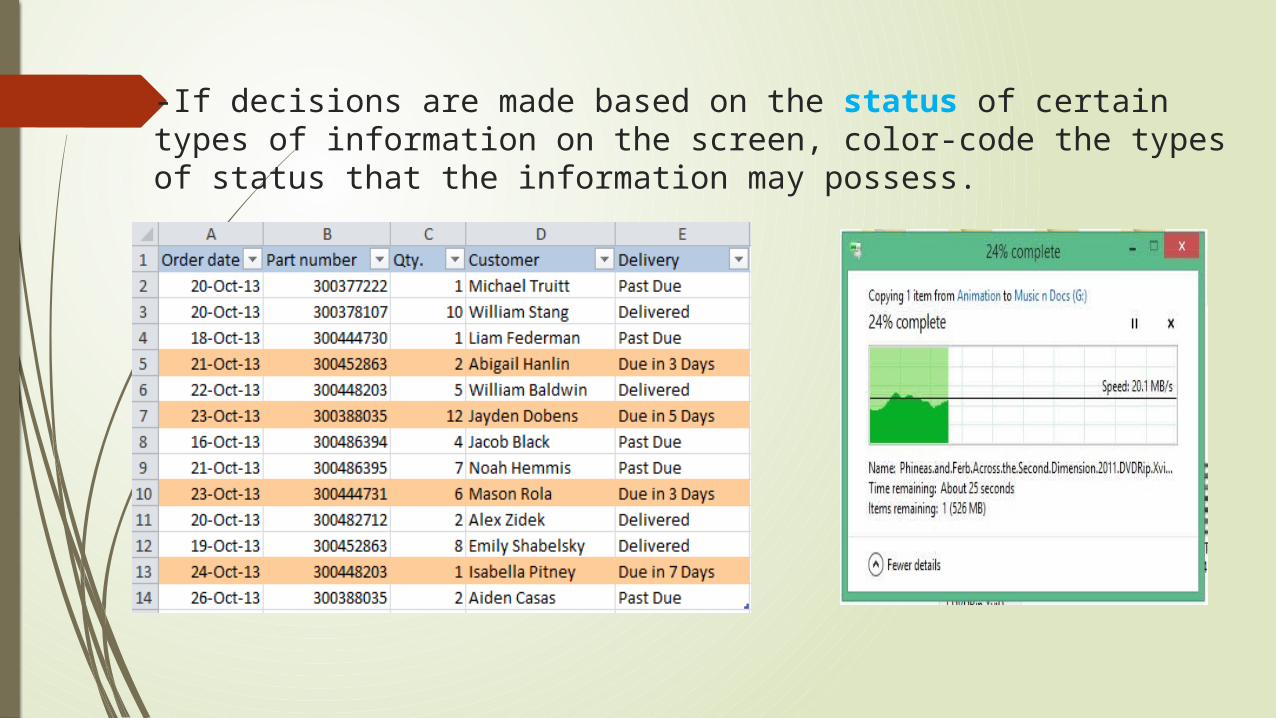
-If decisions are made based on the status of certain types of information on the screen, color-code the types of status that the information may possess.

— If the information displayed on a screen is packed or crowded, use color to provide visual groupings
What is useful in one context may not be in another and may only cause interference.
when developing a color strategy, always consider how spatial formatting, highlighting, and messages may be useful.
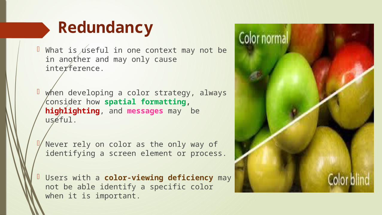
Never rely on color as the only way of identifying a screen element or process.
Users with a color-viewing deficiency may not be able identify a specific color when it is important.
Redundancy

THANK YOU…….