Embed Size (px)
Citation preview
Question 1 In what ways does your magazine use, develop and challenge forms and conventions of real media products?
Using forms and conventions of real media products

Vibe My Music magazine
From the Vibe magazine I used the idea of the ‘USA’ but changed it to ‘The UK’ as it linked better with my target audience around me. I used the bigger letter at the beginning of the text as it makes it look more forma;, and through research I learned that a lot of magazines did this, and I also used the idea of keeping the text on the right and the image on the left as I think it looks very neat, and the image is more eye catching this way.

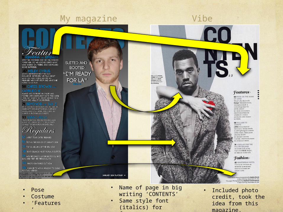
My magazineVibe
I used the idea of a sticker, as this also seems to be a convention throughout magazines, I also put my model in front on the title, and this gives the impression that people will already know the name of the magazine. I also took the idea of the menu as it makes the cover look busier and more interesting and lets the audience know there is a lot in the magazine to do with stars, so they will want to buy it.
My magazine Vibe
• Pose • Costume• ‘Features’
• Name of page in big writing ‘CONTENTS’
• Same style font (italics) for features
• Included photo credit, took the idea from this magazine.
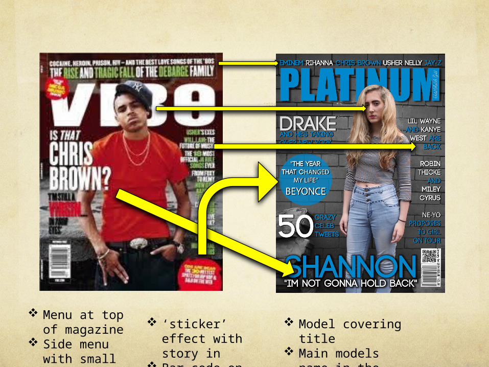
Menu at top of magazine
Side menu with small cover lines
‘sticker’ effect with story in
Bar code on its side
Model covering title
Main models name in the biggest font.
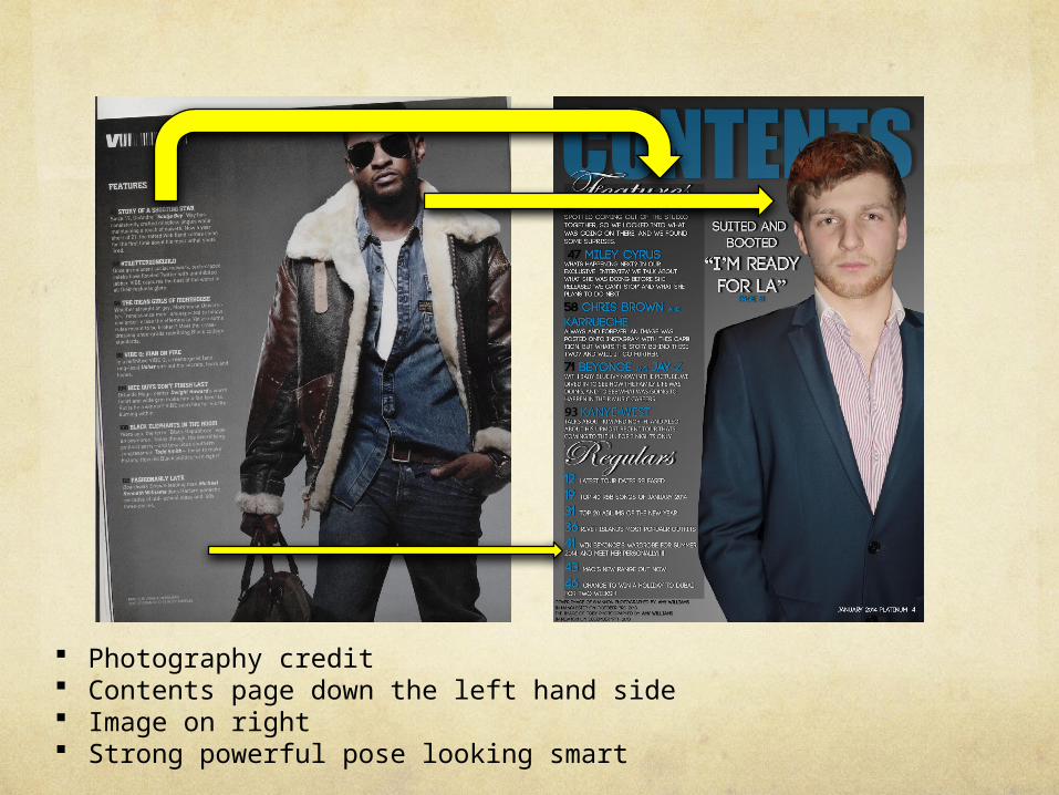
Photography credit Contents page down the left hand side Image on right Strong powerful pose looking smart

Busy background, less placed, more urban which links to R&B
Same type of font used and size.
Side menu used

Developing forms and conventions of real
media products
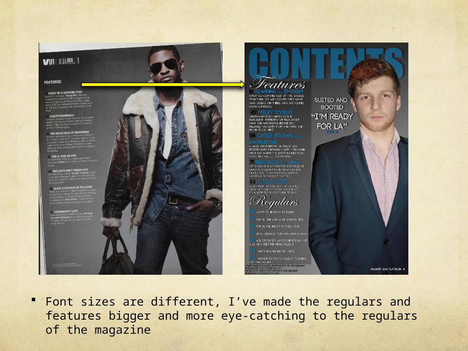
Font sizes are different, I’ve made the regulars and features bigger and more eye-catching to the regulars of the magazine

Quotation from the interview of the main model Busy background idea, looks less placed compared to a plain
background Top menu involving starts names Side barcode and scan for phones, more updated Used one of the cover lines
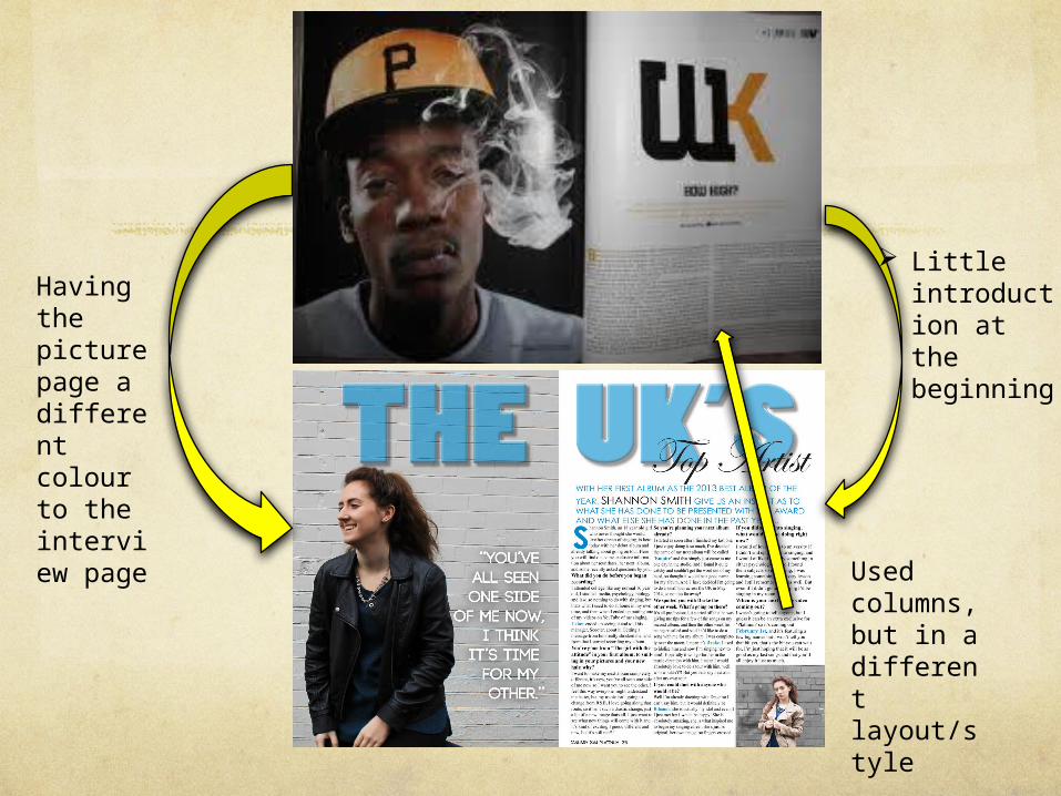
Little introduction at the beginning
Used columns, but in a different layout/style
Having the picture page a different colour to the interview page

Challenging forms and conventions of real media products

Billboard’s content page is very busy, with multiple images on, on a clean white background, there is also a range of colours down the left hand side, I didn’t use this because I don’t think it looks very R&B, most Vibe magazines are quite simple, with a strong powerful image on it, and it isn’t very busy, you can see exactly what is going on, which is why mine is the way it is.
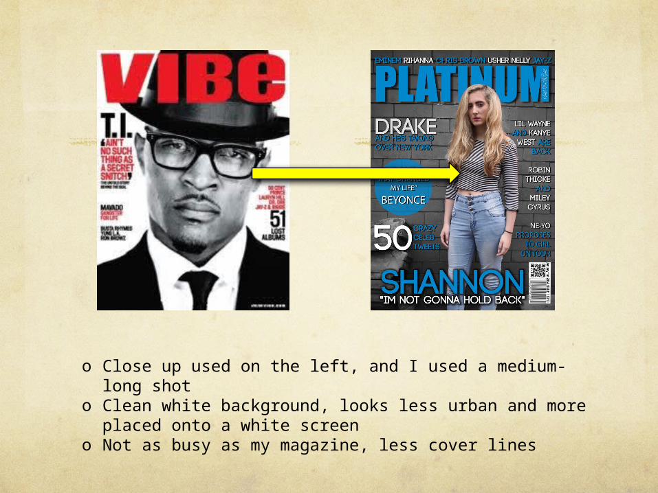
o Close up used on the left, and I used a medium-long shoto Clean white background, looks less urban and more placed
onto a white screeno Not as busy as my magazine, less cover lines
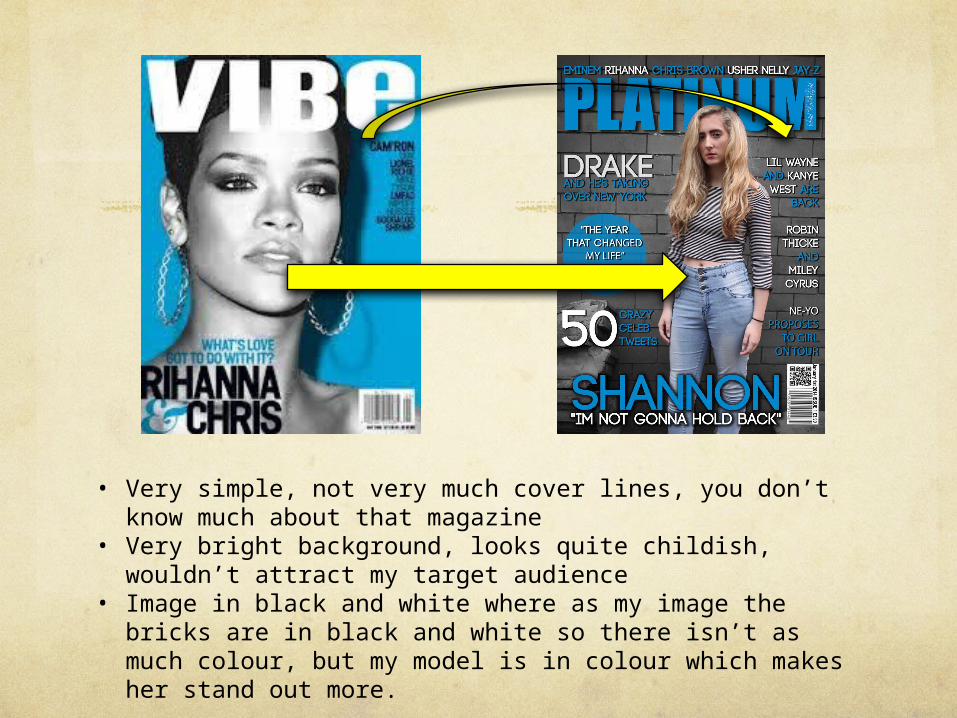
• Very simple, not very much cover lines, you don’t know much about that magazine
• Very bright background, looks quite childish, wouldn’t attract my target audience
• Image in black and white where as my image the bricks are in black and white so there isn’t as much colour, but my model is in colour which makes her stand out more.
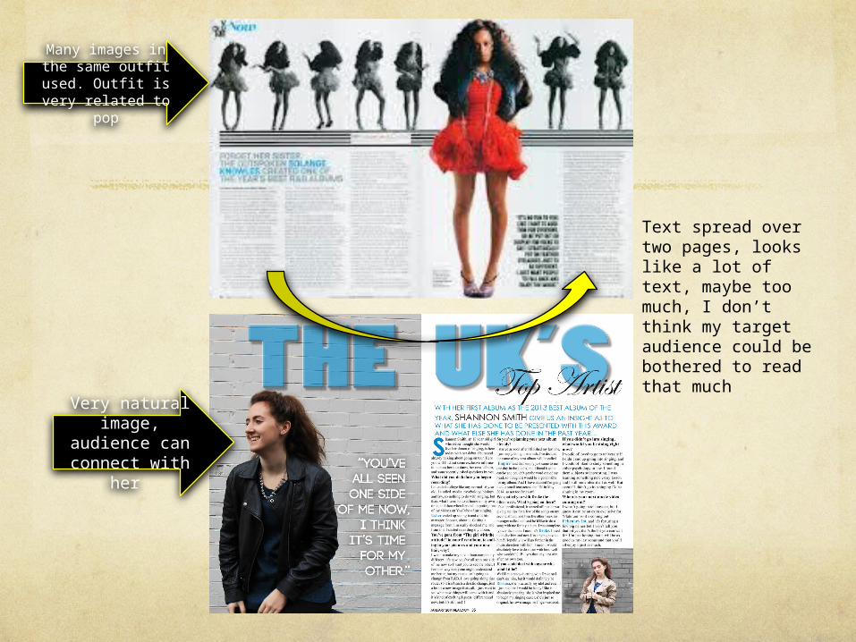
Many images in the same outfit used.
Outfit is very related to pop
Text spread over two pages, looks like a lot of text, maybe too much, I don’t think my target audience could be bothered to read that much
Very natural image,
audience can connect with
her


![Evaluation [number 1] In what does your media product use, develop or develop or challenge forms and conventions or real media products](https://img.pdfslide.us/doc/110x75/5888a1701a28ab264b8b600f/evaluation-number-1-in-what-does-your-media-product-use-develop-or-develop.jpg)