Embed Size (px)
Citation preview
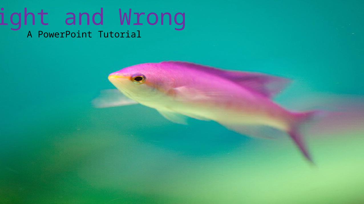
Right and WrongA PowerPoint Tutorial
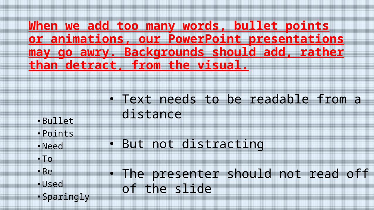
When we add too many words, bullet points or animations, our PowerPoint presentations may go awry. Backgrounds should add, rather than detract, from the visual.
• Bullet • Points• Need• To • Be • Used• Sparingly
• Text needs to be readable from a distance
• But not distracting
• The presenter should not read off of the slide
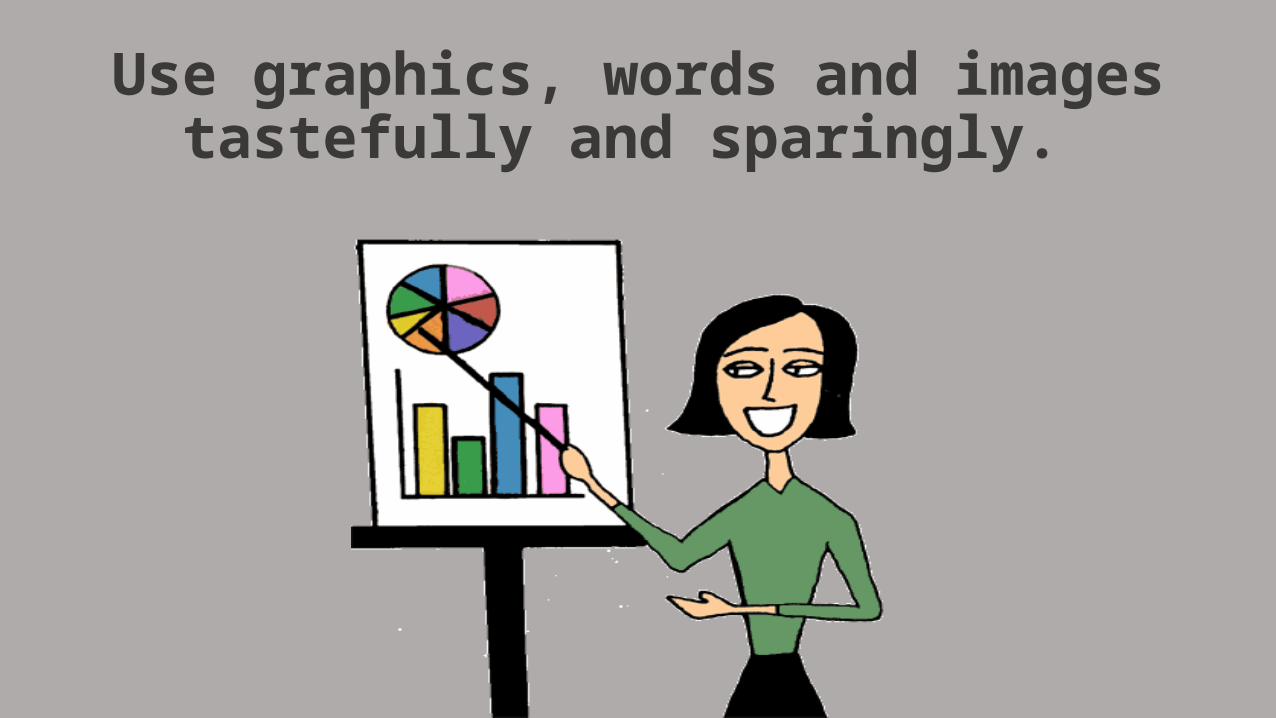
Use graphics, words and images tastefully and sparingly.

ADDING too Many IMAGES can be a PROBLEM!
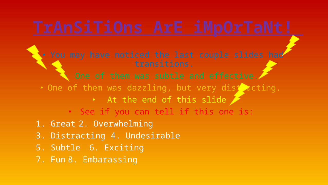
TrAnSiTiOns ArE iMpOrTaNt!
• You may have noticed the last couple slides had transitions. • One of them was subtle and effective.
• One of them was dazzling, but very distracting. • At the end of this slide
• See if you can tell if this one is:1. Great 2. Overwhelming3. Distracting 4. Undesirable5. Subtle 6. Exciting7. Fun 8. Embarassing
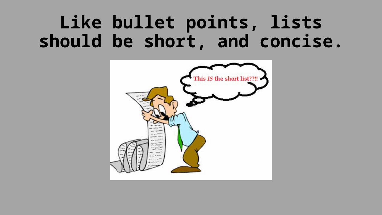
Like bullet points, lists should be short, and concise.
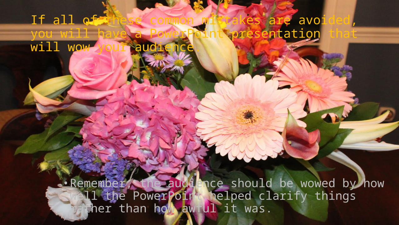
If all of these common mistakes are avoided, you will have a PowerPoint presentation that will wow your audience.
• Remember, the audience should be wowed by how well the PowerPoint helped clarify things rather than how awful it was.