Embed Size (px)
Citation preview
Question 1- In what ways does your media product use, develop or challenge forms and
conventions of real media products?
Ellis Hackett
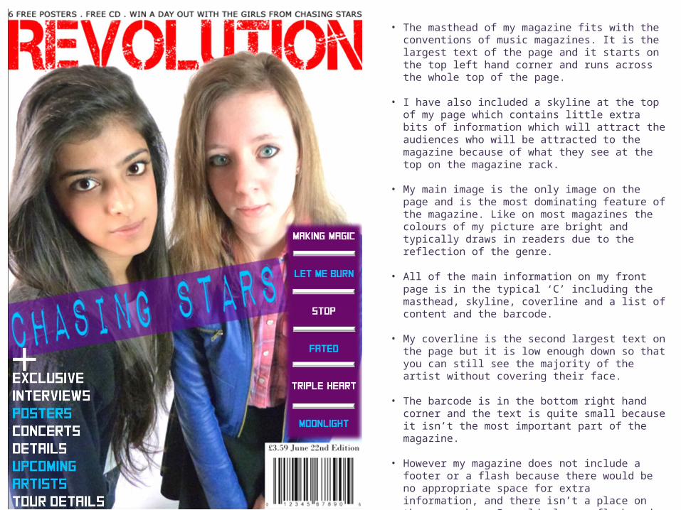
• The masthead of my magazine fits with the conventions of music magazines. It is the largest text of the page and it starts on the top left hand corner and runs across the whole top of the page.
• I have also included a skyline at the top of my page which contains little extra bits of information which will attract the audiences who will be attracted to the magazine because of what they see at the top on the magazine rack.
• My main image is the only image on the page and is the most dominating feature of the magazine. Like on most magazines the colours of my picture are bright and typically draws in readers due to the reflection of the genre.
• All of the main information on my front page is in the typical ‘C’ including the masthead, skyline, coverline and a list of content and the barcode.
• My coverline is the second largest text on the page but it is low enough down so that you can still see the majority of the artist without covering their face.
• The barcode is in the bottom right hand corner and the text is quite small because it isn’t the most important part of the magazine.
• However my magazine does not include a footer or a flash because there would be no appropriate space for extra information, and there isn’t a place on the page where I could place a flash and it wouldn’t block other parts of the magazine.
• The colour scheme I used is also very typical of pop-rock magazine. I have used a combination of dark and light: purple and red, blue and yellow to appeal to my audience.
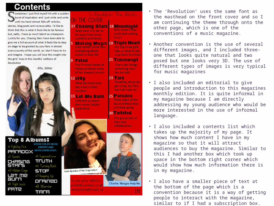
• The ‘Revolution’ uses the same font as the masthead on the front cover and so I am continuing the theme through onto the other page, which is one of the conventions of a music magazine.
• Another convention is the use of several different images, and I included three- one that looks quite natural and two posed but one looks very 3D. The use of different types of images is very typical for music magazines
• I also included an editorial to give people and introduction to this magazines monthly edition. It is quite informal in my magazine because I am directly addressing my young audience who would be more interested in the use of informal language.
• I also included a contents list which takes up the majority of my page. It shows how much content I have in my magazine so that it will attract audiences to buy the magazine. Similar to this I had another box which took up space in the bottom right corner which would show how much information there is in my magazine.
• I also have a smaller piece of text at the bottom of the page which is a convention because it is a way of getting people to interact with the magazine, similar to if I had a subscription box.
• However, unlike other magazines of my genre, I have condensed my contents page onto one page whereas on the other pop-rock magazines it was all spread across two pages.
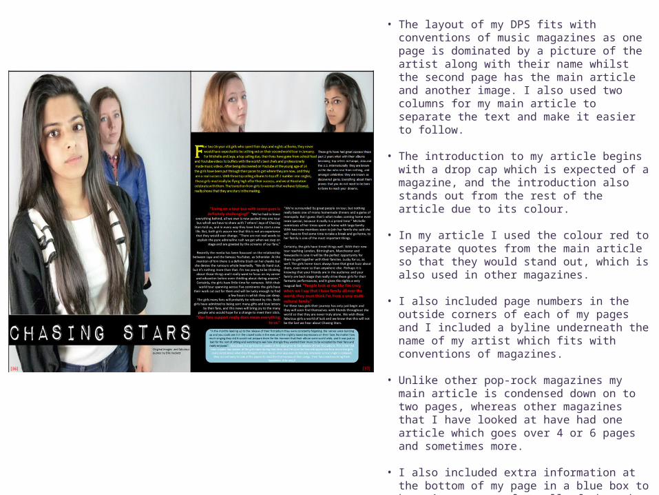
• The layout of my DPS fits with conventions of music magazines as one page is dominated by a picture of the artist along with their name whilst the second page has the main article and another image. I also used two columns for my main article to separate the text and make it easier to follow.
• The introduction to my article begins with a drop cap which is expected of a magazine, and the introduction also stands out from the rest of the article due to its colour.
• In my article I used the colour red to separate quotes from the main article so that they would stand out, which is also used in other magazines.
• I also included page numbers in the outside corners of each of my pages and I included a byline underneath the name of my artist which fits with conventions of magazines.
• Unlike other pop-rock magazines my main article is condensed down on to two pages, whereas other magazines that I have looked at have had one article which goes over 4 or 6 pages and sometimes more.
• I also included extra information at the bottom of my page in a blue box to keep it separate from all of the other text. This was to give another splash of colour in the page to separate it and fill the space. In other magazines this box might be the only piece of text on the page, however I wanted to include it on my page as I had to condense all of the conventions.