Embed Size (px)
Citation preview

PLAN B Website

This is the official homepage for Plan B, and it too contrasts from the album advert featured in the magazine. Firstly, the whole homepage has a very modern feel to it with a modern font and background picture. The black and white theme has been carried over to show consistency and act as a house style and the colour red is still prominent.
The logo however is not in the top left hand corner which slightly breaks conventions, but instead it is in the centre of the page which is still quite common with websites today – though not all.
A noticeable difference is that the logo on the advert is different to the logo on the website. This is perhaps because this particular logo is more difficult to read than the one on his advert: The advert is meant to be glanced at (an easy font is quick to read) where as a website is meant for fans who want a development of his persona (the logo can be more detailed).

The navigation bar is very conventional, with links to music, photos and videos etc. This is an easy way for audience members to find specific media links for Plan B and explore new media which they may not have seen before. Moreover, the fact that there is a ‘free download’ is likely to attract new visitors and almost force them to become interested in the rapper. Another noticeable feature is the social media links to Instagram and Twitter which is highly appealing to commuters who use mobile devices.
The modern content has a contrasting feel to the poster which works as there is still similar house styles carried over.
Something completely original about this website is the pop up bar at the bottom which features a music player filled with Plan B’s music. This is a very clever way to hook people to his music as they don’t have to go out of their way to find songs. Moreover, the bar has various and simple controls so viewers can navigate through playlists, making them feel like they own the ‘whole collection’ of songs.
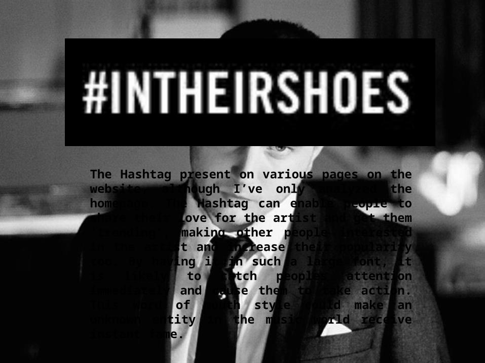
The Hashtag present on various pages on the website, although I’ve only analyzed the homepage. The Hashtag can enable people to share their love for the artist and get them ‘trending’, making other people interested in the artist and increase their popularity too. By having it in such a large font, it is likely to catch peoples attention immediately and cause them to take action. This word of mouth style could make an unknown entity in the music world receive instant fame.

An unusual feature of this website is the lack of text, perhaps to encourage people to look at all the content (large blocks of text are likely to put people off). Instead, in place of the text there are various links to different videos such as performances, interviews and backstage content. This could give make fans feel much more connected to the artist as it connotes the feeling that we are looking into their secret diary and at their personal life. This only strengthens Plan B’s persona and further engages the interest of fans.