Embed Size (px)
Citation preview

Q2. How does your media product represent particular social groups?
The mode of address was to intrigue the audience by relating to them through the main star I used on my magazine cover, I did this by using someone of the same age as if I had used someone older on the cover I felt maybe people would of looked past it. My magazine included social events to go to e.g. clubbing, going to raves and gigs and also fashion, which wouldn’t appeal to an older audience, as these events are only appropriate for a younger age group.

Q4. In what ways does your media product use,
develop or challenge forms and conventions of
real media products?

My magazine uses some typical conventions of a dance magazine however, it also challenges them. I have used
other genres of magazine to help my overall product become more new and exclusive as a lot of dance music
magazines take on the same conventions and are not particular different to any other you can buy. I felt both of these had some similarities and differences I could
compare to my own.
E.g.
Her direct gaze with the camera shows the aim of the photo is for her to appear as quite provocative, this is shown through the open mouth and how she holds herself back as if someone is coming towards her. Which could also show vulnerability.
From his posture it look like he is standing over someone, which shows us his male dominance; this could showing how big they are as musicians.
The image on my front cover was quite typical, overall I wanted look image to look verisimilitude. I tried to make it relate to the audience by the age of the star on the front, I felt my magazine represented a stereotypical teenager this shown through the clothes I wore and the facial expression suggesting rebelliousness. Also, how I hold my jacket portrays an arrogance which makes the reader assume I am confident. The way my mouth is open also suggests a provocative nature, which once again relates to how teenagers are portrayed throughout todays society.
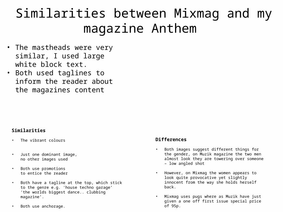
Similarities
• The vibrant colours
• Just one dominant image, no other images used
• Both use promotionsto entice the reader
• Both have a tagline at the top, which stick to the genre e.g. ‘house techno garage’‘the worlds biggest dance.. clubbing magazine’.
• Both use anchorage.
Differences • Both images suggest different things for the
gender, on Muzik magazine the two men almost look they are towering over someone – low angled shot
• However, on Mixmag the women appears to look quite provocative yet slightly innocent from the way she holds herself back.
• Mixmag uses pugs where as Muzik have just given a one off first issue special price of 95p.
Similarities between Mixmag and my magazine Anthem
• The mastheads were very similar, I used large white block text.
• Both used taglines to inform the reader about the magazines content

My influences were..The front cover used a basic masthead and basic colours, the mode of address is to intrigue the reader, I used one main focus which would be the one image I used, I didn’t use any secondary images. However, FADER is the only dance music magazine on here. This is why I felt my magazine challenged the typical conventions you normally see, I personally don’t think they are as big as magazines like NME or Kerrang as it is only aimed at a niche audience. I felt by including different artists, modern as well as some older musicians/DJ’s would entice the reader and the specific age group who read these music magazines. I’d say the main target audience is from young adults (17) to mid 20’s, early 30’s.

The masthead was quite basic (Bell Gothic) so I felt with the rest I could use more vibrant colours which would give anchorage to the genre of the magazine. Personally, I felt this magazine was unique to others as it used a simple masthead which contrasted with the cover line used, I only used two main house colours as I didn’t want the cover to look to cluttered and to challenge the typical conventions.Both people in both images have this mischievous look about them, from the way they are posed – they look quite laid back which gives us this idea its for a teenage audience, as it links to the stereotype of the ‘typical teenager’.
Both contents pages are mainly made up of blocked images, with little writing. I felt this would accommodate the reader making their reading experience much easier and enjoyable. I felt the images I used supported the genre of my magazine; the iconography of the headphones, the Addidas top (linking to the idea of the 90’s rave scene, 90’s fashion) and the mis en scene for some of my images e.g. the derelict wood, suggesting this idea of being a curious adolescent teenage, going into the unknown – growing up.
My double page spread used typical conventions e.g. headline, columns, stand first and drop cap text. All these conventions helped to make my magazine conform to a typical double page spread,

My magazine challenges a