Embed Size (px)
Citation preview
How Did You Attract/ Address Your Audience
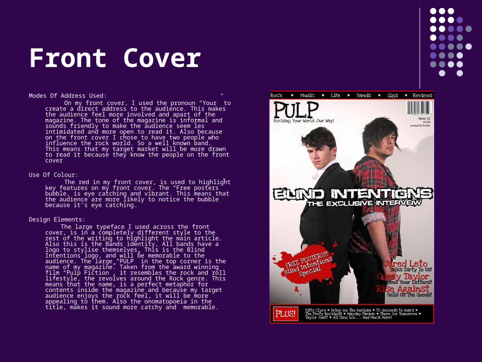
Front CoverModes Of Address Used: On my front cover, I used the pronoun “Your” to create
a direct address to the audience. This makes the audience feel more involved and apart of the magazine. The tone of the magazine is informal and sounds friendly to make the audience seem les intimidated and more open to read it. Also because on the front cover I chose to have two people who influence the rock world. So a well known band. This means that my target market will be more drawn to read it because they know the people on the front cover
Use Of Colour: The red in my front cover, is used to highlight key
features on my front cover. The “Free posters” bubble, is eye catching and vibrant. This means that the audience are more likely to notice the bubble because it’s eye catching.
Design Elements: The large typeface I used across the front cover, is in a
completely different style to the rest of the writing to highlight the main article. Also this is the Bands identity, All bands have a logo to stylise themselves. This is the Blind Intentions logo, and will be memorable to the audience. The large “PULP” in the top corner is the name of my magazine. Taken from the award winning film “Pulp Fiction”, it resembles the rock and roll lifestyle, the revolves around the Rock genre. This means that the name, is a perfect metaphor for contents inside the magazine and because my target audience enjoys the rock feel, it will be more appealing to them. Also the onomatopoeia in the title, makes it sound more catchy and memorable.
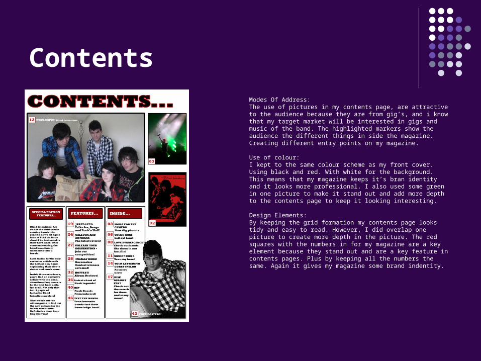
ContentsModes Of Address:The use of pictures in my contents page, are attractive to the audience because they are from gig’s, and i know that my target market will be interested in gigs and music of the band. The highlighted markers show the audience the different things in side the magazine. Creating different entry points on my magazine.
Use of colour:I kept to the same colour scheme as my front cover. Using black and red. With white for the background. This means that my magazine keeps it’s bran identity and it looks more professional. I also used some green in one picture to make it stand out and add more depth to the contents page to keep it looking interesting.
Design Elements:By keeping the grid formation my contents page looks tidy and easy to read. However, I did overlap one picture to create more depth in the picture. The red squares with the numbers in for my magazine are a key element because they stand out and are a key feature in contents pages. Plus by keeping all the numbers the same. Again it gives my magazine some brand indentity.
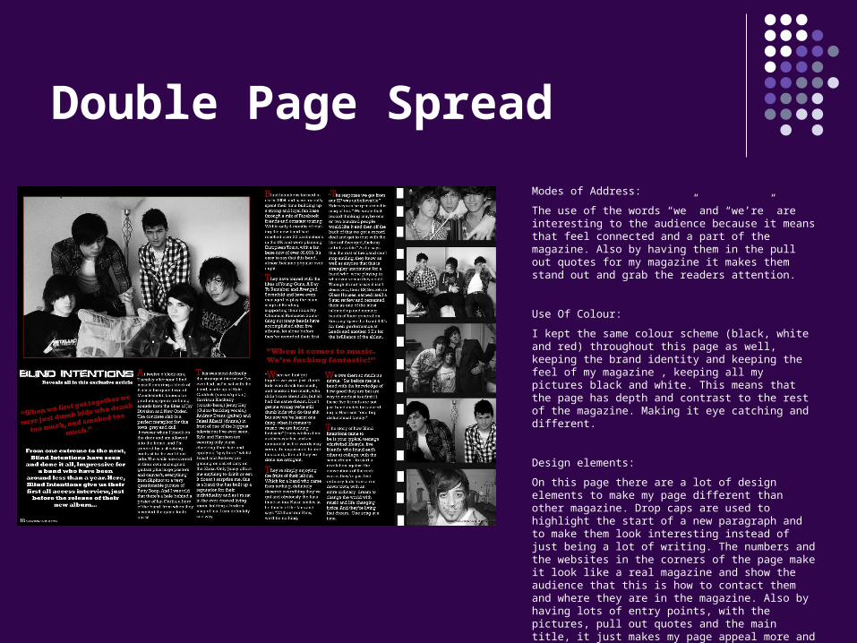
Double Page SpreadModes of Address:The use of the words “we” and “we’re” are interesting to the audience because it means that feel connected and a part of the magazine. Also by having them in the pull out quotes for my magazine it makes them stand out and grab the readers attention.
Use Of Colour:I kept the same colour scheme (black, white and red) throughout this page as well, keeping the brand identity and keeping the feel of my magazine , keeping all my pictures black and white. This means that the page has depth and contrast to the rest of the magazine. Making it eye catching and different.
Design elements:On this page there are a lot of design elements to make my page different than other magazine. Drop caps are used to highlight the start of a new paragraph and to make them look interesting instead of just being a lot of writing. The numbers and the websites in the corners of the page make it look like a real magazine and show the audience that this is how to contact them and where they are in the magazine. Also by having lots of entry points, with the pictures, pull out quotes and the main title, it just makes my page appeal more and become more interesting.