Embed Size (px)
Citation preview
Magazine Analysis Amber Jackson
Magazine Conventions They generally only use a maximum of three colours. Different magazines have colours they are known for. For example;
- Empire uses yellow - Sight & Sound uses red
Header Title is always in block colour and bold fonts to make it eye catching as all magazine are competing and each one has to stand out individually.
There is always a list of articles that are inside to entice the audience.
Information regarding the price and a bar code is placed strategically.
A captivating image and headlines that reveals half a story is placed on the front cover. A smaller sentence following on from the headline, which is a strapline ‘sells’ the magazine, which intrigues the audience, and they have to buy it to read the rest of the story.
Captivating words are used such as ‘New’, ‘Sensational’ or ‘Exclusive’ this makes the audience believe that they can only read a story in that one and only magazine, therefor they can not go and search for it somewhere else, at a lower cost.

HEADER TITLECompared to many other magazines with the bold, 3D effect header, Sight & Sound have differentiated their title a lot to stand out. The use of a bright yellow box contacting and framing the black letters. Followed by a red sub heading ‘The International Film Magazine’ and balancing out the look of the box with the red of the ‘&’. This sub title suggests to new readers that the magazine is well recognised and prestige status, even though it is an independent magazine. MAIN IMAGE The main image is unlike most magazines as it doesn't especially pop out at you, at first glance. The understated look may work well as it will stand out on the shelf against other magazines as it is simply different and the use of lighting is unique because it is so interesting, we are not used to seeing images this highly edited but it still looking ‘natural’. The drawback is that potentially it could get drowned out against all the other magazines bold captivating essences.
HEADLINES ‘Hitchcock’ is a very well established and highly recognised name, which is why the image can be the way that it is because the title being in red catches the eye and people automatically want to read it, simply because of who he is. Above is also a subheading ‘the genius of’ the word ‘genius’ standing out the most as it is reiterating how great everyone thinks he is.
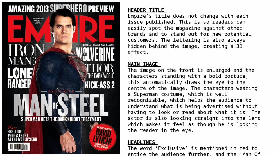
HEADER TITLE Empire’s title does not change with each issue published. This is so readers can easily spot the magazine against other brands and to stand out for new potential customers. The lettering is also always hidden behind the image, creating a 3D effect.
MAIN IMAGE The image on the front is enlarged and the characters standing with a bold posture, this automatically draws the eye to the centre of the image. The characters wearing a Superman costume, which is well recognizable, which helps the audience to understand what is being advertised without having to look or read about what it is. The actor is also looking straight into the lens which makes it feel as though he is looking the reader in the eye.
HEADLINES The word ‘Exclusive’ is mentioned in red to entice the audience further, and the ‘Man Of Steel’ words have a glimmer on them represent a metal like finish making the magazine feel more luxury as there are hints of different textures.
This is a mainstream magazine brand.
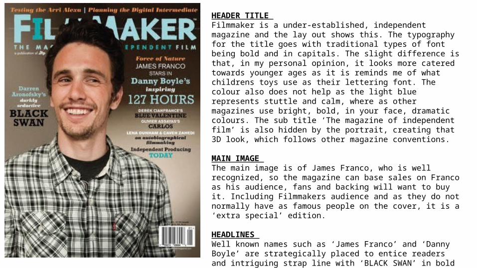
HEADER TITLE Filmmaker is a under-established, independent magazine and the lay out shows this. The typography for the title goes with traditional types of font being bold and in capitals. The slight difference is that, in my personal opinion, it looks more catered towards younger ages as it is reminds me of what childrens toys use as their lettering font. The colour also does not help as the light blue represents stuttle and calm, where as other magazines use bright, bold, in your face, dramatic colours. The sub title ‘The magazine of independent film’ is also hidden by the portrait, creating that 3D look, which follows other magazine conventions.
MAIN IMAGE The main image is of James Franco, who is well recognized, so the magazine can base sales on Franco as his audience, fans and backing will want to buy it. Including Filmmakers audience and as they do not normally have as famous people on the cover, it is a ‘extra special’ edition.
HEADLINES Well known names such as ‘James Franco’ and ‘Danny Boyle’ are strategically placed to entice readers and intriguing strap line with ‘BLACK SWAN’ in bold capitals draws the readers attention to it, it says ‘Darren Aronofsky’s’ (a director) dark seductive black swan’. The majority of people know what black swan the film is about, therefore it makes Aronofsky’s secret dramatic, and drama sells.