Embed Size (px)
Citation preview

Hunger Games Mockingjay part 1 Trailer
BreakdownCharles Harris

The trailer starts with a shot of the logo of the film
company “lionsgate” who made the film. This makes the viewer know that the
film will be of good quality as they will recognise and
trust the brand. The metallic and shiny
typography allows the logo to look like its made of
metal and therefore well built – inferring the film is well made. The way the
logo is “back lit” infers the film was made with divine intervention, and there for
will be good.
Non-diagetic soundtrack of an string instruments playing, this gives the trailer monuments connotations, building the gravitas and
allows the view to feel that the film is important.
The quick fade into the shot, conveys the trailer will be action-packed and the film will be intense as the editor go into the shot
quickly and not over a course of a few seconds

The mise-en-scene of these clips uses contrast, having a high-tech plane as the focus,
with woods in the background, this is conveying
that the film will look at a clash between nature and the
natural way people are against the way things and people are made to be. The shot shows the middle of no where, conveying isolation, this is common in romance trailers as it shows a viewer who feel alone that they will
be able to relate to a character in the love triangle.
Synchronous sound is used as the plane flies past and this is disjointed and distorted. This puts the viewer on edge as it doesn't sounds right. The plane sounds broken which is a reflection of the
broken society in the film.
The loose frame shot enables the viewer to see the background, making
the contrast between high tech plane and the
forest.
Low key lighting is used to convey it being night and,
therefore, a level of stealth and secrecy is being
displayed to excite the viewer and get them to
question why the secrecy – getting them to see the film.
It also makes the people who sent the plane seem untrustworthy and shady,
this adds intrigue to the film.

The use of a hand held cam makes the shot seem
more realistic to the viewer and
therefore absorbs them into the trailer, making
them more likely to watch the film.
A canted angle is used, this makes the scene disorientating for the viewer. This makes the section more realistic and
therefore will excite the viewer – making them more likely to
see the film.

A close up is used to show the emotion on the characters’
faces. This makes them relatable to the viewer,
meaning that the viewer will care about the characters. By having a little girl on screen it
further invokes sympathy.
The shot matches with the line “I just wanted to save my sister,” heard in the voice over acting as a
sound bridge. The voice over is used to bring continuity and context to clips, making them more
potent to the viewer.
The close up shows the protagonist’s face looking scared. This makes her relatable to the
viewer as it shows that she isn’t perfect she human – like the viewer.
The shot also shows a single parent family. This conveys that the character has already had to deal with adversities loosing her
dad part way through her life. This makes her relatable to children of
a single parent family, if this makes the viewer feel a connection too
her, then this will make them more likely to watch the film.

The fade between “save my sister,” and “and keep Peter alive,” shows that the character emotions towards her sister and Peter are linked.
This helps the viewer understand how much she cares about Peter, as it would be similar to how much someone would love their sister.
The over the shoulder shot of the main character looking at the screen shows the viewer that the film will be
about them watching the two on-screen character in their dispute. The
long shot of the guy in the screen portrays him to be quite distant and, therefore, not down to earth, making
the viewer not like him.

The use of a black out causes there to be a build-in tension,
this draws the viewer in, so when the reveal of what’s said
happens, it feels more dramatic, this makes the viewer more
likely to see the film.

A high angle is used when talking to the man in the wheelchair, this is a negative representation for people
with a disability as it shows that they get dominated by the able
bodied. This can infuriates a viewer who may believe in equality, this
means they will want to see the film as they will want to find out what happens to the disabled character.

The pin being placed onto the character’s outfit is reminiscent to the earlier films in the franchise, this reminds the viewer of their excitement about the earlier films, and,
therefore, gets them excited about the new sequel.
The gold nail varnish on the character’s hands is the only
colour in the picture. This shows that the film is about a glimmer of hope in a dark
utopian society.The pin is also the film’s logo, and this clip is the first display of what the film is. By not showing
that the film is the hunger games until 35
seconds in to the trailer, it gets viewers excited
and drawn into the trailer. Also, people who
are “quick to criticise” the franchise can be drawn in
by the action earlier on and therefore their
cynicism will hopefully be minimised.
The close up of the pin being put on shows the importance of the pin.
This conveys that symbolism is a key
theme in the film, as people are obsessing over the meaning of
the mocking jay pin so much that it warrants
its own close up.

The weapons and explosions help to attract men to watch the film, as it displays some physical conflict, which is stereotypical to
young males that fall in the target audience.
The arrow firing at the target and exploding, sounds similar to a drum roll building up to action and atmosphere. This helps to build excitement for
the viewer, making them want to see the film.

The high angle shot shows the dominance that the peace
keepers have over the rebels. This reflects the suppressive
society that makes up penmen in the film.
The shallow focus of the shot makes the rebels
blurred into one entity. This reflects how the
capital view the people of the districts, not as
individual people, but as a collective work force. This makes the viewer want to
watch the film, as they will sympathise with the people being suppressed and what to find out what
happens to them.

A loose frame is used, this allows the people
around the protagonist to show their faces. The
unimpressed body language of the actor in
the background is a binary opposite to the
actress, this shows that the reveal that Peta is alive is controversial.
This makes the viewer want to see the film to
find out why and what’s the after effect of it.
The close up on the actress’ face helps to convey her
emotion to the viewer. She isn’t making eye contact with
the camera, this show the viewer that what’s happening off camera is such a big deal she can’t look anywhere else (as this is a sequel, this helps
to infer how momentous what happening is to a
viewer who haven't seen the previous films, and therefore
wouldn’t understand that Peta being alive is a big deal),
this is matched with the dialogue “your alive!”
conveying surprise.

The two shots are shown next to each other, and are used to contrast each other. On the left, Peta is dressed up smart and he is in a fancy mansion with company. This opposes Katniss, above, who isn’t dressed smart, and is alone in nature. This conveys to the reader that a rift has occurred between the characters and they are now worlds apart. This means the viewer will want to
see the film to find out why and what happens.
This is the first time we see Peta, one of the main characters, but it’s over half way through the trailer,
this makes what’s been happening to the character a mystery for the
viewer, making them want to watch the film to find out.

The prints in the background are a
convention of action films as they create
excitement that something new is being built, this
makes the viewer wonder what, making
them more likely to watch the film.
The high angle shot shows the protagonist taking a
more powerful position and trying to control the people
in charge of her. This reflects the rebellious
character the viewer knows and loves from the previous
films.
The character shouts “find another mocking
jay,” this helps to convey the aggression of the
character, and that the film has high tension
which causes people to raise their voice.

The two shots shown next to each other contrast each other. On the left, the president is in a very high angle shot looking at people worshiping her. Above, Katness is level to
the people worshiping her. This makes the viewer like Katness as the character doesn’t use height to show power, she stays level with the people she’s above. This makes her likeable to the viewer, and if the viewer likes the character
then they’ll go a see the film.

The white rose uses shows the viewer irony, the white
rose is a symbol of the film’s antagonist, white represents
purity and hope, where at the same time the rose’s
thorn symbolises danger. This is done to convey to the
viewer that there is a mix of emotions in the film and that
the film will challenge people’s views on things. The loose frame shows a
simplistic and dark background, this helps to make the roses stand out and be more eye catching to the viewer. The loose
frame also shows how bare the house is, this implies
the Katness to be not materialistic and humble,
making her a likeable character for the reader.

The shot of Katness running in to fire could be following a metaphor. The film uses
fire a symbol of hope, so by running into the fire, the
character is then being set alight and becoming
hopeful. This will make the viewer want to pay to see the film to find out what
inspiring things the character does.
There is a montage of the protagonist in dangerous situations, this conveys to the viewer that the film won’t be
smooth sailing and that there is actual jeopardy and potential fatality.
Because of this, the viewer will be curious about if the protagonist
survives or not, or excited about the action and want to see the film.

This shot contains screaming children, this invokes an
emotion in the viewer as its instinctive human
evolutionary response to try and protect the young of
the species, this means the viewer will want to watch the film to find out if they
are ok.
The use of chiaroscuro lighting means the clip is
dramatic as it’s shadow filled and full of mystery.it’s not clear what’s
happening in the picture. This makes the screaming scary as the viewer won’t know why
people are screaming, and the viewer will want to find out
why.
The sound of the screaming is uncomfortable and unsettling, this means that the sound (and
therefore the trailer) will be remembered after the trailer stops playing, and then is more likely
for the viewer to pay to see the film.
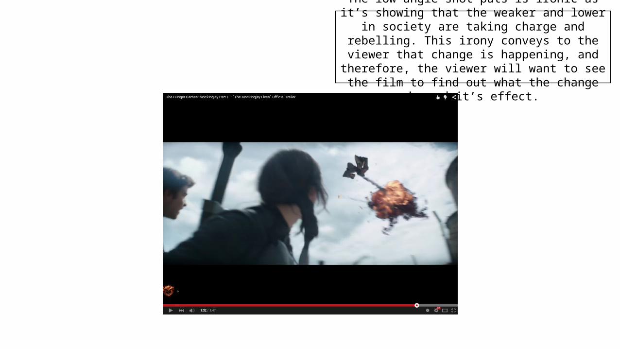
The low angle shot puts is ironic as it’s showing that the weaker and lower in society are taking charge and
rebelling. This irony conveys to the viewer that change is happening, and therefore, the viewer will want to see
the film to find out what the change is and it’s effect.

There are three shots with important film information. This includes the name, the release date, a website and
hashtag as well as information about the studio and copy
right information. This is done to help further advertise the film, directing people to the
correct places to find out and talk about the film.

Media Theory• The trailer follows Todorov’s narrative theory, the trailer starts by
showing equilibrium with the voiceover and establishing shots of district 13, the trailer then shows Dis-equilibrium with the fighting and conflict, however, new equilibrium isn’t shown as it’s a trailer and would give away the ending.• The film has Levi-Strouses Binary opposite theory with the simple
loveable girl Katniss opposing the rich and hated President Snow

The model is positioned in front of the masterhead, this is done because the magazine has a well established brand so by obscuring part of the
masterhead, the reader will still know what the magazine is. This also draws the eye to the
characters face which tell the reader what film is being advertised at a quick glance instead of having
to read the cover line ‘The Hunger Games’
The coverline had black dots over it, this is done to convey to the reader that the film is about an uproar and rebellion by using the pragmatics and stigma that surround graffiti
with it’s connotations of social unrest.
The mockingjay symbol appears in graffiti on the wall, this helps to
display and advertise the franchise. It’s done in graffiti to make it seem more rebellious, this help to show
the films rebellious plot.
The red and white colour scheme are used to contrast each other. The red’s connotations
symbolises the danger in the film but also the romantic aspect. The colour red is also
considered a successful and confident colour and by associating this with the film, conveys to the
audience that the film will be good and successful. The white symbolises purity which
contrasts the red’s connotation, but (in places like China) can also be used to symbolise death, this helps to convey the films themes to the viewer.
The composition for magazine cover background shows destruction with broken
bricks, fire, and a dust cloud. The protagonist is standing in front of that, conveying that
she's the hope for the new future.
The model is standing is a strong defensive pose, standing up straight with legs slightly parted in
armour. This shows her determination and skill at what she does. This defies conventions because
the model is closed of and isn’t welcoming people to watch the film. The bow and arrow is
ready to fire but not aimed, this conveys that the model is wise and isn’t a “trigger happy” ruthless killer, which makes the viewer interested to see how she operates. The film contrasts the female model defensive pose with the “Clint Eastwood
motif” heroic pose in the secondary image, this is done to show that woman can be powerful and a hero, as she has the bigger picture and is above
the male model. This represents how the hunger games is in a “new era” of action film.
The mode of address on the cover, is short and to the point. The coverlines include
“plus,” and “+,” this makes the cover easy to read for a reader who is just scanning the
cover to see if they are interested in buying itThe pug of the barcode and price is at the bottom left corner, these need to be present to be able to sell the magazine but are placed where the buyers hand is likely to go if holding
the magazine, meaning that no important information on the cover will be covered.

The way the model is positioned on with the rings, this is pragmatics to Jesus on the cross. This conveys to the
viewer the idea that the model is going to try and change society for a better one, similar to what Jesus
aimed to do. Fire is used to symbolise hope, rings
have connotations of being eternal, so the ring on fire would show the viewer
that the film is about the eternity of hope and how it can never be supressed
The poster uses the dramatic colour scheme of black and gold. This is simplistic, and by using very few colours, the poster is more eye catching. The black and gold colour scheme is simplistic and eye
catching. The poster is following the franchises metaphor that fire is hope. It turns the protagonist into mockingjay from the pin.
The model isn’t feminised in her pose, this breaks convention as sex isn’t being used to
sell the film. This conveys that woman will be respectfully represented, encouraging
feminists to want to see the film.
The masterhead ‘The Hunger Game MockingJay Part 1’ is in a bold font going
across the bottom of the page. By doing this, its easy for the viewer to read as it takes up
minimal number of lines. The ‘mockingjay’ is in a larger font than the rest because that’s
the important new information as the viewer would be able to work out it’s ‘the hunger games’ and know that ‘part 2’ wouldn’t be
out yet. The text has an effect making it lighter at a point, this makes it look like a
sunrise, conveying that the model is acts like a fresh start.
The model is placed in the middle third, with her face being around a third of the way down,
this draws the viewers eye to focus on her face, this is because her face has become
iconic to the franchise and acts as a logo to advertise the film.
The black background makes the gold colour
stand out more. The black could represent the evil that is the capital and it being set of fire conveys the basic plot of the film.
The model has an orange tint to her to make
it look like she’s actually
on fire.
The slogan for the film and the credits are in a small, hard to read font to draw the viewer into the poster as they try to read it