Embed Size (px)
Citation preview
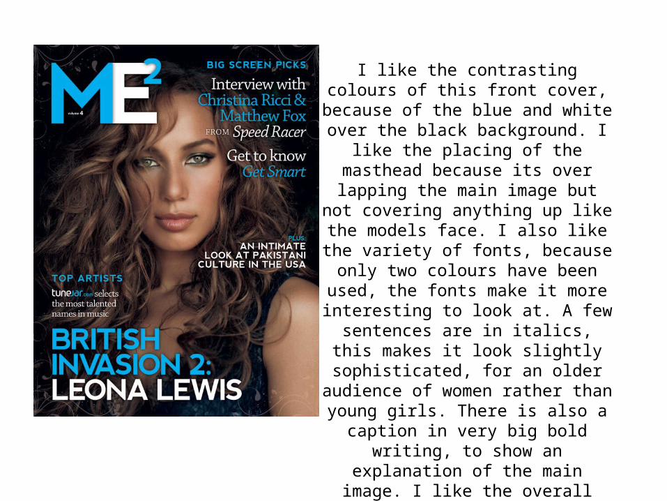
I like the contrasting colours of this front cover, because of the blue and white over the black background. I like the placing of the masthead because its over lapping the main image but not covering anything up like the models face. I also like the variety of fonts,
because only two colours have been used, the fonts make it more interesting to look at. A few sentences are in italics, this makes it look slightly sophisticated, for an older audience of women rather
than young girls. There is also a caption in very big bold writing, to show an
explanation of the main image. I like the overall layout, because its simple, easy
to read, eye catching but there is enough writing to get across to the
reader.
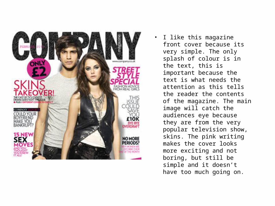
• I like this magazine front cover because its very simple. The only splash of colour is in the text, this is important because the text is what needs the attention as this tells the reader the contents of the magazine. The main image will catch the audiences eye because they are from the very popular television show, skins. The pink writing makes the cover looks more exciting and not boring, but still be simple and it doesn’t have too much going on.
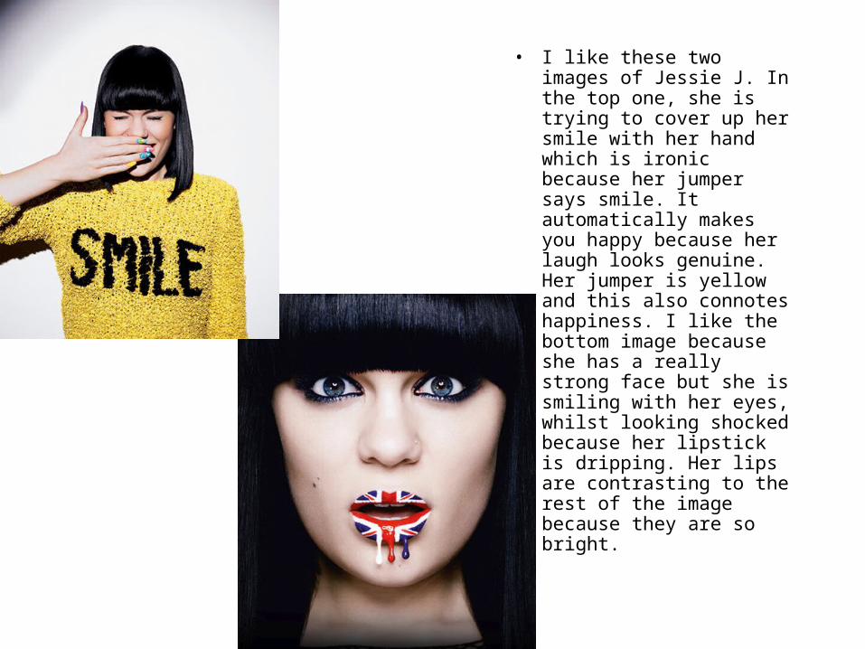
• I like these two images of Jessie J. In the top one, she is trying to cover up her smile with her hand which is ironic because her jumper says smile. It automatically makes you happy because her laugh looks genuine. Her jumper is yellow and this also connotes happiness. I like the bottom image because she has a really strong face but she is smiling with her eyes, whilst looking shocked because her lipstick is dripping. Her lips are contrasting to the rest of the image because they are so bright.
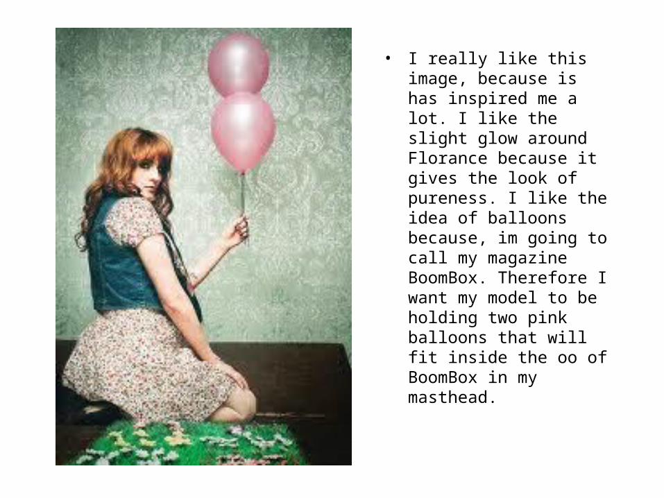
• I really like this image, because is has inspired me a lot. I like the slight glow around Florance because it gives the look of pureness. I like the idea of balloons because, im going to call my magazine BoomBox. Therefore I want my model to be holding two pink balloons that will fit inside the oo of BoomBox in my masthead.
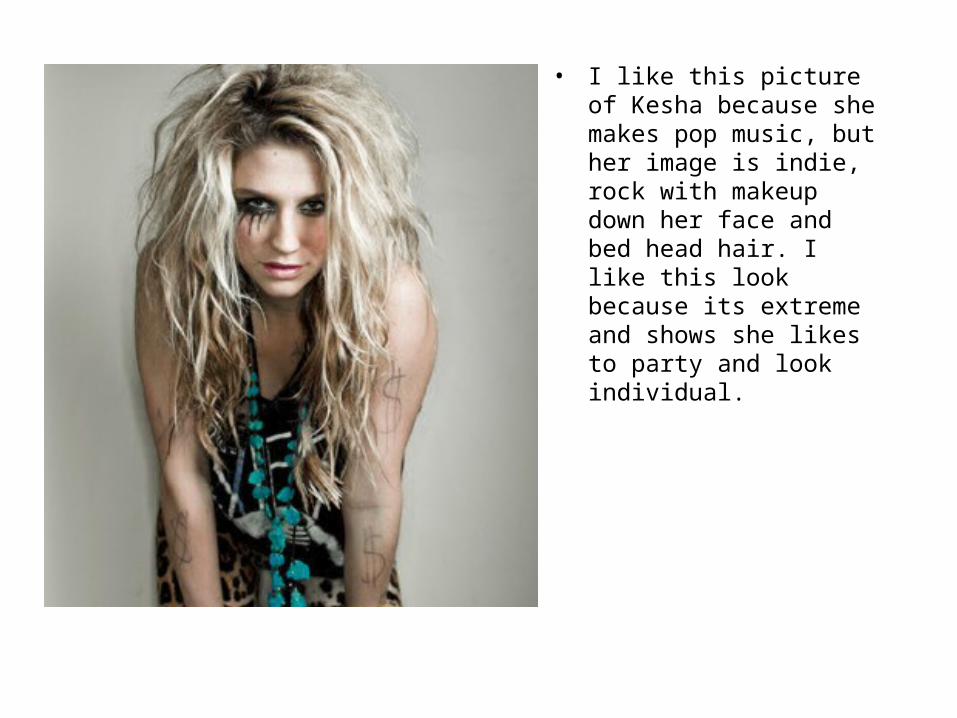
• I like this picture of Kesha because she makes pop music, but her image is indie, rock with makeup down her face and bed head hair. I like this look because its extreme and shows she likes to party and look individual.
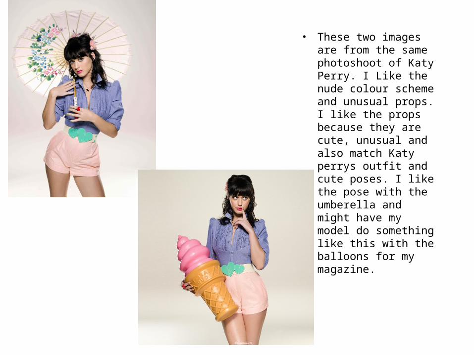
• These two images are from the same photoshoot of Katy Perry. I Like the nude colour scheme and unusual props. I like the props because they are cute, unusual and also match Katy perrys outfit and cute poses. I like the pose with the umberella and might have my model do something like this with the balloons for my magazine.