Embed Size (px)
Citation preview
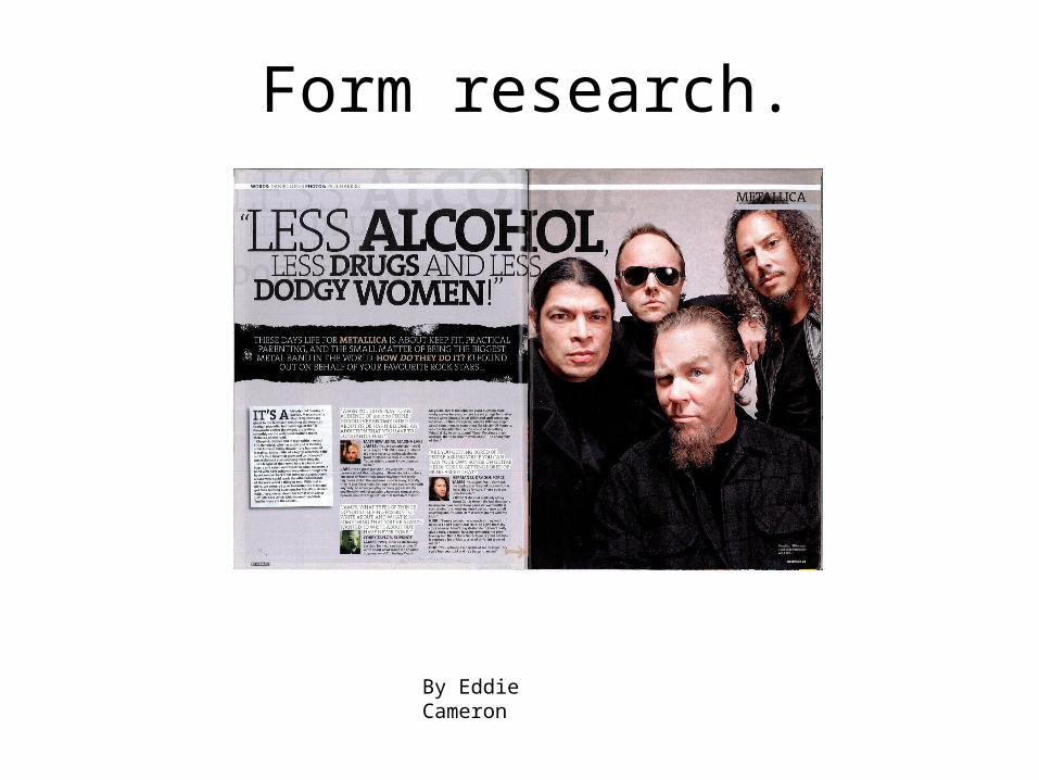
Form research.
By Eddie Cameron
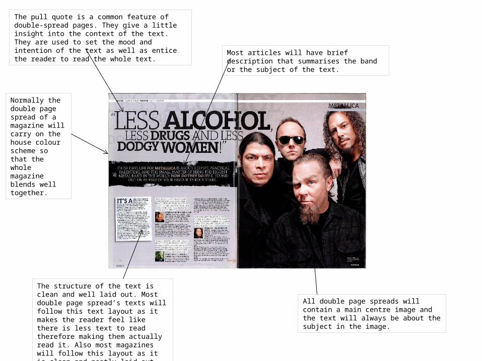
Most articles will have brief description that summarises the band or the subject of the text.
All double page spreads will contain a main centre image and the text will always be about the subject in the image.
The structure of the text is clean and well laid out. Most double page spread’s texts will follow this text layout as it makes the reader feel like there is less text to read therefore making them actually read it. Also most magazines will follow this layout as it is clean and neatly laid out.
The pull quote is a common feature of double-spread pages. They give a little insight into the context of the text. They are used to set the mood and intention of the text as well as entice the reader to read the whole text.
Normally the double page spread of a magazine will carry on the house colour scheme so that the whole magazine blends well together.
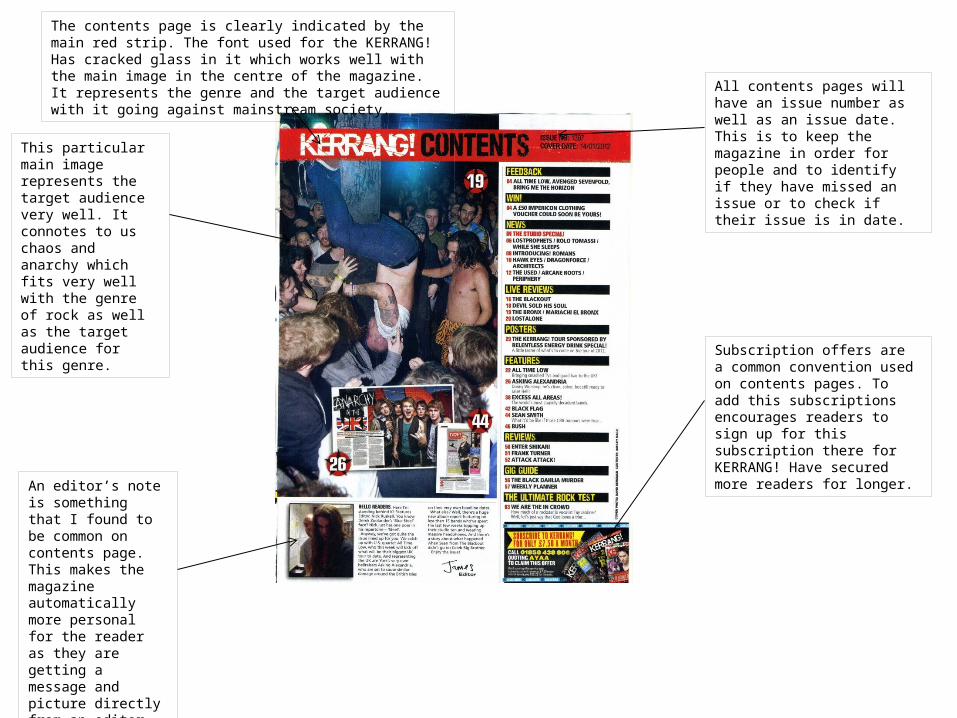
This particular main image represents the target audience very well. It connotes to us chaos and anarchy which fits very well with the genre of rock as well as the target audience for this genre.
All contents pages will have an issue number as well as an issue date. This is to keep the magazine in order for people and to identify if they have missed an issue or to check if their issue is in date.
An editor’s note is something that I found to be common on contents page. This makes the magazine automatically more personal for the reader as they are getting a message and picture directly from an editor of the magazine.
Subscription offers are a common convention used on contents pages. To add this subscriptions encourages readers to sign up for this subscription there for KERRANG! Have secured more readers for longer.
The contents page is clearly indicated by the main red strip. The font used for the KERRANG! Has cracked glass in it which works well with the main image in the centre of the magazine. It represents the genre and the target audience with it going against mainstream society.
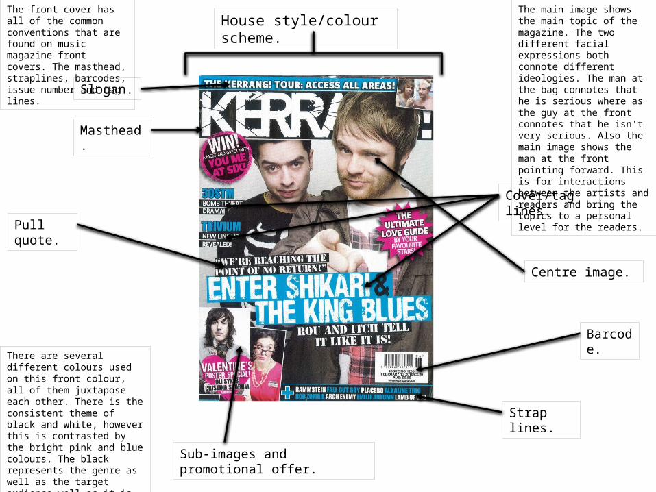
The front cover has all of the common conventions that are found on music magazine front covers. The masthead, straplines, barcodes, issue number and tag lines.
The main image shows the main topic of the magazine. The two different facial expressions both connote different ideologies. The man at the bag connotes that he is serious where as the guy at the front connotes that he isn't very serious. Also the main image shows the man at the front pointing forward. This is for interactions between the artists and readers and bring the topics to a personal level for the readers.
There are several different colours used on this front colour, all of them juxtapose each other. There is the consistent theme of black and white, however this is contrasted by the bright pink and blue colours. The black represents the genre as well as the target audience well as it is dark and both the genre and audience are known for wearing and being linked with darkness.
Slogan.
Masthead.
Cover/tag lines.
Strap lines.
Centre image.
Sub-images and promotional offer.
Pull quote.
Barcode.
House style/colour scheme.