Embed Size (px)
Citation preview
In what ways does your media product use, develop
or challenge forms and conventions of real media
products?
Evaluation Question 1:
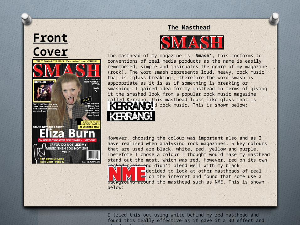
Front CoverThe Masthead
The masthead of my magazine is ‘Smash’, this conforms to conventions of real media products as the name is easily remembered, simple and insinuates the genre of my magazine (rock). The word smash represents loud, heavy, rock music that is ‘glass-breaking’, therefore the word smash is appropriate as it is as if something is breaking or smashing. I gained idea for my masthead in terms of giving it the smashed look from a popular rock music magazine called Kerrang, this masthead looks like glass that is broken due to loud rock music. This is shown below:
However, choosing the colour was important also and as I have realised when analysing rock magazines, 5 key colours that are used are black, white, red, yellow and purple. Therefore I chose a colour I thought would make my masthead stand out the most, which was red. However, red on its own looked plain and didn’t blend well with my black background. I decided to look at other mastheads of real media products on the internet and found that some use a background around the masthead such as NME. This is shown below:
I tried this out using white behind my red masthead and found this really effective as it gave it a 3D effect and stood out much more on the page.
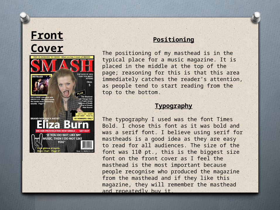
Front Cover Positioning
The positioning of my masthead is in the typical place for a music magazine. It is placed in the middle at the top of the page; reasoning for this is that this area immediately catches the reader’s attention, as people tend to start reading from the top to the bottom.
Typography
The typography I used was the font Times Bold. I chose this font as it was bold and was a serif font. I believe using serif for mastheads is a good idea as they are easy to read for all audiences. The size of the font was 110 pt., this is the biggest size font on the front cover as I feel the masthead is the most important because people recognise who produced the magazine from the masthead and if they like this magazine, they will remember the masthead and repeatedly buy it.
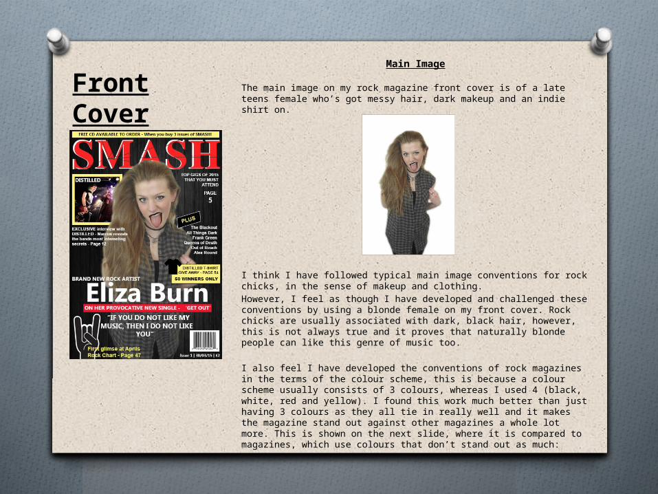
Main Image
The main image on my rock magazine front cover is of a late teens female who’s got messy hair, dark makeup and an indie shirt on.
I think I have followed typical main image conventions for rock chicks, in the sense of makeup and clothing.
However, I feel as though I have developed and challenged these conventions by using a blonde female on my front cover. Rock chicks are usually associated with dark, black hair, however, this is not always true and it proves that naturally blonde people can like this genre of music too.
I also feel I have developed the conventions of rock magazines in the terms of the colour scheme, this is because a colour scheme usually consists of 3 colours, whereas I used 4 (black, white, red and yellow). I found this work much better than just having 3 colours as they all tie in really well and it makes the magazine stand out against other magazines a whole lot more. This is shown on the next slide, where it is compared to magazines, which use colours that don’t stand out as much:
Front Cover
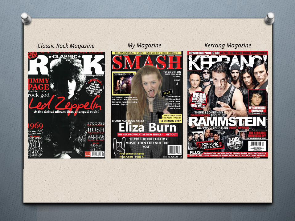
Classic Rock Magazine My Magazine Kerrang Magazine