Embed Size (px)
Citation preview
DIGIPAKIMPLEMENTATION
#1
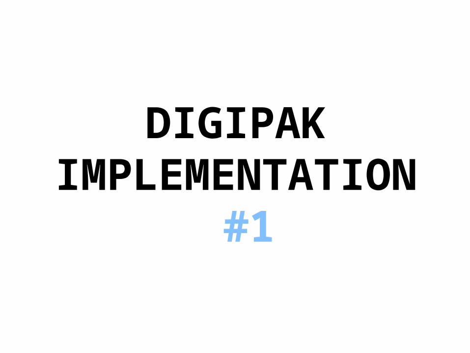
Following on from my initial ideas, I decided to stick with the idea of having a digipak with 3 parts and 2 folds, with the side on the right folding in over the centre, and the side on the left
folding over the top
I am also still going to include the pouches inside the digipak, which will hold the CD in the centre and an information booklet
either side
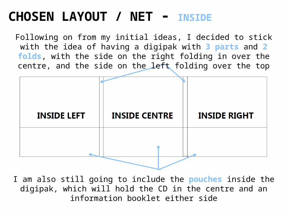
CHOSEN LAYOUT / NET - INSIDE
CHOSEN LAYOUT / NET - OUTSIDE
Front cover will contain the artist’s name and the album
title
Back cover will contain the tracklist of the album, any credits needed to
acknowledge relevant people/companies and a barcode
Inside fold won’t contain any information as usually
they are kept simple
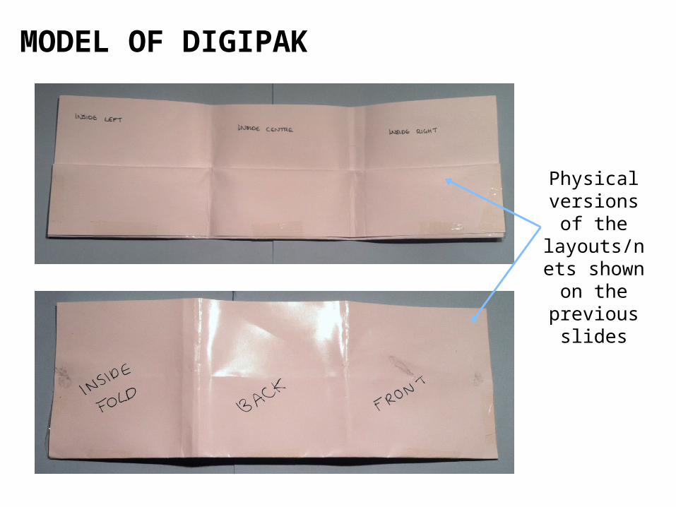
MODEL OF DIGIPAK
Physical versions of
the layouts/nets shown on the
previous slides
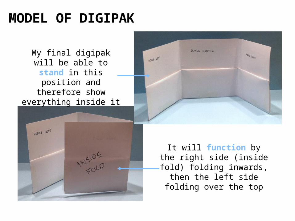
MODEL OF DIGIPAK
My final digipak will be able to stand in this
position and therefore show everything inside
it
It will function by the right side (inside fold)
folding inwards, then the left side folding over the
top
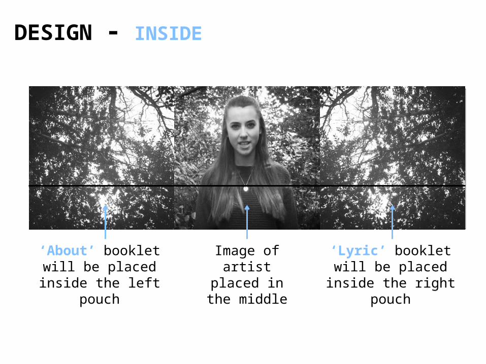
DESIGN - INSIDE
‘About’ booklet will be placed inside the left
pouch
‘Lyric’ booklet will be placed inside the right pouch
Image of artist placed in the
middle

DESIGN - OUTISDE
Song 1Song 2Song 3Song 4Song 5Song 6Song 7
INGRIDMICHAELSON
LIGHTS OUT
Image from music video will be on the inside fold
Same image will be placed on front and back cover, but front angle will be
on front cover, and behind angle on back cover
CREDITS CREDITS CREDITS CREDITS

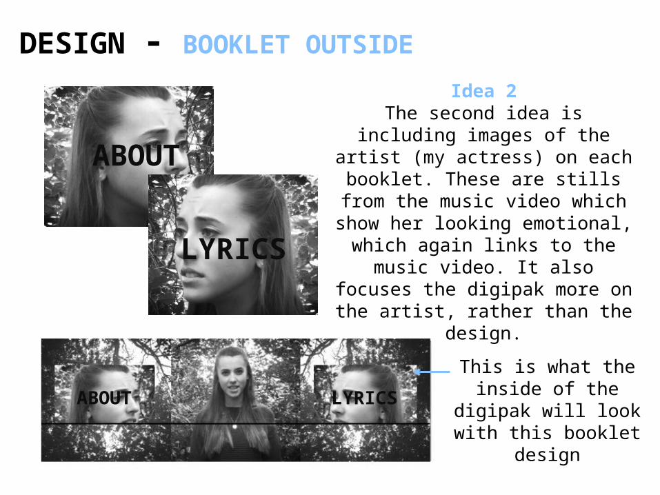
DESIGN - BOOKLET OUTSIDE
LYRICS
LYRICSABOUT
Idea 1The first idea is having an image of leaves on the floor, that I took during filming. It links with the rest of the digipak/music video as it includes nature, however it might make it a bit over the top.
The cover of both designs will include the title of the booklet in
a bold, black coloured font.
This is what the inside of the digipak
will look with this booklet design
DESIGN - BOOKLET OUTSIDE
LYRICSABOUT
ABOUT
LYRICS
This is what the inside of the digipak
will look with this booklet design
Idea 2The second idea is including
images of the artist (my actress) on each booklet. These are stills
from the music video which show her looking emotional,
which again links to the music video. It also focuses the digipak more on the artist, rather than
the design.

DESIGN - BOOKLET INSIDE
LYRICSLYRICSLYRICSLYRICSLYRICSLYRICSLYRICSLYRICSLYRICSLYRICSLYRICSLYRICSLYRICSLYRICS
LYRICSLYRICSLYRICSLYRICSLYRICSLYRICSLYRICSLYRICSLYRICSLYRICSLYRICSLYRICSLYRICSLYRICS
LYRICSLYRICSLYRICSLYRICSLYRICSLYRICSLYRICSLYRICSLYRICSLYRICSLYRICS
LYRICSLYRICSLYRICSLYRICSLYRICSLYRICSLYRICSLYRICSLYRICSLYRICSLYRICSLYRICSLYRICSLYRICS
LYRICSLYRICSLYRICSLYRICSLYRICSLYRICSLYRICSLYRICSLYRICSLYRICSLYRICSLYRICSLYRICSLYRICS
LYRICSLYRICSLYRICSLYRICSLYRICSLYRICSLYRICSLYRICSLYRICSLYRICSLYRICS
I’m going to keep the inside of the booklets as simple as possible, by using white text on a black background, or vice
versa. The rest of the digipak is already full of images, therefore including images on each of the booklet pages would probably
be a bit over-complicated.