Embed Size (px)
Citation preview

Slide 1.1
Analysing quantitative data

Slide 1.2
Quantitative data analysis
Key points
Data must be analysed to produce information
Computer software analysis is normally used for this process (Microsoft Excel, SPSS etc.)
Present, explore, describe & examine relationships
Slide 1.3
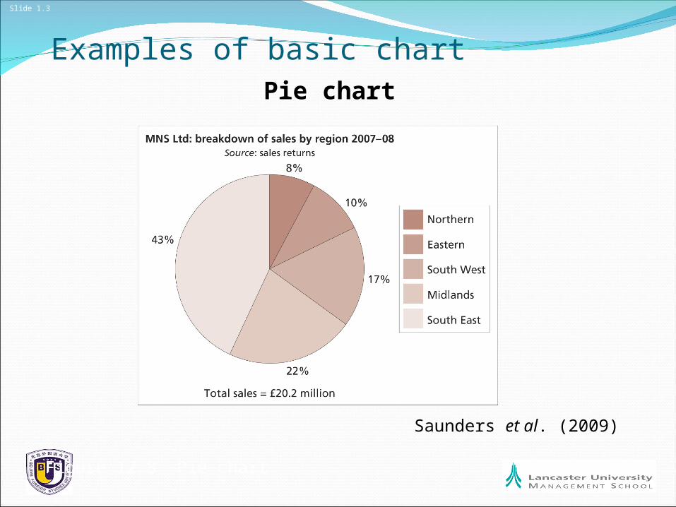
Examples of basic chartPie chart
Saunders et al. (2009)
Figure 12.8 Pie chart

Slide 1.4
More advanced work requires Statistical analysis
Establishing the statistical relationship between two variables (e.g. If I am in this group I am have a % probability of doing X).
If you need to do this then see:
http://www.statsoff.com/textbookhttp://oli.web.cmu.edu/openlearning/
forstudents/freecourses/statistics

Slide 1.5
Quantitative data analysis: Main Concerns Preparing, inputting and checking data
Choosing the most appropriate statistics to describe the data
Choosing the most appropriate statistics to examine data relationships and trends

Slide 1.6
Type of Data: category data Example: Number of cars hatchback / saloon / estate
Can’t measure it, just simply count occurrences Focus on one discrete variable (i.e. Hatchback)
Dichotomous data (e.g. either Male or Female) Ranked data (how strongly you agree with statement
X)
Slide 1.7
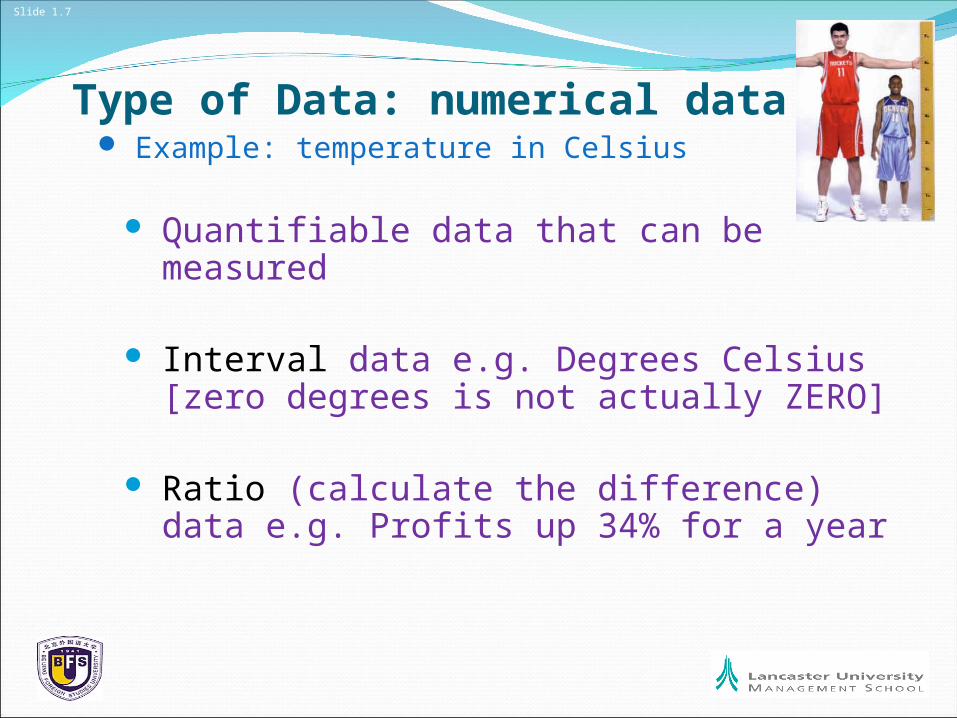
Type of Data: numerical data Example: temperature in Celsius
Quantifiable data that can be measured
Interval data e.g. Degrees Celsius [zero degrees is not actually ZERO]
Ratio (calculate the difference) data e.g. Profits up 34% for a year
Slide 1.8
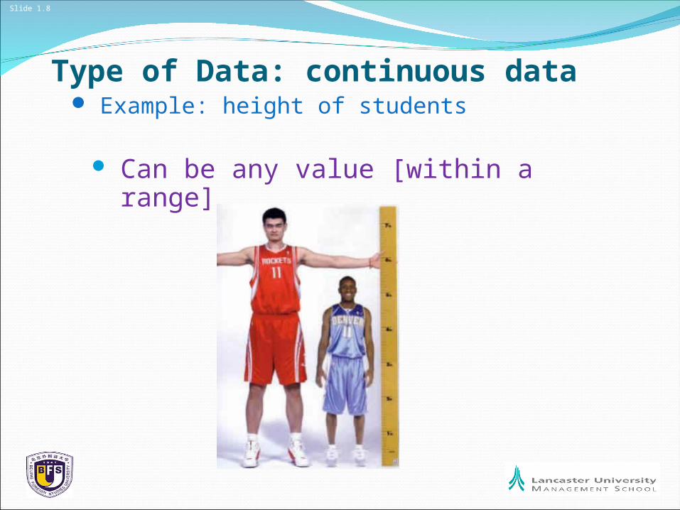
Type of Data: continuous data Example: height of students
Can be any value [within a range]

Slide 1.9
Level of Precision
LESS MORE
Precise data can be grouped to make it less precise (e.g. Mark of 85% grouped into a ‘Very Good’ category but
Not the other way round)

Slide 1.10
Exploring Data: Tukey’s (1977) exploratory data analysis approach focus on tables & diagrams
Great Tables & Diagrams Need:
Clear & Distinctive TitleClearly stated units of measurementClearly stated source of dataAbbreviations explained in notesSize of the sample is stated “n = 43”Column / Row / Axis LabelsDense shading for smaller areasLogical Sequence of columns & rows

Slide 1.11
Exploratory Analysis: Individual unit of data
Highest and lowest values
Trends over time
Proportions (relative size)
Distributions (number in a group)Sparrow (1989)

Slide 1.12
What Do You Want To Show?Highest / Lowest: Bar Chart / Histogram for Categories
You can reordered it for Non-continuous data

Slide 1.13
What Do You Want To Show?Frequency: Again a Histogram / Bar Chart (reorder it
to make it clearer)
Perhaps a pictogram

Slide 1.14
What Do You Want To Show?Trend: Line Chart or histogram

Slide 1.15
What Do You Want To Show?Proportion: Pie chart or bar chart

Slide 1.16
Distribution of values

Slide 1.17
Normal DistributionSample of 100+ people should produce a normal curve.
Standard deviation shows how widethe spread of results are.
Low standard deviation shows a narrow range of values
High standard deviation shows a wide range of values

Slide 1.18
How to calculate it:Consider a population consisting of the following eight values:
2, 4, 4, 4, 5, 5, 7, 9Calculate the Mean (2, 4, 4, 4, 5, 5, 7, 9) / 8 = 5Calculate the difference between each individual data point and
the mean. Then square each one
Calculate the average of these values (i.e. 32 / 8 = 4)Find the sqaure root of this number (square root of 4 is 2)
http://www.statsoff.com/textbookhttp://oli.web.cmu.edu/openlearning/forstudents/freecourses/statistics

Slide 1.19
Negative skew / Positive skew

Slide 1.20
What to do with your distribution?Try to understand what is the story behind the data:
Is the data ‘unrepresentative’?
Are the categories the wrong width?
Is there something going on we did not know about at the start?

Slide 1.21
Comparing variables to show
Totals
Proportions and totals
Distribution of values
Relationship between cases for variables

Slide 1.22
Multiple bar chart: Totals & Highest / Lowest

Slide 1.23
Comparing proportions
Would you buy this product again? – products 1 to 6
Slide 1.24
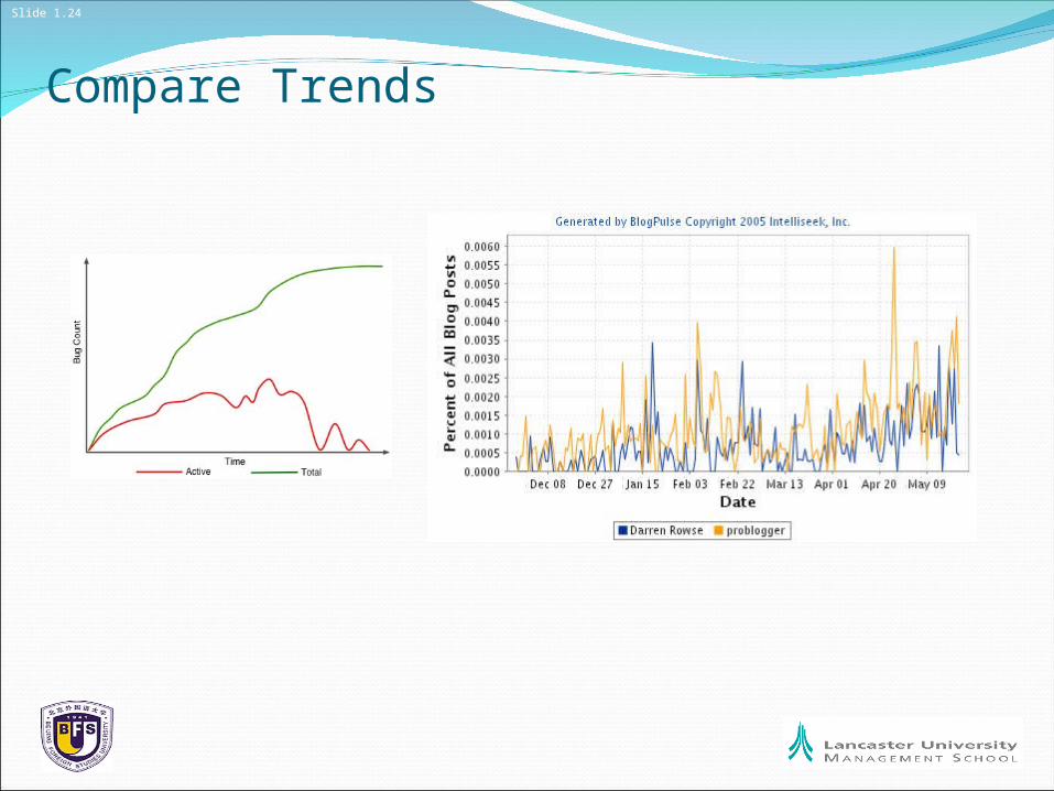
Compare Trends

Slide 1.25
A final word of caution
GI-GO
Garbage In – Garbage Out