Wednesday, September 28
• Complete and hand in Typographic Portraits
• Power Point about Magazine Cover design
• Continue working on creating magazine cover image
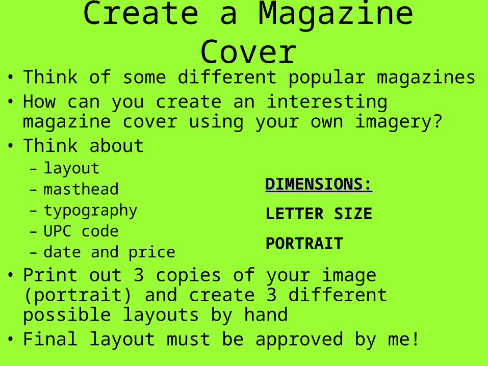
Create a Magazine Cover• Think of some different popular magazines• How can you create an interesting magazine cover
using your own imagery?• Think about
– layout – masthead – typography – UPC code – date and price
• Print out 3 copies of your image (portrait) and create 3 different possible layouts by hand
• Final layout must be approved by me!
DIMENSIONS:DIMENSIONS:
LETTER SIZE
PORTRAIT
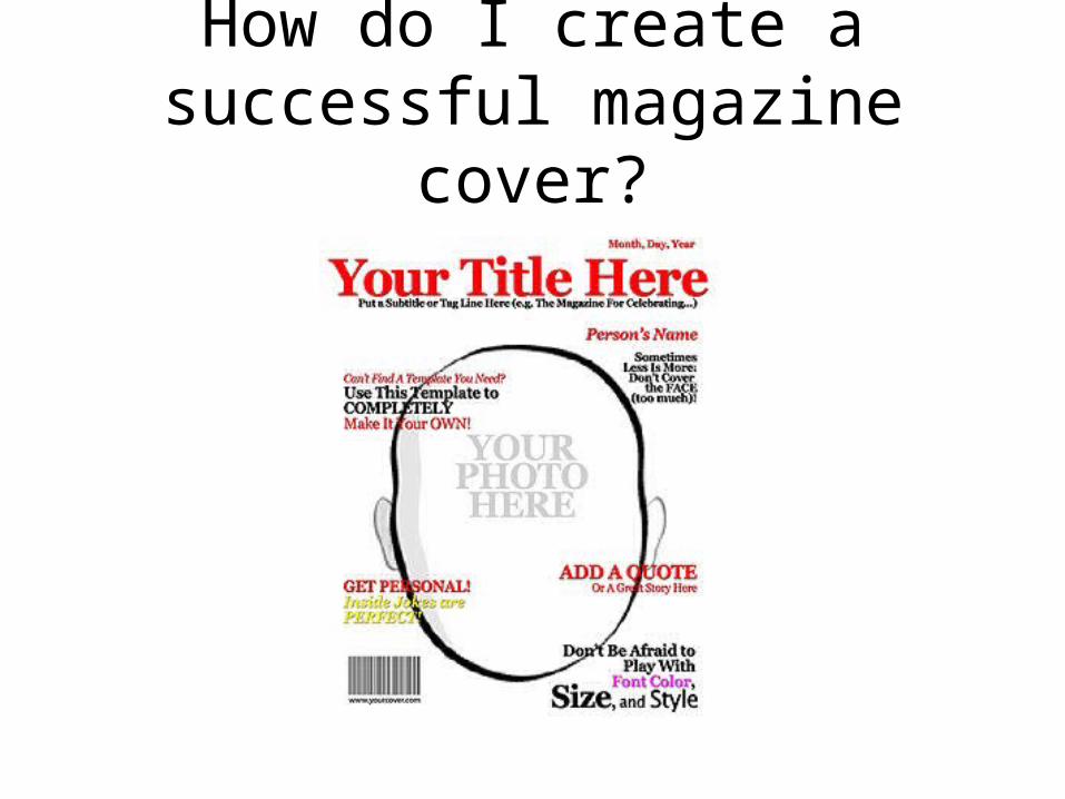
How do I create a successful magazine cover?
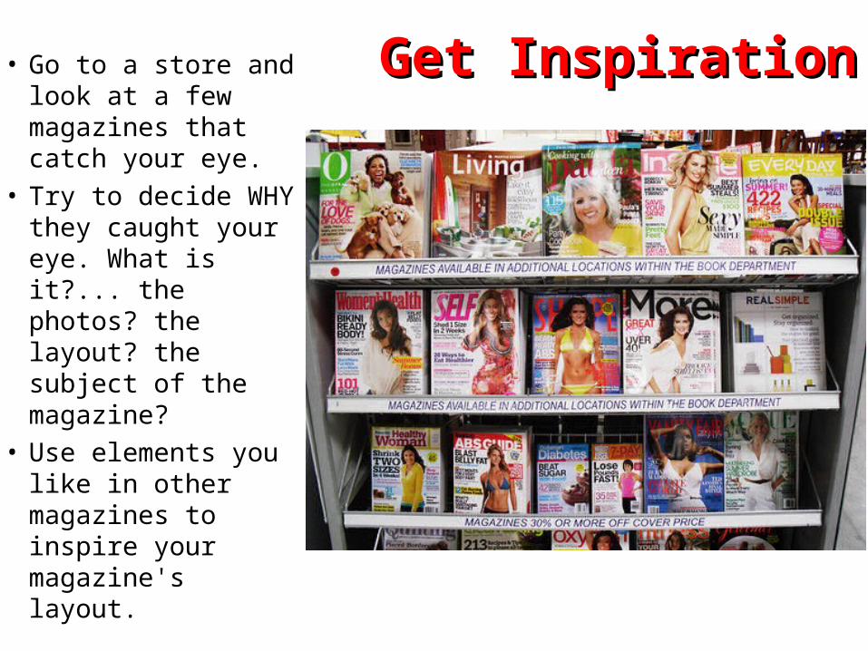
Get Inspiration!Get Inspiration!• Go to a store and look at a few magazines that catch your eye.
• Try to decide WHY they caught your eye. What is it?... the photos? the layout? the subject of the magazine?
• Use elements you like in other magazines to inspire your magazine's layout.
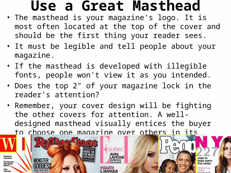
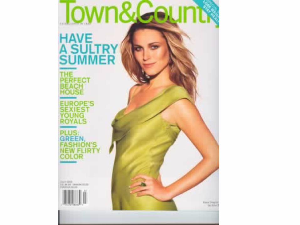
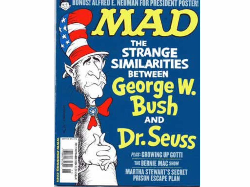
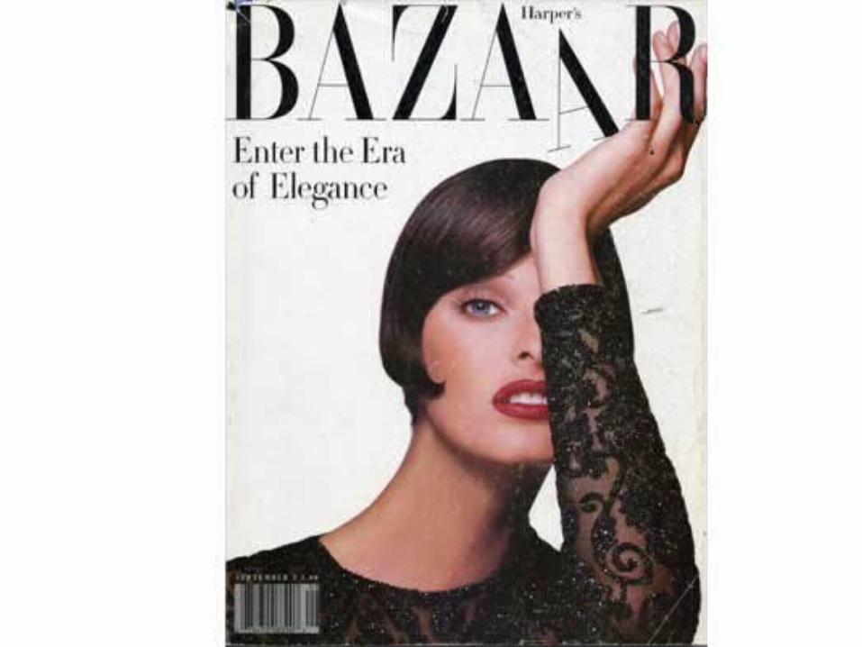
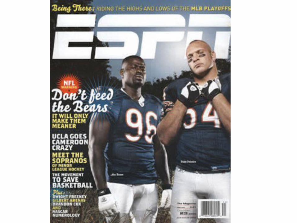
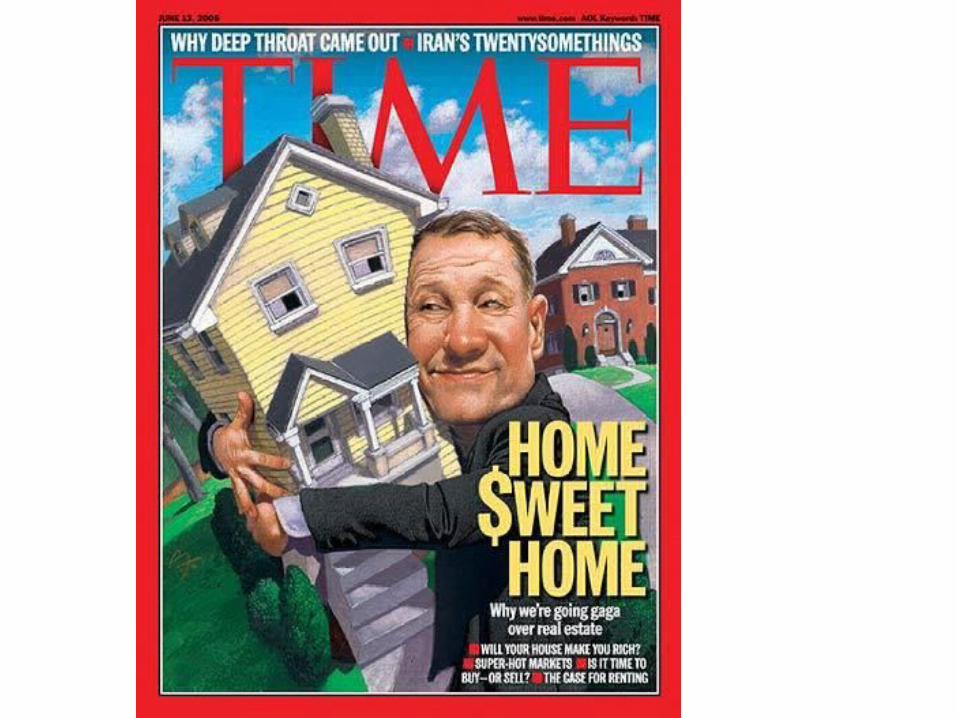
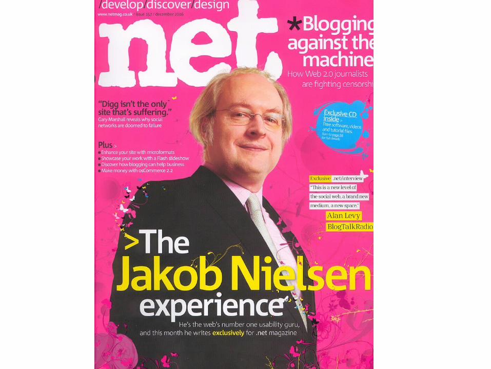
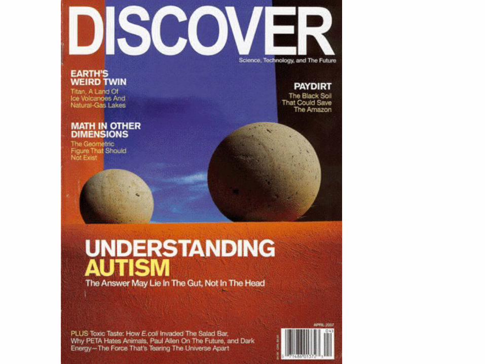
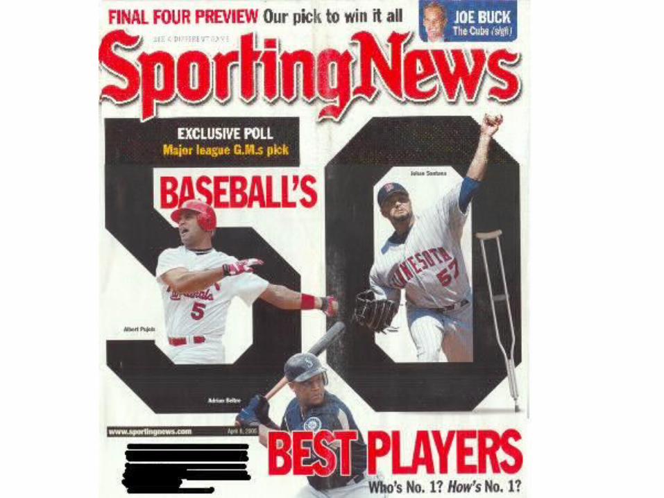
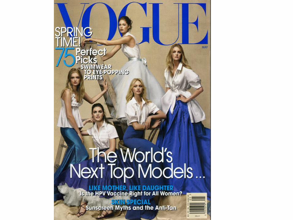
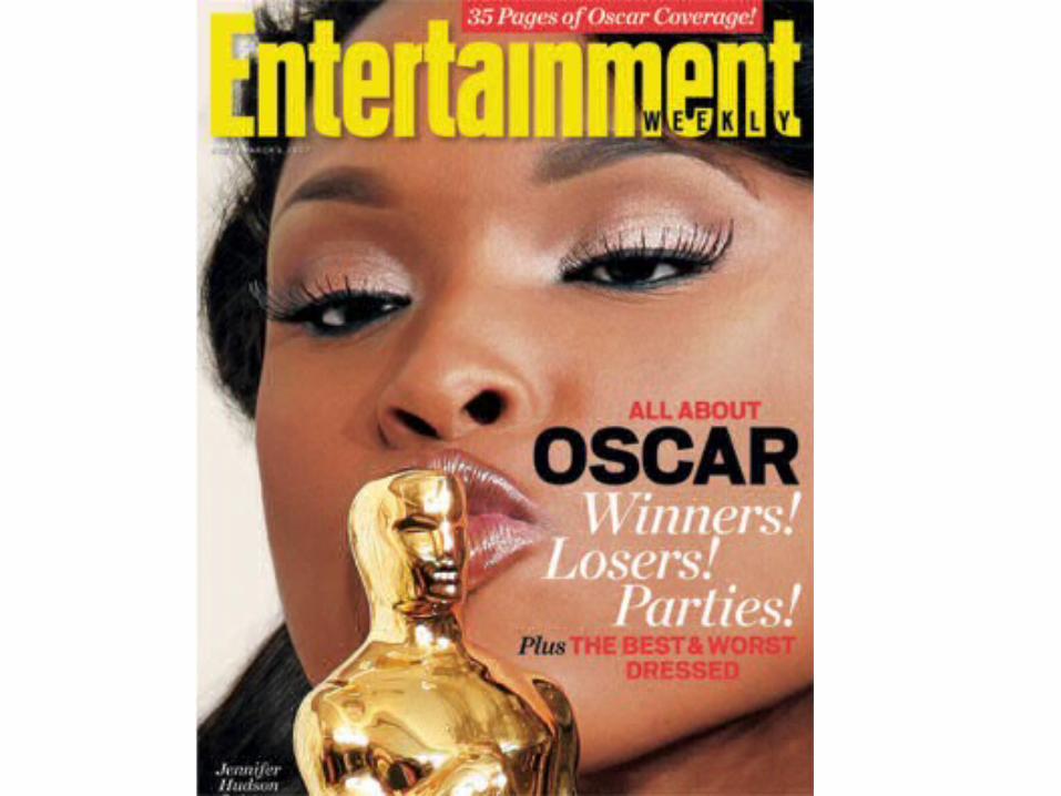
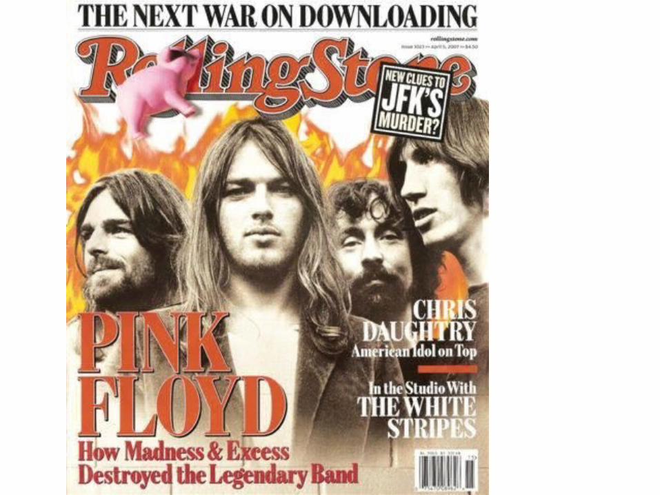
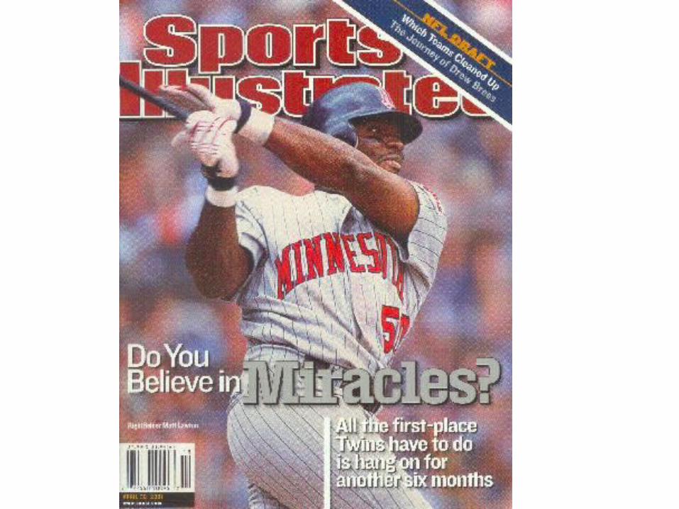
Use a Great Masthead• The masthead is your magazine's logo. It is most often
located at the top of the cover and should be the first thing your reader sees.
• It must be legible and tell people about your magazine. • If the masthead is developed with illegible fonts, people won't
view it as you intended.• Does the top 2" of your magazine lock in the reader's
attention? • Remember, your cover design will be fighting the other
covers for attention. A well-designed masthead visually entices the buyer to choose one magazine over others in its category.
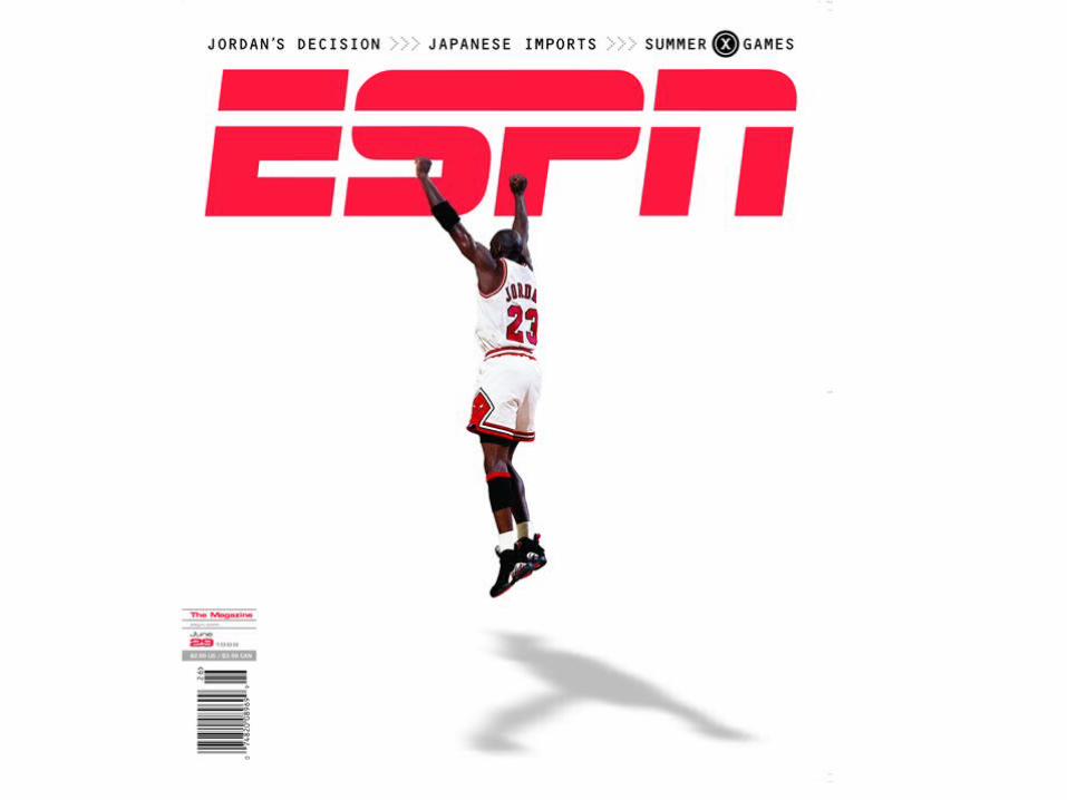
Use a Great Cover Photo
• A well-designed cover can get your magazine noticed and even more importantly, picked up!
• Choose a photo that is interesting to your potential readers or which tells a story.
• Choose a photo that is recognizable to your target readers or shows action, unusual colors, taken from unusual angles, or combinations of all these.
• Remember, your magazine only gets one chance to make its first impression. Photos are powerful in making a good first impression.
Careful Font Usage• The choice of fonts can have a major impact on the overall
professionalism a magazine conveys. – Using too many font faces is visually confusing to the reader. He/she
may have trouble distinguishing the stories from the ads.
• Consider using only one to two font families in your articles; one for the headlines and subheads, one for the body text.
• Research shows that serif fonts, especially small ones, are easier to read than san-serif fonts – (serifs are the little tick marks at the end of lines in the letters). – The eye tracks across the serifs of the letters making reading easier.
• ALL CAPS are difficult to read. – If you want to emphasize a word consider using bold versions of that
font as an alternative. – Stretching/compressing fonts look awkward. Consider the extended or
condensed version of that font or even another font family.
Website featuring a magazine cover redesign:
• http://www.youtube.com/watch?v=tk8hOc5gUGo&feature=related
Recommended